


FROM PRODUCT QUALITY TO MARKETPLACE PERCEPTION
Having A Good Product Is No Longer Enough.
You Need Design That Sells.
On Amazon, strong products are often judged long before their full value is understood—through the speed, clarity, credibility, and relevance of the visual experience surrounding them.
On Amazon, customers rarely begin by understanding the full value of a product. They begin with what they can process almost immediately: the main image, visual hierarchy, product clarity, perceived credibility, benefit communication, and the first impression of whether the listing understands what they actually need.
A strong product can therefore underperform long before price, reviews, technical specifications, or deeper product advantages become part of the decision. When the presentation is inconsistent, generic, overloaded, or difficult to scan, the customer may never stay long enough to discover why the product deserves serious consideration.
That makes Amazon product design much more than decoration. It becomes part of the decision-making environment—organizing information, directing attention, clarifying relevance, and helping genuine product value become easier to recognize.
In this article, we examine five recurring design problems that weaken Amazon product presentation and the visual principles that can help transform a listing from a collection of isolated assets into a clearer, more coherent, and more persuasive customer experience.
THE FIVE AREAS THAT MOST OFTEN BREAK THE EXPERIENCE
First impression. Relevance. Audience clarity. Visual hierarchy. Value communication.
Each one influences a different part of the customer journey, but none of them works in isolation. When they are considered as one connected system, the listing becomes easier to understand, easier to navigate, and more capable of communicating why the product matters.
The problem begins when these areas are treated as separate design tasks rather than parts of one marketplace experience. A strong image cannot compensate for unclear value, precise targeting cannot rescue weak hierarchy, and good information loses impact when the customer has to work too hard to understand it. The real strength comes from aligning all five around one clear product story and one deliberate decision path.
WEAK FIRST IMPRESSION:
VISUALS THAT DON’T TELL A STORY
WHY IT MATTERS
On Amazon, the customer often decides whether a product deserves further attention before reading the deeper details of the listing. The first visual layer must therefore do more than look polished—it needs to establish what the product is, why it matters, who it is for, and what makes it worth considering.
A weak first impression creates friction before the customer has had a chance to evaluate the offer properly. When the hero image, supporting visuals, hierarchy, and product context fail to communicate clearly, the listing asks the customer to work too hard to understand something that should feel immediate.
COMMON FAILURE
The product is visible, but the story is not.
The customer sees packaging, product photography, or isolated graphics without enough visual context to understand the product’s purpose, relevance, or distinctive value. The result may look professionally produced while still failing to create a clear reason to continue exploring the listing.
When The Product Is Visible But The Message Is Not
WHY THIS EXAMPLE MATTERS
The product may be clearly shown, yet the listing still lacks a strong hierarchy, immediate benefit communication, and enough visual context to explain why the offer matters. The result is presence without direction.

WHAT NOT TO DO — A product can be technically visible while the listing still fails to communicate relevance, hierarchy, benefit, or a clear reason to continue.
BETTER
DIRECTION
Use the first visual sequence to establish a clear communication hierarchy:
Product Identity → Core Benefit → Real-World Relevance → Supporting Proof → Brand Character
The objective is not to explain everything at once. It is to make the first few visual decisions work together so the customer can quickly understand the offer and feel confident enough to continue.
Strong marketplace imagery should therefore combine clear product presentation, disciplined hierarchy, purposeful context, benefit-led communication, and visual consistency rather than treating each image as an isolated design asset.
PROJECT
EVIDENCE
In projects such as Vital Colon Detox®, the product presentation was developed as a connected visual system rather than a collection of unrelated marketplace graphics.
Product imagery, benefit communication, supporting context, visual hierarchy, and brand consistency were structured to help the customer understand the offer more clearly across the listing experience.
The value of this approach is not that every image becomes louder.
It is that each image has a defined role within the same product story, allowing the listing to build understanding progressively instead of forcing every message into the first visual moment.
When Every Visual Has A Clear Communication Role
WHY THIS EXAMPLE MATTERS
In the Vital Colon Detox® example, product imagery, benefit communication, supporting context, and brand consistency work as parts of one connected marketplace system rather than isolated graphics. Each visual helps move understanding forward.

PROJECT EVIDENCE
Vital Colon Detox® Amazon Visual Communication System
Product presentation developed around clearer hierarchy, benefit communication, supporting context, and consistent brand recognition across the marketplace experience.
THE FIRST IMAGE EARNS ATTENTION.
THE VISUAL SYSTEM THAT FOLLOWS GIVES THAT ATTENTION A REASON TO CONTINUE.
CUSTOMERS EVALUATE RELEVANCE BEFORE FEATURES
WHY IT MATTERS
A customer can understand what a product technically does and still remain unconvinced that it is relevant to them.
Features describe the product. Relevance explains why those features deserve attention. On Amazon, that distinction matters because customers are rarely studying every specification in isolation—they are trying to decide whether the product fits a need, solves a problem, improves an experience, or offers a meaningful advantage over alternatives.
Strong marketplace communication therefore translates product information into clear customer-facing value without exaggerating what the product can actually deliver.
COMMON FAILURE
The listing explains the product, but never clearly connects those facts to the customer’s real reason for considering it.
Technical specifications, ingredients, materials, dimensions, functionality, or individual features may all be present, yet the communication remains product-centered rather than audience-centered.
The customer is left to make the connection themselves.
When Features Are Listed Without Creating Relevance
WHY THIS EXAMPLE MATTERS
The information may be technically correct, but the presentation gives every feature similar importance and provides little help in understanding which benefit matters most, who the product is intended for, or how those characteristics translate into a meaningful real-world advantage.

WHAT NOT TO DO — Feature-Heavy Communication Without Clear Customer Relevance
Product information alone does not automatically communicate value. Without hierarchy and benefit context, customers must interpret why the listed features should matter to them.
BETTER
DIRECTION
Translate important product features into an understandable sequence:
Feature → Functional Meaning → Customer Benefit → Real-World Context → Supporting Proof
This does not mean turning every specification into an exaggerated marketing claim.
It means identifying which characteristics genuinely influence the customer’s decision and presenting them in a way that makes their relevance easier to understand.
For example:
Material should explain more than what something is made from.
It can clarify durability, comfort, maintenance, weight, or intended use where those qualities are genuinely supported.
Ingredients should not become unsupported health promises.
They can be organized around verified product information, formulation context, or approved benefits where appropriate.
Technical features become more useful when customers can understand what changes in practical use because that feature exists.
PROJECT
EVIDENCE
Different product categories require different ways of translating features into relevance.
A wellness product, cleaning product, or everyday utility item may contain completely different technical information, but the communication principle remains consistent: identify what the customer needs to understand first and build the visual story around that priority.
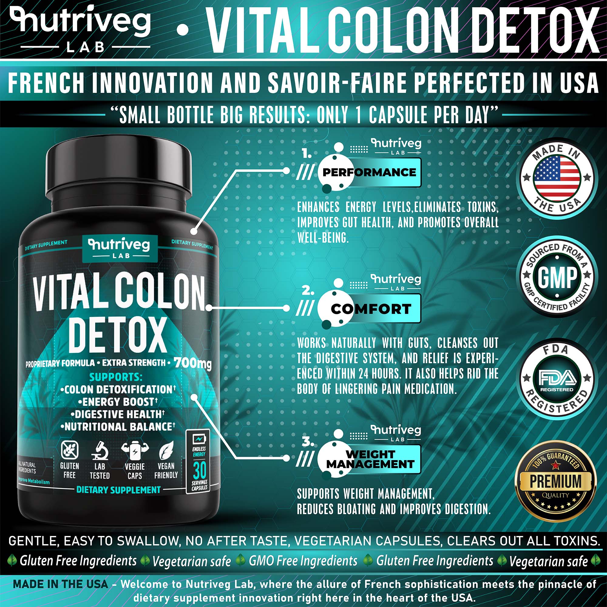
In marketplace projects such as Vital Colon Detox®, product communication was structured around clearer benefit hierarchy and supporting context rather than presenting ingredients and product information as disconnected facts.
The objective was not simply to include more information, but to determine which message should lead, which details should support it, and how product benefits could become easier to understand within the customer’s decision process.
Other product examples demonstrate the same principle from different angles—showing how material characteristics, use scenarios, and functional details become more meaningful when they are presented around the customer’s actual decision, through a clearer, more deliberate sequence of supporting visual evidence.
Turning Product Information Into A Clearer Benefit Story
WHY THIS EXAMPLE MATTERS
The Vital Colon Detox® visual system does not rely on product information appearing as an undifferentiated list. Hierarchy, supporting context, and coordinated visual communication help separate what the product contains, what information matters most, and how the customer should move through the message.
PROJECT EVIDENCE
Vital Colon Detox® Benefit Communication
Marketplace visuals developed to organize product information, benefit hierarchy, and supporting context within one more coherent Amazon communication system.
Making Material Features Easier To Understand In Use
WHY THIS EXAMPLE MATTERS
Material specifications become more meaningful when the customer can connect them to practical use. Instead of presenting microfiber only as a technical characteristic, the visual communication should help explain what that material changes in the actual product experience.

PRODUCT COMMUNICATION EVIDENCE
Material Feature To Practical Benefit
A product feature becomes stronger when visual hierarchy connects technical information with the real-world reason that information matters to the customer.
Connecting Functional Features With A Specific Use Context
WHY THIS EXAMPLE MATTERS
For a specialized utility product, relevance depends on showing more than construction or individual features. The communication becomes clearer when product characteristics are placed within a recognizable use scenario, audience need, and practical decision context.

PRODUCT COMMUNICATION EVIDENCE
Function, Audience, And Use Context
Clear marketplace communication helps customers connect individual product features with the specific situations, priorities, or problems those features are designed to address.
FEATURES EXPLAIN WHAT THE PRODUCT HAS.
RELEVANCE HELPS THE CUSTOMER UNDERSTAND WHY ANY OF IT SHOULD MATTER.
GENERIC MESSAGING WEAKENS AUDIENCE RELEVANCE
WHY IT MATTERS
A product can be professionally photographed, visually polished, and technically well presented while still feeling as though it was designed for no one in particular.
Strong marketplace communication begins with understanding who is most likely to consider the product, what matters to that audience, which questions influence their decision, and what visual or verbal cues help the offer feel immediately relevant.
Audience relevance does not mean exaggerating stereotypes or narrowing the communication so aggressively that the product becomes inaccessible to everyone else. It means establishing enough specificity that the customer can recognize why this product belongs within their needs, priorities, lifestyle, or intended use.
When that connection is missing, even strong design can begin to feel generic.
COMMON FAILURE
The listing tries to communicate with everyone—and becomes meaningful to almost no one.
Generic headlines, interchangeable lifestyle imagery, vague benefits, broad claims, and visual choices disconnected from the intended user can make a product appear professionally presented while still lacking a clear point of view.
The customer may understand what is being sold without understanding why the product is particularly relevant to them.
When The Audience Is Undefined, The Message Becomes Interchangeable
WHY THIS EXAMPLE MATTERS
A listing can contain all the expected elements and still lack audience relevance when imagery, language, hierarchy, and benefits are presented without a clear understanding of who should care most. The result could belong to almost any competing product because nothing in the communication establishes a specific relationship with the intended customer.

WHAT NOT TO DO — Generic Marketplace Communication Without Clear Audience Relevance
Broad messaging may increase the number of people who can technically understand the listing, but it can weaken the specific cues that help the intended customer recognize why the offer deserves attention.
BETTER
DIRECTION
Build the communication around a clearer audience logic:
Audience Need → Priority → Relevant Benefit → Visual Context → Supporting Evidence
The objective is not to redesign the product around assumptions about a demographic.
It is to understand which parts of the offer genuinely matter most to the people considering it and allow those priorities to influence the hierarchy, imagery, language, context, and sequence of information.
A product intended for professional use may require more technical credibility and functional evidence.
A lifestyle product may depend more strongly on context, identity, emotional relevance, or ease of use.
A specialized utility product may need to communicate specific situations, practical priorities, reliability, and intended use before broader brand messaging becomes meaningful.
The strongest direction comes from matching the communication to the actual decision—not simply changing colors, photography, or tone to imitate a target audience.
PROJECT
EVIDENCE
The BodyGuard® tactical pen example demonstrates how product communication can become more relevant when functional characteristics are connected to a clearly understood user context.
Instead of presenting the product only as an isolated object, the visual system can emphasize the characteristics most relevant to its intended use—construction, portability, functionality, reliability, and situational context—while maintaining a consistent product identity.
By connecting those characteristics to the situations in which they become useful, the communication moves beyond a generic feature list. The customer can understand not only what the product offers, but why those qualities may matter within its intended use.
The important principle is not the specific visual style of the example.
It is the decision to let audience priorities influence what is communicated first, what receives visual emphasis, and how the product is positioned within a real use scenario, rather than treating audience relevance as a surface-level stylistic choice. This creates a more focused narrative in which function, context, and relevance reinforce one another.
When Product Communication Reflects A Clear User Context
WHY THIS EXAMPLE MATTERS
The BodyGuard® tactical pen presentation is clearly structured around a focused use case and a defined audience. Its technical decomposition, material details, functional callouts, and visual language reinforce the same product story, helping the customer understand who the product is for, what it is designed to do, and which features matter most in that context.

PROJECT EVIDENCE
BodyGuard® Tactical Pen Audience-Focused Marketplace Communication
A focused visual system built around technical functionality, intended use, and audience-specific priorities rather than broad, interchangeable lifestyle messaging.
WHEN A PRODUCT TRIES TO SPEAK TO EVERYONE IN THE SAME WAY, ITS MOST RELEVANT MESSAGE CAN DISAPPEAR.
STRONGER COMMUNICATION KNOWS WHO NEEDS TO UNDERSTAND IT FIRST.
WEAK VISUAL HIERARCHY MAKES INFORMATION HARDER TO PROCESS
WHY IT MATTERS
Amazon listings often contain a large amount of information competing for limited attention. Product benefits, specifications, use cases, proof points, brand messages, comparisons, technical details, and calls to action can all be relevant—but they should not all demand the same level of attention at the same moment.
Without a deliberate hierarchy, the customer is forced to decide what matters first. That increases cognitive effort and makes even useful information harder to process.
Strong visual hierarchy solves this by establishing what should be noticed first, what should be understood next, and what information can support the decision later. The objective is not to remove valuable content, but to organize it so the listing feels guided rather than crowded.
COMMON FAILURE
Everything is presented as important, so nothing clearly leads the customer forward.
Large headlines compete with secondary benefits. Icons, badges, technical specifications, lifestyle imagery, and promotional claims appear at similar visual weights. The customer receives information, but the listing provides little guidance about where to look first or how the pieces connect.
When Every Message Competes For Attention
WHY THIS EXAMPLE MATTERS
The problem is not necessarily the amount of information—it is the lack of visible priority. When headlines, benefits, specifications, proof elements, and supporting graphics are given similar prominence, the customer has to construct the information hierarchy independently instead of being guided through it.

WHAT NOT TO DO — Dense Marketplace Communication Without A Clear Visual Priority
Useful information becomes harder to absorb when too many elements compete for the same attention and the listing does not clearly distinguish primary messages from supporting detail.
BETTER
DIRECTION
Build the listing around a deliberate information sequence:
Product → Core Benefit → Supporting Benefits → Usage → Proof → Differentiation → CTA
This sequence is not a rigid template for every Amazon listing. The correct order depends on the product and the customer decision.
What matters is that each visual has a defined communication role.
A primary image may establish product identity.
The next visual may clarify the main benefit.
Another may demonstrate use.
Later images can support the story with dimensions, materials, comparisons, certifications, social proof, or technical details.
Visual hierarchy can be controlled through scale, placement, contrast, whitespace, typography, color, image composition, repetition, and sequencing.
The result should feel less like a collection of independent sales graphics and more like a directed visual experience.
PROJECT
EVIDENCE
The ZALDERAN® Campfire Grill marketplace visual shows how multiple layers of product information can coexist without losing the central communication path.
The main lifestyle scene establishes context and emotional relevance first. Supporting circular callouts demonstrate product uses, while functional information appears in secondary positions rather than competing with the hero message.
This creates a hierarchy in which the product experience leads and supporting information becomes evidence rather than visual competition. Each element has a defined role, helping the customer move toward evaluation without disrupting the main story.
The communication moves from experience → use → functional evidence → product value, allowing the customer to understand the product progressively rather than processing every detail at once.
The result is a more deliberate marketplace presentation where context, functionality, and proof reinforce the central message instead of competing for attention.
When Information Is Structured Around A Clear Visual Journey
WHY THIS EXAMPLE MATTERS
The ZALDERAN® visual combines lifestyle storytelling, product application, supporting details, and functional proof within one composition, but the elements are not given equal visual weight. The main story remains dominant while secondary information supports it in a controlled sequence.

PROJECT EVIDENCE
ZALDERAN® Campfire Grill Marketplace Visual Hierarchy
A layered Amazon communication system using a dominant lifestyle story, supporting product applications, and secondary proof points to guide attention through the product experience.
GOOD HIERARCHY DOES NOT REMOVE INFORMATION.
IT GIVES EVERY PIECE OF INFORMATION THE RIGHT MOMENT TO MATTER.
VALUE MUST BE UNDERSTOOD BEFORE IT CAN INFLUENCE THE DECISION
WHY IT MATTERS
Customers do not experience value as a list of features. They experience it through the relationship between what the product offers, how clearly those advantages are communicated, how relevant they feel, and whether the presentation gives enough confidence to justify the decision.
A product may genuinely be well made, useful, technically strong, or competitively priced, yet still appear undifferentiated when the listing fails to make that value visible.
Design cannot manufacture value that the product does not have. What it can do is make real value easier to recognize, understand, compare, and remember.
COMMON FAILURE
The listing contains strong product information, but never organizes it into a clear value proposition.
Features appear without priority. Benefits are broad or repetitive. Supporting visuals demonstrate individual details without explaining how those details contribute to the larger reason the customer should care.
The result is a product that may be good—but still feels interchangeable with competing offers.
When Value Is Claimed But Not Clearly Demonstrated
WHY THIS EXAMPLE MATTERS
Generic quality claims can make a listing sound positive without making it more persuasive. When terms such as premium, durable, innovative, or best value appear without enough product-specific evidence, the customer receives promotional language instead of a clear reason to believe the difference matters.

WHAT NOT TO DO — Generic Value Claims Without Product-Specific Evidence
Broad claims may describe an ambition, but they do not automatically explain what makes the product different, how that difference appears in use, or why it should influence the customer’s decision.
BETTER
DIRECTION
Build value communication around evidence:
Differentiator → Customer Relevance → Supporting Detail → Proof → Brand Context
Instead of asking the design to repeatedly say that the product is better, identify what is genuinely distinctive and how that distinction can be shown.
This may include:
- a specific material or construction advantage;
- a functional feature demonstrated in use;
- a clearly explained product system;
- verified technical information;
- a meaningful comparison;
- visual evidence of craftsmanship or performance;
- relevant certifications or approved proof points;
- a brand experience that makes the product easier to recognize and trust.
The strongest value communication does not make every advantage equally loud. It identifies the few elements that carry the greatest decision-making weight and gives them enough space, hierarchy, and supporting evidence to become believable. Together, these elements make value easier to recognize and trust.
PROJECT
EVIDENCE
The ZALDERAN® Campfire Grill example demonstrates how product value can be communicated through more than a single headline or isolated feature claim.
The visual presentation connects lifestyle context, product use, material information, adjustable functionality, and practical cooking scenarios into a broader story about what the product enables.
By showing how the grill functions within recognizable cooking situations, the communication gives individual product characteristics a practical reason to matter. Material, adjustability, and versatility are not presented as isolated advantages—they become supporting evidence within a broader product experience the customer can immediately understand.
This also allows different layers of value to work together. Functional capability explains what the product can do, real-world context shows why those capabilities matter, and visual proof helps turn those advantages into something the customer can evaluate rather than simply accept as a claim.
The perceived value therefore comes from the relationship between product capability, real-world use, visual proof, and a clearly defined outdoor experience, rather than from simply labeling the product as premium.
When Product Value Is Demonstrated Through Use, Context, And Proof
WHY THIS EXAMPLE MATTERS
The ZALDERAN® visual does not rely on one generic value claim. It shows the product within a recognizable experience while supporting that story with material, functional, and use-case information. The customer can see what the product enables and why those characteristics may matter in practice.

PROJECT EVIDENCE
ZALDERAN® Campfire Grill Value Communication
Marketplace presentation combining real-world context, product functionality, supporting evidence, and brand storytelling to make the offer’s practical value easier to recognize.
VALUE BECOMES MORE PERSUASIVE WHEN THE CUSTOMER DOES NOT HAVE TO IMAGINE WHY THE PRODUCT MATTERS—THE COMMUNICATION MAKES THAT REASON VISIBLE.
FROM VISUAL IMPRESSION TO INFORMED DECISION
Strong Amazon Design Makes Value Easier To Understand
A strong listing does not need to shout louder than the competition. It needs to make the product easier to understand, evaluate, trust, and remember.
Amazon design should not exist simply to decorate a listing or make every product appear more premium than it really is.
Its role is more practical and more valuable: to organize information, establish hierarchy, clarify relevance, communicate genuine differentiation, support credibility, and help the customer move through the product story with less friction.
Across the five areas explored in this article, the same principle keeps returning. First impressions, audience relevance, benefit communication, visual hierarchy, and perceived value are not separate design problems. They are connected parts of the same marketplace experience.
When those parts work together, the listing becomes more than a sequence of product images and promotional claims.
It becomes a structured decision-making environment built around clarity, relevance, evidence, and brand consistency.
THE FIVE AREAS THAT MOST OFTEN BREAK THE EXPERIENCE
First impression. Relevance. Audience clarity. Visual hierarchy. Value communication.
Each one influences a different part of the customer journey, but none of them works in isolation. When they are considered as one connected system, the listing becomes easier to understand, easier to navigate, and more capable of communicating why the product matters.
The problem begins when these areas are treated as separate design tasks rather than parts of one marketplace experience. A strong image cannot compensate for unclear value, precise targeting cannot rescue weak hierarchy, and good information loses impact when the customer has to work too hard to understand it. The real strength comes from aligning all five around one clear product story and one deliberate decision path.
A PRODUCT DOES NOT NEED MORE VISUAL NOISE. IT NEEDS BETTER COMMUNICATION.
FROM ARTICLE TO PRACTICAL APPLICATION
Key Takeaways
A Practical Framework For Evaluating What Your Amazon Listing Communicates, What It Prioritizes, And Where The Customer Experience Can Become Clearer.
The five principles explored in this article point toward one broader idea: stronger Amazon communication is created when clarity, relevance, hierarchy, evidence, and brand consistency are treated as parts of the same decision-making system rather than isolated design tasks.
These takeaways are intended as a practical reference for evaluating existing listings, planning new marketplace visuals, or identifying where communication may be losing strength. The goal is not to apply every principle mechanically, but to use them as a framework for making more deliberate, customer-focused, and professionally grounded design decisions.
01 —
CLARITY BEFORE PERSUASION
If customers cannot quickly understand what the product is, who it is for, and why it matters, stronger promotional language will not solve the underlying communication problem or make the value easier to recognize.
02 —
RELEVANCE BEFORE VOLUME
More information does not automatically create a stronger listing. The right information, organized around the intended audience and decision context, carries more value than a crowded collection of features and claims.
03 —
EVIDENCE BEFORE CLAIMS
Use imagery, specifications, demonstrations, comparisons, context, verified information, and credible proof to support what the product genuinely offers rather than relying on generic language such as “premium,” “best,” or “high quality.”
04 —
HIERARCHY BEFORE DENSITY
Customers should not have to build the communication structure themselves. Strong design establishes what deserves attention first, what supports the message, and what can be understood later across the entire visual experience consistently.
05 —
SYSTEMS BEFORE ISOLATED ASSETS
The strongest Amazon listings connect brand identity, product imagery, benefits, use cases, supporting proof, visual hierarchy, and marketplace requirements into one coherent communication system rather than treating each visual as a separate advertisement with no clear relationship to the complete customer decision journey.
THE STRONGEST LISTING IS NOT THE ONE THAT SAYS THE MOST. IT IS THE ONE THAT MAKES THE RIGHT THINGS EASIEST TO UNDERSTAND.