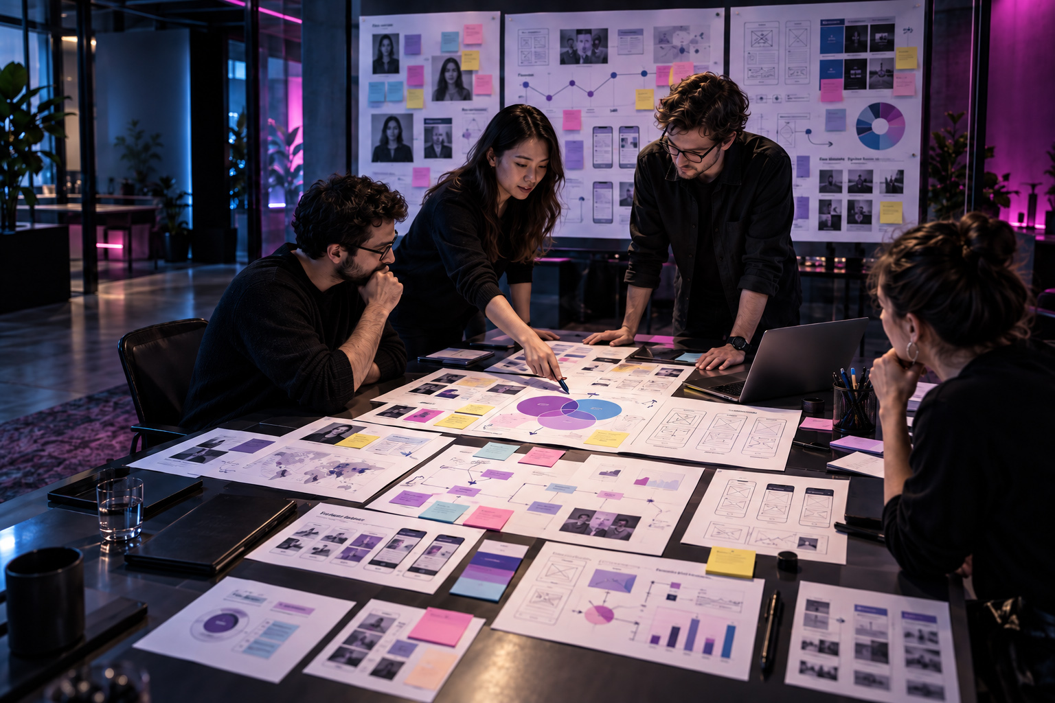
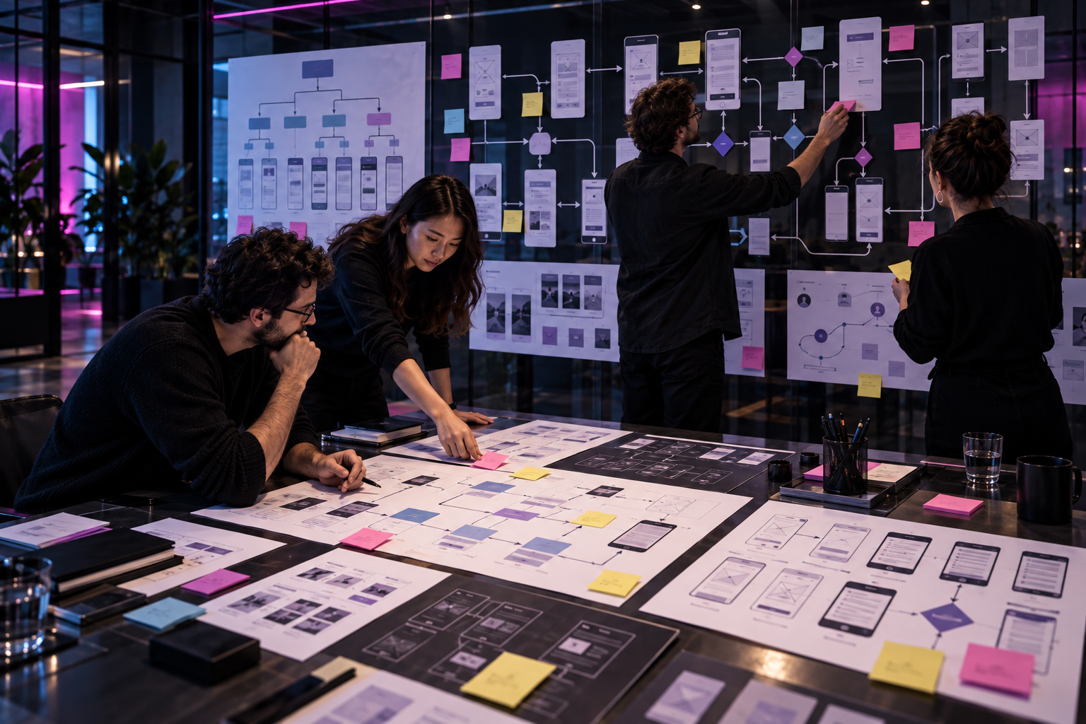
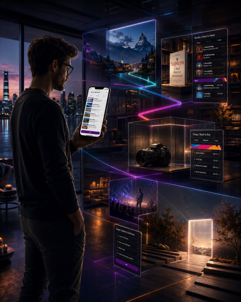
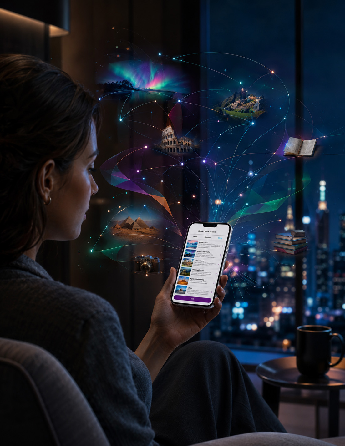
WEB & MOBILE APP DESIGN · UI/UX · RESPONSIVE INTERFACES · DIGITAL EXPERIENCES
TRANSFORM IDEAS INTO INTUITIVE DIGITAL EXPERIENCES
FROM EARLY PRODUCT CONCEPTS AND USER FLOWS TO REFINED WEB INTERFACES, MOBILE APP EXPERIENCES, AND RESPONSIVE DIGITAL SYSTEMS.
NF Creative Studio develops premium Web & Mobile App Design, UI/UX, Interface Design, And Responsive Digital Experiences for brands, products, services, platforms, and emerging digital businesses.
We transform ideas, business requirements, user needs, content structures, and existing digital products into clear, intuitive, visually distinctive, and purpose-driven interfaces designed around real interaction, usability, hierarchy, and communication goals.
From a focused landing page or mobile interface to a broader digital product system combining UX Structure, User Flows, Wireframes, Responsive UI, Prototypes, Design Systems, And Developer-Ready Design Assets, every engagement is shaped around the product’s real audience, functionality, platform, content complexity, and intended use.
THE DIGITAL EXPERIENCE MAY BEGIN WITH A SCREEN. ITS REAL VALUE IS BUILT THROUGH CLARITY, USABILITY, CONSISTENCY, AND PURPOSE.
One Discipline.
Multiple Levels Of Digital Depth.
A Web & Mobile App Design Service Built Around What Your Product Actually Needs.
From Focused Interfaces And Responsive Pages To Complete Web, Mobile App, And Digital Product Design Systems.
Proud Clients
A MULTIDISCIPLINARY WEB & MOBILE APP DESIGN PARTNER
Why High-Value Digital Products Need More Than Attractive Interfaces
THE PLATFORM MAY CHANGE. THE USER LOGIC, DIGITAL CLARITY, AND EXPERIENCE STANDARD MUST REMAIN CONSISTENT.
High-value digital products cannot rely on attractive screens alone. They require a partner capable of understanding business objectives, user behavior, content structure, functional requirements, platform constraints, and the complete journey through which people interact with the product.
From focused websites and landing pages to mobile applications and broader digital platforms, every successful interface depends on a coordinated relationship between UX Strategy, Information Architecture, User Flows, Responsive UI Design, Interaction Logic, Visual Hierarchy, And Technical Handover.
Infinity Design Studio approaches Web & Mobile App Design as a connected digital system—bringing strategic thinking, user-centered structure, visual design, responsive behavior, prototyping, and implementation-ready design logic together within one coordinated service.
Why Clients Choose Infinity Design Studio
- Strategy Before Interface Design – Every engagement begins with a clear understanding of the product, audience, business purpose, required functionality, content structure, platform environment, and the actions users need to complete.
-
User Experience Built Around Real Behavior – Navigation, hierarchy, user flows, calls to action, screen relationships, and interaction patterns are developed to make the experience clear, intuitive, and purposeful rather than visually impressive but difficult to use. -
Connected Visual & Interaction Systems – Typography, color, components, spacing, interface states, imagery, navigation, and responsive behavior are developed as one coordinated language capable of remaining consistent across pages, screens, devices, and future extensions. -
Reliable And Transparent Collaboration – Scope, responsibilities, review stages, functionality assumptions, design deliverables, technical dependencies, and handover requirements are defined clearly so that creative and development decisions remain aligned throughout the project.
Product, Experience & Digital Capabilities
- UX Architecture & User Flow Development – Information hierarchy, navigation structures, user journeys, page relationships, screen sequences, and interaction logic can be developed before visual refinement begins across complex digital products.
-
Responsive Web & Mobile Interface Design – Interfaces are designed around the requirements of desktop, tablet, and mobile environments with deliberate attention to hierarchy, readability, interaction, component behavior, and responsive adaptation. -
Wireframes, Prototypes & Design Systems – Projects may include structural wireframes, interactive prototypes, reusable components, interface patterns, visual rules, and scalable design systems according to the approved product scope. -
Developer-Ready Design & Digital Handover – Final interface assets can be prepared for implementation through organized screens, responsive states, components, interaction notes, content hierarchy, and other agreed documentation required for an efficient development handover.
Our Web & Mobile App Design Service is built for digital products where usability, interface clarity, responsive consistency, visual quality, and structured user experience directly influence product credibility, customer experience, adoption, and long-term digital value.
FROM FIRST USER FLOW TO FINAL DIGITAL INTERFACE, EVERY ELEMENT IS DEVELOPED TO WORK AS ONE.
DIGITAL PRODUCT DISCOVERY · USER NEEDS · BUSINESS OBJECTIVES · STRATEGIC UX FOUNDATIONS
Strong Digital Products Begin With Clarity Long Before The First Interface Is Designed.
A digital product can look polished and still fail if nobody has resolved what it is actually supposed to achieve. Users arrive with goals, expectations, frustrations, habits, and different levels of familiarity, while the business brings its own priorities around conversion, retention, efficiency, growth, and long-term value. The first responsibility of UX is to bring those realities into the same conversation before visual decisions begin to hide unanswered questions.
Discovery creates the structure for that conversation. Stakeholder input, user needs, competitor behaviour, content requirements, journeys, functional dependencies, technical constraints, and business priorities are examined together so assumptions can be separated from evidence. The objective is not to generate more documentation—it is to identify the decisions that will determine whether the product feels obvious, useful, coherent, and worth returning to once it enters real use.
When that foundation is resolved properly, interface design stops being an exercise in arranging screens and begins responding to a clearer product logic. Navigation can reflect real priorities, features can earn their place, content can appear where it is needed, and interaction decisions can support both user progress and business intent. The digital experience becomes stronger because the interface is no longer trying to discover the product while simultaneously presenting it—the thinking has already given the design something precise to solve.
WHEN USER NEEDS, BUSINESS OBJECTIVES, CONTENT, FUNCTIONAL PRIORITIES, AND PRODUCT CONSTRAINTS ARE CLARIFIED BEFORE THE INTERFACE TAKES SHAPE,
UX STRATEGY STOPS BEING A PRELIMINARY PLANNING EXERCISE AND BECOMES THE DECISION-MAKING FOUNDATION OF THE PRODUCT—BUILT TO REDUCE ASSUMPTION, CREATE STRONGER LOGIC, AND GIVE EVERY SCREEN, INTERACTION, AND FEATURE A CLEARER REASON TO EXIST.
COMPLETE WEB DESIGN SERVICES · STRATEGY · UX/UI · RESPONSIVE SYSTEMS · DIGITAL PERFORMANCE
Web Design & Digital Experience
A STRONG WEBSITE DOES MORE THAN PRESENT A BUSINESS. IT ORGANIZES INFORMATION, GUIDES DECISIONS, BUILDS TRUST, AND TURNS BRAND VALUE INTO A CLEAR DIGITAL EXPERIENCE.
We develop Web Design and Digital Experience systems around business objectives, user intent, content architecture, visual identity, interaction logic, responsive behavior, search visibility, and technical implementation—connecting the way a brand presents itself with the structure, usability, and performance required to support real digital journeys across devices.
The objective is not simply to create attractive pages, but to build a coherent digital environment in which content is easier to understand, navigation feels intentional, interfaces remain consistent, and every major interaction supports the next meaningful user decision.
CLEAR STRUCTURE. RESPONSIVE DESIGN. CONSISTENT DIGITAL EXPERIENCE.
Custom Website Design & Digital Experience
Tailored website systems developed around brand identity, user needs, content architecture, commercial objectives, and the technical environment in which the final experience must perform.
- Strategic Website Structure – Page hierarchy, navigation, content relationships, calls to action, and user pathways are developed around the real communication goals of the project.
-
Custom Visual Interface Design – Bespoke layouts, typography, color, imagery, components, and interaction patterns are created to support one recognizable and professional digital identity. -
Responsive Experience Development – Desktop, tablet, and mobile layouts are planned as one connected system rather than simplified versions of a desktop interface. -
Content-Led Design Decisions – Design hierarchy is shaped around the actual content, information density, audience priorities, and actions users need to complete.
Advanced Website Functionality
Complex functionality can be integrated into the design process when the digital product requires more than standard informational pages and basic interactions.
- E-Commerce Experience Design – Product discovery, category systems, product pages, cart-related flows, and other shopping interfaces are designed around the approved commerce structure.
-
Forms, Portals & Functional Interfaces – Contact systems, booking flows, dashboards, account areas, or other functional environments are structured according to project requirements. -
Content-Rich Platform Design – Blogs, editorial systems, resource libraries, searchable content, and other multi-page digital structures are developed with clear hierarchy and navigation logic. -
Custom Functional Requirements – Advanced features are scoped individually according to technical complexity, platform limitations, and development responsibility.
UI Design & Interaction Systems
Interface systems designed to make digital products clear, consistent, visually distinctive, and easier to navigate across pages, screens, states, and devices.
- Interface Hierarchy & Component Design – Buttons, cards, menus, forms, content modules, states, and reusable interface elements are developed within a coordinated design language.
-
Interaction Logic – Hover states, transitions, navigation behavior, screen relationships, and other interaction patterns are defined according to approved UX requirements. -
Visual Consistency Across Screens – Typography, spacing, color, iconography, imagery, and component logic are maintained consistently across the complete digital interface system. -
Scalable UI Systems – Reusable components and interface patterns are prepared to support future pages, features, or product extensions where required over time and across platforms.
Search Visibility & Technical Design Readiness
Design decisions can support search visibility and technical implementation by improving content structure, semantic hierarchy, readability, performance awareness, and publishing readiness.
- SEO-Aware Content Hierarchy – Page structure, headings, content organization, and internal relationships are developed to support clear indexing and user understanding.
-
Performance-Conscious Design – Image use, visual complexity, animation, and interface behavior are considered with practical loading and implementation requirements in mind. -
Metadata & Accessibility Readiness – Design systems can be prepared to support structured metadata, accessible content, alt-text workflows, and publishing requirements. -
No Ranking Guarantees – Search performance depends on technical implementation, content quality, competition, authority, ongoing SEO activity, and platform conditions beyond visual design alone.
Strategic Responsive Web Design
Digital experiences developed to remain readable, functional, and visually consistent across desktop, tablet, and mobile environments throughout the complete user journey.
- Responsive Layout Planning – Content hierarchy, spacing, grids, imagery, and interface behavior are adapted deliberately across defined breakpoints to preserve clarity, balance, and usability.
-
Mobile-First Usability Consideration – Important interactions, navigation, content priority, and readability are evaluated for smaller screens and touch-based use throughout the complete mobile experience. -
Cross-Device Visual Consistency – Brand character and interface logic are preserved across changing screen proportions and device conditions. -
Responsive Asset Preparation – Visual assets and design specifications are prepared according to the requirements of the approved responsive implementation.
Website Redesign & Experience Upgrade
Existing websites can be restructured when the problem is not simply visual age, but fragmented UX, unclear hierarchy, inconsistent branding, or an outdated content system.
- UX & Content Structure Review – Existing pages, navigation, hierarchy, and user pathways are reviewed to identify structural weaknesses and opportunities for improvement.
-
Visual System Modernization – Typography, spacing, imagery, interface components, and brand application are refined without unnecessarily discarding useful existing brand equity. -
Responsive Improvement – Existing layouts are reconsidered across device sizes where the current experience no longer performs consistently. -
Design System Consolidation – Disconnected interface elements are reorganized into a clearer, more repeatable, and easier-to-manage digital system that supports consistency, scalability, and future product growth.
COMPLETE MOBILE APP DESIGN SERVICES · PRODUCT STRATEGY · UX/UI · INTERACTION · VALIDATION
Mobile App Design & Product Experience
A STRONG MOBILE PRODUCT DOES MORE THAN CONNECT SCREENS. IT TURNS COMPLEXITY INTO INTUITIVE FLOWS, BUILDS USER CONFIDENCE, AND MAKES EVERY ACTION FEEL PURPOSEFUL.
We design Mobile App and Product Experiences around user behavior, product logic, platform conventions, feature priorities, navigation, interaction states, feedback, accessibility, and scalable interface systems—connecting the first moment of orientation with the complete sequence of actions users need to understand and complete.
The objective is not to design isolated screens, but to create a connected product experience in which hierarchy, movement, interaction, visual identity, system feedback, and functional priorities work together—making the application easier to learn, more confident to use, and structurally prepared to evolve as the product grows.
INTUITIVE FLOWS. SCALABLE INTERFACES. PURPOSEFUL PRODUCT EXPERIENCE.
iOS & Android Mobile App Interface Design
Mobile interfaces developed around the approved product logic, user journeys, platform requirements, and the complete experience users move through from entry to action.
- Platform-Aware Interface Design – Mobile experiences are developed with consideration for iOS, Android, device behavior, touch interaction, and established interface conventions.
-
Screen Architecture & User Flows – Relationships between onboarding, navigation, content, actions, settings, account areas, and functional states are mapped before final visual refinement. -
Consistent Product Identity – Typography, color, imagery, iconography, components, and interaction patterns are coordinated across the complete application. -
Scalable Screen Systems – Interface logic is structured to support additional screens, functions, or future product development where required across evolving digital product ecosystems.
Ongoing Product Design & Interface Evolution
Established digital products can continue evolving through structured design support as new screens, features, campaigns, content, or product requirements emerge.
- New Screen & Feature Design – Additional interfaces are developed within the established design system and approved product logic across new screens, features, and workflows.
-
Design System Expansion – Components, states, patterns, and documentation are extended as the digital product grows across future features, platforms, workflows, and interface requirements. -
UX Refinement – Existing journeys or interfaces can be revisited when product requirements, user behavior, or content priorities change across evolving product contexts and needs. -
Long-Term Design Support – Ongoing design collaboration can be defined separately according to expected capacity, response requirements, and the product roadmap.
UX Strategy & Interactive Product Design
User experience is developed around what people need to understand, decide, complete, and return to—not around visual decoration alone within digital products.
- User Journey Development – Key actions, decision points, content priorities, friction areas, and navigation paths are defined around the intended product use.
-
Wireframes & Structural Prototypes – Early-stage screen structures are used to test hierarchy, flow, functionality, and information placement before visual polish. -
Interactive Prototype Development – Clickable prototypes may be prepared to demonstrate navigation, screen relationships, interaction logic, and approved product behavior. -
Usability-Led Refinement – Interface decisions are refined around clarity, consistency, cognitive load, interaction confidence, and functional purpose.
Testing, Iteration & Design Validation
Digital products improve through structured review, prototype evaluation, implementation checks, and controlled refinement—not through endless subjective redesign.
- Prototype Review – Screen logic, navigation, hierarchy, interactions, and content relationships are reviewed before final handover.
-
Design QA Support – Final implementation can be reviewed against approved interface designs where this service is included within the agreed project scope. -
Responsive & Device Review – Key screens and interactions can be assessed across agreed device and viewport conditions to support consistent usability, visual clarity, responsive behavior, and interaction quality across screen sizes. -
Controlled Iteration – Refinement follows the approved review structure; new functionality or major product changes are treated as additional scope.
Advanced App Features & Functional Interfaces
Feature-rich products require interface systems capable of supporting complex functionality without sacrificing usability or visual coherence.
- Account & Authentication Flows – Sign-in, registration, profile, verification, password recovery, and related user-account experiences are structured around the approved product requirements.
-
Payments & Transaction Interfaces – Payment-related screens and transactional flows are designed around the selected technical and platform requirements. -
Notifications, Location & Device Features – Interface logic for push notifications, geolocation, permissions, device capabilities, and other approved functionality can be incorporated into the product experience. -
Complex Product States – Empty states, errors, confirmations, loading states, permissions, exceptions, and other real-world interface conditions are considered within the approved scope.
FROM FIRST USER FLOW TO COMPLETE DIGITAL PRODUCT SYSTEM, EVERY SCREEN, INTERACTION, AND DESIGN DECISION IS DEVELOPED TO WORK AS ONE.
DIGITAL PRODUCT STRUCTURE · INFORMATION ARCHITECTURE · USER FLOWS · NAVIGATION LOGIC
A Digital Product Feels Simple When The Complexity Behind Every User Path Has Already Been Resolved.
Users should never have to understand the architecture of a digital product in order to use it successfully. They simply need to know where they are, what they can do next, and how to reach the outcome they came for. Behind that apparent simplicity sits a much more demanding system of content relationships, navigation levels, feature dependencies, decision points, and functional sequences. The interface feels intuitive only when that invisible structure has been made deliberate first.
Information architecture and user-flow development determine how the product thinks before the interface determines how it looks. Content must be grouped according to real user expectations, important actions must appear at the right moment, alternate paths must remain understandable, and complex functionality must be broken into sequences that reduce uncertainty rather than create it. The objective is not to eliminate complexity from the product—it is to prevent that complexity from becoming the user’s problem.
When those pathways are resolved properly, every later design decision gains greater purpose. Navigation becomes easier to trust, screens stop competing for attention, features connect more naturally, and users can move through tasks without repeatedly stopping to interpret the system. The product begins to feel clear not because it contains less, but because its structure knows what should matter first, what should happen next, and how every interaction contributes to meaningful progress.
WHEN CONTENT, NAVIGATION, SCREEN RELATIONSHIPS, DECISION POINTS, AND USER FLOWS ARE STRUCTURED AROUND CLEAR INTENT,
INFORMATION ARCHITECTURE STOPS BEING AN INVISIBLE BACK-END DIAGRAM AND BECOMES THE LOGIC THAT MAKES THE ENTIRE PRODUCT FEEL EASIER TO USE—BUILT TO REDUCE FRICTION, PROTECT USER ORIENTATION, AND TURN COMPLEX FUNCTIONALITY INTO CLEAR, PURPOSEFUL, AND CONFIDENT DIGITAL JOURNEYS.
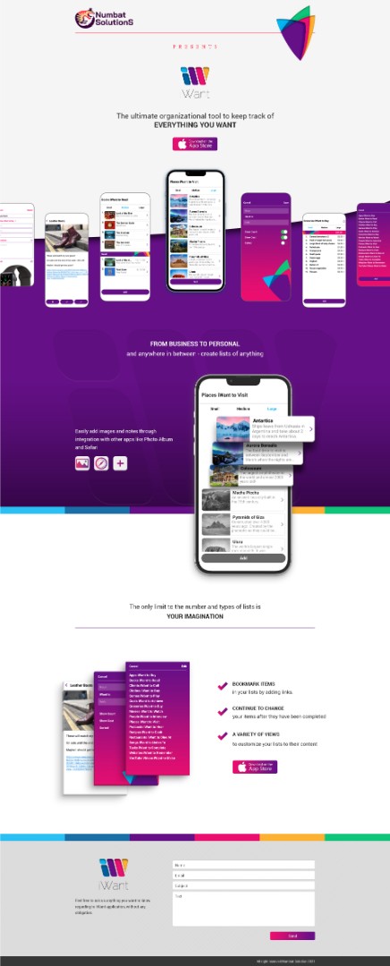
PROJECT EVIDENCE · iWANT · MOBILE APP UX/UI & DIGITAL PRODUCT DESIGN
From Flexible Personal Lists To One Connected Digital Product.
A Mobile Experience Built Around Clarity, Identity, Navigation, And Everyday Use.
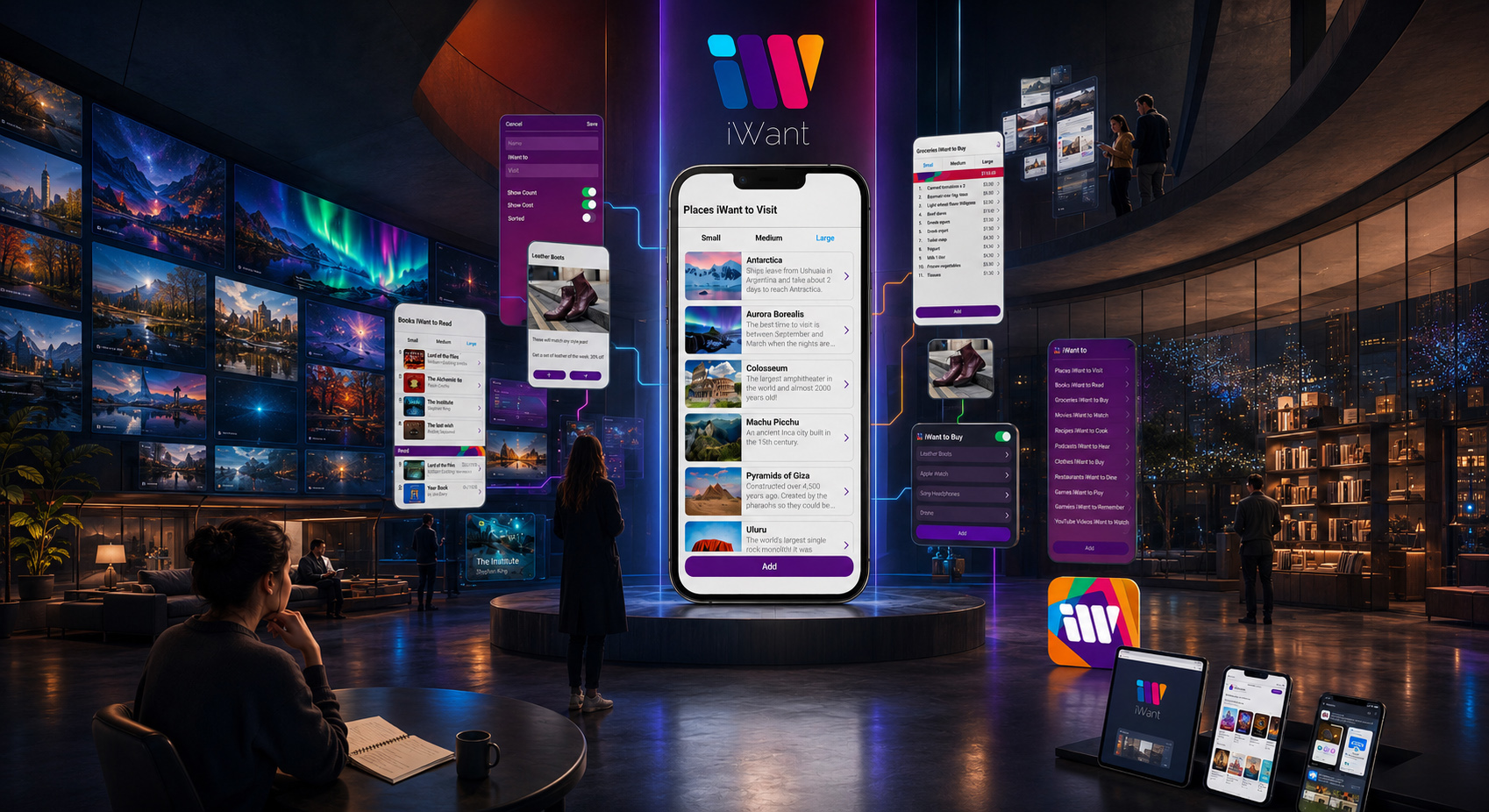
iWant was developed as a flexible mobile product for users who needed one simple place to organize wishes, plans, goals, shopping interests, travel ideas, and everyday lists without being restricted to one predefined use case. That flexibility created the central UX challenge: the interface had to support different kinds of content while remaining intuitive, visually coherent, and easy to navigate.
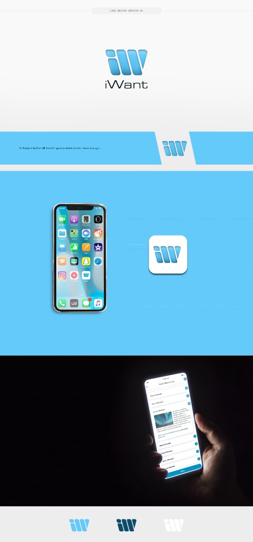
The design work connected Mobile App UX/UI, visual identity, logo and icon development, splash-screen design, interface hierarchy, screen architecture, interaction flow, App Store presentation, and responsive website communication within one coordinated digital system. Ten key mobile screens were developed around recurring actions such as creating lists, navigating between them, adding and editing items, reviewing saved information, and distinguishing active from completed content.
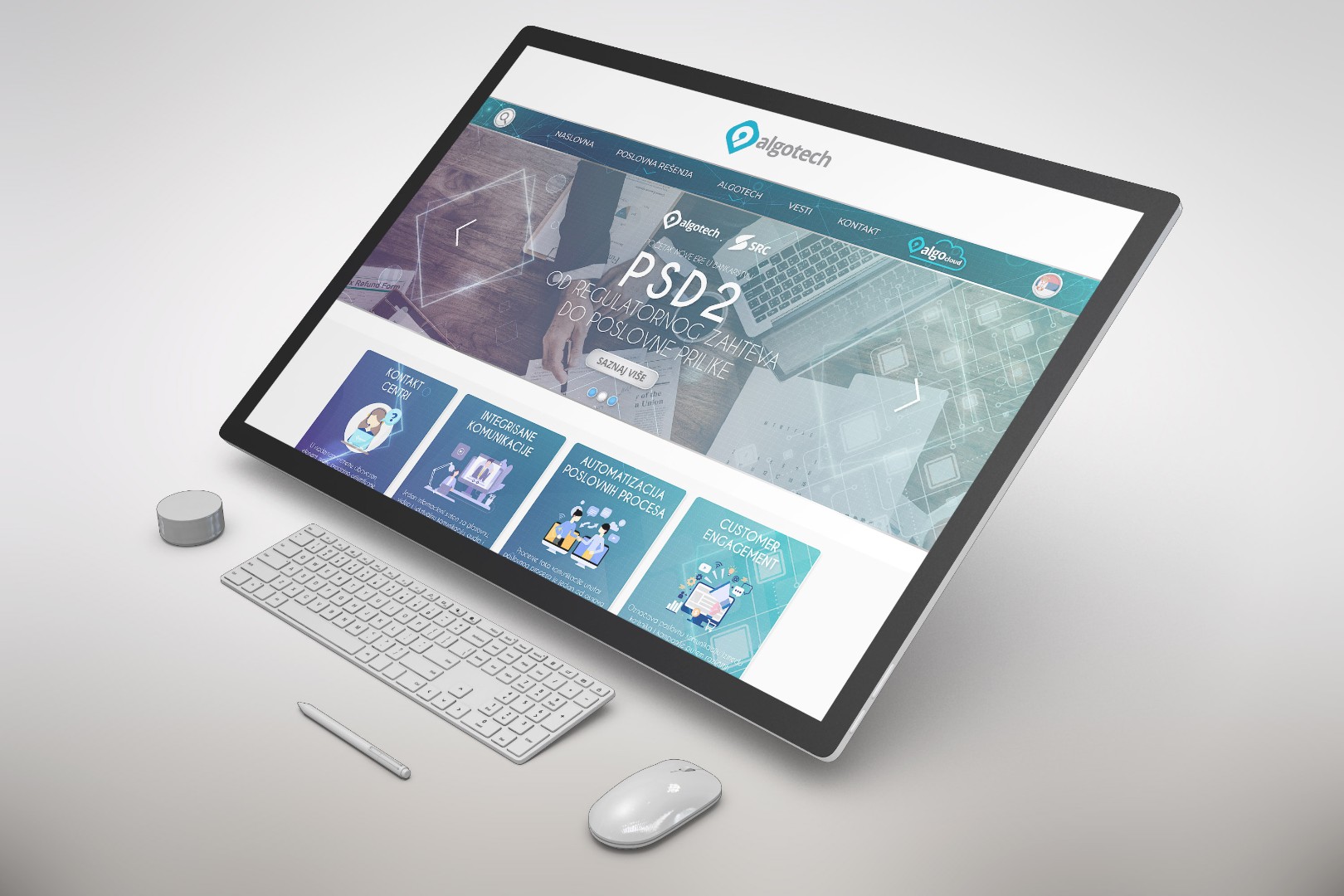
The wider product presentation extended beyond the application itself. The dedicated website introduced the product through a responsive public-facing experience, while the mobile interface remained the core environment where the product was actually used. Together, the two systems demonstrate how product identity, interface consistency, functional clarity, responsive communication, and recognizable visual language can remain connected across different digital touchpoints without forcing every screen or format into the same composition.
WHEN A DIGITAL PRODUCT CAN SUPPORT DIFFERENT USER NEEDS WITHOUT LOSING CLARITY, THE INTERFACE BECOMES MORE THAN A COLLECTION OF SCREENS—IT BECOMES ONE RECOGNIZABLE, FLEXIBLE, AND CONNECTED EXPERIENCE.
DIGITAL PRODUCT CONTEXTS · REAL USER TASKS · CROSS-PLATFORM EXPERIENCE SYSTEMS
Digital Products Become Valuable When Their Experience Logic Fits The Way People Actually Use Them.
A business dashboard, e-commerce journey, booking platform, financial service, health application, learning environment, travel tool, corporate portal, accessible interface, and connected multi-device product may all belong to the same broader discipline—but they ask people to understand information, make decisions, complete tasks, build trust, and move through digital environments in fundamentally different ways.
The experiences presented across these ten contexts are therefore not variations of one visual formula. Each requires a different balance of information hierarchy, navigation logic, interaction design, responsive behavior, content structure, feedback, accessibility, trust signals, device context, and functional complexity. What works for a fast mobile action at an airport cannot simply be transferred to a financial dashboard, healthcare environment, e-commerce journey, or long-term business platform.
Strong Web & Mobile App Design responds to those differences without losing the discipline behind the product. The interface should feel appropriate to the user, task, environment, level of risk, frequency of use, and amount of information involved, while remaining clear enough to reduce friction, structured enough to support complexity, and flexible enough to evolve across new screens, features, devices, and stages of the product lifecycle.
THE PRODUCT CHANGES. THE USER SITUATION CHANGES. THE EXPERIENCE RESPONSIBILITY CHANGES WITH IT.
ONE DIGITAL DESIGN STANDARD BUILT TO KEEP EVERY INTERACTION CLEAR, RESPONSIVE, ACCESSIBLE, TRUSTWORTHY, AND CONNECTED ACROSS DEVICES, TASKS, AND TIME.
WHY STRONG DIGITAL PRODUCTS OFTEN FAIL TO CONNECT
Exceptional Digital Products Deserve More Than Attractive Screens
WHEN STRATEGY, STRUCTURE, FUNCTIONALITY, AND USER EXPERIENCE REMAIN DISCONNECTED, THE DIGITAL PRODUCT BECOMES HARDER TO USE, TRUST, AND GROW.
Many businesses invest in websites and mobile applications with clear goals—stronger brand presence, lead generation, customer engagement, sales growth, or digital service delivery—yet still struggle because the final product is shaped around isolated screens instead of a complete user experience.
Without a professionally developed Web & Mobile App Design Service, important elements such as user flow, content hierarchy, responsive behavior, interaction logic, and conversion structure often remain fragmented. Strong UX/UI Design, strategic planning, and product-focused visual systems help transform digital ideas into experiences that are easier to navigate, easier to trust, and more effective in real use.
THREE BARRIERS THAT LIMIT DIGITAL EXPERIENCE QUALITY
01 — STRATEGY AND USER NEEDS REMAIN CLEARLY MISALIGNED
A website or mobile application may look modern while still failing to support real user expectations, business goals, content priorities, and meaningful actions. Without a clear digital product strategy, the experience often begins with visual design before the structure behind it is fully understood.
Professional Web Design, Mobile App Design, and UX Planning connect audience needs, business objectives, content logic, and user behavior into one coordinated foundation that gives the product greater purpose and direction.
02 — USER FLOWS LACK CLARITY AND FUNCTIONAL STRUCTURE
Navigation, page relationships, screen sequences, calls to action, forms, feature access, and conversion paths can become harder to use when they are not developed as part of one deliberate system. As a result, the product may appear polished while still creating confusion, hesitation, or friction during real interaction.
Professionally developed UX Architecture, Interface Design, and Responsive Structure create clearer journeys, stronger usability, and more consistent digital experiences across web and mobile environments.
03 — DIGITAL VALUE IS HARDER TO TRUST AND CONVERT
Even a strong service, platform, or digital product can underperform when the experience does not clearly communicate credibility, usability, professionalism, and value. If the interface, content, visual hierarchy, and interaction behavior are not working together, the business message becomes weaker and conversion potential becomes harder to realize.
Strategic UI Design, Product Experience Design, and Digital Presentation Systems help transform digital presence into a more credible, more intuitive, and commercially stronger experience.
The challenge is rarely a lack of ambition. It is more often the absence of a connected digital system capable of aligning structure, usability, content, interaction, and brand communication into one clear experience.
A professionally developed Web & Mobile App Design Service connects strategy, UX thinking, interface design, responsive behavior, and digital presentation standards—helping products become easier to understand, easier to use, easier to trust, and better prepared for growth.
THE STRONGEST DIGITAL EXPERIENCES ARE NOT BUILT SCREEN BY SCREEN. THEY EMERGE WHEN STRATEGY, STRUCTURE, FUNCTIONALITY, AND USER EXPERIENCE OPERATE AS ONE CONNECTED SYSTEM.
DIGITAL PRODUCT CONTEXTS · CLIENT TYPES · PLATFORM NEEDS · EXPERIENCE REQUIREMENTS
Who Our Web & Mobile App Design Services Are Built For
DIFFERENT DIGITAL PRODUCTS ASK USERS TO THINK, NAVIGATE, DECIDE, AND ACT IN DIFFERENT WAYS. STRONG DESIGN BEGINS BY UNDERSTANDING THOSE DIFFERENCES BEFORE DEFINING THE INTERFACE.
From startups developing their first digital product to established brands, e-commerce businesses, technology companies, professional services, institutions, and organizations improving an existing platform, every Web & Mobile App Design engagement begins with a different combination of users, business objectives, content demands, functional requirements, technical conditions, and expectations for growth.
A marketing website must guide attention and communicate value differently from an e-commerce platform built around product discovery and conversion. A mobile application depends on clear interaction flows, platform behavior, feedback, and repeated everyday use, while a complex digital platform may require dashboards, account systems, advanced functionality, content architecture, or scalable interface components capable of supporting future development.
For that reason, we do not apply one UX structure, visual language, or interface formula to every project. We shape each engagement around who will use the product, what they need to understand or accomplish, how the business creates value, where friction could appear, and how the experience must perform across devices, screens, states, and future product stages.
The objective is to create digital experiences that are not only visually resolved, but strategically relevant, intuitive to navigate, technically considered, consistent with the brand, and structured around the real decisions users need to make.
- Startups, SaaS & Emerging Digital Products: Building clear and scalable Web Platforms, Mobile App Interfaces, UX Systems, Prototypes, And Digital Product Experiences that help early-stage ideas become structured, credible, and development-ready.
-
Established Brands & Corporate Organizations: Developing professional Websites, Digital Platforms, Customer Portals, And Responsive Interface Systems that strengthen brand consistency, communication clarity, usability, and long-term digital presence. -
E-Commerce & Retail Businesses: Designing Product Discovery, Category Navigation, Product Pages, Shopping Flows, Account Experiences, And Responsive Commerce Interfaces around clear user journeys and approved platform requirements. -
Technology, Software & Platform Companies: Creating structured UX Architecture, Interface Systems, Dashboards, Functional Workflows, Design Systems, And Developer-Ready Product Assets for complex digital services and evolving software environments. -
Professional Services & B2B Companies: Translating complex offers, expertise, content, and business processes into clear Websites, Landing Pages, Service Platforms, Lead-Generation Interfaces, And Digital Communication Systems. -
Healthcare, Education & Specialist Organizations: Structuring information-rich digital experiences where accessibility, content hierarchy, usability, responsive behavior, and clear navigation are essential to communicating specialist knowledge responsibly. -
Real Estate, Architecture & Hospitality: Developing refined Property Websites, Project Presentations, Booking-Oriented Interfaces, Portfolio Experiences, And Mobile-Friendly Digital Systems that connect visual presentation with practical user journeys. -
Consumer, Lifestyle & Service Brands: Designing distinctive Websites, Mobile Interfaces, Campaign Experiences, Booking Flows, Membership Areas, And Branded Digital Touchpoints that connect visual identity with a consistent customer experience. -
Organizations With Existing Digital Products: Redesigning and improving established Websites And Applications through UX Review, Interface Modernization, Responsive Refinement, Design System Consolidation, And Structured Product Evolution.
DIFFERENT PRODUCTS ASK USERS TO DO DIFFERENT THINGS. THE EXPERIENCE SHOULD MAKE THOSE ACTIONS FEEL CLEAR, INTUITIVE, AND CONNECTED—WITHOUT LOSING THE BUSINESS LOGIC, BRAND IDENTITY, OR TECHNICAL REALITY BEHIND THEM.
WIREFRAMING · INTERACTION LOGIC · PROTOTYPE DEVELOPMENT · EXPERIENCE VALIDATION
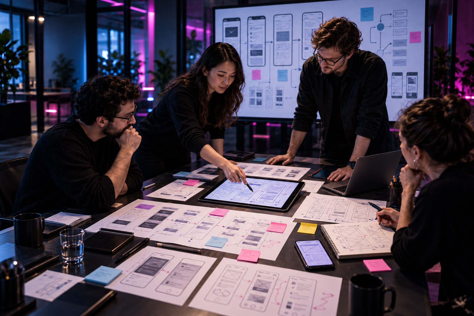
Before An Interface Is Refined, The Experience Must Prove That Its Logic Can Survive Real Use.
A digital product can look convincing in a static concept and still become frustrating the moment somebody tries to move through it. Screens that appear clear in isolation may create dead ends, important actions may arrive too late, transitions may feel disconnected, and information that seemed sufficient during planning may fail once the user has to make an actual decision. Wireframes and prototypes expose those weaknesses while the product is still inexpensive enough to change.
This is where abstract product thinking becomes something observable. Navigation paths can be followed, task sequences can be challenged, interaction states can be compared, and assumptions about what users will understand can finally be tested against behaviour rather than intention. The purpose is not to make unfinished screens look polished—it is to discover whether the experience remains coherent when real actions, choices, dependencies, and edge cases begin to put pressure on the structure.
When that validation happens before high-fidelity design, refinement becomes far more deliberate. Visual hierarchy, motion, typography, component behaviour, and interface styling can build on an experience whose underlying logic has already been questioned, corrected, and strengthened. The prototype stops being a temporary design artifact and becomes the first convincing proof that the product can behave with the clarity, continuity, and confidence the final interface will later be expected to deliver.
WHEN USER FLOWS, SCREEN SEQUENCES, INTERACTION STATES, TASK LOGIC, AND PROTOTYPE BEHAVIOUR ARE TESTED BEFORE VISUAL REFINEMENT,
WIREFRAMING STOPS BEING A ROUGH PREVIEW OF THE FINAL INTERFACE AND BECOMES A VALIDATION SYSTEM—BUILT TO REVEAL FRICTION EARLY, STRENGTHEN PRODUCT LOGIC, AND ENSURE THAT THE EXPERIENCE WORKS AS CONVINCINGLY IN USE AS IT WILL EVENTUALLY LOOK ON SCREEN.
DIGITAL PRODUCT APPLICATION · INTERFACE SYSTEMS · PRODUCT COMMUNICATION · EXPERIENCE EXPANSION
A Strong Digital Product Creates More Value When The Experience Extends Beyond The Interface Itself.
A finished interface may be the most visible expression of a digital product, but it is rarely the only place where users form an opinion about what that product is, why it matters, or whether it deserves their attention. Product identity, feature presentation, onboarding language, supporting imagery, content structure, launch communication, and the way the experience appears across devices all contribute to the same perception. The interface may carry the interaction, but the wider system gives that interaction context, recognition, and meaning.
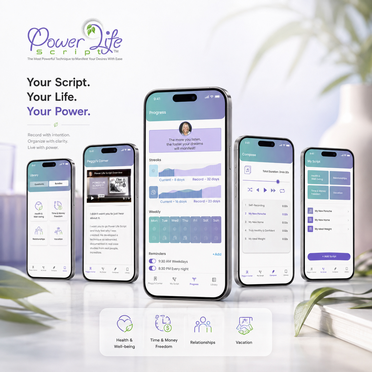
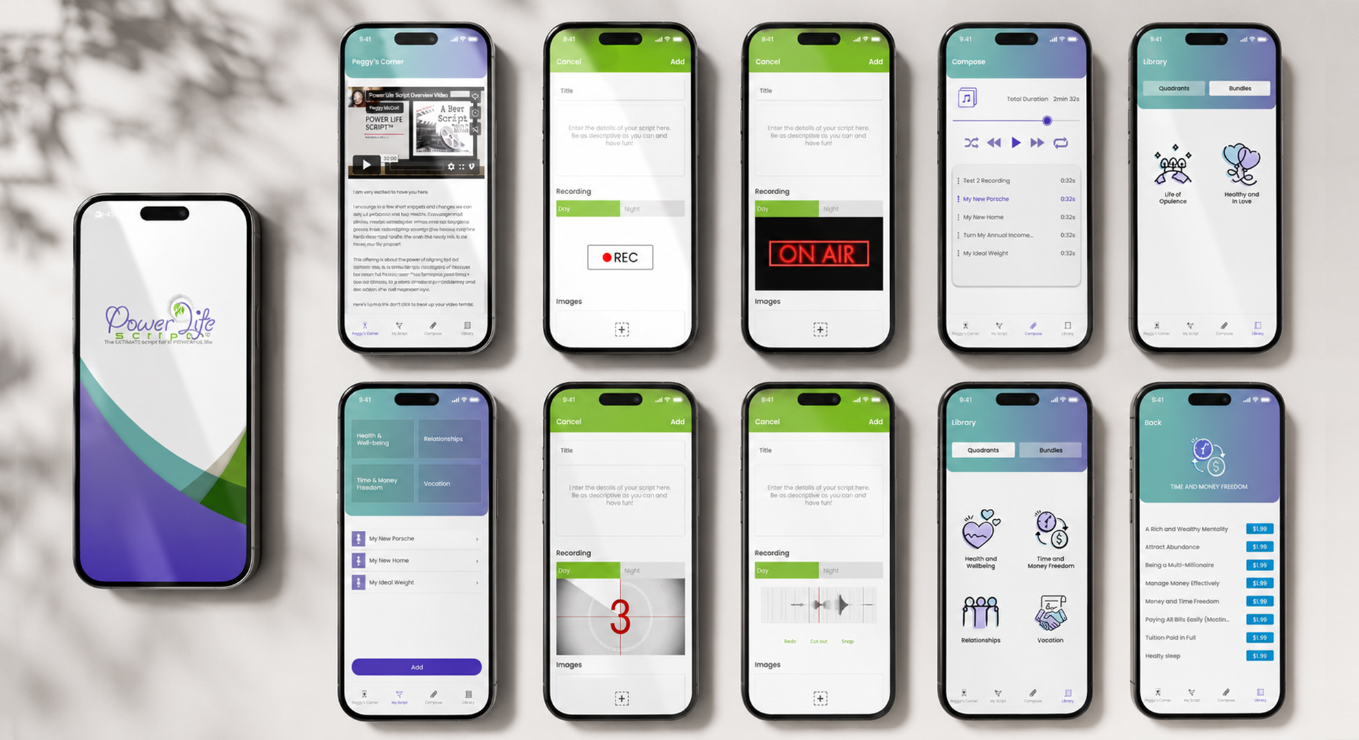
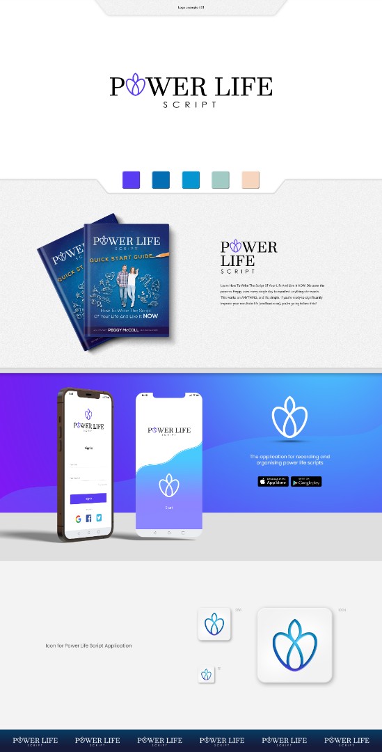
Power Life Script® demonstrates how that broader logic begins to take shape. Separate functions can remain focused within their own screens while typography, colour, navigation behaviour, visual hierarchy, content tone, and product presentation continue reinforcing one recognisable experience. The stronger the connection between interface design and the surrounding communication system, the less the product feels like a collection of screens and the more it begins to behave like one coherent digital identity.
That coherence also creates room for the product to grow. The same foundation can begin supporting launch materials, App Store presentation, campaign assets, motion, branded content, e-commerce touchpoints, new features, platform extensions, and future communication without forcing the experience to be reinvented every time its reach expands. This is where Web & Mobile App Design stops ending at the edge of the screen and begins connecting with the wider creative disciplines that help a digital product enter the market, earn recognition, and remain consistent as it evolves.
WHEN INTERFACE DESIGN, PRODUCT IDENTITY, CONTENT, VISUAL ASSETS, AND LAUNCH COMMUNICATION ARE BUILT AROUND THE SAME DIGITAL EXPERIENCE,
WEB & MOBILE APP DESIGN STOPS BEING ONLY A SYSTEM OF SCREENS AND BECOMES A CONNECTED PRODUCT FOUNDATION—CAPABLE OF SUPPORTING STRONGER RECOGNITION, CLEARER MARKET PRESENTATION, AND THE BROADER CREATIVE COMMUNICATION A DIGITAL PRODUCT NEEDS AS IT MOVES BEYOND THE CORE INTERFACE.
WEB & MOBILE APP DESIGN BEYOND THE CORE INTERFACE
Digital products rarely exist only inside a website or application interface. Their success often depends on how clearly the wider system connects Product Strategy, Brand Identity, UX/UI Design, Content Structure, Visual Assets, Motion, Product Presentation, Launch Communication, App Store Materials, E-Commerce Touchpoints, and other supporting digital experiences around one recognizable product direction.
Where a project requires broader support, the engagement can therefore extend beyond individual pages and screens into the assets, systems, and communication layers that help the product launch clearly, remain visually consistent, explain its value, support user adoption, and evolve across new features, platforms, campaigns, and stages of growth.
These disciplines are introduced only where they strengthen the core digital experience itself—whether by improving product understanding, brand recognition, interface consistency, content clarity, market presentation, onboarding, conversion, or the relationship between what users see before entering the product and what they experience once they begin using it.
The objective is to ensure that the product does not become fragmented as its digital presence expands, but continues to operate as one connected experience—from first impression and public presentation to interaction, repeated use, and long-term product evolution.
DIFFERENT DIGITAL PRODUCTS REQUIRE DIFFERENT USER JOURNEYS.
EVERY PROJECT RECEIVES THE SAME STANDARD OF STRATEGIC CLARITY, UX PRECISION, RESPONSIVE DESIGN, AND PROFESSIONAL EXECUTION.
IT TURNS BUSINESS GOALS, USER NEEDS, CONTENT, AND FUNCTIONALITY INTO A CLEAR DIGITAL EXPERIENCE THAT HELPS PEOPLE UNDERSTAND, NAVIGATE, INTERACT, AND COMPLETE MEANINGFUL ACTIONS.
INTERFACE DESIGN · COMPONENT SYSTEMS · VISUAL CONSISTENCY · SCALABLE UI LOGIC
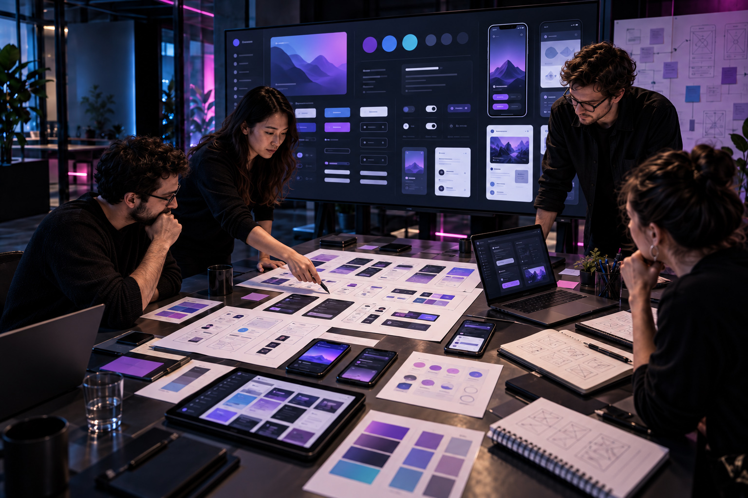
A Strong Interface System Makes Growth Possible Without Sacrificing Clarity, Consistency, Or Product Identity.
Once product structure and interaction logic are resolved, the interface has to translate that invisible foundation into something people can see, understand, and use repeatedly without hesitation. Typography, colour, spacing, navigation, controls, content patterns, imagery, states, and feedback behaviour all begin shaping the product’s visual character. The interface becomes convincing when those decisions stop feeling like isolated styling choices and begin behaving as one recognizable digital language.
A scalable UI system gives that language rules strong enough to survive change. Reusable components, responsive behaviour, spacing logic, interaction states, visual tokens, hierarchy, and component relationships allow new screens and features to be introduced without rebuilding the experience from the beginning. The purpose is not to make every interface identical—it is to make every new part feel naturally connected to the same product, even as functionality and complexity increase.
When that system is built properly, growth becomes less disruptive. Teams can extend the product with greater confidence, users retain familiarity as new capabilities appear, and implementation becomes clearer because the visual and behavioural logic has already been defined. The design system stops being a library of components and becomes the structural memory of the interface—protecting usability, recognition, consistency, and product identity as the experience continues to evolve.
WHEN COMPONENTS, TYPOGRAPHY, SPACING, INTERACTION STATES, RESPONSIVE BEHAVIOUR, AND VISUAL HIERARCHY ARE DEVELOPED AS ONE CONNECTED INTERFACE SYSTEM,
UI DESIGN STOPS BEING A COLLECTION OF FINISHED SCREENS AND BECOMES A SCALABLE PRODUCT LANGUAGE—BUILT TO SUPPORT NEW FEATURES, NEW DEVICES, AND FUTURE GROWTH WITHOUT LOSING THE CLARITY, CONSISTENCY, USABILITY, OR RECOGNIZABLE CHARACTER THAT MADE THE EXPERIENCE COHERENT IN THE FIRST PLACE.
WHEN DIGITAL PRODUCTS ENTER REAL USE
Users Never Experience The Strategy Document.
They Experience Every Decision It Creates.
A Digital Product Earns Trust When Structure, Content, Interaction, Feedback, And Visual Hierarchy Make The Next Action Feel Clear—Without Asking The User To Think About The System Behind It.
Websites and mobile applications are ultimately experienced through a sequence of small decisions. A user arrives, scans, interprets, navigates, compares, enters information, makes a choice, waits for feedback, returns to a previous state, or continues toward a goal. Every one of those moments is shaped by decisions made long before the final interface appears on screen.
This is why strong Web & Mobile App Design cannot be reduced to attractive layouts or isolated screens. UX strategy, information architecture, user flows, responsive behavior, interface hierarchy, interaction states, content structure, accessibility, product identity, and technical constraints need to reinforce one another so that complexity becomes easier to understand rather than something the user is forced to manage.
When those relationships are resolved properly, the design begins to disappear into the experience itself. Navigation feels natural. Important information appears when it is needed. Actions carry clear consequences. Brand identity remains recognizable without interfering with usability. And the product becomes easier to understand, trust, navigate, use, and return to across different devices, contexts, and stages of growth.
EXPLORE HOW DIGITAL PRODUCT THINKING SHAPES THE MOMENTS THAT DETERMINE WHETHER AN EXPERIENCE FEELS INTUITIVE, TRUSTWORTHY, AND WORTH RETURNING TO.
DIGITAL PRODUCT CONTEXT · EXPERIENCE ANALYSIS · INTERFACE LOGIC · CONNECTED USER FLOWS
Beyond The Screen — Understanding How Digital Decisions Become User Experience.
A digital product is rarely understood through one screen alone. Its real character emerges through the relationships between navigation, content hierarchy, interaction states, functional priorities, feedback, visual consistency, and the sequence of actions users move through over time. What appears simple during use is often the result of many coordinated decisions made long before the final interface is presented.
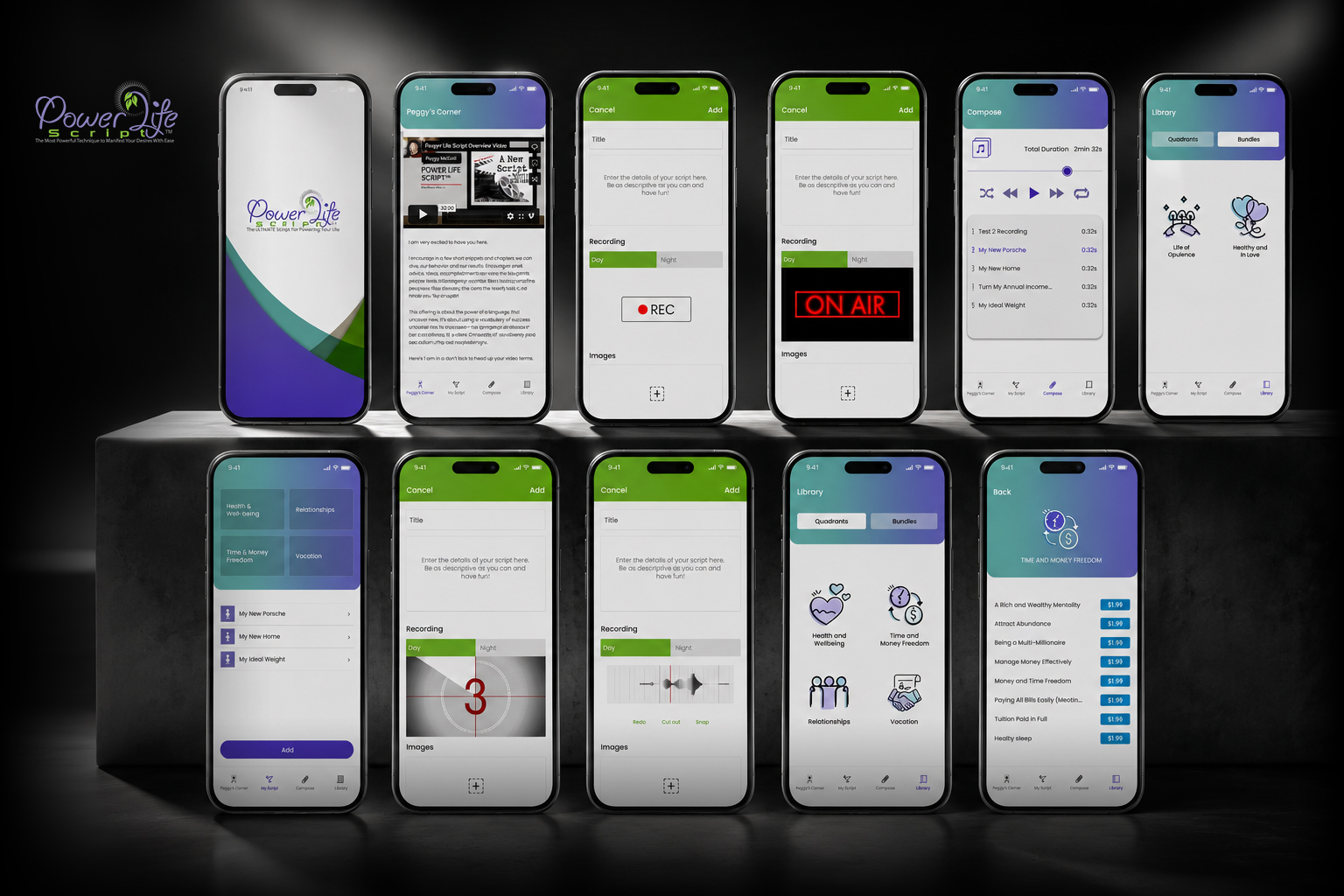
The Power Life Script® screen family demonstrates that principle across a connected product environment. Creation, recording, composition, library access, saved content, category-based organization, and progress-related functions each serve different purposes, yet they must remain recognizable as parts of the same experience. The value lies not in making every screen identical, but in establishing enough structural continuity, interface logic, and visual consistency that users can move between different tasks without losing orientation or confidence.
THE INTERFACE IS WHAT THE USER SEES.
THE EXPERIENCE IS CREATED BY THE SYSTEM OF DECISIONS CONNECTING EVERYTHING BEHIND IT.
COMPLETE WEB & MOBILE APP DESIGN SERVICES · FROM PRODUCT STRUCTURE TO SCALABLE DIGITAL EXPERIENCES
Complete Web & Mobile App Design Services Built Around How People Navigate, Interact, And Use Digital Products
UX STRATEGY, RESPONSIVE WEB DESIGN, MOBILE APP INTERFACES, DIGITAL PLATFORMS, DESIGN SYSTEMS, AND INTERACTION—CONNECTED THROUGH ONE PROFESSIONAL PRODUCT EXPERIENCE.
Every Web & Mobile App Design project requires more than attractive screens. Strong digital products depend on clear structure, intuitive navigation, responsive behavior, functional logic, visual consistency, and a precise understanding of how people move through the experience.
NF Creative Studio develops premium Web Design, Mobile App Design, UX/UI Systems, Responsive Interfaces, And Digital Product Experiences as connected systems—combining strategy, user flows, visual design, interaction logic, reusable components, and implementation-aware delivery within one coordinated process.
From focused websites and mobile interfaces to broader digital platforms, commerce experiences, prototypes, and scalable UI systems, every deliverable is developed around the product’s real audience, functionality, content requirements, technical environment, and long-term digital direction.
THE PLATFORM MAY CHANGE.
THE STANDARD OF USABILITY, DIGITAL CLARITY, AND PROFESSIONAL EXECUTION DOES NOT.
01 — Website Design & Responsive Digital Experiences
Web experiences should do more than present information. We develop responsive website systems that connect content, navigation, brand identity, interface hierarchy, and practical user journeys across desktop, tablet, and mobile.
- Strategic Website Architecture: Page hierarchy, navigation, content relationships, calls to action, and user pathways developed around the project’s business objectives, audience needs, and communication priorities across digital touchpoints.
-
Custom Responsive Interface Design: Bespoke layouts, typography, imagery, components, spacing, and visual hierarchy designed to remain coherent across desktop, tablet, mobile, and other approved viewport conditions. -
Landing Pages & Corporate Websites: Focused landing experiences, service pages, corporate websites, campaign destinations, and multi-page platforms structured for clear communication, intuitive navigation, and professional brand presentation. -
Website Redesign & Experience Improvement: Existing websites reviewed and restructured through UX refinement, visual modernization, responsive improvement, content hierarchy, and design-system consolidation where required.
02 — Mobile App Design & Product Interfaces
Mobile products require more than resized website layouts. We develop iOS and Android interface systems around user behavior, screen relationships, platform conventions, functional priorities, and complete product journeys.
- iOS & Android Interface Design: Mobile application screens developed with consideration for platform conventions, touch interaction, device behavior, functional requirements, and the approved visual language of the product.
-
Screen Architecture & Product Flows: Onboarding, navigation, content areas, account states, settings, feature access, and key user actions structured as one connected mobile experience across screens, states, features, and journeys. -
Functional App States: Empty states, loading conditions, confirmations, errors, permissions, notifications, account interactions, and other real-world interface conditions considered within the approved product scope across key user scenarios. -
Scalable Mobile Interface Systems: Reusable components, screen patterns, interaction rules, and interface logic prepared to support additional features, future screens, and controlled product evolution across expanding mobile ecosystems.
03 — UX Strategy, User Flows & Prototyping
Strong interfaces begin before final visual design. We use UX architecture, wireframes, user flows, and prototypes to establish how information, functionality, decisions, and interactions should work together.
- User Journey & Flow Development: Key tasks, decision points, navigation routes, information priorities, and interaction sequences mapped around what users need to understand, complete, and access across complete end-to-end product journeys.
-
Information Architecture & Navigation Logic: Content groups, screen relationships, navigation levels, access paths, and structural priorities organized to make product information easier to locate, understand, and move through across digital experiences. -
Wireframes & Structural Prototypes: Early-stage layouts used to establish hierarchy, functionality, content placement, and screen relationships before detailed visual development begins across complete end-to-end digital product journeys. -
Interactive Prototype Development: Clickable prototypes prepared where required to demonstrate navigation, screen transitions, interaction logic, and approved product behavior before implementation across complete end-to-end digital product journeys.
04 — E-Commerce, CMS & Functional Digital Platforms
Digital products often require more than informational content. We design commerce, CMS, portal, booking, and functional interface systems around the actual workflows, content structures, and technical project environment.
- E-Commerce Experience Design: Product discovery, category navigation, product pages, cart-related journeys, account areas, and other commerce interfaces structured around the approved platform and customer flow.
-
CMS-Based Website Experiences: WordPress, Shopify, and other approved content-managed environments designed around reusable page structures, content flexibility, responsive behavior, and practical publishing requirements. -
Forms, Portals & Functional Interfaces: Booking systems, inquiry flows, dashboards, customer areas, forms, account experiences, and other functional environments designed according to defined user and technical requirements. -
Advanced Functional Requirements: Custom functionality, integrations, platform-specific behavior, and technically complex features are evaluated and scoped according to feasibility, development responsibility, and the selected technical environment.
05 — UI Systems, Digital Branding & Developer Handover
A professional digital product needs one recognizable interface language. We develop UI systems and digital brand applications that maintain visual and functional consistency across screens, states, devices, and future extensions.
- UI Component & Interface Systems: Buttons, menus, forms, cards, navigation, content modules, interface states, and reusable components developed within one coordinated visual and functional language.
-
Digital Identity & Visual Consistency: Typography, color, iconography, imagery, spacing, interface patterns, and brand elements aligned to preserve recognition and consistency across the complete product experience and future interface growth. -
Design Systems & Scalable UI Libraries: Reusable components, interface rules, spacing logic, states, and visual standards organized to support consistent future development and controlled product expansion across evolving digital platforms. -
Developer-Ready Design Handover: Approved screens, responsive states, components, asset structures, interaction notes, and agreed design documentation prepared to support an efficient implementation process across development environments.
06 — Interaction Design, Motion & Product Evolution
Digital experiences improve when movement serves a clear purpose. We develop interaction patterns, interface motion, visual feedback, and product extensions without compromising usability.
- Interaction & Micro-Interaction Design: Hover states, transitions, feedback states, navigation behavior, interface responses, and other interaction details developed to make digital experiences feel clearer and more deliberate.
-
Interface Motion & Animated Elements: Purposeful motion, animated graphics, transitions, loading behavior, and supporting interface animation developed where they improve communication, hierarchy, or product character. -
Design QA & Implementation Review: Final implementation can be reviewed against approved interface designs, responsive behavior, visual hierarchy, and component logic where design QA support is included within the agreed scope. -
Ongoing Product Design & Interface Evolution: Additional screens, new features, UX refinements, design-system expansion, and future digital product requirements can be developed through separately defined ongoing design support.
Our Web & Mobile App Design Service is built for digital products where user experience, responsive consistency, interface clarity, functional structure, visual quality, and scalable product thinking directly influence credibility, usability, customer experience, and long-term digital value.
FROM FIRST USER FLOW TO FINAL RESPONSIVE PRODUCT SYSTEM, EVERY SCREEN, INTERACTION, COMPONENT, AND DIGITAL TOUCHPOINT IS DEVELOPED TO WORK AS ONE.
RESPONSIVE EXPERIENCE · CROSS-DEVICE CONTINUITY · ADAPTIVE INTERFACES · PRODUCT CONSISTENCY
A Digital Product Should Adapt To The Device Without Asking The User To Learn The Experience Again.
The same digital product can be encountered through a wide desktop canvas, a laptop used for focused work, a tablet held in a different orientation, or a mobile screen where attention, space, and interaction are completely different. Responsive design becomes meaningful when the interface can change its form without changing the logic the user has already learned. The product should feel familiar even when the layout, density, navigation, and interaction model have to behave differently.
That continuity requires more than fluid grids and smaller typography. Content priorities may need to shift, navigation can collapse or transform, components may stack or disappear, touch targets become more important, imagery must respond to available space, and complex interactions may need entirely different behaviour on smaller screens. The strongest responsive systems do not preserve the same composition at every size—they preserve the same hierarchy, intent, and sense of progress while allowing the interface to reorganize around the realities of each device.
When that adaptation is designed deliberately, users can move between devices without losing orientation or confidence. A task started on desktop can remain understandable on mobile, familiar controls continue behaving predictably, and the product keeps the same visual and functional identity even as its structure changes around the screen. Responsiveness stops being a technical accommodation and becomes a form of product continuity—protecting usability, recognition, and trust wherever the experience is encountered.
WHEN CONTENT PRIORITY, NAVIGATION, COMPONENT BEHAVIOUR, TYPOGRAPHY, INTERACTION DENSITY, AND RESPONSIVE STRUCTURE ARE DESIGNED AROUND THE REAL CONDITIONS OF EACH DEVICE,
RESPONSIVE DESIGN STOPS BEING A MATTER OF FITTING THE SAME INTERFACE INTO DIFFERENT SCREEN SIZES AND BECOMES A CROSS-DEVICE EXPERIENCE SYSTEM—BUILT TO PRESERVE PRODUCT LOGIC, USER ORIENTATION, VISUAL IDENTITY, AND FUNCTIONAL CONTINUITY WITHOUT FORCING PEOPLE TO RELEARN THE EXPERIENCE EVERY TIME THE DEVICE CHANGES.
SELECTED MOBILE APP & WEB DESIGN WORK · DIGITAL PRODUCTS · INTERFACE SYSTEMS · USER EXPERIENCES
Digital Products Reveal Their Quality Through
The Way People Move Through Them.
Every Product Demands Its Own
Digital Experience Logic.
MOBILE APPLICATIONS, WEB PLATFORMS, PRODUCT ECOSYSTEMS, AND DIGITAL BRAND EXPERIENCES—EACH DEVELOPED AROUND A DIFFERENT USER JOURNEY, FUNCTIONAL STRUCTURE, AND COMMERCIAL PURPOSE.
THE INTERFACE MAY CHANGE FROM PRODUCT TO PRODUCT. THE THINKING BEHIND A STRONG EXPERIENCE CANNOT.
These selected projects demonstrate how UX/UI Design, Mobile App Design, Web Design, Product Strategy, User Flows, Interface Systems, Digital Brand Communication, and responsive experience design take different forms depending on what users need to understand, accomplish, revisit, and trust. Each product begins with its own combination of audience expectations, business objectives, functional requirements, content complexity, platform conditions, and opportunities for growth rather than with a predetermined interface formula.
Some products depend on fast orientation, repeated everyday actions, clear system feedback, and scalable mobile navigation. Others require richer content architecture, responsive web behavior, conversion paths, product presentation, account-based functionality, or a stronger relationship between public-facing communication and the experience that begins once the user enters the product. The design response changes accordingly—allowing structure, hierarchy, interaction, visual identity, and functionality to develop around the actual role the product must perform.
Across the work, the objective remains consistent: to create digital experiences that are intuitive enough to reduce friction, structured enough to support complexity, visually distinctive enough to build recognition, and flexible enough to remain coherent as products expand across new screens, features, devices, and stages of development.
DIFFERENT DIGITAL PRODUCTS REQUIRE DIFFERENT EXPERIENCE SYSTEMS.
THE STANDARD OF STRATEGY, USABILITY, INTERFACE CLARITY, AND PROFESSIONAL EXECUTION REMAINS CONSISTENT.
STRATEGY BEFORE INTERFACE · USABILITY BEFORE DECORATION
Our Web & Mobile App Design Philosophy
“Every Effective Digital Experience Begins Long Before The Final Screen Is Seen.”
At Infinity Design Studio, exceptional Web & Mobile App Design is not defined by visual appearance alone. It begins with understanding the product, audience, business objective, content structure, required functionality, and the real user actions the final digital experience must support.
We combine UX Strategy, User Flow Planning, Interface Design, Responsive Web Thinking, Mobile App Logic, Interaction Clarity, And Digital Product Structure to transform ideas into clear, intuitive, and professionally developed digital experiences.
Every page, screen, interaction, navigation path, and call to action is developed with purpose — supporting better usability, clearer decision-making, stronger engagement, higher conversion potential, and more consistent digital performance across web and mobile environments.
DESIGN ATTRACTS ATTENTION.
USABILITY BUILDS TRUST. CLARITY DRIVES ACTION.
WEB & MOBILE APP DESIGN · UX STRATEGY · DIGITAL PRODUCTS · PROFESSIONAL DELIVERY
Professional Web & Mobile App Design Built Around Usability, Functionality, And Scalable Digital Experience
From Focused Websites And Mobile Interfaces To Complete UX/UI Systems, Responsive Platforms, And Evolving Digital Products—Every Engagement Is Shaped Around Real Users, Functional Requirements, And Business Purpose.
A professionally developed Web & Mobile App Design system does more than make screens visually attractive. It connects business objectives, user needs, content hierarchy, functionality, navigation, interaction, responsive behavior, and visual identity within one coherent digital experience.
Infinity Design Studio approaches digital products through a coordinated combination of UX Strategy, Information Architecture, User Flows, Responsive Interface Design, Mobile App Design, Prototyping, Design Systems, And Implementation-Aware Delivery.
Depending on the project, the final result may be a focused landing page, a corporate website, an e-commerce experience, a mobile application, an interactive prototype, a scalable interface system, or a broader digital platform developed across multiple devices and user journeys.
THE PLATFORM MAY CHANGE.
THE PURPOSE, USER LOGIC, AND PROFESSIONAL EXPERIENCE STANDARD MUST REMAIN CONSISTENT.
Everything you need to know before we start working together.
Transparency, professionalism, and world-class results.
What Makes Infinity Design Studio Different From Other Web & Mobile Agencies? Most Asked
Our approach begins before interface styling.
We first establish the business objective, intended users, content structure, required functionality, user journeys, platform conditions, and communication priorities that the final digital experience needs to support.
From there, strategy, UX structure, visual design, responsive behavior, interaction logic, and technical handover are developed as one coordinated system rather than as disconnected stages.
Depending on the engagement, our role may combine:
- UX Strategy & Information Architecture
- Web & Mobile Interface Design
- User Flows & Prototyping
- Responsive Design Systems
- Digital Brand Application
- Developer-Ready Design Handover
- Design QA & Ongoing Product Support
The objective is not to force every client into one visual style or predefined template. Each project is developed around its own users, content, functionality, technical environment, and long-term requirements.
We also separate design quality from unsupported performance promises. Strong UX/UI can improve clarity, usability, credibility, and the quality of the digital experience, but traffic, conversions, revenue, retention, and market performance depend on many factors beyond interface design alone.
How Long Does It Take To Design And Develop A Website Or Mobile App?Most Asked
The timeline depends on the size of the product, UX depth, number of pages or screens, functionality, content readiness, responsive requirements, prototyping, revision structure, technical complexity, and speed of client feedback and approvals.
A focused landing page or small website may require significantly less time than:
- a multi-page corporate website;
- an e-commerce platform;
- a feature-rich mobile application;
- a customer portal or dashboard;
- a complete UX/UI redesign;
- a scalable multi-platform design system.
Where development is included, the schedule also depends on the selected technology, integrations, backend requirements, testing, deployment conditions, and third-party dependencies.
The production schedule is confirmed after reviewing the brief, required functionality, existing material, technical environment, content status, and intended delivery scope.
The timeline begins once the engagement is formally activated and the materials required for the agreed first stage are available.
Client-side delays in content, access, stakeholder decisions, technical information, feedback, or approvals may affect the final delivery date.
Do You Create Custom Design Systems And UI/UX Solutions?
Yes.
Our Web & Mobile App work is developed around the requirements of the specific product rather than a fixed visual template.
Depending on the scope, a custom UI/UX system may include:
- information architecture;
- user journeys and screen flows;
- wireframes;
- responsive layouts;
- interface components;
- typography and color systems;
- navigation patterns;
- forms and functional states;
- interaction rules;
- reusable components;
- design-system documentation;
- interactive prototypes.
For larger products, reusable UI structures can be developed to maintain consistency across multiple pages, screens, device sizes, features, product states, and future extensions.
The level of system development is matched to the actual project. A focused website does not automatically require the same documentation or component architecture as a complex SaaS platform or multi-feature mobile application.
Do You Handle Only Design Or Full Web & App Development As Well?
The engagement can be structured around design only, design with technical handover, or broader design and development delivery, depending on the project and approved scope.
Design-focused engagements may include UX strategy, wireframes, interface design, responsive states, prototypes, design systems, assets, and documentation prepared for the client’s development team.
Where development is included, the technical scope may cover approved website or application implementation using the selected platform, CMS, framework, or development environment.
More advanced requirements—such as:
- complex backend systems;
- custom APIs;
- third-party integrations;
- advanced databases;
- payment infrastructure;
- authentication systems;
- specialized security requirements;
- legacy-system integration;
are evaluated separately according to technical feasibility and development responsibility.
When another developer or technical team is involved, we can collaborate through a clearly defined design-to-development handover process.
How Do You Ensure That The Final Product Is Functional And Efficient? Most Asked
Functionality begins with structure, not visual polish.
Before final interface design, we define the relevant content hierarchy, user journeys, navigation logic, screen relationships, functional requirements, interaction patterns, and responsive behavior according to the approved scope.
Depending on the engagement, validation may include:
- wireframe review;
- interactive prototyping;
- responsive-state review;
- component consistency checks;
- user-flow evaluation;
- functional-state design;
- implementation review;
- design QA against approved layouts.
Performance-conscious design decisions may also consider image usage, animation complexity, interface weight, responsive assets, and implementation requirements.
However, final technical performance also depends on development quality, hosting, infrastructure, code, integrations, third-party services, content management, and ongoing technical maintenance.
For that reason, we distinguish clearly between UX/UI design responsibility and technical engineering responsibility whenever different teams are involved.
Do You Offer Support After The Project Is Completed?
Yes.
Post-launch or post-handover support can be arranged according to the needs of the digital product.
Ongoing support may include:
- additional page or screen design;
- new feature interfaces;
- UX refinement;
- responsive adjustments;
- design-system expansion;
- campaign or landing-page extensions;
- implementation review;
- content-related interface updates;
- future product phases.
Support may be commissioned as a defined follow-up project, scheduled support period, or longer-term design collaboration where appropriate.
Ongoing support does not automatically imply unlimited revisions, development, maintenance, new functionality, or permanent platform management.
Hosting, software updates, security monitoring, server administration, third-party plugin maintenance, backend support, and other technical services are included only where specifically defined within the agreement.
Can You Redesign An Existing Website Or Mobile App?Most Asked
Yes.
Existing digital products can be improved through UX review, information architecture, interface redesign, responsive refinement, design-system consolidation, and visual modernization.
A redesign does not always require rebuilding everything from zero. Where the existing structure, content, brand assets, or technical environment remain useful, they can be retained and improved.
Where deeper structural, functional, or technical issues are identified, those requirements are defined separately before implementation begins.
What Do You Need From Us Before A Web Or Mobile App Project Begins?
The required material depends on the project, but a typical engagement may begin with:
- business and product objectives;
- target audience information;
- existing brand guidelines;
- content or preliminary content structure;
- required functionality;
- reference websites or applications;
- existing analytics or user insights where available;
- technical or platform requirements;
- access to relevant client-side stakeholders.
When some of this information does not yet exist, the discovery and UX process can help define the missing structure before detailed interface design begins.
Do You Provide UX Research, User Flows, Wireframes, And Prototypes?Most Asked
Yes, where included within the approved scope.
Depending on the project, our UX Design process may include information architecture, user journeys, screen flows, wireframes, structural prototypes, interface logic, and interactive prototypes before final visual design.
The depth of UX research and validation depends on the engagement. Formal user-research programs, large-scale usability studies, participant recruitment, specialist testing, or extensive behavioral research require separate scope where needed.
Do You Handle Website Content, Copywriting, SEO, And Accessibility?Most Asked
These areas can be incorporated according to the approved project scope, but they are not automatically included within every Web or Mobile App Design engagement.
We can support content hierarchy, UX-oriented messaging structure, SEO-aware page organization, metadata preparation, accessibility-conscious design, and publishing readiness.
Full copywriting, specialist SEO campaigns, technical SEO audits, legal or regulated accessibility certification, translation, and ongoing search optimization may require additional specialist scope.
No specific search ranking, traffic level, conversion rate, or commercial outcome can be guaranteed through design alone.
Can You Work With Our Existing Developers Or Technical Team?
Yes.
We can collaborate with internal developers, external development agencies, SaaS teams, or other approved technical partners through organized design files, responsive states, component systems, interaction notes, prototypes, and agreed handover documentation.
Development feasibility, technical architecture, backend behavior, integrations, security, infrastructure, and platform-specific limitations remain subject to the responsible development team unless those services are specifically included within our engagement.
Clear responsibility boundaries are defined before production to reduce unnecessary redesign or implementation conflicts.
What Counts As A Revision And What Is Considered A Change Of Scope?Most Asked
A revision refines the approved design direction.
Typical revisions may include reasonable adjustments to hierarchy, typography, spacing, selected components, imagery, interface details, or other elements already contained within the approved project structure.
A Change Of Scope occurs when the project materially expands or changes—for example:
- new pages or screens;
- additional functionality;
- a new user journey;
- a different platform;
- major content restructuring;
- additional language versions;
- substantial redesign after an approved stage;
- new integrations or technical requirements.
Changes outside the approved scope are reviewed and priced before the additional work begins.
Who Owns The Final Design, Source Files, And Third-Party Assets?Most Asked
Final usage rights and deliverables are defined within the approved proposal and Service Agreement.
After full payment, the client receives the final design assets and usage rights included within the engagement. Editable source files, design-system files, prototypes, developer handover assets, or other working files are supplied where stated within the selected scope.
Third-party assets—including fonts, stock imagery, plugins, templates, software, icon libraries, or licensed components—remain subject to their original licensing conditions and cannot automatically be transferred beyond those rights.
Confidentiality, NDA requirements, portfolio permissions, and any specific ownership conditions are confirmed in writing where applicable.
GOOD DIGITAL PRODUCTS REQUIRE MORE THAN ATTRACTIVE SCREENS.
THEY REQUIRE CLEAR PRODUCT STRATEGY, DEFINED RESPONSIBILITIES, INFORMED APPROVALS, UX DISCIPLINE, TECHNICAL COORDINATION, AND A PROFESSIONAL PROCESS CAPABLE OF PROTECTING CLARITY, USABILITY, AND CONSISTENCY AS THE PRODUCT EVOLVES.
Contact Us Today!
Ready to transform your digital product, website, or mobile application into a clear, intuitive, and professionally structured user experience?
Contact NF Creative Studio to discuss the right Web & Mobile App Design Service for your project—from focused UX/UI Design, Responsive Website Design, And Mobile App Interfaces to complete Digital Product Systems, Prototypes, Design Systems, And Developer-Ready Handover for clients worldwide.
LET’S BUILD THE DIGITAL EXPERIENCE YOUR PRODUCT DESERVES.
THE TEAM BEHIND EVERY PROJECT
Led By The Founder & Creative Director
ONE MULTIDISCIPLINARY STUDIO.
ONE CONSISTENT STANDARD.
BUILT THROUGH STRATEGIC UX THINKING, INTERFACE CLARITY, RESPONSIVE SYSTEMS, AND DIGITAL PRODUCT PRECISION.
A powerful Web & Mobile App Design project requires more than attractive screens. It brings together user experience strategy, audience understanding, information architecture, navigation logic, responsive behavior, interface hierarchy, interaction design, functional requirements, and developer-ready structure within one coordinated digital process.
Every engagement is personally directed to ensure that the product logic remains clear, the user journey is purposeful, and every screen, interaction, and interface element contributes to one coherent, intuitive, and professionally resolved digital experience.
One Vision. Strategically Structured. Intuitively Designed. Built To Evolve.
Every project is guided through a coordinated combination of strategic thinking, creative direction, specialist expertise, and precise execution. Rather than separating ideas from delivery, our multidisciplinary structure keeps every decision connected—from the first conversation and central concept to the final professional outcome.
Across design, digital products, visual communication, architecture, photography, film, and editorial development, the discipline may change—but the responsibility remains the same: to understand the challenge, protect the integrity of the idea, and deliver work that is clear, considered, and built to create lasting value.
Different Expertise. Shared Direction. One Standard Of Excellence.
The Team Behind the Project:
Every Infinity Design Studio project is personally led and directed by Filip Narančić – Founder & Creative Director.
With a unique blend of creativity, strategy, and precision, Filip ensures that each project delivers premium quality, timeless design, and measurable impact.
Infinity Design Studio operates with a boutique approach, where every detail is carefully crafted, and each solution is tailored to the client’s vision and market demands.
By combining multidisciplinary expertise with hands-on leadership, the studio transforms every project into a distinctive brand experience.
Filip Narančić
Founder & CEO – Infinity Design Studio
SPECIALIZED IN:
Short biography
Born on June 24, 1982, in Valjevo, Filip Narančić turned his passion for architecture and design into a thriving career. He graduated from the Faculty of Technical Sciences in Novi Sad, Department of Architecture and Urbanism. During his studies, he launched a pilot project that later evolved into today’s Infinity Design Studio.
Bogdan Vitezović
Senior Graphic Designer – Infinity Design Studio
Visual Communication & Corporate Branding Specialist
SPECIALIZED IN:
Short biography
Born on April 12, 1983, in Valjevo, Bogdan Vitezović discovered his passion for design in the early 1990s, captivated by the aesthetics of exotic car models. Instead of sketching fast four-wheelers, he chose the path of graphic design, where form, function, and emotion intersect.
He graduated in 2007 from FILUM – Faculty of Philology and Arts in Kragujevac, majoring in Graphic Design. Since 2008, Bogdan has worked in leading marketing and creative agencies, including Leo Burnett, Kreativa New Formula, and Popular Beograd.
Throughout his career, he has collaborated with some of the most prestigious regional and global brands, delivering impactful visual solutions for complex marketing systems.
Ana Suzić
Senior Graphic Designer – Infinity Design Studio
Packaging & Visual Communication Specialist
SPECIALIZED IN:
Short biography
With over 20 years of professional experience in visual communication and packaging design, Ana Suzić is a highly accomplished graphic designer whose work blends aesthetic precision with strategic functionality.
She began her formal education at the School of Design in Belgrade, where she built a solid foundation in art theory, composition, and visual aesthetics. She later graduated from Belgrade Polytechnic, specializing in graphic design, where she further developed her creative expression and technical mastery in modern design tools.
Throughout her career, Ana has led and contributed to numerous projects in branding, corporate identity, and especially packaging and print design, which remains her core expertise. She is known for her ability to turn each package into a visual experience that communicates brand values and captures consumer attention.
Darko Knežević
Senior Graphic Designer & 3D Modeler – Infinity Design Studio
SPECIALIZED IN:
Short biography
Born on October 8, 1983, in Kostolac, Darko Knežević has successfully merged his technical expertise and creative passion into a longstanding career as a graphic designer and 3D modeler.
Through numerous projects, he has developed a distinctive style that combines technical accuracy with visual sophistication, focusing on practical and innovative solutions. His experience spans across a wide range of visual and digital concepts, from graphic design to complex 3D modeling.
Nevena Knežević
Senior Graphic Designer & Product Creator
SPECIALIZED IN:
Short biography
Born on December 24, 1989, in Kostolac, Nevena Knežević has built a long-standing career as a graphic designer, where she skillfully blends creativity and technical precision.
Over the years, she has particularly stood out in the field of book cover design and visual content for social media, known for her authentic style that merges aesthetics and functionality.
Founder of Moj Planer Brand. As the founder of the Moj Planer brand, she combined her love for design and organization into a unique collection of products that inspire and motivate everyday life.
Marko Novaković
Senior Graphic Designer – Infinity Design Studio
Visual Identity & Communication Specialist
SPECIALIZED IN:
Short biography
Born on October 20, 1985, in Belgrade, Marko Novaković began his journey into design through graffiti art, where he explored color theory and typography as powerful tools of expression. His passion evolved through academic studies in Industrial Design at the Faculty of Arts and Design, where he refined both his creative language and technical expertise.
After graduation, he returned to graphic design, initially working as a freelancer on diverse projects, before transitioning into an in-house design role in the gaming industry. He gained extensive experience working with Popular Beograd Agency, where he contributed to the creation of high-end visual solutions for renowned global brands.
Boris Sakač
Senior 3D Modeler & Visualizer – Infinity Design Studio
SPECIALIZED IN:
Short biography
Born in 1979 in Novi Sad, Boris Sakač is a 3D modeling and visualization specialist with extensive experience in architecture, industrial design, and digital effects. His precision, technical expertise, and creative approach allow him to create realistic 3D representations of spaces, products, and video montages that impress clients and elevate every presentation.
Miloš Vojnović
Senior Photographer – Infinity Design Studio
Applied Photography Engineer & Global Visual Artist
SPECIALIZED IN:
Short biography
Born on January 7, 1985, Miloš Vojnović is a graduate engineer of applied photography with more than 20 years of professional experience behind the lens.
Based in Novi Sad, his career has taken him around the world – from luxury ocean liners to some of the most prestigious photographic locations across every continent. His journey through photography is a blend of global experience, technical excellence, and artistic sensibility.
Over the course of his career, Miloš worked onboard cruise ships first as a ship photographer, then as a photo artist in exclusive studios, and ultimately as a photo manager, where he led teams of photographers and ensured both artistic and commercial production standards.
Uroš Terzija
Senior Videographer & Drone Operator Specialist – Infinity Design Studio
Engineer of Audio and Video Technologies
SPECIALIZED IN:
Short biography
Born on September 7, 1994, in Gakovo, Uroš Terzija is an engineer of audio and video technologies with extensive experience in professional videography, drone filming, and visual production. Over the years, he has also worked on ocean liners, where he combined technical knowledge and creative expression, gaining invaluable experience working with people from diverse cultures and backgrounds.
Uroš is known for his ability to capture emotion and spatial atmosphere through movement, light, and rhythm. His body of work includes projects of all sizes – from small-scale artistic and commercial productions to large team-based realizations in technically demanding conditions.
His primary focus is videography, with a specialization in drone filming and aerial cinematography. In addition, he is actively involved in professional photography, which expands his visual language and allows him to explore new approaches to light, composition, and emotional storytelling.
Aleksandar Milošević
Photographer & Videographer – Infinity Design Studio
SPECIALIZED IN:
Short biography
Born on June 14, 1992, in Kragujevac, Aleksandar Milošević developed a passion for photography at the end of elementary school, and began experimenting with videography during high school. He studied at the Faculty of Media and Communications, majoring in Digital Arts.
During his university years, he entered the professional world, working on a variety of creative and commercial projects. This includes participation in TV commercials, film sets, fashion campaigns, editorials, events, and video productions for diverse purposes. His professional focus expanded to e-commerce, branding, and visual storytelling.
Nevena Milošević
Senior Architect & Project Manager – Infinity Design Studio
SPECIALIZED IN:
Short biography
Born on January 6, 1987, in Kragujevac, Nevena Milošević is a Master of Architecture with a rich and diverse professional background across various sectors of the industry. Her experience ranges from architectural design and on-site construction coordination, to interior design projects for hotels and residential complexes in the Middle East, as well as workplace consultancy and office space project management.
She spent three years working on the construction of Andrićgrad, a cultural and architectural complex in Višegrad, conceptualized by Emir Kusturica – the renowned Serbian and Yugoslav director, screenwriter, musician, builder, writer, and former university professor – where she actively participated in both the design and the coordination of the construction process.
This multifaceted engagement enriched her holistic understanding of architectural practice and sharpened her organizational and creative skill set.
Dragan Momčilov
Web & Mobile App Designer – Infinity Design Studio
Head of Web and Mobile Design
SPECIALIZED IN:
Short biography
Born in 1981 in Novi Sad, Dragan Momčilov is a visual design specialist with the philosophy that beauty adds value to every project. As a third-generation artist, Dragan blends creativity and technical skills to create unique visual solutions.
Ivan Gutić
Senior Web Developer & WordPress Expert – Infinity Design Studio
SPECIALIZED IN:
Short biography
Born 1979 in Novi Sad, Ivan Gutić is one of the leading WordPress development, maintenance, hosting, and technical support specialists. He has been professionally involved in music, while working with computers since early childhood — ever since their first appearance on the wider market. He has been seriously involved in website development since 2000, marking the start of his professional career in the digital world. His passion for technology and new challenges drives him to explore, learn, and develop advanced online presence solutions.
Jasminka Nedeljković
Chief Financial Officer – Infinity Design Studio
Founder & CEO – Trend Plus 2011 DOO Valjevo
Certified Financial and Tax Consultant
SPECIALIZED IN:
Short biography
Born on March 1, 1955, in Serbia, Jasminka Nedeljković graduated from the Faculty of Economics, University of Belgrade in 1986 and enrolled in the same program in 1983. With over 40 years of high-level financial experience in leading corporations and companies based in Belgrade, she has established herself as a top-tier financial expert, strategic advisor, and business consultant.
She is the Founder and Director of Trend Plus 2011 DOO Valjevo – a professional firm specialized in accounting, financial consulting, audit services, and tax advisory, serving both national and international clients.
Within Infinity Design Studio, Jasminka plays a crucial leadership role as the CFO and Head of Financial Strategy. Her precision, integrity, and ability to manage complex financial structures bring long-term security and confidence to all studio operations.
USABILITY REVIEW · PROTOTYPE TESTING · BEHAVIORAL FEEDBACK · ITERATIVE REFINEMENT
A Digital Experience Becomes Stronger When Real Use Is Allowed To Challenge The Design.
A product can look completely resolved inside a design file and still behave very differently once somebody begins using it with a real objective in mind. Users hesitate in unexpected places, overlook actions that seemed obvious, interpret labels differently, repeat steps, abandon paths, or discover shortcuts nobody planned for. That moment is valuable because it replaces assumption with evidence—and reveals the distance between how the experience was intended to work and how people actually understand it.
Usability review turns those reactions into design intelligence. Task observation, moderated testing, prototype sessions, interaction feedback, behavioural notes, accessibility checks, and structured review make it possible to see where confidence increases, where friction accumulates, and which parts of the interface demand unnecessary effort. The objective is not to redesign everything that receives criticism; it is to identify the changes that genuinely improve comprehension, efficiency, confidence, and task completion without weakening the logic already proven to work.
When iteration is handled with discipline, refinement becomes more precise rather than endless. Navigation can be clarified without disrupting structure, interaction patterns can become more predictable, accessibility can improve without flattening the visual system, and difficult moments can be corrected before they become expensive product problems. Testing stops being a final approval exercise and becomes the mechanism that allows the experience to evolve through evidence—protecting the strongest decisions while exposing the ones that still need to earn their place.
WHEN REAL USER BEHAVIOUR, TASK COMPLETION, INTERACTION FEEDBACK, ACCESSIBILITY, AND OBSERVED FRICTION ARE ALLOWED TO CHALLENGE THE ORIGINAL DESIGN ASSUMPTIONS,
USABILITY TESTING STOPS BEING A FINAL CHECK AND BECOMES A PRODUCT-REFINEMENT SYSTEM—BUILT TO REVEAL WHERE THE EXPERIENCE CREATES CONFIDENCE, WHERE IT CREATES FRICTION, AND WHICH CHANGES WILL MAKE THE INTERFACE CLEARER, MORE ACCESSIBLE, AND MORE RELIABLE IN THE REAL CONDITIONS OF USE.
COMPLETE WEB & MOBILE APP DESIGN
Professional Web & Mobile App Design Services
FROM EARLY PRODUCT IDEAS AND USER REQUIREMENTS TO INTUITIVE UX/UI SYSTEMS, RESPONSIVE INTERFACES, AND DEVELOPMENT-READY DIGITAL EXPERIENCES.
NF Creative Studio develops professional Web Design, Mobile App Design, UX/UI Systems, Responsive Interfaces, And Digital Product Experiences for startups, established brands, technology companies, e-commerce businesses, institutions, and organizations with evolving digital products.
Every engagement is shaped around the actual product requirements, audience, functionality, content structure, platform environment, technical dependencies, and long-term digital objectives—rather than forcing every project into the same interface template or development model.
Our role may range from focused UX/UI design and responsive website systems to complete digital product architecture, prototypes, design systems, developer-ready handover, implementation coordination, and ongoing product design support.
“Our Web & Mobile App Design Solutions Are Tailored To The Specific Needs, Audience, And Commercial Purpose Of Every Brand.”
- Experienced team: Skilled designers & developers dedicated to your project.
- Personalized approach: Every project is tailored to meet your unique business needs.
- Quality-first mindset: Seamless user experience and technical reliability.
- Cutting-edge technologies: Keeping you ahead of the competition.
OUR CORE WEB & MOBILE APP SOLUTIONS
- Responsive Website Design: Custom web experiences developed around content hierarchy, navigation, responsive behavior, visual identity, user needs, and the approved technical environment.
-
Mobile App Interface Design: iOS and Android product experiences structured around user journeys, screen relationships, platform conventions, interaction logic, and scalable interface systems. -
UX Strategy & Information Architecture: User journeys, navigation structures, content relationships, task flows, information hierarchy, and product logic developed before detailed visual refinement begins. -
UI Design & Digital Product Systems: Typography, color, components, interface states, spacing, interaction patterns, and reusable design logic developed as one coordinated digital language. -
Wireframes & Interactive Prototypes: Structural layouts and clickable prototypes prepared where required to validate hierarchy, navigation, functionality, and approved product behavior before implementation. -
Web Application Interface Design: Functional web application interfaces developed around complex workflows, user roles, navigation logic, content relationships, responsive behavior, and clearly structured digital interactions. -
SaaS, Dashboard & Platform UX/UI: Structured interfaces for SaaS products, dashboards, management platforms, and data-rich environments developed to organize functionality, information density, user actions, and recurring workflows with clarity. -
Interaction & Micro-Interaction Design: Interface states, transitions, feedback behavior, navigation responses, hover actions, and purposeful micro-interactions developed to strengthen usability, orientation, and the overall quality of the digital experience. -
Cross-Platform Digital Experience Design: Connected interface experiences developed to maintain consistent product logic, visual language, interaction patterns, and usability across web, mobile, tablet, and other approved digital environments. -
Accessibility-Conscious Interface Design: Interface hierarchy, readability, contrast, navigation clarity, interaction states, and content presentation developed with practical accessibility principles in mind while supporting the approved visual and functional system.
"We Create Digital Experiences That Inspire And Convert."
We develop functional and visually refined web and mobile applications, focusing on user experience. Our UX/UI approach ensures that your digital platform is intuitive, efficient, and visually appealing.
ADDITIONAL PROFESSIONAL SERVICES
Depending on the approved scope, Web & Mobile App Design development may also include:
- Website Redesign & UX Improvement: Existing digital products can be reviewed and restructured through interface modernization, responsive refinement, navigation improvement, and design-system consolidation.
-
E-Commerce & Functional Platform Design: Product discovery, commerce journeys, booking systems, dashboards, forms, customer areas, portals, and other functional environments can be designed according to approved platform requirements. -
Design Systems & Component Libraries: Reusable interface components, states, patterns, spacing systems, and product rules can be developed to support consistency and future digital expansion. -
Developer-Ready Design Handover: Approved screens, responsive states, component structures, prototypes, interaction notes, and agreed documentation can be organized for implementation by internal or external development teams. -
Implementation & Design QA Support: Where included in scope, we can coordinate with developers and review implemented interfaces against approved UX/UI, responsive behavior, hierarchy, and visual standards. -
Ongoing Product Design: Additional screens, feature extensions, UX refinement, new product phases, and design-system development can continue through separately defined long-term support. -
UX Audit & Digital Product Review: Existing websites, applications, or platforms can be assessed for navigation clarity, user-flow friction, interface consistency, responsive behavior, content structure, and opportunities for focused design improvement. -
Conversion-Focused Journey Refinement: Key landing pages, inquiry paths, registration flows, product journeys, and calls to action can be reviewed and redesigned to improve clarity and reduce unnecessary friction without guaranteeing specific commercial results. -
Multi-Language & Market Adaptation: Approved digital interfaces can be adapted for additional languages, regional content structures, longer or shorter text requirements, navigation changes, and market-specific communication needs. -
Digital Campaign & Launch Experience Support: Product launches, campaign landing pages, feature announcements, promotional interfaces, and supporting digital touchpoints can be developed within the established UX/UI and visual system.
WHY CHOOSE INFINITY DESIGN STUDIO
By combining strategic UX/UI thinking, information architecture, responsive design, interface systems, and seamless functionality, we create digital experiences that feel coherent from the first interaction to the final task. Visual refinement is always supported by usability, consistency, and a clear relationship between content, navigation, and function.
Our goal is to create mobile and web experiences that strengthen engagement, build trust, and support meaningful digital relationships while helping brands communicate with greater clarity and distinction. Each solution is developed to remain recognizable, adaptable, and professionally structured as products, platforms, and user expectations continue to evolve.
OUR DELIVERY STANDARD
Every digital product receives a level of development appropriate to its business purpose, user complexity, functionality, platform requirements, and intended lifecycle.
- User-Centered Structure: Navigation, hierarchy, flows, and interactions are developed around what users need to understand, access, decide, and complete.
-
Responsive Design Logic: Desktop, tablet, mobile, and other agreed viewport conditions are treated as one connected system rather than independent layouts. -
Functional Scope Clarity: Design responsibility, development responsibility, integrations, third-party dependencies, and technical assumptions are defined before production. -
Scalable Product Thinking: Interface systems can be structured to support future pages, screens, features, markets, languages, and product evolution where required. -
Professional Handover & QA: Final assets are organized according to the approved delivery scope so that the transition from design to implementation remains clear and controlled. -
Implementation-Aware Design: Interface decisions are developed with practical consideration for responsive behavior, development feasibility, component reuse, technical dependencies, and the approved implementation environment. -
Consistent Interaction Quality: Navigation patterns, interface states, feedback behavior, transitions, and user actions are structured to remain clear, predictable, and professionally resolved across the complete digital experience. -
Content & Interface Alignment: Content hierarchy, messaging priorities, visual structure, functional elements, and user actions are coordinated so that information and interface logic support one another throughout the product. -
Controlled Review & Final Assurance: Key design stages are reviewed against the approved UX direction, responsive logic, interface consistency, functional requirements, and delivery standards before final handover.
We Do Not Design Isolated Screens. We Build Connected Digital Experiences Around Real Users, Functional Logic, And Long-Term Product Value.
FROM PRODUCT DISCOVERY TO FINAL DIGITAL DELIVERY
Our Web & Mobile App Design Development Process
Every Stage Is Structured To Protect Product Logic, User Experience, Design Consistency, Technical Clarity, And The Quality Of The Final Digital Experience.
Our Web & Mobile App Design Process combines structured discovery, UX strategy, information architecture, interface design, prototyping, responsive system development, and professional handover within one coordinated digital workflow.
Each stage is designed to reduce uncertainty before implementation begins—aligning business objectives, user needs, content, functionality, interaction logic, and technical requirements so that decisions are made at the right time and the final digital product remains coherent from first structure to final delivery.
Initial Consultation & Product Fit
We define the project objective, business model, target audience, current digital environment, required platforms, functionality, content status, existing brand system, technical constraints, and intended delivery model.
This first stage establishes whether the engagement requires focused Web Design, Mobile App Design, UX/UI Development, Product Redesign, Prototype Development, Design System Creation, or a broader digital product scope.
Proposal, Agreement, 50% Advance Payment & Activation
A written proposal defines the scope, deliverables, responsibilities, revision structure, production schedule, technical assumptions, and commercial terms.
A signed Service Agreement and 50% advance payment formally activate the project, reserve the production schedule, and begin the approved discovery and design process.
Any development, third-party services, external software, licensing, hosting, or specialist technical work outside the agreed design scope is identified separately.
Material Intake & Requirements Mapping
We collect and organize the material required to understand the product and its environment.
This may include:
- brand guidelines;
- existing websites or applications;
- content;
- product documentation;
- feature requirements;
- reference platforms;
- technical specifications;
- analytics or user insights where available;
- platform and CMS requirements;
- stakeholder input.
The objective is to establish a reliable foundation before UX architecture and interface decisions begin.
UX Strategy & Information Architecture
We define how the digital product should be structured before determining how it should look.
This stage may include:
- information hierarchy;
- navigation architecture;
- page or screen relationships;
- user journeys;
- primary tasks;
- content priorities;
- calls to action;
- feature access;
- functional dependencies.
The result is a clear UX framework connecting business objectives with user needs and product functionality.
User Flows, Wireframes & Structural Planning
Key journeys are translated into practical page and screen structures.
Wireframes establish:
- layout hierarchy;
- information placement;
- navigation behavior;
- screen sequences;
- functional relationships;
- responsive priorities;
- interaction logic.
This stage allows major structural decisions to be evaluated before detailed visual design consumes production time.
UI Design & Digital Product System Development
Once the approved structure is clear, we develop the visual interface system.
Depending on scope, this may include:
- typography;
- color;
- grids;
- spacing;
- navigation;
- buttons;
- cards;
- forms;
- icons;
- imagery;
- interface states;
- responsive components;
- reusable UI patterns;
- design-system rules.
The objective is not simply to make individual screens attractive, but to create one coherent, scalable, and recognizable digital product language.
Interactive Prototyping, Client Review & Refinement
Where required, approved screens are connected into interactive prototypes to demonstrate the intended user journey, navigation, transitions, and interface behavior.
Client review then focuses on the agreed product structure, UX logic, interface direction, functionality assumptions, responsive behavior, and visual consistency.
Included revision rounds refine the approved direction.
New pages, screens, functionality, user journeys, integrations, platforms, or major changes to previously approved stages are treated as Change Of Scope, not standard revisions.
Final Design QA, Approval, 50% Balance & Handover
Before final release, we review the approved digital system for:
- interface consistency;
- responsive logic;
- component relationships;
- content hierarchy;
- interaction clarity;
- asset organization;
- agreed design documentation;
- final production readiness.
After final client approval, the remaining 50% balance is settled before release of final deliverables, source assets where included, design-system files, prototypes, or agreed implementation access.
The final handover may include developer-ready design files, responsive states, component systems, interaction notes, prototypes, exported assets, and agreed technical documentation.
Where implementation or development forms part of the engagement, the specific development and publishing responsibilities follow the written scope.
Ongoing Product Design & Digital Evolution
A completed website or application may continue evolving after initial delivery.
Future work can include:
- additional pages or screens;
- new features;
- UX refinements;
- additional user journeys;
- responsive extensions;
- design-system expansion;
- campaign experiences;
- new languages or markets;
- design QA for later development phases;
- long-term product design support.
Ongoing work is commissioned through a separately defined scope rather than treated as unlimited maintenance of the original engagement.
From First Product Question To Final Digital Handover, Every Stage Is Developed To Protect Clarity, Usability, Functional Logic, Design Consistency, And Long-Term Product Value.
DEVELOPER HANDOFF · COMPONENT LOGIC · IMPLEMENTATION READINESS · DESIGN-TO-BUILD CONTINUITY
A Digital Product Is Not Finished When The Design Is Approved—It Must Be Ready To Be Built Without Losing Its Intent.
The transition from design to development is one of the most vulnerable moments in a digital product. A polished interface may communicate the intended result clearly to a designer while still leaving developers with unanswered questions about spacing, states, responsive behaviour, component relationships, interaction rules, content exceptions, or implementation priorities. If those decisions remain implicit, the final product begins to depend on interpretation rather than on the system that was actually approved.
A strong handoff turns visual intent into buildable logic. Component specifications, responsive rules, state definitions, design tokens, assets, interaction notes, layout behaviour, edge cases, and reusable patterns create a shared reference between design and development. The objective is not to document every pixel for its own sake—it is to remove the ambiguity that causes inconsistency, duplicated work, avoidable revisions, and gradual drift between the designed experience and the product that eventually reaches users.
When that continuity is protected, implementation becomes part of the design quality rather than the stage where quality begins to erode. Developers can build with greater confidence, designers can review against clearer expectations, and future features can extend the same component logic without reconstructing the system from memory. The handoff stops being a transfer of files and becomes the bridge that allows strategy, interaction, visual language, and usability to survive the move from approved interface to functioning digital product.
WHEN COMPONENT LOGIC, RESPONSIVE RULES, INTERACTION STATES, DESIGN TOKENS, ASSETS, AND IMPLEMENTATION NOTES ARE DEFINED AS ONE BUILD-READY SYSTEM,
DEVELOPER HANDOFF STOPS BEING THE MOMENT DESIGN ENDS AND BECOMES THE CONTINUITY LAYER THAT PROTECTS IT—BUILT TO REDUCE AMBIGUITY, PRESERVE PRODUCT QUALITY, AND ENSURE THAT THE EXPERIENCE RELEASED TO REAL USERS REMAINS FAITHFUL TO THE STRATEGY, USABILITY, AND VISUAL INTENT THAT SHAPED IT IN THE FIRST PLACE.
FROM USER LOGIC TO LASTING DIGITAL VALUE
WHEN DIGITAL DESIGN BECOMES THE EXPERIENCE PEOPLE TRUST BEFORE THEY EVEN THINK ABOUT IT
THE STRONGEST DIGITAL PRODUCTS DO MORE THAN LOOK REFINED. THEY SHAPE HOW PEOPLE NAVIGATE, UNDERSTAND, INTERACT, AND RETURN OVER TIME.
A digital product is rarely remembered because of one screen, one animation, or one isolated interaction. User Experience is built gradually—through clear structure, familiar patterns, purposeful interaction, responsive behavior, and visual consistency that make the product feel easier to understand and more natural to use.
Professional Web & Mobile App Design gives those interactions structure and purpose. Information architecture establishes order. Navigation creates orientation. Interface hierarchy guides attention. Responsive design protects usability across devices. Interaction design provides feedback. Design systems maintain consistency as the product grows. Together, these elements create a coherent Digital Product Experience that users can understand without constantly having to think about how the interface works.
This is where digital design moves beyond isolated screens. A well-developed UX/UI System allows new pages, features, states, journeys, and product extensions to evolve without weakening the logic already established. It gives teams a clearer foundation for design decisions while protecting the consistency that makes the experience recognizable and dependable.
For businesses, this creates practical long-term value. Product teams work from clearer systems. New features can be introduced with greater consistency. Content, interfaces, and functional states remain connected. Web and mobile touchpoints reinforce one another instead of behaving like separate products.
For users, the experience becomes simpler and more confident. Important information is easier to find. Actions become easier to understand. Interfaces feel more predictable. The product earns trust through repeated moments of clarity rather than through visual novelty alone.
The lasting value of Web & Mobile App Design Services therefore lives not only in the screens that are delivered, but in the digital logic that remains established: a clearer user journey, a scalable interface language, and a product experience capable of supporting Usability, Consistency, Product Trust, And Long-Term Digital Value far beyond the first release.
THE PROJECT MAY END WITH FINAL HANDOVER. THE DIGITAL SYSTEM IT ESTABLISHES CAN CONTINUE TO SUPPORT CLARITY, CONSISTENCY, USER CONFIDENCE, AND PRODUCT VALUE LONG AFTER DELIVERY.
BRING STRATEGY, EXPERIENCE, AND DIGITAL PRODUCT DIRECTION INTO ONE CLEAR SYSTEM
Bring Your Digital Product Into Sharper Focus — With The UX Clarity, Product Logic, And Interface Discipline Needed To Move It Forward.
Whether the brief involves a new website, mobile application, digital platform, established product redesign, e-commerce experience, or broader UX/UI system, NF Creative Studio structures the engagement around the real conditions that will determine how the product performs—business objectives, user behavior, content architecture, functional priorities, platform requirements, interaction logic, responsive behavior, technical constraints, and future product growth.
Every engagement is developed to protect the relationship between product purpose and user experience. The objective is to make each important decision progressively clearer—so that navigation remains intuitive, functionality is understandable, interface behavior stays consistent, and the product can expand without losing the logic, usability, and visual identity that make the experience coherent.
LET’S MOVE THE PRODUCT FORWARD WITHOUT LOSING THE CLARITY, USABILITY, AND EXPERIENCE LOGIC THAT MAKE IT WORTH USING.
Trusted By Leading Brands
What Our Clients Say About Us?
Trusted by global brands and visionary entrepreneurs — hear what they say about working with Infinity Design Studio.
We needed a new label for our maple syrup. From start to finish, Filip was right on top of the design, anychanges we requested, and was extremely good at communicating. We loved his style and highly recommend working with him!
The Gateway Farm
THE GATEWAY FARM
“Filip is an extremely talented designer. He was a pleasure to work with throughout this process. In addition to being very responsive, he was able to take a general idea and turn it into something we truly loved. Highly recommend!”
Jrossd
ECOMMDISTRIBUTION, ASHBROOK OUTDOORS
EXCELLENT!!! Filip is the best designer and even the best contractor I have ever worked with. Hecreated an awesome design and worked with me tirelessly from its greatness to its perfection. Now I havethe most gorgeous packaging on the market, and all my competitors are screwed. Hooray :-)!
Jakub.Novotny7
COPPER GEMZ
Excellent professional, quick service. We recommend working with him!
Moltres
BROMELIFE
Filip has done excellent work for our project! He’s quick and delivers great designs. Very attentive, very easy to work with, listens to and understands what I am trying to get done immediately. Thanks! Happy to work with him again!
Filip was wonderful to work with! As a first-timer in product packaging design, I just asked for eye-catching packaging. He exceeded all of our expectations, and we highly recommend working with Filip – you won’t be disappointed!
Fatime.Perazic
TRIDENT POSEIDON
Worked perfectly together and carried out extremely quickly with corrections and changes.
MarceQ
BRAUEREI 2572
This designer’s professionalism and creativity are truly commendable. We’re delighted with his work andhighly recommend collaborating with him. His talent and dedication consistently deliver outstandingresults.
Harmouch.Fk
NUTRIVEG LAB
This designer is AMAZING! I can’t believe how easy it was to work with him on all the changes we madeto our box. He was so positive and encouraging, with great design ability! Highly recommended!
XoginaU
Dr. P RX
Filip is a very enthusiastic designer, proactively looking for various solutions and flexible in terms ofworking and communication. I am very pleased with the final design and our teamwork!
JaanP
LUCIDKITCHEN
I really enjoyed working with Filip. He is very hardworking, and the service is truly excellent!
AromapetD
AROMAPET
I NEED MORE THAN 5 STARS TO RATE FILIP. His relentless commitment and creativity made thisproject a dream come true. Highly recommended!
Wong.Jameson
UNO DOGGO
Tell Us What You’re Building.
Share what you already know—what you are creating, changing, improving, launching, or trying to solve. We’ll use that context to understand the project and determine the right next step.
You do not need a perfect brief to begin. Clear context is enough.
We’ll Review Your Enquiry And Get Back To You Within 24 Hours.
PROFESSIONAL WEB & MOBILE APP PACKAGES · DEFINED SCOPE · SCALABLE DIGITAL PRODUCT DESIGN
Web & Mobile App Design Packages Built Around Your Product, Users, And Functional Goals
One Discipline.
Multiple Levels Of Digital Product Depth.
A Web & Mobile App Design Service Built Around What Your Product Actually Needs.
FROM FOCUSED WEBSITES AND MOBILE INTERFACES TO COMPLETE UX/UI SYSTEMS, RESPONSIVE PLATFORMS, AND SCALABLE DIGITAL PRODUCT EXPERIENCES.
Every project requires a different level of UX Strategy, Interface Design, Responsive Design, Prototyping, Design System Thinking, And Technical Handover.
Some clients need one focused landing page, a compact corporate website, or an initial mobile interface concept. Others require a broader Web Platform, Mobile App Experience, E-Commerce System, SaaS Interface, Customer Portal, Or Multi-Screen Digital Product developed across multiple user journeys, devices, and functional states.
Infinity Design Studio structures each package around the product’s real requirements: business objective, target users, number of pages or screens, UX depth, content complexity, functionality, responsive behavior, component systems, prototyping needs, technical dependencies, revision scope, and intended implementation environment.
From UX Architecture, Wireframes, Responsive Website Design, And Mobile App Interfaces to scalable UI systems, interactive prototypes, functional platforms, developer-ready handover, and ongoing product design support, every engagement combines strategic clarity, user-centered thinking, interface consistency, implementation awareness, and professional digital delivery.
The package structure allows clients to select the level of digital product support they genuinely require—without forcing a focused assignment into an unnecessarily complex system or reducing a sophisticated digital product to disconnected screens and visual fragments.
Each package follows the same professional principle: clearly defined scope, transparent deliverables, structured revisions, controlled functionality assumptions, and final design assets prepared for their agreed platform and implementation requirements.
THE PRODUCT MAY EXPAND.
THE STANDARD OF UX CLARITY, INTERFACE CONSISTENCY, AND PROFESSIONAL DIGITAL DELIVERY REMAINS CONSTANT.
One Web & Mobile App Design Pricing Hub.
Multiple Levels Of UX Depth, Interface Scope, Product Support, And Investment.
Professional Web & Mobile App Pricing Built Around What Your Project Actually Requires.
One Web & Mobile App Design Pricing Hub. Multiple Levels Of Digital Product Scope. One Consistent Standard Of Scope Clarity, UX Precision, Professional Delivery, And Commercial Transparency.
START PREMIUM
“A Professional Foundation For Your Digital Product.”
3.200 EUR / Project
Who this package is for:
Brands and founders needing a clean, professional single-page website or MVP screen set — ideal for Landing Pages, simple Corporate Websites, or an initial Mobile App Design Concept.
Includes:
- Discovery call and UX Brief (goals, users, success metrics)
- One landing page or up to 5 app screens (mobile-first)
- Responsive layout setup (Desktop / Tablet / Mobile)
- Basic SEO Structure (titles, meta, headings) for web pages
- Style mini-kit (colors/typography) for consistency
- Two revision rounds
Key Benefits:
Establishes a polished, conversion-ready Digital Presence with fast turnaround.
Why this investment pays off:
Removes guesswork — a focused scope, modern Responsive Design, and clean User Experience Design reduce rework and speed time-to-market.
Ideal for:
Startups, small teams, single products, early validation.
Start strong with professional UX/UI Design.
→ Request your quote and launch
GROWTH PREMIUM
“Optimization That Sells – More Views, More Conversions.”
6.500 EUR / Project
Who this package is for:
Teams ready to scale impact with richer User Experience, multi-section pages, full-funnel screens, and platform-optimized components across web and mobile.
Includes:
- UX Flows and wireframes for key journeys
- Up to 12 designed screens/sections
- Interaction patterns and states
- Conversion assets: banners, hero visuals, CTA variants
- Two language versions (e.g., English + local)
- Three revision rounds
Key Benefits:
Stronger storytelling, clearer flows, and assets optimized for Conversion Rate Optimization (CRO).
Why this investment pays off:
Combines UX Design and UI Design into one cohesive package that improves conversion and reduces future redesigns.
Ideal for:
Growing brands, product launches, lead generation funnels, onboarding systems.
Accelerate results with design that convinces. → Choose this package and scale with confidence!
BRAND SYSTEM PACK
“Consistency Across Multi-Channel Portfolios – A Design Language For Every Screen.”
9.800 EUR / Project
Who this package is for:
Companies managing several products, websites, or app modules that need unified Design Systems and repeatable components across platforms.
Includes:
- Cohesive UI Design System (color, type, spacing, grid, components)
- Coverage for up to three page types or app modules
- UI Kit and asset library (icons, buttons, forms, cards)
- Social-media & marketing adaptation kit (ratios, thumbnails)
- Four revision rounds
Key Benefits:
Builds a recognizable, scalable Digital Product Identity.
Why this investment pays off:
One investment connects multiple products under a repeatable UX/UI System — faster production, fewer inconsistencies, easier growth.
Ideal for:
SaaS Platforms, E-Commerce Stores, dashboards, app ecosystems.
Don’t deliver pages — build a signature interface.
→ Invest in a system that delivers measurable results!
FULL LAUNCH SYSTEM PACK
“From Idea To Go-Live – Eerything You Need For A Successful Start.”
14.500 EUR / Project
Who this package is for:
Teams launching a flagship Website Design Project or Mobile Application that requires complete UX, UI, prototyping, and developer-ready handoff.
Includes:
- UX Blueprint (personas, flows, wireframes for 10–12 key screens)
- High-fidelity Web Design and Mobile Design
- Interactive prototype (desktop and mobile) for testing & demos
- Micro-interactions and basic motion guidelines
- Handoff support: organized files and specs (Figma/XD/Zeplin)
- Five revision rounds Implementation support and developer QA included during handoff.
Key Benefits:
Covers the complete journey from strategy to implementation.
Why this investment pays off:
Combines research, design, testing, and production into a streamlined Digital Product Design Process.
Ideal for:
Corporate websites, e-commerce launches, MVP applications.
Your product deserves a dream launch.
→ Start with a coordinated, build-ready package!
SIGNATURE DIGITAL PRESENCE
“A Landmark Identity That Elevates Brand And Product.”
21.000 EUR / Project
Who this package is for:
Established brands seeking a comprehensive Digital Brand Identity across customer touchpoints — marketing site, app UI, and campaign assets.
Includes:
- Premium design system for up to five core templates/modules
- Hero visuals and motion guidelines for product storytelling
- Multi-language content structure and localization rules
- Conversion kit: landing variants, forms, pricing tables, FAQs
- Presentation kit: brochures, boards, executive PDF
- Six revision rounds
Key Benefits:
Delivers a premium Digital Experience across websites, applications, and marketing channels.
Why this investment pays off:
A unified UX/UI Ecosystem replaces multiple vendors and improves organizational alignment.
Ideal for:
Flagship brands, SaaS products, enterprise websites, high-growth e-commerce.
Create digital experiences that define your brand.
→ Invest in recognition without compromise!
CUSTOM ENTERPRISE ENGAGEMENT
“Tailored To Your Vision, Platforms, And Commercial Requirements.”
Price: Upon request
Who this package is for:
Enterprises requiring tailored, multi-phase Digital Transformation Programs, large-scale UX/UI Design Systems, and continuous optimization.
Includes:
- Fully personalized scope and schedule (roadmap, sprints)
- Multi-disciplinary delivery (UX research, UI, content, analytics)
- Component governance, accessibility reviews, and design tokens
- Ongoing A/B testing support and CRO optimization
- Full confidentiality and NDA (if required)
Key Benefits:
Flexible In Scope, Platforms, And Complexity—Structured Around Agreed Requirements.

Why this investment pays off:
Enables enterprise-scale Digital Product Development without sacrificing quality, consistency, or speed.
Ideal for:
Global brands, enterprise platforms, regulated industries.

Never settle for templates.

→ Contact us and create a solution that exists only in your vision.