

Brauerei 2572® – Elevating A Craft Brewery Through Strategic Packaging Design
Crafting A Distinctive Beer Identity That Honors Tradition While Building A Brand Ready For The Future.
COMPANY - BRAUEREI 2572
Brauerei 2572 beer label REDESIGN / brand extension PRODUCT LINE PRODUCTION YEAR - 2024 / 2025 / 2026.

Client:
BRAUEREI 2572
COUNTRY: Switzerland, Europe

Info:
Industry: Food & Drink, Retail
Market:
• Switzerland
• Germany
• Austria
• European Market
• Premium Craft Beer Segment
Project Scope:
• Brand Strategy
• Brand Identity Design
• Beer Label Design
• Packaging Design System
• Product Photography
• Editorial Art Direction
• Macro Material Exploration
• Brand Presentation Design
• Print Production & Prepress
• Brand Ecosystem Development
Products:
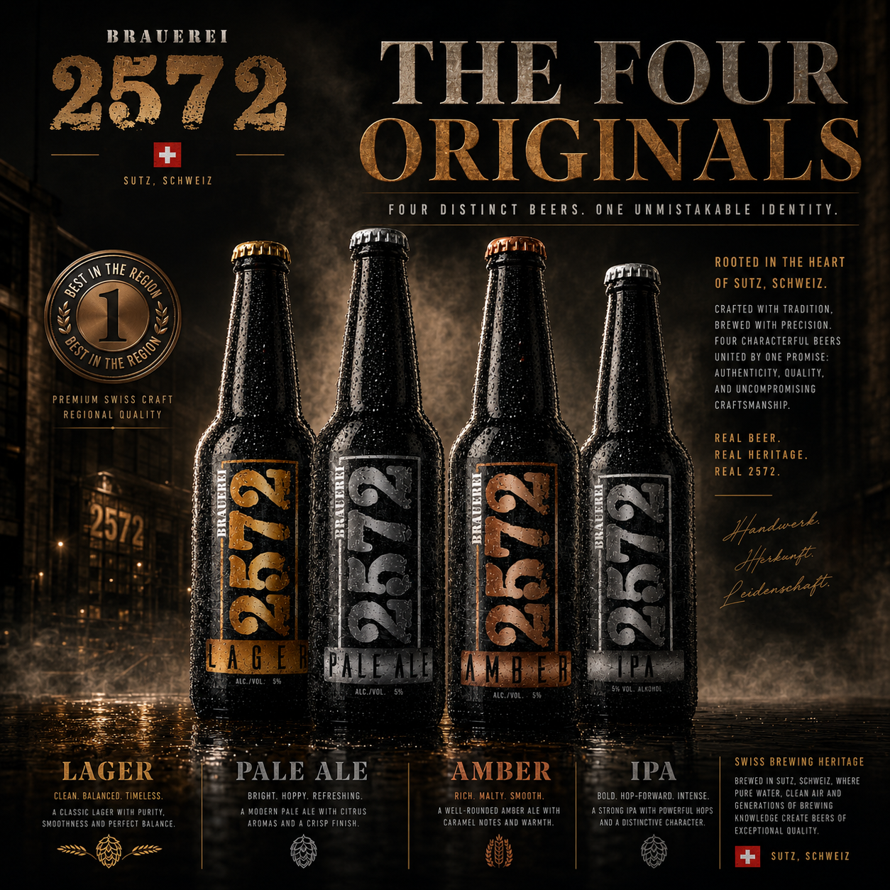
• Lager Beer
• Amber Beer
• Pale Ale
• IPA
• Alkoholfrei
Packaging System:
• Premium Six Pack Carrier
• Premium Eight Bottle Carrier
• Premium Brewery Carton
• Ready For Delivery
• Ready To Enjoy
• Collector's Gift Edition
• Swiss Collector's Edition
Brand Ecosystem:
• Brand Identity
• Packaging Architecture
• Typography System
• Color Strategy
• Material System
• Product Photography
• Lifestyle Photography
• Hospitality Experience
• Retail Experience
• Brand Merchandise
• Corporate Identity
• Editorial Presentation
Process:
• Research
• Discovery
• Strategy
• Identity
• Architecture
• Packaging
• Photography
• Editorial
• Production
• Presentation
• Execution
Strategic Focus:
• Brand Strategy
• Premium Beer Branding
• Packaging Architecture
• Visual Identity System
• Shelf Recognition
• Product Differentiation
• Packaging Consistency
• Premium Perception
• Retail Experience
• Hospitality Branding
• Long-Term Brand Growth
• Brand Ecosystem Development
Deliverables:
• Brand Strategy
• Brand Identity System
• Beer Collection
• Packaging System
• Editorial Photography
• Lifestyle Photography
• Macro Detail Studies
• Brand Guidelines
• Production Files
• Presentation System
• Print Ready Artwork
• Complete Brand Ecosystem
Project Introduction
Crafting A Premium Beer Identity Rooted In Tradition And Built For Modern Retail.
Brauerei 2572 is a family-owned Craft Brewery dedicated to producing authentic Swiss beer through traditional brewing methods, regional heritage, and uncompromising quality. As the brewery expanded its growing portfolio, it required a unified Premium Beer Label Design system capable of expressing the craftsmanship behind every product while creating stronger visual recognition across the entire range.
Infinity Design Studio was commissioned to develop a complete Beer Packaging Design strategy that combined Brand Identity, Visual Identity, and premium packaging architecture into one cohesive system. Every label was carefully designed to balance authenticity, shelf visibility, and commercial appeal while remaining true to the brewery’s character.
Rather than redesigning individual labels independently, the objective was to create one scalable Craft Beer Branding language capable of supporting every current and future beer variety—including Lager, Amber, Pale Ale, IPA, and Alkoholfrei—through consistent typography, color hierarchy, product differentiation, and recognizable packaging structure.
Every design decision focused on strengthening Shelf Presence, improving Brand Recognition, increasing perceived product value, and establishing a timeless Premium Branding system prepared for long-term market growth across Switzerland and the broader European beer market.
Target Audience
Beer enthusiasts who appreciate authentic craft brewing, premium quality, and distinctive packaging. Designed for customers seeking traditional Swiss brewing excellence presented through a contemporary Beer Packaging Design experience that communicates craftsmanship, trust, and premium positioning.
Project Objective
To transform Brauerei 2572 into a visually unified Craft Beer Brand through strategic Premium Beer Label Design, Packaging Design, Brand Identity Development, and scalable packaging architecture capable of strengthening retail presence, product recognition, and long-term portfolio consistency.
The objective extended far beyond creating attractive labels. Every design decision was strategically developed to improve shelf differentiation, reinforce product recognition across multiple beer varieties, and build a premium visual identity capable of supporting future brewery growth.
About BRAUEREI 2572®
Brauerei 2572 represents modern Swiss craft brewing built upon tradition, authenticity, and exceptional product quality.
Infinity Design Studio developed the complete Beer Packaging Design System, including Premium Beer Label Design, Visual Identity, packaging hierarchy, typography refinement, product differentiation, print-ready production artwork, and scalable branding guidelines.
The result is a premium packaging ecosystem capable of supporting current and future beer varieties while maintaining complete visual consistency across every product presented on the shelf.
Key Project Facts:
“Exceptional Craft Beer Brands Are Built Through Hundreds Of Strategic Design Decisions—Not Individual Labels.”
✓ Complete Premium Beer Label Design System
✓ Beer Packaging Design Strategy
✓ Craft Beer Branding
✓ Brand Identity Development
✓ Visual Identity System
✓ Packaging Architecture
✓ Product Portfolio Consistency
✓ Future Product Scalability
Project Impact:
“Great Packaging Doesn’t Simply Protect The Product—It Builds Recognition Before The First Sip.”
✓ Stronger Shelf Presence
✓ Premium Brand Perception
✓ Consistent Beer Portfolio
✓ Improved Product Differentiation
✓ Higher Retail Recognition
✓ Stronger Consumer Trust
✓ Scalable Packaging System
✓ Long-Term Brand Growth
Project Snapshot:
“Premium Beer Packaging Is Where Tradition, Strategy, And Design Become One Brand Experience.”
Industry
Craft Brewery • Beer • Food & Beverage • Premium Retail
Services
Premium Beer Label Design • Beer Packaging Design • Brand Identity • Visual Identity • Packaging Strategy • Print Production • Prepress
Objective
Transform a growing Swiss craft brewery into a visually unified premium beer brand capable of increasing recognition, shelf visibility, and long-term commercial value through one scalable Packaging Design system.
Deliverables
Complete Label Design System • Brand Identity • Packaging Architecture • Print Files • Product Variations • Premium Packaging Guidelines
Focus
Shelf Presence • Premium Branding • Product Differentiation • Packaging Consistency • Consumer Recognition • Portfolio Growth
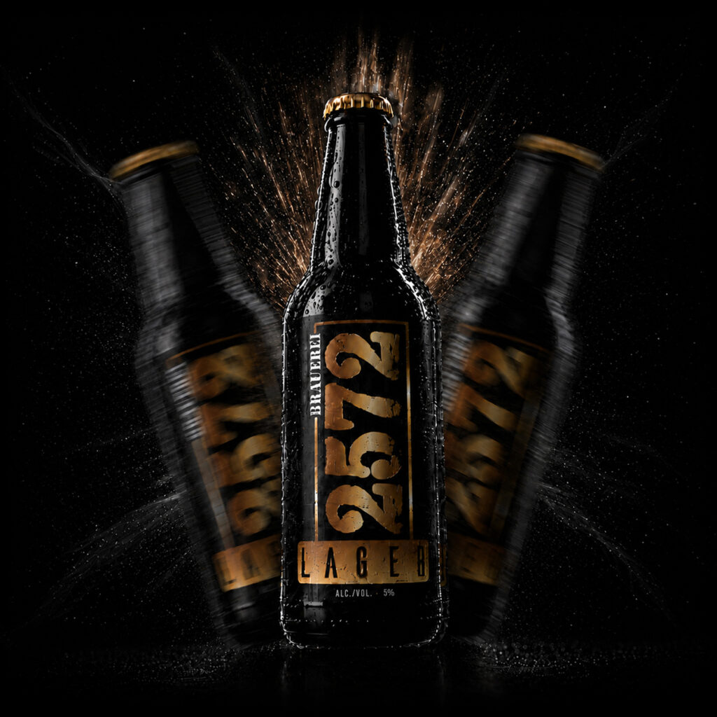
Project Overview:
“Great Beer Packaging Is Never Designed Around One Label—It Is Designed Around An Entire Brand System.”
Brauerei 2572 already possessed exceptional brewing quality, authentic heritage, and a growing portfolio of premium craft beers.
Infinity Design Studio was commissioned to transform this foundation into a complete Premium Beer Packaging Design system capable of communicating quality before the product was even tasted.
The project focused on developing a unified Beer Label Design, Craft Beer Branding, Visual Identity, Packaging Strategy, and scalable product architecture capable of supporting future brewery expansion without sacrificing consistency.
From typography, color psychology, packaging hierarchy, and material selection to production-ready artwork and shelf differentiation, every design decision pursued one objective:
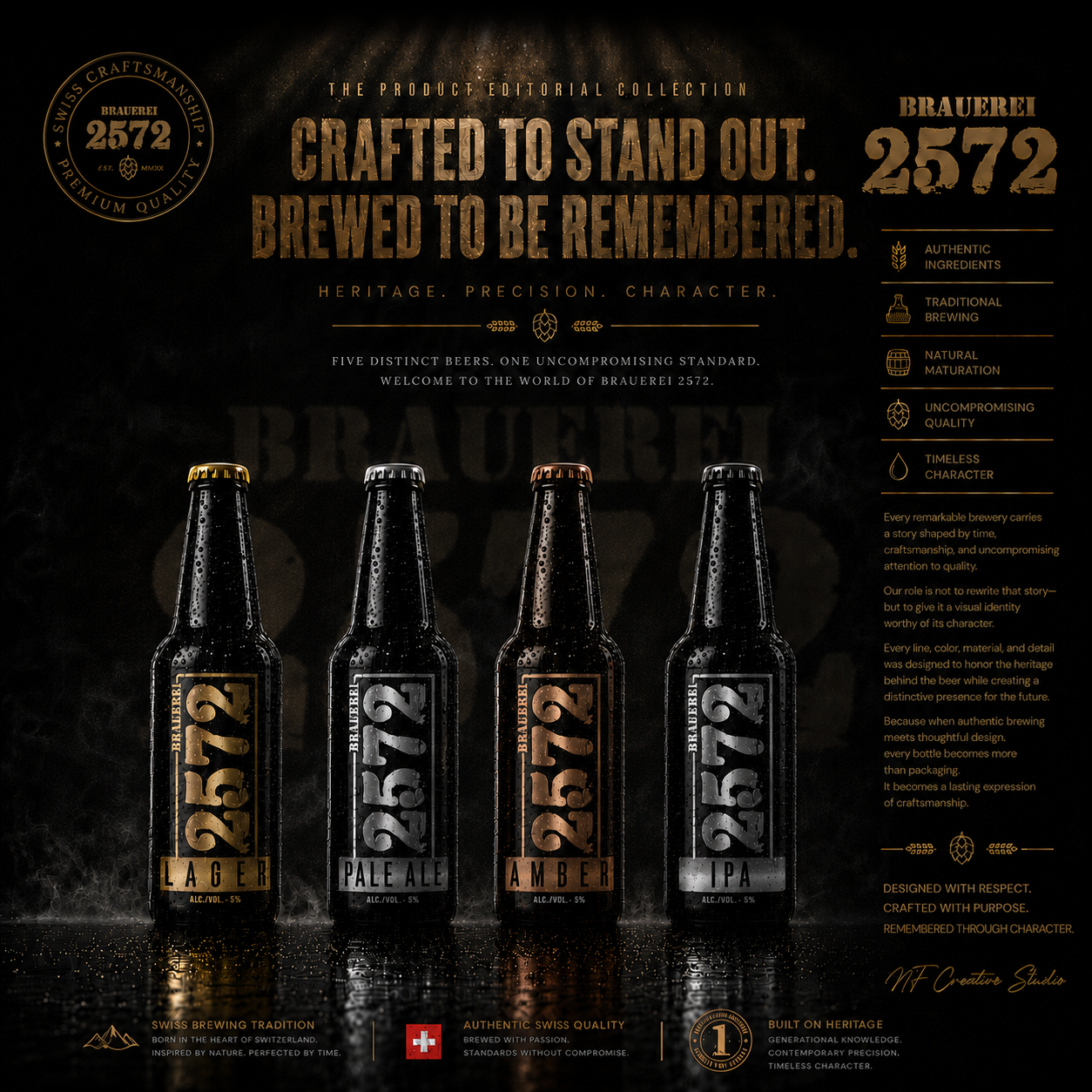
Creating a timeless Premium Beer Label Design System that elevates every beer while strengthening the identity of the brewery as a whole.
Project Scope:
- Premium Beer Label Design
- Beer Packaging Design Strategy
- Complete Brand Identity System
- Visual Identity Development
- Packaging Architecture
- Typography & Layout System
- Color System & Product Differentiation
- Premium Print Production
- Prepress & Manufacturing Preparation
- Retail Shelf Visibility Optimization
- Packaging Consistency
- Product Portfolio System
- Premium Branding Strategy
- Future Beer Line Scalability
"Every Exceptional Beer Begins Long Before The First Pour."
Crafting A Premium Beer Identity Through Authentic Design
The world’s most respected Craft Beer Brands are built on far more than exceptional brewing—they are recognized through authentic storytelling, distinctive Brand Identity, and premium Label Design that reflects the character behind every bottle. Before customers experience the taste, they experience the brand, making first impressions essential in a highly competitive craft beer market.
For Brauerei 2572, our objective extended beyond redesigning a beer label. We set out to create a timeless visual identity inspired by Swiss Craftsmanship, premium brewing traditions, and modern market expectations. Every design decision was strategically developed to strengthen Brand Recognition, improve Shelf Presence, and create a cohesive identity that communicates quality, authenticity, and long-term brand value.
"Great Beer Is Crafted In The Brewery—Great Brands Are Crafted In Every Detail."
“Crafted With Tradition. Designed For Modern Recognition.”
BRAUEREI 2572 -Building A Distinctive Craft Beer Brand Through Strategic Packaging Design
“Exceptional beer packaging goes beyond aesthetics—it tells a story, reinforces authenticity, and transforms every bottle into an instantly recognizable brand experience.”
Brauerei 2572 represents the perfect balance between Swiss Brewing Heritage, Craft Beer Branding, and modern Packaging Design. The objective was to develop a distinctive Beer Label Design System capable of strengthening the brewery’s Brand Identity across retail, hospitality, and specialty beer markets while preserving the authenticity that loyal customers already trusted. Every design decision was strategically developed to improve Brand Recognition, communicate premium quality, and create a memorable customer experience for a growing community of Craft Beer Enthusiasts.
THE SOLUTION INCLUDED:
- Strategic Label Architecture designed to strengthen Product Recognition across multiple beer varieties and future product extensions.
- Bold Heritage-Inspired Typography that reinforces authenticity while maintaining a clean, premium, and contemporary appearance.
- Premium Visual Storytelling elements communicating craftsmanship, brewing tradition, product quality, and the brewery’s unique identity.
- A distinctive Color-Coding System that improves shelf visibility, simplifies product navigation, and strengthens brand consistency across the entire portfolio.
THE FINAL RESULT:
- Successfully positioned Brauerei 2572 as a modern Swiss Craft Brewery that combines traditional brewing values with premium Brand Design, professional Packaging Design, and strong commercial appeal—creating a recognizable visual identity that supports long-term Brand Growth, customer loyalty, and increased market visibility.
"View the full case study and explore the power of strategic beer branding."
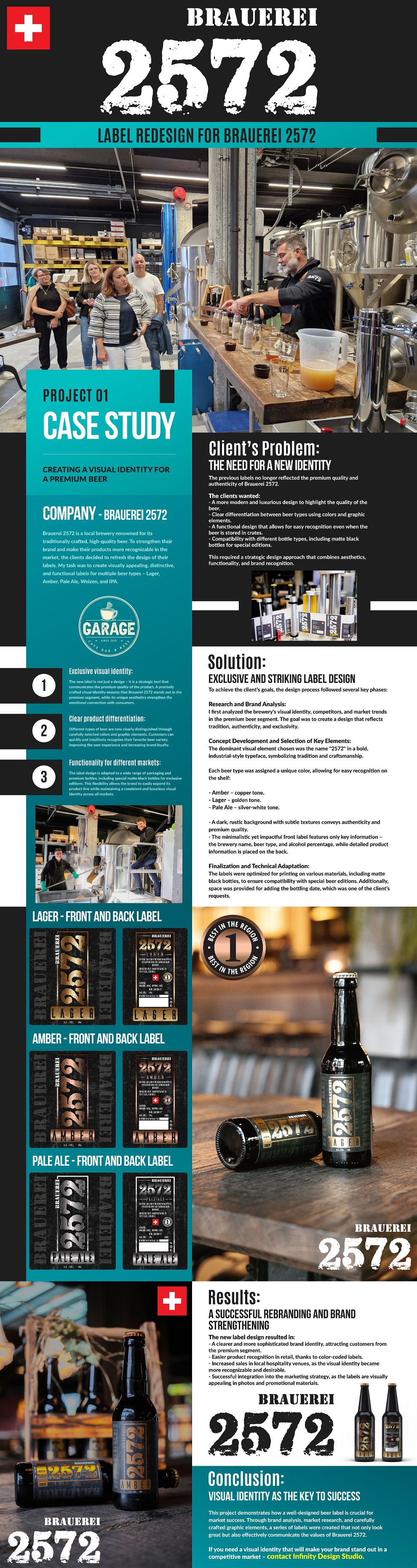
Download Case Study
FROM BREWING HERITAGE TO ONE DISTINCT AND SCALABLE BRAND SYSTEM
Craft Beer Branding Begins Long Before The First Pour
Successful Craft Beer Branding begins before the bottle reaches the shelf or the first beer is poured. Recognition is already being shaped through the identity, label hierarchy, color, typography, materials, and product relationships consumers encounter. For Brauerei 2572®, the strategic challenge was to preserve the authenticity of its Swiss brewing heritage while creating a clearer and more distinctive visual system capable of unifying the complete beer collection.
Our response was to develop one cohesive Beer Packaging Design System in which every product expresses its own character while remaining unmistakably part of the same brewery. The dominant 2572 identity establishes recognition, dedicated color systems support product differentiation, disciplined information hierarchy improves navigation, and a scalable packaging architecture prepares the brand for different formats, seasonal releases, and future portfolio growth. Together, these decisions transform individual labels into one connected brand experience built around heritage, clarity, and lasting shelf presence.
Exclusive Visual Identity:
A successful Beer Label Design should communicate quality before the bottle is even opened.
The new Premium Beer Label Design was developed as a strategic branding tool rather than a decorative element. Every visual decision—from typography and composition to textures and materials—was carefully considered to communicate authenticity, craftsmanship, and premium positioning.
The result is a refined Visual Identity that strengthens emotional engagement while positioning Brauerei 2572 within the premium Craft Beer Branding segment.
Clear Product Differentiation:
One of the primary objectives of the new Beer Packaging Design was to make every beer variety immediately recognizable.
Each style received its own carefully selected color palette and supporting visual accents while remaining part of one cohesive Brand Identity system.
This approach improves customer navigation, reinforces Shelf Presence, and allows consumers to identify their preferred beer within seconds.
Instead of creating unrelated labels, every product contributes to one recognizable Beer Packaging family.
Functionality for Different Markets:
A premium brewery requires packaging capable of evolving alongside its product portfolio.
The complete Packaging Strategy was therefore designed to adapt seamlessly across different bottle formats, premium matte-black editions, seasonal releases, and future beer varieties without sacrificing consistency.
This scalable Beer Packaging Design system allows Brauerei 2572 to expand confidently while maintaining a recognizable premium appearance across every retail environment.
“Great Craft Beer Brands Are Never Built Around Individual Labels. They Are Built Around One Consistent And Recognizable Brand Experience.”
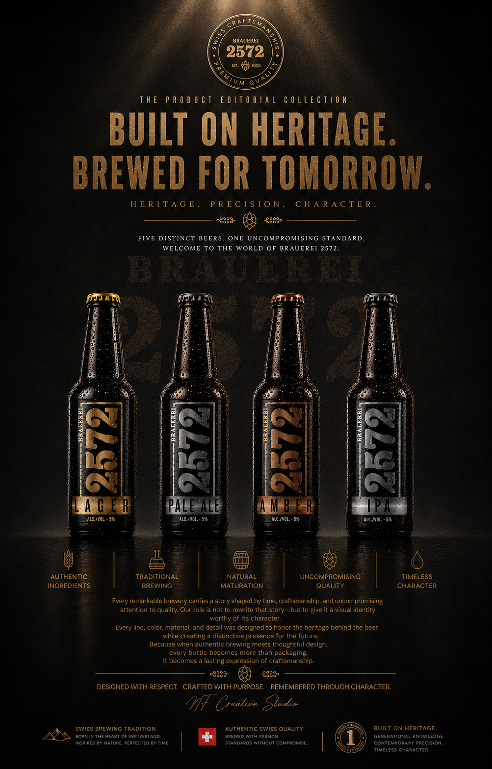
CHAPTER 01
THE BIRTH OF A DISTINCTIVE BRAND
From Strategic Thinking To A Complete Brewery Identity
Building Recognition Through Design, Craftsmanship, And Consistency.
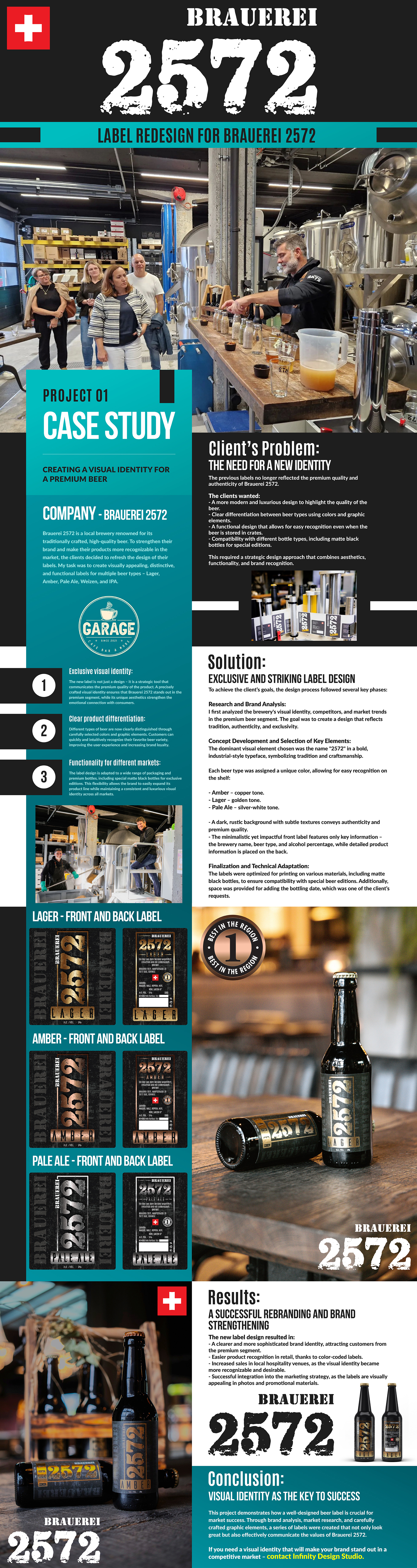
Client’s Problem:
The Need For A Stronger Brand Identity
Although the quality of the beer reflected years of brewing tradition, the previous labels no longer communicated the same premium experience visually.
The client required a strategic Beer Packaging Design capable of elevating the brewery’s image while improving customer recognition across multiple beer styles.
The key objectives included:
- Developing a more refined Premium Beer Label Design that communicates quality, craftsmanship, and authenticity.
- Creating clear visual differentiation between every beer variety through color systems and supporting graphic elements.
- Improving Shelf Presence by ensuring products remain easily recognizable, even when bottles are displayed inside transport crates or grouped together.
- Designing a flexible Packaging Design system compatible with multiple bottle formats, including exclusive matte-black bottles for premium editions.
- Establishing a long-term Brand Identity capable of supporting future product expansion without losing visual consistency.
The challenge extended beyond aesthetics. The objective was to develop a complete Packaging Strategy that transforms every label into an extension of the brewery’s story.
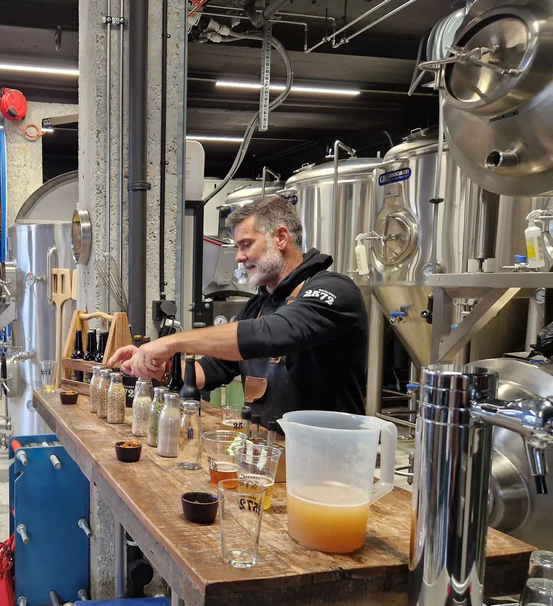
WHERE SWISS CRAFT MEETS MODERN BREWING
Tradition Moves Forward Without Losing Its Identity.
The future of Brauerei 2572 is not built by abandoning its heritage but by carrying it confidently into modern brewing culture. Every new product, every visual decision, and every customer experience remains connected to the same authentic Swiss foundations.
Innovation begins with respect.
Not replacement.
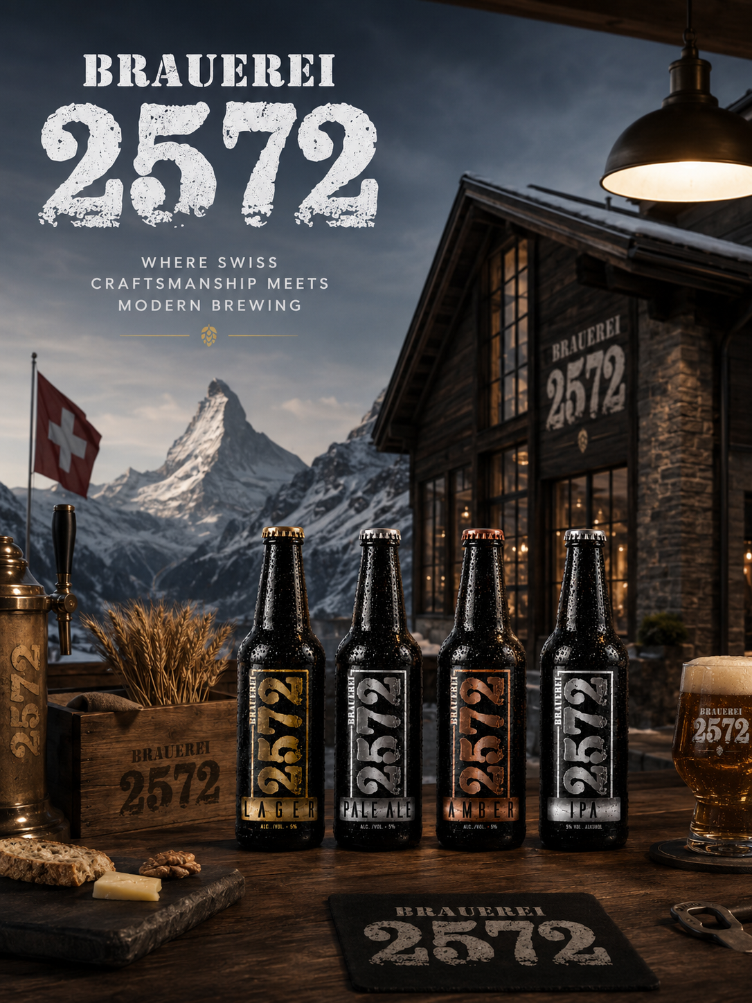
Brewery Philosophy
Swiss heritage.
Modern brewing.
Timeless identity.
Future growth.
Tradition Is Strongest When It Continues To Evolve.

Strategy Before Design:
Great Packaging Begins Long Before The First Sketch.
Every successful brand transformation starts with understanding the business behind the product—not simply the product itself.
Rather than beginning with colors, typography, or visual concepts, the project started by understanding the brewery itself. Its heritage, production philosophy, customer perception, competitive environment, and long-term ambitions became the foundation for every design decision that followed.
The objective was never to redesign labels simply because they appeared outdated. The real challenge was to create a Brand Identity System capable of communicating the same level of quality already present inside every bottle.
Through detailed Brand Analysis, product evaluation, market observation, and positioning research, we identified the visual strengths worth preserving and the communication gaps limiting stronger market recognition. This strategic foundation allowed every creative decision to support measurable business objectives rather than subjective aesthetics.
The result was a clearly defined creative direction where every subsequent design choice—from Packaging Design and typography to materials, production techniques, and photography—served one unified strategic purpose: building a premium brewery brand prepared for long-term growth.
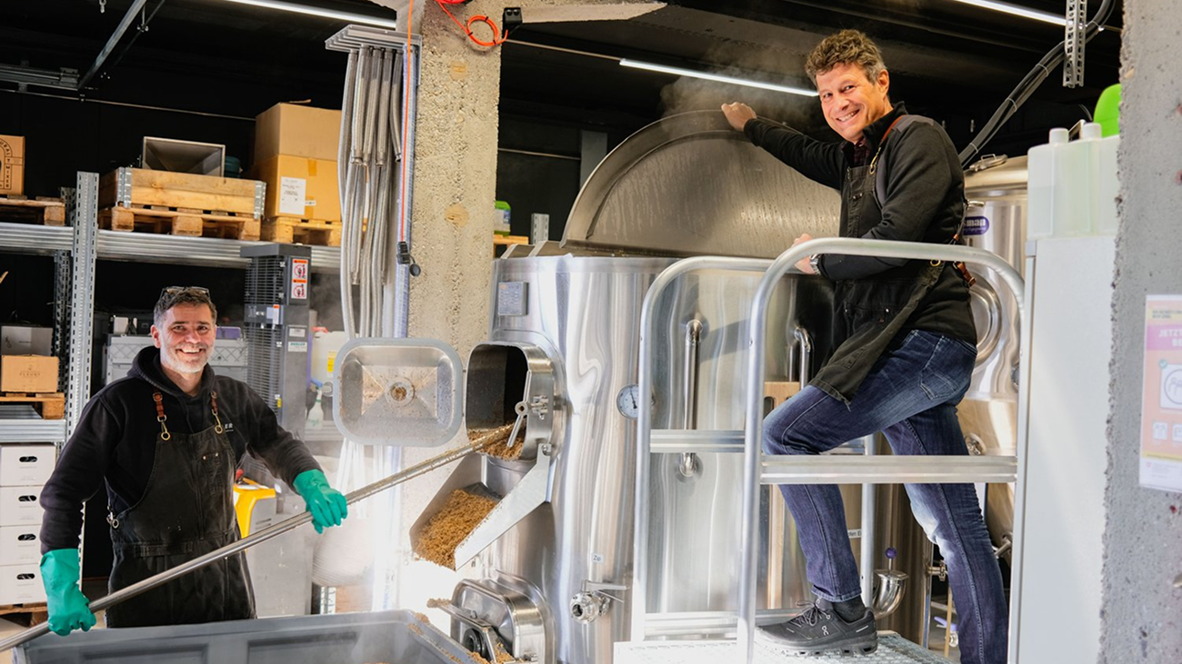
Every Great Brand Transformation Begins With Strategy. Design Simply Makes That Strategy Visible.
Understanding Craft Before Creating Identity
Great Design Begins By Understanding The Product, The Process, And The People Behind It.
Every authentic brand deserves to be experienced before it is designed.
Creating a meaningful Beer Brand Identity requires more than studying existing labels or analyzing market trends. It begins with understanding the craftsmanship, production methods, raw ingredients, and the people whose knowledge defines the brewery every single day.
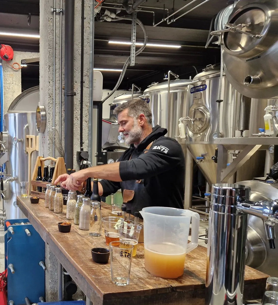
Visiting Brauerei 2572 provided the opportunity to experience the complete brewing process directly—from raw materials and fermentation to tasting sessions and conversations with the brewers themselves. Every observation added context that no creative brief alone could ever communicate.
This immersive approach transformed the project from a conventional Packaging Design assignment into a strategic collaboration built on trust, authenticity, and firsthand understanding. The visual identity was no longer inspired by assumptions—it was shaped by real production, genuine craftsmanship, and the values already living inside the brewery.
Experiencing the brewing environment also revealed countless details that later influenced typography, material selection, color hierarchy, photography direction, and the complete Brand Identity System. Every design decision became a direct reflection of what was learned inside the brewery rather than an interpretation created from a distance.
Ultimately, the strongest brands are built when design respects reality before introducing creativity. Understanding the product first allowed every visual element to communicate not only quality, but also the authenticity that customers immediately recognize and trust.
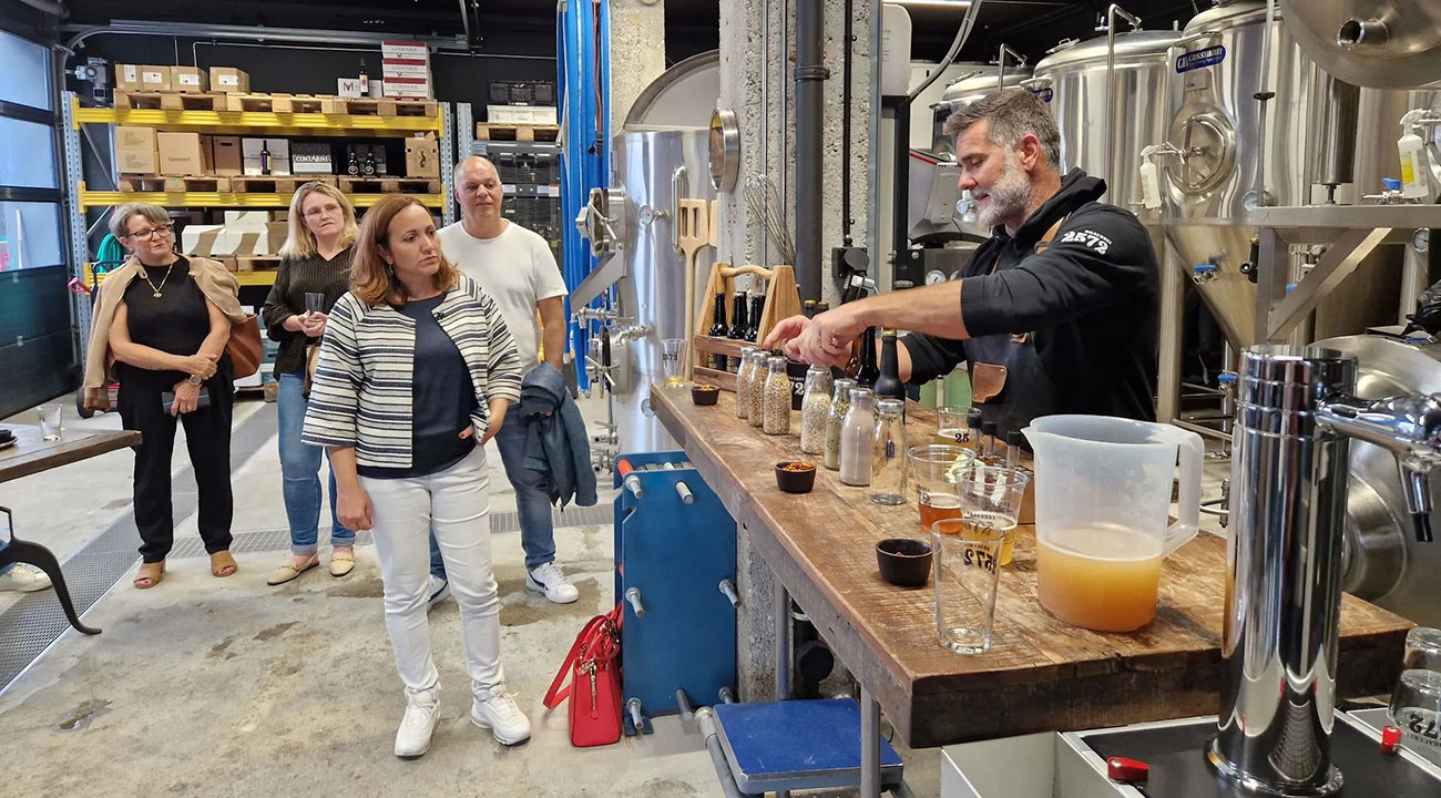
The Best Design Decisions Are Made After Listening, Observing, And Understanding.
Solution:
Exclusive And Distinctive Beer Label Design
Research and Brand Analysis
Every successful Craft Beer Branding project begins with understanding both the brand and the market.
We analyzed Brauerei 2572’s existing Visual Identity, studied competing premium breweries, evaluated current Beer Packaging Design trends, and identified opportunities to strengthen the brewery’s market position without compromising its authentic character.
The objective was to develop a timeless Premium Branding solution that celebrates tradition while appealing to today’s consumers.
Concept Development and Selection of Key Elements
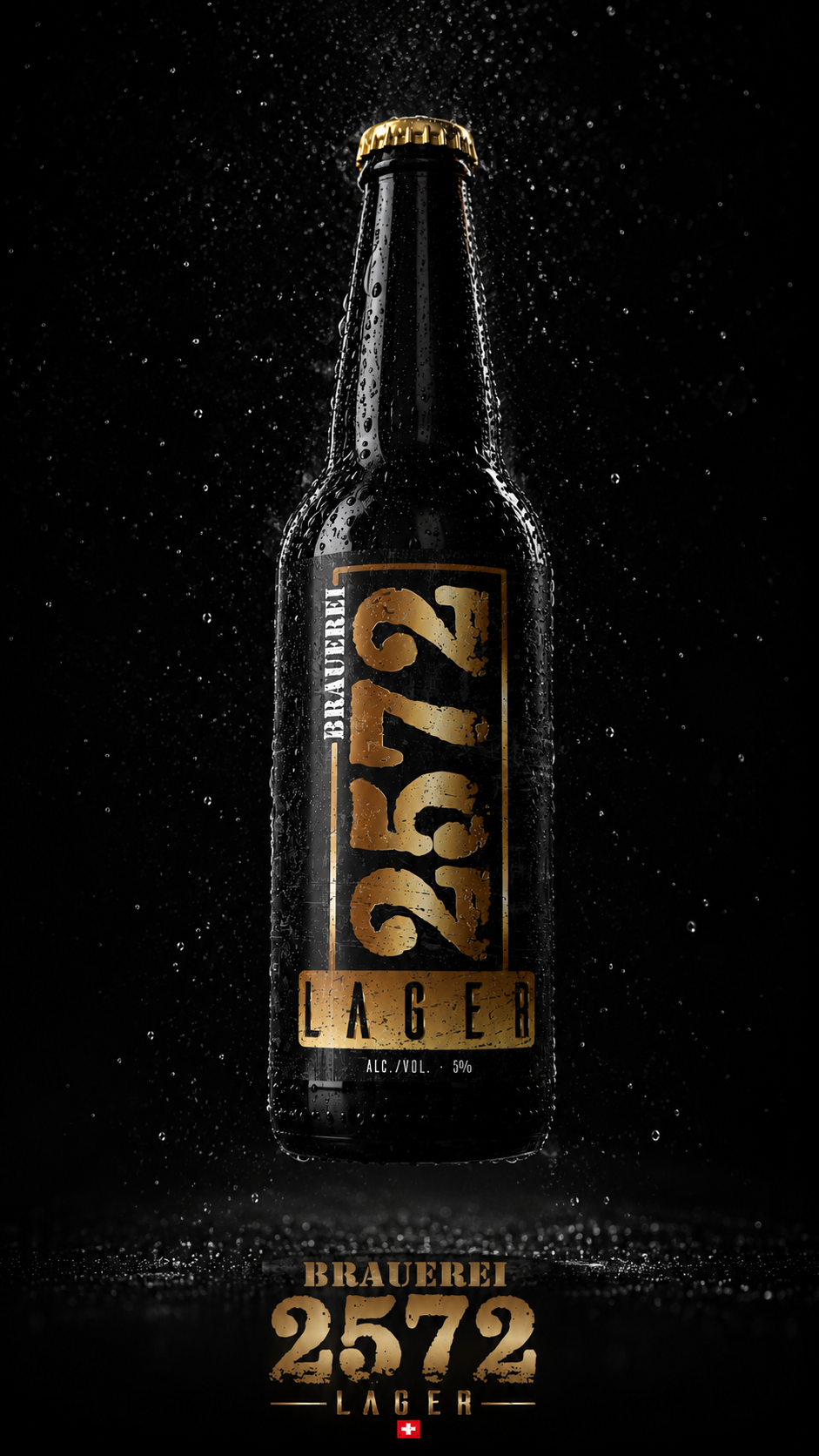
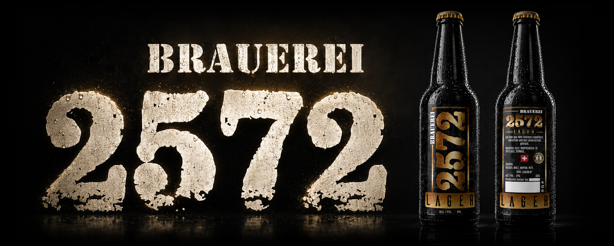
The foundation of the new Beer Label Design became the distinctive “2572” typography, inspired by industrial craftsmanship and brewing heritage.
This bold visual element immediately establishes recognition while becoming the strongest component of the brewery’s Brand Identity.
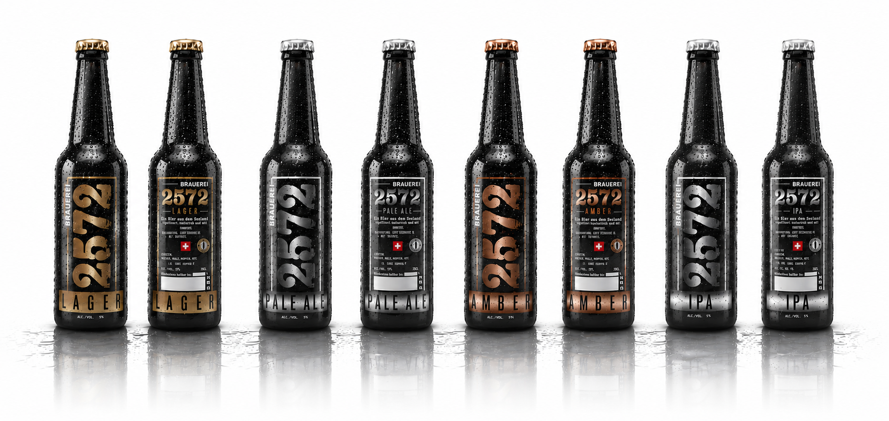
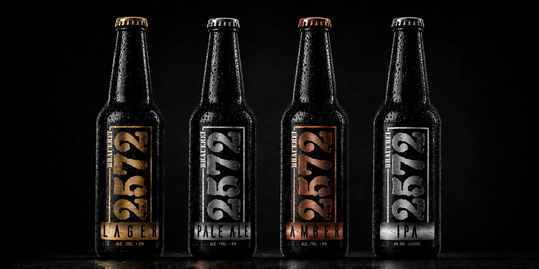
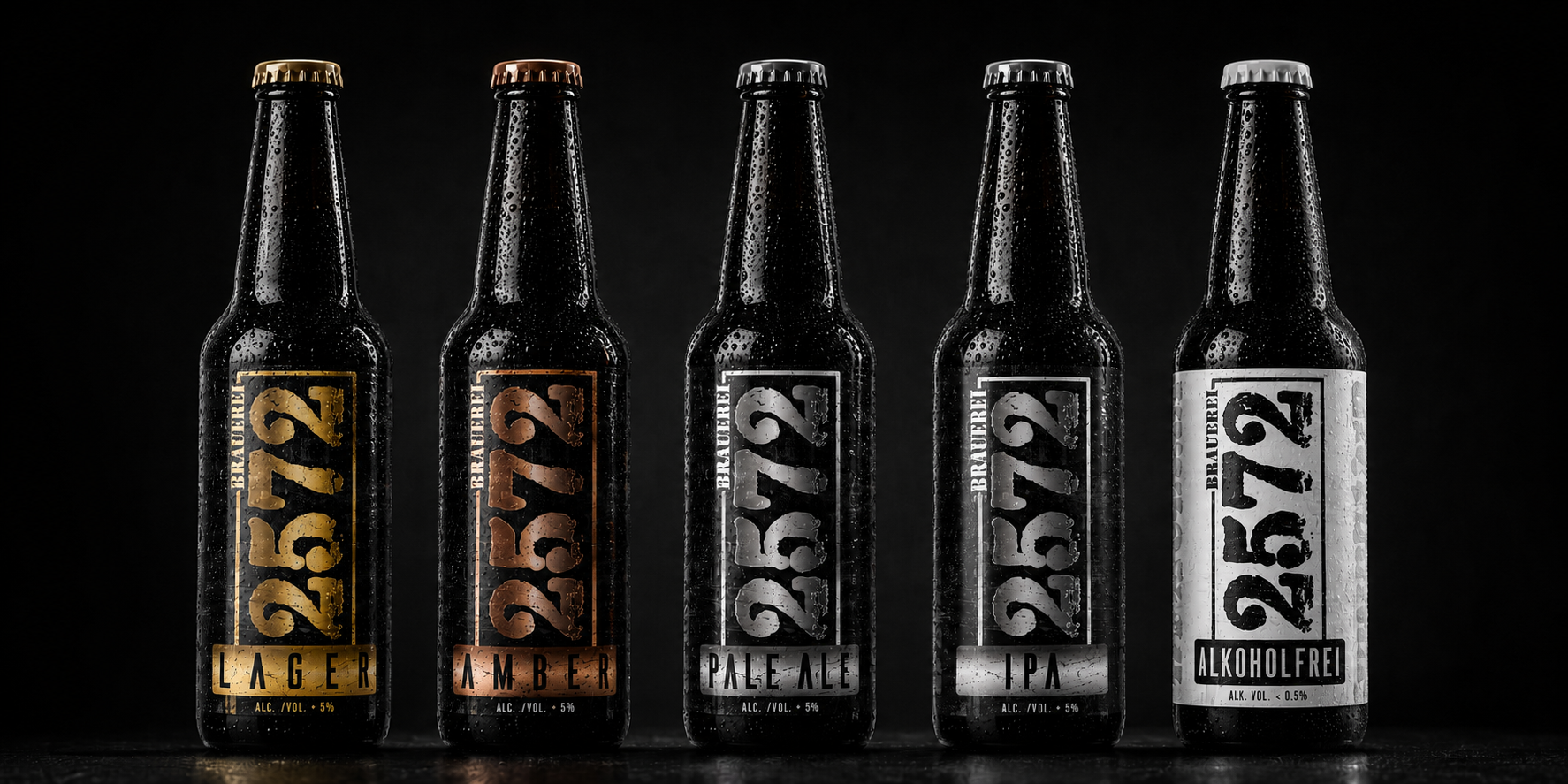
To simplify product recognition and improve Shelf Presence, every beer variety received its own dedicated color system:
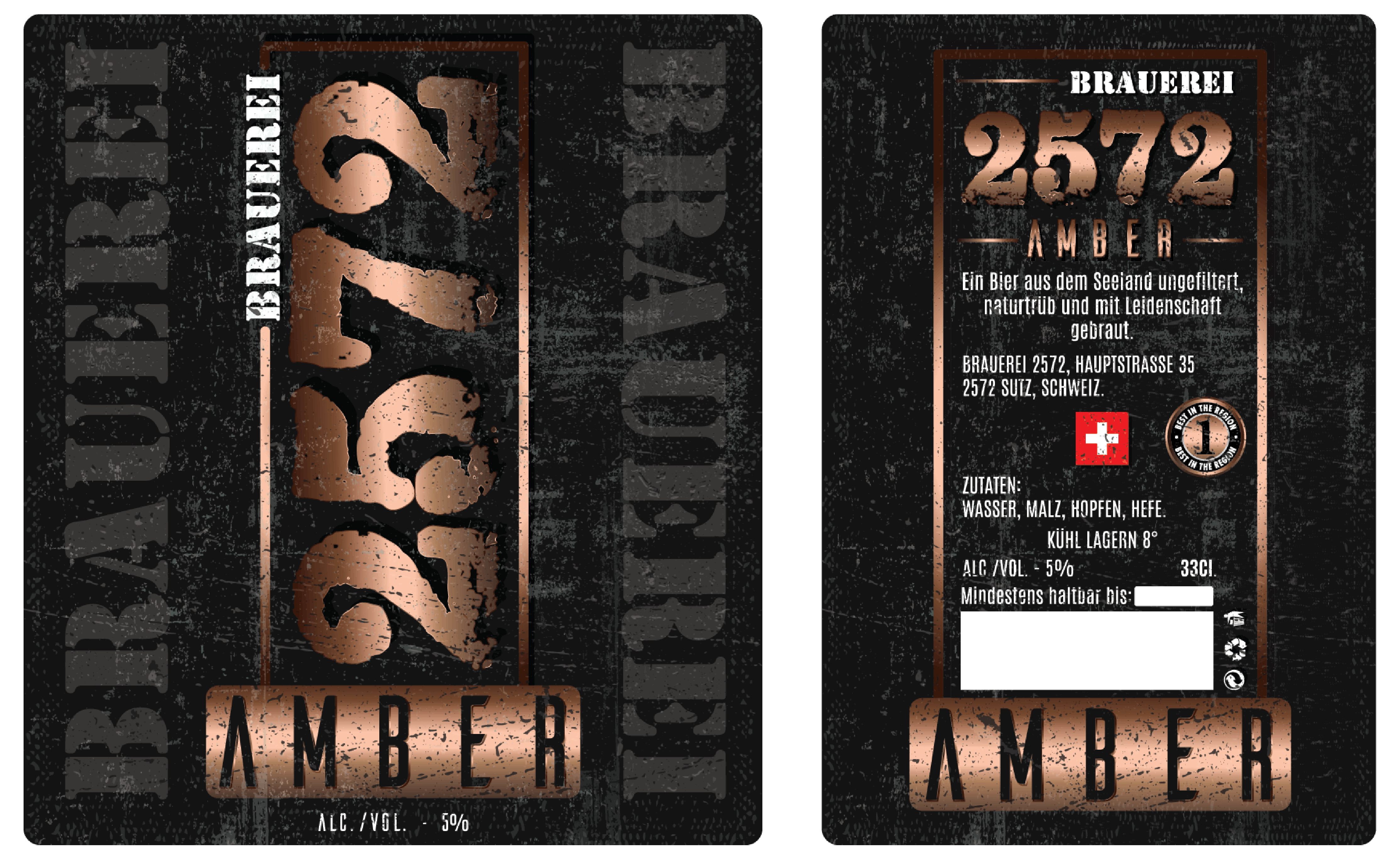
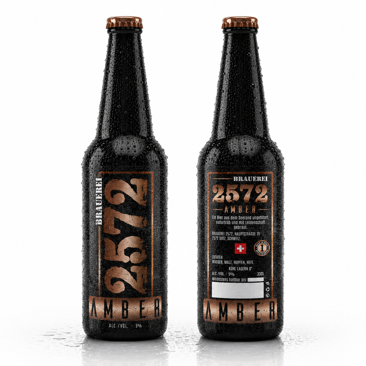
- Amber — warm copper tones reflecting richness and malt character.
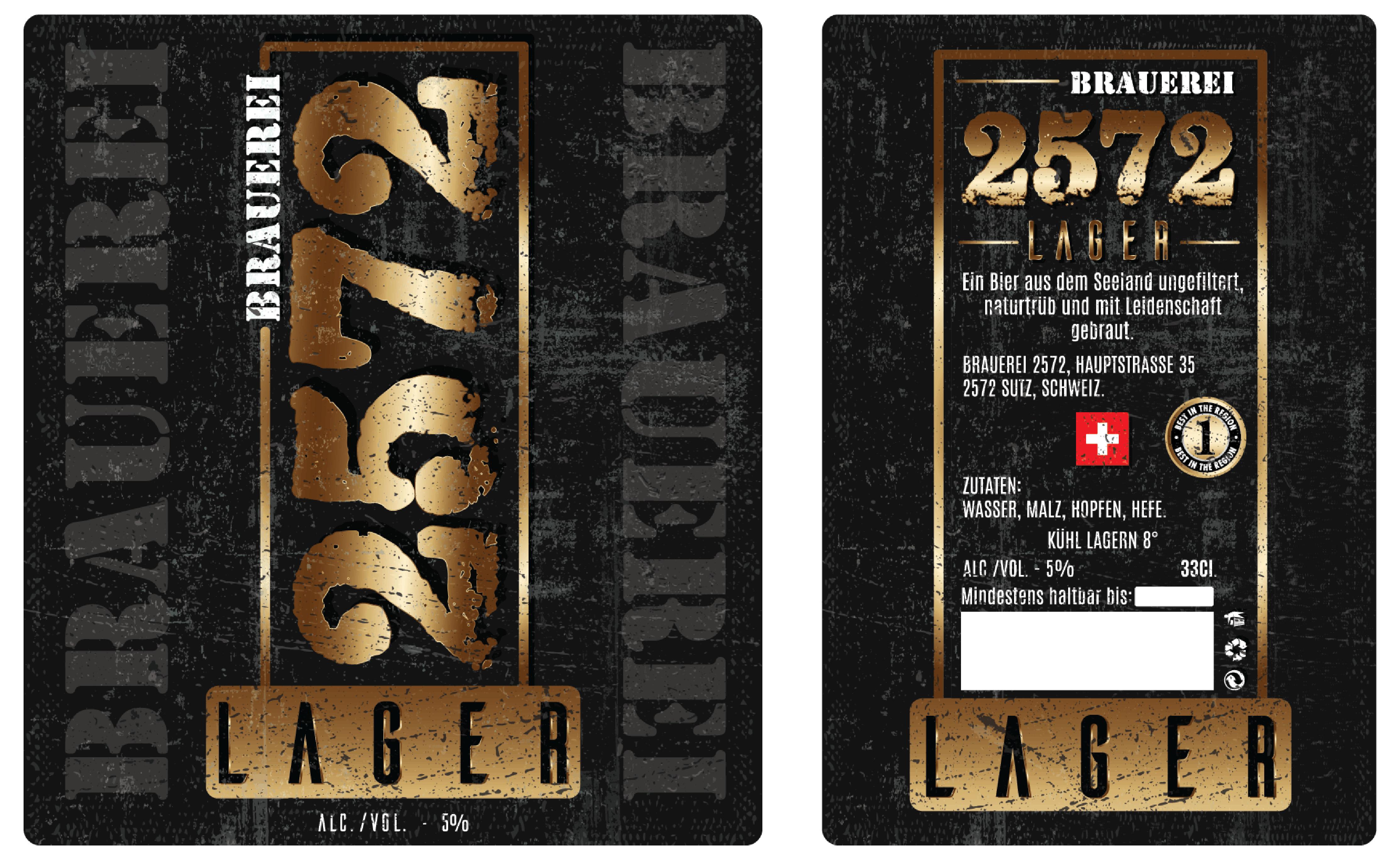
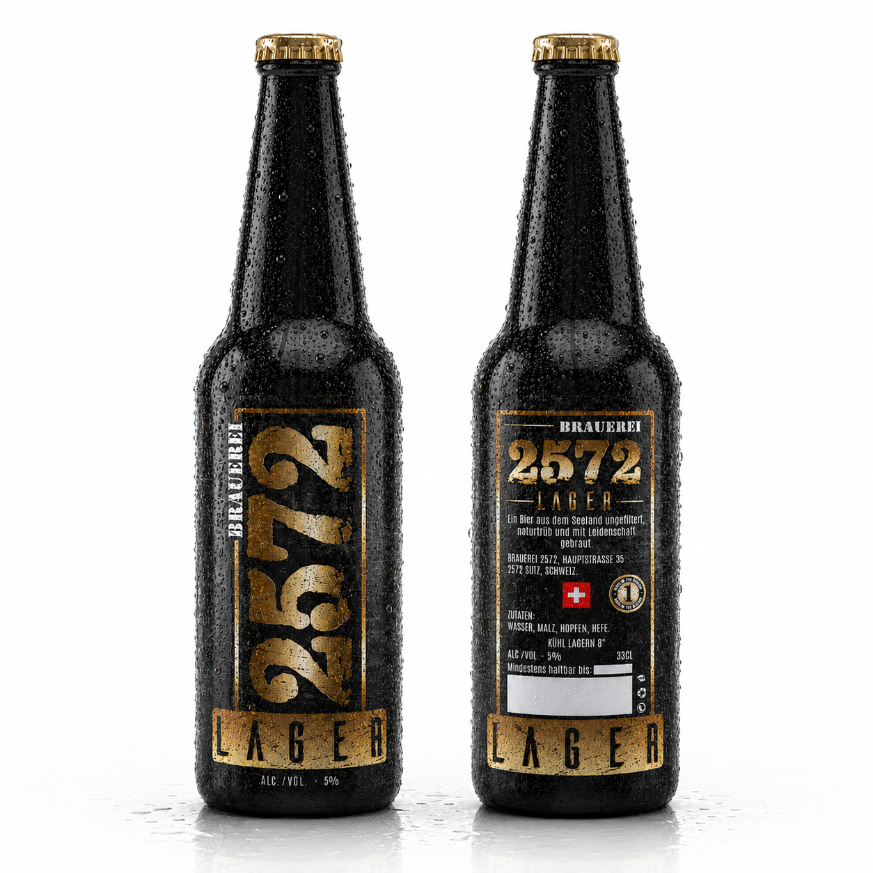
- Lager — elegant golden tones inspired by classic brewing traditions.
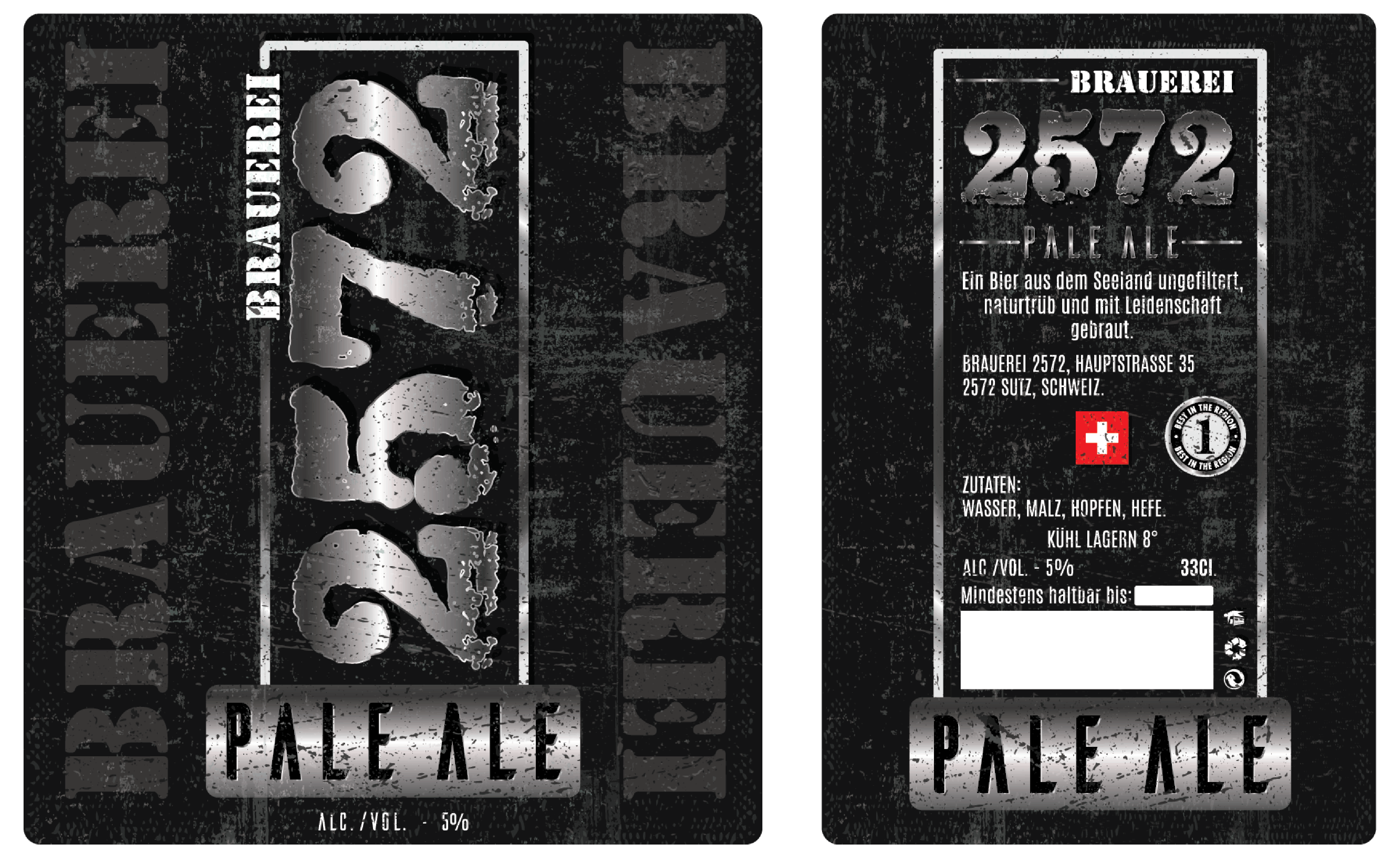
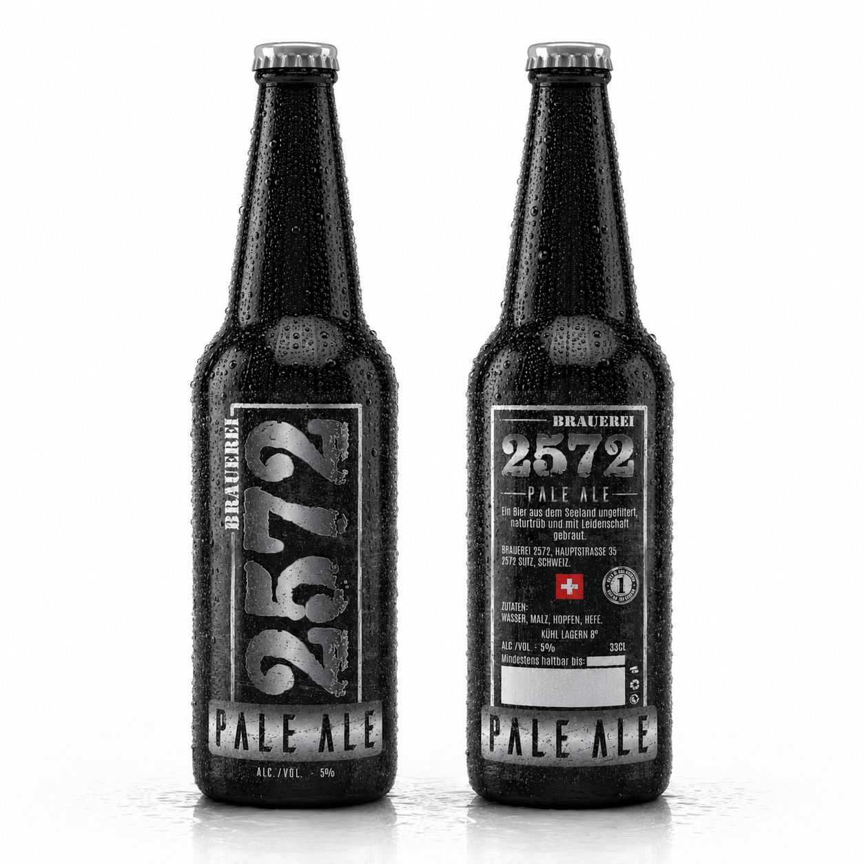
- Pale Ale — refined silver-white tones emphasizing freshness and balance.
- Alkoholfrei — clean white tones communicating purity, clarity, and modern refreshment.
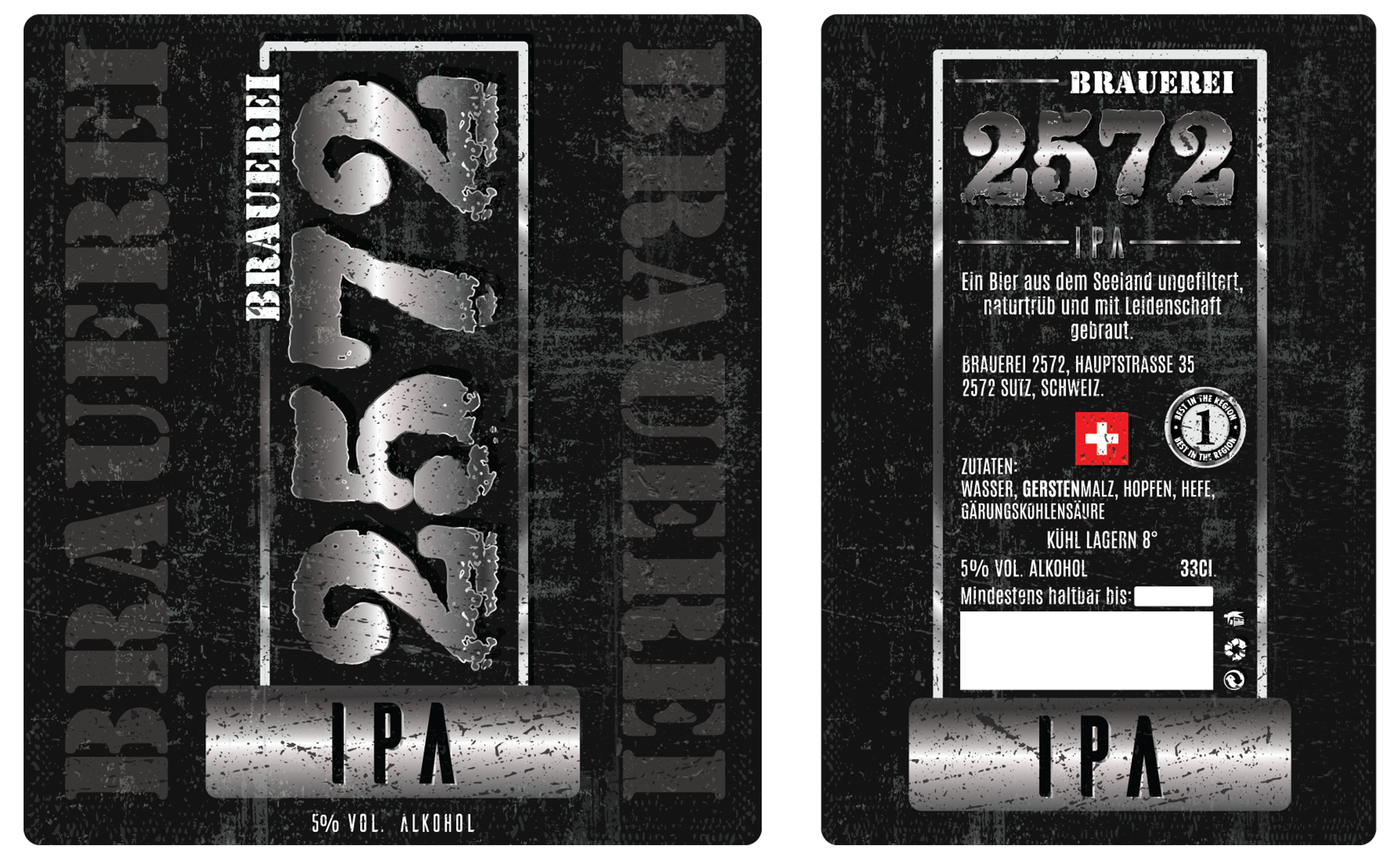
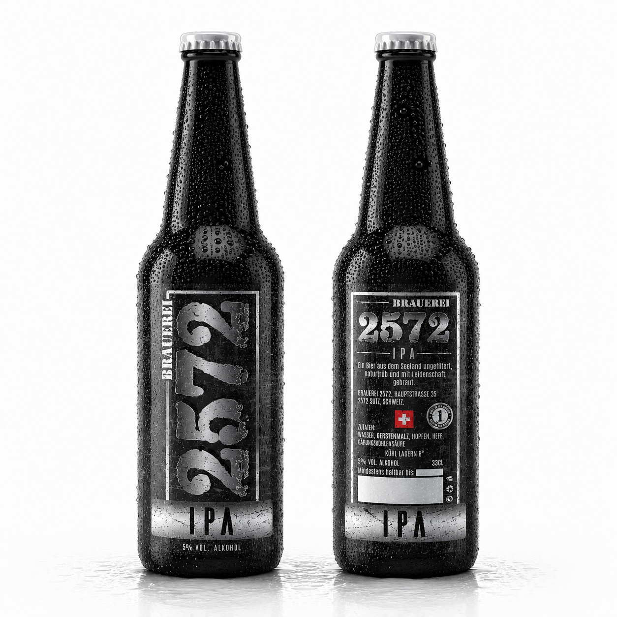
- IPA — bold contemporary accents reinforcing the expressive personality of the style.
Subtle rustic textures combined with a dark background reinforce authenticity while creating a premium Beer Packaging appearance that remains elegant without unnecessary visual complexity.
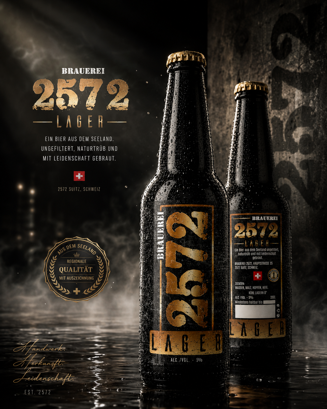
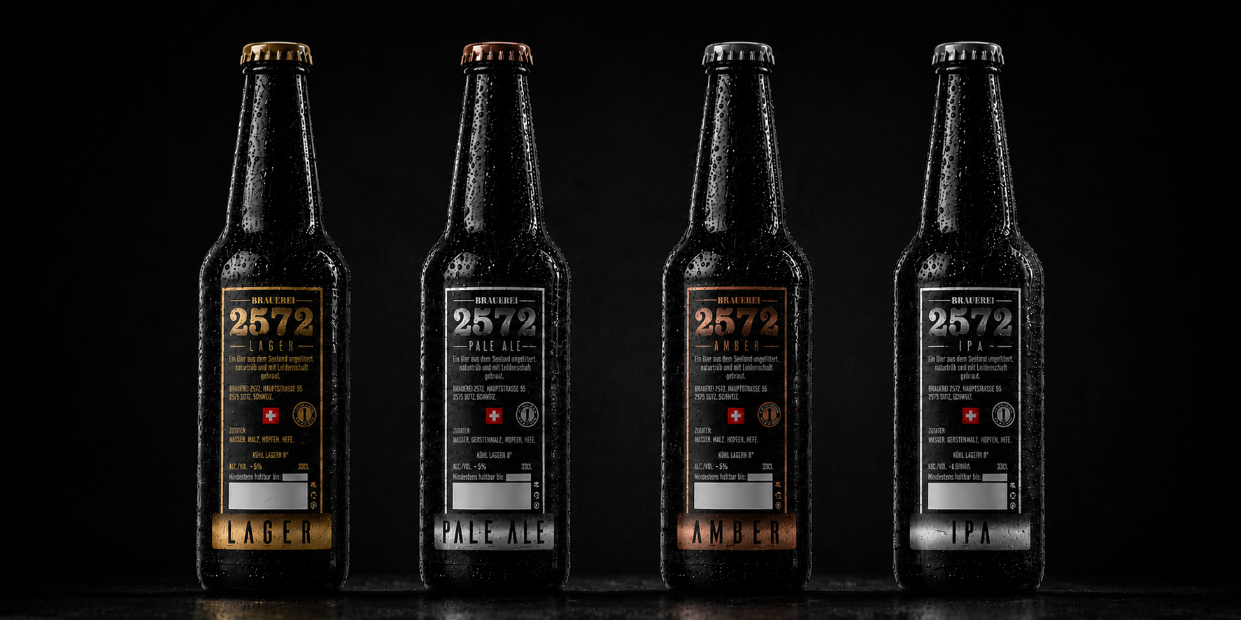
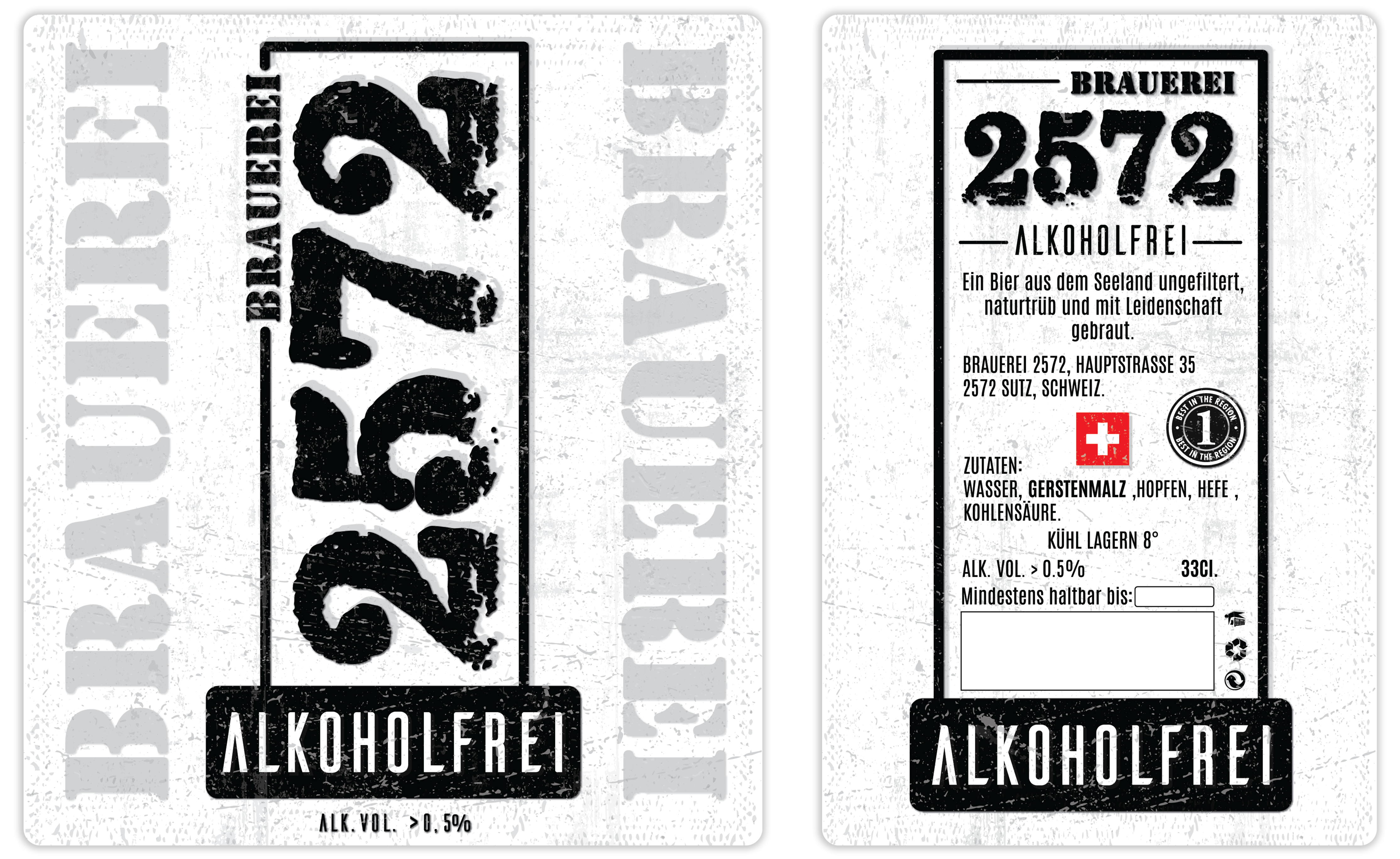
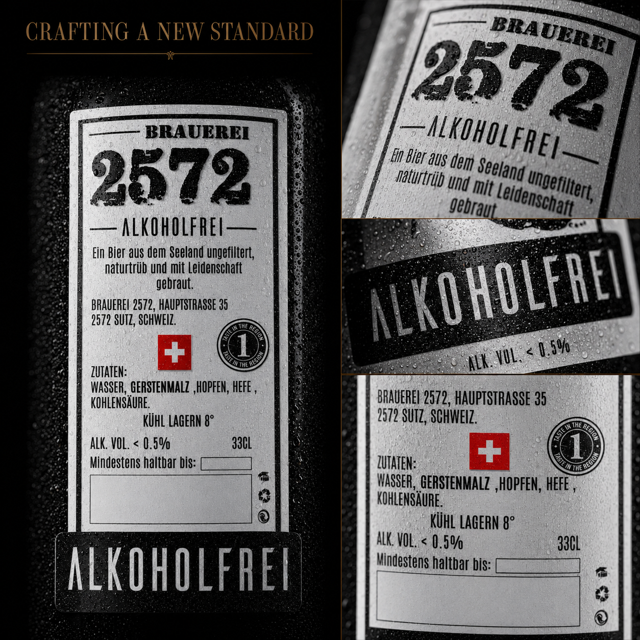
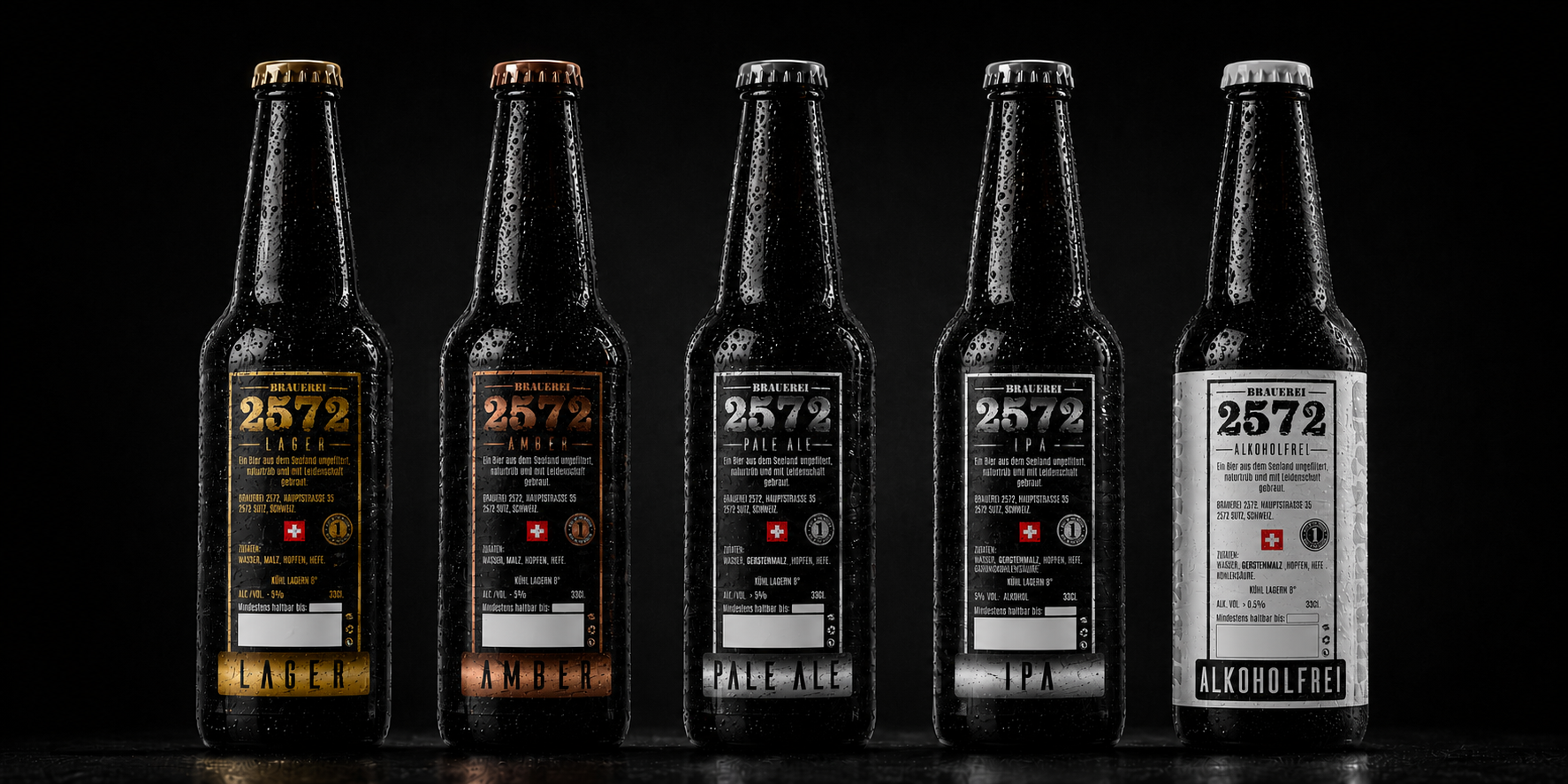
The front label intentionally focuses only on the essential information—brewery name, beer style, and alcohol content—while all detailed product information is organized on the back label, creating a clean and highly legible Packaging Design.
Finalization and Technical Adaptation
The completed Beer Packaging Design was optimized for professional production across various printing techniques and bottle finishes.
Special attention was given to compatibility with premium matte-black bottles used for exclusive editions, ensuring that the Visual Identity performs consistently regardless of packaging material or finish.
Additional production requirements—including designated space for bottling dates and technical information—were integrated without compromising the clean appearance of the Premium Beer Label Design, resulting in a solution equally suited for manufacturing, retail presentation, and future product expansion.
THE FIRST BRAND COLLECTION
FROM DESIGN SYSTEM TO A LIVING BRAND
The Moment Individual Labels Became One Recognizable Brewery.
The strongest brand identities are not built when the first design is approved. They begin when every product starts speaking the same visual language.
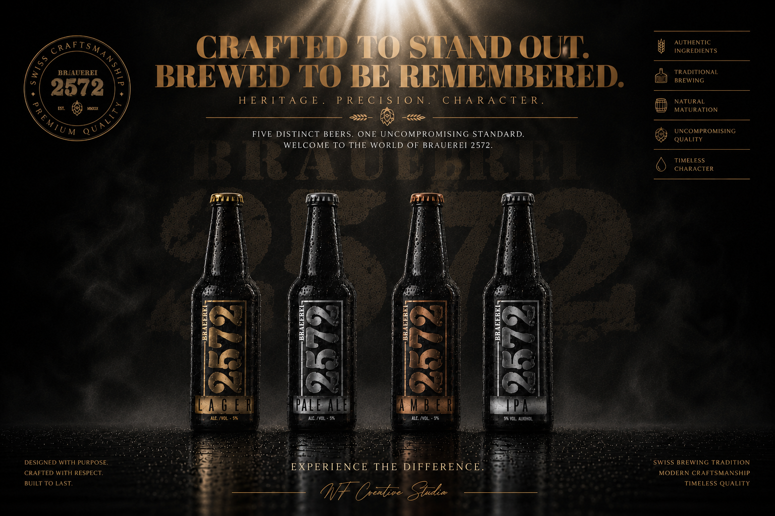
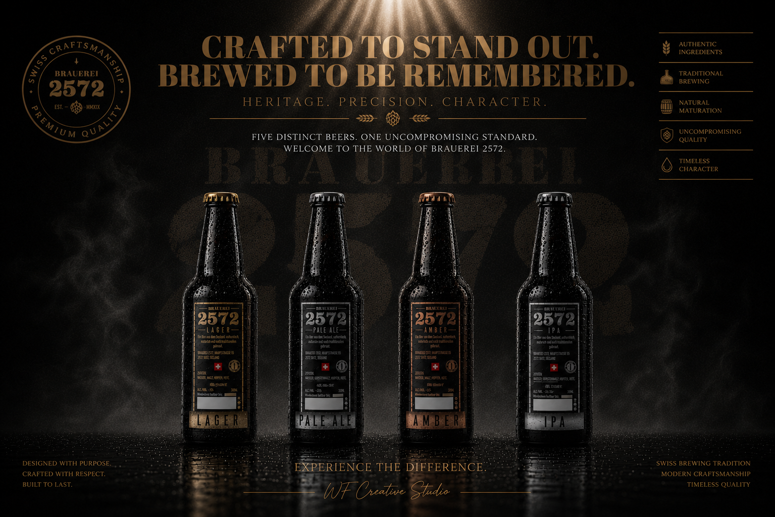
When the first four Brauerei 2572 beers were introduced together, the objective was no longer to evaluate individual label designs—it was to validate whether an entire Beer Brand Identity System could perform as one coherent visual family.
Each product was intentionally developed with its own personality, dedicated color palette, and distinctive visual presence. Yet every bottle follows the same architectural principles, typography hierarchy, proportions, materials, and production standards, ensuring immediate recognition across the complete collection.
Rather than competing against one another, the products strengthen the perception of the brewery as a whole. Customers recognize the family before identifying the individual beer style, creating stronger Shelf Presence, greater Brand Recognition, and a more memorable purchasing experience.
This transition marked the point where Packaging Design became a scalable business asset. The visual identity no longer supported a single product—it became a strategic system capable of expanding into future varieties while maintaining complete consistency across every touchpoint.
The introduction of the first four beers established the visual foundation that would later enable new product development without redesigning the entire brand. Every future extension could now grow from an already recognizable identity rather than starting from the beginning.
A Premium Brewery Is Not Remembered By One Great Label.
It Is Remembered By A Complete System That Works Together.
01
Building Recognition Across The Entire Collection
Every product needed to be instantly distinguishable while remaining unmistakably connected to the brewery. Dedicated color systems, carefully balanced typography, and consistent structural proportions created immediate recognition without sacrificing individuality.
02
One Design Language. Four Distinct Personalities.
Each beer expresses its own character through refined visual differences, while preserving one shared Brand Identity. This balance between differentiation and consistency allows every bottle to stand independently while strengthening the complete product family.
03
Creating A Foundation Designed To Grow
The original collection was never intended to remain static. From the beginning, the visual architecture was designed as a scalable Packaging Design System capable of supporting future product launches without compromising recognition, production efficiency, or premium positioning.
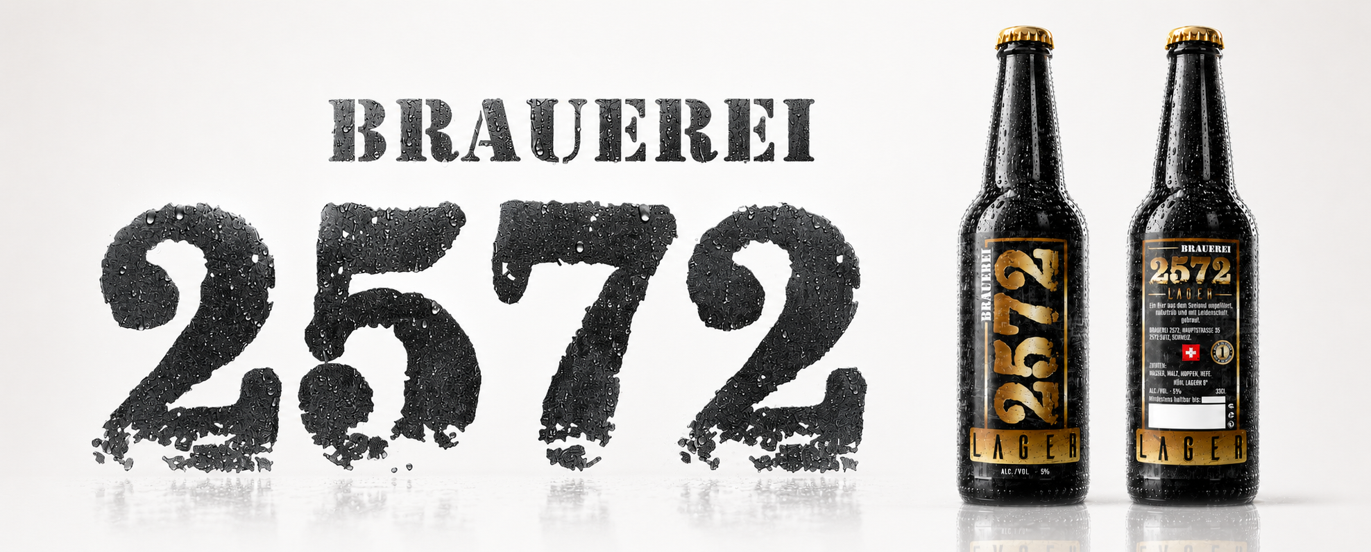
Before New Products Could Be Added.
The Brand First Needed A System Worth Expanding.
SWISS CRAFT
Great Brands Are Built On Values Long Before They Are Built On Products.
Every remarkable brewery is shaped by the people behind it, the traditions they protect, and the standards they refuse to compromise. This editorial composition represents the philosophy behind Swiss Craft Beer, where every decision is guided by precision, patience, and authenticity rather than speed.
Because true craftsmanship cannot be manufactured.
It can only be preserved.
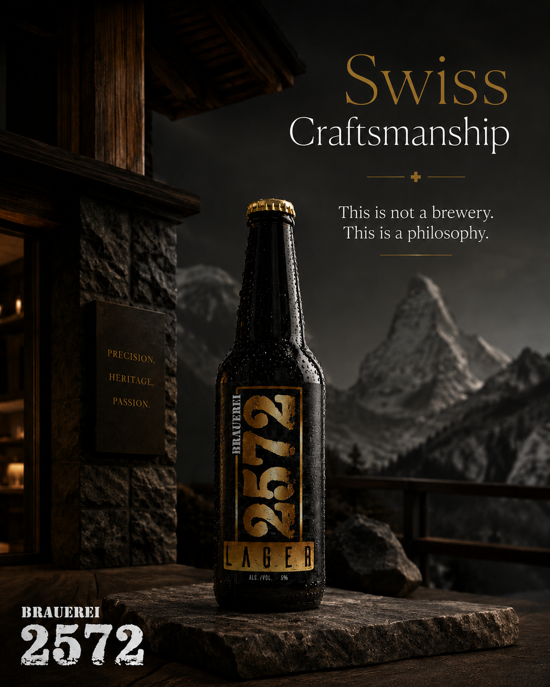
Swiss Craftsmanship
Precision.
Heritage.
Passion.
Timeless standards.
Swiss Precision Creates Character.
CHAPTER CONCLUSION
WHEN A BRAND FINALLY BEGINS TO LIVE
From Strategic Design To Everyday Reality
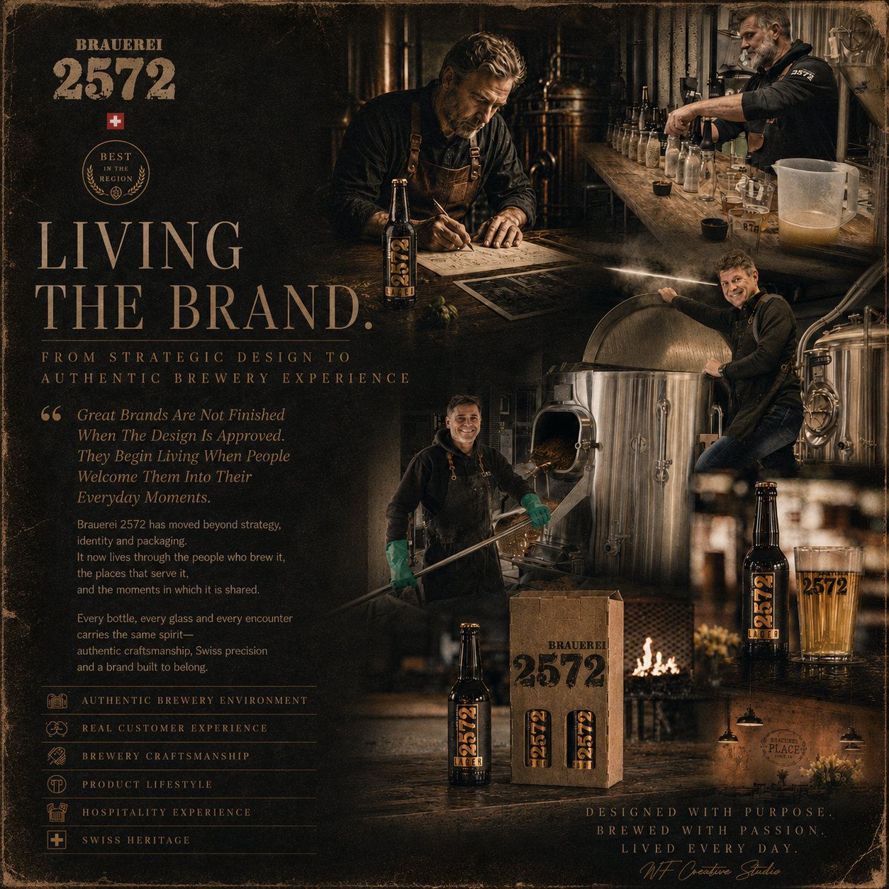
Every successful branding project reaches a defining moment.
The moment when design is no longer evaluated on presentations, mood boards, or approval meetings.
It begins proving its value in the real world.
For Brauerei 2572, that moment arrived when the identity moved beyond the studio and became part of everyday brewery life.
The labels entered production.
The bottles reached restaurant tables.
Customers discovered the collection.
Visitors experienced the brewery.
And the visual identity became inseparable from the craftsmanship that inspired it.
Design alone never creates a successful brand.
It creates the conditions for people to recognize it, remember it, and eventually trust it.
Every bottle carried the same Brand Identity.
Every interaction reinforced the same Packaging Design principles.
Every photograph documented a genuine moment where strategic decisions transformed into authentic customer experiences.
What began as typography, materials, proportions, and production specifications evolved into something far more valuable—
a recognizable brewery that people could immediately identify before reading a single word.
The greatest measure of successful Beer Branding is not how impressive it appears in a presentation.
It is how naturally it becomes part of everyday life.
Inside the brewery.
Inside restaurants.
Inside customers’ hands.
Inside memorable conversations shared around a table.
That is where Brand Strategy becomes reality.
That is where thoughtful design quietly performs its most important work.
Every decision made throughout this project—from the first sketches to the final production files—was guided by one objective:
to create a brewery that people would remember not only for exceptional beer, but for a visual identity capable of expressing the same level of craftsmanship found inside every bottle.
Because when branding is created with purpose, it stops feeling like design.
It simply becomes part of the brewery itself.
THE FIRST COLLECTION WAS NEVER THE FINAL DESTINATION.
IT WAS THE FOUNDATION OF EVERYTHING THAT FOLLOWED.
AND THE STORY WAS ONLY BEGINNING.
Scaling The Brauerei 2572 Brand System
"When A Successful Design Becomes A Scalable Brand SysteM."
COMPANY - BRAUEREI 2572
NEW Brauerei 2572 beer label DESIGN & brand extension / PRODUCT LINE PRODUCTION YEAR - 2026
Client:
BRAUEREI 2572
COUNTRY: Switzerland, Europe
Successful Brand Development doesn’t end with a single product—it creates a scalable Brand System capable of supporting future innovation, portfolio expansion, and long-term business growth.
Every new product should strengthen the existing Brand Identity, preserve visual consistency, and build greater customer recognition while adapting to changing market demands.
Expanding an established product line requires far more than introducing a new design. It demands a strategic balance between Packaging Design, Brand Consistency, Product Differentiation, and commercial performance, ensuring every new release naturally becomes part of a recognizable and cohesive brand experience.
Brand System Extension:
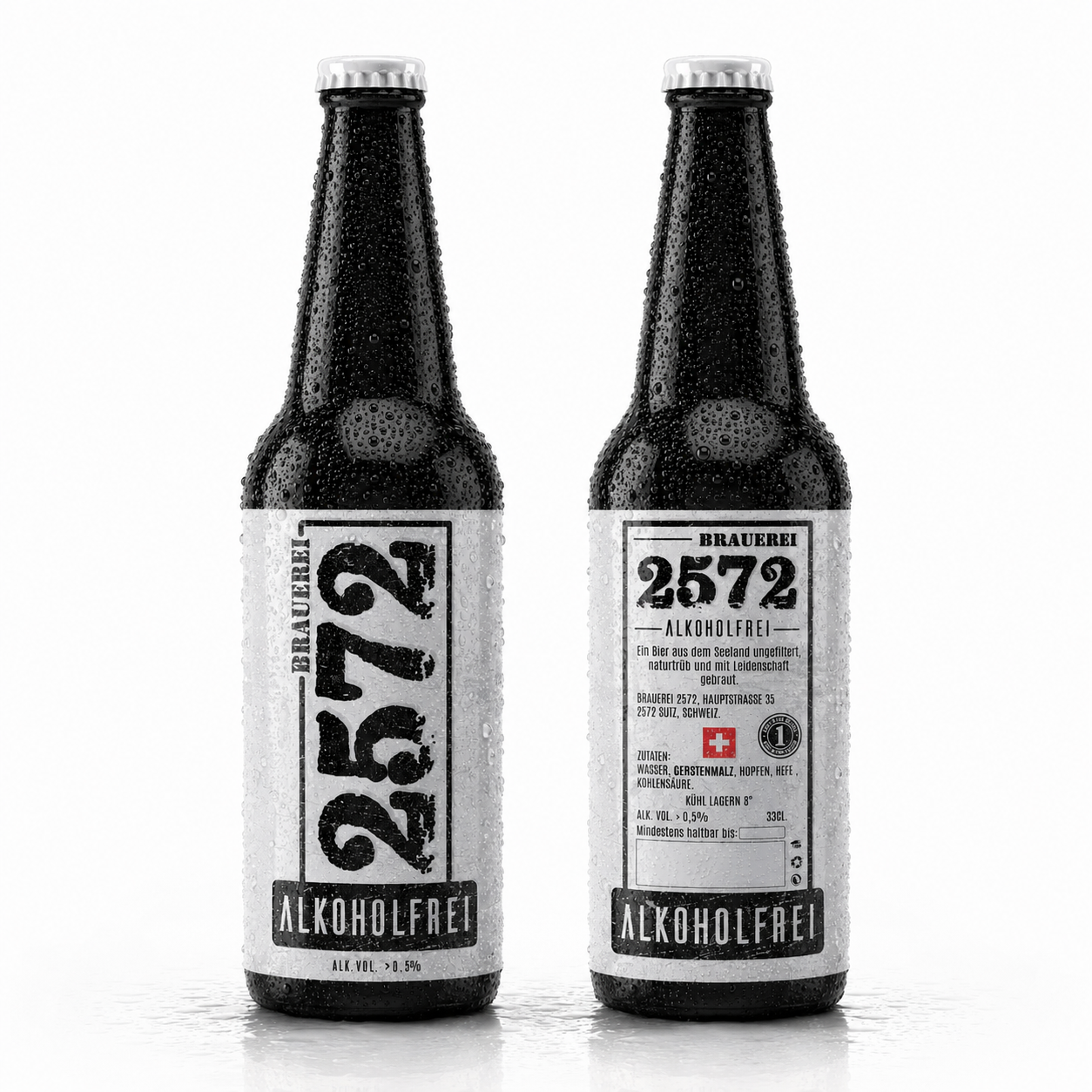
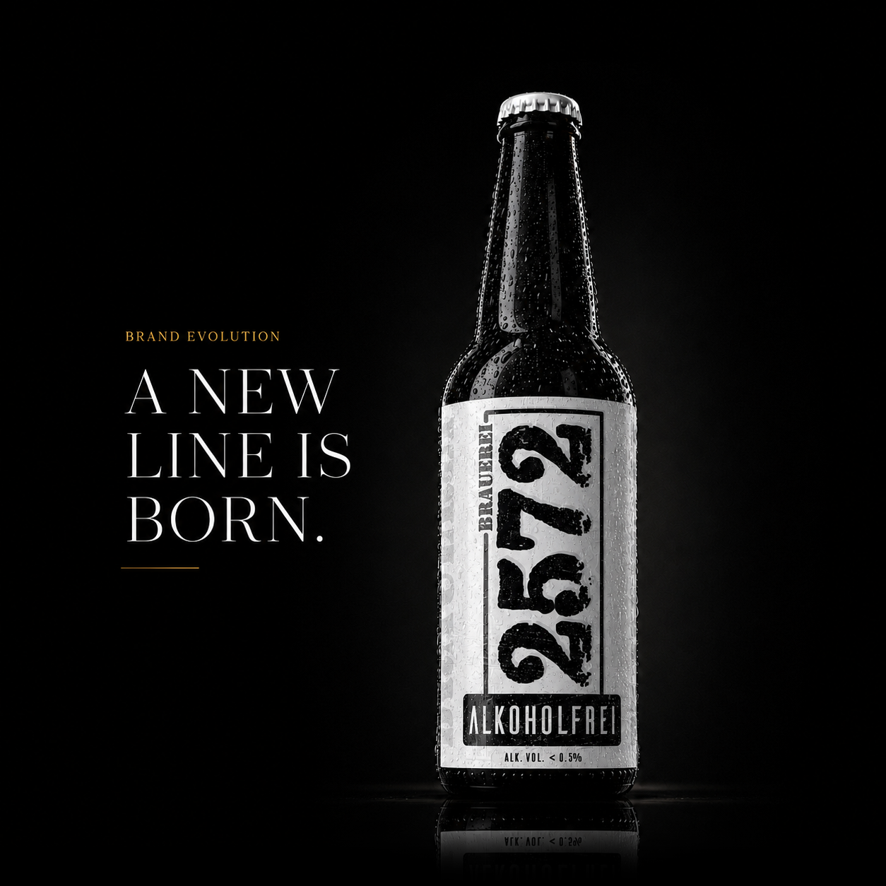
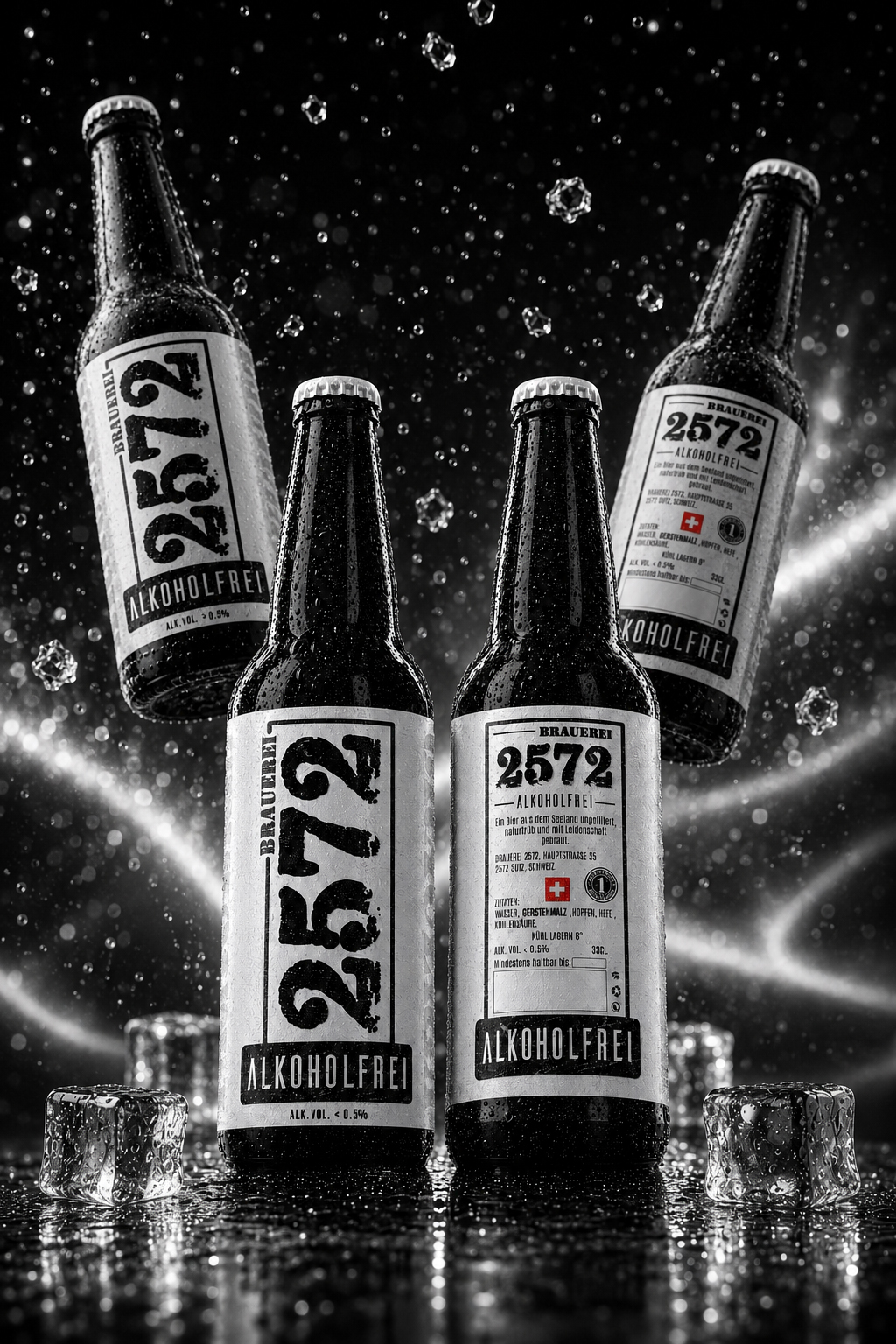
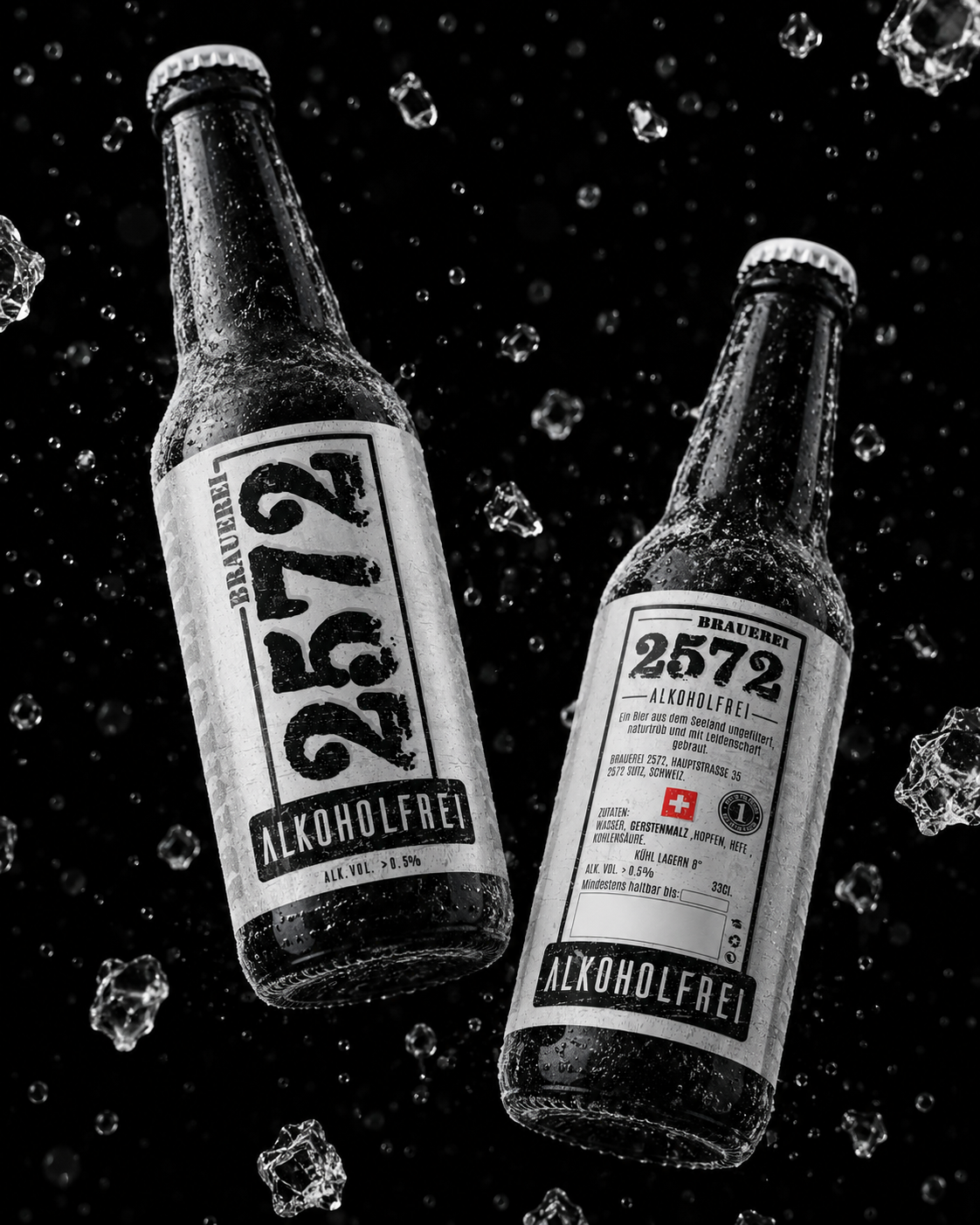
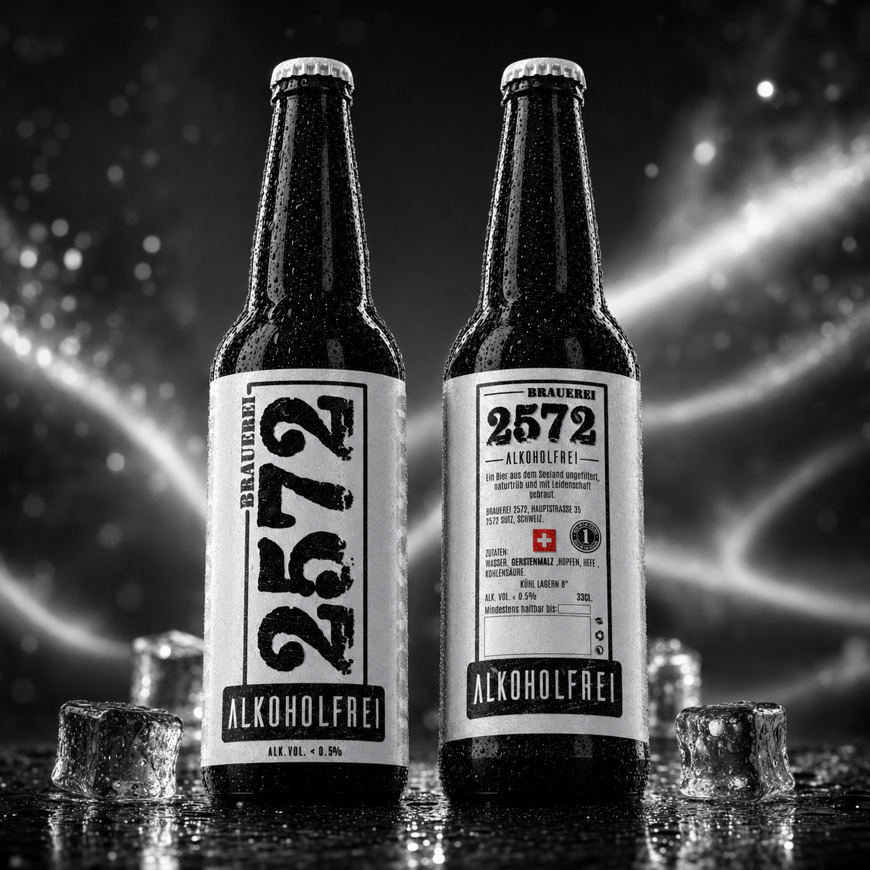
The new Alcohol-Free Label was developed as a natural extension of the existing Brand Identity, preserving the recognizable visual language while introducing a new product category. This approach strengthens Brand Consistency, simplifies future portfolio expansion, and reinforces customer trust across every touchpoint.
Instant Product Recognition:
A refined Information Hierarchy, bold typography, and the prominent ALKOHOLFREI designation allow customers to immediately recognize the product while maintaining a premium and authentic Craft Beer appearance. Faster recognition creates a smoother buying experience and improves shelf performance.
Ready For Future Growth:
The redesigned Packaging System was created with long-term flexibility in mind, allowing new beer varieties, seasonal editions, and limited releases to be introduced while preserving a unified Brand Identity.
“Every new product strengthens the brand instead of competing with it.”
From Strategic Vision To A New Brewing Standard
Building A Competitive Alcohol-Free Product Line Through Precision, Market Insight, And Consistent Brand Identity
A New Product Was Not Simply Added. A New Strategic Opportunity Was Carefully Designed.
The creation of Brauerei 2572 Alkoholfrei began with a clear strategic objective: to expand the brewery’s portfolio while preserving the Brand Identity, craftsmanship, and premium character already associated with the brewery. Every decision was guided by the ambition to develop a Premium Alcohol-Free Beer Packaging Design that feels distinctive, contemporary, and unmistakably connected to the existing Brauerei 2572 Brand System.
The development process combined detailed Market Analysis, consumer expectations, and long-term Brand Strategy. The growing demand for Premium Alcohol-Free Beer created a significant commercial opportunity, but entering this category required far more than adapting an existing label. The new product needed its own visual personality, stronger Shelf Presence, and a distinctive identity capable of competing confidently within an increasingly sophisticated premium beverage market.
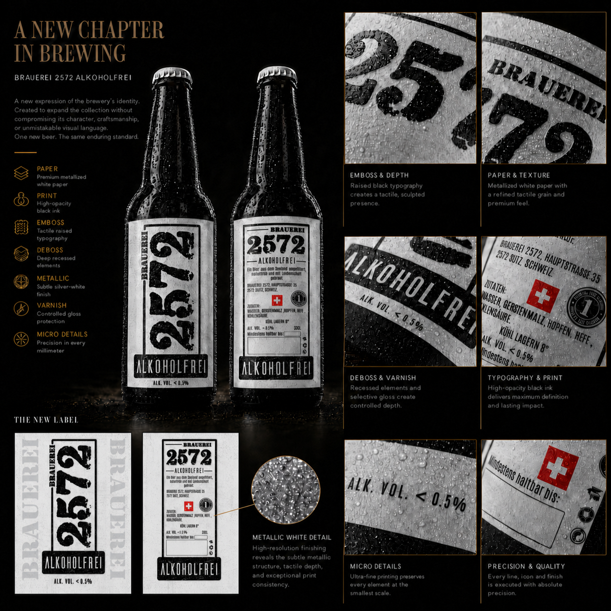
Every component—including Material Selection, Typography, Label Architecture, Print Contrast, visual hierarchy, and premium finishing techniques—was evaluated as part of one integrated Packaging Design System. The metallized white label establishes immediate category differentiation from the darker core beer collection, while the familiar proportions, graphic language, and structural consistency preserve instant Brand Recognition across the complete portfolio.
Premium production techniques—including Embossing, Debossing, Selective Varnish, High-Opacity Printing, refined paper texture, and carefully controlled metallic reflections—transform a predominantly monochrome composition into a tactile luxury experience. Every production decision was made to strengthen Print Quality, visual depth, product legibility, and perceived value, ensuring outstanding performance both on the retail shelf and in premium product photography.
The final result represents far more than a new alcohol-free beer. It is a strategically positioned extension of the Brauerei 2572 Brand, developed through thoughtful design decisions, consistent visual strategy, and a deep understanding of how Brand Consistency and product differentiation must work together. Brauerei 2572 Alkoholfrei broadens the brewery’s product portfolio while strengthening its competitive position, expanding market relevance, and preparing the brand for future growth.
Final Strategy For The New Product Line
The final strategy positioned Brauerei 2572 Alkoholfrei as a distinctive product within one unified Brand Identity System. Its metallized white label creates immediate category recognition, while the established typography, structural proportions, production quality, and visual language maintain a seamless connection with the complete Brauerei 2572 Beer Collection.
Rather than following the familiar visual conventions commonly found within the alcohol-free category, the new product was designed to express the brewery’s own identity with greater confidence and authenticity. Every element—from Premium Material Selection to refined finishing techniques—supports a premium market position while reinforcing the idea that choosing an alcohol-free beer never requires compromising on craftsmanship, quality, or experience.
This carefully balanced strategy allows the new product line to establish its own identity while simultaneously strengthening the entire Brand Architecture. It creates a scalable foundation for future product expansion, broader consumer relevance, stronger Retail Recognition, and long-term positioning within both traditional and emerging premium beer markets.
ONE NEW PRODUCT LINE. ONE UNMISTAKABLE BRAND IDENTITY.
CHAPTER 02
THE EVOLUTION OF THE BRAND
Expanding The Identity Through A New Generation Of Craft Beer Introducing BRAUEREI 2572 ALKOHOLFREI
One Brand. One New Opportunity. One Consistent Identity.
Expanding the BRAUEREI 2572 Product Line
"When A Successful Design Becomes A Scalable Brand System."
Following the success of the original Brauerei 2572 Packaging Design project, the brewery entrusted us with a new challenge—developing the Visual Identity for its upcoming Alcohol-Free Beer while preserving complete consistency across the existing Craft Beer Portfolio.
The objective was not to create a completely new design language, but to strategically extend the established Brand Identity System into a new product category.
The new label needed to be instantly recognizable as part of the Brauerei 2572 family while clearly communicating its Alcohol-Free positioning and maintaining the premium perception customers already associated with the brand.
Achieving this required the perfect balance between Brand Consistency, Shelf Visibility, Product Differentiation, and long-term scalability.
Design Strategy:
To preserve a unified Packaging Design System, we retained the signature visual elements that define the Brauerei 2572 Brand Identity:
- Bold Handcrafted Typography
- Industrial-Inspired Vintage Design
- Minimalist Black & White Visual Language
- Strong Brand Hierarchy
- Authentic Swiss Craft Beer Character
At the same time, the new label was carefully refined to emphasize its Alcohol-Free positioning through a dedicated ALKOHOLFREI designation, optimized Information Hierarchy, and enhanced visual clarity.
Every design decision was strategically developed to improve Product Recognition, simplify customer navigation, strengthen Shelf Impact, and deliver a seamless Brand Experience across the complete product portfolio.
Built For Recognition. Designed For Future Growth.
The final result successfully expands the Brauerei 2572 Product Portfolio with a product that feels both familiar and distinctive.
The new Alcohol-Free Beer integrates naturally into the existing product range while achieving stronger Shelf Visibility, improved Brand Recognition, and immediate product identification for consumers.
By treating the new release as an extension of the existing Brand System rather than an isolated design project, Brauerei 2572 now benefits from a scalable Packaging Design Strategy that supports future product launches, portfolio expansion, and sustainable Brand Growth.
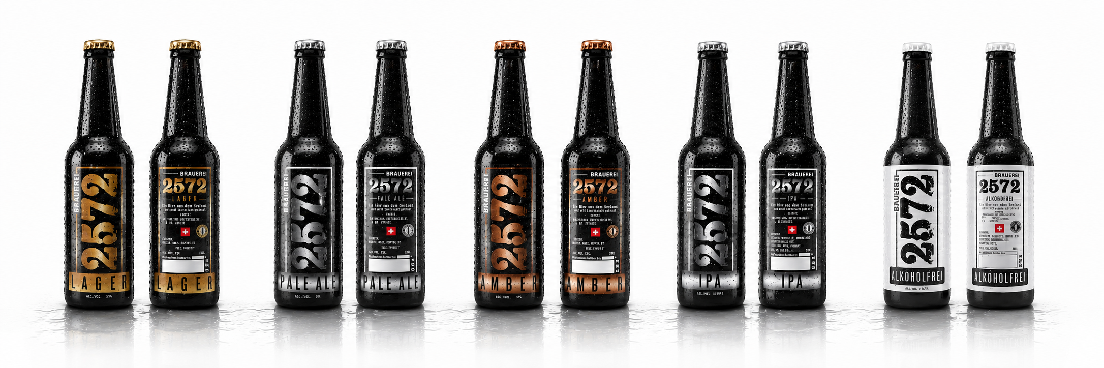
Designing Growth Without Losing Identity
Every Successful Brand Eventually Faces The Same Challenge—How To Grow Without Sacrificing Recognition.
THE STRONGEST BRAND SYSTEMS ARE DESIGNED TO EVOLVE—NOT TO START OVER.
Real Brand Strategy Is Proven When A New Product Feels Instantly Familiar While Offering Something Completely New.
Every growing brewery eventually reaches a point where expanding the product range becomes a strategic necessity rather than a creative exercise.
The challenge is rarely creating another label.
The real challenge is ensuring that every future product strengthens the same Brand Identity instead of fragmenting it.
For Brauerei 2572, the introduction of Alkoholfrei was never approached as an isolated Packaging Design project.
It became an opportunity to demonstrate that the existing Brand System was strong enough to support future growth while preserving the visual consistency customers had already learned to recognize and trust.
Rather than replacing established design principles, every new decision was intentionally developed to extend them.
Typography.
Material hierarchy.
Visual proportions.
Print production.
Shelf recognition.
Every element remained connected to one coherent identity while introducing a product category with its own personality and market position.
This approach transformed a single successful Beer Label Design into a scalable Brand Architecture capable of supporting future portfolio expansion without sacrificing authenticity, recognition, or long-term consistency.
Because remarkable branding is not measured by how beautiful one product appears.
It is measured by how naturally every future product belongs to the same story.
Consistency Creates Recognition. Evolution Creates Longevity.
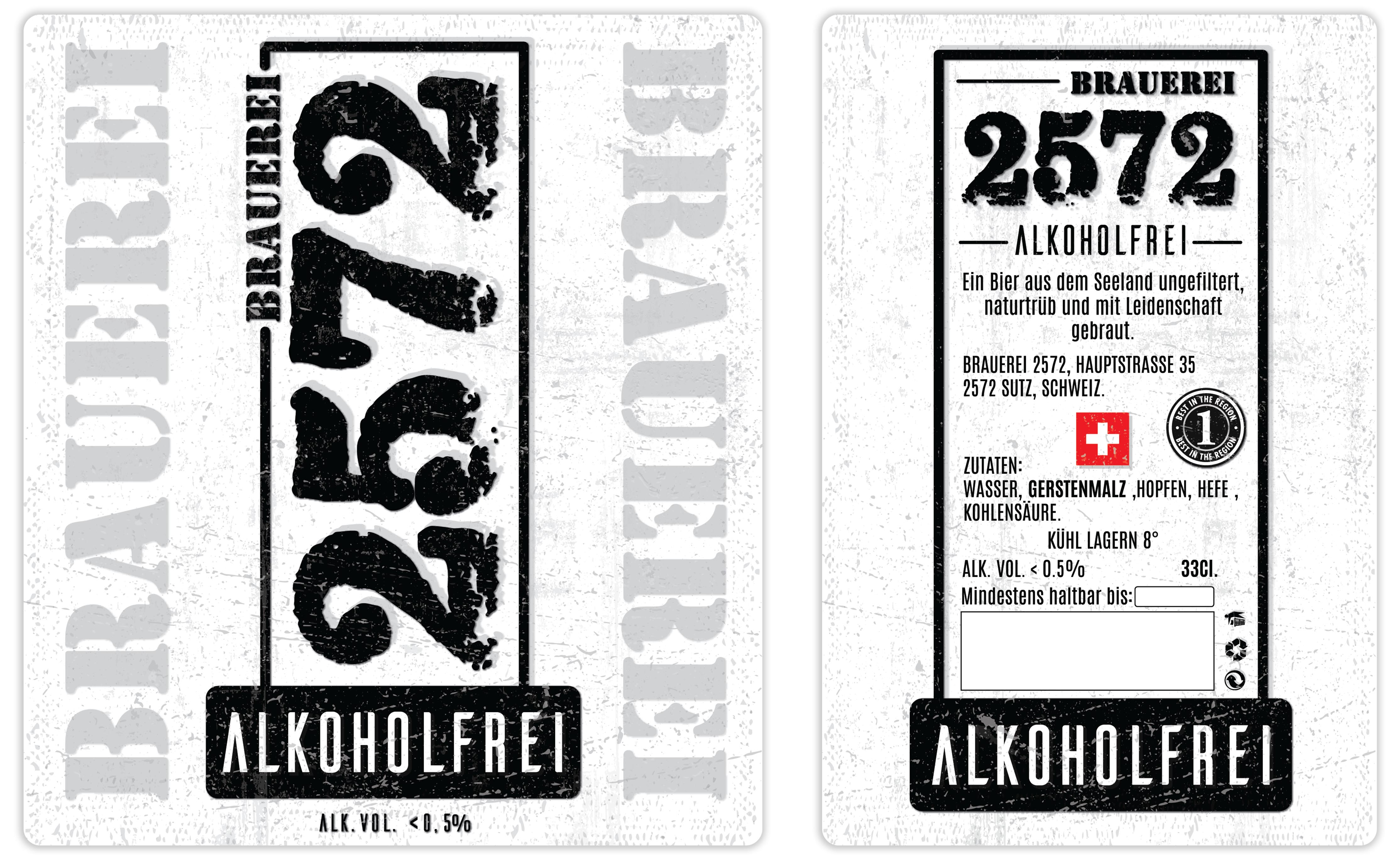
The Alkoholfrei label demonstrates that meaningful Brand Strategy extends far beyond individual products.
Every proportion, every material, and every production decision continues the same visual language established by the original collection while introducing a new market opportunity with complete confidence.
When a Brand Identity is designed as a flexible system instead of a fixed graphic solution, innovation no longer threatens consistency.
It strengthens it.
The strongest brands never redesign themselves for every new launch.
They evolve through one recognizable visual language that customers continue to trust—product after product, generation after generation.
ONE BRAND.
BUILT TO EVOLVE.
DESIGNED TO GROW FOR GENERATIONS.
THE EVOLUTION OF THE BRAND
Expanding One Identity Into A New Generation Of Craft Beer
ONE BRAND. ONE NEW CATEGORY. ONE CONSISTENT FUTURE.
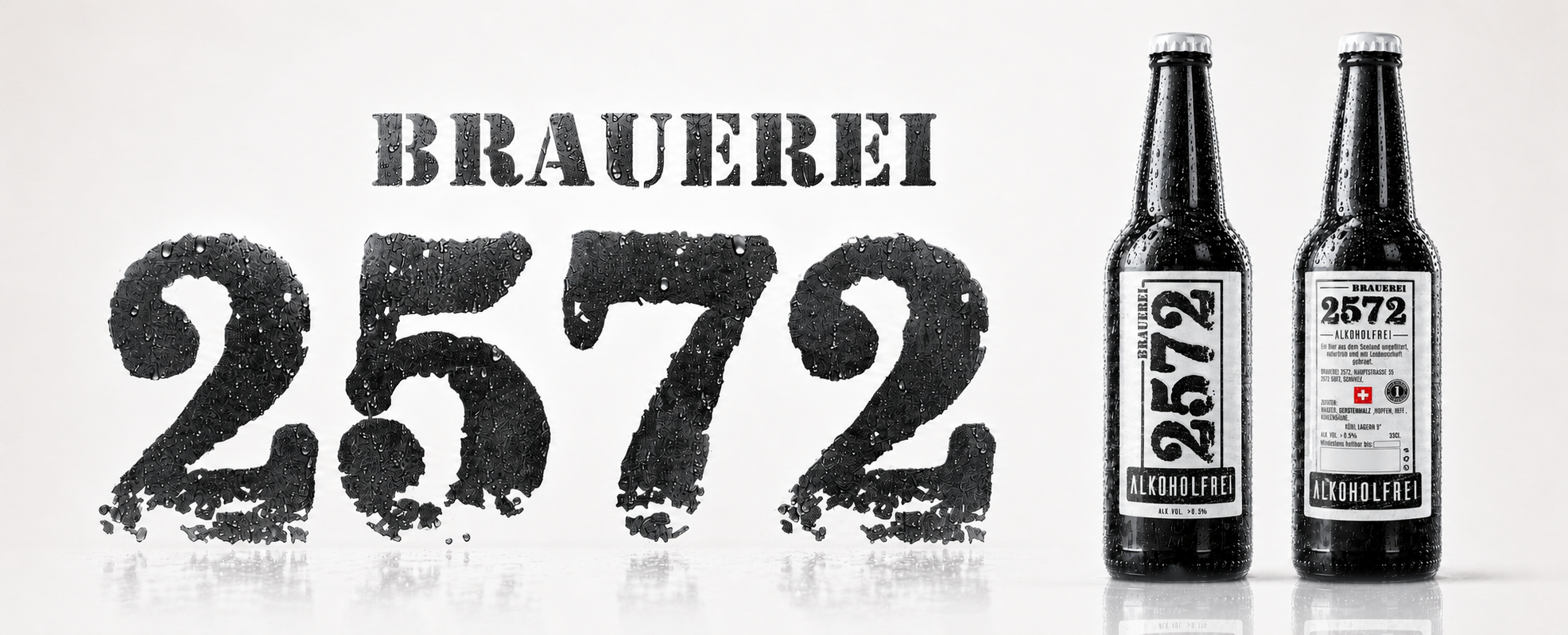
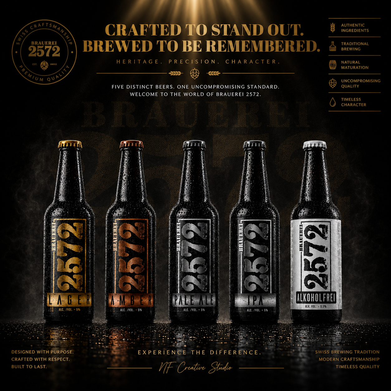
FROM A SINGLE PRODUCT LINE TO A SCALABLE BRAND SYSTEM
TRUE BRAND STRATEGY IS PROVEN WHEN NEW PRODUCTS STRENGTHEN THE SAME IDENTITY INSTEAD OF REPLACING IT.
The strongest Brand Systems are designed to evolve—not to be redesigned every time the business grows.
Following the successful launch of the original Brauerei 2572 collection, the next challenge was not simply creating another beer.
The challenge was protecting everything customers had already learned to recognize.
Introducing Alkoholfrei required expanding the existing Brand Identity into a completely new product category while preserving the visual consistency, craftsmanship, and premium character that defined the original collection.
Every design decision—from typography and information hierarchy to material selection and print production—was developed as an extension of one unified Packaging Design System rather than an independent creative direction.
Instead of creating something different,
the objective was to create something unmistakably familiar.
Because lasting Brand Recognition is achieved when customers instantly recognize the family before identifying the individual product.
A Strong Brand Does Not Grow By Creating New Identities.
It Grows By Expanding One Identity With Complete Consistency.
ONE IDENTITY. UNLIMITED POSSIBILITIES.
HERITAGE. CONSISTENCY. EVOLUTION.
The introduction of Brauerei 2572 Alkoholfrei demonstrates that thoughtful Brand Strategy creates more than successful products.
It creates a visual system capable of supporting future innovation without sacrificing recognition.
BUILT TO EXPAND.
IDESIGNED TO ENDURE.
RECOGNIZED THROUGH EVERY NEW GENERATION.
Building A Brand Ready For Tomorrow
The original Brauerei 2572 collection was never designed as a finished destination.
From the very beginning, every visual decision established the foundation for future expansion.
Introducing Alkoholfrei proves the value of designing Brand Systems instead of individual products.
Rather than redesigning the identity, the new release extends it.
Every proportion, material, hierarchy, and production detail continues the same visual language while introducing a completely new product category.
This approach allows future beers to enter the portfolio without weakening recognition, simplifying production consistency while strengthening long-term Brand Architecture.
Because the strongest identities are not measured by how many products they launch.
They are measured by how naturally every future product belongs to the same story.
Before A Brand Can Grow....
Its Identity Must Be Strong Enough To Grow With It.
Every Great Beer Label Begins With A Great Exploration.
Exploring Multiple Creative Directions Before Defining The Final Identity
Premium Beer Label Design is never created by accident. Every successful identity begins with exploration, experimentation, and strategic refinement before reaching the final solution.
From Creative Exploration To Recognizable Beer Packaging
Developing a successful Beer Packaging Design requires far more than creating an attractive label. Before the final direction was selected for Brauerei 2572, multiple creative concepts explored different approaches to typography, composition, color systems, industrial aesthetics, and visual storytelling. Every proposal represented a unique interpretation of the brewery’s character while testing how effectively the identity could communicate authenticity, craftsmanship, and premium quality.
Each concept was evaluated not only for its visual appeal but also for its ability to strengthen Shelf Presence, improve product recognition, and support future product line expansion. This strategic exploration ensured that every design decision contributed to a scalable Packaging Strategy capable of growing alongside the brewery.
Rather than selecting the first attractive concept, Infinity Design Studio refined the strongest ideas until a unified Beer Label Design system emerged—one capable of representing multiple beer styles while maintaining a consistent Brand Identity and recognizable Visual Identity across the entire collection.
Creative Label Concepts
Strategic Design Exploration
Every concept explored a unique direction in Premium Beer Label Design, helping define the strongest Visual Identity through research, experimentation, and creative refinement before selecting the final solution.
Beer Styles Unified
One Cohesive Packaging System
Lager, Amber, Pale Ale, IPA, and Alkoholfrei were designed as one scalable Beer Packaging Design system, ensuring consistent Craft Beer Branding, clear product differentiation, and stronger Shelf Presence.
Scalable Label System
Future-Ready Packaging Strategy
A unified Beer Label Design framework created to support future product expansion while maintaining a recognizable Brand Identity, premium consistency, and long-term Packaging Strategy portfolio.
Custom Beer Packaging
Built For Recognition & Growth
Every label was custom-designed for Brauerei 2572, combining strategic Packaging Design, premium aesthetics, and production-ready precision to create a lasting and memorable Visual Identity.
Every concept represented another strategic step toward creating a timeless Beer Packaging Design, ensuring the final identity was selected through exploration, refinement, and long-term brand thinking—not coincidence.
Key Highlights
Strategic Creative Exploration:
Every concept explored a different approach to Premium Beer Label Design, ensuring the final direction was selected through research, refinement, and strategic evaluation rather than personal preference.
Scalable Packaging System:
The exploration process focused on creating a flexible Beer Packaging Design system capable of supporting multiple beer styles while maintaining a consistent Brand Identity.
Distinctive Product Differentiation:
Typography, color coding, and layout variations were carefully tested to maximize Shelf Presence and enable immediate recognition across the complete product range.
Premium Craft Beer Branding:
Each creative direction was developed to communicate authenticity, craftsmanship, and premium quality, reinforcing the positioning of Brauerei 2572 as a modern Craft Brewery with a strong visual character.
Production-Oriented Design Decisions:
Every concept considered both aesthetics and real-world application, ensuring the final Packaging Design performs equally well in digital presentations, commercial printing, and on physical bottles.
Future-Ready Brand Identity:
The selected concept established a scalable Visual Identity and long-term Packaging Strategy, allowing future product extensions while preserving complete brand consistency.
"The Strongest Beer Brands Are Built Through Exploration, Not Assumption."
OUR APPROACH
“We Don’t Design Labels In Isolation. We Build Packaging Systems Where Heritage, Product Character, Shelf Recognition, And Future Growth Work As One.”
Every decision was developed to express the authentic character of the brewery while creating a clearer, stronger, and more scalable identity across the complete beer collection.
Our approach combined Brand Strategy, Craft Beer Branding, Packaging Architecture, Premium Beer Label Design, Product Differentiation, Material Exploration, Print Production, and Editorial Art Direction within one unified creative framework.
Every decision—from the dominant 2572 typography and dedicated color systems to label hierarchy, bottle finishes, production requirements, and collection architecture—was designed to preserve authenticity, strengthen recognition, and give every beer its own character without separating it from the brewery.
For Brauerei 2572®, this meant translating Swiss brewing heritage into a complete living brand: one capable of moving confidently from individual bottles and product collections to retail, hospitality, merchandise, brewery experience, and future portfolio expansion.
Infinity Design Studio x NF Creative Studio
Tradition Gives The Brewery Its Character. Strategy Gives The Brand Its Direction. A Unified Packaging System Ensures Every New Product Strengthens The Legacy Behind It.
HERITAGE · CRAFT · RECOGNITION · BRAND LEGACY
Every Exceptional Beer Begins Long Before The First Bottle Reaches The Shelf.
Where Brewing Tradition Meets Strategic Brand Design
From Authentic Brewing To A Recognizable Premium Brand Identity
The strongest Craft Beer Brands are built through patience, craftsmanship, and consistency long before customers experience the final product. Every stage of the brewing process reflects the same commitment to quality that later defines the Beer Packaging Design, strengthens Brand Identity, and shapes lasting customer perception.
For Brauerei 2572, our objective extended beyond creating premium beer labels. We developed a complete visual system inspired by the brewery’s authentic production process—transforming traditional brewing values into a recognizable Packaging Strategy that communicates heritage, craftsmanship, and premium quality across every customer touchpoint.
"Exceptional Brewing Creates Great Beer. Exceptional Branding Makes It Unforgettable."
Exceptional Design Doesn't End On The Screen. It Begins Again In Production.
From Print Production To Market Presence
Transforming Premium Beer Label Design Into Production-Ready Packaging
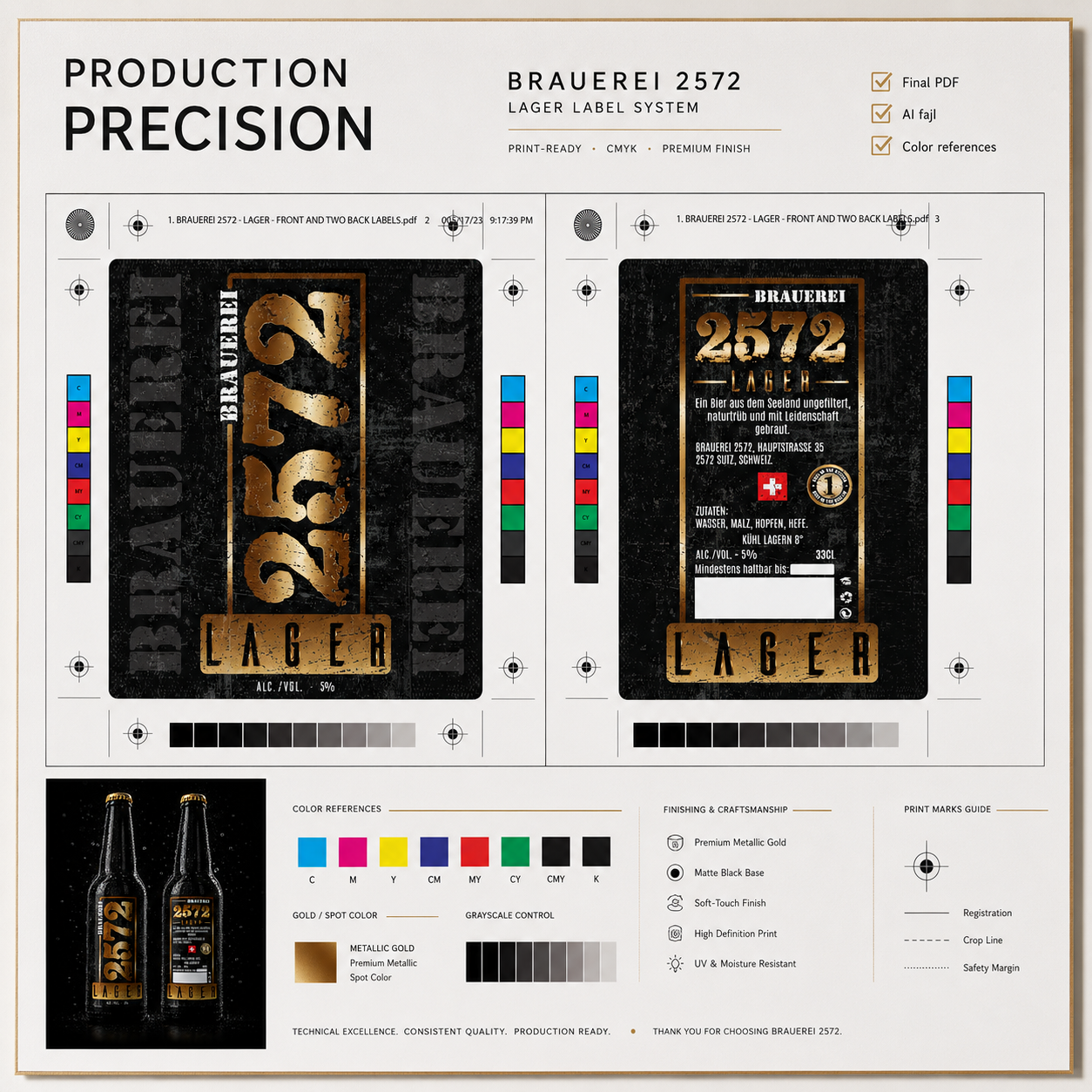
Designing Beer Packaging Ready For Production, Retail, and Real-World Recognition. Professional Print Preparation That Ensures Consistency, Quality, And Scalable Beer Packaging Production.
Creating a successful Beer Packaging Design extends beyond aesthetics. Every label developed for Brauerei 2572 was technically prepared for professional production, ensuring exceptional print quality, precise color reproduction, and seamless application across different bottle formats.
Each artwork was optimized according to commercial printing standards, allowing the Beer Label Design to remain visually consistent on both standard and premium matte black bottles. The system also included carefully structured back labels, production specifications, legally required product information, and dedicated bottling date fields—ensuring both regulatory compliance and manufacturing efficiency.
As the brewery expanded its product range, the same production framework made it possible to introduce the new Alkoholfrei edition without redesigning the entire visual system. This demonstrates how thoughtful Packaging Strategy supports long-term flexibility while preserving a strong and recognizable Craft Beer Branding experience.
The result is a technically refined Packaging Design system that performs just as successfully during production as it does on the shelf—combining precision, scalability, and premium presentation in every detail.
Production Ready. Commercially Proven.
Professional Print Preparation
Every Beer Packaging Design was professionally prepared for commercial production, ensuring flawless print quality, accurate color reproduction, production consistency, and reliable execution across every bottle and future product release.
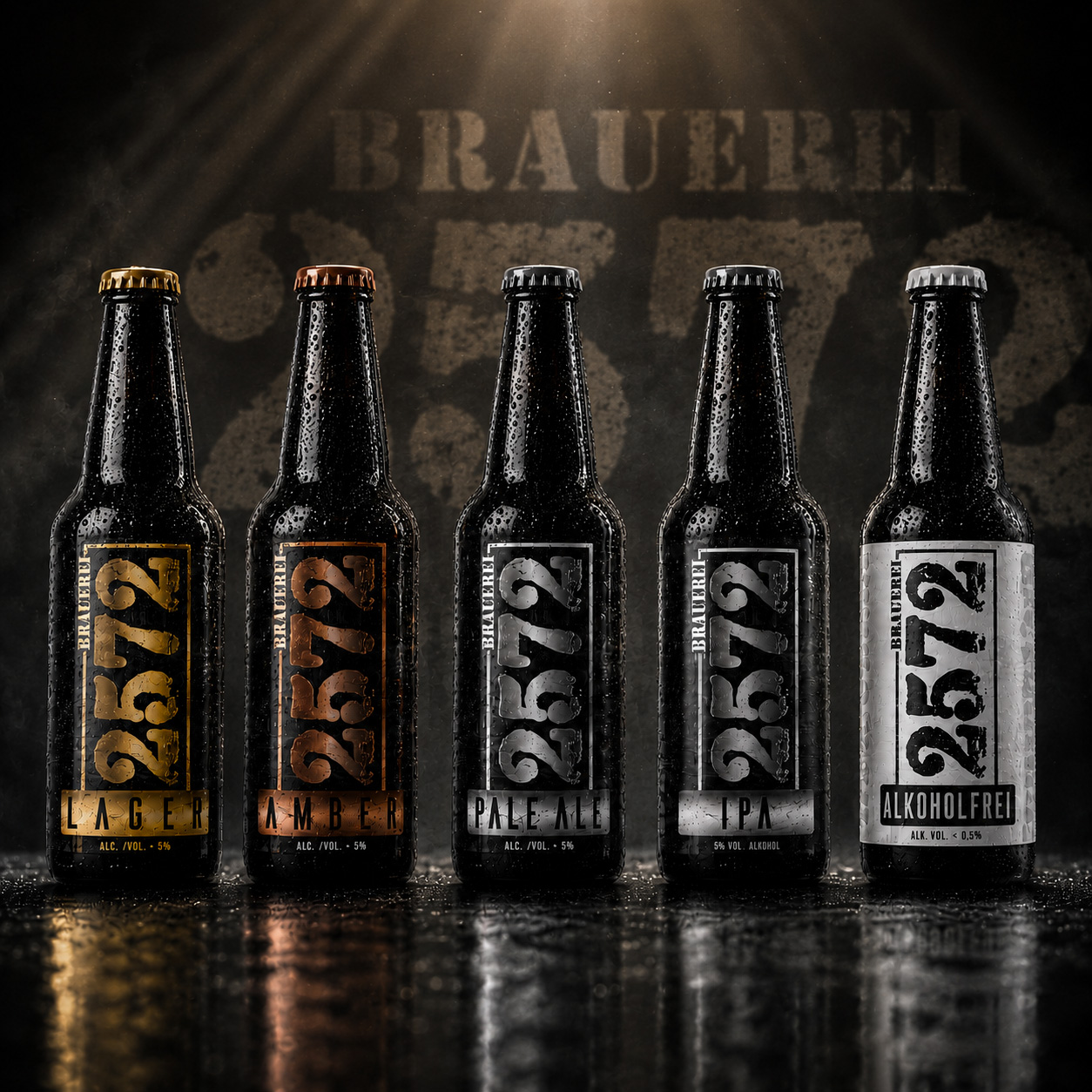
Beer Styles. One Unified Identity.
Complete Product Line System
A strategically developed Beer Packaging Design system created for Lager, Amber, Pale Ale, IPA, and Alkoholfrei, ensuring every product remains instantly recognizable while preserving one consistent Craft Beer Branding experience across the entire collection.
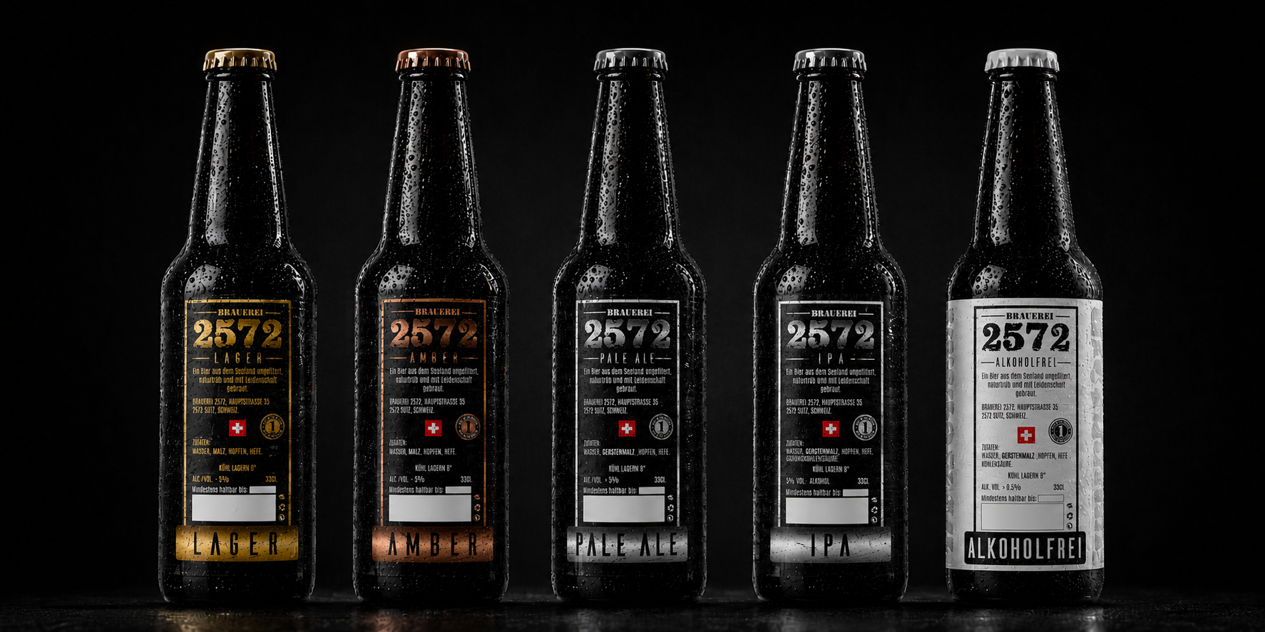
One Front. One Back. Perfect Balance.
Complete Label Architecture
Every Beer Label Design was developed as a fully integrated front and back label system, combining strong visual impact with clear product information, regulatory compliance, and a seamless Packaging Design built for commercial production.
Future Ready. Designed To Grow With The Brewery.
Scalable Packaging Strategy
Built with long-term flexibility in mind, the label system allows new beer varieties, limited editions, and future product expansions to be introduced effortlessly while maintaining complete Visual Identity, Premium Branding, and consistent Shelf Presence across the entire portfolio.
Premium Packaging Is Designed Twice—First For People, Then For Production.
Key Highlights
✔ Commercial Print Production Files
Prepared according to professional printing standards for accurate and consistent manufacturing.
✔ Front & Back Label System
A complete Beer Packaging Design solution balancing visual impact, product information, and regulatory requirements.
✔ Multi-Bottle Compatibility
Optimized for multiple bottle formats, including premium matte black bottles and future packaging applications.
✔ Integrated Production Details
Dedicated areas for bottling dates and production information without compromising the overall design.
✔ Scalable Packaging Architecture
A flexible Packaging Strategy allowing effortless introduction of new beer styles while preserving complete Brand Identity.
✔ Long-Term Brand Consistency
Every technical decision supports a recognizable Craft Beer Branding system built for sustainable growth and premium market positioning.
"Exceptional Beer Deserves More Than Great Design—It Deserves Packaging Engineered For Production, Built For Recognition, And Designed To Grow With The Brand."
Unified Beer Styles
One Complete Product Family
Every beer variety—from Lager, Amber, Pale Ale, IPA, to Alkoholfrei—was developed as part of a unified Beer Packaging Design system, ensuring immediate recognition, visual consistency, and a stronger Craft Beer Branding presence across the entire product line.
Unlimited Future Extensions
Designed To Grow Without Limits
The flexible Packaging Strategy allows new beer styles, seasonal editions, limited releases, and future collections to be introduced while preserving one recognizable Brand Identity and consistent Premium Branding.
Scalable Identity System
Built For Long-Term Expansion
A single Visual Identity system was carefully designed to support future brewery growth, making every new product feel like a natural extension of the original Premium Beer Label Design rather than a separate creation.
Premium Brand Consistency
One Brewery. One Recognizable Identity.
Every label, color variation, bottle application, and future product follows the same strategic Beer Label Design principles—creating a premium customer experience across every touchpoint.
The Best Packaging Systems Are Designed For Tomorrow, Not Only Today.
A Strong Packaging System Doesn't End With One Product. It Grows With The Brand.
Expanding The Brauerei 2572 Product Line
From Original Beer Labels To A Scalable Brewery Packaging System
One of the greatest strengths of an effective Beer Packaging Design is its ability to evolve without sacrificing recognition. Rather than creating isolated labels for individual products, the Brauerei 2572 identity was developed as a flexible system capable of supporting future growth while preserving visual consistency.
When the brewery introduced its Alkoholfrei edition, the existing design framework allowed the new product to integrate naturally into the collection. Typography, layout, hierarchy, textures, and structural elements remained consistent, while carefully selected color accents established clear product differentiation without weakening the overall Brand Identity.
This systematic approach transforms individual labels into a scalable Packaging Strategy, enabling new beer varieties to be introduced efficiently while maintaining strong Shelf Presence, recognizable Visual Identity, and cohesive Craft Beer Branding across every product.
The result is a packaging system prepared not only for today’s portfolio but also for the brewery’s future expansion.
One System. Endless Possibilities.
A scalable Beer Packaging Design system created to support every current product while providing a solid foundation for future beer styles, seasonal releases, and premium brand extensions.
“Great Packaging Doesn’t End With One Product. It Creates A System Ready For Everything That Comes Next.”
METRICS
Unique Beer Styles Unified
One Cohesive Packaging System
Five distinctive beer varieties were developed within one scalable Beer Packaging Design system, ensuring clarity, consistency, and effortless recognition across the complete product portfolio.
Label System Consistency
Designed To Stay Recognizable
Every label follows the same Visual Identity, typography, layout structure, color logic, and production standards, preserving complete brand consistency across every product.
Scalable Packaging Strategy
Ready For Future Growth
A single strategic Packaging Strategy supports product expansion, limited editions, seasonal releases, and future brewery developments without compromising the strength of the existing Craft Beer Branding.
Premium Shelf Presence
Designed To Stand Out Instantly
Bold typography, distinctive color differentiation, and a carefully structured Premium Beer Label Design create stronger visibility, faster product recognition, and a memorable presence wherever the bottles appear.
Every design decision contributed to a unified Beer Packaging system capable of strengthening Brand Identity, improving Shelf Presence, and supporting future product expansion without compromising visual consistency.
"Consistency Creates Recognition. Recognition Builds Great Beer Brands."
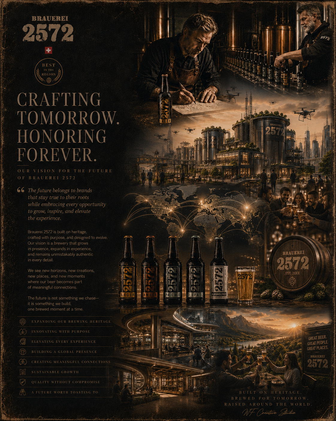
FINAL CHAPTER CONCLUSION - 02
FROM HERITAGE TO THE FUTURE
When A Strong Brand Evolves Without Losing Its Identity.
Every remarkable brand eventually faces its greatest challenge.
Not creating its first successful product—
but creating the second, the third, and every product that follows while remaining unmistakably recognizable.
For Brauerei 2572, the introduction of Alkoholfrei was never intended to become a separate story.
It was designed to become the natural continuation of one carefully built Brand Identity.
The objective was not simply to enter a growing market.
It was to prove that a strong Packaging Design System can evolve, expand, and adapt without sacrificing authenticity, craftsmanship, or visual consistency.
Every strategic decision—from material selection and typography to production finishes and category differentiation—was guided by the same principle:
A growing brewery should never feel fragmented.
It should feel increasingly complete.
The original collection established recognition.
The new line expanded opportunity.
Together they demonstrate how thoughtful Beer Branding becomes a scalable business asset rather than a collection of individual products.
Every bottle speaks with its own personality.
Every label belongs to the same story.
Every new release strengthens the entire system instead of competing against it.
That is the difference between creating products—
and building a brand designed to grow for generations.
Throughout this project, every concept, prototype, production file, material specification, presentation system, and visual refinement served one long-term objective:
to create a brewery capable of evolving confidently while preserving everything that made it recognizable from the very beginning.
Because authentic Brand Strategy is never measured by how much changes.
It is measured by how much can grow while still feeling familiar.
That is where consistency becomes trust.
And where trust becomes lasting recognition.
THE FIRST COLLECTION CREATED THE FOUNDATION.
THE SECOND CHAPTER PROVED THE SYSTEM COULD EVOLVE.
THE FUTURE OF THE BRAND HAS ONLY JUST BEGUN.
CHAPTER 03
PRESENTING THE BRAND
Where Every Detail Reinforces The Identity.
From Packaging To Photography, Every Experience Was Designed To Tell The Same Story.
PACKAGING DESIGN SYSTEM
FROM EVERYDAY FUNCTION TO COLLECTOR EXPERIENCE.
Seven Distinct Packaging Solutions. One Consistent Premium Brand Identity.
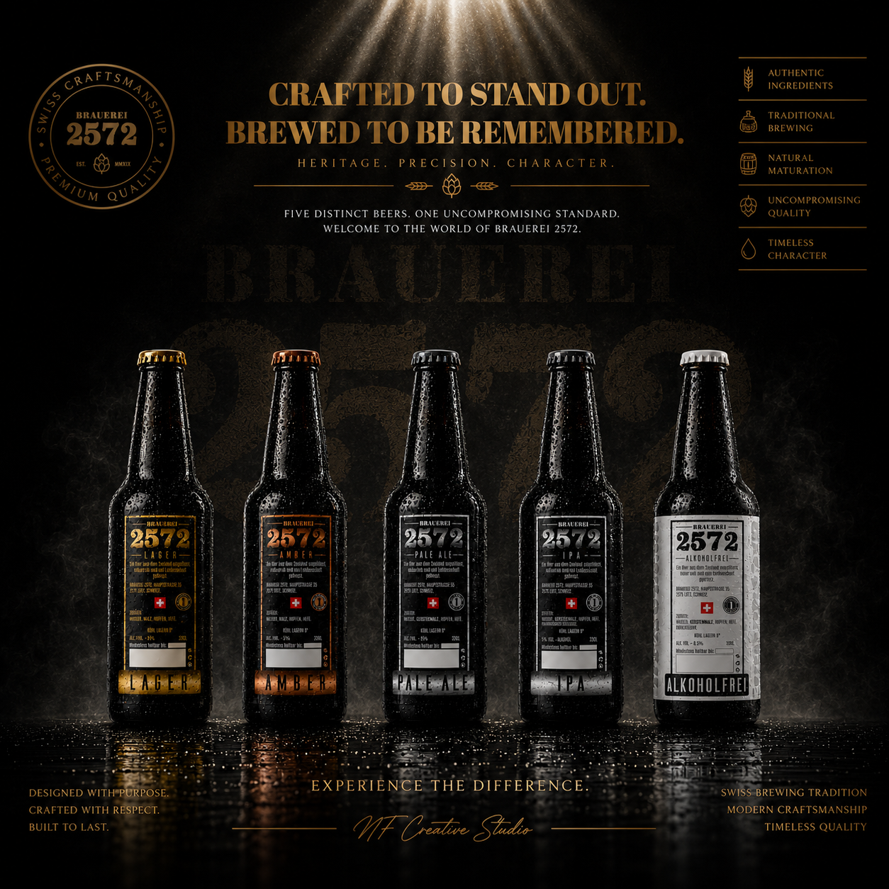
The Brauerei 2572 Packaging Design System was developed to carry the brewery’s identity across every stage of the customer journey—from everyday retail transportation and practical multi-bottle carriers to premium gifting and exclusive collector presentation.
Each packaging format responds to a different commercial purpose while preserving the same recognizable visual language, material integrity, and uncompromising commitment to Swiss Craft Beer Branding.
Different Formats. Different Experiences. One Unmistakable Brewery.
PACKAGING EVOLUTION
FROM FIRST SKETCH TO A COMPLETE BRAND SYSTEM.
Every Premium Package Begins With A Clear Strategic Foundation.
Creating a successful Packaging Design System begins long before the first production file. Every refinement—from typography and hierarchy to material selection and structural balance—was developed to strengthen Brand Recognition, improve Shelf Presence, and create a scalable identity ready for future growth.
Rather than designing a single label, the objective was to build a complete Visual System capable of expanding naturally across every future product and packaging format.
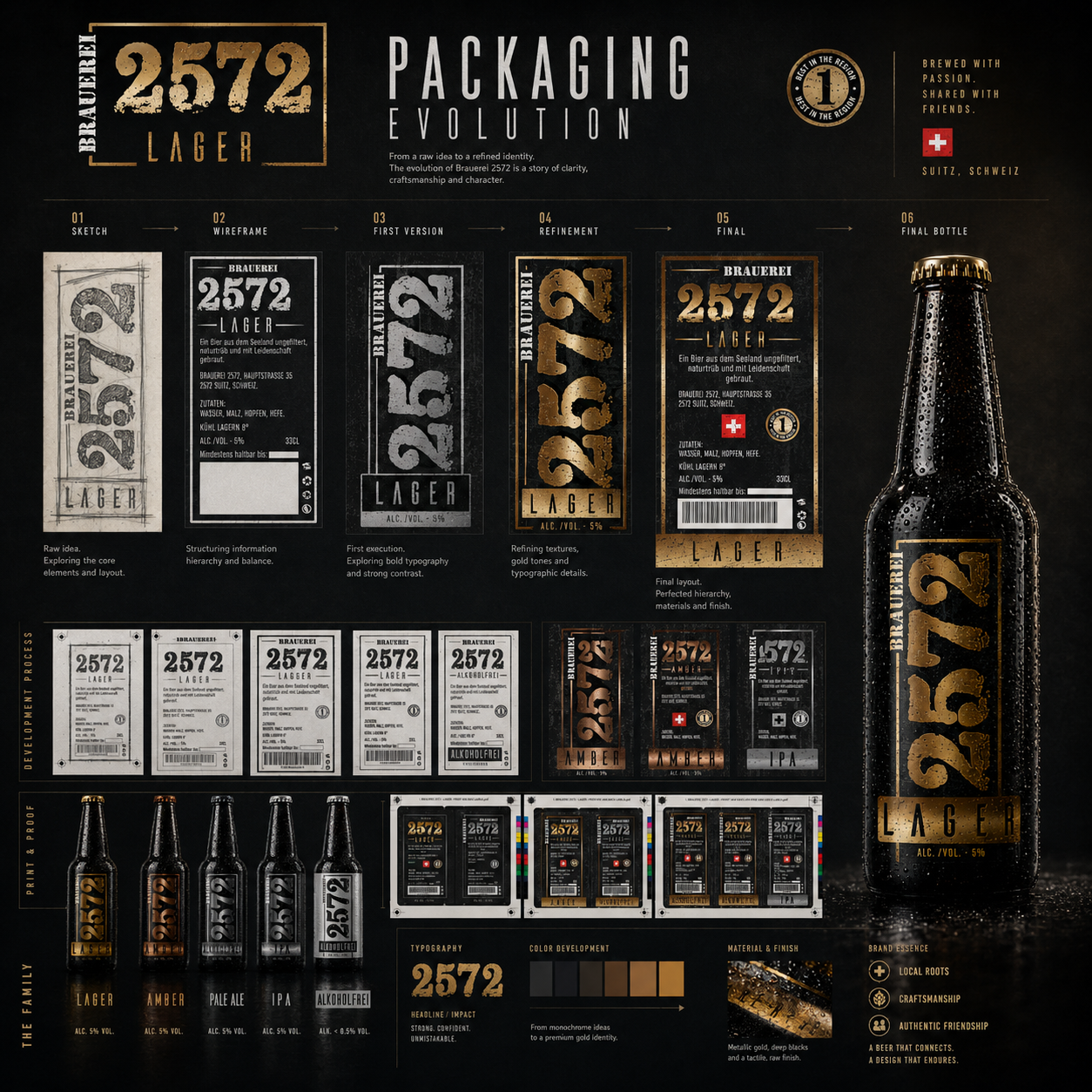
Packaging Evolution
The progression from concept sketches to final production demonstrates how consistent strategic decisions transform an idea into a recognizable premium brewery brand.
Every iteration strengthened clarity.
Every refinement improved communication.
Every decision reinforced one identity.
Great Packaging Is Never Designed In A Single Step. It Is Carefully Refined Until Every Detail Has A Purpose.
PACKAGING STRUCTURE
ONE STRUCTURE. FIVE DISTINCT BEER IDENTITIES.
Built To Scale. Designed To Stay Consistent.
A strong Packaging Architecture allows every product to communicate its own personality while remaining instantly recognizable as part of the same brewery family.
Shared proportions, typography, hierarchy, and information structure create consistency, while dedicated colors and product identifiers provide clear differentiation across the collection.
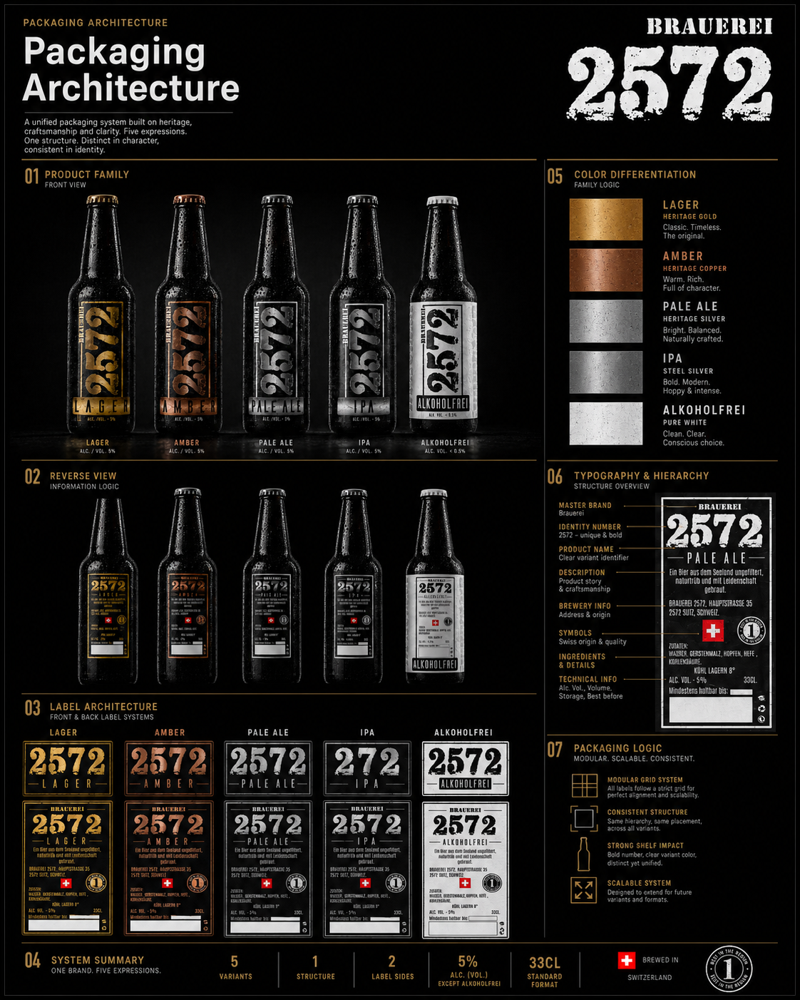
Packaging Architecture
Every label follows one carefully engineered framework.
Only the character changes.
The identity never does.
Consistency Creates Recognition. Recognition Creates Trust.
TYPOGRAPHY SYSTEM
DESIGNING A VISUAL LANGUAGE PEOPLE REMEMBER.
Strong Typography Builds Strong Brand Recognition.
Typography became one of the most recognizable elements of the Brauerei 2572 Brand Identity. The bold handcrafted numerals, industrial-inspired lettering, and disciplined hierarchy create immediate recognition regardless of bottle style or viewing distance.
Every text element serves one purpose:
to communicate clearly while reinforcing the brewery’s authentic heritage.
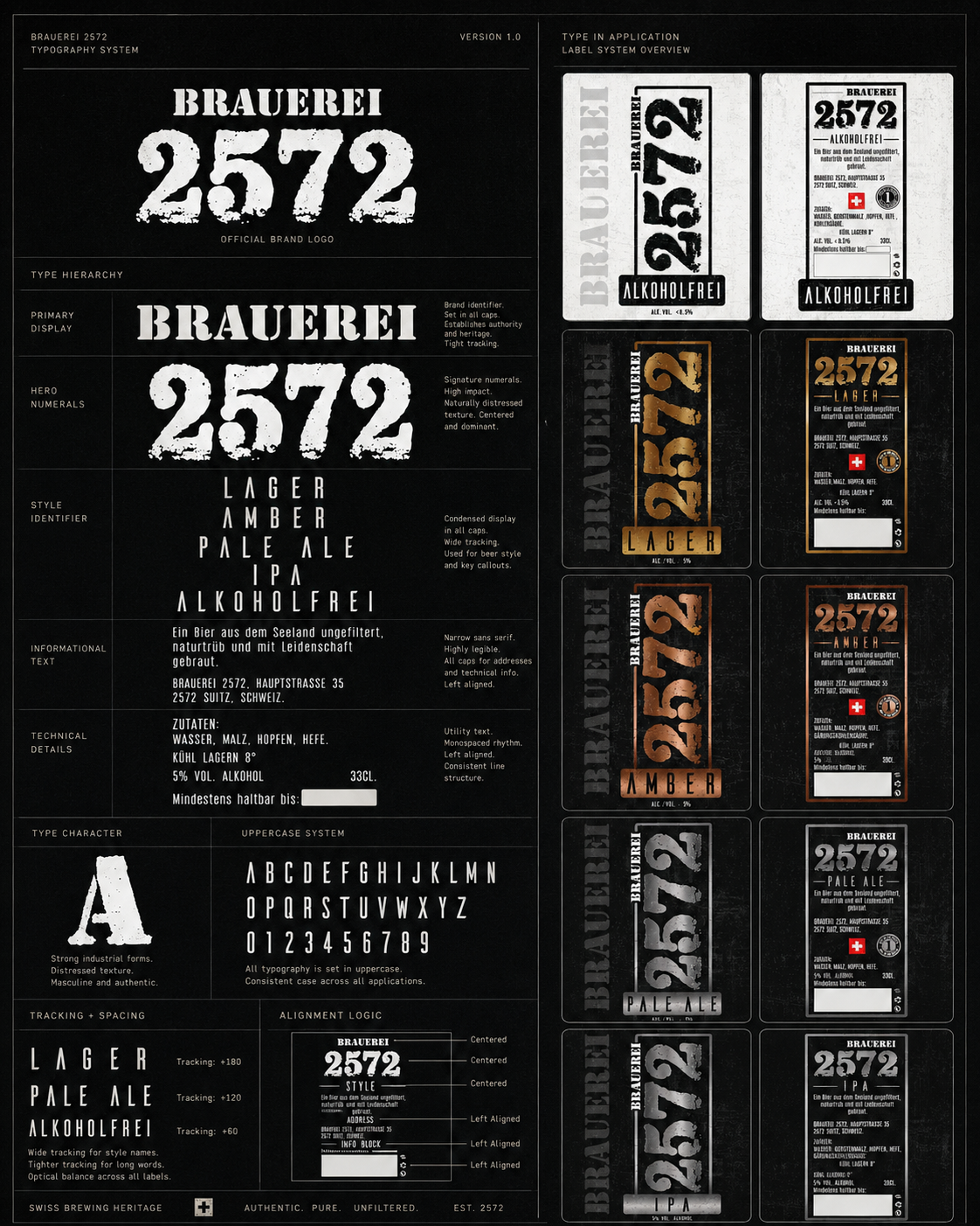
Typography System
One type system.
Multiple beer styles.
One unmistakable visual voice.
Typography Should Never Decorate A Brand. It Should Define It.
COLOR STRATEGY
FIVE DISTINCT EXPRESSIONS. ONE UNIFIED BRAND.
Color Creates Personality Without Sacrificing Consistency.
Each beer received its own dedicated metallic color to strengthen differentiation while preserving the shared visual language across the complete product family.
The result is immediate shelf recognition combined with consistent premium perception.
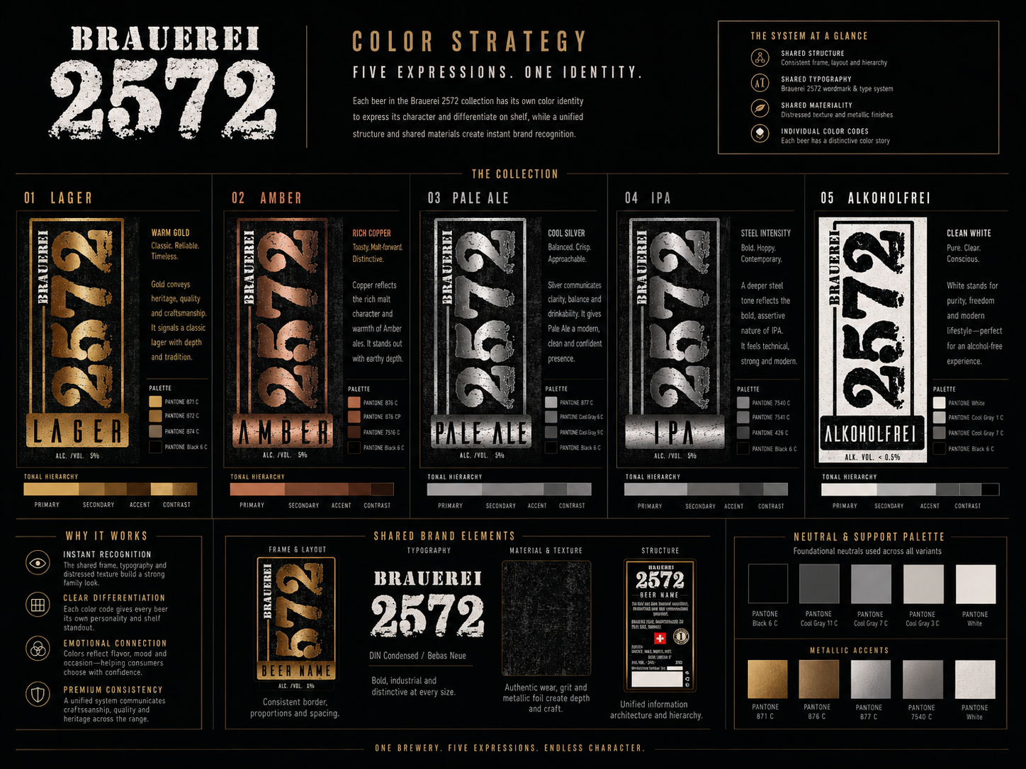
Color Strategy
Different personalities.
One recognizable family.
Every color supports one brand.
Differentiation Creates Choice. Consistency Creates Memory.
MATERIAL SELECTION
PREMIUM MATERIALS CREATE PREMIUM PERCEPTION.
Every Surface Communicates Quality.
Material selection influences how customers perceive craftsmanship long before opening the bottle. Premium papers, refined metallic finishes, embossing, varnishes, and textured surfaces were selected to reinforce authenticity and create a tactile luxury experience.
Every finish supports the same message:
quality deserves to be felt.
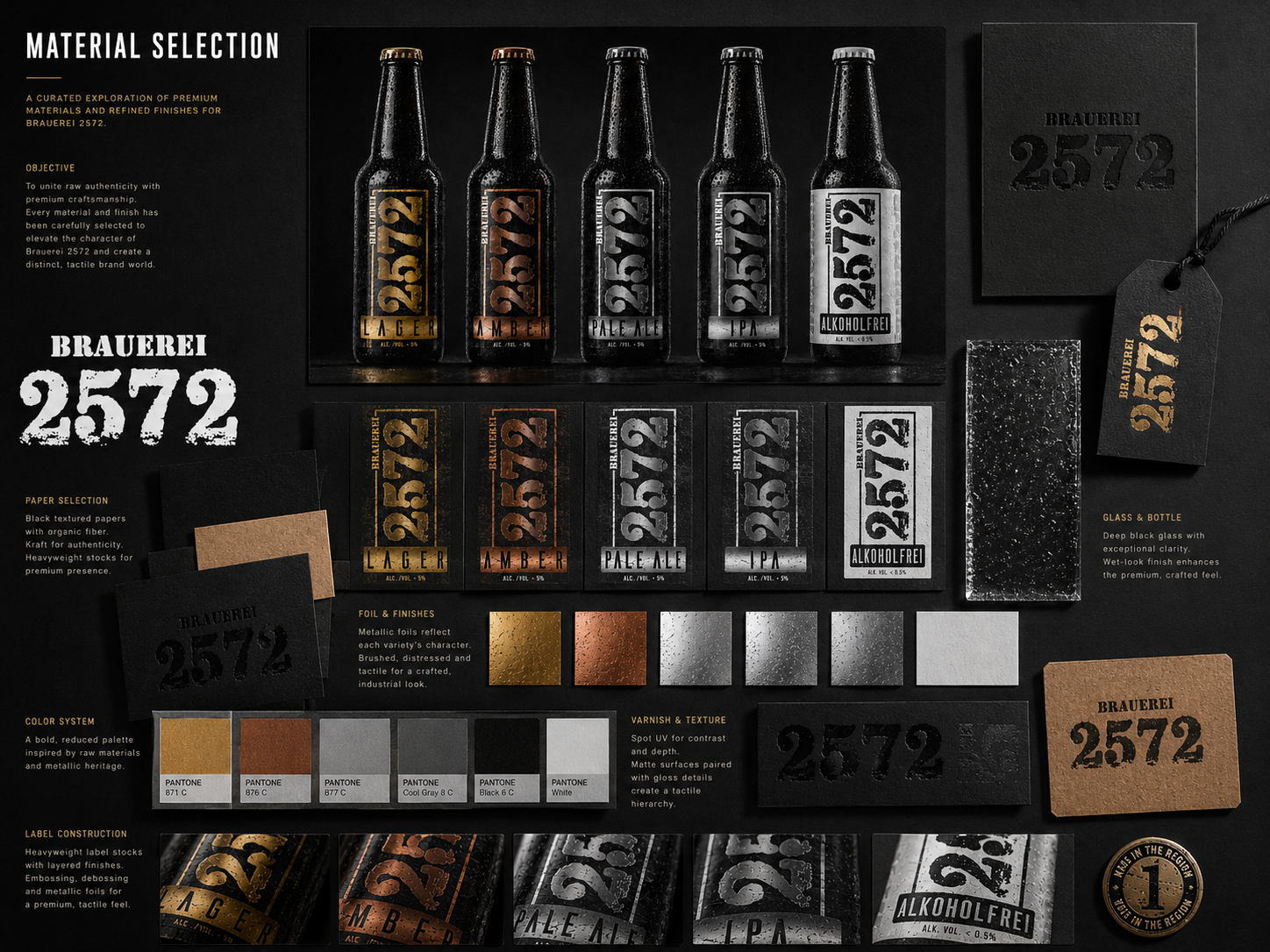
Material Selection
Paper.
Glass.
Foil.
Texture.
Every material strengthens the identity.
Quality Is Seen. Craftsmanship Is Felt.
VISUAL CONSISTENCY
EVERY TOUCHPOINT SPEAKS THE SAME BRAND LANGUAGE.
Identity Extends Far Beyond The Label.
A successful Brand Identity System continues wherever customers encounter the brewery—from packaging and merchandise to signage, hospitality, transportation, and promotional materials.
Every application follows the same visual principles to create one seamless customer experience.
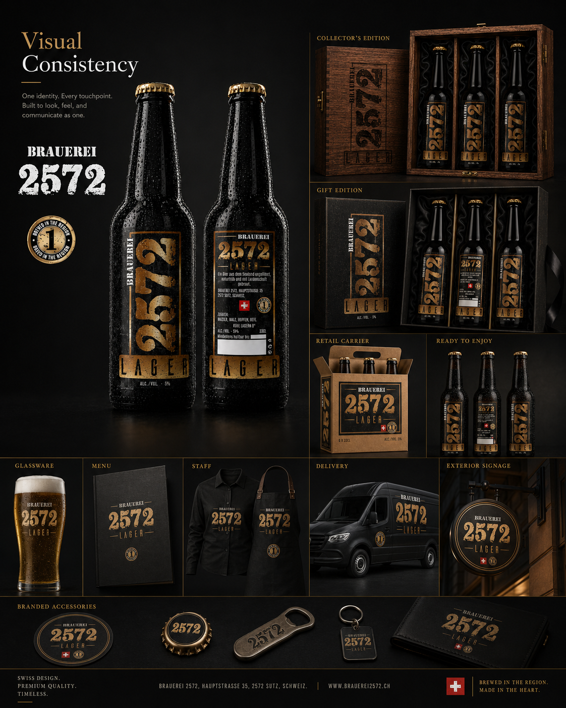
Visual Consistency
One logo.
One language.
Unlimited applications.
A Strong Brand Looks Consistent Everywhere. That Is How Recognition Is Built.
SHELF IMPACT
DESIGNED TO BE CHOSEN BEFORE THE FIRST SIP.
Recognition Begins Before Purchase.
Retail shelves are competitive environments where visual clarity matters. The Brauerei 2572 collection was designed to achieve immediate differentiation through bold typography, disciplined hierarchy, and distinct color coding while maintaining one cohesive identity.
Strong packaging makes decision-making effortless.
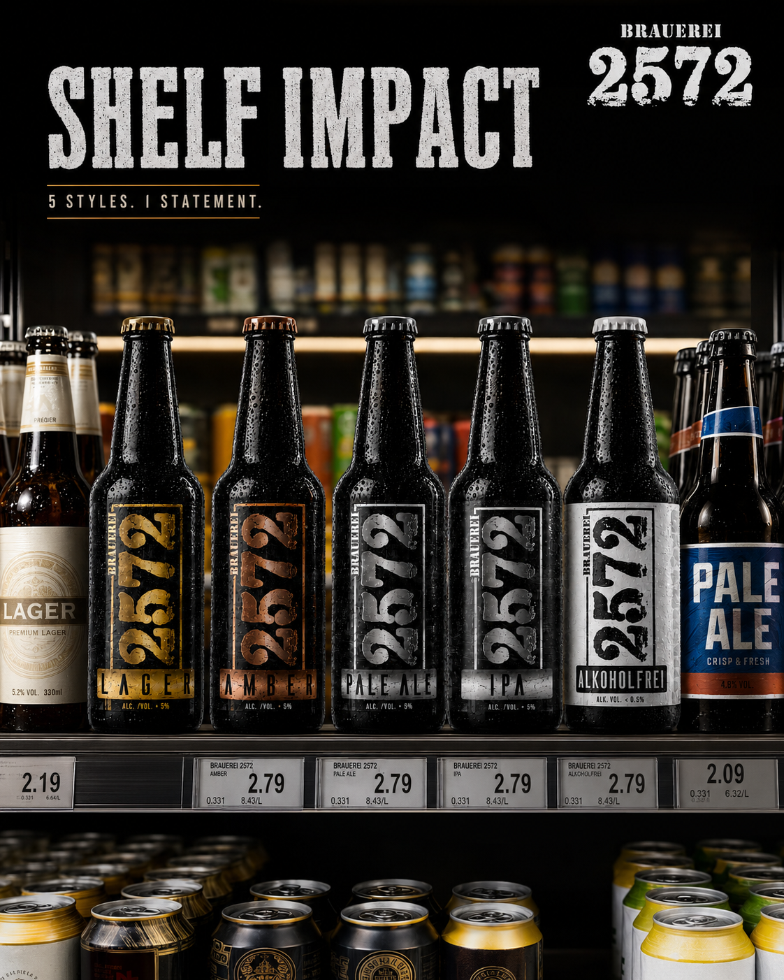
Shelf Impact
Visible.
Recognizable.
Memorable.
Built to perform where it matters most.
First The Bottle Gets Noticed. Then The Brand Gets Remembered.
RETAIL EXPERIENCE
WHERE BRAND IDENTITY BECOMES EVERYDAY CHOICE.
Great Packaging Deserves Great Placement.
A successful Beer Branding System is measured not only by how it looks in a presentation, but by how confidently it performs in the real retail environment. Every shelf, cooler, display, and customer touchpoint becomes an opportunity to reinforce recognition.
The Brauerei 2572 Retail Experience demonstrates how a consistent Packaging Design System, distinctive Visual Identity, and premium product presentation create immediate Shelf Visibility, stronger Brand Recognition, and a memorable customer experience.
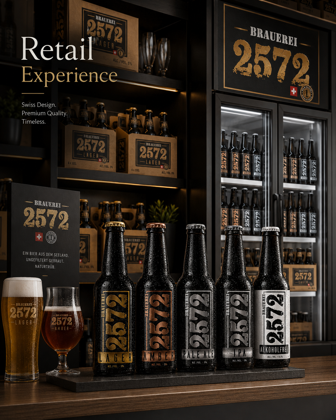
Retail Experience
Premium shelf presence.
Consistent product family.
Instant recognition.
Built for everyday retail.
Recognition Begins Before The First Bottle Is Picked Up.
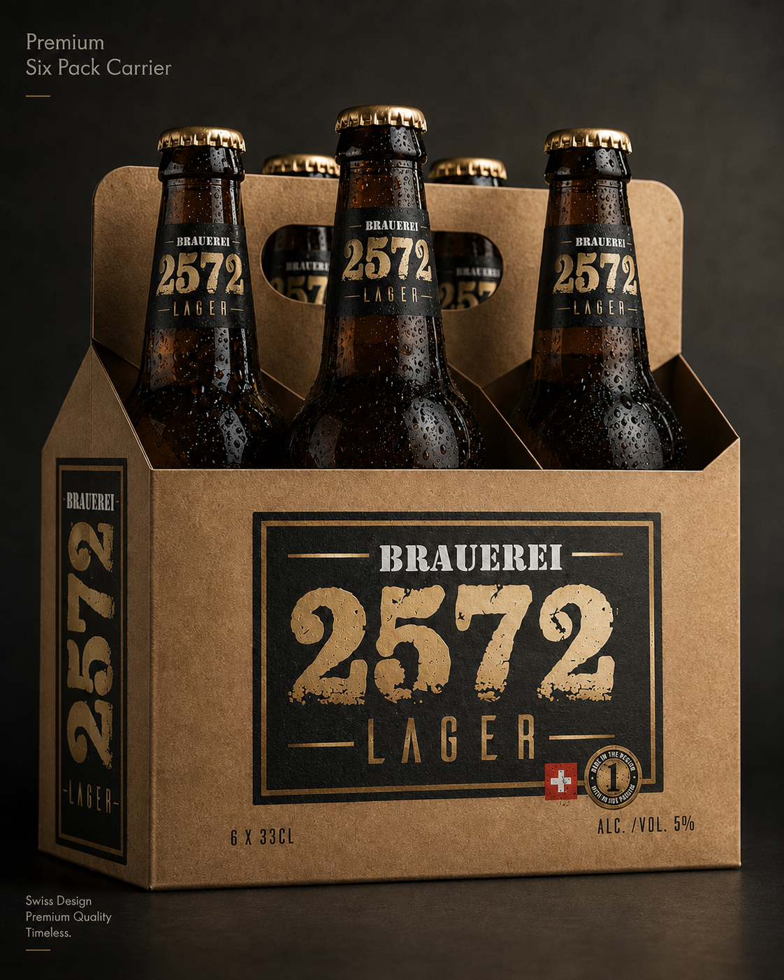
PREMIUM SIX PACK CARRIER
EVERY PACKAGING SYSTEM BEGINS WITH A SINGLE DECISION—HOW THE BRAND WILL BE CARRIED.
Exceptional Packaging Is Never Created To Simply Hold A Product. It Exists To Protect The Brand, Elevate Perception, And Extend The Experience Beyond The Shelf.
Packaging is often the very first physical interaction customers have with a brand. Long before the bottle is opened, the packaging communicates craftsmanship, quality, and attention to detail. Every surface, proportion, and material contributes to the overall perception of the brewery.
For Brauerei 2572, the objective was to develop a Premium Beer Packaging Design system that feels authentic, functional, and unmistakably Swiss. Rather than relying on decorative graphics alone, every visual decision was guided by clarity, consistency, and timeless craftsmanship.
The Six Pack Carrier became the foundation of the complete packaging family. It balances practical transportation with strong Shelf Presence, allowing the brewery’s Visual Identity to remain instantly recognizable whether displayed in retail environments, specialty beer stores, or direct customer purchases.
Every structural element was carefully considered—from typography hierarchy and logo placement to material selection, handle proportions, and graphic balance. The result is a packaging solution that communicates premium quality while supporting efficient production and everyday usability.
Instead of treating secondary packaging as a separate design element, the carrier was developed as a natural extension of the complete Brand Identity system. Every angle reinforces recognition, ensuring that the packaging remains visually connected to the bottles themselves.
Ultimately, the Six Pack Carrier demonstrates how thoughtful Packaging Strategy transforms transportation into an additional branding opportunity—strengthening customer trust before the first bottle is even opened.
Packaging Objectives:
✔ Premium Product Presentation
✔ Efficient Everyday Transportation
✔ Strong Shelf Recognition
✔ Consistent Brand Identity
✔ Retail & Hospitality Compatibility
Key Highlights:
✔ Premium Beer Packaging Design
✔ Structural Packaging Development
✔ Retail Ready Presentation
✔ Swiss Inspired Minimalism
✔ Functional Carrying Solution
✔ Consistent Visual Identity
Packaging Deliverables:
✔ Six Pack Carrier Design
✔ Structural Packaging Layout
✔ Brand Graphics Adaptation
✔ Print-Ready Production Artwork
✔ Material & Surface Application
✔ Premium Presentation System
Packaging Strategy
The carrier was designed to create a seamless connection between Beer Packaging Design, customer experience, and long-term Brand Recognition, ensuring that every interaction reflects the same premium visual language.
Every packaging component contributes to the story of the brewery. By combining structural functionality with refined visual communication, the Six Pack Carrier strengthens both product presentation and customer perception while supporting the long-term growth of the complete Craft Beer Branding system.
When Packaging Becomes Part Of The Brand, Every Journey Strengthens Recognition, Trust, And Lasting Value.
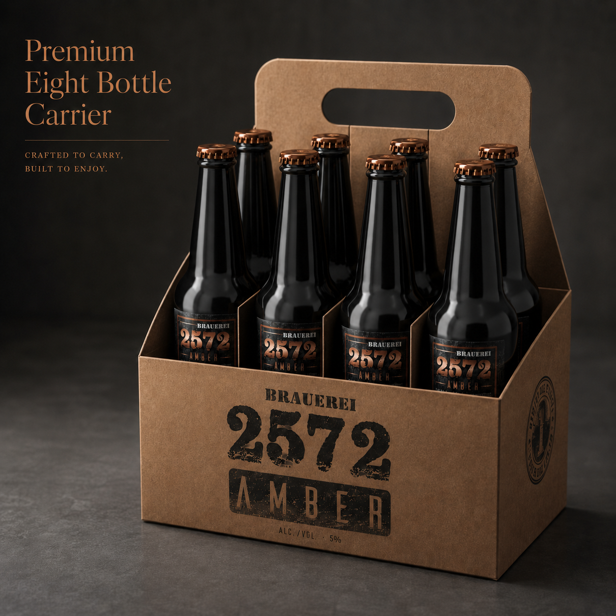
PREMIUM EIGHT BOTTLE CARRIER
DESIGNED TO BALANCE PREMIUM PRESENTATION, PRACTICAL HANDLING, AND EVERYDAY BREWERY DISTRIBUTION.
Exceptional Packaging Does More Than Carry Products—It Carries The Reputation Of The Brand Behind Every Bottle.
A successful Beer Packaging Design must perform long before the first bottle is opened. It protects the product, simplifies transportation, and immediately communicates the brewery’s quality standards. Every structural decision contributes to how customers perceive the brand from the very first interaction.
For Brauerei 2572, the objective was to create a Premium Eight Bottle Carrier that combines efficient transportation with refined visual presentation. Rather than functioning as ordinary retail packaging, the carrier extends the brewery’s Brand Identity into everyday purchasing situations while maintaining the same premium visual language established across the complete product range.
The structural proportions were carefully developed to ensure stability, comfortable handling, and clear product visibility without unnecessary visual complexity. Every graphic element follows the established Visual Identity System, reinforcing consistency across both packaging and bottle design.
High-quality materials, restrained typography, and a clean architectural layout allow the carrier to communicate craftsmanship without relying on excessive decoration. The result is a Craft Beer Branding solution that feels equally appropriate for specialty retailers, premium supermarkets, brewery shops, and direct customer purchases.
Beyond transportation, the packaging becomes an extension of the customer experience. From the first impression on the retail shelf to carrying the beers home, every interaction strengthens Brand Recognition while supporting the premium positioning of the brewery.
Ultimately, the Premium Eight Bottle Carrier demonstrates how intelligent Packaging Design can transform functional packaging into a consistent communication tool that supports both operational efficiency and long-term brand value.
Packaging Objectives:
✓ Efficient Multi-Bottle Transportation
✓ Premium Retail Presentation
✓ Enhanced Customer Convenience
✓ Strong Brand Recognition
✓ Consistent Visual Identity
Key Highlights:
✓ Premium Eight Bottle Carrier
✓ Structural Packaging Design
✓ Ergonomic Carrying Handle
✓ Swiss Minimalist Design
✓ Durable Material Construction
✓ Retail-Ready Presentation
Packaging Deliverables:
✓ Eight Bottle Carrier Design
✓ Print-Ready Packaging Artwork
✓ Structural Layout Development
✓ Premium Graphic System
✓ Material Specification
✓ Production Ready Files
Design Objectives:
- Expand the existing packaging system while preserving complete visual consistency.
- Strengthen Brand Recognition across multiple carrier formats.
- Improve carrying capacity without compromising premium presentation.
- Maintain clean typography hierarchy and strong Shelf Presence.
- Create a packaging solution suitable for retail, gifting, and direct customer purchases.
- Reinforce the brewery’s premium positioning through consistent design language.
Packaging Features:
- Eight Bottle Carrier Structure
- Reinforced Paperboard Construction
- Premium Offset Print
- Consistent Brand Graphics
- Comfortable Integrated Handle
- Optimized Bottle Protection
- Retail-Ready Presentation
- Scalable Packaging Architecture
Packaging Strategy
The Premium Eight Bottle Carrier was developed to extend the brewery’s Visual Identity beyond individual bottles while providing a practical packaging solution suitable for everyday retail distribution. Every proportion, material, and graphic element contributes to a unified Craft Beer Branding system.
Rather than designing simple transportation packaging, the objective was to create a Premium Packaging Design that delivers convenience, reinforces Brand Recognition, and maintains the same level of craftsmanship visible throughout the entire Brauerei 2572 identity.
Project Outcome
The Premium Eight Bottle Carrier demonstrates how thoughtful Packaging Design extends beyond aesthetics. By expanding the original packaging concept into a larger, professionally engineered format, the brewery gained a flexible packaging solution capable of supporting product growth while preserving one recognizable Premium Brand Identity.
Every structural decision contributes to a unified customer experience where craftsmanship, functionality, and visual excellence work together to strengthen the overall perception of the Brauerei 2572 brand.
When Everyday Packaging Reflects Premium Thinking, Every Journey Strengthens The Brand.
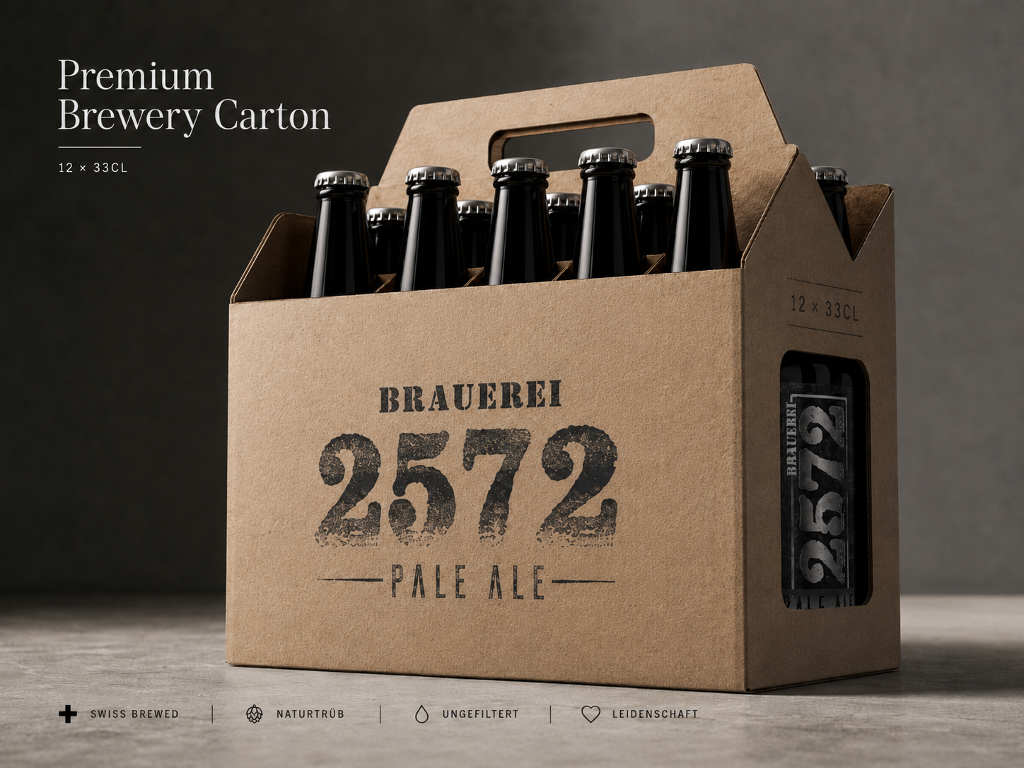
PREMIUM BREWERY CARTON
(12 BOTTLES)
BUILT FOR PROFESSIONAL DISTRIBUTION WHILE PRESERVING THE CHARACTER OF A PREMIUM CRAFT BREWERY.
Industrial Packaging Should Never Feel Industrial—It Should Carry The Same Care And Identity As The Product Inside.
Professional brewery distribution demands packaging capable of protecting products throughout transportation while maintaining a consistent visual identity. A well-designed Beer Packaging Design balances logistics, durability, efficiency, and premium presentation without compromising the character of the brand.
For Brauerei 2572, the Premium Brewery Carton was created as a scalable distribution solution that extends the brewery’s Brand Identity beyond retail presentation into wholesale logistics, storage, and commercial transportation.
The carton structure was engineered to ensure maximum stability, efficient stacking, secure bottle separation, and reliable handling during every stage of distribution. At the same time, the graphic system preserves the recognizable visual language established throughout the complete Visual Identity System.
Minimal graphics, strong typography, carefully positioned branding, and restrained material finishes create a professional appearance suitable for breweries, distributors, restaurants, and premium retail environments. Every visual decision reinforces Brand Recognition without unnecessary complexity.
By maintaining consistency between consumer-facing packaging and industrial transportation packaging, the brewery strengthens trust across every customer touchpoint. The carton becomes more than a shipping solution—it becomes another expression of the brewery’s quality standards.
Ultimately, the Premium Brewery Carton demonstrates how thoughtful Packaging Design supports both operational performance and premium brand perception while remaining fully aligned with the brewery’s long-term Craft Beer Branding strategy.
Packaging Objectives:
✓ Professional Brewery Distribution
✓ Secure Bottle Protection
✓ Efficient Warehouse Handling
✓ Consistent Brand Identity
✓ Reliable Transportation Performance
Key Highlights:
✓ Twelve Bottle Brewery Carton
✓ Industrial Packaging Design
✓ Structural Stability
✓ Stackable Construction
✓ Swiss Design Principles
✓ Production Efficiency
Packaging Deliverables:
✓ Brewery Carton Design
✓ Structural Packaging Layout
✓ Print-Ready Production Artwork
✓ Transportation Graphics
✓ Material Specifications
✓ Production Ready Files
Packaging Strategy
The Premium Brewery Carton extends the brewery’s Brand Identity into professional logistics, ensuring that every stage of transportation reflects the same quality standards established across the consumer-facing packaging system.
Rather than separating industrial functionality from visual identity, the carton integrates both into a unified Premium Packaging Design, strengthening Brand Recognition from production facilities to retail shelves.
When Distribution Reflects Design Excellence, Every Shipment Becomes Part Of The Brand Experience.
READY FOR DELIVERY
ENGINEERED FOR RELIABLE DISTRIBUTION WITHOUT COMPROMISING PREMIUM BRAND PRESENTATION.
Exceptional Packaging Protects More Than Products—It Protects Every Promise A Brand Makes Before The First Bottle Is Opened.
Reliable Beer Packaging Design begins long before the customer experiences the product. Every transportation solution must preserve quality, maintain structural integrity, and communicate professionalism throughout the entire distribution process. Packaging becomes the silent ambassador of the brewery from production to final delivery.
For Brauerei 2572, Ready For Delivery was developed as a Premium Brewery Shipping Solution that combines efficient logistics with a refined visual identity. Every structural element was carefully considered to ensure that transportation strengthens rather than diminishes the premium perception of the brand.
The packaging structure prioritizes stability, bottle protection, and efficient stacking while maintaining the distinctive visual language established across the complete Craft Beer Branding system. Clean graphics, balanced proportions, and durable materials ensure that functionality never sacrifices aesthetics.
Designed for breweries, distributors, specialty retailers, and direct customer shipments, the packaging delivers both operational efficiency and premium presentation. Every detail contributes to stronger Brand Recognition while reinforcing confidence throughout the distribution chain.
Rather than functioning as ordinary transportation packaging, the carton becomes an extension of the brewery’s Brand Identity, ensuring that the first physical interaction with the product already communicates craftsmanship, precision, and uncompromising quality.
Ultimately, Ready For Delivery demonstrates how intelligent Packaging Design can seamlessly combine logistics, protection, and premium branding into one consistent customer experience.
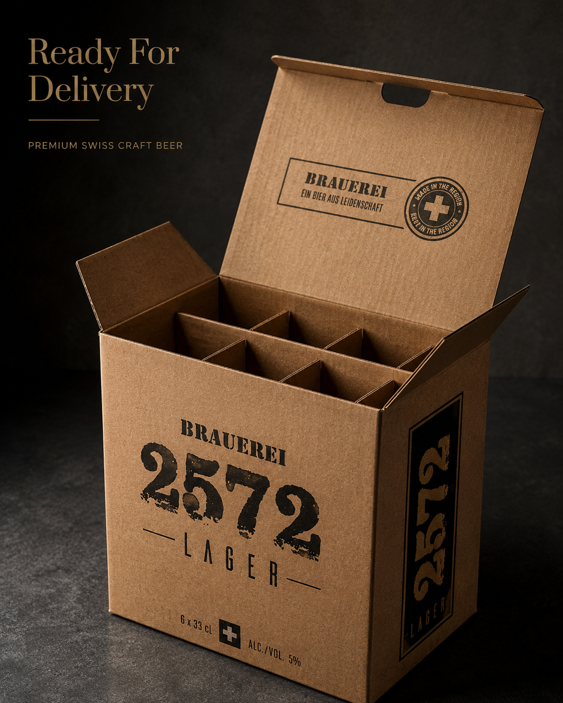
Packaging Objectives:
✓ Secure Product Transportation
✓ Premium Shipping Presentation
✓ Efficient Distribution System
✓ Reliable Bottle Protection
✓ Consistent Brand Identity
Key Highlights:
✓ Distribution Packaging Design
✓ Structural Shipping Solution
✓ Reinforced Bottle Protection
✓ Swiss Packaging Standards
✓ Professional Logistics Design
✓ Retail & Wholesale Ready
Packaging Deliverables:
✓ Shipping Carton Design
✓ Structural Packaging System
✓ Print-Ready Production Artwork
✓ Premium Material Specification
✓ Transportation Graphics
✓ Production Ready Files
Packaging Strategy
The Ready For Delivery packaging system was designed to extend the brewery’s Visual Identity into every stage of transportation while ensuring maximum protection, operational efficiency, and long-term Brand Recognition.
Rather than separating logistics from branding, the packaging integrates both into one cohesive Premium Packaging Design that reflects the same craftsmanship, consistency, and quality found throughout the complete Brauerei 2572 identity.
When Packaging Protects The Experience, Every Delivery Strengthens The Brand.
READY TO ENJOY
DESIGNED TO TRANSFORM PRODUCT PACKAGING INTO A COMPLETE DRINKING EXPERIENCE.
Great Packaging Doesn't End At Purchase—It Begins The Moment The First Bottle Is Shared.
Exceptional Beer Packaging Design should continue creating value long after leaving the retail shelf. It becomes part of the experience itself, encouraging interaction, presentation, and memorable moments that strengthen the emotional relationship between customers and the brand.
For Brauerei 2572, Ready To Enjoy was created as a Premium Multi-Bottle Presentation System that celebrates sharing, hospitality, and the authentic culture of Swiss craft brewing. Every design decision encourages customers to experience the brewery beyond the bottle itself.
The structural carrier allows effortless access to every bottle while maintaining excellent stability and product protection. Clean proportions, carefully balanced branding, and restrained typography preserve the elegance of the overall Visual Identity System without distracting from the product.
The packaging performs equally well in specialty retail environments, restaurants, breweries, events, and private gatherings. Every interaction reinforces Craft Beer Branding while creating an inviting presentation that naturally encourages consumption and conversation.
By transforming practical packaging into part of the customer journey, the carrier strengthens Brand Recognition, enhances perceived value, and supports memorable social experiences that extend beyond the purchase itself.
Ultimately, Ready To Enjoy demonstrates how thoughtful Packaging Design can seamlessly unite functionality, hospitality, and premium presentation into one refined customer experience.
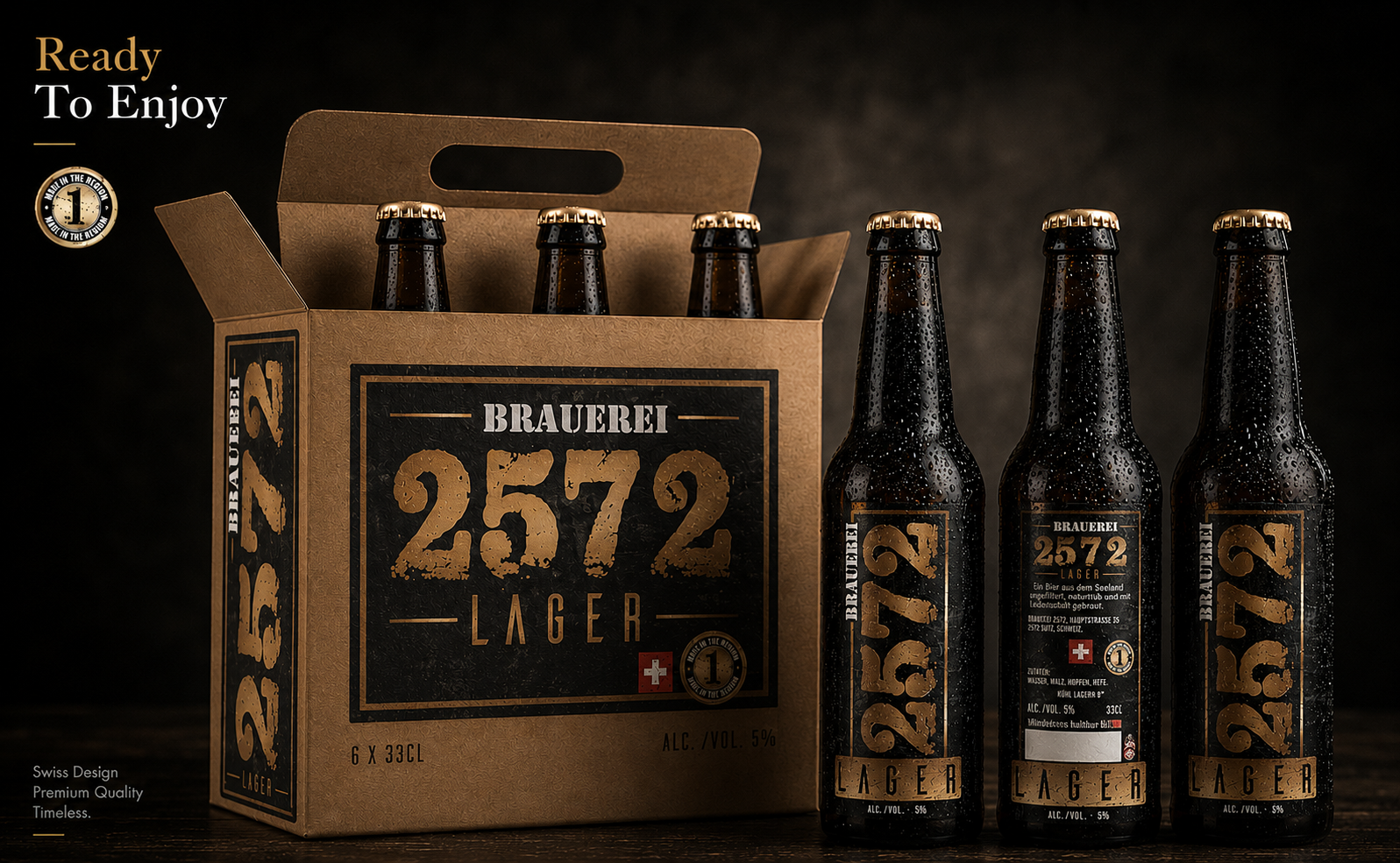
Packaging Objectives:
✓ Premium Serving Experience
✓ Enhanced Customer Interaction
✓ Convenient Bottle Access
✓ Elevated Product Presentation
✓ Strong Brand Recognition
Key Highlights:
✓ Premium Carrying System
✓ Customer Experience Design
✓ Functional Structural Packaging
✓ Swiss Minimalist Presentation
✓ Premium Retail Display
✓ Social Consumption Ready
Packaging Deliverables:
✓ Ready To Enjoy Carrier Design
✓ Structural Packaging Development
✓ Print-Ready Artwork
✓ Premium Material Specification
✓ Production Files
✓ Complete Packaging System
Packaging Strategy
The Ready To Enjoy carrier extends the brewery’s Brand Identity beyond transportation by transforming packaging into an integral part of the overall customer experience. Every structural and visual decision contributes to stronger Brand Recognition while supporting premium product presentation.
Rather than serving only as functional packaging, the carrier becomes an extension of the brewery’s Craft Beer Branding, creating memorable interactions that reinforce quality, hospitality, and long-term customer loyalty.
When Packaging Becomes Part Of The Experience, Every Shared Bottle Strengthens The Brand.
COLLECTOR'S GIFT EDITION
TRUE PREMIUM BRANDS ARE NOT SOLD.
THEY ARE PRESENTED.
Luxury Is Not Defined By Price—It Is Defined By The Care Invested In Every Detail Before The Product Ever Reaches Its Owner.
Exceptional packaging extends far beyond protection. It transforms the product into an experience, creating anticipation before the first bottle is even touched. Every material, texture, and structural decision contributes to a stronger emotional connection between the customer and the brand.
For Brauerei 2572, the objective was to develop a Premium Beer Packaging Design that elevates the brewery beyond traditional retail presentation. The Collector’s Gift Edition was conceived as a premium presentation system that celebrates craftsmanship while communicating exclusivity and timeless Swiss quality.
Designed using refined materials, elegant proportions, and a restrained visual language, the presentation box enhances the perceived value of the entire collection without competing with the product itself. Every visual element reinforces the brewery’s Brand Identity, allowing the bottles to remain the undisputed focal point.
The carefully engineered interior protects each bottle while creating a museum-like presentation inspired by luxury watchmaking, premium spirits, and Swiss product design. The experience begins the moment the box is opened, revealing every bottle as part of a thoughtfully curated collection.
Rather than functioning as standard packaging, the Collector’s Gift Edition becomes a premium storytelling medium. It strengthens Brand Recognition, supports memorable gifting experiences, and reinforces the brewery’s commitment to uncompromising quality.
Ultimately, the presentation demonstrates how strategic Packaging Design can transform a simple purchase into an emotional experience that customers remember long after the final bottle has been enjoyed.
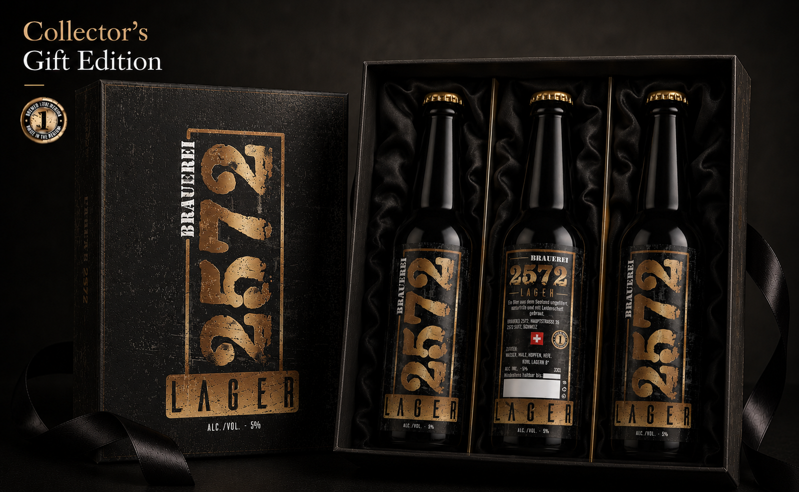
Packaging Objectives:
✔ Premium Gift Presentation
✔ Luxury Brand Experience
✔ Elevated Product Perception
✔ Memorable Unboxing Experience
✔ Long-Term Brand Recognition
Key Highlights:
✔ Premium Collector Packaging
✔ Luxury Presentation Box
✔ Swiss Inspired Design
✔ High-End Material Selection
✔ Protective Interior Construction
✔ Premium Brand Experience
Packaging Deliverables:
✔ Collector’s Gift Box Design
✔ Premium Structural Packaging
✔ Interior Bottle Protection System
✔ Print-Ready Production Artwork
✔ Luxury Material Specification
✔ Complete Gift Packaging Experience
Packaging Strategy
The Collector’s Gift Edition was developed to extend the brewery’s Visual Identity beyond the bottle itself, creating a premium presentation capable of strengthening emotional value, customer perception, and long-term Craft Beer Branding.
Every remarkable brewery deserves packaging that reflects the same dedication invested in brewing. The Collector’s Gift Edition transforms premium beer into a memorable luxury experience while reinforcing the timeless character of the complete Brand Identity system.
When Presentation Reflects Craftsmanship, Every Detail Becomes Part Of The Story.
SWISS COLLECTOR'S EDITION
CREATED TO CELEBRATE ARTISTRY THROUGH A TRULY COLLECTIBLE LUXURY PRESENTATION.
True Luxury Is Never Defined By Exclusivity Alone—It Is Defined By The Lasting Value Every Detail Creates.
The highest level of Beer Packaging Design goes beyond functionality to become a collectible object in its own right. Every material, finish, and construction detail contributes to a presentation that communicates prestige before a single bottle is removed from the box.
For Brauerei 2572, the Swiss Collector’s Edition was conceived as the ultimate expression of the brewery’s Premium Brand Identity. Inspired by Swiss craftsmanship, luxury watchmaking, and timeless product design, the presentation elevates the complete collection into a museum-quality experience.
Premium hardwood construction, precision joinery, refined interior protection, and restrained branding create an object designed to be preserved rather than discarded. Every design element reinforces the brewery’s commitment to authenticity, quality, and exceptional craftsmanship.
The presentation was intentionally designed to enhance perceived value without competing with the product itself. The bottles remain the central focus while the packaging provides a luxurious stage that strengthens Craft Beer Branding and long-term emotional connection.
Rather than functioning as premium packaging alone, the collector’s case becomes a lasting brand artifact that customers proudly display, preserve, and associate with exceptional Swiss brewing tradition.
Ultimately, the Swiss Collector’s Edition demonstrates how extraordinary Packaging Design can transform premium products into enduring collectible experiences that elevate both Brand Recognition and perceived value.
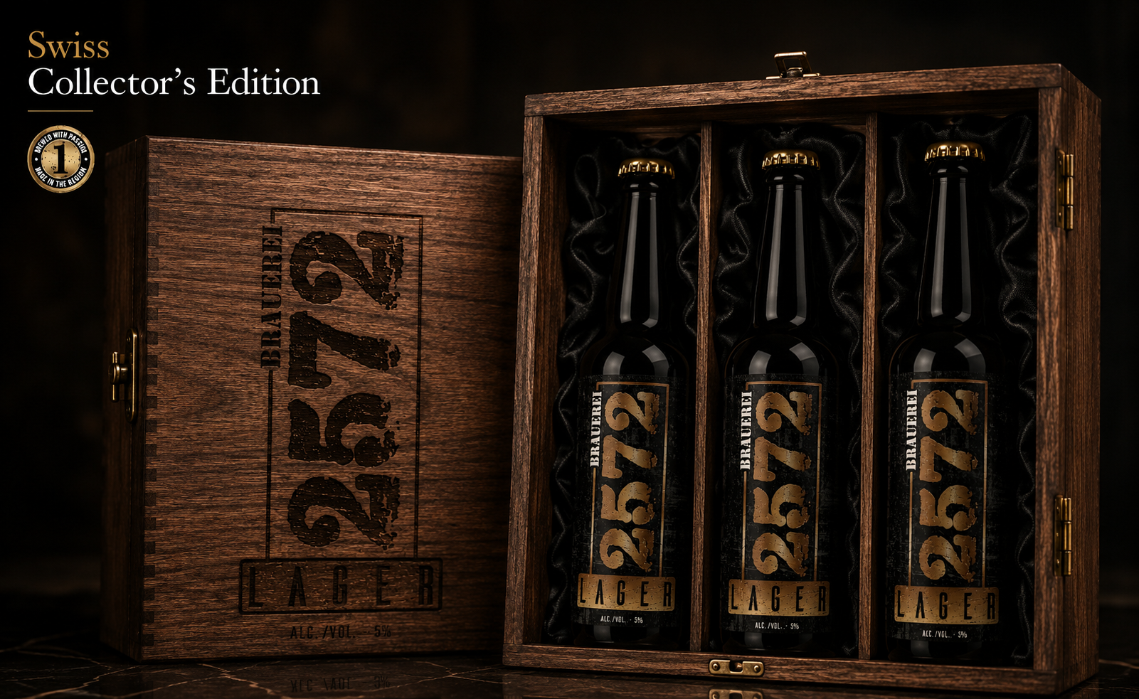
Packaging Objectives:
✓ Luxury Collector Presentation
✓ Premium Brand Prestige
✓ Long-Term Product Preservation
✓ Exceptional Customer Experience
✓ Timeless Brand Recognition
Key Highlights:
✓ Solid Wood Collector Case
✓ Luxury Interior Presentation
✓ Museum-Quality Construction
✓ Swiss Inspired Design
✓ Premium Material Selection
✓ Exclusive Collector Experience
Packaging Deliverables:
✓ Collector Case Design
✓ Luxury Structural Packaging
✓ Premium Interior Protection
✓ Print & Engraving Specifications
✓ Material Engineering
✓ Production Ready Files
Packaging Strategy
The Swiss Collector’s Edition extends the brewery’s Visual Identity into the luxury collector segment by combining timeless craftsmanship, architectural precision, and premium presentation into one unified Packaging Design system.
Rather than creating packaging for transportation alone, the objective was to create a collectible object that strengthens Brand Recognition, preserves emotional value, and represents the highest expression of the Brauerei 2572 identity.
When Craftsmanship Becomes Collectible, Every Detail Becomes Part Of The Brand Legacy.
FINAL CHAPTER CONCLUSION - 03
FROM PACKAGING TO PERCEPTION
When Every Detail Works Together, The Brand Speaks For Itself.
Every successful Brand Identity System eventually reaches a point where it no longer depends on explanation.
Its packaging becomes recognizable.
Its materials become familiar.
Its quality becomes expected.
For Brauerei 2572, every bottle, package, printed surface, and presentation element was designed as part of one connected Packaging Design System.
Not individual projects.
One complete identity.
The strongest brands are remembered because every detail feels unmistakably connected.
That is where Packaging Design becomes Brand Recognition.
And recognition becomes trust.
A GREAT PACKAGE ATTRACTS ATTENTION.
A COMPLETE BRAND SYSTEM EARNS RECOGNITION.
EVERY DETAIL MATTERS.
CHAPTER 04
PRODUCT PHOTOGRAPHY & EDITORIAL STORYTELLING
When Great Design Finally Meets The Camera.
Every Photograph Should Feel Like A Continuation Of The Brand Story.
PRODUCT VISUALS & BRAND NARRATIVE
TRANSFORMING PRODUCT IDENTITY INTO A COMPLETE VISUAL EXPERIENCE.
Every Image Was Created To Reveal A Different Dimension Of The Brauerei 2572 Brand.
The Brauerei 2572 Product Editorial Collection was created to transform the brewery’s identity into a complete visual communication system—capturing every product through premium commercial photography, cinematic storytelling, and strategically designed editorial compositions.
Rather than documenting the bottles alone, each photograph was developed to communicate craftsmanship, atmosphere, authenticity, and timeless Swiss character while preserving one consistent Craft Beer Brand Identity across every visual application.
Different Stories. Different Perspectives. One Unmistakable Brewery.
THE PRODUCT EDITORIAL COLLECTION
SEVEN DISTINCT VISUAL STORIES. ONE UNMISTAKABLE PRODUCT IDENTITY.
“Exceptional Product Photography Does More Than Show What A Brand Produces—It Reveals How That Brand Should Be Experienced.”
Premium product presentation requires far more than photographing a bottle against an attractive background. Every composition, reflection, material, atmosphere, and lighting decision must communicate the character of the product while preserving the consistency of the complete Brand Identity System.
For Brauerei 2572, The Product Editorial Collection was developed as a comprehensive Craft Beer Product Photography System designed to present the complete five-product family across a carefully structured range of premium visual environments. Each scene explores a different dimension of the brewery while remaining unmistakably connected to the same visual story.
The collection begins with the complete product family, establishing immediate Brand Recognition across Lager, Amber, Pale Ale, IPA, and Alkoholfrei. From there, individual compositions reveal purity, natural origin, brewing heritage, serving precision, hospitality, and the elevated ritual associated with authentic Swiss craft beer.
Every bottle was photographed and presented with controlled reflections, realistic condensation, precise label visibility, cinematic lighting, and premium material definition. These details ensure that the Beer Label Design, bottle proportions, metallic finishes, and individual product colors remain accurate while gaining greater emotional and commercial impact.
Rather than relying on one repeated photographic formula, the system creates multiple visual applications for Website Design, Social Media Marketing, Advertising Campaigns, Product Launches, Retail Communication, and premium brand storytelling. Every scene serves a clear strategic purpose while expanding the brewery’s available visual language.
Together, the seven compositions transform the collection from a group of individual beer products into a complete Premium Beverage Brand Experience. The result is a scalable editorial system capable of strengthening recognition, supporting future campaigns, and presenting Brauerei 2572 consistently across every customer touchpoint.
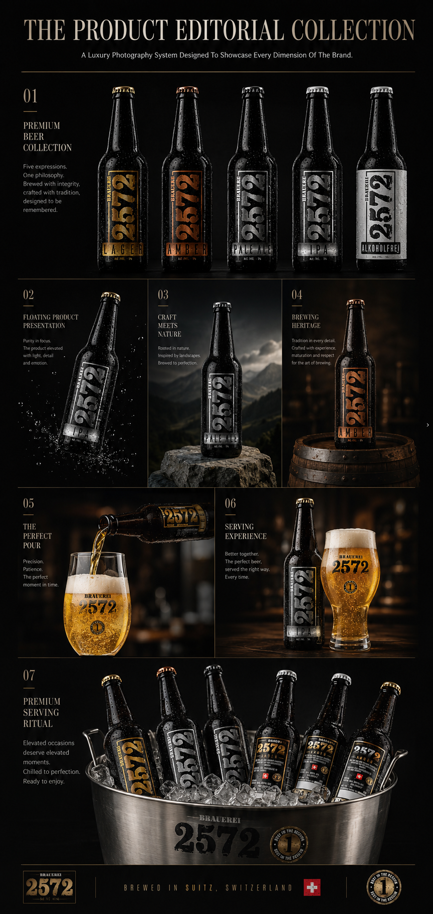
Photography Objectives:
✓ Complete Product Family Presentation
✓ Premium Brand Storytelling
✓ Consistent Product Recognition
✓ Accurate Label & Material Representation
✓ Multi-Channel Visual Communication
✓ Stronger Emotional Brand Connection
Key Highlights:
✓ Seven Editorial Photography Directions
✓ Complete Five-Beer Collection
✓ Cinematic Product Lighting
✓ Realistic Condensation & Glass Detail
✓ Controlled Reflections & Metallic Finishes
✓ Premium Swiss Brewing Atmosphere
Photography Deliverables:
✓ Complete Product Collection Presentation
✓ Individual Hero Product Photography
✓ Lifestyle & Heritage Compositions
✓ Beer Pouring & Serving Experience
✓ Premium Hospitality Visuals
✓ Multi-Product Campaign Photography
Editorial Photography Strategy
The Product Editorial Collection was created to extend the Brauerei 2572 Visual Identity beyond packaging and transform it into a flexible commercial photography system. Each composition communicates a different product quality while preserving consistent typography, color hierarchy, lighting direction, and overall Craft Beer Branding.
By combining product-focused imagery, atmospheric storytelling, authentic brewing references, and premium serving experiences, the collection provides the brewery with a complete visual foundation for Digital Marketing, Website Presentation, Advertising, Social Media, and future product communication.
When Every Image Reveals A Different Dimension Of The Brand, Product Photography Becomes A Complete Visual Language.
DESIGN PHILOSOPHY
WHEN DESIGN REMOVES EVERYTHING THAT DOESN'T MATTER.
Simplicity Is Never The Absence Of Detail. It Is The Result Of Purpose.
Every successful Brand Identity begins with disciplined decisions rather than decoration. Every proportion, texture, material, and composition was intentionally refined to communicate clarity, authenticity, and lasting recognition.
Nothing was added without purpose.
Nothing remained without reason.
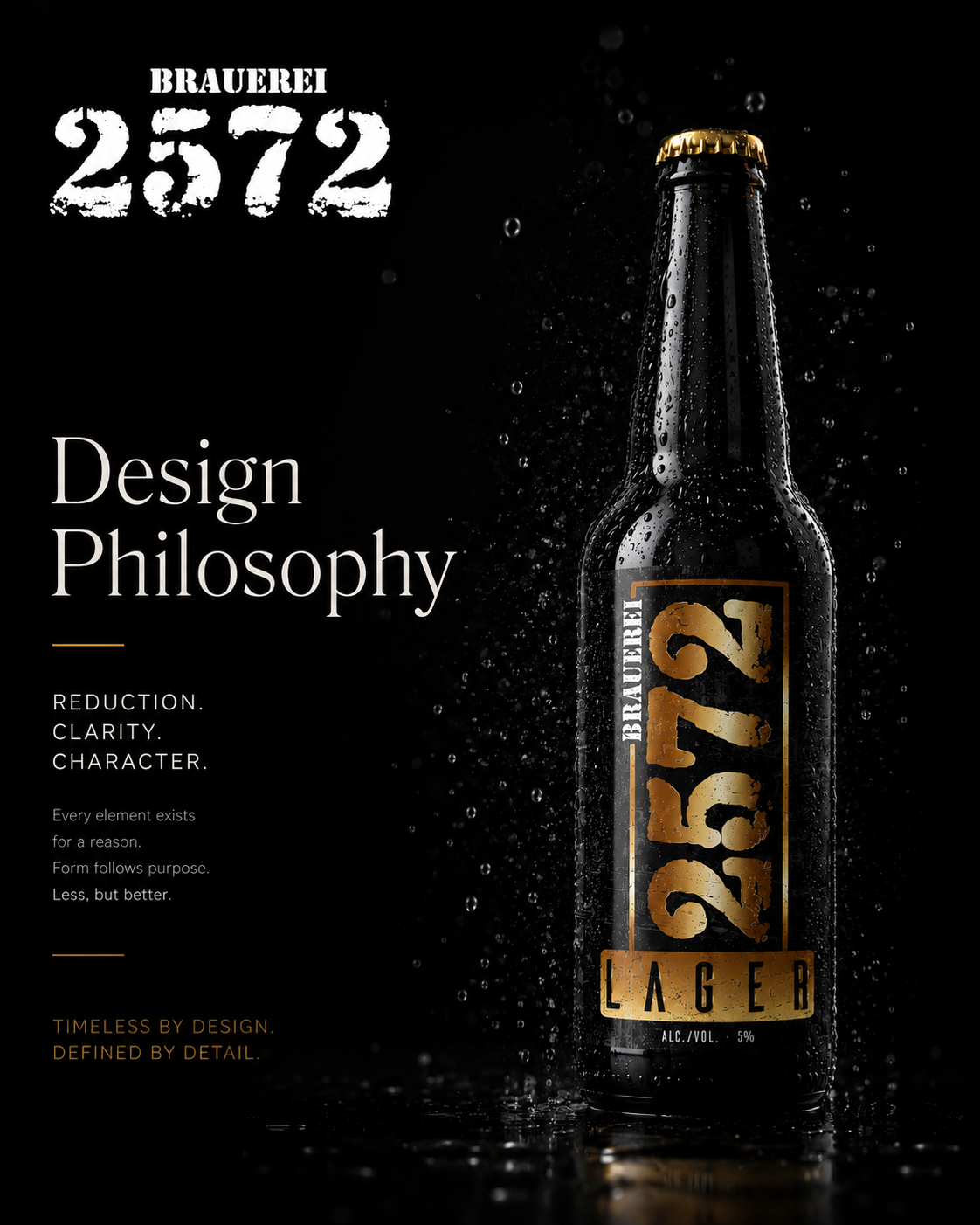
Design Philosophy
Reduction creates clarity.
Clarity creates confidence.
Confidence creates recognition.
The Best Design Is Almost Invisible. Only The Brand Remains Memorable.
BREWING HERITAGE
WHERE EVERY BOTTLE BEGINS LONG BEFORE IT IS FILLED.
Great Beer Is Built On Tradition Before It Is Presented Through Design.
Behind every label stands decades of brewing knowledge, authentic ingredients, and uncompromising craftsmanship. The photography celebrates the connection between the brewery’s heritage and the visual identity created to represent it.
Every bottle reflects the same origin.
Swiss craftsmanship.
Timeless tradition.
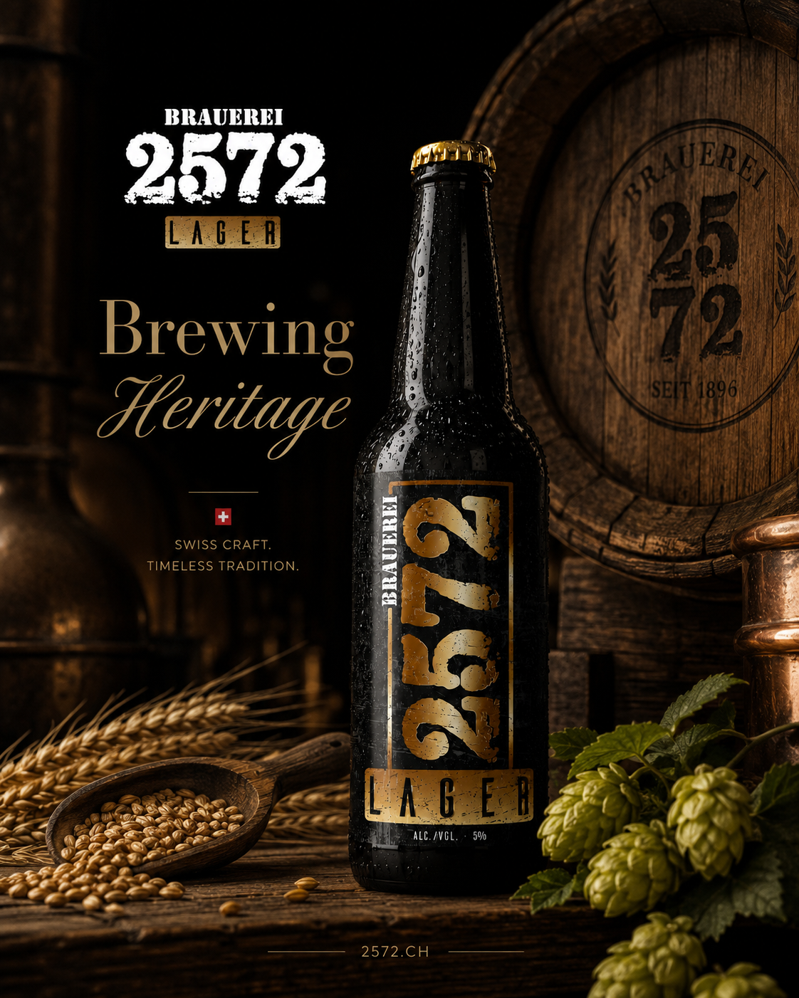
Brewing Heritage
Real ingredients.
Real people.
Real heritage.
One authentic story.
Design Honors Heritage. It Never Replaces It.
NATURE DEFINES EVERY BREW
THE BEST INGREDIENTS NEVER NEED EXAGGERATION.
Authentic Brewing Begins With Authentic Ingredients.
Fresh hops, carefully selected malt, pure water, and traditional brewing methods form the foundation of every Brauerei 2572 beer. Photography highlights these natural elements to reinforce the brewery’s commitment to quality and authenticity.
Every ingredient becomes part of the brand story.
Long before it becomes part of the beer.
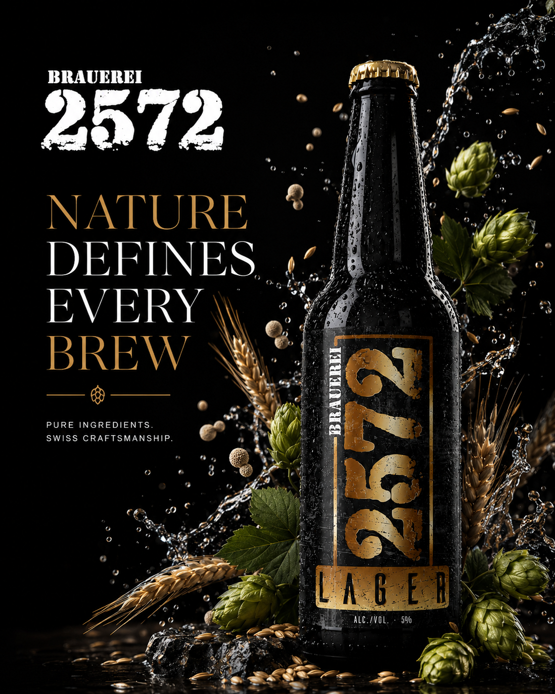
Nature Defines Every Brew
Pure ingredients.
Pure intention.
Pure craftsmanship.
Nature Creates Quality. Craftsmanship Reveals It.
SERVING RITUAL
EVERY POUR IS PART OF THE BRAND EXPERIENCE.
Great Beer Deserves A Moment Worth Remembering.
Opening the bottle, hearing the cap release, watching the foam rise, and serving with care transforms a simple action into a meaningful ritual. Photography captures these moments to express respect for both the product and the people enjoying it.
Because premium brands are experienced—
not simply consumed.
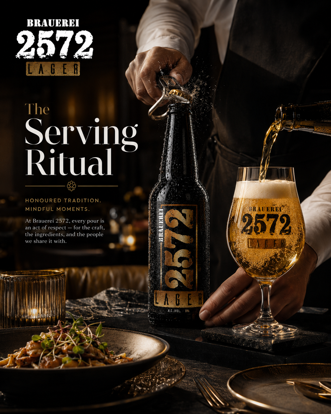
Serving Ritual
Respect the craft.
Respect the moment.
Enjoy the experience.
The Experience Begins Before The First Sip.
PREMIUM TASTING EXPERIENCE
FIVE DISTINCT BEERS. ONE SHARED PHILOSOPHY.
Every Flavor Strengthens The Same Brand Identity.
Each beer offers its own personality while remaining unmistakably connected to the Brauerei 2572 family. Editorial photography presents the collection together to demonstrate variety, consistency, and premium positioning.
Different recipes.
Shared identity.
One memorable tasting experience.
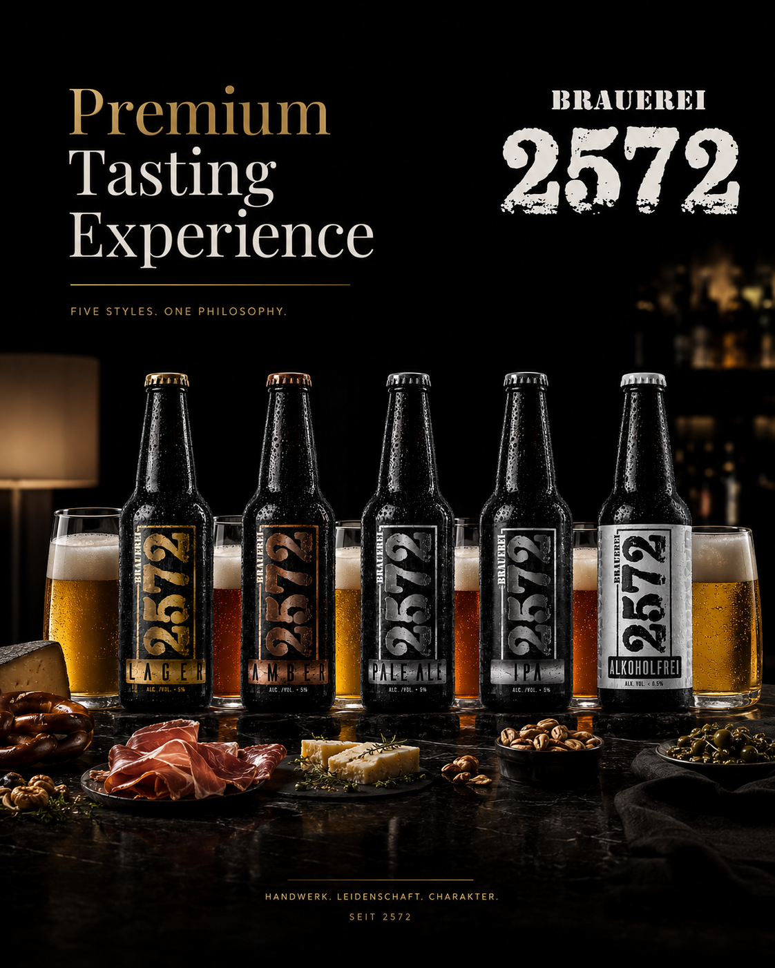
Premium Tasting Experience
Five expressions.
One brewery.
One unmistakable standard.
People Remember Great Taste. They Return Because Of Great Branding.
HOSPITALITY EXPERIENCE
WHERE BRAND IDENTITY BECOMES HUMAN EXPERIENCE.
The Strongest Brands Are Experienced Together.
A brewery is remembered through conversations, hospitality, shared meals, and genuine moments around the table. Photography extends the identity beyond packaging into the atmosphere where customers create lasting memories with the brand.
Because brands ultimately belong to people.
Not products.
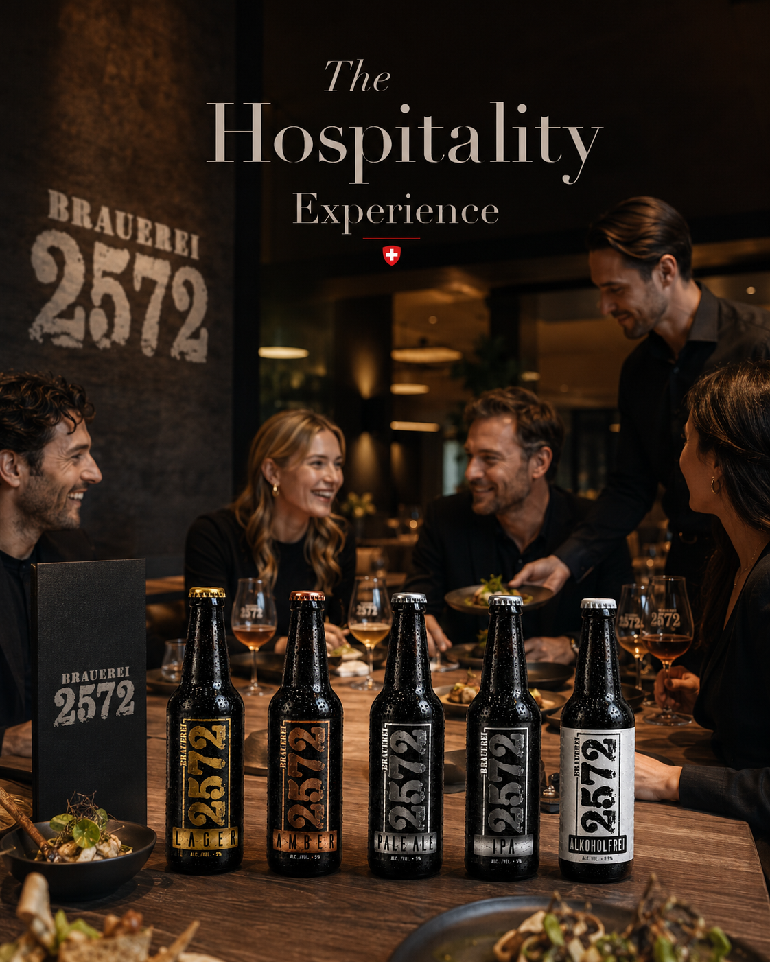
Hospitality Experience
Shared tables.
Shared stories.
Shared memories.
One authentic brewery.
Closing Statement The Brand Lives Wherever People Gather.
CHAPTER 04 - EXTRA EPILOGUE
EDITORIAL BRAND STORIES
Where Photography Becomes Brand Narrative.
Some Stories Are Better Experienced Than Explained.
THE BREWERY EXPERIENCE
Every Great Brewery Is Experienced Before It Is Remembered.
A remarkable Brand Experience extends beyond the bottle itself. The atmosphere, architecture, hospitality, conversations, and brewing process work together to create emotional connections that customers associate with the brand long after the last glass has been emptied.
The brewery becomes the brand.
The people become the story.
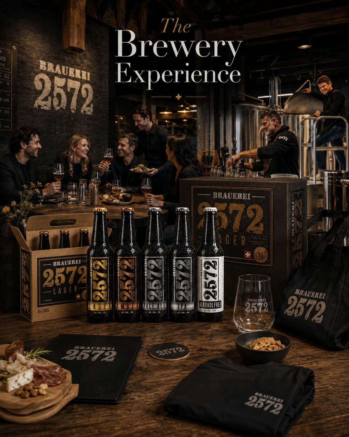
Brewery Experience
Authentic hospitality.
Real brewing.
Shared moments.
One living brand.
The Best Brand Experiences Feel Completely Natural.
CRAFTED FOR MOMENTS THAT LAST
Premium Brands Become Part Of People's Lives.
The strongest brands are not measured only by product quality but by the memories created around them. Friends, conversations, celebration, and authentic human connection transform exceptional products into unforgettable experiences.
Because people rarely remember advertising.
They remember moments.
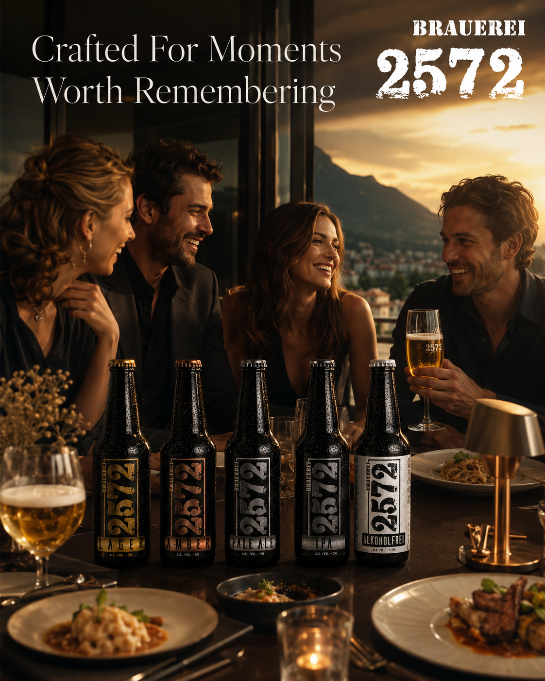
Brand Lifestyle
Shared memories.
Authentic emotion.
Lasting relationships.
Premium lifestyle.
Great Products Create Great Moments.
FINAL CHAPTER CONCLUSION - 04
FROM DESIGN TO DESIRE
The Strongest Images Never Sell A Product. They Make People Want To Experience It.
Every decision throughout this project ultimately reached one destination—
the camera.
Photography was never created to decorate the Brand Identity.
It was created to reveal it.
Every reflection.
Every material.
Every shadow.
Every composition.
Every image continues the same visual story first established through the Packaging Design System.
Because exceptional Product Photography does not invent quality.
It simply makes genuine quality impossible to ignore.
When craftsmanship, storytelling, and visual direction work together—
the product becomes more than packaging.
It becomes a brand people remember.
GREAT PRODUCTS ARE SEEN.
GREAT BRANDS ARE REMEMBERED.
EVERY IMAGE CONTINUES THE STORY.
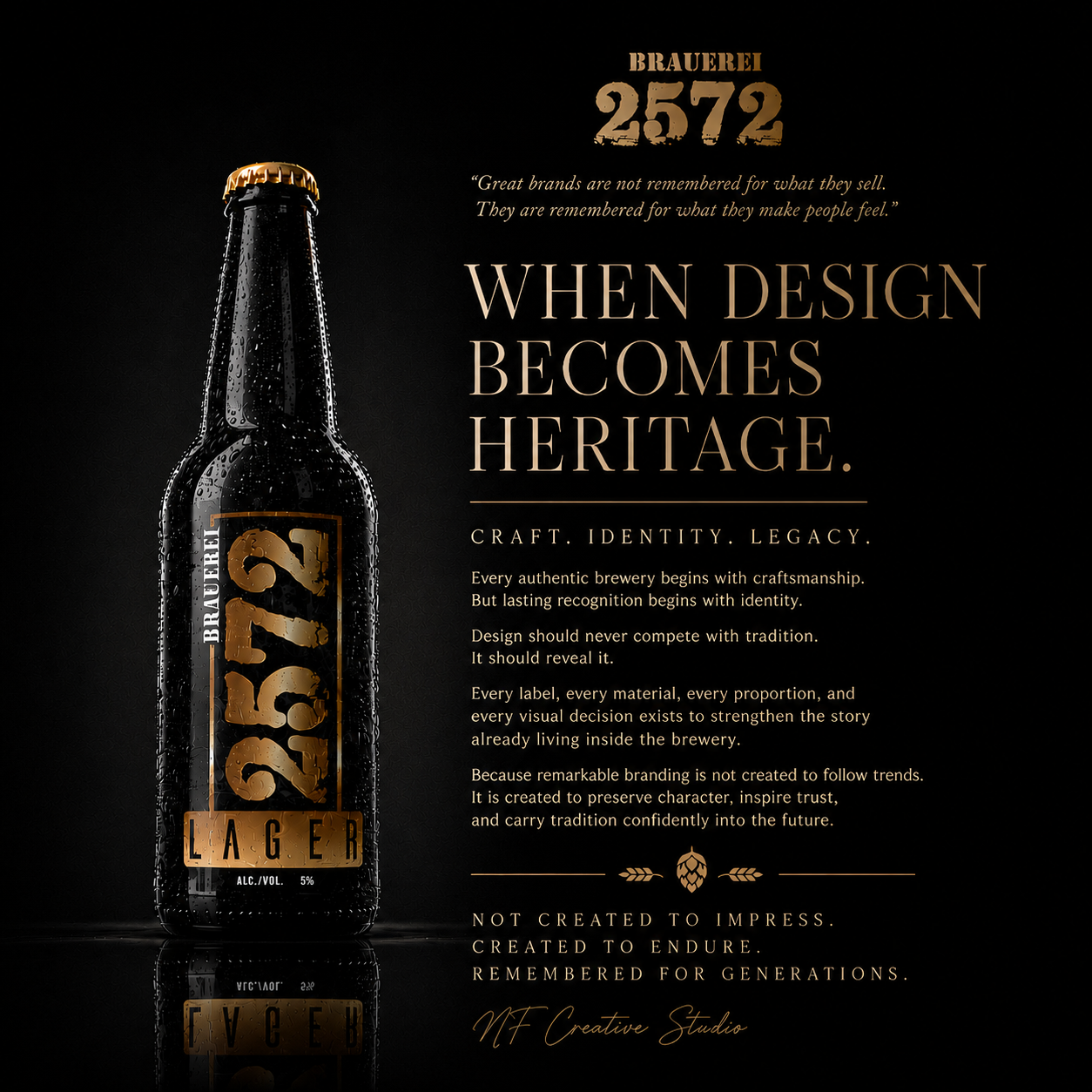
CHAPTER 05
MACRO DETAILS & MATERIAL EXPLORATION
Where Premium Materials Become Brand Experience.
Every Surface. Every Texture. Every Finish Was Designed To Reflect Craftsmanship.
MACRO DETAILS & MATERIAL STUDY
DISCOVERING THE DETAILS THAT DEFINE PREMIUM CRAFTSMANSHIP.
Every Surface. Every Texture. Every Finish Was Designed To Reward A Closer Look.
The Brauerei 2572 Macro Details Collection was created to reveal the craftsmanship hidden within every bottle—capturing the materials, textures, printing techniques, and production quality that often remain unnoticed at first glance but define the true character of a premium Craft Beer Packaging Design.
From the natural texture of the label paper and subtle metallic finishes to the precision of typography, premium glass reflections, and authentic condensation, every macro composition demonstrates how thoughtful details elevate both product perception and long-term Brand Recognition.
Different Details. Same Commitment. One Unmistakable Brewery.
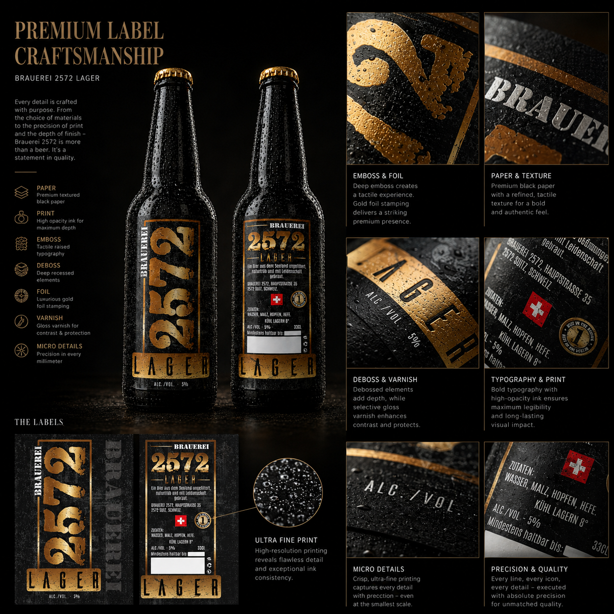
LUXURY FINISHING
PREMIUM FINISHES CREATE PREMIUM PERCEPTION.
Luxury Is Never Created By Decoration—It Is Revealed Through Precision, Material Selection, And Exceptional Finishing.
The visual identity of Brauerei 2572 was designed to achieve a level of finish normally associated with premium spirits, luxury cosmetics, and high-end Swiss manufacturing. Every printing technique was carefully selected to transform the label from a graphic application into a tactile brand experience.
The Luxury Label Finishing System combines Metallic Foil Stamping, Selective Varnish, Embossing, Debossing, Premium Paper, and precision printing to create multiple layers of visual depth. Rather than relying on excessive decoration, each finish contributes to hierarchy, readability, and perceived value.
Every reflective surface was intentionally balanced to react naturally under changing light conditions. The interaction between matte textures and metallic elements allows the label to reveal different characteristics from every viewing angle while maintaining a restrained premium appearance.
Beyond aesthetics, every finishing decision also improves durability and long-term product presentation. Premium coatings protect the printed surface while preserving color accuracy and tactile quality throughout transportation, retail display, and customer handling.
The finishing system strengthens the brewery’s Premium Brand Identity, ensuring that every bottle communicates craftsmanship before the product is even opened. Each detail contributes to a consistent visual language that reinforces recognition across the complete product family.
Ultimately, Luxury Packaging Design is not defined by expensive materials alone—it is defined by how thoughtfully every material is combined into one cohesive premium experience.
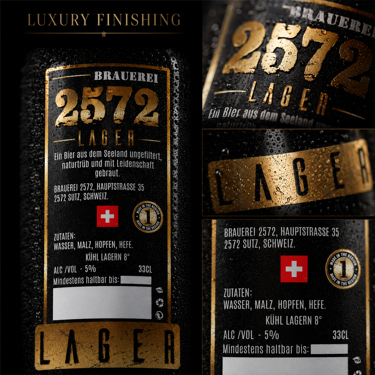
Macro Objectives:
✔ Premium Label Finishing
✔ Luxury Material Expression
✔ Enhanced Visual Depth
✔ Tactile Brand Experience
✔ Long-Term Premium Perception
Key Highlights:
✔ Metallic Foil Stamping
✔ Selective UV Varnish
✔ Emboss & Deboss Details
✔ Matte Premium Surface
✔ Multi-Layer Print Finish
✔ Luxury Label Craftsmanship
Deliverables:
✔ Finishing Specification
✔ Metallic Foil Layout
✔ Premium Print Preparation
✔ Surface Finish Guidelines
✔ Material Recommendations
✔ Production Ready Artwork
Luxury Finishing Strategy
The finishing system was developed to transform every Beer Label Design into a premium tactile experience while preserving timeless elegance and exceptional production quality.
Every surface, reflection, and material interaction contributes to a stronger Brand Identity, proving that premium craftsmanship begins long before the first sip.
When Every Surface Reflects Precision, Luxury Becomes Instantly Recognizable.
TYPOGRAPHY IN FOCUS
EVERY LETTER BUILDS RECOGNITION.
Typography Is Not Decoration—It Is The Most Consistent Voice A Brand Will Ever Have.
Typography became one of the strongest recognition tools throughout the Brauerei 2572 Brand Identity. Rather than following decorative trends, the letterforms were selected to communicate authenticity, confidence, and timeless Swiss craftsmanship.
Every typographic element was carefully balanced to establish hierarchy between the brewery name, product designation, technical information, and supporting content. The result is a system that remains highly legible while preserving a distinctive premium personality.
Large numeric typography creates immediate shelf recognition, while restrained supporting typography provides clarity without competing for attention. This controlled hierarchy improves customer navigation and strengthens visual consistency across the complete collection.
Spacing, proportions, alignment, and letter rhythm were refined repeatedly to achieve maximum readability across multiple viewing distances—from retail shelves to close-up product photography.
The typography also contributes to the tactile quality of the labels through embossing, metallic foil application, and premium printing techniques that reinforce every character physically as well as visually.
Ultimately, the Typography System became more than information—it became one of the strongest identifiers within the complete Craft Beer Branding strategy.
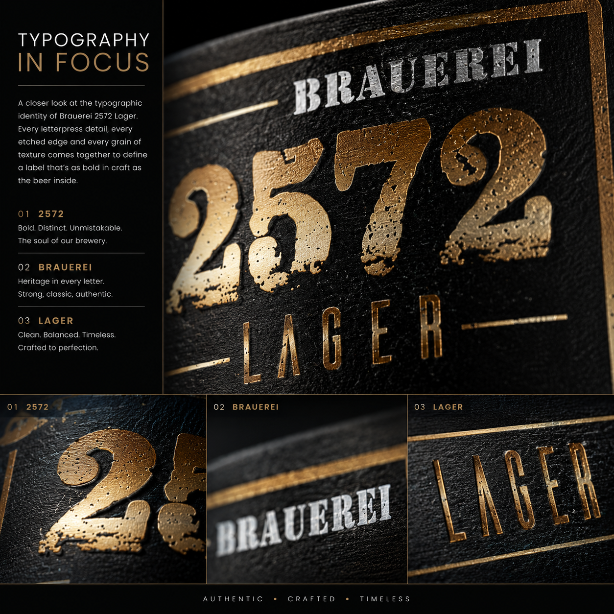
Macro Objectives:
✔ Brand Recognition
✔ Typographic Hierarchy
✔ Premium Readability
✔ Consistent Visual Language
✔ Timeless Character
Key Highlights:
✔ Custom Layout System
✔ Large Recognition Numbers
✔ Premium Letter Spacing
✔ High Contrast Typography
✔ Editorial Hierarchy
✔ Production Accuracy
Deliverables:
✔ Typography System
✔ Layout Guidelines
✔ Hierarchy Standards
✔ Production Typography
✔ Print Specifications
✔ Final Artwork
Typography Strategy
The typography system was developed to ensure every product communicates clarity, confidence, and consistency while reinforcing the complete Visual Identity System.
Every letter strengthens recognition before customers even begin reading.
Recognition Begins Long Before Reading.
MATERIAL MATTERS
PREMIUM MATERIALS CREATE LASTING IMPRESSIONS.
Authenticity Can Be Seen. Exceptional Materials Can Be Felt.
Every premium product deserves materials that reinforce the quality contained inside. For Brauerei 2572, material selection became an essential component of the overall Packaging Design Strategy rather than a simple production decision.
Premium uncoated paper was selected to provide a refined tactile experience inspired by traditional craftsmanship while maintaining excellent print performance and durability. The subtle paper texture adds depth without distracting from the visual identity.
Combined with carefully controlled matte finishes, the material creates a natural contrast against metallic foil, allowing every premium element to stand out without excessive visual complexity.
Every surface was evaluated under different lighting conditions to ensure consistent visual performance in retail environments, professional photography, and everyday customer interaction.
Material selection also contributes to long-term durability by protecting color consistency, improving handling quality, and preserving the premium appearance throughout the product lifecycle.
Ultimately, exceptional Label Materials transform a simple printed label into a memorable physical brand experience that customers instinctively associate with premium quality.
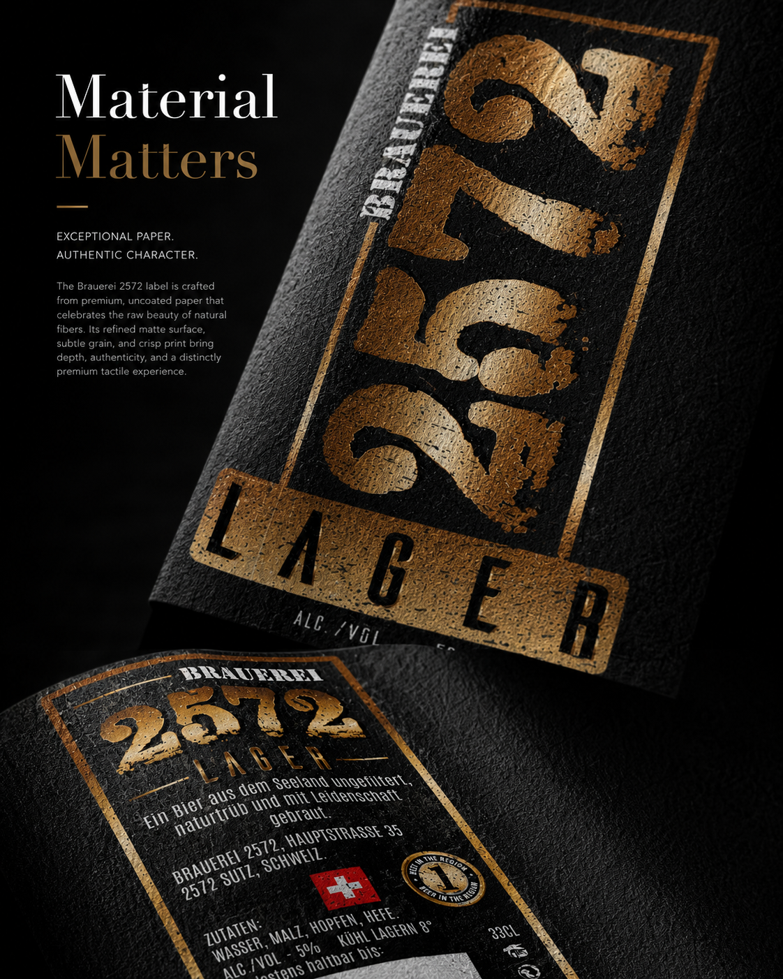
Macro Objectives:
✔ Premium Paper Selection
✔ Material Authenticity
✔ Tactile Experience
✔ Luxury Surface Quality
✔ Long-Term Durability
Key Highlights:
✔ Premium Uncoated Paper
✔ Matte Finish
✔ Natural Texture
✔ Metallic Contrast
✔ Authentic Feel
✔ Luxury Craftsmanship
Deliverables:
✔ Material Specification
✔ Paper Selection
✔ Finish Recommendation
✔ Production Guidelines
✔ Print Ready Files
✔ Material Samples
Material Strategy
Every material was selected to support the complete Brand Identity, ensuring consistency across print production, customer interaction, and premium product presentation.
Premium Design Begins With Premium Materials.
PRODUCTION PRECISION
EVERY MILLIMETER MATTERS.
Exceptional Design Only Becomes Exceptional Packaging When Production Executes It Perfectly.
The visual identity of Brauerei 2572 was developed with manufacturing precision from the earliest design stages. Every layout, alignment, safety margin, and production specification was prepared to guarantee flawless print reproduction.
The complete Print Production System includes accurate color management, bleed control, crop marks, registration standards, foil positioning, and finishing specifications to ensure every label performs consistently across commercial production.
Print-ready artwork was optimized for professional offset and digital workflows, allowing manufacturers to reproduce every detail without compromising quality or precision.
Every production file was tested for consistency across multiple print scenarios to guarantee reliable results while minimizing manufacturing risks and production errors.
Technical preparation also improves production efficiency by simplifying communication between designers, printers, and manufacturers throughout every stage of the printing process.
Ultimately, exceptional production preparation protects the integrity of the Packaging Design, ensuring the final product remains identical to the original creative vision.
Macro Objectives:
✔ Print Precision
✔ Manufacturing Accuracy
✔ Production Consistency
✔ Quality Control
✔ Technical Excellence
Key Highlights:
✔ Print Ready Artwork
✔ CMYK Control
✔ Registration Precision
✔ Crop & Safety Marks
✔ Production Standards
✔ Manufacturing Workflow
Deliverables:
✔ Final PDF Files
✔ AI Source Files
✔ Print Specifications
✔ Color References
✔ Production Documentation
✔ Manufacturing Guidelines
Production Strategy
Professional preparation ensures every Beer Label Design moves confidently from concept to production while preserving absolute quality and consistency.
Great Design Deserves Perfect Production.
CRAFTED TO THE FINEST DETAIL
TRUE QUALITY LIVES IN THE DETAILS.
Customers May Never Notice Every Detail Individually—But They Always Feel Their Combined Effect.
Every bottle was refined far beyond its primary function, transforming ordinary production elements into carefully considered brand expressions. From the crown cap to the bottle shoulder, every surface contributes to the premium perception of Brauerei 2572.
The bottle proportions, label positioning, reflections, and condensation were all evaluated to achieve a realistic commercial presentation while maintaining visual consistency across the complete product family.
Each production element supports the overall Premium Brand Identity, creating subtle layers of quality that strengthen recognition without relying on unnecessary decoration.
Rather than overwhelming the customer with complexity, the design allows craftsmanship to emerge naturally through precision, balance, and exceptional execution.
This attention to detail ensures that every viewing distance—from retail shelves to macro photography—reveals another layer of thoughtful design.
Ultimately, true premium design is measured not by what is added, but by how carefully every existing detail is refined.
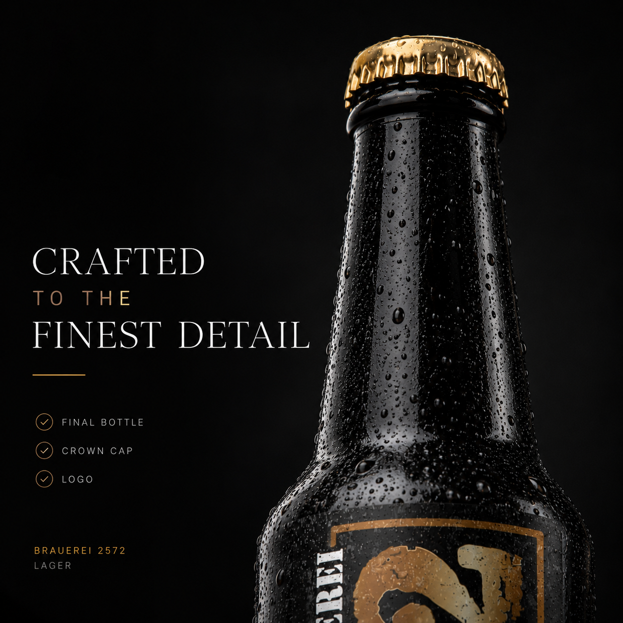
Perfection Is Built One Detail At A Time.
PREMIUM GLASS ARTISTRY
EVERY REFLECTION COMMUNICATES QUALITY.
Premium Glass Does Not Compete With The Label—It Elevates It.
The bottle itself became an integral component of the Brand Identity System, designed to complement the label while reinforcing the brewery’s premium positioning.
Every reflection, curvature, highlight, and glass transition was carefully studied to maximize realism within commercial product photography and luxury presentation.
Controlled reflections reveal the bottle’s elegant proportions without distracting from the visual hierarchy of the label.
Natural condensation enhances authenticity while emphasizing freshness and product quality, creating an emotional connection before the first sip.
The combination of premium glass manufacturing and carefully balanced lighting transforms the bottle into a sculptural object worthy of close observation.
Ultimately, exceptional Glass Craftsmanship allows every detail of the brand to perform at its highest level.
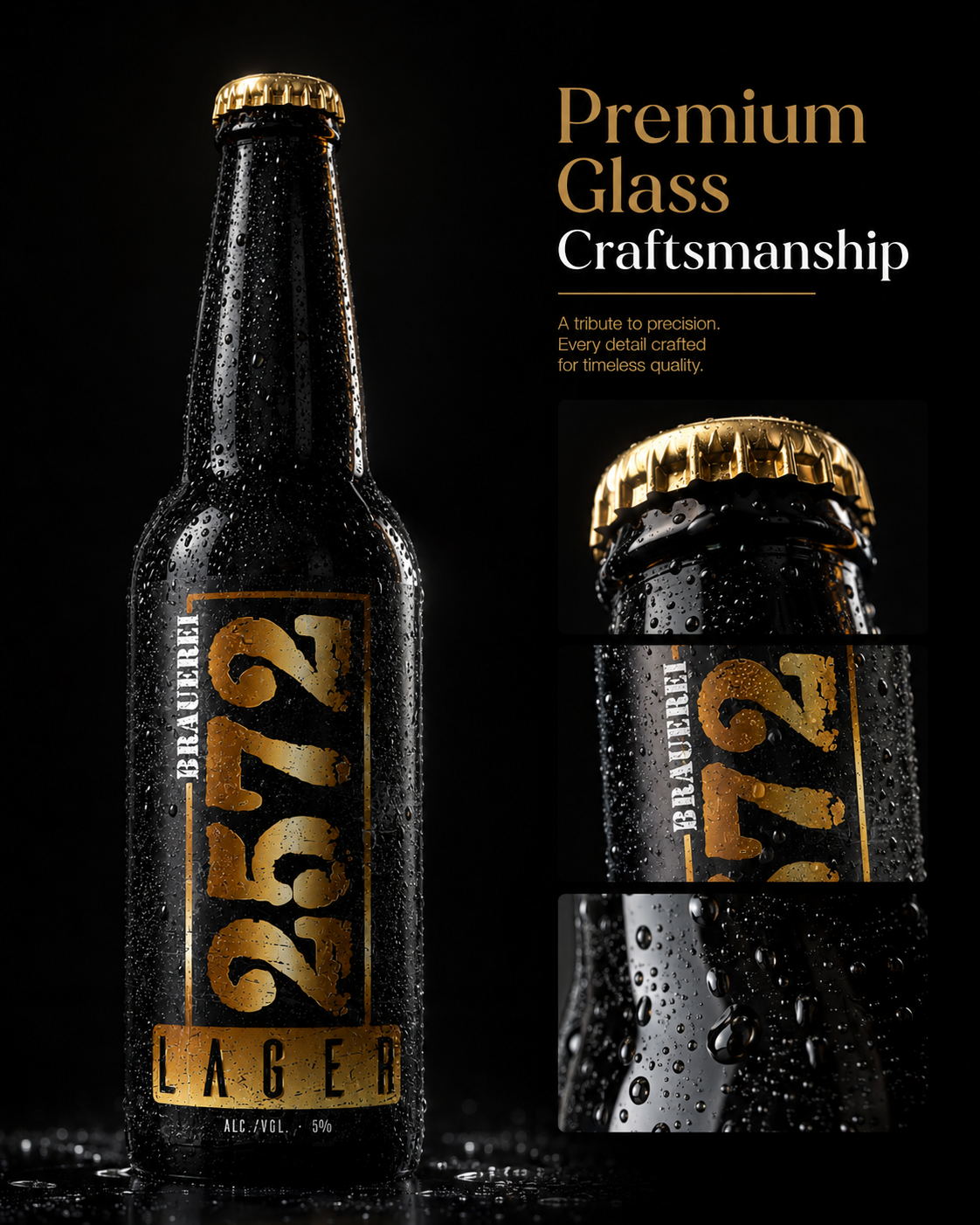
Luxury Is Reflected Before It Is Experienced.
LIGHT DEFINES LUXURY
GREAT PRODUCTS ARE DESIGNED. LUXURY IS REVEALED BY LIGHT.
Light Does Not Create Premium Quality—It Reveals It.
“Light Does Not Create Premium Quality—It Reveals It.”
Lighting played a fundamental role throughout the complete Product Photography system, defining depth, texture, material quality, and visual hierarchy across every presentation.
Rather than using dramatic visual effects, controlled studio lighting was carefully positioned to emphasize authentic reflections, premium materials, and natural bottle geometry.
Each highlight was intentionally placed to strengthen readability while preserving the restrained elegance characteristic of premium Swiss branding.
The relationship between light, shadow, and reflection transforms every bottle into a sophisticated visual object that communicates craftsmanship before any information is read.
This disciplined photographic approach ensures visual consistency across packaging, editorial presentation, marketing communication, and digital platforms.
Ultimately, exceptional lighting completes the Luxury Product Photography system by revealing the craftsmanship already built into every bottle.
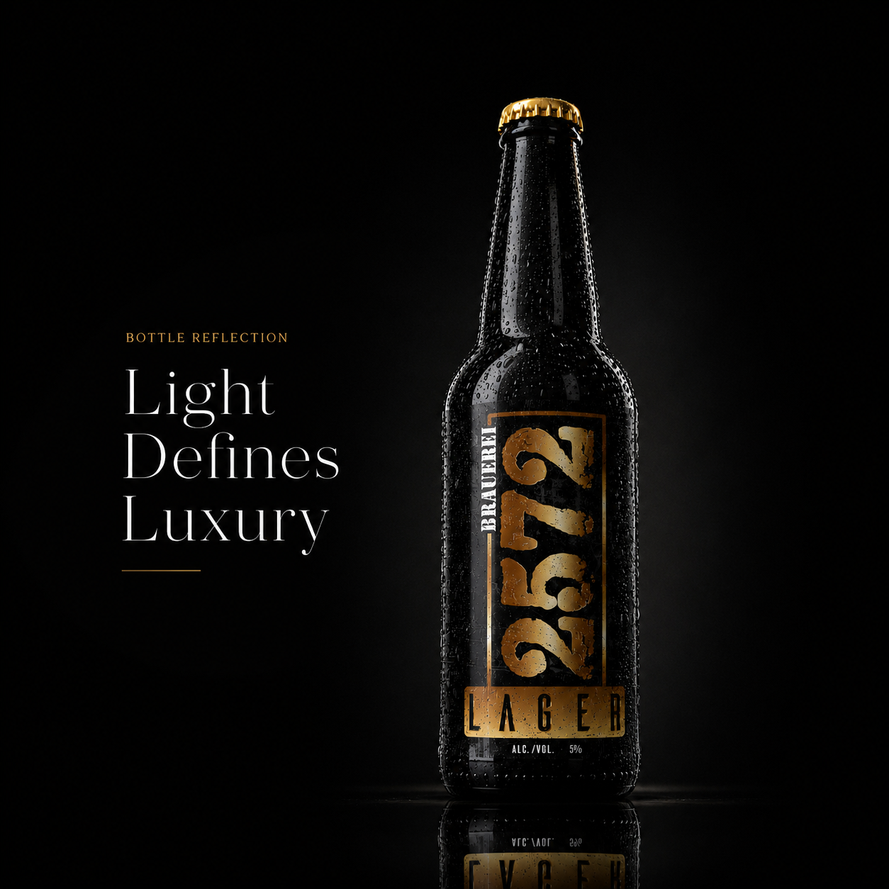
When Light Reveals Craftsmanship, Luxury Speaks Without Words.
FINAL CHAPTER CONCLUSION - 05
FROM CRAFTSMANSHIP TO PERFECTION
When The Smallest Details Become The Strongest Statement.
Every premium product eventually reaches a point where quality is no longer judged by specifications.
It is judged by feeling.
By the weight of the bottle.
By the texture of the label.
By the precision of every printed edge.
By the way light reflects across carefully selected materials.
For Brauerei 2572, every macro detail was intentionally refined to communicate craftsmanship long before the first sip.
Because exceptional Beer Packaging is never created through decoration.
It is created through precision.
Every texture reinforces authenticity.
Every finish reinforces quality.
Every material reinforces trust.
And together they transform ordinary packaging into a premium customer experience.
The difference between good design and remarkable design rarely exists in the obvious decisions.
It lives inside the details most people never consciously notice—
but immediately remember.
A PREMIUM BRAND IS BUILT ONE DETAIL AT A TIME.
TRUE QUALITY NEVER NEEDS TO ANNOUNCE ITSELF.
PEOPLE SIMPLY FEEL IT.
CHAPTER 06
BUILDING A COMPLETE BRAND ECOSYSTEM
Where Every Touchpoint Becomes Part Of The Same Brand Story.
Beyond Packaging. Beyond Photography. A Brand Designed To Live Everywhere.
COMPLETE BRAND ECOSYSTEM
WHERE EVERY TOUCHPOINT BECOMES PART OF THE SAME BRAND STORY.
Beyond Packaging. Beyond Photography. A Brand Designed To Live Everywhere.
The Brauerei 2572 Brand Ecosystem was created to extend one consistent Brand Identity across every customer interaction—from Packaging Design and branded merchandise to retail environments, hospitality experiences, corporate communication, and everyday brand applications.
Rather than treating every touchpoint as an isolated design project, each application follows one unified Visual Identity System, ensuring consistent recognition, stronger Brand Experience, and long-term Brand Recognition wherever customers encounter the brewery.
One Identity. Unlimited Applications. One Unmistakable Brewery.
BRAND IDENTITY SYSTEM
Every Brand Begins With A System Before It Becomes A Reputation.
A complete Brand Identity System extends far beyond a logo. Every document, stationery element, corporate material, and communication asset reinforces the same Visual Identity, ensuring consistency across every interaction.
The Brauerei 2572 identity system establishes a unified foundation that communicates Professionalism, Swiss Precision, and long-term Brand Recognition through every printed and digital touchpoint.
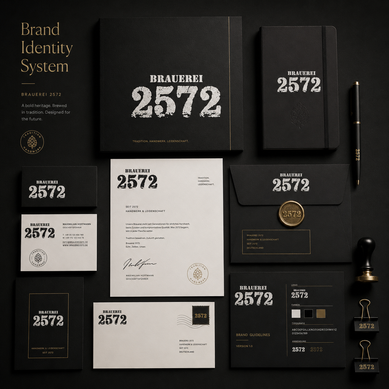
Brand Identity System
Consistent communication.
Professional presentation.
Unified visual standards.
Built for long-term recognition.
Every Identity Begins With Consistency.
BRAND LEGACY
When Every Brand Element Becomes Part Of One Story.
A remarkable Brand Experience is created when packaging, merchandise, printed materials, hospitality, and communication all reinforce the same visual language. Every customer interaction strengthens familiarity and trust.
Brauerei 2572 demonstrates how one carefully developed Brand System expands naturally across products, experiences, and physical environments.
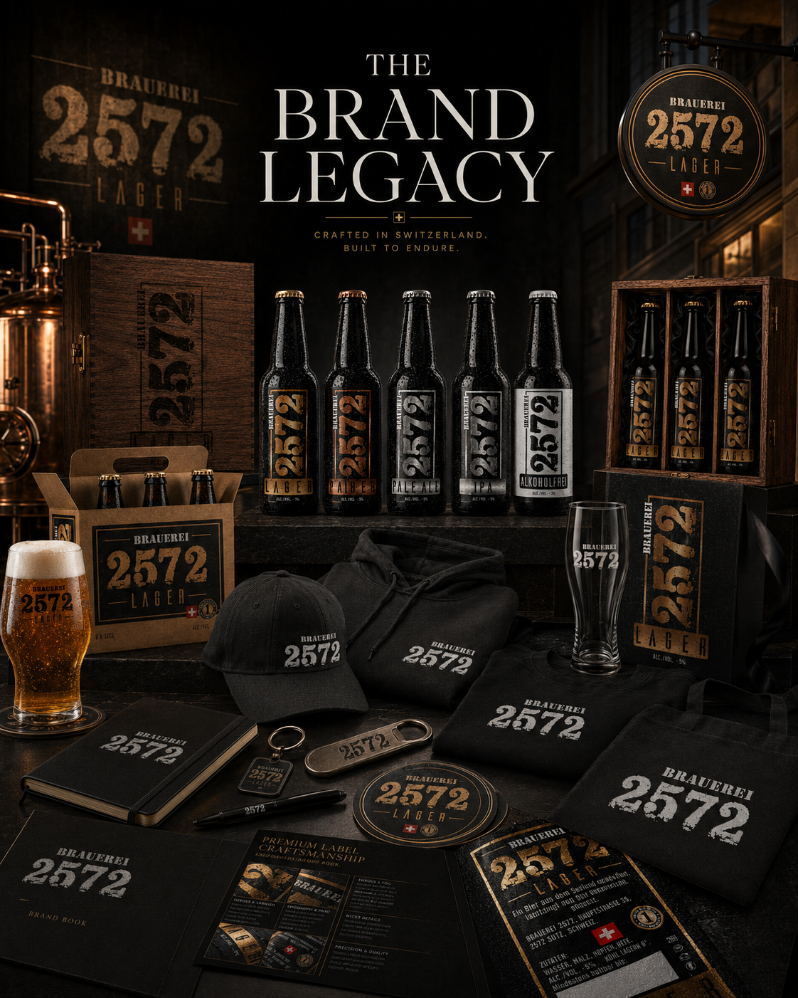
Brand Legacy
One identity.
Many touchpoints.
Endless consistency.
Built to endure.
A Great Brand Never Exists In One Format.
THE BREWERY BRAND WORLD
Designing A Brand People Can Step Inside.
The strongest Brand Identity is not limited to packaging. It creates a complete environment where architecture, merchandise, hospitality, retail presentation, and customer experience all communicate the same story.
Every detail contributes to one recognizable Brewery Brand World built around craftsmanship, authenticity, and premium positioning.
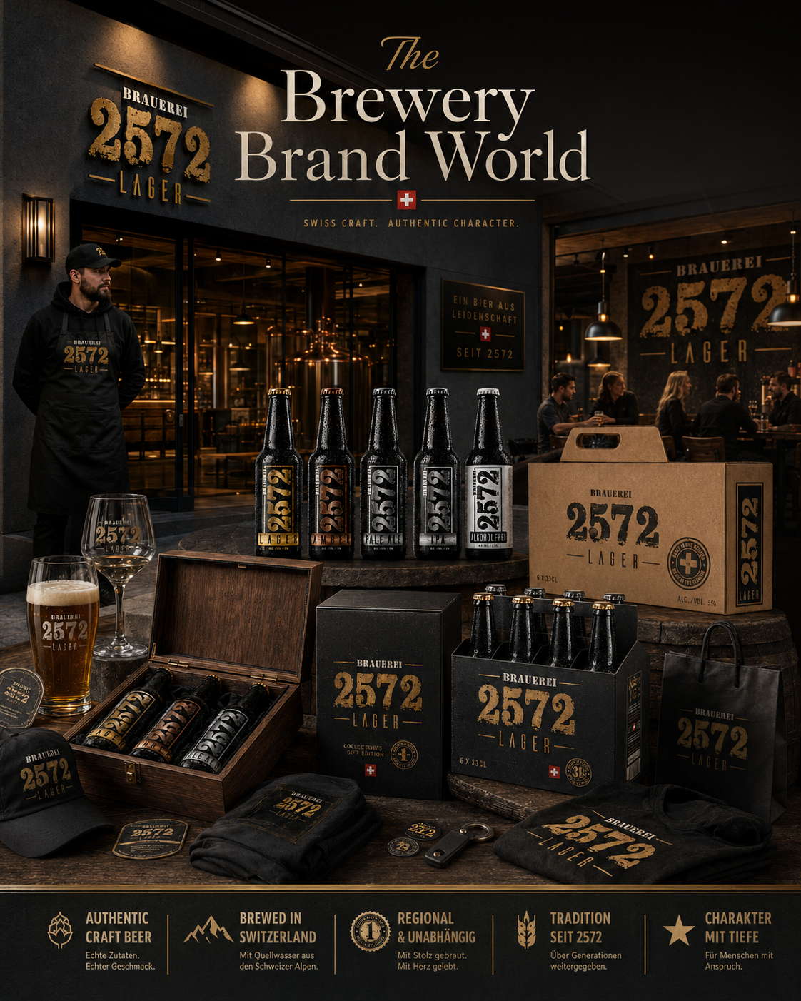
Brewery Brand World
Complete experience.
Connected ecosystem.
Authentic atmosphere.
Living identity.
Brands Become Strongest When They Become Places.
PREMIUM BRAND GOODS
Extending The Brand Beyond The Bottle.
Premium Branded Merchandise transforms everyday objects into lasting reminders of the brewery. Apparel, accessories, glassware, and lifestyle products extend recognition far beyond the first purchase.
Every item reinforces the same Visual Identity, strengthening customer loyalty and expanding the emotional value of the brand.
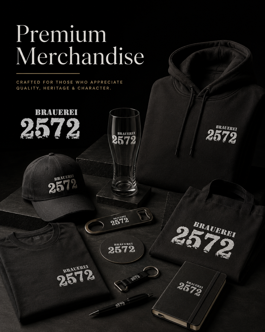
Premium Merchandise
Lifestyle branding.
Brand loyalty.
Collectible quality.
Everyday recognition.
Great Brands Continue Long After The Product Is Finished.
RETAIL EXPERIENCE
Where Brand Recognition Meets Purchase Decisions.
Exceptional Retail Design ensures the brewery stands out in real commercial environments. Shelf presentation, refrigeration displays, branded materials, and product visibility work together to maximize Shelf Impact and customer recognition.
Consistency across every retail touchpoint creates confidence before the first bottle is even picked up.
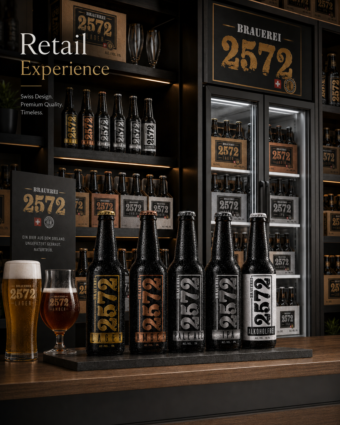
Retail Experience
Premium shelf presence.
Instant recognition.
Commercial consistency.
Built for retail success.
Recognition Begins Before The First Bottle Is Chosen.
FINAL CHAPTER CONCLUSION - 06
FROM IDENTITY TO LEGACY
The Greatest Brands Eventually Stop Feeling Designed. They Simply Become Part Of People's Lives.
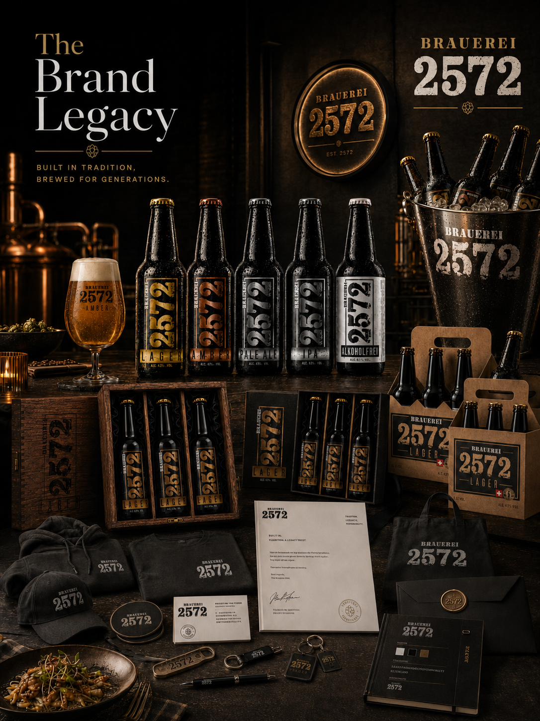
Every chapter of this project explored a different aspect of building a premium brewery.
From Brand Strategy…
to Packaging Design…
to Photography…
to Material Exploration…
Every decision served one objective—
to create a brewery people would instantly recognize, trust, and remember.
Because exceptional branding is never measured by one logo.
One package.
Or one photograph.
It is measured by how naturally every experience feels connected.
That is where Brand Identity becomes Brand Legacy.
That is where design becomes memory.
GREAT PRODUCTS CREATE CUSTOMERS.
GREAT BRANDS CREATE BELONGING.
THE REST BECOMES LEGACY.
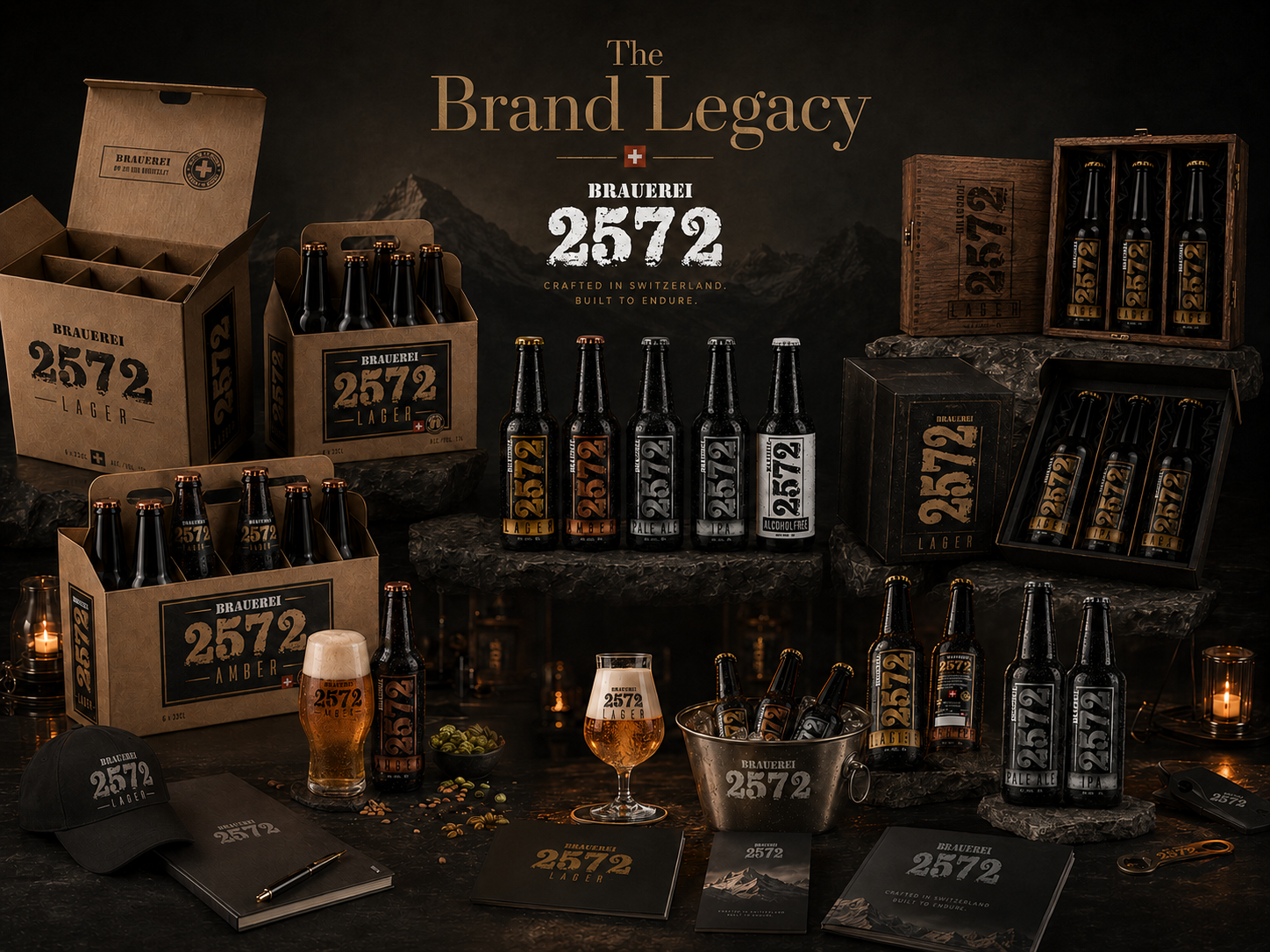
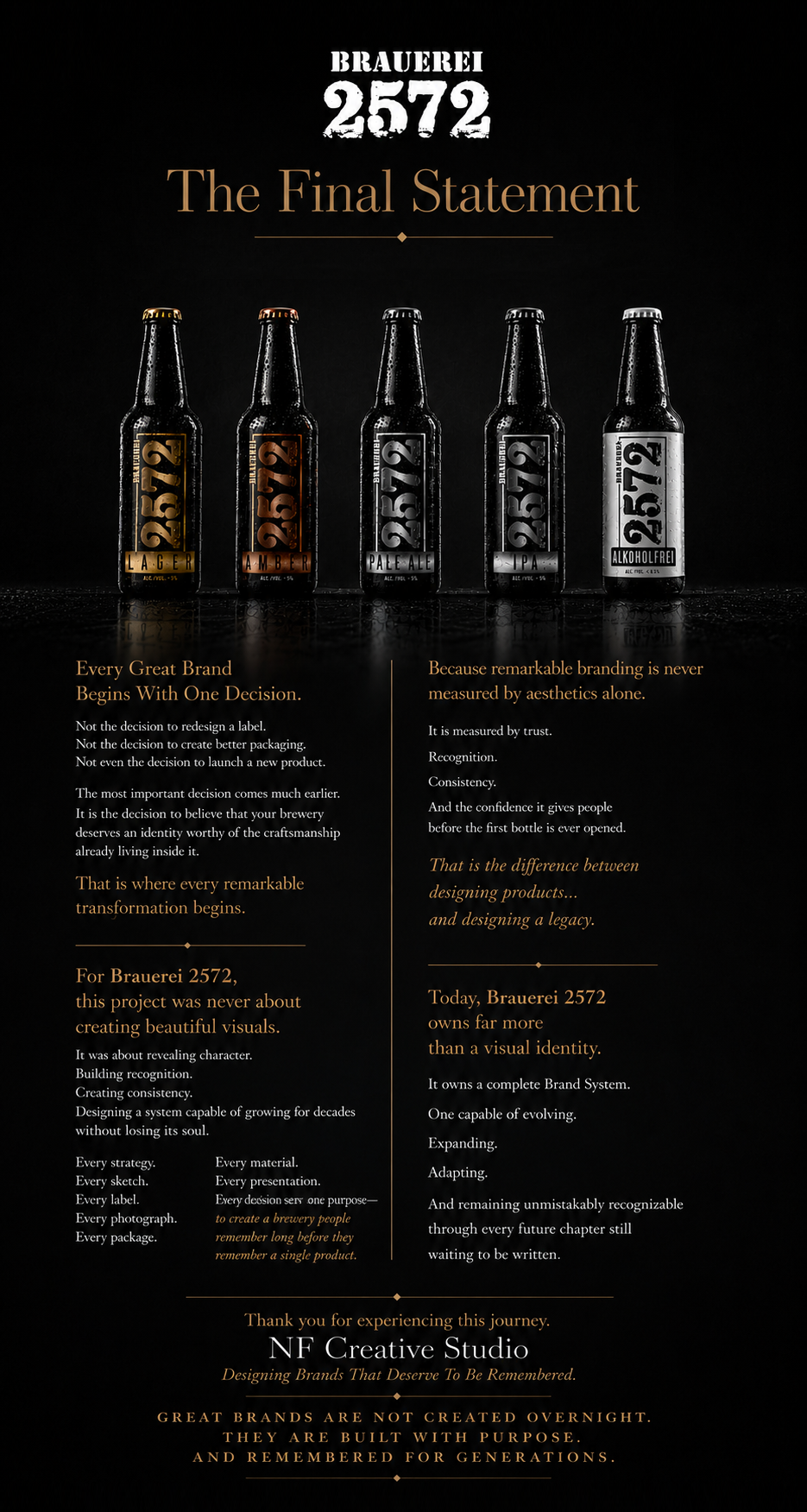
NF CREATIVE STUDIO
GREAT PACKAGING BEGINS BEFORE THE FIRST BOTTLE REACHES THE SHELF.
It Begins By Understanding The Craft, Character, And Tradition A Brewery Has Spent Years Building.
THE BREWERY HAS BEEN INTRODUCED.
NOW WE REVEAL HOW ITS HERITAGE BECAME A BRAND SYSTEM.
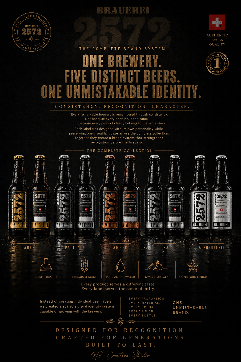
Results:
FROM STRATEGIC THINKING TO MEASURABLE BRAND VALUE
When Every Decision Supports The Same Vision, Results Become Inevitable.
Every successful Brand Identity System is ultimately measured by one thing—
not by how impressive it looks,
but by how consistently it performs.
Throughout the Brauerei 2572 project, every strategic decision, visual refinement, packaging solution, photographic direction, and production specification contributed to one unified objective:
creating a brewery that people recognize instantly, trust naturally, and remember long after the first impression.
Rather than delivering isolated creative assets, the project established a complete Brand Ecosystem designed to support future growth while preserving authentic Swiss brewery heritage.
PROJECT OUTCOMES:
✓ Complete Brand Identity System
A unified visual language that creates immediate recognition across every product, package, environment, and communication channel.
✓ Scalable Packaging Architecture
A flexible packaging system prepared for future product launches without sacrificing consistency, production efficiency, or premium positioning.
✓ Strong Shelf Recognition
Distinctive typography, refined hierarchy, premium materials, and carefully balanced color differentiation improve visibility while strengthening overall Brand Recognition.
✓ Premium Product Perception
Every material, texture, finish, and photographic presentation reinforces craftsmanship before the customer even opens the bottle.
✓ Consistent Customer Experience
From brewery visits and hospitality environments to retail shelves, collector editions, and digital presentations—every touchpoint communicates the same story.
✓ Long-Term Brand Foundation
Instead of solving today’s design challenge, the project established a strategic platform capable of supporting decades of future brand development.
STRATEGIC IMPACT:
The value of this project extends far beyond Packaging Design.
It created a complete framework where Brand Strategy, Product Identity, Packaging Architecture, Material Design, Editorial Photography, Visual Storytelling, and Customer Experience work together as one connected system.
This transforms branding from a collection of creative deliverables into a measurable business asset capable of increasing recognition, strengthening perception, supporting expansion, and protecting long-term brand equity.
WHAT THIS PROJECT DELIVERED:
✔ Immediate Brand Recognition
✔ Premium Market Positioning
✔ Scalable Brand Architecture
✔ Unified Customer Experience
✔ Stronger Product Differentiation
✔ Long-Term Visual Consistency
✔ Future Product Expansion Readiness
✔ Editorial-Level Brand Presentation
✔ Production-Ready Packaging System
✔ A Complete Brewery Brand Ecosystem
FINAL STATEMENT
Great design is rarely remembered because it looks beautiful. It is remembered because it quietly makes everything feel unmistakably connected. That is what this project achieved. Not a better label. Not better packaging. A stronger brewery. A clearer identity. A brand prepared for the future.
ONE STRATEGY. ONE IDENTITY. ONE COMPLETE BRAND ECOSYSTEM.
| PROJECT SUMMARY | STATUS |
|---|---|
| Brand Strategy | ✓ Completed |
| Visual Identity | ✓ Completed |
| Packaging System | ✓ Completed |
| Product Collection | ✓ 5 Final Products |
| Packaging Solutions | ✓ 7 Final Systems |
| Editorial Photography | ✓ Complete |
| Lifestyle Campaigns | ✓ Complete |
| Macro Material Studies | ✓ Complete |
| Brand Experience | ✓ Complete |
| Corporate Identity | ✓ Complete |
| Production Docs | ✓ Complete |
| Print Files | ✓ Ready |
| Brand Guidelines | ✓ Delivered |
| Expansion Platform | ✓ Established |
| Brand Ecosystem | ✓ Built |
| PROJECT STATUS | CURRENT STATE |
|---|---|
| Brand Strategy | ✓ Successfully Completed |
| Research & Discovery | ✓ Completed |
| Brand Identity System | ✓ Established |
| Packaging Design System | ✓ Fully Developed |
| Product Portfolio | ✓ Successfully Expanded |
| Packaging Architecture | ✓ Completed |
| Typography System | ✓ Completed |
| Color Strategy | ✓ Finalized |
| Material & Finish System | ✓ Validated |
| Macro Detail Exploration | ✓ Documented |
| Product Photography | ✓ Editorial Collection Completed |
| Lifestyle Photography | ✓ Completed |
| Hospitality Experience | ✓ Visualized |
| Retail Experience | ✓ Developed |
| Brand Merchandise | ✓ Completed |
| Corporate Identity | ✓ Delivered |
| Production Assets | ✓ Ready |
| Print-Ready Artwork | ✓ Delivered |
| Brand Guidelines | ✓ Established |
| Future Expansion Platform | ✓ Successfully Integrated |
| Complete Brand Ecosystem | ✓ Successfully Built |
ONE STRATEGY. ONE IDENTITY. ONE COMPLETE BRAND ECOSYSTEM.
| PROJECT CONCLUSION | STATUS |
|---|---|
| Final Delivery | ✓ Complete |
| Production Readiness | ✓ Ready |
| Brand System | ✓ Established |
| Future Scalability | ✓ Secured |
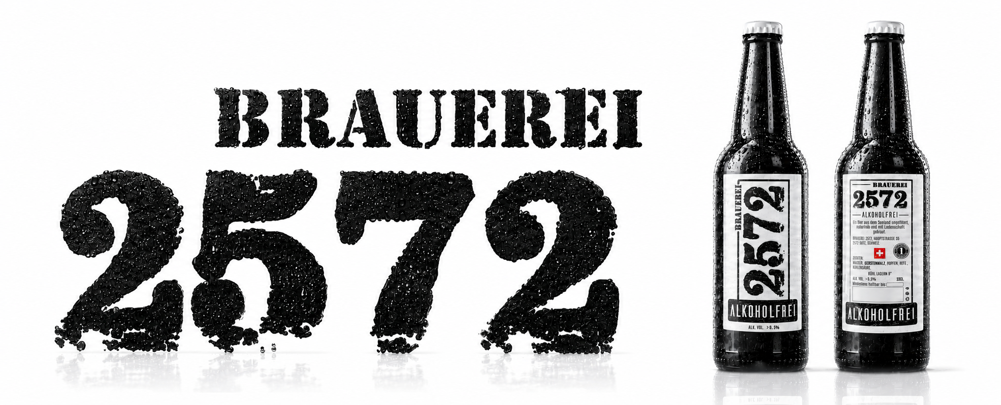
"From Traditional Brewing Heritage to a Scalable Premium Brand Experience."
Crafting a Stronger Brand Identity
We partnered with Brauerei 2572 to transform a collection of individual Beer Labels into a unified and strategically developed Brand Identity System. By combining Packaging Design, Brand Strategy, Visual Storytelling, Product Positioning, and consistent Brand Architecture, we created a stronger, more recognizable market presence while preserving the brewery’s authentic Swiss Craft Beer Heritage.
From the original beer portfolio to the newly introduced Alcohol-Free Beer, every design decision was strategically developed to improve Shelf Visibility, strengthen Brand Recognition, increase customer trust, and support long-term Brand Growth. The result is a cohesive Packaging Design System and premium Visual Identity that enables future product expansion while remaining true to the craftsmanship, tradition, and values that define Brauerei 2572.
"Great packaging doesn't just sell a product — it builds a brand customers remember."
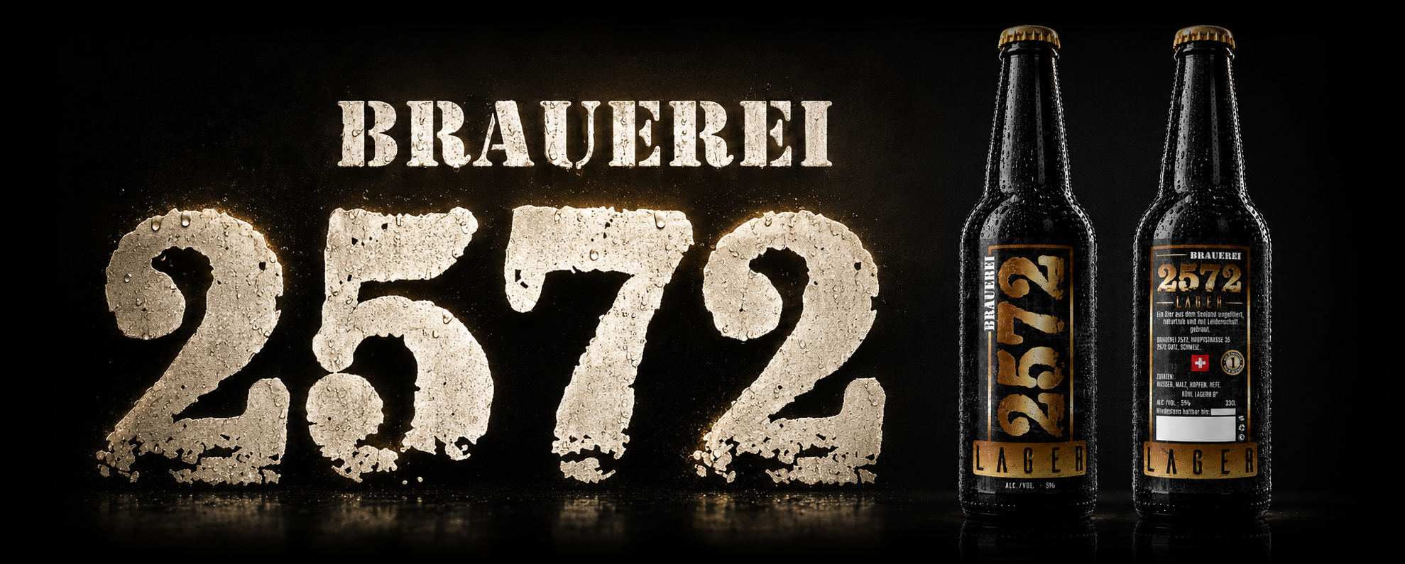
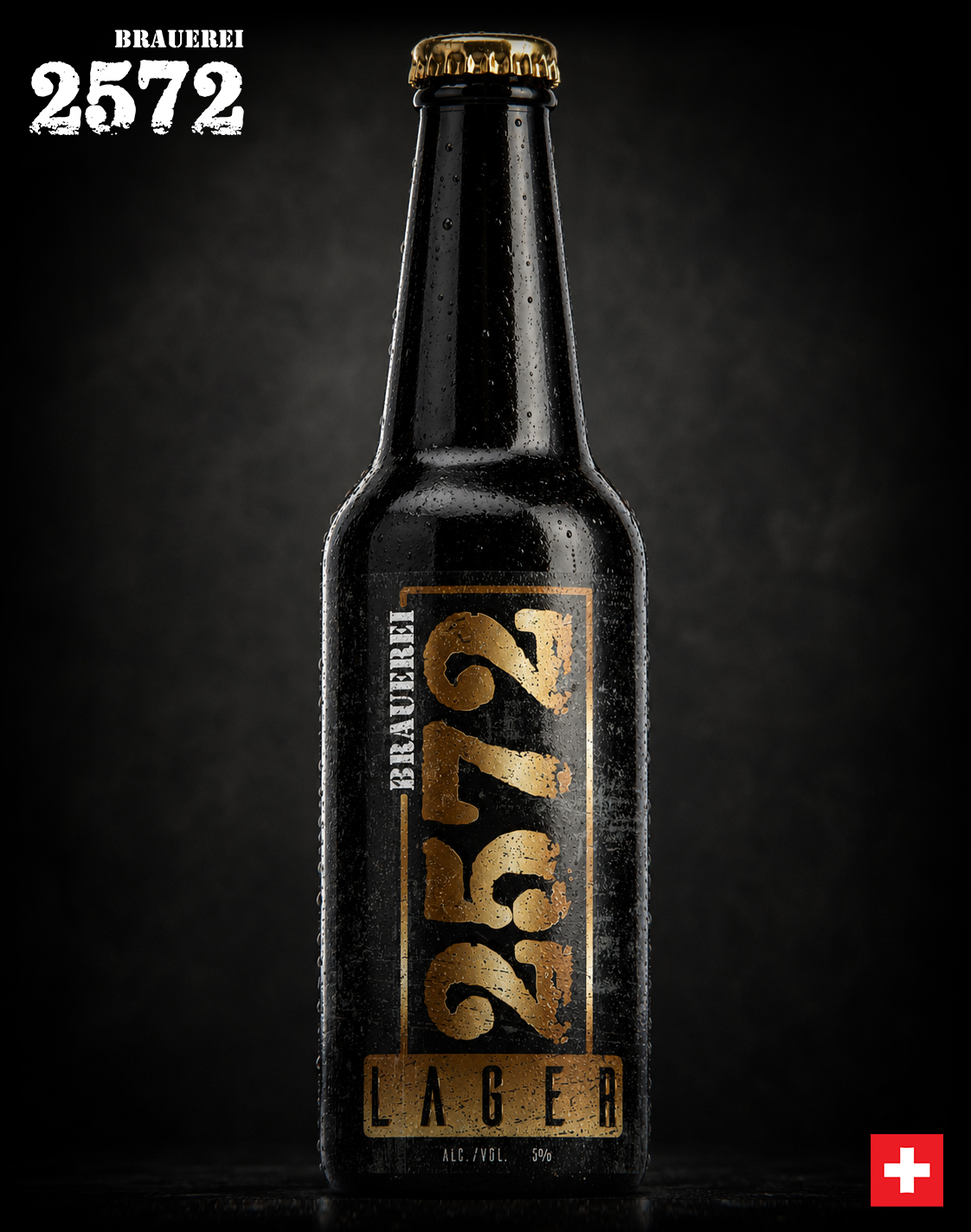

Conclusion:
Creating A Beer Brand Built For Recognition, Growth, And Longevity
This project demonstrates how a well-designed beer label is crucial for market success. Through brand analysis, market research, and carefully crafted graphic elements, a series of labels were created that not only look great but also effectively communicate the values of Brauerei 2572.
The success of the original Packaging Design project evolved into a long-term partnership with Brauerei 2572, continuing through the development of the brewery’s new Alcohol-Free Beer. This follow-up project demonstrates how strategic Brand Development, Beer Label Design, and a scalable Packaging Design System can successfully support Product Innovation, future product launches, and sustainable business growth while maintaining a consistent Brand Identity.
By extending the established visual language across new product categories, we created a cohesive Brand Architecture that strengthens Market Recognition, reinforces customer trust, and provides a flexible foundation for continued portfolio expansion. The result is a future-ready Craft Beer Brand built on consistency, premium design, and long-term commercial success.
If you need a visual identity that will make your brand stand out in a competitive market – contact Infinity Design Studio.
"Great Craft Beer Brands Don't Win Attention By Chance. They Earn Recognition Through Consistent Design."
FINAL THOUGHT
Great Breweries Are Remembered Long Before The First Sip.
Exceptional beer packaging does more than identify a product—it introduces the brewery, communicates its character, and builds recognition before the bottle is ever opened. Every successful redesign is the result of balancing authenticity, craftsmanship, and strategic brand evolution while respecting the heritage that makes every brewery unique.
Every sketch.
Every refinement.
Every label.
Each creative decision strengthened the connection between tradition, quality, and memorable brand recognition.
For Brauerei 2572, packaging became more than a product identity.
It became the visual story of the brewery itself.
WHERE EVERY LABEL TELLS A BREWERY'S STORY.
IMPACT & METRICS:
Increase in
Shelf Visibility
Growth in Sales at
Hospitality Venues
More Social Media
Engagement
Striking packaging generated significantly more customer photos, shares, and mentions online.
Improved Consumer
Differentiation
Beer types are now instantly recognizable, reducing confusion and increasing customer satisfaction and loyalty.
Years Of Experience
Enhanced brand presence enabled distribution expansion into more high-end retail locations and specialty shops.
Increased Brand Trust Among
Premium Consumers
The redesign introduced a sense of heritage, quality, and authenticity that reinforced long-term presence across regional and EU markets.
PRODUCT LINE EXPANSION METRICS:
Brand Consistency
New product developed within the established visual identity system.
Stronger Brand Recognition
The extended visual identity reinforces customer familiarity and strengthens brand recall across the entire product portfolio.
Clear Product Differentiation
Alcohol-free positioning instantly recognizable at shelf level.
Improved Shelf Recognition
Strong typography and visual hierarchy increase product visibility.
Long-Term Brand Flexibility
Foundation created for future seasonal and specialty beer releases.
Scalable Brand Architecture
Design system prepared for future product line extensions.
Proud Clients




























































The Team Behind the Project - Led by Creative Director
The Team Behind the Project:
Every Infinity Design Studio project is personally led and directed by Filip Narančić – Founder & Creative Director.
With a unique blend of creativity, strategy, and precision, Filip ensures that each project delivers premium quality, timeless design, and measurable impact.
Infinity Design Studio operates with a boutique approach, where every detail is carefully crafted, and each solution is tailored to the client’s vision and market demands. By combining multidisciplinary expertise with hands-on leadership, the studio transforms every project into a distinctive brand experience.

Filip Narančić
Founder & CEO – Infinity Design Studio

SPECIALIZED IN:

Short biography
Born on June 24, 1982, in Valjevo, Filip Narančić turned his passion for architecture and design into a thriving career. He graduated from the Faculty of Technical Sciences in Novi Sad, Department of Architecture and Urbanism. During his studies, he launched a pilot project that later evolved into today’s Infinity Design Studio.

What Our Clients Say About Us?
Trusted by global brands and visionary entrepreneurs — hear what they say about working with Infinity Design Studio.

Filip was wonderful to work with! As a first-timer in product packaging design, I just asked for eye-catching packaging. He exceeded all of our expectations, and we highly recommend working with Filip – you won’t be disappointed!

Fatime.Perazic
TRIDENT POSEIDON
“Filip is an extremely talented designer. He was a pleasure to work with throughout this process. In addition to being very responsive, he was able to take a general idea and turn it into something we truly loved. Highly recommend!”

Jrossd
ECOMMDISTRIBUTION, ASHBROOK OUTDOORS
Excellent professional, quick service. We recommend working with him!

Moltres
BROMELIFE
I NEED MORE THAN 5 STARS TO RATE FILIP. His relentless commitment and creativity made thisproject a dream come true. Highly recommended!

Wong.Jameson
UNO DOGGO
This designer’s professionalism and creativity are truly commendable. We’re delighted with his work andhighly recommend collaborating with him. His talent and dedication consistently deliver outstandingresults.

Harmouch.Fk
NUTRIVEG LAB
We needed a new label for our maple syrup. From start to finish, Filip was right on top of the design, anychanges we requested, and was extremely good at communicating. We loved his style and highly recommend working with him!

The Gateway Farm
THE GATEWAY FARM
Worked perfectly together and carried out extremely quickly with corrections and changes.
MarceQ
BRAUEREI 2572
Filip has done excellent work for our project! He’s quick and delivers great designs. Very attentive, very easy to work with, listens to and understands what I am trying to get done immediately. Thanks! Happy to work with him again!

Filip is a very enthusiastic designer, proactively looking for various solutions and flexible in terms ofworking and communication. I am very pleased with the final design and our teamwork!

JaanP
LUCIDKITCHEN
I really enjoyed working with Filip. He is very hardworking, and the service is truly excellent!

AromapetD
AROMAPET
This designer is AMAZING! I can’t believe how easy it was to work with him on all the changes we madeto our box. He was so positive and encouraging, with great design ability! Highly recommended!

XoginaU
Dr. P RX
EXCELLENT!!! Filip is the best designer and even the best contractor I have ever worked with. Hecreated an awesome design and worked with me tirelessly from its greatness to its perfection. Now I havethe most gorgeous packaging on the market, and all my competitors are screwed. Hooray :-)!

Jakub.Novotny7
COPPER GEMZ
Let’s Work Together
Infinity Design Studio is your trusted creative partner for Strategic CASE STUDIES that strengthen Brand Authority, build customer trust, and transform successful projects into powerful business assets.
Explore More Stunning Work
Tell Us What You’re Building.
Share what you already know—what you are creating, changing, improving, launching, or trying to solve. We’ll use that context to understand the project and determine the right next step.
You do not need a perfect brief to begin. Clear context is enough.