

KORYO® – Korean Heritage Reimagined In Premium Tea Packaging
FROM MORE THAN 40 ORIGINAL DESIGN SOLUTIONS, THROUGH 16 SHORTLISTED CREATIVE DIRECTIONS, TO ONE CULTURALLY RESONANT PACKAGING IDENTITY BUILT FOR AUTHENTICITY, RECOGNITION, AND PREMIUM MARKET PRESENCE.
COMPANY - KORYO

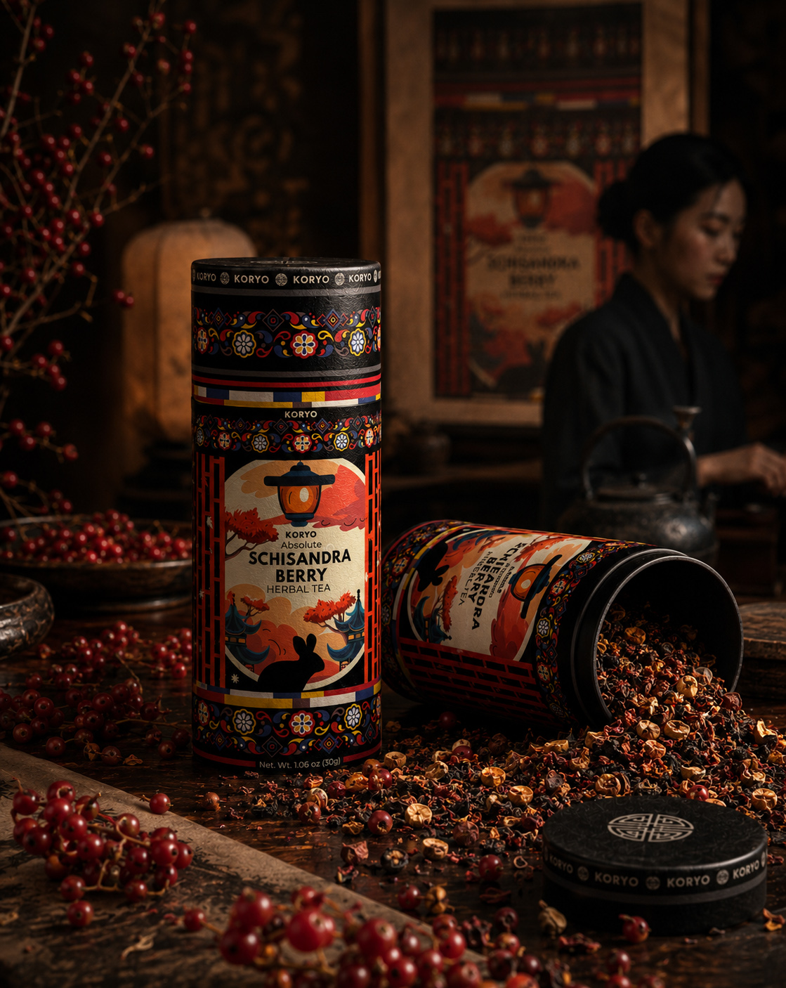
Client:
KORYO®
COUNTRY: South Korea, Asia

Info:
Industry: Amazon, E-Commerce, Food & Drink, Retail
Project Category:
•Premium Tea Packaging
•Beverage Packaging Design
•Tea Brand Identity
•Cultural Packaging Design
Target Markets:
• South Korea
• European Union
• International Premium Market
• Specialty Tea & Gift Market
Visual Packaging Ecosystem:
• Front-Facing Packaging Identity
• Korean Cultural References
• Architectural Visual Language
• Botanical Product Expression
• Illustration & Ornament System
• Color & Contrast Structure
• Typography Hierarchy
• Cylindrical Label Composition
• Premium Product Recognition
• Editorial Presentation System
Product:
• KORYO® Schisandra Berry Herbal Tea
• Premium Herbal Beverage
• Cylindrical Tea Packaging Concept
• Contemporary Korean-Inspired Product
Identity
Team behind the project:
• Filip Narančić — Creative Director & Packaging Designer
• Infinity Design Studio — Original Project Development
• NF Creative Studio — Editorial Direction & Case Study Development
Project Scope:
• Visual Concept Development
• Front-Facing Packaging Design
• Cultural Design Research
• Packaging Identity Exploration
• Tea Brand Visual Direction
• Illustration & Ornament Exploration
• Color Palette Development
• Typography Direction
• Label Composition Development
• Premium Product Positioning
• Final Concept Selection
• Editorial Case Study Development
Process:
• Project Context Review
• Cultural Research
• Visual Reference Mapping
• Concept Territory Definition
• 40+ Concept Directions
• Comparative Design Evaluation
• Front-Label Composition Studies
• Illustration Exploration
• Ornament Development
• Color System Exploration
• Typography Direction
• Concept Refinement
• Final Direction Selection
• Packaging Visualization
• Editorial Case Study Development
Strategic Focus:
• Cultural Meaning
• Authentic Visual Translation
• Tradition Without Imitation
• Contemporary Premium Expression
• Immediate Product Recognition
• Front-Facing Shelf Presence
• Visual Differentiation
• Emotional Product Character
• Controlled Cultural Symbolism
• Consistent Brand Recognition
• Premium Market Relevance
• Long-Term Visual Distinction
Front-Facing Packaging System:
• Primary Brand Recognition
• Product Name Hierarchy
• Cultural Focal Element
• Architectural Illustration Language
• Botanical Product Reference
• Ornament & Border Structure
• Controlled Color Relationships
• Premium Typography Contrast
• Cylindrical Visual Continuity
• Shelf-Facing Composition
• Scalable Visual Framework
• Distinctive Final Identity
Deliverables:
• Cultural Visual Research
• 40+ Packaging Concept Directions
• Front-Facing Label Concepts
• Illustration & Ornament Explorations
• Color Palette Directions
• Typography Explorations
• Packaging Composition Studies
• Comparative Concept Presentation
• Selected Visual Direction
• Final Front-Facing Packaging Concept
• Premium Product Visualizations
• Editorial Case Study Presentation

PROJECT OVERVIEW
KORYO® is a premium herbal tea concept shaped by the challenge of translating Korean cultural heritage into a contemporary and distinctive packaging identity.
The project focused on the front-facing packaging concept—the part of the canister responsible for communicating origin, product character, cultural meaning, and premium value at first sight. Rather than treating tradition as surface decoration, the design process explored how architecture, ornament, botanical references, color, typography, and composition could work together as one authentic visual language.
More than 40 distinct concept directions were developed and evaluated before one final direction was selected. The completed identity brought cultural depth and contemporary clarity into a recognizable presentation for KORYO® Absolute Schisandra Berry Herbal Tea.
THE PROJECT INCLUDED
- Cultural Visual Research
Exploring Korean architectural, ornamental, botanical, and symbolic references relevant to the identity. - 40+ Packaging Concept Directions
Developing multiple visual territories to examine different relationships between tradition, product, and premium expression. - Front-Facing Packaging Design
Building the primary composition responsible for brand recognition, cultural character, and immediate shelf-facing impact. - Final Visual Direction
Refining the selected concept through illustration, ornament, typography, color, hierarchy, and cylindrical presentation.
The objective was not to reproduce tradition, but to translate its meaning into a contemporary premium tea packaging identity.
CULTURE GUIDED MEANING
Korean heritage established the conceptual foundation, guiding how symbolism, architecture, ornament, and botanical meaning shaped a credible contemporary identity.
CLARITY GUIDED STRUCTURE
Product hierarchy and visual structure were organized to communicate Schisandra berry tea with confidence, clarity, and immediate international readability.
DISTINCTION GUIDED EXPLORATION
Distinct creative territories tested how cultural depth, premium character, color, and composition could create stronger recognition without losing authenticity.
CULTURAL MEANING TRANSFORMED INTO A DISTINCTIVE FRONT-FACING PACKAGING IDENTITY
Bringing Korean cultural heritage into a contemporary premium product required more than selecting recognizable decorative references. The creative challenge centered on discovering which visual elements could communicate origin, tradition, product character, and modern relevance through the front-facing presentation of KORYO® Absolute Schisandra Berry Herbal Tea.
Across more than 40 original packaging concept directions, Korean architecture, ornamental structures, botanical associations, illustration styles, typography, color, and composition were explored as interconnected parts of one visual identity. Each direction examined a different balance between cultural expression and contemporary clarity, allowing the final concept to emerge through structured comparison rather than stylistic assumption.
FOUNDATIONS OF THE FINAL DIRECTION
- Cultural Reference Interpretation transformed carefully selected Korean architectural, ornamental, and symbolic influences into a visual language relevant to a contemporary tea product.
- Extensive Packaging Concept Exploration examined more than 40 distinct creative directions, revealing how different cultural references, compositions, colors, and illustration styles influenced recognition and character.
- Front-Facing Identity Development concentrated the brand, product line, tea variety, cultural narrative, and primary visual focal point into one controlled shelf-facing composition.
- Disciplined Visual Selection identified the direction with the strongest capacity to unite heritage, product distinction, premium expression, and long-term brand recognition.
FROM CULTURAL RESEARCH TO VISUAL DISTINCTION
The completed front-facing concept gave KORYO® a clear and ownable expression for the Absolute product line while preserving the specific identity of Schisandra Berry Herbal Tea. Cultural references were not applied as decoration; they were interpreted, compared, refined, and organized into a cohesive composition capable of communicating meaning before detailed information is read.
Through this process, a broad field of visual possibilities became one focused packaging identity—rooted in tradition, shaped for the present, and distinguished by the intelligence of its selection.
MEANING BECAME LANGUAGE
Selected cultural references were simplified and translated into a contemporary visual language that preserved meaning without becoming decorative imitation.
FORM BECAME SYSTEM
Illustration, ornament, typography, and hierarchy were coordinated across the cylindrical format to create one continuous and controlled packaging experience.
SYSTEM BECAME IDENTITY
Cultural meaning, product clarity, and premium distinction were united within a recognizable identity designed for consistency, relevance, and future growth.

ENTERING THE KORYO® VISUAL WORLD
DISCOVERING HOW KOREAN HERITAGE COULD SHAPE ONE CONTEMPORARY EXPRESSION FOR ABSOLUTE SCHISANDRA BERRY HERBAL TEA.
At the center of the assignment stood one decisive question: how could the front of the packaging express cultural origin without reducing tradition to ornament? For KORYO®, the answer could not come from a single expected symbol or an immediately familiar stylistic formula. It required a wider investigation into the visual structures capable of carrying authenticity, emotion, product character, and premium distinction simultaneously.
Commissioned to explore the identity of KORYO® Absolute Schisandra Berry Herbal Tea, Infinity Design Studio developed an expansive front-facing packaging study built around cultural interpretation and concept comparison. More than 40 original directions examined different relationships between Korean architectural references, ornamental rhythm, botanical expression, illustration, typography, color, hierarchy, and cylindrical composition.
Instead of defining the final appearance at the beginning, the process allowed contrasting visual territories to reveal what the brand genuinely needed. Some concepts emphasized architectural structure, others explored ornamental richness, restrained symbolism, botanical character, graphic abstraction, or contemporary minimalism. Together, they created a meaningful basis for evaluation rather than a collection of disconnected stylistic options.
The selected direction emerged because it achieved the most complete balance between KORYO® brand recognition, the Absolute product-line identity, the character of Schisandra Berry Herbal Tea, and the cultural depth behind the concept. Every final element was refined to strengthen the front-facing experience—the principal area through which the packaging introduces the product, establishes distinction, and communicates its visual story.
What resulted was not a reproduction of the past, but a contemporary packaging identity shaped by it: culturally informed, compositionally controlled, and unmistakably connected to the world of KORYO®.

Target Audience
Design-conscious consumers drawn to premium herbal tea, cultural authenticity, and products with a distinctive sense of origin. The concept was shaped for audiences who value meaningful packaging, refined visual storytelling, botanical character, and contemporary interpretations of heritage—particularly within specialty tea, premium beverage, gifting, and design-led retail environments.
Project Objective
The central objective was to define a compelling front-facing packaging identity for KORYO® Absolute Schisandra Berry Herbal Tea—one capable of expressing Korean cultural heritage while remaining contemporary, recognizable, and visually relevant to a premium product category.
Success depended on more than creating an attractive label composition. The front of the cylindrical packaging needed to establish a clear hierarchy between the KORYO® brand, the Absolute product line, and Schisandra Berry Herbal Tea, while allowing architecture, ornament, botanical references, typography, color, and illustration to communicate as one controlled visual narrative.
Through the development and comparative evaluation of more than 40 original concept directions, the project identified the visual territory with the strongest ability to unite cultural meaning, product character, premium distinction, and immediate front-facing recognition.
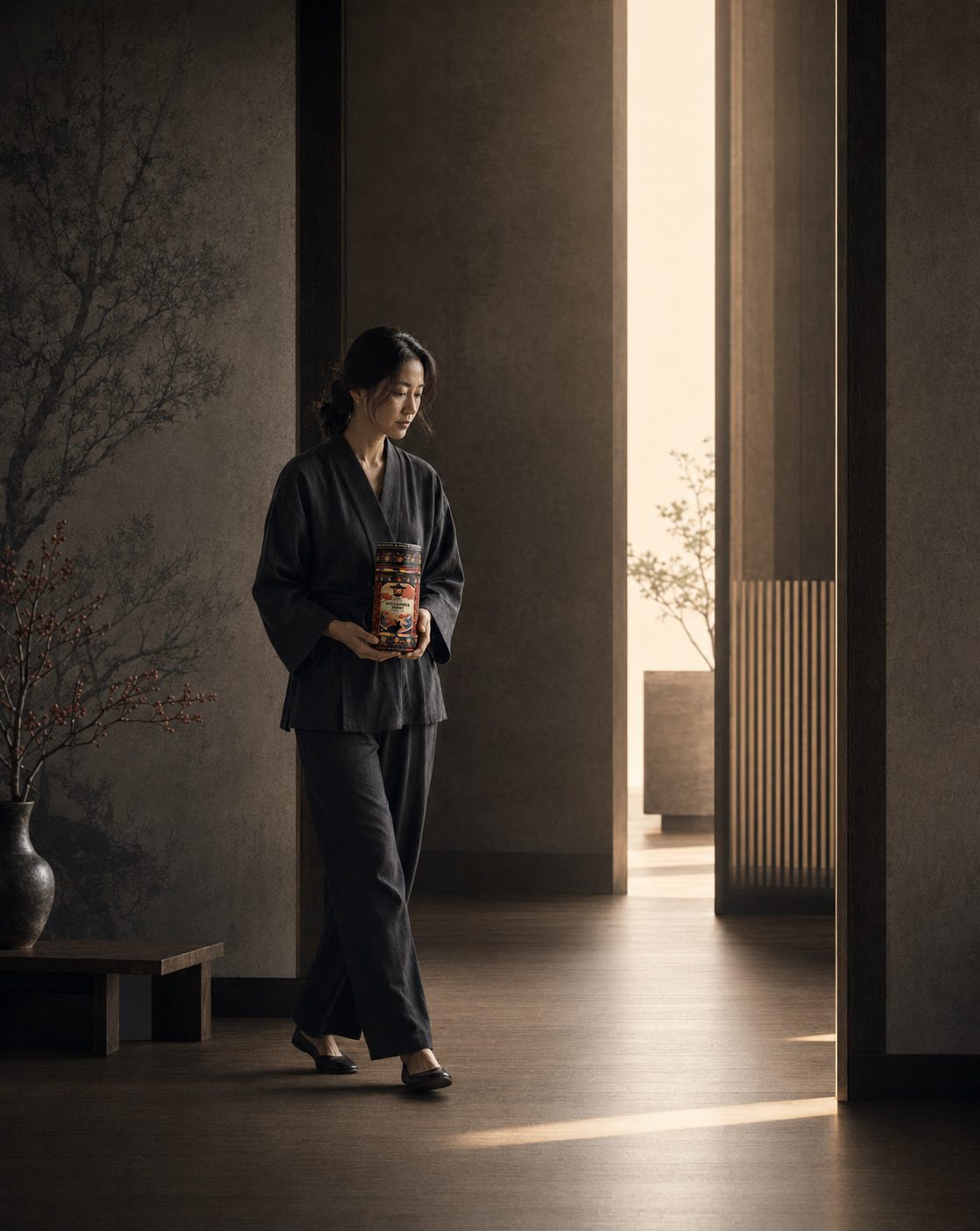
About KORYO® & THE ABSOLUTE PRODUCT LINE
KORYO® is the brand behind Absolute Schisandra Berry Herbal Tea, a product concept whose visual identity draws inspiration from Korean cultural heritage and the expressive character of its botanical category.
Within this hierarchy, KORYO® carries the primary brand recognition, Absolute defines the product line, and Schisandra Berry Herbal Tea identifies the specific product. Preserving that relationship became fundamental to the front-facing composition and to the clarity of the completed packaging concept.
Infinity Design Studio developed the original creative exploration and final visual direction, encompassing cultural reference research, packaging concept development, architectural and ornamental interpretation, botanical expression, illustration, color strategy, typography, visual hierarchy, and cylindrical presentation.
The completed editorial case study expanded this process into a structured visual narrative documenting how an extensive field of possibilities was researched, compared, refined, and ultimately transformed into one distinctive front-facing identity for KORYO®.
More than a presentation of the final design, the project reveals the intelligence of selection behind it—how over 40 cultural interpretations became one controlled, contemporary, and recognizable packaging expression.
Project Foundations:
“Distinctive Packaging Identities Emerge Through Cultural Understanding, Purposeful Exploration, And Disciplined Visual Selection.”
✓ Korean Cultural Reference Research
✓ 40+ Original Packaging Directions
✓ Front-Facing Identity Development
✓ Architectural Illustration Exploration
✓ Botanical & Ornamental Expression
✓ Color & Typography Direction
✓ Comparative Concept Evaluation
✓ Final Visual Direction Selection
Project Distinction:
“Meaningful Packaging Transforms Cultural Depth Into Contemporary Recognition And Lasting Visual Distinction.”
✓ Clearer KORYO® Brand Recognition
✓ Distinctive Absolute Line Expression
✓ Stronger Product Visual Hierarchy
✓ Contemporary Cultural Interpretation
✓ Cohesive Front-Facing Composition
✓ Premium Tea Category Presence
✓ Memorable Botanical Character
✓ Scalable Visual Identity Foundation
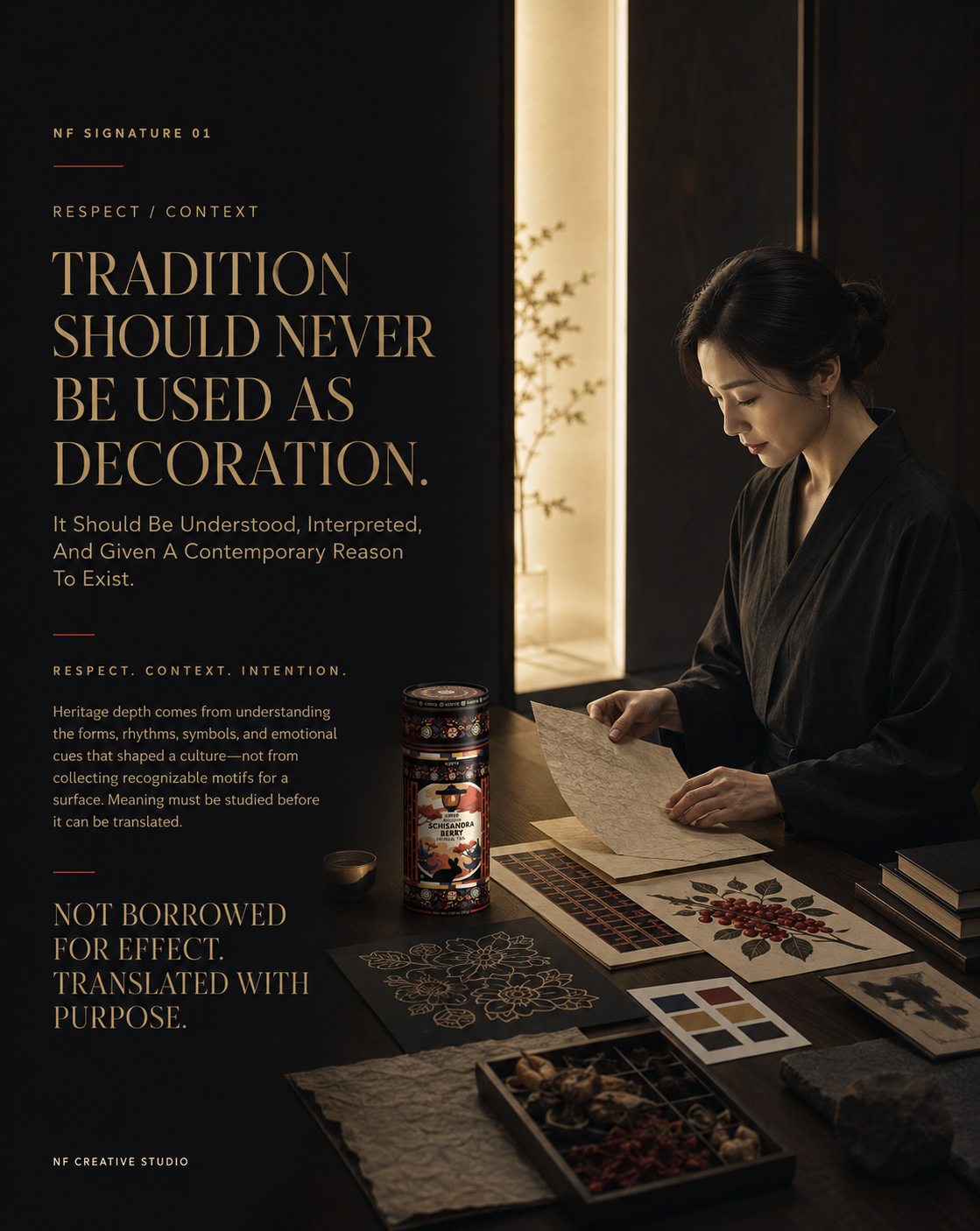

KORYO® PROJECT SNAPSHOT
ONE CULTURAL QUESTION. MORE THAN 40 VISUAL ANSWERS. ONE DISTINCTIVE FINAL DIRECTION.
A focused overview of how Korean cultural heritage, botanical character, and premium product expression were explored through the front-facing identity of KORYO® Absolute Schisandra Berry Herbal Tea.
BRAND
KORYO®
A premium brand identity shaped around the contemporary interpretation of Korean cultural heritage.
PRODUCT LINE
Absolute
The designated product line positioned beneath the primary KORYO® brand architecture.
PRODUCT
Schisandra Berry Herbal Tea
A botanical tea product whose distinctive ingredient character informed the visual exploration.
DESIGN FOCUS
Front-Facing Packaging Concept
The project concentrated on the principal visible surface responsible for recognition, cultural meaning, product distinction, and premium first impression.
CREATIVE EXPLORATION
40+ Original Concept Directions
An extensive investigation of architectural references, ornamental systems, botanical expression, illustration, typography, color, and composition.
FINAL OUTCOME
One Selected Visual Identity
A refined packaging direction capable of connecting cultural depth with contemporary clarity and recognizable product character.
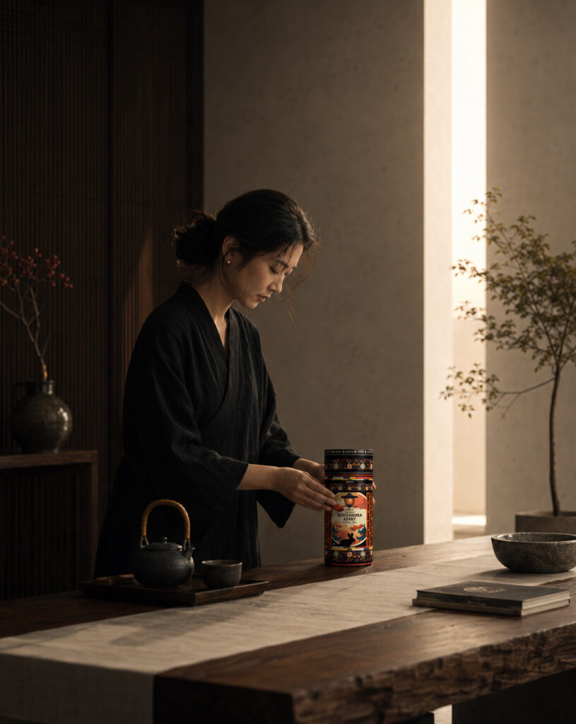
KORYO® PROJECT OVERVIEW
TRANSLATING CULTURAL HERITAGE INTO A CONTEMPORARY PACKAGING EXPRESSION
How extensive visual exploration transformed architecture, ornament, botanical meaning, and product identity into one controlled front-facing concept.
At the heart of the KORYO® project was a clearly defined creative challenge: determining how the front of the packaging could communicate Korean cultural heritage without reducing it to a collection of expected decorative symbols.
The assignment focused on KORYO® Absolute Schisandra Berry Herbal Tea and on the visible composition through which the brand, product line, tea variety, cultural narrative, and premium character would first be understood.
Instead of committing prematurely to one stylistic answer, the process opened a deliberately broad field of possibilities. More than 40 original packaging directions explored different relationships between Korean architectural influences, ornamental rhythm, botanical references, illustration, typography, color, hierarchy, and cylindrical form.
Each direction served as a meaningful design proposition. Some emphasized heritage and architectural structure; others explored botanical richness, restrained symbolism, contemporary minimalism, ornamental detail, or stronger graphic contrast. Their purpose was not to multiply options without direction, but to reveal which visual territory could carry the complete identity most convincingly.
Through comparison, refinement, and disciplined selection, one direction emerged with the strongest balance of cultural meaning, KORYO® brand recognition, Absolute product-line distinction, Schisandra Berry character, and contemporary premium presence.
The completed concept transformed a wide creative investigation into one cohesive front-facing packaging identity—rooted in cultural understanding, refined through design intelligence, and shaped for lasting visual recognition.
PROJECT SCOPE
CULTURAL CONTEXT RESEARCH
Selected Korean architectural, ornamental, symbolic, and visual references were examined to understand their meaning and contemporary design potential.
CONCEPT TERRITORY DEVELOPMENT
Multiple creative territories established contrasting relationships between cultural expression, product character, and premium positioning.
40+ PACKAGING DIRECTIONS
More than forty original front-facing concepts tested alternative illustration styles, compositions, color systems, cultural references, and visual hierarchies.
BRAND ARCHITECTURE CLARITY
The composition preserved the correct relationship between KORYO® as the brand, Absolute as the product line, and Schisandra Berry Herbal Tea as the product.
ARCHITECTURAL INTERPRETATION
Structural forms and culturally relevant architectural influences were translated into distinctive visual focal points rather than copied as decoration.
BOTANICAL EXPRESSION
The character of Schisandra Berry informed selected color, illustration, atmosphere, and product-recognition decisions throughout the exploration.
ORNAMENTAL LANGUAGE
Borders, patterns, rhythm, and decorative structures were investigated as controlled carriers of heritage and visual continuity.
TYPOGRAPHY & HIERARCHY
Type relationships were refined to organize brand recognition, product-line distinction, tea variety, and cultural storytelling within the front-facing composition.
COLOR SYSTEM EXPLORATION
Contrasting palettes examined how color could express botanical character, premium value, cultural atmosphere, and immediate visual distinction.
CYLINDRICAL COMPOSITION
Every selected element was considered in relation to the physical continuity and curved presentation of the tea canister.
COMPARATIVE EVALUATION
The developed directions were reviewed according to cultural relevance, clarity, originality, brand recognition, product character, and long-term visual potential.
FINAL DIRECTION SELECTION
The strongest concept was refined into one cohesive visual identity capable of representing KORYO® with contemporary clarity and cultural depth.
FROM POSSIBILITY TO IDENTITY
The value of the project did not come from producing a large number of stylistic variations alone. It came from using exploration as a strategic instrument—allowing meaningful differences to be seen, compared, understood, and resolved.
More than 40 possibilities created the intelligence required to select one identity with purpose.
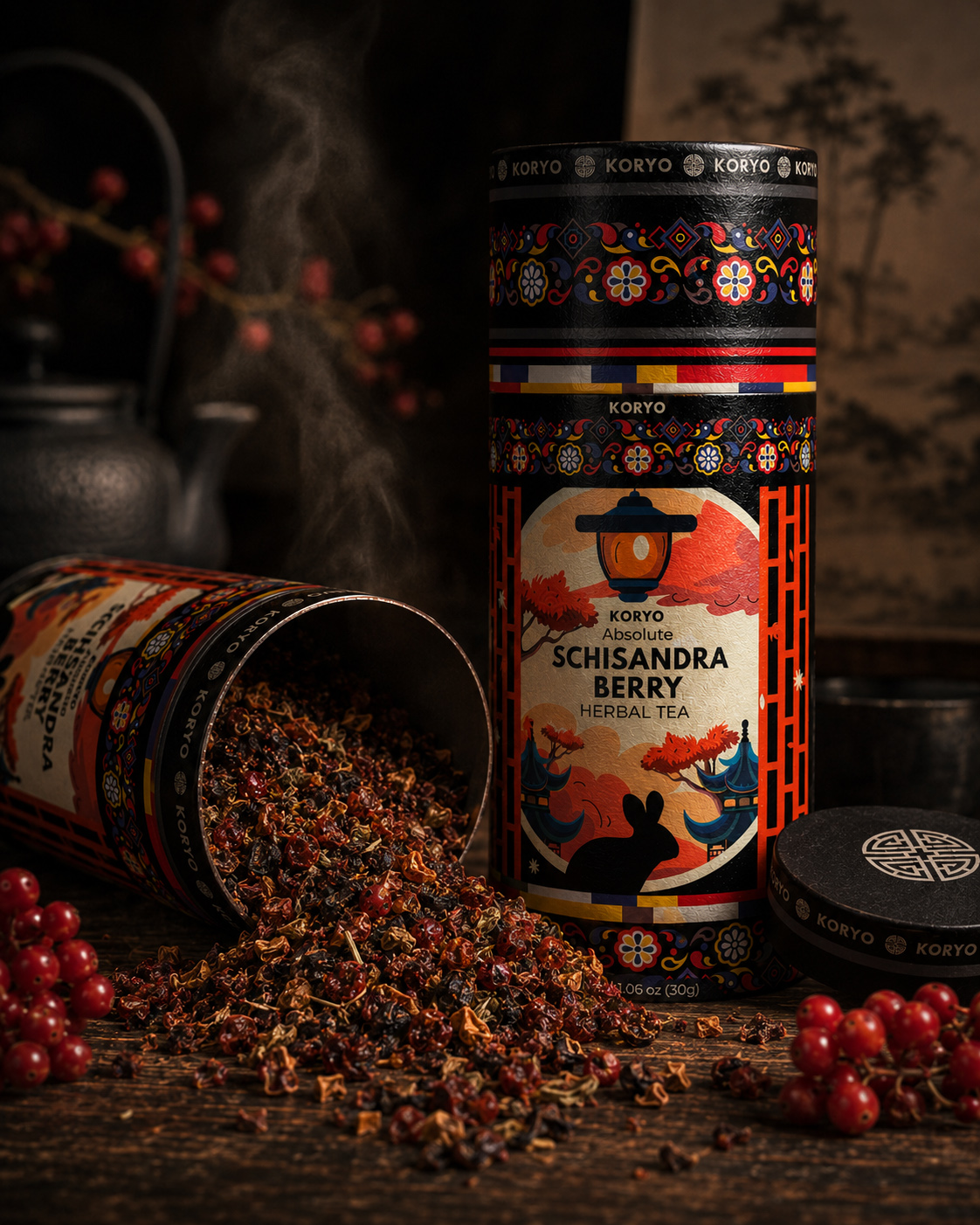
"Every Great Tradition Begins With A Ritual. Every Memorable Brand Begins With A Story."
Preserving Heritage Through Contemporary Packaging Design
For KORYO, the objective extended far beyond designing another tea package. The challenge was to translate centuries of Asian tea culture, craftsmanship, and tradition into a contemporary visual identity capable of connecting with today’s premium wellness consumers.
Inspired by the quiet elegance of traditional tea rituals, every design decision was carefully developed to communicate authenticity, balance, refinement, and cultural respect. Rather than simply decorating the packaging, the goal was to transform every visual element into a storytelling experience—one that immediately communicates quality, heritage, and premium positioning from the very first glance.
The final result is more than a beautifully designed label. It is a distinctive brand identity that bridges tradition with modern retail expectations, creating stronger Shelf Presence, deeper Brand Recognition, and a memorable premium experience that remains true to KORYO’s cultural origins.
"Great Packaging Doesn't Replace Tradition—It Gives Tradition A Future."
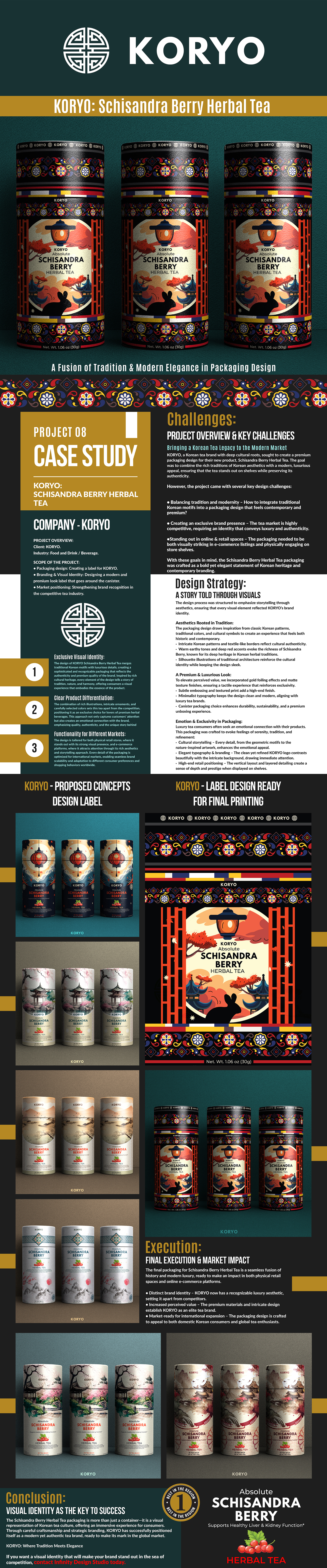
“Where Korean Heritage, Botanical Knowledge, And Contemporary Design Become The Foundation Of A Distinctive Premium Tea Experience.”
KORYO® — Transforming Korean Cultural Heritage Into A Contemporary Premium Tea And Packaging Identity
“Exceptional Packaging Does More Than Contain A Product—It Preserves Its Origin, Expresses Its Character, And Gives Its Story The Power To Travel Across Markets And Generations.”
KORYO® Premium Tea required more than an attractive new package. The objective was to transform a traditional herbal tea product into a distinctive premium brand capable of communicating cultural authenticity, refined craftsmanship, and exceptional product quality across both domestic and international markets.
The central challenge was to interpret Korean visual heritage without relying on predictable cultural clichés. Every design decision—from the brand mark and typographic hierarchy to the ornamental structure, botanical illustration, color system, and cylindrical packaging architecture—had to work as part of one coherent identity.
The result is a packaging language that feels deeply rooted yet unmistakably contemporary: visually rich without becoming excessive, culturally expressive without appearing decorative, and distinctive enough to strengthen recognition across physical retail, gifting environments, digital commerce, and future product extensions.
THE SOLUTION INCLUDED:
- Strategic Brand Positioning developed to establish KORYO® as a culturally authentic, premium tea brand with clear international relevance.
- Premium Packaging Design created to strengthen product perception, communicate craftsmanship, and elevate the complete consumer experience.
- Authentic Brand Storytelling translating Korean heritage into a contemporary visual language through proportion, rhythm, ornament, material sensitivity, and restraint.
- Distinctive Visual Identity System unifying the brand mark, typography, botanical illustration, color relationships, and packaging structure.
- Botanical Illustration System connecting the natural character of Schisandra with the cultural depth and premium positioning of the product.
- Scalable Packaging Architecture designed to support additional tea varieties while preserving consistent recognition across the complete collection.
- Cross-Market Visual Consistency ensuring that the identity remains clear, memorable, and commercially effective across retail, e-commerce, gifting, and international communication.
THE FINAL RESULT:
The completed KORYO® identity transformed a traditional tea product into a sophisticated premium brand with a distinctive position of its own. Cultural heritage, botanical expression, and contemporary packaging design now operate as one integrated visual system.
The final packaging creates stronger shelf presence, clearer product recognition, and a more valuable consumer experience while providing a coherent foundation for future product development and international market growth.
Most importantly, KORYO® does not present Korean culture as surface decoration. It translates heritage into structure, rhythm, material character, and visual meaning—creating packaging that feels authentic in origin, contemporary in expression, and memorable in every environment in which the brand is encountered.
“Premium Packaging Does More Than Preserve A Product—It Preserves Its Origin, Expresses Its Character, And Gives Its Story The Power To Travel.”
Download Case Study
Building A Premium Tea Identity Where Cultural Heritage, Contemporary Design, And Commercial Clarity Work As One
Creating A Distinctive Packaging System In Which Authentic Korean Character, Refined Product Differentiation, And Cross-Market Recognition Strengthen One Another
Successful Premium Tea Packaging Design requires more than an attractive surface. Every strategic decision must communicate origin, establish product value, and transform cultural meaning into a clear and memorable consumer experience.
For KORYO®, our objective extended beyond designing an individual tea canister. We developed a coherent packaging system in which Brand Identity, Cultural Storytelling, Botanical Illustration, Product Differentiation, And International Market Readiness work together—creating recognition, strengthening perceived quality, and supporting the brand across physical and digital environments.
A Distinctive Visual Identity Rooted In Korean Heritage
Creating Recognition Through Culture, Character, And Restraint
Every premium packaging system begins with an identity capable of communicating origin, purpose, and value before the product is examined in detail.
For KORYO®, we created a distinctive visual language that brings traditional Korean influence into a refined contemporary context. Typography, ornamental structures, botanical illustration, color, and spatial proportion work together to establish an immediately recognizable brand character.
Rather than relying on predictable cultural symbols, the identity expresses heritage through rhythm, material sensitivity, and disciplined visual restraint—allowing every package to feel authentic, sophisticated, and unmistakably connected to the KORYO® world.
Clear Product Differentiation Across One Unified Collection
Turning Individual Tea Varieties Into A Coherent Product System
A successful product collection must make every variety easy to distinguish without weakening the recognition of the master brand.
The KORYO® packaging system combines carefully selected colors, intricate botanical illustrations, and controlled typographic hierarchy to give each tea its own character while preserving one consistent visual foundation across the complete range.
Every variation feels individual but never disconnected. This balance strengthens shelf navigation, supports faster product recognition, and creates a more engaging consumer experience—transforming multiple tea varieties into one structured, memorable, and commercially distinctive collection.
One Scalable Packaging System Designed For Every Market
Connecting Physical Retail, Digital Commerce, And Global Recognition
Strong packaging must remain clear, recognizable, and persuasive wherever the customer encounters the product.
For KORYO®, the system was designed to perform consistently across physical retail, specialist stores, e-commerce platforms, promotional materials, and international brand communication. Every element retains its hierarchy and character across different formats, viewing distances, and commercial environments.
Consistent typography, color logic, illustration principles, and packaging architecture create a scalable Tea Packaging And Brand Identity System prepared for portfolio expansion, international adaptation, and long-term growth—without compromising the cultural authenticity that makes the brand distinctive.
“Cultural Heritage Gives The Brand Its Meaning. Consistent Design Gives That Meaning The Power To Travel.”
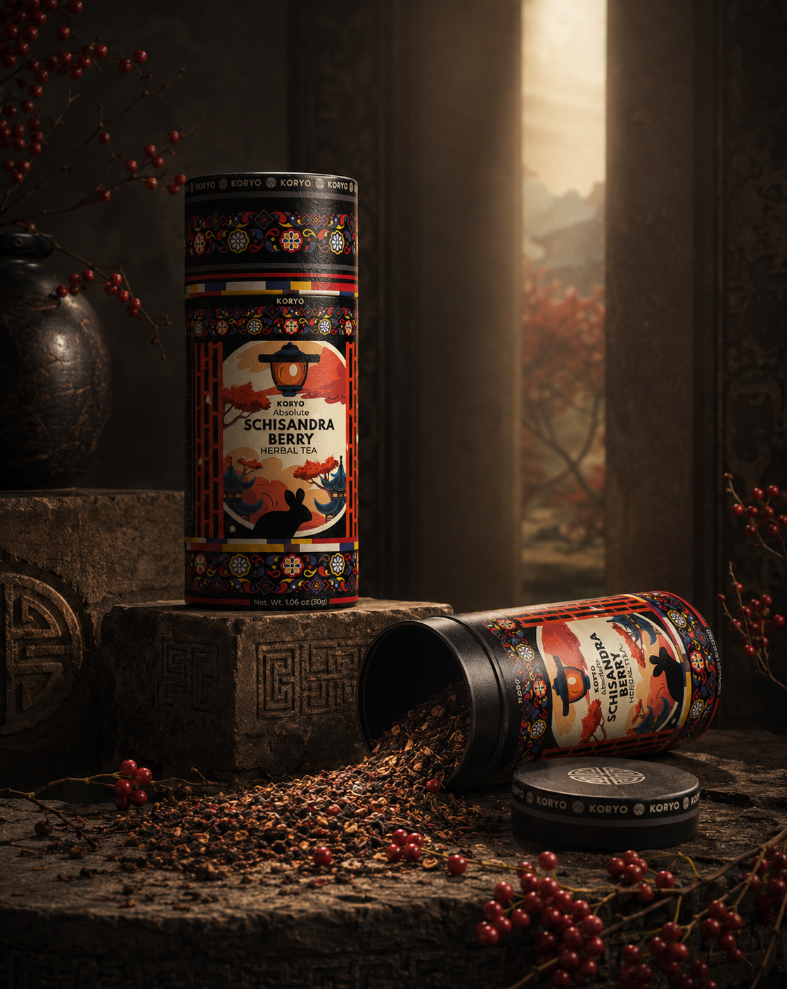
The Challenge:
Project Overview & Strategic Design Challenges
Transforming Korean Heritage Into A Distinctive Premium Tea Experience
KORYO® Absolute Schisandra Berry Herbal Tea required more than visually attractive packaging. The challenge was to transform a culturally rooted herbal product into a distinctive premium brand experience—one capable of expressing Korean heritage, botanical character, and contemporary refinement with equal clarity.
The objective extended beyond creating an individual canister. Every element—from the brand mark and typographic hierarchy to the ornamental structure, botanical illustration, color system, and cylindrical packaging architecture—had to contribute to one coherent identity. The result needed to feel authentic without becoming traditionalist, visually rich without becoming excessive, and premium without relying on artificial luxury codes.
At the same time, the packaging had to communicate effectively across physical retail, gifting environments, digital commerce, and international markets. Cultural meaning, immediate recognition, product clarity, and long-term scalability therefore became equally important parts of the design challenge.
Key Strategic Challenges
- Translating Cultural Heritage With Contemporary Relevance — Interpreting traditional Korean visual principles through rhythm, proportion, ornament, and restraint while creating an identity that feels refined, current, and internationally relevant.
- Establishing A Distinctive Premium Brand Presence — Building a recognizable packaging language capable of differentiating KORYO® within the competitive premium tea category while communicating authenticity, craftsmanship, and exceptional product value.
- Balancing Visual Richness With Product Clarity — Coordinating brand identity, botanical storytelling, ornamental detail, and product information without weakening hierarchy, legibility, or immediate understanding.
- Strengthening Retail And Digital Recognition — Ensuring that the packaging remains distinctive and clearly identifiable at different viewing distances, from physical shelves and gifting displays to e-commerce listings and mobile screens.
- Building A Scalable Packaging Architecture — Creating a flexible visual system capable of supporting future tea varieties, product extensions, and international adaptations without compromising the coherence of the master brand.
These challenges shaped every stage of the KORYO® packaging development. The final system brings together cultural authenticity, botanical expression, contemporary design, and commercial clarity within one unified brand experience—preserving the meaning of its origin while giving the product the distinction, flexibility, and recognition required for long-term growth.
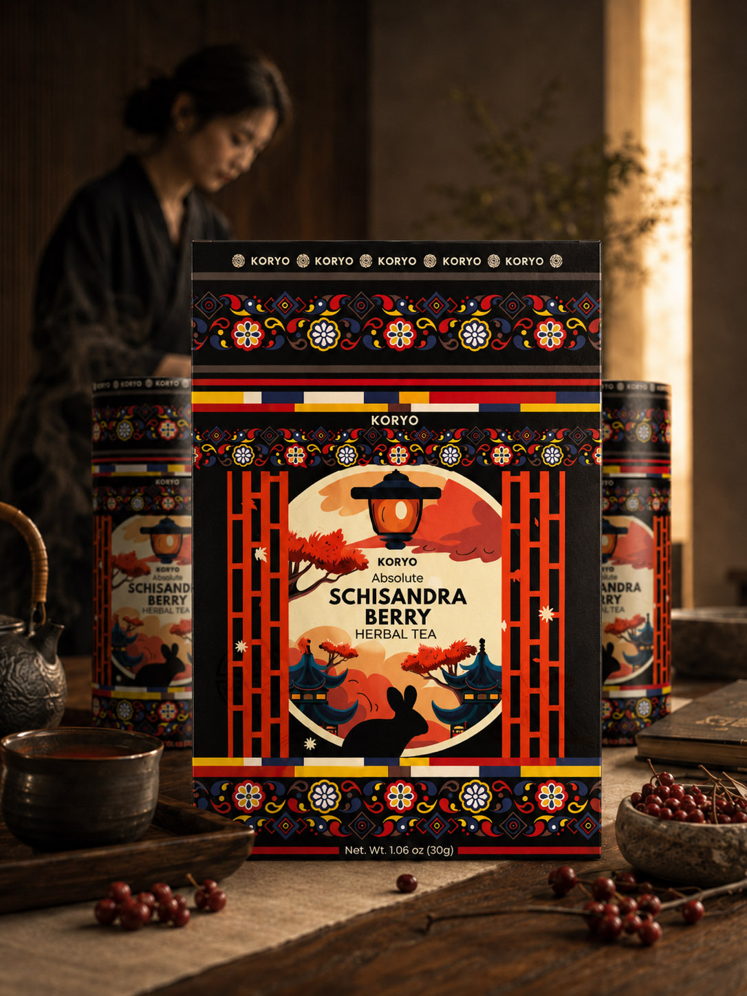
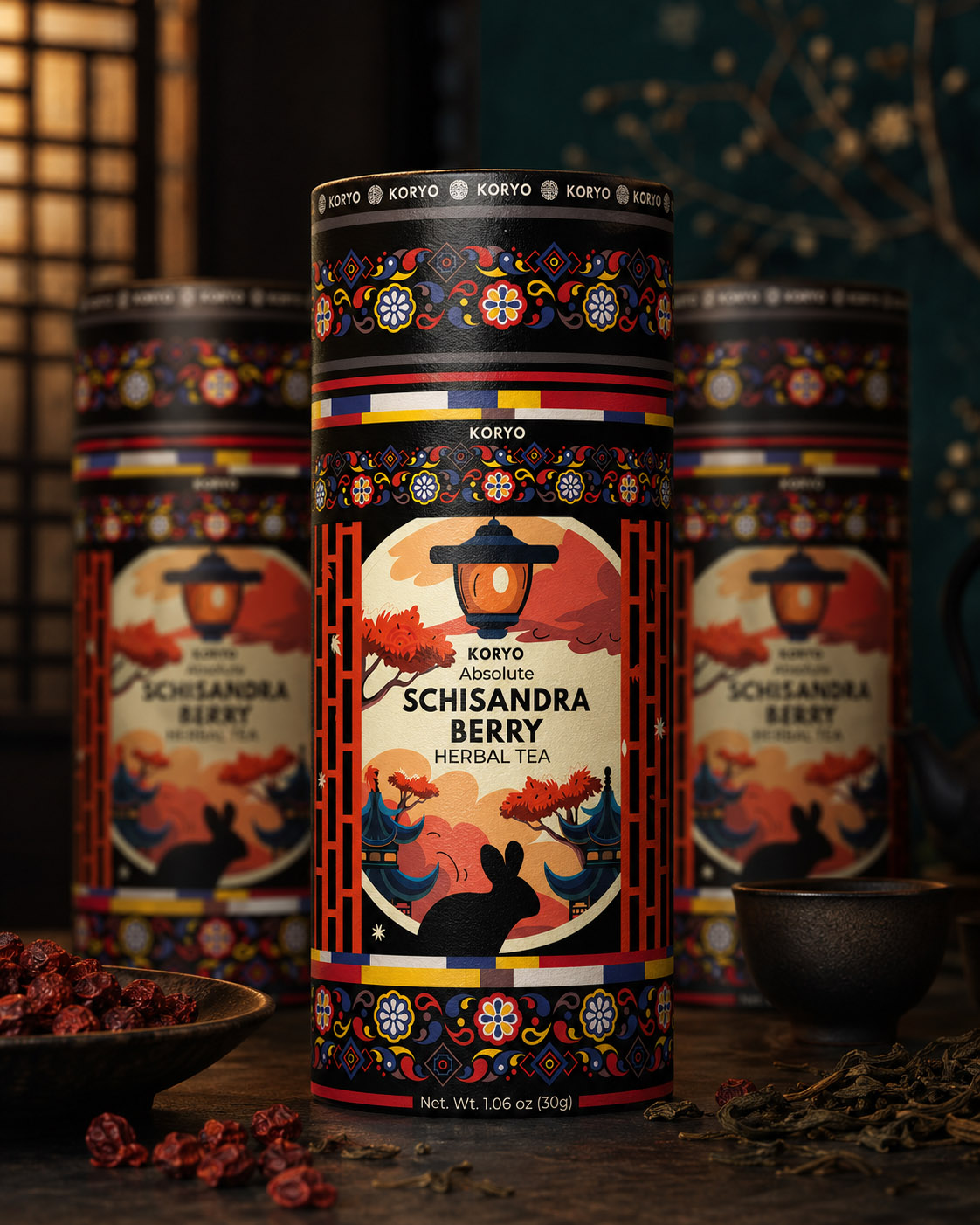
FROM STRATEGIC CHALLENGE TO CREATIVE DIRECTION
DEFINING THE TERRITORY
BEFORE DEFINING THE DESIGN
Translating Cultural Complexity, Product Character, And Commercial Requirements Into One Clear Foundation For The KORYO® Packaging Strategy.
The challenge revealed that KORYO® could not be defined through appearance alone. The identity needed to unite Korean cultural heritage, botanical character, premium positioning, and immediate product recognition within one coherent packaging experience.
Every creative decision therefore had to resolve several demands at once: communicate origin without cultural cliché, express richness without visual excess, establish luxury without artificial decoration, and preserve clarity across the curved surface of the cylindrical canister.
These requirements became the criteria through which more than 40 original concept directions were developed and compared. Typography, ornament, illustration, color, hierarchy, and architectural references were evaluated not as isolated elements, but as interconnected parts of one complete brand system.
Through this process, the challenge became more precise. The objective was no longer simply to create premium tea packaging, but to identify the visual territory capable of transforming cultural meaning, product distinction, and commercial clarity into a recognizable contemporary identity.
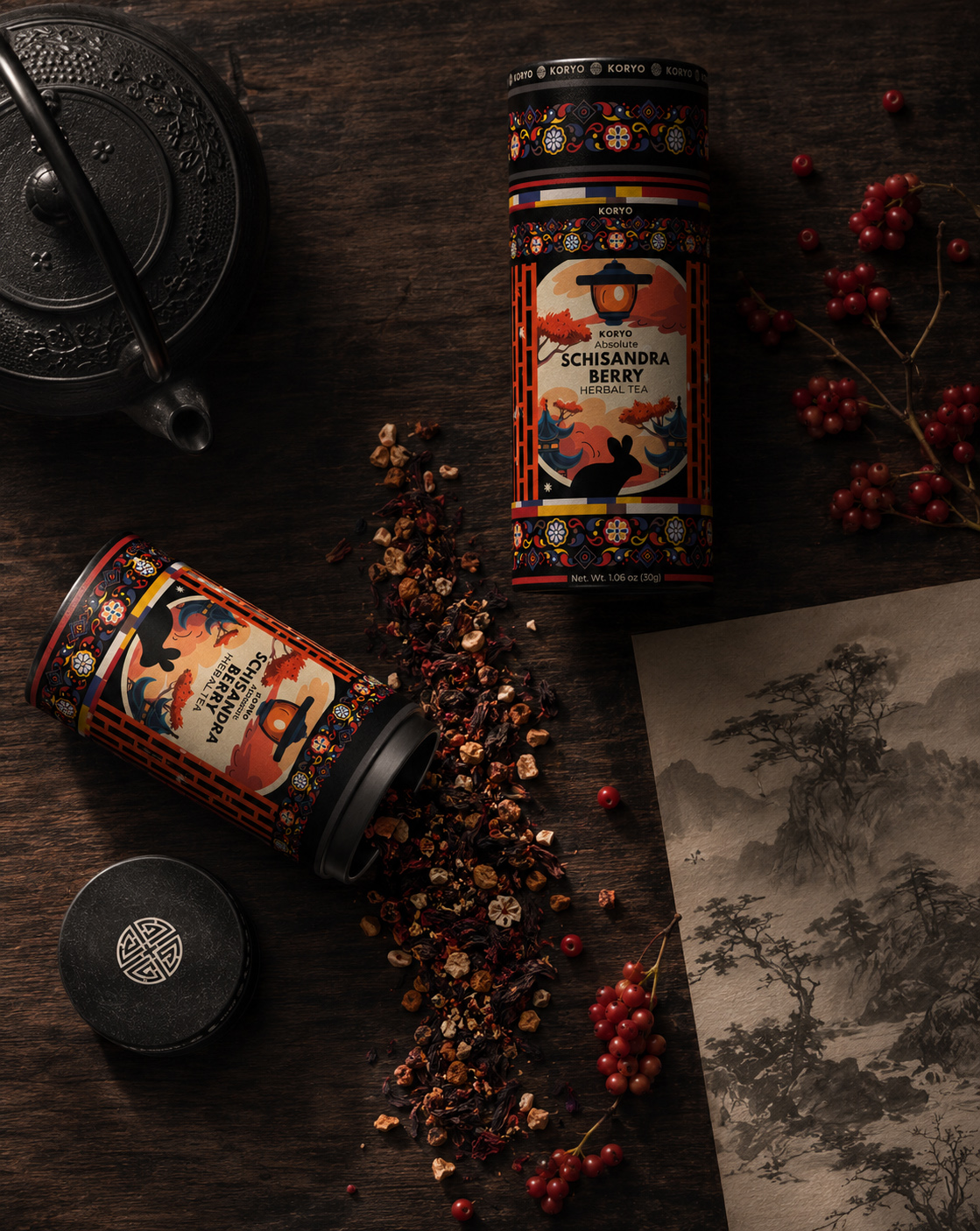
The selected territory established a clear relationship between heritage and modernity. Korean influence would remain visible, but its presence would be communicated through rhythm, proportion, material sensitivity, and controlled ornamental structure rather than literal historical reproduction.
Schisandra became equally important to this foundation. Its distinctive botanical character, deep natural color, and cultural relevance provided a meaningful connection between product identity and the wider visual narrative of the brand.
The cylindrical format introduced another strategic dimension. Because the design continues beyond the front-facing view, every typographic, illustrative, and ornamental element had to remain coherent as the packaging is held, rotated, displayed, photographed, or encountered on screen.
This understanding defined the principles that would guide the next phase: a disciplined hierarchy, a culturally intelligent visual language, a distinctive botanical presence, premium material expression, and a packaging architecture capable of supporting future product development.
The design strategy that followed was therefore not imposed on the project from the outside. It emerged directly from the challenges uncovered through research, comparison, and evaluation—turning complexity into direction and creative possibility into a focused system of design decisions.
“THE CHALLENGE REVEALED WHAT MATTERED. STRATEGY GAVE EVERY DECISION A PURPOSE.”
Design Strategy:
STRATEGIC APPROACH & PREMIUM PACKAGING DIRECTION
Building A Contemporary Tea Identity Through Heritage, Clarity, And Cultural Intelligence
The KORYO® design strategy was developed around one central principle: Korean cultural heritage should not be applied as surface decoration, but translated into a coherent contemporary packaging language with meaning, distinction, and lasting commercial relevance.
Every strategic decision was therefore evaluated through the complete consumer experience. Brand recognition, cultural storytelling, botanical expression, material character, product hierarchy, and cylindrical packaging architecture had to work together—creating a system that feels authentic in origin, refined in execution, and immediately recognizable across physical and digital environments.
Rather than following temporary category trends or relying on conventional luxury codes, the strategy focused on building perceived value through disciplined relationships: carefully controlled typography, meaningful ornament, expressive illustration, balanced color, tactile material qualities, and a consistent visual structure capable of supporting the brand’s future development.
Cultural Storytelling Through Contemporary Design
The visual language draws inspiration from the elegance of Korean art, architecture, textiles, and ornamental traditions. These references were carefully reinterpreted through modern proportion, hierarchy, and restraint—preserving their cultural character without reproducing them literally.
- Traditional Korean Patterns And Decorative Structures were refined into contemporary graphic elements that introduce rhythm, continuity, and cultural recognition across the cylindrical packaging.
- Deep Reds, Charcoal Tones, Warm Ivory, And Natural Accents create a sophisticated color world that connects Schisandra’s botanical character with the refinement of Korean cultural expression.
- Architectural Silhouettes And Symbolic Motifs add narrative depth and emotional meaning, allowing the package to communicate origin without becoming illustrative or overly decorative.
Premium Packaging Built Around Perceived Value
Premium positioning is shaped not only by visual appearance, but by the complete relationship between structure, material, print, proportion, and physical interaction. Every decision was developed to make quality visible before the package is opened and tangible once it is held.
- Refined Finishes And Controlled Production Details reinforce material credibility, tactile quality, and the sense of care associated with a premium herbal tea experience.
- Minimalist Typography And Carefully Balanced Compositions preserve clarity and elegance while allowing cultural and botanical elements to remain expressive.
- The Cylindrical Packaging Architecture combines durability, product protection, gifting value, and a distinctive physical presence within one elevated format.
Designing An Emotional Brand Experience
Today’s premium consumers respond not only to what a product contains, but also to the story, values, and sense of identity surrounding it. For KORYO®, the packaging became the first chapter of that story—communicating authenticity, craftsmanship, and cultural meaning before the tea is experienced.
- Cultural Storytelling transforms every visual element into an expression of Korean identity, product origin, and artisanal character.
- Restrained Hierarchy And Refined Brand Discipline create immediate recognition while preserving the timeless quality required for long-term relevance.
- Strategic Shelf And Screen Presence ensures that the packaging remains visible, distinctive, and clearly understood across retail displays, gifting environments, e-commerce platforms, and mobile formats.
Building A Scalable System For Long-Term Growth
The strategy was designed not only for one Schisandra tea product, but as a flexible foundation for a broader KORYO® collection. Consistent principles of typography, ornament, botanical storytelling, color, and packaging structure allow future varieties to develop individual character without weakening recognition of the master brand.
This balance between consistency and variation gives KORYO® a packaging architecture capable of supporting product expansion, international adaptation, and long-term brand growth—while preserving the cultural intelligence and visual distinction at the heart of the original concept.
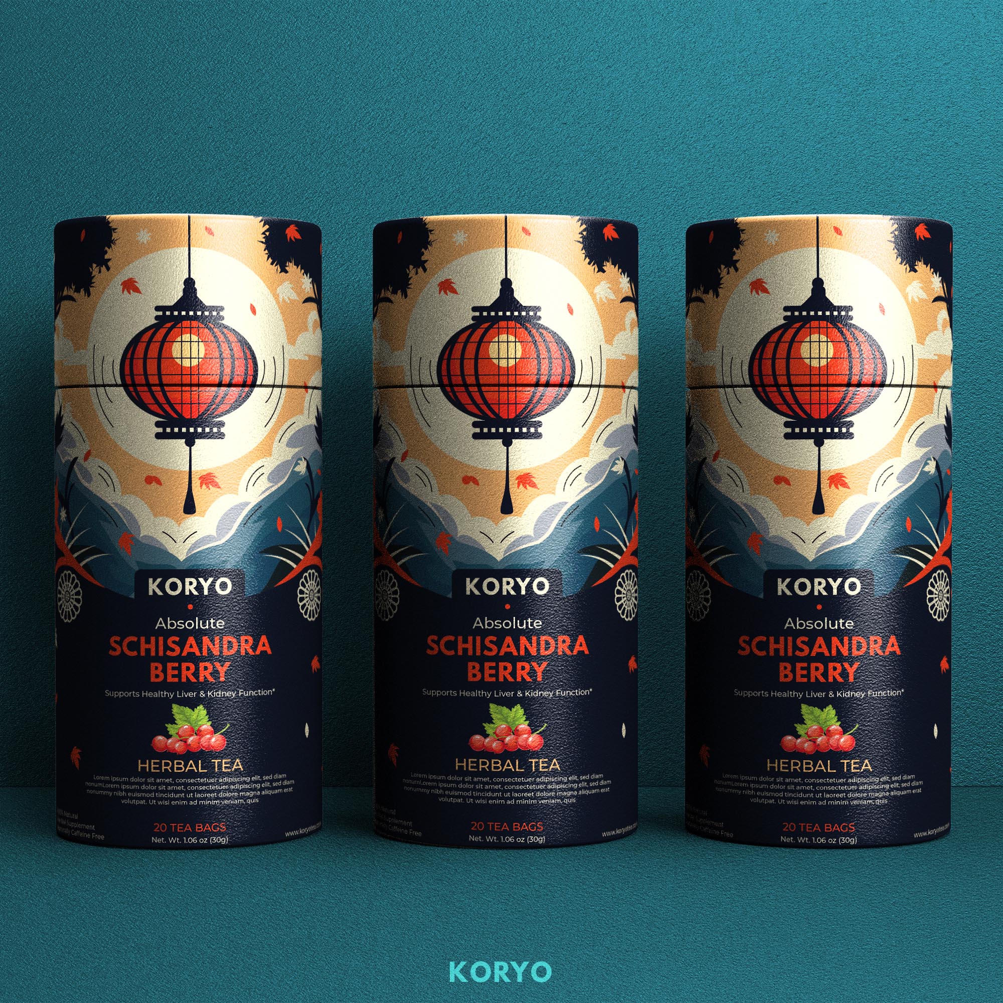
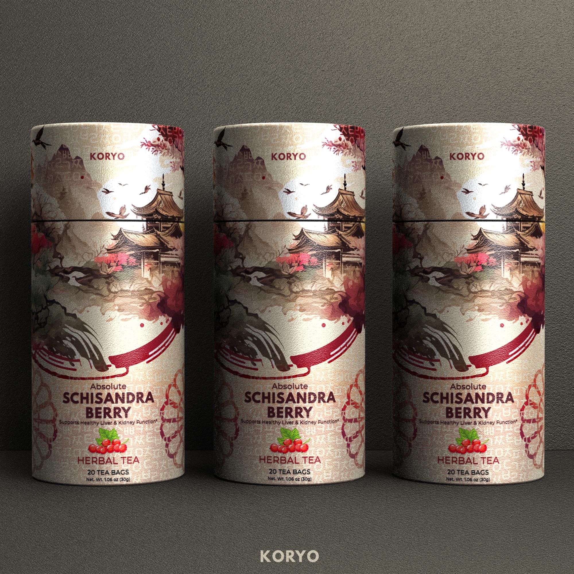
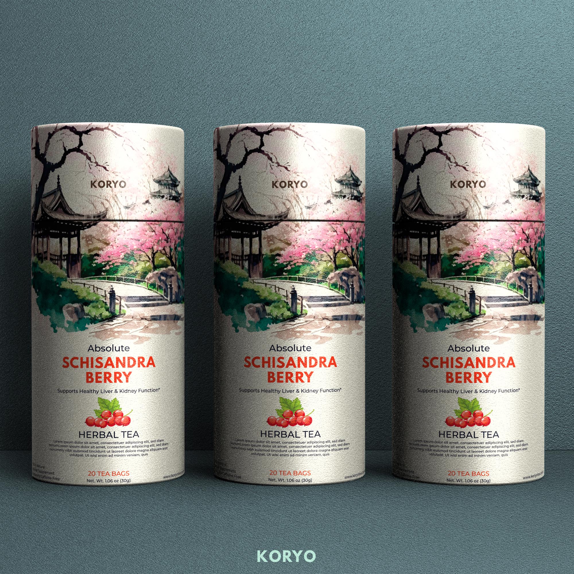
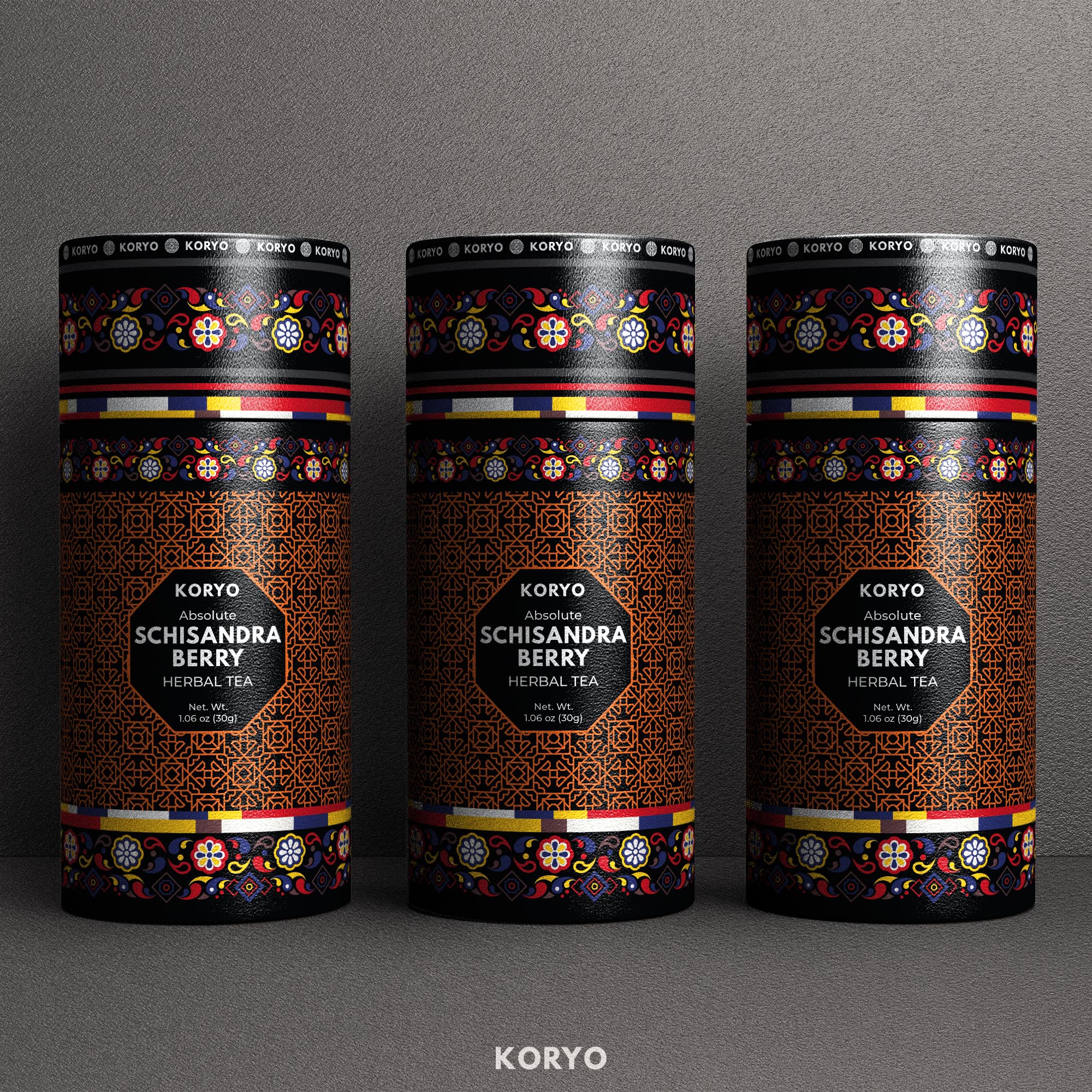
“With The Strategic Foundation Clearly Established, The Next Phase Transformed These Principles Into A Series Of Visual Concepts—Exploring Multiple Creative Directions Before Refining Every Detail Into One Distinctive Premium Packaging Solution.”
The Challenge:
CREATIVE EXPLORATION & PREMIUM PACKAGING DEVELOPMENT
Developing A Distinctive Premium Packaging Identity Through Strategic Concept Exploration
Exploring Multiple Creative Directions Before Defining One Coherent Brand System
Creating a successful premium packaging identity required more than developing an attractive label. The challenge was to discover a visual direction capable of expressing KORYO® through cultural authenticity, botanical character, contemporary refinement, and strong commercial recognition—without allowing any one element to overpower the others.
To achieve this, the project entered an extensive creative exploration process in which more than 40 original packaging concepts were strategically developed, evaluated, compared, and refined before the final design direction was selected.
Each concept investigated a different relationship between brand identity, Korean cultural references, ornamental rhythm, botanical illustration, typography, color, packaging composition, and cylindrical form. The purpose was not to create variation for its own sake, but to identify which visual principles could give KORYO® the strongest, most distinctive, and most sustainable long-term position.
The Exploration Focused On Solving Several Interconnected Branding Challenges:
- Defining An Authentic Cultural Direction — Translating Korean heritage through proportion, rhythm, ornament, and visual restraint without relying on predictable symbolism or decorative clichés.
- Establishing A Distinctive Premium Identity — Creating a recognizable packaging language capable of expressing craftsmanship, product value, and contemporary sophistication within the premium herbal tea category.
- Balancing Botanical And Cultural Storytelling — Integrating the Schisandra ingredient, natural product character, and Korean visual references into one coherent narrative rather than presenting them as separate decorative elements.
- Creating Immediate Product Recognition — Developing a strong hierarchy between the KORYO® brand, product name, tea variety, botanical imagery, and supporting information across both shelf and screen environments.
- Designing For The Cylindrical Packaging Form — Ensuring that typography, illustration, ornament, and visual rhythm remain coherent as the identity moves around the curved physical surface.
- Building A Scalable Packaging Architecture — Establishing principles capable of supporting future tea varieties and product extensions while preserving consistent master-brand recognition.
From Creative Possibility To Strategic Precision
Every direction was carefully reviewed through the same strategic criteria: cultural relevance, visual distinction, product clarity, premium perception, material compatibility, commercial effectiveness, and long-term scalability.
Promising elements were refined and compared across multiple design iterations. Weaker directions were eliminated, while the strongest relationships between typography, ornament, botanical expression, color, and packaging structure were progressively brought together.
The final packaging was therefore not the result of one isolated creative idea. It emerged from a disciplined process that transformed dozens of visual possibilities into one coherent premium identity—an identity capable of representing KORYO® with authenticity, clarity, and distinction across markets and future product developments.
“Exceptional Brand Identities Are Not Discovered By Chance—They Are Revealed Through Exploration, Refined Through Judgment, And Defined Through Strategic Precision.”

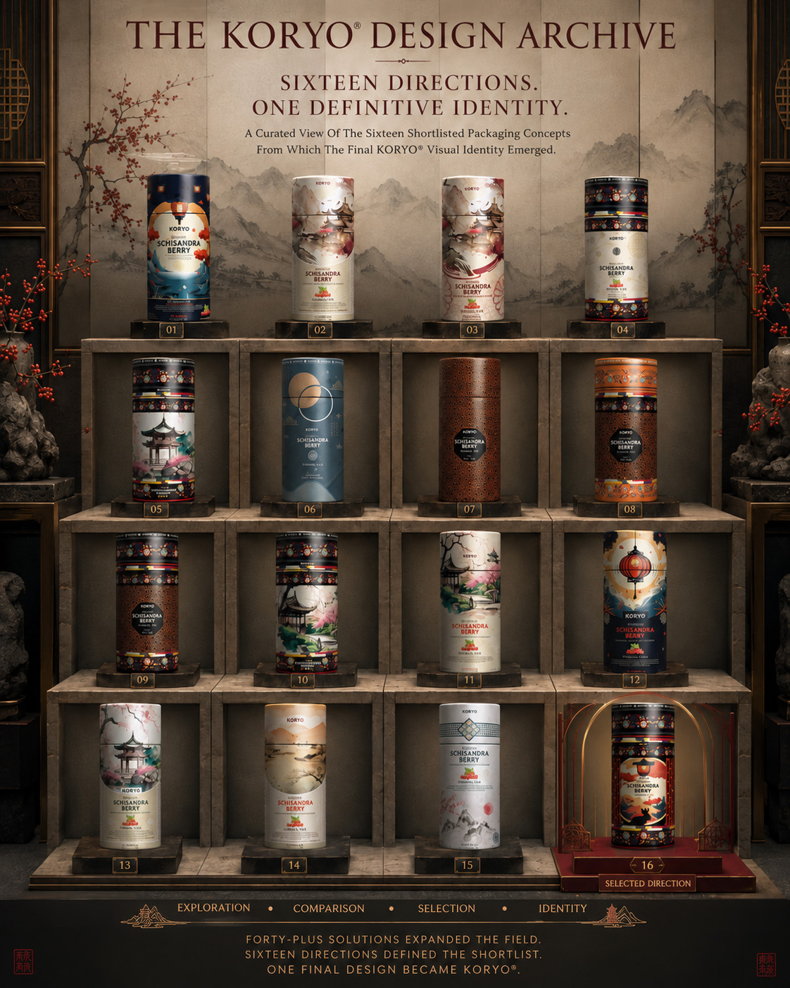
Presented As A Curated Design Archive, These Sixteen Shortlisted Directions Reveal The Creative Breadth Behind KORYO®. Together, They Trace The Journey From Cultural Exploration And Focused Comparison To One Definitive Packaging Identity.
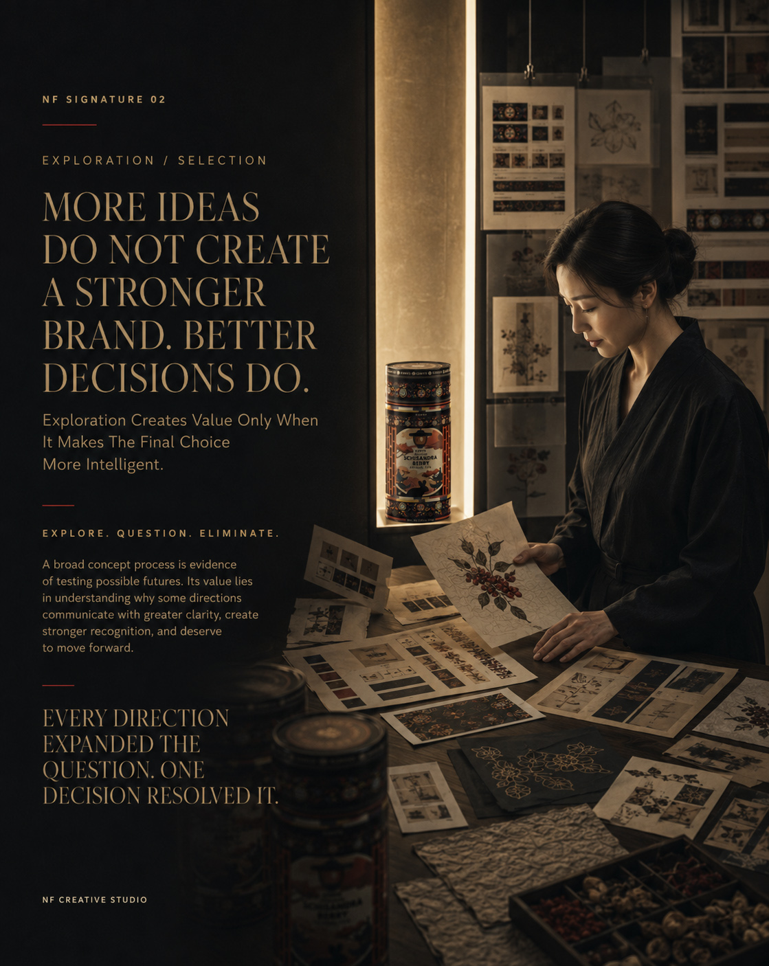
DESIGN EVOLUTION & CONCEPT EXPLORATION
MORE THAN 40 PACKAGING CONCEPTS.
ONE TIMELESS PREMIUM IDENTITY.
Every concept explored a different relationship between Korean cultural heritage, premium positioning, product clarity, and shelf recognition. Through structured comparison and continuous refinement, the strongest strategic direction gradually emerged—forming the foundation of the final KORYO® packaging identity.
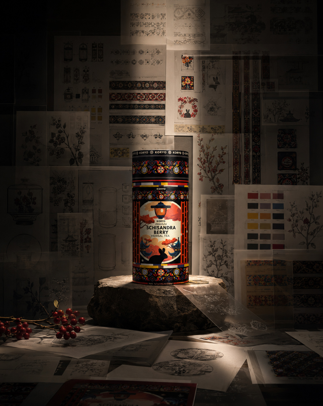
MORE THAN FORTY POSSIBILITIES. SIXTEEN SHORTLISTED DIRECTIONS. ONE DEFINITIVE KORYO® IDENTITY.
BREADTH THROUGH EXPLORATION
More than forty original packaging concepts tested distinct relationships between Korean heritage, botanical storytelling, premium character, product clarity, and visual recognition.
FOCUS THROUGH SELECTION
Sixteen shortlisted directions brought the strongest cultural, illustrative, typographic, ornamental, and structural ideas into one focused field for final client evaluation.
CLARITY THROUGH RESOLUTION
One selected concept unified Korean heritage, Schisandra storytelling, cylindrical composition, premium distinction, and lasting recognition within one complete KORYO® packaging identity.
Creative exploration is where strategy becomes visible. Every direction—including those not selected—revealed what the packaging needed to preserve, simplify, or strengthen.
Together, these evaluations shaped the final KORYO® premium packaging identity, demonstrating that meaningful design is never the result of one isolated idea, but of disciplined comparison, intentional refinement, and confident creative decisions.

“Where Korean Heritage, Strategic Thinking, And Premium Packaging Design Converge Into One Timeless Identity.”
Every Great Brand Is Remembered By The Feeling It Leaves Behind.
DESIGNING STORIES PEOPLE REMEMBER
The strongest packaging designs are remembered long after the product has been opened. They create emotional connections before a single word is read, transforming materials, colors, and illustrations into experiences that people instantly recognize and trust.
For KORYO, our objective extended beyond designing a premium tea package. We set out to create a visual experience capable of expressing Korean heritage through contemporary design—where every illustration, ornamental detail, texture, and composition works together to communicate authenticity, craftsmanship, and refinement.
The result is more than a packaging system. It is a carefully crafted brand experience designed to inspire curiosity, celebrate tradition, and establish a lasting emotional connection between the product and the people who choose it.
The most memorable brands don't simply tell stories—they invite people to become part of them.
THE FINAL IDENTITY
THE CONCEPT THAT BECAME THE BRAND
Where Korean Heritage, Botanical Expression, And Strategic Packaging Design Converged Into One Distinctive Premium Identity.
The final KORYO® packaging represents the culmination of an extensive strategic and creative process in which every decision was shaped by purpose, cultural relevance, and long-term brand value. Following the development and evaluation of more than 40 original packaging concepts, one direction emerged as the most complete expression of the brand’s heritage, premium positioning, and contemporary ambition.
The selected concept brought together the strongest principles revealed throughout the exploration: disciplined typography, controlled ornamental rhythm, expressive botanical illustration, architectural composition, and a color system capable of creating both emotional depth and immediate recognition.
Rather than treating Korean heritage as a decorative layer, the final identity translates it through proportion, repetition, balance, material sensitivity, and visual restraint. Traditional references are not reproduced literally; they are reinterpreted as part of a contemporary packaging language that feels culturally grounded, internationally relevant, and unmistakably KORYO®.
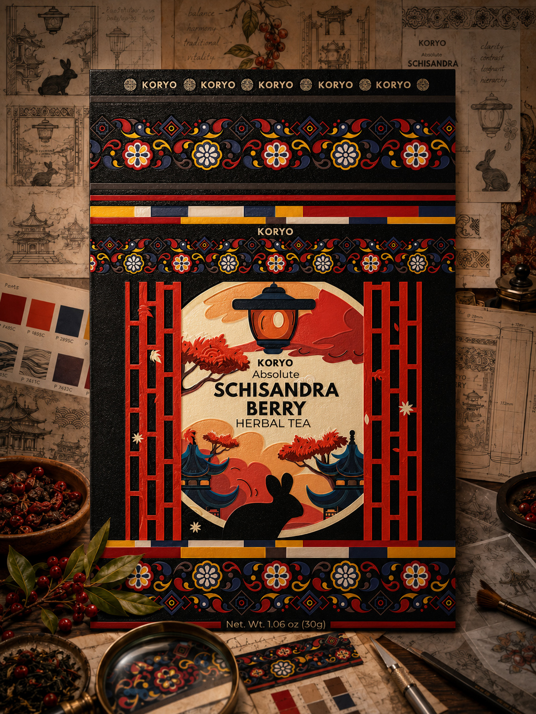
The completed design was developed as more than an individual tea package. It became a coherent Premium Tea Packaging And Brand Identity System in which every visible element performs a specific role—from establishing brand authority and communicating product character to guiding recognition across the complete cylindrical surface.
The central ornamental composition creates continuity around the canister, while the botanical illustration connects the Schisandra ingredient story with the cultural depth of the brand. Typography and information hierarchy preserve clarity, allowing visual richness to support the product narrative without overwhelming it.
Color relationships were equally strategic. Deep charcoal, restrained red, warm ivory, natural gold, and controlled accent tones create a distinctive premium atmosphere while reinforcing contrast, shelf presence, and recognition across physical and digital environments.
Because the system was designed around consistent principles rather than one fixed composition, it can support future product varieties without losing master-brand coherence. Illustration, color, and botanical character can evolve, while the underlying architecture continues to preserve a recognizable KORYO® identity.
The final packaging therefore balances two essential responsibilities: it communicates the individuality of the product while building the foundations of a broader, scalable brand world. Cultural storytelling, commercial clarity, and visual distinction no longer function as separate objectives—they operate as one integrated experience.
From A Selected Packaging Concept To A Complete And Recognizable Brand Experience
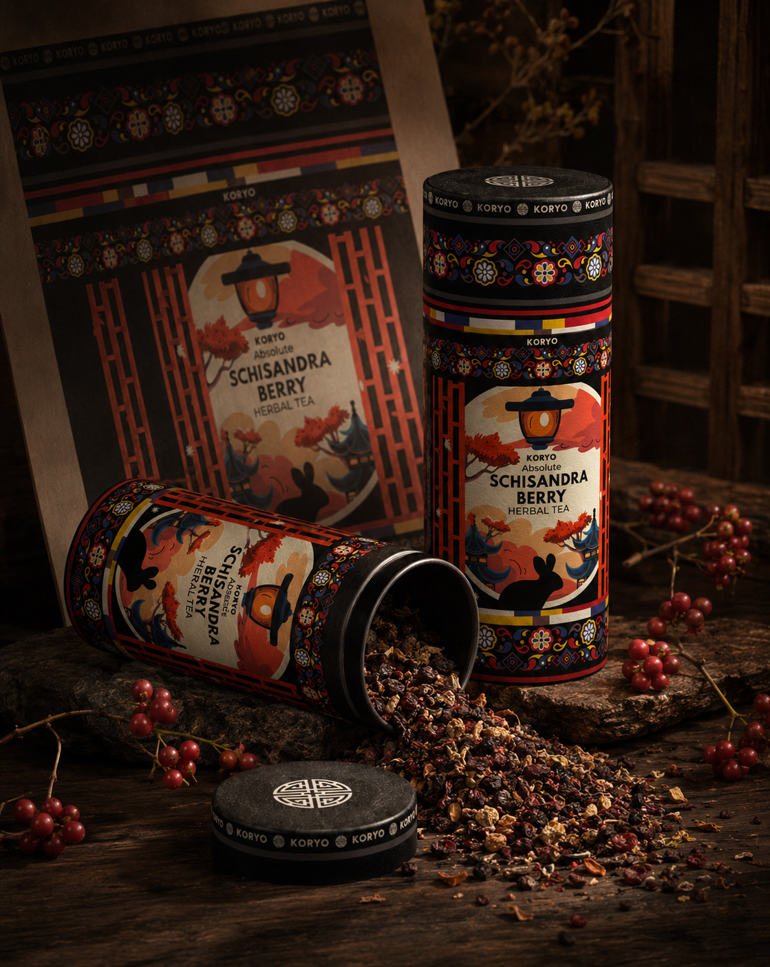
The Result:
A PREMIUM PACKAGING IDENTITY BUILT FOR RECOGNITION, GROWTH, AND LONG-TERM BRAND VALUE
The selected direction transformed KORYO® from a traditional herbal tea product into a distinctive premium brand with a visual territory of its own. By combining authentic cultural storytelling, botanical expression, refined illustration, strategic visual hierarchy, and contemporary packaging design, the final solution creates a stronger and more valuable presence at every point of consumer contact.
Every design decision contributes to one coherent brand experience. The identity communicates quality before the canister is opened, establishes product recognition from different viewing angles, and preserves its clarity across retail displays, gifting environments, editorial presentations, e-commerce platforms, and mobile screens.
The cylindrical packaging is no longer treated as a simple container. Its curvature becomes an active part of the visual narrative, allowing ornament, typography, illustration, and color to unfold continuously around the physical object. This gives the product greater dimensional presence and turns the act of holding and rotating the package into part of the brand experience.
Beyond its immediate visual impact, the final system provides KORYO® with a flexible foundation for future development. Consistent packaging architecture, adaptable botanical storytelling, and controlled product differentiation allow the collection to expand while maintaining strong master-brand recognition.
The result is an identity that feels authentic in origin, contemporary in expression, premium in perception, and scalable in application—positioning KORYO® with the distinction required for lasting recognition and long-term commercial relevance.
“Exceptional Packaging Does More Than Protect A Product—It Preserves Its Heritage, Elevates Its Perceived Value, And Transforms Tradition Into A Brand Experience Designed To Endure.”
FROM CREATIVE SHORTLIST TO FINAL DESIGN SELECTION
SIXTEEN SHORTLISTED DIRECTIONS. ONE DEFINITIVE KORYO® IDENTITY.
MORE THAN FORTY CONCEPTS EXPANDED THE CREATIVE FIELD. SIX DIRECTIONS DEFINED THE STRONGEST TERRITORIES. ONE FINAL SYSTEM GAVE KORYO® ITS IDENTITY.
ORIGINAL DESIGN SOLUTIONS
More Than Forty Distinctive Packaging Solutions Developed And Presented For Client Evaluation.
More than forty original Packaging Design Solutions were developed and presented in response to the project brief, giving the client an extensive creative field from which the future KORYO® identity could be considered.
The proposed solutions explored different relationships between Korean cultural heritage, Schisandra storytelling, premium product character, typography, architectural illustration, botanical detail, ornamental rhythm, color hierarchy, and commercial visibility.
The purpose of this extensive exploration was not to create minor variations of one visual idea. Each solution introduced a distinctive creative possibility, enabling the client to compare genuinely different interpretations before identifying the strongest directions for the focused shortlist.
SHORTLISTED CREATIVE DIRECTIONS
Sixteen Distinct Packaging Concepts Advanced For Focused Client Evaluation.
From more than forty original design solutions, the client selected sixteen distinctly developed Creative Packaging Directions for closer evaluation and comparison. Each concept explored a different relationship between Korean heritage, Schisandra storytelling, premium positioning, visual character, and packaging recognition.
Architectural and botanical illustration, traditional ornament, symbolic patterns, contemporary geometry, restrained minimalism, typography, and color hierarchy were interpreted across sixteen genuinely different creative territories.
By comparing cultural relevance, product clarity, visual hierarchy, cylindrical application, and long-term brand potential, one concept emerged as the strongest foundation for the final KORYO® Premium Tea Packaging Identity.
CYLINDRICAL DESIGN LOGIC
One Continuous Packaging Experience Designed Beyond The Front-Facing View.
The KORYO® identity began with front-facing creative exploration and evolved into a complete 360° Premium Tea Packaging Design. Rather than treating the selected direction as an isolated composition, every element became part of one continuous Packaging Architecture System extending across the complete canister surface.
Typography, architectural illustration, botanical storytelling, ornamental borders, product information, visual rhythm, and negative space were coordinated to create a cohesive Cylindrical Packaging Experience from every viewing angle.
The result is a continuous visual narrative that strengthens the Korean Herbal Tea Packaging Identity, immediate brand recognition, premium market positioning, and the complete product experience.
FINAL PACKAGING IDENTITY
One Definitive System Bringing Culture, Product, And Recognition Together.
One final creative direction emerged as the most complete expression of the KORYO® brand—uniting Korean cultural references, Schisandra botanical character, refined illustration, controlled ornament, premium typography, and contemporary packaging structure.
The selected concept was progressively refined into one coherent Tea Packaging And Brand Identity System capable of communicating authenticity, product distinction, premium value, and immediate recognition across physical and digital presentation.
Rather than functioning as a single decorative label, the final identity established a structured foundation for consistent brand communication, future tea varieties, collection development, e-commerce presentation, and long-term product evolution.
Following the development of more than forty original packaging solutions, sixteen distinctly different creative directions advanced into the focused client shortlist.
Each shortlisted concept explored a different relationship between Korean cultural heritage, Schisandra product storytelling, premium positioning, visual clarity, and packaging recognition. Through direct comparison and a clear selection process, one direction emerged as the strongest and most complete expression of the KORYO® brand.
The selected concept was then refined into the final KORYO® Premium Tea Packaging Identity—a coherent visual system uniting cultural illustration, botanical character, ornamental rhythm, typography, color, and cylindrical packaging architecture within one distinctive design.
FORTY-PLUS SOLUTIONS EXPANDED THE FIELD. SIXTEEN DIRECTIONS DEFINED THE SHORTLIST. ONE FINAL DESIGN BECAME KORYO®.
NF CREATIVE STUDIO
THE FINAL IDENTITY IS ONLY THE BEGINNING OF THE STORY.
Its True Value Is Revealed Through The Research, Exploration, And Decisions That Gave Every Element Its Meaning.
THE RESULT HAS BEEN PRESENTED.
NOW WE REVEAL THE THINKING THAT CREATED IT.
PACKAGING MACRO DETAILS
PRECISION THAT CAN BE FELT
An Intimate Examination Of The Cultural Detail, Graphic Precision, Material Character, And Cylindrical Construction Behind The Final KORYO® Packaging Identity.
The final KORYO® identity was designed to communicate at multiple distances. From its complete cylindrical silhouette to the smallest typographic, ornamental, and botanical detail, every element contributes to a unified premium Korean herbal tea packaging experience.
Macro photography brings the viewer closer to the decisions that cannot be fully understood through a conventional product image. It reveals how cultural references were translated into line, rhythm, hierarchy, material, and print without reducing Korean heritage to surface decoration.
This section examines the final packaging not simply as a graphic composition, but as a carefully constructed physical object in which brand identity, packaging architecture, visual storytelling, and production detail operate as one coherent system.
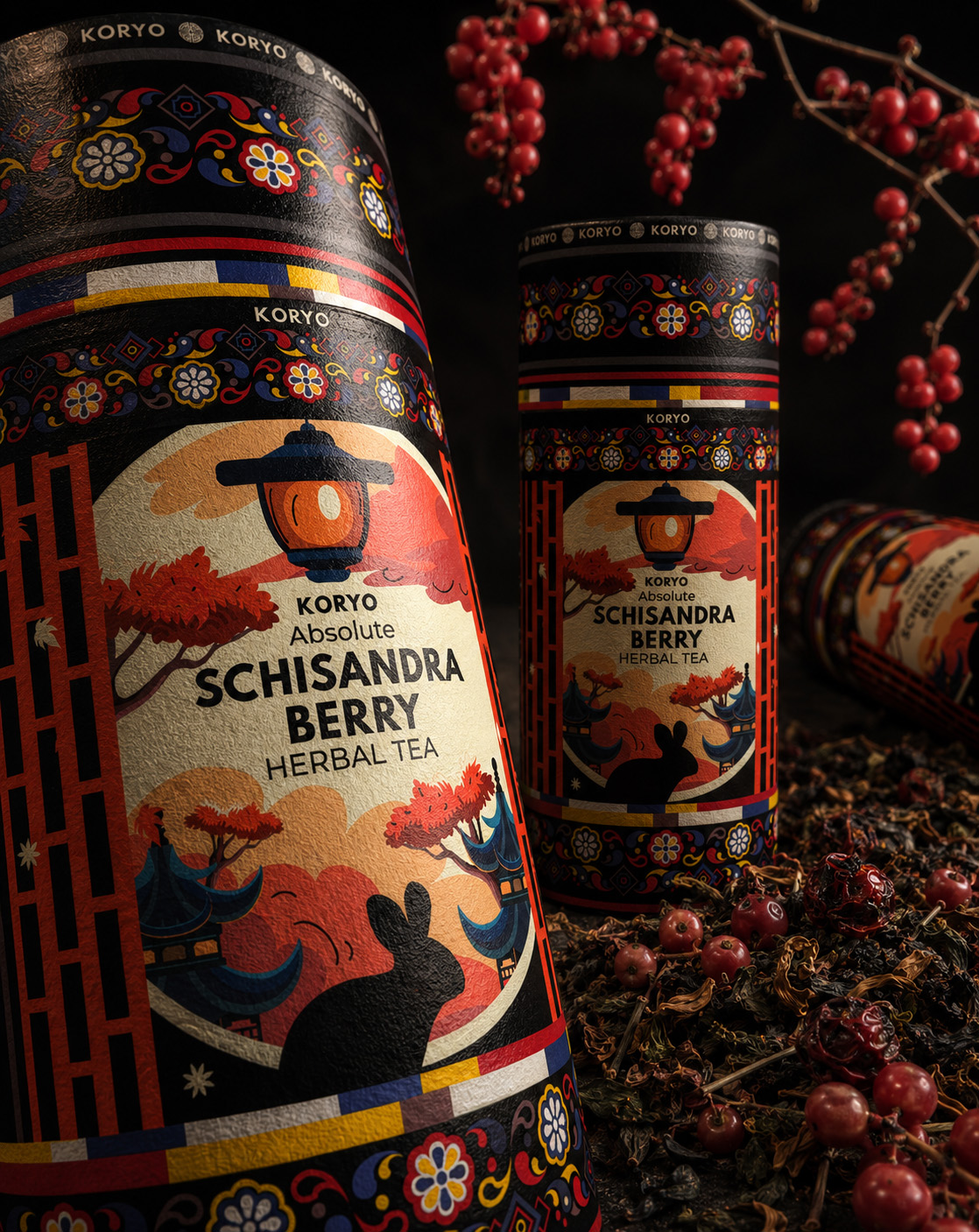
WHERE VISUAL IDENTITY BECOMES PHYSICAL PRESENCE
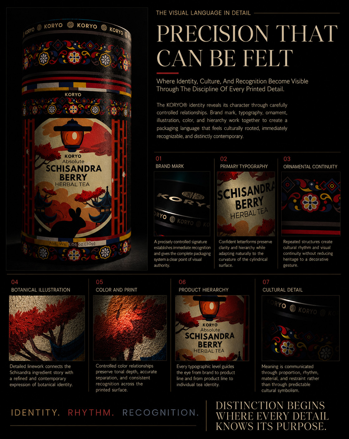
A complete product view establishes the authority of the final packaging, but its true character is carried through the details. The first macro sequence moves progressively across the elements responsible for recognition: the KORYO® brand mark, primary typography, Korean architectural illustration, botanical storytelling, ornamental borders, color relationships, and product hierarchy.
Viewed individually, these elements reveal the precision behind the composition. Viewed together, they demonstrate how the complete tea packaging design system transforms cultural research into a distinctive, contemporary, and commercially recognizable identity.
EVERY DETAIL SERVES THE COMPLETE IDENTITY
The first macro sequence isolates individual design elements so their purpose can be clearly understood. The following editorial composition brings them back together, revealing the relationships that create balance, continuity, and immediate brand recognition across the complete canister.
Typography establishes hierarchy. Architecture carries cultural memory. Botanical illustration communicates the product’s origin and sensory character. Ornament introduces rhythm and continuity. None of these elements was developed as an independent decorative gesture; each was calibrated to strengthen the wider KORYO® packaging identity.
The first poster therefore acts as a visual synthesis—a single editorial statement demonstrating how many controlled decisions combine to create one coherent and emotionally resonant packaging experience.
MATERIAL & STRUCTURE
BUILT BEYOND THE PRINTED SURFACE
Examining How Material Response, Printed Alignment, Structural Precision, And Cylindrical Form Transform The Visual Identity Into A Complete Physical Product.
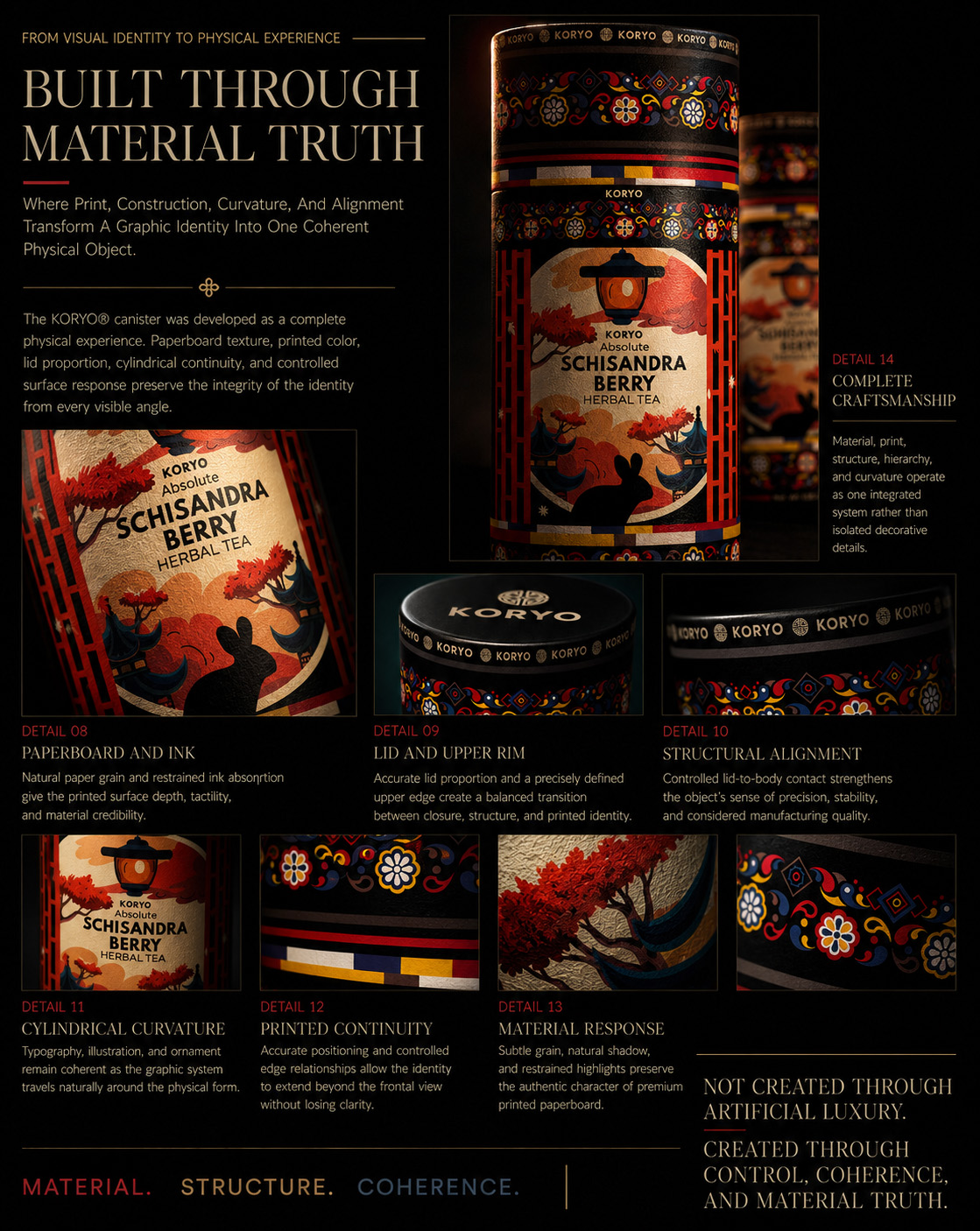
Once the visual language has been established, attention shifts from what the packaging communicates to how it is physically constructed. The second macro sequence examines the points where design meets material: the paperboard surface, ink response, lid and upper rim, printed edges, cylindrical curvature, structural alignment, and continuity of the artwork during rotation.
These details determine whether a packaging concept remains visually persuasive when transferred from a flat design file to a three-dimensional object. Every transition must remain controlled, every line must respect the cylindrical form, and every printed element must preserve hierarchy across changing viewing angles.
Through this closer examination, the KORYO® canister is revealed as more than a surface carrying artwork. Its material, structure, and physical geometry actively participate in the 360° premium packaging design, transforming the identity into a complete tactile and spatial experience.

WHERE DESIGN MEETS ITS PHYSICAL FORM
FROM PRINTED PRECISION TO STRUCTURAL COHERENCE
The hero image establishes the KORYO® canister as one complete physical object. The following macro sequence moves beyond the overall presentation to examine the construction details that determine how successfully the visual identity performs across material, surface, edge, and cylindrical form.
Paperboard texture, ink response, lid construction, rim alignment, printed transitions, and rotational continuity are viewed as interconnected parts of the same Premium Tea Packaging System. Each detail reveals how the design was adapted to preserve clarity, balance, and visual authority beyond the flat artwork.
This closer perspective demonstrates that successful Cylindrical Packaging Design depends not only on the strength of its graphics, but on the precision with which those graphics respond to physical geometry. Material and structure do not simply support the KORYO® identity—they complete it.
MATERIAL. STRUCTURE. COHERENCE.
The second macro sequence demonstrates how the selected visual identity was resolved across the physical realities of packaging production. Material texture, printed detail, structural edges, cylindrical curvature, and rotational continuity were treated as interconnected parts of the same design problem.
The final poster consolidates these observations into one complete editorial overview. Rather than presenting isolated moments of craftsmanship, it shows how each physical detail supports the finished product—from the precision of the lid and rim to the alignment of the printed composition and the consistency of the packaging across every visible surface.
Together, these details establish material credibility. They ensure that the final Korean herbal tea packaging design feels considered not only in presentation, but also in the hand, on the shelf, through photography, and throughout the complete product experience.
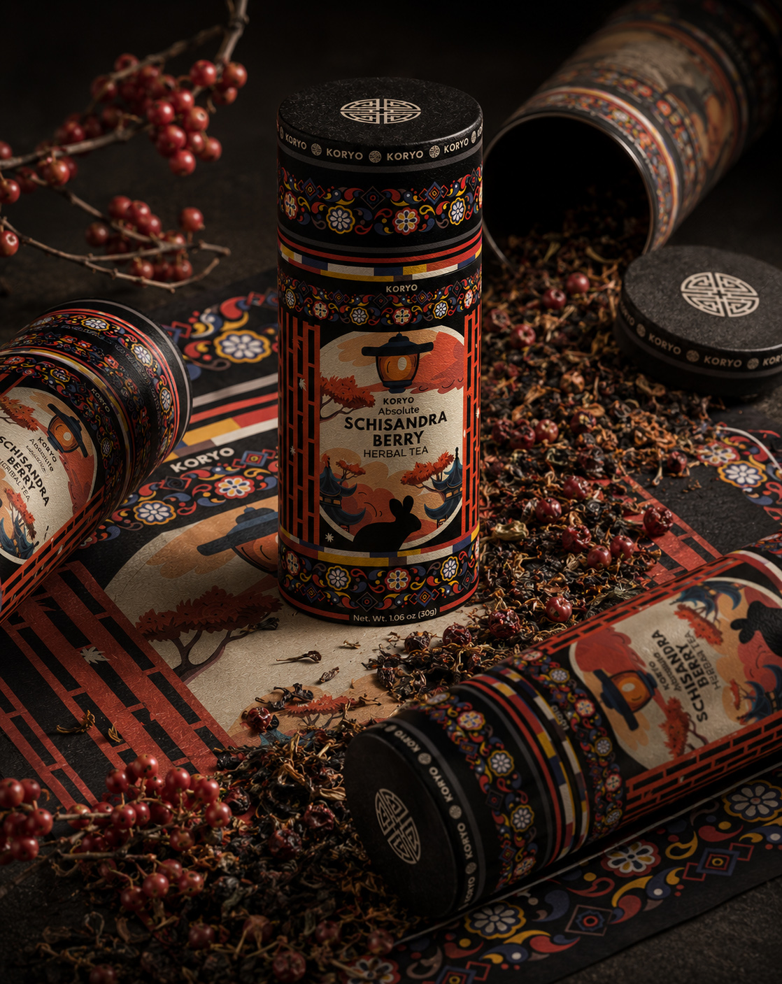
CRAFTED AS ONE COMPLETE EXPERIENCE
The KORYO® macro study reveals that the strength of the final packaging does not depend on one dominant graphic gesture. It emerges from the coordination of many carefully controlled decisions—each contributing to cultural authenticity, visual clarity, material credibility, and immediate brand recognition.
From typography and architectural illustration to botanical storytelling and ornamental continuity, the identity was constructed to remain meaningful at every scale. The same system that creates impact from a distance continues to reward attention when the product is viewed closely, held, photographed, or gradually rotated.
Material and structure complete that experience. The cylindrical form, printed surface, lid, edges, and rotational alignment were not treated as technical limitations, but as active components of the Packaging Architecture System. Together, they transform the selected design direction into a coherent and premium physical object.
What begins as visual identity ultimately becomes something tangible: a product whose culture, purpose, and positioning can be seen in its composition and felt through its construction. The final KORYO® canister is therefore not simply decorated packaging—it is one complete expression of heritage, precision, craftsmanship, and contemporary Korean tea branding.
WHERE HERITAGE, PRECISION, AND MATERIAL CRAFTSMANSHIP BECOME ONE COMPLETE PACKAGING EXPERIENCE.
OUR APPROACH
“We Don’t Apply Culture As Decoration. We Translate Meaning Into A Packaging System Where Origin, Product, Emotion, And Recognition Work As One.”
Every decision is developed to serve a clear role within the wider brand experience—from the first cultural reference and conceptual sketch to the final packaging hierarchy, cylindrical composition, and market-facing presentation.
Our approach combines Cultural Research, Tea Packaging Design, Brand Identity Design, visual-territory exploration, illustration, ornament, color strategy, typography, packaging architecture, and premium product presentation within one integrated creative framework.
Every decision—from the selection of cultural and botanical references to the relationship between the central product panel, architectural illustration, decorative borders, typography, and wrap-around flow—is developed to strengthen understanding, protect visual hierarchy, and create a more distinctive and ownable identity.
For KORYO®, this meant allowing more than 40 possible design directions to test different relationships between Korean heritage, Schisandra berry origin, contemporary premium positioning, and international readability before one final visual system was selected and refined.
Infinity Design Studio x NF Creative Studio
Research Gives Culture Context. Exploration Gives The Brand Possibility. Selection Gives The Identity Direction. A Complete Packaging System Gives It The Power To Be Recognized.
RESEARCH · EXPLORATION · SELECTION · IDENTITY
THE FINAL IDENTITY HAS BEEN REVEALED. NOW ITS COMPLETE STORY BEGINS.
EIGHT CHAPTERS.
ONE DEFINITIVE IDENTITY.
An Eight-Chapter Journey Through Cultural Meaning, Creative Exploration, Packaging Form, Material Precision, Product Ritual, And The Enduring Brand World Behind KORYO®.
ORIGIN. TRANSFORMATION. CONTINUITY.
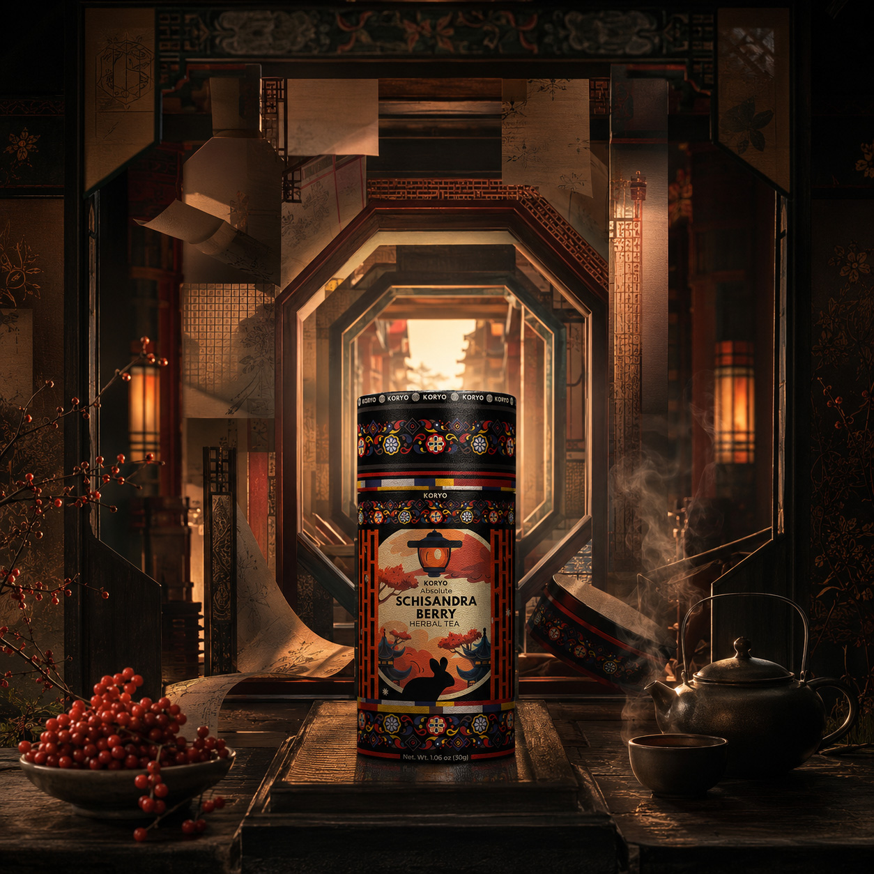
THE STORY BEHIND THE DEFINITIVE IDENTITY
WHAT APPEARS AS ONE COMPLETE OBJECT WAS BUILT THROUGH MANY CONNECTED LAYERS OF MEANING.
The final KORYO® identity has already been revealed. Yet the finished canister represents only the visible conclusion of a much deeper process—one shaped by cultural understanding, botanical origin, creative exploration, disciplined selection, visual storytelling, material precision, and the experience of the product in use.
Across the following eight chapters, the case study moves beyond the surface of the final design. It returns to the cultural threshold from which the project began, follows more than forty original visual possibilities toward one definitive direction, and reveals how selected artwork was transformed into a complete cylindrical packaging object.
The story then moves closer: into the lantern that gives the identity its emotional center, the details that create material and perceived value, the contemporary presentation that positions the product for a new audience, and the ritual through which packaging becomes a physical and sensory experience.
Together, these chapters reveal KORYO® not as a collection of isolated design decisions, but as one connected Korean Herbal Tea Packaging and Brand Experience System—rooted in cultural meaning, realized through precision, and structured to carry its identity forward.
THE IDENTITY HAS BEEN SEEN.
NOW EVERY DECISION BEHIND IT WILL BE REVEALED.
“A Definitive Identity Is Never Created In One Moment. It Emerges When Every Layer Of Meaning Begins To Speak As One.”
EIGHT CHAPTERS.
EIGHT LAYERS OF MEANING.
ONE COMPLETE KORYO® STORY.
CHAPTER 01
BEFORE FORM COULD EMERGE, MEANING HAD TO BE UNDERSTOOD.
THE CULTURAL THRESHOLD
Before KORYO® Could Become A Contemporary Premium Tea Identity, The Project Had To Understand What Its Cultural Heritage, Botanical Origin, And Product Ritual Truly Needed To Carry Forward.
KORYO® began with more than the need for distinctive packaging.
At the center of the project was a Korean herbal tea shaped by cultural memory, botanical character, and a ritual that had existed long before its visual identity was defined.
That depth created value—but it also created responsibility.
A successful Korean Herbal Tea Packaging Design could not depend on ornamental references alone. The identity needed to understand where those references came from, what they represented, and how they could be translated without reducing Korean heritage to a decorative style.
The challenge was therefore not simply to make the product appear traditional.
It was to identify which elements of its origin should be preserved, which should be reinterpreted, and how they could become relevant to a contemporary international audience.
Korean architecture, ornamental rhythm, the organic form and distinctive crimson color of the Schisandra berry, the preparation of herbal tea, and the stillness of the drinking ritual became interconnected parts of one cultural and sensory foundation.
Every early decision needed to answer one central question:
How can Korean cultural heritage be translated into a contemporary premium tea identity without losing its authenticity, clarity, or global relevance?
ORIGIN. MEANING. DIRECTION.
“WHAT NEEDED TO BE PRESERVED BECAME THE FOUNDATION FOR EVERYTHING THAT FOLLOWED.”
MACRO SECTION 01
WHERE CULTURAL MEMORY AND BOTANICAL CHARACTER BECOME ONE SOURCE OF IDENTITY.
THE CULTURAL AND BOTANICAL ORIGIN
Before A Visual Language Could Be Designed, The Project Had To Understand The Cultural World, Natural Character, And Living Ritual From Which KORYO® Emerged.
KORYO® draws its meaning from the meeting of two origins: the cultural heritage of Korea and the distinctive botanical identity of the Schisandra berry.
Korean architecture, ornamental rhythm, traditional materials, restrained color, and the quiet discipline of the tea ritual offered far more than a collection of visual references. Together, they revealed a deeper design principle—one based on balance, structure, symbolism, and respect for the experience surrounding the product.
Within that cultural framework, Schisandra introduced a second layer of identity. Its concentrated crimson color, organic form, botanical character, and long association with Korean herbal traditions gave the product a recognizable natural center. The berry was not treated as a decorative ingredient placed beside the brand, but as an essential part of the story the packaging needed to communicate.
The opportunity was to bring these two sources together without allowing either to become superficial. Cultural heritage needed to provide meaning rather than ornament alone. Botanical origin needed to create distinction without pushing the identity toward a generic wellness aesthetic.
This understanding established the first foundation of the KORYO® Korean Herbal Tea Packaging Design: an identity in which architecture provides structure, nature provides vitality, and ritual connects both with the human experience of the product.
ORIGIN. MEANING. DIRECTION.
“THE IDENTITY DID NOT BEGIN WITH A VISUAL STYLE. IT BEGAN WITH AN UNDERSTANDING OF WHERE THE PRODUCT BELONGED.”
CULTURAL MEMORY
Heritage As A Living Design Source
Korean architectural proportions, ornamental systems, traditional materials, and visual restraint provided a cultural framework that could be interpreted with relevance—not simply reproduced as decoration.
BOTANICAL IDENTITY
Nature As A Recognizable Brand Signature
The Schisandra berry introduced an authentic visual and emotional center through its distinctive form, concentrated color, natural character, and direct relationship with the product itself.
RITUAL CONTINUITY
Experience Connecting Past And Present
The preparation and consumption of herbal tea transformed culture and botany into a living experience—connecting inherited meaning with the expectations of a contemporary audience.
KORYO® WOULD NOT BE BUILT AROUND A BORROWED IMAGE OF KOREA, BUT AROUND THE RELATIONSHIP BETWEEN CULTURE, NATURE, AND RITUAL THAT GAVE THE PRODUCT ITS MEANING.
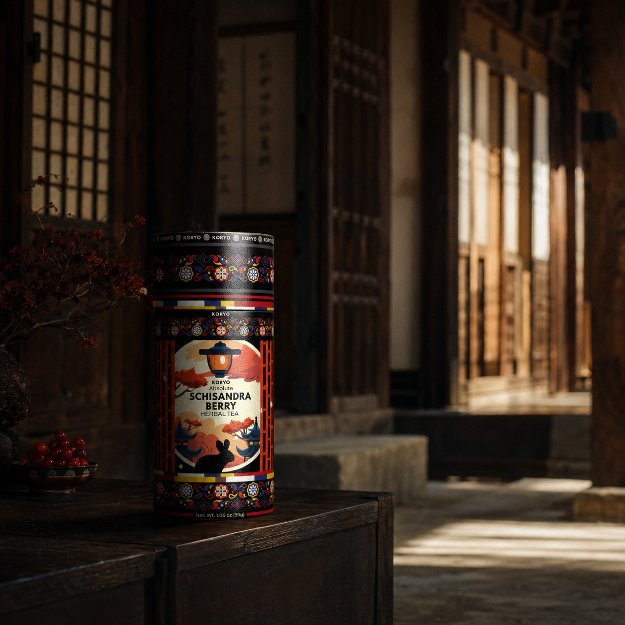
CULTURE AS STRUCTURE
Korean heritage was approached not as a decorative reference, but as a living system of proportion, rhythm, material, and meaning capable of shaping the complete KORYO® identity.
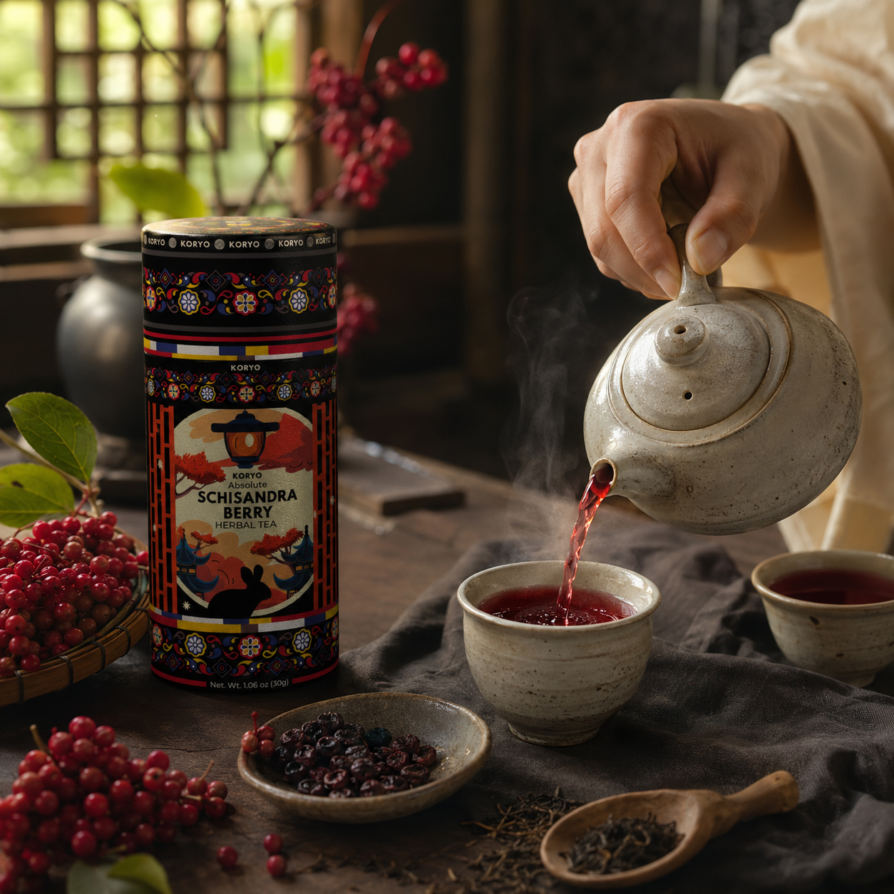
NATURE AS EXPERIENCE
Schisandra gave the identity its botanical signature, while the tea ritual transformed that natural origin into a sensory experience connecting Korean heritage with the present.
ONE ORIGIN. TWO INTERCONNECTED SOURCES.
Culture established the structure. Botany introduced the character. Ritual brought both into human experience. Together, they defined the authentic territory from which the KORYO® identity could begin.
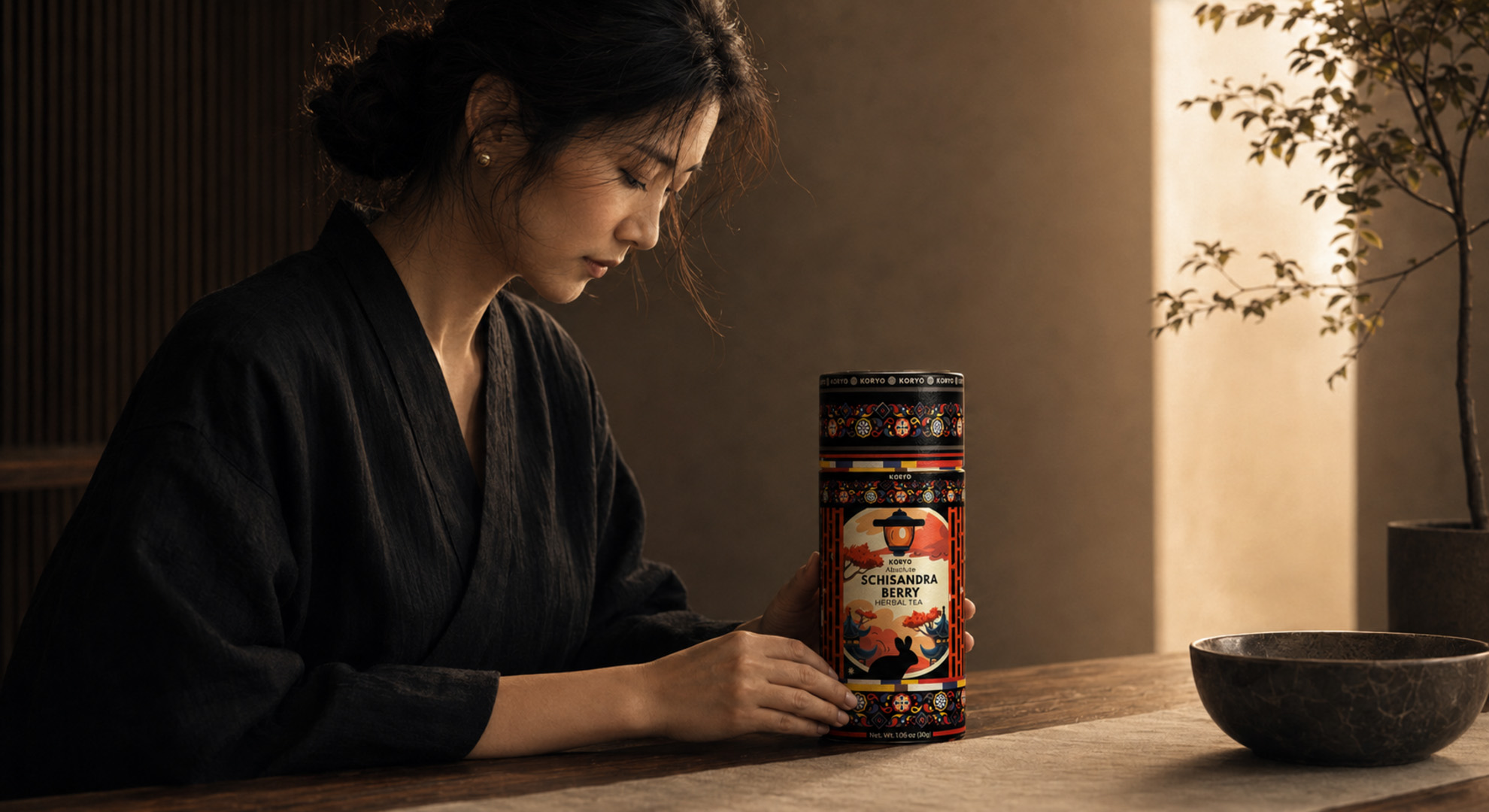
BEFORE KORYO® COULD EXPRESS ITS IDENTITY, IT HAD TO UNDERSTAND THE WORLD THAT GAVE THAT IDENTITY MEANING.
MACRO SECTION 02
WHERE BOTANICAL HERITAGE BECOMES A CONTEMPORARY PREMIUM EXPERIENCE.
THE PRODUCT, THE RITUAL, THE AUDIENCE
KORYO® Needed To Preserve The Meaning Of A Traditional Korean Herbal Tea While Creating A Product Experience Capable Of Belonging Within A Contemporary International Market.
Understanding the origin of KORYO® established where the identity came from. The next challenge was to determine how that meaning would be experienced by the people encountering the product today.
The product could not remain dependent on cultural knowledge that only a familiar audience would immediately understand. Its heritage needed to be made accessible through a clear visual hierarchy, recognizable botanical storytelling, refined material expression, and an experience capable of communicating quality before the tea was prepared.
This made the packaging more than a protective container. It became the first physical point of contact between cultural origin and contemporary expectation.
The cylindrical format introduced a distinctive presence, while its proportions, surface, opening experience, and tactile character offered an opportunity to elevate the product beyond conventional herbal tea packaging. Every element needed to contribute to the sense that KORYO® was not simply an ingredient-based beverage, but a considered ritual presented through a premium contemporary object.
At the same time, the identity needed to remain internationally understandable. A customer unfamiliar with Korean tea traditions still needed to recognize the product category, understand the botanical character of Schisandra, perceive its premium positioning, and feel invited into the experience.
The objective was not to modernize the product by removing its cultural depth. It was to build a bridge through which that depth could become clear, desirable, and relevant to a new audience.
PRODUCT. EXPERIENCE. RELEVANCE.
“THE PRODUCT NEEDED TO FEEL ROOTED IN TRADITION, YET COMPLETELY NATURAL WITHIN CONTEMPORARY LIFE.”
PRODUCT PRESENCE
Packaging As The First Physical Encounter
The cylindrical canister established a distinctive and tactile format through which structure, material, proportion, and visual hierarchy could communicate premium value before the product was opened.
RITUAL EXPERIENCE
Transforming Preparation Into Meaning
Opening the canister, observing the berries, preparing the infusion, and experiencing its color and aroma created a sequence through which the brand could move from packaging into everyday life.
GLOBAL RELEVANCE
Cultural Depth Made Internationally Clear
The identity needed to preserve its Korean origin while remaining visually accessible, commercially relevant, and immediately understandable to audiences encountering Schisandra for the first time.
KORYO® WAS NOT BEING POSITIONED AS A RELIC OF TRADITION, BUT AS A CONTEMPORARY PREMIUM EXPERIENCE WHOSE VALUE BECAME STRONGER BECAUSE ITS ORIGIN REMAINED VISIBLE.
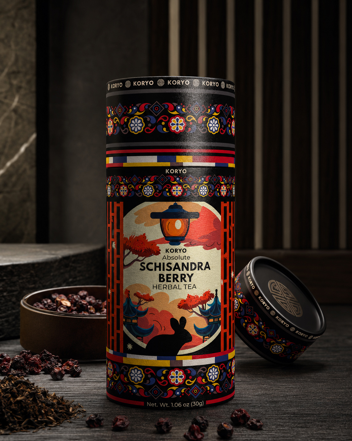
PACKAGING AS THE FIRST ENCOUNTER
The cylindrical canister transformed the brand’s cultural and botanical meaning into a tangible premium object—using form, material, proportion, and opening experience to establish value before the tea was prepared.
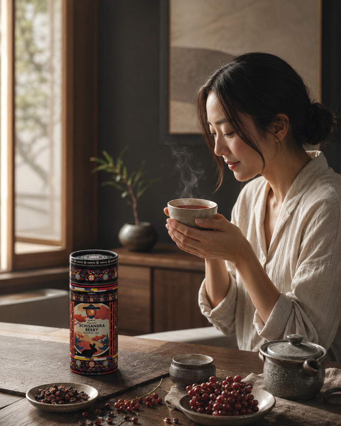
HERITAGE WITHIN CONTEMPORARY LIFE
KORYO® translated cultural depth into an experience that felt intuitive within contemporary life—allowing a new international audience to recognize the product, understand its value, and enter the ritual without prior cultural knowledge.
ROOTED IN ORIGIN. DESIGNED FOR THE PRESENT.
The packaging established physical value. The ritual created emotional connection. Contemporary relevance made the experience accessible beyond its original cultural context. Together, they positioned KORYO® as a premium product whose modernity came from clarity—not from the removal of tradition.
KORYO® DID NOT LEAVE ITS HERITAGE BEHIND TO BECOME CONTEMPORARY. IT MADE THAT HERITAGE CLEAR ENOUGH TO BELONG WITHIN THE PRESENT.
MACRO SECTION 03
WHERE CULTURAL MEANING BECOMES A CLEAR CREATIVE DIRECTION.
DEFINING THE AUTHENTIC TERRITORY OF THE KORYO® IDENTITY
The Identity Could Not Begin With A Predetermined Style. It Had To Emerge From A Clear Understanding Of What The Brand Needed To Preserve, Express, And Make Relevant.
Research into Korean cultural heritage established the origin of the brand. Understanding the product, ritual, and contemporary audience revealed how that origin needed to be experienced. The next step was to transform those findings into a coherent creative territory capable of guiding every future design decision.
This territory could not be built from isolated cultural symbols or an immediately recognizable “Asian” aesthetic. Such an approach would have reduced a meaningful cultural foundation to a collection of visual references without structure, purpose, or authenticity.
Instead, the direction needed to reflect the deeper principles already present within the story of KORYO®: balance, proportion, rhythm, botanical vitality, material restraint, ceremonial attention, and the quiet confidence of an identity that does not need excess to communicate value.
The challenge was to determine how these qualities could coexist within one contemporary packaging system.
Too much historical reference could make the product feel distant, ceremonial, or inaccessible. Too little cultural specificity could turn it into another generic premium tea. Excessive botanical expression could weaken the sense of discipline, while an overly minimal solution could remove the character that made Schisandra and its Korean origin distinctive.
The authentic territory existed between these extremes.
KORYO® needed an identity capable of expressing heritage without imitation, premium value without visual excess, botanical character without conventional wellness language, and contemporary relevance without abandoning cultural depth.
This became the strategic foundation for the creative exploration that followed.
HERITAGE. DISTINCTION. BALANCE.
“THE RIGHT VISUAL DIRECTION WOULD NOT DECORATE THE PRODUCT WITH CULTURE. IT WOULD ALLOW CULTURE TO SHAPE THE COMPLETE LOGIC OF THE IDENTITY.”
CULTURAL AUTHENTICITY
Meaning Before Decoration
Every cultural reference needed to originate from an understood principle—proportion, rhythm, symbolism, material, or ritual—rather than being introduced only for visual recognition.
BOTANICAL DISTINCTION
Schisandra As A Defining Signature
The berry needed to establish character, color, and product specificity without reducing the identity to conventional botanical illustration or generic natural-product packaging.
MODERN CLARITY
Heritage Made Relevant
The final system needed to feel culturally grounded while remaining clear, premium, and immediately accessible within a contemporary international market.
KORYO® REQUIRED A VISUAL TERRITORY PRECISE ENOUGH TO PROTECT ITS CULTURAL MEANING, YET OPEN ENOUGH TO ALLOW GENUINELY DIFFERENT CREATIVE DIRECTIONS TO EMERGE.
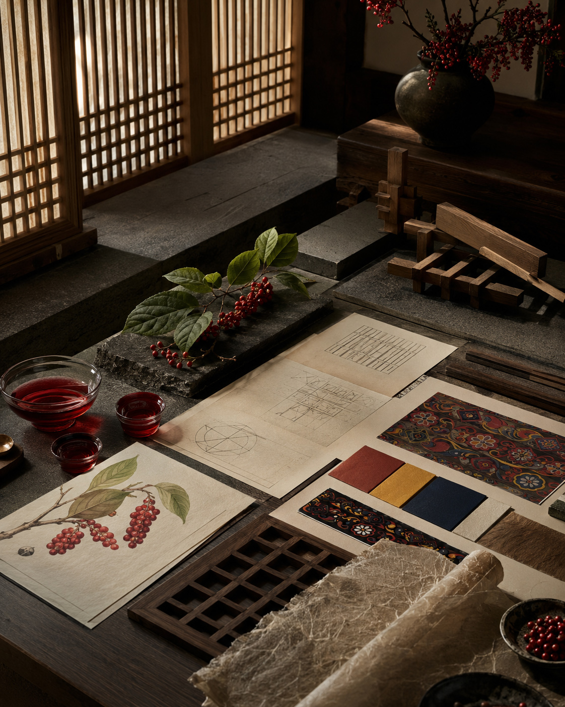
MEANING BEFORE FORM
Before a visual identity could be designed, the cultural, botanical, and material references had to be understood as one interconnected system capable of guiding form with purpose.
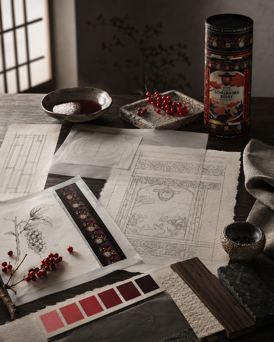
DIRECTION BEFORE DESIGN
The creative territory established what every future direction needed to protect: cultural authenticity, botanical distinction, contemporary clarity, and the disciplined balance between them.
ONE TERRITORY. MULTIPLE CREATIVE POSSIBILITIES.
Heritage defined what had to be preserved. The product revealed what needed to be communicated. The audience clarified how the experience needed to be understood. Together, these principles created a focused territory from which different creative directions could emerge without losing the meaning of KORYO®.
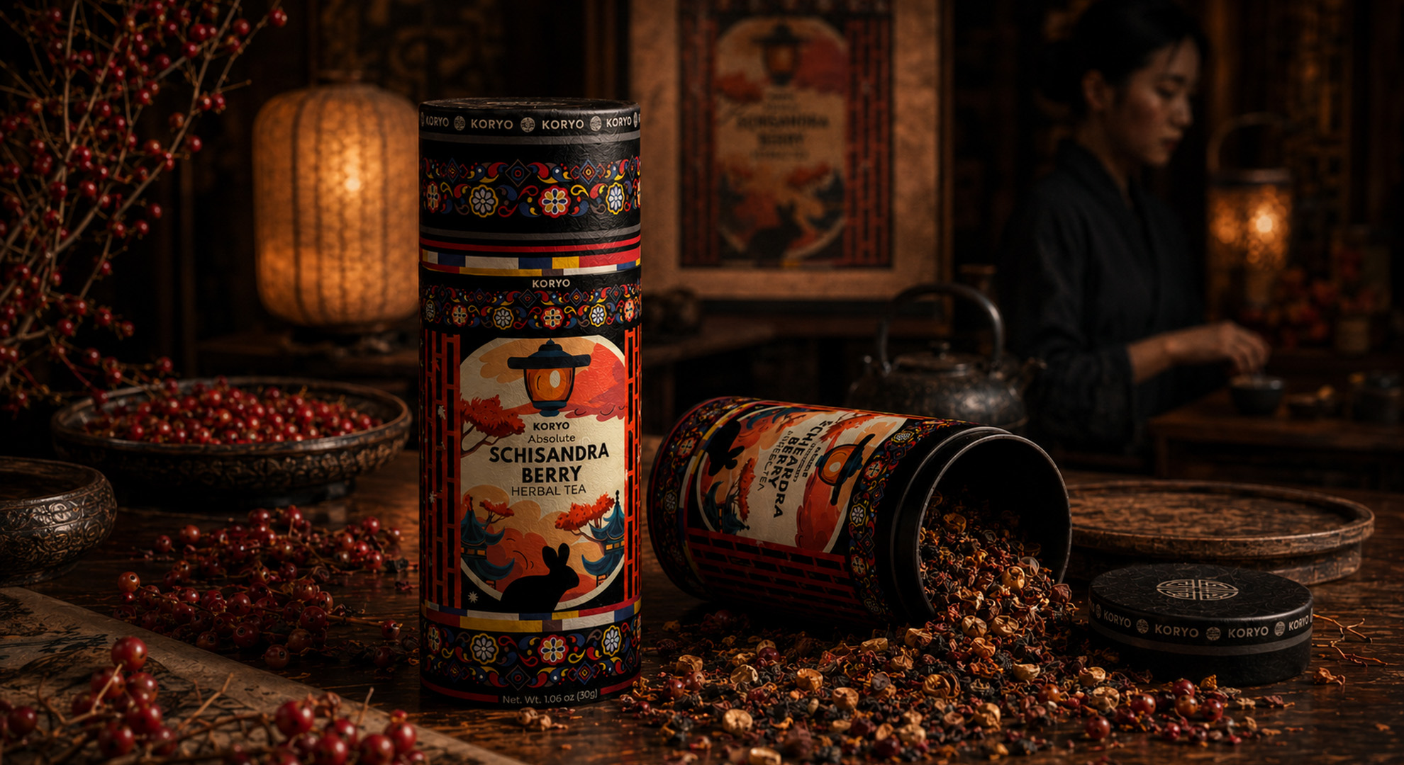
THE EXPLORATION COULD NOW BEGIN—NOT FROM AN EMPTY PAGE, BUT FROM A CLEAR CULTURAL, BOTANICAL, AND STRATEGIC FOUNDATION.
MEASURING THE FOUNDATIONS BEHIND THE IDENTITY
MEANING MADE VISIBLE
The Strategic Depth Behind The KORYO® Brand Identity Is Revealed Through Three Connected Macro Sections, Four Foundational Dimensions, Three Creative Criteria, And One Authentic Territory Guiding Its Premium Tea Packaging Design.
CONNECTED MACRO SECTIONS
One Foundation Built Through Three Strategic Perspectives
Cultural origin, contemporary experience, and creative direction were connected into one coherent foundation for the KORYO® brand identity.
FOUNDATIONAL DIMENSIONS
Culture, Botanical Origin, Ritual, And Audience
Four essential dimensions defined how the premium Korean tea packaging design needed to preserve meaning while remaining relevant internationally.
CREATIVE CRITERIA
Authenticity, Distinction, And Contemporary Clarity
Three strategic criteria established how every future visual identity direction would be evaluated before entering detailed design development.
AUTHENTIC CREATIVE TERRITORY
One Clear Foundation For Every Future Possibility
Research transformed Korean cultural heritage and Schisandra’s botanical character into one focused territory for meaningful creative exploration.
The strategic value of this chapter lies in the relationship between its foundations. Korean cultural heritage established meaning. Schisandra defined botanical distinction. Ritual transformed the product into experience. Together, they created an authentic territory capable of guiding the complete KORYO® premium tea packaging design and visual identity.
“VISUAL IDENTITIES MAY BEGIN WITH FORM. AUTHENTIC IDENTITIES BEGIN WITH MEANING.”
FROM ORIGIN TO CREATIVE DIRECTION
MEANING BECAME THE FOUNDATION OF EVERY POSSIBILITY.
Korean cultural heritage and the distinctive character of Schisandra established the origin of KORYO®. Through premium tea packaging design, ritual, and contemporary experience, that origin became tangible, relevant, and accessible to an international audience.
These insights defined a clear creative territory—one capable of protecting Korean cultural authenticity, expressing botanical distinction, and guiding multiple visual identity directions without losing the meaning at the center of the brand.
“BEFORE DESIGN COULD DEFINE HOW KORYO® WOULD LOOK, UNDERSTANDING HAD TO DEFINE WHAT IT COULD NEVER LOSE.”
FINAL CHAPTER CONCLUSION - 01
BEFORE FORM CAME MEANING.
The First Chapter Established The Cultural, Botanical, Experiential, And Strategic Foundation From Which An Authentic KORYO® Identity Could Begin.
The identity of KORYO® could not begin with packaging aesthetics or predetermined ideas of what a premium Korean tea should look like.
Before exploring any visual direction, the project needed to understand the world from which the brand emerged: the Korean cultural principles that shaped its character, the botanical source that distinguished the product, the ritual that transformed preparation into experience, and the contemporary audience through whom that experience would continue.
This chapter established that foundation.
Korean cultural heritage was approached as a living design intelligence rather than a decorative archive. Architecture, proportion, rhythm, material restraint, and ceremonial attention revealed a cultural logic capable of shaping the KORYO® brand identity from within.
Schisandra berry introduced its defining botanical signature. Its distinctive form, deep crimson color, transformation through infusion, and connection with Korean herbal tea culture gave KORYO® a character inseparable from the product itself.
The ritual brought these cultural and botanical foundations into human experience. Opening the canister, encountering the berries, preparing the infusion, and observing its ruby-red color allowed KORYO® to become more than a packaged product—it became a moment of attention, continuity, and personal connection.
The contemporary audience clarified how this meaning needed to be communicated. KORYO® could not depend on cultural familiarity. Its value had to become visible through packaging form, material, visual hierarchy, botanical clarity, and a premium experience understandable beyond its original context.
The objective was not to simplify Korean heritage, but to reveal its relevance with clarity.
This understanding defined the authentic creative territory of the identity: cultural authenticity without imitation, botanical distinction without familiar wellness clichés, premium value without excess, and contemporary relevance without losing the depth of origin.
The chapter did not produce a finished identity or select a predetermined visual style. It established the criteria by which every future visual identity direction could be created, challenged, and judged.
A successful solution would now need to preserve cultural meaning, express the distinctive character of Schisandra, communicate premium product value, and belong naturally within contemporary life.
The empty page was no longer empty.
It carried a cultural foundation, a botanical signature, a product experience, an audience expectation, and a clearly defined creative responsibility.
The exploration could begin because the meaning of KORYO® had become precise enough to guide its premium tea packaging design and visual identity.
ORIGIN GAVE THE BRAND ITS MEANING.
EXPERIENCE MADE THAT MEANING RELEVANT.
DIRECTION MADE THAT MEANING POSSIBLE TO DESIGN.
CHAPTER 02
FROM STRATEGIC MEANING TO CREATIVE POSSIBILITY.
FORTY DIRECTIONS.
ONE IDENTITY.
Exploring More Than Forty Original Packaging Concepts To Discover The One Visual Direction Capable Of Becoming KORYO®.
With the strategic foundation established, the project entered its most expansive creative phase.
The objective was not to create minor variations of one predetermined solution. It was to explore how the same cultural, botanical, and strategic meaning could generate fundamentally different expressions of premium Korean tea packaging design.
More than forty original concepts opened a broad creative field.
Some directions were shaped by Korean architecture and ornamental rhythm. Others placed Schisandra at the center of the visual narrative. Further concepts explored botanical illustration, symbolic reduction, typographic authority, ceremonial restraint, material contrast, and contemporary premium minimalism.
Each direction offered a different interpretation of KORYO®—but visual distinction alone was never enough.
Every concept had to be measured against the principles established in Chapter 01: cultural authenticity, botanical recognition, contemporary clarity, premium positioning, and the ability to communicate beyond its original cultural context.
The process therefore moved from unrestricted exploration to disciplined comparison.
More than forty possibilities were developed. Sixteen of the strongest directions were shortlisted. Each was examined through the same strategic lens until one concept revealed the depth, clarity, and development potential required to become the definitive KORYO® visual identity.
This chapter documents the journey from possibility to decision—and the creative discipline required to recognize the difference between an attractive packaging concept and an identity capable of defining the brand.
What remains when every promising direction is compared not only by how it looks, but by how completely it expresses what KORYO® is meant to become?
EXPLORE. COMPARE. SELECT.
“THE DEFINITIVE IDENTITY WAS NOT FOUND IN THE FIRST POSSIBILITY. IT EMERGED BY UNDERSTANDING THE VALUE OF EVERY DIRECTION EXPLORED.”
MACRO SECTION 01
FROM STRATEGIC DEFINITION TO UNRESTRICTED CREATIVE EXPLORATION.
EXPLORING THE FULL CREATIVE FIELD
More Than Forty Original Packaging Concepts Opened A Broad Visual Territory For The KORYO® Identity.
Once the cultural, botanical, and strategic foundations of KORYO® had been established, the project entered its most expansive phase of packaging concept development.
The objective was not to generate minor variations of one predetermined design. It was to explore how the same brand meaning could be translated into fundamentally different expressions of premium tea packaging design.
More than forty original concepts were created, each with its own visual logic, compositional structure, and interpretation of the product. Korean architecture, traditional ornament, Schisandra botanicals, typography, symbolism, color, illustration, and ceremonial atmosphere were examined through multiple creative approaches.
Some directions emphasized cultural structure and architectural authority. Others placed the berries, leaves, and natural movement of Schisandra at the center of the composition. Further concepts explored geometric restraint, expressive illustration, ornamental richness, typographic confidence, contemporary minimalism, and the tactile character of luxury packaging design.
This breadth was intentional.
Before one direction could be selected, the project needed to understand how far the KORYO® identity could evolve while preserving its cultural meaning, botanical distinction, and premium positioning.
The complete creative field transformed one strategic foundation into more than forty visible possibilities—each revealing a different way in which KORYO® could be seen, understood, and remembered.
ONE FOUNDATION. MORE THAN FORTY POSSIBLE EXPRESSIONS.
Every concept began from the same strategic core, but no two directions were required to reach the same visual conclusion.
This made the exploration more than an exercise in stylistic variety. It became a structured investigation into how Korean tea packaging, botanical storytelling, and contemporary brand identity could work together across a wide spectrum of visual possibilities.
“CREATIVE FREEDOM BECOMES STRATEGICALLY VALUABLE WHEN EVERY NEW DIRECTION REVEALS SOMETHING THE FINAL IDENTITY MUST UNDERSTAND.”
CULTURAL HERITAGE
Beyond Literal Representation
Korean heritage was explored through proportion, rhythm, geometry, architectural structure, symbolism, and atmosphere—not as a collection of decorative references applied without context.
Each packaging design concept tested a different relationship between cultural authenticity and contemporary clarity. Some drew from the visual order of traditional architecture, while others translated ornamental rhythm and historical character into more restrained graphic systems.
The intention was not to reproduce the past, but to discover how its meaning could remain present within an internationally relevant brand identity design.
BOTANICAL EXPRESSION
Schisandra As A Visual Signature
The distinctive form, color, movement, and natural character of Schisandra created an equally broad field of botanical interpretation.
Across the herbal tea packaging design exploration, the berry appeared as an illustrative subject, symbolic structure, chromatic accent, repeating rhythm, and central storytelling element. Each approach tested how clearly the product could be recognized without reducing it to a familiar natural-wellness convention.
Schisandra needed to communicate origin and ingredient distinction while contributing to the emotional depth and visual authority of the complete KORYO® identity.
PREMIUM POSITIONING
Value Expressed Through Visual Discipline
Premium character was not treated as one predefined aesthetic.
It was explored through composition, typographic hierarchy, controlled contrast, illustration, ornament, restraint, material awareness, and the relationship between visual richness and negative space.
Some premium packaging concepts expressed value through reduction and precision. Others achieved it through narrative depth, intricate detail, or carefully controlled cultural richness.
The objective was to identify the visual principles capable of giving KORYO® distinction without relying on generic luxury codes.
KORYO® WOULD NOT BE DEFINED BY THE FIRST CONVINCING IDEA, BUT BY EXPLORING THE FULL CREATIVE FIELD BEFORE ANY ONE DIRECTION WAS ALLOWED TO LEAD.
DIFFERENT EXPRESSIONS. ONE STRATEGIC STANDARD.
Every direction was allowed to develop its own character, but each remained accountable to the same essential requirements: cultural authenticity, botanical recognition, contemporary clarity, premium value, and the potential to grow into a coherent visual identity system.
MORE THAN FORTY ORIGINAL DIRECTIONS
Opening The Complete Creative Territory
The wider concept archive reveals the true scale of the creative investigation behind KORYO®.
Rather than presenting repeated variations of one established formula, the collection demonstrates a broad spectrum of approaches to product packaging design. Architecture, symbolism, botanicals, ornamental systems, typography, illustration, color, and spatial composition were continuously reorganized to test different expressions of the same strategic story.
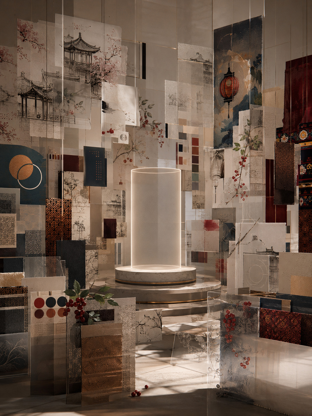
THE FIELD BEFORE THE FORM
More Than Forty Independent Packaging Directions Created An Expansive Field Of Cultural, Botanical, Typographic, And Material Possibilities Before Any Single KORYO® Identity Was Allowed To Take Form.
ONE BRAND STORY, MULTIPLE VISUAL LANGUAGES
Revealing The Range Within A Shared Foundation
Seen together, the concepts demonstrate how dramatically the perception of a brand can change when one visual principle becomes dominant.
Architectural directions created cultural authority. Botanical concepts strengthened product recognition. Minimal compositions introduced clarity and restraint. More expressive approaches developed atmosphere, storytelling, and emotional presence.
Each visual language illuminated a different strength—and exposed a different limitation—within the wider KORYO® packaging design exploration.
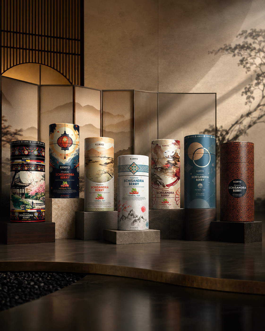
ONE FOUNDATION. MULTIPLE VISUAL LANGUAGES.
Contrasting Visual Languages Transformed One Strategic Foundation Into A Comparative Record Of Cultural, Botanical, And Premium Packaging Possibilities.
TEXTUAL SYNTHESIS
THE COMPLETE FIELD MADE EVERY POSSIBILITY VISIBLE.
Viewed individually, each concept represented one possible future for KORYO®. Viewed collectively, the entire creative field became a form of strategic evidence.
It revealed where cultural reference created authenticity and where it risked becoming overly literal. It showed when botanical expression strengthened product recognition and when it began to dominate the brand. It demonstrated how minimalism could create premium clarity, but also how excessive reduction could remove the identity’s distinctive cultural depth.
These discoveries were not secondary outcomes of the design process. They were the reason the process needed to remain open.
By exploring more than forty original directions, the project established a meaningful basis for comparison. Every concept clarified which qualities were essential, which could remain flexible, and which combinations offered enough distinction and development potential to move forward.
The result of this macro section was not yet one final identity.
It was something that had to exist before a final identity could be responsibly chosen: a complete, visible, and strategically relevant field of possibilities.
“THE FULL CREATIVE FIELD DID NOT MAKE THE DECISION MORE COMPLICATED. IT MADE THE RIGHT DECISION POSSIBLE.”
MACRO SECTION 02
WHERE CREATIVE BREADTH BECAME STRATEGIC JUDGMENT.
SIXTEEN DIRECTIONS.
ONE SHORTLIST.
The Objective Was Not To Select The Sixteen Most Decorative Or Immediately Attractive Concepts. It Was To Identify The Directions With The Strongest Capacity To Carry KORYO® Forward.
The complete creative packaging design field established what was possible. The strategic shortlist needed to determine which possibilities were genuinely worth developing.
Reducing more than forty original packaging design directions to sixteen required more than visual preference. Every concept was evaluated in relation to the complete KORYO® brand identity: its Korean heritage, the botanical character of Schisandra, its premium market positioning, its shelf presence, and its ability to remain distinctive within a contemporary international market.
Some directions created immediate cultural recognition but depended too heavily on literal Korean heritage references. Others achieved exceptional botanical packaging expression, yet allowed the ingredient story to overpower the identity itself. Several minimalist packaging concepts introduced clarity and premium restraint, but not all retained enough cultural character to become unmistakably KORYO®.
The strongest directions were those capable of balancing multiple strategic qualities. They needed to feel culturally grounded without becoming historical, botanical without appearing conventional, premium without becoming generic, and contemporary without losing the depth that made the brand meaningful.
Each shortlisted concept therefore represented more than a successful visual composition. It preserved a credible strategic design territory—one with its own identity, emotional register, commercial potential, and capacity for further development within a complete premium packaging system.
Together, the sixteen directions formed a concentrated record of the project’s strongest packaging design possibilities. They did not present sixteen versions of the same answer. They revealed sixteen distinct ways in which KORYO® could enter the market, communicate its origin, and establish a memorable premium brand presence.
The packaging design shortlist did not conclude the decision.
It created the level of strategic comparison required for the final selection to become precise, defensible, and meaningful to the future of the KORYO® visual identity.
DISTINCTION. RELEVANCE. POTENTIAL.
“THE SHORTLIST WAS NOT CREATED BY REDUCING THE NUMBER OF IDEAS. IT WAS CREATED BY RAISING THE STANDARD EACH DIRECTION HAD TO MEET.”
CULTURAL AUTHENTICITY
Heritage With Contemporary Relevance
Every shortlisted direction needed to establish a credible relationship with Korean visual culture without relying on literal reconstruction or decorative convention.
The strongest concepts transformed architecture, symbolism, ornament, material rhythm, and spatial restraint into a contemporary visual language—preserving cultural meaning while allowing KORYO® to remain relevant beyond its place of origin.
BOTANICAL RECOGNITION
Schisandra As A Distinctive Brand Asset
The botanical character of Schisandra needed to make the product recognizable while contributing to a visual identity greater than the ingredient alone.
Selected directions demonstrated different ways of achieving that balance—from expressive illustration and organic movement to symbolic reduction—revealing where botanical storytelling strengthened KORYO® and where it required greater control.
PREMIUM DISTINCTION
The Capacity To Become Unmistakably KORYO®
A successful direction needed more than visual refinement. It required enough distinction, flexibility, and brand ownership to remain recognizable across packaging, communication, and future extensions.
The shortlisted concepts combined individual character with genuine development potential, giving KORYO® sixteen strategically credible territories from which one definitive identity could ultimately emerge.
THE SIXTEEN DIRECTIONS WERE NOT SELECTED BECAUSE THEY LOOKED MOST ALIKE. THEY WERE SELECTED BECAUSE EACH PRESENTED A DISTINCT, CREDIBLE, AND STRATEGICALLY VALUABLE FUTURE FOR KORYO®.
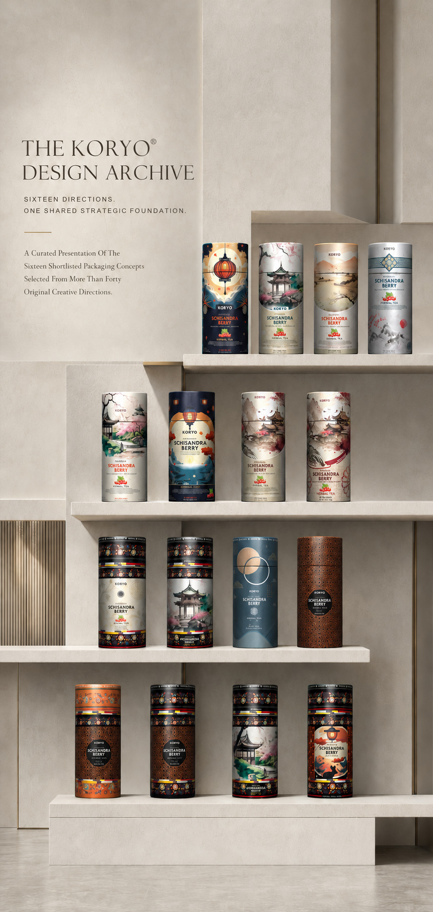
SIXTEEN DIRECTIONS WITHIN ONE STRATEGIC FRAMEWORK
The KORYO® Design Archive Brings Together Sixteen Shortlisted Tea Packaging Concepts, Each Offering A Distinct Interpretation Of Korean Heritage, Schisandra Botanicals, Premium Positioning, And Contemporary Brand Expression.
COMPARATIVE EVALUATION
DIFFERENT VISUAL LANGUAGES.
THE SAME STRATEGIC STANDARD.
The shortlisted directions were evaluated against the same strategic foundation. Beyond cultural authenticity, botanical recognition, and premium distinction, every concept needed to perform convincingly on the physical packaging itself.
The cylindrical canister introduced a critical design challenge. Typography, illustration, ornamental detail, and essential brand assets needed to retain clarity across a curved surface, where the complete composition could never be viewed from one angle alone.
Some concepts created immediate impact from the front but lost hierarchy as the design continued around the container. Others achieved strong continuity yet required clearer brand recognition or stronger product visibility. The most successful cylindrical packaging designs maintained visual rhythm, legibility, and identity across multiple viewing positions.
This evaluation moved the process beyond subjective preference. Each direction was considered according to how effectively it combined cultural relevance, botanical meaning, premium presence, and practical packaging design performance within one coherent system.
Fourth Evaluation Criterion
CYLINDRICAL CLARITY
Recognition Across A Curved Packaging Surface
Every shortlisted direction needed to preserve its hierarchy, readability, and visual authority as the canister rotated. The strongest concepts used the cylindrical format as part of the complete premium tea packaging experience, rather than treating it as a limitation.
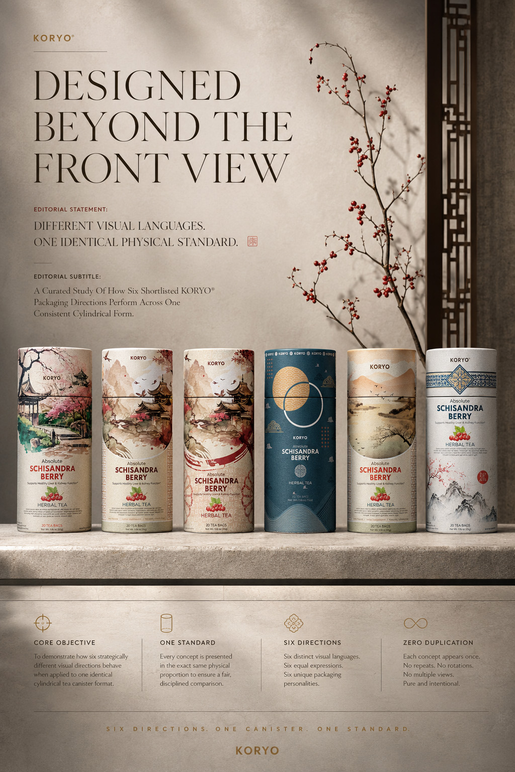
DESIGNED BEYOND THE FRONT VIEW
Each Shortlisted Packaging Design Direction Was Evaluated Across The Complete Cylindrical Form, Ensuring That Brand Recognition, Botanical Detail, And Premium Visual Presence Remained Clear From Multiple Viewing Angles.
CREATIVE DIVERSITY BECAME A STRUCTURED SYSTEM OF EVALUATION.
The sixteen shortlisted directions represented more than a refined collection of attractive concepts. Together, they established a shared system through which cultural meaning, Schisandra recognition, premium character, readability, and physical packaging performance could be compared with consistency.
This process revealed the strengths of every direction while defining the standard the final KORYO® packaging identity would need to surpass.
CULTURE. BOTANICALS. PRESENCE. CLARITY.
“THE SHORTLIST TRANSFORMED SIXTEEN CREATIVE POSSIBILITIES INTO ONE PRECISE STANDARD FOR DECISION.”
MACRO SECTION 03
WHERE COMPARISON BECAME COMMITMENT.
SELECTING THE DEFINITIVE DIRECTION OF THE KORYO® IDENTITY
The Final Decision Was Not Based On Which Concept Appeared Most Decorative. It Was Based On Which Direction Possessed The Strongest Capacity To Become The Complete KORYO® Visual Identity.
The final stage required the most visually attractive but strategically less complete directions to be set aside. Some expressed Korean heritage convincingly but lacked sufficient botanical clarity. Others created strong Schisandra recognition or elegant premium tea packaging, yet did not possess enough cultural ownership to become unmistakably KORYO®.
Concept 16 distinguished itself through balance. Korean-inspired architecture, symbolic imagery, botanical storytelling, ornamental rhythm, controlled color, and a strong black framework worked together without allowing one element to dominate the complete composition.
Its cultural references felt authentic without becoming literal. Schisandra remained clearly connected to the product, while the visual hierarchy preserved the authority of the KORYO® name. Across the cylindrical canister, the design maintained recognition, narrative continuity, and strong premium presence.
Most importantly, Concept 16 offered more than a successful label. Its visual assets had the structure and flexibility required to develop across secondary packaging, editorial communication, digital applications, and future brand extensions.
The selection therefore marked a decisive transition—from exploring what KORYO® could become to defining the direction capable of carrying the brand forward.
BALANCE. OWNERSHIP. POTENTIAL.
“THE DEFINITIVE DIRECTION WAS NOT THE ONE WITH THE LOUDEST INDIVIDUAL ELEMENT. IT WAS THE ONE IN WHICH EVERY ELEMENT BELONGED TO THE SAME STORY.”
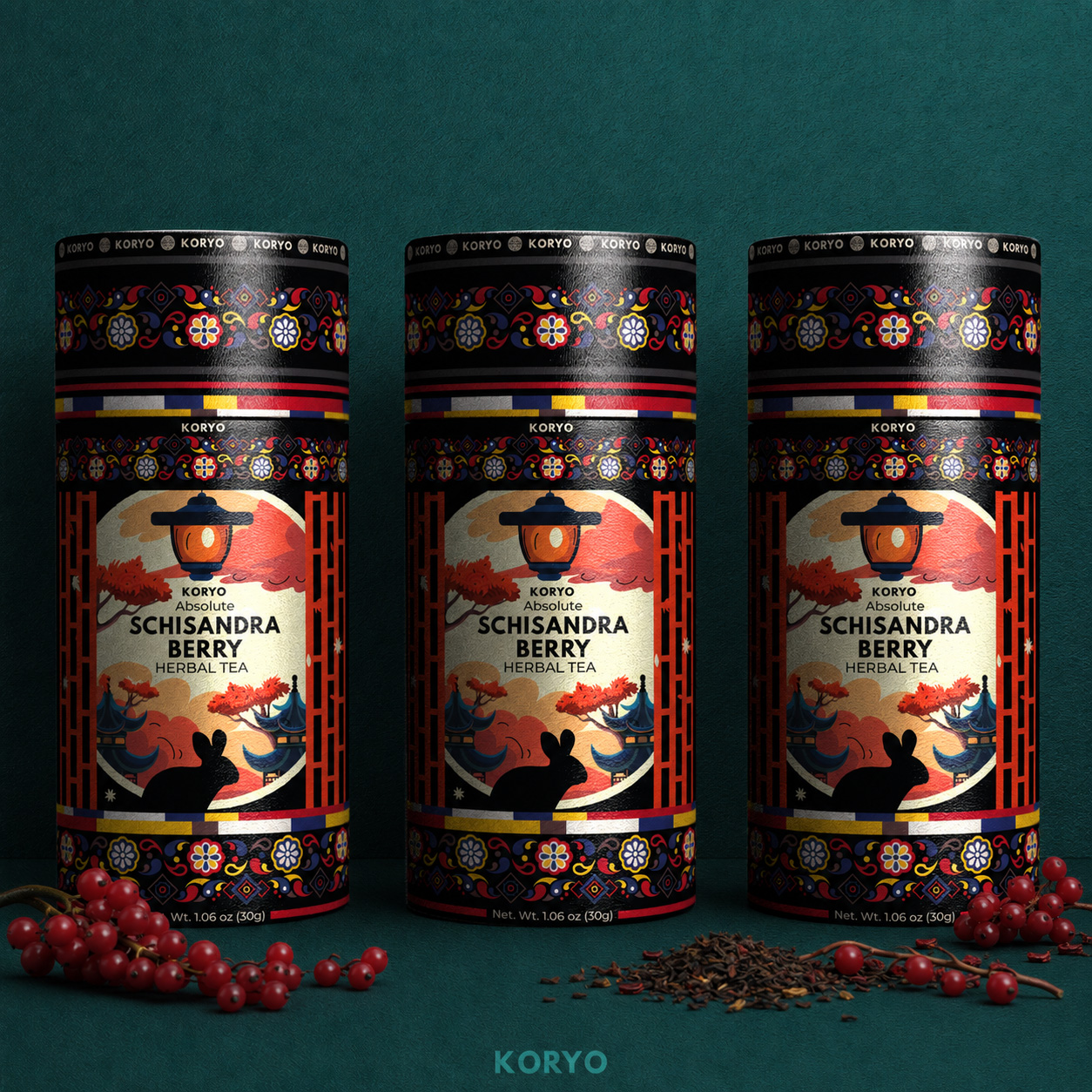
THE DIRECTION THAT HELD THE COMPLETE STORY TOGETHER
Selected From Sixteen Shortlisted Directions And More Than Forty Original Packaging Design Concepts, Concept 16 United Korean Cultural Meaning, Schisandra Recognition, Premium Character, And Cylindrical Packaging Clarity Within One Definitive KORYO® Brand Identity.
CULTURAL OWNERSHIP
Heritage Transformed Into A Distinctive Brand Language
Korean-inspired architecture, the lantern motif, symbolic illustration, ornamental structure, and traditional color references created a cultural identity that felt authentic, contemporary, and unmistakably connected to KORYO®.
BOTANICAL RECOGNITION
Schisandra Integrated Into The Complete Narrative
Botanical elements made the product immediately recognizable without overpowering the brand. Schisandra became part of a broader botanical packaging identity, rather than functioning as an isolated decorative ingredient.
PREMIUM SYSTEM POTENTIAL
Designed To Grow Beyond One Canister
The selected direction contained a coherent system of recognizable visual assets capable of extending across packaging, communication, editorial storytelling, digital touchpoints, and future KORYO® product variations.
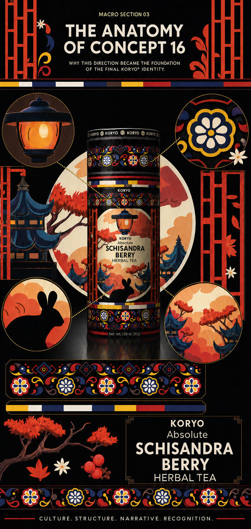
ONE IDENTITY. MULTIPLE OWNABLE ASSETS.
Architecture, Symbolism, Botanical Illustration, Ornament, Color, And Typography Were Integrated Into A Flexible Premium Packaging System Capable Of Remaining Recognizably KORYO® Across Every Future Brand Application.
Section Conclusion
FROM POSSIBILITY TO ONE DEFINITIVE IDENTITY.
Concept 16 was selected because it resolved the complete strategic challenge with the greatest balance and future potential. It preserved Korean cultural depth, strengthened Schisandra recognition, established premium authority, and performed confidently across the cylindrical packaging format.
The decision did not conclude the design process. It established the foundation from which the final KORYO® packaging and brand identity system could now be refined, expanded, and brought to completion.
“FORTY-PLUS DIRECTIONS EXPANDED THE POSSIBILITY. SIXTEEN DEFINED THE STANDARD. ONE BECAME KORYO®.”
FROM CREATIVE EXPANSION TO STRATEGIC SELECTION
POSSIBILITY BECAME DIRECTION THROUGH THE DISCIPLINE OF CHOICE.
More than forty original packaging concepts established the full creative territory of KORYO®. Sixteen shortlisted directions then formed one structured design archive, allowing premium tea packaging design to be evaluated through cultural relevance, botanical distinction, product clarity, visual hierarchy, and shelf recognition.
From that shared foundation, six leading directions were examined across one identical cylindrical format. Concept 16 emerged not as the most decorative solution, but as the most complete—uniting Korean cultural authenticity, Schisandra botanicals, architecture, landscape, ornament, color, and precise product hierarchy within one coherent visual identity system.
“THE FINAL DIRECTION WAS NOT CHOSEN FOR ONE DEFINING ELEMENT. IT WAS CHOSEN BECAUSE EVERY ELEMENT BELONGED TO THE SAME STORY.”
FINAL CHAPTER CONCLUSION - 02
BEFORE IDENTITY CAME SELECTION.
The Second Chapter Transformed Creative Possibility Into One Strategically Defined Direction From Which The Complete KORYO® Visual Identity Could Emerge.
The KORYO® identity could not be defined by selecting the most decorative packaging concept or the direction with the strongest immediate visual impact.
Before one solution could move forward, the packaging concept development process needed to explore the complete creative territory available to the brand and identify the direction best able to unite Korean cultural authenticity, botanical distinction, premium product value, and contemporary relevance.
More than forty original concepts translated the strategic foundation of Chapter 01 into contrasting visual languages shaped by architecture, landscape, ornament, typography, botanicals, color, and cultural symbolism. The objective was not variation for its own sake, but to discover how many credible forms the KORYO® Korean tea packaging identity could take without becoming culturally superficial, visually fragmented, or commercially unclear.
Sixteen shortlisted directions formed The KORYO® Design Archive—a curated record of the concepts with the strongest potential to support the future brand identity design. Presented with equal status, the archive revealed the full creative range while preserving one shared strategic foundation.
Difference alone, however, was not enough.
Each direction needed to transform cultural meaning into a coherent premium tea packaging design, integrate Schisandra naturally, communicate the product clearly, and operate as one complete visual system rather than a collection of disconnected decorative elements.
Six leading concepts were therefore examined across one identical cylindrical canister format. With packaging geometry removed as a variable, typography, illustration, ornament, color, hierarchy, brand visibility, label continuity, and curved-surface behavior could be compared under the same physical conditions.
This controlled cylindrical packaging design comparison transformed visual preference into strategic evidence.
Concept 16 emerged because its lantern motif, rabbit silhouette, Korean-inspired architecture, Schisandra botanicals, landscape illustration, structured ornament, traditional multicolor bands, black framework, and typographic hierarchy created the strongest collective meaning.
No single element carried the concept alone.
Cultural references provided authenticity without imitation. Botanical details connected the Schisandra tea packaging to the product without relying on familiar wellness imagery. Architecture and landscape established origin and atmosphere, while the structured framework created authority, recognition, and contemporary control.
The final analysis confirmed that Concept 16 could become more than an individual packaging label. It possessed the capacity to support product hierarchy, packaging development, brand recognition, future communication, and long-term visual consistency as one complete KORYO® visual identity system.
This chapter did not complete the final identity.
It established the strategic direction from which the complete premium Korean tea packaging identity could now be developed with clarity and confidence.
The creative territory had been explored, challenged, compared, and resolved.
The empty package was no longer waiting for an aesthetic. It carried a selected cultural language, a distinctive botanical narrative, and a recognizable structural system ready to transform one packaging concept into a complete and enduring KORYO® brand identity.
EXPLORATION GAVE THE PROJECT ITS RANGE.
COMPARISON GAVE THE DECISION ITS DISCIPLINE.
SELECTION GAVE THE IDENTITY ITS DIRECTION.
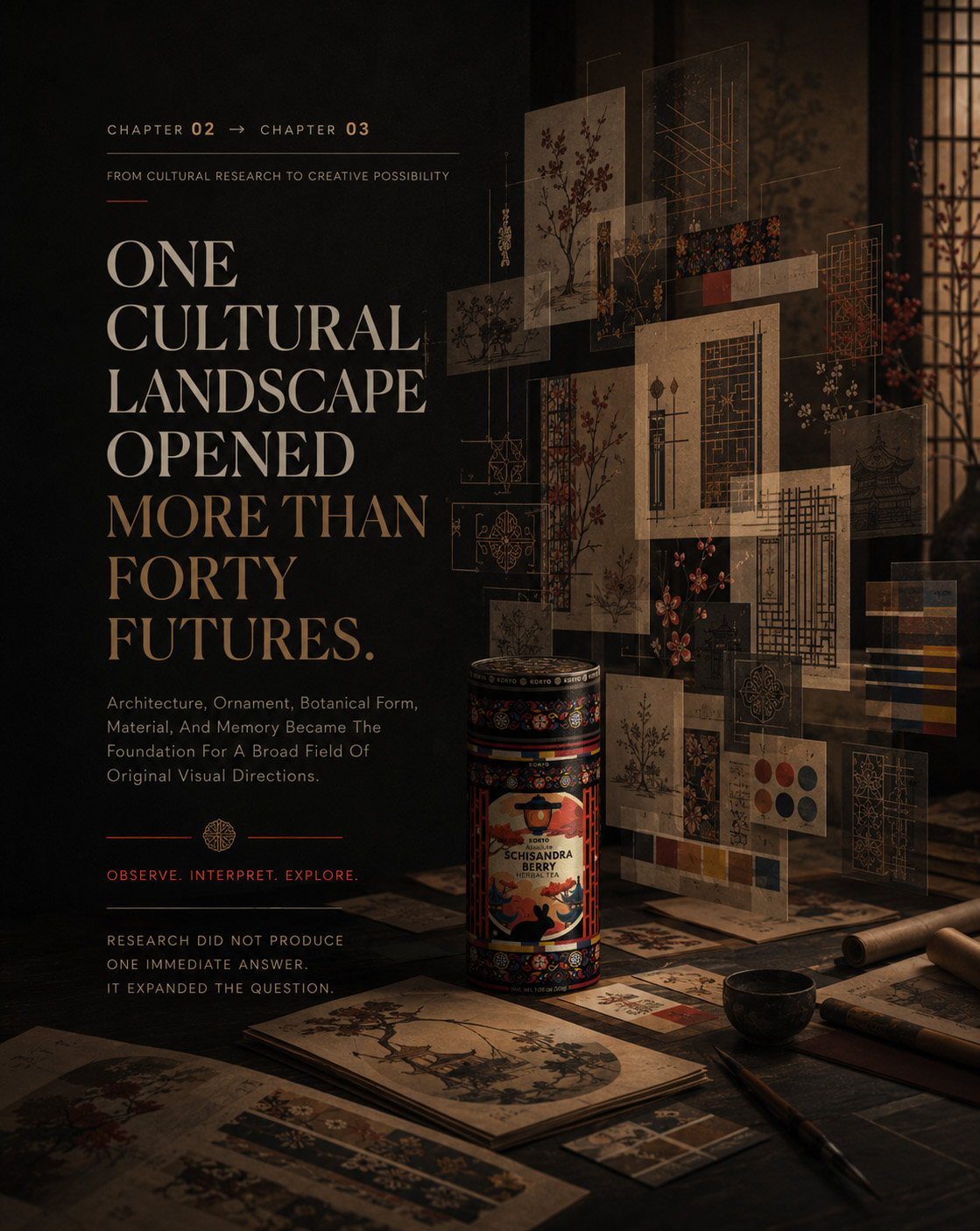
CHAPTER 03
BUILDING THE DEFINITIVE IDENTITY
From Strategic Selection To A Complete Visual Language.
SELECTION → REFINEMENT → IDENTITY
One Direction Had Been Chosen. The Next Challenge Was To Transform Its Potential Into A Precise, Recognizable, And Fully Resolved Brand Identity Design.
FROM CONCEPTUAL PROMISE TO VISUAL AUTHORITY
Concept 16 established the direction, but selection alone could not create the final KORYO® identity.
Its cultural depth, architectural character, botanical symbolism, and distinctive ornamental language provided a powerful foundation. Each element, however, still needed to be refined, balanced, and brought into a controlled relationship with the others.
The objective was not to add more visual information. It was to determine what deserved emphasis, what required restraint, and what could be removed without weakening the original idea.
Through refinement, the selected concept evolved from an expressive creative direction into a coherent Visual Identity System—one capable of communicating Korean origin, premium quality, botanical authenticity, and contemporary relevance with immediate clarity.
THE DIRECTION WAS ALREADY DISTINCTIVE.
THE TASK WAS TO MAKE EVERY ELEMENT FEEL INEVITABLE.
MACRO SECTION 01
REFINING THE SELECTED DIRECTION
Removing The Unnecessary. Strengthening The Essential.
The development of the final identity began by examining the selected concept as a complete Packaging Design Composition rather than as a collection of individual decorative elements.
The strongest components were preserved: the authority of the KORYO® name, the architectural narrative, the Korean ornamental structure, the Schisandra botanical signature, and the contrast between deep black, ceremonial red, and restrained supporting tones.
What changed was the degree of control.
Visual competition was reduced. Relationships between the wordmark, product information, illustration, ornament, and botanical elements were recalibrated. Secondary details were simplified wherever they interrupted recognition or weakened the central Visual Hierarchy.
The composition gradually became more focused. The brand moved forward. Cultural references became more integrated. The product message became easier to navigate. Negative space gained a structural role rather than functioning as an empty background.
Each refinement served the same objective: to preserve the richness of the original concept while giving the Premium Packaging Identity greater clarity, confidence, and visual authority
PRESERVE THE CORE
The cultural and botanical character that made Concept 16 distinctive remained the foundation of the KORYO® Brand Identity.
CONTROL THE HIERARCHY
The KORYO® name, product designation, architectural scene, and supporting information were organized according to a clear order of attention.
REDUCE VISUAL COMPETITION
Unnecessary details were removed or subordinated so that every remaining element could perform a defined role within the complete Packaging Identity System.
STRENGTHEN RECOGNITION
Contrast, scale, spacing, and alignment were refined to ensure that the identity remained immediate and memorable as a complete composition.
REFINEMENT DID NOT CHANGE THE IDEA. IT REVEALED ITS STRONGEST POSSIBLE FORM.
REFINING THE SELECTED DIRECTION
From The Strength Of Concept 16 To A More Controlled, Distinct, And Fully Resolved Packaging Identity.
The selected direction already contained the cultural depth, architectural character, and botanical distinction required to define KORYO®. The refinement process focused on controlling hierarchy, removing visual competition, and strengthening the relationship between every essential element. What emerged was not a different idea, but the clearest and most authoritative expression of the original concept.
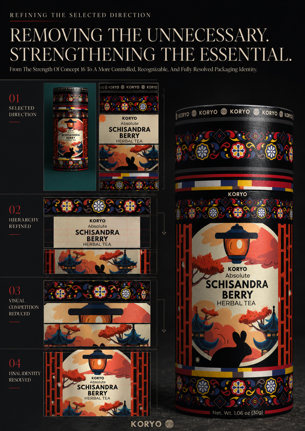
FROM SELECTED CONCEPT TO RESOLVED IDENTITY
A controlled view of the decisive refinements that transformed Concept 16 from a compelling creative direction into the final KORYO® Herbal Tea Packaging Design—preserving its cultural and botanical character while strengthening hierarchy, clarity, and brand recognition.
MEASURING THE JOURNEY FROM EXPLORATION TO IDENTITY
DETAIL MADE VISIBLE
More Than Forty Initial Creative Directions Were Reduced To Sixteen Strategically Relevant Concepts, One Definitive Direction, And Seven Core Elements Working Together As A Complete KORYO® Visual Identity.
INITIAL CREATIVE DIRECTIONS
An Expansive Search For The Right Visual Territory
More than forty packaging directions explored different relationships between Korean cultural heritage, Schisandra’s botanical character, contemporary relevance, and premium brand expression.
SHORTLISTED CONCEPTS
The Strongest Directions Selected For Strategic Evaluation
Sixteen concepts were selected for focused comparison according to their authenticity, visual distinction, packaging potential, cultural relevance, and capacity to support a recognizable identity.
DEFINITIVE DIRECTION
Concept 16 Established The Foundation For The Final Identity
One direction demonstrated the strongest balance of cultural meaning, visual authority, botanical distinction, and contemporary premium character—providing the foundation for refinement.
CORE IDENTITY ELEMENTS
Seven Components Unified Within One Recognizable Language
Wordmark, typography, Korean ornament, architectural illustration, Schisandra botanicals, color, and composition were refined as one controlled and coherent KORYO® visual system.
.
The value of the process was not defined by the number of concepts produced, but by the discipline with which they were compared, reduced, and resolved. Broad exploration created perspective. Strategic selection established direction. Focused refinement transformed Concept 16 into a complete identity in which seven essential elements now communicate with one recognizable voice.
EXPLORATION REVEALED THE POSSIBILITY. REFINEMENT CREATED THE IDENTITY.
THE CONCEPT PROVIDED THE DIRECTION. REFINEMENT CREATED THE IDENTITY.
MACRO SECTION 02
THE COMPLETE KORYO® VISUAL LANGUAGE
Six Distinct Elements. One Unified Identity.
The final KORYO® identity was constructed through the deliberate integration of six core visual elements.
None was designed to function as an isolated motif. Together, they created a connected Brand Design Language in which recognition, cultural meaning, product character, and Premium Brand Positioning reinforced one another.
01 — THE KORYO® WORDMARK
The wordmark establishes the primary point of brand recognition. Its controlled presence gives the composition authority while providing a stable visual anchor for the more expressive cultural and botanical layers.
02 — THE TYPOGRAPHIC HIERARCHY
Typography organizes the transition from brand to product, origin, botanical information, and supporting detail. Variation in scale, weight, spacing, and position creates clarity without disrupting the ceremonial character of the Packaging Design.
03 — THE KOREAN ORNAMENTAL SYSTEM
The ornament introduces rhythm, continuity, and cultural specificity. Rather than functioning as surface decoration, it frames the composition and connects individual visual territories into one structured whole.
Together, these components formed more than an attractive front-facing composition. They established a recognizable Premium Tea Brand Identity capable of retaining its character across scale, detail, orientation, and future brand expression.
04 — THE ARCHITECTURAL ILLUSTRATION
Traditional Korean architecture provides the identity with place, atmosphere, and narrative depth. Its role is not to reproduce heritage literally, but to translate it into a contemporary and internationally understandable form of Cultural Brand Identity.
05 — THE SCHISANDRA BOTANICAL SIGNATURE
The berries connect the identity directly to the product. Their organic form and concentrated red color create a distinctive botanical counterpoint to the architectural precision and dark premium foundation of the Herbal Tea Packaging Design.
06 — THE COLOR SYSTEM
Deep black creates authority and visual depth. Ceremonial red carries energy, botanical recognition, and cultural resonance. Restrained supporting tones preserve hierarchy and allow the primary elements to remain dominant.
EVERY ELEMENT CARRIES A DIFFERENT PART OF THE STORY. THE SYSTEM MAKES THEM SPEAK WITH ONE VOICE.
ONE IDENTITY, FULLY RESOLVED
The Definitive Expression Of KORYO®—Culturally Rooted, Botanically Distinctive, And Precisely Controlled.
Every stage of selection and refinement converged in one final composition. The completed identity brings origin, architecture, ornament, botanics, typography, and color into a unified premium expression. Nothing competes for attention, and nothing appears without purpose.
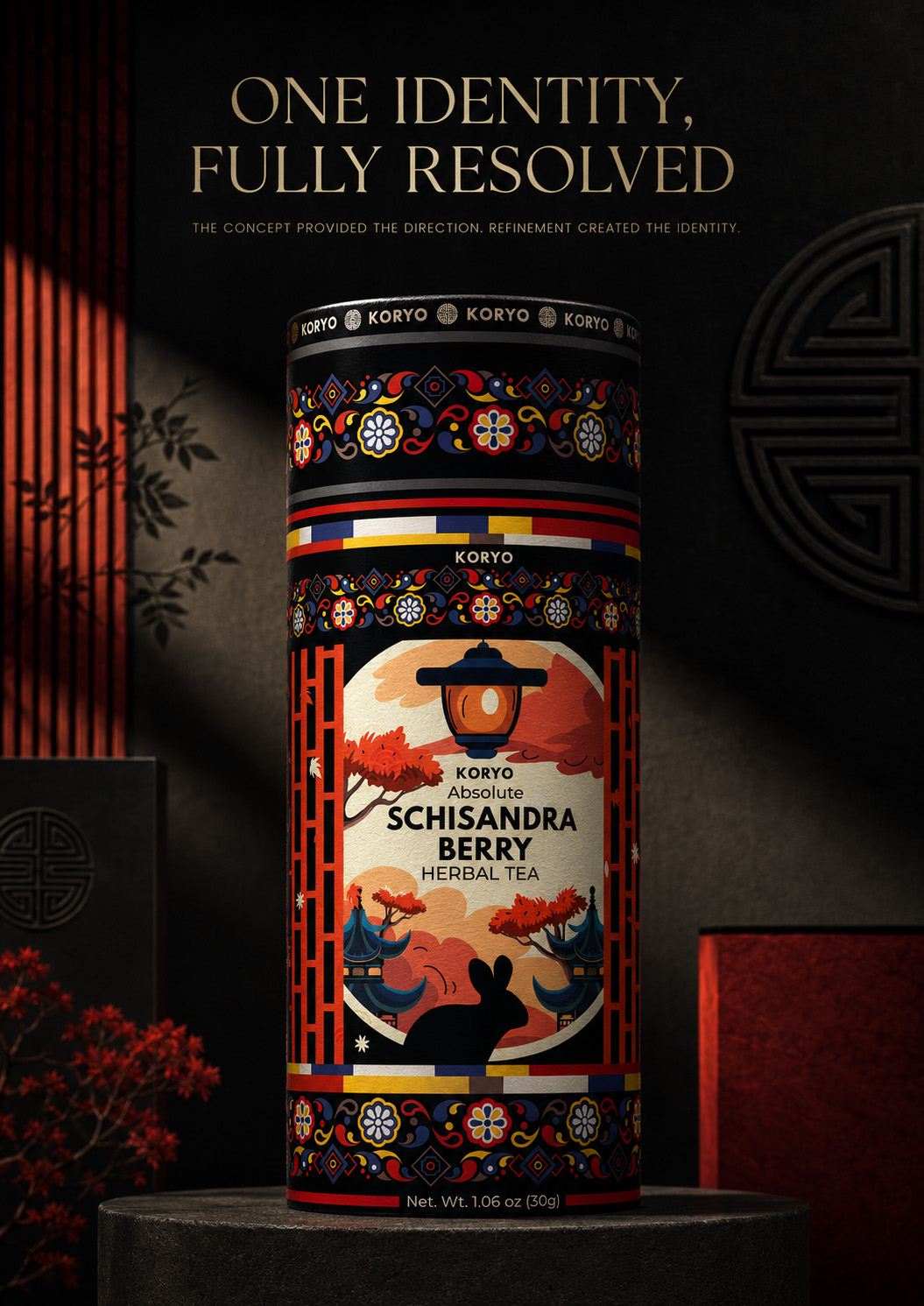
THE DEFINITIVE KORYO® IDENTITY
The final Korean Schisandra Tea Packaging Design resolves every cultural, botanical, architectural, and typographic element into one coherent premium composition—establishing a distinctive visual foundation capable of carrying the KORYO® brand forward.
THE COMPLETE KORYO® VISUAL LANGUAGE
Six Distinct Elements, Deliberately United To Create One Iconic Premium Tea Brand Identity.
The final identity was not defined by a single decorative gesture. It emerged through the controlled relationship between typography, ornament, architecture, botanics, color, and brand recognition. Each element carries a distinct part of the KORYO® story; together, they form one coherent and unmistakable visual language.
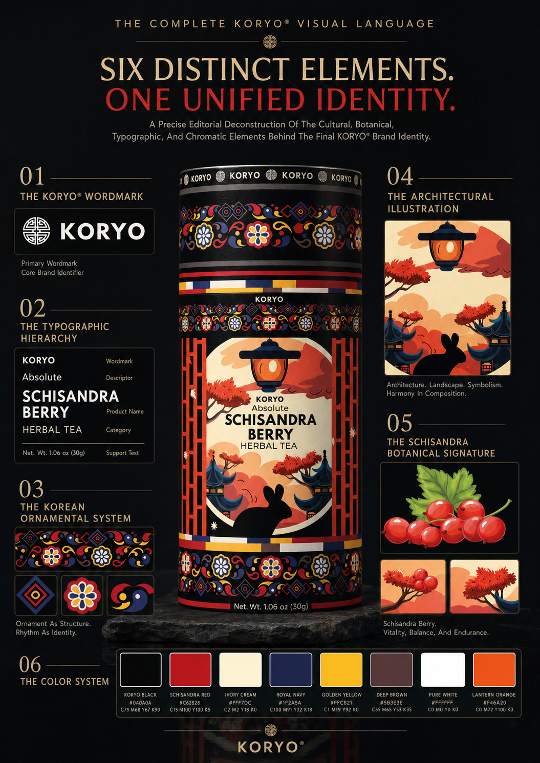
SIX ELEMENTS, ONE DISTINCTIVE BRAND LANGUAGE
The final KORYO® Tea Brand Identity brings wordmark, typography, Korean ornament, architectural illustration, Schisandra botanics, and color into one controlled system—transforming individual visual elements into a unified and recognizable expression of cultural origin and premium value.
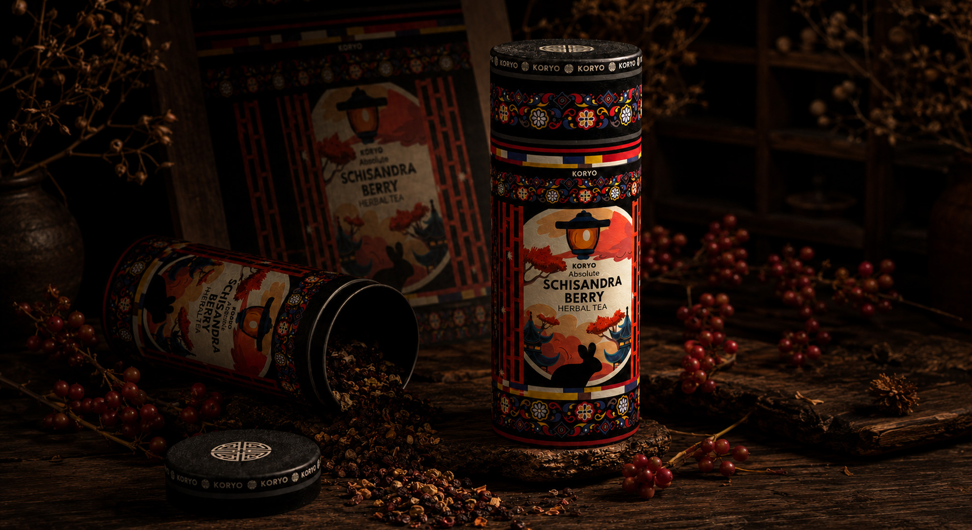
DISTINCT IN THEIR PURPOSE. UNIFIED IN THEIR EXPRESSION.
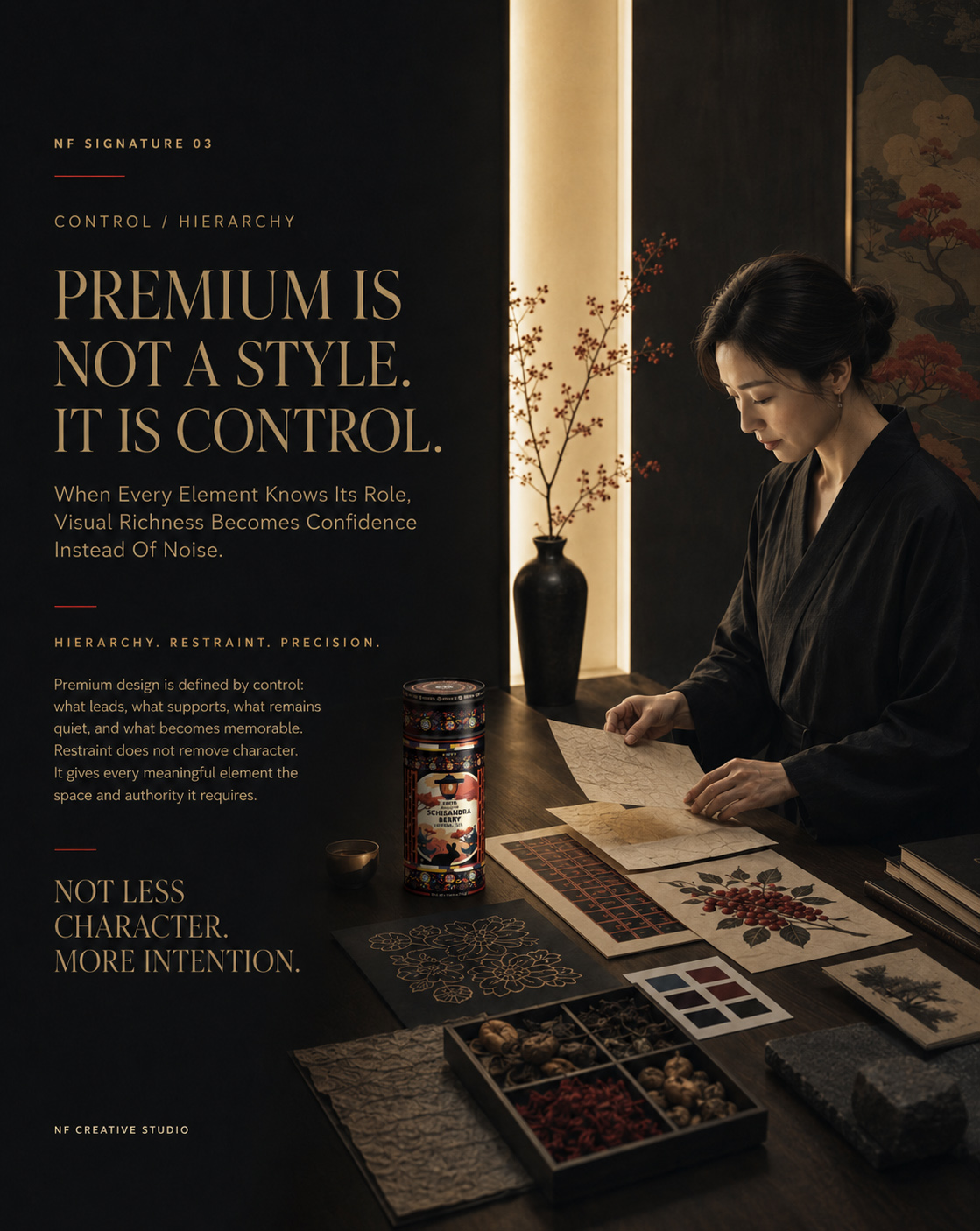
FINAL IDENTITY REVEAL
ONE IDENTITY, FULLY RESOLVED
The completed KORYO® identity no longer appeared as a selected concept awaiting development.
Its hierarchy was controlled. Its cultural references were integrated. Its botanical character was unmistakable. Its visual contrasts were deliberate. Every element contributed to a unified impression of origin, refinement, and premium value.
What began as the strongest direction within a field of possibilities had become the definitive Visual Identity Foundation of the KORYO® brand.
THE CONCEPT PROVIDED THE DIRECTION. REFINEMENT CREATED THE IDENTITY.
FINAL CHAPTER CONCLUSION - 03
THE DIRECTION WAS CHOSEN. THE IDENTITY HAD TO BE RESOLVED.
Chapter 03 Transformed The Selected Concept Into A Controlled, Recognizable, And Complete KORYO® Visual Identity.
Concept 16 provided the foundation. Refinement strengthened its hierarchy, reduced visual competition, and preserved the cultural and botanical character that made the direction distinctive.
Wordmark, typography, Korean ornament, architecture, Schisandra botanics, and color were united into one coherent Visual Identity System.
The result was a fully resolved Premium Tea Brand Identity—culturally rooted, visually controlled, and ready to become a complete Herbal Tea Packaging Design System.
THE CONCEPT PROVIDED THE FOUNDATION.
REFINEMENT CREATED THE CLARITY.
THE SYSTEM COMPLETED THE IDENTITY.
“Every Definitive Direction Begins With A Moment Of Stillness.”
WHERE EXPLORATION BECOMES CLARITY
Chapter 03 opened the visual territory through multiple creative directions—each revealing a different way KORYO® could express its heritage, character, and contemporary relevance.
But meaningful resolution does not emerge through haste. Like the quiet precision of a tea ritual, it requires attention, restraint, and the confidence to let every unnecessary element fall away.
What follows is the moment creative breadth becomes strategic focus—when many compelling possibilities give way to one definitive visual identity, ready to be refined, structured, and brought fully to life.
“Clarity Does Not Come From Adding More. It Emerges When Everything Essential Finally Aligns.”
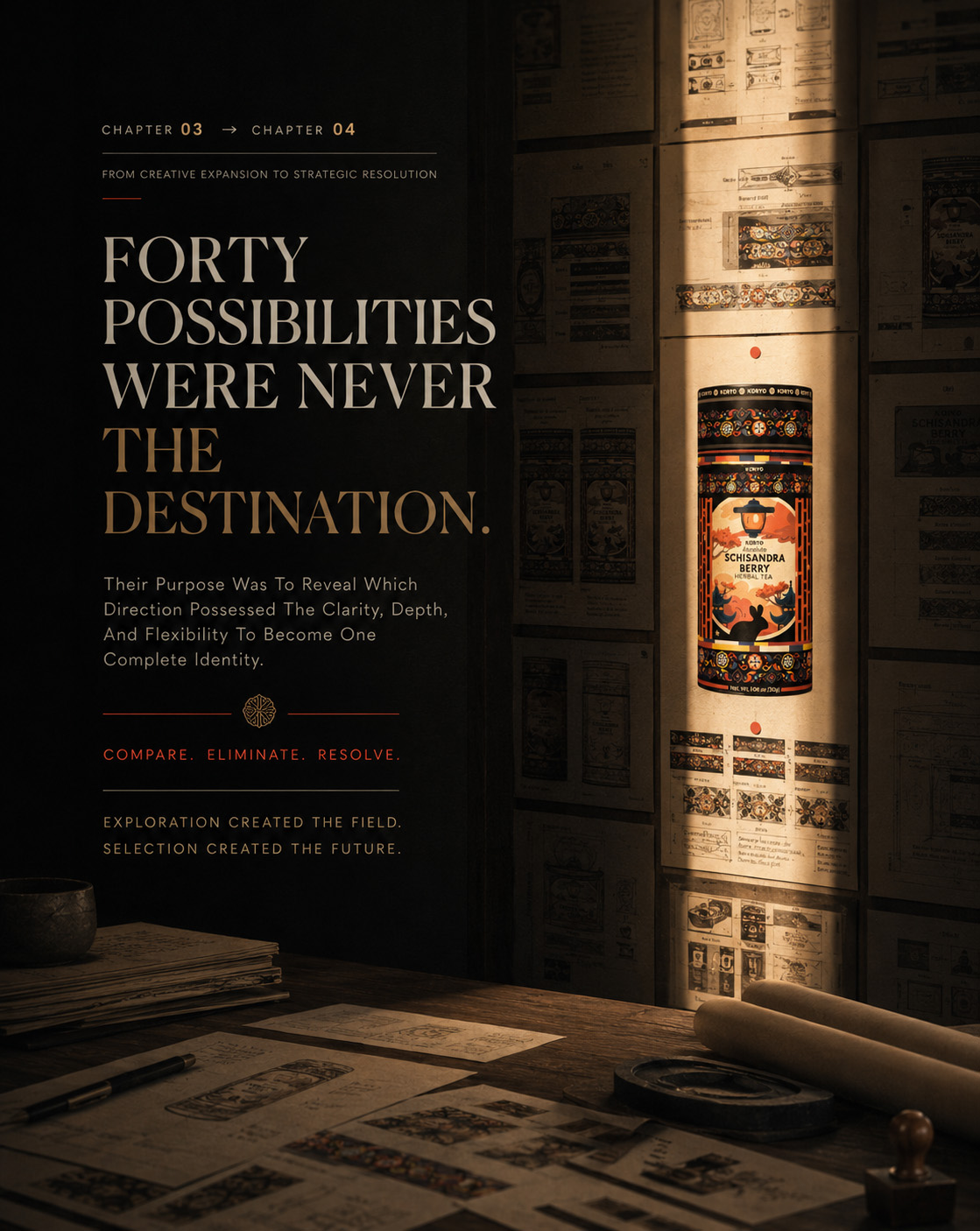
CHAPTER 04
THE PACKAGING AS A COMPLETE SYSTEM
From A Resolved Visual Identity To One Continuous Cylindrical Experience.
IDENTITY → FORM → CONTINUITY
DESIGNING BEYOND THE FRONT
The final KORYO® identity was developed for a cylindrical package—an object viewed through rotation, handling, and gradual discovery.
This required more than adapting a flat artwork to a curved surface. Brand recognition, cultural narrative, botanical distinction, and product information had to remain connected throughout the complete Packaging Design System.
Every visible side became part of one continuous experience. The front established recognition. The surrounding composition extended the story. The back organized essential information without interrupting the visual identity.
The result was a Premium Tea Packaging Design conceived not as a decorated surface, but as one coherent physical form.
THE IDENTITY WAS COMPLETE.
THE PACKAGING HAD TO MAKE IT CONTINUOUS.
MACRO SECTION 01
FROM ARTWORK TO PHYSICAL FORM
From Two-Dimensional Identity To A Complete Cylindrical Experience.
The KORYO® artwork was structured around the proportions, curvature, and physical presence of the cylindrical canister.
Elements that appeared balanced on a flat surface had to remain equally controlled when wrapped around the package. Scale, spacing, alignment, and visual transitions were therefore evaluated in relation to the complete object.
The KORYO® wordmark and product designation retained their authority on the primary viewing side. Architecture, ornament, landscape, and Schisandra botanics extended beyond that central field, allowing the cultural narrative to continue naturally around the form.
This transformation gave the Herbal Tea Packaging dimensional presence without weakening its clarity or recognition.
DESIGN FOR CURVATURE
Every element was positioned according to how it would appear across the rounded surface—not only within the flat artwork.
PROTECT THE PRIMARY VIEW
The brand name, product designation, and central visual narrative remained immediately recognizable from the front.
EXTEND THE STORY
Architecture, ornament, botanics, and color continued beyond the primary panel to create a connected visual experience.
CONTROL EVERY TRANSITION
Spacing and alignment were refined so that no visible side appeared disconnected from the complete Packaging Identity.
THE SURFACE CARRIED THE DESIGN. THE FORM COMPLETED THE EXPERIENCE.
FROM ARTWORK TO PHYSICAL FORM
TRANSFORMING A TWO-DIMENSIONAL IDENTITY INTO A COMPLETE CYLINDRICAL EXPERIENCE.
The final artwork was developed in direct relationship with the canister’s proportions, curvature, and physical presence. Hierarchy, spacing, illustration, and visual transitions were carefully controlled so the identity could retain its clarity while becoming one continuous three-dimensional object.
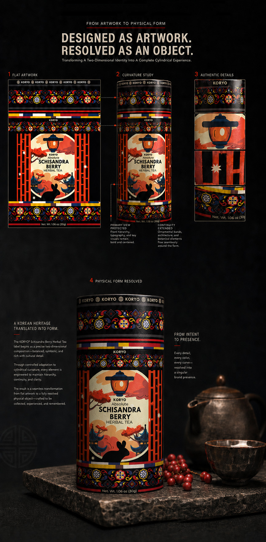
THE IDENTITY BECOMES AN OBJECT
The final KORYO® Tea Packaging Design was translated from a controlled flat composition into a complete cylindrical canister—preserving hierarchy, cultural narrative, botanical distinction, and brand recognition across the physical form.
DESIGNED AS ARTWORK. RESOLVED AS AN OBJECT.
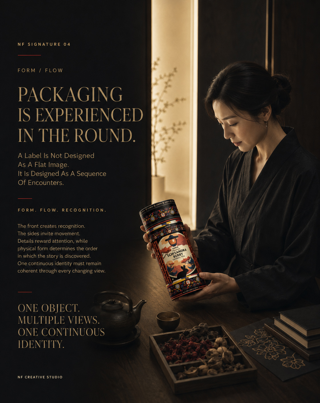
MACRO SECTION 02
THE COMPLETE 360° PACKAGING EXPERIENCE
Front, Sides, And Back Working As One Continuous Visual System.
The cylindrical KORYO® canister has no permanently fixed viewing angle. It is approached from the front, turned by hand, examined from different positions, and understood progressively.
For that reason, each packaging territory was given a clear function while remaining connected to the same Brand Identity System.
The front creates immediate recognition. The surrounding surfaces preserve cultural and botanical continuity. The informational area introduces practical clarity. Together, they transform rotation into a deliberate sequence rather than a series of disconnected panels.
01 — FRONT-FACING RECOGNITION
The primary view establishes KORYO®, Absolute, and Schisandra Berry Herbal Tea through a clear and controlled hierarchy.
02 — CULTURAL CONTINUITY
Architecture, landscape, ornament, and atmospheric details extend the Korean visual narrative beyond the central composition.
03 — BOTANICAL CONNECTION
The Schisandra berry elements preserve the relationship between cultural origin and the product’s defining botanical character.
04 — INFORMATIONAL CLARITY
Supporting product information remains structured, legible, and visually subordinate to the primary brand experience.
05 — CIRCULAR COHESION
Color, framing, illustration, and spacing connect all visible territories into one uninterrupted Cylindrical Packaging Design.
EVERY SIDE PERFORMS A DIFFERENT ROLE. THE COMPLETE FORM DELIVERS ONE IDENTITY.
THE COMPLETE 360° PACKAGING EXPERIENCE
Front, Sides, And Back Working As One Continuous Visual System.
The cylindrical canister is discovered through movement rather than from one fixed viewpoint. Each visible territory performs a distinct role, while typography, architecture, ornament, botanics, color, and information remain connected within one continuous packaging identity.
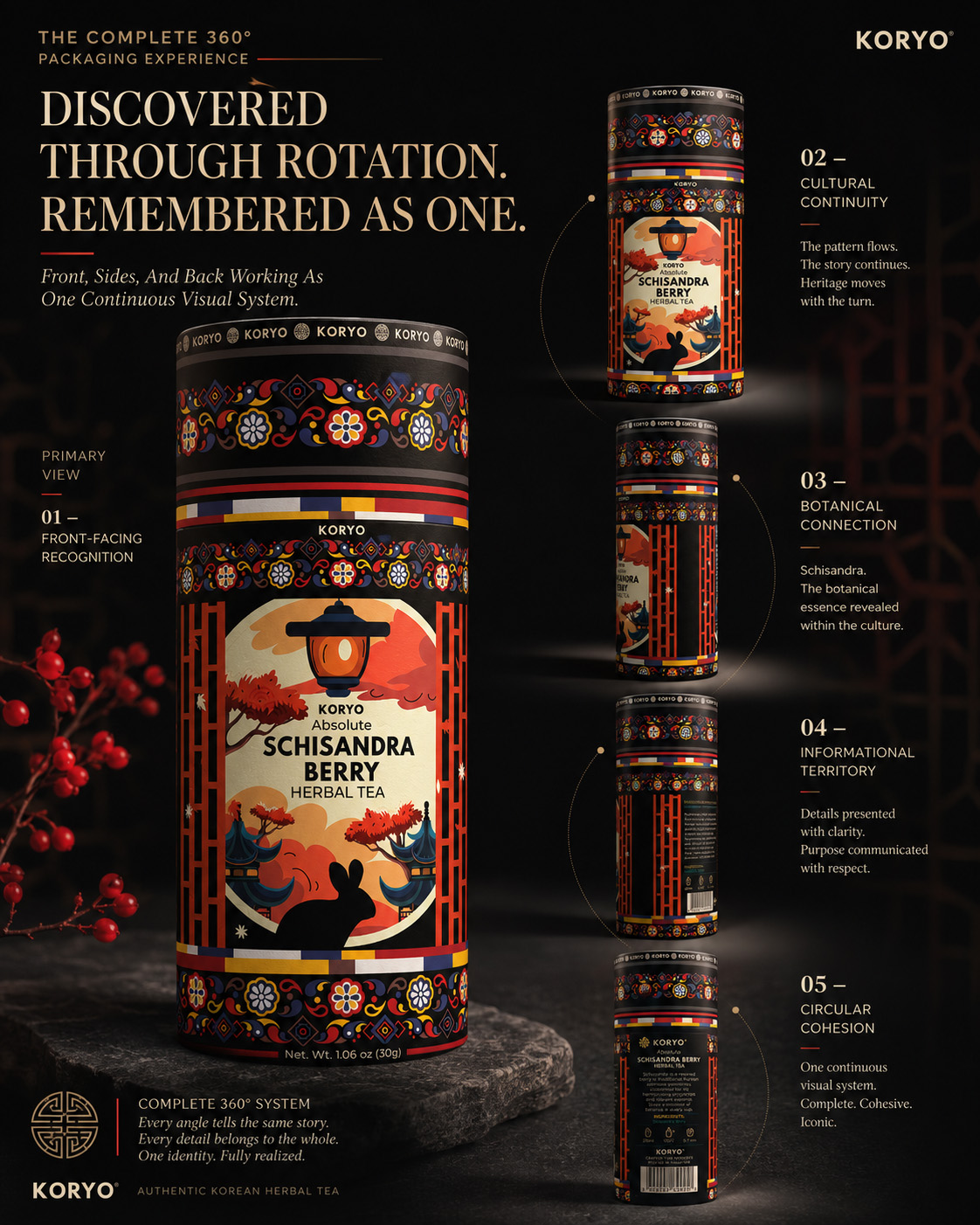
ONE IDENTITY ACROSS EVERY VIEW
The complete KORYO® Cylindrical Packaging Design connects front-facing recognition, cultural narrative, Schisandra botanics, and product information across one continuous 360° system—allowing the package to be discovered through rotation and remembered as a unified brand experience.
DISCOVERED THROUGH ROTATION. REMEMBERED AS ONE.
FINAL PACKAGING REVEAL
ONE FORM, COMPLETELY RESOLVED
The completed KORYO® canister unites identity, structure, narrative, and information within one continuous physical system.
Nothing belongs exclusively to an isolated panel. Every element contributes to how the package is recognized from the front, experienced through movement, and remembered as a complete object.
The result is a distinctive Korean Tea Packaging Design that preserves its authority from every relevant viewing angle.
ONE SURFACE. ONE CONTINUOUS BRAND EXPERIENCE.
FINAL CHAPTER CONCLUSION - 04
THE IDENTITY DEFINED THE LANGUAGE. THE PACKAGE GAVE IT PHYSICAL FORM.
Chapter 04 Transformed The Final KORYO® Identity Into A Continuous, Recognizable, And Fully Integrated Cylindrical Packaging System.
The resolved visual language was adapted to the curvature and physical proportions of the KORYO® canister.
Brand recognition remained dominant at the front, while architecture, ornament, botanics, color, and product information continued naturally around the complete form.
The result was a unified Premium Tea Packaging System—designed to be discovered through movement and remembered as one coherent identity.
THE FRONT ESTABLISHED RECOGNITION.
ROTATION REVEALED THE STORY.
THE COMPLETE FORM UNITED THE EXPERIENCE.
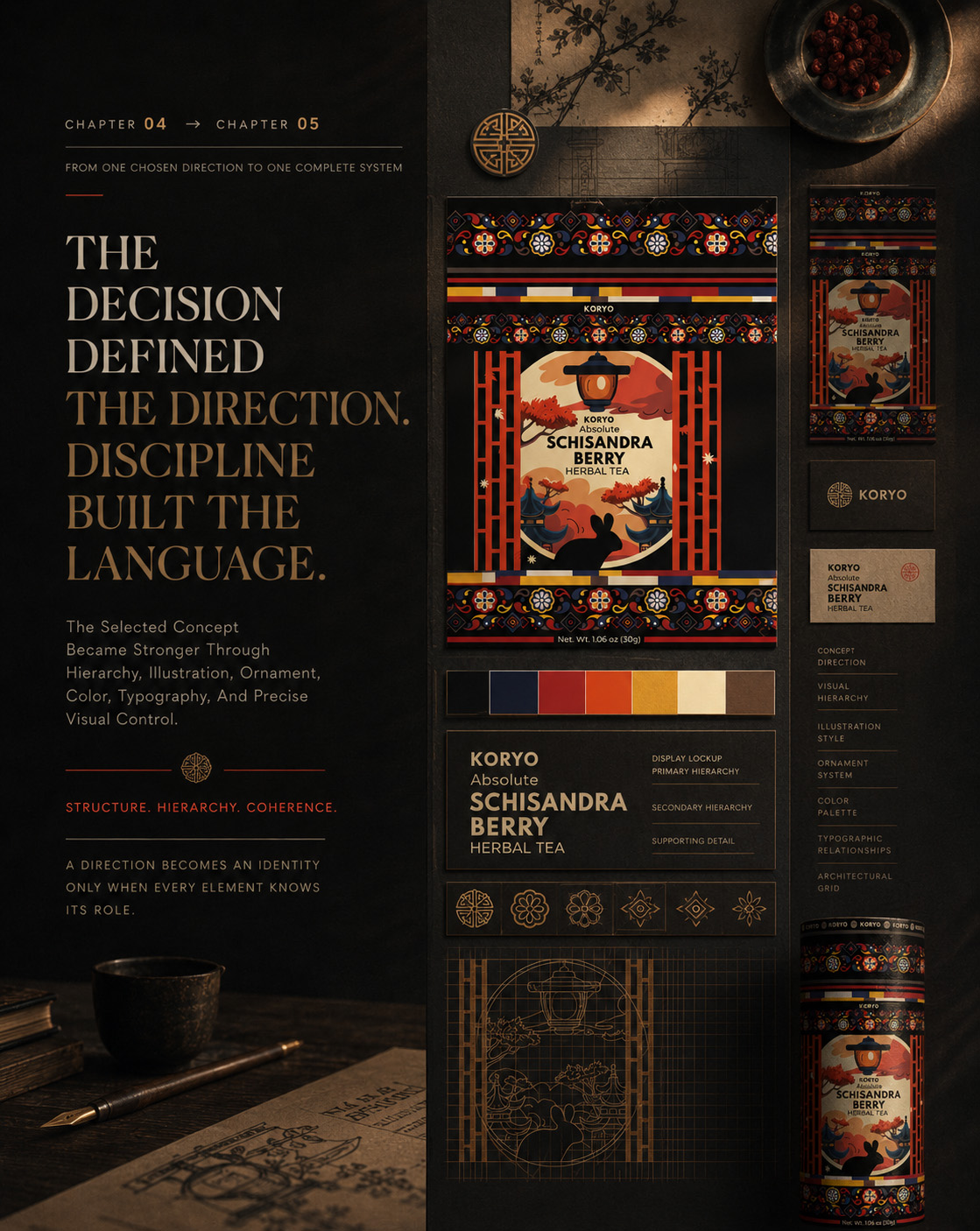
CHAPTER 05
THE VALUE FOUND IN DETAIL
Revealing How Precision, Cultural Character, And Visual Control Elevate The Premium Perception Of The Final Koryo® Tea Packaging.
PRECISION → DETAIL → PERCEPTION
WHERE CLOSER ATTENTION REVEALS GREATER VALUE
The KORYO® identity was designed to establish recognition from the first encounter. Its defining architecture, concentrated black and red palette, Korean-inspired ornament, and Schisandra botanicals create an immediate and distinctive product presence.
Yet the complete value of the design is not revealed through the initial impression alone.
At close range, the final Korean tea packaging design exposes a deeper level of precision: the authority of the wordmark, the measured relationships within the typography, the rhythm of the ornament, the intricacy of the architectural illustration, and the deliberate placement of every botanical detail.
Each element carries its own visual responsibility, but none was developed to operate independently. Their value emerges through proportion, hierarchy, spacing, continuity, and the way every detail supports the identity surrounding it.
Chapter 05 moves closer to the completed KORYO® canister to examine these relationships directly. Rather than explaining the packaging system again, it reveals how controlled detailing strengthens cultural depth, product specificity, and the premium perception of the complete tea canister design.
PREMIUM VALUE IS ESTABLISHED THROUGH THE COMPLETE IMPRESSION.
ITS TRUE DEPTH IS DISCOVERED IN THE DETAILS.
MACRO SECTION 01
CRAFTED TO REWARD CLOSER ATTENTION
From Visual Details To Authority, Cultural Depth, And Botanical Distinction.
The KORYO® wordmark establishes authority, while disciplined typography organizes the product name, tea variety, origin, and supporting information with clarity. Korean-inspired ornament adds rhythm and cultural continuity, connecting the wordmark, architecture, and botanical elements across the canister.
The architectural illustration gives the Korean tea packaging design cultural depth and atmosphere. Schisandra berries add product specificity through their distinctive form and deep red coloration, transforming the ingredient into a recognizable botanical signature within the premium botanical tea packaging.
Together, wordmark, typography, ornament, architecture, and Schisandra botanicals create one controlled visual language. The premium character of KORYO® comes not from excess, but from knowing exactly how much each detail must communicate.
WORDMARK
A central expression of recognition and authority, positioned to remain visually dominant within a composition rich in cultural and botanical detail.
TYPOGRAPHY
A disciplined information hierarchy that balances product clarity, premium character, and the practical demands of tea packaging communication.
KOREAN-INSPIRED ORNAMENT
A continuous visual rhythm that connects cultural memory with the structure and movement of the contemporary package.
ARCHITECTURAL ILLUSTRATION
A detailed expression of origin and atmosphere that transforms cultural reference into a distinctive visual environment.
SCHISANDRA BOTANICALS
A specific botanical signature that gives the product a recognizable ingredient identity and establishes the defining red chromatic accent.
EVERY DETAIL CARRIES MEANING. EVERY RELATIONSHIP STRENGTHENS THE IDENTITY.
THE AUTHORITY OF THE WORDMARK
WHERE RECOGNITION, HIERARCHY, AND PREMIUM CHARACTER BEGIN.
The KORYO® wordmark forms the central point of recognition within the complete premium tea packaging identity. Its scale, position, and relationship with the supporting typography establish authority while preserving clarity across a visually rich composition.
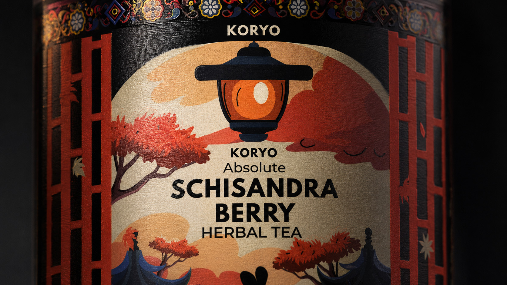
KORYO® Wordmark And Premium Packaging Typography
A close-range study of the KORYO® wordmark and supporting hierarchy, revealing how precise packaging typography design establishes recognition, authority, and clarity within the final Korean tea packaging identity.
CULTURAL RHYTHM IN DETAIL
The controlled Korean-inspired ornament creates cultural rhythm and continuity across the cylindrical canister, connecting typography, illustration, and product information within one coherent premium tea packaging design.
Korean-Inspired Ornament Within The KORYO® Packaging System
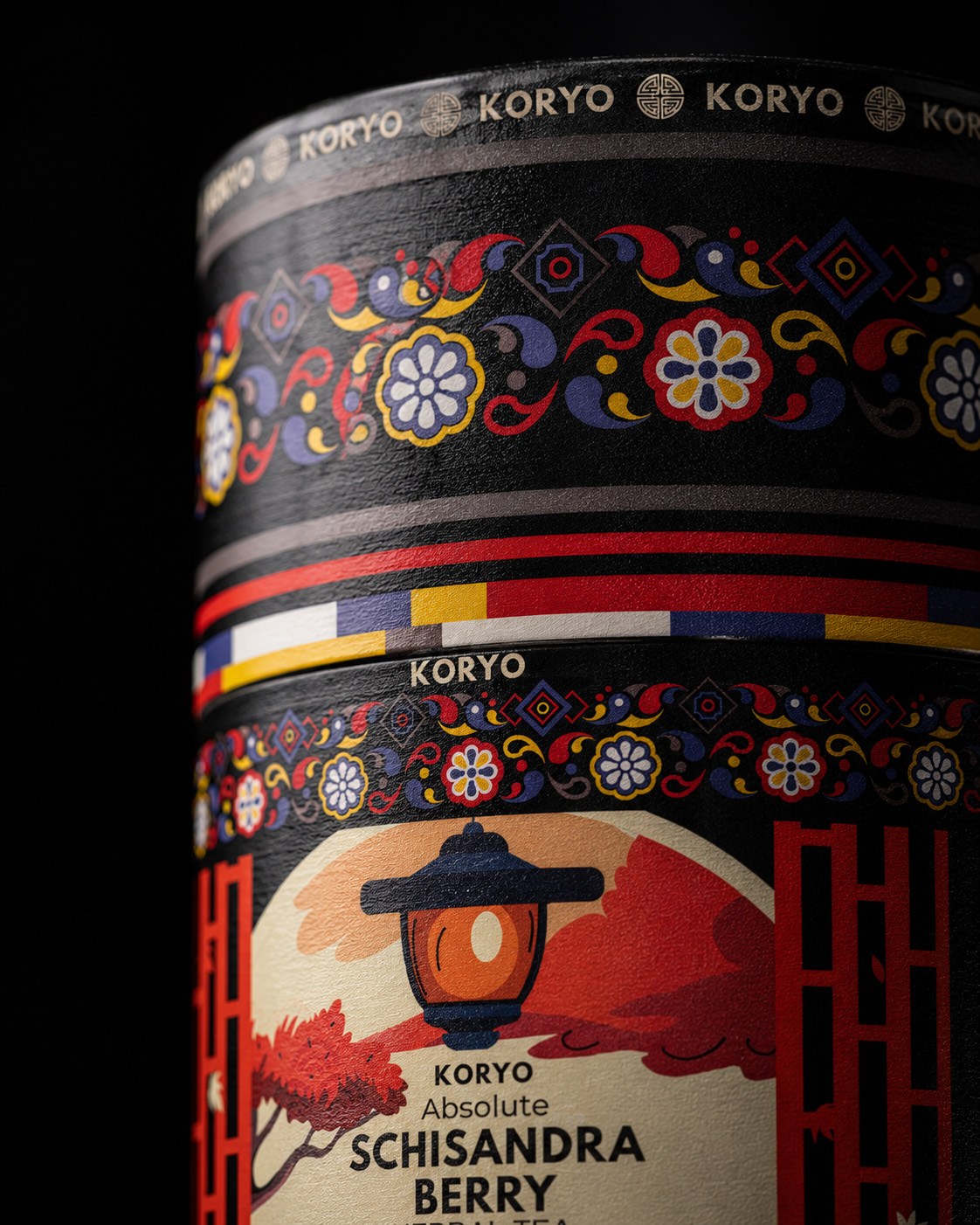
The ornament operates as more than a decorative reference. Across the Korean-inspired packaging design, it creates rhythm, directs attention, and connects typography, architecture, and cultural character within one continuous visual language.
TRANSFORMING KOREAN-INSPIRED ORNAMENT INTO STRUCTURE, MOVEMENT, AND VISUAL CONTINUITY.
ARCHITECTURE AS CULTURAL CHARACTER
A detailed view of the architectural illustration reveals how cultural origin, visual atmosphere, and controlled linework strengthen the final Korean tea packaging design and its distinctive heritage-inspired packaging identity.
Architectural Illustration And Korean Cultural Identity
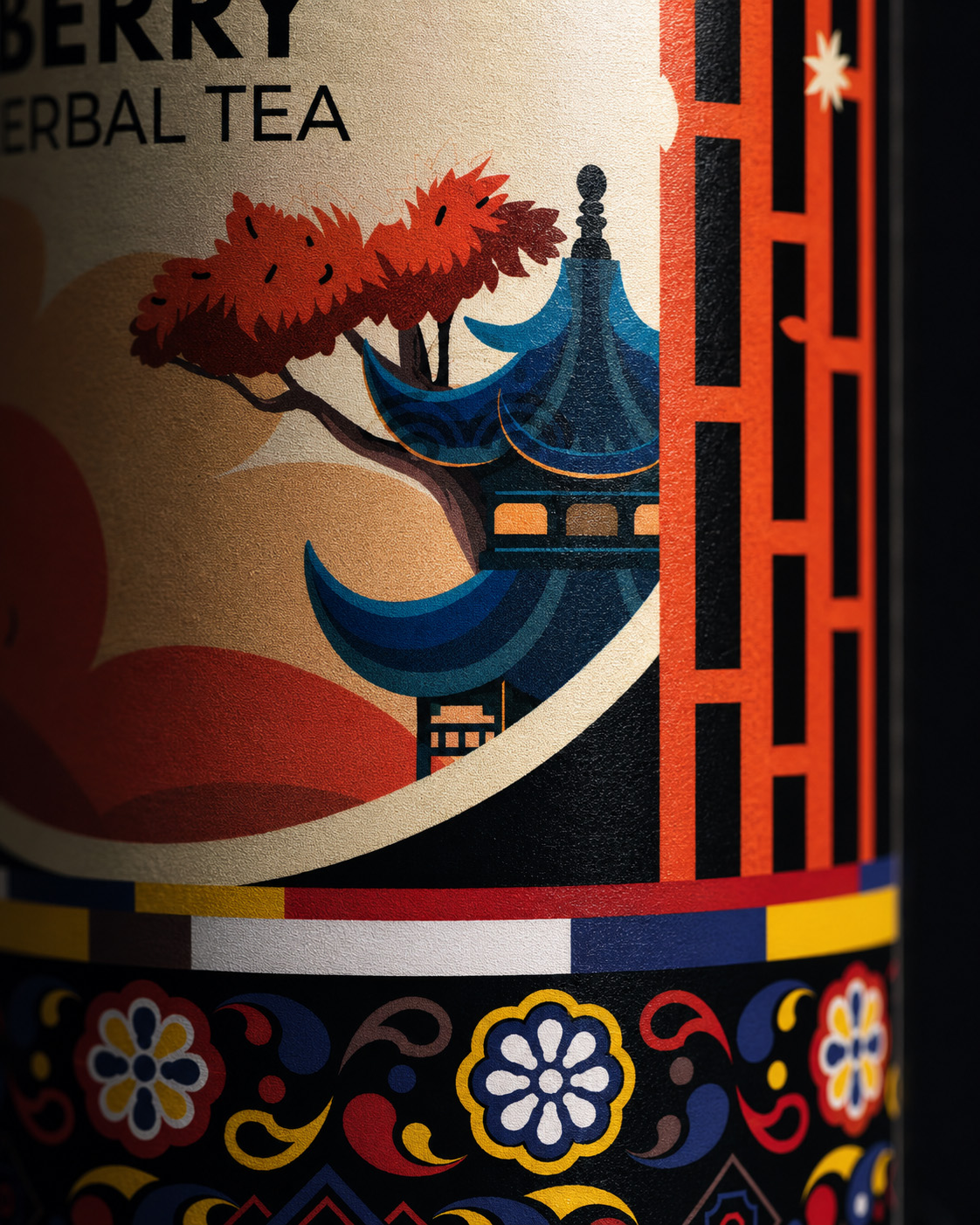
The architectural illustration gives the Korean tea packaging design depth, atmosphere, and a recognizable connection with origin. At close range, its controlled lines reveal how cultural reference became part of the identity rather than an applied decorative scene.
TRANSLATING A SENSE OF ORIGIN INTO A DISTINCTIVE AND CONTEMPORARY PACKAGING ENVIRONMENT.
THE SCHISANDRA SIGNATURE
TURNING ONE DISTINCTIVE INGREDIENT INTO THE DEFINING BOTANICAL EXPRESSION OF THE BRAND.
Schisandra berries provide the botanical tea packaging with product specificity and a recognizable red signature. Their placement, form, and color connect the visual identity directly to the ingredient without reducing the composition to a generic expression of nature.
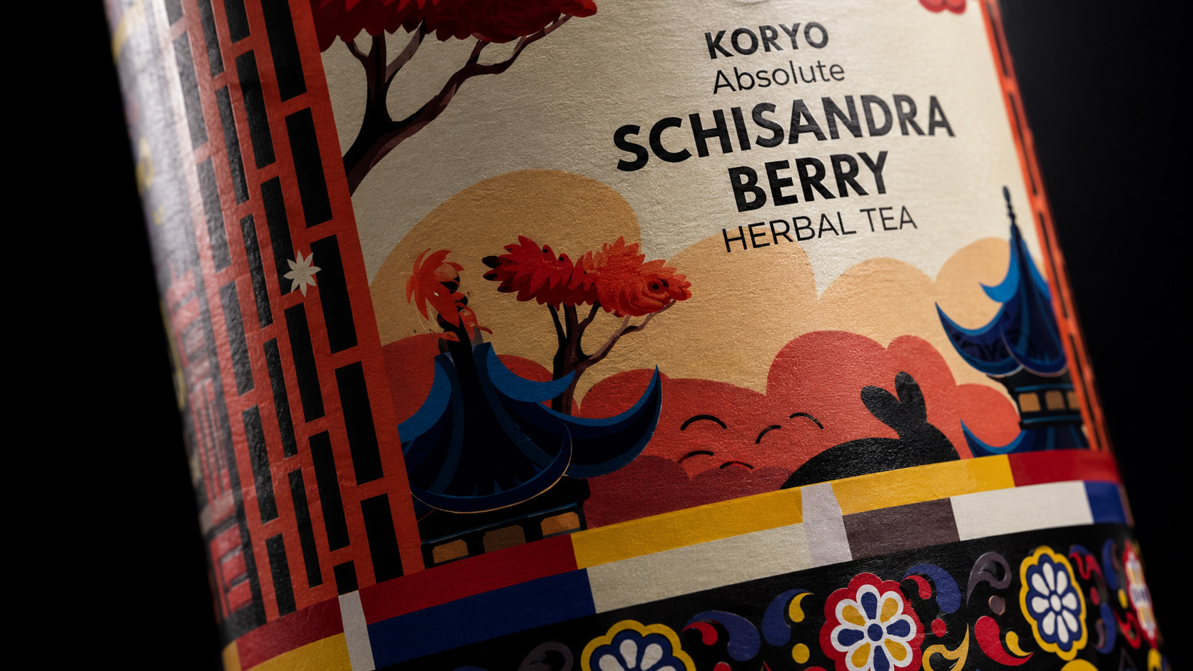
Schisandra Botanical Signature In Premium Tea Packaging
The distinctive Schisandra illustration transforms the primary ingredient into a recognizable visual signature, strengthening product specificity within the complete premium botanical tea packaging and KORYO® herbal tea brand identity.
EVERY DETAIL DEFINES THE CHARACTER. TOGETHER, THEY CREATE THE IDENTITY.
MACRO SECTION 02
WHERE PRECISION BECOMES PREMIUM PERCEPTION
Discovering How Surface, Curvature, Continuity, And Physical Boundaries Transform Visual Detail Into Perceived Product Value.
Premium perception emerges when every visual element performs across the physical package. On the cylindrical KORYO® canister, typography, illustration, and Korean-inspired ornament follow the curvature while preserving clarity, continuity, and balance.
Carefully resolved surfaces, edges, and joins keep the Schisandra tea packaging design coherent at close range. Color, botanical detail, and structural boundaries work together to strengthen tactile quality and perceived value.
This precision proves that the luxury tea packaging design extends beyond the hero view. Every transition within the premium tea canister packaging communicates care, confidence, and craftsmanship—allowing the identity to become more convincing as the viewer moves closer.
SURFACE RESPONSE
The printed visual language remains controlled across the canister, preserving depth, contrast, and compositional clarity at close range.
CURVED CONTINUITY
Typography, ornament, architecture, and botanicals maintain their relationship as the composition follows the cylindrical form.
EDGE CONTROL
Visual elements approach physical boundaries with deliberate spacing and alignment, protecting the integrity of the complete identity.
JOIN PRECISION
Transitions between different areas of the composition remain coherent where the artwork and package construction meet.
CLOSE-RANGE COHERENCE
Every magnified detail continues to belong to the same cultural, botanical, and premium visual world established by the complete package.
PREMIUM PERCEPTION IS NOT APPLIED AT THE END.
IT IS BUILT INTO EVERY VISIBLE RELATIONSHIP.
DESIGNED AROUND THE FORM
PRESERVING VISUAL CONTINUITY AS THE COMPLETE IDENTITY MOVES ACROSS THE CYLINDRICAL CANISTER.
The KORYO® composition was resolved as a continuous cylindrical packaging design, not as artwork applied to a flat surface. Typography, ornament, architecture, and botanicals preserve their hierarchy as they move around the physical form.
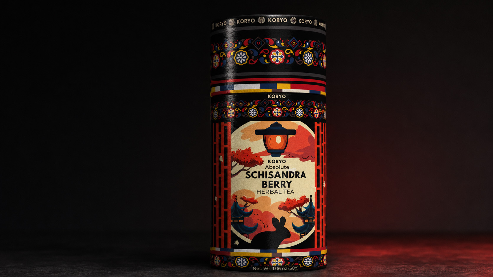
KORYO® Cylindrical Tea Canister Design And Visual Continuity
A close three-quarter view demonstrates how typography, architecture, botanicals, and Korean-inspired ornament maintain clarity and continuity across the complete cylindrical tea canister design.
THE CHARACTER OF THE PRINTED SURFACE
WHERE COLOR, CONTRAST, TEXTURE, AND LIGHT SHAPE THE TACTILE PERCEPTION OF THE PACKAGE.
At close range, the printed surface becomes part of the luxury tea packaging experience. Controlled blacks, concentrated reds, fine illustration, and restrained reflections communicate precision without relying on exaggerated or invented finishing effects.
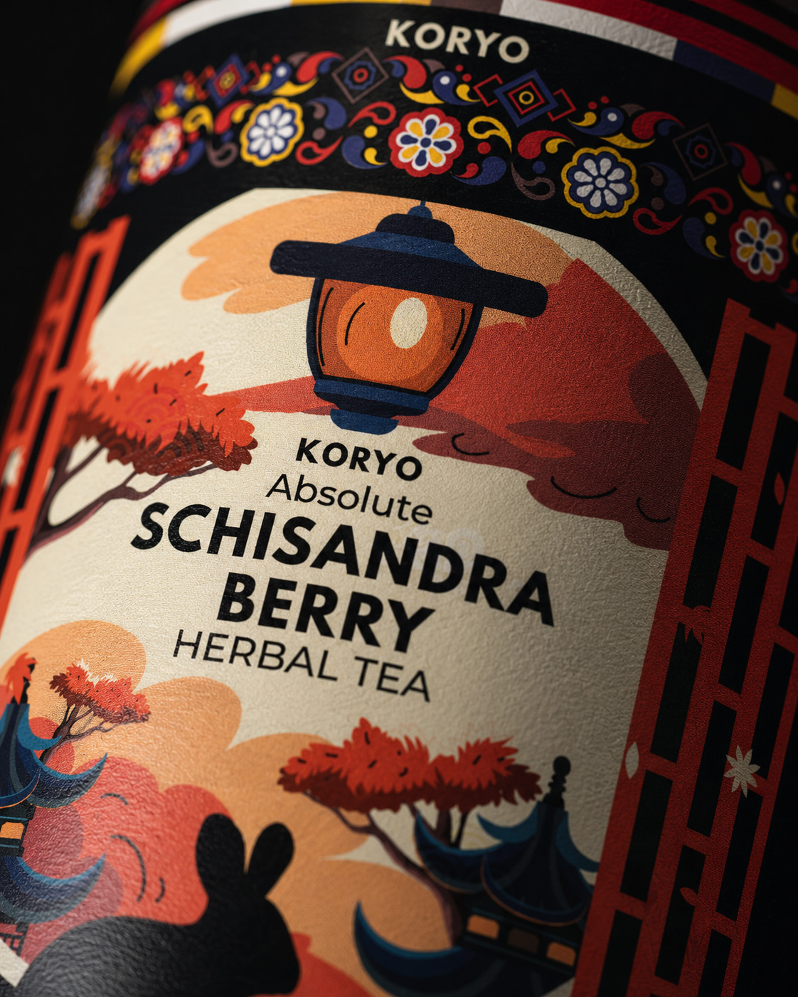
Printed Surface Detail Of The KORYO® Tea Canister
A controlled macro study reveals how color, illustration, texture, and restrained surface response contribute to the tactile quality of the final luxury tea packaging design.
PRECISION AT THE BOUNDARIES
Precise alignment at the edges and joins preserves the integrity of the KORYO® packaging identity, demonstrating how graphic detail and physical construction operate as one resolved premium packaging design.
Edge And Join Precision In Premium Tea Canister Packaging
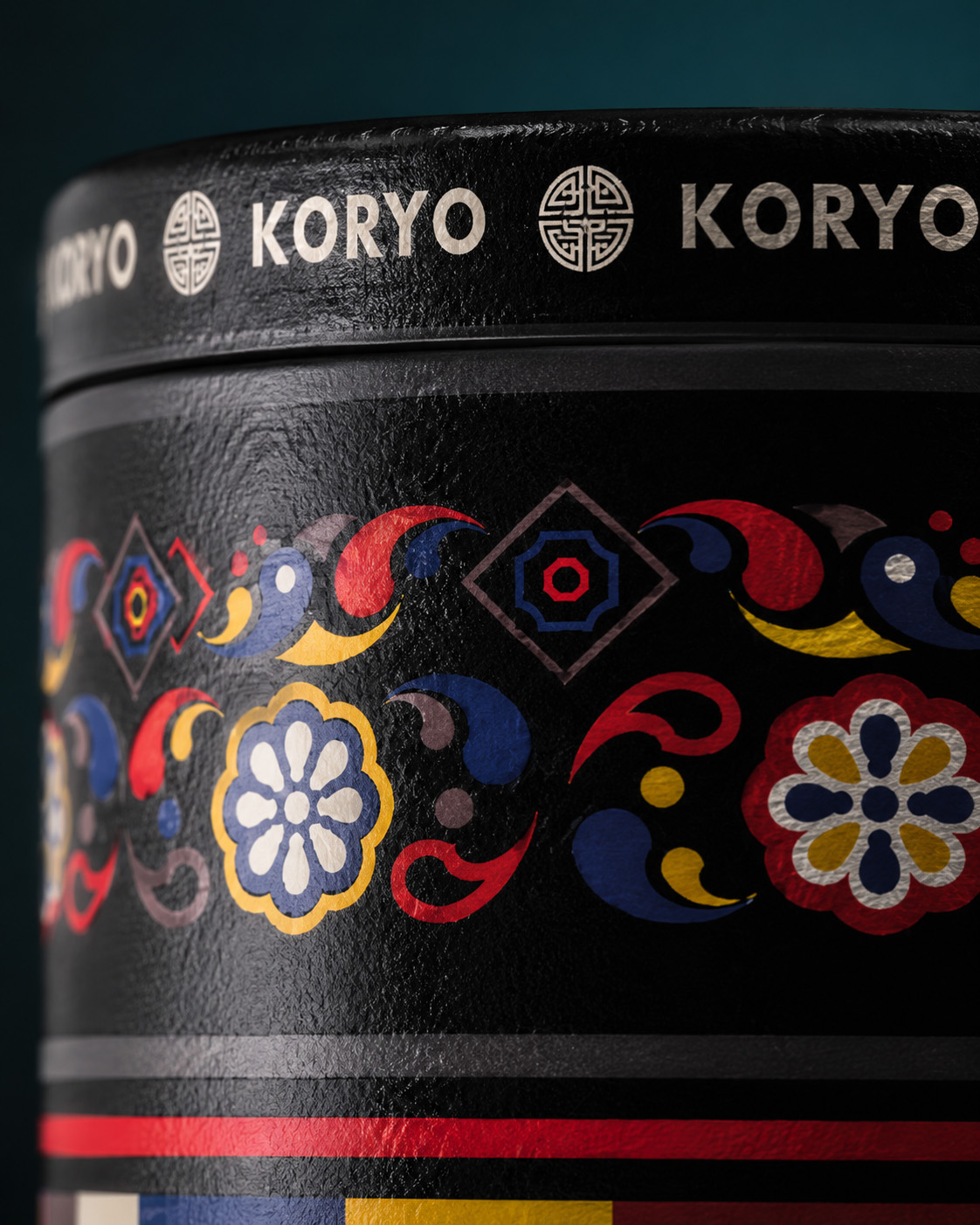
Edges and joins reveal whether a premium tea canister packaging system has been fully resolved. Precise spacing, alignment, and continuity preserve the visual identity at the points where graphic composition meets physical construction.
PROTECTING THE INTEGRITY OF THE IDENTITY WHERE ARTWORK, EDGES, JOINS, AND PHYSICAL CONSTRUCTION MEET.
THE COMPLETE IDENTITY, SEEN FROM WITHIN
BRINGING VISUAL DETAIL, PRINTED SURFACE, PHYSICAL FORM, AND PREMIUM PERCEPTION INTO ONE DEFINITIVE CLOSE-RANGE EXPERIENCE.
The final close-range presentation reveals how every defining element contributes to one coherent premium tea packaging identity. Visual character, botanical specificity, printed surface, curvature, edges, and joins remain connected throughout the complete physical object.
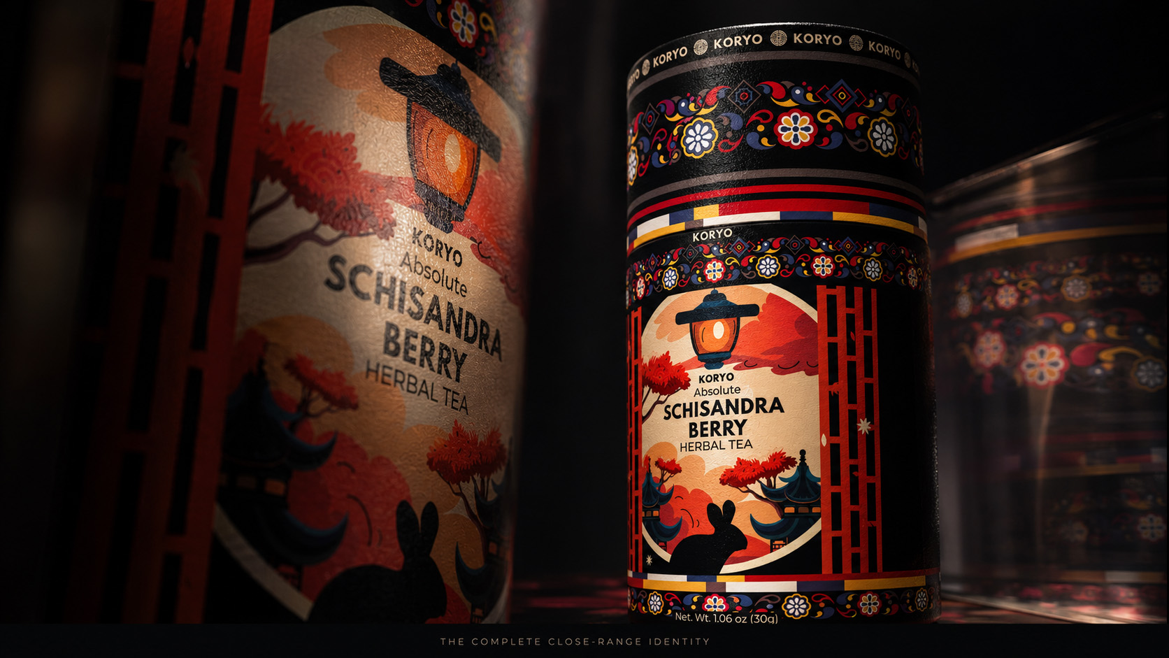
Complete KORYO® Premium Tea Packaging Macro Presentation
The definitive close-range study connects the KORYO® wordmark, Korean-inspired ornament, architectural illustration, Schisandra botanicals, printed surface, curvature, edges, and joins within one precisely resolved premium tea packaging identity.
TRUE CRAFT REVEALS ITSELF AT THE EDGES. PREMIUM VALUE LIVES IN THE RESOLUTION.
FINAL CLOSE-RANGE REVEAL
THE COMPLETE IDENTITY, SEEN FROM WITHIN
BRINGING WORDMARK, TYPOGRAPHY, ORNAMENT, ARCHITECTURE, BOTANICAL DETAIL, SURFACE, AND FORM INTO ONE MONUMENTAL MACRO EXPERIENCE.
The final close-range presentation reveals how the defining details of KORYO® form one coherent premium tea packaging identity. Wordmark, Korean-inspired ornament, architecture, Schisandra botanicals, typography, surface, and cylindrical form remain precisely connected.
Viewed in detail, the Schisandra tea packaging design confirms that the premium character of this Korean herbal tea canister is built into every visual and physical relationship.
WHAT CREATED RECOGNITION FROM A DISTANCE REVEALED ITS CRAFT AT CLOSE RANGE.
FINAL CHAPTER CONCLUSION - 05
THE FINAL KORYO® IDENTITY WAS DESIGNED TO BE RECOGNIZED IMMEDIATELY. ITS DETAILS WERE CRAFTED TO MAKE THAT RECOGNITION LAST.
Chapter 05 Reveals How Close-Range Precision Strengthens The Cultural Character, Botanical Specificity, And Premium Perception Of The Complete KORYO® Packaging Identity.
From the authority of the wordmark to the rhythm of the Korean-inspired ornament, every visual element contributes to one coherent expression. Architectural illustration gives the identity cultural depth. Schisandra botanicals provide product distinction. Typography establishes clarity, while surface, curvature, edges, and joins preserve the system across the physical package.
No individual detail was expected to create premium value on its own.
That value emerged through the discipline of the relationships between them—through the way every element was positioned, balanced, connected, and carried across the cylindrical tea canister.
Chapter 05 demonstrates that detailed resolution is not separate from the complete premium tea packaging identity. It is the evidence that the identity remains convincing beyond the first impression.
ONE IDENTITY.
MULTIPLE LAYERS OF DISCOVERY.
THE SAME STANDARD OF PRECISION THROUGHOUT.
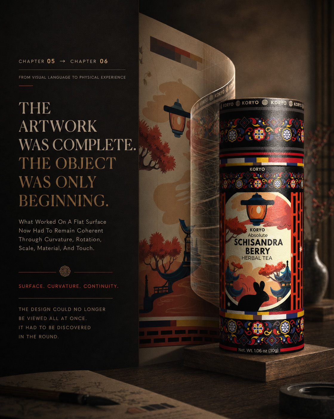
CHAPTER 06
FROM PRODUCT TO RITUAL
Following The KORYO® Canister Beyond Its Visual Identity And Into The Moments Of Opening, Preparation, Serving, And Contemporary Tea Experience.
OPENING → PREPARATION → SERVING → RITUAL
The completed KORYO® canister establishes recognition through form, cultural character, and precise visual detail. Chapter 06 moves beyond how the package looks to explore how it participates in the experience surrounding the product.
Within this premium tea packaging experience, the canister becomes more than a protective container. It introduces the ritual, holds the visual atmosphere, and connects the identity with the moments of opening, preparing, and serving the tea.
This transition allows the Korean tea packaging design to enter a more human context. The identity remains present, but its role changes—from commanding attention as an object to shaping the character of a contemporary tea ritual.
THE PACKAGE ESTABLISHES THE PRESENCE. THE RITUAL REVEALS THE EXPERIENCE.
MACRO SECTION 01
WHEN THE DESIGNED OBJECT BECOMES PART OF THE RITUAL
Discovering How Opening, Preparation, And Serving Transform Premium Packaging Into A Sequence Of Meaningful Interactions.
The relationship between a person and the KORYO® canister changes the moment the product is handled.
What previously functioned as premium tea packaging now becomes part of a physical sequence. The canister is approached, held, opened, and positioned beside the tea it contains. Its form, artwork, and cultural atmosphere remain visible throughout these moments.
This continuity is essential to the complete tea canister design. The packaging does not disappear once attention moves toward preparation. It continues to frame the experience, connecting the product identity with the gestures that follow.
Opening creates anticipation. Preparation introduces care. Serving completes the transition from designed object to personal ritual.
Through this sequence, the Schisandra tea packaging becomes part of the product experience rather than a surface viewed only before use.
OPENING
The first physical interaction transforms recognition into anticipation. The canister’s controlled form and distinctive identity give the opening moment a sense of intention within the complete luxury tea packaging experience.
PREPARATION
Preparing the tea shifts attention from package to product while preserving their visual relationship. The canister, serving objects, and surrounding atmosphere create one coherent premium herbal tea presentation.
SERVING
The final gesture brings product, packaging, and ritual together. The identity remains present without dominating the moment, supporting a calm and considered contemporary tea experience.
THE OBJECT INTRODUCES THE STORY. HUMAN INTERACTION TURNS IT INTO EXPERIENCE.
OPENING THE EXPERIENCE
WHERE THE FIRST PHYSICAL GESTURE TRANSFORMS PRODUCT RECOGNITION INTO ANTICIPATION.
The first interaction moves the KORYO® canister beyond isolated product presentation. Touch, form, and controlled movement introduce anticipation while preserving the authority of the final premium tea packaging design.
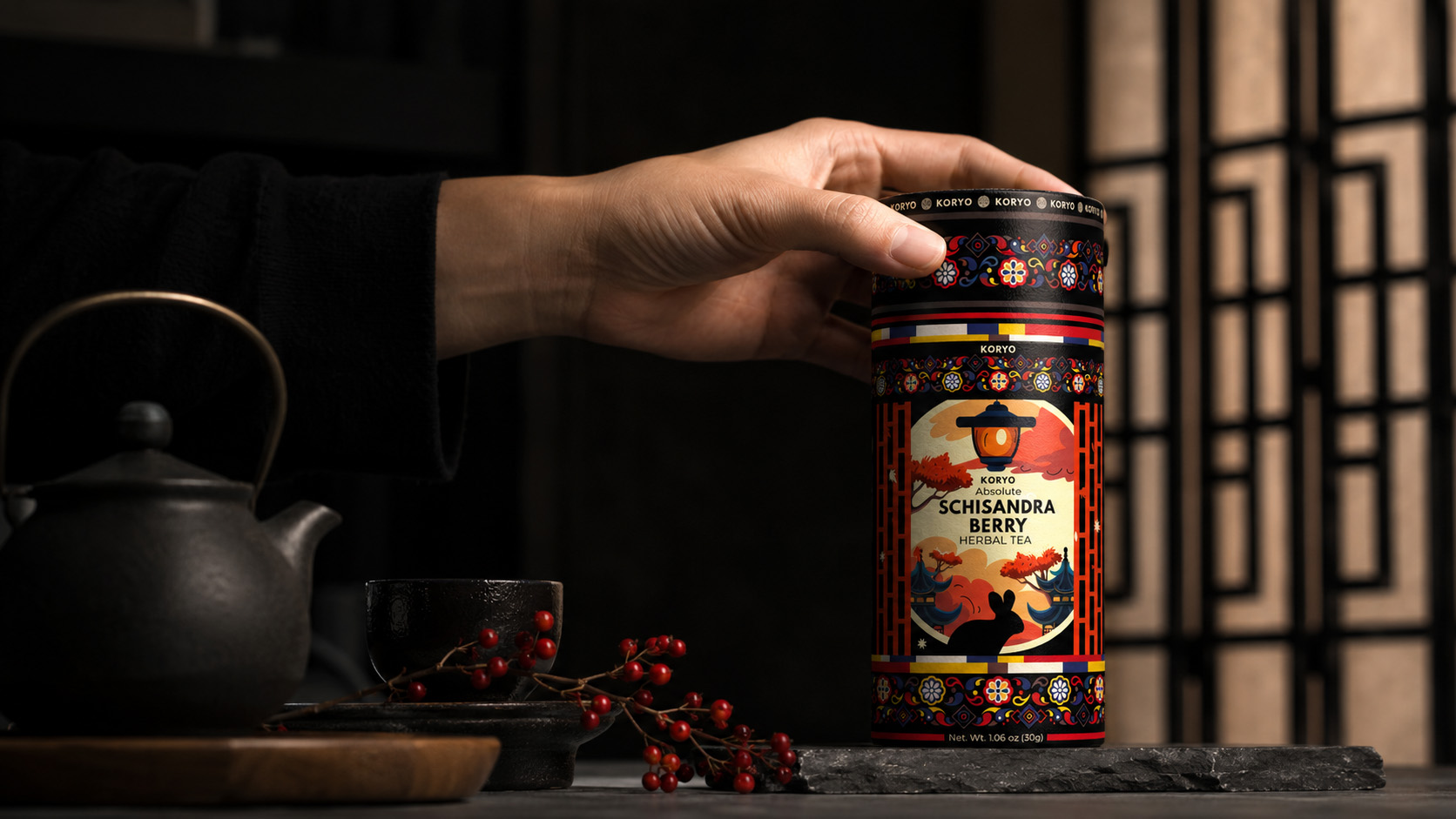
Opening The KORYO® Premium Tea Experience
The first physical interaction transforms the KORYO® canister into an active part of the premium herbal tea experience, connecting recognizable packaging with touch, anticipation, and personal ritual.
FROM CANISTER TO CUP
COMPLETING THE TRANSITION FROM DESIGNED OBJECT TO A FULLY EXPERIENCED CONTEMPORARY TEA RITUAL.
Preparation and serving bring packaging, product, and human interaction into one coherent tea brand experience. The KORYO® canister remains recognizable while the prepared tea becomes the emotional center of the ritual.
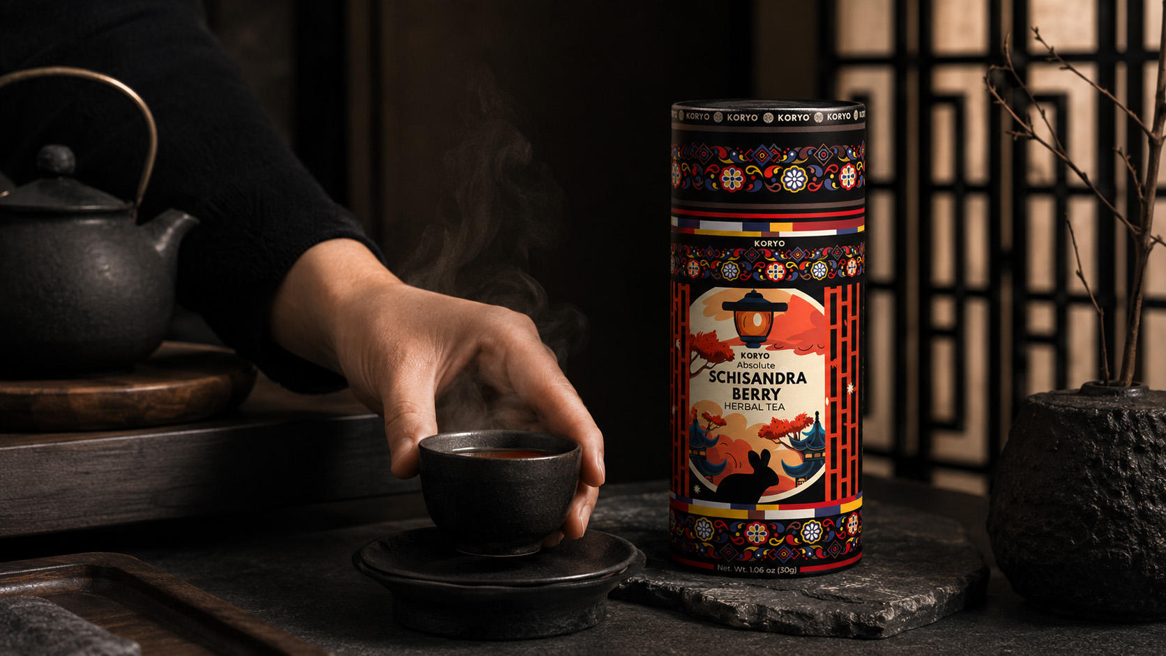
KORYO® From Premium Packaging To Contemporary Tea Ritual
The serving moment connects the final Schisandra tea packaging, prepared herbal tea, and human interaction within one calm and emotionally coherent premium tea brand experience.
DESIGN INITIATES THE ENCOUNTER. RITUAL TRANSFORMS IT INTO EXPERIENCE.
MACRO SECTION 02
CULTURAL CHARACTER WITHIN A MODERN EXPERIENCE
Translating The Atmosphere Of The KORYO® Identity Into A Refined Tea Ritual That Feels Relevant, Human, And Authentic.
Cultural character becomes most convincing when it feels naturally integrated into the experience rather than staged around the product.
Within the KORYO® visual world, architecture, restrained light, natural materials, tea vessels, and human presence extend the atmosphere established by the Korean-inspired packaging design. These elements support the identity without becoming theatrical representations of tradition.
The result is a contemporary expression of tea culture in which heritage provides depth while modern styling preserves relevance. The canister remains clearly recognizable, but it now belongs to a wider emotional environment shaped by stillness, attention, and personal ritual.
This balance strengthens the Korean herbal tea brand identity. It demonstrates that cultural inspiration can move beyond illustration and become part of the way a product is presented, handled, and remembered.
HUMAN PRESENCE
Gesture introduces scale, emotion, and authenticity. The person does not perform for the product; their natural interaction allows the premium tea brand experience to feel lived rather than constructed.
CULTURAL ATMOSPHERE
Architectural shadow, restrained materials, and controlled light extend the character of the Korean tea packaging without relying on generic or exaggerated cultural decoration.
TIMELESS VALUE
Modern composition and editorial restraint position the heritage-inspired tea packaging within a current lifestyle while preserving the depth and specificity of its origin.
SENSORY CONTINUITY
Color, steam, vessels, botanicals, and ambient light connect the package with the sensory world of tea, creating a coherent botanical tea brand experience.
HERITAGE SHAPES THE ATMOSPHERE. CONTEMPORARY RITUAL GIVES IT RELEVANCE.
A HUMAN SCALE OF THE BRAND
WHERE NATURAL PRESENCE TRANSFORMS VISUAL IDENTITY INTO AN AUTHENTIC AND EMOTIONALLY RELEVANT EXPERIENCE.
Human presence introduces scale, emotion, and credibility to the premium tea brand experience. The interaction feels personal and unstaged, allowing the KORYO® identity to become part of contemporary life.
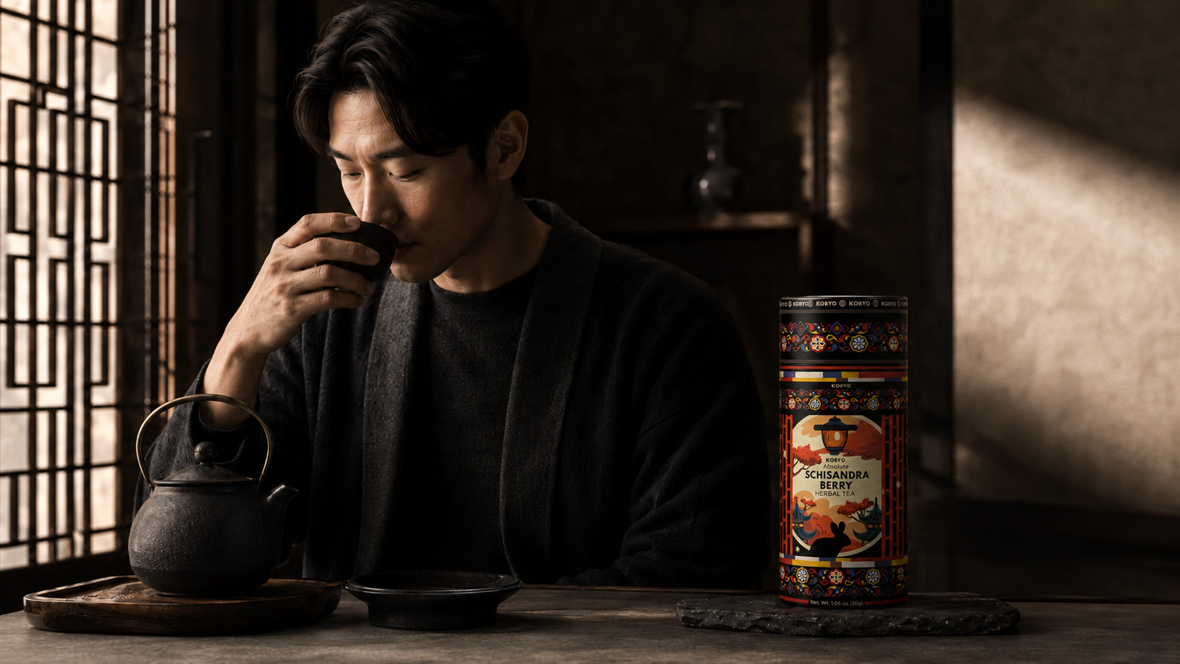
Human Presence Within The KORYO® Tea Brand Experience
Natural human interaction gives the Korean herbal tea brand identity emotional scale and authenticity, positioning KORYO® within a refined and contemporary premium tea lifestyle experience.
WHERE HERITAGE BECOMES CONTEMPORARY
BRINGING CULTURAL CHARACTER, HUMAN PRESENCE, AND MODERN TEA RITUAL INTO ONE COHERENT BRAND WORLD.
Heritage gives the KORYO® identity depth, while contemporary styling keeps it relevant. Architecture, material, light, ritual, and human presence extend the Korean-inspired tea packaging into one complete and recognizable brand world.
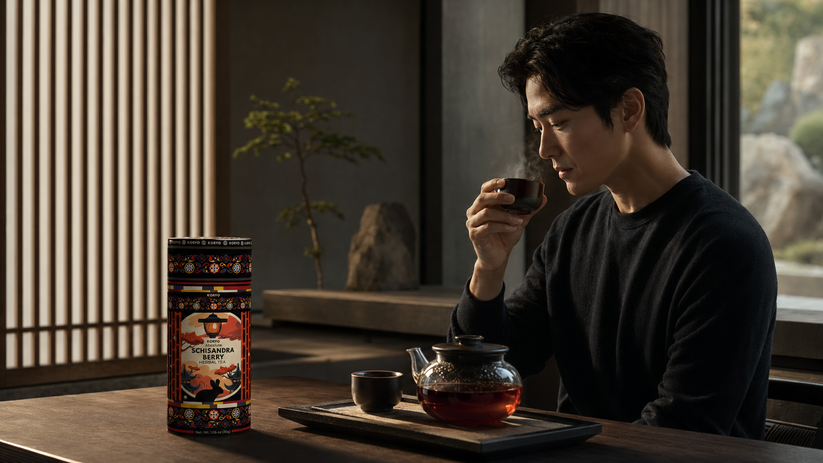
KORYO® Heritage Reimagined Through Contemporary Tea Experience
Cultural atmosphere, contemporary architecture, human presence, and personal ritual extend the Korean-inspired packaging design into a complete and emotionally resonant premium tea brand world.
HERITAGE GIVES THE EXPERIENCE DEPTH. CONTEMPORARY RITUAL KEEPS IT ALIVE.
FINAL EXPERIENCE REVEAL
A BRAND EXPERIENCED BEYOND THE PACKAGE
BRINGING PRODUCT, PACKAGING, HUMAN INTERACTION, AND CULTURAL ATMOSPHERE INTO ONE COMPLETE TEA EXPERIENCE.
The final ritual presentation reveals how KORYO® moves beyond the isolated product view.
The canister remains the central expression of the premium tea packaging identity, but its meaning expands through interaction. Opening introduces anticipation, preparation creates focus, and serving places the product within a personal and emotionally resonant moment.
This is where the Schisandra tea brand identity becomes more than a visual system. Packaging, product, atmosphere, and human presence operate together as one coherent experience.
THE SOLUTION INCLUDED
- A packaging-led opening and preparation sequence;
- contemporary tea ritual storytelling;
- controlled integration of product and human presence;
- culturally grounded environmental direction;
- coherent premium tea lifestyle imagery;
- consistent presentation of the final KORYO® canister;
- visual continuity between packaging, product, and experience;
- a foundation for wider tea brand communication.
WHAT BEGAN AS A DESIGNED OBJECT BECAME A MOMENT TO BE EXPERIENCED.
FINAL CHAPTER CONCLUSION - 06
THE PACKAGE CREATED THE FIRST CONNECTION. THE RITUAL TRANSFORMED IT INTO EXPERIENCE.
Chapter 06 reveals how the KORYO® identity continues beyond the physical package. Through opening, preparation, serving, and human interaction, the premium tea canister design becomes part of a complete and emotionally coherent product experience.
The cultural character established through the Korean-inspired tea packaging remains present, but it is expressed through atmosphere rather than decoration. Light, materials, gesture, and ritual allow heritage to feel contemporary, personal, and relevant.
The result is not simply a package placed beside a cup of tea. It is a connected premium herbal tea experience in which product, identity, and ritual belong to the same visual world.
ONE DISTINCTIVE OBJECT.
ONE CONTINUOUS RITUAL.
ONE RECOGNIZABLE BRAND WORLD.
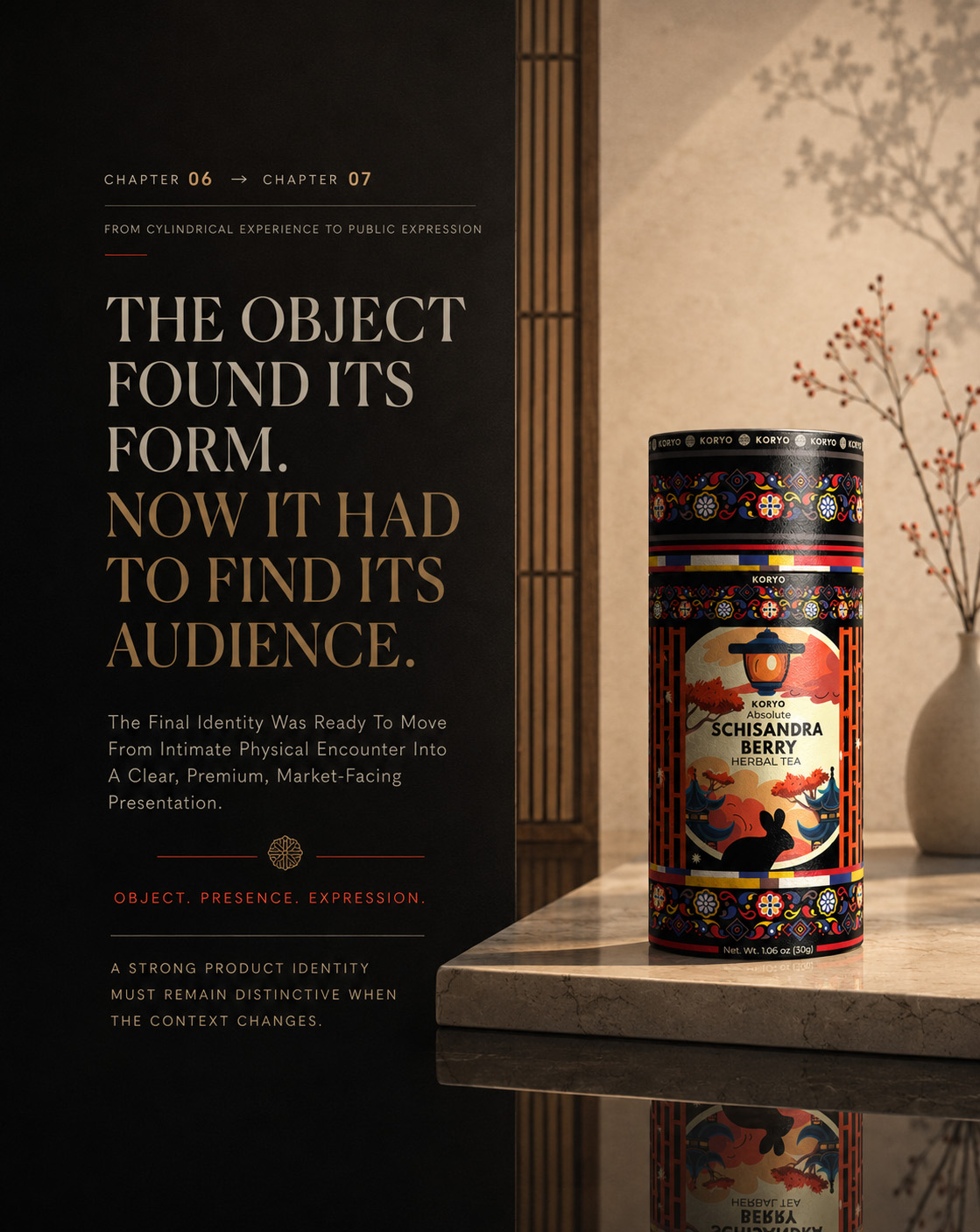
CHAPTER 07
BUILDING THE KORYO® BRAND WORLD
Extending One Culturally Grounded Packaging Identity Into A Distinct Brand System Of Product Presence, Human Experience, And Premium Brand Communication.
IDENTITY → APPLICATION → RECOGNITION
The completed KORYO® canister had already established its physical presence. Its cylindrical form, cultural references, botanical detail, ornamental structure, and controlled hierarchy created a distinctive Korean tea packaging design capable of being recognized from every angle.
But a resolved package is only the beginning of a complete brand experience.
The identity also needed to remain coherent when the product entered a wider visual environment—surrounded by people, ingredients, serving objects, architecture, atmosphere, and the changing contexts through which a premium tea brand communicates.
Chapter 07 follows that expansion.
It examines how the final Schisandra tea packaging moves beyond isolated product presentation and becomes the central point of a broader KORYO® brand world. Every visual expression must preserve the same balance between cultural depth and contemporary relevance established by the package itself.
The objective was not to surround the canister with decoration.
It was to build a visual environment in which the product, ritual, atmosphere, and brand identity could appear to belong to the same considered system.
ONE PRODUCT CREATED RECOGNITION. ONE VISUAL WORLD ALLOWED THAT RECOGNITION TO CONTINUE.
MACRO SECTION 01
THE HERO PRODUCT MOMENT
Establishing The Final KORYO® Canister As The Distinct Center Of Every Brand Expression.
The hero product moment is where the complete packaging identity first assumes a wider public presence.
The KORYO® canister is no longer examined only through individual details, physical curvature, or close-range material interaction. It must now communicate immediately—holding attention within a more complex visual environment while preserving the cultural character and premium positioning built into its design.
The final premium tea canister design provides the visual authority. Composition, lighting, human presence, ingredients, and surrounding materials support that authority without competing with it.
PRODUCT RECOGNITION WITHIN A WIDER CONTEXT
A strong hero image does more than make a product appear desirable. It establishes which elements of the identity must remain dominant when the context becomes broader.
The KORYO® wordmark, central architectural composition, Schisandra botanical artwork, ornamental borders, cylindrical silhouette, and distinctive black-and-red color relationship remain essential points of recognition.
These elements allow the product to stay visually specific even when it enters an atmospheric editorial scene.
The environment can change.
The identity must remain unmistakable.
FROM ISOLATED OBJECT TO MARKET-FACING PRESENCE
Isolated product presentation proves that the packaging works as a designed object.
Editorial product presentation must prove that it can carry the same clarity into a richer and more emotionally expressive context.
The surrounding scene introduces warmth, scale, cultural atmosphere, and sensory expectation. However, the final KORYO® canister remains the principal brand anchor—the element that connects every supporting detail back to one recognizable herbal tea brand identity.
This is the point at which packaging begins to perform as communication.
HUMAN PRESENCE WITHOUT LOSING PRODUCT AUTHORITY
Human interaction makes the product world more relatable, but it must not reduce the canister to a secondary prop.
The relationship between the person, prepared tea, Schisandra berries, teaware, and package is carefully controlled. Each element expands the narrative while protecting the hierarchy of the final Korean-inspired packaging design.
The experience feels personal rather than staged.
The atmosphere feels premium without becoming distant.
The cultural influence remains visible without becoming theatrical.
ELEGANT TEA MOMENT WITH SCHISANDRA BERRIES
WHERE PRODUCT RECOGNITION, NATURAL INGREDIENT CHARACTER, AND HUMAN PRESENCE ENTER ONE PREMIUM EDITORIAL WORLD.
The final KORYO® canister remains the visual center while the surrounding tea moment introduces a broader sense of use, atmosphere, and emotional relevance. Schisandra berries, refined serving elements, and controlled human interaction connect the packaging with the product experience it represents.
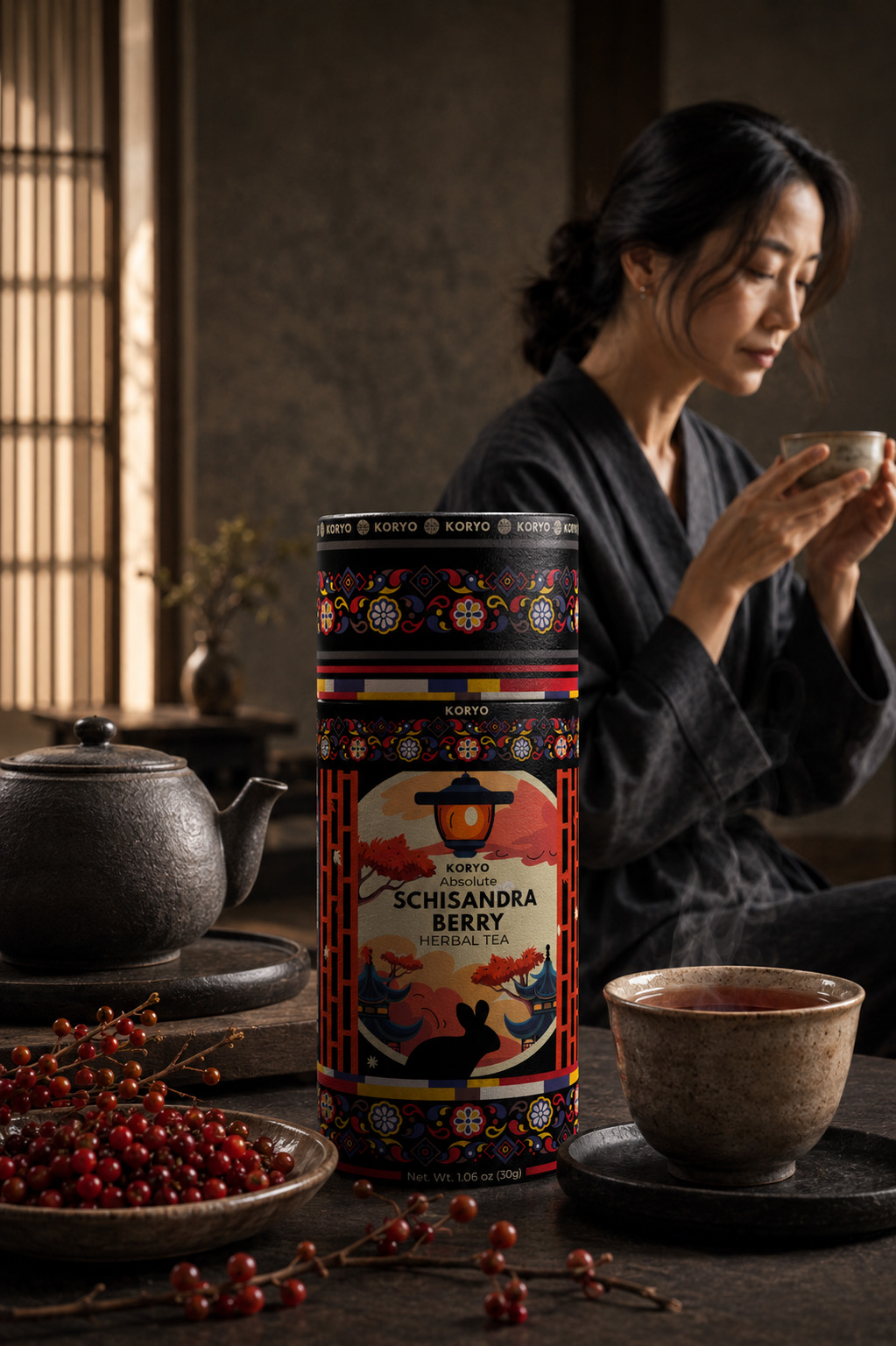
The KORYO® Canister At The Center Of A Premium Tea Experience
A controlled editorial composition extends the final Schisandra tea packaging design into a richer product world while preserving the canister’s cultural character, visual hierarchy, and immediate recognition.
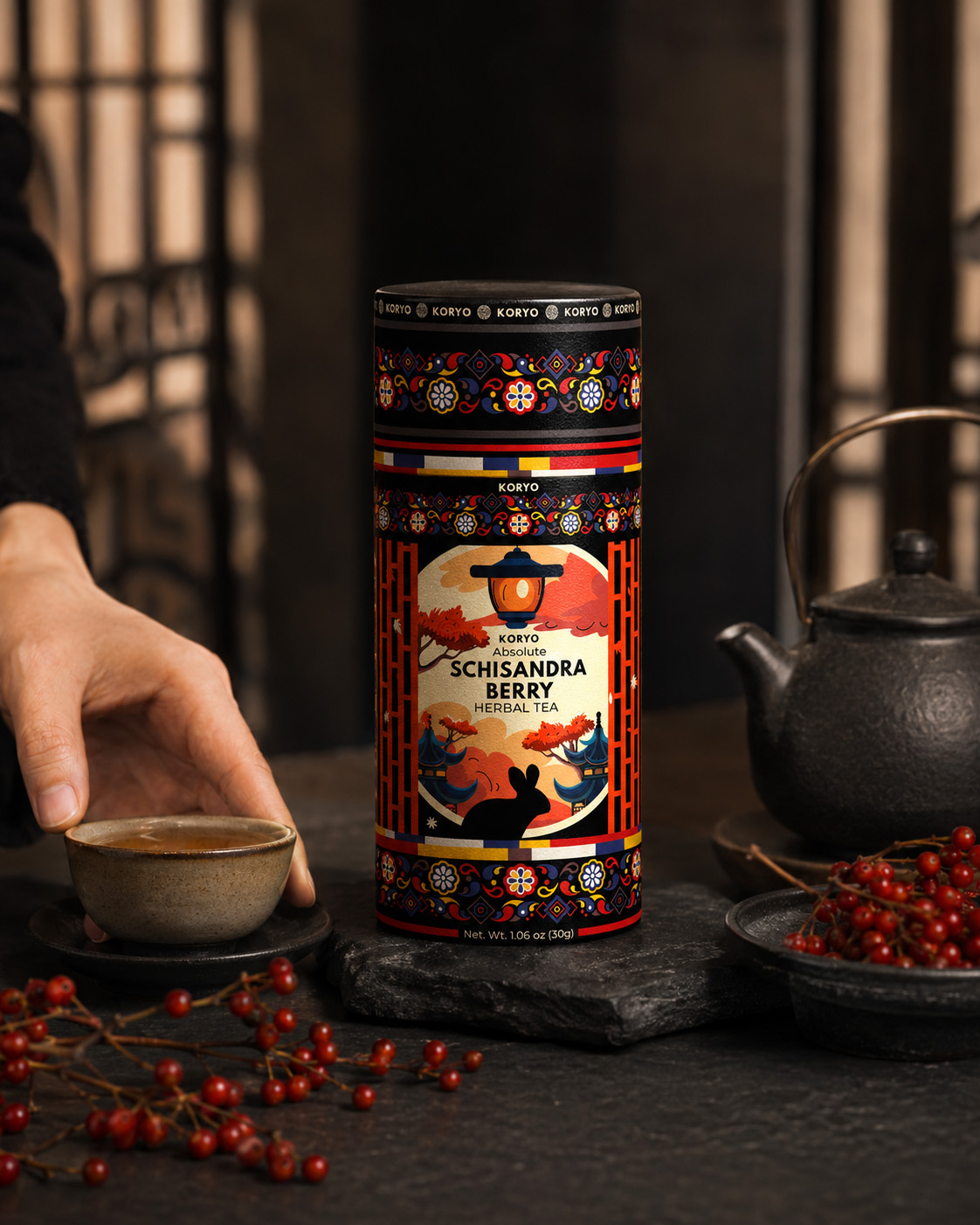
SECTION CONCLUSION
The hero product moment established more than an attractive campaign image.
It demonstrated that the KORYO® canister could remain authoritative within a complete editorial environment—surrounded by human presence, product ingredients, serving objects, and cultural atmosphere without losing its identity.
The package created the focal point.
The wider scene created relevance.
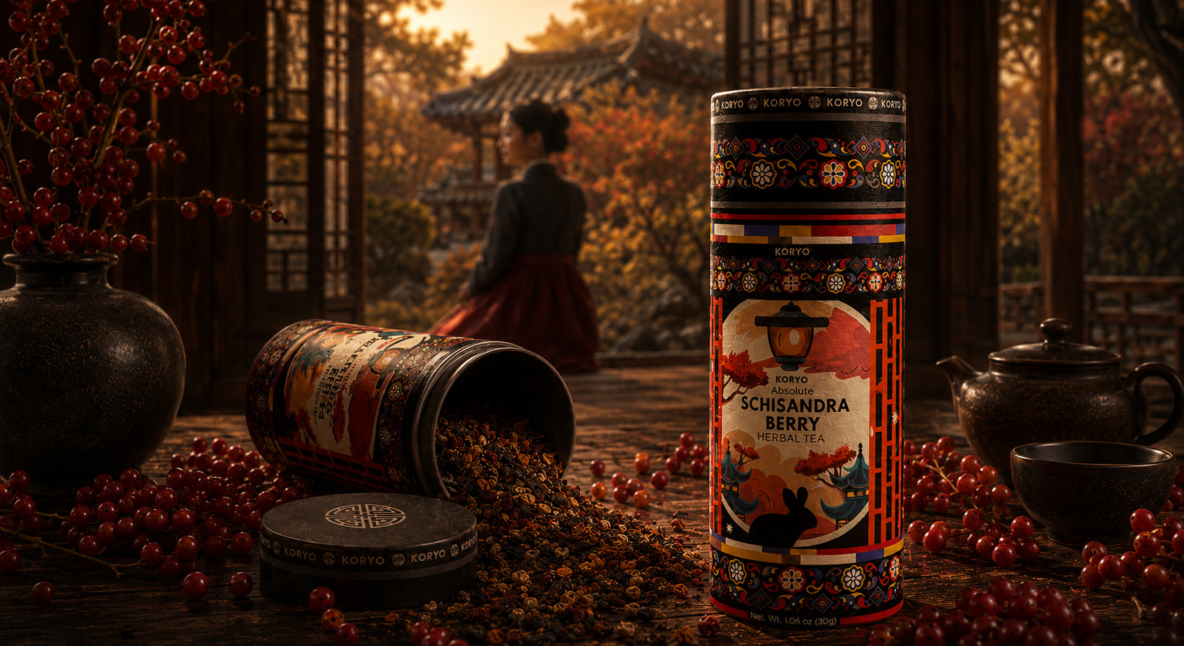
THE PRODUCT HELD THE ATTENTION. THE BRAND WORLD GAVE THAT ATTENTION MEANING.
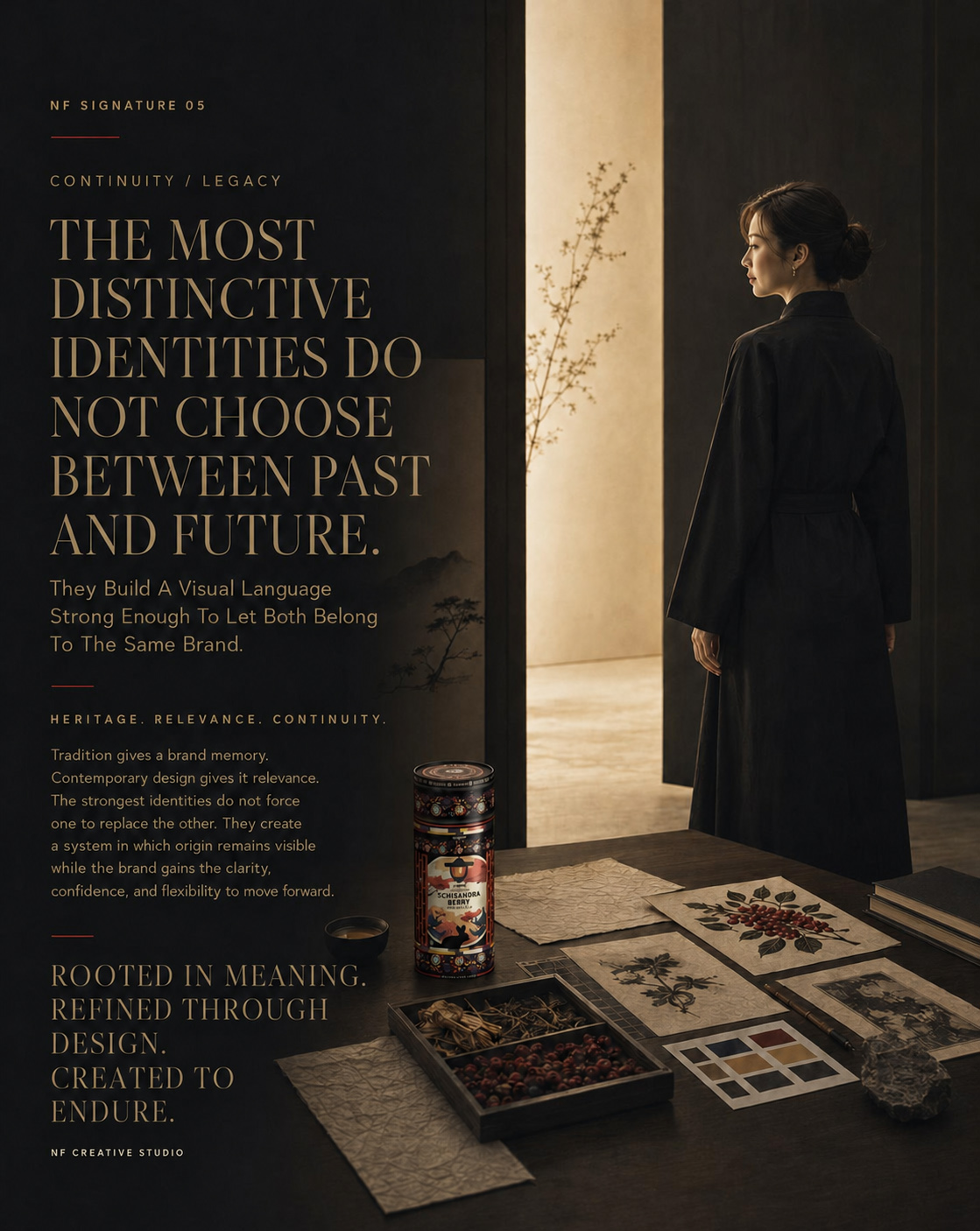
FROM CULTURAL MEMORY TO A BRAND IDENTITY CREATED TO LAST
ROOTED IN HERITAGE. REALIZED AS ONE COMPLETE SYSTEM.
KORYO® began with a clear responsibility: to create a contemporary premium tea identity without separating the brand from the cultural meaning, botanical knowledge, and visual memory from which it originated.
Through strategic research, more than forty original design solutions, sixteen shortlisted creative directions, and one definitive identity, that responsibility was transformed into a complete Korean Herbal Tea Packaging and Brand Experience System.
Every element—from typography, architecture, ornament, and botanical illustration to material expression, packaging structure, digital communication, and the wider brand ecosystem—was developed to carry the same recognizable character. What emerged was not simply a designed product, but a coherent identity capable of communicating with clarity across every scale and touchpoint.
The completed KORYO® system preserves the depth of its origins while giving the brand a confident place within the contemporary global market. Its heritage remains visible, its purpose remains understandable, and its identity is structured to endure beyond the moment of its creation.
ONE HERITAGE. ONE IDENTITY. ONE ENDURING EXPRESSION.
“Designed For The Present. Rooted In Memory. Created To Remain Meaningful.”
MACRO SECTION 02
THE COMPLETE KORYO® BRAND WORLD
Connecting Product Presentation, Human Experience, Cultural Atmosphere, And Visual Continuity Through One Cohesive Premium Identity.
A complete brand world is not created by repeating the same product image across different compositions.
It is created when every expression feels related—even when the scale, environment, emotional tone, and purpose change.
The final KORYO® identity needed enough structure to remain recognizable and enough flexibility to enter a wider range of editorial moments. Product-focused imagery could communicate precision and visual authority. Human-centered scenes could introduce warmth and relevance. Cultural environments could provide depth, while contemporary styling could ensure that the complete experience remained accessible and current.
Each expression carries a different part of the story.
Together, they build one consistent premium herbal tea brand.
PREMIUM PRODUCT PRESENTATION
Premium presentation depends on restraint.
Rather than surrounding the canister with excessive decoration, the KORYO® visual system uses material, light, scale, and composition to protect the product’s importance. Dark wood, natural stone, controlled highlights, warm neutral surfaces, and concentrated Schisandra red details extend the packaging palette into the environment.
The result does not rely on a single background or photographic formula.
Continuity comes from the consistent treatment of hierarchy, atmosphere, cultural character, and product accuracy.
Every composition must feel unmistakably connected to KORYO®.
CULTURAL ATMOSPHERE AS BRAND LANGUAGE
The Korean influence within the identity is not limited to ornament or architectural illustration.
It continues through spatial balance, material restraint, framed light, asymmetrical harmony, natural textures, and the quiet rhythm of the complete composition.
This approach allows the Korean-inspired tea packaging to enter a wider cultural atmosphere without turning that atmosphere into a literal historical reconstruction.
Heritage provides depth.
Contemporary editorial direction gives that depth relevance.
HUMAN EXPERIENCE AS COMMUNICATION
Human presence changes how the brand is perceived.
The product is no longer understood only through form, color, typography, and illustration. It becomes connected to preparation, pause, serving, attention, and the sensory qualities of the tea experience.
These moments make the KORYO® identity more accessible without weakening its premium character. The brand feels lived rather than displayed, allowing the packaging to participate naturally in a contemporary tea ritual.
VISUAL CONTINUITY ACROSS CHANGING SCENES
The strongest brand systems remain recognizable without requiring every image to look identical.
Within the KORYO® world, continuity is maintained through the accurate canister, disciplined product scale, controlled lighting, recurring materials, restrained color treatment, authentic tea presentation, and a consistent relationship between cultural atmosphere and contemporary styling.
This creates a flexible tea brand visual identity capable of supporting different editorial narratives while preserving one coherent emotional and visual language.
WARM TEA RITUAL IN A SERENE SPACE
TRANSFORMING THE FINAL PACKAGING IDENTITY INTO A HUMAN, CULTURALLY GROUNDED, AND CONTEMPORARY BRAND EXPERIENCE.
The serene tea environment develops the brand beyond immediate product recognition. Architecture, light, material, prepared tea, and natural human interaction place the final KORYO® canister within a complete world shaped by calm, cultural depth, and contemporary relevance.
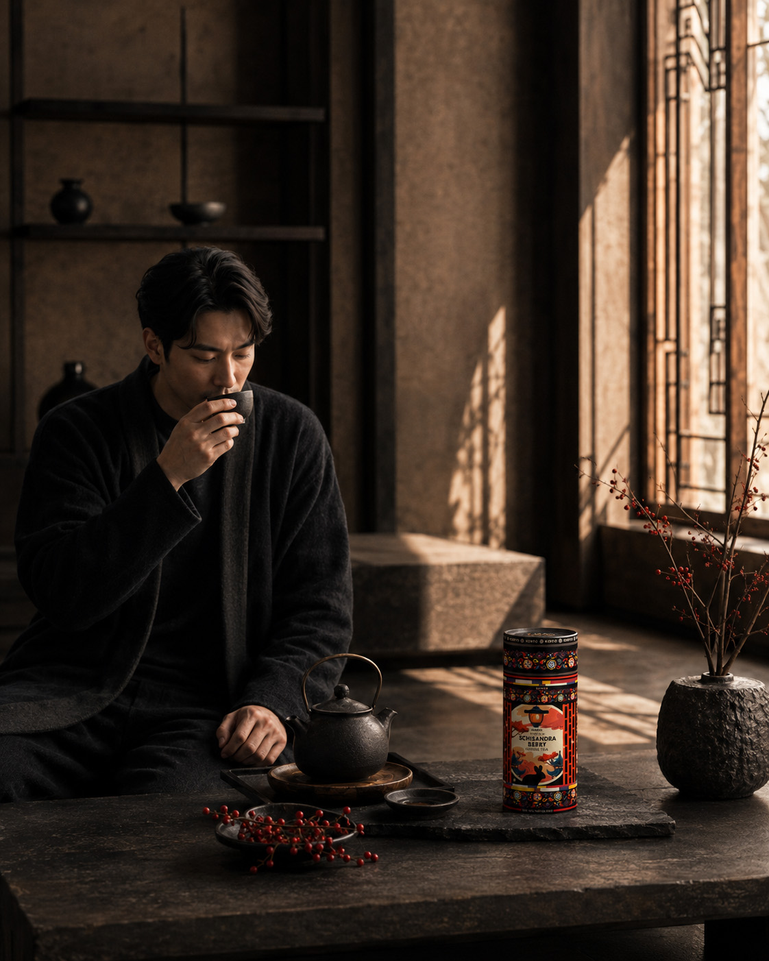
KORYO® Within A Contemporary Korean-Inspired Tea Ritual
Human presence, refined architecture, and sensory atmosphere extend the premium tea packaging into a coherent lifestyle experience while preserving the identity’s cultural specificity and recognizable product character.
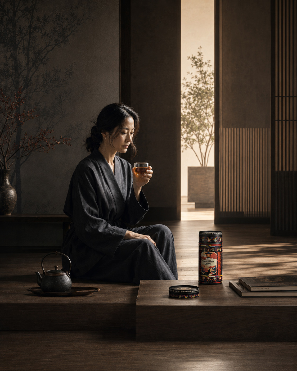
SECTION CONCLUSION
The complete KORYO® brand world connects product presence with human meaning.
Packaging, atmosphere, cultural reference, serving ritual, and editorial communication no longer operate as separate elements. They form one continuous system in which every scene reinforces the same identity from a different perspective.
The brand does not depend on repetition to remain consistent.
It depends on recognizable principles applied with discipline.
ONE IDENTITY. MANY EXPRESSIONS. ONE CONTINUOUS BRAND WORLD.
FINAL BRAND WORLD REVEAL
WHEN EVERY EXPRESSION BELONGS TO THE SAME IDENTITY
The final reveal brings the complete visual language of Chapter 07 into one resolved brand expression.
The KORYO® canister remains the central point of recognition, but its meaning is now strengthened by everything surrounding it: the tea itself, the human ritual, the natural ingredients, the Korean-inspired atmosphere, the architectural restraint, and the premium editorial direction.
This is where the package stops appearing as an isolated outcome.
It becomes the recognizable center of a complete Schisandra herbal tea brand experience.
The visual world does not replace the identity established on the canister.
It reveals how far that identity can extend without losing what makes it distinctive.
THE SOLUTION INCLUDED
The completed Chapter 07 brand expression included:
- a recognizable hero product presentation built around the final KORYO® canister;
- accurate and consistent integration of the approved packaging identity;
- premium editorial product photography;
- controlled human presence and natural product interaction;
- authentic representation of the contemporary tea ritual;
- culturally grounded architectural and material direction;
- integration of Schisandra berry and herbal tea references;
- a consistent visual hierarchy across changing compositions;
- coherent lighting, color, material, and atmospheric treatment;
- premium tea lifestyle imagery connected to the packaging design;
- visual continuity between product, identity, ritual, and environment;
- a flexible foundation for wider KORYO® brand communication.
THE PACKAGE ESTABLISHED THE LANGUAGE. THE BRAND WORLD PROVED THAT LANGUAGE COULD LIVE.
FINAL CHAPTER CONCLUSION - 07
FROM ONE DISTINCTIVE PRODUCT TO ONE COMPLETE BRAND WORLD
Chapter 07 demonstrates that the value of a packaging identity is not limited to the surface of the package itself.
A resolved tea packaging design must remain recognizable when the product enters new visual contexts. It must retain its hierarchy when surrounded by ingredients, people, vessels, architecture, and atmosphere. It must carry the same cultural depth through both product-focused presentation and human experience.
The KORYO® identity achieved that continuity by remaining anchored in a clear set of visual principles.
The cylindrical silhouette maintained product recognition. The black, red, and warm-neutral palette preserved visual character. Korean-inspired architecture and ornament sustained cultural specificity. Schisandra botanical imagery connected the design with the product, while disciplined composition allowed the identity to expand without becoming visually fragmented.
What began as one resolved canister became the foundation of a broader premium herbal tea brand world.
The package created recognition.
Editorial presentation created presence.
Human experience created emotional relevance.
Cultural continuity ensured that every expression still belonged unmistakably to KORYO®.
The result is not a collection of unrelated promotional images. It is one coherent visual system capable of presenting the product with clarity, atmosphere, and distinction across changing brand contexts.
THE PRODUCT CREATED THE FOCAL POINT.
THE EXPERIENCE CREATED THE CONNECTION.
THE BRAND WORLD MADE BOTH RECOGNIZABLE.
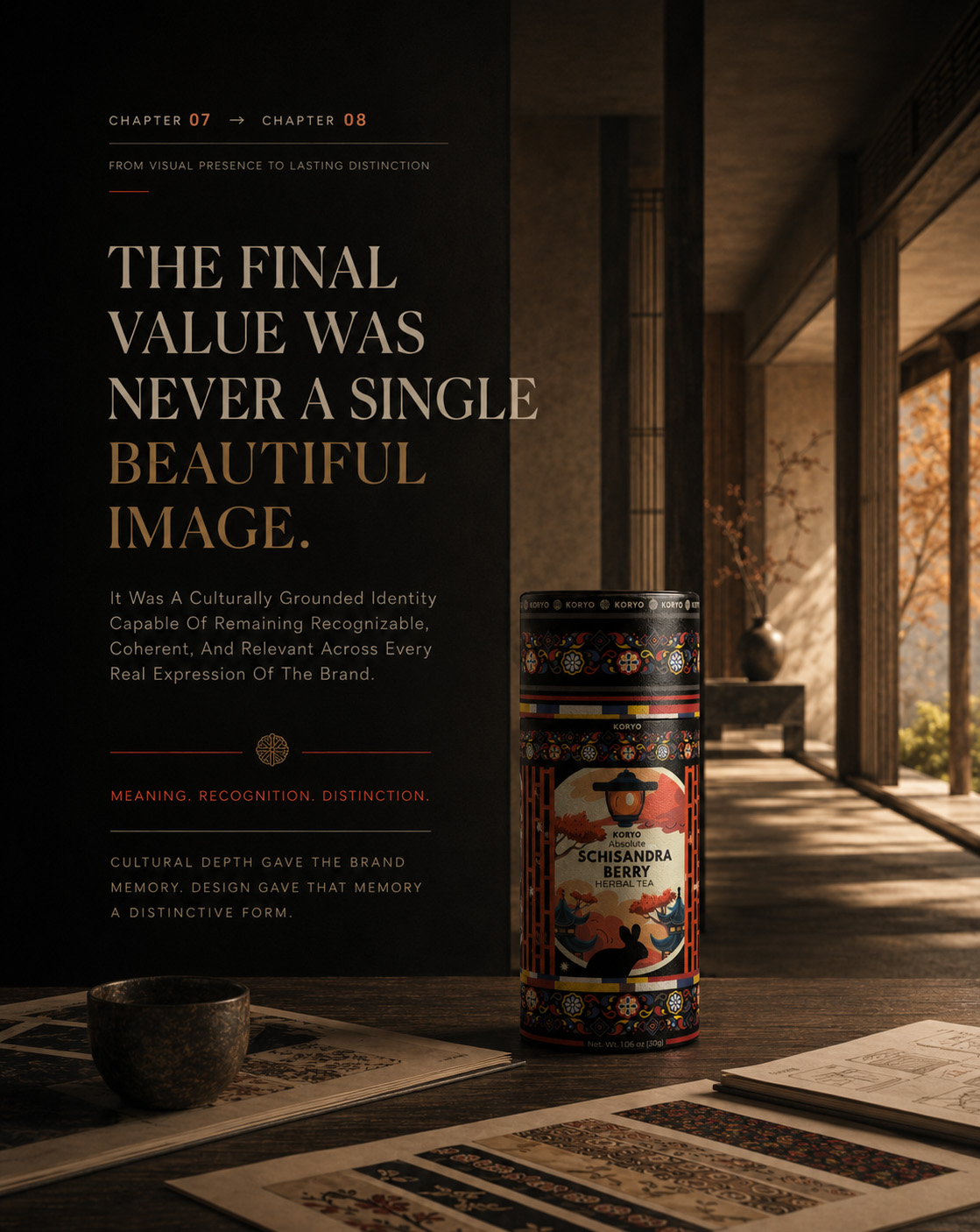
CHAPTER 08
ENDURING BRAND DISTINCTION
Bringing Cultural Origin, Strategic Design, Physical Packaging, Human Experience, And Brand Continuity Into One Definitive KORYO® Identity.
HERITAGE → TRANSFORMATION → LEGACY
The KORYO® journey began with a challenge that extended far beyond appearance:
How could Korean cultural heritage become part of a contemporary premium tea packaging identity without being reduced to decoration, imitation, or nostalgia?
The answer emerged through a complete design process—from cultural research and conceptual exploration to strategic selection, visual refinement, cylindrical packaging development, human ritual, and broader brand expression.
Each stage resolved a different part of the challenge.
Research established meaning. Exploration revealed possibility. Selection created direction. Refinement created control. Physical packaging created credibility. Human experience created emotional relevance.
Chapter 08 brings those achievements together.
It examines what the final KORYO® identity ultimately became: not simply an attractive tea canister, but a culturally grounded and strategically resolved tea brand identity built for recognition, relevance, and lasting distinction.
THE JOURNEY BEGAN WITH CULTURAL MEMORY. IT ENDS WITH AN IDENTITY DESIGNED TO ENDURE.
MACRO SECTION 01
THE COMPLETE DESIGN JOURNEY
From Cultural Context And Visual Exploration To One Fully Resolved Premium Packaging Identity.
The final KORYO® canister carries the visible outcome of an extensive creative process.
Its authority does not come from one illustration, color, or decorative element. It comes from the relationship between cultural origin, product character, typography, architecture, ornament, botanical imagery, composition, and physical form.
Together, these elements transformed an initial creative territory into one coherent Korean-inspired packaging design.
CULTURAL ORIGIN BEFORE VISUAL EXPRESSION
The project began by establishing what KORYO® needed to represent before determining how it should look.
Korean cultural heritage provided the conceptual foundation, while Schisandra berry herbal tea defined the natural product story. Premium positioning introduced the need for refinement, clarity, and immediate visual authority.
The identity therefore needed to balance two essential qualities:
Cultural depth without historical imitation.
Contemporary relevance without cultural loss.
This balance became the strategic foundation of the complete herbal tea packaging design.
EXPLORATION WITH A CLEAR PURPOSE
More than forty initial directions investigated how Korean architecture, traditional ornament, botanical illustration, typography, color, and negative space could shape the packaging.
Sixteen shortlisted concepts then revealed the strongest creative possibilities in greater depth.
The purpose was not variation for its own sake. Every direction helped determine which visual relationships could create the most authentic, recognizable, and premium expression of KORYO®.
Exploration expanded the possibilities.
Strategy identified which possibility deserved to continue.
FROM SELECTION TO REFINEMENT
Concept 16 provided the strongest foundation because it combined cultural presence, compositional authority, and immediate product recognition.
However, selection was only the beginning.
Unnecessary complexity was removed. The hierarchy became clearer. Spacing was controlled. The relationship between the KORYO® wordmark, architectural illustration, Schisandra botanicals, ornamental borders, and supporting information was carefully refined.
This process transformed a strong concept into a resolved Schisandra tea packaging design.
REMOVING THE UNNECESSARY. BUILDING THE ESSENTIAL.
FROM FLAT ARTWORK TO PHYSICAL FORM
The cylindrical canister introduced the final design test.
The artwork needed to remain coherent as it moved around a curved surface, entered and left the field of vision, and connected across multiple viewing angles.
The frontal composition retained immediate recognition, while the wider artwork continued naturally around the complete object. Borders aligned, illustration maintained authority, and information remained integrated within one continuous structure.
The package was no longer a surface carrying the design.
Its physical form became part of the packaging identity itself.
THE EIGHT THRESHOLDS OF KORYO®
ONE CONTINUOUS JOURNEY FROM CULTURAL ORIGIN AND VISUAL EXPLORATION TO PHYSICAL PACKAGING, HUMAN EXPERIENCE, AND ENDURING BRAND DISTINCTION.
The complete eight-chapter journey appears as one connected progression. Cultural research, conceptual expansion, strategic selection, refinement, physical resolution, ritual, and brand expression become successive thresholds leading toward the final KORYO® identity.
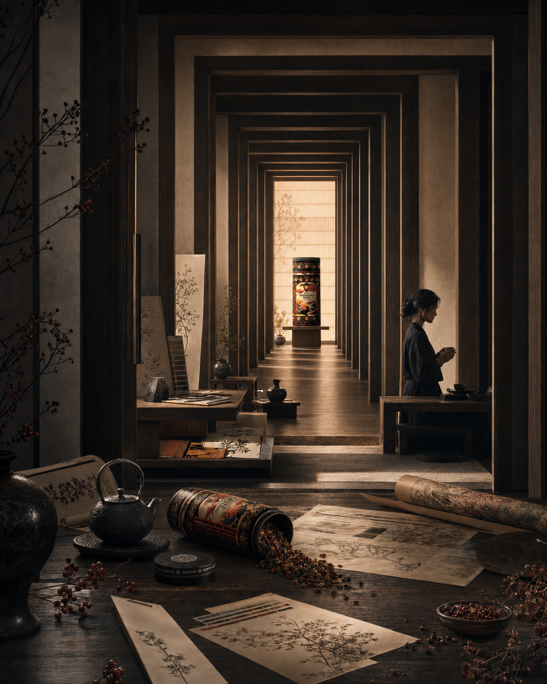
The Complete KORYO® Tea Packaging Design Journey
Eight connected stages reveal how cultural context, creative exploration, design refinement, physical packaging, and human experience shaped one distinctive and fully resolved premium tea packaging design.

SECTION CONCLUSION
The final KORYO® canister contains the evidence of the complete process behind it.
Research created meaning. Exploration tested possibility. Selection established direction. Refinement introduced precision. Physical development transformed the identity into a credible product experience.
Nothing exists independently.
Every element contributes to the same strategic and visual argument.
EIGHT CHAPTERS REVEALED THE PROCESS. ONE FINAL IDENTITY PROVED ITS VALUE.
MACRO SECTION 02
HERITAGE CARRIED FORWARD
Where Cultural Memory Becomes Contemporary Value, Distinct Brand Character, And Enduring Design Value.
A culturally grounded identity cannot remain relevant by reproducing the visual appearance of the past.
It must understand what the past represents and translate that meaning into a form capable of belonging to contemporary life.
For KORYO®, heritage became a living part of the brand identity design through proportion, architectural rhythm, ornamental discipline, botanical character, restrained color, and carefully controlled composition.
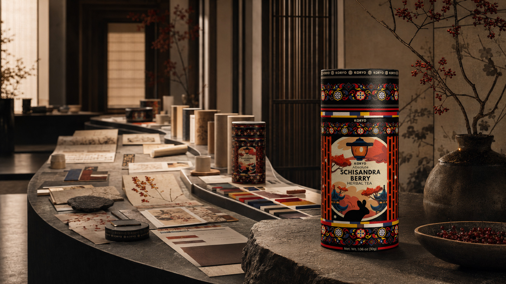
DISTINCTION BUILT THROUGH MEANING
Distinctive packaging is not created by adding more elements.
It is created by establishing relationships that cannot easily be mistaken for another brand.
Within KORYO®, recognition comes from the interaction between the cylindrical silhouette, authoritative wordmark, Korean-inspired architecture, Schisandra botanical illustration, ornamental framing, and controlled black, red, gold, and warm-neutral palette.
Each element supports recognition.
Their relationship creates identity.
A SYSTEM RATHER THAN A STYLE
A visual style may produce one memorable image.
A complete tea packaging design system must remain coherent across changing conditions.
KORYO® retains its identity as flat artwork, physical packaging, close-range material detail, hero product photography, tea ritual, cultural atmosphere, and premium editorial communication.
The compositions do not need to appear identical.
They remain connected because the same principles govern every expression.
CONTEMPORARY RELEVANCE WITHOUT CULTURAL LOSS
Modernizing a culturally influenced identity does not require removing the qualities that make it specific.
It requires refining and controlling them.
KORYO® retains cultural depth without becoming historical or theatrical. Contemporary relevance emerges through disciplined typography, clear hierarchy, balanced composition, premium material expression, and the restraint with which every cultural reference is applied.
The past is not copied.
It is interpreted.
RECOGNITION DESIGNED TO CONTINUE
The lasting value of KORYO® lies in its ability to remain recognizable beyond one product view or editorial composition.
The canister can appear alone, at close range, within a human ritual, or as the center of a complete brand atmosphere. Its context may change, but its essential visual character remains stable.
That stability gives the premium herbal tea brand a credible foundation for continuity.
ROOTED IN ORIGIN. REFINED FOR THE PRESENT. DESIGNED TO MOVE FORWARD.
A COMPLETE KORYO® WORLD OF PRODUCT, RITUAL, AND ATMOSPHERE
WHERE THE FINAL PACKAGING IDENTITY BECOMES PART OF ONE QUIET, CULTURALLY GROUNDED, AND CONTEMPORARY HUMAN EXPERIENCE.
The final reveal places the KORYO® canister inside the complete world developed throughout the case study.
Product, prepared tea, human presence, architecture, natural materials, light, and cultural atmosphere become part of one coherent experience. The packaging remains immediately recognizable while connecting naturally with the life surrounding it.
Heritage is no longer presented as a static reference.
It becomes part of a contemporary ritual.
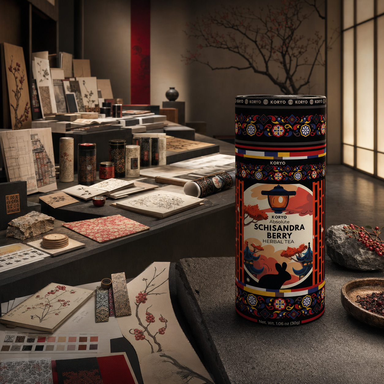
A Complete KORYO® World Of Product, Ritual, And Atmosphere
The final KORYO® Schisandra tea packaging becomes part of a refined contemporary experience where product, cultural atmosphere, prepared tea, and human presence belong to one enduring brand world.
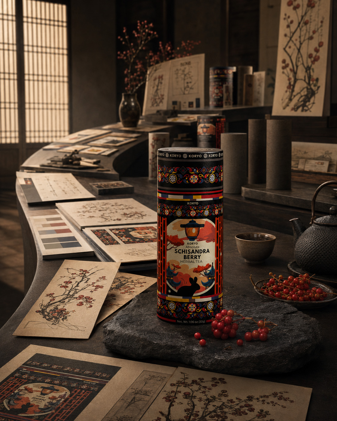
SECTION CONCLUSION
Heritage gave KORYO® cultural memory.
Strategic design transformed that memory into structure. Packaging gave the structure physical presence. Human ritual introduced emotional relevance. The wider brand world allowed the identity to continue without losing its origin.
This is how cultural meaning moves forward.
Not through literal repetition.
Through interpretation, discipline, and continuity.
HERITAGE ESTABLISHED THE MEANING. DESIGN MADE THAT MEANING RECOGNIZABLE. CONTINUITY GIVES IT A FUTURE.
FINAL PROJECT OUTCOME
FROM CULTURAL CONTEXT TO ENDURING BRAND DISTINCTION
The completed KORYO® identity resolves a complex cultural and commercial challenge through one coherent product packaging design.
It gives Korean heritage a contemporary visual expression without reducing it to decorative symbolism. It gives Schisandra berry herbal tea a distinctive presence without relying on generic botanical packaging conventions.
The cylindrical canister is treated as a complete object rather than a neutral surface. Typography, architecture, ornament, botanical illustration, color, and material work together to create one recognizable visual structure.
The result is more than a redesigned package.
It is a complete premium packaging design system capable of communicating origin, product character, cultural value, and contemporary relevance through one controlled identity.
Its value is visible in the design outcome:
- a meaningful relationship between Korean cultural heritage and premium product positioning;
- a distinctive cylindrical silhouette and front-facing hierarchy;
- clear recognition across changing viewing angles;
- a resolved transition from flat artwork to physical packaging;
- consistent integration of architecture, ornament, typography, and botanical illustration;
- a premium visual language capable of extending beyond the canister;
- a culturally grounded identity independent of temporary visual trends;
- a coherent foundation for future brand continuity.
THE SOLUTION INCLUDED
The complete KORYO® identity and editorial case study included:
- cultural and category context analysis;
- Korean-inspired architectural and visual research;
- exploration of typography, ornament, botanical imagery, color, and composition;
- development of more than forty initial creative directions;
- sixteen shortlisted packaging concepts;
- strategic comparison and selection of the strongest direction;
- comprehensive refinement of the selected Concept 16;
- removal of unnecessary visual complexity;
- strengthening of hierarchy, spacing, balance, and product recognition;
- complete cylindrical artwork development;
- integration of the KORYO® wordmark and supporting typography;
- Korean-inspired architectural illustration;
- Schisandra berry botanical artwork;
- ornamental border and framing systems;
- controlled black, red, gold, ivory, and warm-neutral color relationships;
- adaptation of the complete identity to the physical canister;
- close-range presentation of packaging structure and craftsmanship;
- premium hero product presentation;
- contemporary tea ritual and human-experience imagery;
- culturally grounded architectural and material direction;
- premium editorial product photography;
- visual continuity across packaging, ritual, atmosphere, and communication;
- one complete foundation for enduring KORYO® brand distinction.
FINAL CHAPTER CONCLUSION - 08
WHEN CULTURAL MEANING BECOMES ENDURING IDENTITY
Chapter 08 reveals what every previous stage of the KORYO® journey was working toward.
The project was never only about creating a visually impressive surface for a tea canister. Its true purpose was to determine how cultural origin, natural product character, strategic positioning, physical packaging, and contemporary experience could become part of one recognizable identity.
The final solution succeeds because these qualities were not treated as separate themes.
Korean architectural references create origin and structure. Ornament creates rhythm. Schisandra botanical artwork connects the identity with the product. Typography establishes hierarchy and authority. The cylindrical form creates physical presence. Human ritual introduces emotional meaning.
Together, they create a Korean tea packaging identity rooted in culture and resolved through contemporary design discipline.
KORYO® does not imitate heritage.
It carries heritage forward.
It does not depend on excessive decoration to become distinctive.
It builds distinction through the precise relationship between every essential element.
It does not remain confined to one product view.
It continues through physical form, close-range detail, human interaction, cultural atmosphere, and broader editorial expression.
That continuity represents the final value of the identity.
KORYO® remembers where it began, understands the world in which it now exists, and possesses the visual clarity required to continue beyond the limits of this case study.
CULTURAL HERITAGE PROVIDED THE FOUNDATION.
STRATEGIC DESIGN CREATED THE IDENTITY.
CONTINUITY TRANSFORMED THAT IDENTITY INTO LEGACY.
FINAL CASE STUDY CLOSING
HERITAGE CARRIED FORWARD
KORYO® demonstrates that contemporary tea packaging design can respect cultural origin without becoming historical, communicate premium value without becoming excessive, and create recognition without sacrificing depth.
Across eight chapters, one culturally grounded idea was researched, expanded, challenged, selected, refined, constructed, experienced, and ultimately resolved.
The final canister is the visible outcome.
The enduring identity behind it is the greater achievement.
FROM CULTURAL MEMORY TO VISUAL DISTINCTION. FROM PHYSICAL PACKAGING TO HUMAN EXPERIENCE. FROM ONE RESOLVED CANISTER TO ONE ENDURING KORYO® IDENTITY.
CULTURE. CLARITY. CONTINUITY.
ROOTED IN MEANING. REFINED THROUGH DESIGN. CREATED TO ENDURE.
NF CREATIVE STUDIO
NF CREATIVE STUDIO
THE FINAL IDENTITY IS ONLY THE BEGINNING OF THE STORY.
Its True Value Is Revealed Through The Research, Exploration, And Decisions That Gave Every Element Its Meaning.
THE RESULT HAS BEEN PRESENTED.
NOW WE REVEAL THE THINKING THAT CREATED IT.
The Final Result
WHERE CULTURAL HERITAGE BECAME A DISTINCTIVE PREMIUM PACKAGING IDENTITY
From More Than 40 Creative Directions To One Coherent Visual System Designed For Recognition, Cultural Meaning, And Long-Term Brand Growth.
The success of the KORYO® project was not measured by the creation of one visually attractive label, but by the clarity, consistency, and long-term value of the complete packaging identity established through the process.
Throughout the project, Korean cultural references, botanical expression, premium product positioning, packaging architecture, and commercial recognition were brought together within one unified objective.
More than 40 original packaging directions were developed, evaluated, compared, and progressively refined. Each exploration revealed what the brand needed to preserve, simplify, strengthen, or eliminate before one final visual territory could be confidently selected.
Rather than delivering an isolated decorative solution, the project established a complete Premium Tea Packaging And Brand Identity System capable of supporting immediate recognition, coherent product storytelling, future collection development, and consistent presentation across physical and digital environments.
PROJECT OUTCOMES:
✓ A Complete Premium Packaging Identity
The project transformed cultural research, botanical storytelling, illustration, typography, ornament, color, and packaging structure into one distinctive and fully resolved KORYO® identity.
✓ A Recognizable Front-Facing Packaging System
A strong visual hierarchy was established between the KORYO® brand, product name, Schisandra ingredient, cultural illustration, ornamental structure, and essential product information—creating immediate recognition across shelf, screen, and editorial presentation.
✓ An Authentic Contemporary Cultural Expression
Korean heritage was translated through proportion, rhythm, architectural references, controlled ornament, and visual restraint rather than literal imitation, allowing the identity to feel culturally grounded and internationally relevant.
✓ A Coherent Cylindrical Label Architecture
Every visual component was developed to work across the continuous surface of the tea canister, preserving clarity and visual continuity as the packaging is displayed, photographed, held, or rotated.
✓ A Distinctive Botanical Product Narrative
Schisandra berries, branches, natural forms, and illustrative details were integrated into the wider cultural language of the package, giving the product a recognizable ingredient story without reducing the identity to conventional botanical decoration.
✓ A Scalable Foundation For Future Growth
The final system established consistent principles for composition, hierarchy, typography, ornament, illustration, and color—creating a flexible framework capable of supporting future tea varieties and product extensions.
STRATEGIC IMPACT:
The value of this project extends beyond the completed Schisandra Berry Herbal Tea package.
It established a connected visual framework in which Premium Tea Packaging Design, Cultural Brand Identity, Botanical Illustration, Packaging Architecture, and Editorial Storytelling operate as one coherent system.
This transformed KORYO® from an individual packaged product into a recognizable premium brand with a defined visual territory, stronger perceived value, and a structured foundation for future collection development.
The completed identity now communicates with consistency across front-facing packaging, cylindrical product views, premium visualizations, physical retail presentation, e-commerce environments, mobile screens, and editorial brand communication.
WHAT THIS PROJECT DELIVERED:
✓ Cultural Visual Research And Reference Mapping
✓ More Than 40 Original Packaging Concept Directions
✓ Korean-Inspired Visual Territory Development
✓ Front-Facing Packaging Identity System
✓ Premium Tea Brand Visual Direction
✓ Botanical Illustration And Ornament Exploration
✓ Architectural Illustration Language
✓ Typography And Information Hierarchy
✓ Color And Contrast System
✓ Cylindrical Label Composition
✓ Comparative Concept Evaluation
✓ Selected Final Creative Direction
✓ Final Front-Facing Packaging Concept
✓ Premium Product Visualizations
✓ Editorial Case Study Presentation
✓ Scalable Framework For Future Product Expansion
FINAL STATEMENT
The final KORYO® identity demonstrates that premium packaging becomes meaningful when cultural heritage, product character, visual clarity, and commercial purpose are resolved as one complete experience.
The result is not simply a decorated tea canister. It is a coherent packaging system designed to preserve cultural meaning, strengthen recognition, elevate perceived value, and provide the brand with a distinctive foundation for continued development.
ROOTED IN HERITAGE. REFINED THROUGH STRATEGY. BUILT FOR RECOGNITION.
PROJECT SUMMARY
| PROJECT SUMMARY | STATUS |
|---|---|
| Strategic Project Foundation | ✓ Completed |
| Cultural Research & Visual Mapping | ✓ Completed |
| Premium Tea Brand Positioning | ✓ Established |
| 40+ Packaging Concept Directions | ✓ Developed |
| Comparative Concept Evaluation | ✓ Completed |
| Final Creative Direction | ✓ Selected |
| Front-Facing Packaging Identity | ✓ Finalized |
| Korean-Inspired Visual Language | ✓ Established |
| Botanical Illustration System | ✓ Developed |
| Architectural Illustration Language | ✓ Finalized |
| Ornament & Border System | ✓ Completed |
| Typography & Information Hierarchy | ✓ Finalized |
| Color & Contrast System | ✓ Established |
| Cylindrical Label Composition | ✓ Completed |
| Premium Product Presentation | ✓ Delivered |
| Editorial Case Study System | ✓ Completed |
PROJECT STATUS
| PROJECT STATUS | STATUS |
|---|---|
| Cultural Meaning | ✓ Authentically Translated |
| Brand Identity | ✓ Established |
| Product Recognition | ✓ Strengthened |
| Premium Positioning | ✓ Defined |
| Front-Facing Shelf Presence | ✓ Developed |
| Packaging Hierarchy | ✓ Finalized |
| Botanical Product Expression | ✓ Integrated |
| Cultural Illustration | ✓ Resolved |
| Ornamental Structure | ✓ Systemized |
| Cylindrical Visual Continuity | ✓ Established |
| Physical Packaging Presentation | ✓ Completed |
| Digital Product Presentation | ✓ Completed |
| E-Commerce Readiness | ✓ Established |
| Editorial Storytelling | ✓ Completed |
| Master-Brand Consistency | ✓ Secured |
| Future Product Scalability | ✓ Built |
| Collection Expansion Framework | ✓ Established |
| Complete Packaging Ecosystem | ✓ Delivered |
ONE CULTURAL FOUNDATION.
ONE DISTINCTIVE PRODUCT VISION.
ONE COMPLETE PREMIUM PACKAGING IDENTITY.
PROJECT CONCLUSION
| PROJECT CONCLUSION | STATUS |
|---|---|
| Final Packaging Identity | ✓ Complete |
| Cultural Visual Translation | ✓ Established |
| Premium Product Positioning | ✓ Defined |
| Brand Recognition System | ✓ Secured |
| Future Collection Scalability | ✓ Built |
“The Most Enduring Packaging Identities Do More Than Present A Product—They Preserve Meaning, Create Recognition, And Transform Cultural Heritage Into A Brand Experience Designed To Last.”
"Honoring Cultural Heritage. Designing Premium Experiences That Endure."
Where Tradition Becomes a Premium Brand Experience
The KORYO Premium Tea Collection was envisioned as more than a packaging project—it was the creation of a complete premium brand experience rooted in tradition and crafted for today’s global marketplace. Every design element was intentionally developed to preserve the authenticity of Korean-inspired tea culture while translating its richness into a contemporary visual language that speaks to modern consumers.
From the earliest concept sketches to the final production-ready packaging, the entire identity was built around one strategic objective: transforming a premium tea product into a memorable brand capable of standing out through exceptional design, cultural storytelling, and lasting emotional connection.
By combining Premium Packaging Design, Brand Identity Development, Visual Storytelling, and Consumer-Centered Design Strategy, KORYO evolved into a refined product ecosystem where every detail contributes to perceived quality, stronger shelf presence, and a distinctive premium positioning. Rather than simply containing a product, the packaging became an extension of the brand itself—communicating craftsmanship, authenticity, and timeless elegance at every touchpoint.
"Exceptional packaging is never just about appearance—it transforms culture into emotion, craftsmanship into value, and every product into a brand worth remembering."
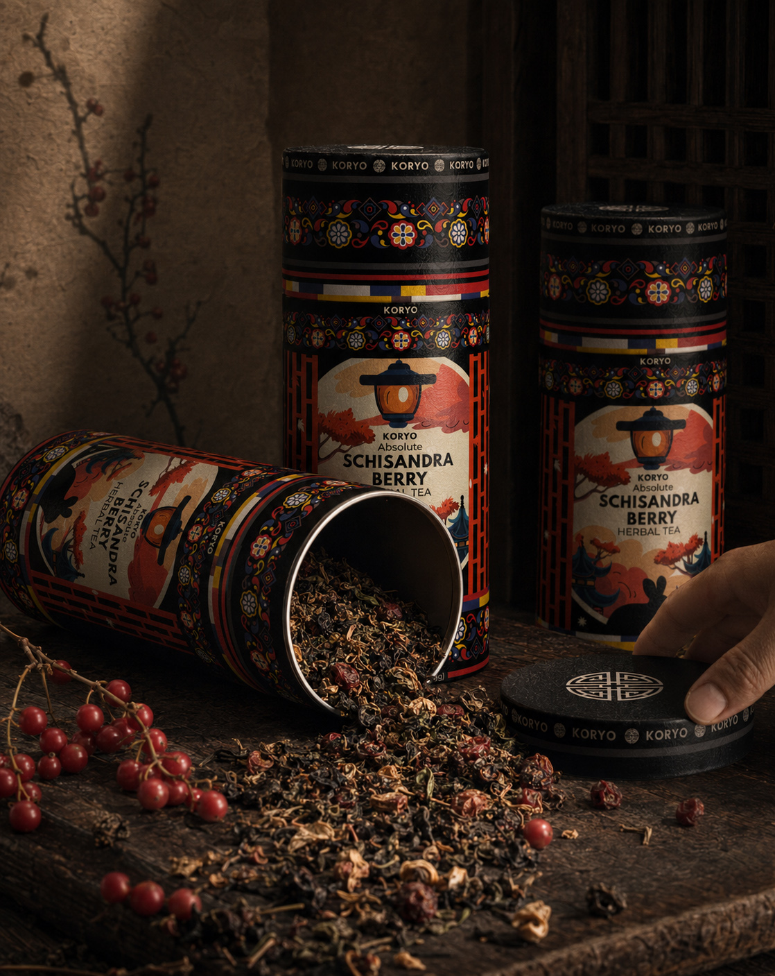

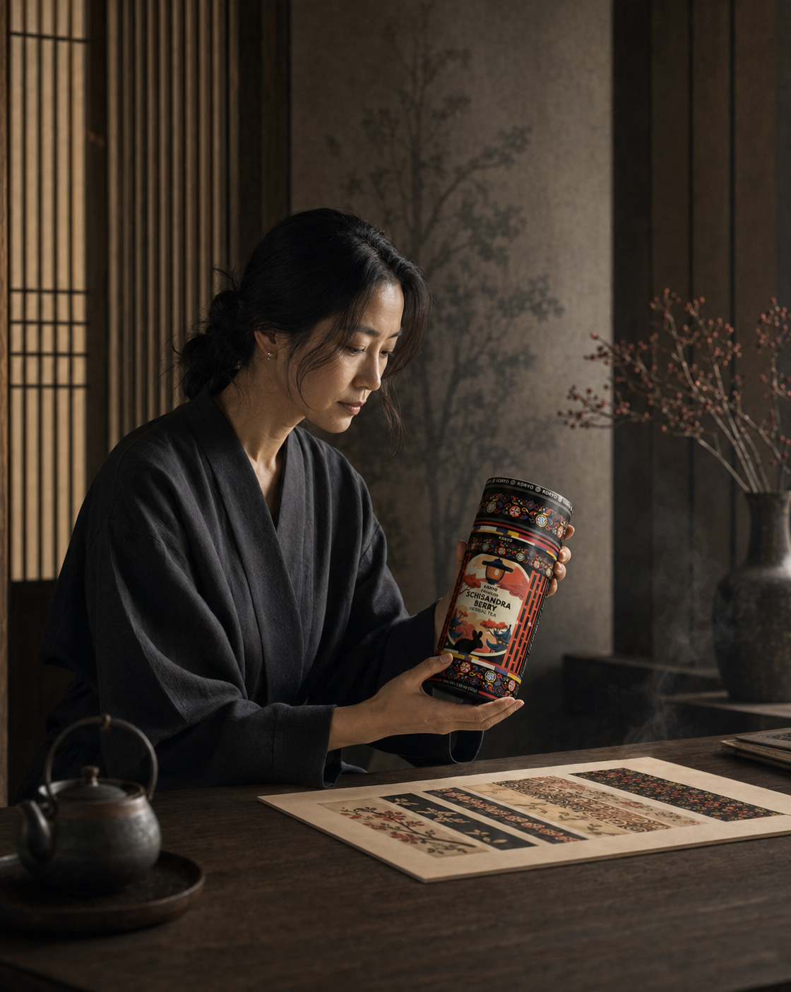
PROFESSIONAL VISUAL IDENTITY AS THE KEY TO SUCCESS

Conclusion:
The Strongest Premium Tea Packaging Doesn’t Simply Present A Product — It Transforms Cultural Heritage Into Recognition, Meaning, And Lasting Brand Value.
Exceptional Premium Tea Packaging Design begins with more than visual appeal. It requires cultural understanding, strategic positioning, product clarity, and a visual system capable of expressing tradition without becoming predictable or ornamental. For KORYO®, the objective extended beyond designing a label for Schisandra Berry Herbal Tea. NF Creative Studio developed a complete Tea Packaging And Brand Identity System connecting Korean heritage, botanical storytelling, contemporary aesthetics, packaging structure, and premium market positioning.
More than 40 original packaging concepts were created, compared, evaluated, and progressively refined. Each direction explored a different relationship between cultural authenticity, product character, typographic hierarchy, illustration, ornament, color, and shelf recognition. This disciplined process revealed which elements needed to be preserved, simplified, strengthened, or removed before one definitive visual territory could be established.
Korean cultural heritage was translated through architectural references, controlled ornamental rhythm, traditional symbolism, balanced proportions, and refined visual restraint. Rather than reproducing historical motifs as decoration, the final Cultural Packaging Design reinterpreted them within a contemporary identity that feels authentic in origin, premium in perception, and internationally relevant in expression.
The cylindrical canister became an active part of the design system. Typography, illustration, botanical elements, ornamental borders, and product information were structured to create continuity across the complete packaging surface. Every viewing angle contributes to the same coherent narrative, allowing the identity to remain recognizable whether presented frontally, rotated in physical use, photographed for editorial communication, or displayed within e-commerce and mobile environments.
Botanical storytelling was integrated with equal precision. Schisandra berries, branches, natural forms, and illustrative details communicate the character of the herbal tea while remaining inseparable from the broader Korean-inspired visual language. The result avoids conventional botanical packaging clichés and establishes a more distinctive, ownable, and emotionally resonant product identity.
What began as the development of one tea label became a scalable Premium Packaging And Brand Identity Ecosystem. Consistent principles for composition, typography, color, illustration, ornament, and information hierarchy now provide KORYO® with a structured foundation for future tea varieties, collection expansion, retail presentation, digital commerce, and long-term brand communication.
If you are looking to create distinctive Product Packaging Design or build a visual identity capable of connecting cultural meaning with contemporary commercial relevance, NF Creative Studio transforms strategic thinking, research, and creative exploration into premium brand experiences designed for recognition, consistency, and lasting value.
“The Most Enduring Packaging Identities Do More Than Present A Product. They Preserve Meaning, Create Recognition, And Transform Cultural Heritage Into A Brand Experience Designed To Last.”
FINAL THOUGHT
Great Brands Are Never Designed In A Single Moment.
They are discovered through curiosity, shaped by strategy, refined through hundreds of creative decisions, and perfected by an uncompromising commitment to detail.
Every sketch.
Every concept.
Every refinement.
A step closer to a brand capable of telling a story long before anyone experiences the product itself.
For KORYO, packaging became more than a container.
It became the first chapter of the brand.
WHERE HERITAGE BECOMES A MODERN ICON.
DESIGN IMPACT & BRAND VALUE
WHERE STRATEGIC DESIGN CREATES LASTING BRAND POTENTIAL
DISTINCTIVE SHELF
IDENTITY
One Recognizable Presence Within The Premium Tea Category
A high-contrast packaging identity designed to create immediate visual separation while preserving the refinement, cultural depth, and authority expected from a premium tea brand.
CORE VIEWING
CONDITIONS
Designed For The Shelf, Product Page, And Smaller Digital Formats
A controlled front-facing hierarchy preserves product recognition across physical presentation, e-commerce environments, campaign imagery, and reduced-scale digital applications.
CONNECTED BRAND
ENVIRONMENTS
One Consistent System Across Physical And Digital Presentation
The packaging identity establishes a coherent foundation for retail displays, online product pages, editorial campaigns, branded communications, and future customer touchpoints.
CHARACTER
DIMENSIONS
Cultural Meaning, Botanical Expression, And Contemporary Restraint
Three complementary dimensions shape the brand atmosphere—combining Korean-inspired references, the natural character of Schisandra, and a refined contemporary visual language.
RECURRING
BRAND CODES
Five Elements Strengthening Recognition Across Every Expression
Architecture, ornament, typography, color, and botanical illustration work as repeating visual signals—building continuity, distinction, and stronger brand recall throughout the system.
SCALABLE IDENTITY
SYSTEM
One Unified Foundation For Future Brand Development
A clearly defined visual system enables future products, formats, communications, and brand extensions to evolve without weakening the recognizable character of KORYO®.
STRATEGIC SUMMARY
The impact of the KORYO® identity is not dependent on one visual moment. It is created through the disciplined repetition of recognizable elements across every physical and digital expression—transforming packaging into a coherent foundation for long-term brand development.
DESIGNED FOR RECOGNITION. BUILT FOR CONTINUITY.
Proud Clients




























































The Team Behind the Project - Led by Creative Director
The Team Behind the Project:
Every Infinity Design Studio project is personally led and directed by Filip Narančić – Founder & Creative Director.
With a unique blend of creativity, strategy, and precision, Filip ensures that each project delivers premium quality, timeless design, and measurable impact.
Infinity Design Studio operates with a boutique approach, where every detail is carefully crafted, and each solution is tailored to the client’s vision and market demands. By combining multidisciplinary expertise with hands-on leadership, the studio transforms every project into a distinctive brand experience.

Filip Narančić
Founder & CEO – Infinity Design Studio

SPECIALIZED IN:

Short biography
Born on June 24, 1982, in Valjevo, Filip Narančić turned his passion for architecture and design into a thriving career. He graduated from the Faculty of Technical Sciences in Novi Sad, Department of Architecture and Urbanism. During his studies, he launched a pilot project that later evolved into today’s Infinity Design Studio.

What Our Clients Say About Us?
Trusted by global brands and visionary entrepreneurs — hear what they say about working with Infinity Design Studio.

Filip has done excellent work for our project! He’s quick and delivers great designs. Very attentive, very easy to work with, listens to and understands what I am trying to get done immediately. Thanks! Happy to work with him again!

EXCELLENT!!! Filip is the best designer and even the best contractor I have ever worked with. Hecreated an awesome design and worked with me tirelessly from its greatness to its perfection. Now I havethe most gorgeous packaging on the market, and all my competitors are screwed. Hooray :-)!

Jakub.Novotny7
COPPER GEMZ
This designer is AMAZING! I can’t believe how easy it was to work with him on all the changes we madeto our box. He was so positive and encouraging, with great design ability! Highly recommended!

XoginaU
Dr. P RX
I NEED MORE THAN 5 STARS TO RATE FILIP. His relentless commitment and creativity made thisproject a dream come true. Highly recommended!

Wong.Jameson
UNO DOGGO
We needed a new label for our maple syrup. From start to finish, Filip was right on top of the design, anychanges we requested, and was extremely good at communicating. We loved his style and highly recommend working with him!

The Gateway Farm
THE GATEWAY FARM
Filip is a very enthusiastic designer, proactively looking for various solutions and flexible in terms ofworking and communication. I am very pleased with the final design and our teamwork!

JaanP
LUCIDKITCHEN
Filip was wonderful to work with! As a first-timer in product packaging design, I just asked for eye-catching packaging. He exceeded all of our expectations, and we highly recommend working with Filip – you won’t be disappointed!

Fatime.Perazic
TRIDENT POSEIDON
I really enjoyed working with Filip. He is very hardworking, and the service is truly excellent!

AromapetD
AROMAPET
Worked perfectly together and carried out extremely quickly with corrections and changes.

MarceQ
BRAUEREI 2572
Excellent professional, quick service. We recommend working with him!

Moltres
BROMELIFE
“Filip is an extremely talented designer. He was a pleasure to work with throughout this process. In addition to being very responsive, he was able to take a general idea and turn it into something we truly loved. Highly recommend!”

Jrossd
ECOMMDISTRIBUTION, ASHBROOK OUTDOORS
This designer’s professionalism and creativity are truly commendable. We’re delighted with his work andhighly recommend collaborating with him. His talent and dedication consistently deliver outstandingresults.

Harmouch.Fk
NUTRIVEG LAB
Let’s Work Together
Infinity Design Studio is your trusted creative partner for Strategic CASE STUDIES that strengthen Brand Authority, build customer trust, and transform successful projects into powerful business assets.
Explore More Stunning Work

Tell Us What You’re Building.
Share what you already know—what you are creating, changing, improving, launching, or trying to solve. We’ll use that context to understand the project and determine the right next step.
You do not need a perfect brief to begin. Clear context is enough.