Kaapkloof Manor® – Elevating A Luxury Wine Brand Through Timeless Label Design

Designing A Timeless Wine Identity That Reflects Heritage, Sophistication, And Premium Craftsmanship.

COMPANY - VICAMPO.DE GmbH - KAAPKLOOF MANOR

Client

Vicampo.de GmbH

Info

Industry: Food & Drink, Retail

Market: Germany, Austria, Switzerland, Netherlands,
South Africa

Project Type: Wine Label Design, Branding, Packaging,
Visual Identity

Products

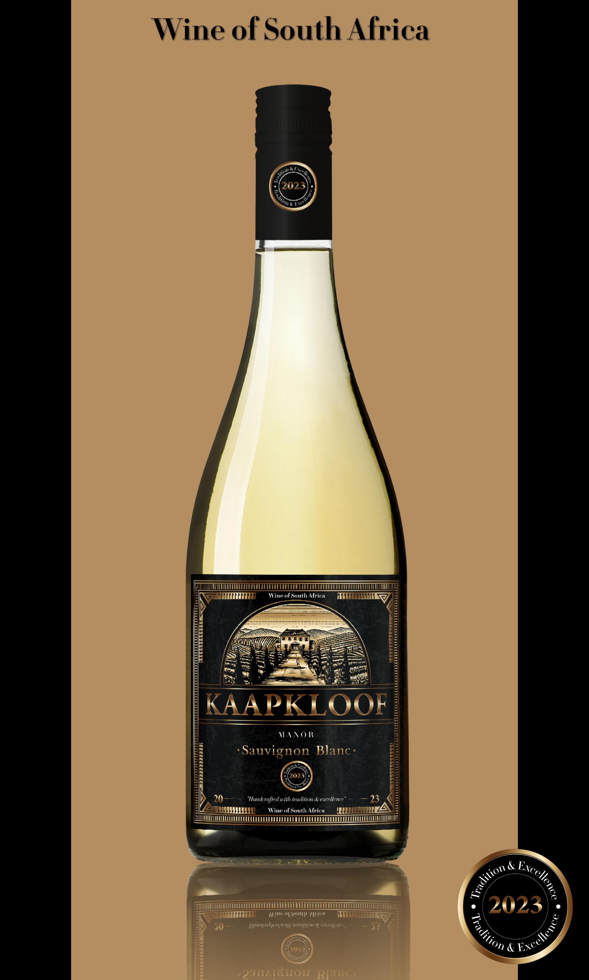
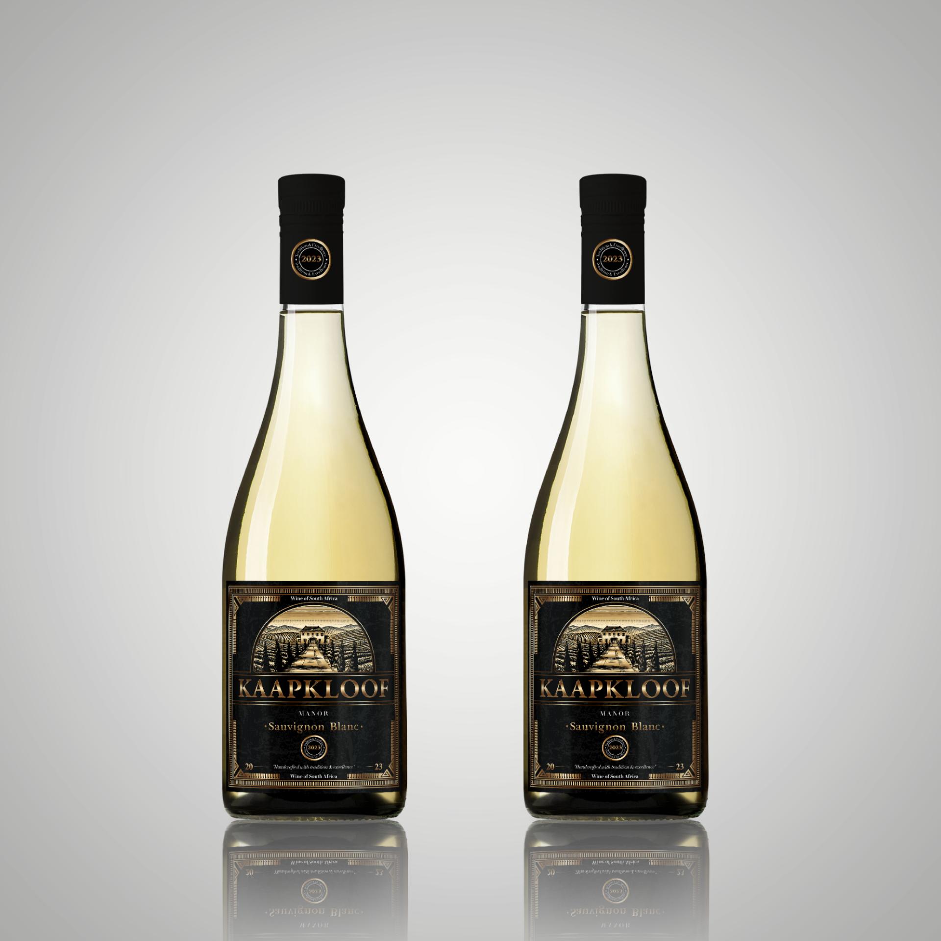
Kaapkloof Manor – Black Label
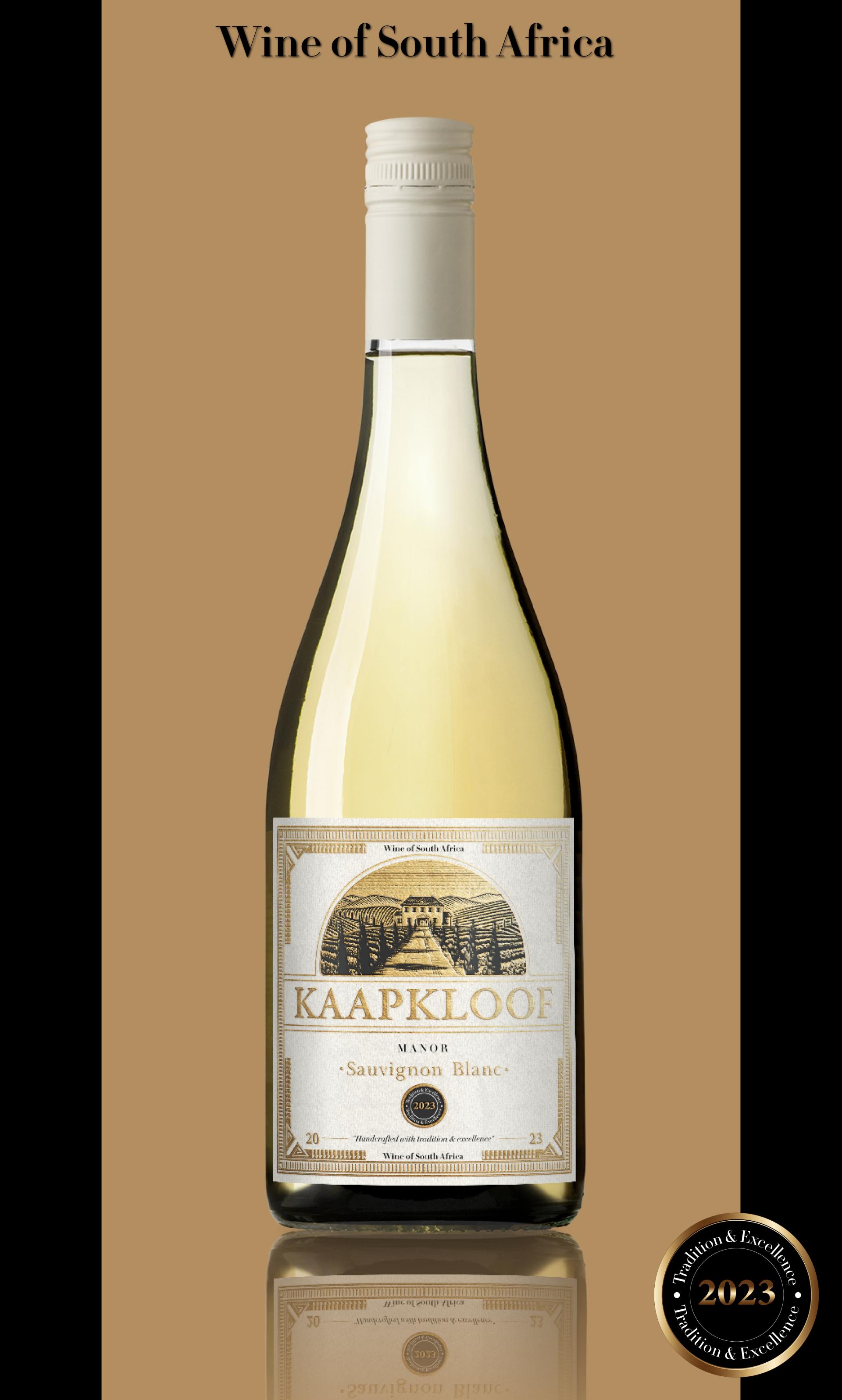
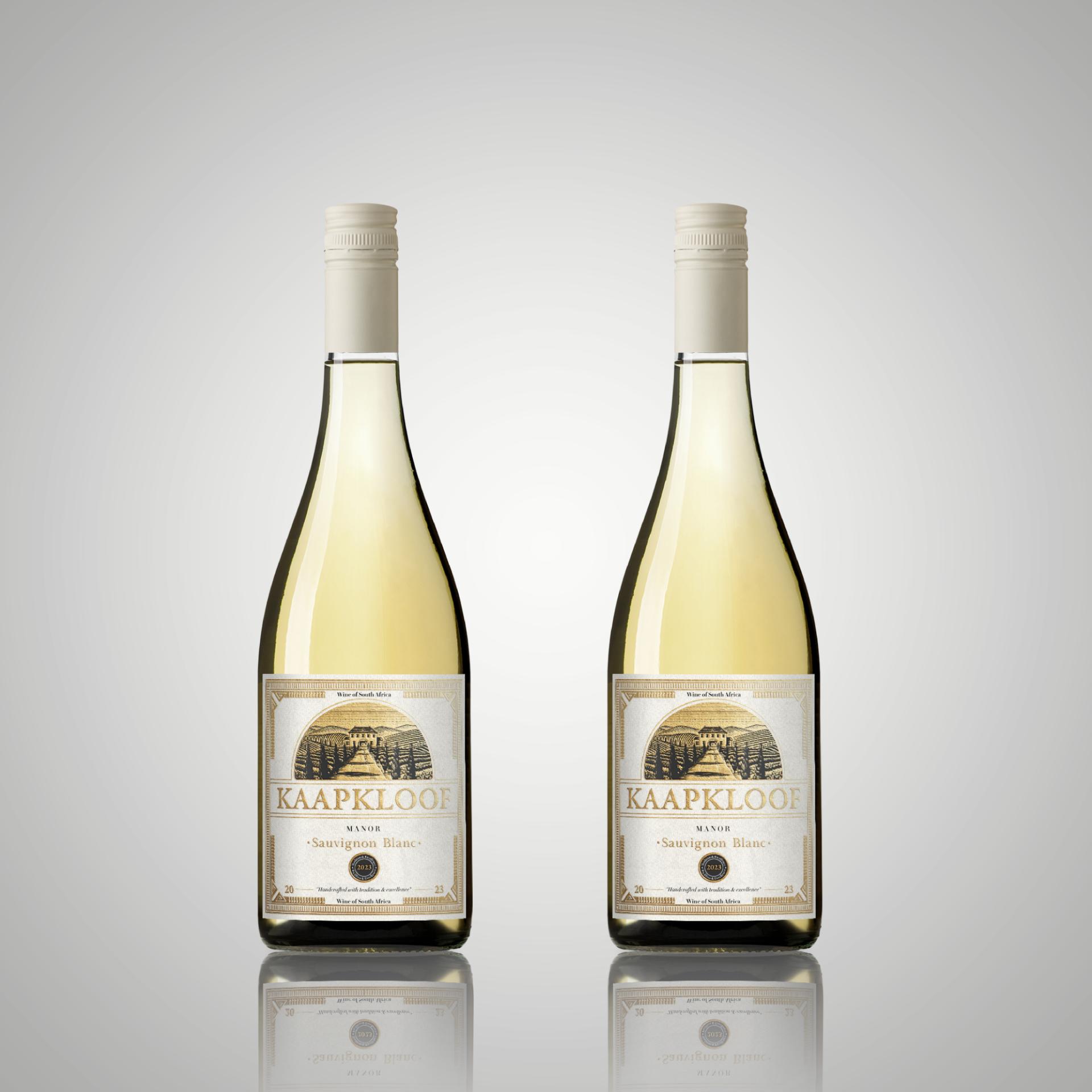
Edition & White Label Edition

Creating a Timeless Identity for a Luxury Wine Brand

Kaapkloof Manor is a high-end South African wine brand inspired by the region’s rich winemaking heritage, breathtaking landscapes, and timeless elegance. The brand’s goal was to develop a sophisticated and artisanal label design that reflects tradition, craftsmanship, and exclusivity, making it stand out in the premium wine market.

Kaapkloof Manor wines cater to elite wine connoisseurs, collectors, and fine-dining enthusiasts across Germany, Austria, Switzerland, and the Netherlands —markets that value heritage, authenticity, and exceptional craftsmanship.
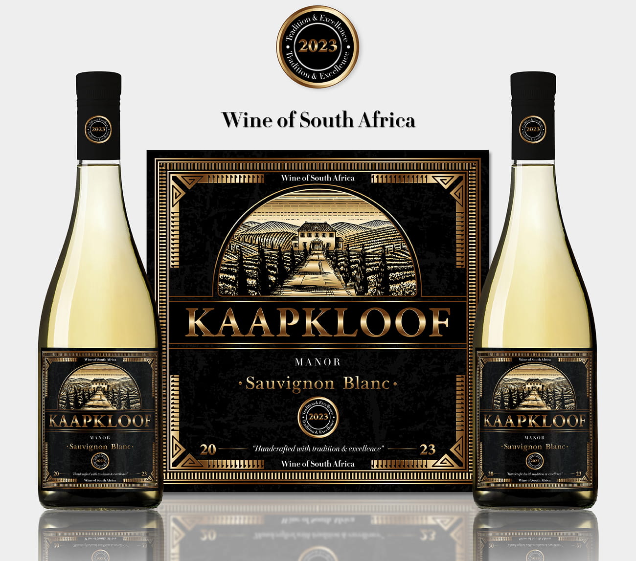
Exclusive Visual Identity:

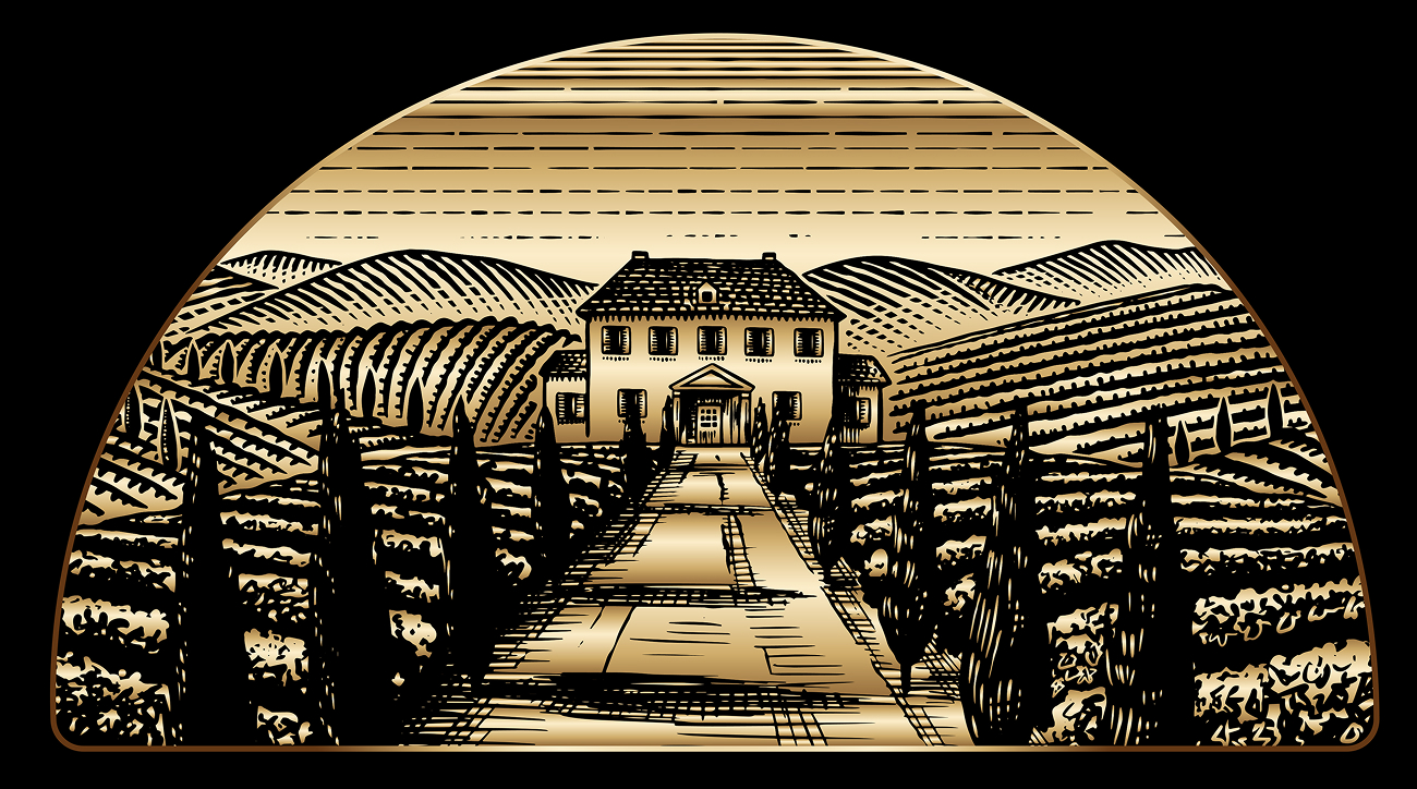
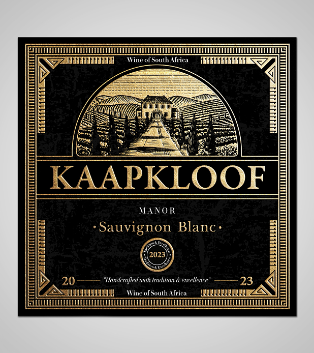
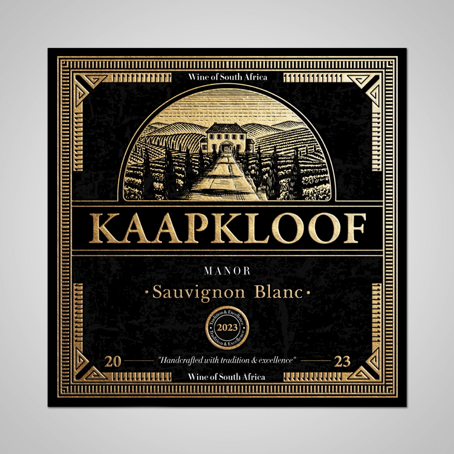
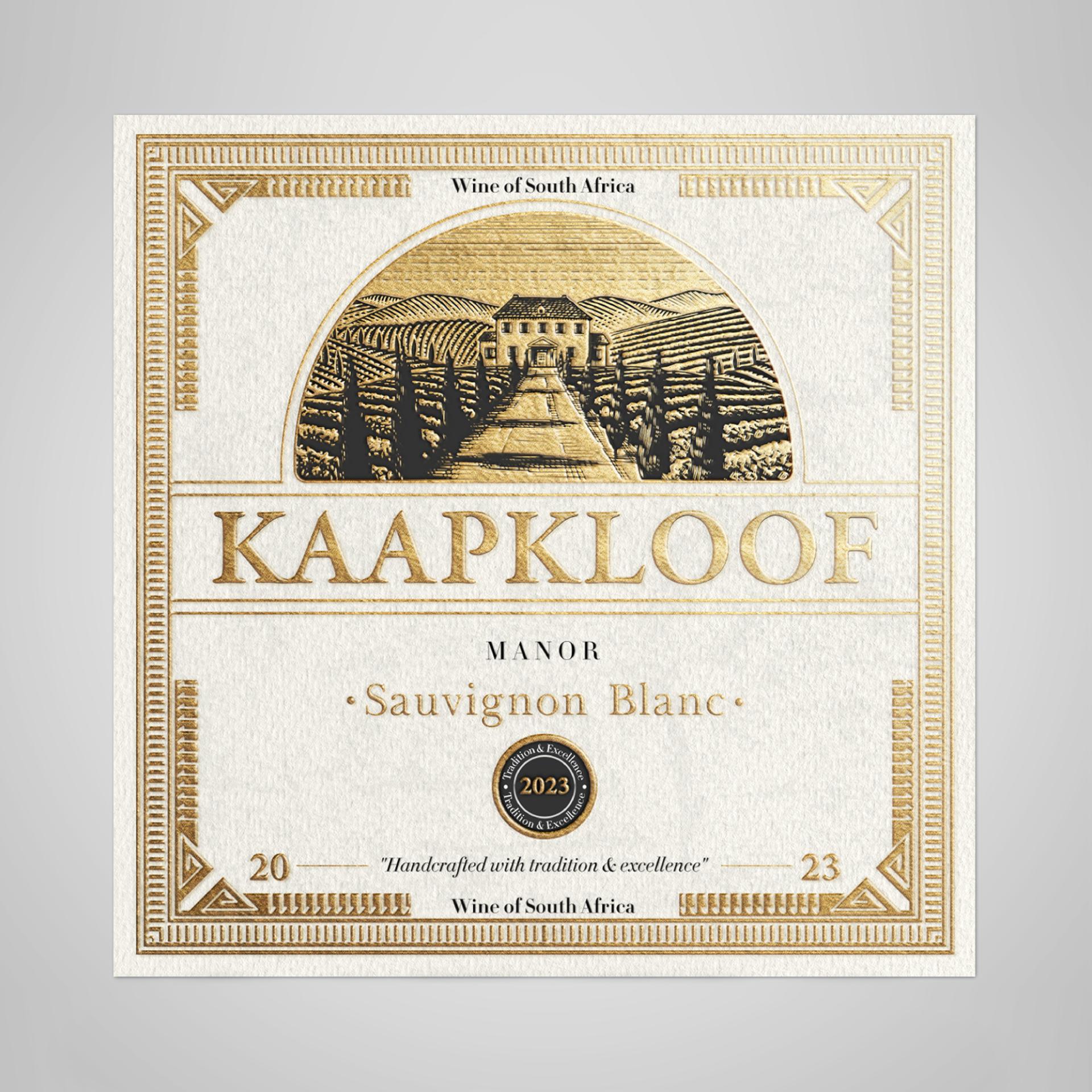
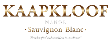
The Kaapkloof Manor label blends heritage and sophistication through engraved illustrations , elegant serif typography , and gold-foil accents . Inspired by Cape Dutch architecture , it conveys tradition and exclusivity , ensuring a timeless, premium appeal that stands out in the luxury wine market .

Clear Product Differentiation:

With a bold typographic hierarchy, intricate engraving details, and ornate gold accents, the label establishes instant recognition. The classic yet refined aesthetic sets it apart, appealing to wine connoisseurs who value heritage, authenticity, and craftsmanship.


Functionality for Different Markets:

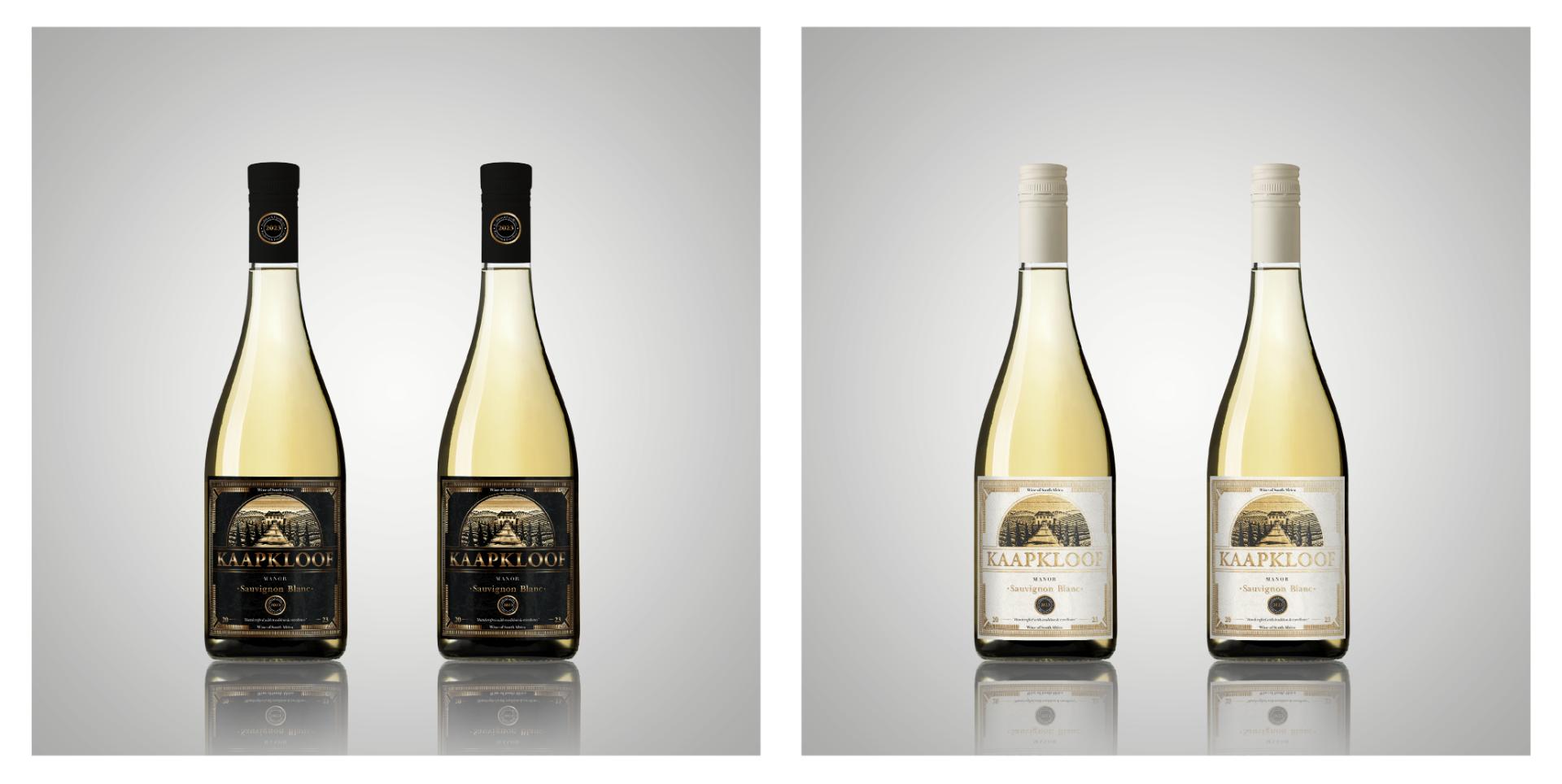
Designed for global appeal, the label balances tradition with versatility. The black-and-gold version exudes luxury, while the lighter variation offers a fresh, premium look. This adaptability ensures a strong presence in diverse markets, from fine dining to exclusive retail.

The Challenge:

THE NEED FOR A LUXURIOUS VISUAL IDENTITY

Kaapkloof Manor sought a high-end, visually stunning label that would:

• Establish a strong luxury presence in the premium wine industry.
• Balance classic sophistication with a modern, exclusive feel.
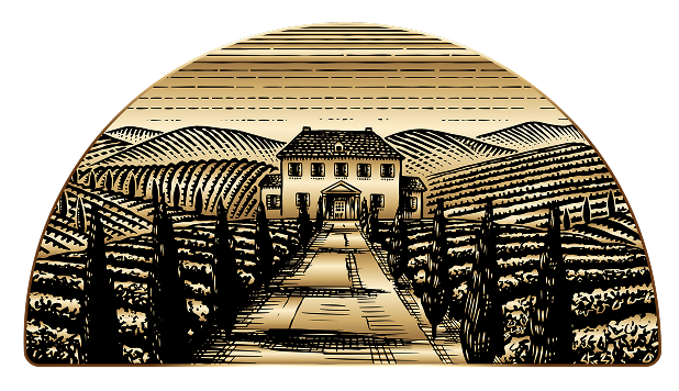
• Feature engraved-style illustrations of vineyards and a Cape Dutch Manor, reinforcing the brand’s deep heritage.
• Use gold foil detailing , embossed typography, and ornamental borders to convey artisanal craftsmanship and prestige.

Additionally, the label needed to be adaptable for different market preferences, requiring a design approach that blends elegance, heritage, and visual impact.

Solution:

THE NEED FOR A LUXURIOUS VISUAL IDENTITY

To achieve the brand’s premium vision, we developed two distinct label variations, both maintaining the same level of luxury and storytelling.

The Black Label Edition – Opulent & Bold

  • Deep black background for a luxurious, striking aesthetic.
  • Gold foil typography and accents to highlight prestige and exclusivity.
  • Engraved illustration of a Cape Dutch estate surrounded by vineyards.
  • Elegant filigree and ornamental details reinforcing the premium identity.
  • This version exudes power and luxury, making it perfect for exclusive wine tastings, fine-dining settings , and high-end collectors.

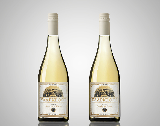
The WHITE Label Edition – Classic & Refined

  • Warm off-white textured background for a timeless, sophisticated appeal.
  • Gold foil details blend harmoniously for a soft yet high-class aesthetic.
  • More traditional and subtle elegance, ideal for gifting and wine collectors.
  • This version caters to an audience that appreciates understated, classic luxury while maintaining the brand’s signature exclusivity 

FINALIZATION & TECHNICAL ADAPTATION

Both label designs were optimized for high-quality printing techniques, ensuring compatibility with premium textured paper and foil stamping. The result is a high-end, market-ready visual identity that embodies the art of winemaking and heritage of South African vineyards.

Results:

A Stronger, More Luxurious Brand Identity

The new label design achieved:
• A premium, sophisticated brand image tailored for the high-end wine market.
• Greater shelf impact and recognizability, making the product stand out.
• Stronger emotional connection with luxury consumers and wine collectors.
• Versatility for both bold and traditional market preferences.

Conclusion:

Visual Identity as The Key to Success

This project demonstrates how strategic label design is essential for positioning a wine brand in the high-end market. Through detailed research, meticulous craftsmanship, and premium print techniques, we created a label that is not only aesthetically stunning but also reinforces the Kaapkloof Manor legacy.

“Looking to create a wine label that blends tradition, luxury, and storytelling?”, contact Infinity Design Studio today.

IMPACT & METRICS

Increase in Perceived
Luxury Value

0 %

The handcrafted illustration and gold foil stamping dramatically enhanced the premium perception of the wine.

New Stockists
Across Europe

+ 0

Following the redesign, the wine was picked up by high-end retailers and specialty wine shops in 7 EU countries.

More Engagement
on Wine Platforms

0 x

Label aesthetics and storytelling led to increased ratings, reviews, and user interaction on Vivino and similar platforms.

Rise in Direct-to-
Consumer Orders

0 %

Consumers associated the packaging with tradition, trust, and sophistication — validating the cultural storytelling approach.

Improved Brand
Recall at Tastings

0 %

Unique visual elements helped wine lovers easily remember and recommend Kaapkloof after sampling events.

Sales Increase in
Luxury Gift Segment

0 %

The refined design positioned the wine as a premium gift item, leading to significantly higher sales in boutique gift stores and curated holiday collections.

Proud Clients

The Team Behind the Project - Led by Creative Director

The Team Behind the Project:
Every Infinity Design Studio project is personally led and directed by Filip Narančić – Founder & Creative Director.

With a unique blend of creativity, strategy, and precision, Filip ensures that each project delivers premium quality, timeless design, and measurable impact.

Infinity Design Studio operates with a boutique approach, where every detail is carefully crafted, and each solution is tailored to the client’s vision and market demands. By combining multidisciplinary expertise with hands-on leadership, the studio transforms every project into a distinctive brand experience.

Color portrait of Filip Narančić, Founder and CEO of Infinity Design Studio.

Filip Narančić

Founder & CEO – Infinity Design Studio

SPECIALIZED IN:

Architecture and Urbanism
Interior Design
Graphic Design and Professional Photography
Video Production and Drone Filming
Website and Mobile App Design
3D Modeling and Rendering

Short biography

Born on June 24, 1982, in Valjevo, Filip Narančić turned his passion for architecture and design into a thriving career.
He graduated from the Faculty of Technical Sciences in Novi Sad, Department of Architecture and Urbanism. During his studies, he launched a pilot project that later evolved into today’s Infinity Design Studio.

What Our Clients Say About Us?

Trusted by global brands and visionary entrepreneurs — hear what they say about working with Infinity Design Studio.

Explore More Stunning Work

Translating the Boston City Grid engraving into a compelling visual story required more than standard product footage.
The goal was to create a modern, minimalist, and recognizable visual identity for a leading karaoke system company based in
MIXUP LABS required a modern and minimalist label design for their LiKE mono-flavored e-liquid range that communicates freshness and simplicity

Tell Us What You’re Building.

Share what you already know—what you are creating, changing, improving, launching, or trying to solve. We’ll use that context to understand the project and determine the right next step.

You do not need a perfect brief to begin. Clear context is enough.

We’ll Review Your Enquiry And Get Back To You Within 24 Hours.

Personal Information
Start with the essentials so we know who we’re speaking with and how to reach you. The project itself becomes clearer in the next steps.
Project Details
Tell us what you’re working on, what needs to change, and what outcome you want the project to support. A perfect brief is not required—clear context is enough to begin.
Budget & Timeline
Share the investment range and timeline you currently have in mind. These details help us understand the scale, priorities, and most appropriate way to structure the engagement.
Final Note
Add anything that would help us understand the project more clearly—important context, existing links, constraints, collaborators, references, or questions you would like us to consider before we respond.

Subscribe to Our Newsletter

Selected studio updates, new work, editorial perspectives, and professional insights — delivered when there is something worth sharing.

Occasional updates from Infinity Design Studio × NF Creative Studio. You can request removal at any time.

Schedule a Call

Tell us a little about your project, what you would like to discuss, and when you would prefer to connect.

We’ll review your request and follow up to confirm a suitable time.