

ACCENTRA® – Designing A Seasonal Collection That Transforms Everyday Care Into A Premium Brand Experience
Creating A Distinctive Front-Facing Visual Language That Strengthens Brand Recognition Through Consistency, Elegance, And Gift-Ready Presentation.
COMPANY - ACCENTRA GmbH & Co. KG

Client:
ACCENTRA GmbH & Co. KG
COUNTRY: Germany, Europe

Info:
Industry: Amazon, Cosmetics & Beauty, E-Commerce, Fashion
Industry:
• Cosmetics & Beauty
• Bath & Body
• Toiletries
• Gift Packaging
Project Category:
• Seasonal Cosmetic Packaging Design
• Front-of-Pack Visual Concept
• Product Family Design Direction
• Open-Box Gift Set Design
Target Markets:
• Germany
• Austria
• European Union
• Drugstore & Perfumery Retail
Seasonal Visual System:
• Front-Facing Packaging Identity
• Spring/Summer Creative Direction
• Watercolor Botanical Language
• Pastel Color Architecture
• Handwritten Display Typography
• White Tea Product Expression
• Format-Responsive Composition
• Gift-Oriented Visual Presentation
• Retail-Facing Product Recognition
Collection:
• ACCENTRA® Spring/Summer Toiletries Collection
• White Tea Bath & Body Range
• Shower Gel Packaging Concepts
• Tube, Bottle & Pump Formats
• Open-Box Gift Set Presentation
• Coordinated Seasonal Product Family
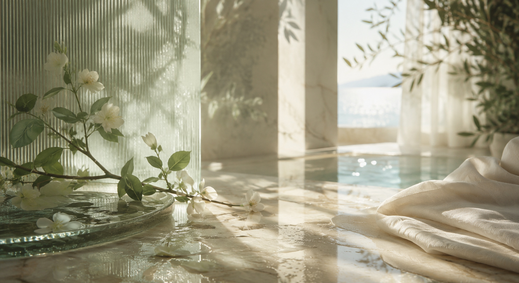
Turning Seasonal Atmosphere Into A Distinctive Front-Facing Experience
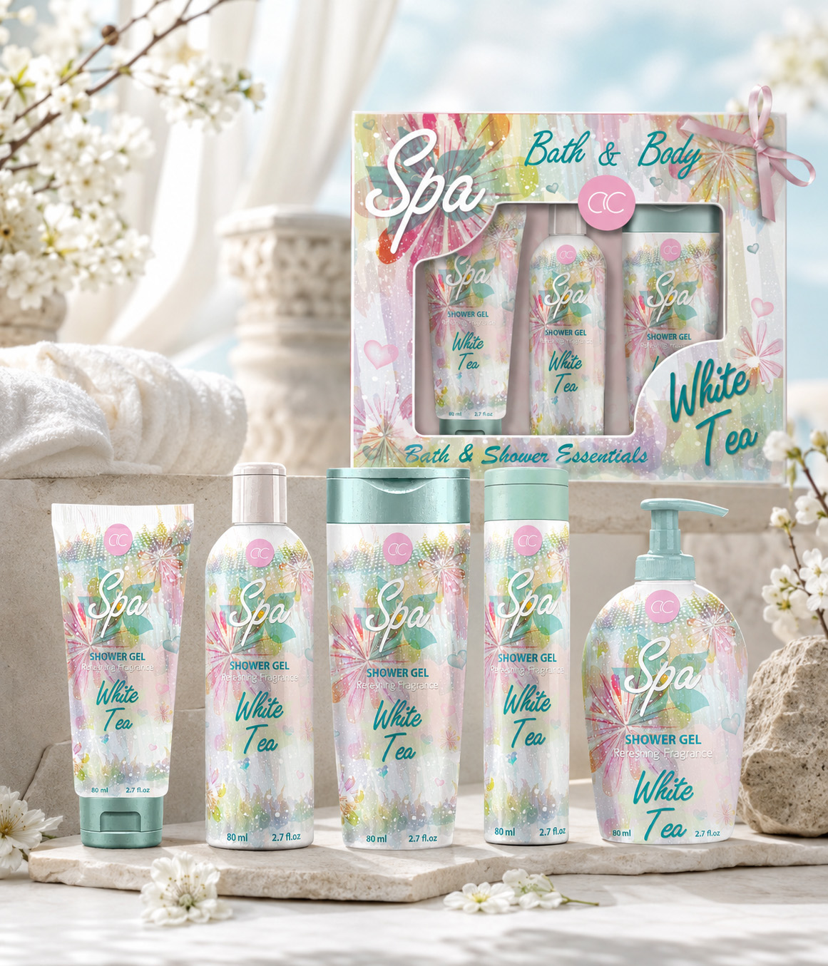
For ACCENTRA®, the Spring/Summer Toiletries Collection was developed around one clear objective: to create an immediately recognizable Front-of-Pack Visual Concept capable of expressing freshness, softness, and gift-oriented appeal at first glance. Rather than relying on seasonal decoration alone, the final direction combined watercolor botanical imagery, a controlled pastel palette, expressive display typography, and carefully balanced product naming to establish a cohesive visual presence across tubes, bottles, pump formats, and the open-box gift presentation.
Each application was treated as part of the same visual family, while allowing the composition to respond naturally to the proportions of the visible packaging surface. The result was not a technical redesign of every label panel, but a focused Cosmetic Packaging Design concept built around what customers encounter first: the front-facing image of the product and the emotional promise it communicates. This approach connected the individual formats, strengthened the seasonal character of the collection, and extended the same visual idea into a more complete gift experience—establishing the creative foundation for the Project Scope, Creative Process, Strategic Focus, Front-Facing Design System, and Final Deliverables presented below.
Project Scope:
• Seasonal Visual Concept Development
• Front-Facing Packaging Design
• Product Family Visual Direction
• Watercolor & Botanical Art Direction
• Pastel Color Palette Development
• Display Typography Direction
• Cross-Format Front Composition
• Open-Box Gift Set Design
• Final Concept Selection & Refinement
• Premium Product Visualization
Creative Process:
• Existing Collection Context Review
• Project Brief & Category Review
• Seasonal Territory Definition
• Visual Reference Mapping
• Watercolor & Botanical Exploration
• Front-of-Pack Concept Studies
• Color Relationship Exploration
• Typography Direction Development
• Cross-Format Composition Testing
• Open-Box Gift Presentation Studies
• Comparative Concept Evaluation
• Final Direction Refinement
• Product Visualization Development
Strategic Focus:
• Immediate Front-Facing Impact
• Spring/Summer Freshness
• Premium Yet Accessible Character
• One Identity Across Different Formats
• Recognition Without Mechanical Repetition
• Giftability & Collection Completeness
• Retail-Facing Differentiation
• Emotional Product Appeal
• Softness Balanced With Visual Clarity
• Consistent Seasonal Recognition
• Memorable Collection Character
Front-Facing Design System:
• Primary ACCENTRA® Recognition
• Spa Focal Typography
• White Tea Naming Hierarchy
• Watercolor Botanical Field
• Controlled Pastel Color Relationships
• Format-Responsive Front Composition
• Clear Product-Type Recognition
• Balanced Decorative Density
• Consistent Seasonal Visual Rhythm
• Shelf-Facing Product Presence
• Open-Box Window Presentation
• Distinctive Final Collection Identity
Final Deliverables:
• Seasonal Visual Direction
• Front-Facing Packaging Concept System
• Tube, Bottle & Pump-Front Concepts
• Watercolor & Botanical Artwork Directions
• Color Palette Directions
• Typography & Hierarchy Explorations
• Packaging Composition Studies
• Comparative Concept Presentations
• Selected Final Front-Facing Direction
• Open-Box Gift Set Design
• Premium Product Visualizations
Transforming Seasonal Atmosphere Into A Distinctive Front-Facing Packaging Experience
The ACCENTRA® Spring/Summer Toiletries Collection was developed around one clearly defined objective: to create an immediately recognizable front-facing packaging concept capable of expressing freshness, softness, and seasonal beauty at first glance.
Rather than treating each product as an isolated design, the collection was shaped through one connected visual direction. Watercolor botanical imagery, a refined pastel palette, expressive Spa typography, and the White Tea product identity established a light and gift-oriented character across tubes, bottles, pump formats, and the open-box presentation.
The primary challenge was not the technical development of every packaging surface. It was defining how the visible face of each product could communicate the same atmosphere while responding naturally to different proportions and formats.
The final concept preserved a consistent seasonal expression without forcing every package into an identical composition. Each front-facing application remained visually connected to the wider collection, while the open-box design extended the same creative language into a more complete and memorable gift experience.
Project Scope
- Front-Facing Packaging Concept developed for tubes, bottles, and pump formats
- Seasonal Visual Direction shaped through watercolor botanicals, pastel tones, and expressive typography
- Cross-Format Composition Development adapted to different visible packaging proportions
- Product Family Visual Cohesion connecting individual formats through one recognizable creative language
- Open-Box Gift Set Design extending the product identity into a coordinated presentation
- Final Concept Refinement and Product Visualization presenting the completed collection as one unified seasonal experience
THE PROJECT WAS NOT DEFINED BY HOW MUCH INFORMATION COULD FIT ON THE PACKAGE, BUT BY HOW CLEARLY ITS FRONT-FACING DESIGN COULD EXPRESS THE SEASON.
SEASON
SHAPED
THE ATMOSPHERE
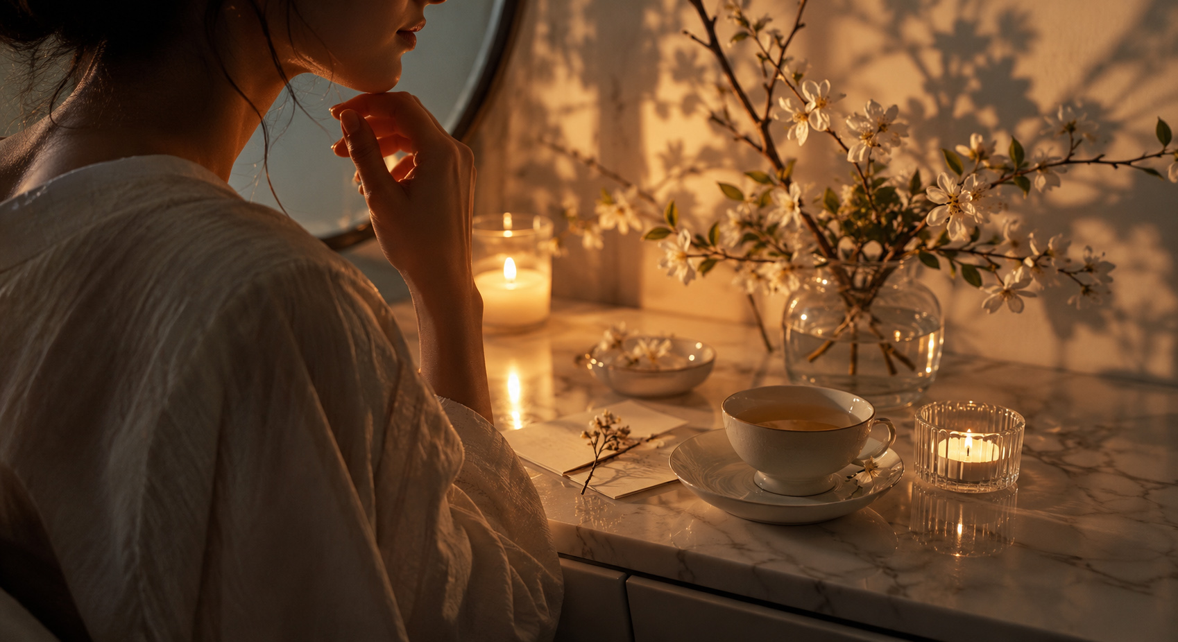
Spring and summer informed the collection’s emotional direction, shaping the pastel palette, watercolor botanicals, and visual lightness that gave the front-facing packaging an immediate sense of freshness, softness, and seasonal distinction.
CONSISTENCY SHAPED
THE COLLECTION
A shared visual language connected tubes, bottles, pump formats, and visible gift packaging, while each composition was adjusted to the proportions of its surface without losing recognition, balance, or collection-wide cohesion.
GIFTABILITY SHAPED
THE EXPERIENCE
The open-box presentation extended the front-facing concept beyond individual products, transforming the collection into a more complete and gift-oriented experience built around anticipation, visual harmony, and considered everyday care.
PROJECT OVERVIEW
The ACCENTRA® Spring/Summer Toiletries Collection was shaped by the challenge of creating a distinctive seasonal presence within an established bath and body product world. The collection needed to feel fresh, visually coordinated, and immediately appealing while preserving the accessible, gift-oriented character of the brand.
The project focused on the front-facing packaging concept—the visible part of the product responsible for communicating seasonal atmosphere, product character, and collection recognition at first sight. Rather than extending into a complete technical label system, the design process explored how watercolor botanical imagery, pastel color relationships, expressive typography, product naming, and composition could work together as one coherent visual language across tubes, bottles, pump formats, and open-box gift packaging.
A series of visual directions and front-facing composition studies were developed and evaluated before the final concept was selected and refined. The completed direction balanced softness with clarity, allowing each packaging format to respond naturally to its own proportions while preserving the same recognizable Spring/Summer identity throughout the collection.
THE PROJECT INCLUDED
- Seasonal Visual Direction
Defining a clear Spring/Summer atmosphere through watercolor botanicals, pastel tones, visual lightness, and a refined beauty-oriented expression. - Front-Facing Packaging Concept Development
Creating the primary visible compositions responsible for immediate recognition, product character, and seasonal impact. - Cross-Format Visual Adaptation
Adjusting illustration, typography, hierarchy, and decorative balance across different front-facing packaging proportions. - Open-Box Gift Set Design
Extending the selected visual direction into a coordinated presentation that connected the products and completed the gift experience.
The objective was not to redesign every technical surface of the packaging, but to create one distinctive front-facing visual world capable of making the complete collection feel fresh, connected, and worth giving.
FRONT-FACING IMPACT
DEFINED THE CONCEPT
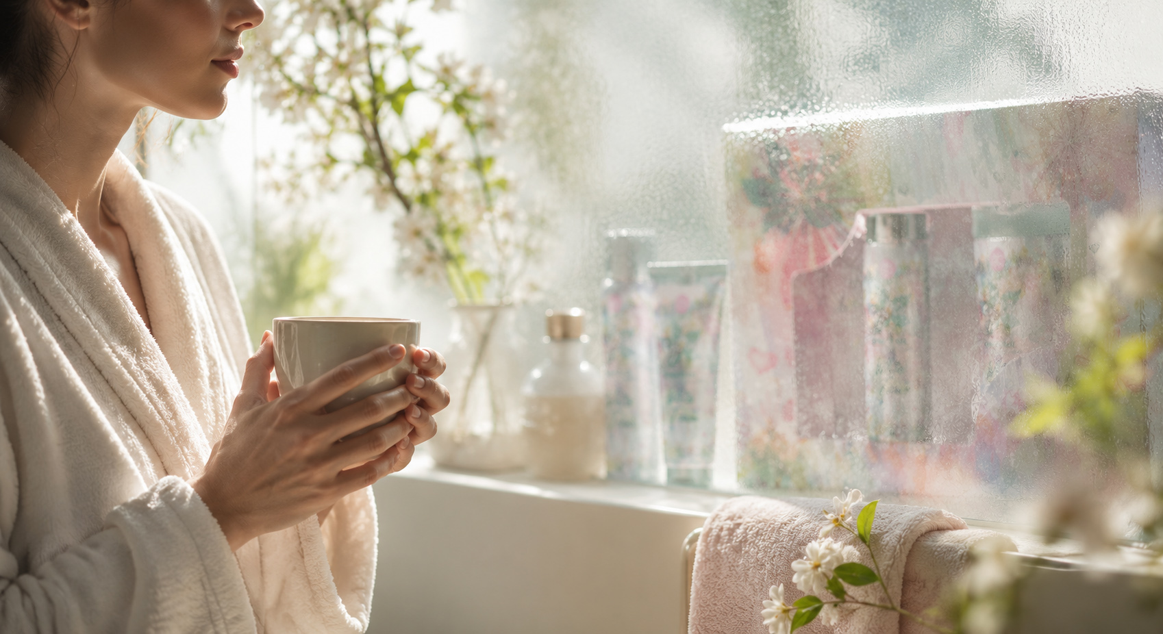
The visible face of each product became the central design focus, combining watercolor botanicals, pastel contrast, expressive Spa typography, and clear White Tea naming to create immediate seasonal recognition.
FORMAT ADAPTATION
PRESERVED COHESION
Each composition was adjusted to the proportions of tubes, bottles, and pump formats, allowing one visual language to remain consistent without forcing identical layouts across structurally different packaging forms.
OPEN-BOX PRESENTATION
COMPLETED THE EXPERIENCE
The gift-box concept brought individual products together through coordinated graphics, product visibility, and considered arrangement, transforming the collection into a more complete and emotionally engaging seasonal presentation.

ENTERING THE ACCENTRA® SEASONAL WORLD
DISCOVERING HOW COLOR, CHARACTER, AND GIFT-READY PRESENTATION COULD TRANSFORM EVERYDAY CARE INTO A COHESIVE BRAND EXPERIENCE.
At the center of the project stood one defining question: how could a seasonal toiletries collection feel expressive, recognizable, and ready to be given as a complete experience? For ACCENTRA®, the answer began with a front-of-pack concept capable of creating immediate visual appeal while connecting different products through one coherent seasonal atmosphere.
The creative work focused on the most visible consumer-facing elements: color, illustration, typography, hierarchy, and product character. Each component was shaped to strengthen recognition across the collection while allowing individual formats to remain clear and distinctive.
The visual direction was then extended into an open gift-box presentation, where separate products could be perceived as one coordinated offering. The result was a vibrant yet controlled concept that elevated everyday care through seasonal emotion, collection coherence, and gift-ready impact.
SEASON BECAME EMOTION
Color, illustration, and visual character translated the seasonal theme into an immediate emotional impression designed to feel joyful, approachable, and memorable.
VARIETY BECAME COLLECTION
Shared front-facing cues connected different product formats, allowing each item to retain its individuality while clearly belonging to one coordinated ACCENTRA® collection.
PRESENTATION BECAME EXPERIENCE
The open gift-box concept brought the products together as one considered offering, transforming everyday toiletries into a more engaging and gift-ready brand experience.
Target Audience
Consumers drawn to expressive personal-care products, seasonal gifting, and packaging with immediate visual appeal. The concept was shaped for audiences who value colorful storytelling, coordinated product collections, approachable premium character, and gift-ready presentation—particularly within cosmetics, toiletries, lifestyle, and seasonal retail environments.
Project Objective
The central objective was to create a distinctive front-of-pack visual concept for the ACCENTRA® seasonal toiletries collection—one capable of transforming everyday personal care into a more memorable, coordinated, and emotionally engaging brand experience.
Success depended on establishing a clear relationship between the ACCENTRA® brand, individual product formats, and the shared seasonal theme. Color, illustration, typography, and visual hierarchy needed to work together while preserving clarity and recognition across the collection.
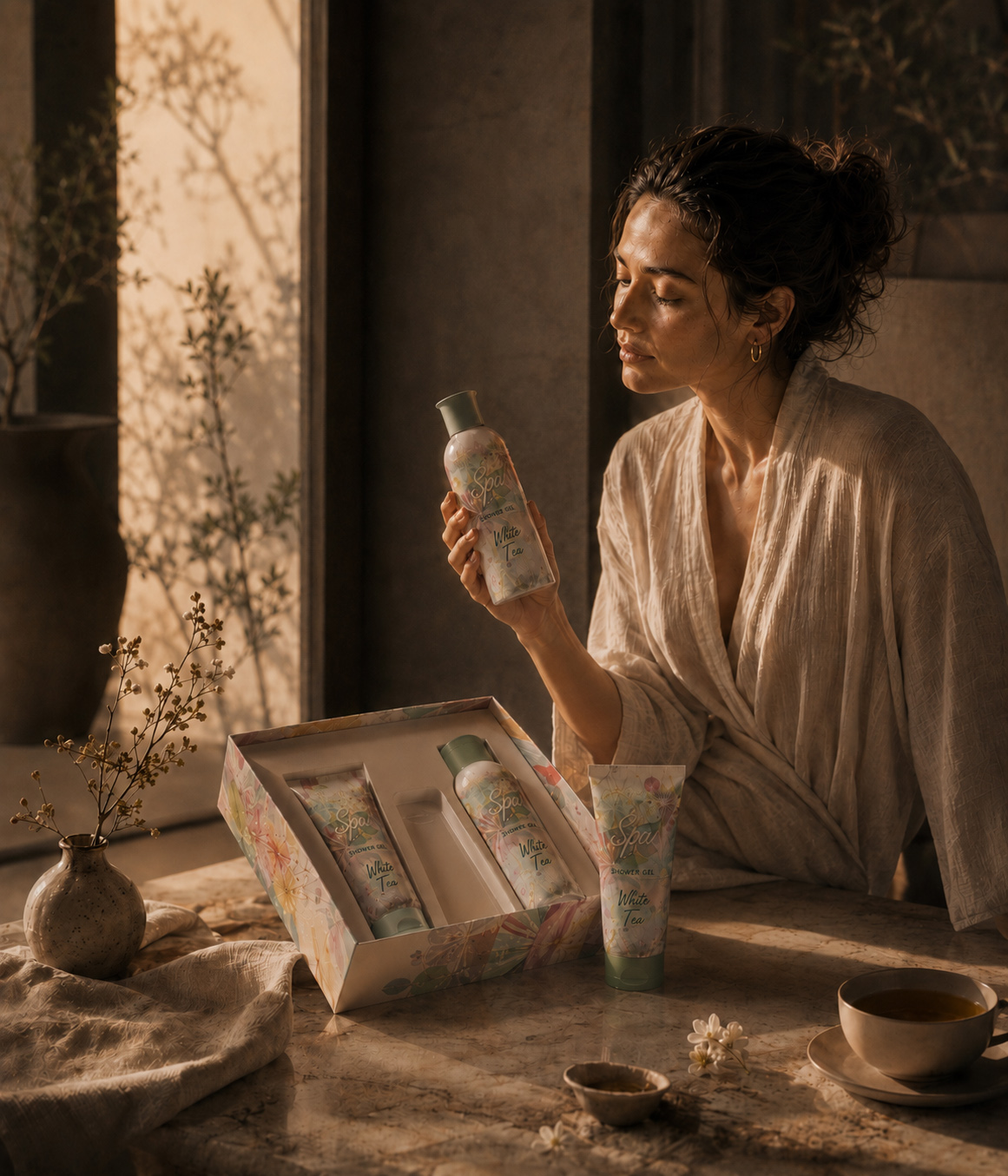
The selected direction was also extended into an open gift-box presentation, allowing separate products to function as one coherent offering with stronger shelf presence, gifting potential, and immediate front-facing impact.
ABOUT ACCENTRA® & THE SEASONAL PRODUCT LINE
ACCENTRA® is a German cosmetics and accessories brand offering personal-care products and coordinated gift collections designed to bring greater visual character to everyday routines.
For this seasonal toiletries line, the creative opportunity was to establish an expressive visual world capable of connecting multiple product formats through shared color, illustration, typography, and front-facing composition. Each product needed to remain individually recognizable while contributing to the atmosphere of the complete collection.
Infinity Design Studio developed the original creative exploration and selected front-of-pack direction, encompassing seasonal concept development, visual storytelling, color strategy, typography, packaging hierarchy, and open gift-box presentation.
The resulting concept positioned the ACCENTRA® product line as more than a collection of everyday toiletries. It became a coordinated seasonal experience shaped around recognition, emotional appeal, gift readiness, and consistent visual character.
| PROJECT CORE: | PROJECT DISTINCTION: |
|---|---|
| “Focused Exploration Shapes Seasonal Character Through Clear Front-Facing Packaging And A Cohesive Gift Experience.” | “Focused Direction Shapes Everyday Experiences Through Stronger Brand Recognition And One Cohesive Gift Experience.” |
| ✓ Seasonal Concept & Visual Research | ✓ Clearer ACCENTRA® Brand Recognition |
| ✓ Front-of-Pack Design Exploration | ✓ Stronger Seasonal Shelf Presence |
| ✓ Color & Illustration Direction | ✓ More Cohesive Product Presentation |
| ✓ Typography & Visual Hierarchy | ✓ Distinctive Front-Facing Character |
| ✓ Cross-Product Visual Coherence | ✓ Greater Gift-Ready Appeal |
| ✓ Open Gift-Box Presentation | ✓ Consistent Collection Experience |
| ✓ Final Creative Direction Selection | ✓ Memorable Everyday Care Positioning |

ACCENTRA® PROJECT SNAPSHOT
ONE SEASONAL WORLD. MULTIPLE PRODUCTS. ONE COHESIVE GIFT EXPERIENCE.
A focused overview of how seasonal color, illustration, typography, and front-of-pack composition shaped an expressive ACCENTRA® toiletries collection and its open gift-box presentation.
BRAND
ACCENTRA®
A German cosmetics and accessories brand offering expressive personal-care products and coordinated gift collections.
PRODUCT LINE
Spring–Summer Toiletries Collection
A seasonal product line connecting multiple formats through shared visual character and gift-ready presentation.
PRODUCT
Coordinated Personal-Care Assortment
A multi-product toiletries selection designed to read clearly as individual items and collectively as one seasonal offering.
DESIGN FOCUS
Front-of-Pack Visual Concept
The project focused on consumer-facing packaging surfaces and open-box presentation, where color, illustration, typography, and hierarchy create recognition and appeal.
CREATIVE EXPLORATION
Multiple Seasonal Concept Directions
Alternative visual territories were explored through color, illustration, composition, cross-product relationships, and gift-box arrangement.
FINAL OUTCOME
One Selected Seasonal Direction
A cohesive front-facing concept connecting individual products through memorable character, collection consistency, and stronger gift-ready impact.
ACCENTRA® PROJECT OVERVIEW
TRANSFORMING SEASONAL CHARACTER INTO A COHESIVE FRONT-OF-PACK AND GIFT-READY EXPERIENCE.
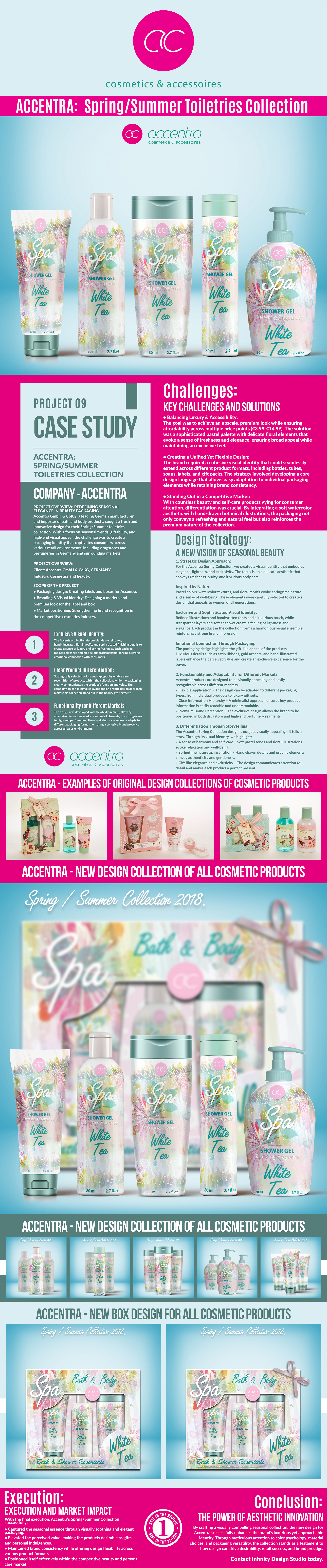
The ACCENTRA® project focused on creating an expressive visual direction for a seasonal toiletries collection. The challenge was to connect different product formats through one recognizable front-facing character while preserving clarity across the line.
Exploration centered on color, illustration, typography, packaging hierarchy, and open gift-box presentation. Through comparison and refinement, one direction emerged that combined seasonal appeal, collection coherence, and stronger gifting impact.
Together, the individual products formed one clear and memorable seasonal story, strengthening recognition while elevating the collection into a more engaging gift-ready experience.
PROJECT SCOPE
SEASONAL CONTEXT RESEARCH
Personal-care, gifting, color, and seasonal references were reviewed to define the collection’s emotional and visual territory.
CONCEPT TERRITORY DEVELOPMENT
Alternative directions explored different relationships between freshness, warmth, energy, illustration, and retail appeal.
FRONT-OF-PACK EXPLORATION
Consumer-facing compositions tested how branding, product information, imagery, and color could create immediate recognition.
COLLECTION STRUCTURE
Shared visual cues connected the ACCENTRA® brand, seasonal theme, and individual product formats without sacrificing clarity.
ILLUSTRATION DIRECTION
Illustrative elements were shaped to give the collection a distinctive seasonal personality and stronger emotional appeal.
COLOR STORY DEVELOPMENT
Coordinated color relationships created variety across the products while preserving the unity of the collection.
GRAPHIC LANGUAGE
Supporting shapes and decorative details strengthened recognition without overwhelming the front-facing composition.
TYPOGRAPHY & HIERARCHY
Type and information were organized to improve clarity, rhythm, product recognition, and front-facing impact.
CROSS-PRODUCT COHERENCE
Each product retained its individual character while contributing to the same recognizable seasonal visual world.
OPEN GIFT-BOX COMPOSITION
Multiple products were arranged to create a balanced presentation and a more engaging gift-ready experience.
COMPARATIVE EVALUATION
Alternative concepts were compared for clarity, seasonal relevance, collection coherence, and presentation value.
FINAL DIRECTION SELECTION
The selected concept achieved the strongest balance between expressive character, product clarity, and cohesive gifting appeal.
FROM SEASONAL IDEA TO GIFT EXPERIENCE
The project’s value came from connecting individual products through one focused visual direction rather than treating each package as an isolated design.
One seasonal idea became a recognizable front-facing collection and one coherent open gift-box presentation.
“Seasonal Character Begins Before The Collection Is Experienced—It Begins With The Way Every Visible Detail Works Together.”
Designing Seasonal Character Into A Coherent Front-Facing Experience
For ACCENTRA®, the objective was not to reinvent the complete brand or redesign every technical packaging surface. The assignment focused on the visible elements responsible for first impression—defining how one seasonal direction could connect different personal-care formats through clarity, softness, and recognizable front-facing character.
Inspired by the freshness of Spring and Summer and the quiet atmosphere of everyday care, the final language brought together watercolor botanicals, pastel color relationships, expressive Spa typography, White Tea naming, and a controlled information hierarchy. Each component was developed to serve a clear role within the collection rather than functioning as decoration alone.
The direction was then adapted across the confirmed product formats, allowing every container to retain its own silhouette and proportion while remaining visually connected to the wider family. Illustration scale, typography placement, and decorative rhythm changed according to the available surface, but the collection’s essential atmosphere remained consistent.
The final result is a focused Seasonal Packaging Design experience that connects individual products through one recognizable idea and extends that relationship into a coordinated gift presentation—clear as separate formats, stronger as a family, and complete when presented together.
“Exceptional Seasonal Packaging Does Not Simply Add Beauty. It Gives Every Visible Format A Clearer Character, A Stronger Connection, And A Shared Sense Of Purpose.”
“Where Seasonal Freshness, Watercolor Expression, And Gift-Oriented Design Become The Foundation Of A Distinctive Bath & Body Collection.”
ACCENTRA® — Transforming Seasonal Atmosphere Into A Cohesive Front-Facing Packaging And Gift Experience
“Exceptional Seasonal Packaging Does More Than Decorate A Product—It Creates Recognition At First Sight, Connects Different Formats, And Turns Everyday Care Into Something Worth Giving.”
ACCENTRA® SPRING/SUMMER TOILETRIES COLLECTION
ACCENTRA GmbH & Co. KG commissioned the development of a distinctive front-facing visual concept for a new Spring/Summer toiletries collection presented across tubes, bottles, pump formats, and an open-box gift set.
The project centered on the part of the packaging customers encounter first—the visible surface responsible for expressing seasonal atmosphere, product character, and collection recognition at a glance. Rather than expanding into a complete technical label system, the work focused on creating a memorable front-of-pack identity capable of connecting different formats through one coherent visual direction.
Watercolor botanical imagery, a refined pastel palette, expressive Spa typography, White Tea naming, and carefully balanced compositions established the collection’s fresh and gift-oriented character. Each application responded naturally to the proportions of its packaging format while preserving the same recognizable relationship between color, illustration, typography, and product presentation.
The open-box concept extended this visual language beyond individual products, bringing the range together as one complete seasonal gift experience.
THE SOLUTION INCLUDED:
Seasonal Front-Facing Visual Direction
A distinctive Spring/Summer expression developed through watercolor botanicals, pastel color relationships, visual lightness, and a refined beauty-oriented character.
Cross-Format Packaging Composition
Front-facing layouts adapted across tubes, bottles, and pump formats while preserving one consistent visual identity without forcing identical compositions.
Product Family Recognition
A shared system of color, illustration, typography, and product naming created an immediate visual relationship between the individual packaging formats.
Open-Box Gift Set Design
A coordinated gift presentation connected the products through visible arrangement, unified graphics, and a stronger sense of completeness and occasion.
THE FINAL RESULT:
The completed direction gave the ACCENTRA® Spring/Summer Toiletries Collection a clear and recognizable seasonal identity shaped around freshness, softness, and visual cohesion.
Each product retained its individual format while belonging to the same front-facing visual world. The watercolor botanical language, pastel palette, expressive typography, and coordinated product presentation allowed the collection to feel consistent without becoming repetitive.
The open-box gift design completed the experience by transforming a group of individual toiletries into one visually connected and gift-oriented collection—demonstrating how focused cosmetic packaging design can turn everyday care into something more distinctive, considered, and memorable.
“The collection was not made memorable by one decorative element, but by the way every front-facing detail worked together.”
Download Case Study
Building A Seasonal Packaging Experience Where Front-Facing Impact, Collection Cohesion, And Giftability Work As One
Creating A Distinctive Cosmetic Packaging Direction In Which Watercolor Expression, Format Adaptation, And Open-Box Presentation Strengthen One Another
Successful Cosmetic Packaging Design requires more than an attractive seasonal surface. Every front-facing decision must create immediate recognition, communicate product character, and preserve visual clarity across different packaging forms.
For ACCENTRA®, the objective extended beyond designing individual product fronts. We developed a connected Seasonal Packaging Design direction in which Watercolor Botanicals, Pastel Color Relationships, Front-Facing Composition, Product Family Cohesion, And Open-Box Gift Presentation work together—creating freshness, strengthening recognition, and transforming everyday toiletries into a complete gift-oriented experience.
A Distinctive Seasonal Identity Built For Immediate Recognition
Turning Watercolor Softness Into A Memorable Front-Facing Character
The ACCENTRA® collection was shaped around a distinctive seasonal visual identity capable of communicating freshness, softness, and beauty character before the product was examined in detail.
Watercolor botanicals, a controlled pastel palette, expressive Spa typography, and the White Tea product expression were brought together to create a recognizable front-facing packaging concept. Rather than functioning as isolated decoration, these elements established one coherent emotional atmosphere across the collection.
Each composition balanced visual richness with enough clarity to preserve the product’s presence within the artwork. Floral movement, translucent color, and light-reflective details created the seasonal mood, while recurring relationships between typography, naming, and illustration strengthened immediate product recognition.
The completed direction gave the collection a refined Cosmetic Packaging Design language built around first impression, visual softness, and memorable seasonal character—allowing every product to feel distinctive on its own while remaining unmistakably connected to the wider ACCENTRA® family.
Clear Product Differentiation Within One Connected Collection
Giving Every Format Its Own Presence Without Losing The Family
A successful Toiletries Packaging Design direction must allow individual products to remain visually distinct without weakening the identity of the complete collection.
For ACCENTRA®, the front-facing concept was adapted across tubes, bottles, and pump formats with different proportions. Illustration scale, typographic placement, decorative density, and the relationship between the Spa and White Tea elements were adjusted according to each composition.
These adaptations were not created to make every package identical. Their purpose was to preserve the same seasonal product character while allowing each format to feel naturally resolved within its own structure. Recurring watercolor imagery, coordinated pastel closures, consistent naming, and a shared visual rhythm established collection-wide cohesion.
The result was a connected Beauty Packaging Design family in which every product retained its individual silhouette and clear presence, yet contributed to one recognizable Spring/Summer collection—clear as a single item and stronger when experienced together.
One Flexible Front-Facing System Across Products And Gift Presentation
Extending The Front-Facing Concept Into A Complete Open-Box Experience
The collection required a flexible Product Packaging Design direction capable of responding to different formats without losing the character of the selected concept.
Rather than developing a complete technical system for every packaging surface, the work concentrated on the areas responsible for first impression, seasonal expression, and front-facing recognition. Watercolor fields, botanical elements, typography, naming, and pastel color relationships were repositioned to suit the proportions of each package.
This controlled flexibility allowed the same creative language to move from narrow tubes to cylindrical bottles and wider pump formats while preserving a consistent emotional foundation. The Open-Box Gift Set Design then extended that language beyond the individual products.
Coordinated graphics, product visibility, window composition, and considered arrangement transformed separate toiletries into a gift-oriented packaging experience—demonstrating how one seasonal concept could connect product presentation, collection identity, and the moment of giving without exceeding the original design scope.
“Seasonal Atmosphere Gives The Collection Its Emotion. Consistent Front-Facing Design Gives That Emotion The Power To Belong Across Every Format.”
Where The Transformation Began
Defining One Distinctive Seasonal Front-Facing Experience
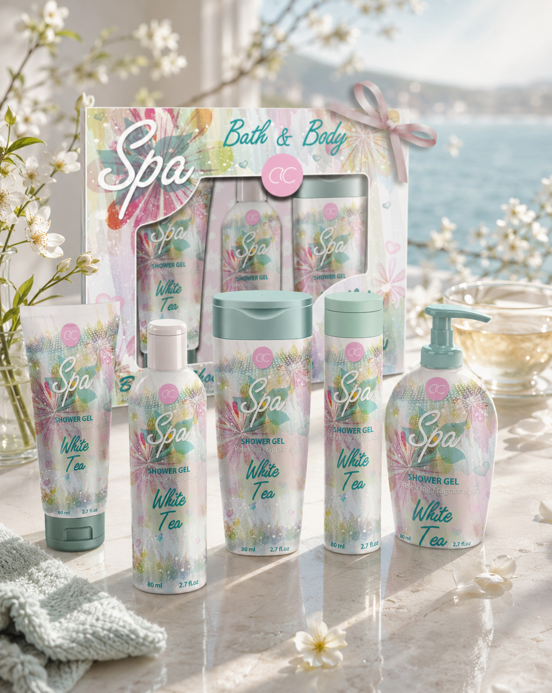
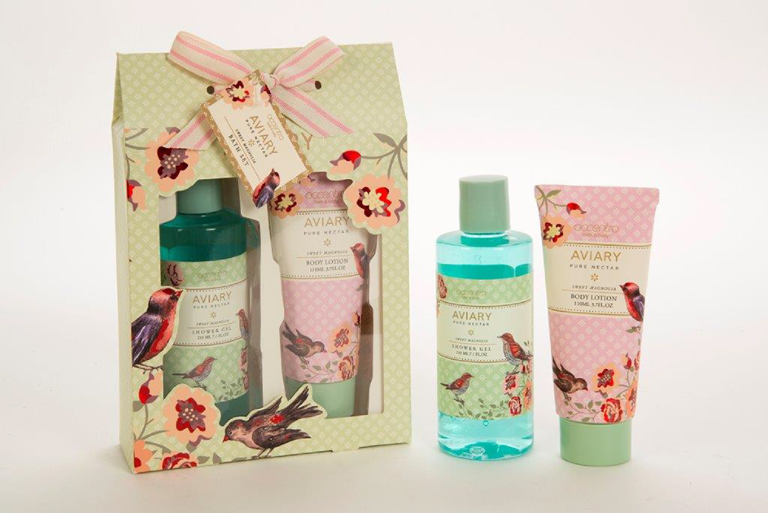
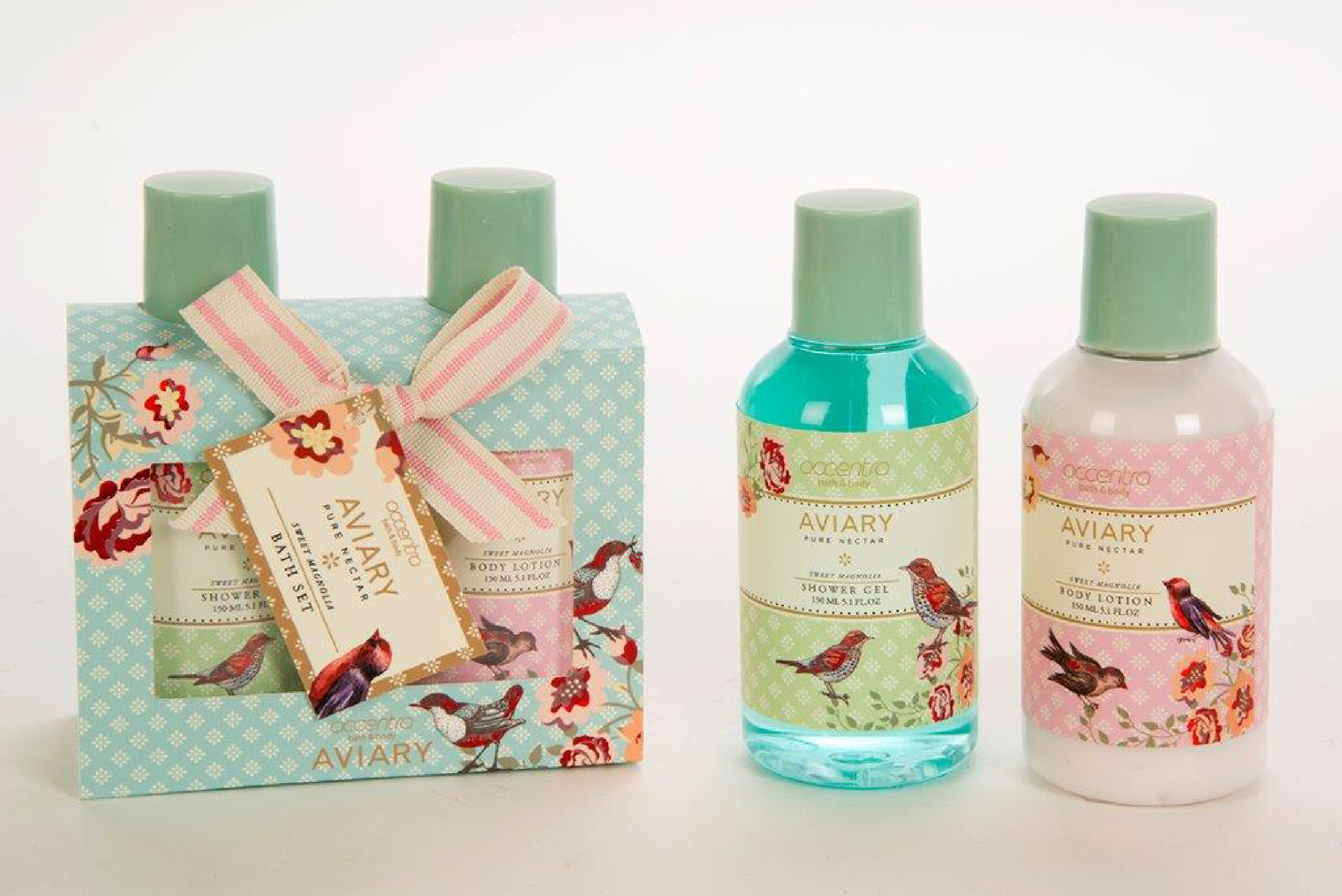
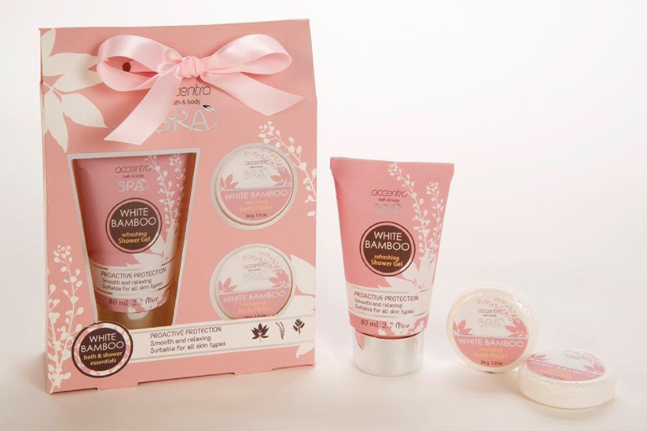
The established ACCENTRA® collection already offered a recognizable foundation within Beauty & Personal Care. The opportunity was not to reinvent the complete brand, but to give the Spring/Summer range a more distinctive seasonal character through focused Cosmetic Packaging Design—strengthening each visible product front while connecting its tubes, bottles, pump formats, and the open-box gift presentation through one coherent direction.
Rather than redesigning every technical panel, the project concentrated on the front-facing packaging concept—the area responsible for creating recognition at first sight. Watercolor botanicals, pastel color relationships, expressive Spa typography, White Tea naming, and controlled composition were developed as a connected Beauty Packaging Design language. Every element was refined to communicate freshness and softness while preserving enough clarity for the products to remain readable, distinctive, and visually related across the complete seasonal collection.
The selected Seasonal Packaging Design direction was adapted across tubes, bottles and pump formats with different proportions. Illustration scale, typographic placement, decorative density, and product naming responded to each front-facing surface, while recurring watercolor movement, coordinated pastel closures, and a shared visual rhythm preserved consistency. Each format retained its own presence without becoming disconnected from the complete ACCENTRA® family.
The open-box presentation completed the transformation by extending the visual language beyond individual formats. Coordinated graphics, product visibility, and a shared seasonal rhythm brought the range together as a refined, cohesive gift experience.
The objective was not to recast ACCENTRA® as a brand but to refine how one seasonal collection could appear, connect, and communicate. The final Beauty Packaging Design direction strengthened cohesion, front-facing recognition, and the perceived value of everyday care.
“Meaningful transformation starts by revealing the potential hidden in what already exists.”
The Challenge:
KEY CHALLENGES AND STRATEGIC RESPONSES
• Balancing Seasonal Appeal With Everyday Accessibility
The collection needed to feel refined and gift-worthy without losing the approachable character of everyday bath and body care. The response was a focused Cosmetic Packaging Design direction built around soft pastel tones, watercolor botanicals, expressive Spa typography, and controlled visual lightness—creating stronger front-facing appeal without relying on excessive luxury cues.
• Connecting Different Formats Through One Visual Language
Tubes, bottles, pump formats, and the open-box presentation introduced different proportions and visible surfaces. Rather than repeating one layout, the front-facing packaging concept was adapted through changes in illustration scale, typographic placement, and decorative density, preserving collection cohesion while allowing each format to feel naturally resolved.
• Creating Recognition In A Visually Crowded Category
The collection needed to communicate freshness and seasonal character at first sight. A coordinated Seasonal Packaging Design language combined recurring watercolor movement, pastel closures, clear White Tea naming, and balanced product presentation to strengthen recognition across the range. The open-box gift design extended the same visual logic, turning separate toiletries into one connected and memorable seasonal experience.
The Solution Included:
FROM ONE SEASONAL DIRECTION TO A CONNECTED PRODUCT FAMILY AND GIFT-READY PACKAGING EXPERIENCE
ONE VISUAL LANGUAGE CONNECTED EVERY PRODUCT, FORMAT, AND MOMENT OF PRESENTATION.
The solution was developed as one focused Seasonal Cosmetic Packaging Design direction capable of creating immediate recognition across the complete ACCENTRA® collection.
A distinctive front-facing language was established through watercolor botanicals, pastel color relationships, expressive Spa typography, White Tea naming, and a clear relationship between decorative character and product information. These elements created a fresh Spring/Summer atmosphere while preserving the clarity required for everyday bath and body packaging.
Seasonal Front-Facing Visual Direction
The primary packaging surfaces were shaped to communicate freshness, softness, and seasonal character at first sight. Illustration, typography, color, and hierarchy were organized to give the collection a recognizable beauty-oriented identity without overwhelming the product itself.
Cross-Format Packaging Composition
The same design could not simply be copied from one container to another. Tubes, bottles, wider formats, and pump dispensers required individually adapted compositions. Element scale, spacing, negative space, and information placement were adjusted to respect each structure while preserving one consistent Front-Facing Packaging System.
Product Family Recognition
Recurring color, illustration, typography, naming, and ACCENTRA® brand placement created an immediate relationship between the individual products. Each format retained its own proportions and function, but remained visibly connected to the wider collection.
Open-Box Gift Set Design
The seasonal language was extended into a coordinated Gift Set Packaging Design presentation. The window structure, visible product arrangement, exterior graphics, and ribbon detail transformed separate personal-care products into one complete and gift-ready experience.

THE OBJECTIVE WAS NOT TO MAKE EVERY PACKAGE LOOK IDENTICAL.
IT WAS TO MAKE EVERY PRODUCT FEEL INTENTIONALLY CONNECTED.
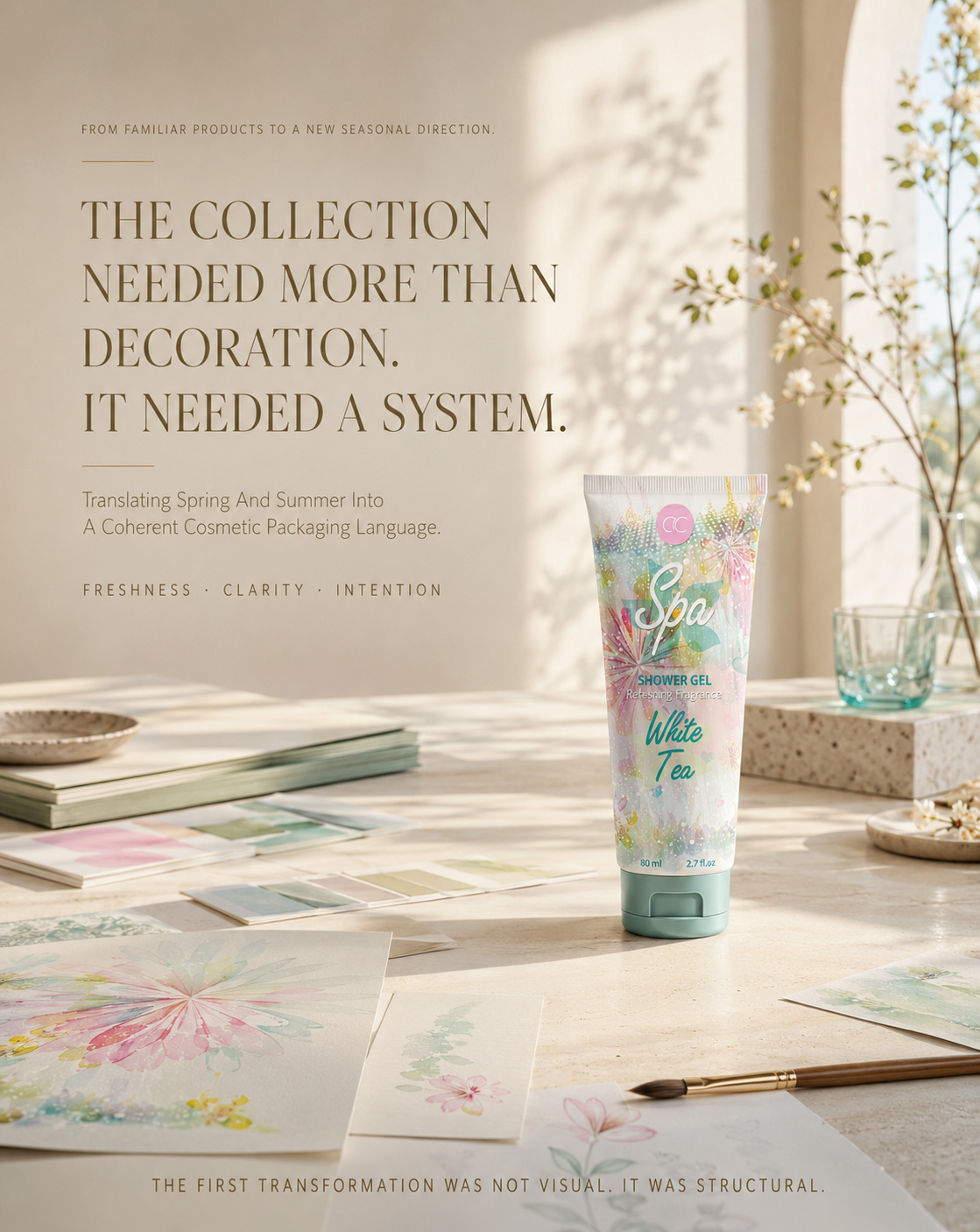
DESIGNING THE FEELING OF SPRING AND SUMMER
Transforming Seasonal Atmosphere Into A Distinctive Front-Facing Experience
1. Defining The Seasonal Visual Direction
Every successful Cosmetic Packaging Design project begins with a clear understanding of what the product should communicate before it is examined in detail.
For the ACCENTRA® Spring/Summer collection, the strategy focused on creating a fresh, recognizable, and gift-oriented front-facing packaging concept capable of connecting different product formats through one coherent seasonal expression.
Rather than developing a complete technical label system, the work concentrated on the visible areas responsible for first impression, emotional character, and immediate collection recognition.
Inspired By Seasonal Nature
Watercolor botanicals, delicate floral movement, pastel color relationships, and translucent visual layers formed the creative foundation of the collection.
These elements were not introduced as surface decoration alone. They were selected to communicate freshness, softness, personal care, and the light emotional atmosphere associated with spring and summer.
The resulting Beauty Packaging Design language created a distinctive seasonal world without overwhelming the product itself.
Softness Through Visual Control
The visual direction balanced expressive illustration with carefully controlled composition.
The Spa typography established the primary emotional focal point, while the White Tea naming, ACCENTRA® mark, product type, and botanical artwork were arranged to preserve front-facing clarity across different proportions.
Negative space, color intensity, illustration scale, and decorative density were adjusted to ensure that softness remained recognizable rather than visually undefined.
Creating Emotional Value Before Use
Packaging begins shaping the product experience before the product is opened.
By combining seasonal imagery, expressive typography, coordinated colors, and gift-oriented presentation, the selected Seasonal Packaging Design direction gave everyday toiletries a more considered and emotionally engaging presence.
The design created anticipation at first sight while preserving the approachable character of bath and body care.
2. One Direction Across Different Product Forms
A strong Toiletries Packaging Design concept must remain recognizable even when the visible packaging surface changes.
The ACCENTRA® collection included narrow tubes, cylindrical bottles, wider pump formats, and an open-box gift presentation. Each format required its own front-facing composition while remaining visually connected to the same seasonal idea.
Format-Responsive Composition
The selected direction was adapted rather than mechanically repeated.
Watercolor fields were expanded or concentrated according to the available surface. Typography was repositioned to maintain prominence, botanical details were rescaled, and visual density was adjusted to preserve balance across different product silhouettes.
This approach allowed every format to feel individually resolved without becoming disconnected from the wider collection.
Consistent Front-Facing Recognition
Recognition was created through recurring visual relationships rather than identical layouts.
The ACCENTRA® placement, Spa typography, White Tea expression, coordinated pastel closures, botanical movement, and shared color atmosphere established a consistent visual rhythm throughout the range.
The result was one connected Product Packaging Design direction in which different forms belonged naturally to the same Spring/Summer family.
Clear Visual Priority
The strategy defined which elements needed to attract attention first and which elements supported the wider composition.
Expressive typography created the emotional entry point, the product name established clarity, and the watercolor botanical field completed the seasonal character.
This hierarchy ensured that the visible face of each package remained appealing, recognizable, and compositionally controlled.
Extending The Concept Into The Open Box
The Open-Box Gift Set Design expanded the visual direction beyond individual products.
Product visibility, window composition, coordinated graphics, and the arrangement of the contents were developed to present the collection as one complete gift experience.
The box did not introduce a separate visual language. It brought the existing front-facing elements together in a format designed around anticipation, presentation, and giving.
3. Storytelling Through The Visible Face Of The Collection
The ACCENTRA® collection communicated its story through atmosphere rather than explanation.
Watercolor botanicals suggested freshness and seasonal renewal. Pastel tones introduced softness and visual lightness. Expressive typography created a more personal beauty character, while the repeated front-facing relationships connected the complete product family.
The objective was not to transform the entire ACCENTRA® brand or create a system for every technical packaging surface. It was to define how one seasonal collection could appear, connect, and communicate with greater clarity at first sight.
Each visible composition contributed to the same narrative of everyday care presented with greater attention, emotional appeal, and gift-oriented value.
The final Cosmetic Packaging Design direction demonstrated how a focused front-facing concept could unite different packaging formats, preserve collection recognition, and extend naturally into a coordinated Gift Set Packaging Design experience.
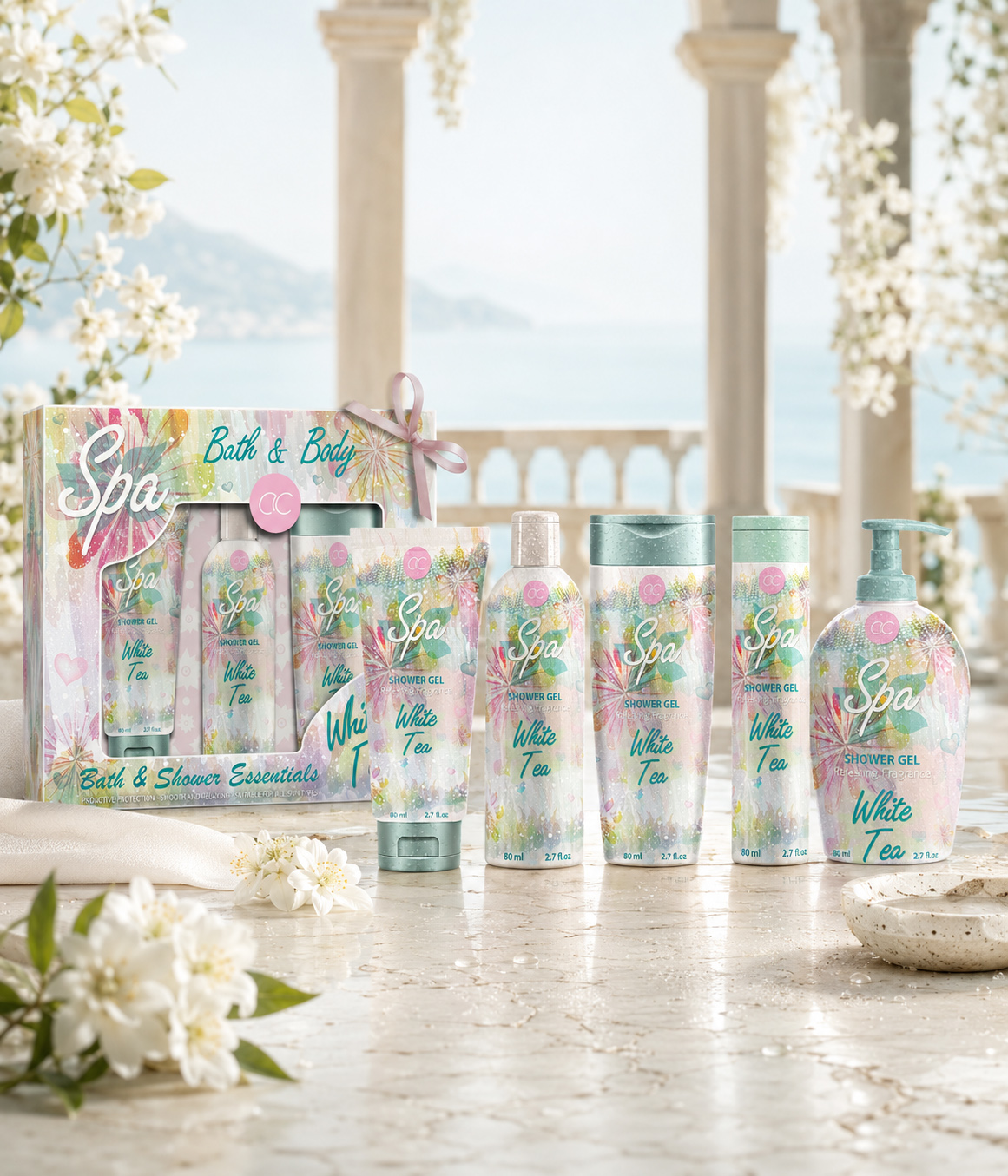
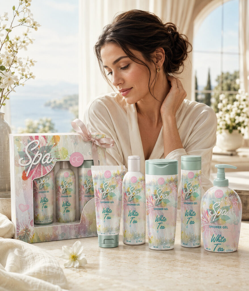
The completed ACCENTRA® presentation brings the entire seasonal system into one resolved visual moment, showing how individual products and the gift-box format work together as a coherent family.
Across bottles, tubes, dispensers, and the coordinated box, the same watercolor botanicals, pastel transitions, typographic rhythm, and front-facing packaging hierarchy create continuity without erasing the character of each format.
The design was developed to make the collection immediately recognizable at first sight, while preserving enough variation to keep every product visually distinct and commercially relevant.
Rather than treating the box as a secondary container, the final Gift Set Packaging Design extends the identity into the experience of giving—turning everyday care into a more considered seasonal presentation.
The completed Cosmetic Packaging Design system demonstrates how one focused creative direction can connect multiple packaging formats, strengthen collection recognition, and transform a varied product range into one cohesive, gift-ready brand experience.
“THE FINAL VALUE OF THE COLLECTION LIES IN THE RELATIONSHIP BETWEEN ITS PARTS—ONE SEASONAL IDEA, INTELLIGENTLY ADAPTED, CLEARLY RECOGNIZED, AND COMPLETED THROUGH THE EXPERIENCE OF GIVING.”
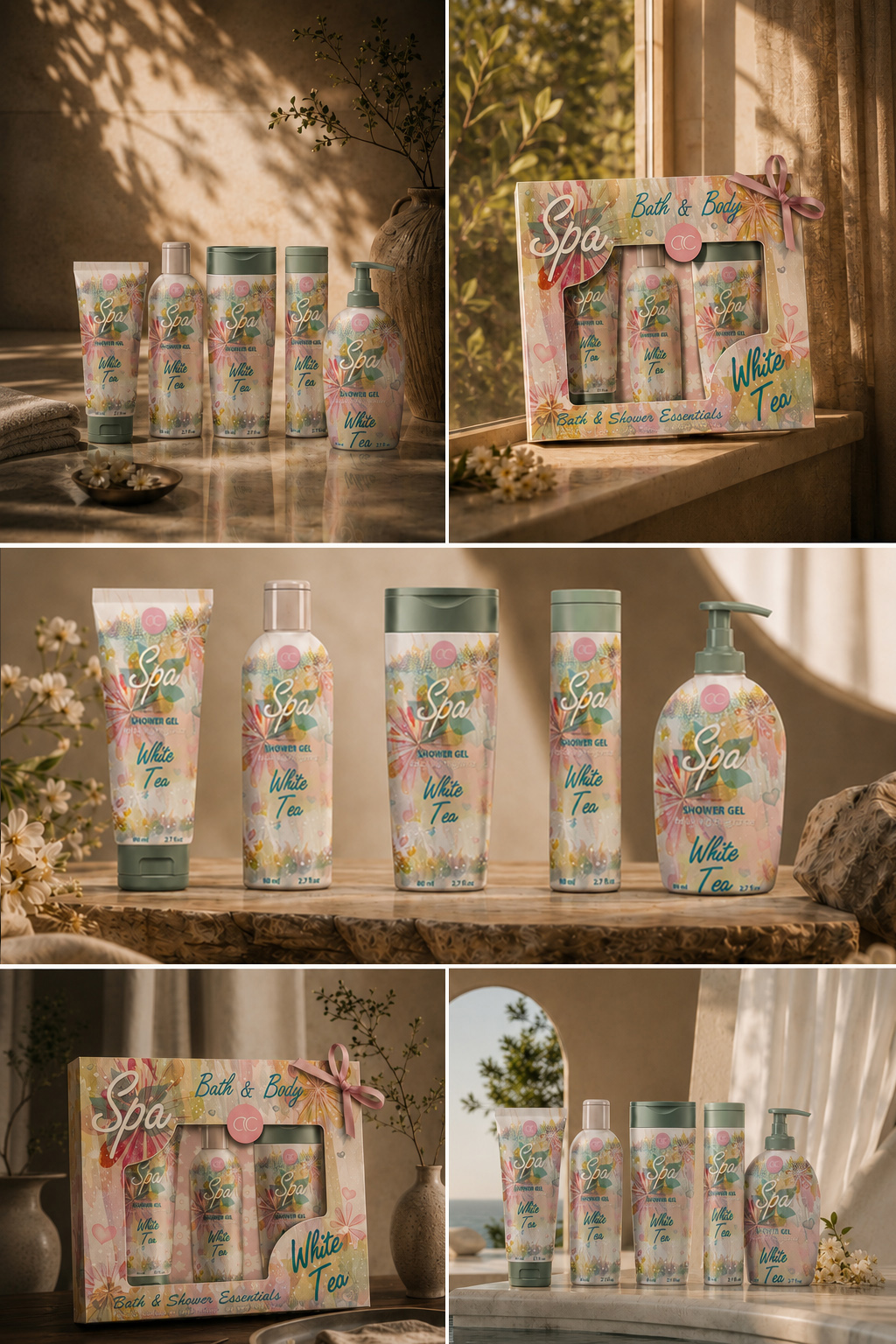
The ACCENTRA® collection was developed as a seasonal visual experience in which atmosphere, recognition, and gifting value worked together from the first encounter.
Watercolor botanicals introduced freshness and movement. Soft pastel tones created visual lightness, while expressive typography gave the range a more distinctive beauty character. Repeated front-facing cues connected the different formats and allowed the product family to feel coherent without becoming repetitive.
The project remained intentionally focused on the surfaces carrying the greatest visual responsibility: the front-facing packaging concept and the gift-box presentation. Technical information panels and secondary copy were treated as supporting elements rather than the creative focus.
Each composition translated everyday care into a more considered, emotionally engaging, and gift-ready experience.
The completed Cosmetic Packaging Design direction demonstrated how one seasonal concept could unite multiple formats, strengthen collection recognition, and extend naturally into a coordinated Gift Set Packaging Design experience.
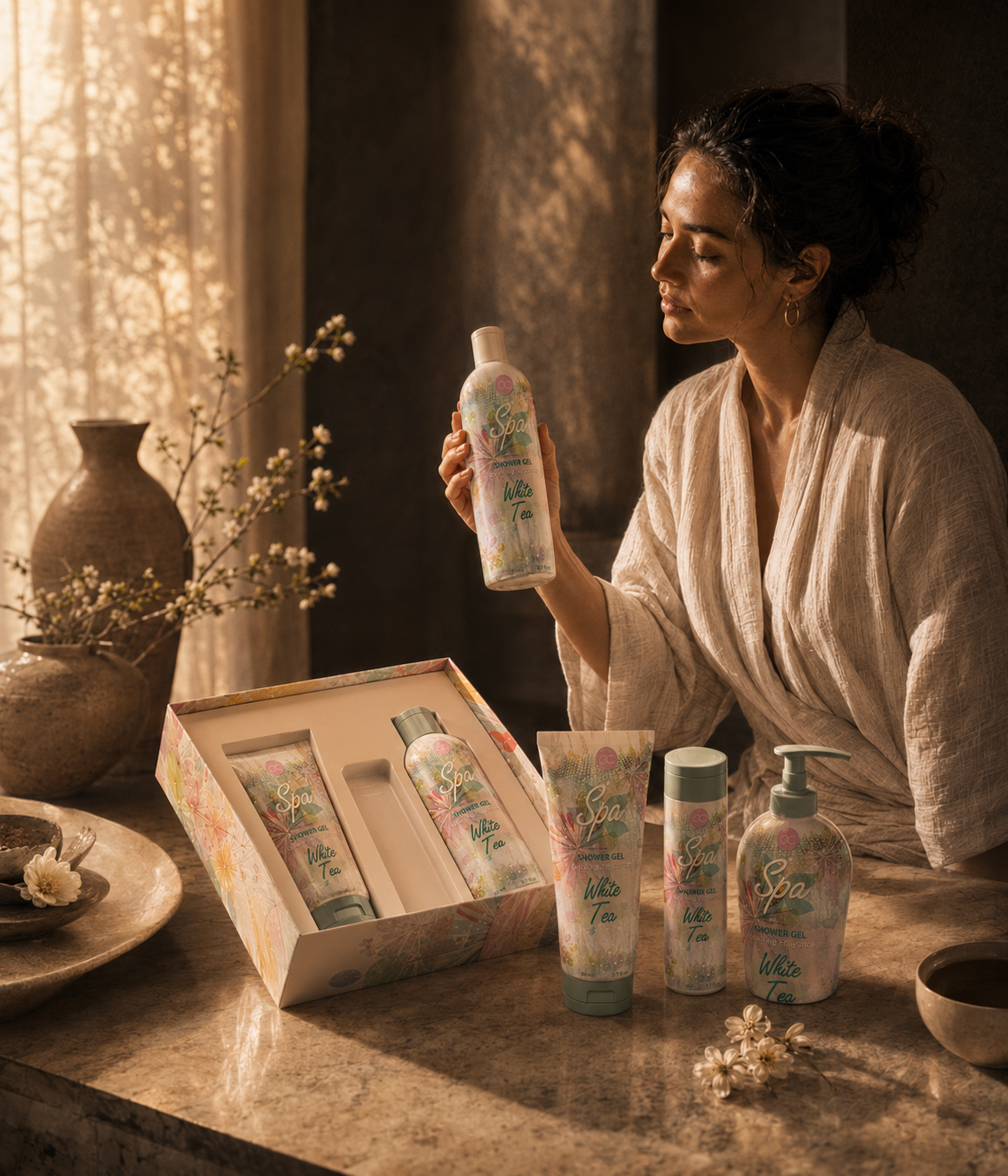
“THE STRONGEST SEASONAL PACKAGING DOES MORE THAN REFLECT A TIME OF YEAR. IT TURNS ONE ATMOSPHERE INTO A VISUAL EXPERIENCE THAT EVERY PRODUCT CAN SHARE.”
FROM SEASONAL ATMOSPHERE TO A RECOGNIZABLE VISUAL SYSTEM
THE SEASONAL VISUAL LANGUAGE
A CONTROLLED BALANCE OF WATERCOLOR SOFTNESS, BOTANICAL DETAIL, PRODUCT CLARITY, AND COLLECTION RECOGNITION.
The ACCENTRA® seasonal identity was not built around one decorative gesture. It emerged through a controlled relationship between color, illustration, typography, hierarchy, and repetition.
Pastel aqua, blush pink, mint green, and warm white established the emotional atmosphere of the collection. Watercolor textures and botanical forms introduced freshness and movement, while the ACCENTRA® mark, Spa typography, White Tea naming, and functional product information preserved clarity across every front-facing composition.
The result was a Seasonal Packaging Design language in which softness created attraction, but structure protected recognition.
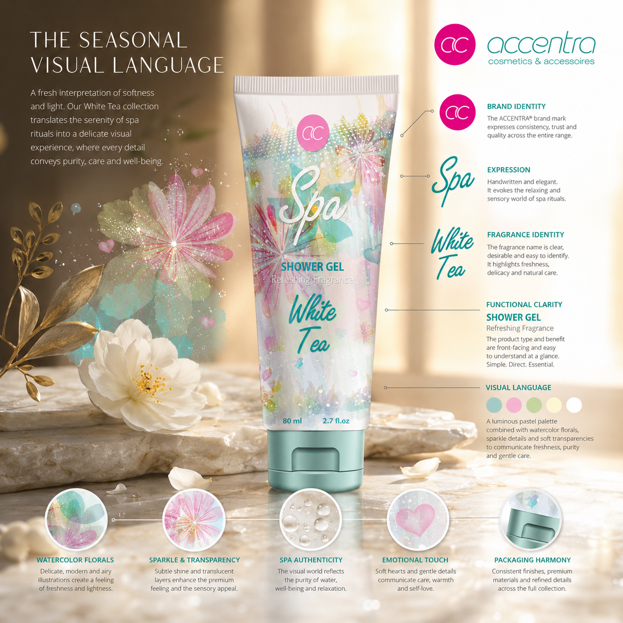
THE VISUAL DNA OF THE SEASON
This strategic composition reveals how pastel color, watercolor botanicals, Spa typography, White Tea naming, ACCENTRA® brand placement, and front-facing information hierarchy were coordinated into one flexible Cosmetic Packaging Design system. Each element performs a clear role: color establishes atmosphere, illustration creates emotional character, typography strengthens recognition, and structure preserves clarity across different packaging formats.
COLOR LOGIC
Pastel aqua, blush pink, mint green, and warm white created a light seasonal field that felt fresh, approachable, and immediately connected to the Spring/Summer character of the collection.
Color was not applied as surface decoration. It established the emotional tone of the Beauty Packaging Design system and created continuity across products with different shapes and proportions.
WATERCOLOR & BOTANICAL RHYTHM
Layered watercolor textures, floral forms, translucent details, and controlled sparkle introduced movement and visual softness without overwhelming the product information.
The illustration system gave the collection its sensory character, while repeated botanical cues allowed every format to remain connected to the same Watercolor Packaging Design language.
TYPOGRAPHIC CHARACTER
The handwritten Spa typography created personality, warmth, and a more expressive beauty-oriented presence.
This softer display language was balanced by functional product typography for Shower Gel, White Tea, fragrance information, and volume—ensuring that atmosphere never replaced clarity.
INFORMATION HIERARCHY
The ACCENTRA® mark, Spa expression, product category, White Tea naming, supporting information, and volume were organized through a consistent front-facing hierarchy.
Their proportions and positions could adapt to each format, but their relationship remained stable—allowing the complete Cosmetic Packaging System to stay recognizable without forcing every composition to become identical.
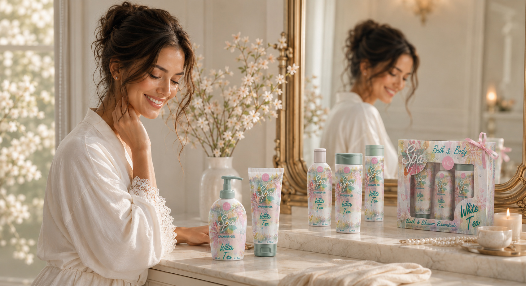
Repeated elements created recognition across the collection, while controlled variation allowed each product to respect its own physical structure.
This balance between emotional softness and functional discipline transformed separate graphic elements into one coherent visual language—strong enough to connect the collection, yet flexible enough to adapt across different packaging formats.
SOFTNESS CREATED THE MOOD. STRUCTURE MADE IT RECOGNIZABLE.
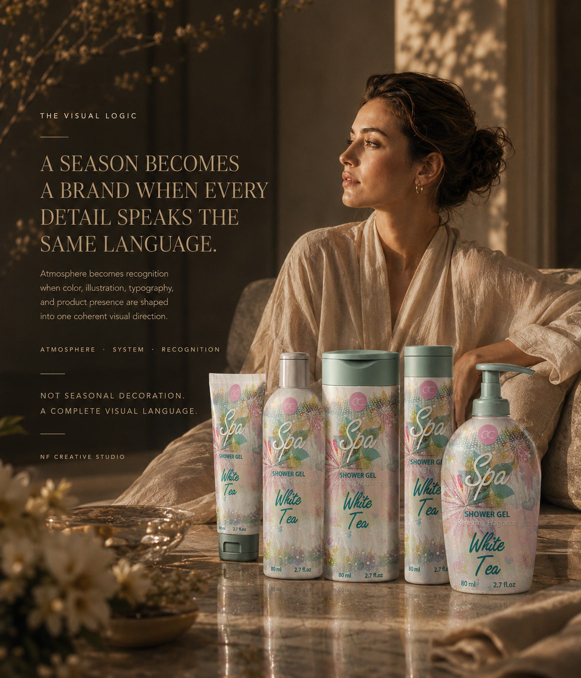
Front-Facing Packaging Concepts
More than 70 visual concepts were developed to test seasonal expression, front-facing impact, format adaptation, and open-box gift presentation. Each direction explored a different balance between watercolor softness, product recognition, and collection cohesion.
Creative Exploration
DEVELOPING THE VISUAL WORLD BEFORE DEFINING THE FINAL COLLECTION
70+ Front-Facing Packaging Concepts Developed
Following the initial strategic review, the project moved into an extensive exploration of front-facing design directions for the ACCENTRA® Spring/Summer collection. More than 70 packaging concepts were created to examine different relationships between watercolor botanicals, pastel color structures, expressive typography, product naming, decorative density, and open-box presentation.
Each concept focused on the visible surface responsible for first impression and seasonal recognition. Rather than developing a complete technical label system, the process tested how one Cosmetic Packaging Design direction could respond to tubes, bottles, pump formats, and gift packaging while preserving a recognizable visual character.
The exploration examined multiple approaches to Beauty Packaging Design—from softer botanical compositions and lighter color fields to more expressive floral movement and stronger typographic presence. Every direction was evaluated according to its ability to communicate freshness, support front-facing clarity, and connect individual products through one coherent Seasonal Packaging Design language.
The selected concepts presented here represent only a focused part of the complete development process. Together, they reveal how repeated comparison, refinement, and cross-format testing shaped the final front-facing packaging concept and the coordinated Open-Box Gift Set Design.
“EXCEPTIONAL SEASONAL PACKAGING IS NOT DEFINED BY THE FIRST ATTRACTIVE IDEA—IT EMERGES WHEN MANY POSSIBILITIES ARE REFINED INTO ONE UNMISTAKABLE VISUAL DIRECTION.”
Strategic Visual Directions
More than 50 distinct creative territories were explored before the final ACCENTRA® direction was defined. Each concept tested a different relationship between seasonal atmosphere, watercolor expression, typography, product recognition, and open-box gift presentation.
Creative Exploration
FROM MANY POSSIBLE SEASONAL WORLDS TO ONE DEFINITIVE FRONT-FACING DIRECTION
50+ Strategic Concepts Explored
Every successful Cosmetic Packaging Design concept begins before the final composition takes shape. It begins by questioning how the product should feel, what customers should recognize first, and which visual language can communicate that character with the greatest clarity.
For ACCENTRA®, the creative exploration examined more than 50 strategic visual directions before one final front-facing identity was selected. These were not simply minor changes to color or illustration. Each direction proposed a different interpretation of the Spring/Summer collection—testing how softness, freshness, femininity, giftability, and product visibility could coexist within one memorable visual world.
Some concepts relied on lighter watercolor fields and more restrained botanical detail. Others explored denser floral movement, stronger pastel contrast, more expressive Spa typography, or a more prominent relationship between the White Tea naming and the surrounding artwork. The scale and position of the ACCENTRA® mark, product title, botanical imagery, and decorative accents were repeatedly reconsidered to determine which hierarchy created the strongest first impression.
The process also examined how each visual territory could extend beyond one individual package. A successful front-facing packaging concept needed to remain recognizable across tubes, cylindrical bottles, wider pump formats, and the open-box gift presentation. This required more than choosing the most attractive single label. It required identifying a direction flexible enough to respond to different proportions while preserving the same seasonal character.
Every concept was therefore assessed through a consistent set of creative criteria:
- immediate front-facing recognition;
- clarity of the Spa and White Tea hierarchy;
- balance between botanical richness and visual breathing room;
- compatibility with different packaging silhouettes;
- relationship between individual products and the wider collection;
- potential to extend into Gift Set Packaging Design;
- strength of the complete collection when presented together.
Within the broader development process, the 50+ figure refers specifically to strategic creative directions. Cross-format adaptations, detailed composition refinements, and individual packaging variations formed an additional layer of development around those territories.
The final direction emerged because it achieved the strongest balance between emotional softness and visual control. Its watercolor botanical language felt expressive without overwhelming the product, while its typography, pastel relationships, and recurring compositional rhythm created clear belonging across the range.
The concepts presented in the editorial represent only a curated part of this wider exploration. Together, they reveal how comparison, rejection, refinement, and repeated visual testing transformed many possible interpretations into one cohesive Seasonal Packaging Design direction.
“THE FINAL IDENTITY DID NOT EMERGE FROM THE FIRST BEAUTIFUL IDEA. IT EMERGED WHEN MANY POSSIBLE SEASONAL WORLDS WERE REFINED INTO ONE CLEAR AND RECOGNIZABLE DIRECTION.”
Front-Facing Packaging Adaptations
More than 30 format-specific adaptations were developed to evaluate how one seasonal visual direction could remain recognizable across tubes, bottles, pump formats, and the open-box gift presentation—without forcing every surface into the same composition.
Product Adaptation
ADAPTING ONE SEASONAL IDEA ACROSS EVERY VISIBLE PRODUCT FORM
30+ Front-Facing Variations Developed. One Direction. Multiple Packaging Proportions.
A successful Cosmetic Packaging Design concept cannot depend on a single ideal format. It must preserve its character when the available surface becomes narrower, wider, taller, or more curved—and when the relationship between illustration, typography, product naming, and negative space inevitably changes.
For ACCENTRA®, more than 30 front-facing packaging adaptations were developed to test how the selected Spring/Summer direction performed across the visible areas of tubes, cylindrical bottles, wider containers, pump formats, and gift packaging.
The purpose was not to reproduce one label mechanically. Each adaptation reconsidered the scale and position of the watercolor botanicals, the prominence of the Spa typography, the White Tea naming hierarchy, the balance of pastel color, and the amount of decorative detail appropriate for the format.
This process allowed the Seasonal Packaging Design language to remain emotionally consistent while responding naturally to different silhouettes. Narrower surfaces required more concentrated compositions. Wider formats allowed the botanical field to expand. Curved packaging demanded a stronger central focus so that the essential front-facing elements remained recognizable from the primary viewing angle.
The same principles informed the open-box presentation, where individual products needed to remain visible while contributing to one coordinated gift experience.
Together, these adaptations created a flexible Toiletries Packaging Design direction in which every format retained its own presence without becoming disconnected from the collection. The result demonstrated that visual consistency is not achieved through repetition, but through the disciplined adjustment of one shared creative logic.
“GREAT PACKAGING IS NOT REPEATED FROM ONE FORMAT TO ANOTHER—IT IS INTELLIGENTLY ADAPTED WITHOUT LOSING THE IDEA THAT MAKES IT RECOGNIZABLE.”
FROM FORMAT-SPECIFIC EXPLORATION TO ONE CONNECTED SYSTEM
EVERY ADAPTATION TESTED WHETHER THE VISUAL LANGUAGE COULD REMAIN RECOGNIZABLE THROUGH CHANGE.
More than 30 format-specific packaging adaptations examined how the selected seasonal direction could respond to different proportions, structures, and front-facing requirements. Illustration scale, typography placement, decorative density, negative space, and product hierarchy were adjusted repeatedly to determine which elements could change—and which had to remain consistent.
This process transformed creative exploration into a disciplined Cosmetic Packaging Design system. The objective was no longer to discover another visual possibility, but to prove that one direction could preserve its character across every format without becoming repetitive, fragmented, or visually disconnected.
“BEFORE ONE DIRECTION COULD BECOME THE COLLECTION, IT HAD TO PROVE THAT IT COULD ADAPT WITHOUT LOSING RECOGNITION.”
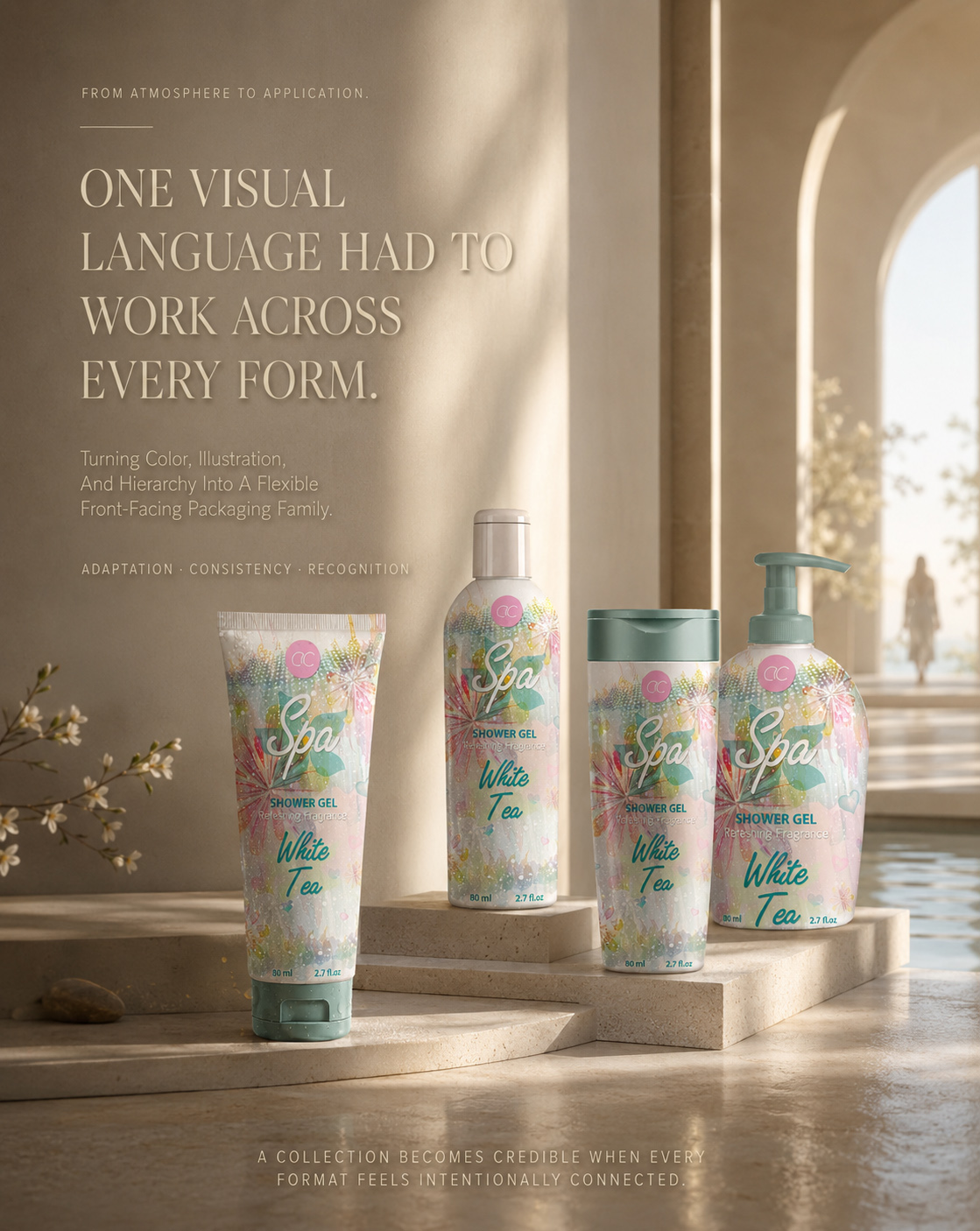
NF CREATIVE STUDIO
THE FINAL COLLECTION IS ONLY THE VISIBLE RESULT.
Its True Value Is Revealed Through The Exploration, Adaptation, And Decisions That Turned Seasonal Atmosphere Into One Coherent Front-Facing And Gift Experience.
THE COLLECTION HAS BEEN PRESENTED.
NOW WE REVEAL THE THINKING THAT MADE EVERY FORMAT BELONG.
OUR APPROACH
“We Don’t Apply Seasonal Elements As Decoration. We Translate Atmosphere Into A Front-Facing Visual Direction Where Product, Emotion, Recognition, And Giftability Work As One.”
Every decision was developed to serve a clear role within the complete collection—from the first seasonal reference and watercolor study to the final front-facing packaging composition, cross-format adaptation, and open-box gift presentation.
Our approach combined Cosmetic Packaging Design, Seasonal Visual Direction, Watercolor Botanical Exploration, Typography Development, Color Strategy, Product Family Cohesion, and Gift Set Packaging Design within one connected creative framework.
Every decision—from the balance of pastel tones and botanical movement to the relationship between the ACCENTRA® mark, Spa typography, White Tea naming, and visible product surface—was refined to strengthen first impression, preserve clarity, and create one recognizable seasonal identity across different formats.
For ACCENTRA®, this meant exploring more than 50 strategic visual directions, developing over 70 front-facing packaging concepts, and refining more than 30 format-specific adaptations before one final creative direction was selected and extended across tubes, bottles, pump formats, and the open-box gift experience.
Infinity Design Studio x NF Creative Studio
Seasonal Atmosphere Gives The Collection Emotion. Exploration Gives The Concept Possibility. Adaptation Gives Every Format Belonging. A Complete Gift Presentation Turns The Visual Direction Into An Experience.
ATMOSPHERE · EXPLORATION · ADAPTATION · EXPERIENCE
“Every Meaningful Packaging Journey Reaches The Same Point—One Direction Proves It Can Carry The Complete Collection.”
Choosing The Direction That Could Unite The Seasonal Collection
The journey from creative exploration to the final Cosmetic Packaging Design direction was never about selecting the most decorative artwork. It was about identifying the concept capable of connecting the confirmed product formats through one recognizable seasonal character.
After exploring dozens of strategic and creative possibilities, refining watercolor illustration, typography, color relationships, and front-facing composition, one direction consistently demonstrated greater clarity and adaptability. It preserved the lightness and emotional appeal of the Spring/Summer concept while establishing a stronger visual relationship across tubes, bottles, pump formats, and the final gift presentation.
The selected direction became more than an isolated packaging solution. It established a cohesive seasonal front-facing system in which illustration scale, decorative density, typography placement, and information hierarchy could respond to different container proportions without losing collection recognition.
What follows is the final seasonal packaging direction—the concept selected to connect the individual formats, preserve their distinctive silhouettes, and extend naturally into one coordinated gift-ready experience.
“The Strongest Direction Was Not The One That Made Every Package Look Identical. It Was The One That Gave Every Format The Same Visual Reason To Belong.”
WHEN ONE DIRECTION BECAME THE COLLECTION
FROM EXPLORATION TO ONE DEFINITIVE SEASONAL DIRECTION
SELECTING THE VISUAL LANGUAGE WITH THE CHARACTER, CLARITY, AND FLEXIBILITY TO LEAD THE COMPLETE COLLECTION.
After more than 50 strategic visual directions, over 70 front-facing packaging concepts, and more than 30 format-specific adaptations, exploration reached the point where possibility had to become decision.
The selected direction was not chosen simply because it created the strongest individual package. It offered the clearest foundation for the complete ACCENTRA® Spring/Summer collection—bringing watercolor botanicals, pastel color relationships, expressive Spa typography, White Tea naming, and controlled front-facing hierarchy into one recognizable visual idea.
Its strength was the balance it created between emotional character and practical clarity. The concept felt seasonal and distinctive, while remaining disciplined enough to guide every following packaging decision.
THIS WAS THE MOMENT ONE VISUAL POSSIBILITY BECAME THE FOUNDATION OF THE COLLECTION.
Unified Front-Facing Design Direction
One selected seasonal identity was refined across every visible product format, creating a coherent ACCENTRA® collection built around recognition, freshness, and gift-oriented appeal.
ONE VISUAL LANGUAGE. EVERY FRONT-FACING FORMAT CONNECTED.
One Collection. Every Format Intentionally Adapted.
The selected Seasonal Packaging Design direction was extended across tubes, bottles, wider containers, tall cylindrical formats, pump dispensers, and the open-box gift presentation.
The objective was not to repeat one identical composition across every surface. Each format required its own balance of illustration, typography, negative space, product naming, and front-facing hierarchy.
Watercolor botanicals, pastel color relationships, expressive Spa typography, White Tea naming, and consistent ACCENTRA® brand placement created one recognizable foundation across the complete product family.
As proportions changed, the composition adapted. Decorative density, illustration scale, typography placement, and focal emphasis were refined to respect the physical character of each container without weakening collection recognition.
The result was a flexible Cosmetic Packaging Design system in which every product retained its own presence while remaining clearly connected to the same seasonal identity.
DIFFERENT FORMATS. ONE RECOGNIZABLE VISUAL SYSTEM.
MEASURING THE SYSTEM THROUGH WHAT WAS ACTUALLY DEVELOPED
VERIFIED SYSTEM METRICS
REAL PROJECT SCALE, DOCUMENTED THROUGH EXPLORATION, ADAPTATION, AND FINAL COLLECTION COHERENCE.
These metrics reflect the documented creative process and visible project scope. They do not represent invented sales, engagement, or conversion results. Each figure is supported by the concepts, adaptations, product formats, and final presentation shown throughout the editorial.
STRATEGIC
VISUAL DIRECTIONS
More than 50 strategic directions explored different relationships between seasonal atmosphere, illustration, typography, color, hierarchy, and product recognition.
FRONT-FACING PACKAGING CONCEPTS
Over 70 packaging concepts tested how the ACCENTRA® collection could communicate freshness, beauty character, and seasonal distinction across visible product surfaces.
FORMAT-
SPECIFIC ADAPTATIONS
More than 30 packaging adaptations examined how the selected visual language could respond to different structures, proportions, and front-facing composition requirements.
VISIBLE
PRODUCT FORMATS
The final Seasonal Packaging Design system connected five distinct product formats while allowing every container to preserve its individual silhouette and functional character.
COORDINATED GIFT SET PRESENTATION
One Open-Box Gift Set Design extended the visual language beyond individual products and transformed the collection into a complete gift-oriented experience.
UNIFIED
FRONT-FACING SYSTEM
One final visual direction brought color, illustration, typography, naming, and hierarchy together across the complete ACCENTRA® seasonal collection.
The value of these metrics lies not in scale alone, but in what that scale made possible: extensive exploration was progressively refined into one clear, flexible, and recognizable Cosmetic Packaging Design system.
MANY POSSIBILITIES WERE EXPLORED. ONE COHERENT SYSTEM WAS BUILT.
Unified Seasonal Collection
One final front-facing visual direction brought together across every visible product format and the open-box gift presentation, creating one coherent ACCENTRA® seasonal experience.
FROM A UNIFIED SYSTEM TO THE COMPLETE PRODUCT FAMILY
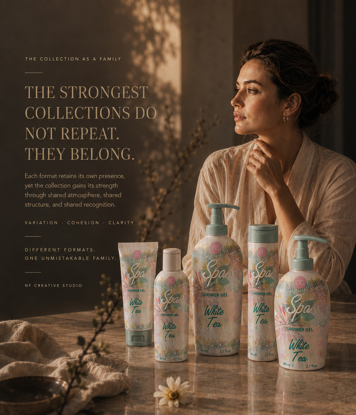
THE FINAL PRODUCT FAMILY
FIVE DISTINCT FORMATS, ONE CONNECTED SEASONAL EXPERIENCE.
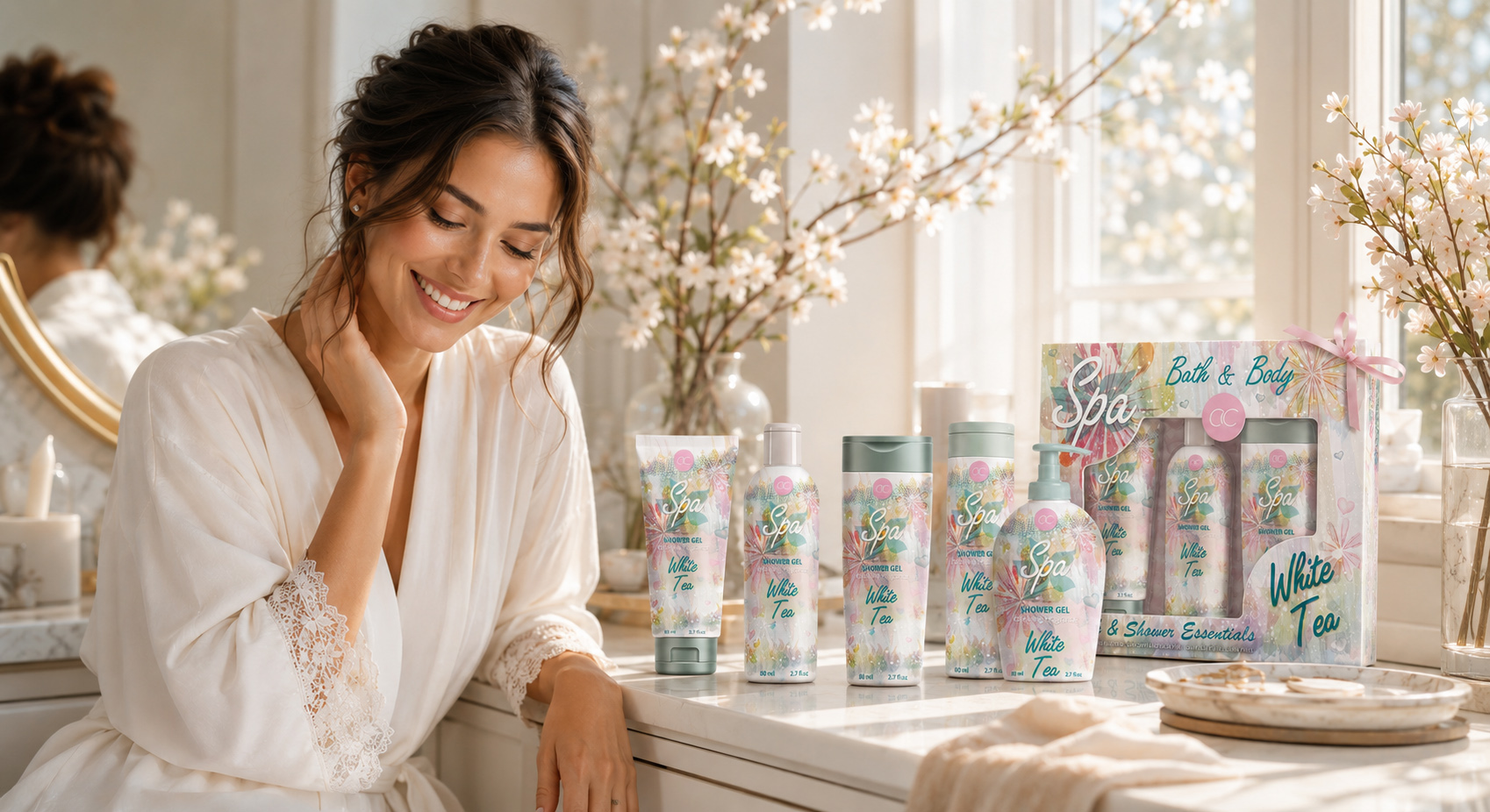
The completed ACCENTRA® collection demonstrates how one front-facing packaging system can preserve recognition across products with different forms, proportions, and visual requirements.
Tubes, bottles, cylindrical containers, and the pump format each retained their individual silhouette, while watercolor botanicals, pastel relationships, Spa typography, White Tea naming, and consistent ACCENTRA® placement created one recognizable Seasonal Packaging Design language.
The system did not depend on mechanical repetition. Illustration scale, decorative density, typography placement, and negative space were adjusted to suit each visible surface, allowing every product to feel individually resolved while remaining unmistakably connected to the wider family.
Presented together, the products reveal the full value of the design: not five separate applications, but one coordinated Cosmetic Packaging Design collection shaped around freshness, clarity, and seasonal recognition.
EACH FORMAT RETAINED ITS OWN PRESENCE. TOGETHER, THEY BECAME ONE COMPLETE COLLECTION.
FROM FINAL SYSTEM TO COLLECTIVE RECOGNITION
ONE COLLECTION. FIVE DISTINCT FORMATS. ONE SHARED SENSE OF BELONGING.
The completed ACCENTRA® product family demonstrated that collection cohesion does not depend on making every package identical. Its strength came from preserving the individual character of each format while connecting them through one recognizable Seasonal Packaging Design language.
Watercolor botanicals, pastel color relationships, Spa typography, White Tea naming, and a consistent front-facing hierarchy created continuity across tubes, bottles, cylindrical formats, and pump packaging. Each product remained visually distinct, yet every application clearly belonged to the same Cosmetic Packaging Design system.
“BEFORE A COLLECTION CAN BE RECOGNIZED AS ONE, EVERY FORMAT MUST FIRST HAVE A CLEAR REASON TO BELONG.”
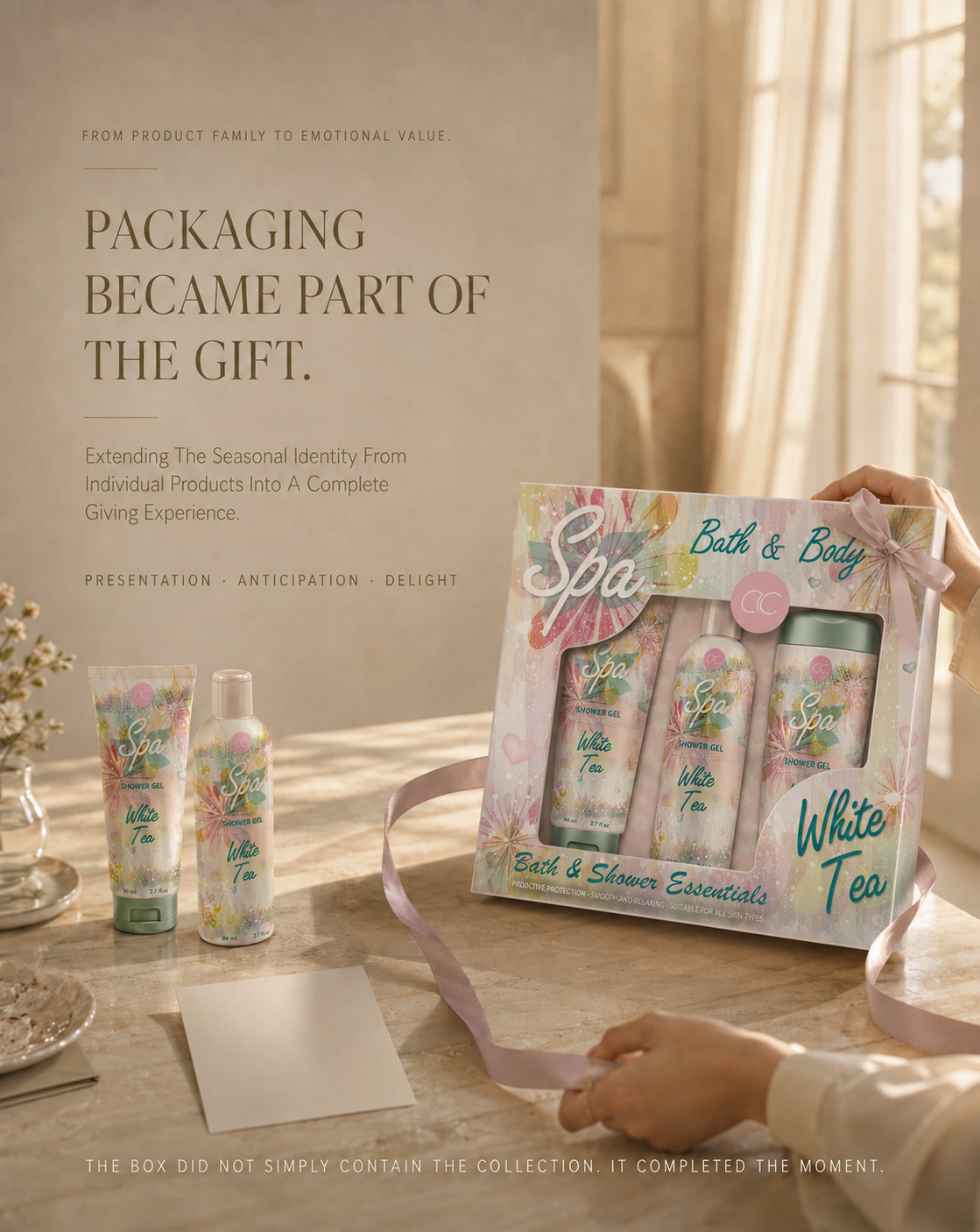
FROM PRODUCT FAMILY TO GIFT-READY EXPERIENCE
DESIGNED TO BE GIVEN
WHEN PRODUCT VISIBILITY, SEASONAL CHARACTER, AND PRESENTATION COME TOGETHER AS ONE CONSIDERED GIFT EXPERIENCE.
The ACCENTRA® collection reached its final expression when the visual language moved beyond individual products and entered a coordinated Gift Set Packaging Design experience.
The box was not treated as a secondary container. It became the surface where product visibility, seasonal storytelling, front-facing recognition, and presentation value were brought together.
Through a transparent window, considered product arrangement, watercolor continuity, and repeated White Tea cues, the relationship between the individual formats became immediately visible. Each product retained its own identity, while the gift-box presentation gave the collection a stronger sense of completion.
The result transformed everyday personal-care products into a more intentional seasonal offering—clear enough to preserve product recognition, expressive enough to communicate giftability, and cohesive enough to feel like one complete gesture.
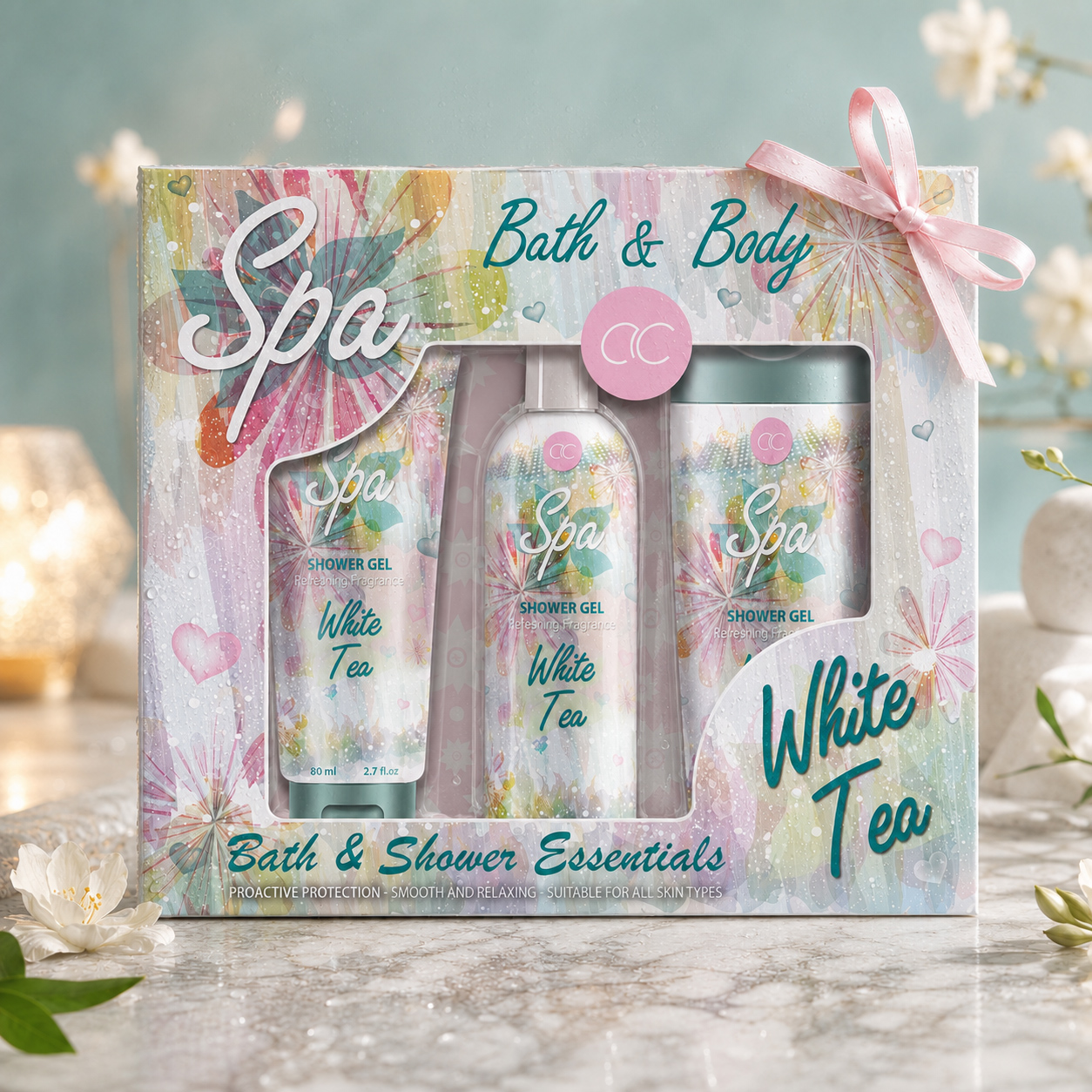
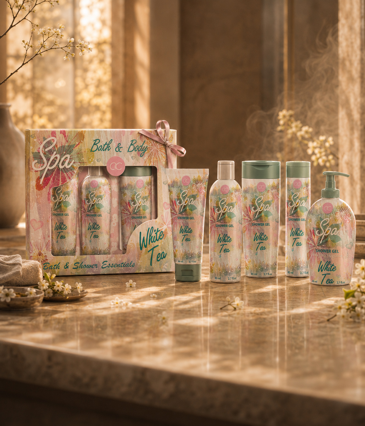
THE COLLECTION, PRESENTED AS ONE
The final ACCENTRA® window-box presentation connects three distinct product formats through visible arrangement, watercolor continuity, White Tea naming, and a shared front-facing hierarchy—transforming separate products into one coherent Seasonal Gift Packaging experience.
WINDOW-BOX CONCEPT
The transparent front window preserved immediate product visibility and allowed the contents to become part of the exterior composition.
Rather than concealing the products, the box framed them—turning the relationship between packaging structure, product hierarchy, and graphic presentation into the central visual experience.
PRODUCT LAYOUT
The selected formats were organized to create clear rhythm, balance, and distinction inside the box.
Differences in height, silhouette, and proportion remained visible, while the controlled arrangement strengthened the perception of one connected Cosmetic Packaging Design collection.
SEASONAL CONTINUITY
Watercolor botanicals, pastel transitions, Spa typography, White Tea naming, and ACCENTRA® brand placement extended naturally from the individual products onto the gift-box surface.
The box did not introduce a separate visual identity. It completed the language already established across the collection.
GIFTABILITY & EMOTIONAL VALUE
The coordinated presentation elevated everyday care through anticipation, visibility, and the emotional character of giving.
The final Gift Set Packaging Design added value not by changing the products themselves, but by changing how the complete collection was encountered, understood, and remembered.
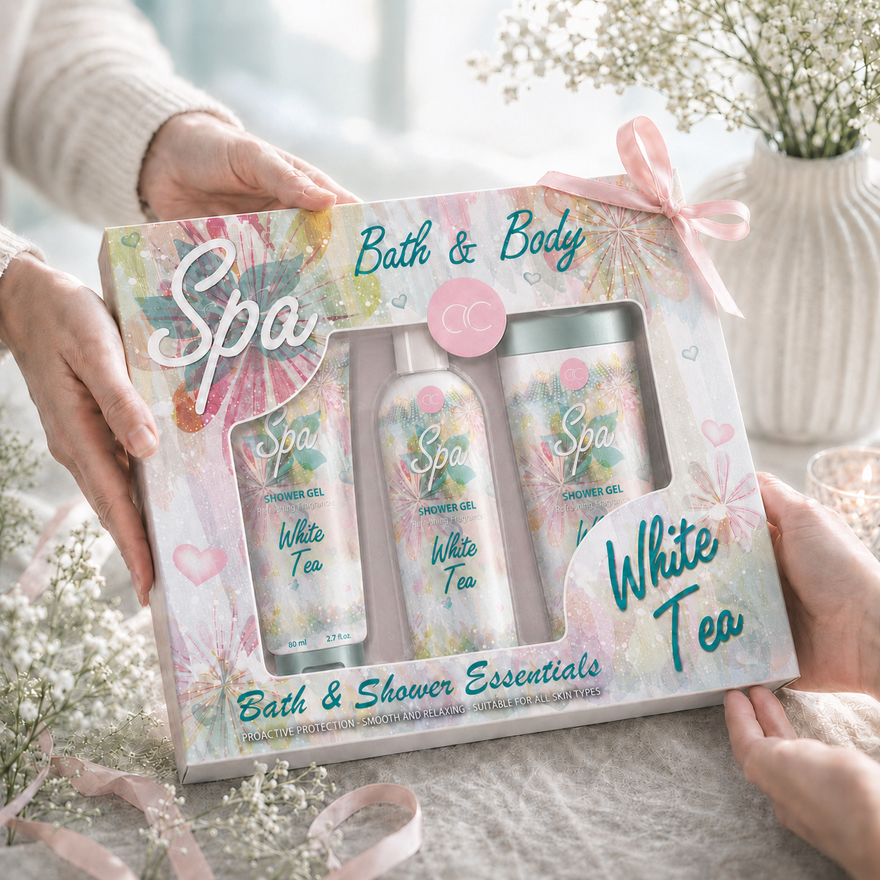
WHEN PACKAGING BECOMES PART OF THE GIFT
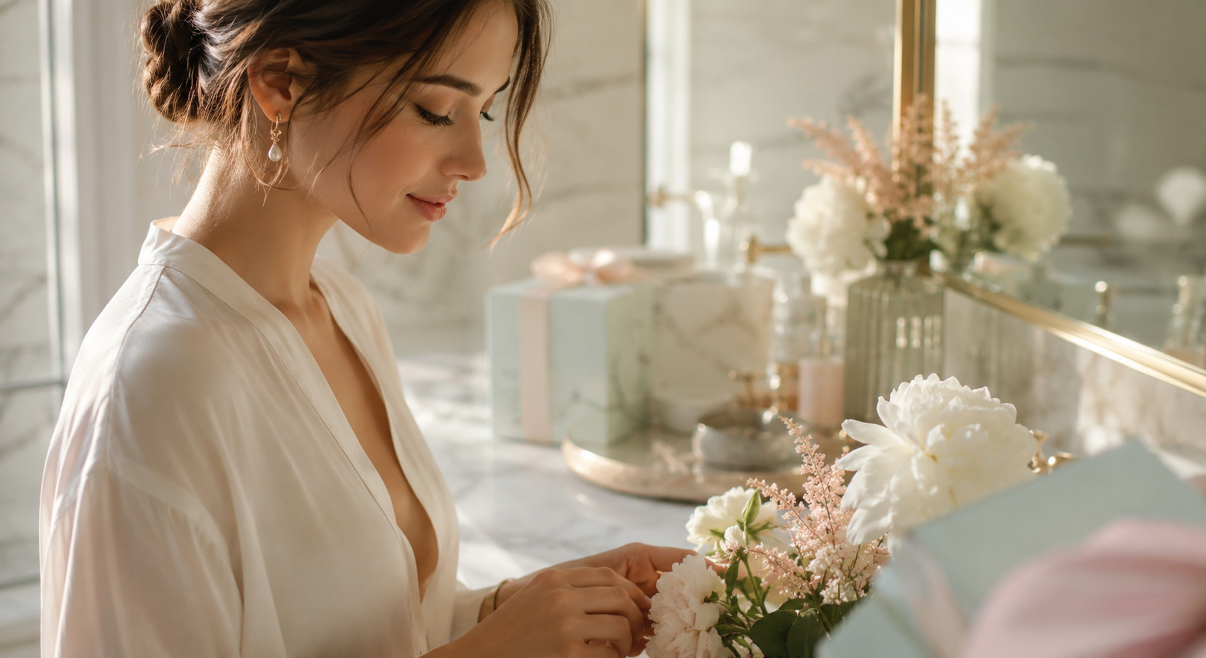
In its final cinematic presentation, the ACCENTRA® gift set extends beyond containment. Structure, product visibility, seasonal graphics, and the gesture of giving work together to create a more complete and emotionally resonant Gift Set Packaging Design experience.
The completed presentation demonstrated that giftability does not begin with decoration alone. It begins when structure, visible products, graphic continuity, and the moment of presentation are resolved as one experience.
For ACCENTRA®, the gift set became the final expression of the seasonal system—a coordinated object that connected product recognition with emotional value and transformed separate toiletries into something intentionally designed to be given.
SOFTNESS CREATED THE MOOD. STRUCTURE MADE IT RECOGNIZABLE.
“The Gift Has Been Presented. Now The Experience Can Slow Down.”
Let The Moment Breathe
After the anticipation of presentation and the gesture of giving, the story becomes quieter. The box is opened, the products enter everyday life, and design gives way to something more personal: a few unhurried moments of warmth, water, fragrance, and care.
The video creates a deliberate pause within the editorial. Its slow movement, amber light, and calm water do not explain the packaging—they reveal the feeling the collection was designed to support.
Here, value is no longer measured through composition alone. It is felt through atmosphere, touch, stillness, and the simple decision to step away from routine for a moment.
This quiet interval marks the transition from gift-ready presentation to lived experience. What was designed to be seen becomes something to use, feel, and remember.
“The Collection Was Designed To Be Given. The Ritual Begins When The Moment Becomes Your Own.”
FROM THE MOMENT OF GIVING TO THE MOMENTS THAT FOLLOW
BEYOND THE PACKAGE: THE EVERYDAY RITUAL
WHEN A SEASONAL IDENTITY CONTINUES THROUGH THE QUIET RHYTHM OF EVERYDAY CARE.
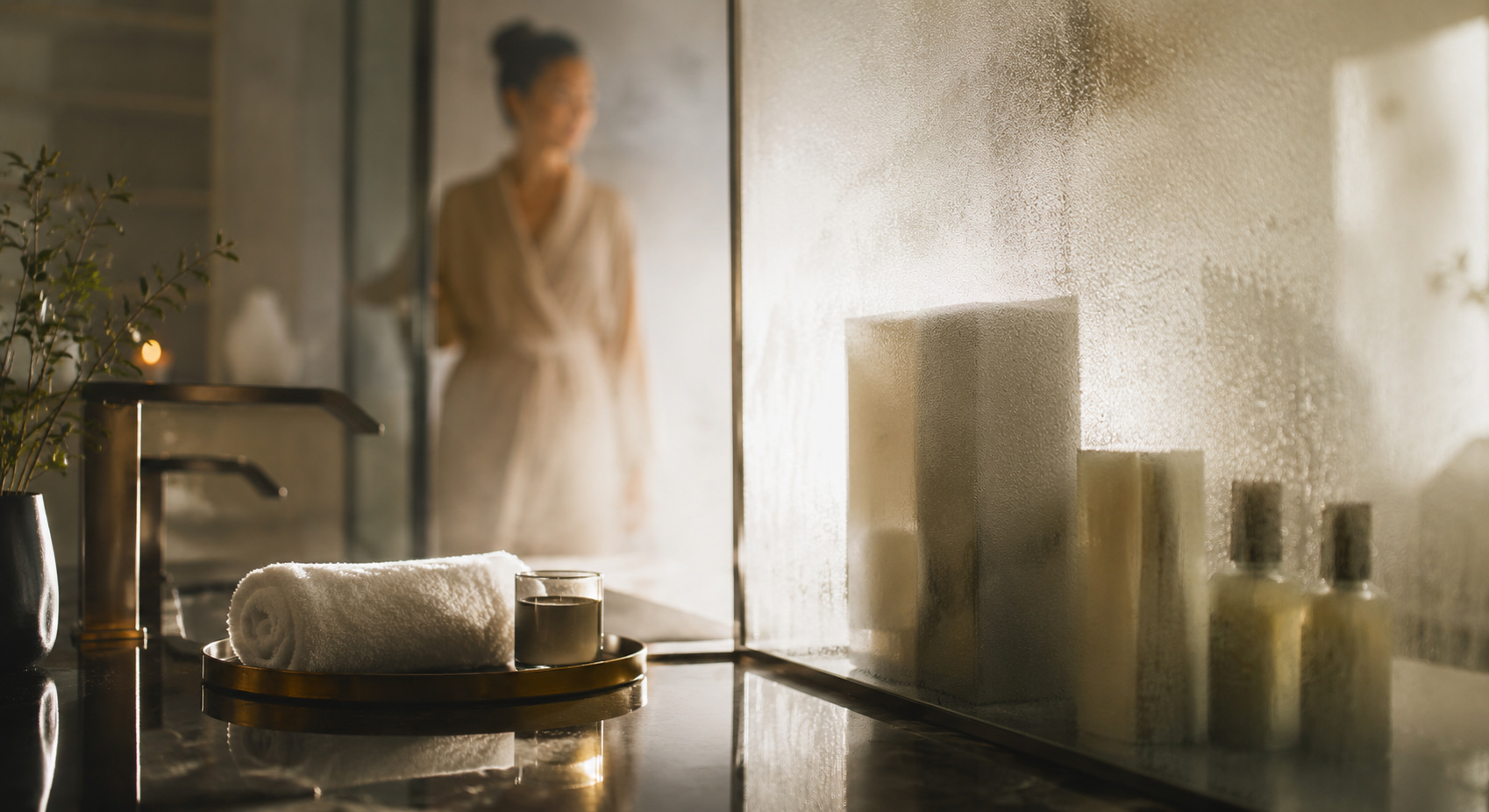
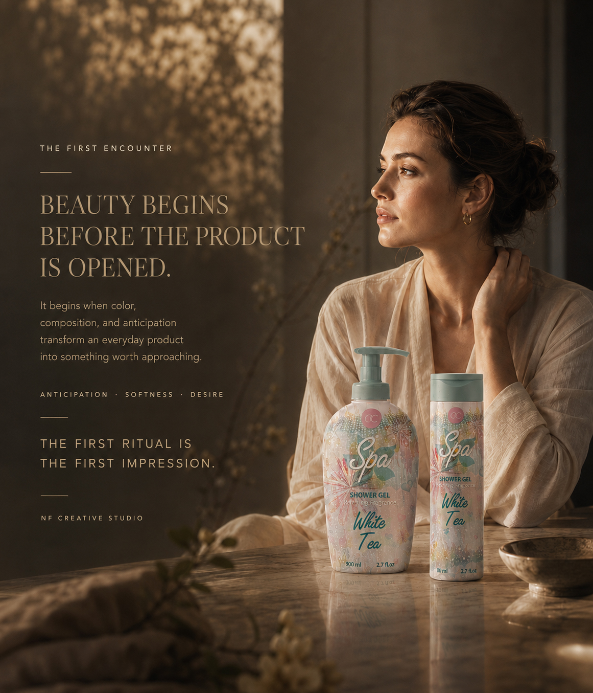
The ACCENTRA® experience did not conclude when the gift set was presented or when the products were removed from the box. At that moment, the collection simply entered a more intimate chapter—moving from seasonal presentation into the quiet, personal rhythm of everyday care.
Within this environment, packaging becomes more than a temporary point of attraction. It is placed beside water, reflected across polished surfaces, held in the hand, and encountered repeatedly through moments of pause, preparation, and personal attention. What first created interest now begins to build familiarity.
Watercolor botanicals, pastel color relationships, expressive Spa typography, and the recognizable White Tea identity preserved the collection’s atmosphere beyond the initial gift experience. The same front-facing elements that established recognition at first sight continued to give every format a calm, connected, and unmistakably ACCENTRA® presence in use.
The value of the design therefore extended beyond how the collection was introduced. It remained in the continuity between first impression, presentation, and ritual—allowing each product to feel considered on its own while remaining emotionally and visually connected to the complete seasonal experience.
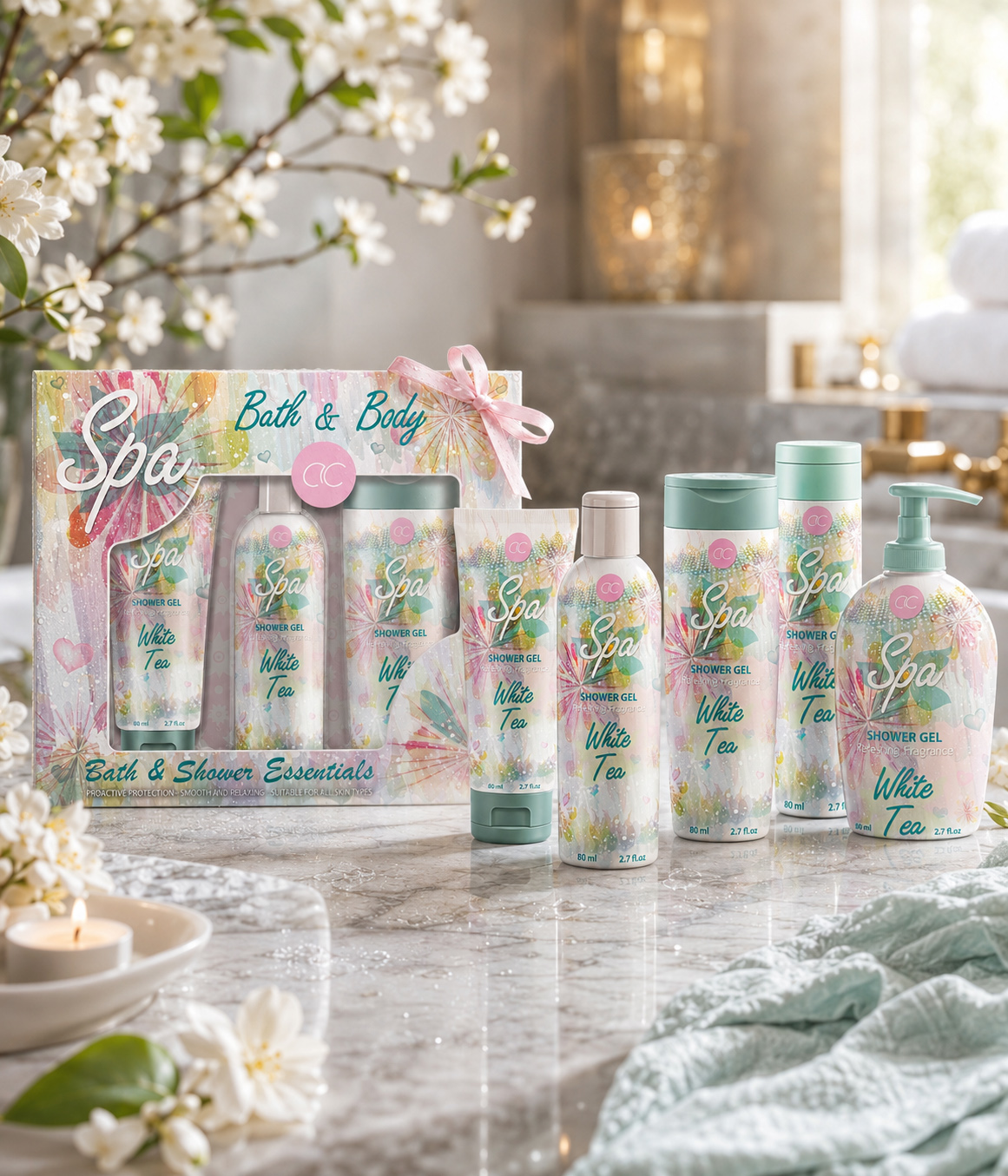
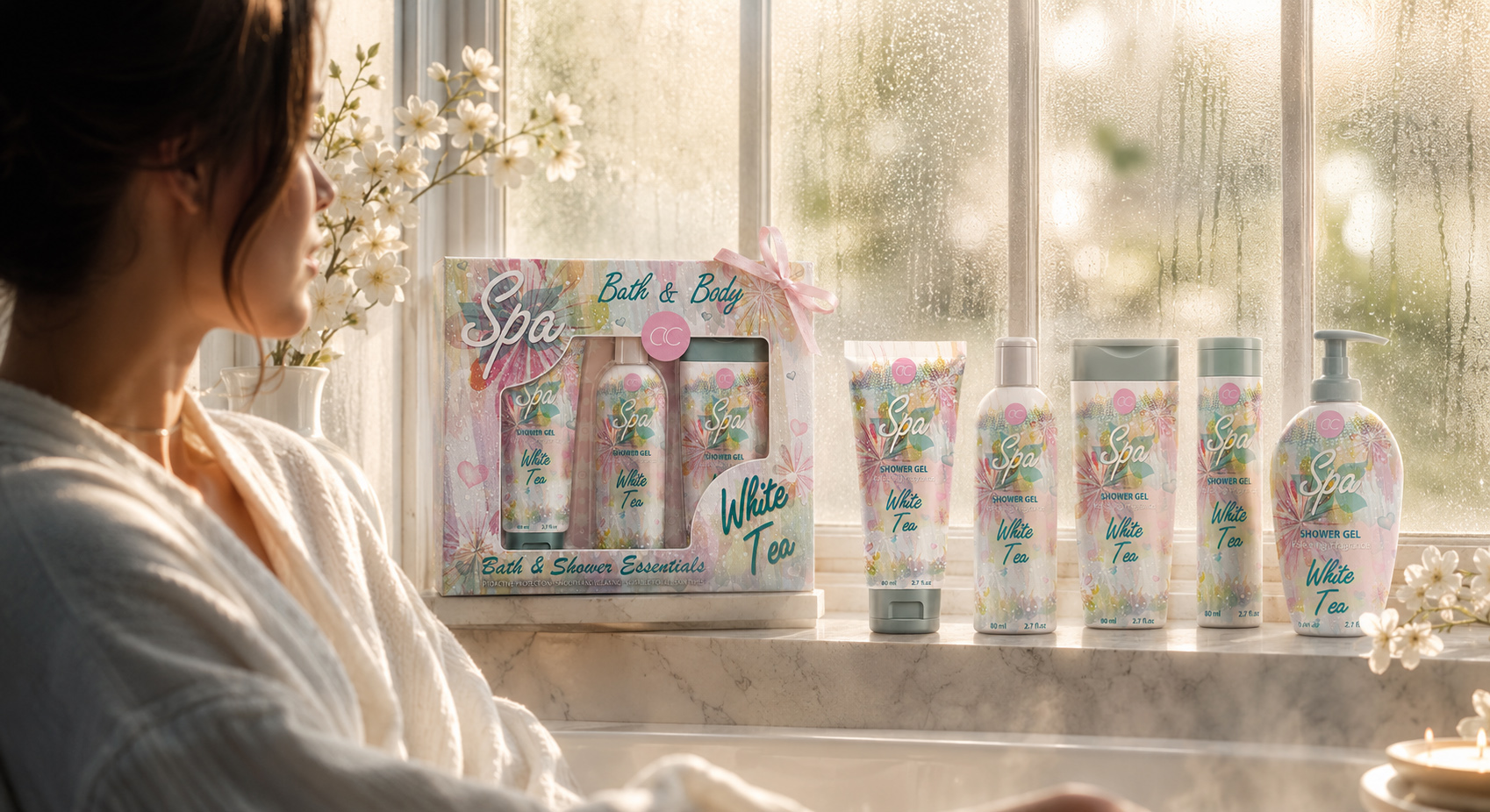
WHEN THE GIFT BECOMES PART OF THE DAY
Removed from the gift box and placed within a lived environment, the ACCENTRA® products begin a quieter chapter of the seasonal story. Recognizable color relationships, watercolor illustration, expressive typography, and front-facing hierarchy continue to connect the individual formats—allowing the collection to retain its identity while becoming part of the personal rhythm of everyday care.
FROM PRESENTATION TO PRESENCE
The gift-box presentation created the first impression of completeness, but the individual products were designed to carry that experience beyond the moment of giving.
Once removed from the box, every format continued to express the same Seasonal Packaging Design language. The products no longer depended on the surrounding presentation to feel connected; their shared atmosphere, visual structure, and recognizable front-facing character allowed the collection to remain coherent within everyday use.
PACKAGING WITHIN THE RITUAL
In daily life, packaging becomes part of the environment in which care takes place—positioned beside water, reflected across polished surfaces, held in the hand, and encountered through repeated moments of preparation, pause, and personal attention.
Its responsibility therefore extends beyond creating attraction at first sight. The design must continue to feel clear, considered, and emotionally relevant once the product leaves the gift set and enters a quieter, more intimate setting.
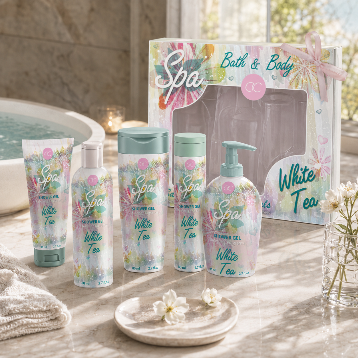
WHEN THE COLLECTION ENTERS EVERYDAY LIFE
Removed from the gift presentation and placed within a calm, lived environment, the ACCENTRA® products continue the seasonal narrative through recognizable color, watercolor illustration, White Tea naming, and one consistent front-facing identity—transforming a completed gift set into a familiar part of everyday care.
RECOGNITION THROUGH CONTINUITY
The repeated relationship between the ACCENTRA® mark, Spa expression, White Tea naming, watercolor botanicals, and functional product information preserved continuity across every encounter.
Because this front-facing hierarchy remained recognizable across different formats, each product could function independently without becoming visually disconnected from the wider collection. Repetition created familiarity, while controlled adaptation preserved the individual presence of every package.
EMOTIONAL VALUE IN EVERYDAY CARE
The design did not attempt to invent a new ritual or attach unsupported promises to the products. Its contribution remained focused and credible: giving familiar personal-care formats a softer atmosphere, stronger visual recognition, and a more intentional presence.
Through this restraint, the packaging supported the experience rather than competing with it. Design became part of the surrounding mood—present enough to shape perception, yet calm enough to belong naturally within the everyday moment.
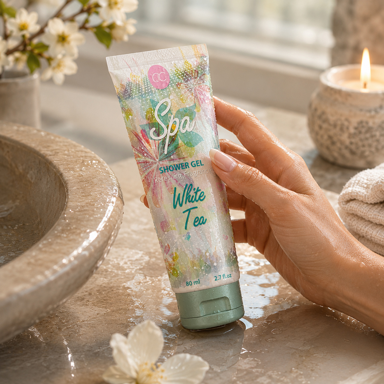
DESIGN THAT REMAINS WITHIN THE RITUAL
A closer interaction reveals how the ACCENTRA® identity continues beyond presentation. Through recognizable color, illustration, typography, and product hierarchy, the packaging remains visible, familiar, and emotionally consistent within the small routines of everyday care.
The complete seasonal experience was not defined by one image, one package, or one moment of giving. It was created through continuity—from the first encounter, through the coordinated gift presentation, and into the everyday environment where the products would continue to be seen, held, and recognized.
By preserving the same visual character across these different moments, the ACCENTRA® direction connected packaging with something more lasting than temporary seasonal attraction. The collection established a familiar atmosphere that remained present after the box was opened—allowing the original gesture of giving to evolve naturally into a personal and recognizable everyday care experience.
THE GIFT CREATED THE FIRST MOMENT. THE RITUAL ALLOWED THE EXPERIENCE TO CONTINUE.
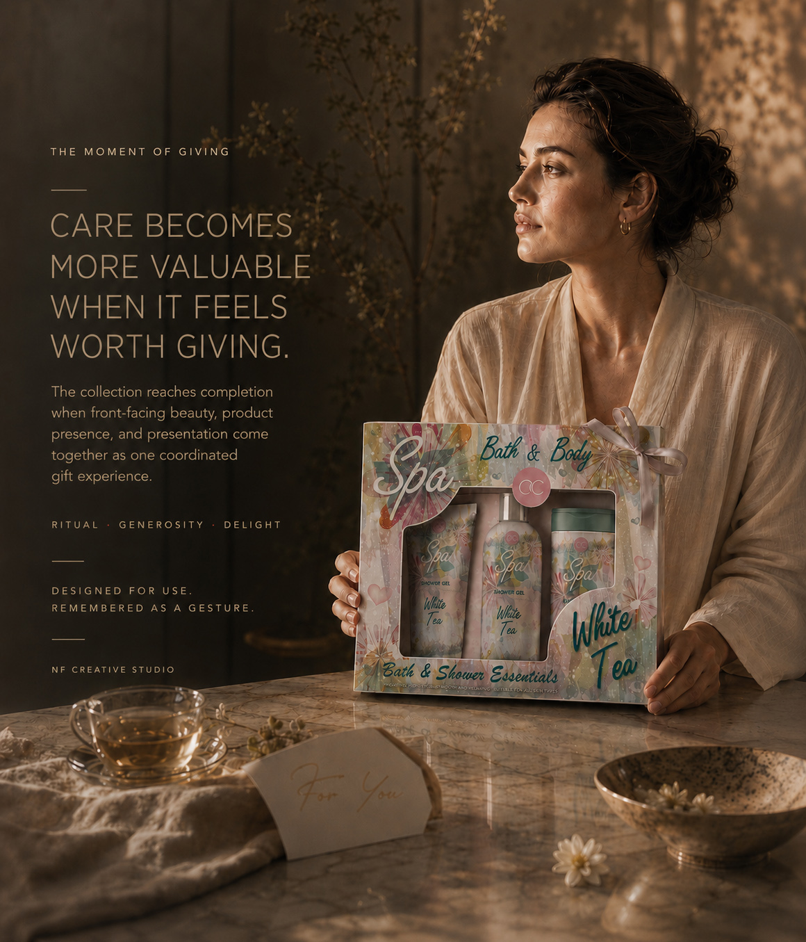
FROM A SEASONAL IDEA TO A RECOGNIZABLE COLLECTION EXPERIENCE
WHAT THE PROJECT ESTABLISHED
A DISTINCT FRONT-FACING LANGUAGE, A CONNECTED PRODUCT FAMILY, AND A GIFT EXPERIENCE SHAPED THROUGH ONE CLEAR VISUAL DIRECTION.
The ACCENTRA® project established more than a decorative seasonal appearance. It defined how one focused front-facing visual direction could give different product formats a shared character without forcing them into identical compositions.
Watercolor botanicals, pastel color relationships, expressive Spa typography, White Tea naming, and a controlled information hierarchy created a recognizable foundation across every visible application. Each format retained its own proportions and presence, while the collection gained clarity through repetition, adaptation, and visual continuity.
The same direction extended naturally into the final window-box presentation. Product visibility, coordinated artwork, and considered arrangement transformed separate toiletries into one coherent Gift Set Packaging Design experience—connecting first impression with anticipation, presentation, and the emotional value of giving.
The project remained deliberately focused on the visible surfaces responsible for seasonal character, product recognition, and collection cohesion. It did not claim to redesign every technical packaging component. Its strength came from resolving the part of the experience audiences encounter first—and ensuring that every visible element communicated the same idea.
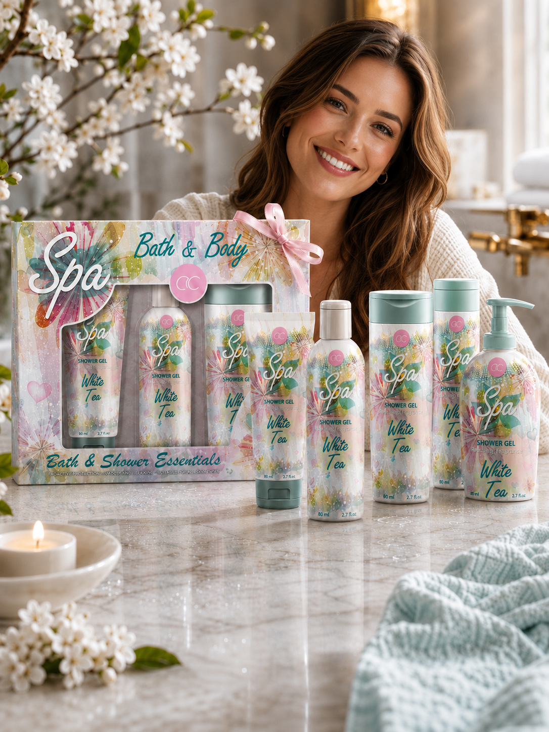
FROM VISUAL DIRECTION TO COMPLETE EXPERIENCE
Presented together, the final ACCENTRA® products and coordinated window-box reveal the complete value of the selected direction: distinctive formats connected through one recognizable front-facing language and extended into a considered seasonal gift experience.
SEASONAL CHARACTER WITH A CLEAR IDENTITY
The final direction translated the softness, freshness, and visual lightness of the season into a recognizable packaging character rather than applying temporary decoration.
Color, watercolor movement, botanical rhythm, typography, and naming worked together to give the collection an immediate and distinctive emotional presence.
FLEXIBILITY ACROSS VISIBLE FORMATS
The system proved that cohesion does not require mechanical repetition. Illustration scale, decorative density, typography placement, and front-facing hierarchy were adapted according to the proportions of each container.
This flexibility allowed every product to remain individually resolved while preserving clear recognition across the wider Cosmetic Packaging Design family.
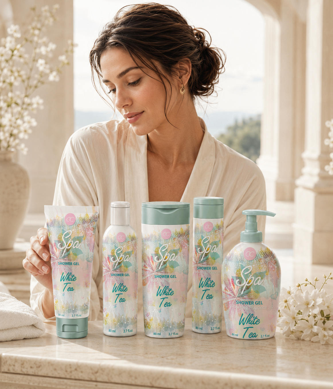
The ACCENTRA® White Tea Collection as a Lasting Brand Experience
Five distinct product formats retain their individuality while creating one coherent, human, and immediately recognizable seasonal collection.
GIFTABILITY BUILT INTO PRESENTATION
The final window-box did more than contain selected products. Its transparent window, visible arrangement, coordinated artwork, and repeated White Tea identity made the relationship between the individual formats immediately understandable.
The packaging transformed the collection from a group of separate toiletries into one complete, gift-ready seasonal gesture.
A FOCUSED AND CREDIBLE OUTCOME
The project’s value was not expressed through invented sales figures, unsupported performance claims, or an exaggerated technical scope.
It was visible in the documented exploration, the disciplined selection of one direction, its adaptation across the confirmed front-facing formats, and the consistency of the final product and gift presentation.
What the project ultimately established was a clear relationship between seasonal atmosphere, product recognition, format adaptation, and emotional presentation.
The final direction gave every visible part of the collection a defined role: individual products carried the identity, the product family demonstrated its flexibility, the gift box completed the presentation, and the everyday ritual allowed the atmosphere to continue beyond the initial moment of giving.
The result was not a collection held together by identical layouts. It was a collection held together by shared meaning, recognizable character, and one carefully resolved visual reason to belong.
THE PROJECT ESTABLISHED ONE CLEAR VISUAL REASON FOR EVERY VISIBLE PART OF THE COLLECTION TO BELONG.
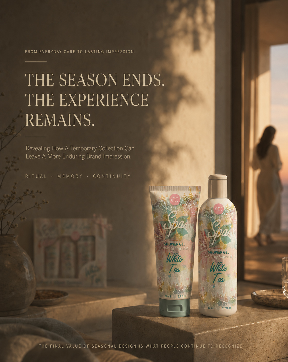
FROM SEASONAL CONCEPT TO LASTING BRAND IMPRESSION
THE COMPLETE SEASONAL BRAND EXPERIENCE
ONE VISUAL DIRECTION CONNECTED PRODUCT, PRESENTATION, RITUAL, AND MEMORY INTO A COMPLETE ACCENTRA® EXPERIENCE.
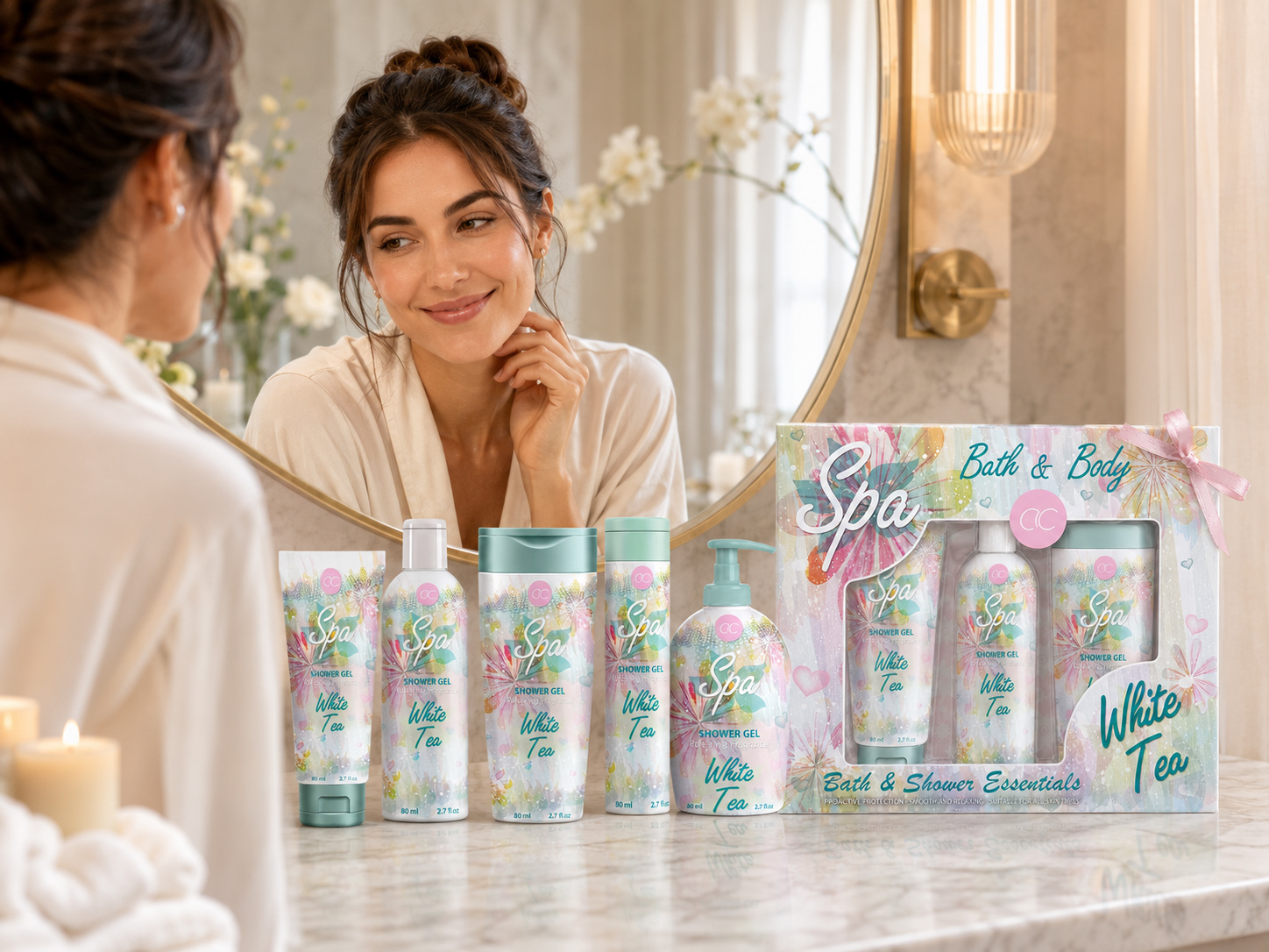
THE COMPLETE EXPERIENCE, SEEN AS ONE
Presented together within a lived environment, the final ACCENTRA® product family and coordinated gift set reveal the complete seasonal journey—from visual recognition and presentation to personal ritual and lasting brand memory.
The final value of the ACCENTRA® project emerged through the relationship between every stage of the experience—not through one isolated image, product, or presentation.
What began as an exploration of seasonal color, watercolor illustration, typography, and front-facing composition gradually developed into a recognizable visual language. Its strength came from the ability to connect different product formats while allowing each one to retain its own proportion, rhythm, and individual presence.
That language continued across the complete product family, gained greater emotional value through the coordinated window-box presentation, and entered the quieter context of everyday care. What first created recognition became part of presentation; what shaped presentation continued through use; and what began as a seasonal gesture developed into a more complete and memorable brand experience.
The collection therefore became more than a temporary Spring/Summer expression. It became a coherent Seasonal Packaging Design system shaped through continuity—first discovered as a visual possibility, then refined into one clear direction, extended across a connected family, presented as a gift, and ultimately remembered through the moments that followed.
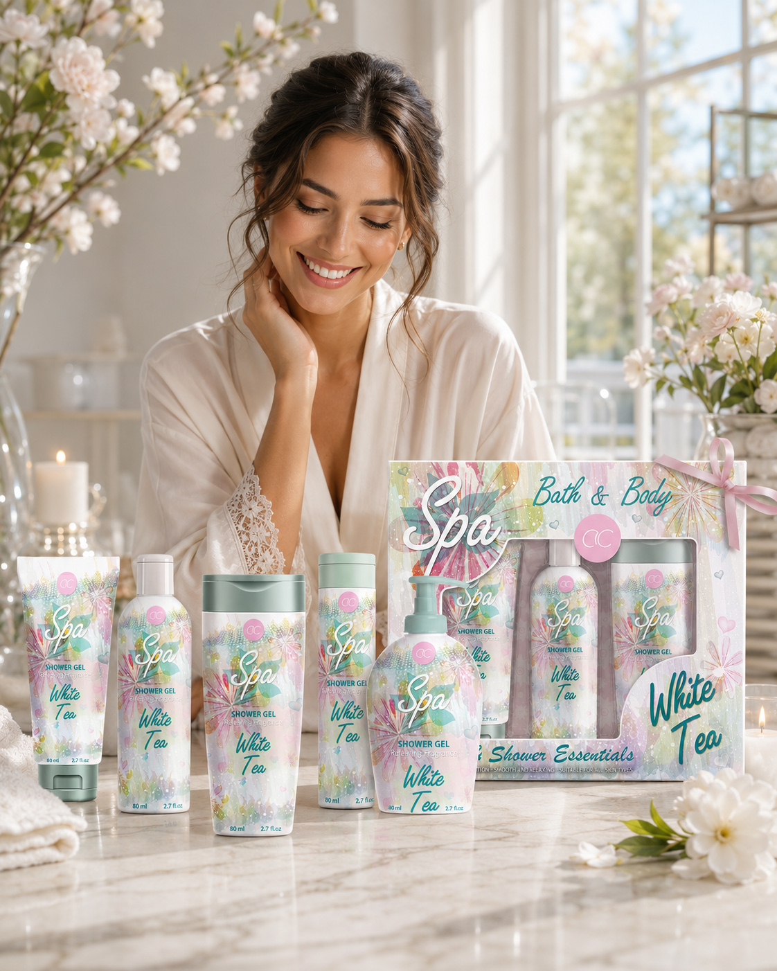
THE COLLECTION, COMPLETED THROUGH EXPERIENCE
Presented beside the final ACCENTRA® product family and coordinated gift set, the human presence completes the seasonal narrative—connecting visual recognition, gift-ready presentation, personal care, and emotional satisfaction within one coherent brand experience.
ONE IDEA, EXTENDED WITH PURPOSE
The final direction remained recognizable because its essential components were not merely repeated—they were carefully protected, recalibrated, and reinterpreted across every visible application.
Watercolor botanicals established movement. Pastel color relationships introduced softness and seasonal lightness. Spa typography, White Tea naming, ACCENTRA® placement, and a controlled front-facing hierarchy created the structure that held the collection together.
Each format required a different balance of scale, density, spacing, and emphasis. Yet every adaptation preserved the original character of the idea, allowing the system to remain flexible without becoming fragmented.
FROM PRODUCT TO COLLECTION
Individually, every format carried its own silhouette, proportion, and visual presence. Together, those differences became part of the collection’s strength.
Cohesion was not created by forcing identical layouts across every surface. It emerged through shared atmosphere, recurring visual cues, consistent hierarchy, and a disciplined relationship between variation and recognition.
The products did not need to look the same to belong together. They needed to communicate the same seasonal intention.
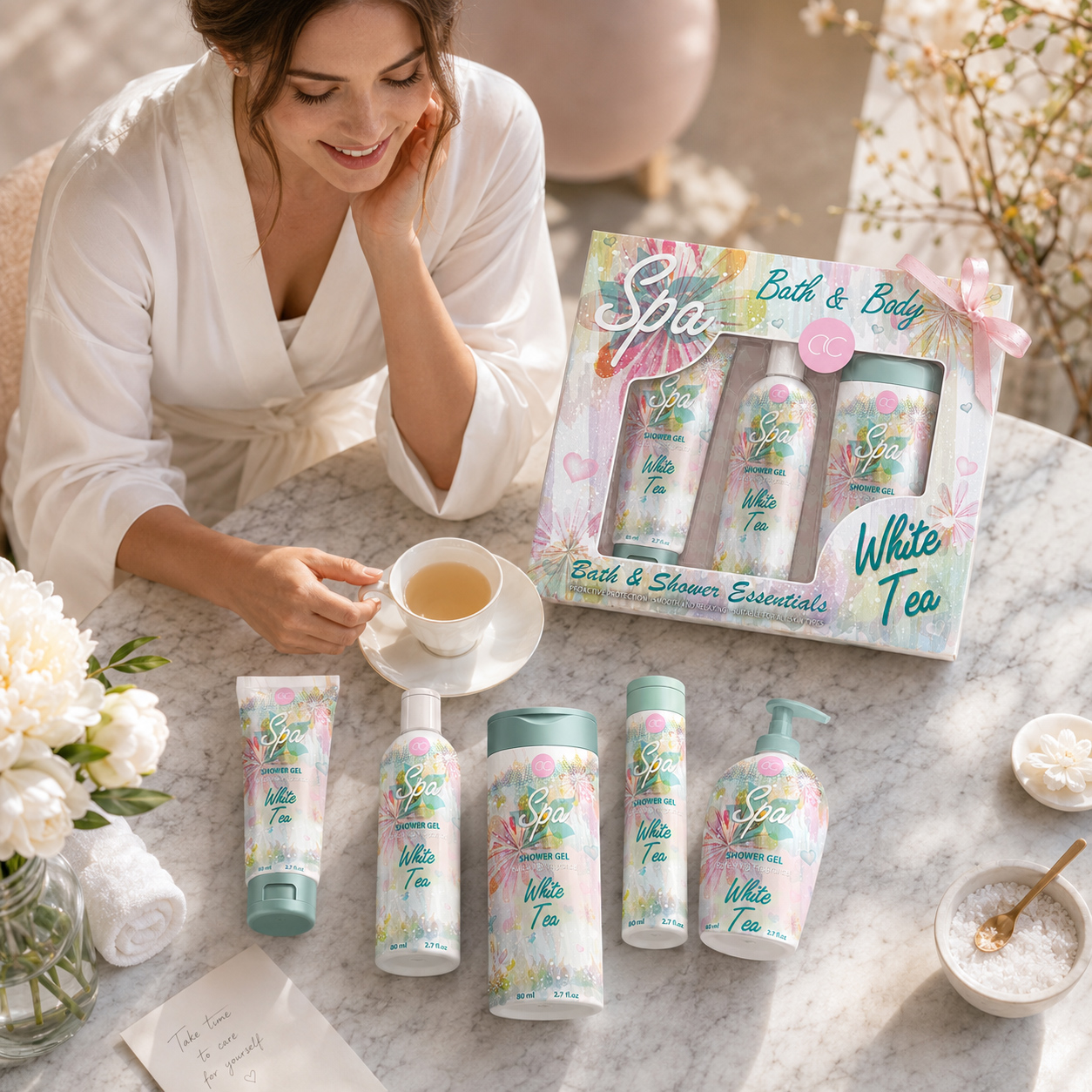
WHEN THE COMPLETE EXPERIENCE BECOMES PERSONAL
Seen within a quiet moment of self-care, the final ACCENTRA® product family and coordinated gift set move beyond presentation and become part of a lived experience. Product, packaging, ritual, and emotional value come together through one recognizable seasonal language—transforming the collection from something designed to be given into something personally enjoyed and remembered.
FROM COLLECTION TO EXPERIENCE
The window-box presentation extended the identity beyond individual packaging and transformed recognition into anticipation, presentation, and emotional value.
Once the products entered everyday use, the same visual language continued to operate in a quieter and more personal context. Packaging became part of the surrounding ritual—seen beside water, reflected across surfaces, held in the hand, and encountered through repeated moments of care.
Through this continuity, the project connected discovery, selection, giving, use, and remembrance within one coherent experience.
FROM SEASONAL PRESENCE TO BRAND MEMORY
A seasonal collection may exist for a limited period, but the impression it creates does not have to disappear with the season.
When color, illustration, typography, product structure, gift presentation, and lifestyle atmosphere reinforce the same idea, temporary visual appeal can become a more lasting form of brand recognition.
By carrying one resolved language across every stage of the experience, the ACCENTRA® collection gained more than seasonal charm. It gained a clearer emotional identity—one capable of remaining familiar after the first encounter had passed.
The completed project demonstrated that seasonal design creates lasting value when every visible element is given a clear role within the same experience.
The products established recognition. The collection transformed individual formats into one connected family. The gift box introduced anticipation and emotional completeness. Everyday use allowed the identity to move beyond presentation and become part of a more personal rhythm.
Together, these stages transformed one selected visual direction into a complete and credible ACCENTRA® brand experience—not through exaggerated claims or forced complexity, but through continuity, restraint, and disciplined visual connection.
What remains is not simply the memory of one package, one illustration, or one seasonal campaign. It is the recognition of a collection whose color, atmosphere, structure, and emotional character were designed from the beginning to feel inseparable.
THE SEASON MAY PASS. THE EXPERIENCE SHOULD REMAIN.
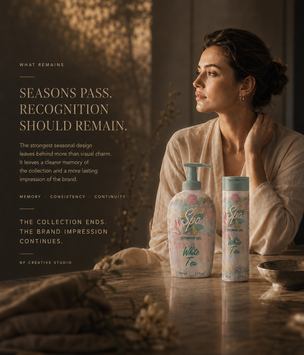
FINAL CASE STUDY CLOSING
THE SEASON PASSES. THE EXPERIENCE REMAINS.
ACCENTRA® demonstrates that seasonal Cosmetic Packaging Design can create immediate freshness without becoming temporary, connect different product formats without forcing repetition, and transform everyday care into a more complete and emotionally considered experience.
Across the complete editorial journey, one visual direction was explored, challenged, selected, refined, extended, presented, experienced, and ultimately remembered.
The final collection is the visible outcome.
The sense of recognition, belonging, and emotional continuity behind it is the more enduring achievement.
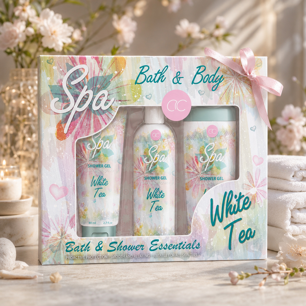
FROM SEASONAL ATMOSPHERE TO VISUAL RECOGNITION. FROM INDIVIDUAL PRODUCTS TO ONE CONNECTED GIFT EXPERIENCE. FROM ONE RESOLVED DIRECTION TO AN ACCENTRA® IDENTITY DESIGNED TO REMAIN.
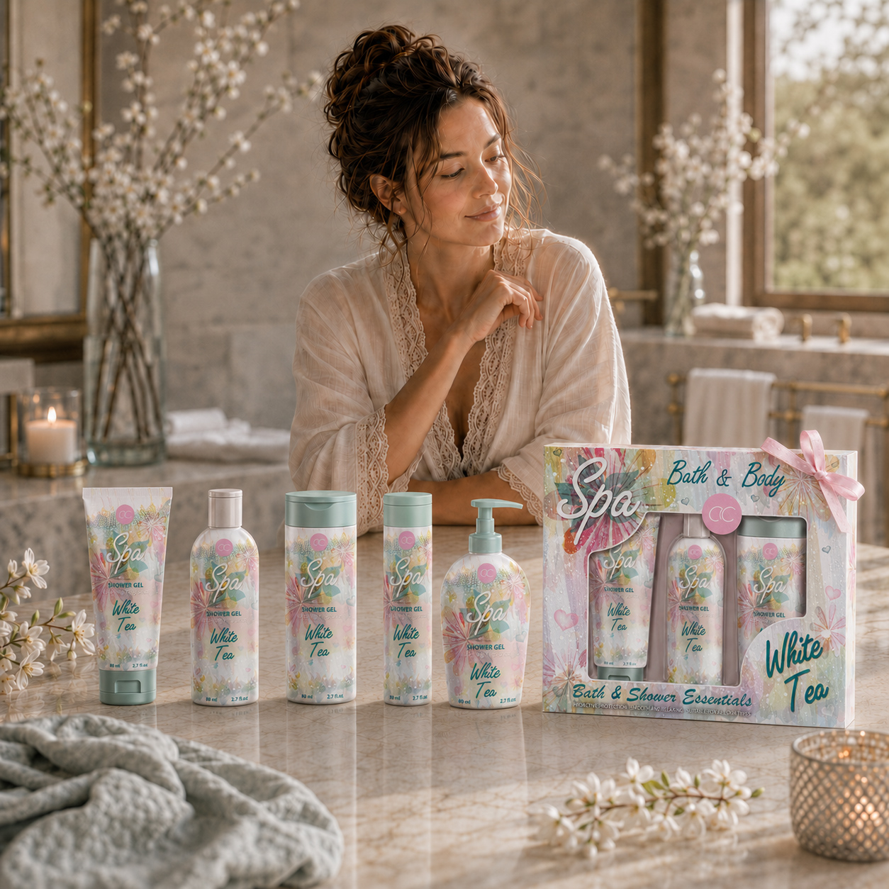
ATMOSPHERE. BELONGING. MEMORY.
CREATED FOR THE SEASON. REFINED THROUGH EXPERIENCE. REMEMBERED BEYOND THE MOMENT.
NF CREATIVE STUDIO
The Final Result
FROM FRONT-FACING EXPLORATION TO ONE COHERENT SEASONAL COLLECTION
When Seasonal Atmosphere, Product Recognition, And Gift Presentation Work Together, Packaging Becomes More Than A Surface—It Becomes A Complete Visual Experience.
The ACCENTRA® project concluded with the development of a clearly defined front-facing cosmetic packaging direction designed to connect multiple toiletries formats through one recognizable seasonal language. Rather than expanding into a complete technical packaging system, the final outcome focused on the visible areas responsible for first impression, product character, collection cohesion, and gift-oriented presentation.
Through the selection of one refined visual direction, the collection established a shared language of watercolor botanicals, pastel color relationships, expressive Spa typography, White Tea naming, and controlled front-facing composition. This allowed tubes, bottles, pump formats, and the open-box gift presentation to feel visually connected while preserving the individual presence of each format.
PROJECT OUTCOMES:
✓ Unified Front-Facing Collection Identity
A coherent Cosmetic Packaging Design direction connected the collection through one recognizable seasonal visual language.
✓ Cross-Format Visual Consistency
The selected concept was adapted across tubes, bottles, and pump formats while preserving front-facing recognition and collection cohesion.
✓ Seasonal Product Character
Watercolor botanicals, pastel tones, and expressive typography created a distinctive Seasonal Packaging Design atmosphere shaped around freshness, softness, and giftability.
✓ Open-Box Gift Presentation
The final Open-Box Gift Set Design extended the visual language beyond individual products and completed the collection as a coordinated gift experience.
✓ Product Family Cohesion
Every visible format retained its own role while contributing to one connected Beauty Packaging Design family.
STRATEGIC IMPACT:
The value of this project lies in how a focused front-facing packaging concept can transform multiple toiletries formats into one emotionally coherent collection.
Instead of relying on technical complexity or unsupported market claims, the ACCENTRA® outcome demonstrates the strength of clear visual strategy, disciplined adaptation, and a seasonal language capable of connecting product recognition, aesthetic appeal, and gift-oriented presentation.
This transforms ACCENTRA® from a set of individual packaging applications into a more complete Seasonal Cosmetic Packaging Design experience built around atmosphere, consistency, and memorability.
WHAT THIS PROJECT DELIVERED:
✓ Seasonal Visual Direction
✓ Front-Facing Packaging Concept
✓ Watercolor Botanical Language
✓ Pastel Color Strategy
✓ Spa Typography Expression
✓ White Tea Product Identity
✓ Cross-Format Composition Adaptation
✓ Product Family Cohesion
✓ Open-Box Gift Set Design
✓ Premium Product Visualizations
FINAL STATEMENT
Strong seasonal packaging is remembered not because every format looks identical, but because every visible detail feels intentionally related. In the ACCENTRA® project, the final value emerged through the disciplined translation of one seasonal atmosphere into a connected collection of products and gift presentation—creating a Cosmetic Packaging Design experience that feels clear, cohesive, and worth remembering.
ONE SEASONAL IDEA. ONE CONNECTED COLLECTION. ONE RECOGNIZABLE VISUAL EXPERIENCE.
| PROJECT SUMMARY | STATUS |
|---|---|
| Seasonal Direction | ✓ Completed |
| Front-Facing Concept | ✓ Completed |
| Strategic Exploration | ✓ Completed |
| Final Creative Direction | ✓ Finalized |
| Tube Packaging | ✓ Completed |
| Bottle Packaging | ✓ Completed |
| Pump Packaging | ✓ Completed |
| Product Cohesion | ✓ Established |
| Open-Box Gift Set | ✓ Completed |
| Product Visualization | ✓ Delivered |
PROJECT STATUS
| PROJECT STATUS | STATUS |
|---|---|
| Collection Strategy | ✓ Completed |
| Seasonal Mood Definition | ✓ Completed |
| Watercolor Exploration | ✓ Completed |
| Botanical Visual Language | ✓ Developed |
| Typography Direction | ✓ Finalized |
| Color Relationship System | ✓ Finalized |
| Front-Facing Composition | ✓ Completed |
| Product Naming Hierarchy | ✓ Established |
| Cross-Format Adaptation | ✓ Completed |
| Gift Presentation System | ✓ Completed |
| Product Family Presentation | ✓ Structured |
| Final Collection Identity | ✓ Delivered |
ONE SEASONAL ATMOSPHERE.
ONE COHERENT FRONT-FACING DIRECTION.
ONE COMPLETE GIFT-ORIENTED COLLECTION EXPERIENCE.
PROJECT CONCLUSION
| PROJECT CONCLUSION | STATUS |
|---|---|
| Final Visual Direction | ✓ Complete |
| Cross-Format Consistency | ✓ Achieved |
| Gift Set Presentation | ✓ Ready |
“The Most Memorable Seasonal Packaging Does More Than Decorate A Product—It Creates Recognition, Connects Different Formats, And Transforms Everyday Care Into A Cohesive Gift-Oriented Experience Designed To Be Remembered.”
"The Best Beauty Experiences Begin Before The First Drop."
Designing The Feeling Behind Every Beauty Ritual
The Accentra My Secret Spa Collection was never intended to be just another line of personal care products. It was created to transform everyday routines into meaningful moments of relaxation, elegance, and self-care.
Every element of the Packaging Design was carefully developed to communicate softness before the product is even touched. Through delicate color palettes, refined floral illustrations, premium visual detailing, and a cohesive Brand Identity, the collection creates an immediate emotional response that extends beyond functionality.
Rather than simply presenting cosmetic products, the design establishes an atmosphere—one that reflects comfort, beauty, and modern wellness. By elevating Shelf Presence, strengthening Consumer Perception, and creating a memorable visual experience, the collection successfully positions Accentra as a premium lifestyle brand where every detail contributes to a lasting emotional connection.
"The most memorable beauty experiences begin long before the first product is ever used."
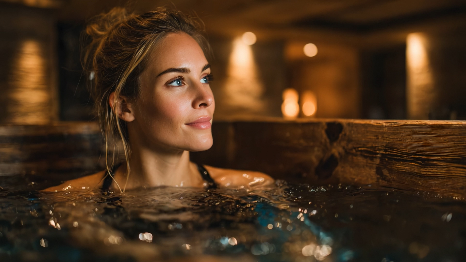
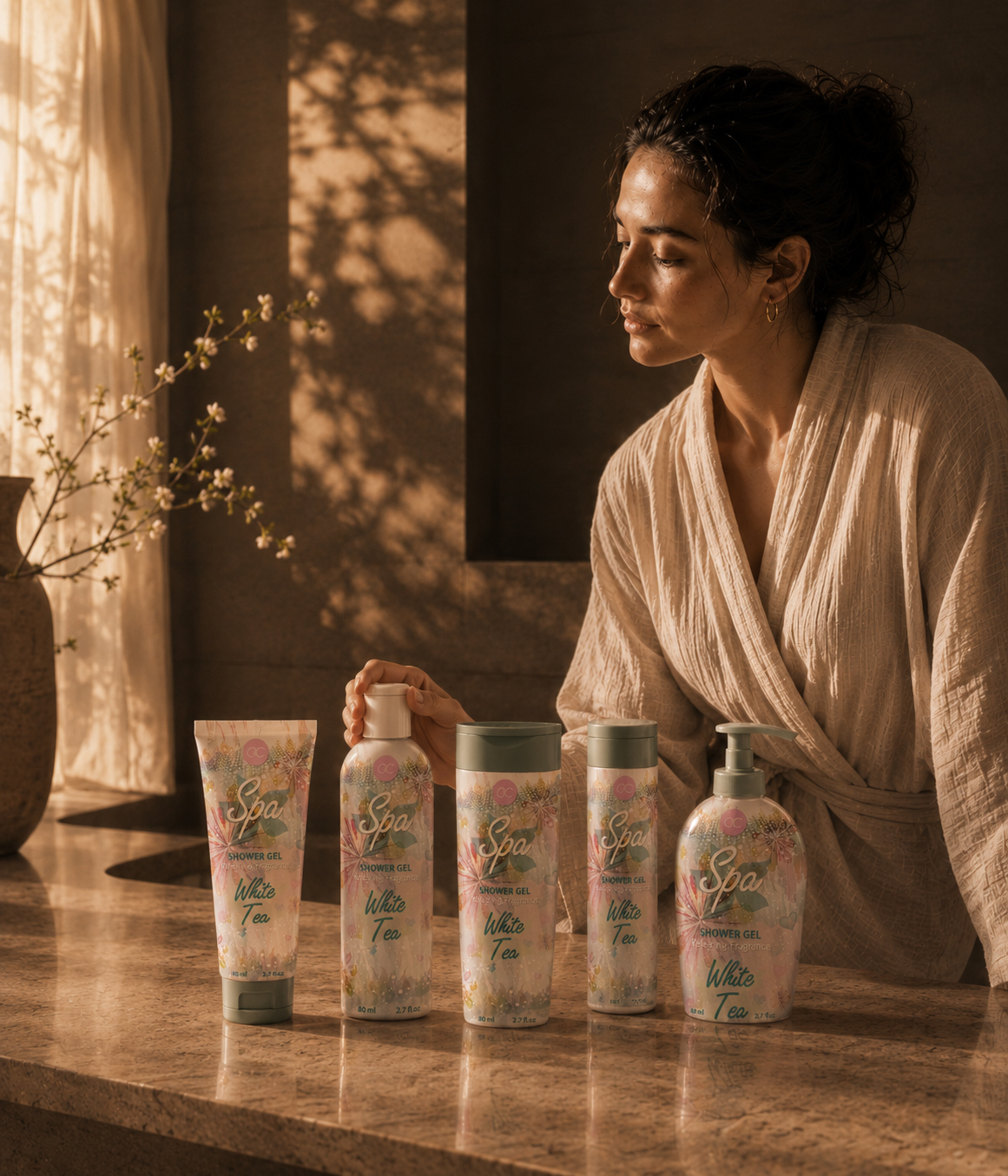
Designing Seasonal Character That Extends Beyond The Front Of The Pack

Conclusion:
The Strongest Seasonal Packaging Does More Than Introduce A Product—It Creates Immediate Recognition, Connects Different Formats, And Turns Everyday Care Into A More Cohesive Gift Experience.
The ACCENTRA® seasonal collection demonstrates how focused Cosmetic Packaging Design, a clearly defined seasonal visual direction, and a carefully developed front-of-pack concept can give a varied toiletries range one clear and recognizable character. Rather than treating every product format as a separate visual task, the project established a shared direction through color, illustration, typography, hierarchy, and coordinated seasonal expression.
The central challenge was to create enough visual distinction to make the collection memorable while preserving clarity across different packaging formats. Each front-facing application needed to feel expressive on its own while remaining visibly connected to the wider product line, strengthening collection recognition and visual consistency.
Creative exploration examined multiple ways to balance decorative appeal, product recognition, seasonal atmosphere, and gift-oriented presentation. Through comparison and refinement, one direction emerged with the strongest potential to unite the collection while creating a more cohesive Seasonal Packaging Design language across the range.
The selected visual language extended naturally from individual products into an open-box gift presentation. This strengthened the relationship between everyday personal care products and a more complete gift experience, allowing the collection to feel coordinated, inviting, and ready for seasonal presentation.
For ACCENTRA®, the final result was not simply a more decorative package front. It became a focused front-facing design direction capable of strengthening collection consistency, supporting gift-oriented appeal, and establishing a more distinctive seasonal experience across every verified product and presentation format.
“The Final Value Of The Collection Lies In The Relationship Between Its Parts—One Seasonal Idea, Intelligently Adapted, Clearly Recognized, And Completed Through The Experience Of Giving.”
FINAL THOUGHT
Great Beauty Collections Begin Long Before They Reach The Shelf.
Exceptional cosmetic packaging is more than beautiful graphics—it creates anticipation, communicates product quality, and transforms everyday routines into enjoyable lifestyle experiences. Every creative decision was carefully developed to express freshness, elegance, and seasonal emotion while strengthening retail presence and long-term brand recognition.
Every illustration.
Every color palette.
Every refinement.
Each iteration brought the collection closer to becoming a cohesive beauty system that feels light, premium, and instantly recognizable across every product and every customer touchpoint.
For Accentra, packaging became more than seasonal decoration.
It became the visual language of the collection.
WHERE EVERYDAY BEAUTY BLOOMS INTO BRAND EXPERIENCE.
WHAT THE FINAL DIRECTION ESTABLISHED
WHERE ONE SELECTED VISUAL LANGUAGE BECAME A COMPLETE SEASONAL EXPERIENCE
SELECTED SEASONAL DIRECTION
One final front-facing visual direction was selected to define the visible character of the ACCENTRA® Spring/Summer collection across every confirmed application.
CONNECTED PRODUCT FORMATS
Five distinct packaging silhouettes were brought together through shared watercolor illustration, pastel relationships, Spa typography, White Tea naming, and one recognizable front-facing hierarchy.
PRODUCTS INTEGRATED INTO THE GIFT SET
Three selected product formats were coordinated within the final transparent window-box presentation while remaining clearly visible, individually recognizable, and compositionally connected.
COORDINATED WINDOW-BOX EXPERIENCE
One final Open-Box Gift Set Design extended the seasonal language beyond individual products and transformed the collection into a complete, gift-ready presentation.
CONNECTED EXPERIENCE STAGES
The final direction remained consistent across four key moments: product recognition, collection cohesion, gift presentation, and everyday ritual.
COMPLETE SEASONAL EXPERIENCE
One resolved visual system connected product, collection, presentation, and emotional value without forcing identical compositions across every packaging format.
STRATEGIC SUMMARY
The final value of the ACCENTRA® project is visible not only in the volume of exploration, but in what that exploration ultimately established.
One selected seasonal direction connected five confirmed product formats, coordinated three products within the final gift presentation, and carried the same recognizable visual language across product recognition, collection cohesion, gifting, and everyday experience.
Watercolor botanicals, pastel color relationships, expressive Spa typography, White Tea naming, and controlled front-facing hierarchy were adapted according to each format’s proportions while preserving one consistent seasonal character.
The result is a focused and credible Seasonal Packaging Design system—clear across individual products, stronger as a connected family, and complete when extended into the final window-box experience.
ONE DIRECTION. FIVE CONNECTED FORMATS. FOUR EXPERIENCE STAGES. ONE COMPLETE SEASONAL IDENTITY.
Proud Clients




























































The Team Behind the Project - Led by Creative Director
The Team Behind the Project:
Every Infinity Design Studio project is personally led and directed by Filip Narančić – Founder & Creative Director.
With a unique blend of creativity, strategy, and precision, Filip ensures that each project delivers premium quality, timeless design, and measurable impact.
Infinity Design Studio operates with a boutique approach, where every detail is carefully crafted, and each solution is tailored to the client’s vision and market demands. By combining multidisciplinary expertise with hands-on leadership, the studio transforms every project into a distinctive brand experience.

Filip Narančić
Founder & CEO – Infinity Design Studio

SPECIALIZED IN:

Short biography
Born on June 24, 1982, in Valjevo, Filip Narančić turned his passion for architecture and design into a thriving career. He graduated from the Faculty of Technical Sciences in Novi Sad, Department of Architecture and Urbanism. During his studies, he launched a pilot project that later evolved into today’s Infinity Design Studio.

What Our Clients Say About Us?
Trusted by global brands and visionary entrepreneurs — hear what they say about working with Infinity Design Studio.

Filip was wonderful to work with! As a first-timer in product packaging design, I just asked for eye-catching packaging. He exceeded all of our expectations, and we highly recommend working with Filip – you won’t be disappointed!

Fatime.Perazic
TRIDENT POSEIDON
Excellent professional, quick service. We recommend working with him!

Moltres
BROMELIFE
“Filip is an extremely talented designer. He was a pleasure to work with throughout this process. In addition to being very responsive, he was able to take a general idea and turn it into something we truly loved. Highly recommend!”

Jrossd
ECOMMDISTRIBUTION, ASHBROOK OUTDOORS
This designer’s professionalism and creativity are truly commendable. We’re delighted with his work andhighly recommend collaborating with him. His talent and dedication consistently deliver outstandingresults.

Harmouch.Fk
NUTRIVEG LAB
Worked perfectly together and carried out extremely quickly with corrections and changes.

MarceQ
BRAUEREI 2572
Filip is a very enthusiastic designer, proactively looking for various solutions and flexible in terms ofworking and communication. I am very pleased with the final design and our teamwork!

JaanP
LUCIDKITCHEN
EXCELLENT!!! Filip is the best designer and even the best contractor I have ever worked with. Hecreated an awesome design and worked with me tirelessly from its greatness to its perfection. Now I havethe most gorgeous packaging on the market, and all my competitors are screwed. Hooray :-)!

Jakub.Novotny7
COPPER GEMZ
We needed a new label for our maple syrup. From start to finish, Filip was right on top of the design, anychanges we requested, and was extremely good at communicating. We loved his style and highly recommend working with him!

The Gateway Farm
THE GATEWAY FARM
I really enjoyed working with Filip. He is very hardworking, and the service is truly excellent!

AromapetD
AROMAPET
This designer is AMAZING! I can’t believe how easy it was to work with him on all the changes we madeto our box. He was so positive and encouraging, with great design ability! Highly recommended!

XoginaU
Dr. P RX
Filip has done excellent work for our project! He’s quick and delivers great designs. Very attentive, very easy to work with, listens to and understands what I am trying to get done immediately. Thanks! Happy to work with him again!

I NEED MORE THAN 5 STARS TO RATE FILIP. His relentless commitment and creativity made thisproject a dream come true. Highly recommended!

Wong.Jameson
UNO DOGGO
Let’s Work Together
Infinity Design Studio is your trusted creative partner for Strategic CASE STUDIES that strengthen Brand Authority, build customer trust, and transform successful projects into powerful business assets.
Explore More Stunning Work
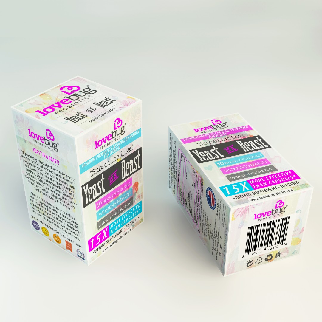

Tell Us What You’re Building.
Share what you already know—what you are creating, changing, improving, launching, or trying to solve. We’ll use that context to understand the project and determine the right next step.
You do not need a perfect brief to begin. Clear context is enough.