THE FINAL IDENTITY
THE CONCEPT THAT BECAME THE BRAND
"Where Korean Heritage, Strategic Thinking, and Premium Packaging Design Converged Into One Timeless Identity."
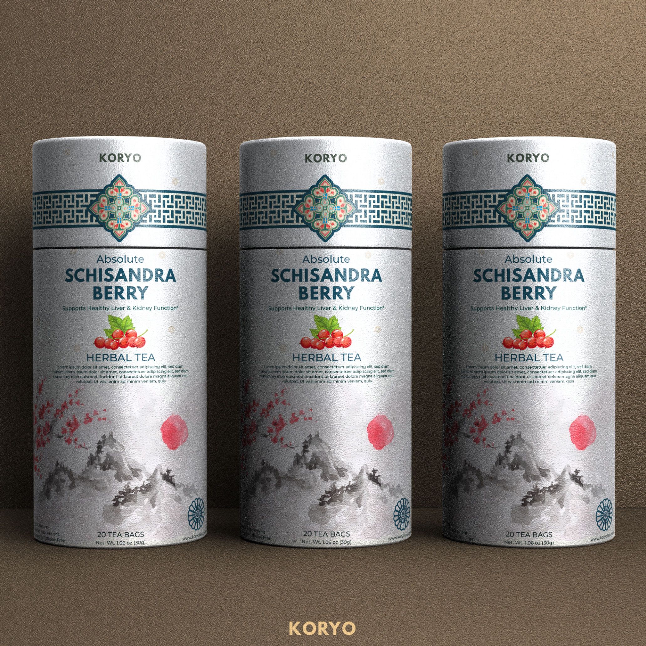
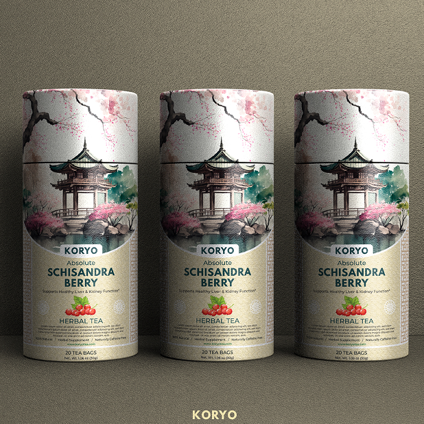
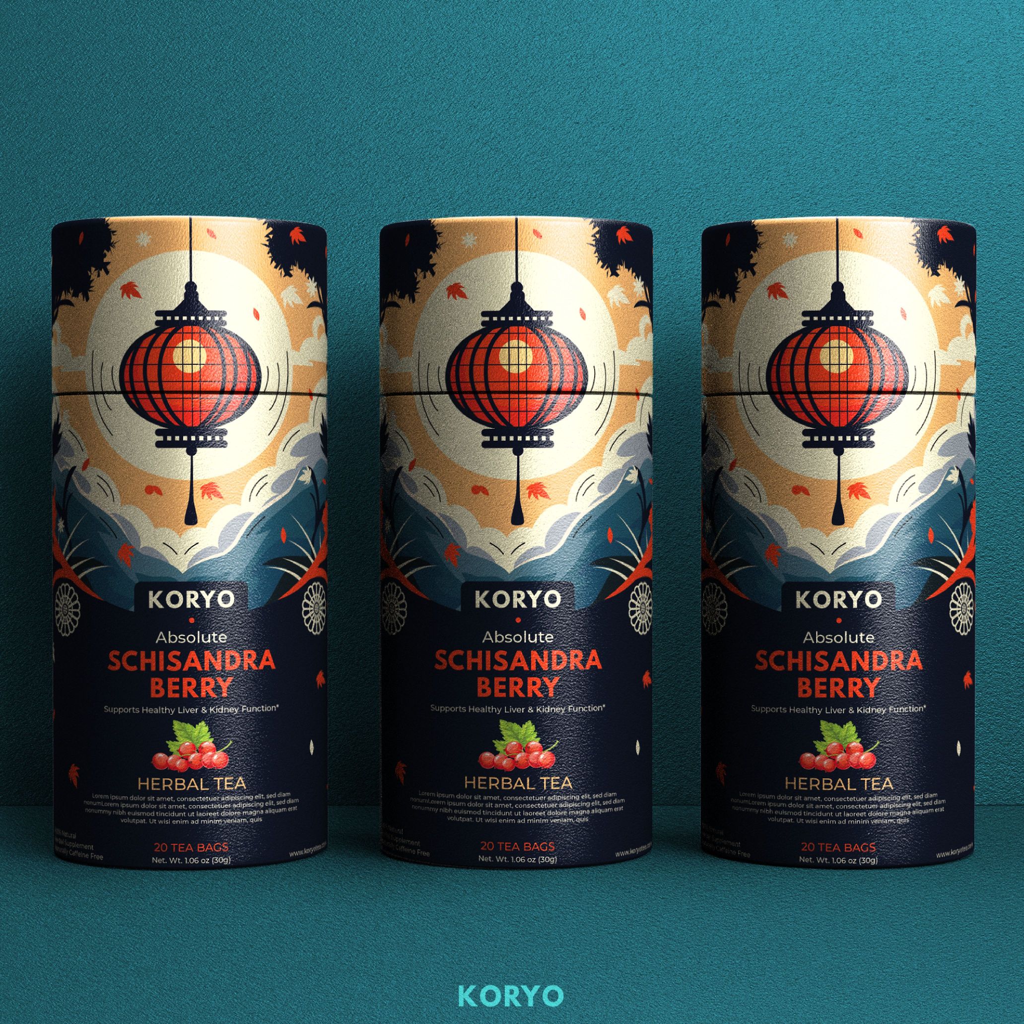
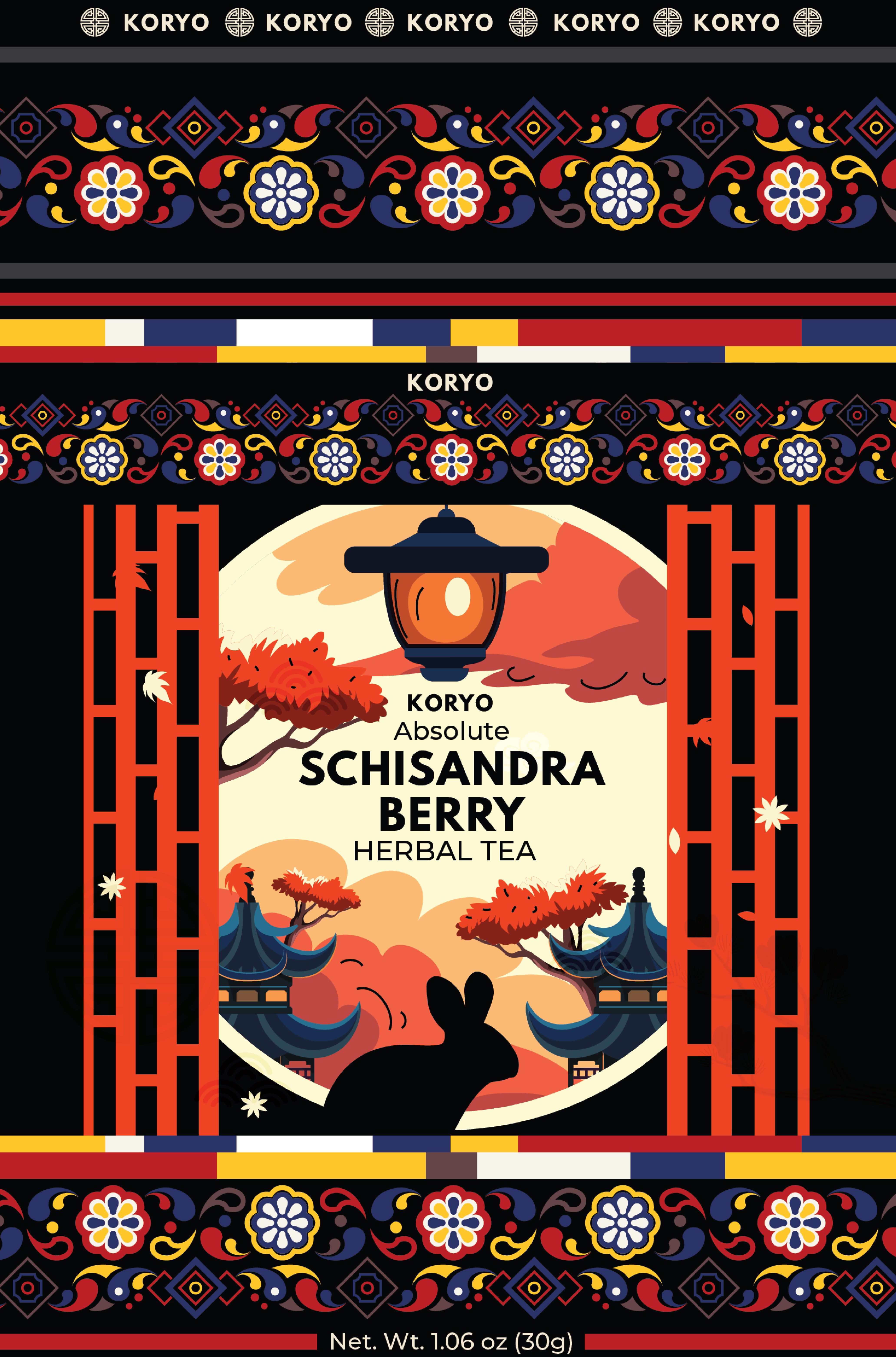
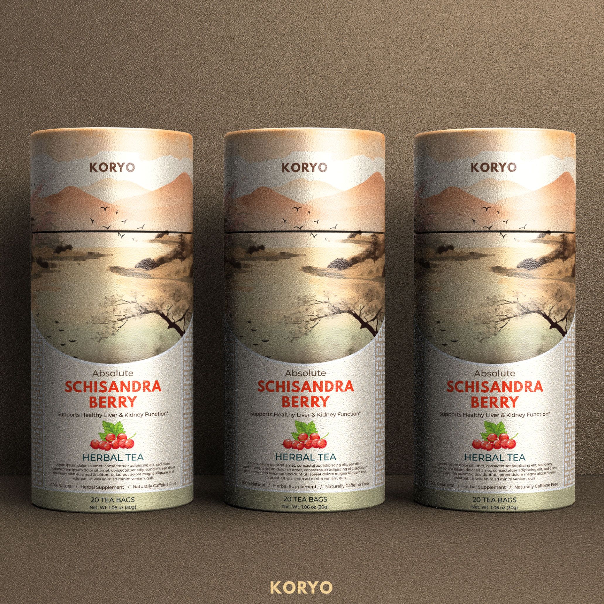
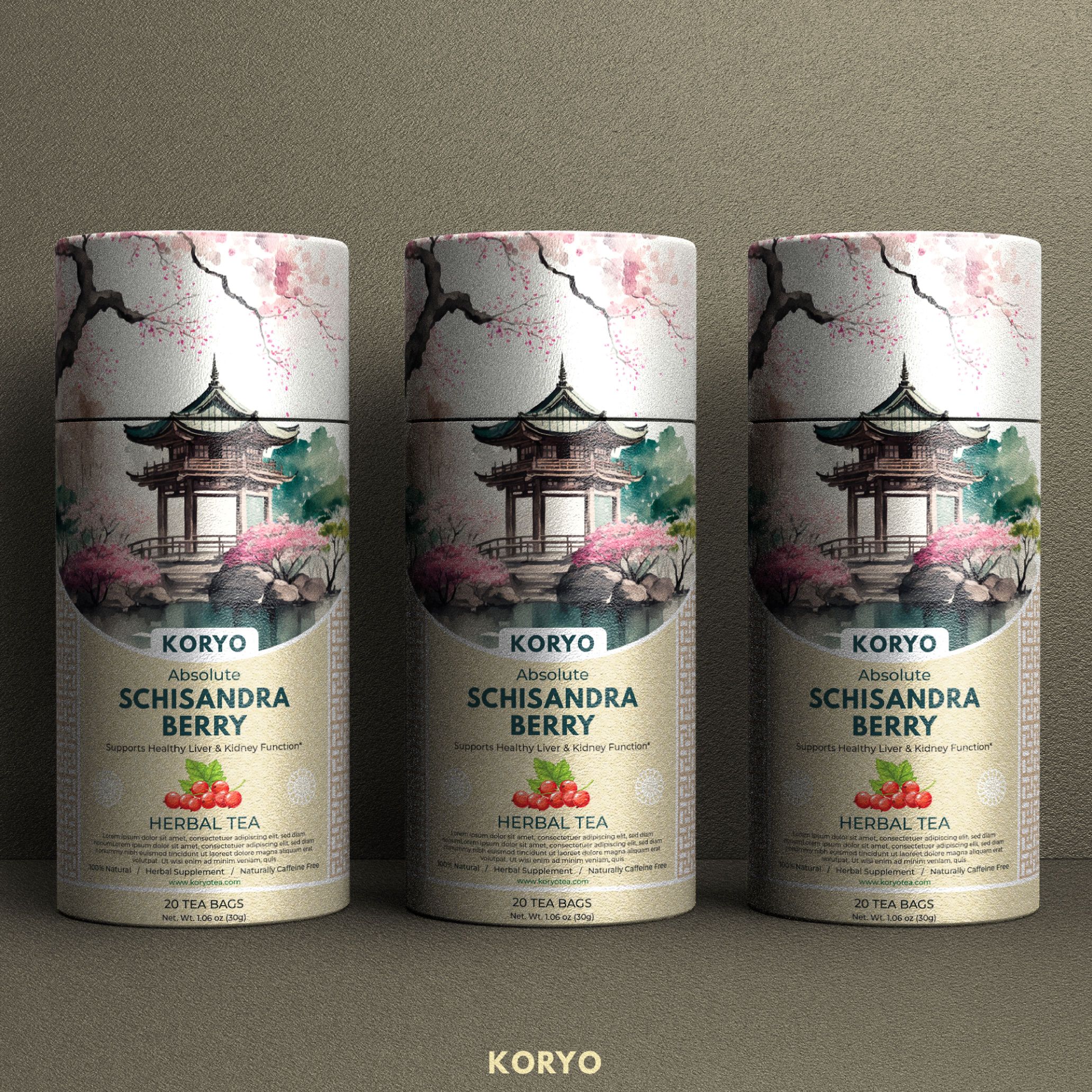
The final KORYO packaging represents the culmination of an extensive strategic design process where every creative decision was guided by purpose rather than aesthetics alone. After exploring more than 40 original packaging concepts, the selected direction emerged as the strongest expression of the brand’s cultural authenticity, premium positioning, and long-term commercial potential.
Inspired by the richness of traditional Korean art, architecture, ornamental patterns, and natural landscapes, the final identity transforms centuries of cultural heritage into a contemporary premium packaging experience. Every illustration, color relationship, decorative motif, and compositional element was intentionally crafted to communicate craftsmanship, refinement, and authenticity while creating immediate visual distinction in both retail and digital environments.
Beyond visual appeal, the packaging was designed as a scalable brand system capable of supporting future product variations without compromising consistency. It balances emotional storytelling with functional clarity, creating an identity that strengthens shelf presence, enhances perceived product quality, and establishes a memorable connection between the consumer and the KORYO brand.
Rather than becoming simply another tea package, the final design evolved into a complete visual language—one that communicates tradition through modern design principles while positioning KORYO confidently within the premium specialty tea market.
THE RESULT
A PREMIUM PACKAGING IDENTITY DESIGNED FOR RECOGNITION, GROWTH, AND LONG-TERM BRAND VALUE
The selected packaging successfully transformed KORYO from a product into a distinctive premium brand experience. By combining authentic cultural storytelling, refined illustration, strategic visual hierarchy, and luxury packaging aesthetics, the final solution delivers stronger product differentiation, elevated perceived value, and a timeless identity prepared for future portfolio expansion.
Every design decision contributes to a cohesive brand experience that feels authentic, memorable, and commercially effective—allowing the packaging to communicate quality before the product is even opened.
"Exceptional packaging doesn't simply protect a product—it preserves heritage, elevates perception, and transforms tradition into a brand experience that endures."