

iWant® – Designing A Digital Product That Connects People Through Meaningful User Experiences
Designing A Digital Experience That Brings People Together Through Simplicity, Clarity, And Human-Centered Thinking.
COMPANY - iWANT & NUMBAT SOLUTIONS

Client:
iWANT & NUMBAT SOLUTIONS
COUNTRY: Australia

Info:
Industry: Entertainment, Technology
Market:
• Australia
• United States
• European Union
• Global Digital Market
• App Store Ecosystem
• Cross-Platform Environments
Project Scope:
• Product Strategy
• Digital Brand Identity
• Logo Development
• UX/UI Design
• Information Architecture
• User Flows
• Interaction Design
• Responsive Website Design
• Application Development
• App Store Optimization
• Launch Implementation
• Product Analytics
• Cross-Platform Design Consistency
Products:
• iWant® Mobile Application
• Responsive Product Website
• App Store Product Presentation
• Connected Digital Brand Experience
Team behind the project:
• Grant Wilson
• Dragan Momčilov
• Filip Narančić
PROJECT SCOPE & COLLABORATIVE RESPONSIBILITIES
A Complete Digital Product Developed Through Integrated Creative And Technical Expertise
iWant® was developed as a complete digital product rather than a standalone visual design exercise. The project brought together product strategy, digital brand identity, UX/UI design, information architecture, interaction logic, responsive web design, application development, programming, launch implementation, App Store optimization, and product analytics.
Infinity Design Studio—now presented within the unified Infinity × NF Creative Studio authorship system—led the strategic, visual, and experiential design framework. Grant Wilson, the project initiator and technical specialist from Australia, led application programming, development, launch implementation, optimization, and analytics. Together, the team transformed the original product idea into a coherent, functional, and launch-ready digital experience.
Digital Product Ecosystem:
• Digital Brand Identity
• Mobile Application Experience
• Responsive Website Experience
• App Store Brand Presence
• Information Architecture System
• User Flow Architecture
• Interface Component System
• Visual Communication System
• Cross-Platform Brand Consistency
• Connected Product Touchpoints
• Scalable Product Framework
Process:
• Research
• Discovery
• User-Need Analysis
• Product Strategy
• Information Mapping
• User Flow Development
• UX Architecture
• Interface Exploration
• UI System Development
• Interaction Design
• Usability Refinement
• Responsive Adaptation
• App Store Optimization
• Editorial Execution
Strategic Focus:
• Human Connection
• User Understanding
• Intuitive Discovery
• Clear Navigation
• Meaningful Interaction
• Product Recognition
• Accessible Information
• Visual Consistency
• Cross-Device Usability
• User Engagement
• Platform Scalability
• Long-Term Product Growth
Digital Product System:
• Human-Centered Navigation
• List Creation & Management
• Personalized Content Structure
• Images, Links & Descriptions
• Bookmarking Experience
• Customizable Visual Layouts
• Reusable Interface Components
• Consistent Interaction Patterns
• Responsive Web Architecture
• App Store Communication System
• Scalable UX/UI Framework
Deliverables:
• Product Strategy
• Digital Brand Identity
• UX/UI Design
• Information Architecture
• User Flow System
• Interface Component Library
• Interaction Design Framework
• Responsive Product Website
• App Store Optimization
• Cross-Platform Design Consistency
• Editorial Case Study
• Scalable Digital Product Ecosystem

From Personal Intent To Meaningful Digital Connection
One Connected Product Experience Designed To Help People Organize What Matters, Discover What Is Relevant, And Share Possibilities With Greater Clarity.
“The Most Useful Digital Products Don’t Add More Complexity—They Create Clearer Paths Between People, Needs, And Opportunities.”
The iWant® digital product experience was conceived around a simple human behavior: people continually collect ideas, remember possibilities, organize future intentions, and look for easier ways to return to what matters. The challenge was to transform that everyday behavior into an intuitive Mobile App Design supported by a recognizable identity, clear information architecture, and a connected web presence.
Rather than presenting iWant® as a conventional list-management tool, the product was structured as a flexible digital environment where personal intentions can become organized, enriched, revisited, and eventually connected with relevant content, people, and opportunities.

The iWant® Mobile Experience
✓ Create And Organize Meaningful Lists
Users can create different types of lists—from books they want to read and places they want to explore to products, ideas, experiences, and future priorities. A clear Information Architecture keeps every collection accessible, understandable, and easy to manage.
✓ Add Context Through Images, Links, And Descriptions
Every saved item can be enriched with supporting information. Images introduce immediate visual recognition, links preserve useful destinations, and descriptions help users remember why an item originally mattered.
✓ Save Possibilities For Future Discovery
The integrated bookmarking experience allows users to preserve products, articles, destinations, references, and other relevant content for later exploration—turning fragmented digital discoveries into one organized personal environment.
✓ Choose A Layout That Supports The Content
Customizable visual formats allow different collections to be presented in ways that improve readability, browsing, and usability. The interface adapts to the nature of each list while maintaining one consistent UX/UI Design System.
The Connected Website Experience
✓ A Digital Introduction To The Product
The iWant® website extends the mobile experience into a clear communication platform where prospective users can understand the concept, explore its core functions, and recognize the value of the product before downloading the application.
✓ Search-Ready Product Communication
The website content and hierarchy were structured to support organic visibility through naturally integrated phrases such as Mobile App Design, Digital Product Design, Human-Centered UX Design, and Digital Brand Identity—without compromising clarity or editorial quality.
✓ A Clear Path From Interest To Action
Strategically positioned calls to action connect product discovery with the App Store presentation, creating a direct and understandable progression from initial interest to product exploration and download.
✓ One Experience Across Every Device
Responsive principles ensure that typography, navigation, product messaging, and visual identity remain clear and consistent across desktop, tablet, and mobile environments.
One Product. Multiple Intentions. One Connected Digital Experience.
The iWant® app and website were designed as parts of the same scalable product ecosystem. Together, they transform personal lists into structured possibilities, fragmented discoveries into meaningful collections, and individual intentions into clearer paths toward future action.
“When Digital Design Understands Human Intent, Every Saved Idea Can Become The Beginning Of A Meaningful Connection.”
Human-Centered Product Positioning Through Strategic Digital Product Design
iWant® was developed for an increasingly connected digital market, where User Understanding, Product Clarity, and immediate visual recognition strongly influence adoption and engagement. The objective was to create a human-centered Digital Product Design system that organizes different user intentions, simplifies discovery, supports meaningful choices, and performs consistently across mobile interfaces, web platforms, App Store presentation, and future digital touchpoints.
Key Strategic Elements:
- Human-Centered Mobile App Design developed to simplify discovery, communicate available possibilities clearly, and help users move confidently from personal intent to relevant people, needs, and opportunities.
- Distinctive Digital Brand Identity created to express openness, connection, and social energy through a recognizable visual language while strengthening Product Recognition and perceived platform credibility.
- Intuitive Information Architecture structured to organize content, user intentions, navigation paths, interactions, and supporting information with clarity, accessibility, and cross-platform consistency.
- Scalable UX/UI Product System designed to improve usability, responsive performance, App Store visibility, and visual continuity across the mobile application, website, marketplace presentation, and future product extensions.
Product Value & Digital Market Impact
The completed Human-Centered Digital Product system transformed iWant® from an isolated mobile application concept into a cohesive and recognizable platform experience. By combining strategic Digital Brand Communication, intuitive user flows, purposeful UX/UI Design, and consistent cross-platform presentation, the project established clearer user journeys, stronger product differentiation, more meaningful interaction, and a scalable digital foundation prepared for future features, new communities, and long-term platform growth.
Project Introduction
Building A Human-Centered Digital Product Designed For Connection And Built For Meaningful Interaction.
iWant® is a mobile product focused on helping people discover shared needs, relevant possibilities, and meaningful opportunities through clear interaction, intuitive navigation, and thoughtful visual communication. As the platform entered an increasingly competitive digital environment, it required a unified Mobile App Design system capable of simplifying different user intentions while creating stronger recognition across every digital touchpoint.
Infinity Design Studio was commissioned to develop a complete Digital Product Design strategy that combined UX/UI Design, Digital Brand Identity, Information Architecture, and cross-platform product presentation into one cohesive system. Every element was carefully designed to balance intuitive usability, visual clarity, human relevance, meaningful engagement, and long-term product performance.
Rather than treating the mobile application, website, App Store listing, and supporting communication as independent assets, the objective was to create one scalable Human-Centered Product Experience capable of connecting discovery, choice, interaction, and communication through consistent typography, color psychology, iconography, interface components, and recognizable digital presentation.
Every design decision focused on improving User Understanding, strengthening Product Recognition, supporting meaningful connection, and establishing a complete Digital Brand Experience prepared for mobile devices, web platforms, marketplace visibility, future feature development, and long-term product growth.
Target Audience
Digitally active adults who value simplicity, relevance, and meaningful human connection. Created for people seeking an intuitive mobile experience that helps them discover shared needs, interests, and opportunities through Human-Centered Digital Product Design built around clarity, accessibility, trust, and purposeful interaction.
Project Objective
To transform iWant® into a visually unified digital product through focused Mobile App Design, UX/UI Strategy, Digital Brand Identity Development, information architecture, and a scalable cross-platform system capable of strengthening product recognition, user understanding, and long-term engagement.
The objective extended far beyond creating an attractive mobile interface. Every design decision was strategically developed to simplify discovery, organize different user intentions, support meaningful interaction, reinforce trust across app, web, and marketplace touchpoints, and provide a flexible foundation for future product growth.
About iWANT® & NUMBAT SOLUTIONS
iWant® represents a human-centered digital product built around discovery, shared needs, and the belief that technology should make meaningful connection feel natural, relevant, and easy to understand.
NF Creative Studio developed the complete Digital Product Experience, covering Mobile App UX/UI Design, Digital Brand Identity, information architecture, user-flow development, interface hierarchy, typography, color strategy, iconography, App Store presentation, website communication, and scalable digital-product guidelines.
The result is a connected product ecosystem capable of supporting future features, new user needs, and continued platform expansion while maintaining complete visual consistency across every mobile, web, and marketplace touchpoint.
Key Project Facts:
“Exceptional Digital Products Are Built Through Hundreds Of Human-Centered Design Decisions—Not Individual Screens.”
✓ Complete Mobile App UX/UI Design System
✓ Human-Centered Digital Product Strategy
✓ Distinctive Digital Brand Identity
✓ Information Architecture Development
✓ Connected User Experience System
✓ Cross-Platform Interface Consistency
✓ App Store Product Presentation
✓ Future Platform Scalability
Project Impact:
“Great Digital Design Doesn’t Simply Connect Screens—It Connects People, Needs, And Opportunities.”
✓ Clearer Product & Digital Presence
✓ Stronger Brand Recognition
✓ Consistent Cross-Platform Experience
✓ More Intuitive Product Discovery
✓ Higher User Understanding
✓ Stronger Interaction Confidence
✓ Scalable Digital Product System
✓ Long-Term Platform Growth
Project Snapshot:
“Human-Centered Digital Product Design Is Where Connection, Clarity, And Technology Become One Meaningful Experience.”
Industry
Technology · Digital Products · Mobile Applications · Digital Platforms
Services
Mobile App UX/UI Design · Digital Brand Identity · Information Architecture · User Flow Design · Website Design · App Store Presentation
Objective
Transform a mobile application concept into a visually unified digital product capable of simplifying discovery, strengthening product recognition, and creating long-term value through one scalable Digital Product Design system.
Deliverables
Mobile App UX/UI System · Digital Brand Identity · User Flow Architecture · Responsive Website · App Store Presentation · Cross-Platform Guidelines
Focus
Human Connection · Intuitive Discovery · Product Clarity · Meaningful Interaction · Visual Consistency · Long-Term Platform Growth
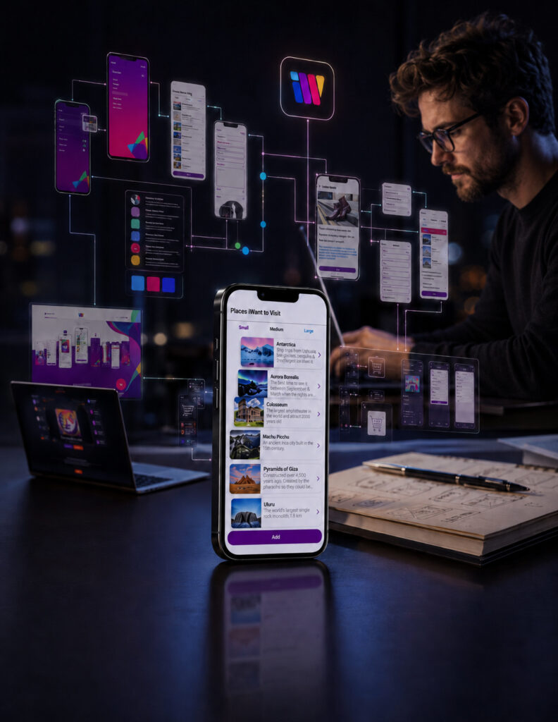
Project Overview:
“Meaningful Digital Products Are Never Designed Around Individual Screens—They Are Designed Around Human Intent.”
iWant® already possessed a distinctive product concept, a recognizable visual direction, and clear potential to connect people with shared needs, interests, and opportunities.
NF Creative Studio was commissioned to transform this foundation into a complete Human-Centered Digital Product Design system capable of simplifying discovery before the complete platform experience was explored in depth.
The project focused on developing a unified Mobile App UX/UI Design, Digital Brand Identity, Information Architecture, and scalable interface system capable of supporting future feature development without sacrificing clarity, usability, or visual consistency.
From user-flow strategy, navigation hierarchy, typography, and interface components to responsive website communication and App Store presentation, every design decision pursued one focused objective:

Creating One Connected Digital Product Experience That Strengthens Product Recognition While Helping People, Needs, And Opportunities Find One Another.
Project Scope:
- Human-Centered Product Strategy
- Mobile App UX/UI Design
- Complete Digital Brand Identity
- Information Architecture
- User Flow Development
- Navigation & Interaction System
- Typography & Interface Hierarchy
- Color System & Product Recognition
- Iconography & UI Components
- Responsive Website Design
- App Store Presentation Design
- Cross-Platform Brand Consistency
- Editorial Product Storytelling
- Future Platform Scalability
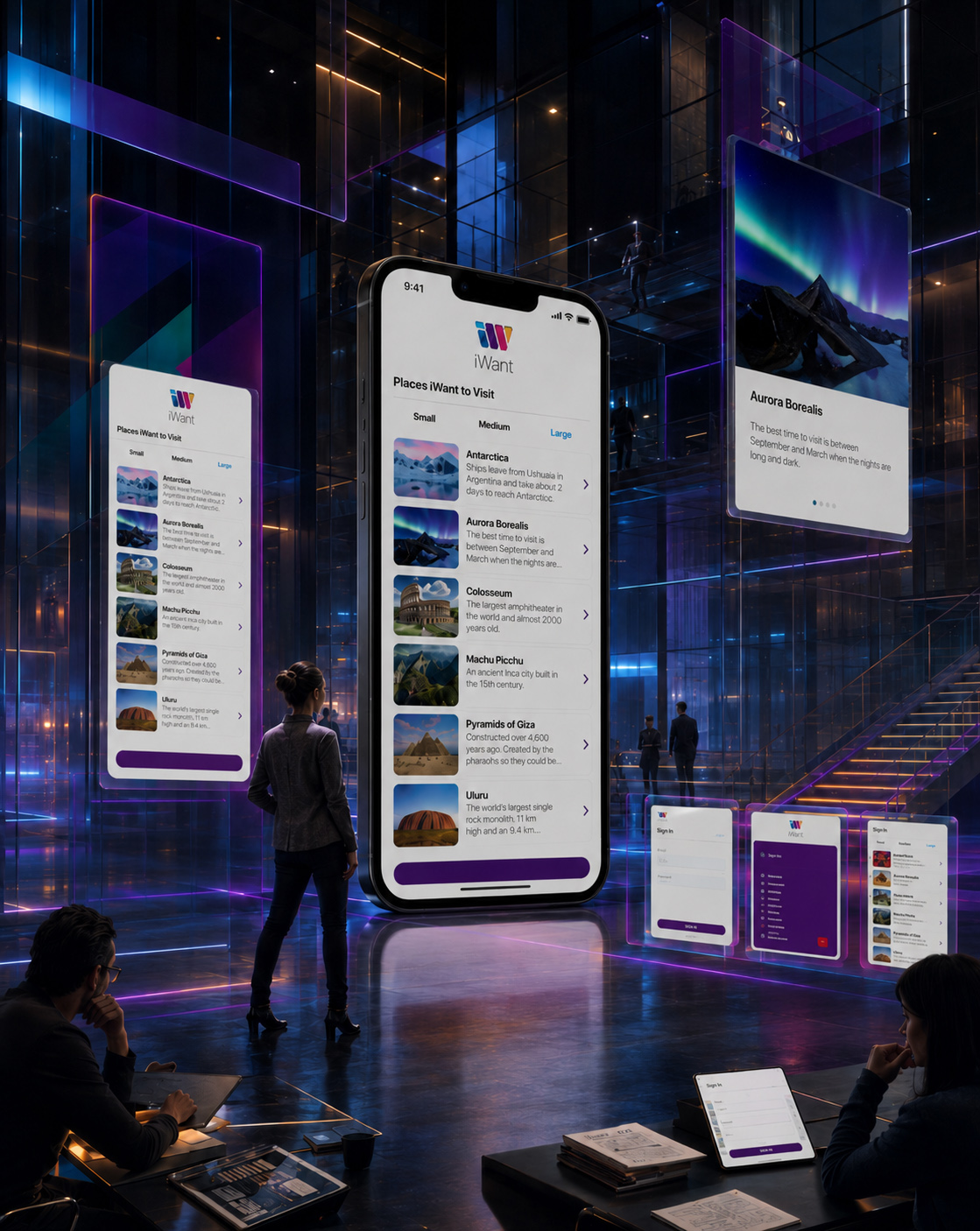
"The Best Digital Experiences Don't Demand Attention—They Become Part Of Everyday Life."
Designing Digital Experiences That Connect People With What Matters Most
Technology delivers its greatest value when it feels effortless. The most successful digital products don’t interrupt people’s lives—they simplify them, inspire discovery, and create intuitive experiences that seamlessly fit into everyday routines. Behind every exceptional mobile application is a thoughtful design strategy focused on people before technology.
For iWant, our objective extended far beyond designing another mobile interface. We developed a complete Digital Brand Identity and UX/UI Design System that transforms complex functionality into an engaging, intuitive, and visually consistent user experience. From brand identity and interface design to App Store presentation and responsive digital assets, every element was carefully crafted to improve usability, strengthen brand recognition, and create meaningful interactions that users genuinely enjoy returning to.
Great Digital Products Don't Simply Guide Users—They Make Every Interaction Feel Effortless.

“Where Human Needs Meet Meaningful Digital Connection.”
iWANT® — Transforming A Human-Centered Mobile Concept Into A Connected Digital Product Experience
“The Most Meaningful Digital Products Don’t Simply Connect Screens—They Help People, Needs, And Opportunities Find One Another.”
The iWant® project required far more than designing a visually appealing mobile application. The objective was to develop a complete Human-Centered Digital Product capable of transforming different intentions, shared needs, and everyday possibilities into one intuitive and meaningful user experience. Every element was strategically designed to simplify discovery, guide interaction, and help people move naturally from an initial need toward a relevant connection.
Our approach combined Mobile App Design, UX/UI Strategy, Digital Brand Identity, Information Architecture, and Cross-Platform Product Design to transform the original concept into a recognizable and scalable digital experience. By establishing clear user journeys, intuitive navigation, and a distinctive visual language, the redesigned system strengthens Brand Recognition, encourages meaningful engagement, and creates a consistent experience across the mobile application, website, App Store presentation, and future digital touchpoints.
Rather than treating the app, brand identity, and supporting platforms as separate deliverables, every component was developed as part of one connected Digital Product Ecosystem. The result is a flexible product foundation designed to support future functionality, new user needs, platform expansion, and long-term market growth without losing clarity, familiarity, or human relevance.
THE SOLUTION INCLUDED:
- Human-Centered Mobile App Design strategically developed to simplify discovery, support intuitive interaction, and help people connect with relevant needs, opportunities, and shared interests.
- Strategic UX/UI Design & Information Architecture created to organize complex intentions into clear user journeys, logical navigation, accessible content, and purposeful interaction pathways.
- Distinctive Digital Brand Identity designed to establish a recognizable, approachable, and socially open visual language across the complete product experience.
- Connected User Experience System developed to unify onboarding, search, discovery, profiles, communication, and essential user actions within one coherent digital journey.
- Scalable Interface & Component System structured to support future features, interface updates, responsive formats, and continued product development while maintaining complete visual consistency.
- Cross-Platform Brand Experience created to connect the mobile application, website, App Store presentation, digital communication, and future product touchpoints through one consistent identity.
- Mobile-First Product Presentation optimized for usability, responsiveness, marketplace visibility, and clear communication across different devices and screen environments.
- Consistent Visual Hierarchy & Interaction Language combining typography, color, iconography, interface components, and UX principles to improve understanding and strengthen recognition at every digital touchpoint.
THE FINAL RESULT:
The completed solution transformed iWant® from an initial mobile concept into a modern, scalable, and human-centered Digital Product Experience built around meaningful connection. Through the integration of Mobile App UX/UI Design, Digital Brand Strategy, Information Architecture, and consistent cross-platform communication, the product now delivers a more intuitive, recognizable, and purposeful experience.
By reducing unnecessary complexity and creating clearer pathways between people, needs, and opportunities, the new system strengthens User Understanding, Product Usability, Brand Recognition, and long-term engagement. Every screen, interaction, and supporting brand element contributes to one connected experience rather than functioning as an isolated design asset.
The project established a flexible foundation prepared for future features, new user groups, platform expansion, and continued digital growth. More than a redesigned application, iWant® became a complete Human-Centered Product Ecosystem designed to turn discovery into interaction, interaction into connection, and connection into lasting product value.
“Outstanding Digital Products Don’t Simply Attract Users—They Help People, Needs, And Opportunities Find One Another.”
Download Case Study
Designing A Digital Product Where People, Needs, And Opportunities Find One Another
Creating A Human-Centered Mobile Experience Where Brand Identity, Intuitive Interaction, And Meaningful Connection Work Together
Successful Digital Product Design is about far more than creating an attractive interface. Every strategic decision must simplify interaction, guide discovery, and help people understand how the product connects their intentions with relevant opportunities.
For iWant®, our objective extended beyond designing a mobile application. We developed a complete digital ecosystem in which Brand Identity, User Experience Design, Information Architecture, Mobile UI Design, and Cross-Platform Communication work together as one recognizable product experience—building clarity, encouraging engagement, and creating meaningful connections between people.
A Distinctive Digital Identity Built For Human Connection
Creating Recognition Before The First Interaction Begins
Every successful digital product begins with an identity that communicates purpose, personality, and relevance before users explore its features.
For iWant®, we created a distinctive visual language designed to feel modern, approachable, socially open, and immediately recognizable across the complete product experience.
Logo design, typography, color psychology, iconography, and interface styling work together to establish a memorable Digital Brand Identity that gives every interaction a consistent and human character.
An Intuitive Product Experience Designed For Meaningful Discovery
Turning Different Intentions Into Clear User Journeys
A Human-Centered UX Design system must transform different needs, choices, and possibilities into an experience that feels simple from the first moment of interaction.
For iWant®, navigation, content structure, search, discovery, user actions, and communication points were organized through one clear and intuitive Information Architecture.
Every screen, visual hierarchy, interactive component, and user flow was designed to reduce hesitation, support faster understanding, and help people move naturally from intention to meaningful connection.
One Connected Brand System Built For Every Digital Touchpoint
Creating Recognition Across App, Web, And Marketplace
Strong digital products are remembered when every touchpoint feels connected, recognizable, and intentionally designed as part of the same experience.
For iWant®, the mobile app became the foundation for the website, App Store presentation, product communication, interface components, and future digital brand extensions.
Consistent typography, color, iconography, interaction principles, and product storytelling create a scalable Mobile Product Branding system prepared for cross-platform visibility, continued development, and long-term growth.
“Clarity Helps People Discover What Matters. Consistent Design Helps Every Meaningful Connection Begin With Trust.”
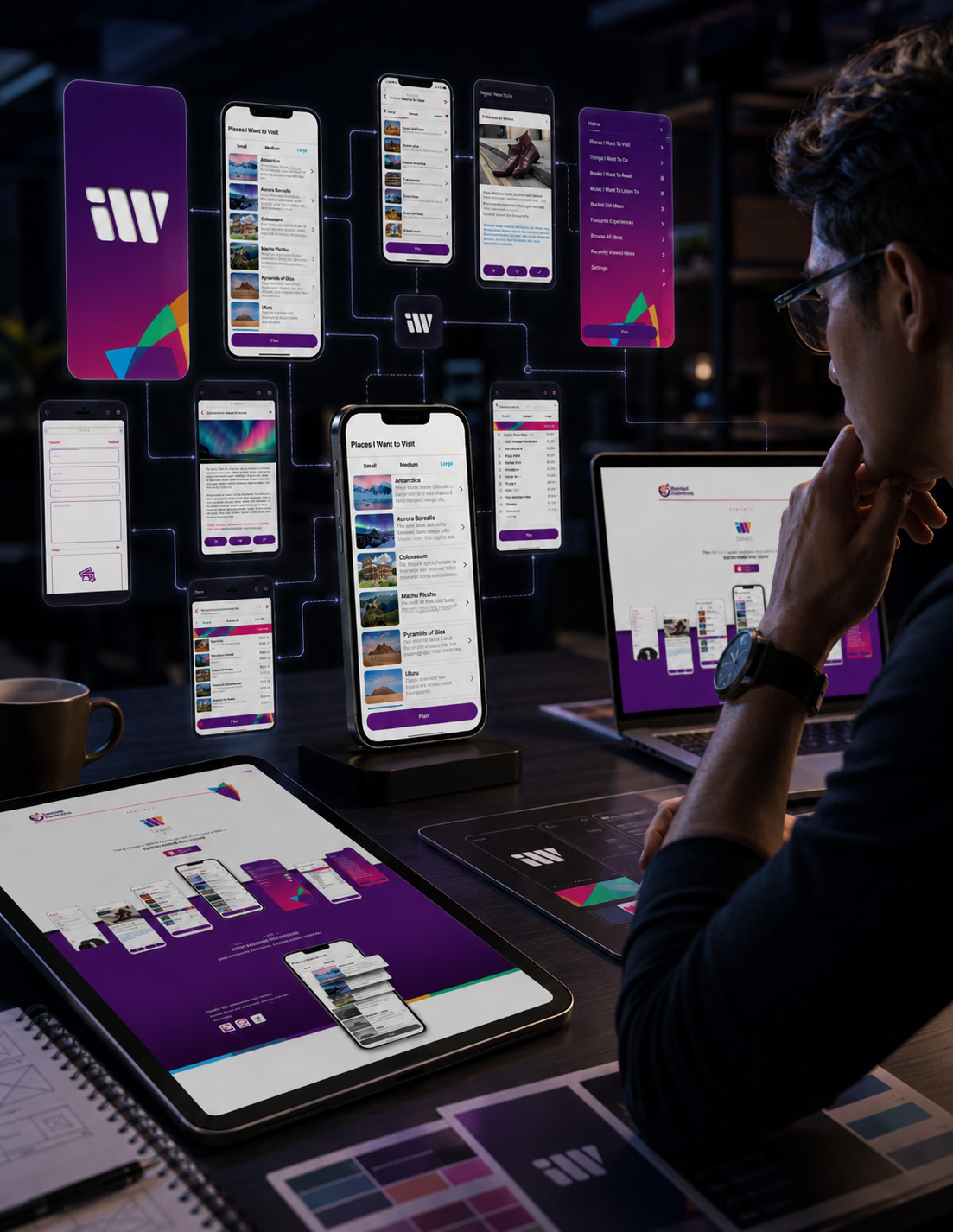
KEY PRODUCT DESIGN CHALLENGES & STRATEGIC SOLUTIONS
Developing iWant as a connected mobile application and digital ecosystem required more than designing individual screens. The central challenge was to create one cohesive Mobile App UX/UI Design system capable of transforming complex functionality into a clear, intuitive, and recognizable experience across every digital touchpoint.
- Creating An Intuitive User Experience — The application needed to support people with different levels of digital confidence. A user-centered structure combined simplicity, accessibility, and advanced functionality to make organizing personal interests feel natural from the first interaction.
- Building A Scalable Digital Brand Identity — A cohesive Mobile App Branding system was developed to create recognition across the application, responsive website, App Store presence, and future product extensions. Logo design, color strategy, iconography, interface components, and supporting visual assets were designed to operate as one connected identity.
- Designing A Consistent UX/UI System — Every screen, interaction, and navigation pattern was shaped through a unified User Interface Design language. This strengthened usability, reduced unnecessary friction, and protected visual consistency as the digital product continued to expand.
- Presenting The Product For App Store Discovery — The App Store Presentation Design was created to communicate the product’s purpose, interface, and everyday value within seconds. Clear screenshot sequencing and focused visual storytelling strengthened recognition and provided a more confident introduction to the application.
- Extending The Experience Beyond The Application — A Responsive Product Website expanded the mobile experience into a broader digital platform. It introduced the product clearly, reinforced brand credibility, presented key functionality, and established a consistent path from initial discovery to product consideration.
APP BRANDING & LOGO DESIGN EVOLUTION
FROM CREATIVE EXPLORATION TO A DISTINCTIVE AND SCALABLE DIGITAL IDENTITY
A Memorable Digital Identity Is Not Simply Selected—It Is Revealed Through Exploration.
Creating the iWant Visual Identity Design began with a strategic search for the symbol best equipped to represent the product’s purpose, personality, and future potential. Rather than committing to the first promising direction, multiple logo concepts were developed, compared, and progressively refined until one solution achieved the strongest balance of meaning, originality, recognition, and digital usability.
Each direction investigated a different relationship between visual form, symbolic meaning, typography, color, and movement. Concepts were evaluated not only as standalone logos, but as functional elements within the complete Mobile App UX/UI Design system—from compact app icons and mobile interfaces to the responsive website, App Store presentation, and broader digital brand environment.
The selected identity emerged as the solution capable of remaining recognizable at its smallest scale while retaining enough character to support a distinctive and expandable product ecosystem.
THE IDENTITY DEVELOPMENT PROCESS INCLUDED:
- Exploring Multiple Creative Directions — Alternative Logo Design Concepts were developed to investigate different symbolic meanings, brand personalities, and expressions of the iWant product idea.
- Testing App Icon Recognition And Scalability — Every leading direction was reviewed at realistic digital sizes to ensure clarity across mobile home screens, App Store listings, interface navigation, and supporting branded touchpoints.
- Refining Typography And Visual Balance — Wordmark proportions, spacing, hierarchy, and relationships between symbol and typography were adjusted to achieve clarity, simplicity, and long-term usability.
- Developing A Distinctive Color Strategy — Multiple color relationships were evaluated for emotional impact, digital visibility, interface compatibility, and consistency across the wider App Branding System.
- Evaluating Real-World Digital Applications — Concepts were tested through authentic mobile UI previews, app interface design scenarios, responsive website applications, and product presentation materials before final selection.
- Selecting And Refining The Final Identity — The strongest direction was developed into a cohesive Digital Brand Identity that balances originality, functional performance, product recognition, and future scalability.
“Distinctive Digital Identities Are Never Found By Chance. They Are Explored Through Possibility, Tested Through Application, And Refined Until Recognition Feels Inevitable.”
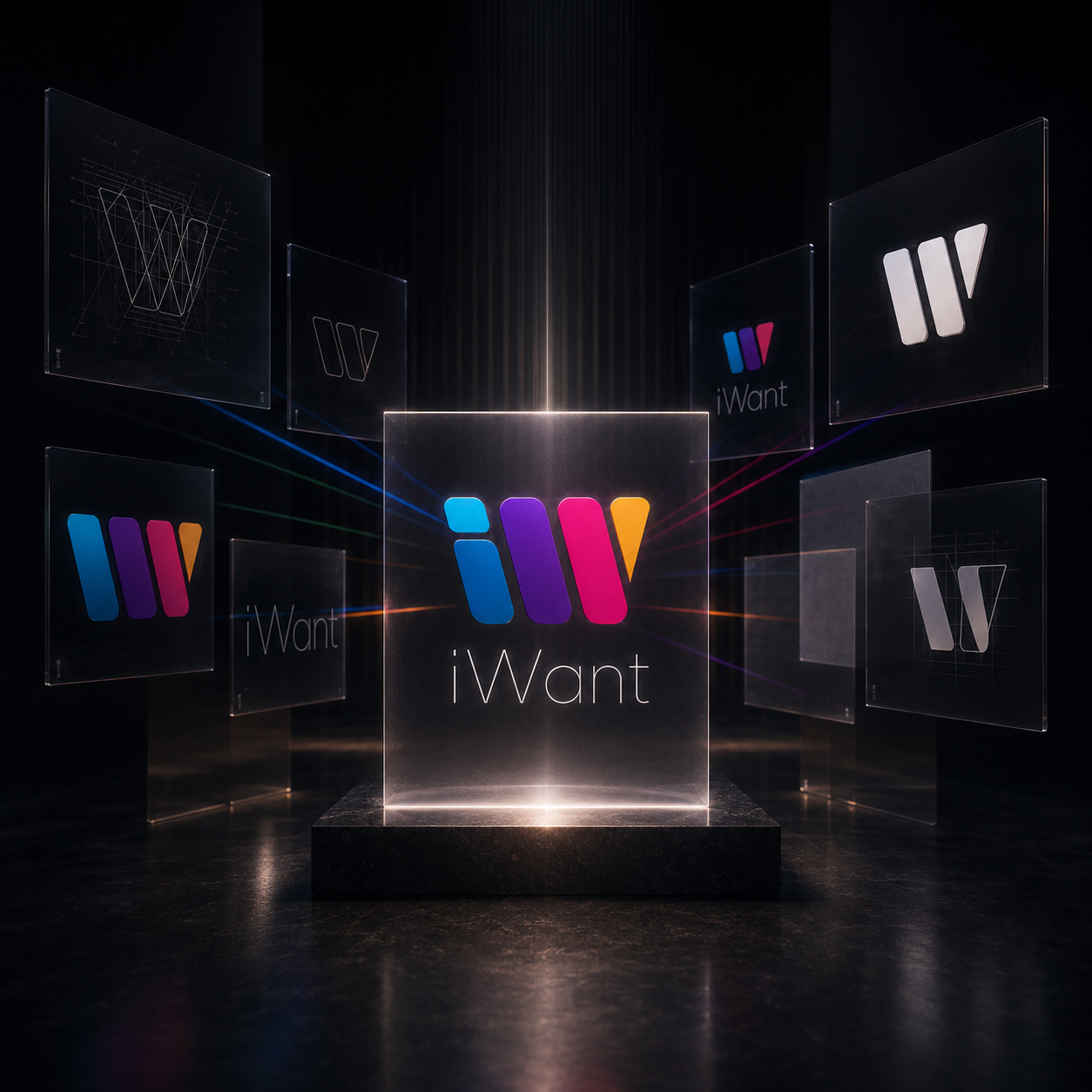
FINAL LOGO SELECTION & BRAND IDENTITY
THE IDENTITY CHOSEN TO UNIFY RECOGNITION, USABILITY, AND FUTURE SCALE
One Distinctive Symbol. One Connected Digital Language.
Following a comprehensive process of creative exploration, comparison, and real-world application testing, one direction emerged as the strongest expression of the iWant product.
The final Logo Design was selected for its ability to combine visual distinction with practical digital performance. Its compact geometric structure remained recognizable at app-icon scale, while its color, movement, and modular character gave the identity enough flexibility to extend across the complete Mobile App UX/UI Design system.
More than a standalone mark, the selected solution established the visual foundation for the entire iWant digital ecosystem—connecting the mobile application, interface design, responsive website, App Store presentation, supporting graphics, and future product touchpoints through one consistent identity.
THE FINAL IDENTITY SYSTEM INCLUDED:
- A Distinctive And Scalable Logo — A compact visual signature designed to retain clarity, character, and recognition across both small digital applications and larger brand presentations.
- A Recognizable App Icon — A high-impact App Icon Design created to remain visually clear within crowded home-screen and App Store environments without losing the personality of the wider identity.
- A Vibrant Color Architecture — A coordinated Brand Color System of blue, violet, magenta, orange, and green expressing creativity, organization, optimism, and the diversity of human interests represented by the product.
- A Unified Visual Language — Typography, iconography, interface components, geometric forms, and supporting graphic elements were aligned into one coherent Mobile App Branding system.
- Consistent Cross-Platform Application — The identity was structured to remain recognizable across mobile UI, Responsive Website Design, App Store assets, product communication, and future digital touchpoints.
- A Future-Ready Brand Foundation — The final Brand Identity System was designed to evolve alongside the product while preserving the visual principles that make iWant distinctive and recognizable.
THE FINAL RESULT
The selected logo transformed the central idea of iWant into a clear and ownable visual symbol. Its layered forms express variety within unity, while its forward movement reflects discovery, intention, and personal possibility.
By connecting the logo, app icon, color system, typography, and interface language, the final identity established a consistent foundation for the complete digital product. Every touchpoint could now feel recognizably iWant—without requiring the brand to repeat itself in exactly the same form.
The result was not simply a finished logo, but a scalable digital brand identity designed to support product recognition, interface consistency, and long-term evolution across an expanding digital ecosystem.
“The Strongest Logo Is Not Simply The Most Distinctive Mark. It Is The One Capable Of Making The Entire Product Feel Connected.”
ADAPTIVE BRAND IDENTITY & COLOR SYSTEM
ONE RECOGNIZABLE FORM. MULTIPLE COLOR DIRECTIONS. ONE CONSISTENT IDENTITY.
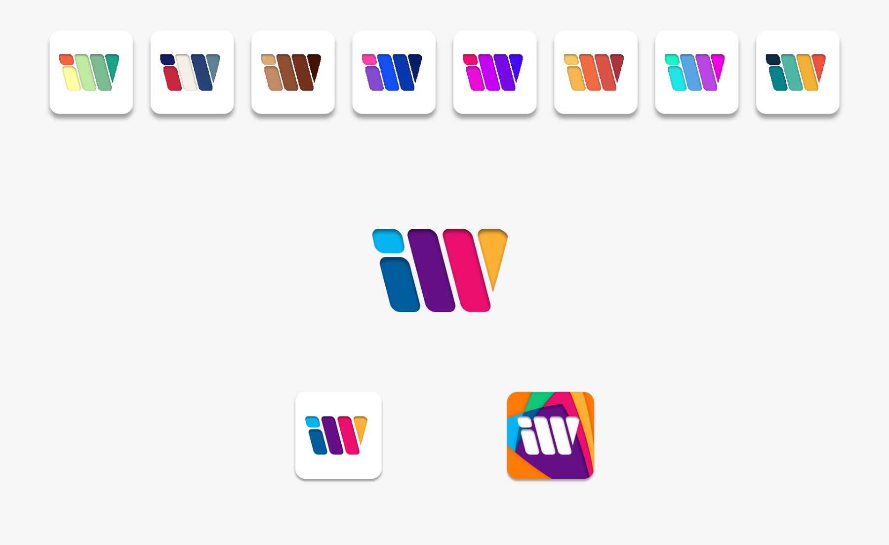
Exploring Visual Flexibility Without Losing Brand Recognition.
A successful Digital Brand Identity must remain recognizable before its individual colors are consciously processed. For iWant, this meant creating a logo structure strong enough to preserve its character across different color relationships, interface environments, screen sizes, and digital applications.
The purpose of this exploration was not to produce arbitrary logo alternatives. It was to understand how much visual expression the identity could support without weakening the geometry, hierarchy, movement, and recognition established by the selected mark.
Multiple color directions were evaluated within realistic Mobile App Branding applications. Each variation examined a different tonal personality while allowing the core logo structure to remain consistent. This process helped define the primary identity and establish the principles governing supporting color expressions across the wider digital product ecosystem.
THE COLOR SYSTEM EXPLORATION INCLUDED:
- Developing Multiple Color Directions — Alternative palettes were created to explore different levels of energy, warmth, contrast, sophistication, and digital presence within the wider Brand Color System.
- Evaluating Small-Scale Recognition — Every direction was reviewed within app-icon and mobile interface dimensions to ensure that the logo retained clarity and recognizable visual structure.
- Reviewing Contrast And Digital Readability — Color relationships were assessed across light and dark interface environments, compact screen applications, and supporting digital materials.
- Preserving Structural Consistency — The geometry, proportions, spacing, and movement of the selected mark remained unchanged while different color expressions were explored.
- Testing Cross-Platform Applications — Leading variations were tested across mobile UI, App Store assets, Responsive Website Design, and digital product presentations to evaluate consistency in real applications.
- Defining The Primary Color Architecture — The strongest combination was refined into the official iWant palette, balancing distinction, usability, visual energy, and long-term brand recognition.
THE FINAL RESULT
The exploration confirmed that the strength of the iWant Logo Design extends beyond a single color combination. Its recognition is anchored in a distinctive geometric structure, while color introduces personality, emotional tone, and visual adaptability.
The final primary palette became the defining expression of the brand, supported by clear color principles capable of guiding future applications without fragmenting the identity. This gave iWant the flexibility to evolve across new digital contexts while remaining connected to the same recognizable product.
The result is an adaptive Visual Identity System that supports creative expression while protecting consistency across the complete Mobile App UX/UI Design and app-branding ecosystem.
“Adaptability Does Not Mean Changing Who The Brand Is. It Means Giving One Recognizable Identity The Freedom To Evolve Without Losing Its Core.”
FROM PRODUCT IDENTITY TO THE BRAND BEHIND THE PRODUCT
DESIGNING THE IDENTITY BEHIND THE DIGITAL EXPERIENCE
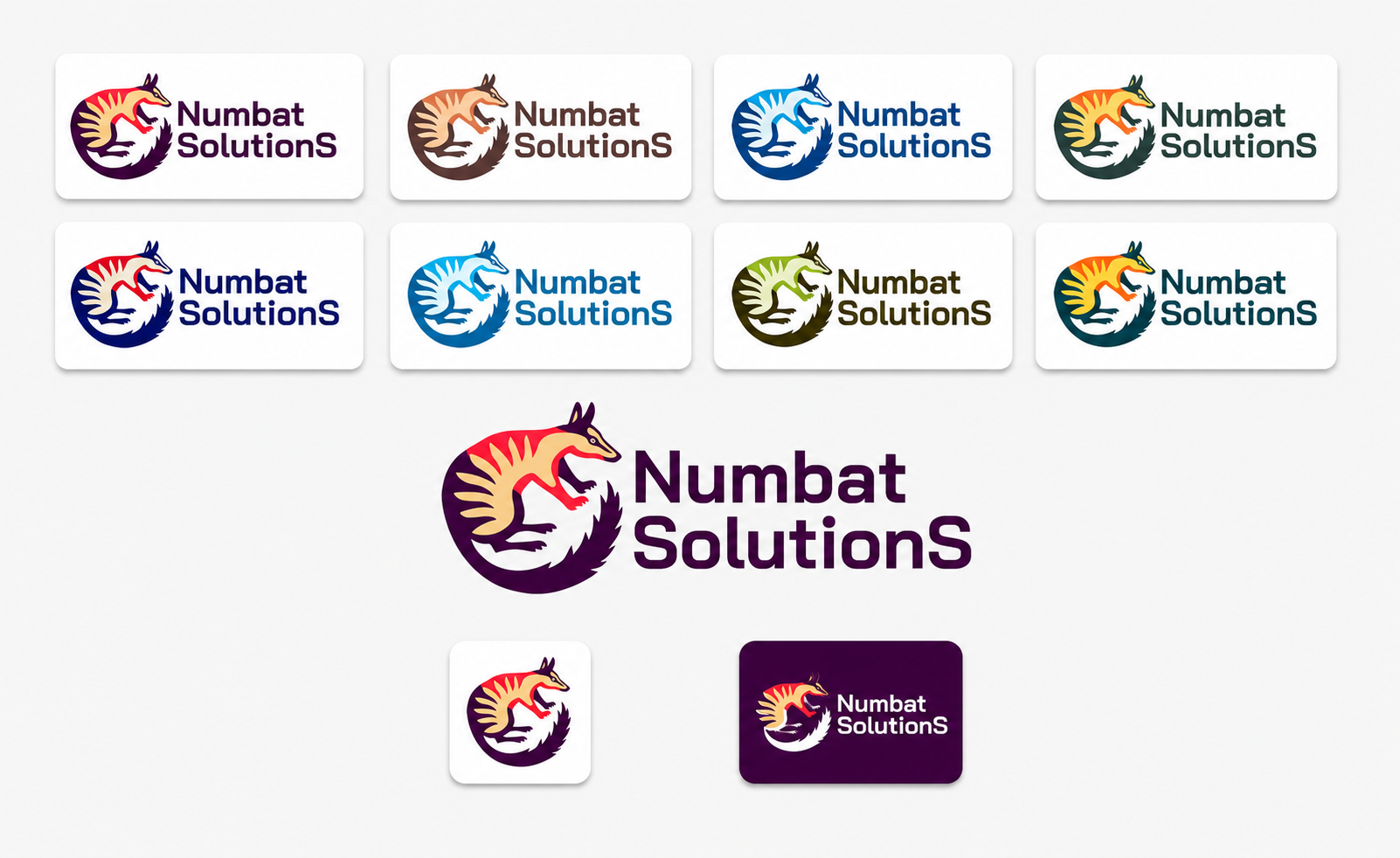
The Creative Direction Extended Beyond The iWant Product, Establishing A Distinct Corporate Identity For Numbat Solutions And A Clear Visual Relationship Between Two Connected Brands.
The iWant application was not developed as an isolated digital product. It was created within the wider business environment of Numbat Solutions—a company that also required a distinctive Corporate Identity Design, recognizable Logo Design, and professional Visual Identity System.
The creative scope therefore extended beyond Mobile App UX/UI Design and Digital Product Branding. It included the complete Numbat Solutions Brand Identity Design, from the development of its corporate logo and Brand Color System to the refinement of its final visual expression and the definition of how the company and product identities would appear together.
Although iWant and Numbat Solutions belonged to the same Digital Brand Ecosystem, the two brands were not designed as visual copies of one another.
The iWant Mobile App Branding needed to feel immediate, colorful, personal, and product-focused. The Numbat Solutions Corporate Branding required a more established presence: distinctive enough to remain memorable, flexible enough to work across digital and business environments, and visually confident enough to represent the company behind the product.
The objective was to establish a connected Brand Architecture built around two independent identities. One communicated the personality and usability of the digital product. The other expressed the organization, expertise, and professional foundation responsible for bringing that product to life.
A Complete Brand Ecosystem Does Not Make Every Identity Look The Same. It Gives Every Identity A Distinct Role Within One Coherent Story.
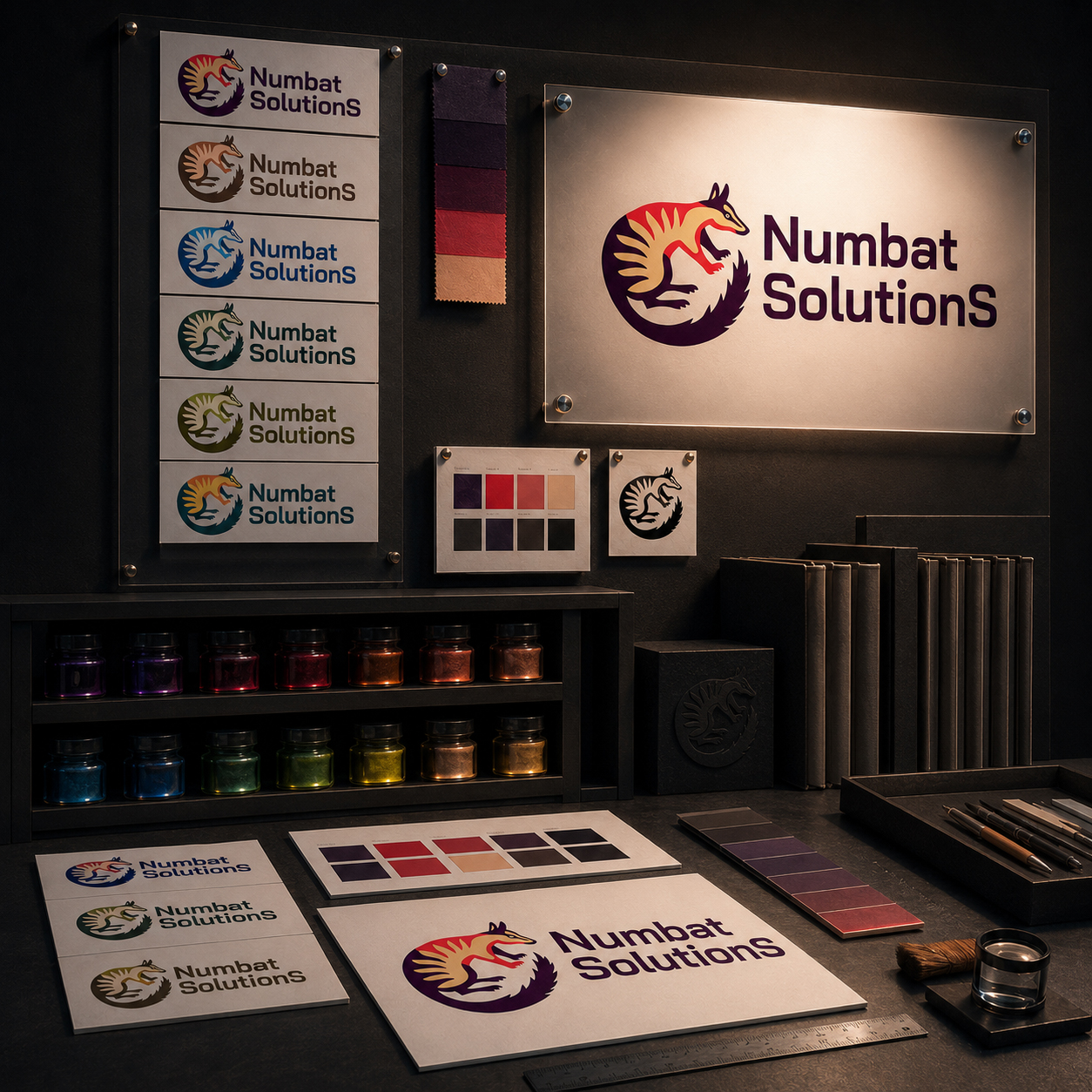
EXPLORING COLOR WITHOUT LOSING RECOGNITION
The Numbat Solutions Logo Design was developed around a distinctive visual foundation: an illustrated Australian numbat forming a circular symbol beside a direct, highly legible corporate wordmark.
Once the primary Corporate Logo Design had been established, color became the central field of exploration. Multiple Brand Color System directions were created to evaluate how the same identity could communicate different qualities—from warmth, accessibility, and environmental awareness to technology, confidence, and corporate stability.
The purpose of this Visual Identity Exploration was not to produce disconnected logo alternatives. Every direction preserved the recognizable animal form, circular movement, typographic relationship, and overall silhouette of the Numbat Solutions brand.
This approach allowed color to influence emotional tone without weakening Brand Recognition. The Corporate Identity System could adapt across websites, digital products, company presentations, marketing materials, and other professional environments while its essential visual character remained consistent.
A Strong Brand Identity System Uses Color To Expand Expression Without Weakening Recognition, Consistency, Or Corporate Credibility.
RECOGNITION BEFORE VARIATION
Every Logo Color Variation preserved the same distinctive symbol, corporate wordmark, and recognizable Brand Identity Structure.
COLOR WITH A STRATEGIC PURPOSE
The Brand Color System explored how warmth, technology, confidence, and accessibility could influence perception without changing the underlying Corporate Identity.
EXPLORATION TOWARD RESOLUTION
Multiple Visual Identity Directions were evaluated before defining one final Corporate Logo Design capable of representing Numbat Solutions consistently.
Together, these decisions transformed color exploration into a disciplined Brand Identity Design process. Each variation tested a different emotional and professional direction while preserving the symbol, corporate wordmark, and visual structure required for consistent Brand Recognition.
The final Numbat Solutions Corporate Identity emerged through comparison rather than assumption. By balancing distinction, adaptability, and professional credibility, the selected Logo Design established a stable visual foundation capable of supporting websites, digital products, presentations, marketing materials, and future brand communication.
BUILDING DISTINCTION WITHIN ONE SHARED BRAND STORY
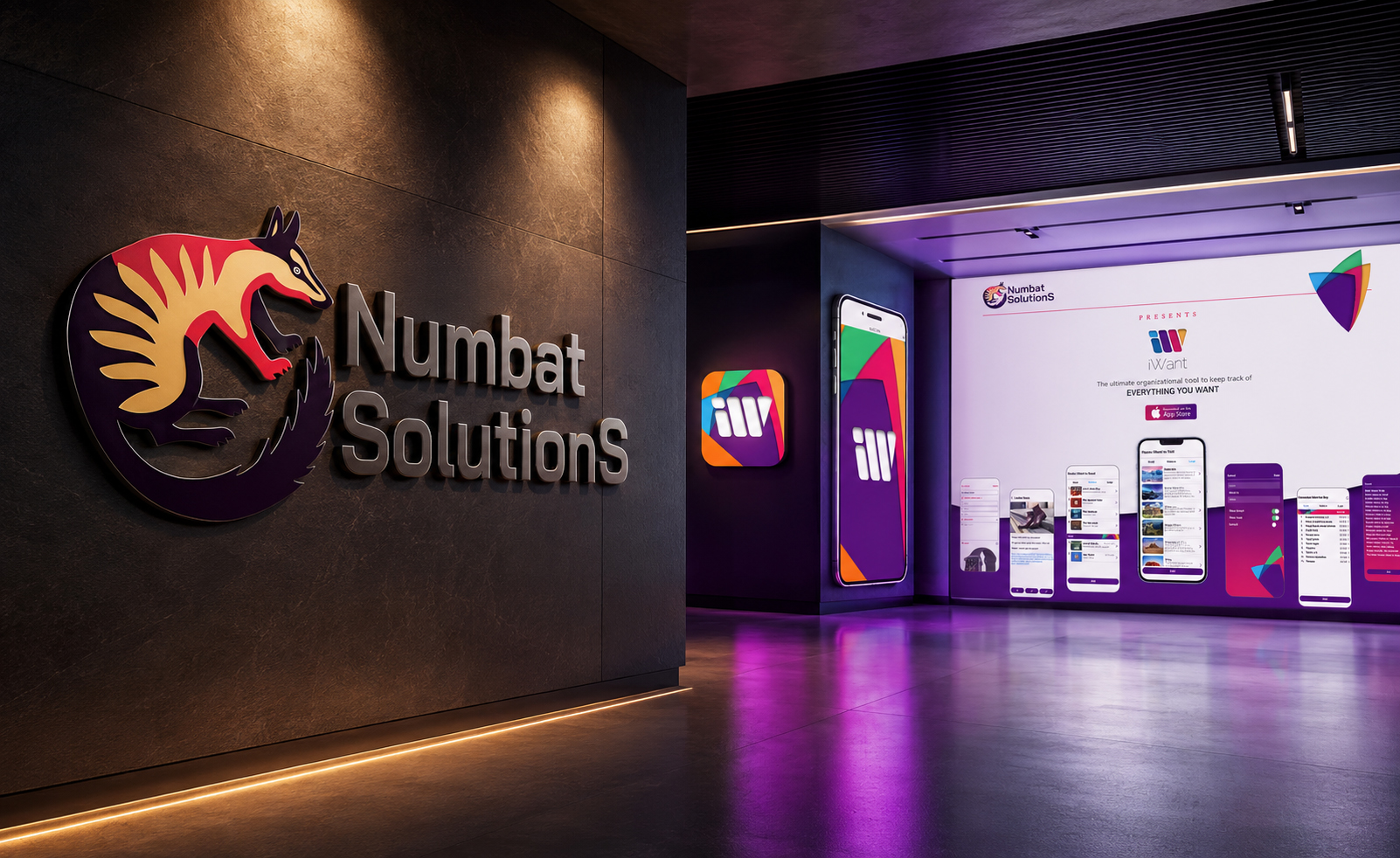
The final Numbat Solutions Brand Identity selected a vivid combination of deep corporate purple, energetic red, and warm neutral tones. Together, these colors gave the illustrated symbol enough personality to remain distinctive while allowing the corporate wordmark to communicate stability, professionalism, and confidence.
The relationship between Numbat Solutions and iWant was established through strategic distinction rather than visual imitation. This allowed the Corporate Identity Design and Digital Product Branding to remain individually recognizable while contributing to one connected Brand Architecture.
Numbat Solutions represented the organization, expertise, and business foundation behind the project. iWant represented the digital product itself: its visual personality, Mobile App UX/UI Design, recognizable interface, and everyday value experienced by users.
When presented together across the Responsive Website Design, product communication, company presentations, and digital marketing materials, the two identities created a clear hierarchy. Numbat Solutions introduced and endorsed the product, while iWant remained the principal focus of the user-facing experience.
This created a connected Digital Brand Ecosystem in which the company and product strengthened one another without competing for the same visual role.
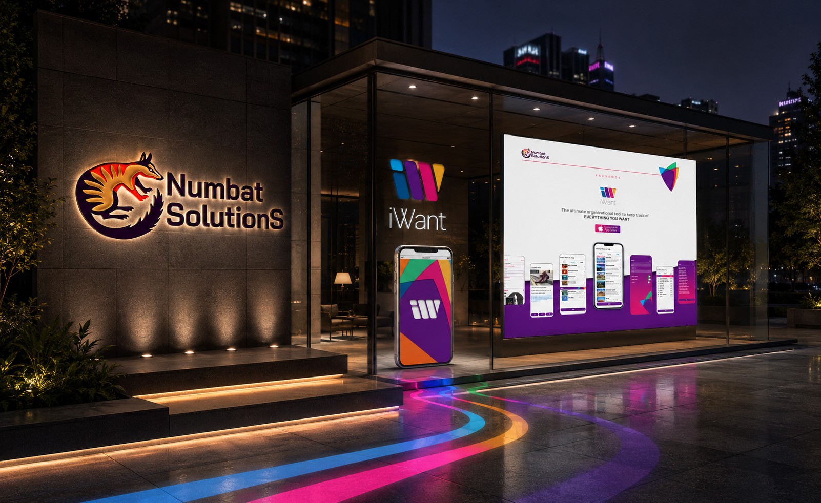
Designing both identities made it possible to approach the project as a complete Brand Identity System rather than a collection of isolated design deliverables.
The creative work connected Corporate Identity Design, Logo Design, Product Branding, Mobile App UX/UI Design, Responsive Website Design, and Digital Brand Communication through one coordinated creative direction.
Each brand retained its own visual language and strategic role. Numbat Solutions communicated authorship, professional trust, and organizational capability. iWant communicated product utility, personality, and the direct human experience of the application.
Their connection did not depend on making them visually identical. It depended on creating a clear Brand Architecture in which the corporate brand and digital product could remain distinctive while contributing to the same coherent business story.
The result was a complete Corporate and Product Brand Ecosystem capable of supporting recognition, communication, and consistency across every major digital touchpoint.
The Company Gave The Product A Professional Foundation. The Product Gave The Company A Visible Expression Of Its Creative And Digital Capability.
“Two Brands Become One Ecosystem Not When They Share The Same Appearance, But When Each One Makes The Purpose Of The Other More Complete.”
FINAL BRAND COLOR SYSTEM
A STRATEGIC DIGITAL PALETTE BUILT FOR RECOGNITION, HIERARCHY, AND CONSISTENCY
Turning Color Into A Functional Language Across The Complete iWant Experience.
A recognizable digital brand requires more than a memorable logo. It also needs a disciplined Brand Color System capable of guiding attention, organizing information, supporting interaction, and preserving identity across every product touchpoint.
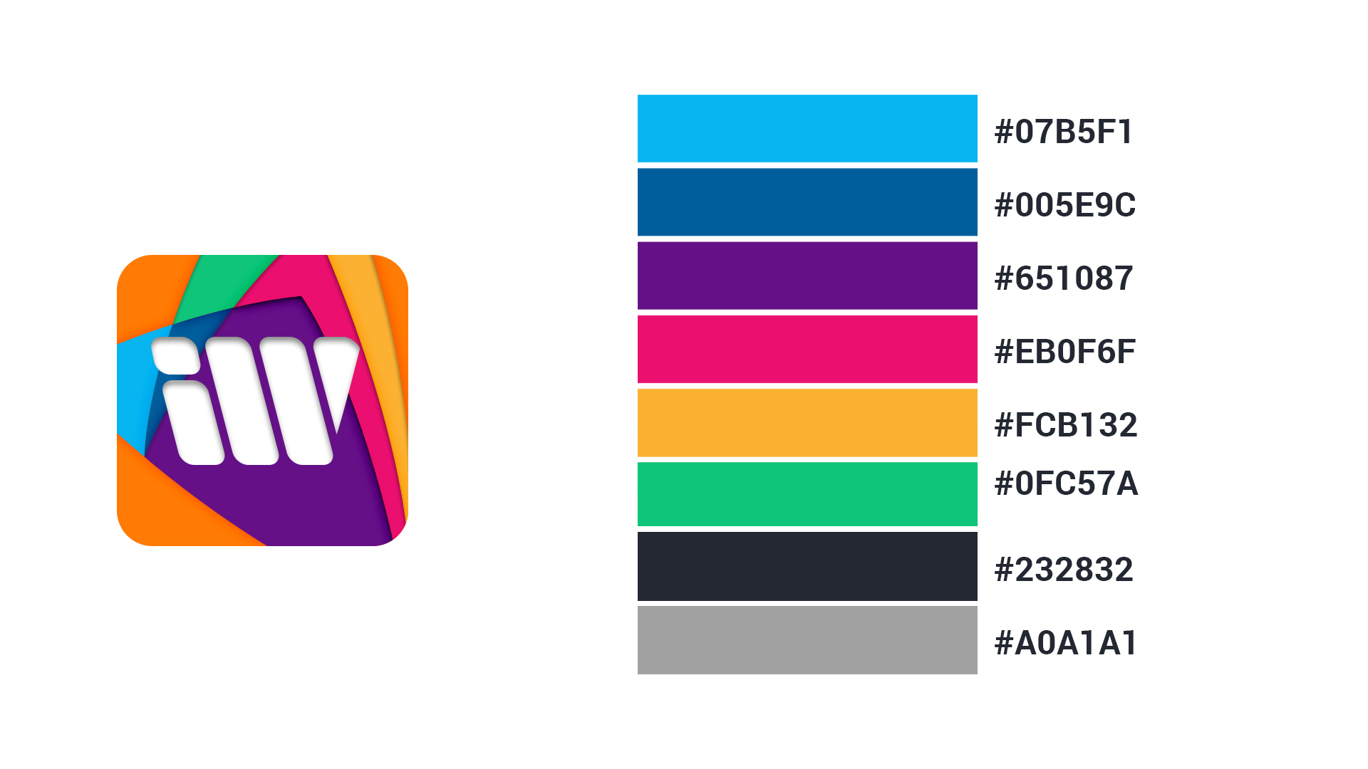
For iWant, the final palette was developed as an extension of the selected logo and app icon. Each primary, supporting, and neutral color was assigned a clear role within the wider identity, allowing expressive brand moments to coexist with the clarity required by a functional Mobile App UX/UI Design system.
The resulting color architecture brings personality to the product while maintaining visual hierarchy, readability, and consistency across mobile interfaces, Responsive Website Design, App Store presentation assets, and supporting brand communication.
THE FINAL COLOR SYSTEM INCLUDED:
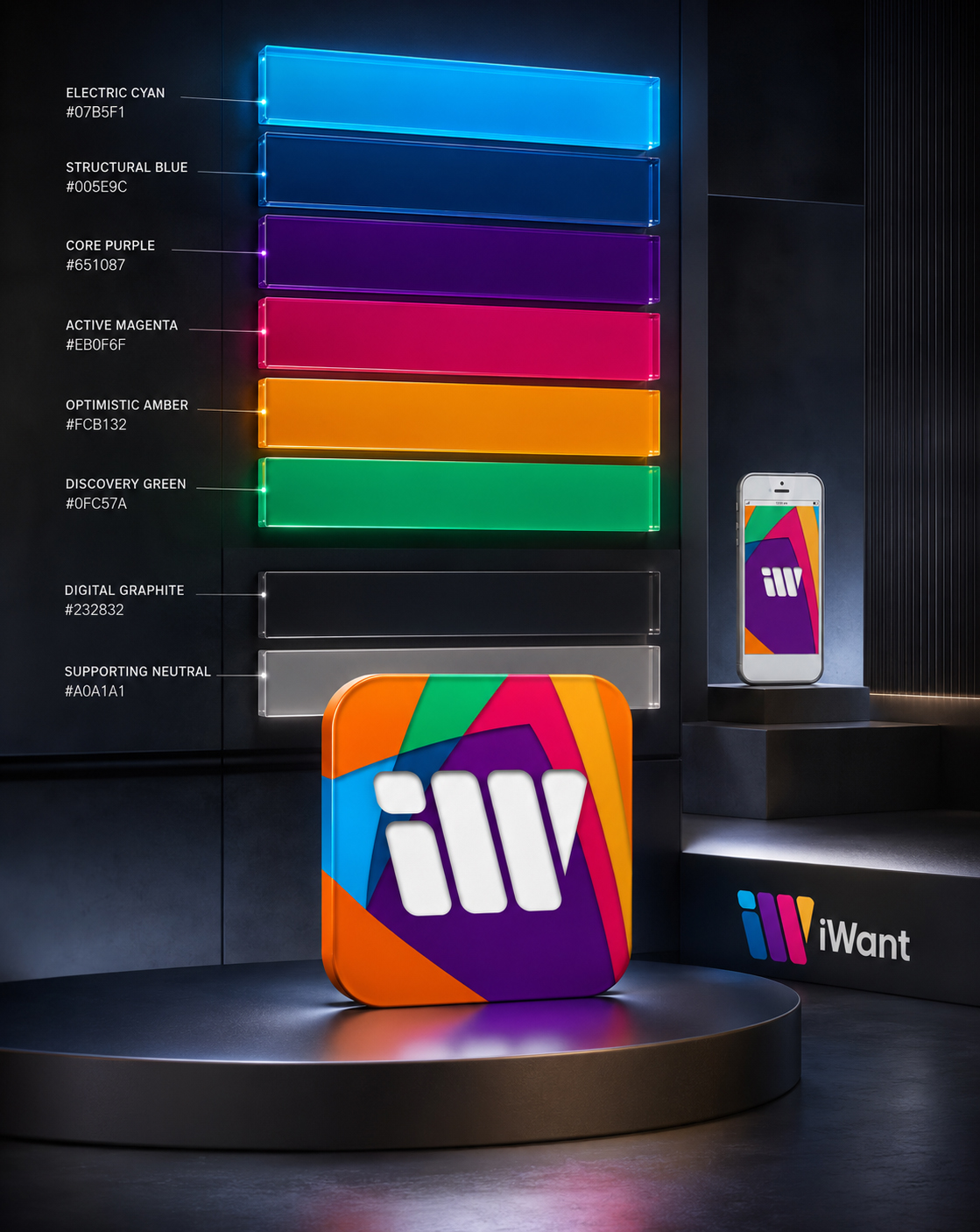
- Primary Recognition Colors — Blue, violet, and magenta establish the defining visual character of iWant and create continuity between the logo, app icon, interface, and wider Digital Brand Identity.
- Supporting Accent Colors — Orange, yellow, green, and cyan introduce energy, variety, and controlled emphasis across selected interface elements and branded communications.
- A Structured Visual Hierarchy — Color relationships help distinguish primary actions, supporting information, navigation states, content categories, and moments requiring user attention.
- A Neutral Interface Foundation — Deep graphite and balanced gray provide contrast, stability, and visual breathing room, allowing the expressive palette to remain clear without overwhelming the User Interface Design.
- Consistent Digital Color Standards — Defined HEX values establish a repeatable reference for mobile UI, responsive website applications, App Store assets, and future digital product materials.
- Scalable Application Principles — The palette was structured to support future product extensions while preserving the color relationships responsible for iWant’s recognizable Mobile App Branding.
THE FINAL RESULT
The finalized Brand Color System became a functional layer of the complete iWant visual identity. It connected brand expression with interface clarity, giving designers and developers a consistent framework for applying color across the digital product ecosystem.
Rather than using color as decoration, the system gave every hue a defined purpose—whether establishing recognition, directing attention, organizing content, supporting navigation, or introducing moments of emotional energy.
The result is a distinctive and repeatable visual language designed to strengthen brand recognition and maintain consistency as iWant evolves across new screens, applications, and digital touchpoints.
“Color Attracts Attention. Structure Gives It Purpose. Consistency Turns Both Into Recognition.”
FROM CREATIVE POSSIBILITY TO ONE RECOGNIZABLE SYSTEM
IDENTITY DEFINED THROUGH DECISION
EXPLORATION CREATED THE OPTIONS. SELECTION CREATED THE BRAND.
Six Expressive Brand Colors
One Distinctive Spectrum Built For Recognition And Digital Energy.
Six defining colors create the expressive core of the iWant Brand Color System. Cyan, blue, violet, magenta, yellow-orange, and green introduce contrast, movement, diversity, and visual personality across the logo, app icon, Mobile App Interface Design, and supporting digital communication.
Each color performs a distinct strategic role while remaining connected to one recognizable visual architecture. This coordinated palette gave the Mobile App Brand Identity enough flexibility to remain expressive across different applications without losing consistency or recognition.
Two Neutral Foundation Colors
Graphite And Gray Create Balance, Contrast, And Visual Control.
Two neutral colors provide the structural foundation supporting the more expressive brand palette. Deep graphite introduces contrast and visual authority, while balanced gray creates Visual Hierarchy, separation, and breathing room across interface and presentation environments.
Together, these neutral tones allow the vibrant colors to remain distinctive without overwhelming the functional clarity required by the wider Digital Product Design System. Expression remains visible, while information, interaction, and usability retain visual control.
Three Core Identity Expressions
Symbol. Wordmark. Application Icon.
The final Logo Design operates through three connected brand expressions. The symbol provides immediate recognition, the wordmark establishes the iWant name, and the App Icon Design translates the identity into its most compact and visible digital form.
Each element can perform independently when required, while their shared geometry, color, and visual character preserve continuity across every branded product touchpoint. Together, they establish a flexible Visual Identity System designed for both recognition and practical digital application.
One Unified Digital Identity
The selected logo, app icon, wordmark, Brand Color System, typography, and supporting graphic language were integrated into one scalable Brand Identity System.
Rather than functioning as isolated visual assets, they established a shared foundation capable of supporting the Mobile App UX/UI Design, Responsive Website Design, App Store presentation, product communication, and future digital extensions without fragmenting brand recognition.
The purpose of Brand Identity Design is not to create more visual elements than a digital product needs. It is to establish a coherent Visual Identity System in which color, geometry, typography, and every brand application contribute to the same recognizable idea.
By refining these elements into one disciplined structure, iWant gained a distinctive Mobile App Brand Identity capable of preserving consistency across different interfaces, screen sizes, and digital contexts. The result was a flexible Digital Product Branding System that could adapt as the application evolved without weakening clarity, recognition, or visual character.
“Exploration Opened The Field. Selection Gave The Product A Face. Consistency Made It Recognizable.”
USER INTERFACE EVOLUTION
FROM EARLY SCREEN CONCEPTS TO A COHESIVE MOBILE PRODUCT EXPERIENCE
Every Intuitive Interface Is Built Through Deliberate Iteration.
A successful Mobile App UX/UI Design system is rarely resolved in a single attempt. It develops through a sequence of design decisions in which structure, navigation, hierarchy, interaction, and visual language are continuously reviewed as parts of one connected user experience.
For iWant, the interface evolution began with multiple screen concepts exploring different ways to organize personal lists, present saved content, guide navigation, and accommodate varying levels of information. Each iteration helped clarify what users needed to see first, what could remain secondary, and how complex functionality could feel increasingly natural.
EXPLORE THE INTERFACE EVOLUTION
Move Through The Concepts To See How Structure, Hierarchy, And Visual Clarity Progressively Shaped The Final iWant Experience.
THE INTERFACE EVOLUTION INCLUDED:
- Exploring Multiple Interface Directions — Alternative screen structures and interaction models were developed to compare different approaches to navigation, content organization, and task progression.
- Refining User-Centered Layouts — Screen hierarchy, spacing, typography, and content density were adjusted to make essential information easier to recognize and navigate.
- Strengthening Navigation And User Flow — Relationships between screens were clarified to create more predictable movement through lists, categories, saved content, and supporting product functions.
- Standardizing Interface Components — Reusable buttons, fields, cards, navigation patterns, and content modules were aligned into one consistent app interface design system.
- Simplifying Complex Interactions — Unnecessary visual and functional complexity was reduced so that advanced features could remain accessible without overwhelming the experience.
- Aligning Interface And Brand Identity — Color, typography, iconography, geometric forms, and supporting visual details were progressively connected to the final iWant app branding system.
- Preparing The UI For Future Scale — The final component logic was structured to support new screens, content types, and product extensions without fragmenting the established experience.
THE FINAL RESULT
The iterative design process transformed a collection of early interface concepts into a cohesive and recognizable mobile product experience.
Navigation became clearer, content hierarchy became more disciplined, and individual screens began to operate as connected parts of one unified system. The final Mobile UI Design balances expressive brand character with the functional clarity required by a productivity and list-management application.
The result is a scalable user interface foundation designed to support consistent interaction, future product development, and a recognizable experience across the wider iWant digital ecosystem.
“Exceptional User Experiences Are Not Created In A Single Step. They Emerge As Every Screen, Interaction, And Decision Becomes Part Of One Clearer System.”
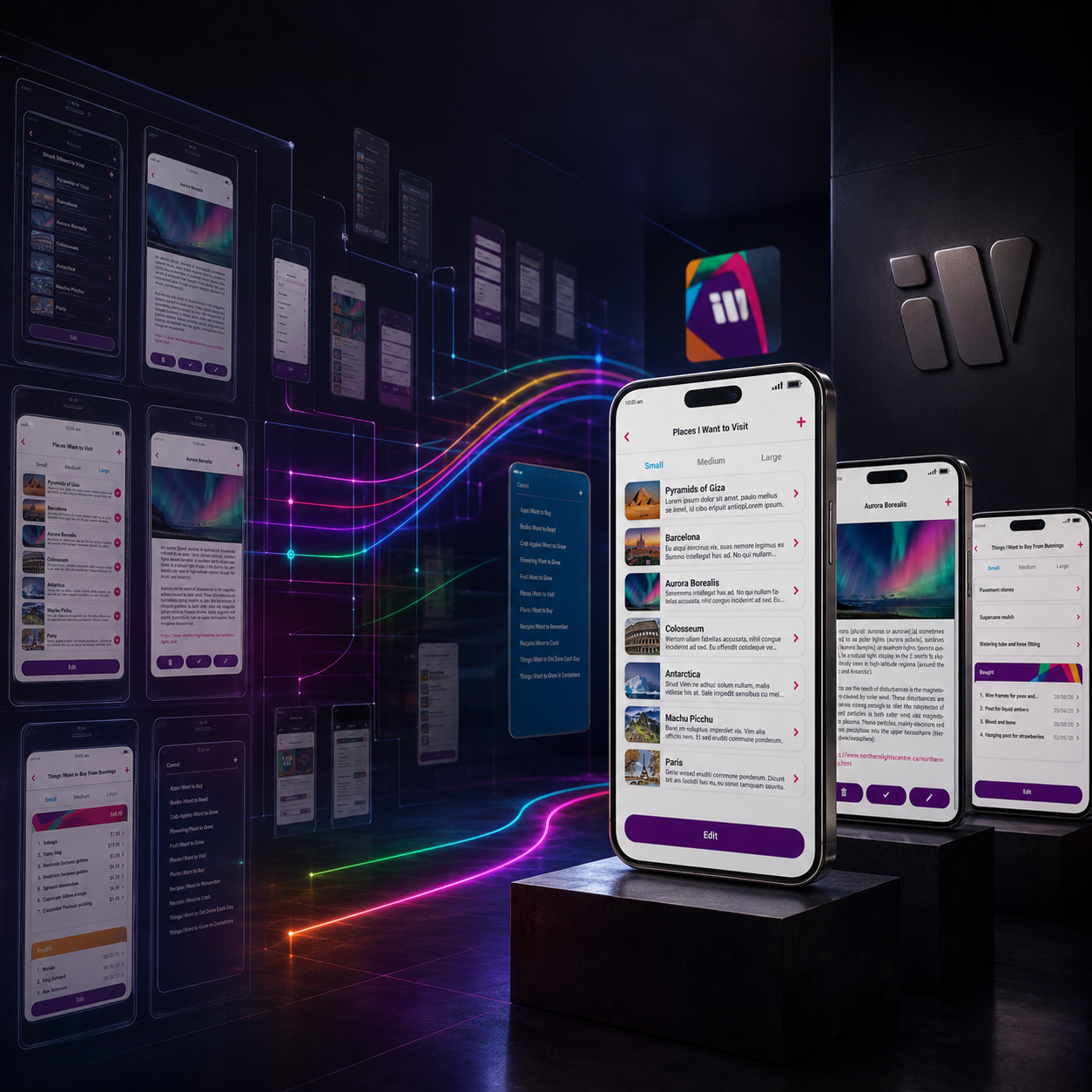
FINAL MOBILE APPLICATION DESIGN
WHERE STRATEGY, IDENTITY, AND USER EXPERIENCE CONVERGE IN ONE COMPLETE DIGITAL PRODUCT
A Cohesive Mobile Experience Designed For Clarity, Functionality, And Future Evolution.
The final iWant application represents the culmination of a complete Mobile App UX/UI Design process in which product strategy, information architecture, app branding, interface design, and user-centered thinking were developed as one connected system.
Rather than treating screens as isolated layouts, the final experience was built around a consistent product logic. Navigation, content hierarchy, list management, image integration, personalized settings, and interface components were refined to help users organize different types of information without unnecessary complexity.
THE COMPLETE MOBILE EXPERIENCE
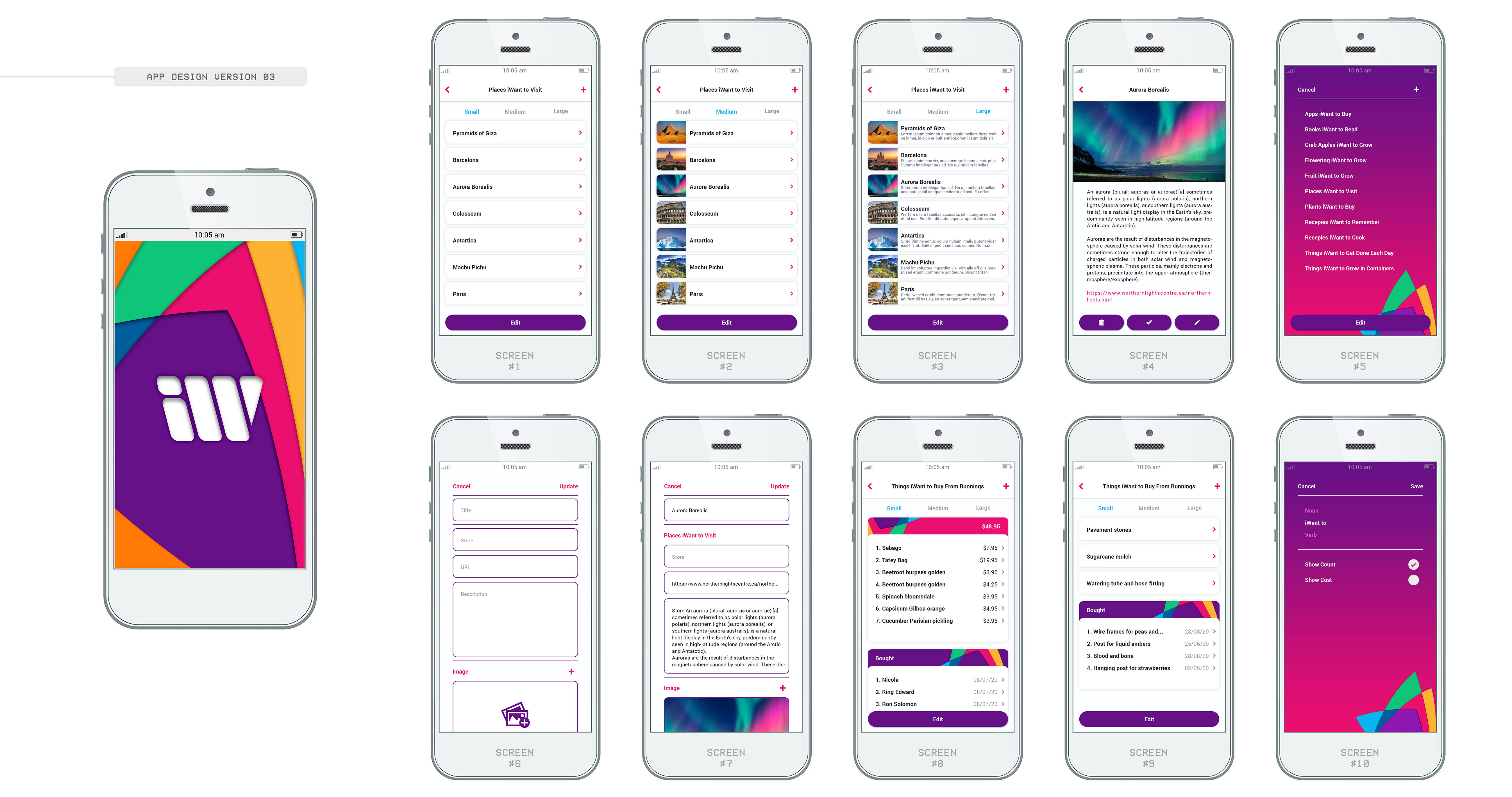
The Final Screen Family Demonstrates How Every Interface, Interaction, And Content Type Belongs To One Unified Digital Product.
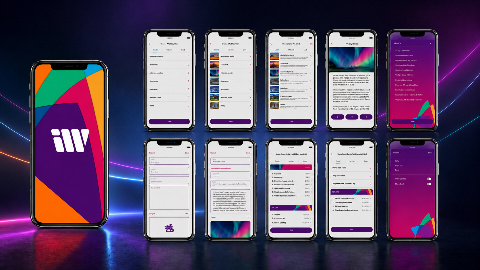
Every screen was shaped to perform a specific role while remaining visibly connected to the wider application. Reusable components, predictable interaction patterns, disciplined spacing, and a consistent visual hierarchy allow users to move between different lists and content types without having to relearn the interface.
The result is a flexible Mobile UI Design system that combines expressive brand character with the clarity required by a productivity and list-management application.
THE FINAL MOBILE EXPERIENCE INCLUDED:
- Intuitive Application Navigation — A clear navigational structure helps users move confidently between lists, saved content, item details, creation tools, and personalized settings.
- Consistent UX/UI Architecture — Shared layouts, controls, interaction patterns, and visual principles create continuity across every screen and product function.
- Structured Information Hierarchy — Typography, spacing, color, and content organization guide attention and make different levels of information easier to understand.
- Flexible List-Management System — The interface supports different categories, content quantities, images, links, descriptions, and personalized organizational needs.
- Reusable Interface Components — Buttons, fields, cards, navigation elements, and content modules form a scalable component library capable of supporting future screens.
- Integrated App Branding — The final logo, app icon, color system, typography, geometric forms, and interface details operate as one recognizable digital identity.
- User-Centered Interaction Patterns — Essential actions are presented clearly, reducing unnecessary friction and supporting a more natural everyday workflow.
- Cross-Platform Product Consistency — The mobile application establishes the central experience while remaining visually aligned with the responsive website, App Store presentation, and supporting digital touchpoints.
THE FINAL RESULT
The completed application transformed the original iWant idea into a cohesive digital product with a recognizable identity, structured user experience, and scalable interface foundation.
Every screen contributes to the same product logic. Navigation remains predictable, content is organized through a consistent hierarchy, and the visual identity supports recognition without competing with functionality.
The final result is a complete productivity app design system prepared to support continued product development, new content scenarios, and future digital extensions while preserving the clarity and consistency of the core experience.
“The Final Interface Is More Than A Collection Of Finished Screens. It Is The Moment Every Strategy, Interaction, And Visual Decision Begins To Work As One Product.”
FROM INDIVIDUAL SCREENS TO ONE CONNECTED PRODUCT EXPERIENCE
INTERFACE COMPLEXITY ORGANIZED
EVERY SCREEN HAS A PURPOSE. EVERY INTERACTION BELONGS TO THE SAME SYSTEM.
Ten Core Application Screens
One Complete Screen Family Built Around A Shared Product Logic.
Ten core screens demonstrate how iWant supports navigation, list creation, content organization, item details, saved information, alternative layouts, and personalized settings.
Although each screen performs a different function, consistent spacing, typography, reusable UI Components, and predictable Interaction Design Patterns connect them into one recognizable Mobile App UX/UI Design system rather than a collection of unrelated interface layouts.
Three Flexible Content Views
Small. Medium. Large.
Three flexible content-view options allow users to control how much information appears within their lists. The small, medium, and large layouts support different quantities of content and levels of detail while preserving the same navigation and User Interface Design logic.
This adaptable Mobile App Interface Design allows the product to respond to different organizational preferences without changing the fundamental structure users have already learned.
One Branded Launch Experience
The Product Identity Introduced Before The First Interaction.
A dedicated opening sequence connects the application icon with the active mobile interface. Color, geometry, scale, and controlled movement transform a necessary loading moment into a concise expression of Mobile App Branding.
This branded Motion Design experience extends the product identity beyond static visuals and establishes continuity before users reach the first functional screen, naturally introducing the animation and interaction system that follows.
One Unified UX/UI System
Navigation. Components. Identity. Interaction.
One connected Mobile App UX/UI Design System governs every screen and product interaction. Reusable components, predictable navigation, structured Information Architecture, and consistent visual principles allow the interface to remain clear as content and functionality expand.
The system protects usability and brand recognition while providing a stable foundation for future screens, product features, and Cross-Platform Digital Experiences.
The strength of a mobile product is not measured by the number of screens it contains, but by how naturally those screens work together.
Through disciplined Information Architecture, reusable UI Components, flexible content views, and consistent Mobile App Interface Design, iWant transformed multiple functional requirements into one clear, recognizable, and scalable Digital Product Experience.
“Screens Create Moments. Structure Connects Them. A System Turns Them Into A Product.”
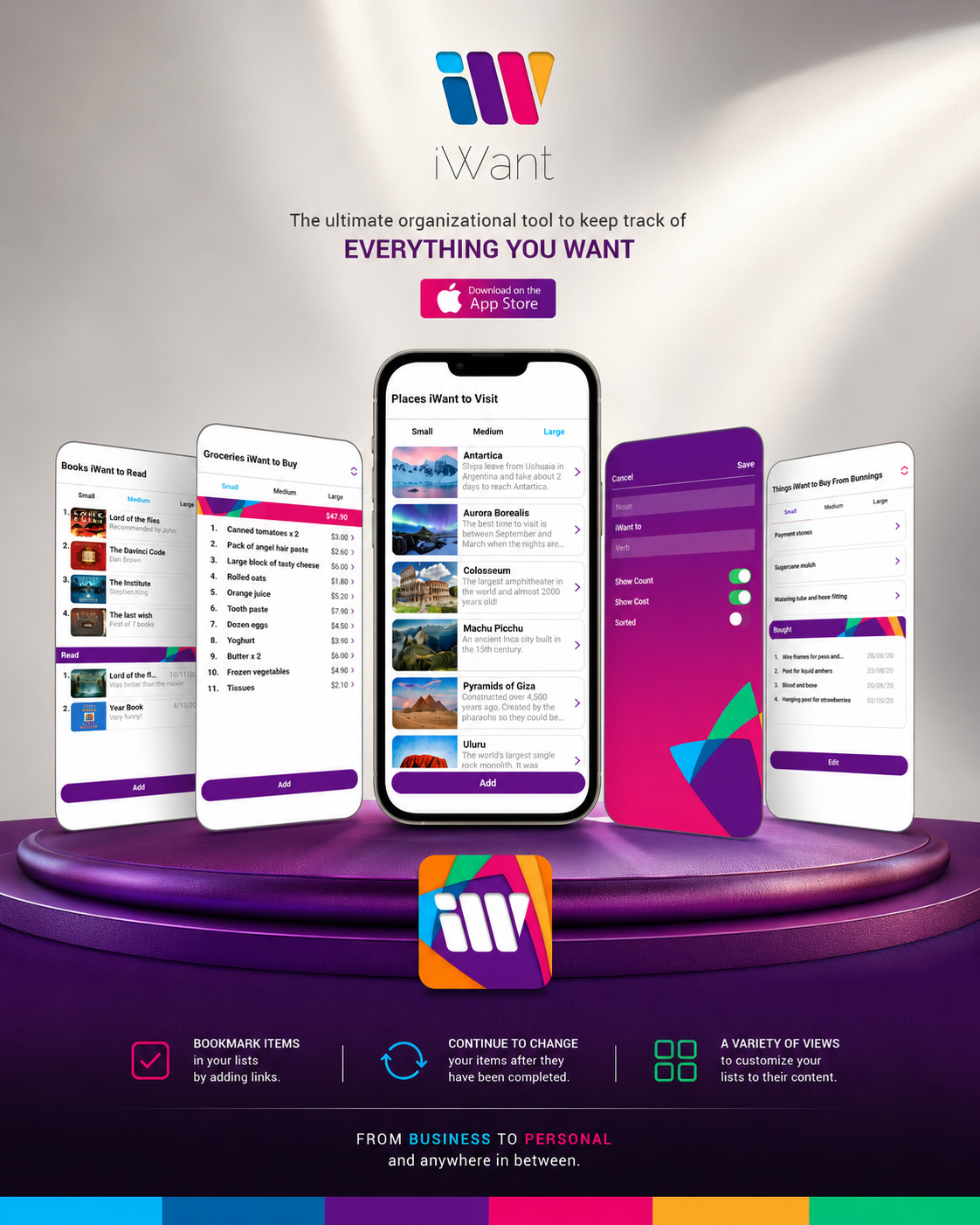
OPENING EXPERIENCE & MOTION DESIGN
DESIGNING THE FIRST IMPRESSION BEFORE THE INTERFACE APPEARS
Turning A Necessary Loading Moment Into A Recognizable Brand Introduction.
The User Experience Design begins before navigation, content, or functionality becomes available. For iWant, the opening sequence was treated as the first designed moment of the product—a brief opportunity to introduce the identity, establish visual continuity, and prepare users for the interface that follows.
Instead of presenting a generic static loading screen, the Mobile App Launch Animation uses controlled movement, layered brand geometry, and the recognizable iWant symbol to create a focused transition into the application. Color, timing, scale, and composition work together to make the sequence feel intentional without delaying or distracting from product access.
This approach extends the visual identity beyond static brand assets and into the behavior of the interface itself. Motion becomes part of the wider Mobile App UX/UI Design system, connecting the app icon, opening experience, and final interface through one continuous digital language.
KEY MOTION DESIGN OBJECTIVES
- Introduce The Brand Immediately — The iWant identity appears before the first functional screen, creating continuity between the app icon, launch sequence, and mobile experience.
- Transform Waiting Into A Designed Moment —A necessary loading state becomes a purposeful Branded Loading Experience rather than an empty or disconnected pause.
- Use Motion With Restraint — Timing, transitions, scale, and visual rhythm are carefully controlled so the Motion Design supports the experience without becoming decorative or intrusive.
- Preserve Visual Consistency — The opening sequence uses the same colors, geometric forms, proportions, and recognizable symbol established throughout the Mobile App Branding system.
- Create A Natural Interface Transition — The motion sequence guides the eye smoothly toward the main application, avoiding an abrupt shift between launch and interaction.
- Support Product Recognition — Repeated exposure to the core symbol and color architecture strengthens visual continuity across the wider Digital Product Experience.
- Keep The Experience Focused And Efficient — The animation remains concise, allowing the user to enter the application without unnecessary delay.
THE FINAL RESULT
The final Opening Animation Design transformed the application launch into an integrated part of the iWant experience. It introduced the product identity through movement while maintaining the clarity and efficiency expected from a functional mobile interface.
By combining restrained motion with the established brand color system and geometric visual language, the sequence creates a recognizable transition from app icon to active interface. The result is a concise, polished opening moment that feels distinctly iWant before the user completes the first interaction.
“The First Interaction Begins Before The First Tap. Motion Introduces The Brand, Sets The Rhythm, And Opens The Door To The Experience.”
APP STORE PRODUCT PRESENTATION
TURNING PRODUCT VALUE INTO A CLEAR AND COMPELLING APP STORE STORY
Communicating Purpose, Functionality, And Brand Value Before The First Download.
A complete digital product must communicate clearly before people have an opportunity to experience it. Within the App Store, the icon, feature graphic, screenshot sequence, and supporting visual assets become the first introduction to the application’s purpose, personality, and everyday relevance.
For iWant, the marketplace presentation was developed as an extension of the complete Mobile App UX/UI Design and app branding system. The objective was to translate a complex, flexible product into a concise visual story that could be understood within seconds—without overwhelming potential users with every available feature.
THE COMPLETE APP STORE VISUAL SYSTEM
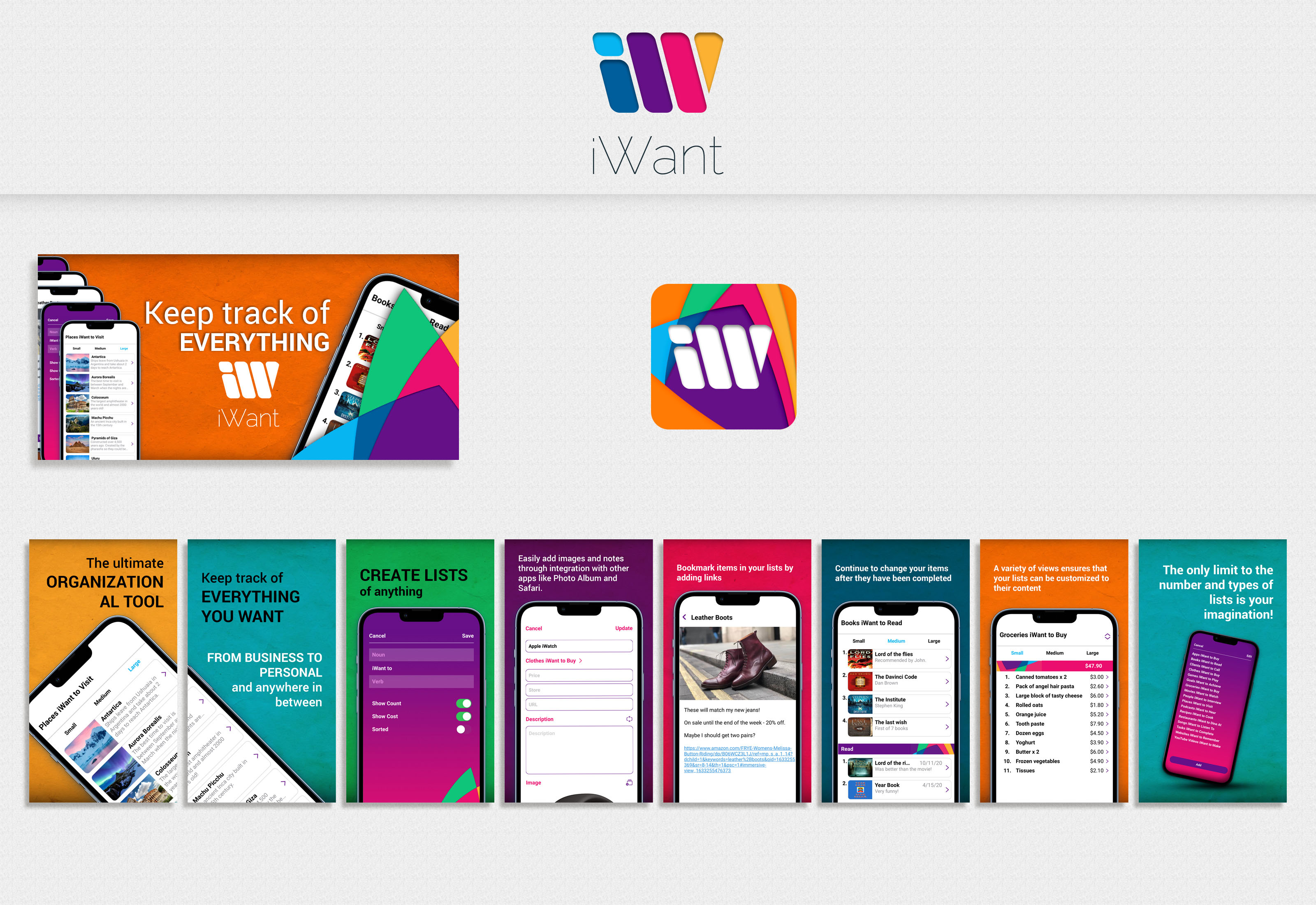
From App Icon To Screenshot Sequence, Every Asset Contributes To One Clear And Recognizable Product Introduction.
Rather than presenting a disconnected collection of interface screens, the final App Store Screenshot Design guides viewers through the product in a deliberate order. The sequence begins with the central organizational idea, introduces the flexibility of custom lists, demonstrates content creation and management, and concludes by revealing the wider range of possibilities available within the application.
This creates a focused progression from initial recognition to product understanding. Brand identity attracts attention, authentic interface previews establish credibility, and concise, benefit-led communication helps potential users understand the product and evaluate whether it is relevant to their needs.
THE APP STORE PRESENTATION INCLUDED:
A Recognizable Application Icon
The final App Icon Design translates the iWant identity into a compact marketplace asset created to remain visually distinctive and recognizable at small digital sizes.
A Clear Feature Graphic
The primary App Store Feature Graphic introduces the product personality and central value proposition through a focused combination of brand color, authentic interface imagery, and concise communication.
A Strategically Sequenced Screenshot Story
The App Store Screenshots move from product purpose to core functionality, allowing potential users to understand the application progressively instead of encountering a disconnected collection of features.
Benefit-Led Visual Communication
Each visual pairs authentic interface content with a focused message explaining how the feature contributes to the user’s everyday organizational experience.
Consistent App Branding
Color, typography, geometric forms, device presentation, and interface styling remain connected to the complete iWant Mobile App Brand Identity.
Mobile-First Legibility
Headlines, interface previews, contrast, and composition were designed to remain clear within the restricted scale and rapid browsing conditions of a mobile app marketplace.
Conversion-Aware Product Presentation
The complete App Store Presentation Design reduces ambiguity and communicates the application’s value through a clear, accessible, and logically structured visual sequence.
THE FINAL RESULT
The completed App Store Presentation gave iWant a focused and recognizable marketplace presence built from the same strategic principles as the application itself.
The icon establishes recognition. The feature graphic introduces the identity. The screenshot sequence explains the experience. Together, these App Store Visual Assets transform product functionality into a coherent narrative that supports discovery, understanding, and informed download consideration.
The final system positions iWant as a professionally developed digital product while preserving continuity between its Mobile App UX/UI Design, marketplace presentation, responsive website, and wider brand ecosystem.
“Before People Experience The Product, They Experience Its Presentation. Clarity Turns Discovery Into Confident Consideration.”
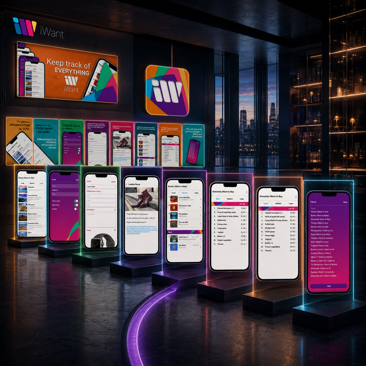
APP STORE SCREENSHOT STORYTELLING - A CLOSER LOOK AT THE SCREENSHOT JOURNEY
EIGHT SCREENS. ONE CLEAR JOURNEY FROM PRODUCT PROMISE TO EVERYDAY VALUE.
Designing The Screenshot Gallery As A Guided Product Narrative.
An effective App Store Gallery Design must do more than display attractive interface screens. It should introduce the product quickly, establish relevance, explain its essential functionality, and help potential users understand what the application enables them to accomplish.
For iWant, the App Store Screenshot Sequence was structured as one progressive product story. Each frame answers a new question: what the application is, who it is designed for, what users can create, how saved information can be enriched, and how the Mobile App Experience adapts to different organizational needs.
THE COMPLETE SCREENSHOT NARRATIVE
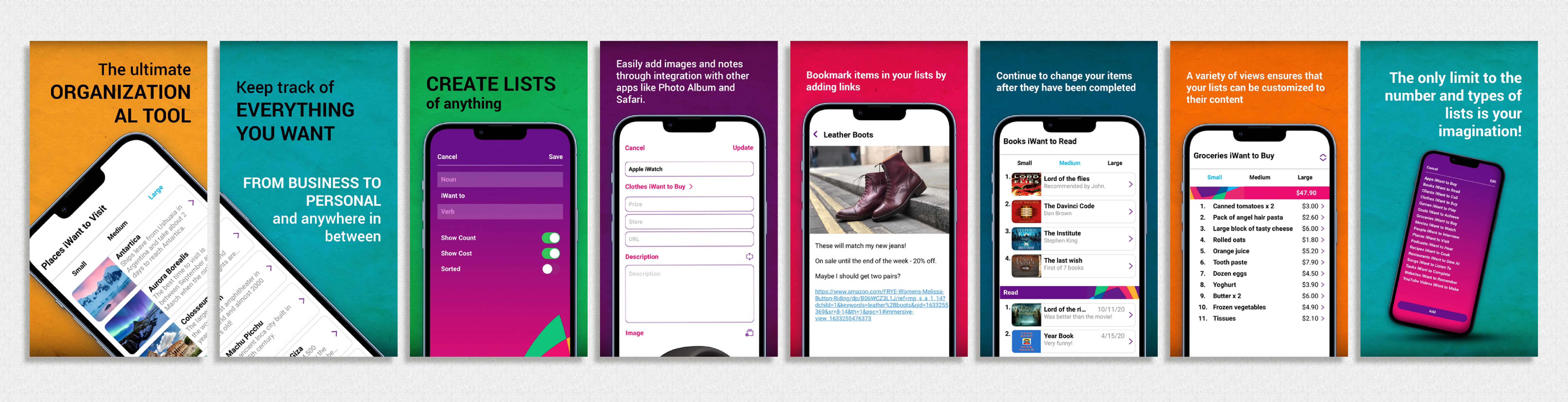
Each Frame Introduces One New Layer Of The Product—Moving From Immediate Recognition To A Broader Understanding Of The Complete Experience.
The sequence was intentionally designed to move from broad product value toward increasingly specific examples of use. Rather than presenting unrelated features, every screenshot builds upon the previous one, allowing the gallery to communicate both simplicity and depth within a limited viewing time.
THE SCREENSHOT JOURNEY INCLUDED:
- 01 — Establishing The Central Product Promise — The opening frame positions iWant as an organizational tool capable of bringing different interests, intentions, and personal information into one accessible place.
- 02 — Expanding The Product’s Relevance — The second frame demonstrates that the application can support everything from professional priorities to personal interests and everyday plans.
- 03 — Introducing Flexible List Creation — Users are shown how different types of lists can be created and personalized according to their own organizational needs.
- 04 — Demonstrating Richer Content Management — Images, descriptions, and supporting notes reveal that individual items can contain more than a simple title.
- 05 — Showing Saved Links And References — Bookmarking functionality communicates how external information and useful resources can become part of an organized personal list.
- 06 — Presenting Ongoing List Interaction — Completed items and evolving content demonstrate that lists are active tools designed to change alongside the user.
- 07 — Revealing Alternative Content Views — Different layouts show how information can adapt to varying quantities, categories, and levels of detail.
- 08 — Closing With Product Flexibility — The final frame expands the viewer’s understanding of iWant by presenting the wider variety of lists and personal applications the system can support.
THE NARRATIVE RESULT
Together, the eight screenshots transform a complex application into a clear and progressively understandable product story.
The opening frames establish relevance. The middle sequence demonstrates functionality. The final screens reveal flexibility and future possibility. This hierarchy allows the App Store gallery to communicate more than a list of features—it presents a coherent experience built around organization, personalization, and everyday usefulness.
The result is a structured visual narrative that connects authentic app interface design with concise benefit-led communication, strengthening continuity between the Mobile App UX/UI Design, app branding, and marketplace presentation.
“A Strong App Store Gallery Does Not Show Everything At Once. It Reveals The Right Information In The Right Order Until Product Value Becomes Clear.”
FROM COMPLETE PRODUCT VALUE TO A CLEAR MARKETPLACE STORY
THE PRODUCT PRESENTED IN SEQUENCE
EVERY ASSET HAS A ROLE. EVERY SCREEN REVEALS THE NEXT LAYER.
Ten Connected Marketplace Assets
One Complete App Store Visual Communication System.
The final App Store Presentation Design combines one application icon, one primary feature graphic, and eight sequential screenshots. Together, these ten assets create a connected product introduction rather than a collection of independent promotional materials.
Each element performs a different communication role while maintaining consistent app branding, interface presentation, visual hierarchy, and product positioning across the complete marketplace experience.
Eight App Store Story Screens
Eight Frames. One Guided Product Journey.
Eight App Store Screenshots guide potential users from the central product promise toward a broader understanding of the application. The sequence introduces organization, personal relevance, list creation, enriched content, saved links, ongoing interaction, alternative views, and wider product flexibility.
Every frame reveals one new layer, allowing the Mobile App Experience to develop progressively without presenting every function at once.
One Recognizable Application Icon
The First Marketplace Point Of Brand Recognition.
One compact App Icon Design carries the iWant identity into its most immediate marketplace application. Its geometry, color architecture, and distinctive symbol remain recognizable within visually crowded mobile and App Store environments.
Before screenshots communicate functionality, the icon establishes the first connection between the digital product, its identity, and the wider brand ecosystem.
One Primary Feature Graphic
A Focused Visual Introduction To The Complete Product.
One primary App Store Feature Graphic brings together the iWant identity, authentic interface presentation, and central product message. Its role is to introduce the application quickly while establishing visual continuity with the screenshot sequence that follows.
Rather than attempting to explain every function, it creates a clear entry point from which the broader product narrative can progressively unfold.
The marketplace story is built through a simple but deliberate mathematical structure:
1 Application Icon + 1 Feature Graphic + 8 Story Screens = 10 Connected Marketplace Assets
The value of this App Store Visual System does not come from the number alone. It comes from the relationship between its parts.
The icon establishes recognition, the feature graphic introduces the product, and the screenshot sequence develops understanding. Strategy connects all ten assets into one coherent path from initial discovery to informed product consideration.
“Recognition Begins With One Icon. Understanding Develops Across Eight Screens. Strategy Connects Everything Into One Story.”
THE CHAPTERS AHEAD
NEW CHAPTERS. DEEPER QUESTIONS. MORE TO DISCOVER.
Now Each Finished Screen Has A Story To Tell.
We have seen the complete digital product from a distance. The chapters ahead move closer—into the decisions, structures, interactions, and human considerations that shaped every part of the experience. This is where the polished outcome opens to reveal the Product Design Strategy and internal logic behind it.
Each chapter isolates one essential layer, examines why it matters, and reconnects it to the larger product. We move from human intention to brand meaning, from Information Architecture to interaction, and from a single mobile experience to a scalable digital ecosystem.
The pace now changes. We are no longer introducing what was created; we are opening it, questioning it, and tracing how its parts work together. Expect fewer grand entrances, more revealing details, and several design decisions that were doing more work than they first admitted.
THE NEXT ACT WILL OPEN:
- Human Intention And Brand Meaning
- Information Architecture And Navigation
- User Flows And Interaction Logic
- UI Component Systems And Interface Consistency
- Scalable Product UX Design
- Human Connection And Everyday Relevance
- Market Visibility And Product Discovery
- Future Growth And Digital Ecosystem Expansion
The overview is complete. One scroll takes us into the system—where the deeper story begins.
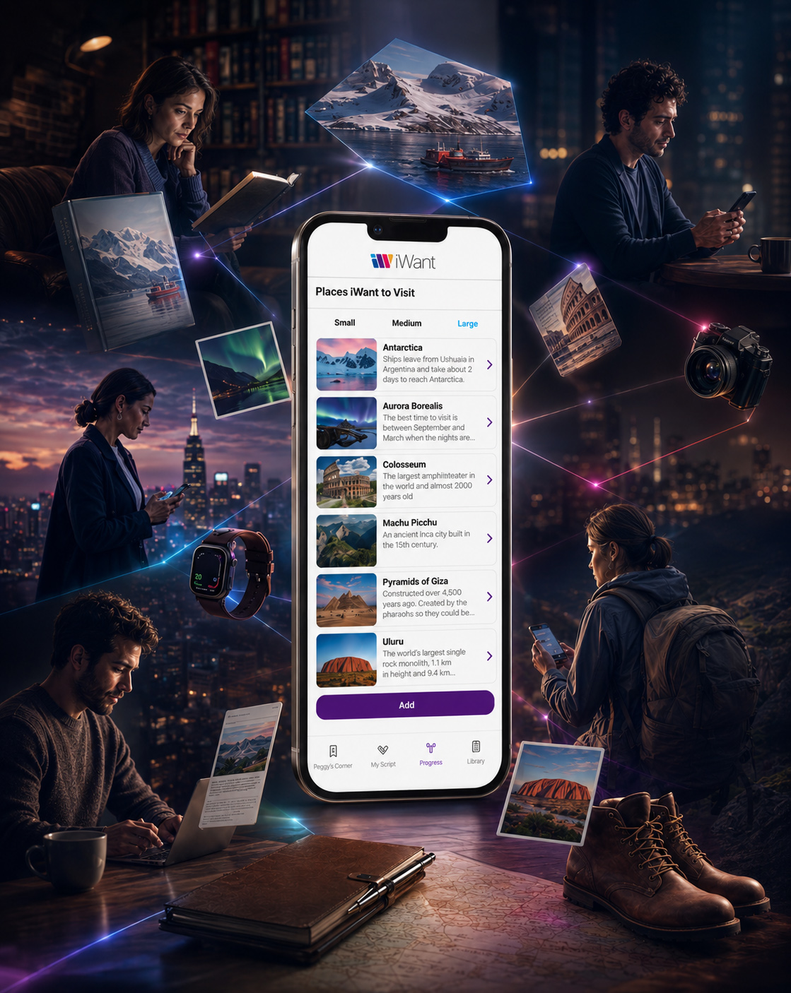
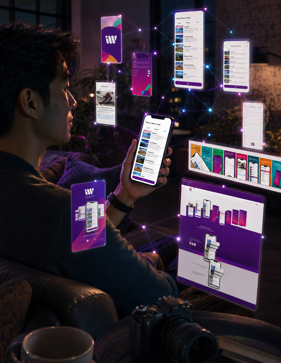
THE PRODUCT SO FAR
ONE PRODUCT. MANY DECISIONS. ZERO RANDOM DETAILS.
Yes, Even The Loading Screen Had A Job To Do.
We began with a human need and followed it through product strategy, Brand Identity Design, Mobile App UX/UI Design, motion, and marketplace presentation. What first appeared to be a simple list-making application gradually revealed the connected design system required to make simplicity feel natural.
The logo was explored before it was selected. Color was tested before it became a system. Screens were refined before they became a complete Digital Product Experience. Even the opening animation and App Store sequence were given specific roles within the wider product story.
Nothing was added simply because it looked impressive. Every element had to clarify the product, strengthen brand recognition, support usability, or prepare iWant for future growth. That is a lot of responsibility for a few colorful shapes and some very organized lists.
THE FIRST ACT CONNECTS:
- Human Need And Product Purpose
- Logo Design Exploration And Final Selection
- Adaptive Identity And Brand Color Architecture
- Interface Evolution And UX/UI Design
- Final Mobile Application Design
- Motion Design And Brand Introduction
- App Store Product Presentation
That was the foundation. Now we stop admiring the system from a distance—and step inside it.
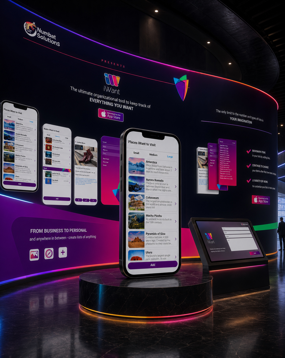

WEBSITE FEATURE
FROM MOBILE PRODUCT TO A COMPLETE DIGITAL PRESENCE
EXTENDING IWANT BEYOND THE APP
The Mobile Application Established The Product Experience. The Website Extended That Experience Into A Clear, Responsive, And Strategically Connected Digital Presence.
The iWant project extended beyond the design of the mobile application.
A dedicated Product Website was developed for Numbat Solutions to introduce iWant, communicate its purpose, present its key capabilities, and connect initial discovery with the decision to explore or download the application.
The Responsive Website Design translated the established iWant identity into a wider digital environment. Product screens, feature communication, adaptable layouts, calls to action, and supporting content were coordinated to create a recognizable relationship between the application and its public presentation.
Rather than functioning as an unrelated promotional layer, the website completed the original digital ecosystem—giving the product a clear destination beyond the App Store and a structured space in which its value could be understood.
DISCOVER. UNDERSTAND. CONNECT.
The Application Created The Experience. The Website Created The Place Where That Experience Could Be Discovered.
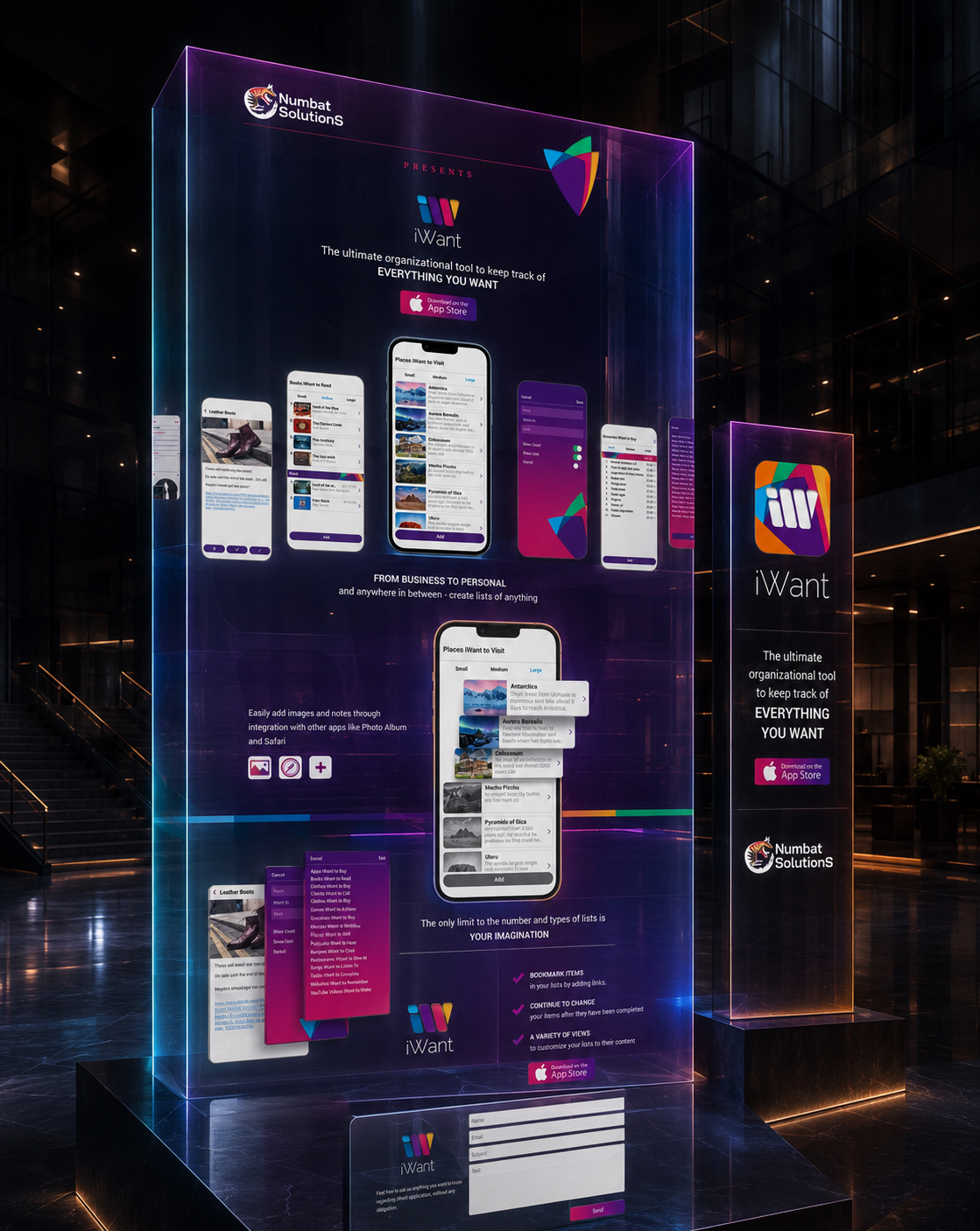
CONNECTING PRODUCT EXPERIENCE WITH DIGITAL DISCOVERY
The mobile application and website were designed to serve different moments within the same Digital Customer Journey.
The application supported the personal experience of creating, organizing, reviewing, and preserving information. The website introduced that experience from the outside—communicating what iWant was, how it could be used, and why its flexible list system could remain relevant across different personal and practical contexts.
By extending the same identity, product imagery, and communication principles across both environments, the project created continuity between discovering the product and understanding its value.
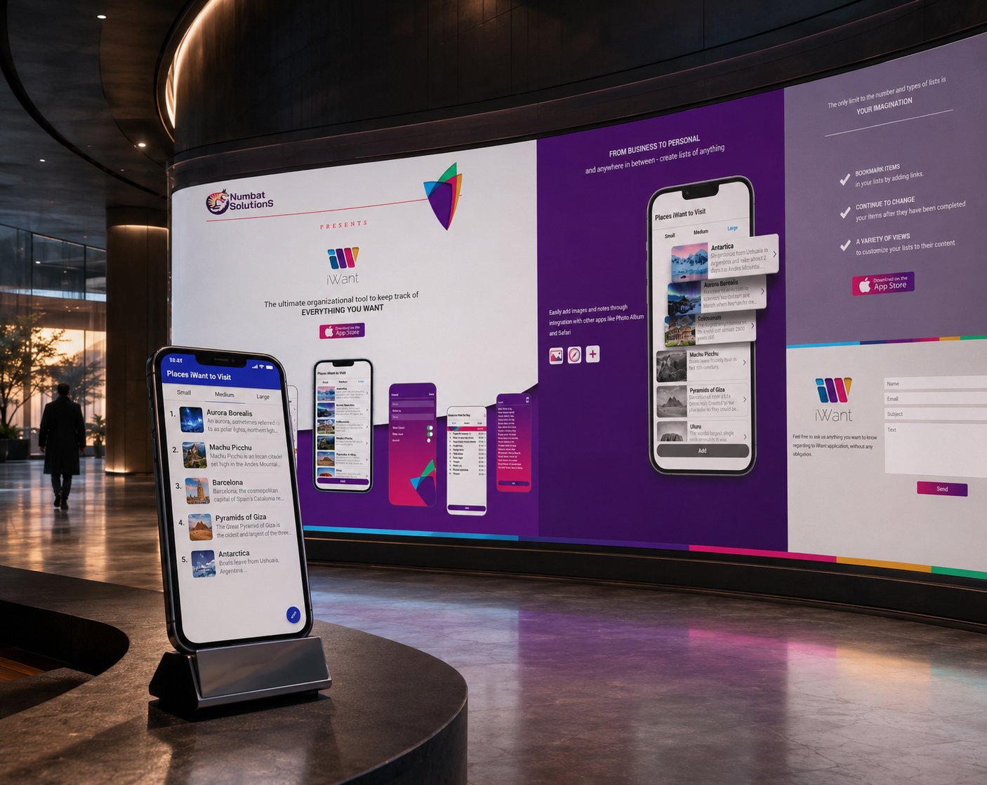
THE COMPLETE DIGITAL ECOSYSTEM
A complete Digital Product Ecosystem requires more than visual consistency between different screens.
It requires every touchpoint to contribute to the same purpose, communicate the same identity, and help people move naturally from initial recognition toward meaningful interaction.
By connecting the mobile product experience with its public presentation, iWant established a coherent relationship between what the application offered and how that value was communicated.
The ecosystem became complete when discovery, understanding, and product interaction began to support one another.
“A Digital Product Becomes Stronger When Every Touchpoint Helps People Understand Why The Experience Matters.”
INTRODUCE THE PRODUCT
The website gave iWant a dedicated digital destination where its purpose, identity, and core value could be communicated beyond the application itself.
EXPLAIN THE EXPERIENCE
Authentic screens, feature presentations, and structured content translated application functionality into clear and accessible Product Communication.
SUPPORT THE NEXT ACTION
Responsive layouts and focused calls to action connected product understanding with exploration, contact, and the original App Store journey.
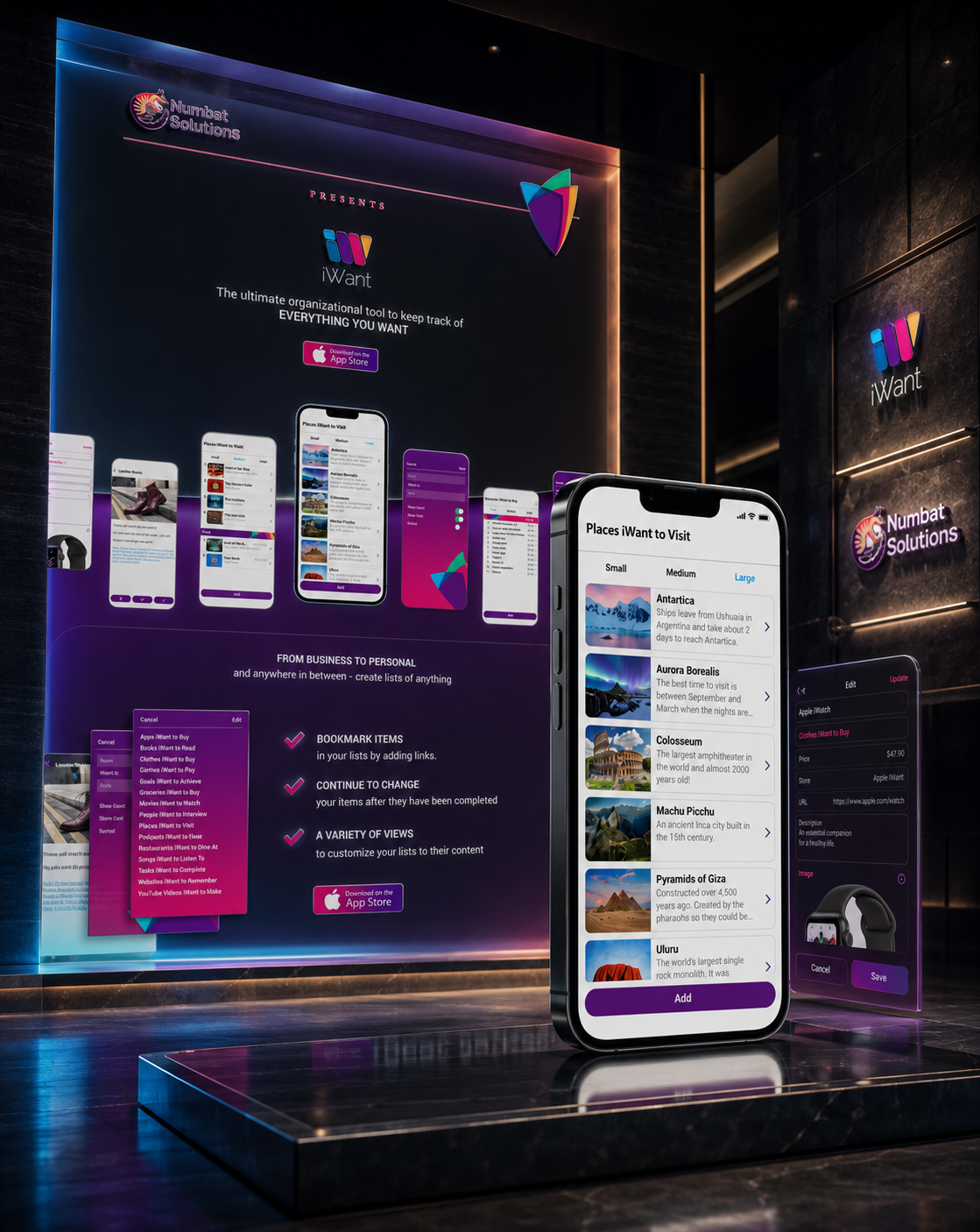
THE COMPLETE DIGITAL ECOSYSTEM
The mobile application and website were developed as two connected expressions of the same digital product.
While the application supported the personal experience of organizing and preserving information, the website created a wider environment in which the product’s purpose, functionality, and value could be clearly introduced.
Together, they transformed iWant from an isolated interface into a more complete Digital Brand Presence.
It was one product expressed through two coordinated experiences—one designed for use, the other designed for discovery.
“The Product Felt Continuous Because Every Return Began With Something The User Already Recognized.”
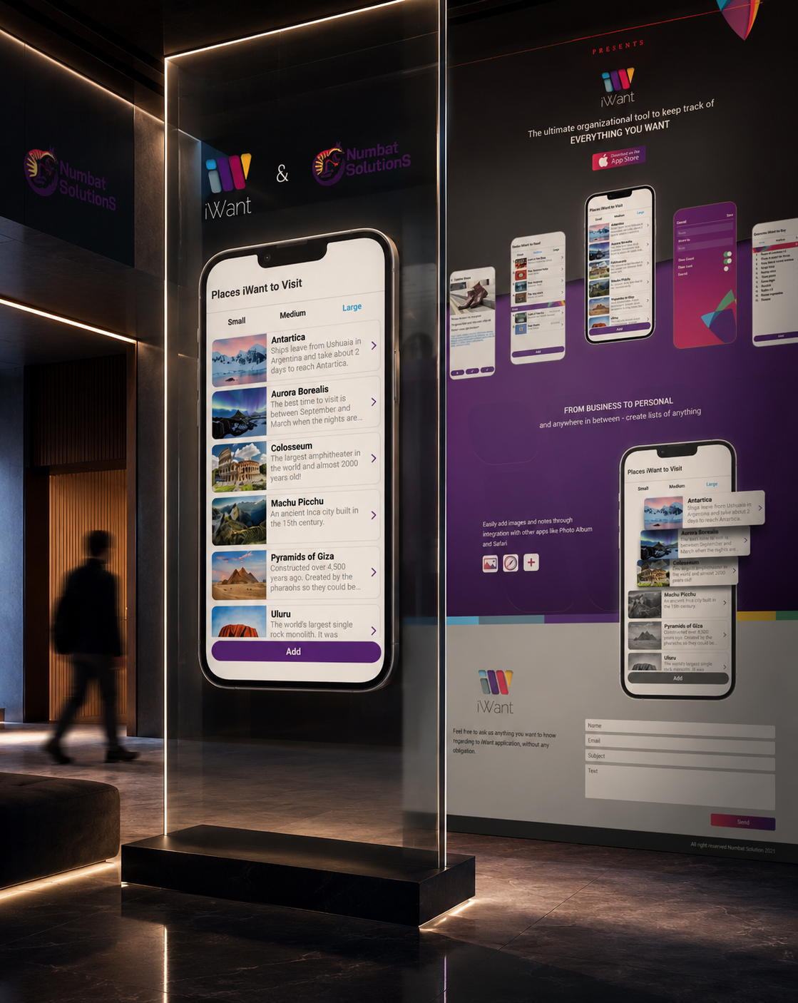
GIVING THE PRODUCT A CLEAR PLACE TO BE UNDERSTOOD
The website transformed the application from a product encountered only through its interface into a wider digital story.
Its Website Content Structure introduced the central value proposition, demonstrated the flexibility of the list system, presented important product behaviors, and used focused calls to action to guide visitors toward the next step.
This created a deliberate progression from first recognition to deeper product understanding.
Visual communication attracted attention, authentic screens provided evidence, and supporting content explained how the product could adapt to different kinds of personal information.
“Digital Presence Begins When A Product Can Communicate Its Value Before Asking People To Use It.”
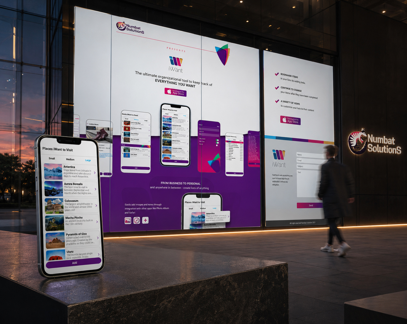
FROM MOBILE PRODUCT TO DIGITAL PRESENCE
The iWant application established the functional heart of the product, but its wider digital presence required a different form of communication.
The website translated application screens, features, and interaction principles into a structured Product Storytelling experience that could be understood before the first download or direct interaction.
This gave the original mobile experience greater context, visibility, and a recognizable place within the wider Numbat Solutions digital environment.
The product moved beyond the device when its purpose could be clearly communicated to people who had not yet experienced it.
“Digital Presence Begins When A Product Can Communicate Its Value Before Asking People To Use It.”
THE WEBSITE SOLUTION INCLUDED
RESPONSIVE WEBSITE DESIGN
A coordinated experience developed for desktop, tablet, and mobile presentation.
STRATEGIC LANDING EXPERIENCE
A focused Landing Page Design structured around product purpose, key capabilities, and discovery.
PRODUCT STORYTELLING
Authentic application screens and supporting content translated functionality into value.
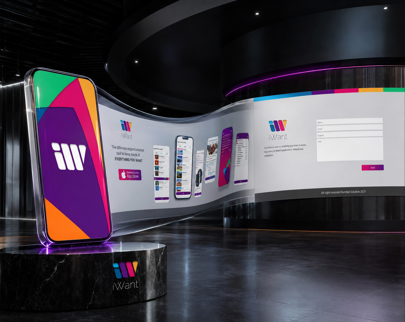
BRAND IDENTITY INTEGRATION
The iWant and Numbat Solutions identities were connected across one digital environment.
UX-FOCUSED CONTENT STRUCTURE
Clear Information Architecture and visual hierarchy guided visitors from recognition toward understanding and action.
CONVERSION-FOCUSED ACTIONS
Calls to action supported product exploration, contact, and the original download journey.
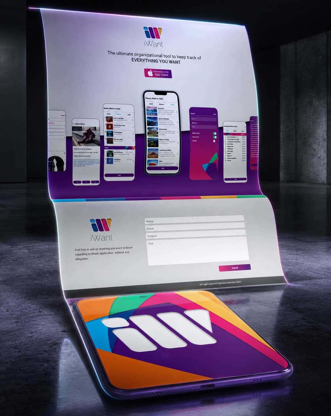
Different devices introduced different proportions, reading conditions, interaction expectations, and amounts of available space.
The Responsive Web Experience therefore could not depend on repeating one fixed composition. It needed to preserve the essential relationships between identity, hierarchy, imagery, content, and action as each format changed.
Across mobile, tablet, and desktop environments, the expression adapted while the product remained unmistakably iWant.
Consistency was protected not by freezing the design, but by allowing it to respond without losing its recognizable character.
“One Identity Can Change Its Shape Across Every Screen Without Changing What People Recognize.”
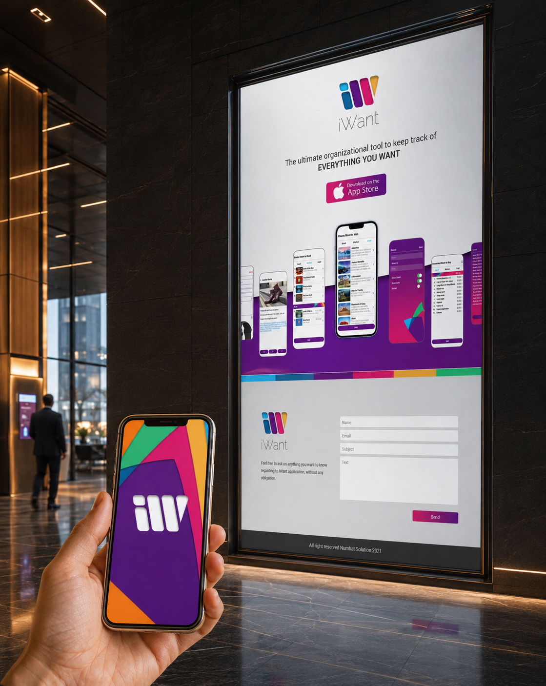
ONE IDENTITY ACROSS EVERY SCREEN
Responsive Website Design was treated as a continuation of the product system rather than a technical adjustment made after the visual direction had been completed.
Every format required deliberate decisions about scale, spacing, hierarchy, imagery, and content priority so that the experience remained clear wherever it appeared.
This allowed the wider digital presence to respond to different devices while preserving one coherent relationship between the application, website, and brand.
The experience remained unified because every adaptation followed the same underlying visual and strategic logic.
“Responsive Design Succeeds When The Screen Changes, But The Product Still Feels Immediately Familiar.”
ONE PRODUCT. TWO CONNECTED JOURNEYS.
Together, the mobile application and website created two distinct but connected expressions of the same digital product.
The application supported the personal experience of using iWant. The website supported the public experience of discovering it.
One organized information. The other organized understanding.
Through shared identity, authentic product imagery, Responsive Web Design, and coordinated digital communication, the complete project extended from Mobile App UX/UI Design into a wider digital presence developed for Numbat Solutions.
“A Complete Digital Product Is Not Defined Only By How It Works, But By How Clearly Its Value Can Be Discovered Before The First Interaction Begins.”
***THE COMPLETE WEBSITE STRATEGY, CONTENT ARCHITECTURE, RESPONSIVE EXPERIENCE, AND PRODUCT COMMUNICATION SYSTEM ARE EXPLORED IN THE FINAL CHAPTER OF THIS CASE STUDY.
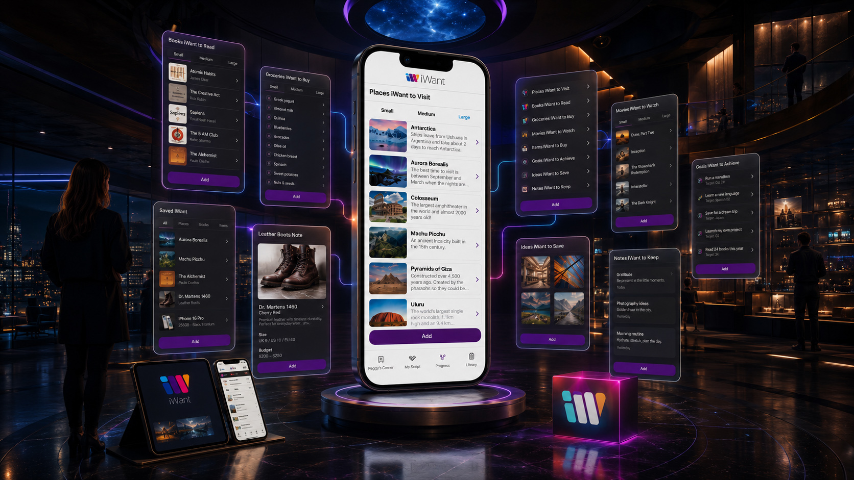
OUR APPROACH
“We Don’t Design Isolated Screens. We Build Connected Digital Products Where Strategy, Human Needs, UX/UI Design, And Brand Experience Work As One.”
Every decision is developed to serve a clear function within the wider product experience—from the first moment of discovery to meaningful interaction, cross-platform consistency, and long-term user relevance.
Our approach combines Digital Product Strategy, Human-Centered UX Design, Information Architecture, digital brand identity, interface systems, responsive communication, and App Store presentation into one integrated creative framework.
Every decision—from user-flow architecture and navigation hierarchy to typography, iconography, interface components, and cross-device adaptation—is developed to simplify understanding, reinforce product recognition, and create a more intuitive and consistent digital experience.
For iWant®, this meant connecting personal intent with every stage of the digital user journey: discovery, organization, evaluation, interaction, meaningful choice, continued engagement, and long-term product connection.
Infinity Design Studio x NF Creative Studio
Strategy Gives The Product Direction. Design Gives The Experience Clarity. A Connected Digital Ecosystem Gives People Meaningful Reasons To Return.
STRATEGY · DESIGN · CONNECTION · PRODUCT GROWTH
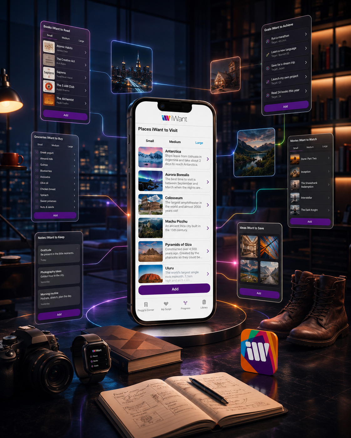
“Before An Interface Can Guide Someone Forward, It Must First Understand What They Are Trying To Hold Onto.”
WHERE INTENTION FINDS ITS DIRECTION
A Quiet Moment Between The Digital Product We Can See And The Human Thinking That Gave It Meaning.
The finished product is now visible—but every finished screen began somewhere less visible: with a person trying to remember an idea, organize a need, preserve an interest, or make sense of what might come next.
Before navigation, there was intention. Before interface components, there were questions. Before the identity became recognizable, the product first had to understand why someone would choose to return. This is where meaningful User Experience Design truly begins—not with decoration, but with attention.
For iWant, Mobile App UX/UI Design became the process of translating scattered human intentions into a digital experience that feels clear, flexible, and naturally organized. Branding created recognition. Information architecture created direction. Interaction design turned that direction into movement.
What follows is not another presentation of the finished application. The chapters ahead open the product from the inside—revealing the human insight, brand meaning, structural decisions, interface logic, scalable systems, and connected touchpoints that shaped one complete Digital Product Design experience.
“The Screen Is Where The Experience Becomes Visible. Human Intention Is Where The Story Truly Begins.”
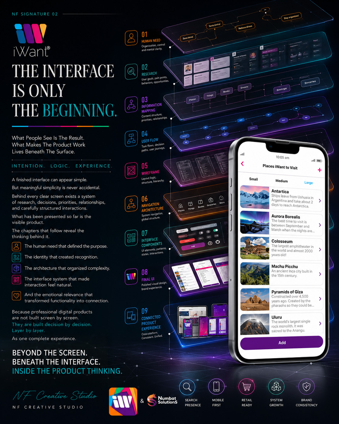
NF CREATIVE STUDIO
DESIGN BEGINS BEFORE THE FIRST SCREEN.
It Begins The Moment A Human Need Is Understood Clearly Enough To Become A Meaningful Experience.
THE PRODUCT HAS BEEN INTRODUCED.
NOW WE OPEN THE THINKING BEHIND IT.
CHAPTER 01
WHEN A NEED BECOMES A MEANINGFUL IDENTITY.
DISCOVERING THE HUMAN NEED BEHIND THE PRODUCT
Before iWant Became an Interface, It Began as a Simple Human Question: How Can Everyday Intentions, Interests, and Future Plans Be Captured Without Losing Their Meaning?
The iWant product journey did not begin with screens, components, or visual styling. It began by examining the small but important things people try to remember every day—places they hope to visit, books they want to read, products they may buy, ideas worth saving, and goals they intend to pursue.
What initially appeared to be a list-management challenge revealed a broader Digital Product Design opportunity: to create a flexible mobile experience capable of organizing different kinds of personal intention without forcing them into one rigid structure.
OBSERVE. UNDERSTAND. DEFINE.
Every Meaningful Digital Product Begins By Understanding What People Are Really Trying To Remember, Organize, Explore, Or Achieve.
MACRO SECTION 01
FROM EVERYDAY INTENTION TO AN ORGANIZED PRODUCT IDEA
BEFORE THE PRODUCT HAD AN INTERFACE
The First Design Challenge Was Not Deciding How The Application Should Look, But Understanding What People Actually Needed To Capture, Organize, And Return To.
THE MOMENT BEFORE THE PRODUCT
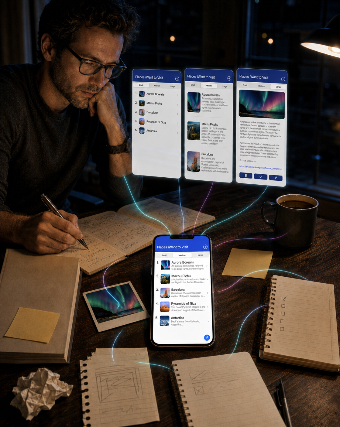
Everyday intentions rarely arrive in identical forms. A future destination may need an image and description. A product someone intends to buy may require a price, store, or link. A book list may need a simple reading status, while a practical task may require only a short name and a clear completion state.
This variety became the foundation of the early User Experience Design process. Rather than building separate tools for every possible use case, the initial product concept explored how one flexible mobile environment could accommodate different types of lists, information depths, and personal contexts.
Early interface concepts tested three viewing levels—Small, Medium, and Large—allowing users to control how much information appeared at any moment. The purpose was not simply visual customization. It was an early attempt to make the Mobile App Interface respond to the importance and complexity of the content itself.
The product idea gradually developed into a flexible Personal Organization App capable of preserving images, descriptions, links, prices, completed items, and meaningful details without making every interaction feel equally complex.
The system should adapt to human intention—not require human intention to adapt to the system.
ONE PLACE FOR DIFFERENT INTENTIONS
Places, books, purchases, goals, ideas, and everyday tasks could exist within one recognizable organizational structure.
DIFFERENT NEEDS REQUIRE DIFFERENT DEPTH
The Small, Medium, and Large views allowed information density to change without disrupting the underlying Product UX Design logic.
INFORMATION SHOULD REMAIN USEFUL OVER TIME
Saved content needed to support more than initial capture. It had to remain understandable, editable, and relevant when users returned later.
ORIGINAL PRODUCT IDEA
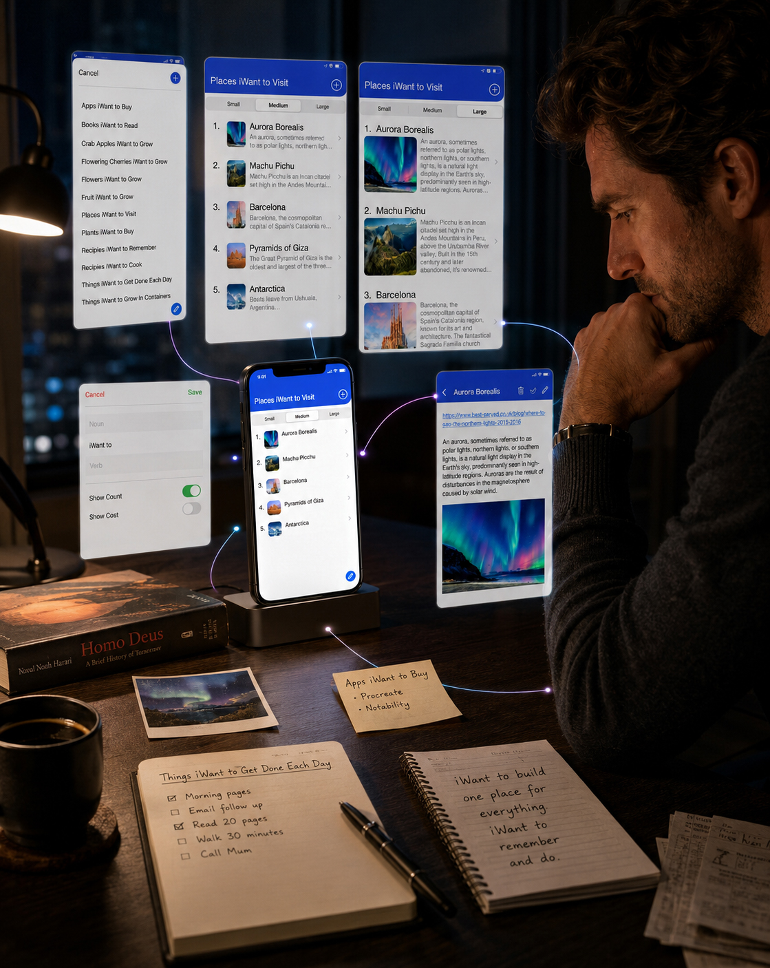
THE ORIGINAL PRODUCT IDEA
The original idea was intentionally simple: give people one place where different intentions could be captured without requiring a different application for every category of life.
That simplicity created a more demanding Mobile App Design question. If the product could contain almost anything, how could the experience remain clear, predictable, and easy to use?
The answer began to emerge through a consistent interaction model: choose or create a list, select the appropriate level of detail, add only the information that matters, and preserve the result in a form that remains useful over time.
THE EARLY DESIGN QUESTION
How can one mobile product support many different intentions without becoming visually fragmented or structurally confusing?
THE EMERGING PRINCIPLE
One Recognizable System. Multiple Types Of Content. Only As Much Complexity As Each Moment Requires.
FROM A SIMPLE THOUGHT TO A USEFUL PERSONAL SYSTEM
The Early Interface Explored How One Intention Could Be Captured, Enriched, Organized, Completed, And Still Remain Meaningful Over Time.
FROM A SIMPLE THOUGHT TO A USEFUL PERSONAL SYSTEM
- 6_ListSelection
Choose a Context - 7_CreateNewList
Create a New List - 3_MainListSmall
Start With Only What Is Needed - 1_MainListMedium
Add Enough Context to Recognize - 2_MainListLarge
Explore in Greater Detail
- 10_NewItemView
Capture a New Intention - 9_ItemEditView
Add Personal Meaning - 8_ItemDetailView
Return to Complete Context - 5_MainListWithPrices
Adapt to Practical Information - 4_MainListDoneItems
Preserve What Has Already Happened
Together, these early screens reveal the first working logic of iWant: a product capable of moving from a broad personal intention to a structured, detailed, and reusable piece of information. The visual language would continue to evolve, but the essential product principle was already present.
“The Interface Did Not Create The Need. It Gave An Existing Human Behavior A Clearer Place To Live."
MACRO SECTION 02
FROM INDIVIDUAL INTENTIONS TO SHARED BEHAVIORAL PATTERNS
KNOWING THE PEOPLE BEHIND THE NEED
The Product Became Relevant Only After Different User Intentions, Everyday Contexts, And Information Needs Were Understood As Parts Of One Connected Behavioral System.
People do not organize information simply because they enjoy creating lists. They organize it because everyday life continuously produces things worth remembering, comparing, planning, completing, or returning to later.
Some intentions are immediate and practical. Others remain open for weeks, months, or even years. The challenge was to design one Mobile App Experience capable of supporting both without making the product feel rigid, complicated, or limited to a single type of user.
This shifted the focus from designing lists to understanding the human behaviors behind them.
The real design problem was not how to store more information—but how to help different people preserve what matters without losing clarity.
DIFFERENT PEOPLE. DIFFERENT INTENTIONS. ONE FLEXIBLE SYSTEM.
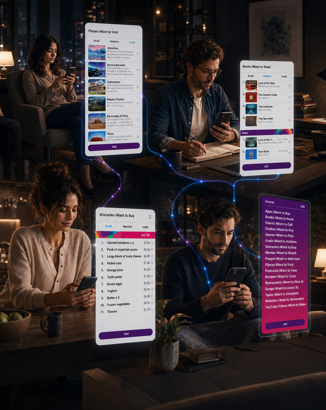
USER NEEDS & BEHAVIORAL CONTEXT
The emerging audience could not be defined by one profession, age group, or lifestyle. What connected potential users was a shared behavioral need: the desire to move information out of memory and into a structure that remained easy to understand.
Users needed to capture ideas quickly, but they also needed the freedom to add context when an intention became more important. A simple reminder might require only a title. A future purchase could require a price and store. A destination might need an image, description, and external link.
The Small, Medium, and Large views responded directly to these differences. Instead of forcing every item into the same visual format, the User Interface Design allowed information depth to follow user intent.
The real design problem was not how to store more information—but how to help different people preserve what matters without losing clarity.
CAPTURE WITHOUT INTERRUPTION
Users needed a fast way to preserve an intention before attention moved elsewhere.
ADD CONTEXT WHEN IT MATTERS
Images, descriptions, links, prices, and status information could be introduced only when they added genuine value to the User Experience.
RETURN WITHOUT RELEARNING
Every saved item needed to remain recognizable and understandable when revisited later.
DEFINING THE REAL PRODUCT PROBLEM
Existing tools often separated notes, lists, bookmarks, purchases, goals, and saved discoveries into unrelated environments. That fragmentation required users to remember not only what they had saved, but also where they had saved it.
iWant presented a different Digital Product Design opportunity: one recognizable mobile structure capable of supporting many kinds of personal content while preserving clarity across every interaction.
The central challenge was therefore not feature quantity. It was structural flexibility—creating enough freedom for different intentions without allowing the experience to become inconsistent or overwhelming.
ONE PRODUCT NEEDED TO SUPPORT MANY HUMAN INTENTIONS WITHOUT FEELING LIKE MANY DIFFERENT PRODUCTS.
WHO THE PRODUCT WAS DESIGNED TO SUPPORT
iWant was designed for digitally active adults who regularly collect ideas, plans, recommendations, purchases, destinations, tasks, and personal goals across different parts of everyday life.
The product was especially relevant for people who wanted more structure than a basic note-taking app, but less complexity than a conventional project-management platform.
Rather than defining the audience through a narrow demographic profile, the User-Centered Design process focused on a shared behavioral pattern: people who frequently discover something meaningful and need a reliable place to preserve it for later action.
FOUR BEHAVIORAL CONTEXTS
DISCOVER. CAPTURE. ORGANIZE. RETURN.
The core Mobile App Experience was structured around four recurring moments that connect initial interest with future action.
THREE INFORMATION DEPTHS
SMALL. MEDIUM. LARGE.
Three viewing levels allowed users to control how much information appeared without changing the underlying interaction model.
FIVE PRIMARY USER NEEDS
REMEMBER. PLAN. COMPARE. COMPLETE. REVISIT.
Five connected needs defined the product’s human value beyond conventional list management.
ONE SHARED PRODUCT OBJECTIVE
KEEP WHAT MATTERS CLEAR AND ACCESSIBLE.
Every feature and User Interface Design decision supported one central objective: helping people preserve meaningful intentions without unnecessary complexity.
By defining the audience through behavior rather than a narrow demographic profile, the project established a stronger foundation for the next stage of Mobile App UX/UI Design. Different users could bring different intentions into the product while relying on the same clear and recognizable experience.
“People Do Not Need More Places To Store Information. They Need One Clearer Way To Keep What Matters Within Reach.”
MACRO SECTION 03
FROM UNDERSTOOD HUMAN NEEDS TO A CLEAR PRODUCT DIRECTION
DEFINING WHAT THE PRODUCT NEEDED TO BECOME
Once The Human Need Became Clear, The Next Challenge Was To Translate It Into A Focused, Flexible, And Recognizable Mobile Product.
Understanding users clarified why iWant needed to exist. The next step was defining what the product needed to become—and what it deliberately did not need to become.
It was not intended to be another basic notes application, a rigid task manager, or an overloaded productivity platform. Its purpose was to create one flexible environment where different intentions could be captured, organized, enriched, and revisited without losing their personal meaning.
This became the strategic foundation for every later Mobile App UX/UI Design decision.
A Strong Product Direction Defines More Than What The Experience Can Do. It Clarifies Why Every Capability Deserves To Exist.
FROM HUMAN INSIGHT TO PRODUCT DIRECTION
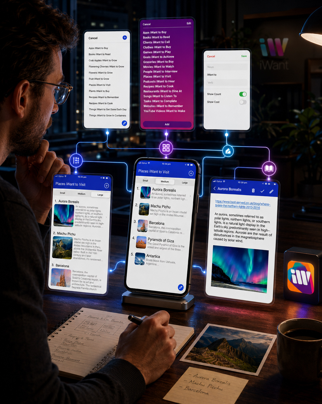
DEFINING THE PRODUCT OBJECTIVES
The primary objective was to transform a broad list-management idea into a cohesive Digital Product Experience capable of supporting different types of personal information through one consistent interaction model.
The experience needed to remain immediate enough for quick capture, flexible enough for detailed content, and predictable enough for users to understand without repeatedly learning new behaviors.
Every objective supported the same central ambition: reduce the distance between discovering something meaningful and preserving it in a form that could remain useful later.
CAPTURE WITH LESS FRICTION
Allow users to preserve an intention quickly, before attention moves elsewhere or useful context is forgotten.
ORGANIZE WITHOUT RIGIDITY
Support different categories, content types, and information depths without forcing every list into the same structure.
RETURN WITH CLARITY
Ensure saved information remains recognizable, understandable, and ready for future action.
GROW WITHOUT LOSING FAMILIARITY
Establish a consistent Mobile UI Design foundation capable of supporting product evolution without fragmenting the experience.
THE OPPORTUNITY TO CONNECT
The deeper opportunity extended beyond personal organization. By giving different intentions a shared and recognizable structure, iWant could create the foundation for future discovery, exchange, and connection around relevant human needs.
A destination could become more than a saved image. A book could carry a recommendation. A purchase could preserve useful context. A personal goal could remain visible long enough to become meaningful action.
The immediate product remained focused on clear organization and list management, but its underlying architecture created room for a broader Digital Product Ecosystem—one capable of connecting people with information, interests, possibilities, and future opportunities.
This potential did not require inventing unnecessary features. It required building the initial User Experience Design with enough clarity, consistency, and flexibility to support what could come next.
The Product Needed To Solve Today’s Organizational Need Without Closing The Door On Tomorrow’s Possibilities.
THE DIRECTION THAT EMERGED
The completed product direction combined four essential qualities:
Human Relevance ensured that the experience remained connected to real everyday intentions.
Structural Clarity created a predictable path through lists, items, information depths, and completed content.
Flexible Interaction allowed different types of information to exist without unnecessary complexity.
Scalable Recognition established the foundation for a consistent application, brand identity, website, App Store presence, and future digital touchpoints.
Together, these principles transformed the original idea into a focused brief for the next stage of Digital Product Design.
By the end of the discovery phase, iWant had moved beyond a broad application concept. It had gained a defined audience, a clear behavioral purpose, a focused set of product objectives, and a strategic foundation capable of guiding the brand, Information Architecture, interface, and future product ecosystem.
“Human Insight Defined The Need. Product Strategy Gave That Need A Direction. Design Would Give It A Recognizable Form.”
FINAL CHAPTER CONCLUSION - 01
FROM HUMAN NEED TO PRODUCT DIRECTION
When Human Intention Becomes Clear, The Product Gains A Meaningful Purpose.
Every meaningful Digital Product Design process begins before the first interface is created.
It begins with people—their intentions, everyday behaviors, unresolved frustrations, and the different kinds of information they want to capture, organize, and revisit.
For iWant, Chapter 01 established the human foundation of the product: one flexible personal system capable of supporting different needs without making every interaction unnecessarily complex.
The early research, product thinking, and User-Centered Design process transformed a broad idea into a clear direction for the future Mobile App UX/UI Design.
Not features without purpose.
Not complexity disguised as capability.
Not an interface designed before the human need was understood.
A focused product direction built around relevance, flexibility, clarity, and meaningful everyday use.
When human behavior informs product strategy, every future design decision gains a reason.
GREAT PRODUCTS BEGIN WITH HUMAN UNDERSTANDING.
CLEAR NEEDS CREATE MEANINGFUL PRODUCT DIRECTION.
THE INTERFACE COMES NEXT. THE HUMAN PURPOSE COMES FIRST.
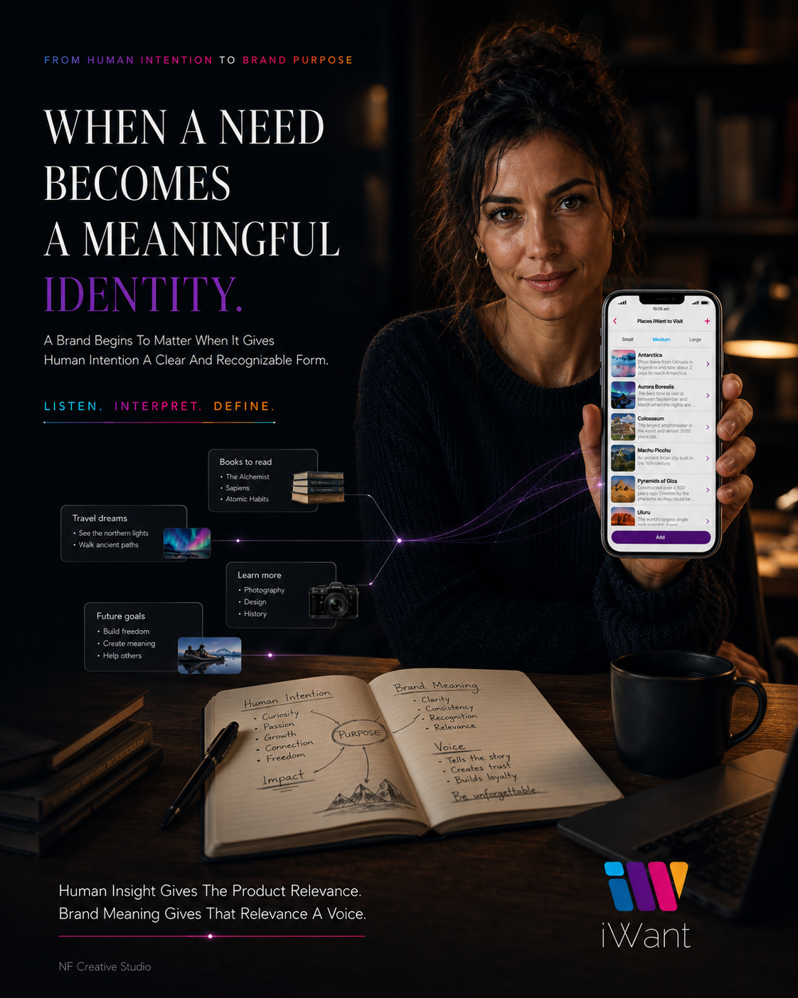
CHAPTER 02
WHEN HUMAN PURPOSE BECOMES A RECOGNIZABLE BRAND.
BUILDING A BRAND PEOPLE CAN RECOGNIZE AND TRUST
Before iWant Could Guide an Interaction, It Needed a Distinctive Identity Capable of Making a Flexible and Unfamiliar Product Feel Clear, Approachable, and Immediately Recognizable.
The human need defined why iWant should exist. The next challenge was giving that purpose a recognizable visual form.
Because the product was designed to organize many different kinds of personal intention, its identity needed to communicate flexibility without appearing fragmented, and individuality without becoming visually unpredictable. It had to feel useful enough for everyday organization, expressive enough to remain memorable, and structured enough to work consistently across a growing Digital Product Ecosystem.
The branding process therefore extended beyond creating a logo. It established the visual foundation for the complete Mobile App Design—from the application icon and interface color system to the website, App Store presentation, marketing assets, and future product touchpoints.
Every decision needed to answer the same question:
How can one identity represent many different human intentions while still feeling unmistakably like one product?
EXPLORE. DISTILL. RECOGNIZE.
“Before People Can Trust The Experience, They Must First Recognize The Product Behind It.”
MACRO SECTION 01
FROM HUMAN PURPOSE TO A RECOGNIZABLE VISUAL SIGNAL
GIVING THE PRODUCT A DISTINCTIVE IDENTITY
The First Branding Challenge Was Not Creating a Decorative Mark, but Discovering Which Visual Idea Could Express Flexibility, Organization, Personality, and Long-Term Digital Recognition as One Coherent System.
iWant was built around a simple but expansive human behavior: people continually discover things they want to remember, explore, experience, purchase, complete, or return to later.
This created an unusual Brand Identity Design challenge. The identity could not represent only one category, activity, or emotional state. It needed to feel relevant whether someone was organizing future destinations, books, purchases, practical tasks, personal goals, or entirely different forms of saved intention.
The emerging Brand DNA was therefore defined through five connected qualities: human, flexible, optimistic, organized, and distinct.
Human relevance kept the identity connected to everyday life rather than abstract technology. Flexibility allowed it to represent many kinds of personal content. Optimism introduced energy and possibility. Organization provided visual order. Distinction ensured that these qualities could remain recognizable across every digital touchpoint.
The brand needed enough personality to be memorable, but enough restraint to support a functional User Experience Design without competing with the content people came to organize.
“The Identity Needed To Represent Many Different Intentions Without Becoming Many Different Brands.”
HUMAN
The identity begins with real intentions, personal interests, and everyday behaviors—not with technology for its own sake.
FLEXIBLE
The Visual Identity System can support different content categories, user contexts, and digital applications without losing coherence.
OPTIMISTIC
Color and form communicate possibility, movement, discovery, and the positive energy of things still to be experienced.
ORGANIZED
Clear geometry and controlled visual relationships give a broad product idea structure, rhythm, and usability.
DISTINCT
Every expression preserves enough distinctive visual DNA to remain immediately connected to iWant.
EXPLORING THE VISUAL DIRECTIONS
The Logo Design process began as a deliberate exploration rather than a search for immediate decoration. Each concept investigated a different relationship between the product name, the idea of wanting, the letterform, the application icon, and the broader emotional character of the brand.
Some directions emphasized simplicity and utility. Others explored movement, layered possibility, color, or a more expressive digital personality. Every concept was evaluated not only as a standalone logo, but as a potential foundation for the complete App Branding System.
The strongest direction needed to remain clear at application-icon scale, feel distinctive within a crowded mobile environment, support both neutral and expressive applications, and establish a visual language capable of extending into the interface itself.
FROM EXPLORATION TO RECOGNITION
Each Direction Tested a Different Balance of Simplicity, Expression, Scalability, and Digital Brand Recognition Before the Final Identity Was Selected.
SLIDE 01 – CONCEPT 01 — STRUCTURED SIMPLICITY
A compact geometric direction focused on clarity, direct recognition, and reliable performance across small digital applications.
SLIDE 02 – CONCEPT 02 — FLUID PERSONAL EXPRESSION
A softer visual direction exploring movement, human character, and the relationship between personal intention and digital organization.
SLIDE 03- CONCEPT 03 — LAYERED POSSIBILITY
An expressive identity built around overlapping color, variety, discovery, and the idea that one product could contain many different intentions.
SLIDE 04 – THE SELECTED DIRECTION — DISTINCTIVE UNITY
A recognizable modular symbol combining clear geometry, expressive color, scalable construction, and a visual rhythm capable of supporting the complete iWant digital ecosystem.
SELECTING THE STRONGEST DIRECTION
A Memorable Digital Identity Is Not Simply Selected—It Is Revealed Through Exploration.
The final selection was not based on which concept appeared most decorative in isolation. It was chosen because it created the strongest balance between product meaning, visual distinction, mobile usability, and future scalability.
The selected symbol transformed the initial “iW” idea into a modular sequence of recognizable forms. Its individual elements could suggest different intentions, categories, or possibilities, while their shared direction and alignment preserved the feeling of one connected system.
This made the identity particularly relevant to the product itself. iWant was designed to hold many different kinds of content without losing structural clarity. The final logo expressed the same principle visually: multiple elements, one recognizable direction.
Its geometry remained readable at small scale, its silhouette created a distinctive App Icon Design, and its color structure provided the foundation for a wider Mobile App Interface Design language.
“The Winning Identity Did Not Reduce Variety. It Gave Variety a Recognizable Structure.”
DISTINCTIVE AT FIRST GLANCE
The final symbol created a recognizable silhouette capable of standing apart within mobile interfaces, App Store listings, and digital communication.
MEANINGFUL BEYOND THE LOGO
Its modular forms reflected the product idea itself: different intentions organized within one clear and connected system.
READY TO BECOME A COMPLETE BRAND
The selected direction provided enough visual structure to guide color, typography, iconography, interface components, motion, and future digital applications.
The identity exploration transformed an abstract product purpose into a distinctive visual signal. What began as a wide field of possible expressions became one focused direction capable of balancing human relevance, digital clarity, and long-term recognition.
The logo was now selected, but the Brand Identity System was not yet complete. Its construction, colors, typography, and supporting visual language still needed to be refined into a consistent framework capable of guiding every future product touchpoint.
“A Logo Creates The First Signal. A Brand System Teaches That Signal How To Remain Recognizable Everywhere.”
MACRO SECTION 02
FROM A DISTINCTIVE SYMBOL TO A COMPLETE VISUAL LANGUAGE
BUILDING THE SYSTEM BEHIND THE IDENTITY
The Selected Logo Established the Signal. Construction, Color, and Typography Transformed That Signal Into a Consistent and Scalable Digital Brand System.
Selecting the final identity established what iWant would look like. The next stage defined how that identity would behave.
A recognizable logo could introduce the product, but it could not independently maintain consistency across the Mobile App Design, application icon, responsive website, App Store presentation, interface components, promotional graphics, and future digital touchpoints.
The identity therefore needed to become a system—one governed by clear proportions, repeatable relationships, intentional color roles, and typography capable of supporting both brand expression and functional interface communication.
Each element was developed to perform a specific role while remaining visibly connected to the same product.
“Recognition Begins With a Symbol. Consistency Begins With the System Built Around It.”
FROM VISUAL FORM TO REPEATABLE STRUCTURE
BUILDING A SYMBOL DESIGNED TO REMAIN CLEAR
Every Proportion, Interval, Angle, and Relationship Was Refined to Preserve Recognition Across Different Sizes, Formats, and Digital Environments.
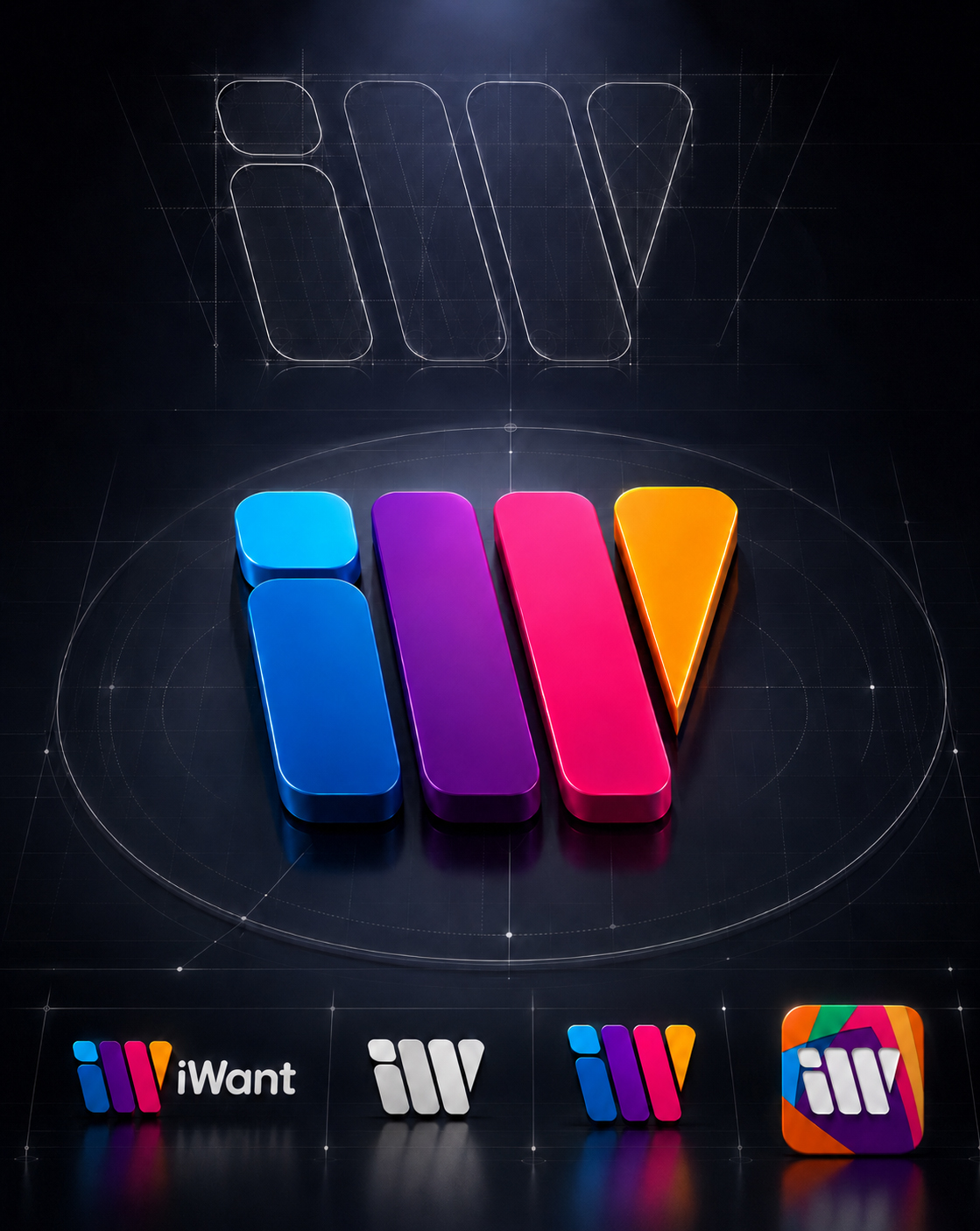
The final iWant symbol was constructed as a sequence of individual forms moving in one shared direction. Each element retained its own visual presence, while consistent angles, spacing, and alignment created the impression of one unified mark.
This balance reflected the product itself. iWant allows different intentions and content types to exist independently while remaining part of one recognizable organizational system.
The Logo Design process focused on preserving a strong silhouette at every scale. Fine details were deliberately avoided because the symbol needed to remain legible inside compact navigation areas, mobile interfaces, promotional assets, and the application icon.
The resulting mark could function as a complete logo, an independent symbol, a monochrome identifier, or a modular element within the wider App Branding System without losing its essential character.
PROPORTION CREATES STABILITY
Consistent relationships between the individual forms allow the symbol to remain visually balanced across changing sizes.
SPACING PROTECTS RECOGNITION
Controlled intervals preserve the rhythm of the mark and prevent its separate elements from appearing disconnected.
SIMPLICITY SUPPORTS SCALE
A clear silhouette allows the identity to perform across application icons, interfaces, websites, and promotional environments.
“The Symbol Could Change in Scale and Application—But Never in Its Essential Visual Logic.”
FROM STRUCTURAL CLARITY TO EMOTIONAL RECOGNITION
GIVING THE SYSTEM ENERGY AND MEANING
Color Was Used Not as Decoration, but as a Strategic Language for Recognition, Hierarchy, Optimism, and Digital Continuity.
The iWant Brand Color System was developed to express the variety of human intention without allowing the identity to become visually fragmented.
Purple established the central brand anchor, communicating imagination, individuality, and a strong digital presence. Magenta introduced energy and forward movement. Cyan and blue created clarity, trust, and navigational contrast. Amber added optimism and warmth, while green suggested discovery, possibility, and completion.
These expressive colors were supported by graphite, white, and controlled neutral tones that protected readability and prevented the interface from becoming visually overwhelming.
The palette was not designed so every color would compete for attention at the same moment. Each tone was assigned a specific role within the wider Mobile UI Design system—brand recognition, navigation, emphasis, interaction, supporting information, or visual balance.
RECOGNITION
Purple and magenta establish the most distinctive and memorable core of the iWant visual identity.
CLARITY
Blue and cyan support orientation, digital trust, interface hierarchy, and clear visual separation.
POSSIBILITY
Amber and green introduce warmth, optimism, discovery, progress, and the energy of future intention.
BALANCE
Graphite, white, and neutral tones create the restraint necessary for accessibility, readability, and everyday use.
“Color Gave Each Element a Role—Without Allowing Any Element to Lose Its Connection to the Whole.”
FROM EMOTIONAL EXPRESSION TO FUNCTIONAL CLARITY
A TYPE SYSTEM DESIGNED TO GUIDE
Typography Connected the Personality of the Brand With the Precision Required by a Clear and Usable Mobile Interface.
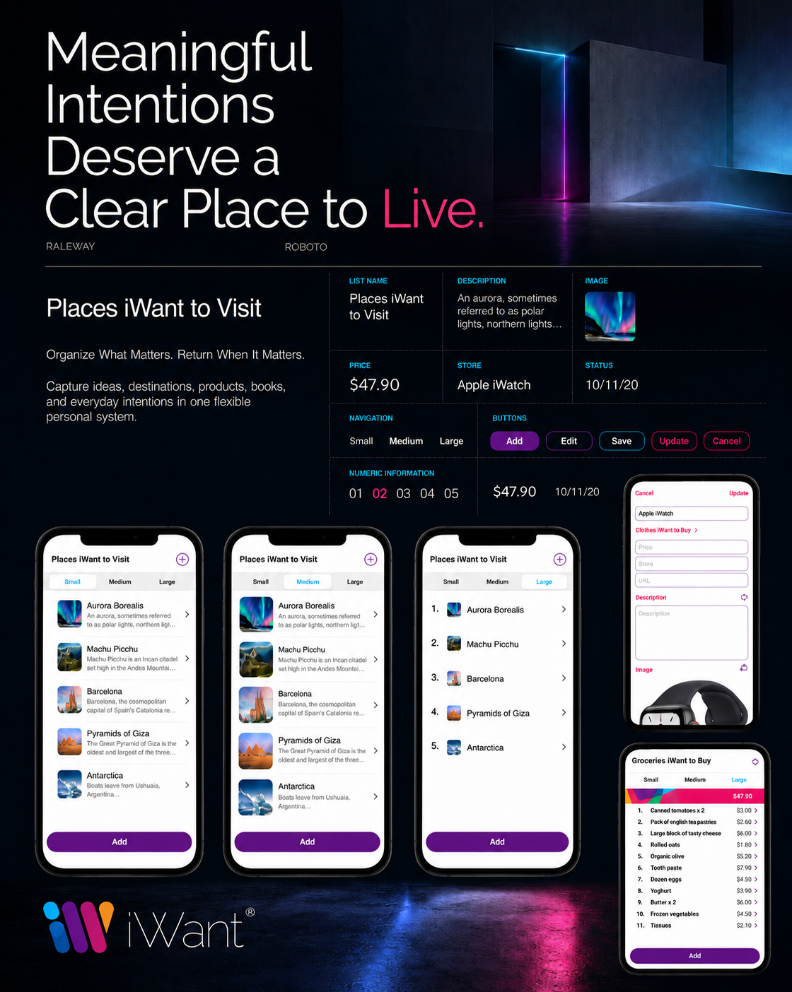
Typography needed to perform two different but connected functions.
At the brand level, it had to support a contemporary, approachable, and distinctive personality. Inside the product, it needed to organize changing amounts of information with absolute clarity.
A controlled typographic hierarchy separated list names, item titles, descriptions, prices, dates, links, navigation controls, and system actions. Differences in size, weight, spacing, and contrast helped users understand what deserved immediate attention and what could be explored later.
The type system was designed to remain readable across the Small, Medium, and Large content views. As information density changed, the hierarchy continued to behave predictably, allowing users to move between concise overviews and detailed content without losing orientation.
This made typography an active part of the User Experience Design—not simply a branded surface applied after the interface had been created.
HEADLINES ESTABLISH DIRECTION
Clear titles and list names immediately communicate the user’s current location and purpose.
HIERARCHY REDUCES EFFORT
Differences in size, weight, and spacing separate primary actions from supporting information.
CONSISTENCY BUILDS FAMILIARITY
Repeated typographic patterns allow new screens and content types to feel understandable from the first interaction.
“Typography Did More Than Present Information. It Taught the Interface How to Speak Clearly.”
Logo construction gave the identity stability. Color gave it energy and emotional distinction. Typography gave it hierarchy, rhythm, and a clear functional voice.
Together, these elements transformed the selected logo into a complete Digital Brand Identity capable of supporting both expressive communication and practical product use.
The system now had a recognizable visual foundation. The final challenge was defining how that foundation would expand through iconography, interface details, brand personality, and consistent guidelines across every digital touchpoint.
“A Brand Becomes Scalable When Every Element Can Evolve Without Forgetting Where It Belongs.”
MACRO SECTION 03
FROM A RECOGNIZABLE IDENTITY TO A CONSISTENT DIGITAL PRESENCE
CREATING A BRAND THAT COULD LIVE ACROSS EVERY TOUCHPOINT
The Identity Needed to Remain Clear Not Only Inside the Application, but Across Every Symbol, Interface Pattern, Marketing Asset, and Digital Environment Surrounding the Product.
A recognizable logo established the visual center of iWant, but a complete Digital Brand Identity required more than one memorable symbol. Every supporting element needed to reinforce the same sense of clarity, flexibility, and human relevance.
Icons had to help people interpret actions quickly. Interface symbols needed to remain familiar across different screens. Brand expressions had to feel energetic without becoming inconsistent. Digital guidelines needed to protect recognition as the product moved between the mobile application, website, App Store presentation, and future communication assets.
The final challenge was therefore not creating more visual elements.
It was defining how every element could belong to one system.
CONNECT. EXPRESS. PROTECT.
“A Brand Becomes A System When Every Touchpoint Speaks With The Same Recognizable Voice.”
FROM FUNCTIONAL ACTIONS TO INSTANT UNDERSTANDING
A SYMBOL LANGUAGE DESIGNED TO GUIDE WITHOUT DISTRACTION
Interface Icons and Supporting Symbols Were Used to Clarify Actions, Reduce Repetition, and Preserve Familiarity Across the Complete Mobile Experience.
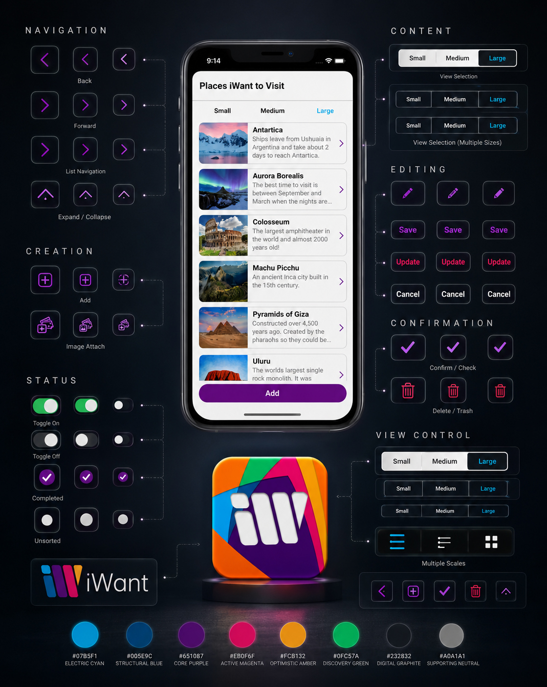
The iWant symbol language developed as a practical extension of the User Interface Design rather than as a decorative layer. Each visible icon needed to communicate a recognizable action while remaining visually secondary to the content users were organizing.
Add, edit, confirm, delete, navigate, attach, and change-view actions were presented through familiar forms and repeated interaction patterns. This reduced the amount of written instruction required and allowed users to build confidence through recognition.
Because the original product materials did not contain a separately documented icon library, the system shown here has been reconstructed from the final interface screens. Its purpose is not to claim an independent icon-design deliverable, but to reveal the consistent visual logic already operating throughout the product.
The strongest symbols do not ask for attention. They make the next action easier to understand.
RECOGNITION BEFORE EXPLANATION
Familiar visual actions reduce the amount of interpretation required before users can move forward.
CONSISTENCY BUILDS INTERACTION CONFIDENCE
Repeated symbols and control patterns allow knowledge gained on one screen to remain useful on the next.
SYMBOLS SUPPORT CONTENT
The icon language remains visually restrained so that personal information—not interface decoration—continues to lead the experience.
“An Effective Icon Does Not Decorate An Action. It Makes That Action Easier To Recognize.”
FROM VISUAL CONSISTENCY TO A RECOGNIZABLE CHARACTER
GIVING THE DIGITAL PRODUCT A HUMAN PERSONALITY
The Brand Needed to Feel Organized Without Becoming Rigid, Expressive Without Becoming Chaotic, and Optimistic Without Losing Functional Clarity.
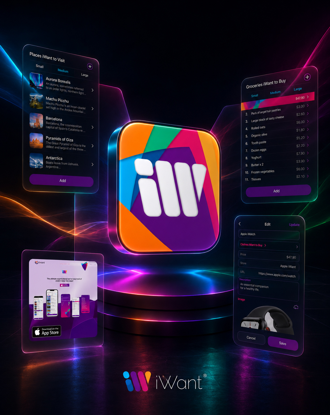
The final iWant personality emerged from a deliberate balance between expressive identity and practical usefulness. Its visual energy needed to communicate possibility, but its structure needed to preserve calm and orientation.
Color introduced optimism and distinction. Typography maintained clarity. The App Icon Design created immediate recognition. Repeated interface patterns gave the experience stability. Together, these elements allowed the product to feel personal without becoming visually unpredictable.
This balance was particularly important because iWant was designed to accommodate many different kinds of personal content. The brand could not belong exclusively to travel, shopping, reading, productivity, or planning.
It needed a character broad enough to connect them all.
EXPRESSIVE, NOT CHAOTIC
A vibrant identity creates energy while controlled hierarchy prevents that energy from overwhelming the product.
STRUCTURED, NOT RIGID
Repeated patterns establish familiarity without limiting the variety of content users can organize.
USEFUL, BUT STILL MEMORABLE
Functional clarity makes the product easy to use. Distinctive personality makes the experience easier to recognize and remember.
“Personality Creates Recognition. Structure Ensures That Recognition Never Compromises Use.”
FROM INDIVIDUAL ASSETS TO ONE PROTECTED BRAND SYSTEM
GUIDELINES DESIGNED TO PRESERVE RECOGNITION AS THE PRODUCT GROWS
The Final System Defined How Logo, Color, Typography, Iconography, Interface Patterns, and Digital Applications Should Work Together Across Every Brand Touchpoint.
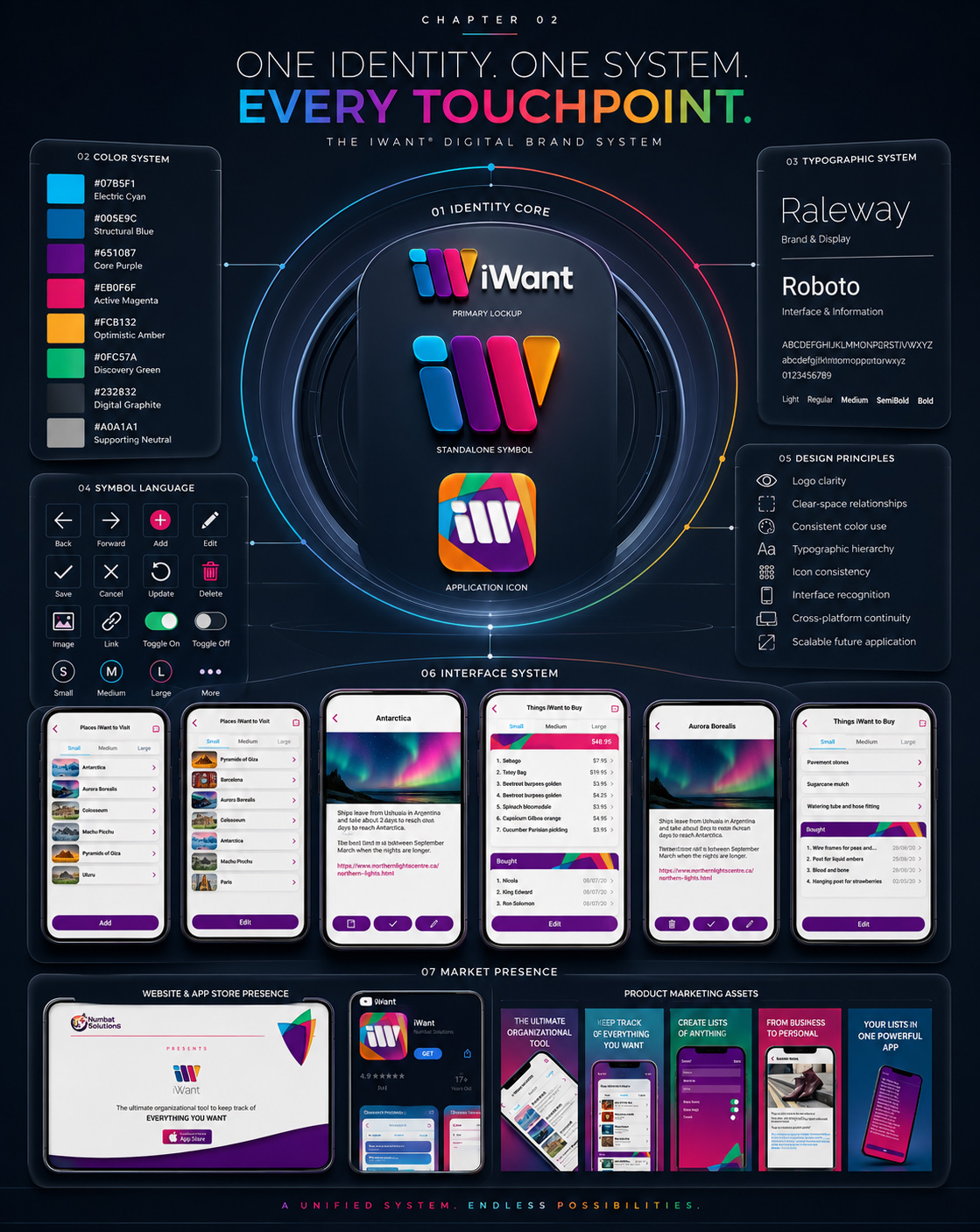
The final digital guidelines transformed the iWant identity from a collection of successful assets into a repeatable Brand Identity System. Their role was not to restrict expression, but to protect the relationships that made the product recognizable.
Logo use, application-icon presentation, color hierarchy, typography, interface symbols, screen patterns, and marketing applications were connected through one shared visual logic. This allowed different teams, formats, and future touchpoints to communicate with greater consistency.
The guidelines also established an important distinction: consistency did not require every application to look identical.
It required every application to preserve the same recognizable principles.
PROTECT THE IDENTITY CORE
The final logo, symbol, application icon, and essential proportions remain stable across every application.
USE COLOR WITH PURPOSE
Brand colors create recognition and hierarchy, while graphite and supporting neutrals preserve balance and readability.
MAINTAIN TYPOGRAPHIC ROLES
Raleway gives the brand an expressive and recognizable voice. Roboto protects functional clarity throughout the interface.
EXTEND WITHOUT FRAGMENTING
New screens, formats, and communication assets may evolve while remaining connected to the established Visual Identity System.
“Guidelines Do Not Prevent A Brand From Evolving. They Ensure It Remains Recognizable While It Does.”
Together, the icon language, brand personality, and digital guidelines completed the transformation of iWant from a functional mobile application into a recognizable digital-product identity.
Every element now served a connected purpose: symbols clarified action, personality created emotional distinction, and guidelines protected consistency across the growing Digital Product Ecosystem.
The result was not simply a collection of branded screens. It was a visual system capable of expressing flexibility without fragmentation, energy without confusion, and growth without losing recognition.
“Recognition Begins With A Symbol. Trust Grows When Every Experience Continues To Honor It.”
FINAL CHAPTER CONCLUSION - 02
FROM HUMAN PURPOSE TO A RECOGNIZABLE DIGITAL IDENTITY
When Every Visual Element Shares One Purpose, Recognition Becomes The Beginning Of Trust.
The iWant identity began with a complex challenge: create one recognizable visual language capable of representing many different intentions without making the product feel fragmented.
The solution was not found in a single logo, color, typeface, or interface screen.
It emerged through the relationship between them.
Logo Design exploration transformed an abstract product idea into a distinctive symbol. Construction principles gave that symbol stability. Color introduced energy, optimism, and emotional recognition. Raleway gave the brand an expressive voice, while Roboto protected functional clarity throughout the Mobile App UX/UI Design.
Icons and supporting symbols simplified action. Brand personality connected organization with human relevance. Digital guidelines ensured that the same identity could remain recognizable across the mobile application, responsive website, App Store presentation, and future product touchpoints.
Not expression without structure.
Not consistency without flexibility.
Not recognition created through repetition alone.
One connected Digital Brand Identity designed to make a broad and adaptable product feel clear, approachable, and unmistakably iWant.
When purpose guides identity, every visual decision becomes easier to understand.
When identity remains consistent, every new interaction feels more familiar.
And when recognition continues across every touchpoint, the product begins to earn trust before the user has explored its full experience.
PURPOSE GIVES THE IDENTITY MEANING.
CONSISTENCY TURNS MEANING INTO RECOGNITION.
RECOGNITION CREATES THE FOUNDATION FOR TRUST.
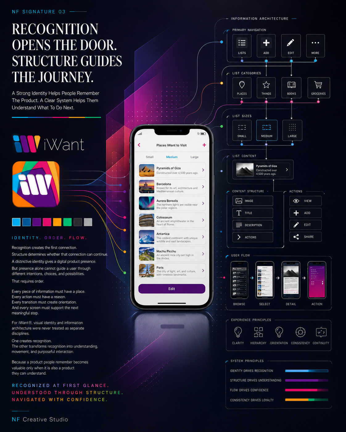
FROM THE IDENTITY PEOPLE RECOGNIZE TO THE STRUCTURE THEY CAN UNDERSTAND
RECOGNITION CREATES FAMILIARITY. STRUCTURE CREATES DIRECTION.
The visual identity established how iWant looked, felt, and remained recognizable across its wider Digital Product Ecosystem.
But recognition alone could not guide the complete experience.
The next stage moved beneath the visible surface—into Information Architecture, navigation logic, content relationships, and User Flow Design capable of transforming a flexible product idea into a clear and understandable Mobile App Experience.
What people recognized now needed to become something they could confidently navigate.
IDENTITY ESTABLISHED. STRUCTURE AHEAD.
“The Brand Creates The Signal. The Product Structure Shows People Where To Go Next.”
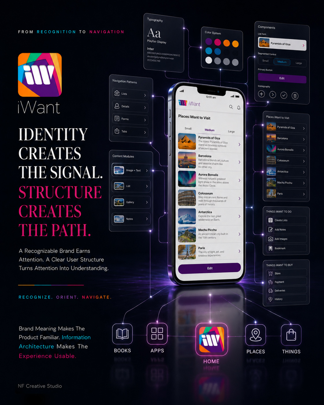
CHAPTER 03
IDENTITY CREATES THE SIGNAL. STRUCTURE CREATES THE PATH.
TURNING COMPLEX INTENTIONS INTO SIMPLE USER FLOWS
Once iWant Had a Recognizable Identity, the Next Challenge Was to Transform Many Different Types of Personal Intention Into One Clear, Predictable, and Effortless Product Structure.
The iWant concept was deliberately flexible. People could use the product to remember places, organize purchases, save books, preserve useful links, record personal ideas, or manage everyday goals.
That flexibility created value—but it also introduced structural complexity.
A successful Mobile App UX/UI Design system could not treat every type of content as a separate experience. Users needed to understand where they were, what they could do next, and how different lists, items, details, and actions belonged to the same product.
The challenge was therefore not to reduce the number of possibilities.
It was to organize those possibilities through one clear and repeatable interaction model.
Information Architecture, navigation logic, content hierarchy, and User Flow Design became the invisible framework connecting every part of the application. Each pathway needed to feel familiar without forcing every use case into an identical experience.
Every structural decision needed to answer one central question:
How can one digital product support many different intentions while always making the next action feel obvious?
MAP. ORGANIZE. GUIDE.
“When Product Structure Becomes Clear, Complexity Stops Feeling Like Work.”
MACRO SECTION 01
FROM UNSTRUCTURED INTENTIONS TO A NAVIGABLE PRODUCT SYSTEM
MAKING EVERY POSSIBILITY FEEL LIKE PART OF ONE PRODUCT
Before Individual Screens Could Be Designed, Every List, Item, Detail, State, and Action Needed a Clear Place Within the Larger Product Structure.
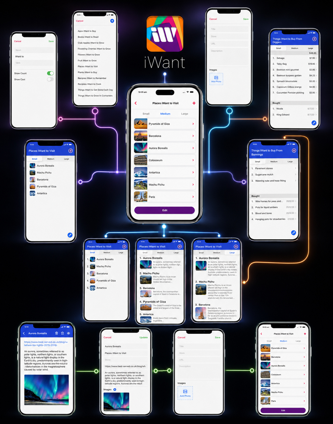
The earliest iWant concepts revealed that the product was not built around one isolated task. It was built around a recurring human behavior: capturing something now so that it could remain useful later.
That behavior could begin in many ways. A user might select an existing list, create a new context, save a destination, add a product, preserve an image, record a price, attach a link, or mark something as completed.
Although the content changed, the underlying User Journey Design needed to remain recognizable.
The Information Architecture therefore established a shared relationship between lists, items, content depth, actions, and saved states. Instead of creating unrelated workflows for every category, the system reused a focused set of predictable structural principles.
At the highest level, users moved from context to content: first identifying where an intention belonged, then deciding how much information it required.
Small, Medium, and Large views allowed the same content model to support different reading depths without forcing users into separate interfaces.
Within each list, individual items could remain simple or become more detailed through images, descriptions, links, prices, dates, and completion states. This preserved flexibility while keeping the broader User Experience Design consistent.
The result was not merely a collection of application screens.
It was a navigable Digital Product Structure in which different intentions could behave differently while still belonging unmistakably to one system.
A flexible product becomes usable only when every possibility has a clear structural home.
ONE SHARED PRODUCT LOGIC
Lists, items, details, and actions followed a recognizable relationship regardless of the content being organized.
DEPTH WITHOUT FRAGMENTATION
Small, Medium, and Large views changed information density without changing the underlying navigation model.
CONTINUITY BEYOND CAPTURE
Saved content could be revisited, enriched, edited, completed, and still remain understandable over time.
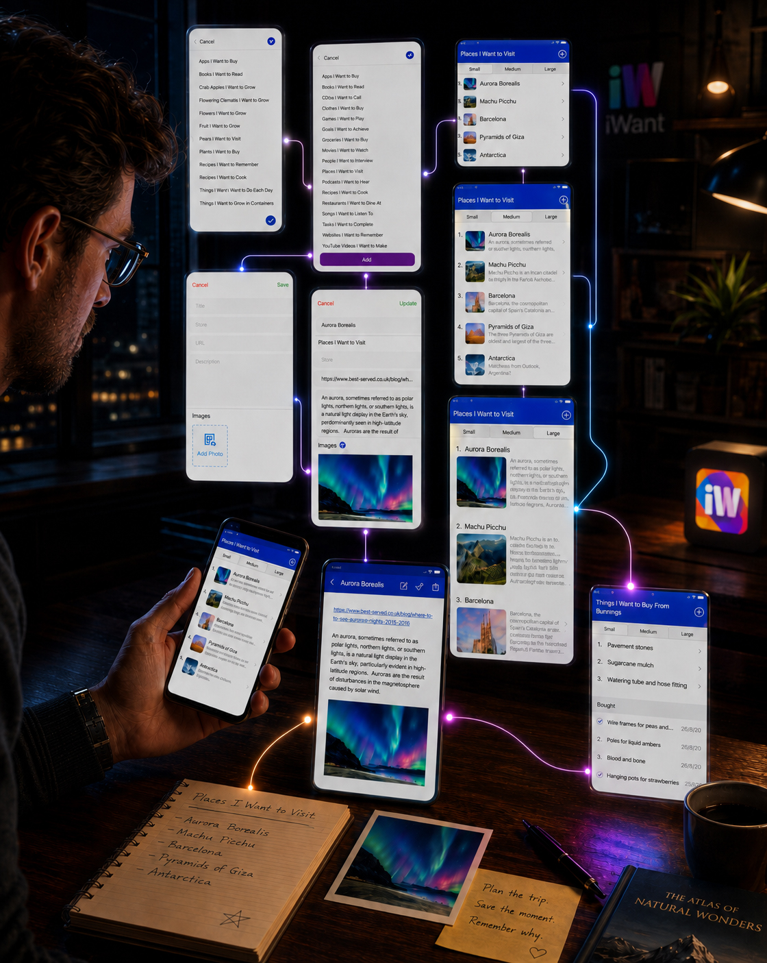
USER JOURNEY MAPPING
ONE INTENTION. ONE CLEAR PATH FORWARD.
The Journey Was Designed to Preserve the Simplicity of an Initial Thought While Gradually Introducing Only the Structure, Detail, and Control Needed to Make It Useful.
The core iWant journey begins before the user opens a form or selects an interface control.
It begins with a personal intention—something worth remembering, organizing, exploring, purchasing, reading, or completing.
That intention first needs a recognizable context. Instead of confronting users with one universal input process, the journey allows them to choose an existing list or create a new one based on the kind of information they want to preserve.
Once the context is established, the Mobile App Interface introduces complexity gradually.
A simple item may require only a name, while more meaningful content can include an image, description, link, store, price, or other relevant details. Small, Medium, and Large views allow users to control how much of that information they see without changing the underlying Information Architecture.
The same journey continues after an item is saved.
Users can return to the content, understand why it mattered, update its details, mark it as completed, or preserve it as part of their personal history.
This approach transformed the Mobile App UX/UI Design from a sequence of isolated screens into one continuous behavioral loop:
recognize an intention → give it context → add meaning → preserve it → return when it becomes relevant
The strongest part of the journey is its restraint. The system does not ask users to define everything immediately. It allows information to become more detailed only when greater detail creates real value.
A Clear User Journey Does Not Remove Possibility. It Reveals Possibility at the Right Moment.
01 — RECOGNIZE
A Personal Intention Appears
The journey begins with something the user wants to remember, organize, explore, purchase, read, or complete.
02 — POSITION
Give the Intention a Home
The user chooses an existing list or creates a new context that gives the information purpose and meaning.
03 — ENRICH
Add Only What Matters
Images, descriptions, links, prices, and supporting details are introduced only when they make the saved content more useful.
04 — ORGANIZE
Control Info Depth
Small, Medium, and Large views allow the same content to remain recognizable across different levels of detail.
05 — RETURN
Preserve Future Value
Saved content remains understandable, editable, and actionable when the user returns to it later.
FROM PERSONAL INTENTION TO REUSABLE KNOWLEDGE
The Authentic Interface Sequence Reveals How iWant Moves From Context Selection and Content Capture to Deeper Understanding, Continued Editing, and Meaningful Return.
Each screen represents one necessary decision within the journey. Together, they form a continuous interaction model that remains recognizable even as the content, level of detail, and user objective change.
SLIDE 01
6_ListSelection
CHOOSE A CONTEXT
The journey begins by identifying where the intention belongs within the user’s existing organizational system.
SLIDE 02
7_CreateNewList
CREATE A NEW LIST
When the right context does not yet exist, users can create one without leaving the underlying interaction model.
SLIDE 03
3_MainListSmall
START WITH ESSENTIAL RECOGNITION
The Small view reduces every item to the minimum information needed for immediate scanning and orientation.
SLIDE 04
1_MainListMedium
ADD USEFUL CONTEXT
The Medium view introduces imagery and supporting information while preserving speed, clarity, and easy comparison.
SLIDE 05
2_MainListLarge
EXPLORE IN GREATER DETAIL
The Large view expands the same content model when deeper understanding becomes more valuable than rapid scanning.
SLIDE 06
10_NewItemView
CAPTURE A NEW INTENTION
A clear creation state allows users to record a new item and decide how much information it actually requires.
SLIDE 07
9_ItemEditView
ADD PERSONAL MEANING
Descriptions, links, images, and contextual details transform a simple entry into information worth returning to.
SLIDE 08
8_ItemDetailView
RETURN TO COMPLETE CONTEXT
The detail view restores the full meaning of the saved item without forcing that complexity into every previous step.
SLIDE 09
5_MainListWithPrices
ADAPT TO PRACTICAL INFORMATION
The same structure can support price-based and purchase-oriented content without becoming a separate product experience.
SLIDE 10
4_MainListDoneItems
PRESERVE WHAT HAS HAPPENED
Completed items remain visible as part of the user’s history, allowing progress to remain meaningful instead of disappearing.
The authentic screen sequence demonstrates how one structural model can support very different moments without losing continuity.
List selection establishes context. Creation screens capture new intentions. Variable views control information depth. Detail and editing states preserve meaning, while completed-item sections allow the journey to continue beyond the initial action.
This consistency reduces the need for users to relearn the product whenever their objective changes. Whether they are saving a destination, recording a purchase, organizing a book list, or returning to completed information, the underlying Mobile App UX/UI Design logic remains familiar.
The result is a User Experience Design system in which flexibility is created through controlled variation—not through unrelated interfaces.
Different Content. Different Depth. One Familiar Way Forward.
FROM MANY POSSIBILITIES TO ONE RECOGNIZABLE STRUCTURE
CLARITY BEGINS WHEN EVERY DECISION HAS A PREDICTABLE PLACE TO GO
By defining the relationship between contexts, lists, items, information depth, editing, completion, and return, iWant established the structural foundation required for every interaction that followed.
The Information Architecture did not limit what the product could contain. It created the order necessary for that flexibility to remain clear, intuitive, and usable throughout the complete Mobile App UX/UI Design system.
“The Product Became Flexible Not Because Every Journey Was Different, but Because Every Different Journey Shared the Same Structural Logic.”
MACRO SECTION 02
DESIGNING CLEAR PATHS THROUGH THE PRODUCT
Once Every Type of Information Had a Defined Place, the Next Challenge Was Ensuring That Users Could Move Between Lists, Items, Details, and Actions Without Losing Context or Direction.
A clear Information Architecture establishes where content belongs. A successful User Flow Design determines how naturally people can reach it, understand it, change it, and continue forward.
For iWant, navigation could not depend on users learning a different interaction pattern for every type of list. Places, books, purchases, saved ideas, and completed items contained different information, but movement through the product needed to remain familiar.
The Mobile App UX/UI Design therefore developed around a small number of recognizable decisions. Users could select or create a context, choose an appropriate information view, open an item, add or edit relevant details, and return to the list without losing their position within the wider system.
This approach reduced the number of decisions required at each step. Rather than exposing every possible action simultaneously, the interface introduced functionality progressively—only when the user’s current task required it.
Clear navigation is not created by showing every possible direction. It is created by making the next meaningful direction easy to recognize.
CONTEXT BEFORE ACTION
Every interaction begins inside a recognizable list or item, helping users understand where they are before deciding what to do next.
PROGRESSIVE INTERACTION
Additional controls and information appear only when required, protecting the primary task from unnecessary interface complexity.
FAMILIAR RETURN PATHS
Consistent navigation, editing, saving, and completion patterns allow users to move forward and return without rebuilding their understanding.
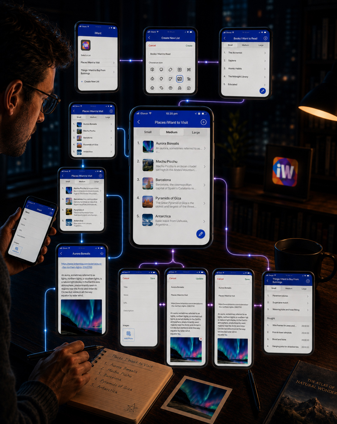
CORE USER FLOWS
DIFFERENT GOALS. ONE FAMILIAR WAY FORWARD.
The Product Was Designed Around Repeatable Interaction Patterns That Help Users Recognize What Comes Next Without Limiting the Variety of Content They Can Organize.
The strongest user flows do not call attention to themselves. They allow people to concentrate on what they are trying to accomplish while the interface quietly preserves context, hierarchy, and direction.
Across iWant, the primary interaction pathways share a common foundation. A user begins by identifying a relevant list, enters a familiar content structure, selects the amount of information needed, and proceeds toward viewing, creating, editing, or completing an item.
The content may change significantly from one context to another, but the underlying interaction grammar remains stable. Navigation controls occupy familiar positions. List views preserve recognizable hierarchy. Detail screens gather related information into one place. Creation and editing states introduce only the fields required to complete the current task.
This consistency allows the App Interface Design to remain flexible without making every new context feel like a different product.
Different user goals should create different outcomes—not different rules for understanding the interface.
01 — FIND A RELEVANT CONTEXT
Users begin by selecting an existing list or creating a new one, establishing a clear destination before information is introduced.
02 — CONTROL INFORMATION DEPTH
Small, Medium, and Large views allow users to move between recognition, useful context, and deeper understanding without changing the underlying navigation model.
03 — CREATE OR REFINE CONTENT
Creation and editing states organize relevant fields into a predictable sequence, allowing users to add only the information required by the current intention.
04 — RETURN WITH CONTEXT PRESERVED
Saved and completed information remains connected to its original list, allowing users to return later without reconstructing what the content means.
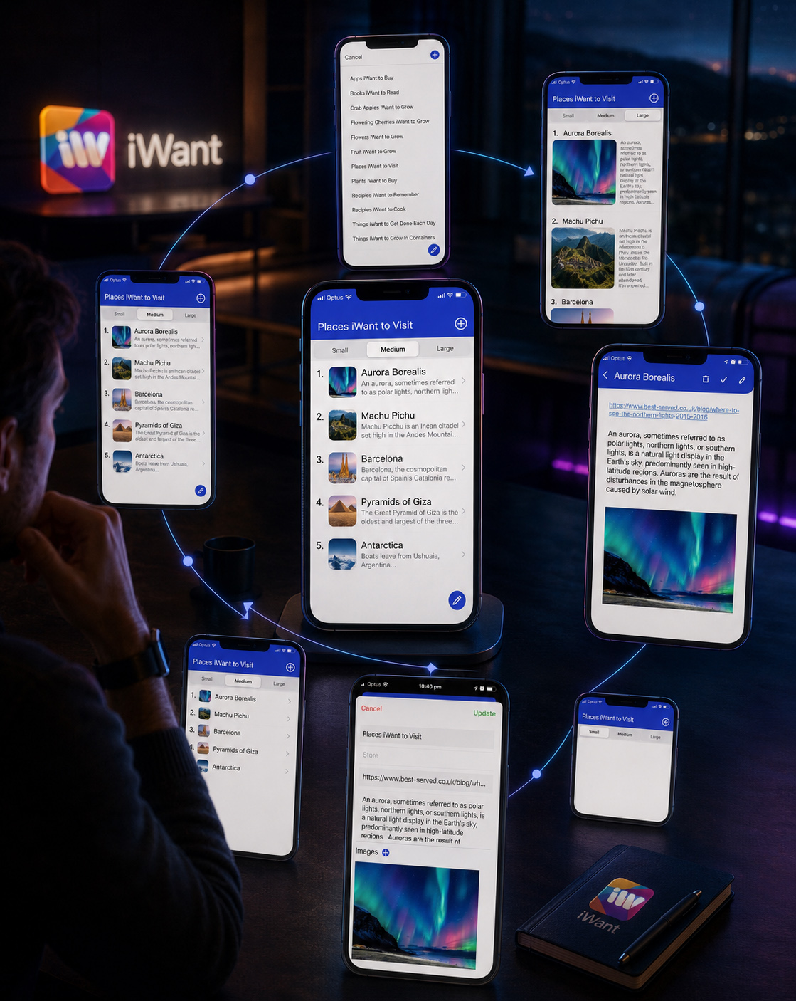
NAVIGATION LOGIC
EVERY ACTION BEGINS WITH ORIENTATION
A Predictable Interface Helps Users Understand Their Current Context Before Asking Them to Make the Next Decision.
Navigation was treated as a continuous relationship between context, content, and action—not as a collection of isolated buttons.
At list level, users can immediately recognize the selected context and choose the amount of information they want to see. At item level, related content remains grouped within one understandable detail view. When information needs to change, the editing state preserves the connection between the item and its original list.
This creates a clear interaction loop:
Select the context. Understand the content. Take the required action. Return without losing position.
By repeating this logic across different list types, the User Experience Design reduces the need for instruction. Users do not have to rediscover how the product works whenever the subject changes.
The structure itself teaches the interaction.
LOCATION REMAINS VISIBLE
Titles, list contexts, and screen hierarchy continuously communicate where the user is working.
ACTIONS REMAIN CLEAR
Creation, editing, saving, updating, and returning follow familiar patterns throughout the experience.
COMPLEXITY APPEARS GRADUALLY
Additional information and controls become visible only when the current task requires them.
RETURN REMAINS NATURAL
Every deeper interaction leads back to a recognizable list or context, preserving continuity throughout the journey.
FROM NAVIGATION LOGIC TO INTERACTION CONFIDENCE
WHEN USERS UNDERSTAND THE PATH, THE INTERFACE CAN STEP OUT OF THE WAY
By establishing consistent entry points, progressive information depth, recognizable actions, and dependable return paths, iWant transformed a broad content system into a clear and navigable Mobile App Experience.
The product could support many different intentions because users were never required to learn a completely different journey for each one. Every interaction remained connected through the same familiar User Flow Design logic—helping people move forward with clarity, preserve context, and return without losing orientation.
“The Best Navigation Does Not Tell People Where To Go. It Makes The Right Direction Feel Immediately Clear.”
MACRO SECTION 03
FROM EARLY PRODUCT LOGIC TO A REFINED INTERACTION SYSTEM
REFINING STRUCTURE THROUGH REAL INTERACTION
The Product Structure Became Stronger Each Time It Was Tested Against Real Content, Different Information Depths, And The Everyday Actions Users Needed To Complete.
The early iWant structure established a clear foundation, but a logical system on paper still needed to prove itself through real interaction.
Lists had to remain understandable whether they contained only a few words, multiple images, detailed descriptions, external links, prices, or previously completed items.
This stage of the Mobile App UX/UI Design process focused on observing how the same navigation logic behaved across different types of content. Instead of treating every screen as an isolated composition, each interaction was evaluated as part of a continuous journey—from choosing a list and adjusting its information depth to creating, reviewing, editing, and completing an item.
The purpose of iteration was not to continuously add more functionality.
It was to remove uncertainty, strengthen recurring patterns, and ensure that users could understand each next action without relearning the product from screen to screen.
The interface improved not by becoming more complex, but by making the same product logic clearer in every context.
REAL CONTENT REVEALS REAL FRICTION
Actual destinations, books, purchases, images, links, descriptions, and completed items exposed where hierarchy needed greater clarity.
REPEATED ACTIONS REQUIRE CONSISTENT RULES
Creating, viewing, editing, completing, and returning needed to feel related even when the content and screen purpose changed.
REFINEMENT SHOULD REDUCE HESITATION
Each iteration focused on making location, available actions, information depth, and the next meaningful step easier to recognize.
FROM FUNCTIONAL STRUCTURE TO A COHESIVE MOBILE EXPERIENCE
Each Iteration Preserved The Central Product Idea While Improving Hierarchy, Consistency, Readability, And Interaction Confidence.
iwant-mobile-app-ux-ui-design-concept-version-01
Establishing the Initial Product Logiciwant-mobile-app-ux-ui-design-concept-version-02
Strengthening Structure and Brand Integrationiwant-final-mobile-app-interface-design-screen-system
Unifying the Final Mobile Experience
ITERATION WITH A CLEAR PURPOSE
The first interface direction established the essential product structure: lists, selectable information depths, item details, editable content, and practical completion states. It proved that one application could support many different personal intentions through a shared organizational model.
The second direction refined the relationship between structure and identity. Navigation became more controlled, content groups became easier to distinguish, and the evolving color system began supporting interaction rather than functioning only as decoration.
The final direction consolidated those improvements into one recognizable App Interface Design system. Spacing, cards, controls, form fields, visual emphasis, and recurring actions were standardized so that different types of content could feel distinct without fragmenting the overall experience.
The evolution was therefore not a sequence of unrelated redesigns.
It was a controlled process of preserving what worked, identifying what created hesitation, and refining the complete experience around a clearer set of shared rules.
A successful iteration does not replace the original idea. It helps that idea work with greater clarity and confidence.
01 — CLEARER INFORMATION HIERARCHY
Titles, images, descriptions, prices, links, and completion states gained more deliberate visual priority.
02 — STRONGER ACTION CONSISTENCY
Add, Edit, Save, Update, Complete, and Return actions became more predictable across different screens.
03 — MORE FLEXIBLE CONTENT DEPTH
Small, Medium, and Large views allowed the same information structure to support quick scanning and deeper exploration.
04 — GREATER CROSS-SCREEN CONTINUITY
Lists, forms, detail views, and completed states began to feel like parts of one connected product rather than separate interfaces.
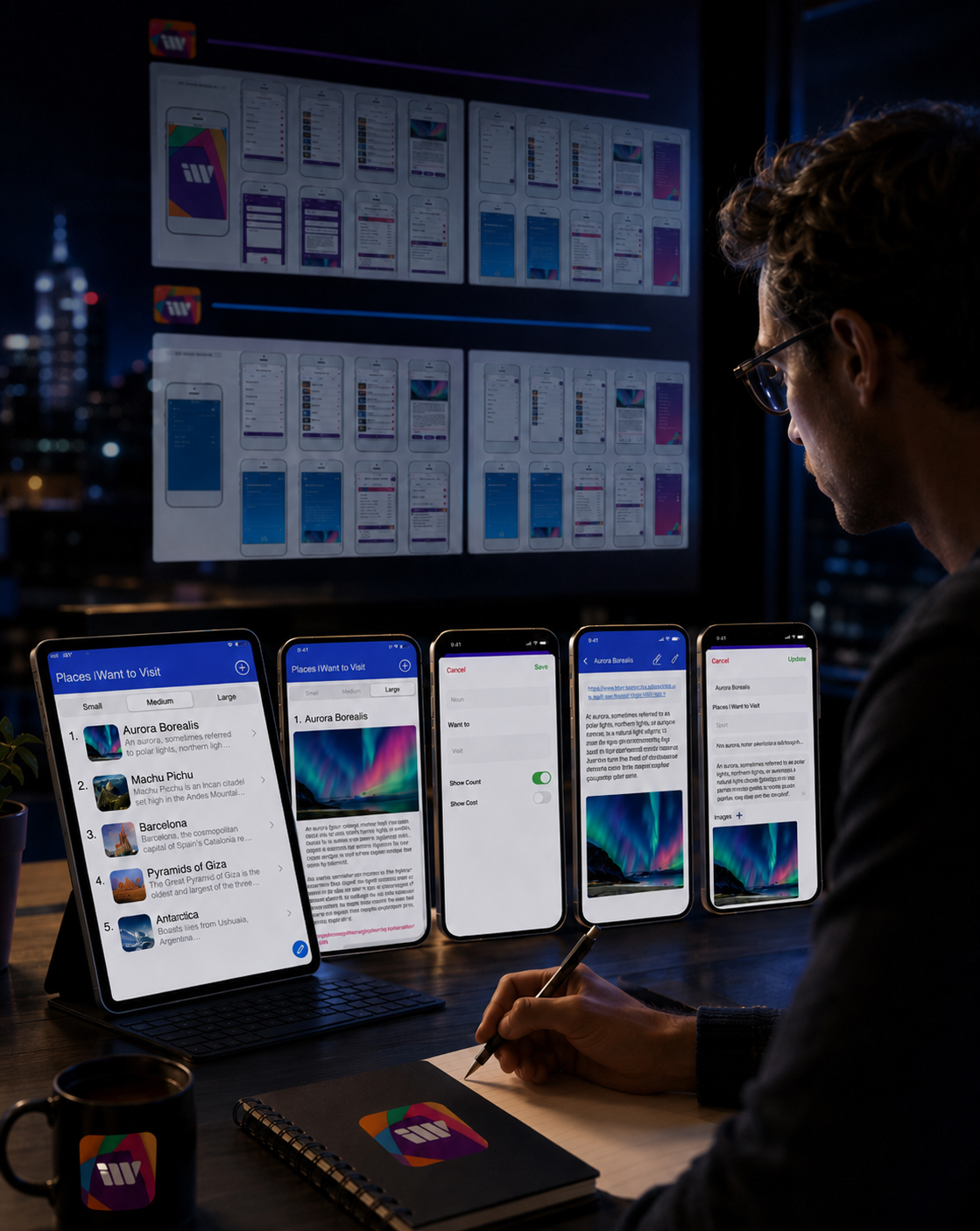
THE MOMENT THE SYSTEM BECAME COHESIVE
The final interface emerged when navigation, content hierarchy, brand expression, and interaction behavior began operating as one coordinated system.
Users no longer needed different mental models for different content types. Whether they were organizing destinations, recording purchases, saving an image, adding a description, or reviewing a completed item, the underlying interaction logic remained familiar.
This continuity became one of the most important outcomes of the User Experience Design process.
The product could support variety without making that variety feel unpredictable.
MEASURING THE STRUCTURE BEHIND THE EXPERIENCE
PRODUCT LOGIC MADE VISIBLE
The Depth Of The iWant User Experience Can Be Understood Through The Number Of Views, Screens, Actions, And Shared Rules Working Together Behind Every Interaction.
THREE
INFORMATION DEPTHS
Small. Medium. Large.
One content system supports quick recognition, balanced context, and detailed exploration without changing the underlying navigation logic.
TEN CORE
PRODUCT SCREENS
One Connected Mobile Journey.
The primary interface system connects list selection, content views, creation, editing, details, practical information, and completed states.
FIVE
RECURRING ACTIONS
Create. View. Edit. Complete. Return.
Repeated interaction patterns reduce the need to relearn controls as users move between different types of lists and personal content.
ONE UNIFIED PRODUCT
LOGIC
Different Intentions. Familiar Rules.
Every screen operates within one recognizable structure designed to keep varied information clear, editable, and useful over time.
The refinement process transformed iWant from a collection of functional screens into a coherent Mobile Product Experience.
Different content types, viewing depths, and user actions could now exist within one predictable structure—allowing the interface to support complexity without making the experience feel complicated.
The final system did not remove variety from the product.
It gave that variety a clear and repeatable way to behave.
“Strong User Experience Design Does Not Eliminate Complexity. It Organizes Complexity Until The Right Action Feels Natural.”
FINAL CHAPTER CONCLUSION - 03
FROM STRUCTURE TO NATURAL INTERACTION
When Product Logic Becomes Predictable, Every Next Action Begins To Feel Effortless.
A clear mobile experience is not created by simplifying every screen in isolation.
It is created by understanding how information, actions, and decisions connect across the complete user journey.
For iWant, Chapter 03 transformed many different human intentions into one coherent product structure.
Places to visit.
Books to read.
Products to consider.
Ideas to preserve.
Tasks to complete.
Each type of content could require a different level of detail, but none of them should require users to learn an entirely different way of navigating the product.
The Information Architecture established where content belongs.
The User Journey Mapping clarified how people move from intention to action.
The Core User Flows connected creation, exploration, editing, completion, and return.
And continuous interface refinement ensured that the same logic remained understandable across different screens, information depths, and everyday use cases.
Not navigation built around technical complexity.
Not separate interaction rules for every category.
Not additional features without a clear role in the journey.
One connected User Experience Design system created to make varied personal information feel organized, predictable, and easy to revisit.
When structure creates orientation, users know where they are.
When recurring patterns create familiarity, users understand what they can do next.
And when product logic becomes consistent enough to disappear into the experience, interaction begins to feel natural.
CLEAR STRUCTURE CREATES ORIENTATION.
CONSISTENT PATHS BUILD INTERACTION CONFIDENCE.
THE BEST PRODUCT LOGIC BECOMES ALMOST INVISIBLE.
“Before A Digital Path Can Become An Experience, Someone Must Be Able To Move Through It With Clarity.”
WHERE THE INVISIBLE PATH BECOMES EXPERIENCE
A Quiet Passage Between The Logic That Organizes The Product And The Human Movement That Brings It To Life.
The paths are now defined—but structure alone remains invisible. Behind every clear interaction exists a carefully organized system of information, priorities, relationships, and decisions guiding someone toward what matters.
Like a figure gradually emerging through fog, people do not experience Information Architecture as a diagram or User Flow Design as a sequence of connected steps. They experience direction. They recognize where they are, understand what is possible, and move forward without needing to question the logic beneath them.
For iWant, structure established the path through the product. It transformed different intentions into coherent journeys and gave every interaction a meaningful place within one connected Mobile App UX/UI Design system. But the path only becomes complete when someone can enter it, move through it, and experience its purpose firsthand.
What follows brings that invisible logic into view. The next chapter reveals how structure became interface, how direction became interaction, and how carefully organized possibilities evolved into one clear, flexible, and human Digital Product Experience.
“Structure Gives The Journey Direction. Experience Gives That Direction Human Meaning.”
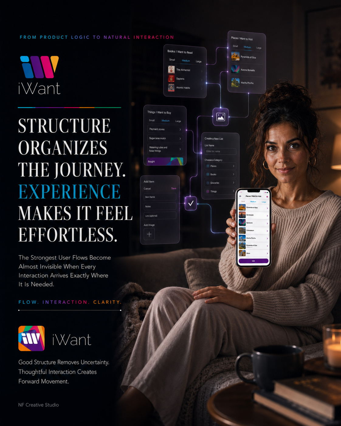
CHAPTER 04
STRUCTURE ORGANIZES THE JOURNEY. EXPERIENCE MAKES IT FEEL EFFORTLESS.
DESIGNING THE CORE PRODUCT EXPERIENCE
Once The Product Structure Was Clear, The Next Challenge Was To Transform That Logic Into A Mobile Experience Where Every Action Felt Immediate, Understandable, And Naturally Connected To The User’s Intention.
The core iWant experience was designed around a simple principle: people should be able to capture what matters without first having to understand a complicated system.
A destination, book, future purchase, practical task, or personal idea may contain very different information, but every interaction should begin from a familiar place. Users needed to recognize where they were, understand what they could do, and move forward without hesitation.
This stage of the Mobile App UX/UI Design process transformed the previously defined Information Architecture and User Flows into the product’s most important everyday interactions.
Selecting or creating a list, choosing the appropriate level of detail, adding meaningful information, reviewing saved content, editing an item, and preserving completed actions all became parts of one continuous Mobile Product Experience.
The objective was not to make every screen look identical.
It was to ensure that every screen behaved according to a recognizable set of rules.
Each interface decision therefore answered three essential questions:
What Is The User Trying To Accomplish?
What Information Is Necessary At This Exact Moment?
How Can The Design Make The Next Action Feel Obvious Without Becoming Visually Intrusive?
ENTER. ACT. CONTINUE.
“A Product Experience Becomes Intuitive When Every Screen Understands What The User Is Trying To Do Next.”
MACRO SECTION 01
FROM PERSONAL INTENTION TO THE FIRST MEANINGFUL ACTION
EVERY CLEAR EXPERIENCE BEGINS WITH ONE OBVIOUS PLACE TO START
Before Users Could Organize Detailed Information, The Product First Needed To Help Them Recognize Their Context, Choose A Direction, And Begin Without Hesitation.
The first meaningful product interaction is rarely the most complex one.
It is the moment when users understand where they are, recognize what the product allows them to do, and feel confident enough to begin.
For iWant, that moment started with context.
A person might already have a list they wanted to continue, or they might be arriving with an entirely new intention. The App Interface Design therefore needed to support both recognition and creation without forcing either path to feel secondary.
Existing lists had to remain immediately visible and understandable.
Creating a new list had to feel equally direct.
The product could support many different categories of personal information, but its first interaction still needed to communicate one simple idea:
Choose what matters—or create a new place for it.
Once a list was selected, the Small, Medium, and Large views allowed users to control how much information they wanted to see.
This established an important product behavior from the beginning: the structure remained consistent while the level of detail adapted to the user’s immediate need.
The First Screen Should Not Explain The Entire Product. It Should Make The First Meaningful Action Feel Obvious.
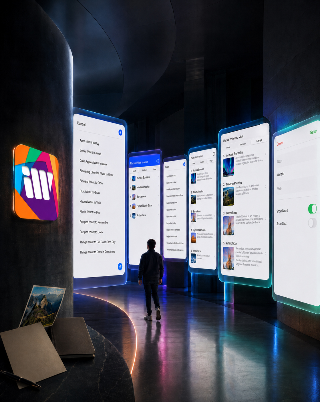
MAKING THE BEGINNING FEEL IMMEDIATELY FAMILIAR
The entry experience was structured around two equally important situations: continuing something that already existed and creating something entirely new.
The list-selection screen gave returning users immediate access to recognizable personal contexts. Instead of opening into an abstract dashboard, the product presented meaningful destinations—books, places, purchases, recipes, tasks, or any other list the user had previously defined.
The creation path used the same language of clarity.
A new list required only enough information to establish its purpose. Additional controls could then shape how that list behaved without overwhelming the moment in which the user was simply trying to begin.
This balance between continuity and creation prevented the product from feeling either empty for new users or restrictive for returning users.
Different intentions entered through different paths, but both paths led into the same recognizable User Experience Design system.
RECOGNITION BEFORE EXPLANATION
Existing lists provided familiar context immediately, allowing users to continue without first navigating through an unnecessary dashboard or instructional layer.
CREATION WITHOUT FRICTION
A new intention could become a structured list through a short and focused process that introduced only the decisions required at that moment.
DETAIL UNDER USER CONTROL
Small, Medium, and Large views allowed the same content to move between rapid scanning, balanced recognition, and deeper understanding.
FROM ARRIVAL TO THE FIRST CLEAR ACTION
The Opening Product Flow Helped Users Recognize A Context, Create A New One When Necessary, And Decide How Much Information They Needed To See.
Together, these interactions established the opening rhythm of the iWant product experience.
Users were not asked to understand the complete system before taking action. They were given a recognizable context, one clear decision, and the freedom to reveal additional complexity only when it became useful.
The interface therefore introduced the product through action rather than explanation.
Selecting, creating, and adjusting information depth became the first expression of a broader Mobile UX Design principle that would continue across the complete application.
“The Best Beginning Does Not Show Everything A Product Can Do. It Gives People Enough Clarity To Do The First Thing That Matters.”
MACRO SECTION 02
FROM BASIC CAPTURE TO MEANINGFUL CONTEXT
CAPTURING THE DETAILS THAT GIVE AN INTENTION MEANING
A Useful Mobile Experience Does Not Ask People To Enter More Information. It Helps Them Preserve The Right Information For The Moment In Which They Will Need It Again.
Once users had chosen a list and established the appropriate level of detail, the experience needed to support the information behind each intention.
Not every saved item required the same content.
A destination might depend on an image, description, and useful link. A future purchase could require a store, price, reference image, and personal note. A book might need only a title and a short reminder of why it mattered.
The App Interface Design therefore needed to remain flexible without becoming unpredictable.
Instead of forcing every item into one large and demanding form, the interface allowed users to add only the details relevant to their immediate purpose.
This created a layered interaction model.
Basic information established recognition.
Supporting details added personal meaning.
Images and links preserved context.
Practical fields such as price and store transformed a general intention into information capable of supporting a future decision.
The objective was not to maximize the amount of captured information.
It was to ensure that every saved item could remain understandable when the user returned later.
Information Becomes Valuable When It Preserves The Reason Something Mattered In The First Place.
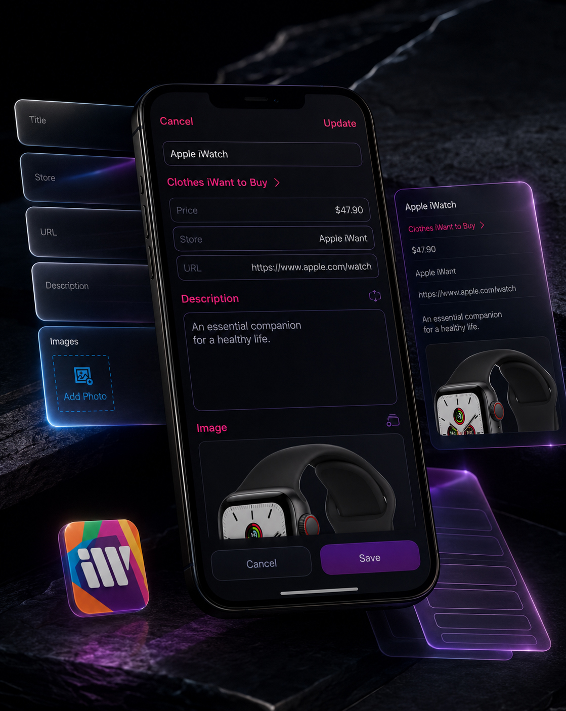
DESIGNING FOR THE INFORMATION EACH MOMENT ACTUALLY REQUIRES
The content model was designed to support gradual commitment.
Users could begin with a simple title and then decide whether the intention required a store, URL, description, image, price, or another supporting detail.
This reduced the pressure associated with large forms. The product never assumed that every intention needed to become a fully documented record before it could be useful.
The same structural logic supported very different contexts.
A saved destination could preserve visual inspiration and useful research. A future purchase could connect an item with its price, store, and reference image. A personal note could remain concise. A completed item could retain its meaning after the immediate action had passed.
Through this flexible User Experience Design model, information depth became a user decision rather than a system requirement.
START WITH THE ESSENTIAL
A title and recognizable context create enough structure for an intention to exist without making the first action unnecessarily demanding.
ADD MEANING WHEN IT MATTERS
Descriptions, links, images, stores, and prices allow users to preserve the details that support a future decision.
KEEP COMPLEXITY PROPORTIONAL
The interface reveals additional depth through user choice instead of forcing every item through the same amount of input.
FROM AN EMPTY FIELD TO A COMPLETE PIECE OF PERSONAL CONTEXT
The Interface Allowed Users To Begin With Almost Nothing, Add Only The Details That Mattered, And Return To Information That Still Made Sense Later.
Together, these interactions transformed basic capture into meaningful personal context.
Users could begin with the smallest useful amount of information and gradually enrich it as their intention developed. Every additional field had a clear role: strengthening recognition, preserving meaning, or supporting a future action.
The interface did not treat completeness as the number of fields users filled in.
Completeness depended on whether the saved information still communicated why the item mattered when the user returned.
This allowed simple intentions to remain simple while giving more complex ones enough structure to stay useful over time.
“The Best Beginning Does Not Show Everything A Product Can Do. It Gives People Enough Clarity To Do The First Thing That Matters.”
MACRO SECTION 03
FROM SAVED INFORMATION TO CONTINUOUS PERSONAL VALUE
KEEPING PERSONAL INFORMATION ACTIVE OVER TIME
The Experience Was Not Complete When Something Was Saved. It Became Complete When Users Could Return, Understand, Update, Complete, And Continue From Where They Had Left Off.
Capturing an intention is only the beginning of its useful life.
People return to saved information with different expectations.
Sometimes they need to recognize an item quickly. Sometimes they need the full description, image, link, or price. At other moments, they need to update what has changed, confirm an action, or preserve an item as completed.
The core Mobile App Design therefore treated every saved intention as an active piece of information rather than a static record.
List views supported quick recognition.
Detail views restored complete context.
Editing allowed information to evolve.
Confirmation and completion states protected continuity without erasing what had already happened.
This created a product experience based on return, not merely capture.
Users could move between overview and detail, intention and action, and current relevance and completed history without losing their orientation.
The interface remained visually consistent throughout that movement, allowing the content to change while the interaction logic stayed familiar.
A Productivity Product Creates Long-Term Value When Saved Information Remains Clear After The Moment Of Capture Has Passed.
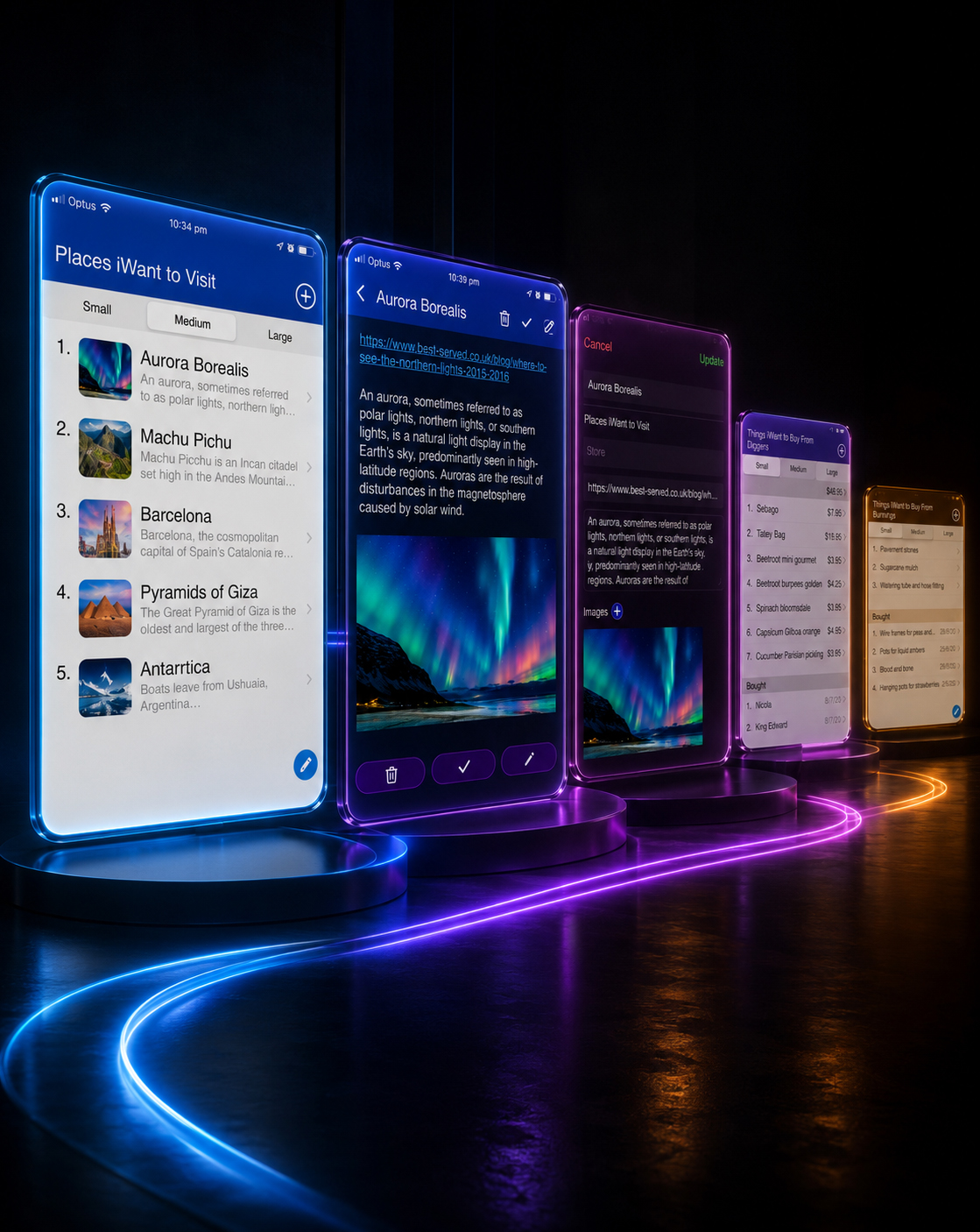
DESIGNING FOR RETURN, CHANGE, AND COMPLETION
The interface supported continuity through a recognizable relationship between overview, detail, editing, and completion.
List views helped users scan and recognize information quickly. Small, Medium, and Large modes allowed the same content to adapt to the amount of context needed at a specific moment.
Detail views restored descriptions, links, imagery, and supporting information without disconnecting users from the original list.
Editing was treated as part of the normal life of saved information.
Intentions could change, practical details could become more specific, and supporting context could grow over time. The product therefore needed to make updating feel as natural as initial capture.
Completed items were not simply removed.
Their preserved state allowed the application to acknowledge progress while retaining useful history. This protected continuity between what users intended to do, what they were currently considering, and what had already happened.
RETURN WITHOUT RELEARNING
Consistent list, detail, and editing patterns allowed users to recover their orientation without learning the product again.
CHANGE WITHOUT LOSING CONTEXT
Saved information could evolve while remaining connected to its original category, purpose, and supporting details.
COMPLETE WITHOUT ERASING VALUE
Finished items could remain visible as meaningful history rather than disappearing from the product experience.
MEASURING THE CORE PRODUCT EXPERIENCE
ONE JOURNEY. MULTIPLE LAYERS OF VALUE.
The Strength Of The Core Product Was Defined By How Consistently It Supported Different Intentions, Information Depths, And Moments Of Return.
THREE
INFORMATION DEPTHS
Small. Medium. Large.
Three coordinated viewing modes allowed users to control how much information appeared without changing the underlying product structure.
FOUR CORE EXPERIENCE STATES
Capture. Review. Edit. Complete.
The essential lifecycle of an intention was organized around four familiar states that remained connected through consistent interaction logic.
SIX CONTEXTUAL INFORMATION TYPES
Title. Category. Store. Link. Description. Image.
The product supported different combinations of meaningful information without requiring every field in every situation.
ONE RECOGNIZABLE INTERACTION MODEL
Different Intentions. One Consistent Product Logic.
Places, books, products, tasks, and personal ideas could behave differently in content while remaining familiar in use.
They describe the structural scope of the designed experience: one coherent Mobile App UX/UI Design system capable of supporting different intentions, different levels of detail, and different moments in the life of saved information.
“Flexibility Created The Possibility. Consistency Made That Possibility Usable.”
FROM FIRST INTENTION TO CONTINUOUS PRODUCT VALUE
The Complete Core Experience Connected Recognition, Capture, Context, Editing, Completion, And Return Into One Familiar Product Journey.
The completed core experience transformed iWant from a collection of list screens into a continuous personal information system.
Users could enter through a familiar context, choose the amount of information they needed, preserve meaningful details, return without losing orientation, update what had changed, and retain completed actions as part of an ongoing personal record.
The interface did not attempt to predict every possible intention.
It established a flexible and recognizable Mobile Product Experience capable of supporting many intentions through the same clear product logic.
“A Meaningful Product Experience Does Not End When An Action Is Completed. It Preserves Enough Clarity For The Next Moment To Begin.”
FINAL CHAPTER CONCLUSION - 04
FROM PRODUCT LOGIC TO A COMPLETE HUMAN EXPERIENCE
WHEN EVERY ACTION FEELS CONNECTED, THE PRODUCT BEGINS TO FEEL NATURAL
A Strong Core Experience Does Not Ask People To Think About The Interface. It Gives Their Intentions A Clear Place To Begin, Develop, And Remain Useful.
Chapter 04 transformed the structural foundation of iWant into a complete and usable Mobile App Design experience.
The product began with recognition.
Users could identify an existing context or create a new one without first understanding the full system.
It continued through controlled information depth.
Small, Medium, and Large views allowed the experience to respond to different moments without fragmenting the product logic.
It gained meaning through flexible capture.
Titles, categories, descriptions, links, images, stores, prices, and supporting details could be added only where they contributed genuine value.
It remained active through return and editing.
Saved information could be reviewed, expanded, corrected, or completed without losing the context in which it had originally been created.
The result was not a collection of isolated screens.
It was one connected User Experience Design system built around the natural lifecycle of human intention:
Recognize what matters.
Capture what is necessary.
Add meaning when it becomes relevant.
Return when the information is needed.
Update what has changed.
Preserve what has already happened.
Through these coordinated decisions, the interface became quieter while the product became more capable.
Complexity remained available, but it appeared only when the user’s intention required it.
CLEAR ENTRY CREATES CONFIDENCE.
FLEXIBLE INFORMATION CREATES RELEVANCE.
CONTINUOUS INTERACTION CREATES LASTING PRODUCT VALUE.
“The Core Experience Succeeded When Different Human Intentions Could Move Through One Product Without Losing Their Individual Meaning.”
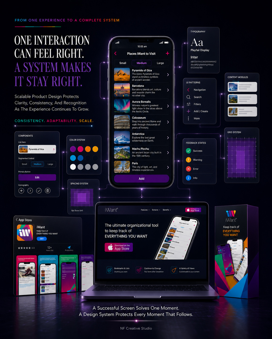
CHAPTER 05
FROM INDIVIDUAL INTERFACES TO ONE RECOGNIZABLE PRODUCT LANGUAGE
A VISUAL SYSTEM DESIGNED TO SCALE
The Visual Identity Was Not Applied As Decoration Around The Product. It Was Transformed Into A Flexible Interface System Capable Of Creating Recognition, Supporting Interaction, And Remaining Consistent As The Experience Expanded.
Once the core product experience had been defined, the next challenge was to ensure that every part of iWant felt as though it belonged to the same digital product.
The application needed to support different lists, information depths, content types, controls, and interaction states without becoming visually fragmented. Each screen could serve a different purpose, but the complete Mobile App Interface still needed to remain immediately recognizable.
This required more than selecting a color palette or styling a collection of screens.
The visual identity had to become an active Digital Design System.
Color needed to communicate hierarchy and action. Typography needed to support rapid scanning and deeper reading. Icons and controls needed to remain familiar across different contexts. Spacing, surfaces, imagery, and component behavior needed to create consistency without forcing every screen into the same composition.
Every element of the UI Design System therefore performed two connected roles: helping users understand the immediate interface while strengthening recognition across the complete product experience.
The result was a scalable visual language designed to balance personality with usability.
It gave iWant enough character to remain memorable, enough structure to remain understandable, and enough flexibility to expand without losing its identity.
IDENTITY. CONSISTENCY. SCALE.
“A Product Becomes Recognizable When Every Visual Decision Feels Different In Purpose, Yet Connected In Language.”
MACRO SECTION 01
FROM BRAND CHARACTER TO FUNCTIONAL INTERFACE EXPRESSION
DESIGNING A LANGUAGE USERS COULD RECOGNIZE BEFORE THEY NEEDED TO EXPLAIN IT
Color, Typography, Iconography, Imagery, And Spatial Hierarchy Were Coordinated To Give Every Screen A Distinct Purpose While Preserving One Familiar Product Identity.
The visual direction of iWant needed to express the openness and variety of personal intention without sacrificing functional clarity.
Its multicolored identity represented the diversity of things people might want to remember, explore, purchase, experience, or complete. Inside the application, however, that expressive character required careful control.
Color was therefore transformed from a branding element into a functional part of the User Interface Design.
Blue created orientation and structural continuity. Purple and magenta emphasized active moments and meaningful decisions. Green supported confirmation and completion. Amber introduced warmth and distinction where additional recognition was useful.
Typography established a clear relationship between list titles, item names, descriptions, supporting information, prices, controls, and actions. The typographic system allowed content to become more detailed without weakening hierarchy or disrupting its natural reading order.
Iconography followed the same principle.
Each symbol needed to communicate an action quickly, remain visually compatible with the wider App Visual Identity, and work consistently across different screens and interaction states.
Imagery provided immediate content recognition. Spacing separated different levels of information. Contrast and scale helped users distinguish what required attention from what remained supportive.
Together, these elements created a cohesive Mobile App Design System in which expression supported understanding instead of competing with it.
Visual Identity Became Useful When Every Element Helped Users Recognize What They Were Seeing, What It Meant, And What They Could Do Next.
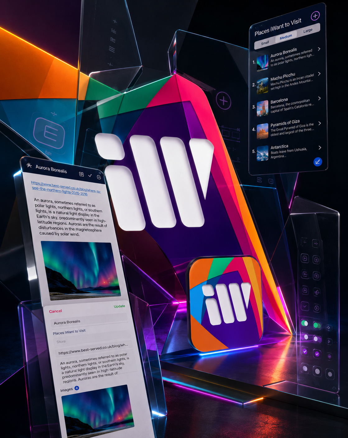
TRANSFORMING EXPRESSION INTO RECOGNITION
The iWant identity was designed to remain expressive without allowing visual variety to weaken product clarity.
Its multicolored character created distinction and emotional openness, while the Interface Design System established a clear functional role for every visual element.
Strong color moments identified active controls and meaningful decisions. Neutral surfaces gave personal content enough space to remain visible. Typography created predictable reading patterns across lists, forms, detail views, practical information, and completed states.
Images strengthened recognition without dominating the interface.
Icons reduced the need for repeated explanation.
Spacing separated different levels of content and protected clarity as information became richer.
Through this balance of expression and restraint, the Mobile App UX/UI Design remained visually distinctive while supporting many different kinds of personal intention.
The identity did not need to appear in the same way on every screen.
It needed to behave according to the same recognizable visual principles.
COLOR WITH A CLEAR ROLE
The expressive palette was translated into controlled functional accents that supported orientation, action, confirmation, and product recognition.
HIERARCHY BEFORE DECORATION
Typography, spacing, contrast, and scale established a predictable reading order before visual personality was introduced.
CHARACTER WITHOUT VISUAL NOISE
The identity remained present across the experience without competing with the personal information users came to preserve.
Through these decisions, the visual identity became more than a recognizable surface.
It became a practical Digital Product Design language through which users could distinguish information, understand hierarchy, recognize actions, and move between different product contexts without losing orientation.
Individual elements remained expressive enough to create character, yet disciplined enough to support one complete and scalable interface system.
“Recognition Was Not Created By Making Every Screen Look The Same. It Was Created By Giving Every Screen The Same Visual Logic.”
MACRO SECTION 02
FROM INDIVIDUAL DESIGN DECISIONS TO COORDINATED INTERFACE BEHAVIOR
BUILDING CONSISTENCY WITHOUT LIMITING THE EXPERIENCE
The System Needed To Repeat What Users Should Recognize While Remaining Flexible Enough To Support Different Content, Different States, And Different Levels Of Information.
It is created by identifying which relationships must remain stable and which elements must be allowed to adapt.
For iWant, navigation patterns, content containers, input fields, controls, spacing principles, image behavior, and interaction states were coordinated as reusable User Interface Components. Their appearance and behavior remained familiar even when the information inside them changed.
A list of destinations could contain visual descriptions and links. A purchase list could introduce stores and prices. A personal task could remain concise. A completed item could require a different status while preserving its original identity.
The system therefore standardized behavior without standardizing personal meaning.
Reusable components reduced unnecessary variation, while flexible content structures allowed the Mobile App Interface to support different intentions without appearing fragmented or restrictive.
A Scalable Interface Repeats The Rules That Create Confidence While Preserving The Flexibility That Gives Content Meaning.
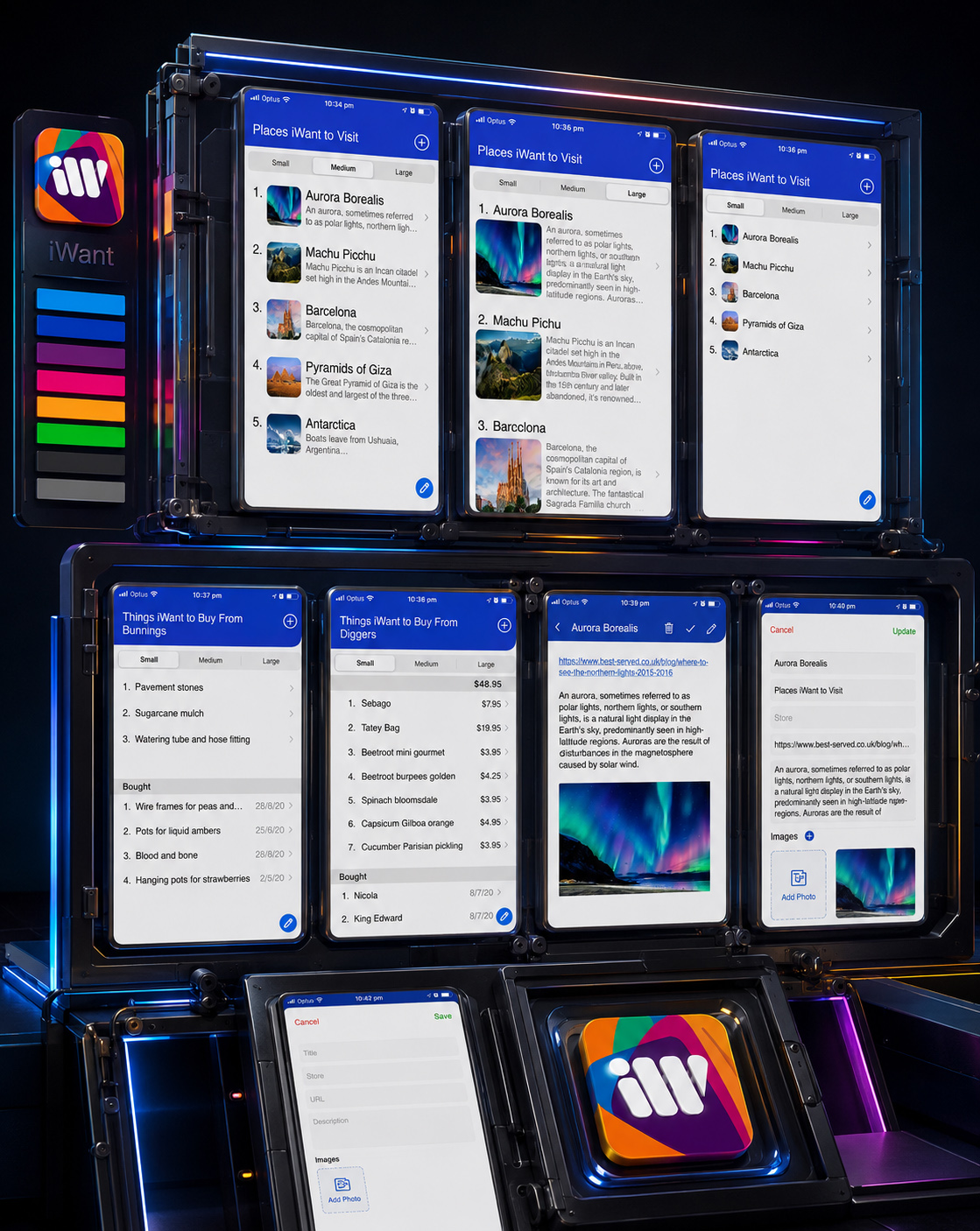
DESIGNING RULES THAT COULD ADAPT WITHOUT DISAPPEARING
The UI Component System established a consistent relationship between content, controls, navigation, imagery, and interaction states.
List items followed recognizable patterns while adapting to different amounts and types of information. Input fields preserved familiar behavior across creation and editing. Detail views expanded context without introducing a new visual language. Completion states changed the status of an item without erasing its identity.
Small, Medium, and Large views demonstrated the flexibility of the same underlying Information Architecture.
Information could contract for rapid scanning, expand for greater recognition, or reveal richer detail while maintaining familiar alignment, hierarchy, and control patterns.
This allowed the App Interface Design to grow through coordinated variation rather than isolated screen design.
REUSE WHAT BUILDS CONFIDENCE
Navigation, controls, fields, spacing, and hierarchy remained familiar wherever repeated behavior helped users understand the product.
ADAPT WHAT GIVES CONTENT MEANING
Images, descriptions, links, stores, prices, and information depth changed according to the intention being preserved.
SCALE WITHOUT FRAGMENTATION
New contexts could enter the product through established components instead of requiring an entirely new interface language.
MEASURING THE CORE PRODUCT EXPERIENCE
ONE JOURNEY. MULTIPLE USES.
The Strength Of The Core Product Was Defined By How Consistently It Supported Different Intentions, Information Depths, And Moments Of Return.
THREE
INFORMATION DEPTHS
Small. Medium. Large.
Three coordinated viewing modes allowed users to control how much information appeared without changing the underlying Mobile App Design structure.
FOUR CORE EXPERIENCE STATES
Capture. Review. Edit. Complete.
The essential lifecycle of an intention was organized around four familiar states connected through consistent User Experience Design logic.
SIX CONTEXTUAL INFORMATION TYPES
Title. Category. Store. Link. Description. Image.
The product supported different combinations of meaningful information without requiring every field in every situation.
ONE RECOGNIZABLE INTERACTION MODEL
Different Intentions. One Consistent Product Logic.
Places, books, products, tasks, and personal ideas could behave differently in content while remaining familiar in use.
They describe the structural scope of the designed experience: one coherent Mobile App UX/UI Design system capable of supporting different intentions, different levels of detail, and different moments in the lifecycle of saved information.
“Flexibility Created The Possibility. Consistency Made That Possibility Usable.”
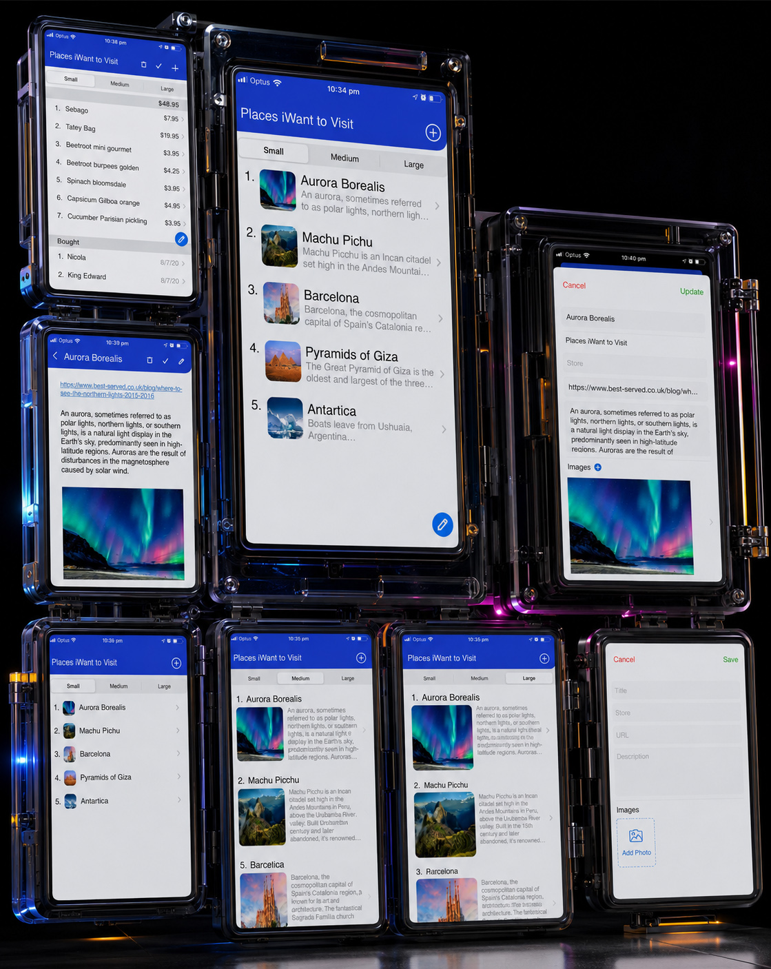
The completed visual system allowed iWant to support variation without sacrificing recognition.
Different content types, interaction states, viewing modes, and levels of detail could appear across the product while remaining connected through shared visual and behavioral principles.
This gave the interface the flexibility required by personal information and the consistency expected from a usable and scalable Digital Product Experience.
The system did not remove difference.
It gave difference a structure through which it could remain clear.
“A Strong Design System Does Not Make Every Experience Identical. It Makes Every Experience Feel As Though It Belongs.”
FINAL CHAPTER CONCLUSION - 05
FROM VISUAL EXPRESSION TO LASTING PRODUCT RECOGNITION
WHEN EVERY ELEMENT SPEAKS THE SAME LANGUAGE, THE PRODUCT BECOMES MORE THAN A COLLECTION OF SCREENS
The Final Visual System Connected Identity, Hierarchy, Interaction, And Adaptability Into One Recognizable Product Experience Built To Remain Consistent As It Grew.
Chapter 05 transformed the visual identity of iWant into a complete and reusable Mobile App Design System.
The expressive character of the brand was preserved through a distinctive palette, recognizable imagery, clear typography, and controlled visual energy.
That expression was then given structure.
Color received functional roles. Typography established predictable hierarchy. Icons and controls created familiar actions. Reusable UI Components coordinated lists, forms, detail views, editing states, practical information, and completed items.
Small, Medium, and Large views allowed information density to change without requiring users to learn a different interface. Flexible content structures supported destinations, purchases, books, tasks, ideas, and other personal intentions without fragmenting the User Experience Design.
The result was not uniformity.
It was coordinated variation.
Every screen could respond to its specific purpose while remaining part of the same recognizable App Visual Identity.
Through that balance, iWant gained the consistency required for usability, the flexibility required for growth, and the character required for lasting product recognition.
IDENTITY CREATED RECOGNITION.
CONSISTENCY CREATED CONFIDENCE.
FLEXIBILITY CREATED THE POSSIBILITY TO SCALE.
“The System Succeeded When New Content Could Enter The Product Without Making The Experience Feel New Again.”
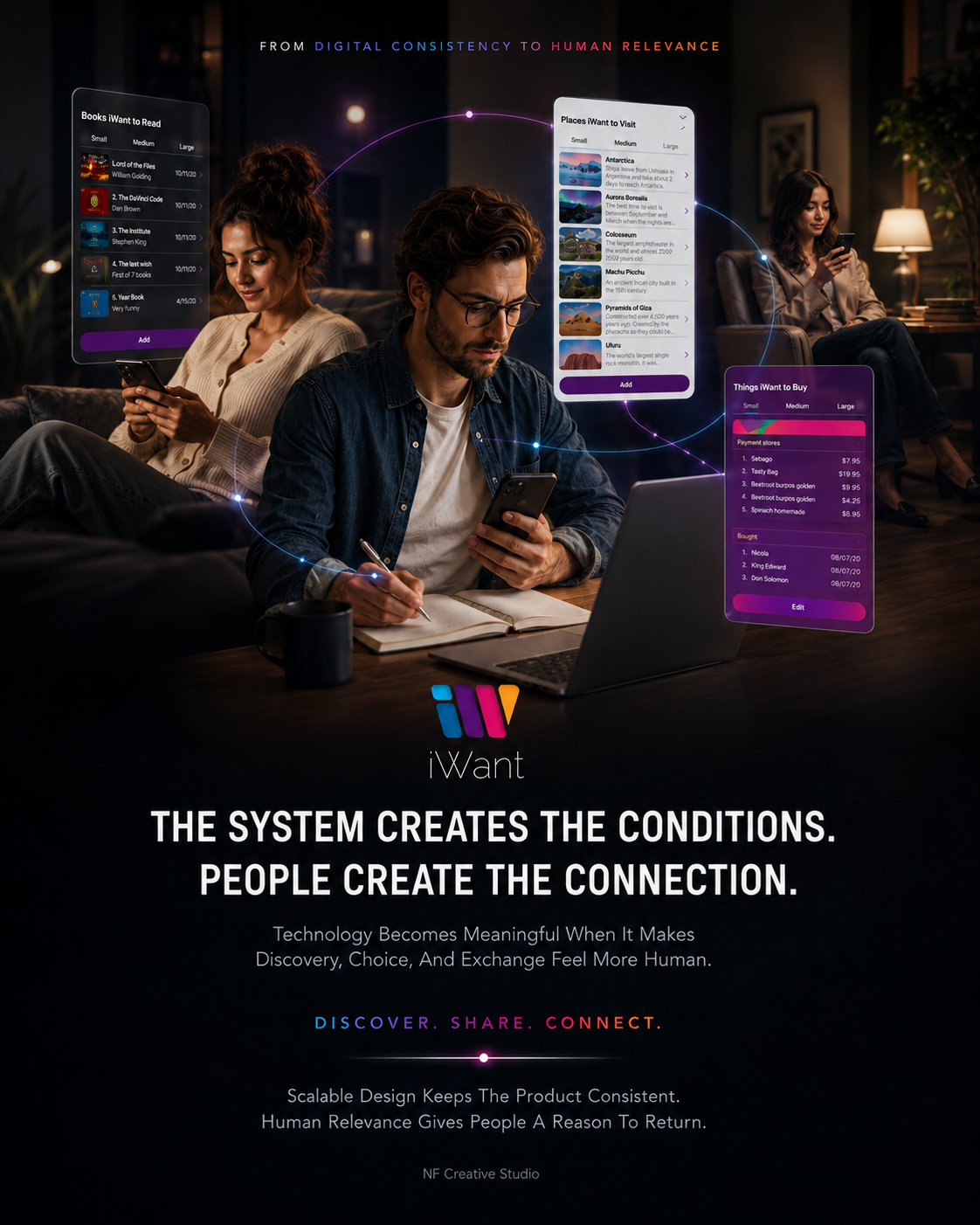
CHAPTER 06
FROM COORDINATED INTERFACES TO ONE COMPLETE PRODUCT EXPERIENCE
FROM DESIGNED INTERFACE TO A COMPLETE DIGITAL EXPERIENCE
The Final Product Emerged When Strategy, Structure, Interaction, Visual Identity, And Human Context Began To Work Together As One Continuous And Recognizable Experience.
A digital product is not experienced as a collection of separate design decisions.
Users do not consciously divide Information Architecture, interface components, visual hierarchy, content structure, and interaction patterns into independent systems. They experience only whether the product feels clear, useful, and naturally connected to what they are trying to accomplish.
The final stage of the iWant Mobile App UX/UI Design process therefore focused on synthesis.
Every previously designed layer needed to behave as part of one complete Digital Product Experience: the human intention behind the product, the structure that organized it, the interactions that moved it forward, and the visual system that made it recognizable.
Lists, viewing modes, item creation, detailed information, editing, practical data, and completed states were no longer evaluated as isolated screens. Their value appeared in the way users could move between them without losing context.
The objective was to transform a designed interface into a complete digital product—one capable of supporting different personal intentions while preserving clarity, continuity, and meaning.
CONNECT. EXPERIENCE. CONTINUE.
“A Digital Product Becomes Complete When People Stop Experiencing Its Parts And Begin Experiencing One Continuous Possibility.”
MACRO SECTION 01
FROM INDIVIDUAL ACTIONS TO ONE CONTINUOUS PRODUCT JOURNEY
MAKING EVERY MOMENT FEEL CONNECTED TO WHAT CAME BEFORE AND WHAT COMES NEXT
The Final Experience Connected Recognition, Capture, Context, Editing, Completion, And Return Without Requiring Users To Rebuild Their Understanding At Every Step.
The strength of the final Mobile Product Experience depended on continuity.
A user might begin by selecting an existing list or creating a new one. They could then choose the amount of information they wanted to see, capture a new item, add supporting context, return to saved information, update what had changed, or preserve something as completed.
Each action served a different purpose, but none of them should feel disconnected from the original intention.
Navigation therefore remained familiar as users moved between overview and detail. Visual hierarchy protected recognition as information became richer. Creation and editing shared predictable controls. Completed states acknowledged progress without removing valuable context.
This consistency reduced the need for repeated explanation. Users could focus on the content they wanted to preserve rather than continually interpreting the App Interface Design around it.
The complete User Journey Design became a continuous relationship between intention, information, action, and return.
Continuity Was Created When Every Action Preserved Enough Context For The Next Action To Feel Natural.
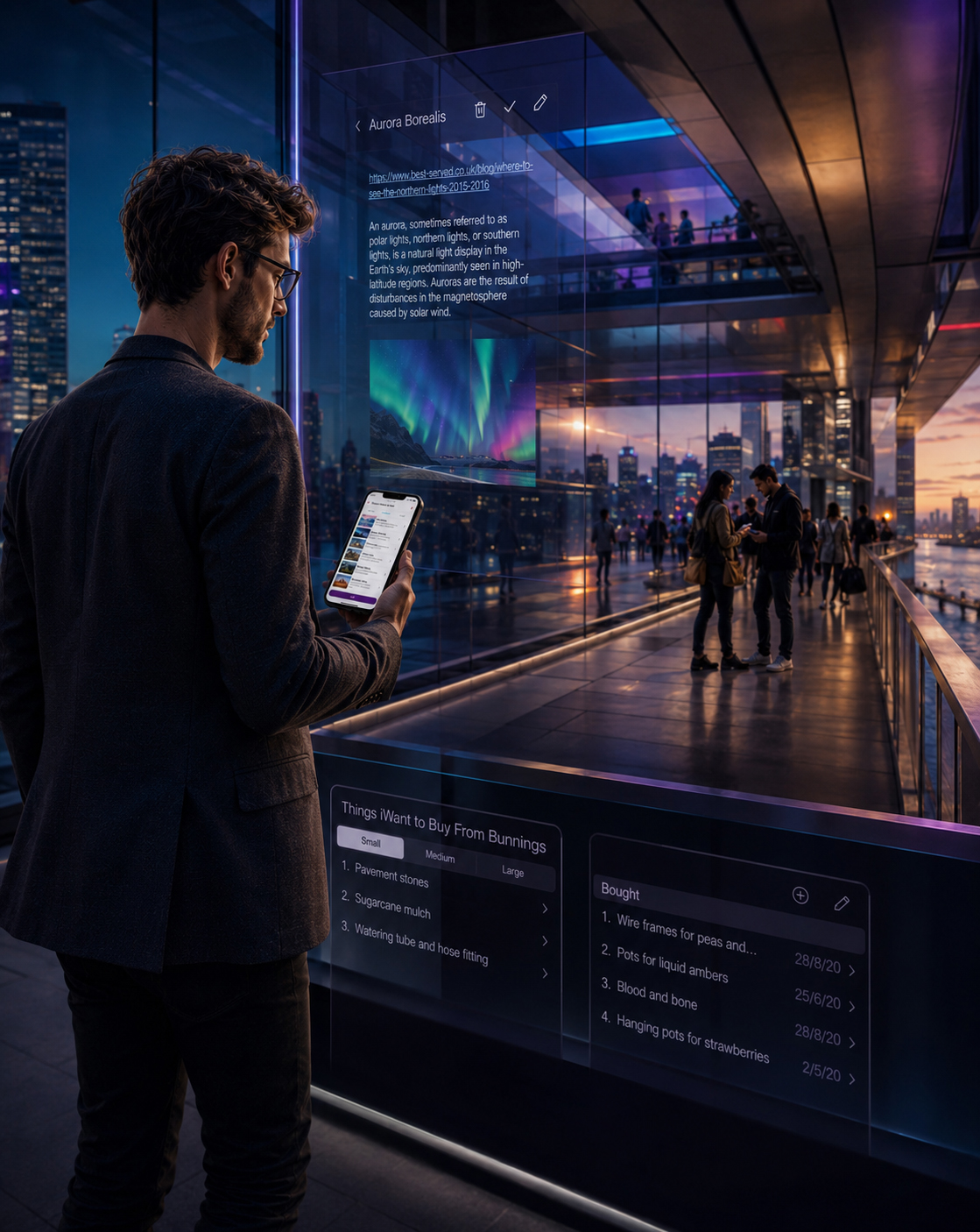
DESIGNING FOR MOVEMENT BETWEEN MOMENTS
The final experience was designed around the understanding that personal information rarely remains useful in only one moment.
An intention may begin as a quick thought, gain detail through research, become practical through a link or price, and later require an update or confirmation. Its value depends on whether the product can preserve continuity throughout that change.
iWant connected these moments through familiar structures and consistent Interaction Design patterns. Users could enter at different points without losing the relationship between the item, its list, its supporting information, and its current state.
The interface remained stable enough to protect recognition while allowing the information itself to evolve.
ENTER FROM A FAMILIAR CONTEXT
Recognizable lists and viewing modes allowed users to continue from an existing intention without rebuilding their orientation.
MOVE WITHOUT LOSING MEANING
Overview, detail, creation, and editing remained connected through shared hierarchy, controls, and visual behavior.
COMPLETE WITHOUT BREAKING CONTINUITY
Completed items preserved useful history and allowed progress to remain part of the wider personal information system.
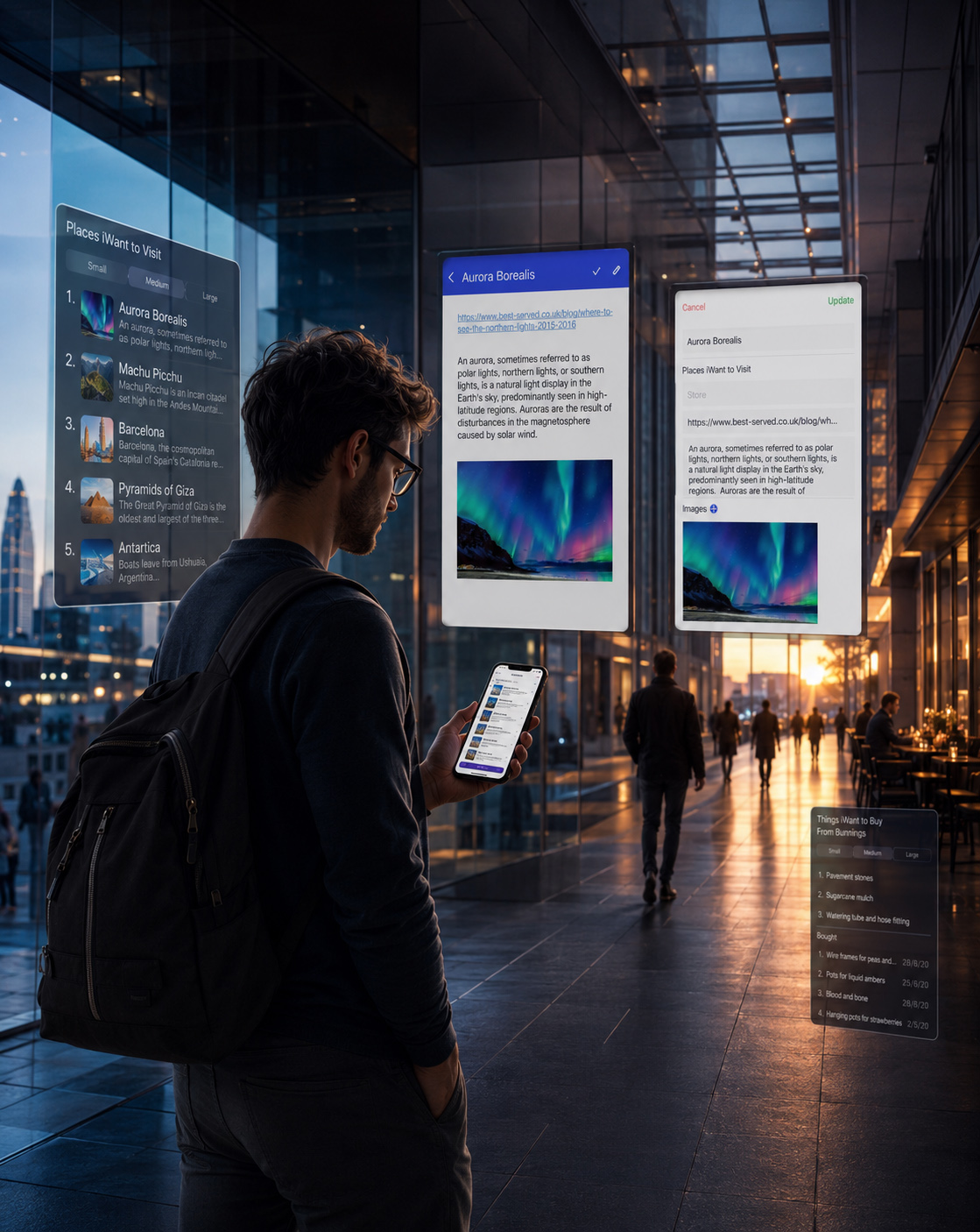
Together, these interactions created a Digital Product Design journey that remained coherent as users moved between different moments and levels of information.
The system preserved enough familiarity to make each return feel immediate, while allowing personal content to change according to real circumstances.
The result was not simply an interface through which actions could be completed.
It was a continuous User Experience Design system through which intentions could remain active and understandable over time.
“The Product Felt Continuous Because Every Return Began With Something The User Already Recognized.”
MACRO SECTION 02
FROM EVERYDAY USEFULNESS TO A RECOGNIZABLE PRODUCT PRESENCE
BRINGING STRATEGY, EXPERIENCE, AND IDENTITY TOGETHER AS ONE COMPLETE PRODUCT
The Final iWant Experience Connected Human Purpose, Product Structure, Interface Behavior, And Visual Recognition Into One Coherent Digital Product.
The completed iWant product represented the synthesis of every decision developed throughout the project.
Human insight established why the product should exist. Brand Strategy gave that purpose a recognizable voice. Information Architecture organized different intentions into a clear structure. User Flow Design defined how people could move through that structure. The core experience transformed those flows into useful interactions. The Mobile App Design System then connected every screen through one scalable visual language.
None of these layers created the product independently.
Their combined behavior allowed iWant to support personal complexity without becoming complicated in use.
The final application could accommodate different categories, content types, information depths, practical details, and completion states while preserving one recognizable Mobile App Experience.
This transformed iWant from an interface concept into a coherent digital product with a clear purpose, distinct identity, and structure capable of supporting continued use.
The Final Product Was Not Defined By The Number Of Screens It Contained, But By How Completely Those Screens Worked Together.
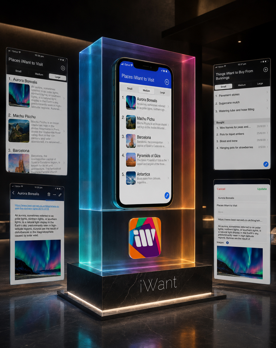
ONE PRODUCT BUILT FROM MANY COORDINATED DECISIONS
The final iWant application brought every strategic, structural, experiential, and visual decision into one recognizable Digital Product Design system.
Its value did not depend on one exceptional screen or one distinctive feature. It emerged through the consistency with which different actions, content types, and moments of return were supported across the complete experience.
The product remained flexible enough to reflect different human intentions and structured enough to make those intentions manageable.
Through that balance, iWant became more than a list application. It became a personal digital framework for preserving what matters, adding meaning when needed, and continuing without losing context.
CLEAR IN PURPOSE
The product remained focused on helping people preserve, organize, and return to personally meaningful intentions.
FLEXIBLE IN CONTENT
Different categories, information types, and levels of detail could coexist without fragmenting the User Experience Design.
CONSISTENT IN USE
Shared interaction and visual principles allowed different product moments to remain immediately familiar.
READY TO EXPAND
The coordinated Digital Design System created a stable foundation for broader product communication and future digital presence.
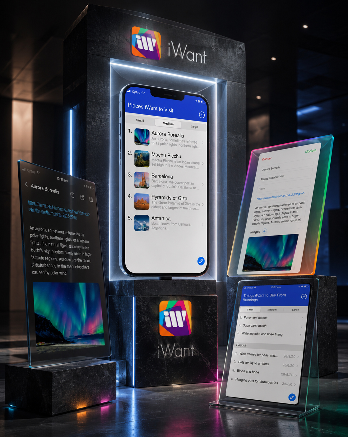
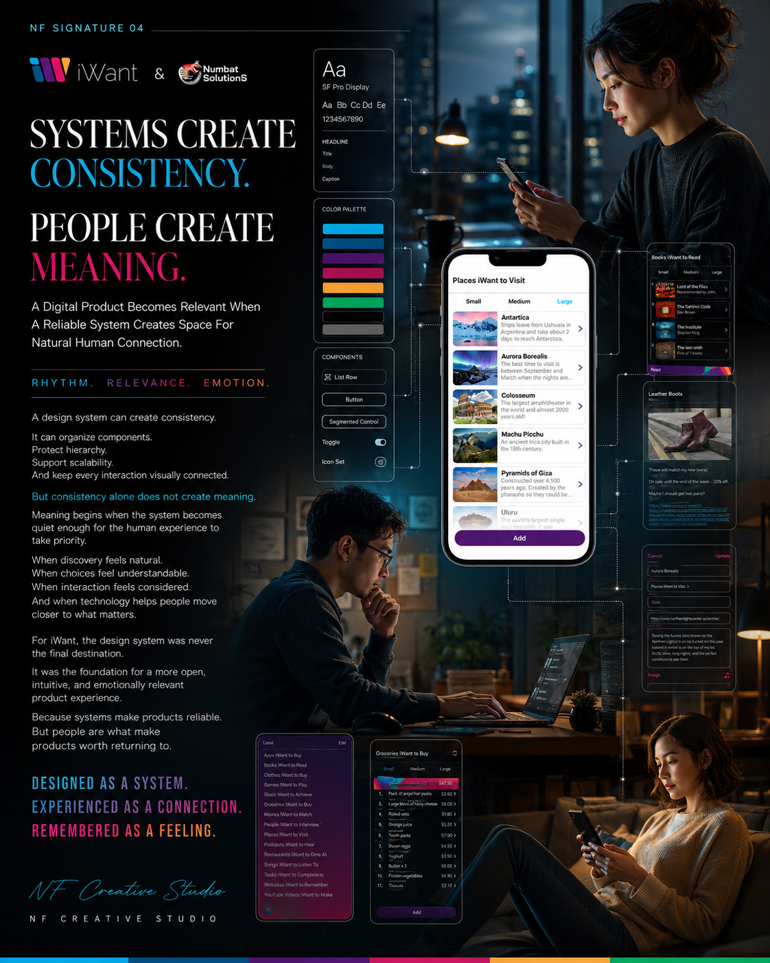
FINAL CHAPTER CONCLUSION - 06
FROM A HUMAN INTENTION TO ONE COMPLETE DIGITAL PRODUCT
WHEN PURPOSE, STRUCTURE, INTERACTION, AND IDENTITY MOVE TOGETHER, THE PRODUCT FEELS WHOLE
The Complete iWant Experience Demonstrated How A Complex Range Of Personal Intentions Could Be Supported Through One Clear, Flexible, And Recognizable Digital Product.
Chapter 06 brought the complete iWant Digital Product Experience together.
The project began with human intention: the need to preserve ideas, plans, destinations, purchases, tasks, and possibilities without losing the context that made them meaningful.
Product Strategy transformed that need into a clear purpose. Information Architecture organized different intentions into understandable relationships. Interaction Design allowed users to move naturally between recognition, capture, detail, editing, completion, and return.
The Mobile App Design System gave those different moments one recognizable identity.
Together, these layers created a coherent Mobile App UX/UI Design experience capable of supporting personal variation without becoming unpredictable or difficult to use.
The final product did not attempt to define what people should want.
It created a flexible digital framework through which different intentions could remain visible, manageable, and useful over time.
That was the complete value of iWant: not simply helping people create lists, but helping them preserve the meaning behind the things they wanted to remember, experience, purchase, change, or complete.
PURPOSE GAVE THE PRODUCT DIRECTION.
STRUCTURE GAVE THE EXPERIENCE CLARITY.
HUMAN RELEVANCE GAVE PEOPLE A REASON TO RETURN.
“The Product Became Complete When Every Designed Decision Returned To The Human Intention That Started It.”
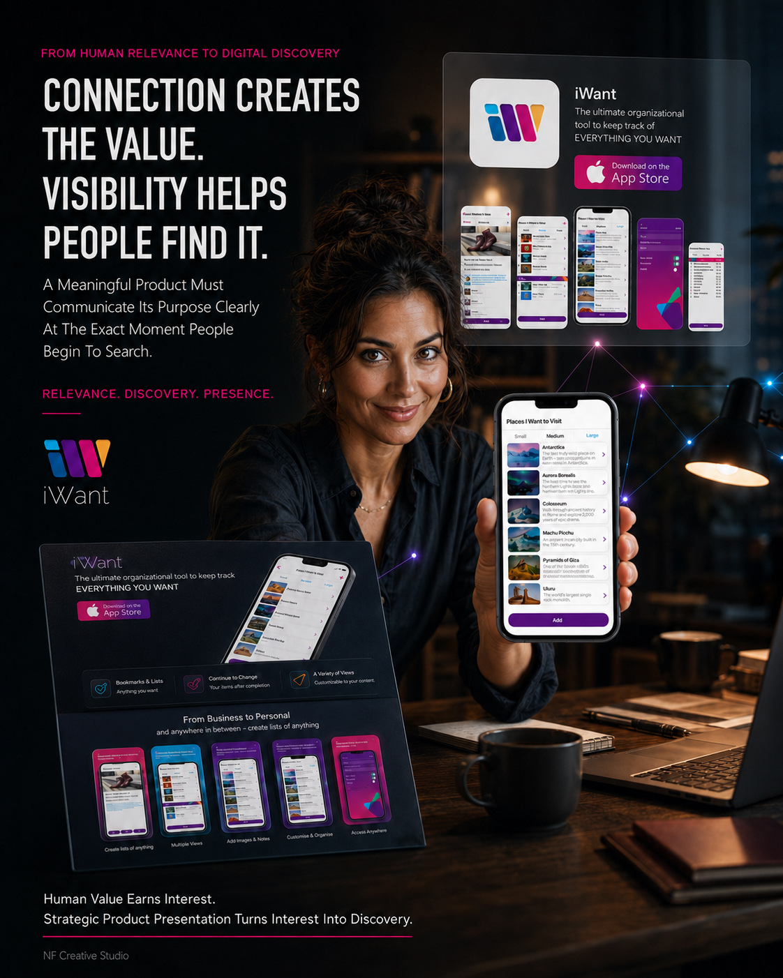
CHAPTER 07
FROM PRODUCT EXPERIENCE TO DIGITAL DISCOVERY
DESIGNING THE EXPERIENCE BEFORE THE FIRST INTERACTION
How Website Architecture, Product Communication, Responsive Design, And Clear Calls To Action Transformed A Complete Mobile Product Into One Connected Public Digital Experience.
A digital product begins creating expectations before it is ever downloaded.
People encounter its identity, message, interface, and purpose through the digital environments surrounding the product. Before they can experience how it works, they must understand what it offers, why it matters, and whether it belongs within their lives.
For iWant, this moment of discovery required the same strategic clarity that had already shaped the application itself.
The mobile product was designed to help people preserve, organize, and revisit personally meaningful intentions. The website needed to make that value understandable to someone encountering iWant for the first time.
It could not rely on a list of functions or a collection of attractive interface screens.
The complete Website User Experience needed to guide visitors from recognition toward relevance, from relevance toward understanding, and from understanding toward a clear next action.
Every section therefore performed a specific communication responsibility.
The opening experience introduced the product and established immediate recognition. Product communication translated interface functionality into human value. Authentic application screens demonstrated how that value existed in practice. The responsive system preserved the same story across desktop, tablet, and mobile environments. Carefully positioned calls to action connected product understanding with App Store discovery.
The application organized personal intentions.
The website organized the understanding of the application.
Together, they created one coordinated Web And Mobile Design System in which product experience and public communication supported the same purpose.
FROM FIRST IMPRESSION AND PRODUCT UNDERSTANDING TO RESPONSIVE EXPERIENCE, CLEAR ACTION, AND ONE COMPLETE DIGITAL PRESENCE.
DISCOVER. UNDERSTAND. CONNECT.
“Before People Can Experience A Digital Product, They Must First Understand Why It Deserves A Place In Their Lives.”
MACRO SECTION 01
FROM FIRST IMPRESSION TO PRODUCT UNDERSTANDING
BUILDING A DIGITAL PATH FROM CURIOSITY TO CLARITY
The Website Was Structured Around The Questions Visitors Naturally Ask—Allowing Recognition, Relevance, Understanding, Confidence, And Action To Develop In A Deliberate Sequence.
The official iWant website was not organized as a collection of independent promotional sections.
It was designed as a progressive Digital Discovery Experience.
Someone encountering the product for the first time would not possess the strategic, structural, and experiential context developed throughout the design process. They would need to understand the product gradually—without being overwhelmed by excessive information or asked to act before its value became clear.
The website architecture therefore followed a sequence of natural questions:
- What is iWant?
- Why could it matter to me?
- What can I use it for?
- How does the experience work?
- Who stands behind the product?
- What should I do next?
The opening communication established identity and immediate relevance before introducing detailed functionality.
Product sections then expanded that initial understanding through clear benefits, authentic interface examples, and recognizable use situations. Company and brand communication established credibility. App Store pathways appeared as a continuation of the story rather than as disconnected promotional demands.
This sequencing allowed the website to control not only what visitors encountered, but also when each type of information became useful.
The result was a deliberate Website Information Architecture through which every section prepared the visitor for the section that followed.
Digital Discovery Became Clear When Every Section Prepared The Question Answered By The Next.
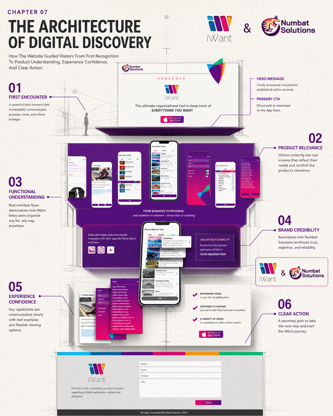
EXPLAIN THE PURPOSE
Beginning With The Human Situation Behind Every Capability.
Each feature was introduced through the personal intention, information need, or everyday situation it was designed to support.
REVEAL THE EXPERIENCE
Connecting Product Promises With Authentic Interface Evidence.
Real application screens demonstrated how communicated benefits became understandable and usable product interactions.
CONNECT VALUE TO ACTION
Introducing The Next Step After Meaning Became Clear.
Calls to action appeared when visitors could understand both what the product offered and why that capability could matter.
“The Website Created Relevance By Connecting Every Product Capability With A Human Reason To Care.”
STRUCTURING THE JOURNEY FROM RECOGNITION TO ACTION
Every Website Section Was Given A Clear Communication Responsibility—Allowing Product Recognition, Relevance, Understanding, Confidence, And Action To Develop As One Connected Digital Journey.
The iWant website was designed around the way product understanding naturally develops.
Before visitors could explore individual features or consider downloading the application, they first needed to recognize the product, understand its purpose, and see how it could become relevant within their own lives.
The website architecture organized that progression deliberately.
The opening experience established immediate identity and product relevance. Feature communication then translated application capabilities into understandable human value. Authentic interface screens provided visible evidence of how the experience worked, while Numbat Solutions communication strengthened credibility and connected the product with the team behind it.
Only after purpose, functionality, and experience had become clear did the website introduce the final pathway toward App Store discovery.
Every section therefore performed more than a visual or informational role. Each one answered a specific visitor question and prepared the understanding required for the next stage of the journey.
This transformed the complete Website Information Architecture into a structured Digital Discovery Experience—connecting first recognition, product understanding, experience confidence, and meaningful action within one continuous narrative.
RECOGNIZE THE PRODUCT
Establishing identity, purpose, and immediate relevance from the first encounter.
UNDERSTAND THE EXPERIENCE
Connecting product capabilities with human meaning and authentic interface evidence.
CONTINUE WITH CONFIDENCE
Introducing App Store action only after the product’s value had become clear.
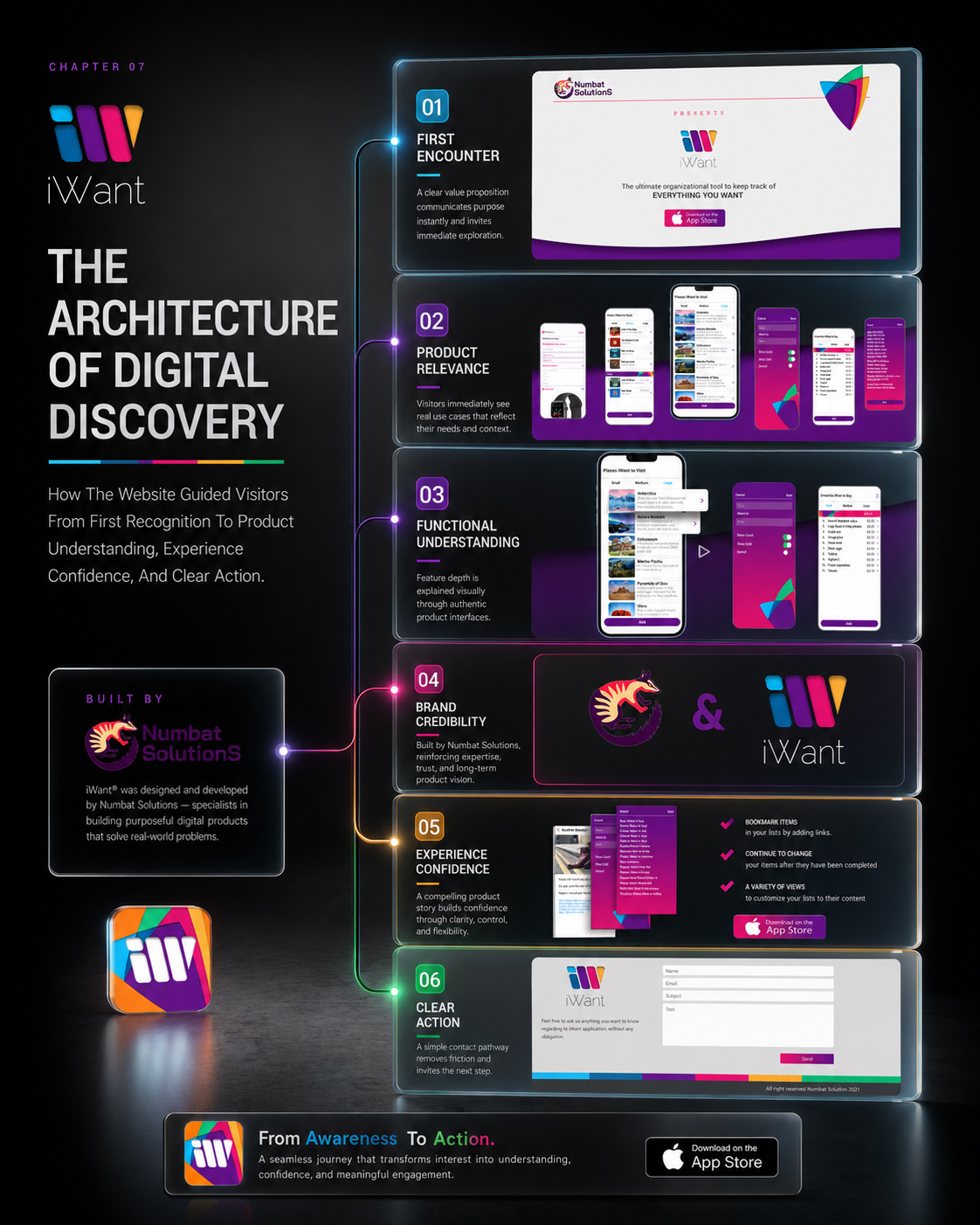
FROM WEBSITE STRUCTURE TO CLEAR DIGITAL DISCOVERY
Together, these interactions created a Digital Product Design journey that remained coherent as users moved between different moments and levels of information.
The system preserved enough familiarity to make each return feel immediate, while allowing personal content to change according to real circumstances.
The result was not simply an interface through which actions could be completed.
It was a continuous User Experience Design system through which intentions could remain active and understandable over time.
“The Product Felt Continuous Because Every Return Began With Something The User Already Recognized.”
MACRO SECTION 02
FROM INTERFACE FUNCTIONALITY TO HUMAN RELEVANCE
TURNING PRODUCT FEATURES INTO A STORY PEOPLE COULD UNDERSTAND
The Website Translated What The Application Could Do Into A Clearer Understanding Of What Those Capabilities Could Mean Within Everyday Life.
Product functionality rarely becomes persuasive through technical explanation alone.
People do not choose a digital product simply because it contains lists, viewing modes, editable information, image fields, external links, or completed states. They respond when they can recognize how those capabilities relate to something they already want to preserve, organize, understand, or accomplish.
The iWant website therefore needed to translate interface functionality into human relevance.
Personalized lists were presented as places for different intentions.
Flexible content views became a way to control how much information was visible at a particular moment.
Images, notes, and external links demonstrated how useful context could remain connected to an item.
Editing showed that saved information could evolve instead of becoming static.
Completed items represented progress while preserving a meaningful relationship with what came before.
Authentic interface screens were essential within this communication system.
They did not function as decoration or abstract product imagery. They provided visual evidence that the promises communicated by the website belonged to a real and coherent Mobile App Experience.
Feature explanation, human value, interface evidence, and calls to action were therefore treated as one connected narrative.
The website did not simply tell visitors what iWant contained.
It helped them understand what the product could allow them to do.
“A Feature Becomes Persuasive When People Can Recognize The Difference It Could Make In Their Own Experience.”
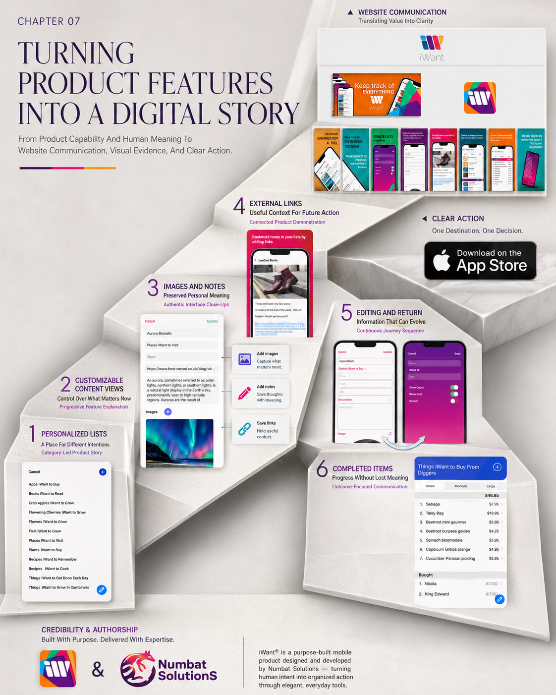
EXPLAIN THE PURPOSE
Beginning With The Human Situation Behind Every Capability.
Each feature was introduced through the personal intention, information need, or everyday situation it was designed to support.
REVEAL THE EXPERIENCE
Connecting Product Promises With Authentic Interface Evidence.
Real application screens demonstrated how communicated benefits became understandable and usable product interactions.
CONNECT VALUE TO ACTION
Introducing The Next Step After Meaning Became Clear.
Calls to action appeared when visitors could understand both what the product offered and why that capability could matter.
“The Website Created Relevance By Connecting Every Product Capability With A Human Reason To Care.”
TURNING PRODUCT CAPABILITIES INTO HUMAN VALUE
Every Product Feature Was Connected With A Recognizable Human Purpose—Allowing Functionality, Personal Meaning, Authentic Interface Evidence, And Action To Become One Continuous Digital Story.
The iWant website was designed to communicate more than the technical capabilities of the application.
Before individual features could become persuasive, visitors needed to understand how those capabilities could support something meaningful within their own lives.
The website translated functionality into human relevance deliberately.
Personalized lists became places for different intentions. Flexible content views gave people control over what mattered at a particular moment. Images, notes, and external links preserved useful context around every saved item, while editing allowed information to evolve rather than remain static.
Completed items communicated progress without separating users from the meaning attached to what they had already achieved.
Authentic application screens provided visible evidence throughout this narrative.
They demonstrated that every communicated benefit belonged to a real and coherent product experience. Website messaging introduced the human purpose, while interface examples revealed how that purpose became practical interaction.
Only after capability, meaning, and experience had become connected did the website introduce the next step toward App Store discovery.
This transformed conventional feature communication into a structured Digital Product Story—connecting what the application could do with why those capabilities could matter and how people could experience them in practice.
EXPLAIN THE PURPOSE
Beginning with the human intention, information need, or everyday situation behind every product capability.
REVEAL THE EXPERIENCE
Using authentic application screens to demonstrate how communicated value became a clear and usable interaction.
CONNECT VALUE TO ACTION
Introducing App Store discovery after product capability and personal relevance had become understandable.
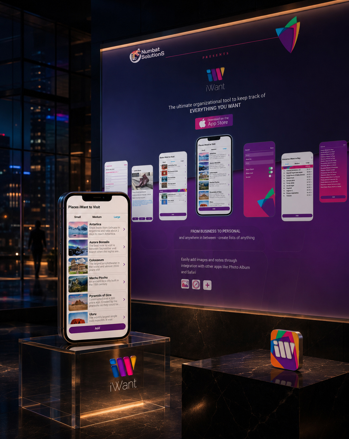
FROM PRODUCT CAPABILITY TO MEANINGFUL CLARITY.
Together, these relationships created a Digital Product Story that connected what the application could do with why those capabilities could matter.
Authentic interface evidence allowed every communicated benefit to remain grounded in the real iWant experience.
The result was not simply a website describing a collection of product features.
It was a coherent Product Communication System through which functionality became understandable, relevant, and persuasive before action was introduced.
“A Product Capability Became Meaningful When People Could Recognize The Human Purpose Behind It.”
MACRO SECTION 03
FROM RESPONSIVE LAYOUT TO CONTINUOUS DIGITAL EXPERIENCE
PRESERVING THE SAME PRODUCT STORY ACROSS EVERY DEVICE
Desktop, Tablet, And Mobile Compositions Changed According To Their Context—While The Sequence Of Recognition, Understanding, Evidence, And Action Remained Intact.
Responsive design was not treated as the mechanical reduction of one desktop composition.
Every device introduced different conditions.
Screen width changed the relationship between text and imagery. Reading rhythm became more vertical. Navigation required different behavior. Product visuals occupied different levels of attention. Content entered and left the visible area at different moments. Calls to action needed to remain accessible without interrupting the story.
The composition therefore needed to adapt.
The product story did not.
Across desktop, tablet, and mobile experiences, visitors still needed to recognize iWant, understand its relevance, explore its capabilities, see authentic product evidence, and encounter a clear pathway toward the App Store.
The responsive system preserved this sequence while reorganizing how its individual elements behaved.
Wide desktop layouts could establish simultaneous relationships between message, interface, and brand imagery.
Tablet compositions concentrated those relationships into more focused modules.
Mobile layouts transformed the same content into a carefully paced vertical experience in which hierarchy and sequence became even more important.
Spacing, scale, navigation, image position, content density, and CTA placement changed according to the device.
Meaning, recognition, and communication priority remained consistent.
This created one complete Responsive Website Design system—not because every layout looked identical, but because every layout protected the same product understanding.
“One Experience Was Not Created By Preserving Every Layout. It Was Created By Preserving What Every Layout Needed To Communicate.”
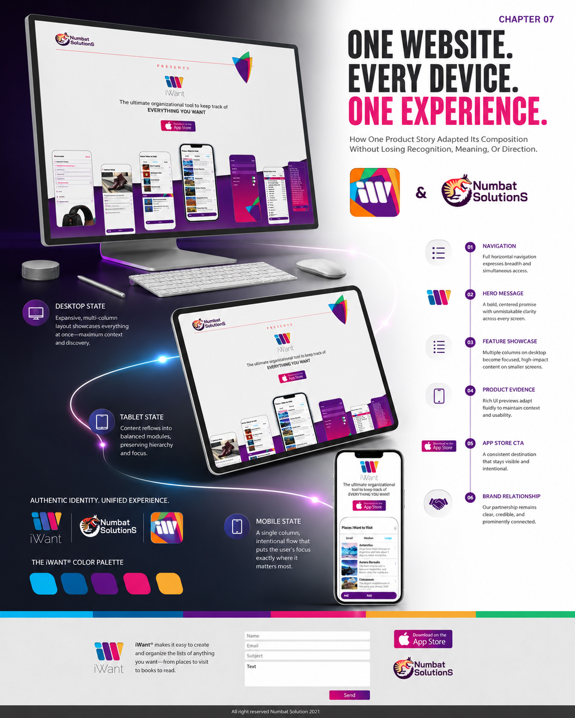
PRESERVE THE STORY
Maintaining The Complete Journey Across Every Screen Size.
The sequence from product recognition and relevance to interface evidence and action remained understandable throughout every responsive state.
ADAPT THE COMPOSITION
Responding To The Way Each Device Is Read And Used.
Content scale, spacing, navigation, hierarchy, visual relationships, and scrolling rhythm changed according to the available screen conditions.
PROTECT THE NEXT STEP
Keeping Meaningful Action Clear And Accessible.
Every responsive composition maintained a natural pathway from product discovery toward App Store connection.
“The Composition Changed With The Device. The Meaning, Recognition, And Direction Of The Experience Did Not.”
PRESERVING ONE PRODUCT STORY ACROSS EVERY DEVICE
Every Responsive Composition Adapted To The Conditions Of Its Screen—While Product Recognition, Communication Priority, Authentic Evidence, And Clear Action Continued As One Connected Experience.
The iWant website was designed to preserve one continuous product story across desktop, tablet, and mobile environments.
Responsive design was not approached as the mechanical reduction of a desktop layout.
Every screen condition changed how visitors encountered and understood the content.
Desktop allowed messaging, interface imagery, and calls to action to exist through broader spatial relationships. Tablet reorganized those relationships into more concentrated content modules. Mobile transformed the same communication into a carefully paced vertical journey.
Scale, spacing, navigation, hierarchy, image position, content grouping, and scrolling rhythm adapted according to each device.
The meaning of the experience remained consistent.
Visitors could still recognize iWant, understand its relevance, explore its capabilities, encounter authentic interface evidence, and continue naturally toward App Store discovery.
The same key content remained traceable throughout every responsive state, even when its composition and relationship with surrounding elements changed.
This transformed three different screen conditions into one coordinated Responsive Website Experience—preserving recognition, understanding, evidence, and direction without forcing every layout to look identical.
PRESERVE THE STORY
Maintaining the complete journey from product recognition and understanding to authentic evidence and action.
ADAPT THE COMPOSITION
Reorganizing scale, spacing, navigation, hierarchy, and content rhythm for the way each device is experienced.
PROTECT THE NEXT STEP
Keeping the pathway toward App Store discovery clear and accessible throughout every responsive state.
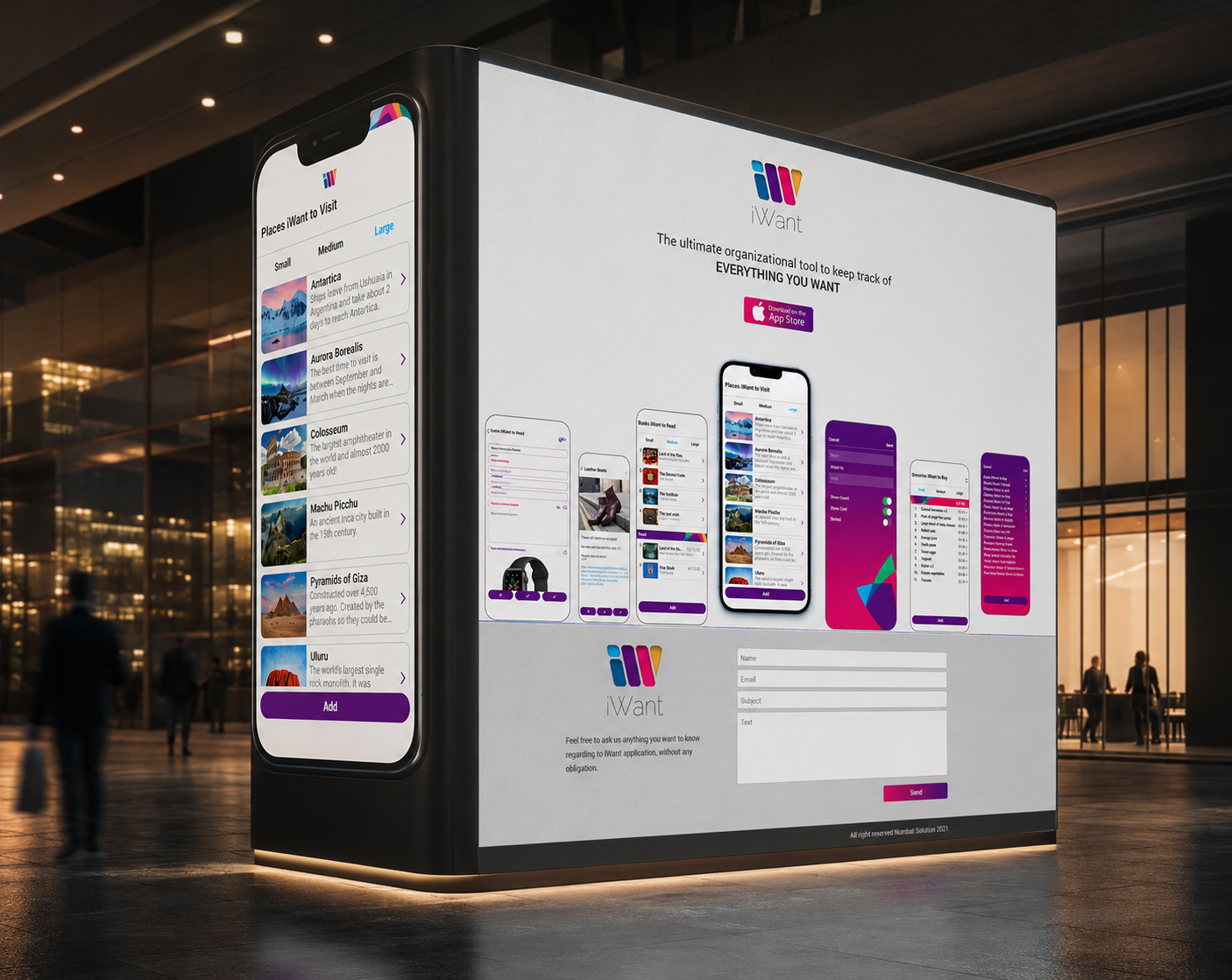
FROM RESPONSIVE ADAPTATION TO ONE CONTINUOUS EXPERIENCE
Together, these responsive states created a Responsive Website Design system that remained coherent as visitors moved between different devices and screen conditions.
Each composition adapted its scale, hierarchy, spacing, navigation, and rhythm while preserving the same product story and communication priorities.
The result was not simply one desktop layout reproduced at smaller dimensions.
It was a continuous Digital Experience through which recognition, understanding, authentic evidence, and action remained connected across every device.
“The Experience Remained Continuous Because Every Responsive State Preserved What People Needed To Recognize, Understand, And Do Next.”
“The Experience Remained Continuous Because Every Responsive State Preserved What People Needed To Recognize, Understand, And Do Next.”
FINAL CHAPTER CONCLUSION - 07
FROM DIGITAL DISCOVERY TO ONE COMPLETE PRODUCT ECOSYSTEM
WHEN PRODUCT EXPERIENCE AND PUBLIC COMMUNICATION MOVE TOGETHER, THE DIGITAL STORY BECOMES COMPLETE
The Final Website Experience Connected Product Purpose, Public Understanding, Authentic Interface Evidence, Responsive Continuity, And Clear Action Into One Recognizable Digital Presence.
Chapter 07 completed the public dimension of the iWant experience.
The application had already transformed different personal intentions into a clear, flexible, and recognizable Mobile App UX/UI Design system.
The website extended that system into the moment before product use.
It gave the experience a place to be discovered.
It translated functionality into understandable human value.
It used authentic interface screens to connect product promises with visible evidence.
It organized content according to the questions visitors naturally needed answered.
It preserved the same story across desktop, tablet, and mobile environments.
And it created a clear pathway through which understanding could become action.
The website did not repeat the mobile application.
It revealed the purpose, relevance, and possibility already contained within it.
Across the complete project, strategy defined why iWant should exist. Brand identity made that purpose recognizable. Information Architecture organized its possibilities. User Experience Design transformed them into meaningful interactions. The Mobile App Design System protected consistency across the product. The website then made the complete experience publicly visible, understandable, and accessible.
Each layer performed a different responsibility.
Their connection created the complete digital product.
iWant could now be recognized before it was opened, understood before it was used, and experienced through one continuous relationship between identity, communication, interaction, and human intention.
The conclusion was not a separate promotional website placed around a finished application.
It was one complete Digital Product Ecosystem in which product experience and public communication finally worked together.
THE PRODUCT CREATED PERSONAL VALUE.
THE WEBSITE CREATED PUBLIC UNDERSTANDING.
THE COMPLETE SYSTEM CREATED ONE RECOGNIZABLE DIGITAL PRESENCE.
“The Story Became Complete When People Could Discover The Product With The Same Clarity With Which They Could Experience It.”
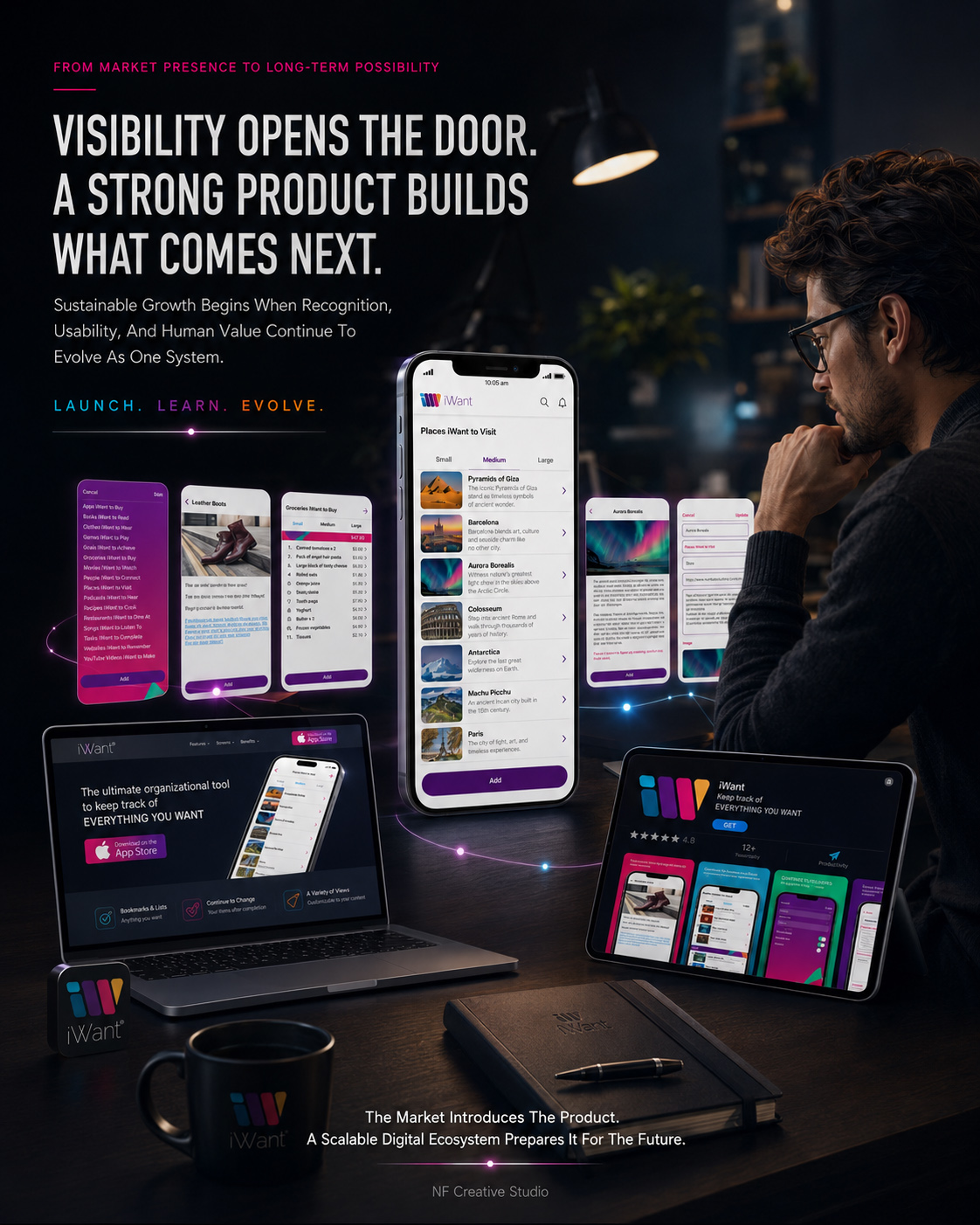
Together, these interactions created a Digital Product Design journey that remained coherent as users moved between different moments and levels of information.
The system preserved enough familiarity to make each return feel immediate, while allowing personal content to change according to real circumstances.
The result was not simply an interface through which actions could be completed.
It was a continuous User Experience Design system through which intentions could remain active and understandable over time.
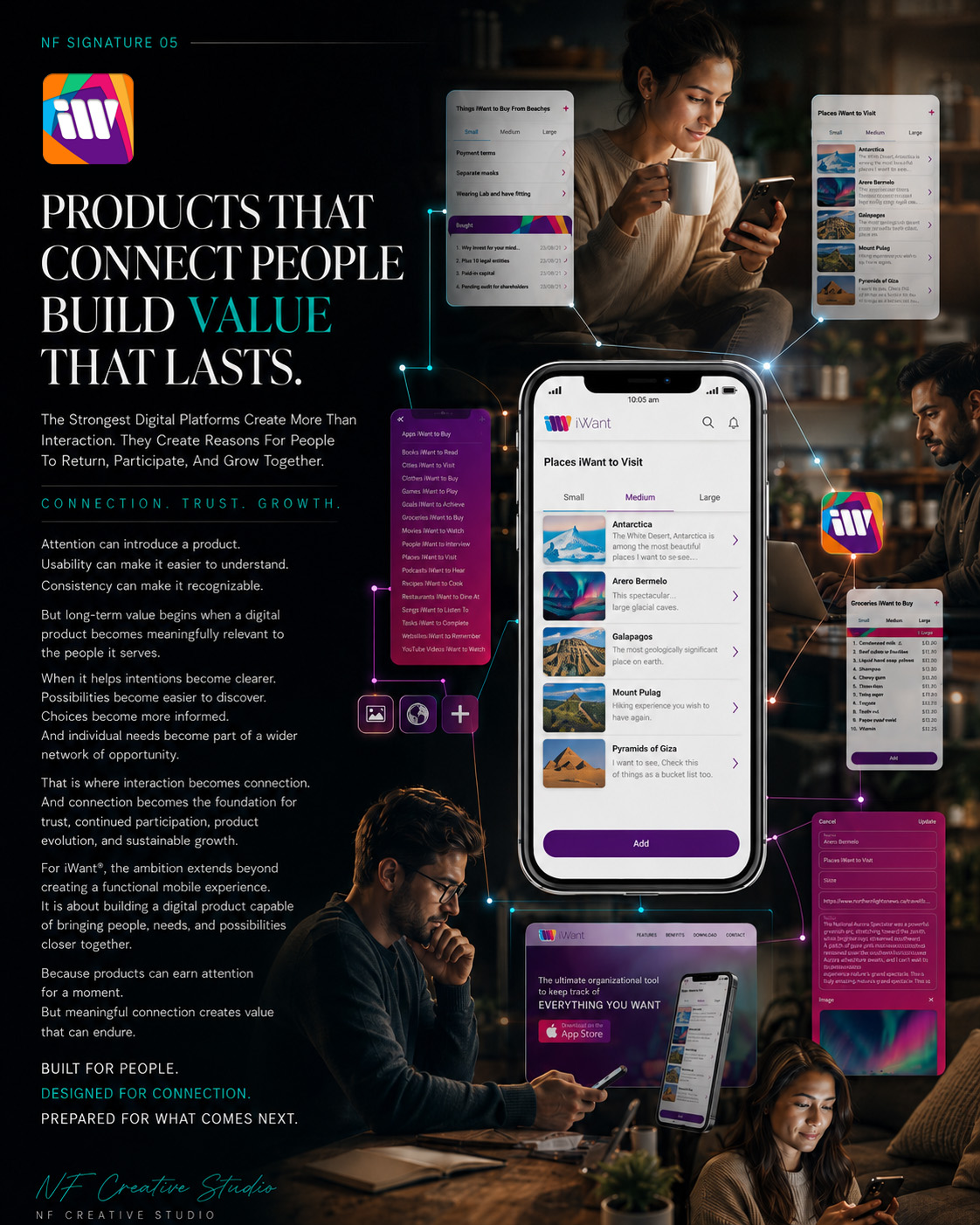
The Final Result
FROM HUMAN-CENTERED STRATEGY TO MEANINGFUL DIGITAL VALUE
When Every Interaction Supports The Same Human Intention, Connection Becomes Natural.
Every successful Digital Product Experience is ultimately measured by one thing—
not by how many features it contains,
but by how clearly it helps people move forward.
Throughout the iWant® project, every strategic decision, user-flow refinement, interface component, visual identity element, and cross-platform application contributed to one unified objective:
creating a digital product that helps people organize what matters, discover relevant possibilities, and connect personal intentions with meaningful opportunities.
Rather than delivering isolated digital assets, the project established a complete Human-Centered Product Ecosystem designed to support future development while preserving clarity, recognition, and purposeful interaction.
PROJECT OUTCOMES:
✓ Complete Digital Brand Identity System
A unified visual language that creates immediate recognition across the mobile application, website, App Store presentation, and every supporting digital touchpoint.
✓ Scalable UX/UI Product Architecture
A flexible interface framework prepared for future features, additional content types, evolving user needs, and long-term platform development.
✓ Clearer User Flow & Navigation
Purposeful information architecture and intuitive interaction paths simplify discovery while helping users understand where they are and what they can do next.
✓ Meaningful Product Interaction
Lists, bookmarks, supporting content, and adaptable layouts work together to transform personal intentions into organized and useful digital experiences.
✓ Consistent Cross-Platform Experience
From mobile interfaces and responsive web presentation to marketplace communication, every touchpoint communicates the same product purpose and visual identity.
✓ Long-Term Digital Product Foundation
Instead of solving only the immediate interface challenge, the project established a strategic system capable of supporting continued evolution and future platform growth.
STRATEGIC IMPACT:
The value of this project extends far beyond Mobile App Design.
It created a connected framework where Digital Product Strategy, Human-Centered UX Design, Information Architecture, Digital Brand Identity, and cross-platform communication work together as one coherent system.
This transforms iWant® from a collection of designed screens into a meaningful digital product capable of strengthening recognition, simplifying user decisions, supporting engagement, and protecting long-term product clarity.
WHAT THIS PROJECT DELIVERED:
✓ Immediate Product Recognition
✓ Human-Centered Product Positioning
✓ Scalable UX/UI Architecture
✓ Intuitive Information Structure
✓ Clearer User Journey System
✓ Unified Cross-Platform Experience
✓ Stronger Digital Brand Consistency
✓ App Store Product Presentation
✓ Future Product Expansion Readiness
✓ Editorial-Level Product Presentation
✓ Responsive Website Experience
✓ A Complete Digital Product Ecosystem
FINAL STATEMENT
Great digital design is rarely remembered because every screen looks polished. It is remembered because it quietly makes discovery, organization, and interaction feel natural. That is what this project achieved. Not simply a better interface. Not simply a stronger identity. A clearer product purpose. A connected experience. A digital platform prepared for the future.
ONE STRATEGY. ONE PRODUCT. ONE CONNECTED DIGITAL ECOSYSTEM.
| PROJECT SUMMARY | STATUS |
|---|---|
| Digital Product Strategy | ✓ Completed |
| Research & Discovery | ✓ Completed |
| Digital Brand Identity | ✓ Completed |
| Mobile App UX/UI System | ✓ Complete |
| Information Architecture | ✓ Established |
| User Flow Architecture | ✓ Complete |
| Navigation System | ✓ Finalized |
| Interaction Design | ✓ Completed |
| Interface Component System | ✓ Delivered |
| Typography System | ✓ Finalized |
| Color & Visual Language | ✓ Finalized |
| Responsive Website Design | ✓ Complete |
| App Store Presentation | ✓ Delivered |
| Cross-Platform Guidelines | ✓ Established |
| Future Expansion Platform | ✓ Successfully Built |
| PROJECT STATUS | STATUS |
|---|---|
| Product Strategy | ✓ Completed |
| Research | ✓ Completed |
| Human Needs | ✓ Established |
| Brand Identity | ✓ Developed |
| Mobile App UX/UI | ✓ Completed |
| Information Architecture | ✓ Structured |
| User Journey | ✓ Completed |
| User Flow | ✓ Finalized |
| Navigation | ✓ Validated |
| Interactions | ✓ Documented |
| Components | ✓ Systemized |
| App Icon System | ✓ Completed |
| Responsive Experience | ✓ Developed |
| App Store | ✓ Completed |
| Cross-Device Support | ✓ Delivered |
| Product Messaging | ✓ Established |
| Editorial Storytelling | ✓ Completed |
| Cross-Platform | ✓ Secured |
| Feature Framework | ✓ Integrated |
| Digital Ecosystem | ✓ Built |
ONE HUMAN NEED.
ONE PRODUCT VISION.
ONE CONNECTED DIGITAL EXPERIENCE.
| PROJECT CONCLUSION | STATUS |
|---|---|
| Final Product Delivery | ✓ Complete |
| Cross-Platform Readiness | ✓ Ready |
| Digital Product System | ✓ Established |
| Future Scalability | ✓ Secured |
“The Future Belongs To Digital Products That Don’t Simply Ask For Attention—They Understand Human Intent, Create Meaningful Connections, And Give People A Reason To Return.”
"Designing Digital Products That Inspire Progress, Build Habits, and Create Lasting Value."
Building More Than an App - Creating a Meaningful Digital Experience
The iWant project demonstrates how Strategic Branding, Mobile App Design, UX/UI Design, Digital Product Strategy, and User Experience come together to create more than a functional application—they create a product that people genuinely enjoy using.
From the earliest concept sketches and brand exploration to the final interface, App Store presentation, onboarding experience, motion design, and visual identity, every decision was driven by one objective: to simplify everyday organization while encouraging long-term engagement through intuitive design.
Rather than treating branding, interface design, and user experience as separate disciplines, they were developed as one unified ecosystem—ensuring every interaction reinforces the same message, personality, and emotional connection.
The result is a scalable digital product with a consistent identity, seamless usability, and a visual language that strengthens user trust, increases engagement, and supports sustainable product growth.
"Great digital products aren't remembered because they look beautiful—they're remembered because they make people's lives simpler, more meaningful, and impossible to imagine without."
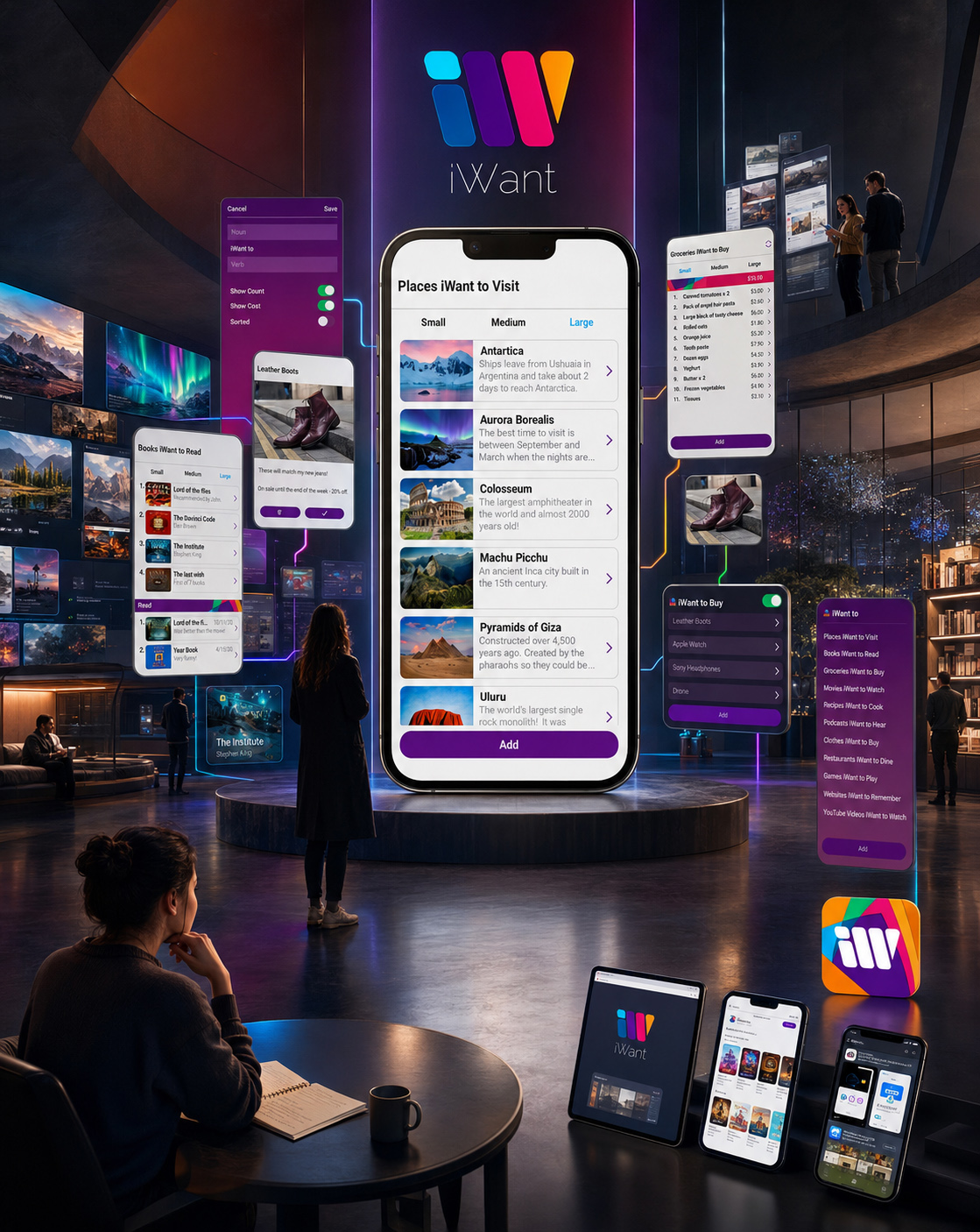
Human-Centered Digital Product Design As The Key To Meaningful Connection

Conclusion:
The Strongest Digital Products Don’t Simply Connect Screens — They Connect People, Needs, And Opportunities Through One Meaningful Experience.
Exceptional Digital Product Design begins with human understanding, strategic clarity, and a defined product purpose. For iWant®, the objective extended far beyond designing an attractive mobile application. NF Creative Studio developed a complete Mobile App UX/UI Design and Digital Brand Identity system connecting research, information architecture, user flows, interface design, responsive communication, and App Store presentation.
Different user intentions were transformed into a clear and intuitive product structure designed for easier discovery. Flexible lists organize personal interests, supporting content adds relevance, and carefully structured navigation helps users move confidently between saved ideas and new possibilities. Every interaction performs a defined role within one cohesive Human-Centered UX Design system.
The distinctive visual identity, expressive color palette, purposeful typography, recognizable iconography, and reusable interface components translate the strategy into a consistent digital experience. Across mobile, web, App Store presentation, and future platform extensions, the same Digital Brand Identity remains recognizable, accessible, functionally clear, and emotionally open.
What began as a mobile application concept became a scalable Digital Product Ecosystem connecting discovery, choice, organization, interaction, and future growth. When product strategy, visual communication, UX architecture, and technology work together, an interface becomes more than a collection of screens—it becomes a platform capable of supporting meaningful human connection.
If you are looking to create a distinctive Mobile App Design or build a scalable digital experience that performs across mobile, web, and marketplace environments, NF Creative Studio transforms strategic thinking into human-centered products designed for recognition, engagement, and lasting value.
“Successful Digital Products Don’t Compete Through More Features. They Earn Relevance Through Human Understanding, Meaningful Interaction, And An Experience People Want To Return To.”
FINAL THOUGHT
Great Digital Products Begin Long Before The First Screen Is Designed.
Every meaningful application starts with understanding people, their routines, and the everyday challenges they want technology to simplify. Successful digital products are not defined by features alone—they are built through thoughtful strategy, continuous refinement, and a commitment to creating intuitive user experiences that naturally become part of everyday life.
Every insight.
Every interaction.
Every improvement.
Each decision moved the product one step closer to becoming a digital experience that feels simple, effortless, and genuinely useful.
For iWant, organization became more than a feature.
It became a smarter way to live every day.
WHERE EVERYDAY ORGANIZATION BECOMES EFFORTLESS LIVING.
DESIGN IMPACT & DIGITAL PRODUCT VALUE
WHERE STRATEGIC UX/UI DESIGN CREATES A CONNECTED AND SCALABLE PRODUCT EXPERIENCE
CORE INTERFACE
SCREENS
One Connected Product Sequence
Eleven documented mobile screens present the central product experience—from list selection and content views to item details, creation, editing, and completed-item tracking.
ADAPTIVE CONTENT
VIEWS
Three Levels Of Information Control
Small, medium, and large content views enable users to control information depth while preserving consistent hierarchy, navigation, and interaction logic.
CONNECTED DIGITAL
ENVIRONMENTS
One Experience Across Mobile And Web
The mobile application and responsive website extend the same identity, interface principles, content structure, and recognizable product character across two digital environments.
USER-JOURNEY
STAGES
From Personal Intention To Continued Use
Five documented stages—Recognize, Position, Enrich, Organize, and Return—translate individual intentions into structured, editable, and reusable digital content.
CORE BRAND
COLORS
A Defined Palette Supporting Recognition
Eight coordinated colors establish hierarchy, interaction emphasis, navigation clarity, emotional character, and visual continuity throughout the iWant® digital product system.
SCALABLE PRODUCT
SYSTEM
One Unified Foundation For Future Development
A clearly structured combination of brand identity, interface components, content logic, and responsive behavior provides a consistent foundation for future product evolution.
STRATEGIC SUMMARY
The value of the iWant® experience is not defined by an unsupported performance claim. It is demonstrated through the disciplined connection of identity, information architecture, interface design, responsive behavior, and user-journey logic—transforming a personal idea into one coherent digital product system.
DESIGNED FOR CLARITY. STRUCTURED FOR CONTINUITY.
Proud Clients




























































The Team Behind the Project - Led by Creative Director
The Team Behind the Project:
Every Infinity Design Studio project is personally led and directed by Filip Narančić – Founder & Creative Director.
With a unique blend of creativity, strategy, and precision, Filip ensures that each project delivers premium quality, timeless design, and measurable impact.
Infinity Design Studio operates with a boutique approach, where every detail is carefully crafted, and each solution is tailored to the client’s vision and market demands. By combining multidisciplinary expertise with hands-on leadership, the studio transforms every project into a distinctive brand experience.

Filip Narančić
Founder & CEO – Infinity Design Studio

SPECIALIZED IN:

Short biography
Born on June 24, 1982, in Valjevo, Filip Narančić turned his passion for architecture and design into a thriving career. He graduated from the Faculty of Technical Sciences in Novi Sad, Department of Architecture and Urbanism. During his studies, he launched a pilot project that later evolved into today’s Infinity Design Studio.

What Our Clients Say About Us?
Trusted by global brands and visionary entrepreneurs — hear what they say about working with Infinity Design Studio.

We needed a new label for our maple syrup. From start to finish, Filip was right on top of the design, anychanges we requested, and was extremely good at communicating. We loved his style and highly recommend working with him!

The Gateway Farm
THE GATEWAY FARM
Worked perfectly together and carried out extremely quickly with corrections and changes.

MarceQ
BRAUEREI 2572
“Filip is an extremely talented designer. He was a pleasure to work with throughout this process. In addition to being very responsive, he was able to take a general idea and turn it into something we truly loved. Highly recommend!”

Jrossd
ECOMMDISTRIBUTION, ASHBROOK OUTDOORS
EXCELLENT!!! Filip is the best designer and even the best contractor I have ever worked with. Hecreated an awesome design and worked with me tirelessly from its greatness to its perfection. Now I havethe most gorgeous packaging on the market, and all my competitors are screwed. Hooray :-)!

Jakub.Novotny7
COPPER GEMZ
I really enjoyed working with Filip. He is very hardworking, and the service is truly excellent!

AromapetD
AROMAPET
Excellent professional, quick service. We recommend working with him!

Moltres
BROMELIFE
Filip was wonderful to work with! As a first-timer in product packaging design, I just asked for eye-catching packaging. He exceeded all of our expectations, and we highly recommend working with Filip – you won’t be disappointed!

Fatime.Perazic
TRIDENT POSEIDON
I NEED MORE THAN 5 STARS TO RATE FILIP. His relentless commitment and creativity made thisproject a dream come true. Highly recommended!

Wong.Jameson
UNO DOGGO
This designer is AMAZING! I can’t believe how easy it was to work with him on all the changes we madeto our box. He was so positive and encouraging, with great design ability! Highly recommended!

XoginaU
Dr. P RX
Filip is a very enthusiastic designer, proactively looking for various solutions and flexible in terms ofworking and communication. I am very pleased with the final design and our teamwork!

JaanP
LUCIDKITCHEN
Filip has done excellent work for our project! He’s quick and delivers great designs. Very attentive, very easy to work with, listens to and understands what I am trying to get done immediately. Thanks! Happy to work with him again!

This designer’s professionalism and creativity are truly commendable. We’re delighted with his work andhighly recommend collaborating with him. His talent and dedication consistently deliver outstandingresults.

Harmouch.Fk
NUTRIVEG LAB
Let’s Work Together
Infinity Design Studio is your trusted creative partner for Strategic CASE STUDIES that strengthen Brand Authority, build customer trust, and transform successful projects into powerful business assets.
Explore More Stunning Work
Tell Us What You’re Building.
Share what you already know—what you are creating, changing, improving, launching, or trying to solve. We’ll use that context to understand the project and determine the right next step.
You do not need a perfect brief to begin. Clear context is enough.