

VITAL COLON DETOX® – Elevating A Premium Supplement Brand Through Strategic Packaging And Amazon-First Design
FROM SUPPLEMENT PACKAGING DESIGN AND BRAND IDENTITY TO AMAZON VISIBILITY, CONSUMER TRUST, AND ONE COMPLETE WELLNESS BRAND ECOSYSTEM.
COMPANY - NUTRIVEG LAB

Client:
NUTRIVEG LAB
COUNTRY: France, Europe

Info:
Industry: Amazon, Dietary Supplements, E-Commerce, Health & Wellness, Retail
Market:
• United States
• European Union
• Amazon Marketplace
• Direct-To-Consumer
• International Market
Project Scope:
• Brand Strategy
• Brand Identity Design
• Supplement Packaging Design
• Label Information Architecture
• Amazon Content Development
• Product Photography
• Editorial Art Direction
• Lifestyle Visual Storytelling
• Material & Finish Exploration
• Brand Ecosystem Development
Products:
• Vital Colon Detox®
• Premium Dietary Supplement
• 30-Capsule Product Format
• Digestive Wellness Category
Brand Ecosystem:
• Brand Identity
• Packaging Architecture
• Typography System
• Color Psychology System
• Product Photography
• Lifestyle Photography
• Amazon Brand Experience
• Customer Education
• Brand Touchpoints
• Retention Experience
• Editorial Presentation
Process:
• Research
• Discovery
• Market Analysis
• Brand Strategy
• Information Mapping
• Visual Exploration
• Label Development
• Photography
• Amazon Optimization
• Editorial Execution
Strategic Focus:
• Consumer Trust
• Scientific Clarity
• Supplement Branding
• Product Differentiation
• Information Hierarchy
• Amazon Visibility
• Mobile-First Readability
• Premium Brand Perception
• Visual Consistency
• Customer Education
• Cross-Channel Recognition
• Long-Term Brand Growth
Packaging System:
• Complete Wraparound Label
• Front-Facing Priority Panel
• Side Information Panel
• Supplement Facts Panel
• Benefit Communication System
• Usage & Guidance System
• Trust Icon Architecture
• Production-Ready Label Artwork
Deliverables:
• Brand Strategy
• Brand Identity System
• Dietary Supplement Packaging
• Complete Label System
• Amazon Content System
• Product Photography
• Lifestyle Photography
• Macro Detail Studies
• Material & Finish System
• Visual Brand Guidelines
• Editorial Case Study
• Complete Brand Ecosystem
Premium Supplement Positioning Through Strategic Packaging Design
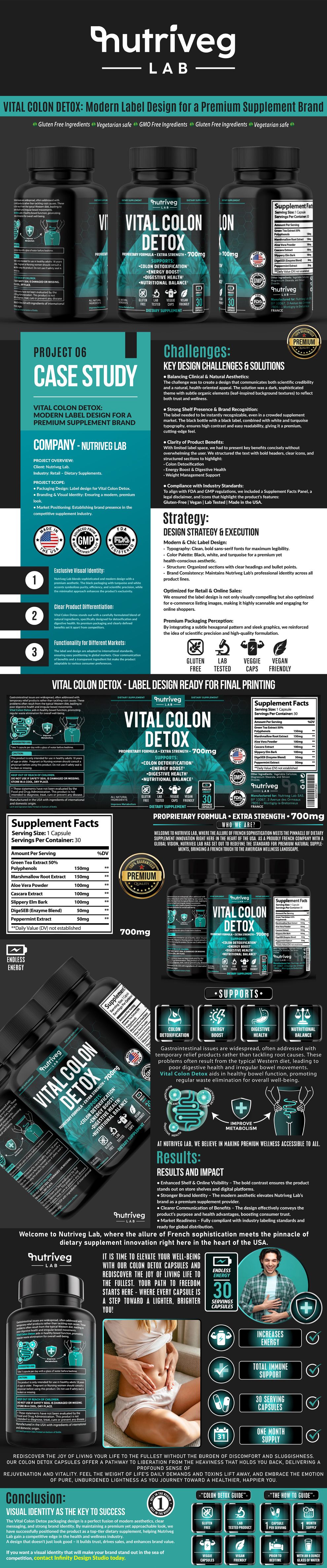
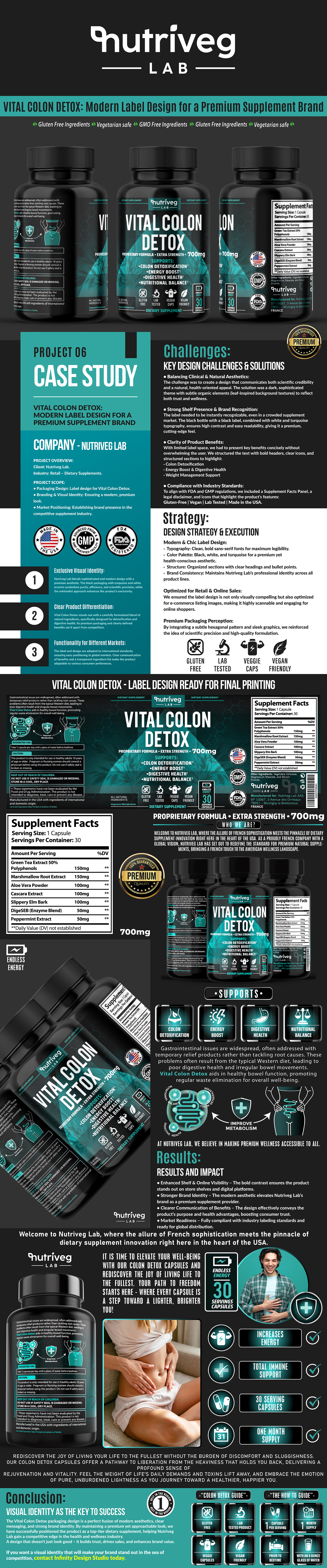
Vital Colon Detox® was developed for the highly competitive health and wellness supplement market, where Consumer Trust, Product Clarity, and immediate visual recognition strongly influence product evaluation. The objective was to create a premium Supplement Packaging Design system that organizes complex information, communicates product value with confidence, strengthens brand authority, and performs consistently across retail shelves, Amazon, and digital commerce.
Key Strategic Elements:
- Strategic Supplement Packaging Design developed to communicate essential product information clearly, improve Consumer Understanding, and support more confident product evaluation.
- Premium Wellness Brand Identity created to connect scientific precision with an approachable visual language while strengthening Brand Recognition and perceived product quality.
- Regulatory-Conscious Information Architecture structured to present ingredients, Supplement Facts, usage guidance, warnings, and supporting information with clarity, readability, and visual consistency.
- Amazon-Optimized Product Positioning designed to improve thumbnail recognition, mobile legibility, digital shelf visibility, and visual continuity across listing images, A+ Content, Brand Store, and web shop environments.
Brand Value & Market Impact
The completed Health Supplement Packaging system transformed Vital Colon Detox® from an isolated product presentation into a cohesive and recognizable wellness brand experience. By combining strategic Brand Communication, structured information hierarchy, premium Wellness Packaging Design, and Amazon-first visual consistency, the project established stronger Product Differentiation, clearer Customer Communication, and a scalable Brand Identity prepared for future retail, e-commerce, and product-line expansion.

Project Introduction
Building A Premium Supplement Identity Designed For Clarity And Built For Modern Commerce.
Nutriveg Lab is a French wellness brand focused on presenting premium dietary supplements through clear communication, considered design, and contemporary visual standards. As Vital Colon Detox® entered competitive retail and digital environments, it required a unified Supplement Packaging Design system capable of communicating product information with clarity while creating stronger visual recognition across every customer touchpoint.
Infinity Design Studio was commissioned to develop a complete Health Supplement Packaging strategy that combined Brand Identity, Visual Communication, Information Architecture, and Amazon-first product presentation into one cohesive system. Every element was carefully designed to balance scientific credibility, consumer accessibility, premium perception, and commercial performance.
Rather than treating the label, Amazon listing, photography, and supporting content as independent assets, the objective was to create one scalable Supplement Branding language capable of connecting packaging, e-commerce, education, lifestyle storytelling, and customer experience through consistent typography, color psychology, iconography, and recognizable product presentation.
Every design decision focused on strengthening Marketplace Visibility, improving Brand Recognition, supporting Consumer Confidence, and establishing a complete Wellness Brand Design system prepared for Amazon, web shops, premium retail environments, future product extensions, and long-term international brand growth.
Target Audience
Wellness-conscious adults who value premium quality, clarity and purposeful modern product design. Created for customers seeking a contemporary wellness experience expressed through Health Supplement Packaging that communicates scientific clarity, everyday relevance, trust, and premium positioning.
Project Objective
To transform Vital Colon Detox® into a visually unified wellness brand through focused Supplement Packaging Design, Brand Identity Development, information architecture, and a scalable Amazon-first system, capable of strengthening product recognition, digital visibility, and brand consistency.
The objective extended far beyond creating an attractive label. Every design decision was strategically developed to simplify complex information, strengthen marketplace differentiation, reinforce customer confidence across physical and digital touchpoints, and serve future brand growth.
About NUTRIVEG LAB®
Nutriveg Lab represents modern wellness built on scientific clarity, natural intelligence and purposeful premium design.
NF Creative Studio developed the Health Supplement Packaging System, covering Brand Identity Design, label architecture, typography, color psychology, finish exploration, Amazon content, editorial photography, lifestyle storytelling, and scalable brand guidelines.
The result is a wellness brand ecosystem capable of supporting current and future products while maintaining complete visual consistency across each physical and digital customer touchpoint.
Key Project Facts:
“Exceptional Craft Beer Brands Are Built Through Hundreds Of Strategic Design Decisions—Not Individual Labels.”
✓ Complete Supplement Packaging Design System
✓ Health Supplement Packaging Strategy
✓ Premium Supplement Branding
✓ Brand Identity Development
✓ Visual Communication System
✓ Packaging Information Architecture
✓ Amazon-First Brand Consistency
✓ Future Product Scalability
Project Impact:
“Great Packaging Doesn’t Simply Show The Product—It Builds Recognition Before The First Search.”
✓ Stronger Shelf & Digital Presence
✓ Premium Brand Perception
✓ Consistent Wellness Brand Experience
✓ Clearer Product Differentiation
✓ Higher Marketplace Recognition
✓ Stronger Consumer Confidence
✓ Scalable Amazon Content System
✓ Long-Term Brand Growth
Project Snapshot:
“Premium Supplement Packaging Is Where Strategy, Clarity, And Design Become Brand Experience.”
Industry
Health & Wellness · Dietary Supplements · E-Commerce · Premium Retail
Services
Supplement Packaging Design · Brand Identity · Visual Communication · Amazon Content · Product Photography · Editorial Storytelling
Objective
Transform a dietary supplement into a visually unified wellness brand capable of strengthening recognition, Amazon visibility, and lasting commercial value through one scalable Supplement Packaging Design system.
Deliverables
Complete Label Design System · Brand Identity · Amazon Content System · Editorial Photography · Lifestyle Visuals · Brand Ecosystem Maps
Focus
Product Clarity · Premium Branding · Clear Differentiation · Amazon Visibility · Consumer Confidence · Long-Term Brand Growth
Project Overview:
“Supplement Packaging Is Never Designed Around One Label—It Is Designed Around An Entire Brand System.”
Vital Colon Detox® already possessed a defined product formula, a defined Nutriveg Lab identity, and clear commercial potential.
NF Creative Studio was commissioned to transform this foundation into a complete Supplement Packaging Design system capable of communicating clarity before the product was explored in depth.
The project focused on developing a unified Label Design, Supplement Branding, Visual Identity, Packaging Strategy, and scalable communication architecture, capable of supporting future brand expansion without sacrificing consistency.
From typography, color psychology, information hierarchy and material selection to Amazon content and lifestyle storytelling, every design decision pursued one focused objective:
Creating One Complete Health Supplement Packaging System That Strengthens Product Recognition While Connecting Every Customer Touchpoint.
Project Scope:
- Premium Supplement Label Design
- Health Supplement Packaging Strategy
- Complete Brand Identity System
- Visual Identity Development
- Packaging Information Architecture
- Typography & Layout System
- Color Psychology & Product Differentiation
- Material & Finish Exploration
- Print & Production Preparation
- Amazon Marketplace Optimization
- Cross-Channel Brand Consistency
- Editorial Product Photography
- Lifestyle Brand Storytelling
- Future Product Line Scalability
"True Wellness Doesn't Begin With A Product—It Begins With How You Choose To Live."
Designing Wellness Experiences That Inspire Healthier Everyday Living
The pursuit of better health begins long before choosing a supplement—it begins with a commitment to feeling stronger, lighter, and more balanced every single day. Modern wellness is no longer defined by products alone, but by the lifestyle choices that support long-term vitality, sustainable habits, and overall quality of life.
For Nutriveg Lab – Vital Colon Detox, our objective extended beyond creating premium supplement packaging. We developed a sophisticated Brand Identity and Packaging Design System that transforms complex health benefits into clear, trustworthy, and visually engaging communication. By combining scientific credibility with modern aesthetics, intuitive information hierarchy, and premium visual storytelling, we created a brand experience that builds confidence, strengthens product perception, and reflects the lifestyle today’s health-conscious consumers aspire to achieve.
The Best Wellness Brands Don't Promise Better Health—They Inspire Better Living.
“Where Scientific Clarity Meets Purpose-Driven Supplement Packaging.”
VITAL COLON DETOX® — Elevating A Premium Supplement Brand Through Strategic Packaging And Amazon-First Design
“The Strongest Supplement Brands Don’t Simply Present Information—They Transform Complexity Into Clarity, Recognition, And Consumer Trust.”
Vital Colon Detox® by Nutriveg Lab required more than a conventional Supplement Packaging Redesign. The objective was to transform complex product information into a clear, premium, and recognizable brand experience capable of performing consistently across Amazon, retail, and e-commerce environments. Every creative decision was guided by one principle: product credibility begins with communication customers can understand.
Our approach combined Strategic Supplement Packaging Design, consumer-centered Information Architecture, and a scalable Wellness Brand Identity. By aligning packaging, typography, iconography, product photography, Amazon content, and lifestyle storytelling, the project created one consistent visual language designed to strengthen recognition, improve product clarity, and support future brand expansion.
THE SOLUTION INCLUDED:
- Premium Supplement Packaging Design strategically developed to communicate product value, establish a credible market presence, and create immediate visual recognition.
- Consumer-Centered Information Architecture designed to organize ingredients, benefits, usage guidance, Supplement Facts, and supporting information into one clear and accessible hierarchy.
- Complete Wellness Brand Identity created to connect scientific precision with contemporary wellness while strengthening Product Differentiation and visual consistency.
- Scalable Amazon & Brand Ecosystem developed to connect packaging, marketplace content, product photography, lifestyle communication, and future product extensions across every relevant customer touchpoint.
THE FINAL RESULT:
The completed project established a cohesive and recognizable Premium Wellness Brand Identity for Vital Colon Detox®. Rather than delivering isolated creative assets, the system connected Supplement Packaging Design, Amazon Visibility, Product Education, Editorial Photography, and Brand Communication within one scalable visual framework.
The result is a clearer and more consistent customer experience designed to support Product Recognition, Consumer Understanding, marketplace differentiation, and long-term growth across retail, e-commerce, and future wellness product lines.
“Exceptional Wellness Brands Don’t Simply Present Products—They Transform Clarity, Consistency, And Trust Into Lasting Brand Value.”
Download Case Study
Designing A Wellness Brand Customers Recognize Before The First Product Decision
Creating A Strategic Supplement Packaging System Where Visual Identity, Product Clarity, And Marketplace Consistency Work Together
Successful Supplement Packaging Design is about far more than creating an attractive label. Every visual decision must organize complex information, communicate product value, and help customers understand what they are evaluating across both physical and digital environments.
For Vital Colon Detox®, our objective extended beyond redesigning packaging. We developed a complete visual ecosystem in which Brand Identity, Information Architecture, Product Photography, Amazon Content, and Lifestyle Storytelling work together as one recognizable wellness brand experience—building clarity, reinforcing trust, and supporting long-term growth.
A Distinctive Visual Identity Built For Brand Recognition
Building Confidence Before The Product Is Fully Explored
Every successful supplement brand begins with a visual identity that communicates credibility, purpose, and premium quality before customers examine the details.
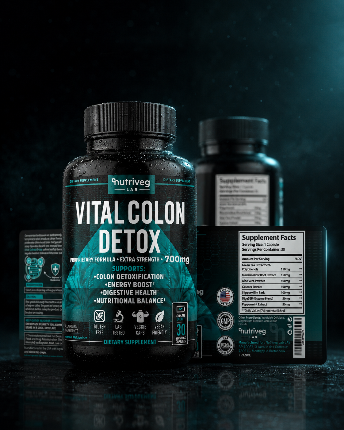
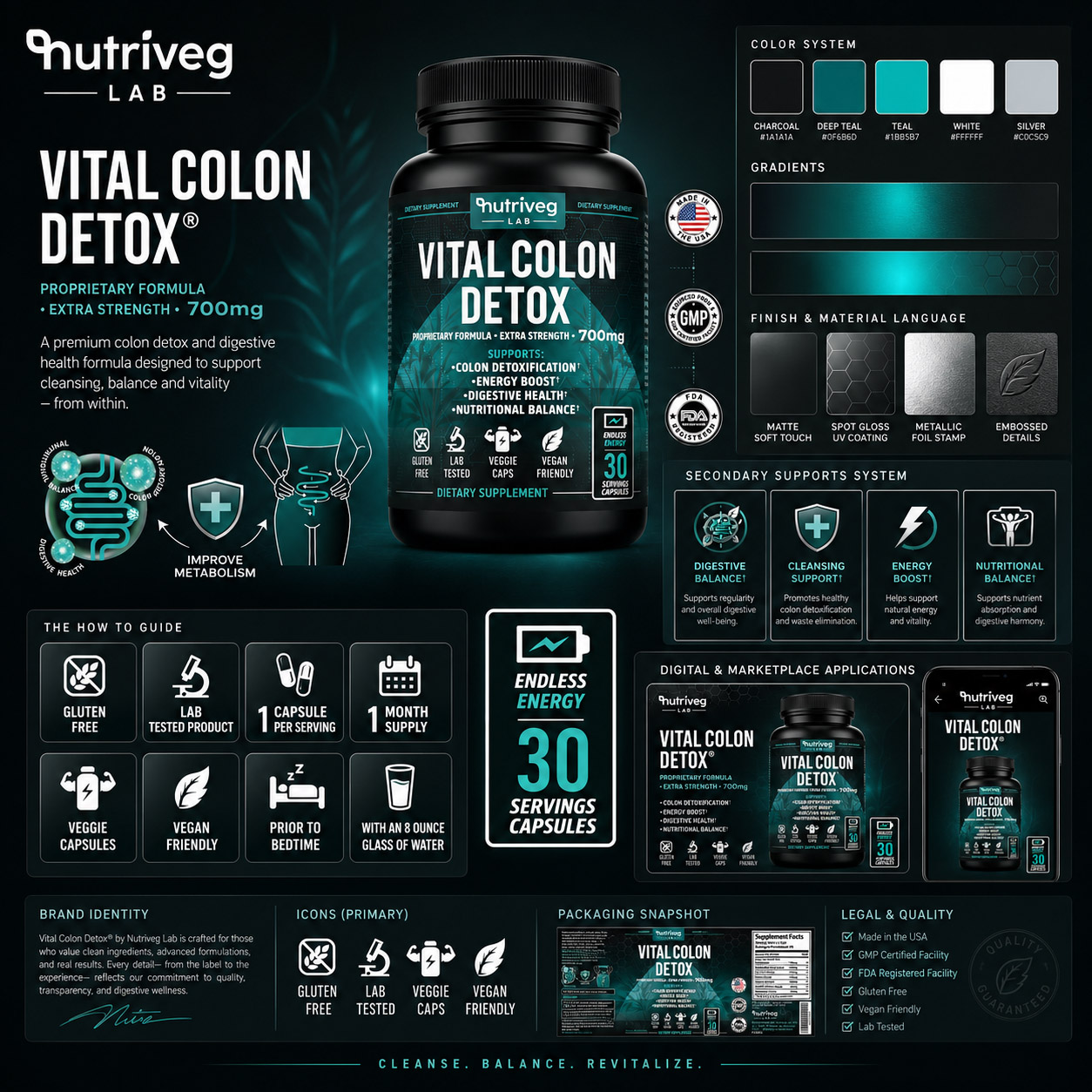
For Vital Colon Detox®, we developed a distinctive black and teal packaging language that connects scientific precision with contemporary wellness.
Typography, color psychology, iconography, and product presentation work together to strengthen brand recognition across every physical and digital touchpoint.
Clear Information Architecture Designed For Understanding
Turning Complex Information Into Customer Understanding
Exceptional supplement packaging must make complex information feel structured, accessible, and trustworthy from the first moment of evaluation.
For Vital Colon Detox®, ingredients, benefits, usage guidance, and supporting information were organized through one clear communication hierarchy.
Each label zone, icon, headline, and content module was designed to improve readability and also help customers navigate the complete product story with clarity and confidence.
One Consistent Brand System Built For Modern Marketplaces
Creating Recognition Across Amazon, Retail, And Commerce
Strong wellness brands are remembered when every customer interaction feels fully connected, recognizable, and intentionally designed across every channel.
For Vital Colon Detox®, the packaging became the foundation for Amazon content, product photography, lifestyle imagery, and digital communication.
Consistent typography, color, hierarchy, and product presentation create one scalable brand experience prepared for international retail visibility and future growth.
“Clarity Gives A Product Meaning. Consistent Design Gives Customers A Reason To Trust The Brand At Every Touchpoint.”

THE CHALLENGE:
TRANSFORMING COMPLEX SUPPLEMENT INFORMATION INTO A CLEAR, TRUSTED, AND MARKET-READY BRAND EXPERIENCE
Balancing Scientific Credibility With Human Wellness
The central challenge was to create a premium Supplement Packaging Design system capable of presenting detailed product information without appearing clinical, complicated, or visually overwhelming. The brand needed scientific precision without coldness, natural wellness without familiar category clichés, and premium aesthetics without unnecessary visual excess.
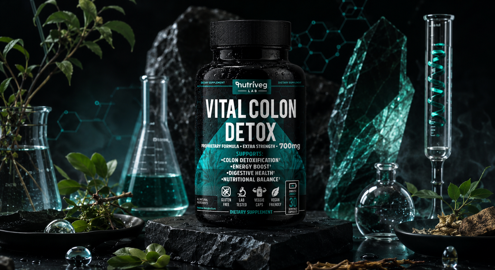
Deep charcoal, controlled teal, structured typography, and restrained botanical elements were brought together to create a visual language that feels credible, contemporary, and approachable—establishing a considered balance between product authority and everyday wellness.
Building Recognition In A Crowded Marketplace
Within the highly competitive dietary supplement category, Vital Colon Detox® needed to remain recognizable before customers examined the product in detail. This was particularly important across Amazon search results, mobile screens, e-commerce listings, and retail environments where products are evaluated quickly and often at a reduced scale.
The black bottle silhouette, dominant product-name typography, teal differentiation, controlled contrast, and clearly positioned information zones were designed to strengthen Digital Shelf Visibility, support faster Brand Recognition, and create a consistent presence across every commercial environment.
Turning Product Information Into Decision Architecture
Vital Colon Detox® required more than attractive packaging. Ingredients, strength, support statements, usage guidance, warnings, trust signals, and Supplement Facts all needed to coexist within one limited physical surface without competing for attention.
A structured Packaging Information Architecture was developed to guide customers through the product in a deliberate reading order:
- Product name and dosage strength
- Approved product-support statements
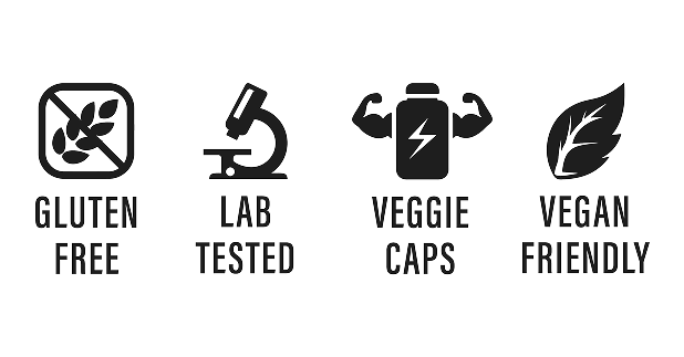
- Lifestyle and product attribute icons
- Serving quantity and usage guidance
- Ingredients and Supplement Facts
- Warnings and regulatory information
Every label zone was assigned a clear function, transforming dense content into an intuitive communication system designed to improve Readability, Product Understanding, and purchasing confidence.
Designing For Compliance, Clarity, And Consumer Trust
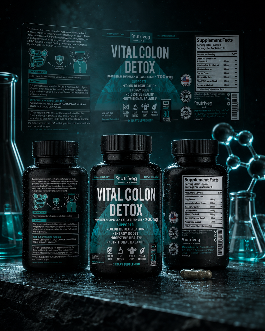
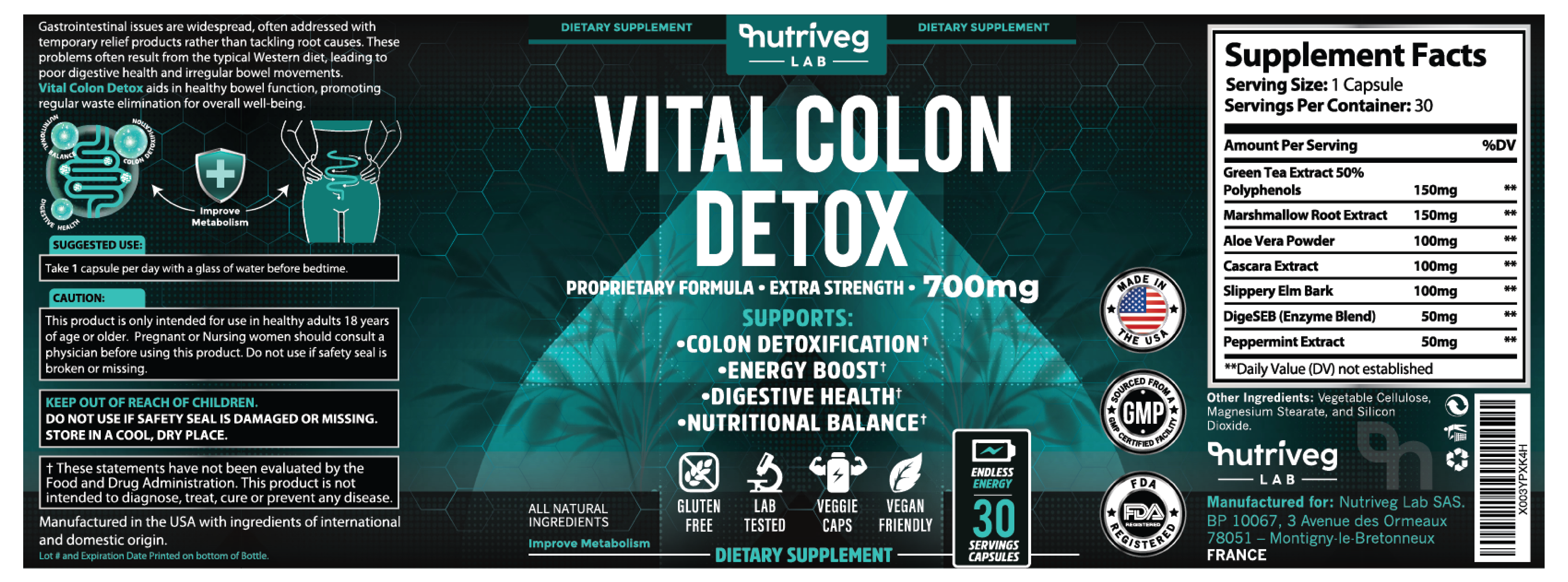
The final Dietary Supplement Packaging system needed to accommodate essential regulatory and production information without weakening the premium visual experience. Supplement Facts, ingredient information, suggested use, warnings, manufacturer details, traceability elements, barcode placement, and supplied trust marks were integrated into one consistent label architecture.
Rather than treating compliance content as a visual interruption, the system uses alignment, spacing, contrast, and controlled information density to make technical content feel intentional, accessible, and fully connected to the wider Wellness Brand Design.
INDUSTRY STANDARDS:
REGULATORY INFORMATION INTEGRATED AS PART OF THE BRAND EXPERIENCE
The completed Health Supplement Packaging system was structured around the supplied product information, production credentials, marketplace requirements, and relevant dietary supplement label content.
A dedicated Supplement Facts panel, clear ingredient presentation, usage guidance, warnings, manufacturer information, barcode, traceability details, and client-supplied certification assets were organized to support professional readability and production consistency.
This approach ensures that essential information is not visually separated from the brand experience. Every technical element contributes to the same objective: creating packaging that feels transparent, considered, and prepared for final production and regulatory verification across intended markets.

“Exceptional Supplement Packaging Doesn’t Hide Complexity—It Gives Every Detail A Clear Purpose.”
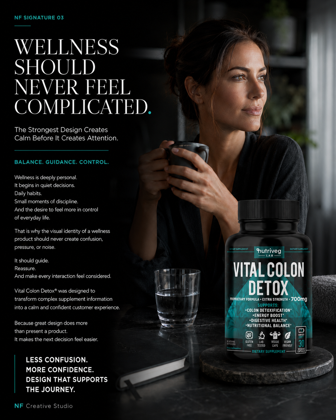
STRATEGY:
Scientific Packaging Strategy & Premium Brand Execution
“Premium Packaging Begins With Trust, Structure, And Scientific Clarity.”
Creating successful Supplement Packaging Design requires far more than visual impact. It demands a strategic balance between Consumer Trust, product communication, regulatory information, marketplace visibility, and long-term brand consistency.
For Vital Colon Detox®, the objective was to transform complex supplement information into a structured Dietary Supplement Packaging system capable of communicating purpose clearly while establishing a distinctive presence within the competitive wellness category.
Every design decision—from typography and information hierarchy to color, iconography, and label architecture—was developed to improve readability, reinforce Brand Recognition, and prepare the product to perform consistently across Amazon, e-commerce, and premium retail environments.
The Strategy Included:
- Strategic Supplement Packaging Design
A modern packaging system developed to communicate product purpose clearly, strengthen product credibility, and establish a premium market presence. - Consumer-Centered Information Architecture
A carefully organized hierarchy designed to simplify complex information and help customers recognize essential product details at a glance. - Scientific Wellness Brand Identity
Contemporary typography, controlled contrast, refined teal accents, and a subtle molecular pattern create a visual language connecting scientific precision with approachable wellness. - Amazon & E-Commerce Optimization
The label was structured to remain recognizable, readable, and commercially effective across thumbnails, mobile screens, digital listings, and supporting content. - Scalable Brand Consistency
A flexible Wellness Brand Design system prepared to support future extensions while preserving visual continuity, portfolio cohesion, and brand ownership.
The Selected Direction
The final direction combines professional aesthetics with strategic Brand Communication, transforming Vital Colon Detox® into a more confident and recognizable premium wellness product.
Rather than relying on decorative design or excessive messaging, the system uses structure, contrast, and purposeful information to create clarity. The result is a scalable Health Supplement Packaging foundation designed to support customer understanding, marketplace recognition, and long-term brand development.
“THE STRONGEST WELLNESS BRANDS EARN CONFIDENCE LONG BEFORE THE FIRST PRODUCT DECISION.”
FROM STRATEGIC THINKING TO A SCALABLE COMMERCIAL SYSTEM
STRATEGIC SYSTEM FRAMEWORK
ONE CLEAR DIRECTION. EVERY DESIGN DECISION WORKING TOWARD THE SAME COMMERCIAL OBJECTIVE.
One Unified Brand Strategy
Connecting Positioning, Packaging, And Market Performance.
The project was guided by one integrated strategy connecting Supplement Branding, product communication, visual differentiation, and marketplace presentation. Every creative decision was developed to strengthen recognition, simplify customer understanding, and establish a consistent foundation for long-term brand growth.
Five Strategic Design Pillars
Clarity. Credibility. Recognition. Consistency. Scalability.
Five principles directed the complete Supplement Packaging Design system. Together, they shaped the visual hierarchy, information architecture, product presentation, and brand communication required to create a premium identity that performs consistently across physical and digital customer environments.
Three Commercial Environments
Amazon. E-Commerce. Premium Retail.
The identity was designed to communicate effectively across three essential market environments. From Amazon thumbnails and mobile listings to branded webshops and Retail Packaging, the product maintains clarity, visual authority, and immediate recognition wherever customers discover and evaluate it.
One Scalable Packaging System
Built For The Product Today. Prepared For The Brand Tomorrow.
Rather than creating an isolated label, the project established one adaptable Dietary Supplement Packaging system. Its typography, color logic, iconography, and information structure can support future products while preserving complete visual consistency and recognizable Nutriveg Lab brand ownership.
The strategic value of this project lies in the relationship between its parts. Brand positioning informed the packaging. Packaging informed product communication. Product communication shaped the marketplace experience. Together, they created a connected Wellness Brand Design system built to perform beyond a single product launch.
“Strong Packaging Begins With Design. Scalable Brands Begin With A System.”
THE CHALLENGE:
CREATING AN AMAZON-FIRST PRODUCT EXPERIENCE FOR A PREMIUM WELLNESS BRAND
The Vital Colon Detox® project extended beyond Supplement Packaging Design into the development of a complete Amazon product presentation system. The objective was to translate the product’s packaging, information architecture, and visual identity into a digital experience capable of remaining clear, recognizable, and professionally consistent across search results, desktop listings, and mobile screens.
The challenge was not simply to make the product more visible. Every listing image needed to help customers move from initial recognition to product understanding without overwhelming them with information or separating the Amazon experience from the wider Nutriveg Lab identity.
To achieve this, the Amazon content system was developed around five strategic priorities:
- Create a High-Recognition Amazon Main Image that preserves product clarity and brand distinction at thumbnail scale.
- Develop a Mobile-First Information Hierarchy that keeps essential product information legible on smaller screens.
- Build a connected Amazon Visual Storytelling System combining product presentation, education, ingredients, lifestyle context, and usage guidance.
- Maintain consistent Brand Recognition across every listing image, A+ Content module, Brand Store asset, and supporting marketplace visual.
- Establish a scalable Amazon Content Framework prepared for future product extensions without sacrificing visual consistency.
The central challenge was to create an Amazon experience that does more than display the product. It needed to organize information, reduce uncertainty, reinforce product credibility, and guide customers through a clear and connected evaluation journey.
“The Strongest Amazon Experiences Don’t Demand Attention—They Earn It Through Clarity, Consistency, And Immediate Recognition.”
“GREAT AMAZON LISTINGS BEGIN WITH A HERO IMAGE THAT MAKES THE PRODUCT CLEAR BEFORE A SINGLE WORD IS EXPLAINED.”
PRODUCT COMMUNICATION
From Complex Supplement Information To Clear Customer Understanding
“The Most Effective Product Presentations Don’t Simply Add Information—They Give Every Detail A Clear Function.”

Vital Colon Detox® contains multiple layers of product information that must coexist within one limited visual space. Product identity, dosage strength, ingredients, approved support statements, usage guidance, trust indicators, warnings, and Supplement Facts all needed to remain accessible without competing for attention.
Rather than treating this content as one dense block, we developed a structured Visual Product Communication System in which every information category was assigned a deliberate position and level of priority. Typography, spacing, contrast, iconography, and visual grouping were used to establish a clear reading order from immediate recognition to detailed product evaluation.
The resulting Packaging Information Architecture transforms complex supplement content into a professional and intuitive customer experience. It supports Readability, reinforces Brand Consistency, and connects the physical label with Amazon content, educational graphics, and every additional digital presentation.
“Great Product Communication Doesn’t Remove Complexity—It Gives Customers A Clear Way Through It.”
CONSUMER GUIDANCE
FROM PRODUCT INFORMATION TO INTUITIVE CUSTOMER GUIDANCE
“The Best Product Experiences Don’t Simply Inform—They Help Customers Understand What Matters, When It Matters.”
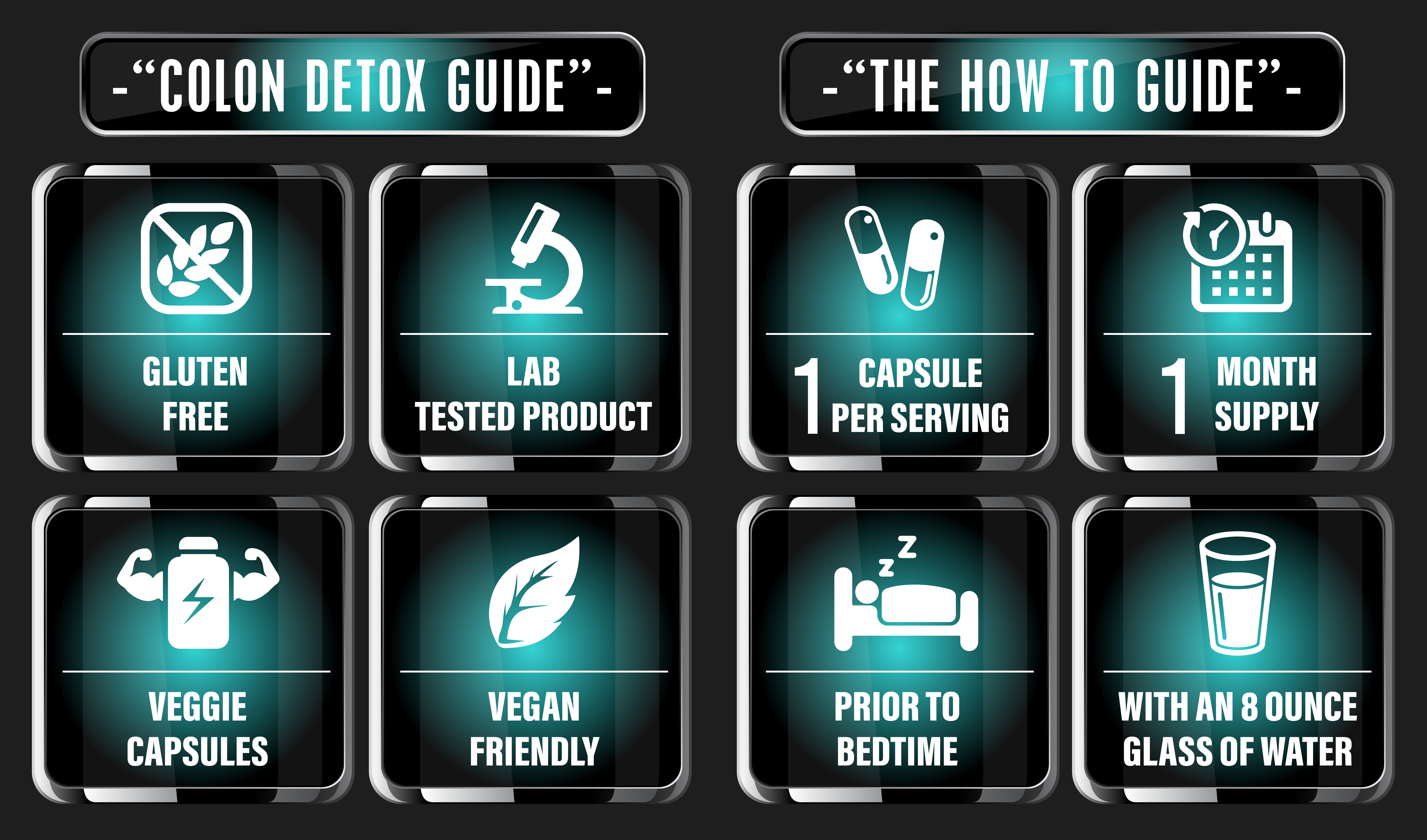
Effective Dietary Supplement Packaging must answer practical questions quickly. Customers need to recognize essential product attributes, understand serving information, locate usage guidance, and identify the details relevant to their evaluation without searching through visually disconnected content.
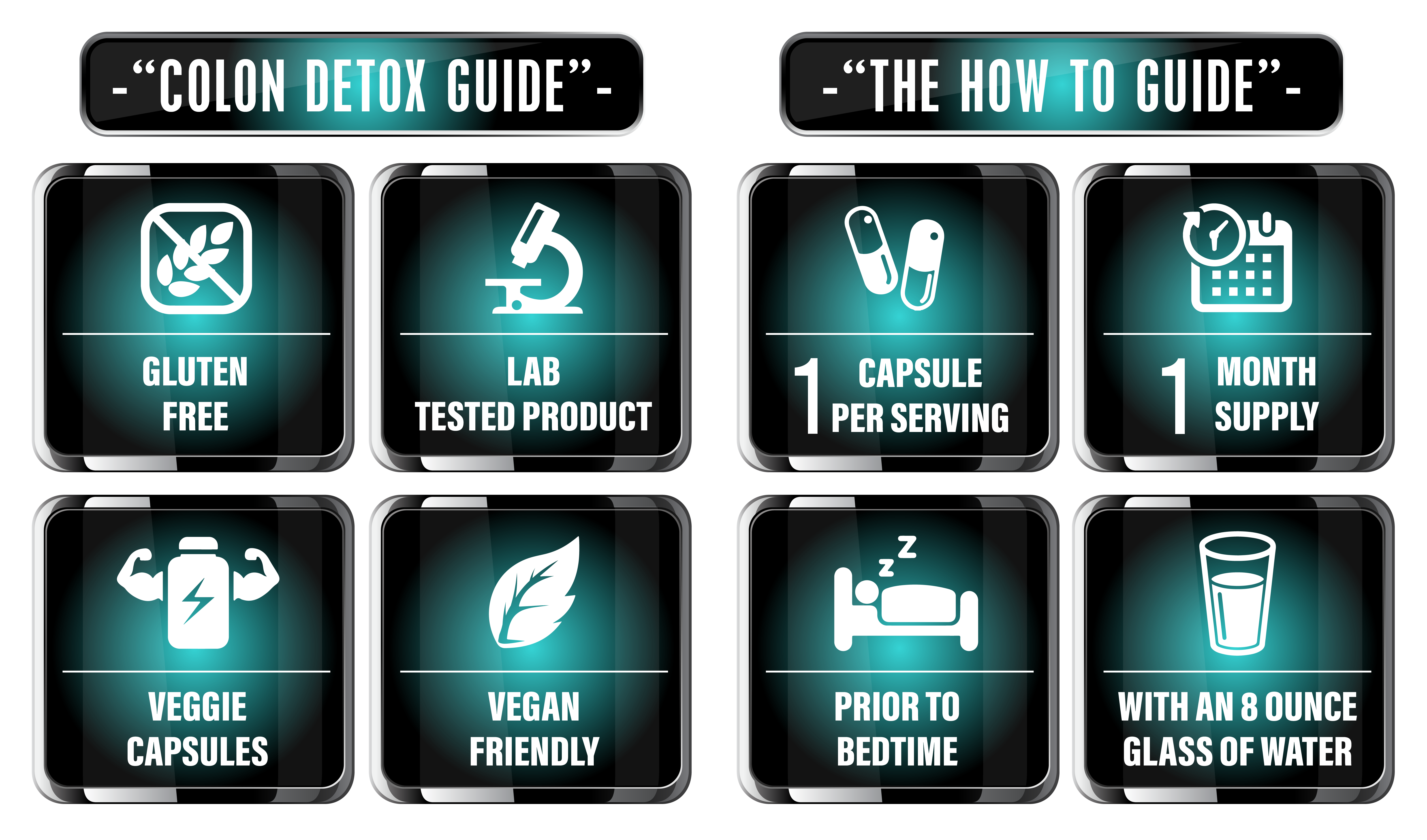
For Vital Colon Detox®, a dedicated Visual Guidance System was developed using recognizable icons, concise language, controlled grouping, and repeatable information modules. Product attributes, serving quantity, supply duration, suggested timing, and water guidance were converted into a structured visual language designed for immediate comprehension.
The same system extends beyond the label into Amazon infographics, instructional content, product presentations, and mobile marketplace experiences. This creates one consistent communication framework capable of supporting Product Clarity while maintaining the premium character of the Nutriveg Lab identity.
“Exceptional Product Guidance Doesn’t Complicate The Decision—It Makes Every Essential Detail Easier To Understand.”
“Clarity Is Not The Absence Of Information—It Is The Result Of Intelligent Structure.”
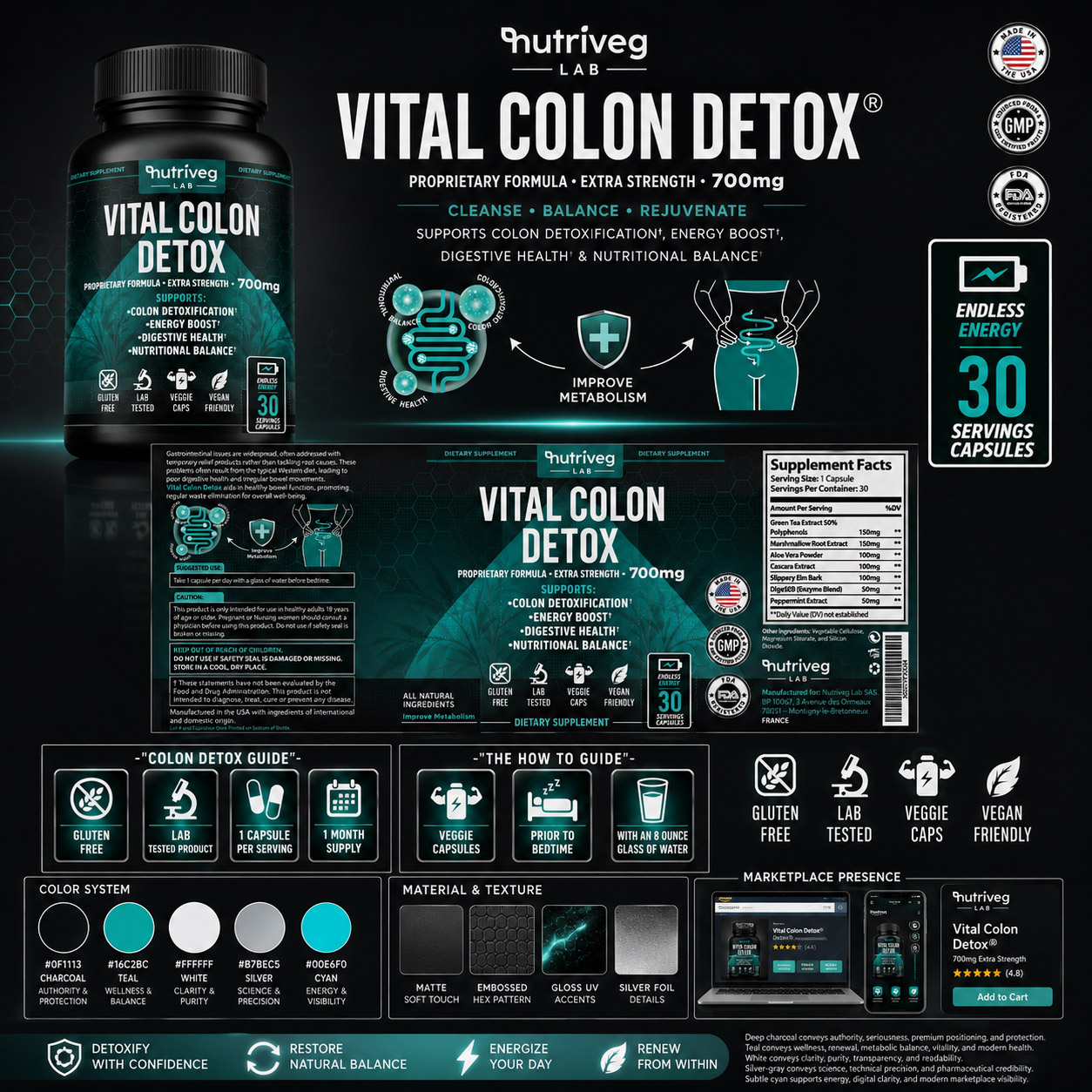
“Great Brands Answer Questions Before Customers Need To Ask Them.”
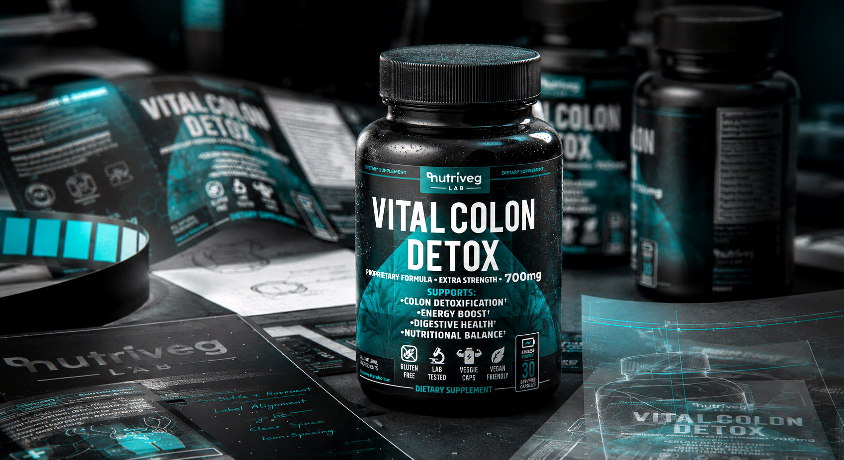
VISUAL EVIDENCE BUILDS BRAND CONFIDENCE
“WHERE VISUAL EVIDENCE BECOMES EVERYDAY CONFIDENCE.”
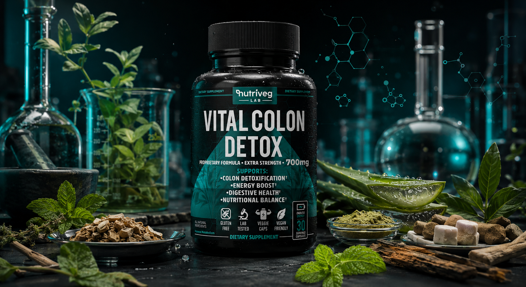
Vital Colon Detox was developed as a complete Supplement Packaging Design system in which visual evidence shapes how the product is perceived. Rather than treating packaging as decoration, the work transforms structured proof into a clear visual experience customers can recognize, understand, and trust.
Across packaging, lifestyle imagery, and marketplace content, every decision reinforces the same Brand Identity Design. The result is a premium wellness brand that remains coherent from first discovery to everyday interaction. Built to stay coherent.
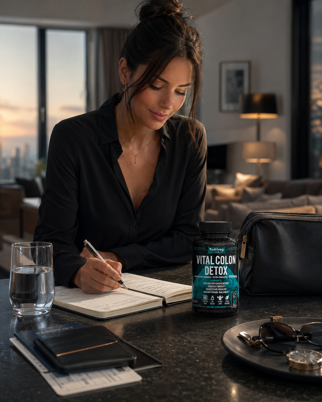
The second stage extends market presence across every customer touchpoint. Wellness Packaging Design, lifestyle photography, educational graphics, and digital presentation are directed by one visual language, allowing the identity to feel familiar without becoming repetitive.
This continuity turns commercial value into customer action. Customers encounter the same priorities in the label, supporting imagery, and Amazon content, while the brand gains a scalable foundation for future communication, product extensions, and long-term recognition.
HUMAN RELEVANCE BUILDS BRAND CONFIDENCE
“WHERE HUMAN RELEVANCE BECOMES EVERYDAY CONFIDENCE.”
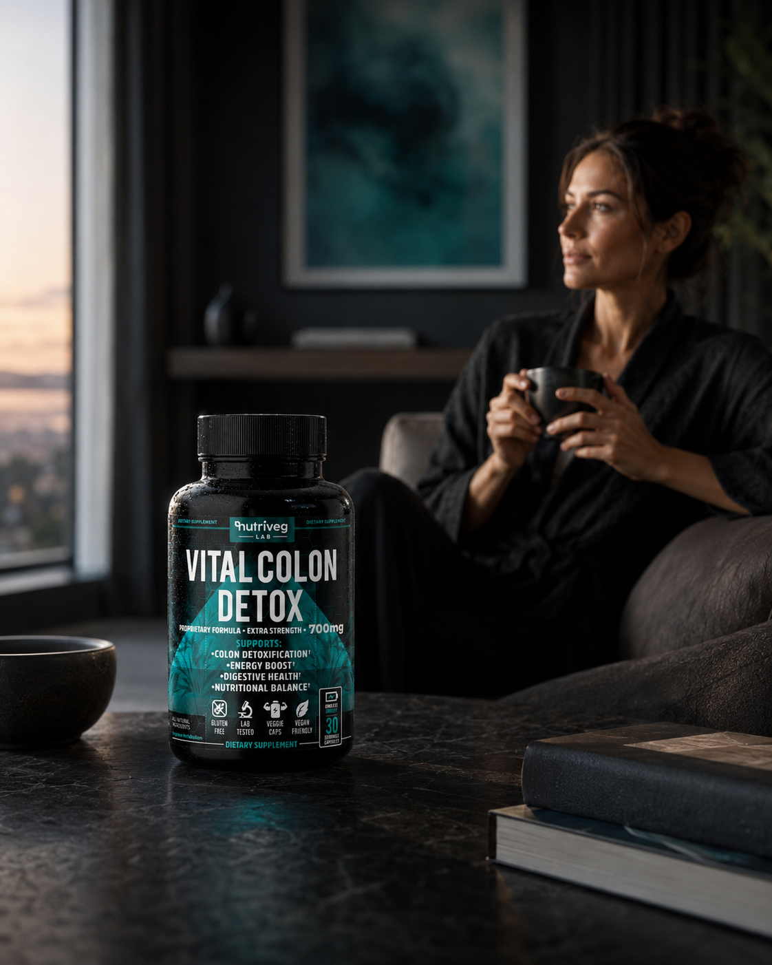
Vital Colon Detox was developed as a complete Supplement Packaging Design system in which human relevance shapes how the product is perceived. Rather than treating packaging as decoration, the work transforms personal meaning into a clear visual experience customers can recognize, understand, and trust.
Across packaging, lifestyle imagery, and marketplace content, every decision reinforces the same Brand Identity Design. The result is a premium wellness brand that remains coherent from first discovery to everyday interaction. Built to stay coherent.

The second stage extends brand coherence across every customer touchpoint. Wellness Packaging Design, lifestyle photography, educational graphics, and digital presentation are directed by one visual language, allowing the identity to feel familiar without becoming repetitive.
This continuity turns everyday context into strategic value. Customers encounter the same priorities in the label, supporting imagery, and Amazon content, while the brand gains a scalable foundation for future communication, product extensions, and long-term recognition.
“Great Brands Transform Complexity Into Clarity, Making Every Interaction Feel Simple, Meaningful, And Genuinely Human.”
THE HERO IMAGE:
Building Immediate Product Recognition For Amazon Shoppers
“On Amazon, The First Image Does More Than Introduce A Product—It Determines Whether The Brand Earns A Closer Look.”
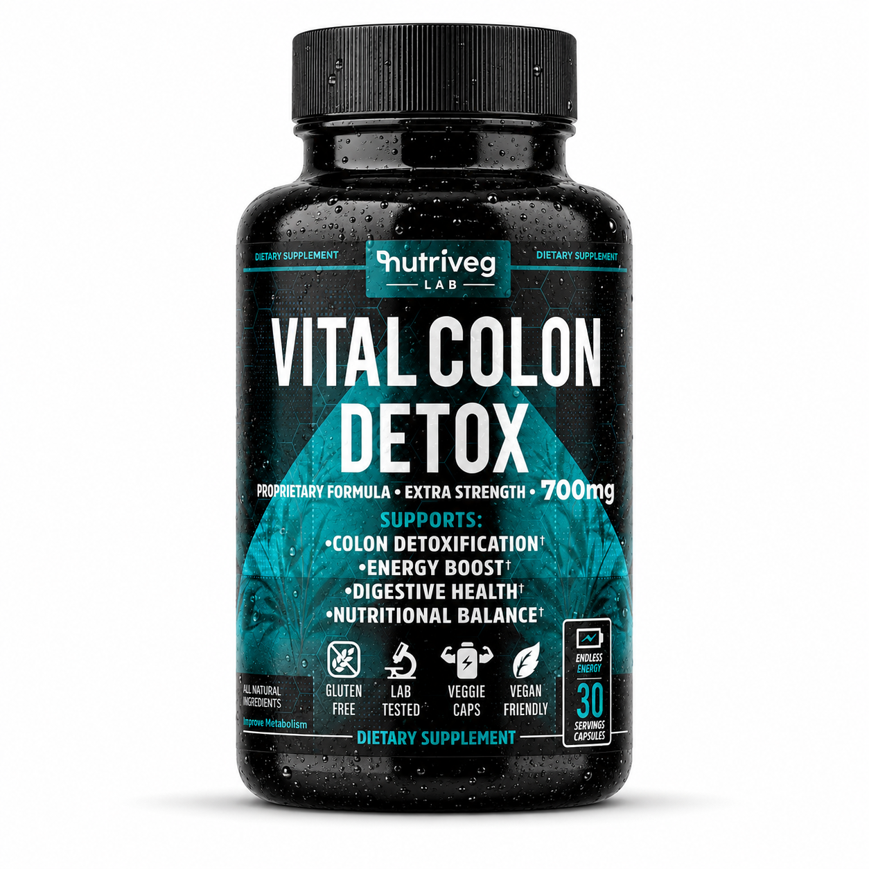
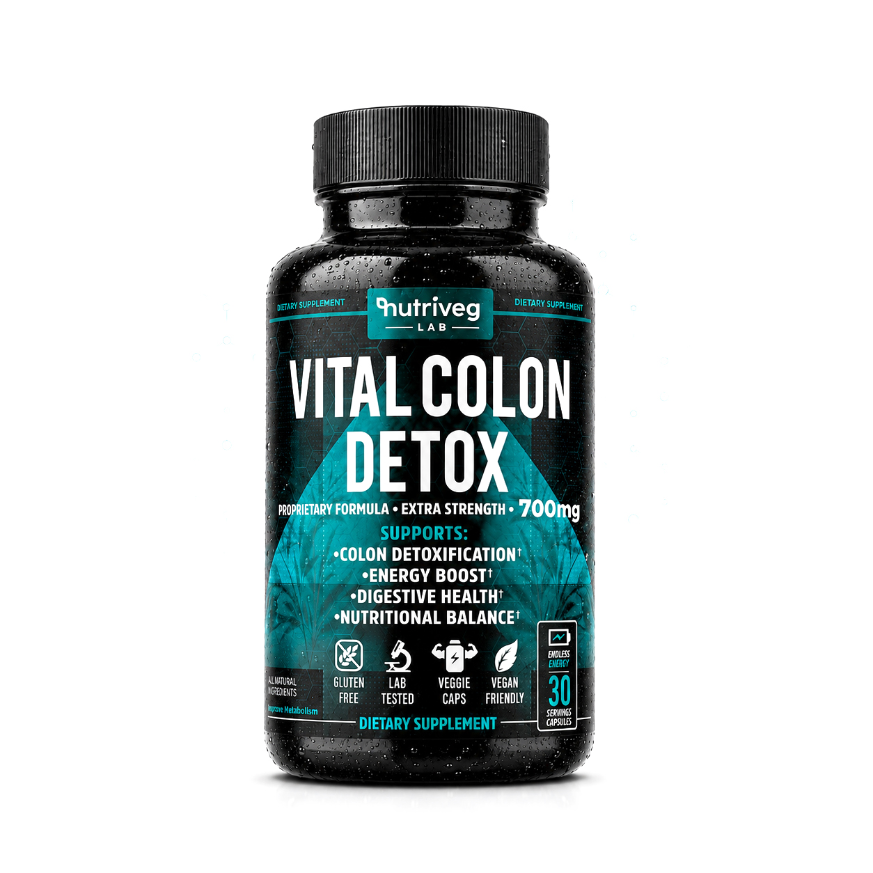
The Hero Image represents the first and most decisive visual interaction within an Amazon Product Listing. Before customers explore ingredients, benefits, supporting graphics, or brand content, they must be able to recognize the product clearly and understand its category within seconds.
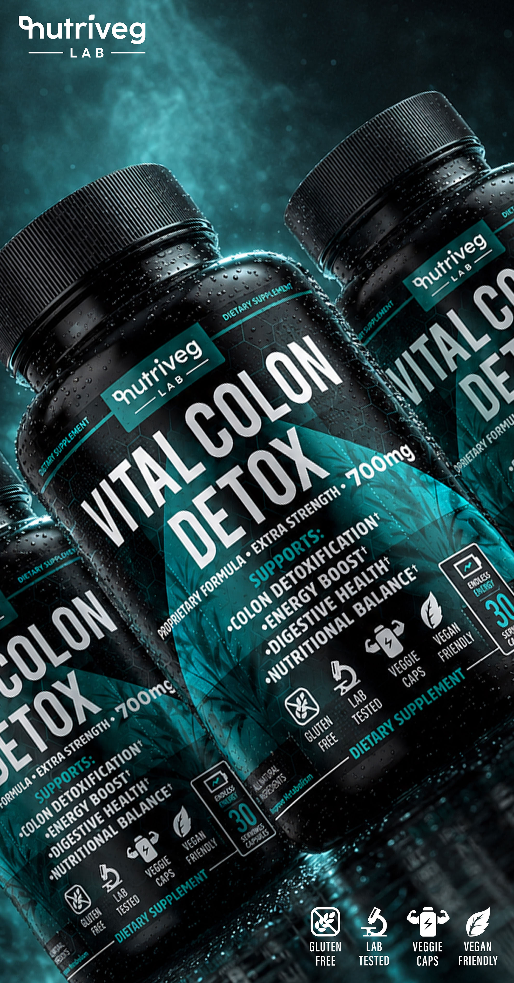
For Vital Colon Detox®, the objective was to create a premium, marketplace-ready presentation that preserves the integrity of the Supplement Packaging Design while remaining visually clear across desktop results, mobile screens, and reduced thumbnail sizes.
The composition prioritizes the bottle silhouette, Nutriveg Lab identity, product name, dosage visibility, and essential label hierarchy. Controlled lighting, realistic materials, and a clean white environment allow the packaging to communicate with confidence without introducing unnecessary visual noise.
The Solution Included:
- Development of a premium Amazon Hero Image optimized for immediate recognition and small-screen clarity.
- Strategic emphasis on the Nutriveg Lab identity, product name, label contrast, and core information hierarchy.
- Accurate product proportions, controlled reflections, realistic materials, and professionally balanced shadows.
- Clean marketplace presentation designed to preserve label readability across desktop and mobile formats.
- Consistent application of the established Wellness Packaging Design language throughout the listing experience.
The final Hero Image establishes the visual foundation for the complete Amazon presentation. It introduces the product with clarity, reinforces premium positioning, and creates a recognizable starting point for every image and message that follows.
“GREAT AMAZON LISTINGS BEGIN WITH A HERO IMAGE THAT MAKES THE PRODUCT CLEAR BEFORE A SINGLE WORD IS EXPLAINED.”
THE PRODUCT OVERVIEW:
Presenting The Complete Product With Clarity, Credibility, And Confidence
“Great Product Presentations Don’t Leave Essential Questions Unanswered—They Build Understanding Through Complete Visual Communication.”
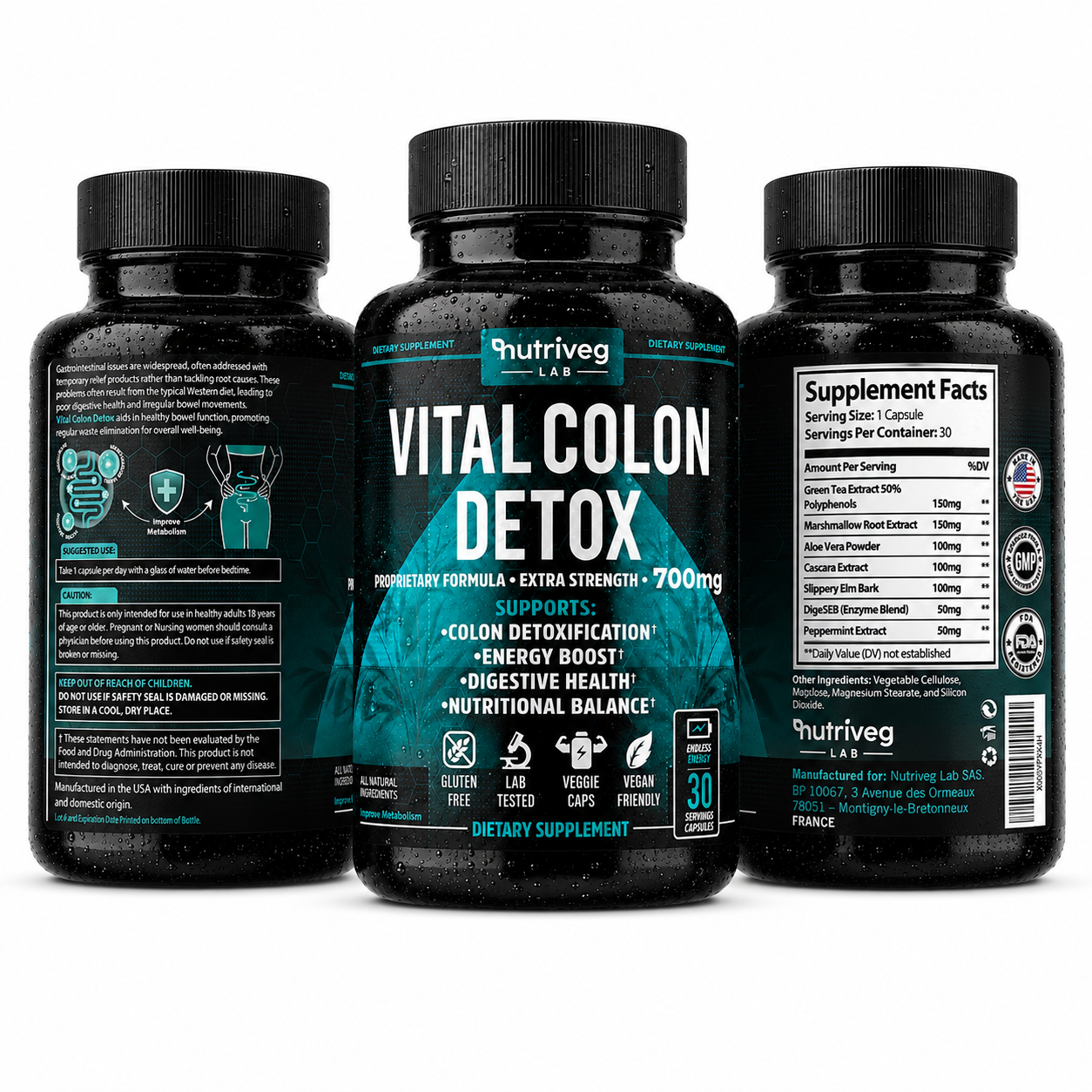
Once the Hero Image earns attention, the next responsibility is to provide customers with a complete and coherent understanding of the physical product.
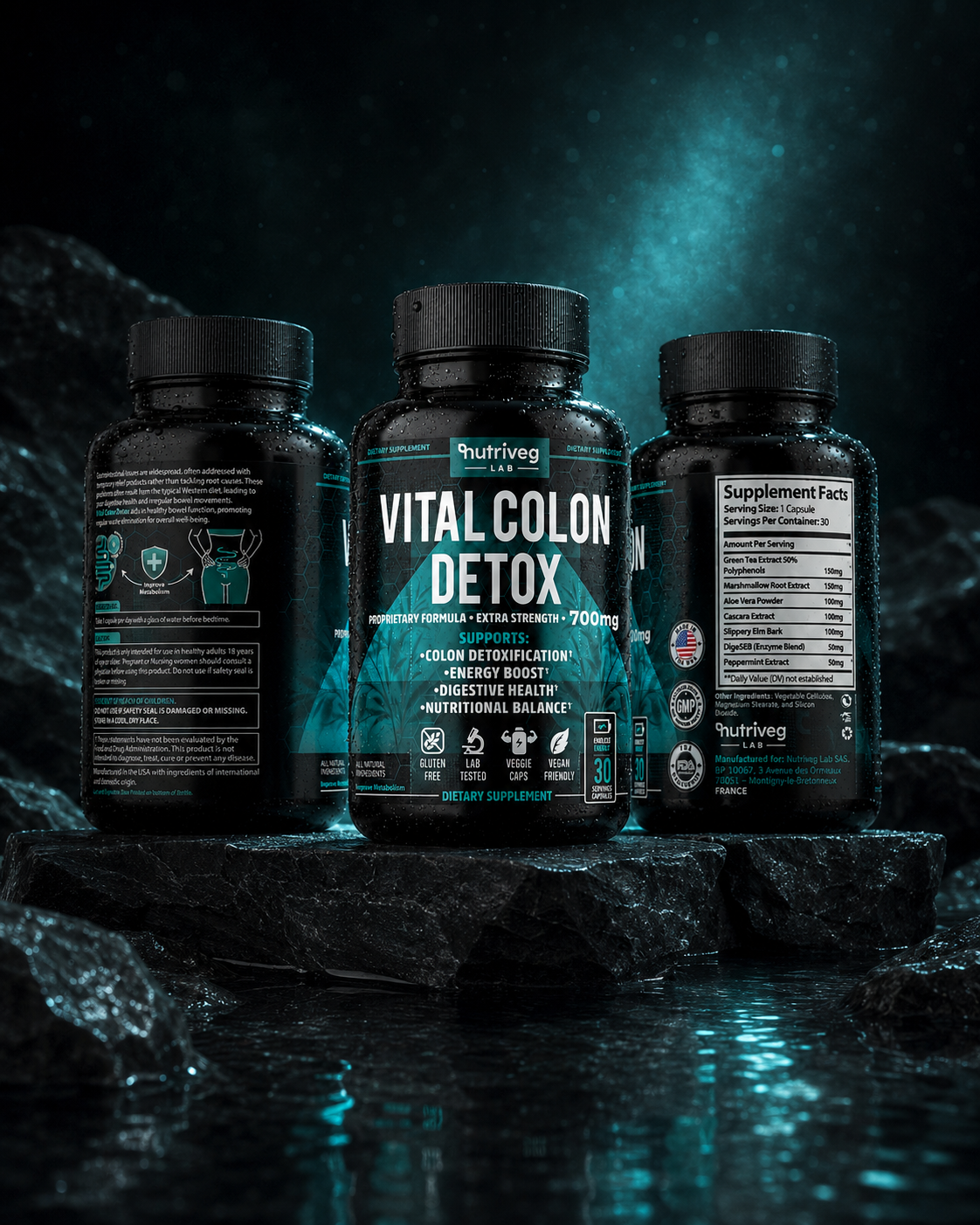
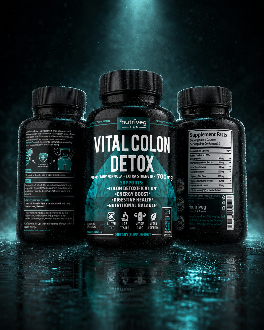
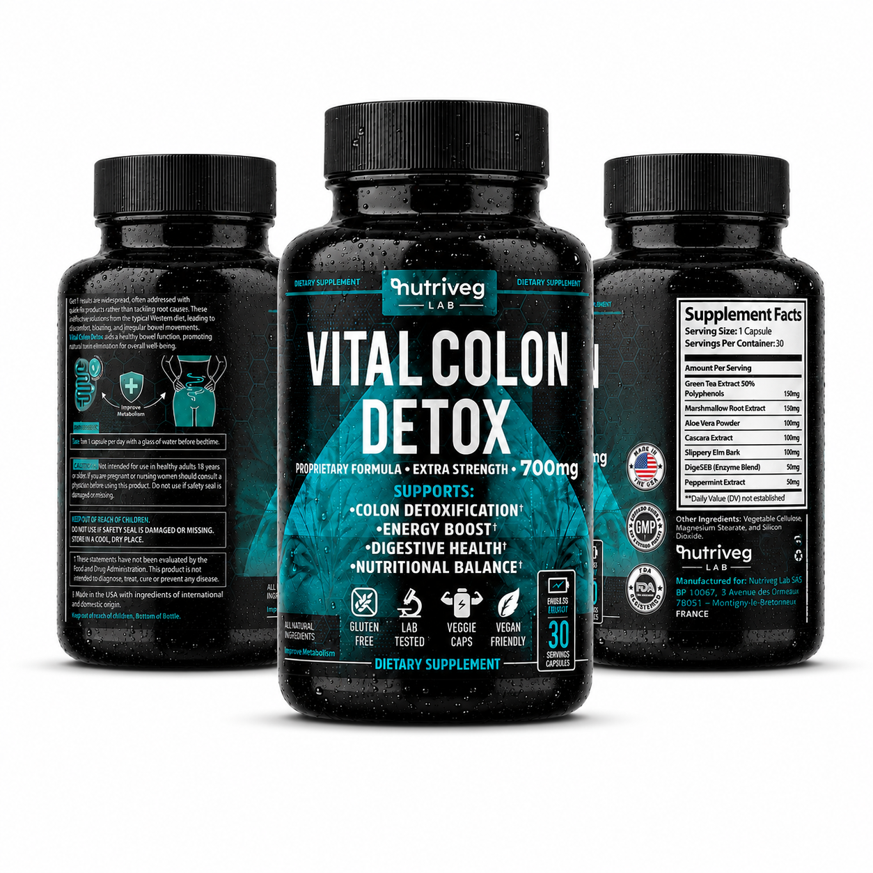
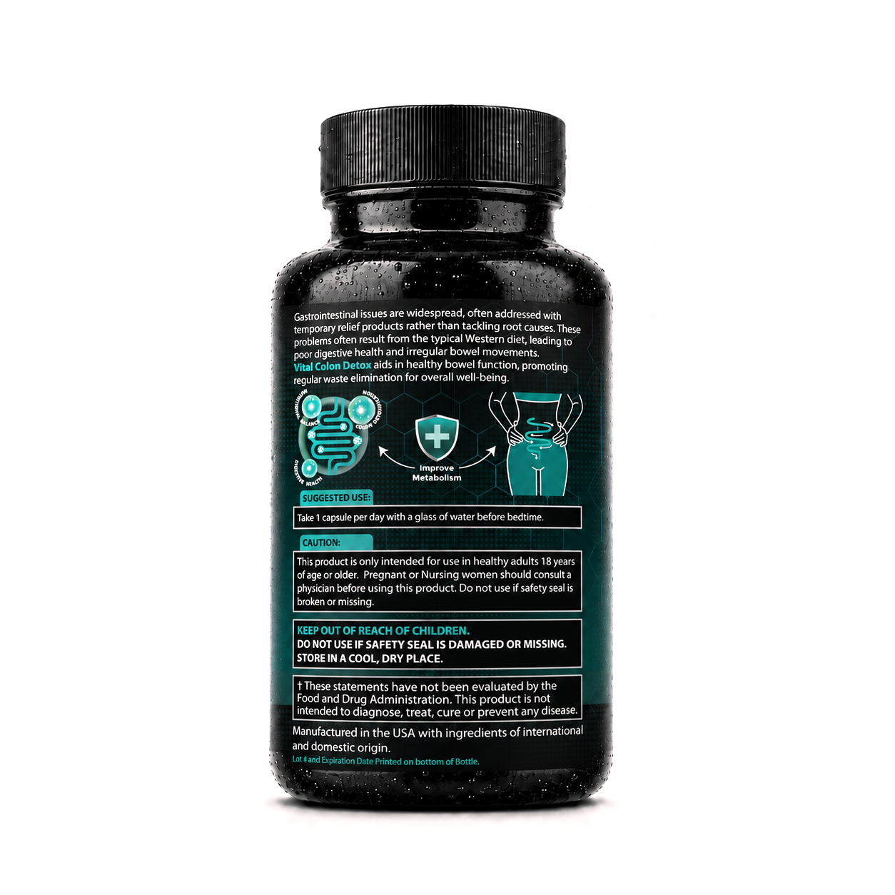
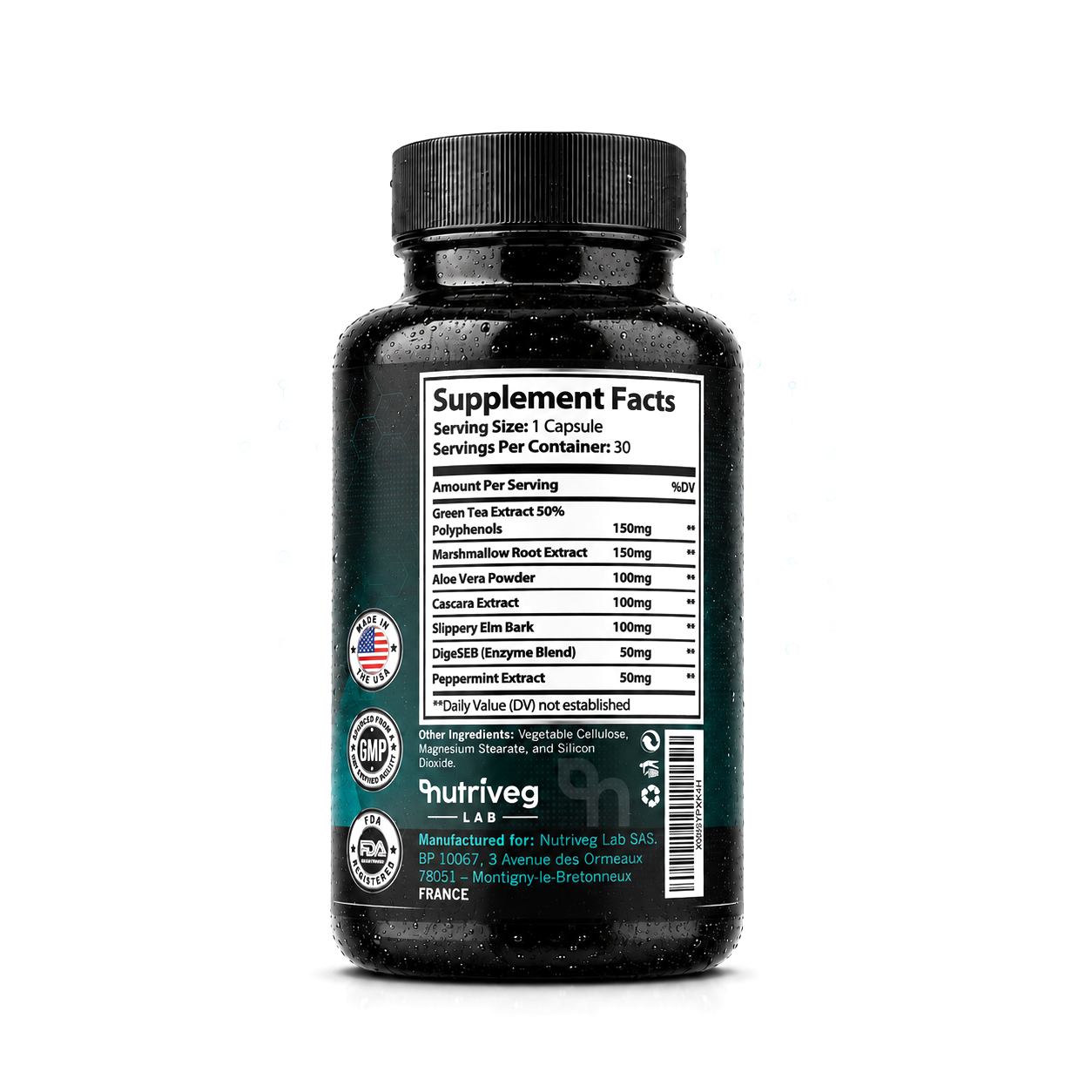
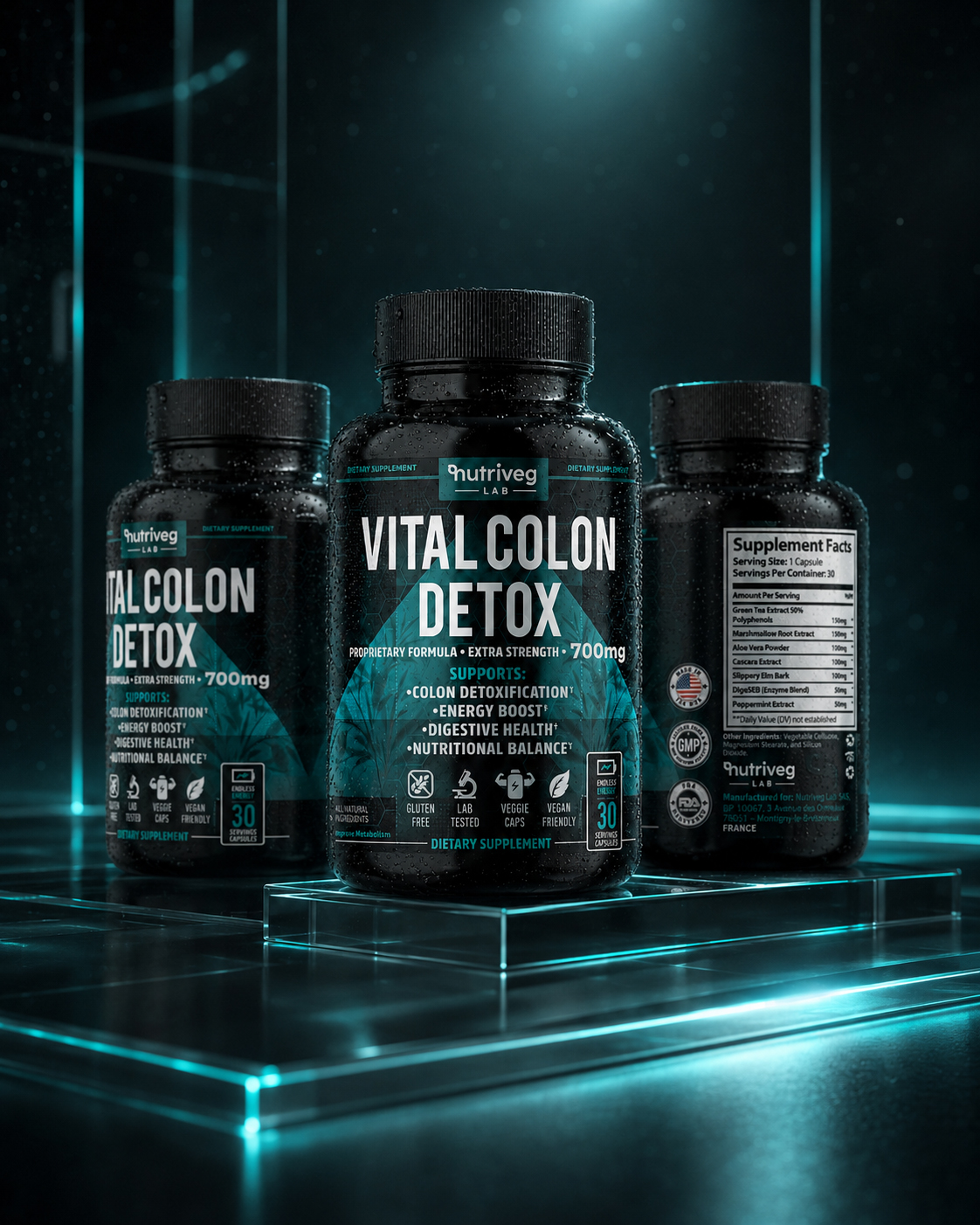
The Product Overview presents the front, side, and back packaging as one connected Product Packaging Design system. Each view serves a specific purpose: the front establishes recognition, the side communicates guidance, and the back organizes Supplement Facts, ingredients, and required product information.
Rather than treating these surfaces as separate layouts, the design connects them through consistent typography, color, spacing, iconography, and visual hierarchy. This creates one uninterrupted brand experience around the entire container.
The Solution Included:
- Complete 360-degree product presentation featuring the front, side, and back packaging.
- Clear visibility of the label architecture, Supplement Facts panel, supporting information, and brand ownership.
- Consistent application of typography, teal accents, iconography, and structural alignment.
- Balanced composition designed to communicate transparency without overwhelming the customer.
- Premium product rendering prepared for Amazon, e-commerce, presentations, and digital brand environments.
The final overview demonstrates that professional Dietary Supplement Packaging must work as a complete information system. Every surface contributes to recognition, understanding, and the overall perception of quality.
“CUSTOMER CONFIDENCE GROWS WHEN EVERY PRODUCT SURFACE COMMUNICATES AS PART OF ONE COMPLETE SYSTEM.”
FROM A SINGLE PRODUCT VIEW TO COMPLETE CUSTOMER UNDERSTANDING
COMPLETE PRODUCT SYSTEM
EVERY SURFACE HAS A PURPOSE. EVERY DETAIL ANSWERS A DIFFERENT CUSTOMER QUESTION.
Complete Product Presentation
Every Essential Perspective Presented As One Experience.
The product was presented through a complete visual sequence that reveals its appearance, structure, information, and brand character. This 360-degree approach transforms Product Packaging Design into an understandable customer experience rather than limiting the presentation to one attractive front-facing image.
Three Essential Packaging Views
Front. Information Panel. Supplement Facts.
Three principal views communicate the complete physical product. The front establishes recognition, the secondary panel provides guidance, and the facts panel delivers detailed information—creating a balanced Health Supplement Packaging presentation built around visibility, transparency, and informed customer evaluation.
Seven Structured Information Zones
Every Message Positioned According To Its Strategic Priority.
The label architecture organizes brand ownership, product naming, dosage strength, primary benefits, trust icons, serving information, and detailed facts into seven clearly defined zones. This structure improves readability while preventing complex content from competing for the customer’s attention.
One Unified Label Architecture
Multiple Information Layers. One Consistent Reading Experience.
Every label surface follows one controlled visual system combining typography, spacing, contrast, iconography, and regulatory information. The result is a unified Packaging Design architecture that keeps the product recognizable while allowing every content category to perform its specific communication function.
Complete product communication does not mean presenting more information without control. It means organizing the right information in the right order. By connecting product visualization with structured information hierarchy, the packaging helps customers move naturally from recognition to understanding and from understanding to confidence.
“Transparency Is Not Created By Showing Everything—It Is Created By Giving Every Detail A Clear Place.”
THE BRAND STORY:
Building Meaning Through Brand Identity, Heritage, And Purpose
“Strong Brands Don’t Simply Introduce Products—They Give Customers A Reason To Understand Who Stands Behind Them.”
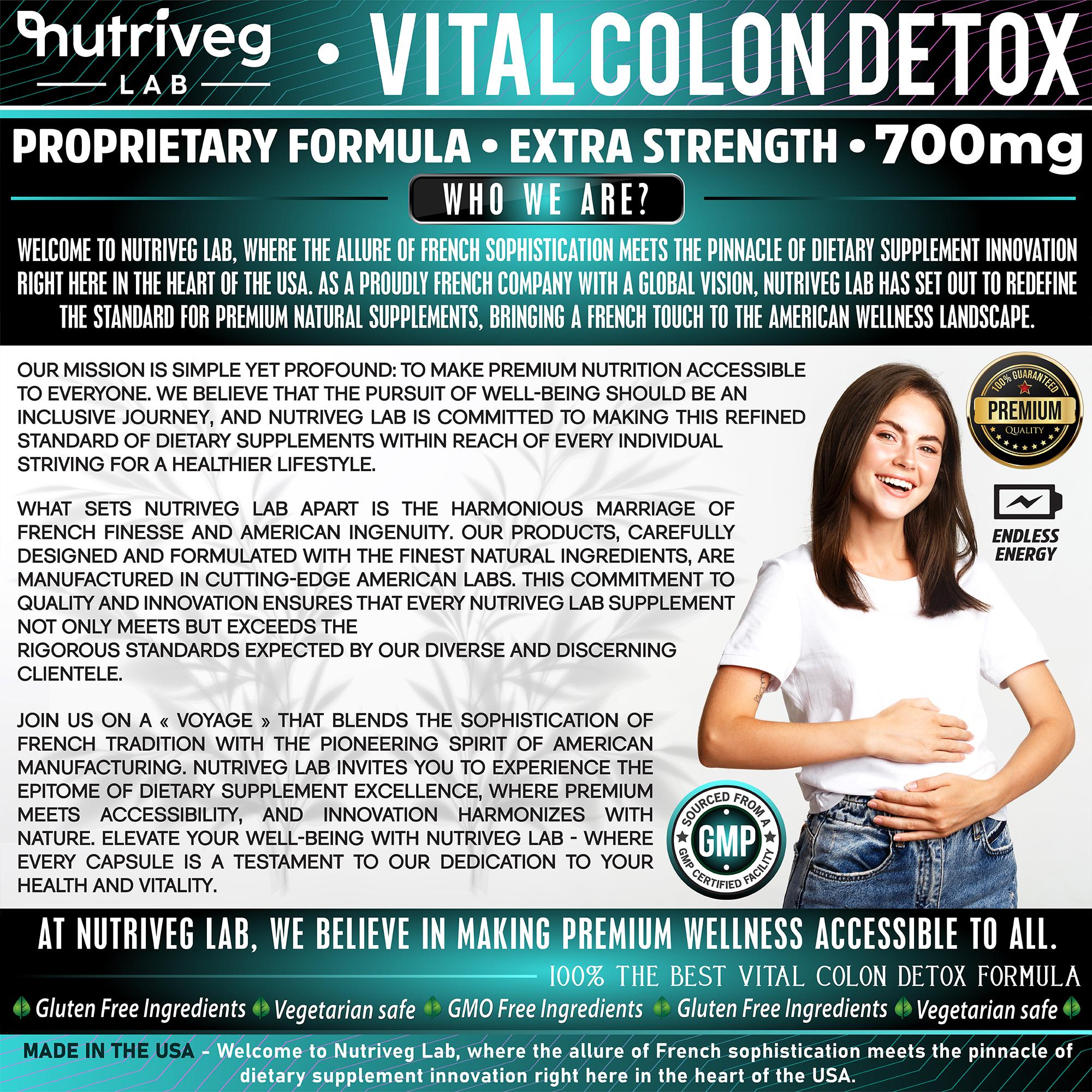
Customers increasingly want to understand more than product features. They want to recognize the values, standards, personality, and long-term purpose behind the brand.
The Nutriveg Lab Brand Story was developed to connect French sophistication, contemporary wellness thinking, and international market ambition through one cohesive visual narrative. Its role is not to repeat the packaging information, but to explain the identity and perspective from which the product was created.
Brand typography, lifestyle imagery, product presentation, and carefully structured messaging work together to position Nutriveg Lab as a premium wellness brand with a clear visual character and a recognizable point of view.
The Solution Included:
- Development of an editorial Amazon Brand Story designed to strengthen Brand Identity and customer familiarity.
- Clear presentation of the company’s origins, philosophy, market perspective, and commitment to premium wellness.
- Integration of brand heritage and contemporary visual language into one coherent narrative.
- Lifestyle imagery selected to introduce human relevance without relying on exaggerated wellness promises.
- Structured information hierarchy designed to maintain readability across marketplace and mobile environments.
The final Brand Story transforms Nutriveg Lab from a name printed on packaging into a recognizable brand with purpose, personality, and room to grow. It connects product communication with a broader identity that can extend across Amazon, retail, content, and future product categories.
“PEOPLE MAY DISCOVER PRODUCTS THROUGH SEARCH—BUT THEY REMEMBER BRANDS THAT GIVE EVERY EXPERIENCE A CLEAR MEANING.”
THE KEY BENEFITS:
Communicating Product Value Through Structured Benefits And Visual Storytelling
“Customers Don’t Need More Claims—They Need A Clearer Way To Understand What The Product Is Designed To Support.”
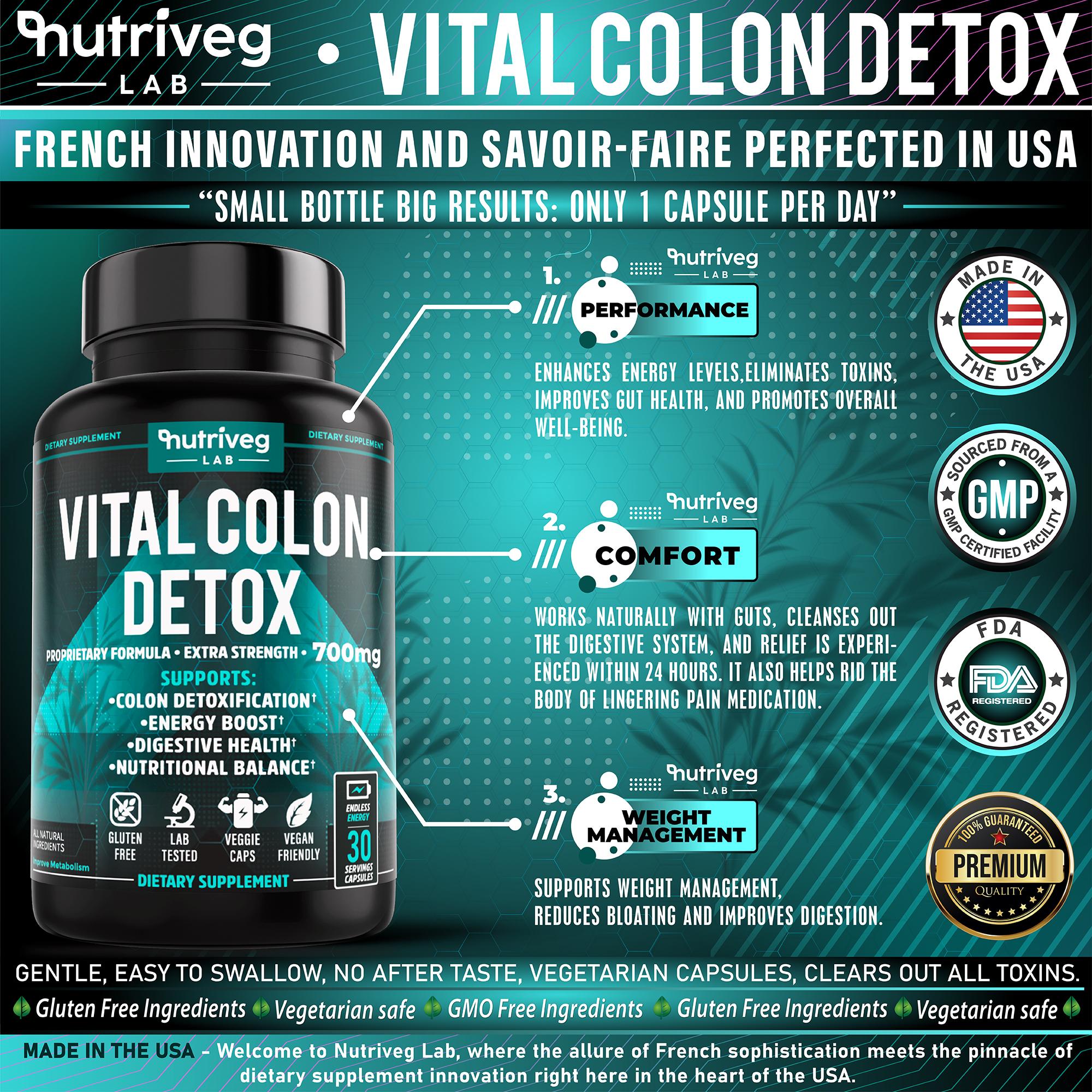
Effective benefit communication requires discipline. When every feature competes for equal attention, the customer receives more information but less understanding.
For Vital Colon Detox®, the benefit presentation was developed as a clear visual framework that organizes the product’s principal areas of support without disconnecting them from the packaging, ingredient context, or wider brand identity.
The hierarchy combines concise messaging, supporting icons, product visualization, and controlled contrast to guide attention through the information in a deliberate sequence. This makes the content easier to scan while maintaining a professional Wellness Brand Design language.
The Solution Included:
- Development of a benefit-focused Amazon infographic with a clearly defined visual reading order.
- Strategic organization of the primary areas of product support into concise, recognizable information blocks.
- Integration of custom icons and structured typography to improve comprehension at smaller sizes.
- Consistent use of the Nutriveg Lab color palette, packaging language, and established visual system.
- Marketplace-oriented composition designed to support faster product evaluation and more confident exploration.
The completed infographic transforms dense product information into a more accessible customer experience. It communicates value through hierarchy and design—not through visual pressure or excessive claims.
“THE MOST EFFECTIVE AMAZON INFOGRAPHICS DON’T SIMPLY LIST BENEFITS—THEY MAKE PRODUCT VALUE EASIER TO UNDERSTAND.”
THE SCIENCE BEHIND THE FORMULA:
Explaining Product Structure Through Educational Visual Communication
“Scientific Credibility Becomes Valuable Only When Customers Can Understand The Information Behind It.”
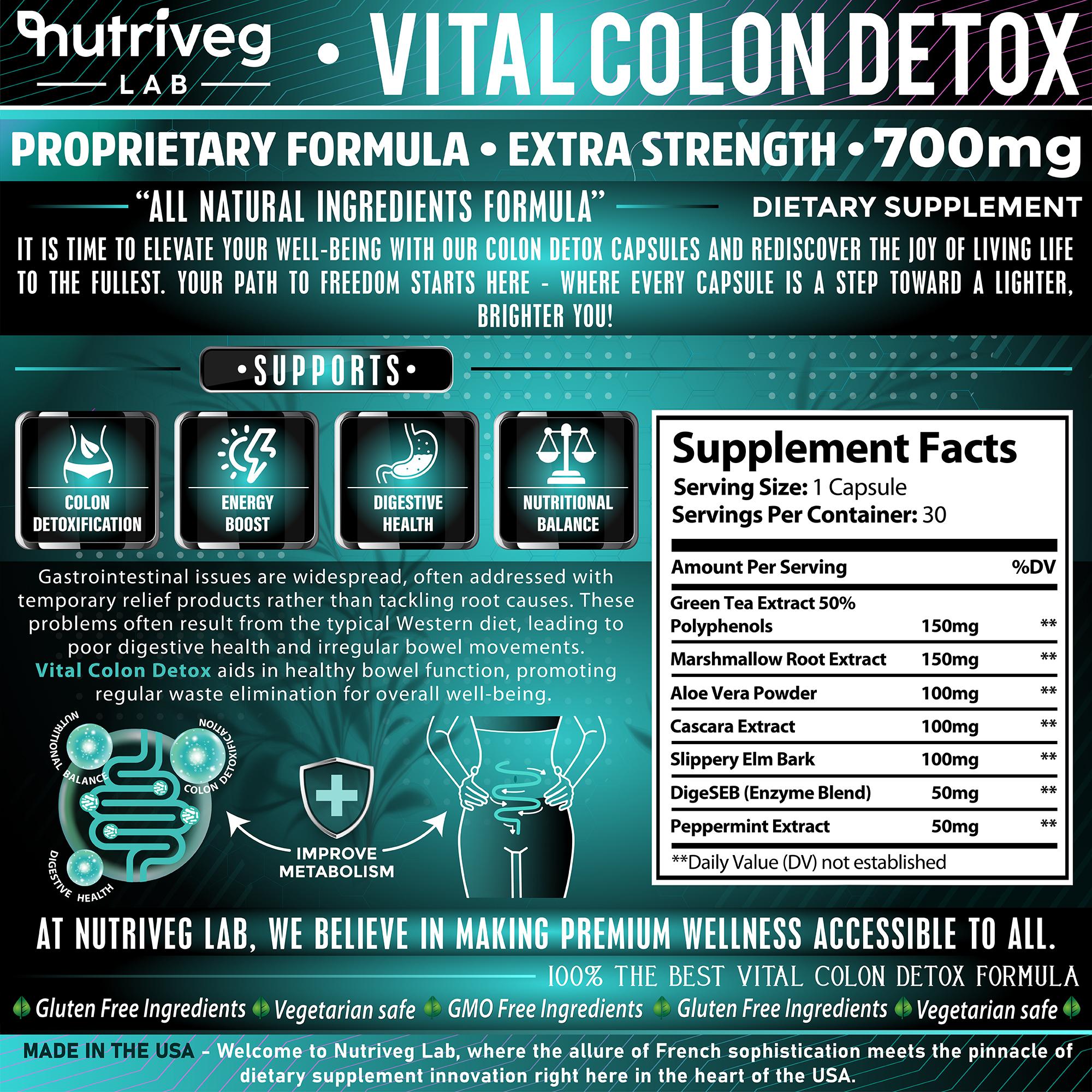
Modern supplement customers often expect more than promotional messaging. They want to understand what the formula contains, how the information is structured, and where essential product details can be found.
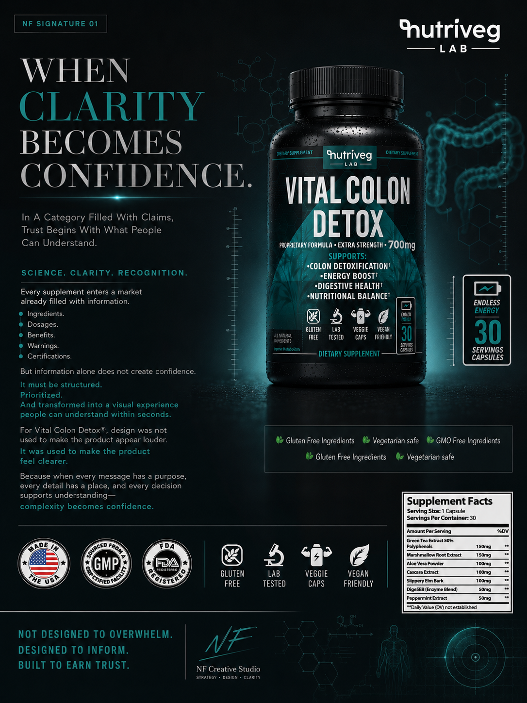
This educational infographic was designed to transform complex formula-related content into a clear, approachable visual system. Ingredients, Supplement Facts, product-support categories, and explanatory graphics are organized into defined informational layers.
The design connects botanical references with a contemporary scientific visual language, allowing the product to feel informed and premium without becoming visually cold, clinical, or inaccessible.
The Solution Included:
- Development of an educational Amazon Infographic Design focused on formula transparency and customer understanding.
- Structured presentation of ingredients, product information, and principal areas of support.
- Clear integration of the Supplement Facts panel within the wider communication hierarchy.
- Purposeful use of diagrams, icons, botanical imagery, and scientific visual cues.
- Marketplace-optimized composition designed to preserve clarity across mobile and desktop viewing.
The final presentation demonstrates how Health Supplement Packaging and educational content can work together. Complex information becomes easier to navigate, while the brand maintains a consistent balance between scientific structure and everyday wellness.
“CONFIDENCE BEGINS WHEN COMPLEX INFORMATION BECOMES STRUCTURED, TRANSPARENT, AND EASY TO NAVIGATE.”
FROM COMPLEX FORMULA INFORMATION TO ACCESSIBLE CUSTOMER EDUCATION
COMPLEXITY MADE CLEAR
SCIENTIFIC CONTENT BECOMES VALUABLE ONLY WHEN PEOPLE CAN READ, UNDERSTAND, AND USE IT.
Seven Ingredients Clearly Organized
One Formula Presented Without Visual Complexity.
Seven ingredients were organized into a consistent educational system combining ingredient names, quantities, natural references, and Supplement Facts information. The presentation supports clear customer understanding without turning the formula into an overwhelming or visually fragmented technical explanation.
Four Core Communication Categories
Formula. Benefits. Guidance. Transparency.
Product information was divided into four essential communication categories. This structure separates what the formula contains, what the packaging communicates, how the product is presented for use, and where customers can find detailed information—creating a more intuitive educational experience.
Three Educational Information Layers
Notice First. Understand Next. Explore In Detail.
The educational hierarchy operates across three reading depths. Customers first recognize the primary message, then understand the supporting information, and finally explore detailed content. This layered structure makes complex nutritional communication accessible without sacrificing depth, credibility, or professional presentation.
One Transparent Facts System
Detailed Information Connected To One Consistent Visual Language.
The Supplement Facts panel, ingredient communication, dosage references, and supporting graphics were integrated into one transparent information system. Consistent typography and visual hierarchy connect technical content with the broader Wellness Packaging Design, reinforcing clarity across every customer-facing presentation.
The purpose of educational design is not to make scientific information appear more impressive. Its purpose is to make information easier to navigate, compare, and understand. By structuring formula content with restraint and precision, the brand creates a calmer and more credible path toward informed customer consideration.
“Information Builds Knowledge. Structure Builds Understanding. Understanding Builds Confidence.”
THE LIFESTYLE EXPERIENCE:
Connecting Premium Product Design With Authentic Everyday Life
“The Strongest Lifestyle Images Don’t Manufacture Emotion—They Reveal Where A Product Naturally Belongs.”
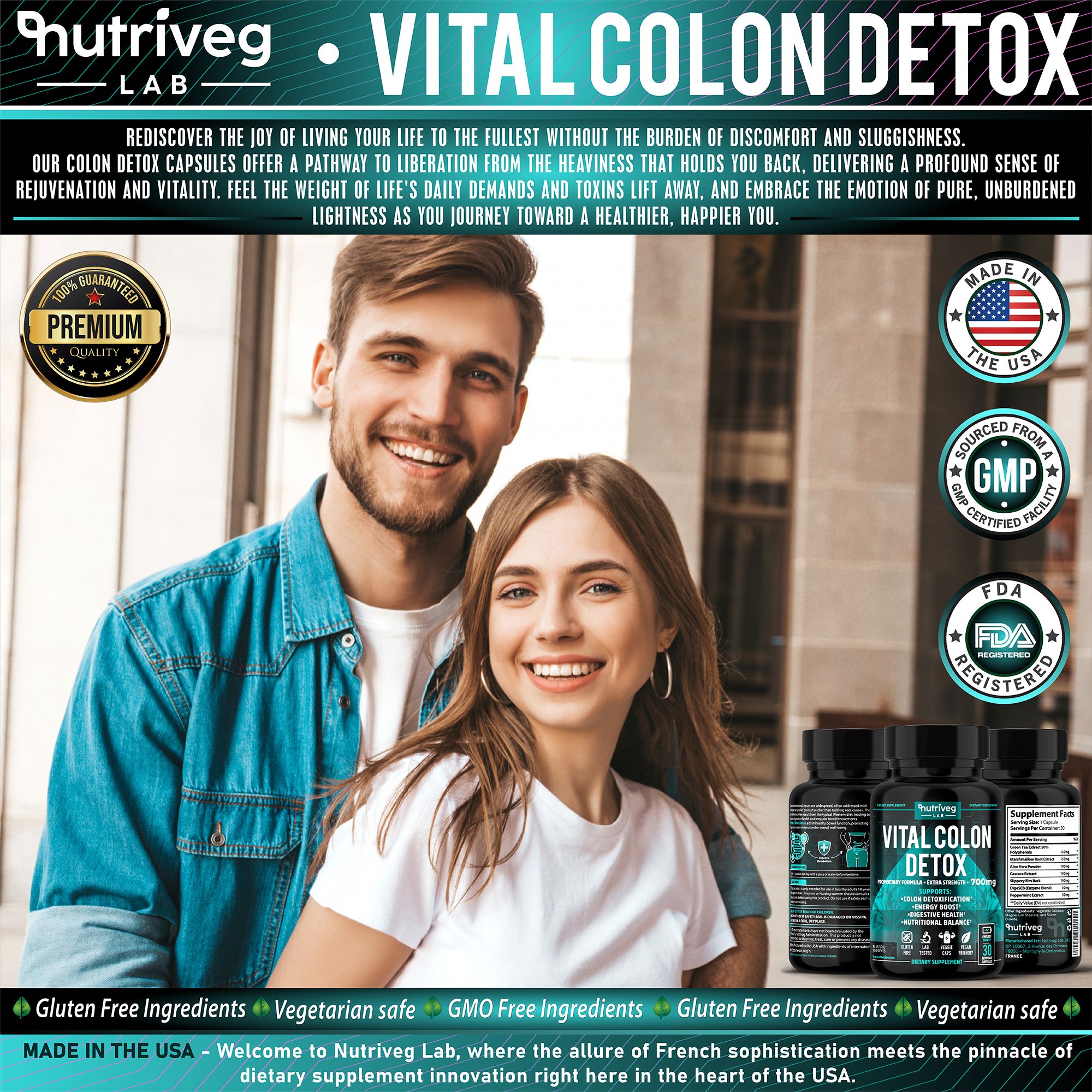
After customers understand the product and its information, lifestyle storytelling introduces a different layer of the brand experience: human relevance.
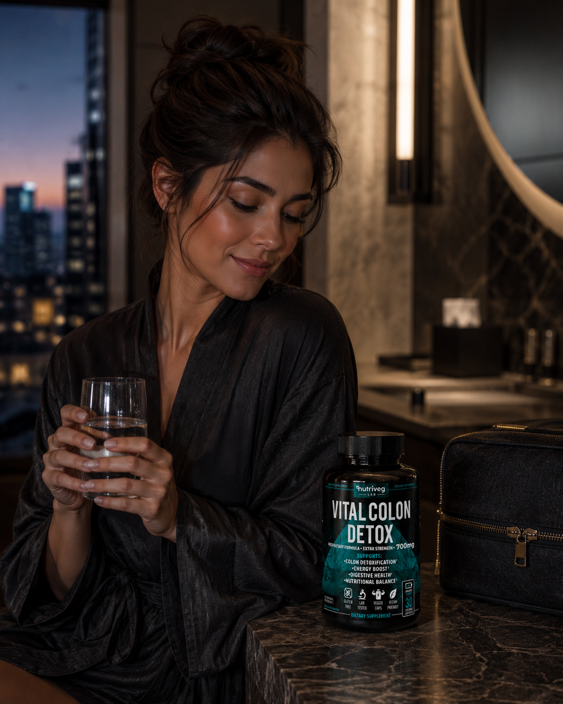
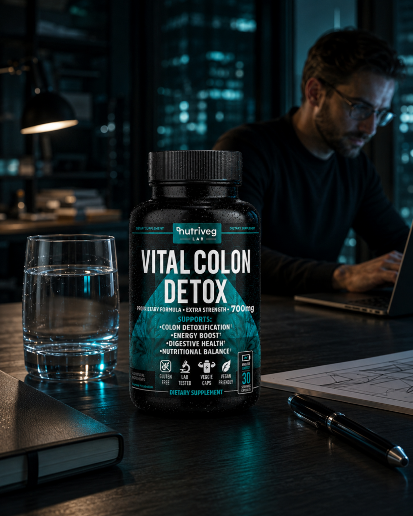
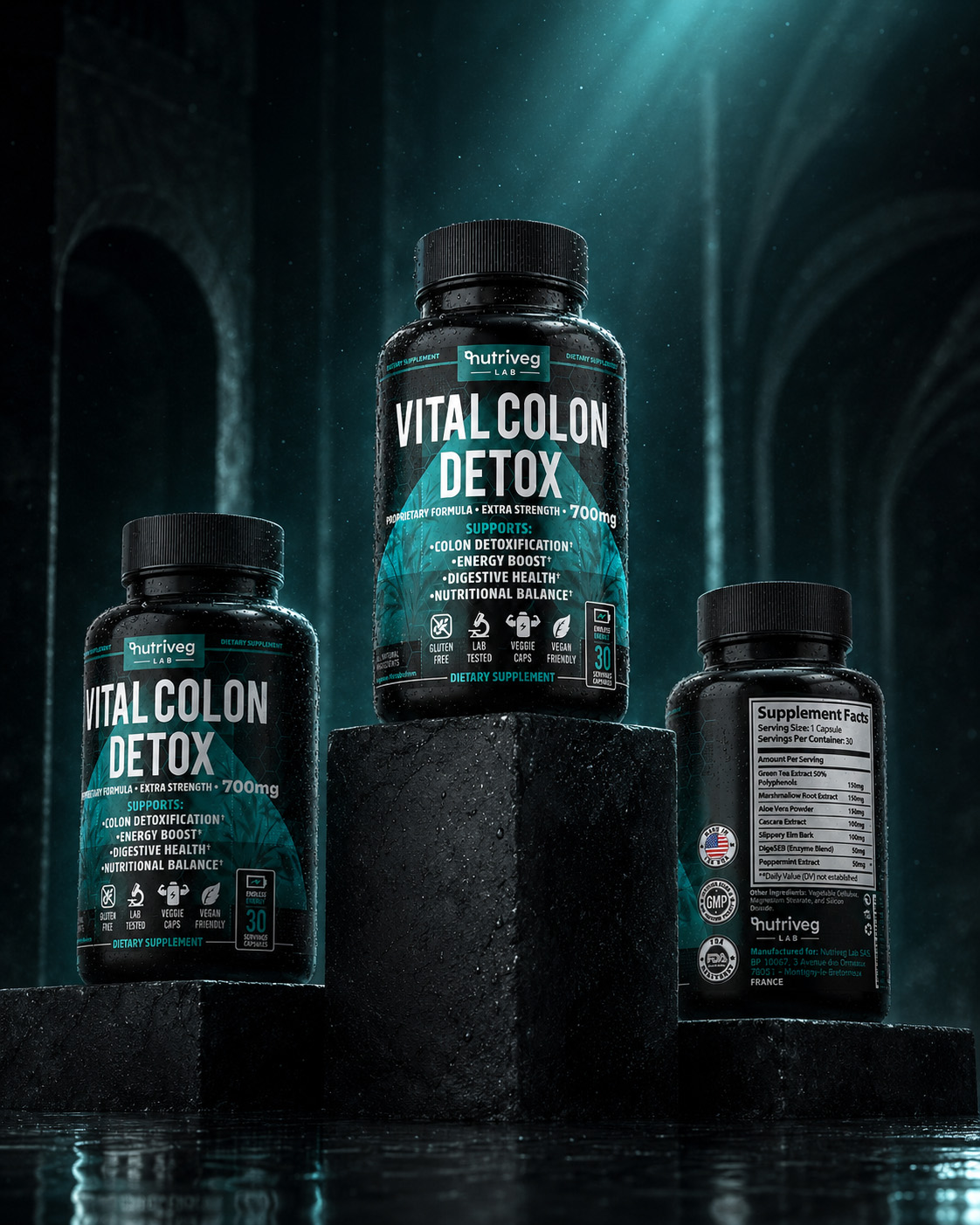
This section positions Vital Colon Detox® within a considered wellness environment that feels calm, contemporary, and believable. The objective is not to dramatize product outcomes, but to demonstrate how premium Supplement Branding can exist naturally within everyday routines and spaces.
Authentic people, restrained expressions, natural light, and refined product integration create emotional warmth while preserving the visual authority established by the packaging.
The Solution Included:
- Development of a lifestyle-focused Amazon image designed to connect product presentation with real-life context.
- Authentic editorial photography with natural expressions and credible environmental interaction.
- Strategic product placement that preserves label visibility without creating an aggressive advertising composition.
- Consistent black, teal, neutral, and natural tones aligned with the complete visual system.
- Marketplace-oriented framing designed to strengthen emotional relevance and brand memorability.
The final lifestyle presentation expands the identity beyond the bottle. It gives the product a human setting while keeping communication responsible, visually restrained, and consistent with the premium character of the brand.
“THE MOST MEMORABLE WELLNESS BRANDS DON’T JUST SHOW PRODUCTS—THEY CREATE A WORLD CUSTOMERS CAN RECOGNIZE THEMSELVES WITHIN.”
LIFESTYLE MARKETING & CUSTOMER ASPIRATION
Turning Product Presence Into A Brand Experience Customers Can Relate To
“People Don’t Connect With Perfect Promises—They Connect With Brands That Understand Real Life.”
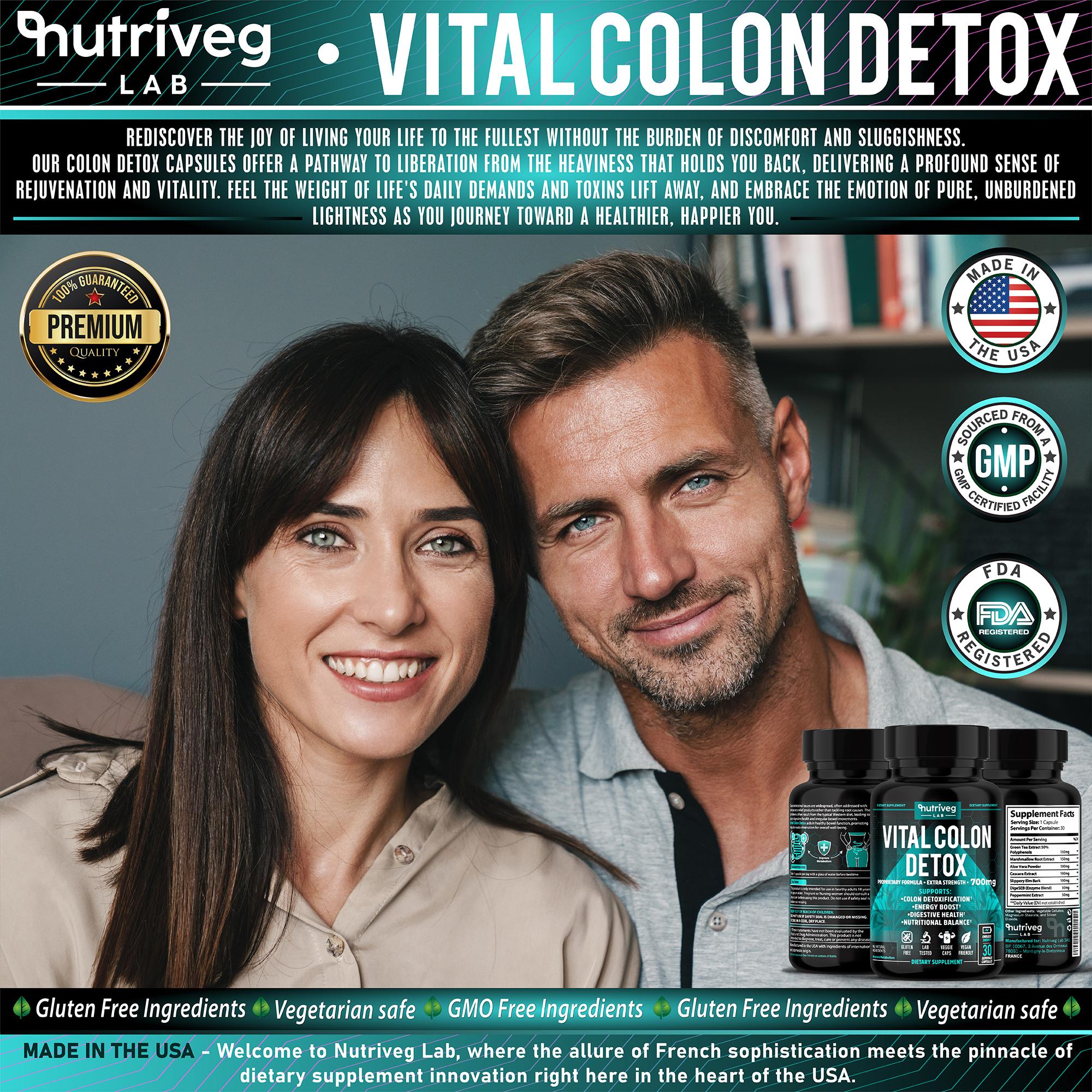
Lifestyle marketing becomes meaningful when it moves beyond decorative imagery and begins to express the emotional character of the brand.
For Vital Colon Detox®, this presentation was developed to communicate confidence, balance, and everyday continuity through authentic human storytelling. Product visibility remains important, but the environment, composition, and emotional tone carry an equally important role.
The design connects packaging with an aspirational yet credible wellness context. It allows potential customers to imagine the product as part of a considered routine without implying guaranteed outcomes or unrealistic transformation.
The Solution Included:
- Creation of a premium Lifestyle Marketing Visual designed to strengthen emotional engagement.
- Authentic adult lifestyle photography focused on calm, confidence, and everyday relevance.
- Controlled integration of the product and brand assets within a believable domestic environment.
- Balanced visual hierarchy that preserves both human emotion and packaging recognition.
- Consistent editorial treatment supporting Amazon, digital campaigns, brand storytelling, and social content.
The completed visual transforms a functional product presentation into a broader brand experience. It demonstrates how professional Wellness Brand Design can connect commercial clarity with emotional intelligence and long-term customer recognition.
“THE STRONGEST LIFESTYLE COMMUNICATION DOESN’T PROMISE A DIFFERENT LIFE—IT SHOWS HOW THE BRAND CAN BELONG WITHIN A REAL ONE.”
BENEFIT-FOCUSED INFOGRAPHIC DESIGN
Transforming Complex Product Information Into Clear, Decision-Supporting Visual Benefits
“The Best Amazon Listings Don’t Overload Customers With Information—They Organize What Matters Into Immediate Understanding.”
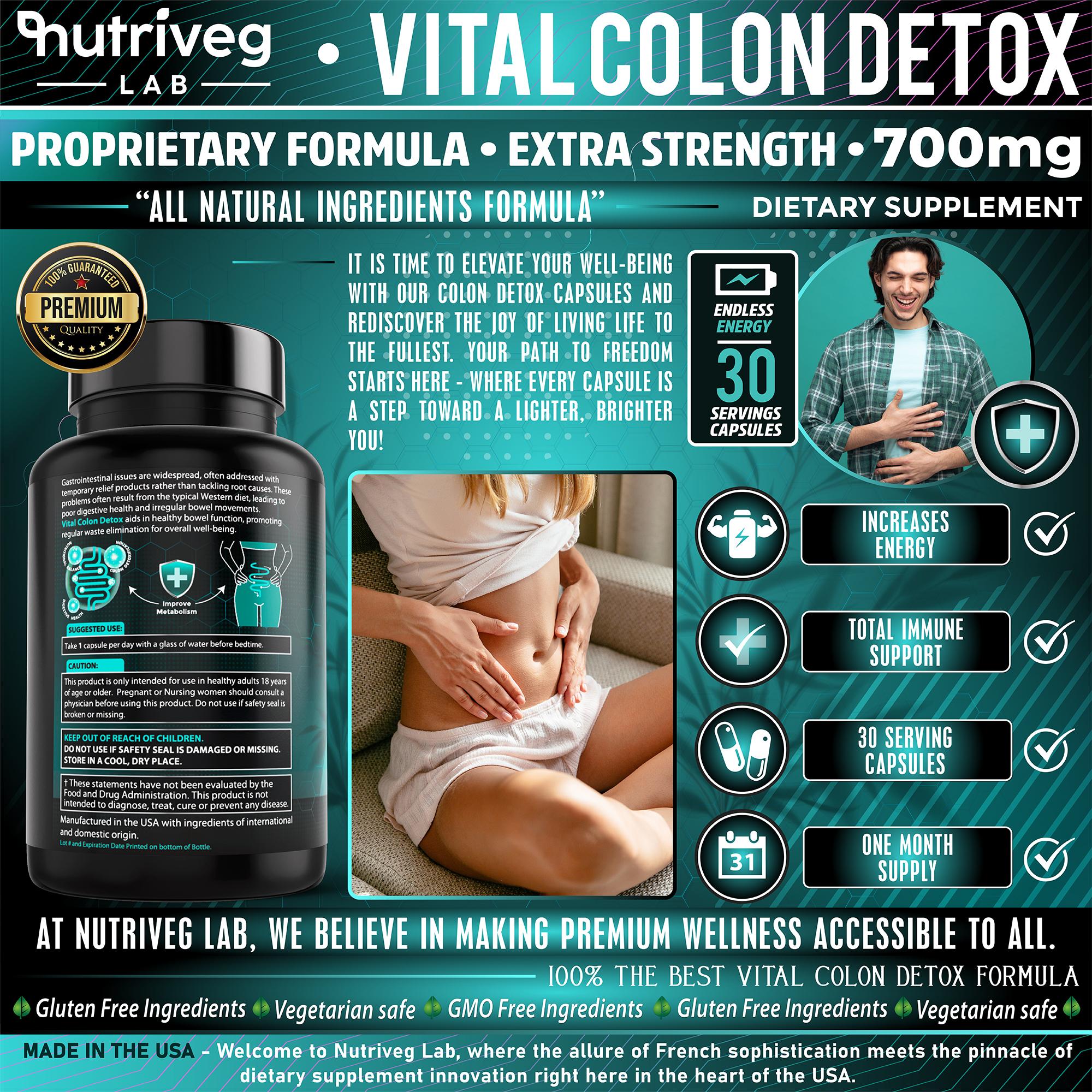
Every marketplace infographic should answer one fundamental question quickly: why is this information relevant to the customer?
This benefit-focused visual was designed to simplify product evaluation by transforming multiple features into a structured hierarchy of recognizable information. Typography, iconography, product imagery, and supporting lifestyle elements guide customers through the content without forcing every message to compete for attention.
The composition supports mobile-first browsing while maintaining the premium visual character established by the Supplement Packaging Design.
The Solution Included:
- Development of a benefit-focused infographic optimized for Amazon and mobile-first viewing.
- Organization of key information into clearly differentiated visual sections.
- Integration of custom icons and concise communication designed to improve scanability.
- Strategic relationship between packaging, informational graphics, and supporting lifestyle imagery.
- Consistent application of color, typography, spacing, and established brand assets.
- Marketplace-oriented hierarchy designed to support product understanding and confident evaluation.
The final infographic turns technical and promotional content into a controlled visual experience. It reduces cognitive pressure, reinforces product recognition, and helps customers understand the brand’s principal communication points within seconds.
“EXCEPTIONAL AMAZON INFOGRAPHICS DON’T TURN EVERY FEATURE INTO A PROMISE—THEY TURN INFORMATION INTO A REASON TO KEEP EXPLORING.”
GUIDED INFOGRAPHIC & CONVERSION OPTIMIZATION
Guiding Customers From Product Interest To Purchase Confidence
“The Strongest Amazon Listings Anticipate Essential Questions—And Answer Them Before Uncertainty Interrupts The Decision.”
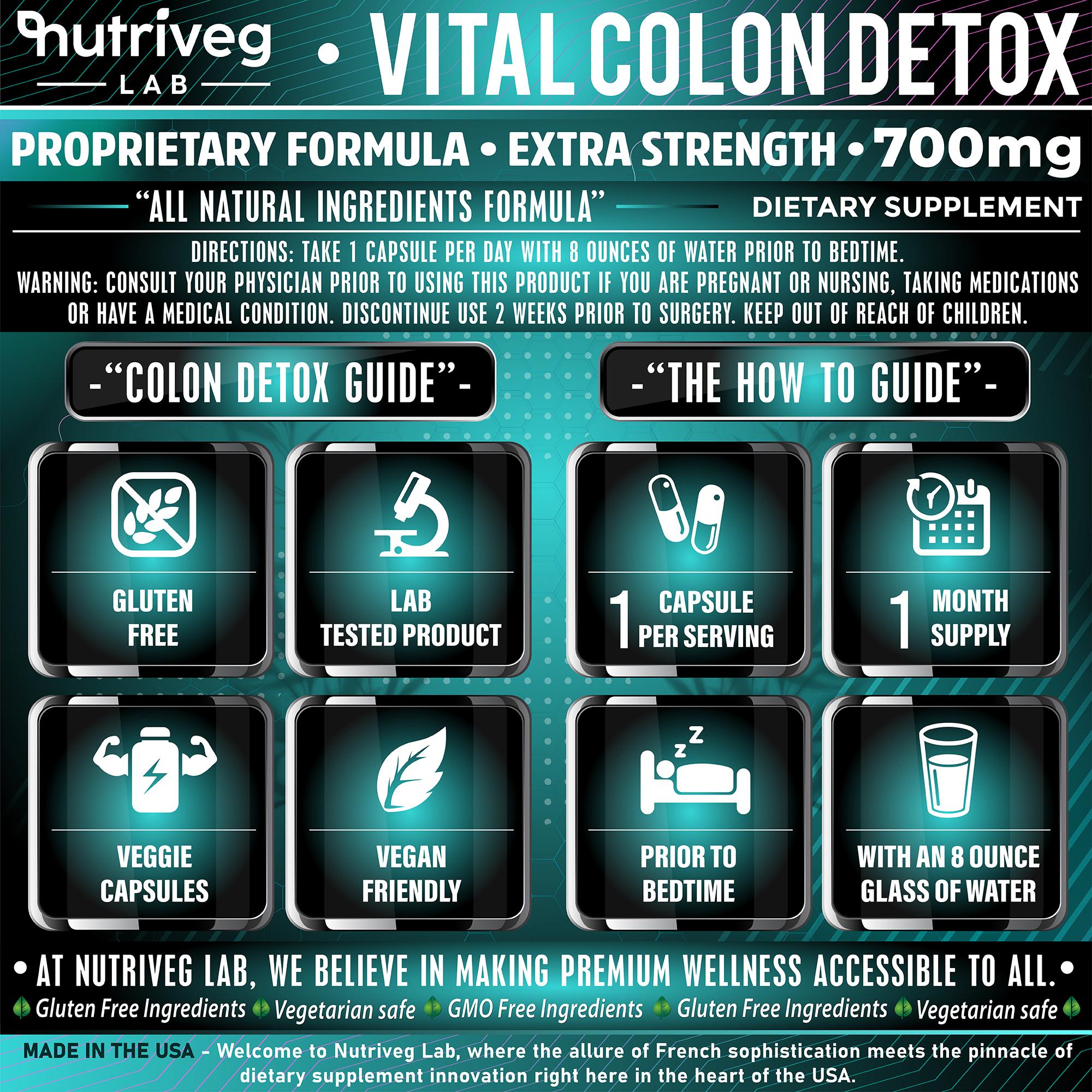
The final stage of the Amazon presentation was designed to remove friction at the point where product interest becomes purchasing consideration. Rather than leaving customers to interpret dosage, usage, product attributes, and routine guidance independently, the Instructional Infographic System organizes essential information into one clear and immediately accessible visual experience.
Every component was structured to support faster understanding across desktop and mobile environments. Clear iconography, controlled spacing, concise instructional language, and consistent Brand Identity Design transform detailed product information into practical guidance—without overwhelming the customer or weakening the premium character of the brand.
The Solution Included:
- Comprehensive Instructional Infographic
A structured visual module developed to communicate approved usage guidance, serving information, routine context, and essential product attributes with immediate clarity. - Intuitive Information Architecture
A carefully organized reading sequence that helps customers move naturally from product characteristics to practical guidance and informed consideration. - Consistent Product Icon System
Recognizable visual symbols created to communicate key product attributes quickly while maintaining complete consistency with the wider Supplement Branding system. - Mobile-First Communication Design
A legible, high-contrast layout designed to preserve comprehension and visual hierarchy across smaller Amazon and e-commerce screens. - Conversion-Conscious Customer Guidance
A focused presentation that reduces unnecessary uncertainty, strengthens Consumer Confidence, and supports a more intuitive path toward purchase.
The completed system transforms practical product information into a refined customer experience. By combining Infographic Design, instructional clarity, premium Wellness Packaging Design, and marketplace-focused communication, the presentation strengthens product credibility while completing the visual logic of the Amazon listing.
“Great Amazon Listings Don’t End With Attractive Design—They End With Complete Customer Understanding.”
FROM FIRST SEARCH TO A COMPLETE MARKETPLACE BRAND EXPERIENCE
COMPLETE AMAZON EXPERIENCE
EVERY CONTENT MODULE WAS DESIGNED TO ANSWER A DIFFERENT QUESTION WITHIN THE CUSTOMER JOURNEY.
Nine Marketplace Content Modules
One Structured Journey From Discovery To Understanding.
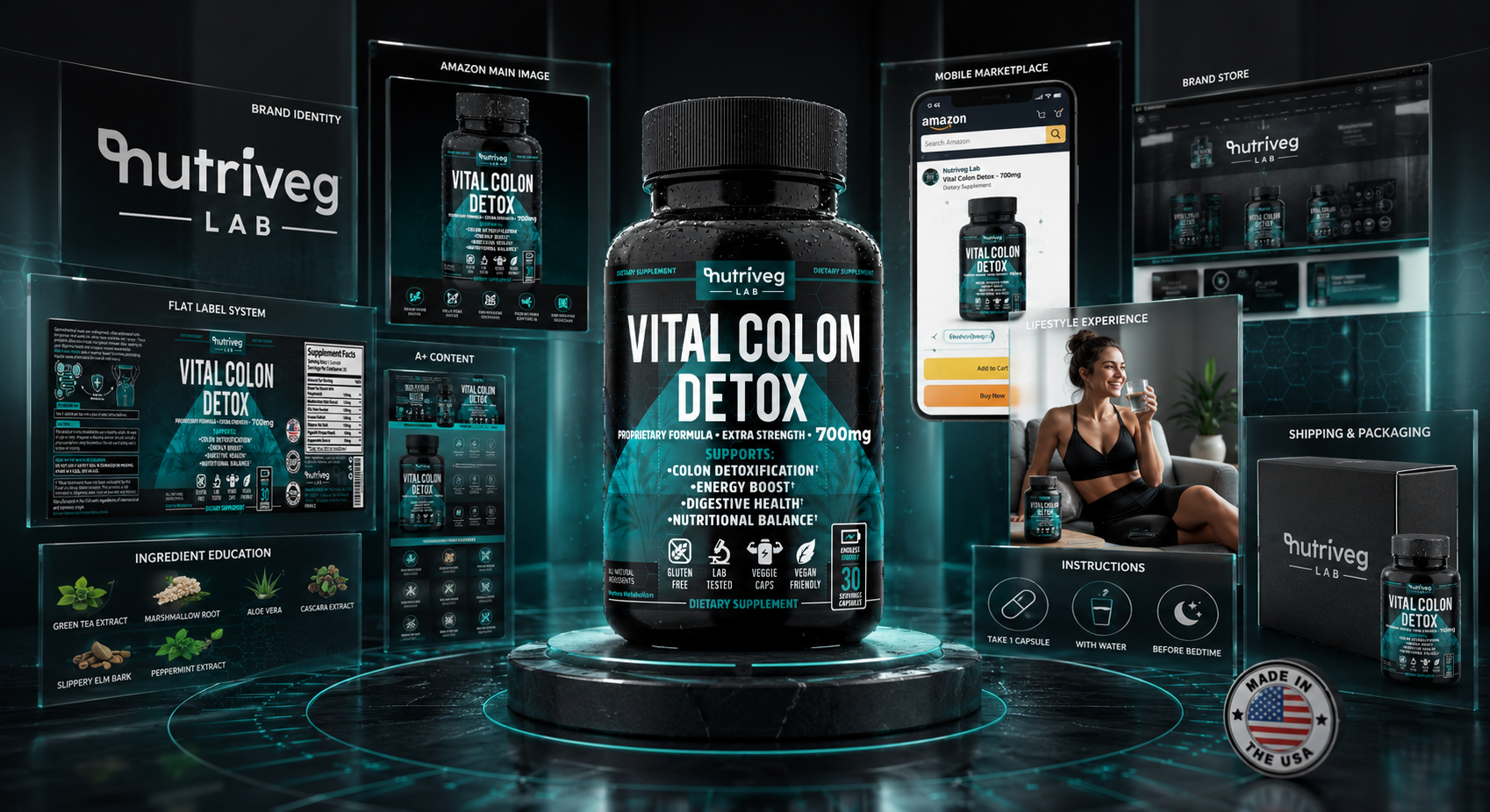
Nine principal content modules form the complete Amazon presentation: hero image, product overview, brand story, key benefits, formula education, lifestyle experience, customer aspiration, benefit infographic, and usage guidance. Together, they create one connected Amazon Listing Design system.
Three Primary Shopping Contexts
Search Results. Product Page. Mobile Experience.
The system was designed around three decisive marketplace contexts. It must attract attention during search, communicate value on the product page, and preserve clarity on smaller mobile screens—ensuring that the complete presentation remains effective throughout the Amazon shopping journey.
One Consistent Visual Language
Packaging, Content, And Commerce Speaking As One Brand.
Typography, color, product imagery, iconography, and information hierarchy remain consistent throughout every marketplace asset. This unified visual language connects the physical Supplement Packaging Design with digital commerce, strengthening recognition and preventing the listing from feeling like a collection of unrelated promotional images.
One Complete Marketplace Experience
Designed For Discovery. Structured For Confident Evaluation.
The final system connects product visibility, educational content, emotional storytelling, usage guidance, and brand credibility within one continuous experience. Every module supports the next customer question, transforming Amazon presentation from a product gallery into a strategically organized commercial brand environment.
An effective Amazon presence is not created by one successful hero image or one persuasive infographic. It is created when every asset performs a specific role while remaining connected to the same Brand Identity Design system. That consistency turns individual marketplace content into a recognizable and scalable brand experience.
“Amazon Visibility Wins The First Second. A Complete Brand System Builds Confidence Through Every Moment That Follows.”
PROJECT EVOLUTION
FROM STRATEGIC PACKAGING TO ONE COMPLETE MARKETPLACE BRAND SYSTEM
“Exceptional Products Aren’t Built Through Design Alone—They’re Built Through Every Connected Brand Experience.”
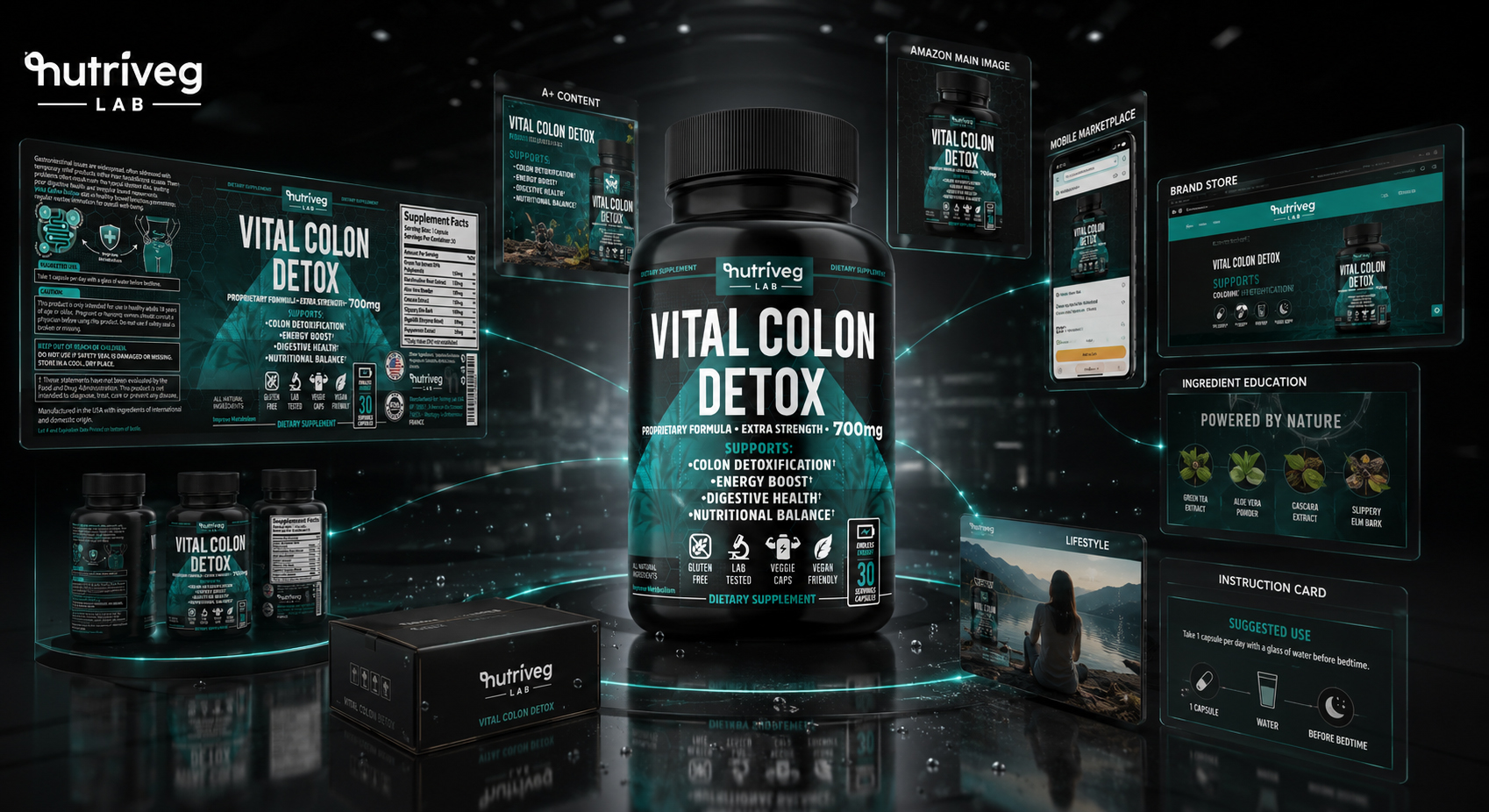
The Vital Colon Detox® project began with the need for a clearer and more competitive Supplement Packaging Design system. As the strategy developed, it became evident that the label could not operate as an isolated creative asset. Packaging needed to become the foundation for every environment in which customers would discover, evaluate, understand, and remember the product.
The visual identity was therefore expanded into a complete marketplace communication system connecting packaging, Amazon content, product education, lifestyle storytelling, photography, and customer guidance. Each component was developed to perform a different role while remaining part of one recognizable Nutriveg Lab experience.
From the Amazon Main Image and secondary infographics to A+ Content, Brand Store presentation, web shop assets, and editorial photography, every touchpoint was governed by the same typography, color psychology, information hierarchy, iconography, product scale, and visual standards.
The Solution Included:
- Complete Brand Positioning and Visual Strategy
- Premium Health Supplement Packaging
- Complete Front, Side, and Back Label System
- Structured Packaging Information Architecture
- Amazon Main Image Development
- Amazon Secondary Image System
- Educational and Benefit Infographics
- Instructional Product Communication
- A+ Content Visual Framework
- Amazon Brand Store Direction
- Editorial Product Photography
- Lifestyle Brand Storytelling
- Material and Macro Detail Studies
- Mobile-First Marketplace Optimization
- Cross-Channel Brand Consistency
- Scalable Brand Ecosystem Development
The Final Transformation:
The completed project is more than a professionally designed supplement package. It is a connected Wellness Brand Design system in which packaging, digital visibility, product education, and customer experience support the same strategic brand position.
Rather than producing a collection of unrelated assets, the project established one scalable visual framework prepared to support Amazon, web shops, premium retail presentation, future product extensions, and long-term Nutriveg Lab brand development.
“Great Packaging Earns Attention. Complete Brand Systems Build Recognition, Trust, And Room To Grow.”
OUR APPROACH
“We Don’t Design Isolated Assets. We Build Connected Brand Systems Where Strategy, Packaging, Amazon Content, And Customer Experience Work As One.”
Every decision is developed to serve a clear function within the wider brand experience—from the first moment of recognition to detailed product understanding and long-term visual consistency.
Our approach combines Brand Strategy, Supplement Packaging Design, information architecture, editorial storytelling, Amazon marketplace communication, and visual consistency into one integrated creative system.
Every decision—from label hierarchy and typography to product photography, educational content, lifestyle imagery, and mobile presentation—is developed to strengthen the brand, simplify customer understanding, and create a more consistent commercial experience.
For Vital Colon Detox®, this meant connecting the physical package with every stage of the digital customer journey: search visibility, product recognition, evaluation, education, emotional relevance, purchase confidence, and long-term brand retention.
Infinity Design Studio x NF Creative Studio
Strategy Gives The Product Direction. Design Gives The Brand Recognition. A Complete Ecosystem Gives The Business Room To Grow.
STRATEGY · DESIGN · CLARITY · BRAND GROWTH
“Before A Brand Can Move With Confidence, Every Element Must First Find Its Balance.”
Where Clarity Finds Its Rhythm
Creating A Quiet Moment Between Strategic Foundation And The Complete Brand Story Still To Unfold
The strongest wellness brands are not built by adding more noise. They are built by understanding what deserves attention, what requires explanation, and what should simply be allowed to breathe. Before moving deeper into the strategy, systems, and decisions behind Vital Colon Detox®, this moment creates space to pause—and recognize the central idea guiding the entire project: clarity should always feel considered, never forced.
For Vital Colon Detox®, Supplement Packaging Design became more than a way to present a product. It became a carefully structured balance between scientific precision and human reassurance—translating complex information, brand character, and commercial purpose into an experience that feels calm, credible, and immediately understandable across packaging, Amazon, retail, and everyday wellness touchpoints.
What follows is the story beneath the finished surface: the Brand DNA, label architecture, information hierarchy, material decisions, lifestyle storytelling, Amazon visibility, and complete brand ecosystem that transformed individual design choices into one coherent experience. Each chapter reveals how strategy, emotion, and visual consistency work together—turning a premium supplement package into a brand built to be recognized, understood, and trusted.
“The Strongest Brand Systems Don’t Force Every Element To Speak. They Give Every Element A Purpose, A Rhythm, And A Reason To Belong.”
CHAPTER 01
DISCOVERING THE TERRITORY OF TRUST
Where Strategy Begins Before Design.
Understanding The Market, The Customer, And The Psychology Behind Every Decision.
STRATEGIC RESEARCH & CONSUMER INSIGHT
FROM MARKET COMPLEXITY TO A CLEAR TERRITORY OF TRUST.
Every Meaningful Design Decision Began With Understanding The Category And The Customer.
The Vital Colon Detox® Supplement Packaging Strategy was developed to understand how health and wellness products communicate across a complex marketplace—from Amazon search results and mobile product listings to retail environments and everyday customer evaluation.
By examining category conventions, competitive repetition, information priorities, and consumer decision psychology, the research established a clear foundation for Health Supplement Packaging built around science, wellness, clarity, and confidence.
Before Design Creates Recognition, Strategy Must Define What The Brand Needs To Mean.
STRATEGIC FOUNDATION METRICS
Strategic Territories. One Defined Direction.
Science. Wellness. Trust.
The project began by examining three complementary territories capable of shaping credible Health Supplement Packaging. Scientific precision established authority, wellness introduced human relevance, and trust connected both perspectives into one focused strategic direction for the brand.
Market Contexts. One Clear Opportunity.
Category And Amazon Research
The competitive review considered both the wider supplement category and the specific Amazon environment. Studying these two contexts revealed where visual sameness dominated and where a more distinctive Supplement Packaging Design system could create immediate recognition.
Decision Stages. One Confidence Journey.
From Uncertainty To Confidence
The customer experience was structured around five natural stages: uncertainty, reading, understanding, confirmation, and confidence. Each stage informed how hierarchy, language, and trust signals should work together within a clear and reassuring Wellness Packaging Design experience.
Strategic Position. Built To Stand Apart.
Clarity Within A Crowded Category
Research identified one central opportunity: combining scientific credibility with approachable premium wellness. This position became the foundation for every subsequent Brand Identity Design decision, ensuring the product could feel authoritative, distinctive, and understandable without becoming visually clinical or aggressive.
BEFORE THE DESIGN
DISCOVERING THE VISUAL TERRITORY BETWEEN SCIENCE, WELLNESS, AND CONSUMER TRUST.
Every Successful Supplement Brand Begins With Understanding Before Expression.
Before typography, color, packaging hierarchy, or visual style could be defined, the project began with a more important question: what must a premium supplement brand communicate in a category shaped by complex information, competing benefit language, clinical visual cues, natural ingredients, and limited customer attention?
The research phase examined established conventions within Health Supplement Packaging, Dietary Supplement Packaging, and the wider wellness market across Amazon, e-commerce platforms, and retail environments. The objective was not to imitate existing products, but to understand which signals customers already recognize, where competing brands begin to look interchangeable, and where a clearer visual opportunity could be created.
Many products within the category rely on similar combinations of green botanical imagery, medical terminology, aggressive claims, clinical symbols, and dense information. When every element attempts to attract attention simultaneously, the result can become visually crowded, difficult to navigate, and harder to remember.
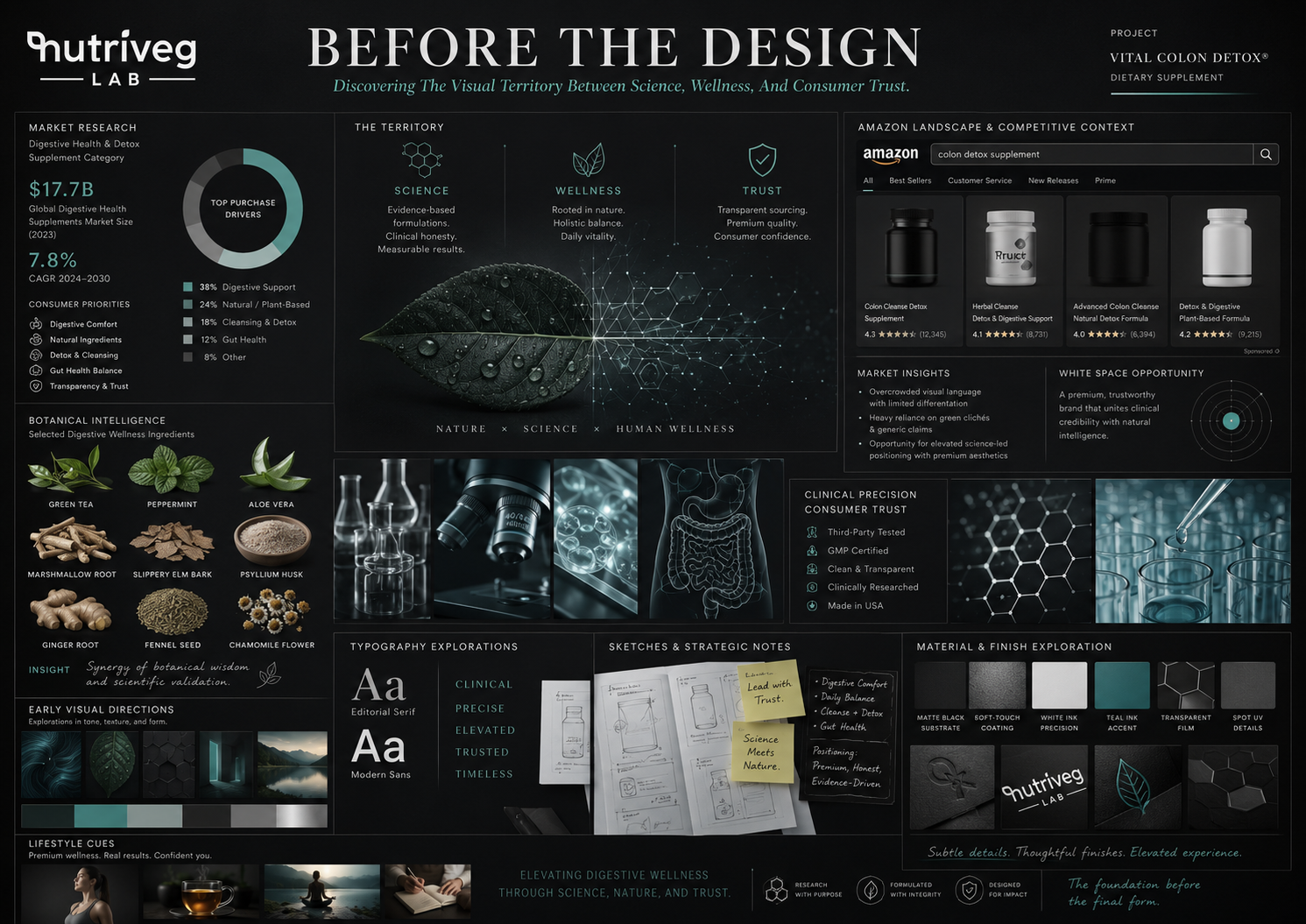
This revealed a strategic opportunity for Vital Colon Detox®: to create a Wellness Packaging Design system capable of balancing scientific credibility with a more approachable and human sense of wellbeing.
The brand needed to feel credible without becoming cold. Natural without appearing generic. Premium without becoming distant. Visible without relying on exaggeration. Every decision therefore had to support clarity, recognition, and informed product evaluation.
Research into category behavior, customer information priorities, Amazon visibility, mobile presentation, material references, typography, color psychology, and competitor positioning established the foundation for the complete Supplement Packaging Design strategy.
Rather than beginning with a predetermined aesthetic, the visual identity was developed from a clearly defined strategic territory—where science, wellness, product transparency, and consumer confidence could work together as one coherent brand experience.
STRATEGIC RESEARCH OBJECTIVES:
- Analyze the competitive supplement packaging landscape.
- Identify established category conventions and areas of visual repetition.
- Understand which product information requires immediate visibility.
- Evaluate packaging performance across Amazon, mobile, e-commerce, and retail.
- Define a distinctive territory between science and natural wellness.
KEY STRATEGIC INSIGHTS:
- Clarity must come before persuasion.
- Strong hierarchy reduces unnecessary visual effort.
- Scientific structure and human wellness must feel connected.
- Differentiation can be achieved without excessive visual aggression.
- Consistency supports faster recognition across every brand interaction.
INITIAL DESIGN DIRECTION:
- Deep charcoal foundations with controlled teal accents.
- Clear and scalable typographic hierarchy.
- Restrained botanical and molecular visual references.
- Strong legibility across physical and digital formats.
- A flexible Brand Identity Design system prepared for future growth.
STRATEGIC FOUNDATION
The research phase did not prescribe a final label. It established the criteria that every later design decision would need to satisfy.
Every color needed a psychological purpose. Every typographic level needed a communication role. Every icon, pattern, material, and visual accent needed to support the wider Supplement Branding strategy.
By grounding the creative process in Packaging Market Research, consumer behavior, category analysis, and digital visibility, Vital Colon Detox® could move beyond generic Product Packaging Design and begin developing a recognizable identity built around clarity, structure, and confidence.
Before A Brand Can Be Seen Differently, It Must First Understand The Market Differently.
THE PSYCHOLOGY OF CONFIDENCE
WHEN INFORMATION FEELS CLEAR, THE DECISION FEELS SAFER.
Clear Information Reduces Uncertainty Before It Creates Preference.
Customers rarely begin by reading every available detail. First, they notice. Then, they scan. They compare. They search for recognizable signals. Only then do they decide whether a product feels clear and credible enough to explore further.
This process happens quickly in retail environments and even faster across Amazon search results, mobile listings, and e-commerce product pages. Within seconds, Health Supplement Packaging must communicate the brand, product category, product name, key information, visual credibility, and an immediate reason to continue reading.
Confidence is not created by a single logo, color, icon, or certification symbol. It develops through a sequence of small moments in which uncertainty is gradually replaced by understanding.
For Vital Colon Detox®, that sequence was defined through five connected stages:
Initial Uncertainty → Reading → Understanding → Confirmation → Confidence
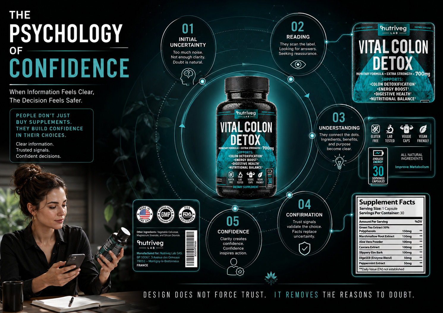
The label was structured to support this natural decision process. The Nutriveg Lab identity creates immediate brand recognition. The product name establishes a strong visual anchor. Formula and strength information are positioned for faster scanning. Supporting information, iconography, and Supplement Facts provide additional layers for customers who want to evaluate the product more closely.
This approach transforms Wellness Packaging Design from a decorative surface into a guided information experience.
The purpose is not to manufacture trust, imply guaranteed effectiveness, or pressure the customer into a decision. It is to organize verified product information so that customers can understand what they are viewing, identify what matters to them, and evaluate the product with less unnecessary confusion.
Through controlled contrast, clear typography, consistent iconography, predictable information placement, and a carefully structured hierarchy, the complete Dietary Supplement Packaging system was designed to make every stage of product evaluation feel more considered.
CUSTOMER DECISION STAGES:
- Initial Uncertainty — The customer enters a category filled with competing information.
- Reading — Attention moves toward the product name, category, and primary details.
- Understanding — Information begins to form a clear and connected picture.
- Confirmation — Verified details and relevant trust signals support evaluation.
- Confidence — Clarity makes the next decision feel more informed.
DESIGN SIGNALS:
- Immediate brand recognition.
- Clear product category communication.
- Strong product-name hierarchy.
- Visible formula and strength information.
- Structured supporting information.
- Consistent colors, typography, and iconography.
COMMUNICATION OBJECTIVES:
- Reduce unnecessary visual noise.
- Support faster information scanning.
- Make product comparison easier.
- Improve communication across physical and digital formats.
- Strengthen recognition without relying on exaggerated claims.
CONFIDENCE THROUGH CLARITY
Consumer psychology became an active part of the Packaging Design Strategy. Instead of asking only how the label should look, the project examined how the customer’s attention moves, where uncertainty may appear, which information requires priority, and how the complete system can guide understanding without creating pressure.
In effective Consumer-Centered Packaging Design, confidence is rarely produced by one dramatic element. It develops when every part of the experience feels intentional, readable, consistent, and connected.
Vital Colon Detox® was therefore designed not simply to occupy space on a bottle, but to create a clearer relationship between the product, its information, and the person evaluating it.
Design Does Not Force Trust. It Removes The Reasons To Doubt.
FINAL CHAPTER CONCLUSION - 01
FROM RESEARCH TO RECOGNITION
When Strategy Creates Clarity, Every Visual Decision Gains Purpose.
Every meaningful Brand Identity Design begins before the first visual solution is created.
It begins with the market.
The category.
The customer.
The competitive environment.
And the moment uncertainty becomes a decision.
For Vital Colon Detox®, Chapter 01 established the strategic foundation through research, category analysis, consumer psychology, Amazon context, and the principles of clear information architecture.
Not decoration without purpose.
Not visibility without understanding.
Not differentiation built on unnecessary noise.
One connected Supplement Packaging Strategy designed to transform complex category information into a clearer, more recognizable, and more confident brand experience.
When research informs positioning, positioning guides design.
When design organizes information, understanding becomes easier.
And when every decision has a reason, the brand begins to earn recognition.
GREAT DESIGN BEGINS WITH UNDERSTANDING.
CLEAR INFORMATION BUILDS CONFIDENCE.
EVERY VISUAL DECISION NEEDS A STRATEGIC REASON.

CHAPTER 02
BUILDING A BRAND LANGUAGE BETWEEN SCIENCE AND WELLNESS
Where Strategic Positioning Becomes A Distinctive Visual Identity.
From Brand Purpose To Visual Expression, Every Element Was Designed To Communicate Credibility, Clarity, And Everyday Wellness.
BRAND IDENTITY DESIGN SYSTEM
FROM STRATEGIC VALUES TO A RECOGNIZABLE WELLNESS BRAND.
One Brand Purpose. One Consistent Language. One Complete Visual Identity.
The Vital Colon Detox® Brand Identity System was developed to translate trust, clarity, science, vitality, balance, confidence, transformation, and accessibility into one coherent visual and communication language.
By connecting Brand DNA, color psychology, typography, iconography, packaging, and digital presentation, the project established a scalable Supplement Branding system capable of remaining recognizable across every physical and digital brand interaction.
Science With Structure. Wellness With Humanity. One Unmistakable Brand.
BRAND IDENTITY METRICS
Visual Directions. One Strategic Choice.
Exploration Before Commitment
Six visual territories examined different ways to communicate the same product promise—from clinical precision and botanical wellness to scientific technology, premium minimalism, Amazon impact, and human transformation. This exploration established a considered foundation for the final Wellness Brand Design direction.
Purposeful Colors. One Recognizable Palette.
Authority. Wellness. Clarity. Science. Energy.
Five controlled colors define the visual personality of the brand. Deep charcoal communicates authority, teal signals wellness, white creates clarity, silver introduces scientific precision, and soft cyan directs attention throughout the complete Supplement Packaging Design system.
Typography Roles. One Clear Hierarchy.
Recognition Supported By Readability
Two complementary typographic roles balance commercial impact with accessible information. Condensed display typography creates immediate product recognition, while the secondary sans serif maintains clarity across supporting content, creating a flexible Brand Identity Design system for packaging and digital communication.
Brand Language. Consistent At Every Scale.
Built To Remain Recognizable
One unified visual language connects color, typography, iconography, scientific references, and wellness imagery. This system allows the Supplement Branding to remain recognizable across the physical label, Amazon content, website applications, and every future customer-facing brand expression.
BRAND DNA
WHERE SCIENTIFIC CREDIBILITY MEETS EVERYDAY WELLNESS.
A Strong Supplement Brand Is Built From Purpose Before It Is Recognized By Design.
A successful brand is more than a logo, color palette, or packaging surface. It is a connected system of values, intentions, behaviors, visual signals, and customer expectations that determines how the brand should communicate in every environment.
For Vital Colon Detox®, the Brand DNA was developed around the need to create a clearer relationship between scientific structure and everyday wellness. The identity needed to feel informed and credible while remaining accessible, calm, modern, and human.
Eight central values established the foundation:
Trust. Clarity. Science. Vitality. Balance. Confidence. Transformation. Accessibility.
These values were not introduced as decorative language. Each one became a practical criterion for evaluating the complete Wellness Brand Design system.
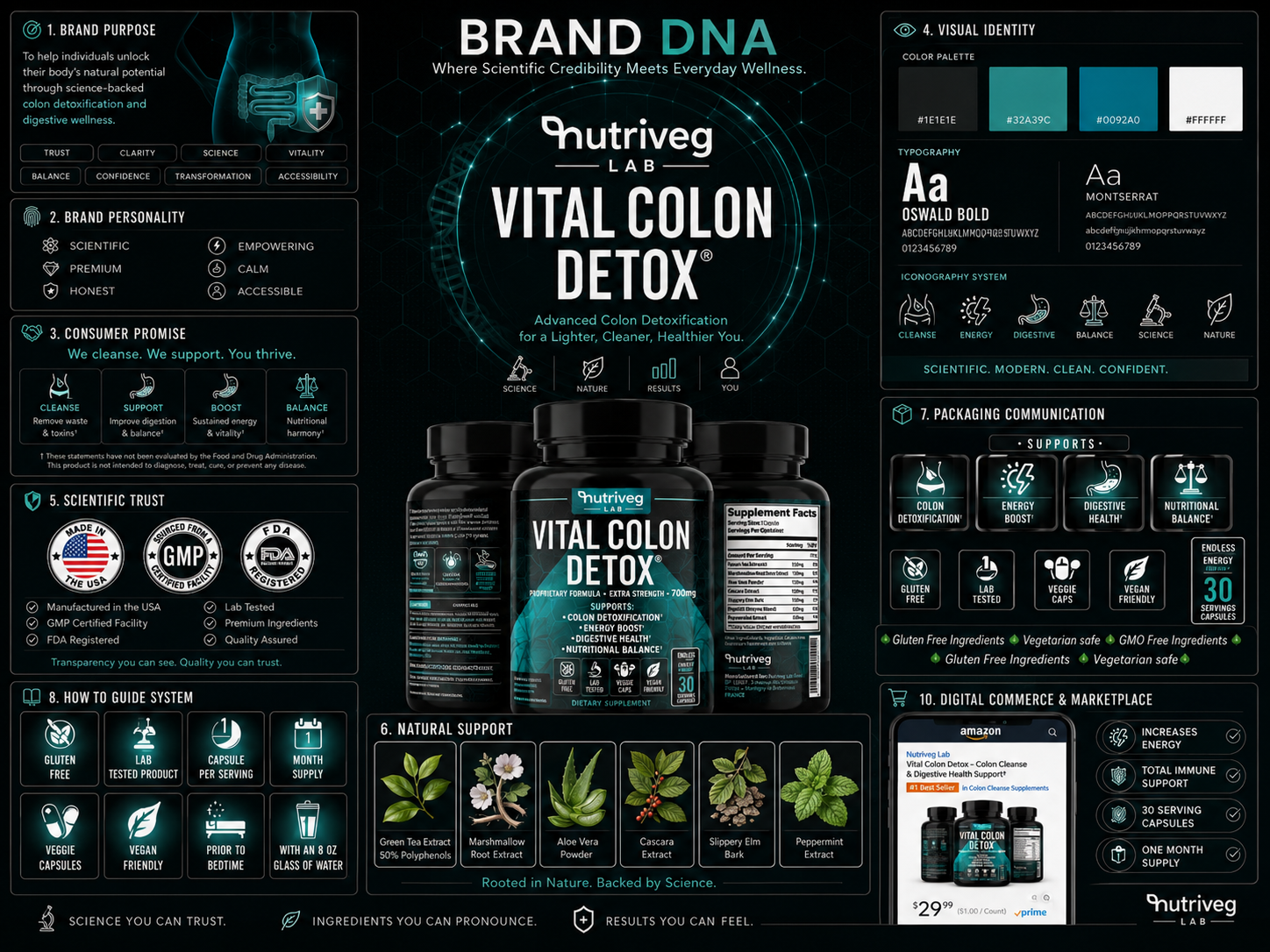
Trust required consistency and transparency. Clarity demanded disciplined information hierarchy. Science introduced structure, precision, and controlled visual references. Vitality added energy without unnecessary aggression. Balance connected clinical information with natural wellness. Confidence shaped the tone of communication. Transformation introduced a sense of positive progress. Accessibility ensured that the brand remained understandable rather than distant or overly technical.
Together, these principles established a personality that could feel scientific without becoming clinical, premium without becoming exclusive, and empowering without relying on exaggerated promises.
The same Brand DNA informed the logo application, product-name hierarchy, color palette, typography, molecular patterns, iconography, packaging communication, ingredient presentation, digital commerce system, and wider Supplement Brand Identity.
Instead of treating each application as a separate design task, the identity was developed as one connected structure capable of adapting across packaging, Amazon listings, e-commerce platforms, retail communication, lifestyle content, and future brand extensions.
BRAND FOUNDATIONS:
- Clear and purposeful brand positioning.
- A defined purpose and customer promise.
- Trust, clarity, and accessibility as central principles.
- Science and wellness presented as complementary ideas.
- A confident, premium, and human brand personality.
VISUAL IDENTITY COMPONENTS:
- Nutriveg Lab master brand.
- Vital Colon Detox® product identity.
- Charcoal, teal, white, silver, and cyan color system.
- Strong headline and supporting typography.
- Molecular and hexagonal visual patterns.
- Consistent iconography and information hierarchy.
BRAND APPLICATIONS:
- Product label and complete packaging system.
- Ingredient and Supplement Facts communication.
- Amazon and e-commerce presentation.
- Retail and digital brand recognition.
- Lifestyle and educational content.
- Scalable future touchpoints and product extensions.
BRAND STRATEGY
The purpose of the Brand DNA was not to make every application look identical. It was to ensure that every application communicated the same strategic values.
A packaging label may require stronger hierarchy. An Amazon image may require immediate readability. An ingredient story may need greater warmth. A scientific infographic may demand more structure and precision. The format can change, but the brand character must remain unmistakably connected.
This is how Brand Identity Design becomes more than visual consistency. It becomes a system that helps customers recognize the brand, understand its position, and experience the same level of clarity across every touchpoint.
When Every Element Expresses The Same Purpose, Identity Becomes Recognition.
COLOR PSYCHOLOGY
EVERY COLOR WAS CHOSEN TO BUILD TRUST BEFORE THE FIRST WORD IS READ.
Color Communicates Positioning Before Typography Has Time To Explain It.
Color is one of the first brand signals customers process. Before product information is examined in detail, the palette has already begun communicating category, quality, personality, energy, and emotional tone.
For Vital Colon Detox®, color was treated as a strategic component of the complete Wellness Brand Identity Design rather than a decorative layer applied after the design was established.
The palette needed to balance five different communication requirements: authority, wellness, clarity, scientific precision, and controlled energy.
Deep charcoal established the visual foundation. It created depth, seriousness, restraint, and a premium shelf presence while allowing lighter information to remain highly visible.
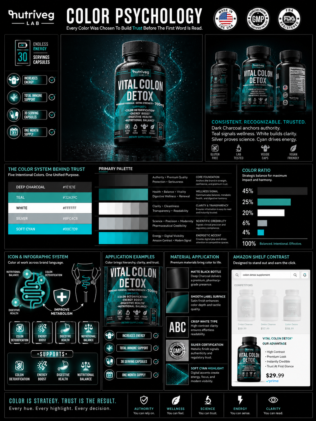
Teal connected the product with balance, vitality, contemporary wellness, and a more human expression of science. It became the central brand accent and the most recognizable point of differentiation across the packaging.
White introduced clarity, cleanliness, contrast, and readability. It allowed the product name, supporting information, and essential packaging details to remain legible across both physical and digital formats.
Silver-neutral accents added precision, material sophistication, and a controlled reference to science and modern formulation without making the brand feel cold or pharmaceutical.
Soft cyan was reserved for smaller moments of energy, digital visibility, and guided attention. Used selectively, it helps emphasize important details without disturbing the wider visual balance.
Together, these colors created a controlled Packaging Color Psychology system capable of supporting recognition across the label, ingredient communication, iconography, photography, digital listings, Amazon content, and future brand applications.
COLOR SYSTEM:
- Deep Charcoal — authority, restraint, protection, and premium positioning.
- Teal — wellness, balance, vitality, and brand recognition.
- White — clarity, cleanliness, transparency, and readability.
- Silver Neutral — scientific precision, modernity, and material quality.
- Soft Cyan — energy, digital visibility, and controlled emphasis.
EMOTIONAL FUNCTION:
- Authority without unnecessary visual aggression.
- Wellness without generic natural-product aesthetics.
- Clarity without clinical coldness.
- Science without visual complexity.
- Energy without oversaturation or noise.
BRAND APPLICATION:
- Product-name and information hierarchy.
- Label contrast and small-format readability.
- Icon and infographic organization.
- Ingredient and scientific communication.
- Packaging materials and controlled reflections.
- Amazon, mobile, e-commerce, and retail visibility.
COLOR STRATEGY
The strength of the palette does not depend only on the individual colors. It depends on the relationship between them.
Deep charcoal establishes the environment. Teal creates recognition. White organizes information. Silver reinforces precision. Cyan directs attention. Every color has a defined responsibility, and no color is used only for decoration.
This controlled approach ensures that the Color Strategy For Packaging remains recognizable even when the format, scale, background, or communication objective changes.
Across Health Supplement Packaging, color often becomes either overly clinical or generically natural. Vital Colon Detox® was positioned between those extremes, creating a visual territory where science and wellness could feel credible, contemporary, and connected.
Color Builds Feeling. Feeling Builds Trust. Trust Strengthens Recognition.
FINAL CHAPTER CONCLUSION - 02
FROM PURPOSE TO VISUAL LANGUAGE
When Every Element Communicates The Same Values, The Brand Begins To Feel Complete.
A brand purpose becomes visible through design.
Its values become recognizable through color.
Its personality becomes clearer through typography.
Its promises become easier to understand through hierarchy and iconography.
And its identity becomes stronger when every application feels intentionally connected.
For Vital Colon Detox®, the Brand DNA, color psychology, and visual language exploration were developed as parts of one complete Supplement Branding System.
Not disconnected visual styles.
Not decorative decisions without purpose.
Not consistency created through repetition alone.
One strategic identity capable of communicating science, wellness, clarity, and confidence across packaging, Amazon, e-commerce, retail, and every future brand interaction.
When purpose guides expression, the brand becomes clearer.
When visual language remains consistent, recognition becomes stronger.
And when every element supports the same idea, design becomes identity.
A STRONG BRAND BEGINS WITH PURPOSE.
A CONSISTENT VISUAL LANGUAGE BUILDS RECOGNITION.
EVERY ELEMENT MUST COMMUNICATE THE SAME IDEA.
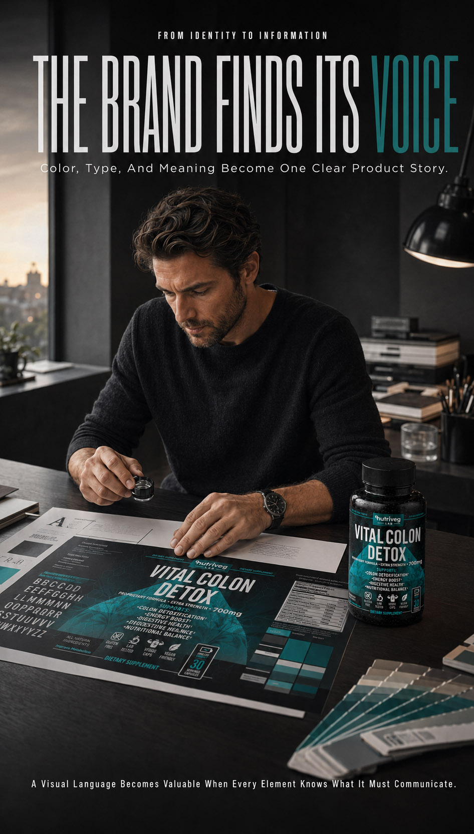
CHAPTER 03
DESIGNING A LABEL THAT EDUCATES BEFORE IT SELLS
Structuring Complex Information Into A Clear, Compliant, And Confident Product Experience.
From First Recognition To Final Detail, Every Layer Was Designed To Make The Product Easier To Understand.
THE LABEL AS A CLARITY SYSTEM
FROM COMPLEX CONTENT TO ONE CLEAR PRODUCT EXPERIENCE.
Every Element Was Given A Role. Every Message Was Given A Place.
A successful Supplement Packaging Design must do more than create visual impact. It must help customers recognize the product, understand its purpose, locate essential information, and feel confident enough to continue exploring.
For Vital Colon Detox®, the label was developed as a complete communication system—combining product positioning, information hierarchy, ingredient transparency, regulatory content, trust signals, and strong digital recognition within one consistent Health Supplement Packaging experience.
The objective was not to place more information on the package.
It was to make every piece of information easier to find, understand, and remember.
Information Organized. Trust Strengthened. Decisions Made Easier.
LABEL SYSTEM METRICS
Development Stages. One Refined Label.
From Structure To Final Form
The label progressed through four connected stages: initial structure, information hierarchy, visual refinement, and final execution. Each stage removed unnecessary complexity while strengthening the clarity, recognition, and production readiness of the complete Dietary Supplement Packaging system.
Reading Priorities. One Guided Decision.
Information In The Right Order
Seven intentional decision points guide the eye from brand recognition and product naming to strength, benefits, trust icons, serving quantity, and detailed information. This sequence transforms a dense label into a structured Product Packaging Design experience that can be understood quickly.
Trust Layers. One Credible Experience.
Information. Proof. Guidance.
Trust was constructed through three connected communication layers. Transparent product information explains what matters, visible quality signals provide reassurance, and structured usage guidance supports understanding—creating Health Supplement Packaging that earns confidence through consistency rather than a single dominant claim.
Connected Surfaces. One Complete System.
Front. Side. Back.
The front, side, and back panels were developed as one continuous communication architecture. Each surface performs a different role while preserving consistent typography, color, spacing, and visual rhythm across the complete Supplement Packaging Design and production-ready label system.
LABEL EVOLUTION
FROM COMPLEX INFORMATION TO ONE CLEAR, CONFIDENT PRODUCT STORY.
Every Successful Label Begins With A Clear Strategic Foundation.
Creating an effective Supplement Packaging Design begins long before the final production file. Every decision—from content mapping and typography to icon development, spacing, contrast, and regulatory organization—must support the same product story.
The initial challenge was not a lack of information. It was the need to transform multiple messages, benefits, instructions, certifications, and required details into a structured Dietary Supplement Packaging system that could be understood at a glance.
Rather than treating every message with equal visual importance, the content was organized according to what customers needed to recognize first, what they needed to understand next, and what they would look for before making a decision.
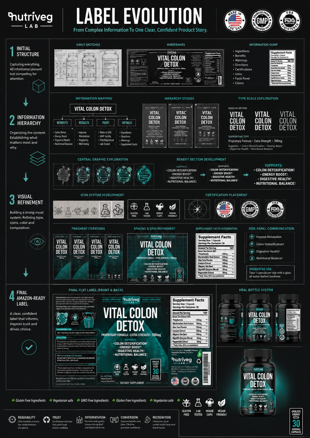
LABEL EVOLUTION
The process began by mapping every available piece of content and identifying its strategic role within the customer experience.
Product naming established immediate category recognition. Dosage strength communicated product value. Supporting information explained purpose. Icons simplified key attributes. Certification and regulatory elements provided reassurance, while the Supplement Facts panel delivered the transparency expected from credible Health Supplement Packaging.
Each refinement removed unnecessary competition between messages.
Each decision strengthened the reading order.
Each iteration brought the product closer to a label capable of performing across physical packaging, mobile screens, Amazon thumbnails, and future digital commerce environments.
THE EVOLUTION FOCUSED ON:
- Clear product and brand recognition
- Strategic information mapping
- Strong front-panel hierarchy
- Improved typography and readability
- Consistent benefit communication
- Purposeful icon development
- Structured regulatory information
- Mobile and Amazon visibility
- Scalable visual consistency
- Production-ready label organization
LABEL DESIGN STRATEGY
The final system balances commercial impact with information clarity. Large-scale product naming creates immediate recognition, while supporting messages are positioned in a controlled sequence that allows the eye to move naturally across the label.
This approach transformed the label from a collection of individual details into one connected Product Packaging Design system—built to educate, reassure, and remain recognizable wherever the product appears.
Great Labels Are Never Designed In A Single Step. They Are Refined Until Every Message Has A Purpose.
DESIGN DIRECTIONS & STRATEGIC SELECTION
FROM MULTIPLE CREATIVE ROUTES TO ONE CONFIDENT BRAND DIRECTION.
The Final Label Was Not Chosen Because It Looked Different. It Was Chosen Because It Communicated More Clearly, Performed More Consistently, And Created The Strongest Foundation For Growth.
Before the final Vital Colon Detox® Supplement Packaging Design was approved, multiple creative directions were developed to examine how the product could communicate science, natural wellness, premium quality, and commercial confidence through distinctly different visual languages.
Each concept explored a different relationship between typography, botanical references, color balance, product hierarchy, ingredient communication, benefit visibility, and digital recognition. The objective was not to produce superficial variations of one label, but to evaluate several credible strategic routes before defining the strongest long-term direction for the brand.
Some concepts emphasized clinical restraint and minimalism. Others introduced botanical storytelling, stronger teal fields, premium metallic accents, or a more direct Amazon-focused hierarchy. Every route was assessed according to the same essential criteria: Brand Recognition, Information Clarity, Consumer Trust, Shelf Visibility, Mobile Readability, Regulatory Structure, and Future Scalability.
EVALUATING MORE THAN AESTHETICS
A successful Dietary Supplement Packaging system cannot be selected through personal preference alone. Every design direction must be evaluated according to how effectively it performs across the complete customer journey—from the first search-result thumbnail to detailed product evaluation, purchase consideration, daily use, and future brand recognition.
The selected direction achieved the strongest balance between visual distinction and functional clarity. It preserved the premium black bottle, established teal as a recognizable brand asset, strengthened the product-name hierarchy, organized complex information, and created a visual system capable of performing consistently across Amazon, E-Commerce, Retail Packaging, Product Photography, and future brand extensions.
The result was not simply the most visually dramatic concept. It was the concept with the clearest strategic potential.
EXPLORING THE POSSIBILITIES
Different Visual Directions. One Strategic Objective.
The following concepts document the creative exploration that preceded the approved label. Each direction tested a different balance of scientific credibility, natural wellness, premium positioning, information clarity, and commercial visibility.
***Early design concepts are presented exclusively as documentation of the creative development process. Product information, dosage references, visual claims, and label details shown in exploratory concepts reflect their respective development stages and do not represent the final approved consumer packaging.
WHY THE FINAL DIRECTION WON
The approved design brought together the strongest qualities discovered throughout the exploration: immediate product recognition, disciplined information hierarchy, premium contrast, distinctive teal ownership, structured benefit communication, and consistent performance across physical and digital environments.
Rather than selecting the most decorative solution, the process identified the direction with the greatest potential to strengthen Consumer Confidence, Brand Recognition, Amazon Visibility, and long-term Brand Growth.
Many Directions Were Explored. One Complete Brand System Was Built.
THE SELECTION PROCESS INCLUDED:
- Multiple Creative Directions
Distinct label concepts were developed to explore clinical, botanical, premium, minimal, and commercially expressive positioning opportunities. - Typography & Hierarchy Testing
Product-name scale, dosage visibility, supporting information, benefit structure, and icon placement were tested for immediate comprehension. - Color & Recognition Evaluation
Black, teal, white, botanical green, cyan, and restrained accent colors were examined for contrast, category distinction, and long-term brand ownership. - Botanical & Scientific Balance
Natural ingredient cues were compared against more clinical and structured graphic systems to establish the right relationship between wellness and credibility. - Amazon & Mobile Readability Review
Each route was evaluated at reduced scale to determine whether the brand, product name, dosage, and key differentiators remained recognizable within seconds. - Scalability & Brand Consistency
Concepts were assessed for their ability to support future products, digital content, photography, retail presentation, and a complete Wellness Brand Design system.
THE SELECTED DIRECTION
The final direction was selected because it transformed complex product information into a controlled, confident, and immediately recognizable Health Supplement Packaging experience.
Its bold product-name hierarchy creates rapid category recognition. The black and teal palette establishes premium distinction. The structured benefit system improves comprehension. The iconography accelerates evaluation, while the botanical and scientific visual layers give the product a character that feels credible, modern, and relevant to the wellness category.
Most importantly, the chosen concept provided more than a successful label. It created a scalable visual foundation capable of connecting packaging, Amazon presentation, educational content, lifestyle storytelling, and the wider Nutriveg Lab brand ecosystem.
Great Packaging Is Rarely Found In The First Idea. It Is Built By Exploring Every Relevant Direction—Then Choosing The One Capable Of Carrying The Brand Forward.
THE ANATOMY OF THE LABEL
EVERY LAYER HAS A FUNCTION. EVERY FUNCTION SUPPORTS A FASTER DECISION.
Information Architecture Designed For Clear Understanding Across Packaging, Mobile, And Amazon.
A supplement label must communicate within a limited physical space while serving several different customer needs at the same time.
Some customers begin with the product name. Others look for dosage strength, benefits, ingredients, certifications, usage directions, or Supplement Facts. The role of professional Wellness Packaging Design is to make every path feel intentional.
For Vital Colon Detox®, the label was divided into clearly defined communication zones. Each surface was assigned a specific function, allowing visual hierarchy, regulatory content, product education, and brand recognition to work together without unnecessary competition.
The result is not simply a decorated label.
It is a complete information architecture.
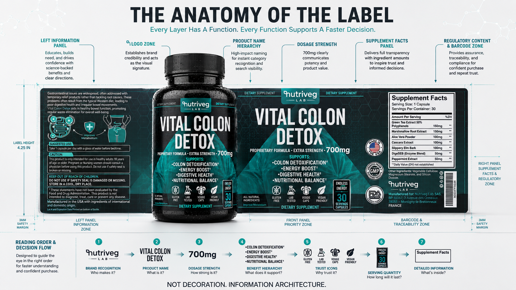
INFORMATION ARCHITECTURE
The front panel was designed for immediate recognition and fast category understanding. The supporting panel provides context, suggested use, warnings, and educational information. The regulatory panel organizes Supplement Facts, ingredients, manufacturing details, certifications, and traceability information.
Together, these three areas form one connected Supplement Label Design system.
FRONT-PANEL PRIORITIES
- Nutr i veg Lab brand recognition
- Vital Colon Detox® product naming
- Visible dosage strength
- Structured support information
- Lifestyle and product attribute icons
- Serving quantity communication
- Immediate Amazon thumbnail recognition
SUPPORTING INFORMATION PANEL
- Product story and benefit context
- Suggested use instructions
- Caution and safety information
- Supporting educational graphics
- Manufacturing origin information
- Required disclaimer placement
- Clear separation between content levels
REGULATORY AND RETAIL PANEL
- Supplement Facts presentation
- Ingredient transparency
- Certification and quality signals
- Manufacturer information
- Barcode and traceability zone
- Recycling and production details
- Structured retail compliance content
READING ORDER & DECISION FLOW
The label was designed to guide the eye through seven essential questions:
- Who makes it?
Immediate brand recognition. - What is it?
Clear product category and naming. - How strong is it?
Visible dosage communication. - What does it support?
Prioritized benefit hierarchy. - Why should I trust it?
Consistent quality and lifestyle signals. - How long will it last?
Clear serving quantity. - What is inside?
Accessible detailed information.
This structured reading sequence is particularly important for Amazon Supplement Packaging, where customers often encounter the product first as a small digital image rather than as a physical bottle.Strong information architecture ensures that the most important messages remain visible before customers enlarge the image, read the listing, or examine the full product details.
Not Decoration. Information Architecture Designed To Make Every Decision Feel Clearer.
TRUST SIGNALS
CONFIDENCE IS NEVER CREATED BY ONE CLAIM. IT IS BUILT THROUGH EVERY DETAIL.
Credibility Was Designed As A Consistent Network Of Clear, Verifiable Signals.
In the wellness category, customers rarely build confidence from a single message. Trust develops through the combined effect of clear product naming, visible information, structured Supplement Facts, consistent icons, manufacturing details, certifications, usage guidance, and professional presentation.
For Vital Colon Detox®, every trust signal was integrated into the broader Supplement Branding system rather than added as a disconnected badge or decorative element.
The objective was to create an experience in which customers could quickly identify what the product is, understand how its information is organized, and locate the details that matter to them without confusion or unnecessary pressure.
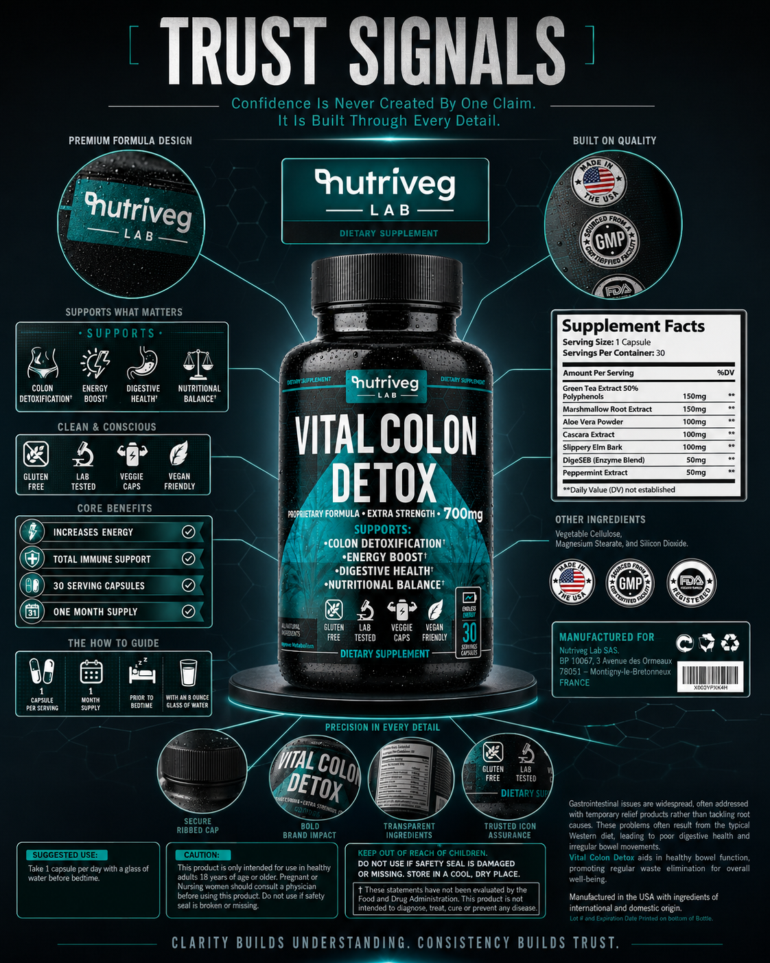
BUILDING CREDIBILITY THROUGH DESIGN
Trust is strengthened when information appears consistent across every surface.
The front panel establishes recognition. Supporting benefits provide context. Icons simplify product attributes. Supplement Facts and ingredient information create transparency. Certifications and manufacturing details reinforce quality, while usage instructions demonstrate that the product experience has been considered beyond the initial purchase.
RECOGNITION SIGNALS
- Consistent Nutr i veg Lab identity
- Clear product naming
- Strong dosage visibility
- Recognizable color and typography
- Consistent front-panel composition
- Unified iconography
QUALITY SIGNALS
- Structured certification placement
- Visible manufacturing information
- Consistent quality badges
- Professional material presentation
- Precise label production
- Controlled visual hierarchy
TRANSPARENCY SIGNALS
- Accessible Supplement Facts
- Clearly organized ingredients
- Suggested use instructions
- Caution and safety communication
- Barcode and traceability information
- Defined serving quantity
TRUST STRATEGY
Effective Dietary Supplement Packaging does not ask customers to accept every message immediately. It gives them the structure and information needed to evaluate the product for themselves.
That is why clarity became one of the most important design principles within the project.
Nothing was hidden behind unnecessary decoration.
Nothing important was left without a clear position.
Every signal was designed to support the next, creating a cumulative sense of credibility across the complete customer experience.
Clarity Builds Understanding. Consistency Builds Trust.
FINAL CHAPTER CONCLUSION - 03
FROM INFORMATION TO CONFIDENCE
When Every Element Has A Clear Role, The Entire Product Becomes Easier To Understand.
Every successful Supplement Packaging Design eventually reaches a point where visual impact and functional clarity must operate as one.
The product must be noticed.
Its purpose must be understood.
Its information must be accessible.
Its details must feel consistent.
For Vital Colon Detox®, the label was developed as a complete communication system in which product naming, benefit hierarchy, icons, Supplement Facts, usage guidance, regulatory information, and trust signals all support the same customer experience.
Not individual messages.
One connected structure.
The strongest Dietary Supplement Packaging does not overwhelm customers with information. It organizes that information so every important detail appears at the right moment.
That is where Packaging Design becomes product education.
And where product education becomes confidence.
A STRONG LABEL ATTRACTS ATTENTION.
A CLEAR INFORMATION SYSTEM BUILDS UNDERSTANDING.
A CONSISTENT PRODUCT EXPERIENCE EARNS TRUST.
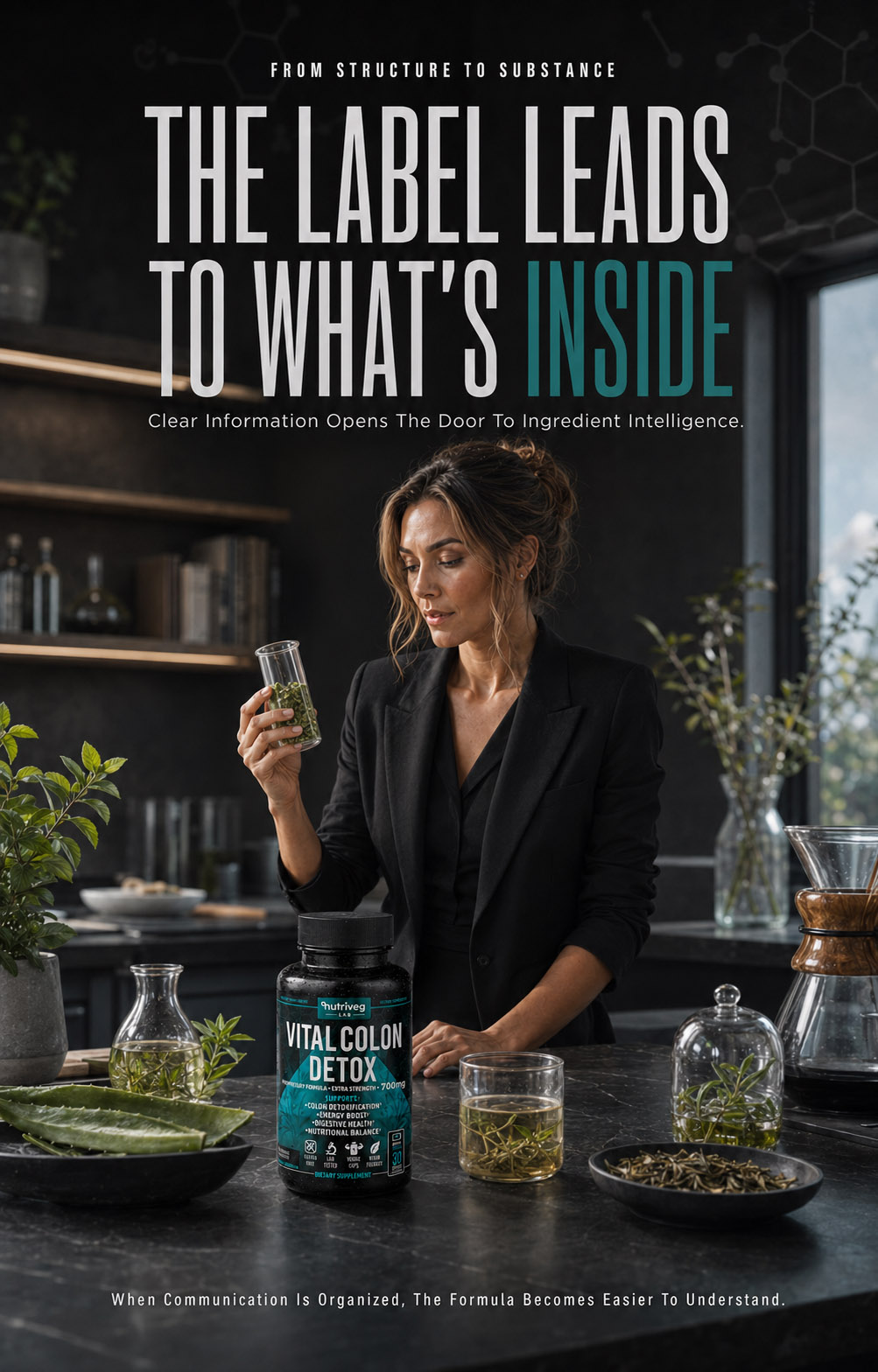
CHAPTER 04
MAKING SCIENCE VISIBLE
Translating Ingredient Intelligence Into A Clear, Credible, And Commercial Product Experience.
From Botanical Origins To First Impression, Every Layer Was Designed To Make Product Value Easier To Understand.
WHEN SCIENCE BECOMES EXPERIENCE
FROM PURPOSEFUL FORMULATION TO CONFIDENT CLARITY.
A Strong Product Begins With What It Contains. A Strong Brand Makes That Value Visible.
The value of a wellness product is created long before it reaches the shelf. It begins with the formula, the relationship between its ingredients, and the purpose behind every element contained within the capsule.
But formula quality alone does not create understanding.
Customers must be able to recognize the ingredients, navigate the information, understand the product’s structure, and connect its internal value with the experience presented through the packaging.
For Vital Colon Detox®, ingredient communication became an essential part of the broader Supplement Packaging Design strategy. Botanical materials, precise quantities, scientific cues, capsule presentation, label architecture, and digital visibility were brought together within one connected product story.
The objective was to make the formula feel transparent, considered, and accessible—without allowing complex information to become visual noise.
Science Creates The Formula. Design Creates Understanding. Clarity Creates Confidence.
FORMULA INSIGHT METRICS
Formula Components. One Structured Story.
Every Ingredient Has A Role
Seven formula components are organized into one clear ingredient narrative. Rather than presenting botanical information as disconnected details, the system gives every component a defined place within a controlled Health Supplement Packaging story designed to support understanding and transparency.
Communication Layers. One Clear Explanation.
Ingredient. Structure. Understanding.
Three communication layers translate the formula into an accessible customer experience. Ingredient identity establishes what is included, formula structure organizes the relationship between components, and visual explanation transforms technical information into purposeful Dietary Supplement Packaging communication.
Connected Stages. From Formula To Trust.
The Complete Product Journey
Eight connected stages follow the product from formula and ingredient intelligence through the capsule, information architecture, finished packaging, digital visibility, customer evaluation, and trust. Together, they demonstrate how Product Packaging Design makes internal product value visible and understandable.
Product Narrative. Science Made Accessible.
Complexity Organized With Purpose
One continuous narrative connects botanical origin, formula composition, product form, label communication, and first impression. The result is a Wellness Packaging Design experience that presents detailed information with confidence while avoiding unnecessary complexity, visual pressure, or unsupported promises.
THE FORMULA BEHIND THE EXPERIENCE
NATURE SELECTED WITH PURPOSE. SCIENCE STRUCTURED FOR EVERYDAY SUPPORT.
Seven Purposeful Ingredients Presented Through One Clear And Consistent Product Story.
The formula represents the internal foundation of the product, but customers cannot experience that value unless it is communicated clearly.
For Vital Colon Detox®, the ingredient story was developed through a combination of botanical photography, laboratory visual language, controlled typography, and structured product information. Each element helps connect natural ingredient origins with the precision expected from modern Health Supplement Packaging.
Rather than presenting the formula as an isolated list, the visual system gives every ingredient a recognizable form, name, position, and relationship to the finished product.
The bottle remains at the center of the composition while botanical materials and scientific details build context around it. This creates a clear connection between what the customer sees on the package and what the product contains.
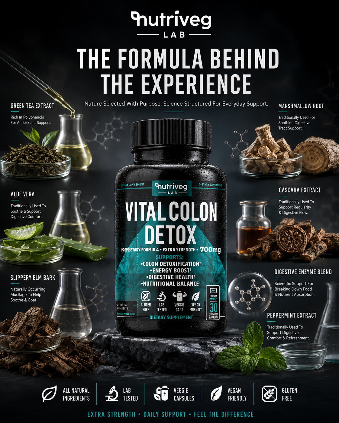
FORMULA STORYTELLING
Ingredient communication must balance two different expectations.
The first is emotional. Customers want to recognize natural materials and understand where the product story begins.
The second is informational. They expect clear naming, transparent quantities, consistent presentation, and a credible connection between the formula and the package.
The visual language was designed to satisfy both.
Natural ingredients provide familiarity and material authenticity. Laboratory vessels, molecular structures, controlled lighting, and the premium black-and-teal environment introduce scientific precision. Together, they create a Wellness Packaging Design experience positioned between botanical intelligence and modern formulation.
THE FORMULA PRESENTATION INCLUDED:
- Green Tea Extract 50% Polyphenols — 150 mg
- Marshmallow Root Extract — 150 mg
- Aloe Vera Powder — 100 mg
- Cascara Extract — 100 mg
- Slippery Elm Bark — 100 mg
- DigeSEB® Enzyme Blend — 50 mg
- Peppermint Extract — 50 mg
INGREDIENT CLARITY STRATEGY
Each ingredient was presented as part of a complete system rather than as a disconnected product claim.
Clear naming improves recognition. Visible botanical materials create familiarity. Supporting scientific cues establish context, while the central package connects every ingredient back to one finished consumer experience.
This approach allows the formula to become part of the broader Supplement Branding system. It can be translated consistently across packaging, Amazon imagery, ecommerce content, product education, photography, and future marketing touchpoints.
This approach transformed the label from a collection of individual details into one connected Product Packaging Design system—built to educate, reassure, and remain recognizable wherever the product appears.
THE EXPERIENCE WAS BUILT AROUND:
- Botanical ingredient visibility
- Clear ingredient identification
- Consistent quantity communication
- Natural and scientific balance
- Premium product presentation
- Formula transparency
- Strong package recognition
- Scalable ingredient storytelling
The result is a formula story that feels informative without becoming clinical, natural without becoming generic, and premium without relying on unnecessary exaggeration.
The Formula Defines The Product. The Experience Determines How Clearly Its Value Is Understood.
THE SCIENCE BEHIND EVERY CAPSULE
WHERE BOTANICAL INTELLIGENCE, FORMULA CLARITY, AND PURPOSEFUL DESIGN WORK AS ONE.
Seven Ingredients. Precise Quantities. One Connected Wellness Formula.
A capsule may appear simple, but the information behind it is not.
Every ingredient has a specific identity, quantity, position within the formula, and role within the overall product communication system. The challenge for effective Dietary Supplement Packaging is to present that complexity in a way that feels organized, transparent, and immediately understandable.
For Vital Colon Detox®, the formula was translated into a structured visual ecosystem. The bottle acts as the central product anchor, while individual ingredient modules, quantities, the capsule, Supplement Facts, and trust signals provide supporting layers of information.
This allows customers to move naturally from product recognition to formula exploration and, finally, to detailed product evaluation.
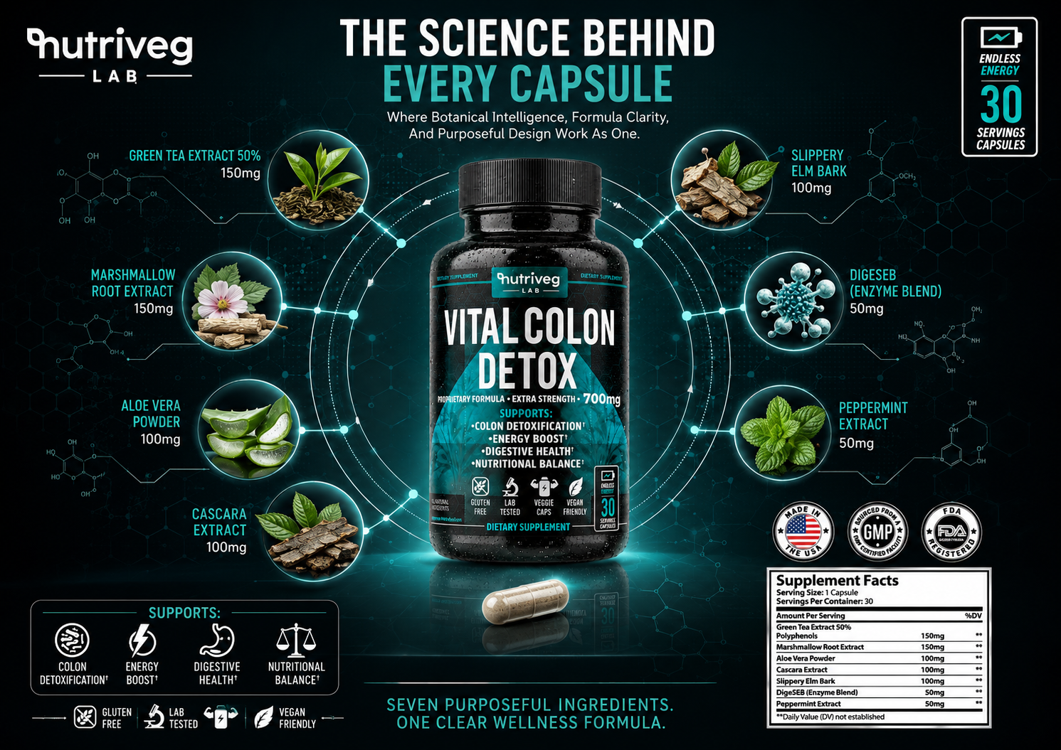
SEVEN INGREDIENTS. ONE CONNECTED SYSTEM.
The circular composition was created to communicate that the formula is not a random collection of ingredients.
Every ingredient is visually connected to the finished product.
Every quantity is presented consistently.
Every supporting element reinforces the same structured experience.
The central bottle creates immediate brand and product recognition. Botanical ingredient modules make the formula easier to explore. The capsule transforms abstract formulation into a tangible daily format, while the Supplement Facts panel provides the detailed transparency required for informed evaluation.
THE SCIENCE COMMUNICATION SYSTEM INCLUDED:
- Individual ingredient identification
- Precise quantity presentation
- Botanical ingredient visualization
- Consistent formula hierarchy
- Capsule format communication
- Supplement Facts integration
- Product attribute iconography
- Quality and manufacturing signals
- Serving quantity communication
- Unified scientific visual language
FROM INGREDIENT TO CAPSULE
The journey from raw ingredient to finished capsule is an important part of the customer’s understanding.
Botanical materials communicate origin.
Precise quantities communicate structure.
The capsule communicates format and convenience.
The Supplement Facts panel communicates transparency.
The package brings every part together within one recognizable Product Packaging Design system.
This progression allows complex information to be absorbed in layers rather than presented all at once. Customers can begin with the product, continue with the formula, and examine detailed information according to their own level of interest.
SCIENCE-LED VISUAL LANGUAGE
The scientific character of the section was created through structure rather than visual coldness.
Circular systems, connecting lines, molecular references, measured spacing, high contrast, and controlled teal illumination establish precision. Botanical photography prevents the experience from becoming overly technical, while the central product ensures that every scientific detail remains commercially relevant.
This balance is especially important for Nutraceutical Packaging Design, where customers expect both natural familiarity and credible information.
Science Becomes More Valuable When Customers Can See Its Structure And Understand Its Purpose.
FINAL CHAPTER CONCLUSION - 04
FROM FORMULATION TO RECOGNITION
A Product Creates Value Through What It Contains. A Brand Creates Confidence Through How Clearly That Value Is Communicated.
The formula is where the product begins.
But it is not where the customer experience begins.
Customers first encounter the name.
The package.
The color.
The information.
The image on a digital shelf.
Only then do they begin exploring the ingredients, quantities, product format, Supplement Facts, and supporting details.
For Vital Colon Detox®, each of these moments was designed to remain connected to the same underlying formula story.
Botanical materials communicate origin.
Scientific structure communicates precision.
The capsule communicates format.
The label creates understanding.
The finished package creates recognition.
Amazon and ecommerce presentation extend that experience into the digital marketplace.
Not separate communication layers.
One complete Health Supplement Packaging ecosystem.
That is where formulation becomes presentation.
Where presentation becomes understanding.
And where understanding begins to create confidence.
SCIENCE CREATES SUBSTANCE.
DESIGN CREATES UNDERSTANDING.
CONSISTENCY CREATES CONFIDENCE.
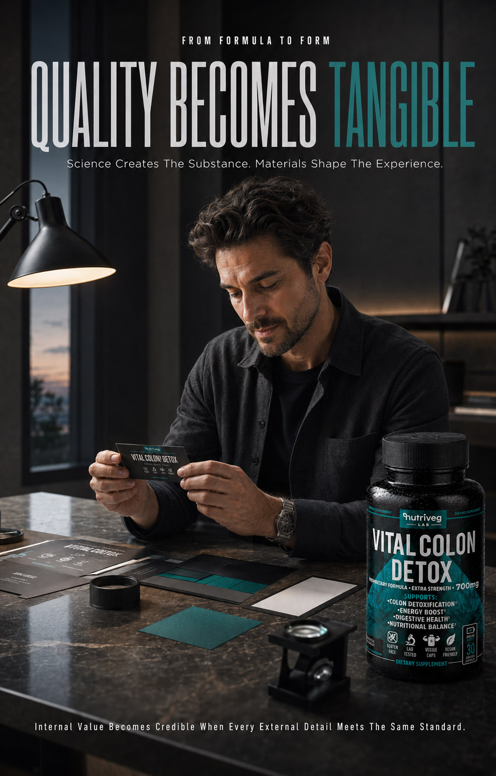
CHAPTER 05
MACRO DETAILS & MATERIAL EXPLORATION
Where Material Selection, Print Precision, And Tactile Detail Transform Packaging Into A Premium Product Experience.
From First Touch To Closest Inspection, Every Surface Was Designed To Communicate Quality.
QUALITY YOU CAN SEE BEFORE YOU TOUCH
FROM MATERIAL SELECTION TO MICROSCOPIC PRECISION.
Premium Perception Is Built Through The Details Most Customers Never Consciously Analyze.
Customers experience packaging before they experience the product itself.
They notice its weight, surface, contrast, construction, print sharpness, label alignment, cap texture, and the way every material responds to light. These details may not always be examined individually, but together they determine whether the product feels generic, considered, or genuinely premium.
For Vital Colon Detox®, material selection and production quality were treated as essential parts of the broader Supplement Packaging Design strategy.
The bottle, cap, label substrate, ink system, selective finishes, printing precision, protective materials, and transport packaging were developed to communicate the same brand qualities: clarity, science, trust, control, and premium wellness.
The objective was not decoration for its own sake.
It was to ensure that every material decision strengthened both the functional product experience and the perceived value of the brand.
Premium Quality Is Not Added At The End. It Is Engineered Into Every Surface.
MATERIAL AND PRODUCTION METRICS
Material Decisions. One Premium Experience.
Bottle. Cap. Label. Finish. Protection.
Five material considerations define the physical experience: bottle construction, cap texture, label substrate, printed finish, and protective packaging. Together, they translate the visual identity into a tactile Premium Packaging Design system designed for durability, precision, and perceived quality.
Macro Details. Precision At Every Scale.
Craftsmanship Seen Up Close
Eight macro perspectives examine product naming, logo reproduction, teal graphics, benefit typography, icon printing, Supplement Facts clarity, label edges, and bottle materials. These details demonstrate how refined Supplement Packaging Design remains credible even under the closest visual inspection.
Print Priorities. One Controlled Result.
Readability. Registration. Consistency.
Production quality was guided by three essential priorities: clear information, accurate print registration, and consistent surface reproduction. These standards ensure the Dietary Supplement Packaging maintains its intended hierarchy, contrast, and premium character from the approved artwork to the manufactured product.
Production System. Ready For Real Application.
Designed Beyond The Screen
The final result operates as one production-conscious system connecting materials, inks, finishes, label construction, and protective components. Every decision was considered for real manufacturing, allowing the Product Packaging Design to preserve its clarity and brand integrity beyond the digital presentation.
PREMIUM LABEL PRINT MACRO DETAILS
PREMIUM LABEL CRAFT
THE DETAILS CONSUMERS MAY NOT NOTICE—BUT INSTANTLY FEEL.
Macro photography reveals what ordinary product presentation often leaves unseen.
At close range, typography, ink density, label edges, surface texture, icon reproduction, print registration, and material transitions become visible. These details show whether the packaging system has been resolved only from a distance or considered at every scale.
For Vital Colon Detox®, macro imagery was used to document the physical quality of the finished package and demonstrate how strategic design decisions translate into real production detail.
This is where Packaging Design becomes craftsmanship.
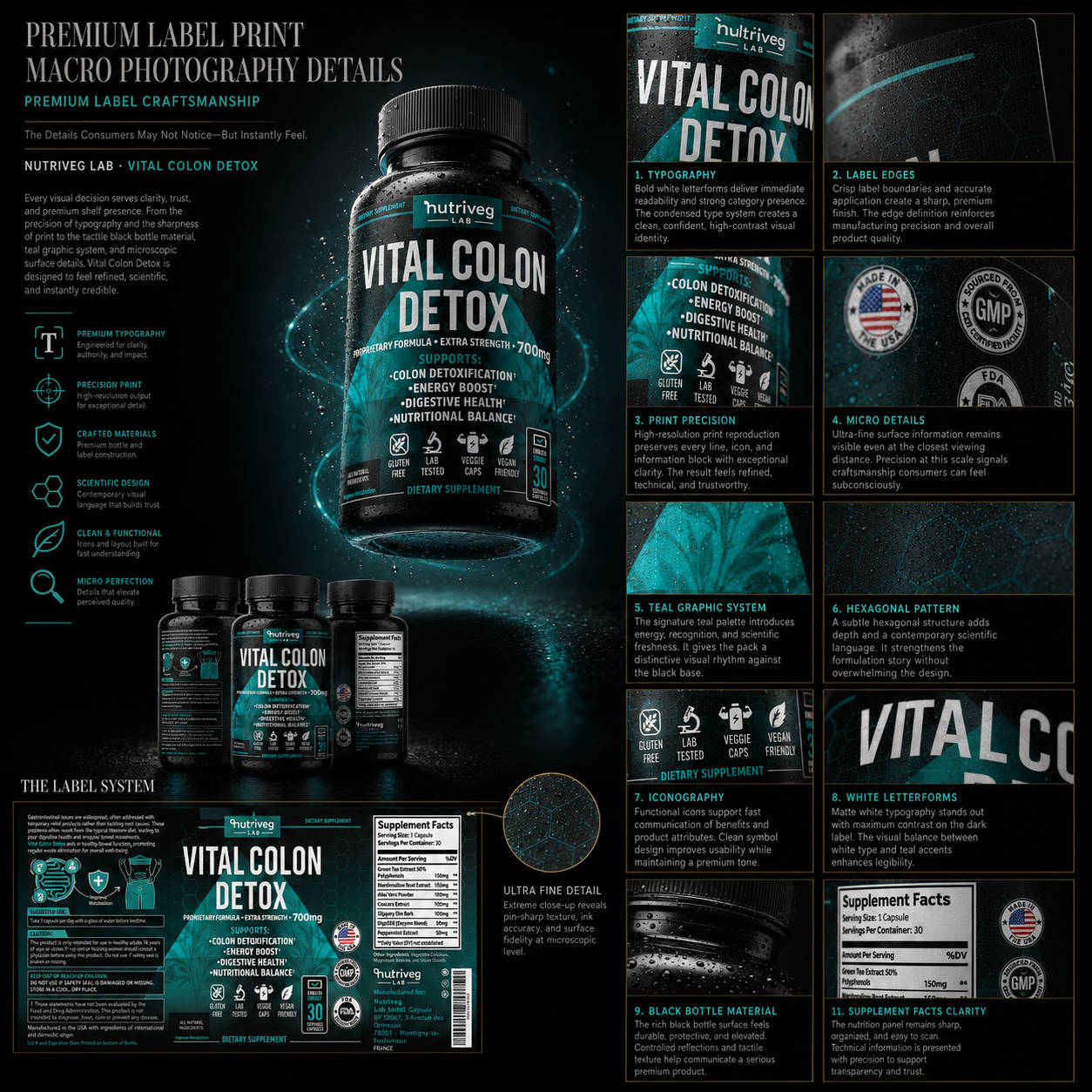
CRAFTSMANSHIP AT EVERY SCALE
A premium package must remain convincing when viewed from across the shelf, held in the hand, photographed for ecommerce, and examined at the closest distance.
Macro photography allows each of these production qualities to become part of the editorial story.
It transforms small details into visible evidence of control, consistency, and care.
01. PRODUCT NAME MACRO
The product name is the strongest typographic element on the front panel.
Crisp white letterforms, controlled ink density, and precise spacing create immediate recognition and strong category presence.
At macro scale, the quality of the typography demonstrates that visual impact is supported by accurate production.
02. LOGO MACRO
The Nutriveg Lab logo acts as the primary brand anchor.
Sharp letterforms, consistent white ink application, and clean boundaries preserve brand recognition even under close inspection.
The logo reproduction establishes a standard of precision that continues across the complete Brand Identity Design system.
03. TEAL GRAPHIC MACRO
The teal graphic system creates depth, movement, and brand distinction.
Subtle tonal transitions and controlled printing allow the graphic to remain rich without compromising the clarity of the information placed above it.
The macro view reveals how color, texture, and scientific geometry work together within the label surface.
04. BENEFIT TYPOGRAPHY MACRO
Supporting information was designed to remain clean, aligned, and readable.
Consistent spacing, high-contrast typography, and controlled ink application ensure that smaller information retains clarity without competing with the product name.
This balance supports both functional communication and premium presentation.
05. CERTIFICATION ICON MACRO
Icons simplify information and help customers recognize important product attributes quickly.
At close range, their sharp outlines, consistent scale, and precise reproduction reinforce the quality of the broader Supplement Label Design system.
Every icon was treated as a functional communication element—not as decoration.
06. SUPPLEMENT FACTS MACRO
The Supplement Facts panel carries some of the most detailed information on the package.
High contrast, precise rules, consistent spacing, and clearly reproduced typography allow the panel to remain organized and easy to scan.
Technical information was presented with the same production care as the primary brand elements, reinforcing transparency and trust.
07. LABEL EDGE MACRO
Label edges reveal the accuracy of application and finishing.
Clean boundaries, controlled alignment, and a smooth wrap around the bottle help the label feel integrated with the package.
Even a small irregularity at the edge can affect perceived quality, making this one of the most important details within professional Label Printing Design.
08. BOTTLE AND CAP MATERIAL MACRO
The bottle and cap create the tactile foundation of the package.
Subtle sheen, fine ribbing, controlled reflections, and realistic surface texture communicate durability and premium construction.
Macro photography shows how these functional components contribute to the emotional perception of the finished product.

MACRO PRODUCT PHOTOGRAPHY STRATEGY
Macro imagery was not created simply to make the product appear dramatic.
Its purpose was to document the relationship between design intention and production execution.
It proves that the visual system continues to perform beyond the initial front-facing impression.
THE MACRO SYSTEM DOCUMENTED:
- Typography sharpness
- Logo reproduction
- Ink density and consistency
- Teal color transitions
- Surface texture
- Selective gloss interaction
- Icon precision
- Supplement Facts clarity
- Label-edge accuracy
- Bottle and cap materials
- Tactile construction details
- Controlled reflections
- Finished product quality
This type of Packaging Detail Photography is especially valuable for premium wellness brands because customers cannot physically touch a product when discovering it through Amazon, ecommerce, a portfolio, or a digital campaign.
Close-up imagery helps translate material quality into a visual experience.
It allows texture to be seen.
Precision to be examined.
And craftsmanship to become part of the brand story.
The Strongest Details Are Not Designed To Demand Attention. They Are Designed To Reward It.
MATERIAL & FINISH SHOWCASE STUDY
PREMIUM PERCEPTION BEGINS LONG BEFORE THE PRODUCT IS USED.
Every Material, Finish, And Production Detail Was Selected To Support One Consistent Brand Experience.
A successful Health Supplement Packaging system must perform visually, physically, and commercially.
It must protect the product, remain legible, reproduce accurately, withstand transport, feel considered in the hand, and maintain the same level of quality across every customer touchpoint.
For Vital Colon Detox®, the material exploration began with the primary bottle and extended across the cap, label, ink system, selective finishes, certification details, protective packaging, and transport carton.
Each decision was evaluated according to function, durability, print performance, brand consistency, and customer perception.
The result is a material system in which every component supports the same premium product language.
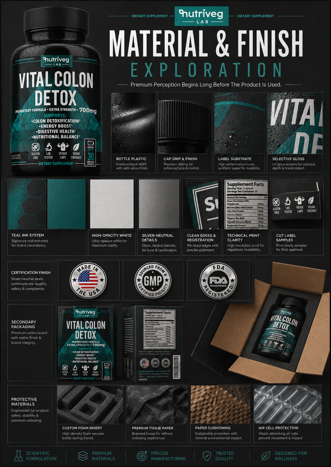
THE MATERIAL SYSTEM
Materials were not selected as isolated production components.
They were developed as a connected Product Packaging Design system in which the bottle, label, typography, color, finish, and secondary packaging reinforce one another.
The dark bottle establishes visual authority and provides a controlled foundation for the label. Matte surfaces reduce unnecessary reflection, while selective gloss introduces depth and emphasis. High-opacity white ink creates clarity, teal builds brand recognition, and silver-neutral details support scientific precision.
The contrast between these finishes creates a package that feels sophisticated without becoming ornamental.
PRIMARY PACKAGING
BLACK BOTTLE PLASTIC
The premium black HDPE bottle creates a strong, protective, and commercially recognizable base.
Its dark satin surface communicates authority and product seriousness while allowing the teal, white, and silver label elements to achieve maximum contrast.
The controlled sheen prevents the bottle from appearing flat, but remains restrained enough to preserve the premium character of the Dietary Supplement Packaging system.
RIBBED CAP TEXTURE
The cap was selected for both function and tactile character.
Fine ribbing improves grip, supports daily usability, and introduces a precise repeating texture that complements the structured geometry of the label.
This is a functional detail that also contributes to perceived quality.
MATTE LABEL SUBSTRATE
The matte label substrate creates a smooth, controlled surface with excellent ink receptivity.
It reduces excessive glare, improves readability under different lighting conditions, and gives the package a refined tactile quality.
The finish allows the label to feel integrated with the bottle rather than applied as a separate decorative layer.
PRINT AND FINISH SYSTEM
SELECTIVE GLOSS
Selective gloss was applied to key visual elements to introduce contrast, depth, and controlled emphasis.
Against the matte foundation, the gloss responds to light without overwhelming the composition. It allows important graphic details to become more visible as the bottle moves, creating a subtle layer of interaction.
DEEP TEAL INK
Teal functions as the signature brand color.
Its controlled application creates recognition across the logo area, graphic system, information highlights, and supporting details. The color introduces energy and wellness while maintaining the scientific character of the brand.
Consistency in teal reproduction was essential for maintaining a recognizable Supplement Branding system across physical and digital environments.
HIGH-OPACITY WHITE INK
White typography carries some of the most important information on the label.
High-opacity reproduction ensures that the product name, dosage strength, benefit hierarchy, icons, and Supplement Facts remain sharp and readable against the dark background.
This clarity is especially important for Retail Packaging and Amazon imagery, where information must remain visible at reduced scale.
SILVER-NEUTRAL DETAILS
Silver-neutral accents support certification, quality, and scientific communication.
The metallic character remains controlled and technical rather than decorative, helping the package communicate precision without introducing unnecessary visual noise.
PRINT REGISTRATION AND CUT PRECISION
Accurate print registration ensures that typography, color fields, graphic details, and information zones remain consistently aligned.
Clean die-cut edges allow the label to wrap smoothly around the bottle, preserving its structure and avoiding irregular boundaries that could weaken the premium impression.
In professional Packaging Production Design, precision at the edge is as important as precision at the center.
REAL-WORLD APPLICATION
Materials and finishes were evaluated not only as isolated swatches but as parts of the completed product.
The label was examined across curved surfaces, front-facing typography, certification areas, Supplement Facts, fine graphic patterns, and label boundaries.
This ensured that the system continued to perform under realistic lighting, close inspection, physical handling, product photography, and ecommerce presentation.
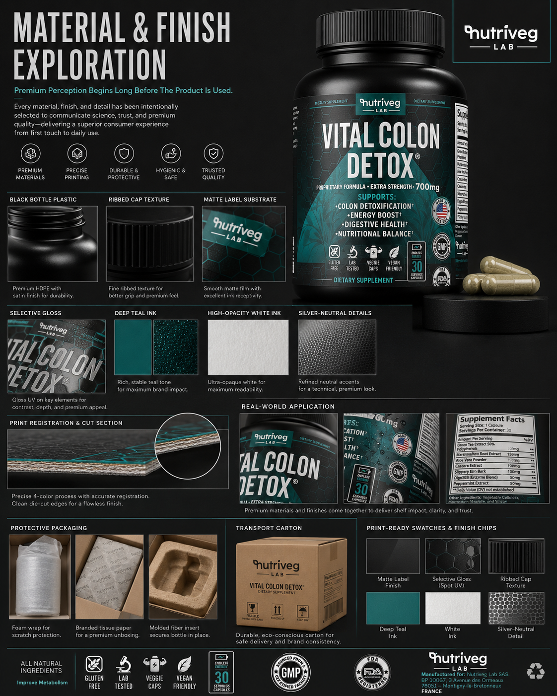
THE MATERIAL EXPLORATION INCLUDED:
- Premium black HDPE bottle
- Satin bottle finish
- Fine ribbed cap texture
- Matte label substrate
- Selective gloss application
- Deep teal signature ink
- High-opacity white typography
- Silver-neutral details
- Precise four-color printing
- Controlled print registration
- Clean die-cut label edges
- Supplement Facts readability
- Certification detail reproduction
- Print-ready material swatches
- Finished production samples
PROTECTIVE PACKAGING
Premium presentation must remain intact throughout storage, transport, delivery, and unboxing.
Protective packaging was therefore considered as part of the customer experience rather than as a purely logistical requirement.
PROTECTIVE SOLUTIONS INCLUDED:
- Protective bottle wrapping
- Branded tissue paper
- Molded fiber support
- Secure internal positioning
- Impact protection
- Movement reduction during transport
- Durable outer carton construction
- Clear handling and shipping information
- Consistent Nutriveg Lab branding
TRANSPORT CARTON
The transport carton extends the identity beyond the primary bottle.
Its restrained exterior presentation maintains brand recognition while prioritizing durability, delivery safety, handling clarity, and practical production requirements.
This creates continuity between the product, the unboxing experience, and the logistics system supporting it.
MATERIAL AND PRODUCTION STRATEGY
The strongest Premium Supplement Packaging systems balance appearance with performance.
Every finish must support readability.
Every material must support durability.
Every structural decision must protect the product.
Every production detail must remain consistent across repeated manufacturing.
For Vital Colon Detox®, premium perception was created through the coordination of these decisions—not through one isolated material or decorative effect.
Different Materials. Different Functions. One Consistent Standard Of Quality.
FINAL CHAPTER CONCLUSION - 05
FROM MATERIAL TO PERCEPTION
When Every Surface Is Considered, Quality Becomes More Than A Claim. It Becomes An Experience.
Premium packaging is rarely defined by one dramatic finish.
It is created through the relationship between material, structure, print, texture, color, protection, and production accuracy.
The bottle establishes the physical foundation.
The cap supports function and touch.
The label substrate controls the visual surface.
Ink creates clarity and recognition.
Selective finishes introduce depth.
Print precision protects the integrity of every detail.
Protective packaging preserves the experience until the product reaches the customer.
For Vital Colon Detox®, these elements were developed as one connected Wellness Packaging Design system.
Not isolated material choices.
Not decorative effects.
One consistent standard—from production to transport, from the first touch to the closest inspection.
That is where packaging begins to communicate quality without explanation.
And where craftsmanship becomes part of brand recognition.
PREMIUM MATERIALS CREATE THE FOUNDATION.
PRECISION PRINTING REVEALS THE QUALITY.
EVERY DETAIL SHAPES PERCEPTION.
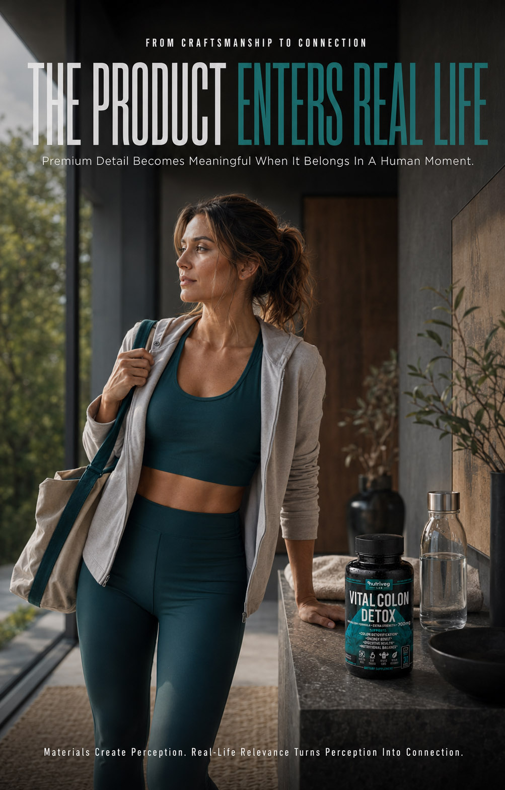
CHAPTER 06
PRODUCT PHOTOGRAPHY & VISUAL STORYTELLING
Transforming A Functional Product Into A Human, Recognizable, And Emotionally Relevant Brand Experience.
From First Search To Daily Ritual, Every Image Was Designed To Show Where The Product Belongs.
FROM PRODUCT TO REAL LIFE
WHERE STRATEGY BECOMES ROUTINE AND PACKAGING BECOMES PART OF THE CUSTOMER’S WORLD.
Great Wellness Photography Does More Than Show A Product. It Shows The Role That Product Can Play.
Until this point, the project has explained the strategy, visual identity, label architecture, formula, materials, and production details behind Vital Colon Detox®.
Chapter 06 introduces the human dimension.
The product is no longer presented only as an object. It becomes part of real environments, personal routines, digital interactions, moments of movement, quiet pauses, workdays, travel, and shared experiences.
This transition was essential to the broader Supplement Branding strategy.
Strong Health Supplement Packaging creates recognition, but human-centered photography gives that recognition emotional meaning. It helps customers imagine the product within their own world and understand how the brand intends to support a considered, balanced lifestyle.
Every image was therefore developed as part of one connected Wellness Brand Design system—not as isolated lifestyle decoration.
A Product Is Seen. A Routine Is Understood. A Brand Experience Is Remembered.
LIFESTYLE EXPERIENCE METRICS
Lifestyle Contexts. One Familiar Routine.
From Morning To Evening
Eight lifestyle contexts position the product within authentic moments of everyday life—from morning intention and professional focus to movement, travel, shared routines, mindful pauses, and evening consistency. Each setting extends the Wellness Brand Design into a credible human experience.
Journey Touchpoints. One Continuous Experience.
From Discovery To Reorder
Ten customer journey touchpoints connect initial need, search, discovery, evaluation, trust, purchase, delivery, daily routine, renewed confidence, and reorder. Together, they show how Supplement Branding can support a relationship that continues beyond the first commercial interaction.
Experience Phases. One Connected Relationship.
Discovery. Routine. Retention.
Three primary phases organize the complete customer experience. Discovery creates initial understanding, routine integrates the product into everyday life, and retention maintains continuity through follow-up and support—extending the role of Health Supplement Packaging into a broader brand relationship.
Human Experience. Designed Around Real Life.
Relevance Beyond The Product
One emotionally consistent lifestyle narrative connects the product with calm, considered, and recognizable daily moments. The result expands Wellness Packaging Design beyond visual presentation and demonstrates how a brand can remain present without becoming intrusive, exaggerated, or artificially promotional.
CUSTOMER EXPERIENCE JOURNEY
FROM THE FIRST SEARCH TO A DAILY RITUAL BUILT ON TRUST.
Every Touchpoint Was Designed To Make Discovery, Evaluation, And Continued Engagement Feel Connected.
Customers rarely build a relationship with a wellness brand through one interaction.
Their experience begins before the package is physically present. It may start with a personal need, a search query, an Amazon result, a product image, a review, or the first moment the packaging creates enough interest to explore further.
From there, each touchpoint influences the next.
For Vital Colon Detox®, the complete customer journey was mapped from initial discovery to continued brand engagement. Search visibility, product presentation, information clarity, packaging, purchase, delivery, daily use, and loyalty were treated as parts of one continuous experience.
This is where Supplement Packaging Design expands beyond the physical bottle and becomes part of a complete digital and emotional brand system.
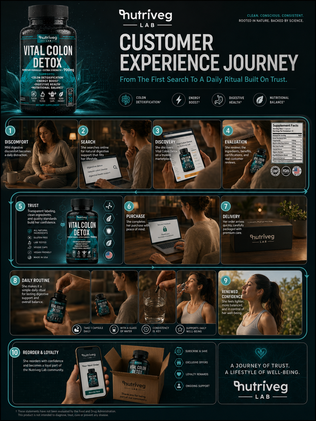
THE COMPLETE CUSTOMER EXPERIENCE
The customer journey was structured around ten connected stages.
Each stage represents a different customer question, expectation, or decision. The objective was to ensure that the brand remained visually consistent and informationally clear throughout the entire process.
01. NEED RECOGNITION
The journey begins when customers recognize a personal wellness priority and begin looking for a product that fits their expectations.
At this stage, the brand is not yet present.
What matters is understanding the language, concerns, motivations, and emotional state surrounding the search.
This insight informs the tone of the Wellness Packaging Design, digital content, photography, and product communication that follows.
02. SEARCH
Customers move from a general need to active product discovery.
They search through Amazon, ecommerce platforms, search engines, and wellness marketplaces, often comparing many visually similar products within seconds.
Visibility depends on clear naming, category recognition, relevant information, and a package capable of remaining distinctive at thumbnail size.
03. DISCOVERY
The product enters the customer’s consideration set.
At this moment, the primary image, product name, packaging contrast, visible information, and overall presentation determine whether the customer continues exploring.
Strong Retail Packaging principles are equally important on a digital shelf. The product must be noticed quickly without becoming visually aggressive or difficult to understand.
04. EVALUATION
Once interest has been created, customers begin examining the details.
They review ingredients, Supplement Facts, supporting information, product images, manufacturing details, certifications, instructions, and customer feedback.
The role of professional Product Packaging Design is to ensure that the information presented across the label and digital listing feels consistent, accessible, and trustworthy.
05. TRUST
Trust develops through the combined effect of transparency, visual consistency, information hierarchy, packaging quality, and professional presentation.
It is not created through one badge, claim, image, or design element.
Every interaction must support what the previous interaction communicated.
06. PURCHASE
The purchase stage should feel like a natural continuation of the evaluation process.
Product information, pricing, imagery, delivery expectations, and checkout communication must remain clear and predictable.
A consistent Brand Identity Design reduces friction by reassuring customers that they are purchasing the same product they have already evaluated.
07. DELIVERY
The physical product is the first opportunity to confirm the expectations created online.
Protective packaging, presentation, product condition, brand consistency, and unboxing details all contribute to the customer’s first real-world impression.
The digital promise must be matched by the physical experience.
08. DAILY ROUTINE
Once delivered, the product enters the customer’s everyday environment.
The bottle must remain recognizable, functional, easy to handle, and clear to navigate. Usage information, serving quantity, label readability, and structural consistency continue supporting the experience after the initial purchase.
This is where Dietary Supplement Packaging becomes part of a repeated daily interaction.
09. CONTINUED CONFIDENCE
A successful experience becomes familiar.
Customers recognize the package, understand where to find information, and know what to expect from each interaction with the product.
Consistency reduces the need to relearn the brand and supports stronger long-term recognition.
10. REORDER AND LOYALTY
The final stage transforms a completed purchase into an ongoing relationship.
Reorder communication, subscription options, loyalty systems, customer support, and future product extensions must feel connected to the experience that began with the first search.
The objective is not only conversion.
It is continuity.
THE CUSTOMER EXPERIENCE SYSTEM INCLUDED:
- Search-result visibility
- Amazon product discovery
- Mobile-first presentation
- Consistent ecommerce imagery
- Clear product evaluation
- Packaging and listing continuity
- Ingredient and Supplement Facts access
- Secure checkout communication
- Branded delivery experience
- Daily-use clarity
- Reorder communication
- Subscription support
- Customer loyalty touchpoints
- Scalable community engagement
CUSTOMER JOURNEY STRATEGY
A strong customer journey allows every touchpoint to prepare the customer for the next.
Search creates discovery.
Discovery creates interest.
Information supports evaluation.
Consistency builds trust.
Packaging confirms expectations.
Routine creates familiarity.
Familiarity supports loyalty.
For Vital Colon Detox®, the customer journey became an extension of the complete Supplement Branding system—connecting Amazon, ecommerce, packaging, product photography, customer experience, and long-term brand recognition.
The First Purchase Creates A Customer. A Consistent Experience Builds A Relationship.
A DAY WITH VITAL COLON DETOX
DESIGNED TO BECOME PART OF A BALANCED ROUTINE—NOT A DISRUPTION TO IT.
A Human-Centered Story Told Through Familiar Moments, Real Environments, And Everyday Consistency.
Lifestyle photography becomes meaningful when it reflects how customers actually experience a product.
The objective was not to create an artificial world built around the bottle. It was to place the product within familiar moments where it could feel natural, considered, and relevant.
For Vital Colon Detox®, a complete day was developed as a visual narrative—from the first quiet moments of the morning to work, movement, digital interaction, evening routine, and rest.
The product remains present, but it does not overwhelm the scene.
This balance allows the Health Supplement Packaging to retain recognition while the human experience remains emotionally central.
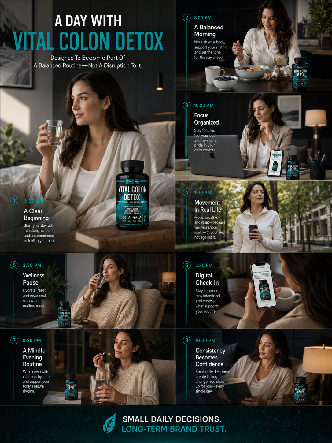
ONE DAY. EIGHT CONNECTED MOMENTS.
The daily narrative was structured as a sequence rather than a collection of unrelated lifestyle images.
Lighting, wardrobe, interior design, props, product placement, and emotional tone evolve naturally as the day progresses.
01. A CLEAR BEGINNING
The day opens with calm, natural light and a restrained environment.
The product is introduced as part of a considered morning moment rather than as the dominant subject. Water, neutral textiles, and soft surfaces create a sense of simplicity and personal intention.
02. A BALANCED MORNING
Breakfast introduces the product into a more active daily context.
Natural ingredients, tea, tableware, and morning light connect the package with a broader wellness environment while preserving its premium visual character.
03. FOCUS AND ORGANIZATION
The work environment demonstrates that the brand is designed for real schedules and contemporary lifestyles.
The product remains recognizable beside the laptop and mobile interface, creating continuity between the physical package and digital brand experience.
04. MOVEMENT IN REAL LIFE
The visual story moves beyond the home.
Outdoor movement, natural light, and an urban setting expand the brand beyond a static wellness ritual and show that the experience can remain relevant across different parts of the day.
05. THE WELLNESS PAUSE
A quieter afternoon moment introduces space for reflection.
The product is integrated into the environment through controlled placement, color continuity, and subtle brand recognition.
The scene communicates pause without becoming passive.
06. DIGITAL CHECK-IN
Customers increasingly manage product information, purchases, subscriptions, and routines through their phones.
The digital check-in connects the physical product with ecommerce content and demonstrates how Supplement Packaging Design continues functioning within a mobile-first customer experience.
07. A MINDFUL EVENING ROUTINE
Warm lighting and softer contrast shift the story toward the end of the day.
The product appears within a calm, familiar setting, reinforcing the idea of consistency rather than dramatic transformation.
08. CONSISTENCY BECOMES CONFIDENCE
The final moment brings the visual narrative to rest.
The packaging remains present and recognizable, but the emotional focus is on familiarity, control, and the comfort of a routine that feels considered.
LIFESTYLE STORYTELLING PRINCIPLES
The complete day was designed around several consistent principles:
- Natural product integration
- Human-centered composition
- Familiar real-life environments
- Clear package visibility
- Controlled black and teal brand accents
- Premium neutral styling
- Morning-to-evening lighting progression
- Mobile and ecommerce continuity
- Inclusive everyday relevance
- Calm, confident emotional direction
PRODUCT PLACEMENT STRATEGY
In effective Wellness Product Photography, the package should remain visible without making every scene feel like an advertisement.
The bottle was positioned as a recognizable anchor within the environment. It appears close enough to retain product identification, but naturally enough to preserve the credibility of the lifestyle moment.
This balance supports both emotional storytelling and commercial recognition.
Customers can see the product.
But more importantly, they can understand where it belongs.
Small Daily Decisions Create Familiarity. Familiarity Creates Long-Term Brand Trust.
PREMIUM WELLNESS LIFESTYLE COLLECTION
MORE THAN A PRODUCT PRESENTATION. A COMPLETE VISUAL WORLD BUILT AROUND EVERYDAY WELLNESS.
From Morning Rituals To Travel And Shared Moments, Every Image Extends The Same Brand Experience.
A single lifestyle image can communicate an atmosphere.
A complete photography system communicates a brand.
The Premium Wellness Lifestyle Collection was developed to show how Vital Colon Detox® could remain visually recognizable across different people, locations, routines, emotional states, and commercial applications.
Each scene tells a separate story, but all scenes share the same visual foundation: controlled lighting, premium neutral environments, teal brand continuity, natural product placement, human connection, and a calm sense of confidence.
This creates a scalable Wellness Brand Design language capable of supporting the website, Amazon content, ecommerce campaigns, social media, advertising, brand storytelling, and future product communication.
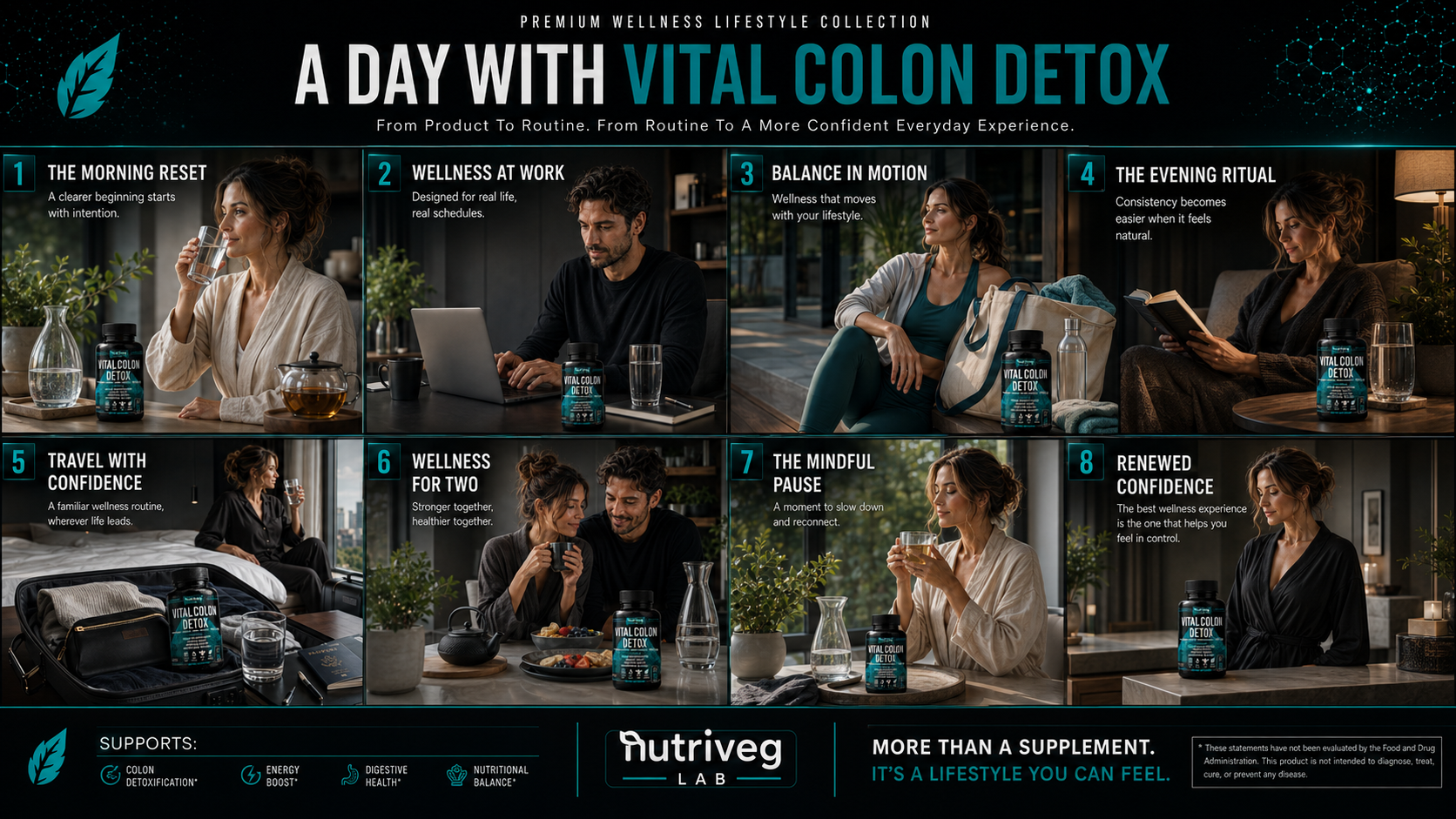
EIGHT MOMENTS. ONE CONNECTED BRAND WORLD.
01. THE MORNING RESET
A quiet morning introduces the brand through hydration, natural light, and a calm personal environment.
The product appears as part of the scene, establishing familiarity without creating unnecessary visual pressure.
02. WELLNESS AT WORK
The work setting expands the product experience into professional daily life.
Dark wardrobe, clean surfaces, restrained styling, and visible packaging maintain the premium identity while reflecting a realistic modern schedule.
03. BALANCE IN MOTION
The movement scene introduces energy and an active lifestyle without losing the visual sophistication of the brand.
Teal clothing subtly extends the packaging palette into the human environment, creating color continuity without appearing artificially matched.
04. THE EVENING RITUAL
Warm ambient light shifts the emotional tone toward calm and reflection.
The package remains clearly identifiable while books, water, furniture, and personal styling create a familiar evening context.
05. TRAVEL WITH CONFIDENCE
Travel photography demonstrates portability and lifestyle continuity.
The product appears within a carefully organized travel environment, allowing the brand experience to extend beyond the home.
06. WELLNESS FOR TWO
The shared scene introduces warmth, connection, and broader human relevance.
The product becomes part of a lifestyle experience shared between people rather than an isolated individual object.
07. THE MINDFUL PAUSE
A quiet pause creates emotional space within the collection.
Natural elements, warm drinks, soft light, and restrained styling reinforce the calm, considered character of the Supplement Branding system.
08. RENEWED CONFIDENCE
The closing scene brings together product visibility, premium environment, and personal composure.
It provides an emotional conclusion without relying on exaggerated transformation or unsupported promises.
VISUAL STORYTELLING SYSTEM
The lifestyle collection was created as a modular image library.
Individual scenes can function independently, while the complete collection presents a recognizable visual world.
THE PHOTOGRAPHY SYSTEM INCLUDED:
- Morning lifestyle imagery
- Professional work environments
- Active wellness moments
- Evening ritual photography
- Travel-oriented product imagery
- Shared lifestyle experiences
- Mindful editorial scenes
- Premium interior settings
- Consistent product visibility
- Controlled brand color integration
- Natural human interaction
- Website and campaign flexibility
- Amazon lifestyle image potential
- Ecommerce content adaptability
- Social media storytelling assets
ART DIRECTION STRATEGY
The visual direction was built around calm confidence rather than conventional wellness clichés.
Dark architectural environments connect with the black packaging. Teal accents preserve brand recognition. Warm natural light humanizes the scientific visual identity, while neutral wardrobe and interior styling keep the product visually relevant across different contexts.
The result is a Brand Identity Design system that remains consistent without forcing every image to look identical.
Different people.
Different moments.
Different environments.
One unmistakable brand character.
COMMERCIAL APPLICATION
The photography collection was designed to support multiple brand and sales environments:
- Case study editorial content
- Brand website storytelling
- Amazon lifestyle imagery
- Ecommerce product pages
- Digital advertising
- Social media campaigns
- Email marketing
- Subscription communication
- Customer retention content
- Future retail presentations
This allows the Product Packaging Design to remain connected with every communication channel surrounding it.
The package creates recognition.
Photography creates relevance.
The complete system creates a world customers can remember.
More Than A Supplement. A Lifestyle Story Built Through Recognition, Relevance, And Consistency.
FINAL CHAPTER CONCLUSION - 06
FROM PRODUCT VISIBILITY TO HUMAN CONNECTION
When Customers Can Recognize The Product And Understand Where It Belongs, Packaging Becomes Part Of A Larger Brand Experience.
A product can be strategically designed.
Its label can be clear.
Its materials can feel premium.
Its formula can be communicated with precision.
But a complete brand must also connect with people beyond the package.
For Vital Colon Detox®, photography and visual storytelling created that connection.
The customer journey explains how the brand is discovered.
The daily routine shows how the product enters real life.
The lifestyle collection expands that experience across work, movement, travel, shared moments, and personal rituals.
Together, these elements transform Health Supplement Packaging into a human-centered Wellness Brand Design system.
Not lifestyle imagery added after the design.
Not disconnected campaign photography.
One consistent visual experience extending from the digital shelf to the customer’s everyday world.
That is where visibility becomes relevance.
Where relevance becomes familiarity.
And where familiarity begins to build long-term brand recognition.
PACKAGING CREATES RECOGNITION.
PHOTOGRAPHY CREATES HUMAN CONNECTION.
CONSISTENCY BUILDS THE BRAND.
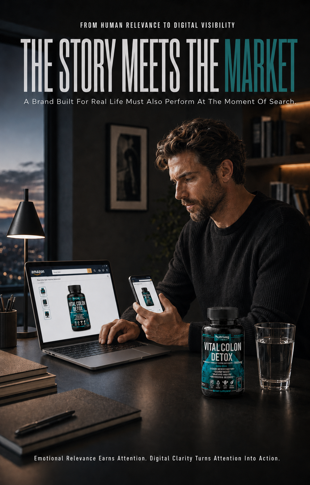
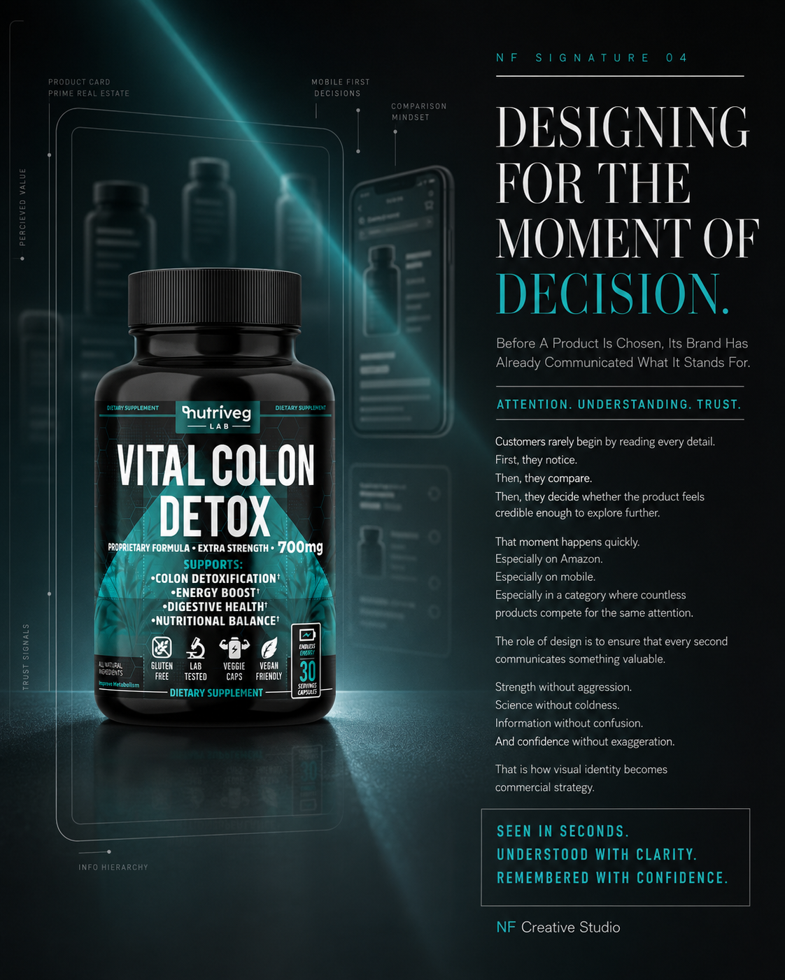
CHAPTER 07
BUILDING A COMPLETE AMAZON BRAND EXPERIENCE
Designing Every Product Image, Information Module, And Brand Touchpoint To Perform Across The Digital Shelf.
Visible In A Second. Understood In Moments. Remembered After The Click.
DESIGNED FOR THE MOMENT OF DECISION
FROM SEARCH RESULT TO PRODUCT DETAIL PAGE.
On Amazon, The Package Must Begin Communicating Before The Customer Ever Zooms In.
Amazon is not simply another platform where finished packaging is displayed.
It is a highly competitive visual environment where products are discovered at reduced scale, compared within seconds, evaluated across mobile screens, and judged through a sequence of images before customers ever experience the physical package.
This chapter does not present a generic brand ecosystem.
It demonstrates how Supplement Packaging Design was developed specifically for the realities of Amazon: thumbnail recognition, mobile readability, product comparison, primary-image performance, secondary image sequencing, A+ Content, Brand Store continuity, and fast customer evaluation.
For Vital Colon Detox®, every Amazon touchpoint was treated as part of one connected commercial system.
The bottle creates recognition.
The listing creates understanding.
The supporting content creates confidence.
The complete Amazon experience turns packaging strategy into marketplace performance.
Designed To Be Seen. Structured To Be Understood. Built To Be Chosen.
AMAZON EXPERIENCE METRICS
Shopping Environments. One Recognizable Product.
Search. Desktop. Mobile.
The packaging was evaluated across three essential Amazon environments: search results, desktop product pages, and mobile screens. Maintaining recognition across each context ensures the Amazon Packaging Design remains visible, legible, and commercially coherent throughout the customer’s decision journey.
Content Modules. One Connected Story.
Image. Infographic. Content. Comparison.
Four content modules extend the packaging into a complete Amazon experience: the main product image, secondary infographics, A+ Content, and product comparison. Each module performs a distinct role while preserving consistent Supplement Branding and marketplace communication.
Recognition Scales. Clarity At Every Size.
Full Size To Thumbnail
Recognition was considered at four viewing scales: full size, quarter size, tenth size, and search thumbnail. Bold product naming, controlled contrast, and a distinctive silhouette allow the Health Supplement Packaging to retain its essential identity as visual space becomes smaller.
Visual System. Consistent Across Every Touchpoint.
Built For Marketplace Recognition
One visual consistency system connects the label, Amazon imagery, A+ Content, Brand Store, mobile interface, social content, and supporting communication. This continuity strengthens recognition by ensuring every digital encounter feels like part of the same intentional Wellness Brand Design.
DESIGNED FOR AMAZON FIRST
EVERY ELEMENT WAS BUILT TO COMMUNICATE BEFORE THE CUSTOMER EVER ZOOMED IN.
Packaging, Information Hierarchy, And Digital Presentation Designed Around The Amazon Shopper Journey.
Amazon customers rarely begin by carefully reading every product detail.
They scan.
They compare.
They notice color, silhouette, product name, dosage visibility, image quality, information density, ratings, price, and the overall credibility of the listing.
Only products that communicate quickly earn the opportunity to be examined more closely.
For Vital Colon Detox®, the Health Supplement Packaging system was designed to remain recognizable and understandable throughout this compressed decision-making process.
The black bottle creates a distinctive silhouette. The teal color system separates the product from lighter category competitors. The product name dominates the front panel, while dosage strength, supporting information, trust icons, and serving quantity remain structured for rapid scanning.
This Amazon-first thinking influenced the label long before the product listing was created.
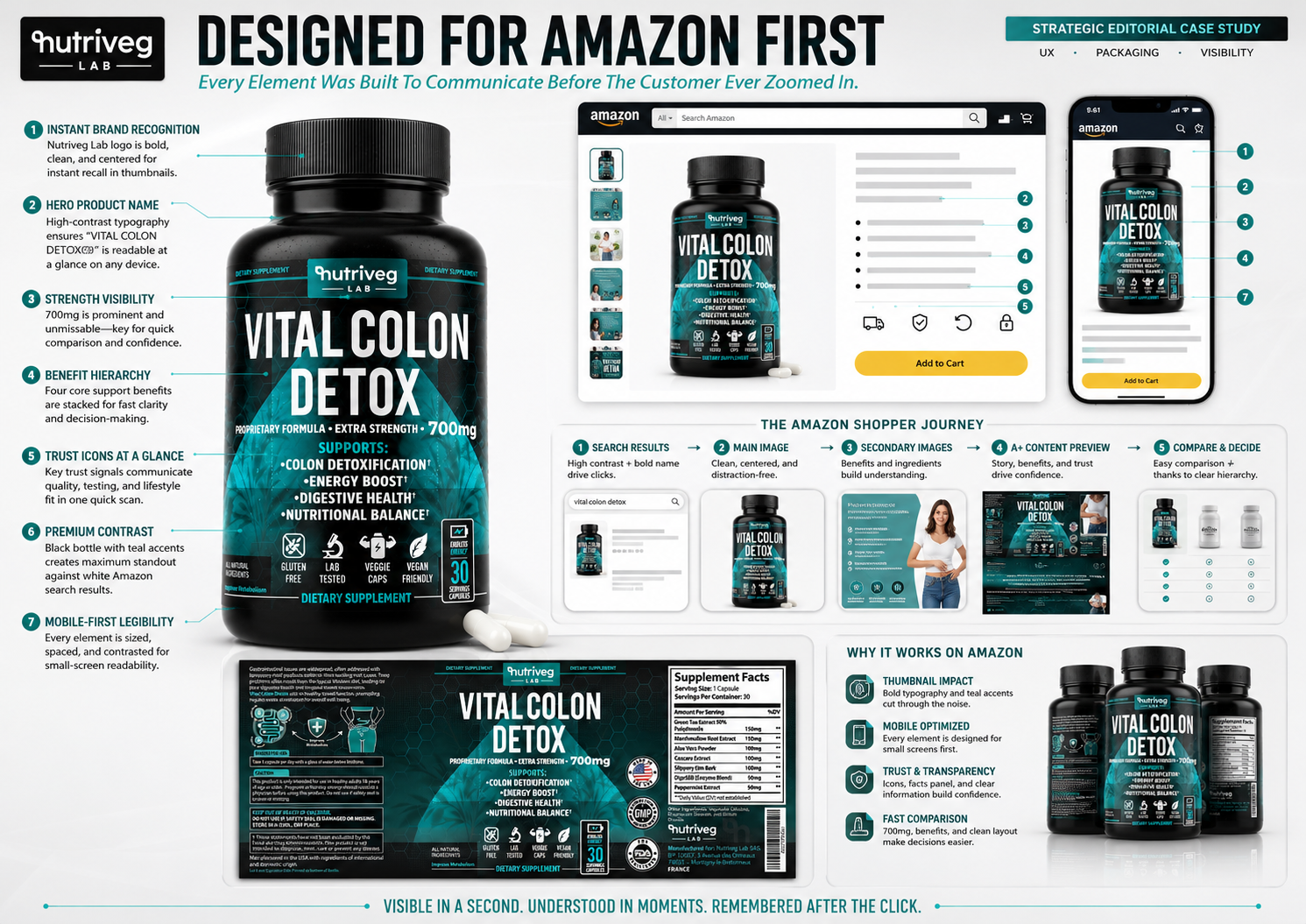
THE AMAZON SHOPPER JOURNEY
The Amazon experience was structured around five connected stages.
Each stage asks the packaging and digital content to perform a different commercial function.
01. SEARCH RESULTS
Recognition Must Happen Before Consideration Can Begin.
In Amazon search results, the product appears alongside many competing solutions.
At this size, detailed copy is secondary. The bottle silhouette, product name, brand mark, color contrast, and overall image clarity determine whether the product is noticed.
The primary objectives were:
- Immediate Nutriveg Lab recognition
- Dominant product-name visibility
- Clear black bottle silhouette
- Strong teal category differentiation
- Visible dosage strength
- Uncluttered primary image
- Reliable thumbnail performance
This is where Amazon Product Image Design and Supplement Packaging Design must work as one system.
02. MAIN IMAGE
Clean Presentation Creates The First Commercial Standard.
The Amazon main image must present the product clearly, accurately, and without visual distraction.
The bottle was positioned as the unquestioned hero. Controlled lighting, clean background separation, strong front-panel visibility, and realistic product scale allow customers to understand what they are viewing immediately.
The main image does not need to explain everything.
Its function is to establish recognition, clarity, and professional credibility.
03. SECONDARY IMAGES
Supporting Images Turn Attention Into Understanding.
Once customers enter the product detail page, secondary images begin answering questions that the main image intentionally leaves open.
They explain:
- Product positioning
- Ingredient information
- Supporting product attributes
- Serving quantity
- Formula structure
- Label details
- Usage guidance
- Lifestyle context
- Packaging quality
This sequence transforms the listing from a single product image into a structured Amazon Product Listing Design system.
04. A+ CONTENT
Extended Content Builds Brand Authority And Deeper Product Understanding.
A+ Content allows the brand to move beyond individual image tiles and create a more complete editorial experience.
Typography, product photography, ingredient presentation, comparison modules, lifestyle imagery, icons, and brand narrative were organized into a consistent visual structure.
The objective of the Amazon A+ Content Design was not to repeat the label.
It was to expand the information in a clearer and more visually engaging format.
05. COMPARE AND DECIDE
Clear Hierarchy Makes Product Evaluation Faster.
Amazon customers compare products through packaging, price, images, information, reviews, quantities, attributes, and overall brand credibility.
The Vital Colon Detox® system was designed to make those comparisons easier by keeping the most important information visible and consistent across every stage.
When customers can recognize the product, understand its structure, and locate essential information quickly, the decision feels more controlled.
AMAZON-FIRST PACKAGING DECISIONS
01. INSTANT BRAND RECOGNITION
The Nutriveg Lab logo was positioned prominently and consistently to establish ownership at small scale.
02. HERO PRODUCT NAME
High-contrast typography gives the product name immediate visual priority across desktop and mobile devices.
03. STRENGTH VISIBILITY
Dosage strength was placed within the primary reading sequence so customers could identify it quickly during comparison.
04. BENEFIT HIERARCHY
Supporting information was structured as a clear vertical block rather than dispersed across the front panel.
05. TRUST ICONS AT A GLANCE
Icons provide fast recognition of important product attributes without requiring customers to read long explanations.
06. PREMIUM CONTRAST
The black bottle and teal accents create strong separation from predominantly white and light-colored category packaging.
07. MOBILE-FIRST LEGIBILITY
Typography, spacing, contrast, and content priority were evaluated according to small-screen visibility.
WHY THE SYSTEM WORKS ON AMAZON
- Strong thumbnail impact
- Immediate product recognition
- Clear mobile presentation
- Controlled information hierarchy
- Fast product comparison
- Consistent trust communication
- Distinctive category contrast
- Scalable image sequencing
- Continuity between package and listing
- Professional marketplace presentation
THE AMAZON SOLUTION INCLUDED:
- Amazon main image direction
- Desktop product page presentation
- Mobile product page presentation
- Search-result thumbnail optimization
- Secondary infographic imagery
- Ingredient communication modules
- Lifestyle image integration
- Comparison content
- A+ Content previews
- Brand Store continuity
- Supplement Facts visibility
- Product attribute iconography
- Amazon-safe information hierarchy
- Consistent commercial art direction
The result is an Amazon Packaging Design system developed around real shopper behavior rather than adapted to Amazon after the physical label was completed.
Every Second Communicates. Every Image Has A Role. Every Detail Supports The Decision.
SHELF IMPACT SIMULATION
DESIGNED TO REMAIN RECOGNIZABLE EVEN WHEN EVERYTHING ELSE COMPETES FOR ATTENTION.
Testing Visibility Across Physical Shelves, Amazon Results, Mobile Screens, And Reduced Image Sizes.
Strong packaging cannot be evaluated only as a full-size isolated design.
It must be tested within the environments where customers will actually encounter it.
On a physical shelf, the package competes with different bottle shapes, colors, typography systems, and claims. On Amazon, it competes within search grids, mobile screens, sponsored placements, recommendation modules, and rapidly changing product results.
For Vital Colon Detox®, shelf impact was tested as a system of recognition rather than as a subjective impression.
The question was not simply whether the design looked attractive.
The question was whether it remained identifiable, legible, and commercially distinctive when surrounded by competitors and reduced to the size of a thumbnail.
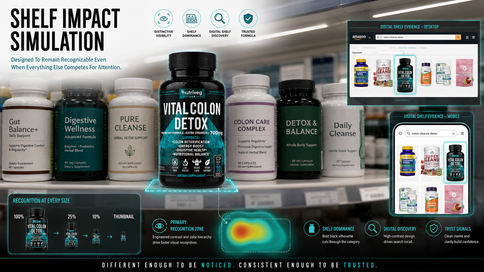
THE RECOGNITION SYSTEM
Four primary design characteristics create the product’s shelf presence.
01. DISTINCTIVE VISIBILITY
The black bottle creates immediate separation within a category dominated by lighter packaging.
Its silhouette remains recognizable even when individual label details become too small to read.
02. SHELF DOMINANCE
Bold product naming and a controlled front-panel hierarchy establish a clear recognition zone.
The design does not rely on excessive graphic noise to attract attention. It uses contrast, scale, and structure.
03. DIGITAL SHELF DISCOVERY
The teal and black color relationship creates search recall across Amazon results.
Customers can recognize the product through its dominant colors and silhouette before reading every element.
04. TRUSTED PRESENTATION
Clean typography, consistent icons, controlled information density, and professional image quality allow the product to feel considered within a crowded environment.
This supports both visual distinction and commercial credibility.
RECOGNITION AT EVERY SIZE
The packaging was evaluated across four key scales.
100% — FULL-SIZE PRESENTATION
At full size, customers can explore the complete information hierarchy, graphic system, icons, dosage strength, and supporting details.
25% — REDUCED PRODUCT VIEW
At quarter size, the brand mark, product name, bottle silhouette, and teal graphic system continue to create recognition.
10% — SMALL DIGITAL VIEW
At ten percent, detailed information becomes secondary. The package must rely on its strongest visual assets: black silhouette, teal color, white naming, and controlled composition.
THUMBNAIL — SEARCH-RESULT CONDITIONS
At thumbnail scale, recognition becomes the primary objective.
The package must remain visually distinct before customers enlarge the image or open the listing.
This is the point where Wellness Packaging Design becomes a commercial navigation tool.
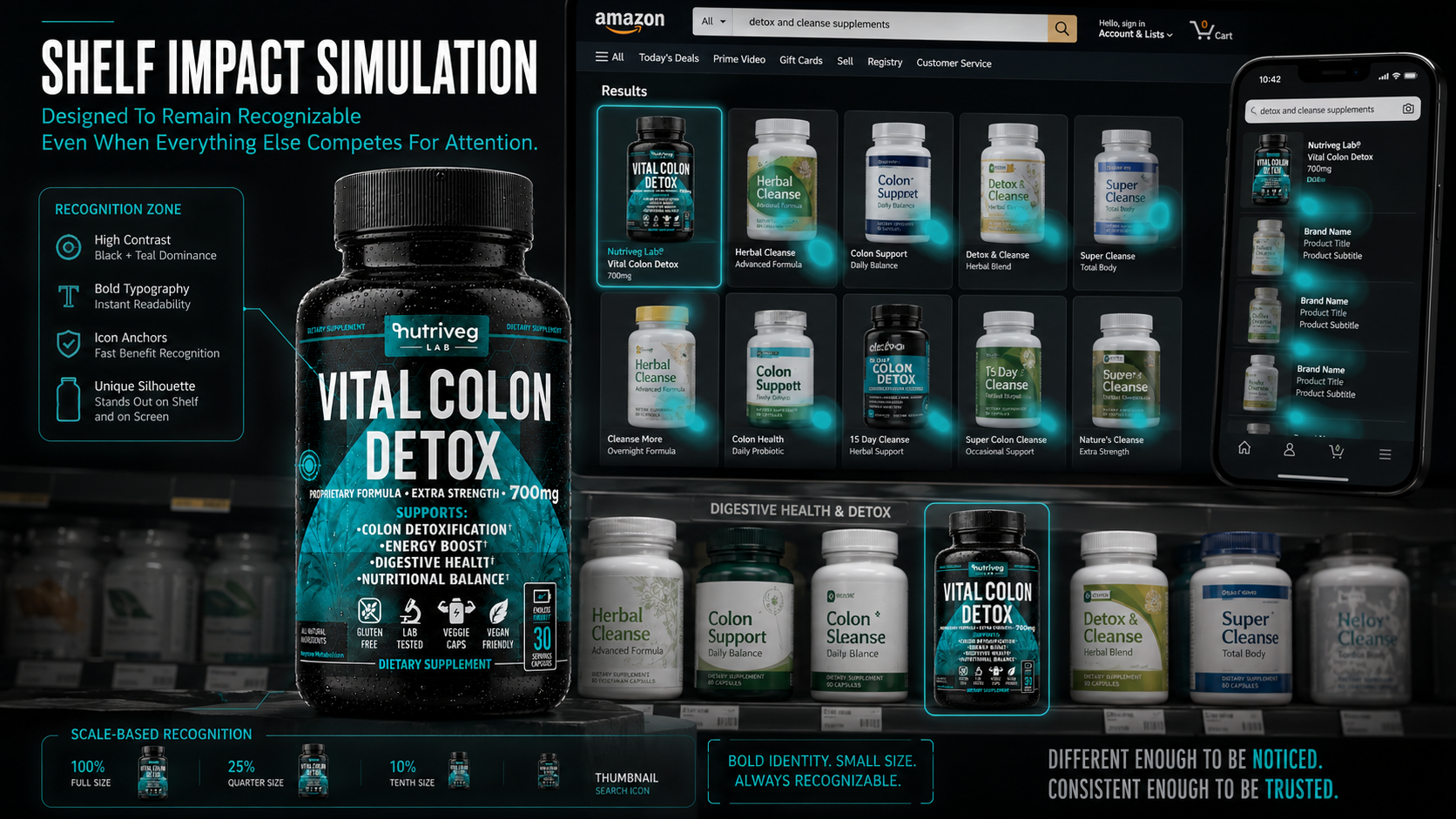
PHYSICAL SHELF PERFORMANCE
The physical shelf simulation demonstrates how the package behaves beside competing bottles.
Vital Colon Detox® gains visibility through:
- Dark silhouette contrast
- Dominant product naming
- Teal color ownership
- Strong front-facing composition
- Controlled icon placement
- Consistent serving callout
- Premium material appearance
- Clear category positioning
The result is Retail Packaging that remains different enough to be noticed without appearing disconnected from the category.
DIGITAL SHELF PERFORMANCE
On Amazon, the same system must work under more demanding conditions.
Customers see fewer physical details, compare more products, move faster, and frequently shop through mobile devices.
The digital shelf simulation demonstrates that recognition remains consistent across:
- Desktop search results
- Mobile product grids
- Sponsored placements
- Product recommendations
- Comparison modules
- Reduced primary images
- Thumbnail navigation
- Amazon listing sequences
VISUAL ATTENTION AND PRIMARY RECOGNITION
The recognition-zone simulation demonstrates where attention is concentrated first.
The strongest visual area includes:
- Nutriveg Lab brand mark
- Vital Colon Detox® product name
- Black bottle silhouette
- Teal graphic field
- Dosage visibility
- Front-facing benefit hierarchy
These elements work together to create one immediate recognition signature.
SHELF IMPACT STRATEGY
Effective Product Packaging Design must accomplish two goals simultaneously.
It must be distinctive enough to interrupt visual similarity.
And it must be consistent enough to feel credible.
Excessive difference can create confusion.
Insufficient difference creates invisibility.
The final packaging system balances both.
Different Enough To Be Noticed. Consistent Enough To Be Trusted.
VISUAL CONSISTENCY SYSTEM
ONE PRODUCT. EVERY AMAZON TOUCHPOINT. ONE UNMISTAKABLE VISUAL LANGUAGE.
Creating Recognition Across The Complete Marketplace Experience Without Rebuilding The Brand For Every Module.
Consistency does not mean repeating the same layout everywhere.
It means preserving the elements that make the product recognizable while adapting the communication to different Amazon formats, screen sizes, customer questions, and stages of evaluation.
For Vital Colon Detox®, visual consistency was developed around a stable system of brand assets:
- Nutriveg Lab identity
- Black bottle silhouette
- Teal and white color relationship
- Bold product typography
- Scientific graphic language
- Structured benefit communication
- Consistent iconography
- Controlled photographic lighting
- Premium material appearance
These elements allow the brand to move from the package to Amazon images, A+ Content, Brand Store modules, mobile interfaces, lifestyle photography, shipping materials, and supporting communication without losing its identity.
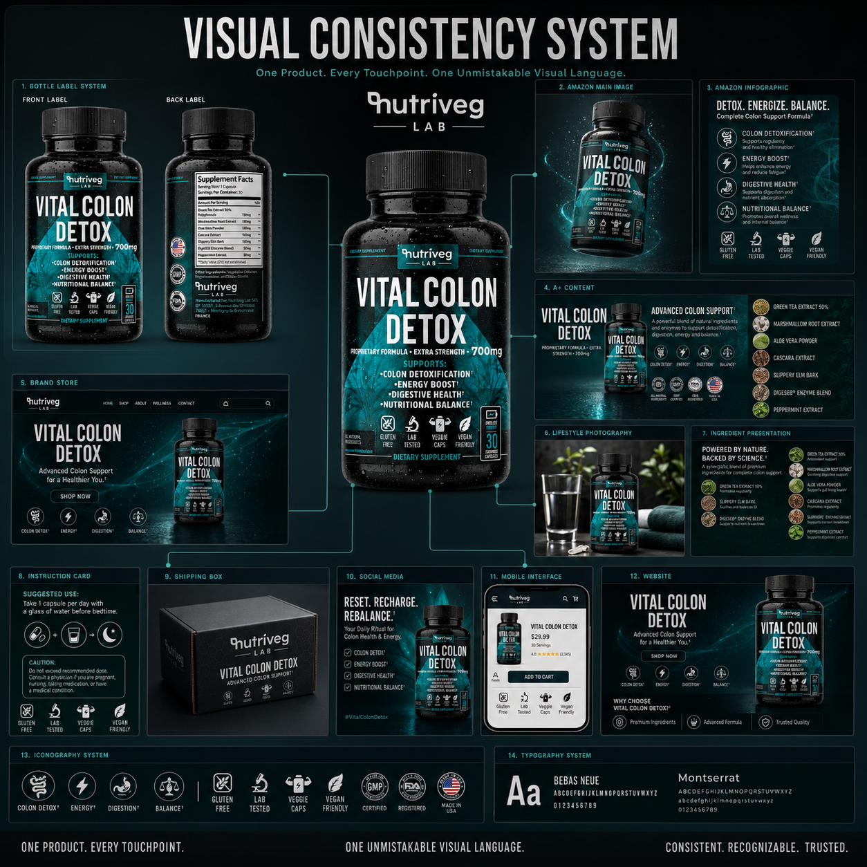
THE AMAZON VISUAL SYSTEM
01. BOTTLE LABEL SYSTEM
The label establishes the primary visual language.
Brand mark, product naming, color, typography, dosage strength, supporting information, icons, and Supplement Facts form the foundation for every later touchpoint.
02. AMAZON MAIN IMAGE
The main image simplifies the experience to its most essential commercial form.
The product remains accurate, centered, clearly illuminated, and immediately recognizable.
03. AMAZON INFOGRAPHIC
Infographics expand the product story through structured information, iconography, and visual hierarchy.
They explain key content without losing the visual identity established by the package.
04. A+ CONTENT
A+ Content transforms individual product information into a longer branded narrative.
Product imagery, ingredients, benefits, lifestyle context, trust signals, and comparison modules are connected through one consistent Amazon A+ Content Design system.
05. BRAND STORE
The Brand Store extends the experience beyond a single listing.
Navigation, product presentation, brand story, imagery, and future product extensions must feel connected to the same visual foundation.
This allows Amazon Brand Store Design to function as a branded destination rather than a collection of unrelated product tiles.
06. LIFESTYLE PHOTOGRAPHY
Lifestyle imagery adds human relevance while preserving product recognition.
Lighting, styling, environment, and color accents remain compatible with the Amazon visual system.
07. INGREDIENT PRESENTATION
Ingredient imagery connects botanical materials with scientific structure.
The same typography, color, iconography, and product presentation ensure continuity with the primary listing.
08. INSTRUCTION CARD
The customer experience continues after delivery.
Usage information, icons, caution content, and product guidance remain visually connected to the Amazon listing and physical package.
09. SHIPPING BOX
Packaging for delivery reinforces brand recognition and protects continuity between digital expectations and physical arrival.
10. SOCIAL MEDIA
Social communication extends product visibility beyond Amazon while directing customers back toward a recognizable product experience.
11. MOBILE INTERFACE
The mobile interface prioritizes the most important information first.
Images, product name, price, ratings, attributes, and purchase controls must remain easy to navigate within limited space.
12. WEBSITE
The website supports broader brand storytelling and product education while maintaining continuity with Amazon.
It does not replace the Amazon strategy. It reinforces the same identity across another customer touchpoint.
13. ICONOGRAPHY SYSTEM
Icons create fast information recognition across the label, Amazon images, A+ Content, Brand Store, instruction cards, and digital interfaces.
14. TYPOGRAPHY SYSTEM
Typography controls hierarchy across every format.
Bold display type creates product recognition, while supporting typography maintains clarity across longer content and smaller digital modules.
CONSISTENCY WITHOUT REPETITION
The same design elements were not copied mechanically from one touchpoint to another.
They were adapted according to function.
The main image prioritizes the product.
Infographics prioritize explanation.
A+ Content prioritizes extended understanding.
The Brand Store prioritizes navigation and brand authority.
Mobile prioritizes speed.
Lifestyle photography prioritizes human relevance.
What remains constant is the visual signature connecting them.
THE VISUAL CONSISTENCY SYSTEM INCLUDED:
- Bottle label application
- Amazon primary imagery
- Amazon secondary images
- Product infographics
- Ingredient presentations
- A+ Content modules
- Comparison modules
- Brand Store design
- Desktop listing presentation
- Mobile listing optimization
- Lifestyle photography
- Instruction cards
- Shipping materials
- Social content
- Website continuity
- Unified iconography
- Unified typography
- Controlled product photography
AMAZON CONSISTENCY STRATEGY
This supporting system is not presented as a generic Brand Ecosystem.
Its purpose is to demonstrate how the physical Dietary Supplement Packaging was translated into a complete Amazon marketplace experience.
Every additional touchpoint exists to reinforce the customer journey surrounding Amazon:
Discovery.
Evaluation.
Purchase.
Delivery.
Continued engagement.
The result is a focused Amazon Brand Experience that remains commercially adaptable without becoming visually fragmented.
One Product. Every Touchpoint. One Recognizable Amazon Experience.
FINAL CHAPTER CONCLUSION - 07
FROM SEARCH VISIBILITY TO MARKETPLACE RECOGNITION
On Amazon, Design Must Perform Before The Customer Has Time To Study It.
Amazon compresses the customer journey.
Recognition happens in seconds.
Comparison happens across competing products.
Evaluation happens through images, information, reviews, and mobile interfaces.
Trust must be supported before the physical product is ever held.
For Vital Colon Detox®, the package was designed to operate within that reality.
The front panel creates thumbnail recognition.
The main image establishes clarity.
Secondary images create understanding.
A+ Content expands the story.
The Brand Store reinforces ownership.
Mobile optimization supports fast evaluation.
Visual consistency connects every stage.
Not a generic collection of branded touchpoints.
One focused Amazon system built around discovery, comparison, understanding, and decision-making.
That is where Supplement Packaging Design becomes digital shelf strategy.
Where Health Supplement Packaging becomes marketplace communication.
And where Wellness Packaging Design becomes a complete commercial experience.
A STRONG PACKAGE EARNS THE FIRST LOOK.
A CLEAR LISTING EARNS CONSIDERATION.
A CONSISTENT AMAZON EXPERIENCE EARNS TRUST.

CHAPTER 08
FROM ONE PRODUCT TO A SCALABLE BRAND
Connecting Every Touchpoint, Customer Experience, And Commercial Mechanism Into One Recognizable System Built For Long-Term Growth.
Built For Today. Designed For Tomorrow. Ready To Grow Beyond The First Product.
DESIGNING THE SYSTEM BEYOND THE PACKAGE
FROM INDIVIDUAL TOUCHPOINTS TO LONG-TERM COMMERCIAL VALUE.
Great Packaging Can Introduce A Product. A Connected Brand System Creates Its Future.
A product does not become a brand through packaging alone.
It becomes a brand when every interaction surrounding that package communicates the same identity, delivers the same standard, and strengthens the same customer expectation.
For Vital Colon Detox®, the project began with Supplement Packaging Design, but the strategy was never limited to a single bottle.
The packaging became the foundation for a wider system connecting Amazon, ecommerce, education, photography, customer support, delivery, retention, marketing, and future brand growth.
Each component performs a different function.
The touchpoint ecosystem identifies where customers encounter the brand.
The complete health brand ecosystem connects those encounters into one recognizable world.
The integrated marketing ecosystem transforms that world into a commercial mechanism capable of building visibility, trust, conversion, retention, and long-term value.
This is where Health Supplement Packaging becomes brand infrastructure.
Where Wellness Packaging Design becomes customer experience.
And where strategic design becomes a scalable business asset.
One Product Can Begin The Story. One Connected System Can Build The Brand.
BRAND ECOSYSTEM METRICS
Brand Touchpoints. One Continuous Relationship.
Before. During. After.
Ten customer-facing touchpoint groups connect product, commerce, education, experience, communication, retention, shipping, unboxing, support, and mobile interaction. Together, they extend Supplement Branding beyond the package and create continuity before, during, and after the purchase.
Ecosystem Layers. One Complete Brand World.
Product To Long-Term Growth
Six connected layers define the complete health brand ecosystem: product foundation, commerce visibility, customer education, trust and conversion, experience and retention, and brand growth. Each layer expands the role of Brand Identity Design within one recognizable commercial experience.
Marketing Stages. One Integrated Growth Path.
Identity To Brand Expansion
Nine strategic stages connect brand identity, packaging, Amazon visibility, education, trust, conversion, experience, retention, and growth. This structure demonstrates how Packaging Design becomes part of a larger business mechanism rather than remaining an isolated visual deliverable.
Connected System. Designed For What Comes Next.
Consistency With Room To Grow
The complete project functions as one scalable brand system capable of supporting future products, channels, content, and commercial opportunities. By connecting Wellness Packaging Design, digital commerce, customer experience, and retention, the identity creates value far beyond the initial product launch.
BRAND TOUCHPOINT ECOSYSTEM
BUILDING A BRAND THAT REMAINS CONSISTENT BEFORE, DURING, AND AFTER THE PURCHASE.
Every Place Of Contact Was Designed To Reinforce Recognition, Clarity, And Trust.
Customers do not experience a brand through one controlled presentation.
They encounter it across search results, product pages, packaging, educational content, advertising, email, mobile screens, delivery materials, customer support, subscription communication, and repeated daily interactions.
Each encounter is a touchpoint.
Each touchpoint can either strengthen the brand or fragment it.
For Vital Colon Detox®, the Brand Touchpoint Ecosystem was created to map these moments and define the role each one plays within the customer relationship.
This section is not about presenting the complete brand world or explaining the business growth mechanism.
Its function is precise:
To identify every important place where the customer and brand meet.
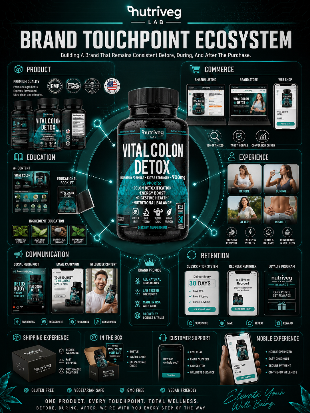
THE COMPLETE TOUCHPOINT MAP
01. PRODUCT
The physical product is the central touchpoint.
The bottle, label, Supplement Facts, certifications, material quality, serving information, icons, typography, and package construction create the most direct expression of the brand promise.
The physical Dietary Supplement Packaging must confirm the expectations created through every digital interaction that came before it.
PRODUCT TOUCHPOINTS INCLUDE:
- Primary bottle
- Front-label communication
- Side and back information
- Supplement Facts
- Ingredient presentation
- Certifications
- Product attributes
- Material and finish quality
- Serving quantity
- Usage information
02. COMMERCE
Commerce touchpoints are where visibility becomes evaluation and evaluation becomes action.
Amazon listings, Brand Store pages, ecommerce platforms, and web shops must preserve the same product identity while adapting content to different screen sizes and shopping behaviors.
COMMERCE TOUCHPOINTS INCLUDE:
- Amazon search results
- Amazon main image
- Amazon secondary images
- Amazon product detail page
- A+ Content
- Amazon Brand Store
- Mobile listing
- Desktop listing
- Web shop
- Checkout experience
03. EDUCATION
Customers need more than recognition.
They need information that helps them understand the product, its ingredients, its format, its usage, and the structure behind the formula.
Educational touchpoints expand what the label begins without overwhelming the primary package.
EDUCATIONAL TOUCHPOINTS INCLUDE:
- A+ Content modules
- Ingredient education
- Formula explanation
- Usage guidance
- Instruction cards
- Educational booklets
- Comparison information
- Frequently asked questions
- Supporting iconography
- Product-detail content
04. EXPERIENCE
Experience touchpoints show how the product enters the customer’s life.
Lifestyle photography, product interaction, daily routines, digital interfaces, and physical handling transform an object into a recognizable human experience.
This is where Supplement Branding becomes personally relevant.
EXPERIENCE TOUCHPOINTS INCLUDE:
- Lifestyle photography
- Daily-routine storytelling
- Product handling
- Mobile interactions
- Product-use guidance
- Human-centered content
- Editorial photography
- Real-world environments
05. COMMUNICATION
Communication touchpoints keep the brand present before and after purchase.
Social media, email, campaign imagery, influencer content, and product education must feel connected to the packaging and core identity.
COMMUNICATION TOUCHPOINTS INCLUDE:
- Social media content
- Email campaigns
- Product launches
- Educational campaigns
- Influencer communication
- Promotional materials
- Customer announcements
- Reorder reminders
- Subscription communication
06. RETENTION
Retention touchpoints continue the customer relationship beyond the initial order.
Their function is to provide convenience, relevant information, ongoing value, and a clear path toward repeated engagement.
RETENTION TOUCHPOINTS INCLUDE:
- Subscription systems
- Reorder reminders
- Loyalty programs
- Email follow-up
- Customer rewards
- Ongoing product education
- Support communication
- Personalized account experiences
07. SHIPPING EXPERIENCE
Delivery is the first physical confirmation of the digital promise.
Secure packaging, delivery condition, branded presentation, and practical protection all influence whether the product feels as considered in reality as it appeared online.
08. IN THE BOX
The unboxing experience creates another opportunity for clarity and recognition.
The product, protective insert, instruction card, educational guide, and thank-you communication should feel like parts of the same Brand Identity Design system.
09. CUSTOMER SUPPORT
Support touchpoints demonstrate how the brand behaves when customers need assistance.
Live chat, email, FAQ content, usage guidance, and customer education must remain clear, accessible, and visually consistent.
10. MOBILE EXPERIENCE
The mobile experience connects discovery, evaluation, purchase, support, subscription, and reorder activity within the customer’s most frequently used device.
Its priorities are:
- Fast recognition
- Clear navigation
- Mobile-first information
- Secure checkout
- Simple product evaluation
- Accessible customer support
- Convenient repeat purchase
TOUCHPOINT CONSISTENCY STRATEGY
Not every touchpoint needs to look identical.
But every touchpoint must feel related.
The product page should not feel disconnected from the physical package.
The shipping box should not feel disconnected from the premium product experience.
The instruction card should not introduce a new visual language.
The customer support interface should not feel like an unrelated service.
Consistency is created through shared typography, color, iconography, photography, tone, hierarchy, and information standards.
THE TOUCHPOINT SYSTEM INCLUDED:
- Physical product packaging
- Amazon marketplace content
- Ecommerce presentation
- Product education
- Lifestyle photography
- Mobile commerce
- Social communication
- Email marketing
- Delivery packaging
- Unboxing materials
- Instruction systems
- Subscription communication
- Reorder systems
- Loyalty programs
- Customer support
Each touchpoint performs a specific role.
Together, they ensure that the customer never needs to rediscover the brand from the beginning.
Every Interaction Is A Touchpoint. Every Touchpoint Is An Opportunity To Strengthen The Brand.
THE COMPLETE HEALTH BRAND ECOSYSTEM
WHERE STRATEGIC DESIGN CONNECTS PRODUCT, COMMERCE, EDUCATION, TRUST, AND LONG-TERM GROWTH.
One Product Foundation Extended Into One Complete And Recognizable Customer Experience.
A touchpoint map identifies where interactions happen.
A complete brand ecosystem explains how those interactions work together and what kind of world they create around the customer.
For Vital Colon Detox®, the product remains at the center, but the brand experience extends far beyond the bottle.
Packaging provides the foundation.
Commerce creates access.
Education creates understanding.
Trust supports evaluation.
Customer experience builds familiarity.
Retention continues the relationship.
Growth expands the system into future opportunities.
This is the complete Wellness Brand Design experience.
Not a collection of independent marketing assets.
One connected world organized around the same identity, product standard, and customer expectation.
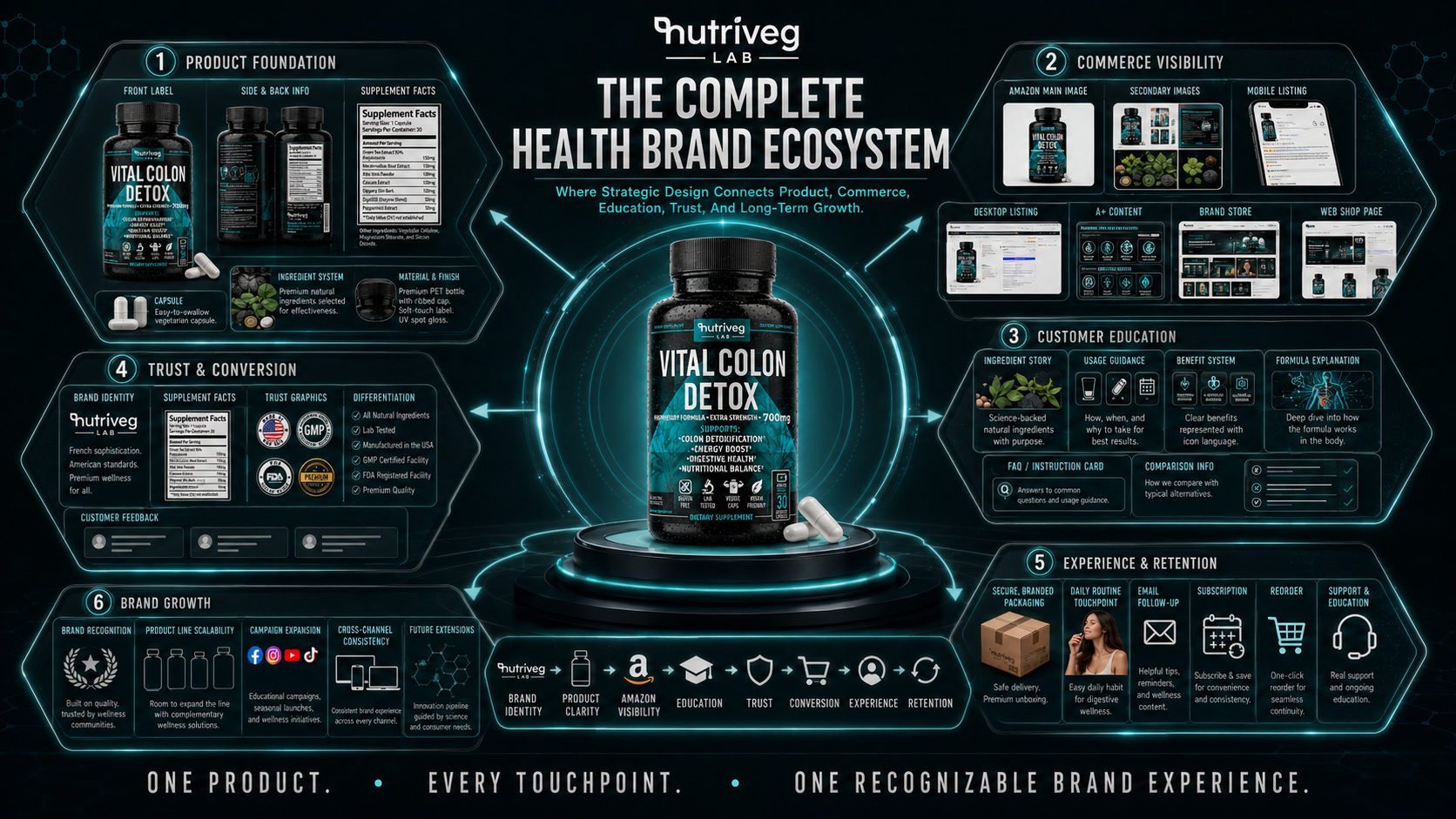
SIX CONNECTED DIMENSIONS OF THE BRAND
01. PRODUCT FOUNDATION
The product foundation gives the complete ecosystem something stable to build upon.
It includes:
- Front-label communication
- Side and back information
- Supplement Facts
- Ingredient system
- Capsule format
- Material selection
- Label finishes
- Product attributes
- Visual hierarchy
- Packaging quality
Every later touchpoint must remain consistent with this foundation.
The package establishes what the brand looks like, how it communicates, and the standard customers should expect.
02. COMMERCE VISIBILITY
Commerce visibility makes the product discoverable and commercially understandable.
It translates the physical package across Amazon, ecommerce, mobile, desktop, and owned digital channels.
COMMERCE VISIBILITY INCLUDES:
- Amazon main image
- Secondary listing images
- Desktop product listing
- Mobile product listing
- A+ Content
- Amazon Brand Store
- Web-shop presentation
- Product comparison
- Digital shelf visibility
The role of commerce is not only to display the product.
It must preserve recognition while guiding customers toward evaluation and action.
03. CUSTOMER EDUCATION
Education transforms product information into accessible customer understanding.
The label introduces the essential facts. Extended content allows those facts to be explained more clearly, visually, and contextually.
CUSTOMER EDUCATION INCLUDES:
- Ingredient story
- Formula communication
- Benefit hierarchy
- Usage guidance
- Supplement Facts access
- Comparison information
- FAQ content
- Instruction cards
- Icon-based communication
- Supporting product education
Within professional Product Packaging Design, education is not separated from branding.
The way information is organized is part of the brand experience.
04. TRUST AND CONVERSION
Customers move toward purchase when the product feels understandable, transparent, and professionally presented.
Trust and conversion are supported through the combined effect of:
- Consistent brand identity
- Clear Supplement Facts
- Structured product information
- Certification presentation
- Ingredient transparency
- Professional packaging
- Customer feedback touchpoints
- Reliable ecommerce presentation
- Clear differentiation
- Predictable customer experience
Conversion is therefore not treated as a visual trick.
It is the commercial result of accumulated clarity.
05. EXPERIENCE AND RETENTION
The complete brand experience continues after purchase.
Secure delivery, unboxing, instructions, daily interaction, follow-up communication, subscription options, reorder systems, and customer support all influence whether the relationship continues.
EXPERIENCE AND RETENTION INCLUDE:
- Delivery experience
- Branded packaging
- Product unboxing
- Instruction cards
- Daily-routine integration
- Email follow-up
- Subscription systems
- Reorder communication
- Customer support
- Continued education
The initial purchase proves that the product was visible and convincing.
Retention proves that the complete experience delivered consistency.
06. BRAND GROWTH
Growth becomes possible when the existing system is clear enough to expand without losing recognition.
The brand foundation can support:
- Cross-channel communication
- Educational campaigns
- Content and community
- Product-line extensions
- Complementary wellness products
- Retail distribution
- Strategic partnerships
- New marketplace channels
- International expansion
- Long-term brand equity
This is where Health Supplement Packaging becomes a scalable foundation rather than a one-time design solution.
ONE RECOGNIZABLE BRAND EXPERIENCE
The complete health brand ecosystem connects different functions through one identity.
Product and commerce are connected.
Commerce and education are connected.
Education and trust are connected.
Trust and conversion are connected.
Conversion and experience are connected.
Experience and retention are connected.
Retention and growth are connected.
Customers may enter the ecosystem at different points, but the brand should always feel recognizable.
COMPLETE ECOSYSTEM STRATEGY
The objective was not to surround the product with as many branded materials as possible.
The objective was to build a coherent system in which every component improves the customer’s understanding and strengthens the same brand promise.
THE COMPLETE ECOSYSTEM INCLUDED:
- Product foundation
- Packaging architecture
- Material and finish system
- Amazon visibility
- Ecommerce content
- Brand Store design
- Product education
- Ingredient communication
- Customer trust signals
- Conversion support
- Delivery experience
- Daily-routine integration
- Retention communication
- Customer support
- Future product scalability
- Long-term brand growth
One Product. Every Touchpoint. One Recognizable Brand Experience.
INTEGRATED BRAND MARKETING ECOSYSTEM
WHERE STRATEGIC DESIGN BECOMES VISIBILITY, TRUST, CONVERSION, AND LONG-TERM GROWTH.
A Connected Commercial Mechanism Designed To Move The Brand Forward At Every Stage.
The Brand Touchpoint Ecosystem identifies the places where customers and the brand meet.
The Complete Health Brand Ecosystem defines the connected world surrounding those interactions.
The Integrated Brand Marketing Ecosystem explains how the system works as a business mechanism.
It maps the movement from identity to packaging, from packaging to Amazon visibility, from visibility to education, from education to trust, from trust to conversion, and from conversion to experience, retention, and scalable growth.
This is not a static presentation of brand assets.
It is a continuous growth cycle.
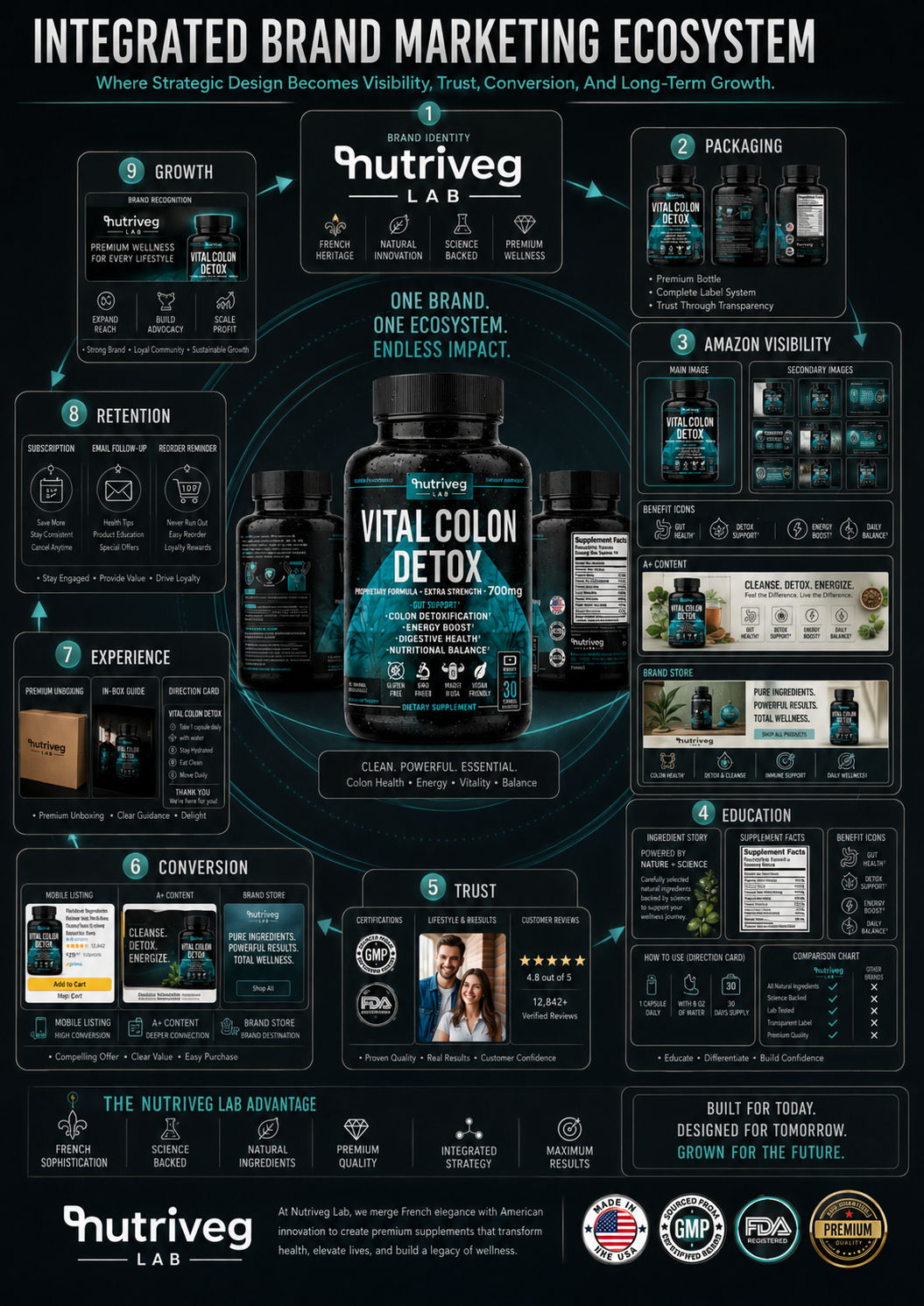
THE NINE-STAGE BRAND GROWTH ENGINE
01. BRAND IDENTITY
Brand identity creates the foundation for recognition.
The logo, typography, color system, positioning, visual language, tone, and strategic character define how the brand should appear and behave.
Without a clear identity, every later marketing activity becomes more difficult to connect.
02. PACKAGING
Packaging transforms identity into a physical commercial product.
It organizes information, communicates category, creates distinction, supports trust, and establishes the visual foundation for Amazon, ecommerce, photography, and marketing content.
This is the role of strategic Supplement Packaging Design.
03. AMAZON VISIBILITY
Amazon visibility introduces the product to active marketplace demand.
Main images, secondary content, thumbnails, mobile presentation, A+ Content, and Brand Store modules transform the package into a complete digital shelf presence.
Visibility creates the first opportunity.
But visibility alone does not guarantee understanding.
04. EDUCATION
Education gives customers a reason to continue exploring.
Ingredient communication, product information, usage guidance, Supplement Facts, comparison content, and supporting imagery reduce uncertainty and make the offer easier to evaluate.
Education turns attention into informed consideration.
05. TRUST
Trust develops when brand identity, packaging, information, photography, customer feedback, and marketplace presentation all support the same expectation.
It is cumulative.
Every previous stage contributes to it.
06. CONVERSION
Conversion occurs when customers have enough clarity and confidence to act.
Product presentation, pricing, information hierarchy, comparison, checkout simplicity, mobile usability, and perceived credibility all contribute to this decision.
A strong Wellness Packaging Design system makes the product easier to recognize.
An integrated commercial system makes the decision easier to complete.
07. EXPERIENCE
After purchase, the brand must deliver on the expectations created before it.
Delivery, packaging condition, unboxing, product usability, instructions, communication, and support determine whether the commercial promise feels credible.
08. RETENTION
Retention transforms a completed transaction into an ongoing relationship.
Subscription options, reorder reminders, email follow-up, useful content, customer support, and loyalty communication keep the brand relevant beyond the initial sale.
09. GROWTH
Growth is the accumulated result of the complete system.
Recognition supports new customer acquisition.
Consistency supports loyalty.
Retention supports repeat purchasing.
A stable identity supports product expansion.
Customer experience supports advocacy.
The system then returns to the beginning with stronger brand awareness, greater market understanding, and more opportunities for expansion.
GROWTH IS A CYCLE
The mechanism does not end at stage nine.
Growth strengthens the identity.
A stronger identity improves the next packaging extension.
A scalable packaging system supports new Amazon listings.
Greater visibility creates more opportunities for education.
Education strengthens trust.
Trust improves conversion.
Conversion creates more customer experiences.
Positive experiences support retention.
Retention creates sustainable growth.
The system continues.
THE INTEGRATED MARKETING SYSTEM INCLUDED:
- Brand strategy
- Brand identity
- Packaging design
- Amazon visual strategy
- Marketplace visibility
- Main and secondary images
- A+ Content
- Brand Store design
- Customer education
- Ingredient storytelling
- Trust communication
- Conversion content
- Ecommerce experience
- Delivery and unboxing
- Subscription systems
- Email follow-up
- Reorder communication
- Customer support
- Loyalty development
- Product-line scalability
- Long-term brand growth
FROM DESIGN SYSTEM TO BUSINESS SYSTEM
Design becomes commercially valuable when it improves more than appearance.
It should increase recognition.
Create consistency.
Organize information.
Support marketplace visibility.
Strengthen customer understanding.
Improve the complete buying experience.
Create a foundation for retention and future expansion.
That is the difference between producing individual marketing assets and developing an Integrated Brand Strategy.
Individual assets solve immediate communication needs.
An integrated system connects those solutions into long-term commercial value.
One Brand. One Ecosystem. Continuous Opportunity For Growth.
FINAL CHAPTER CONCLUSION - 08
FROM A SINGLE PRODUCT TO A LONG-TERM BRAND ASSET
When Every Decision Supports The Same System, Packaging Becomes The Beginning Of Something Much Larger.
Vital Colon Detox® began as a supplement packaging project.
But the opportunity extended far beyond the label.
Research created strategic direction.
Brand DNA created character.
Color and visual language created recognition.
Information architecture created clarity.
Formula communication created understanding.
Materials and finishes created perceived quality.
Photography created human relevance.
Amazon strategy created marketplace visibility.
Touchpoints created continuity.
Customer experience created familiarity.
Integrated marketing created a mechanism for retention and growth.
The final result is not one isolated piece of Dietary Supplement Packaging.
It is a complete and scalable Wellness Brand Design system.
A system capable of supporting the product today.
Extending across new channels tomorrow.
And creating a foundation for future products, customers, markets, and commercial opportunities.
That is where Packaging Design becomes brand strategy.
Where brand strategy becomes customer experience.
And where customer experience becomes long-term business value.
ONE PRODUCT CAN CREATE THE FIRST SALE.
ONE CONNECTED EXPERIENCE CAN BUILD THE BRAND.
ONE SCALABLE SYSTEM CAN CREATE LONG-TERM VALUE.
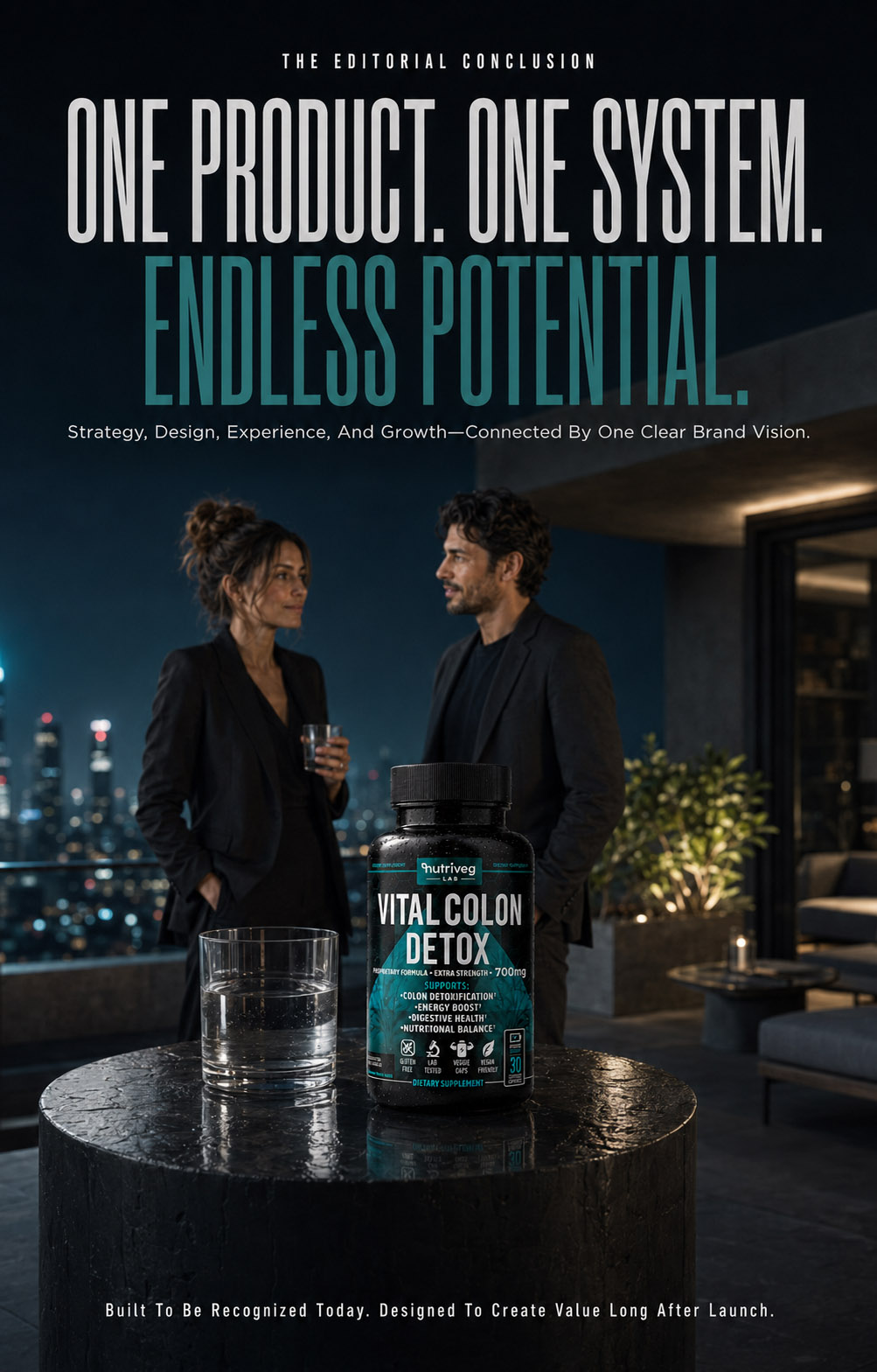
NF CREATIVE STUDIO
CONSUMER TRUST BEGINS BEFORE THE FIRST CLAIM IS READ.
It Begins When Science, Wellness, And Product Information Are Organized Clearly Enough To Inspire Confidence.
THE WELLNESS PRODUCT HAS BEEN INTRODUCED.
NOW WE REVEAL THE CLARITY BEHIND ITS CONFIDENCE.
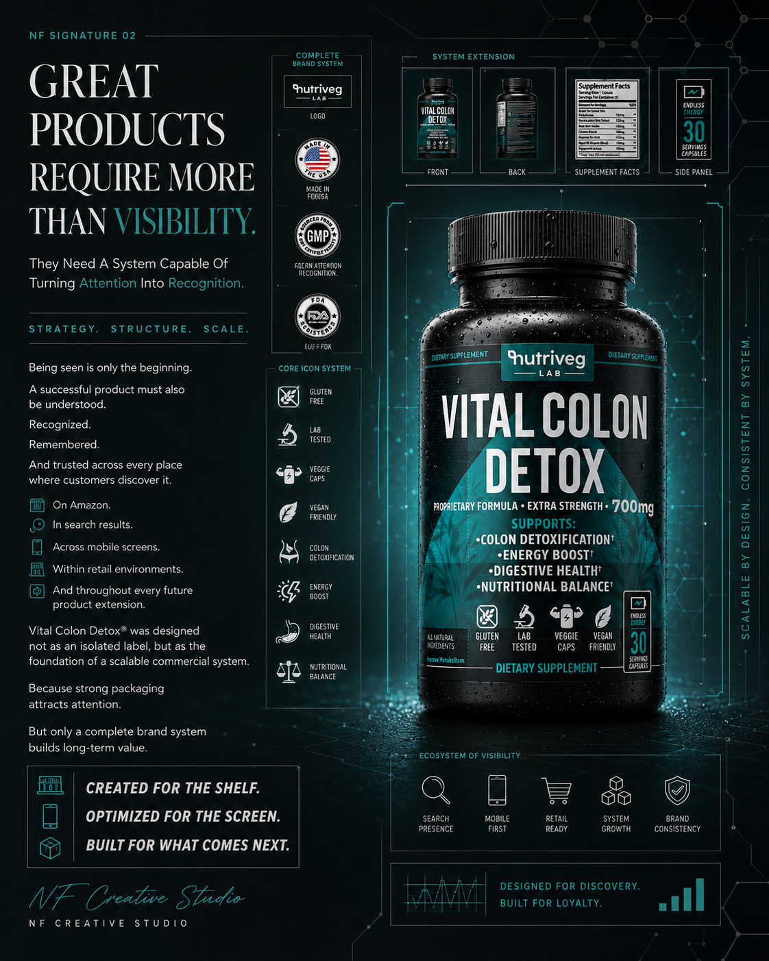
Results:
FROM STRATEGIC PACKAGING TO A COMPLETE WELLNESS BRAND SYSTEM
When Every Touchpoint Supports The Same Promise, Recognition Becomes Consistent.
Every successful Brand Identity System is ultimately evaluated by more than its appearance.
It must communicate clearly, remain recognizable across different environments, and provide a reliable foundation for future brand growth.
For Vital Colon Detox®, the project evolved far beyond a single packaging redesign. Research, brand positioning, information hierarchy, visual identity, materials, photography, Amazon content, customer experience, and long-term brand applications were connected through one strategic objective:
creating premium Health Supplement Packaging that customers can recognize quickly, understand confidently, and experience consistently across every touchpoint.
Rather than producing isolated creative assets, the project established a complete brand system designed to support product visibility, digital commerce, customer education, and future expansion.
PROJECT OUTCOMES:
✓ Complete Supplement Brand Identity
A unified visual language connects strategy, color, typography, iconography, scientific references, wellness imagery, and product communication across the complete Supplement Branding system.
✓ Structured Label Architecture
Complex product information was organized into a clear reading sequence that prioritizes brand recognition, product naming, formula strength, supporting information, trust signals, serving quantity, and detailed regulatory content.
✓ Stronger Shelf And Digital Recognition
The black bottle silhouette, bold typography, controlled teal palette, and consistent icon system create a distinctive presence across physical shelves, Amazon search results, product pages, and mobile screens.
✓ Premium Product Perception
Material choices, label finishes, print precision, macro details, product photography, and lifestyle presentation work together to reinforce the quality and consistency of the complete Dietary Supplement Packaging experience.
✓ Amazon-First Brand Experience
The packaging system was extended into main images, secondary infographics, A+ Content, comparison modules, mobile applications, and Brand Store environments designed to support faster recognition and clearer product evaluation.
✓ Scalable Brand Ecosystem
Product, commerce, education, trust, customer experience, retention, and future growth were connected through one flexible Wellness Brand Design platform prepared for additional products, campaigns, channels, and customer touchpoints.
STRATEGIC IMPACT:
The value of this project extends far beyond the physical label.
It created a connected framework in which Brand Strategy, Supplement Packaging Design, information architecture, material development, editorial photography, Amazon presentation, lifestyle storytelling, and customer experience operate as one cohesive system.
This transforms the packaging from an isolated creative deliverable into a long-term brand asset capable of strengthening recognition, supporting premium positioning, improving communication consistency, and preparing Nutriveg Lab for future commercial expansion.
WHAT THIS PROJECT DELIVERED:
✓ Strategic Category And Amazon Research
✓ Defined Brand Positioning
✓ Complete Brand DNA System
✓ Unified Visual Language
✓ Purposeful Color Psychology
✓ Structured Label Architecture
✓ Complete Front, Side, And Back Label System
✓ Integrated Trust And Information Hierarchy
✓ Material And Finish Exploration
✓ Production-Conscious Packaging Development
✓ Premium Product And Macro Photography
✓ Lifestyle Brand Storytelling
✓ Customer Experience Journey
✓ Amazon-First Content System
✓ Shelf And Thumbnail Recognition Strategy
✓ Cross-Channel Visual Consistency
✓ Complete Brand Touchpoint Ecosystem
✓ Integrated Brand Marketing Framework
✓ Future Product Expansion Foundation
✓ Editorial-Level Case Study Presentation
FINAL STATEMENT
Great Product Packaging Design is rarely remembered because of one isolated visual detail. It is remembered because every interaction feels connected, intentional, and unmistakably part of the same brand.
That is what this project established.
Not simply a more attractive label.
Not simply a premium product presentation.
But a clearer identity, a stronger commercial system, and a brand prepared for what comes next.
ONE STRATEGY. ONE IDENTITY. ONE COMPLETE WELLNESS BRAND ECOSYSTEM.
| PROJECT SUMMARY | STATUS |
|---|---|
| Brand Strategy | ✓ Successfully Completed |
| Research & Discovery | ✓ Completed |
| Market Positioning | ✓ Established |
| Brand DNA System | ✓ Defined |
| Visual Language Exploration | ✓ Completed |
| Brand Identity System | ✓ Established |
| Color Strategy | ✓ Finalized |
| Typography System | ✓ Finalized |
| Label Evolution | ✓ Documented |
| Information Architecture | ✓ Fully Developed |
| Complete Label System | ✓ Completed |
| Trust Signal System | ✓ Integrated |
| Material & Finish Exploration | ✓ Completed |
| Production Preparation | ✓ Ready |
| Macro Detail Studies | ✓ Documented |
| Product Photography | ✓ Editorial Collection Completed |
| Lifestyle Photography | ✓ Completed |
| Customer Experience Journey | ✓ Visualized |
| Amazon Packaging Strategy | ✓ Developed |
| Amazon Content System | ✓ Established |
| Shelf Impact Simulation | ✓ Completed |
| Visual Consistency System | ✓ Integrated |
| Brand Touchpoint Ecosystem | ✓ Built |
| Integrated Marketing Ecosystem | ✓ Established |
| Future Expansion Platform | ✓ Secured |
| Case Study Editorial | ✓ Successfully Completed |
PROJECT CONCLUSION
| PROJECT CONCLUSION | STATUS |
|---|---|
| Strategic Foundation | ✓ Complete |
| Brand Identity | ✓ Established |
| Packaging System | ✓ Production-Ready |
| Amazon Experience | ✓ Developed |
| Customer Experience | ✓ Connected |
| Brand Ecosystem | ✓ Built |
| Future Scalability | ✓ Secured |
| Editorial Presentation | ✓ Complete |
ONE PRODUCT. ONE SYSTEM. ENDLESS POTENTIAL.
Nutriveg Lab Brings Together Refined European Brand Character, Contemporary Wellness Thinking, And A Purposefully Designed Supplement Experience Built For Clarity, Recognition, And Long-Term Growth.
"Every Successful Product Begins Long Before It Reaches The Shelf."
Designing Brands Consumers Trust Before They Buy
Exceptional supplement brands are built on more than attractive packaging. They succeed because every visual element communicates credibility, quality, and confidence before the product is ever experienced. In competitive health and wellness markets, trust is established within seconds—and thoughtful design becomes one of the strongest factors influencing purchasing decisions.
The Nutriveg Lab project demonstrates how strategic branding, premium packaging design, and clear product communication can transform a supplement into a recognizable retail brand prepared for long-term growth. Every creative decision was developed to strengthen consumer confidence, improve shelf visibility, and create a visual identity capable of supporting future product expansion across multiple health categories.
The Strongest Brands Don't Simply Promise Better Health—They Inspire Confidence Before The First Dose Is Taken.
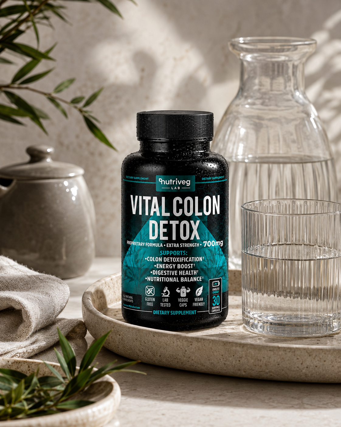
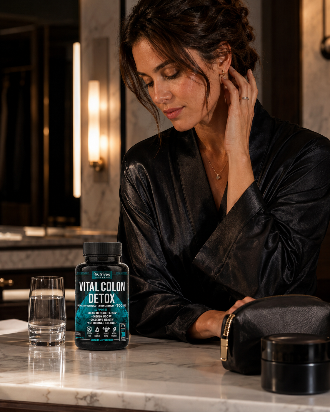


Professional Visual Identity As The Key To Success
Conclusion:
The Strongest Supplement Packaging Doesn’t Simply Present A Product — It Builds Confidence Across Every Brand Interaction.
Exceptional Supplement Packaging Design begins with strategy, category understanding, and a clear market position. For Vital Colon Detox®, the objective extended beyond redesigning a label. NF Creative Studio developed a complete Health Supplement Packaging and Brand Identity Design system connecting research, information architecture, visual identity, materials, lifestyle storytelling, and Amazon-first visibility.
Complex product information was transformed into a structured hierarchy designed for faster understanding. Product naming creates recognition, supporting information communicates what matters, and carefully positioned trust signals provide reassurance. Every surface performs a defined role within one cohesive Dietary Supplement Packaging system.
The black bottle, matte label, controlled teal palette, precise typography, print preparation, and protective packaging translate the strategy into a premium physical experience. Across Amazon, mobile, A+ Content, e-commerce, and lifestyle applications, the same Wellness Packaging Design remains consistent, recognizable, and commercially relevant.
What began as a packaging project became a scalable Supplement Branding ecosystem connecting product, commerce, education, trust, customer experience, and future growth. When strategy, design, production, and digital visibility work together, packaging becomes more than a product surface—it becomes a long-term brand asset.
If you are looking to create distinctive Product Packaging Design or build a visual system that performs across Amazon, retail, and e-commerce, NF Creative Studio transforms strategic thinking into premium brand experiences designed for recognition, consistency, and lasting value.
“Successful Wellness Brands Don’t Compete Through Visual Noise. They Earn Recognition Through Strategic Packaging, Clear Communication, And A Brand Experience Customers Can Trust.”
FINAL THOUGHT
Better Wellness Brands Are Built Through Trust, Not Trends.
Exceptional health products inspire confidence long before consumers experience their benefits. Every successful packaging system is designed to communicate purity, credibility, and quality—transforming complex health solutions into brands that people immediately recognize and trust.
Every ingredient.
Every decision.
Every detail.
Each refinement strengthened the connection between scientific credibility, premium presentation, and consumer confidence.
For Vital Colon Detox, packaging became more than product protection.
It became the first promise of better health.
WHERE TRUST BECOMES THE FOUNDATION OF WELLNESS.
IMPACT & METRICS
Improved Visibility in E-Commerce Listings
The modern label design led to a significant increase in click-through rates on Amazon and health product marketplaces.
Growth in First-Time Buyer Conversions
Clear communication of product benefits and minimalist packaging instilled confidence in new customers.
Positive Design Feedback from Health-Conscious Users
Surveys and reviews highlight appreciation for the clean, premium, and trustworthy look.
Increase in Repeat
Purchase Rate
Brand consistency and strong shelf presence built user loyalty, doubling repeat order rates within 60 days.
Regulatory Compliance for Global Markets
Packaging meets FDA and GMP standards, ensuring readiness for international distribution without additional revisions.
Estimated Additional
Revenue in First 90 Days
The upgraded packaging and premium positioning contributed to a significant e-commerce sales uplift after launch.
Proud Clients




























































The Team Behind the Project - Led by Creative Director
The Team Behind the Project:
Every Infinity Design Studio project is personally led and directed by Filip Narančić – Founder & Creative Director.
With a unique blend of creativity, strategy, and precision, Filip ensures that each project delivers premium quality, timeless design, and measurable impact.
Infinity Design Studio operates with a boutique approach, where every detail is carefully crafted, and each solution is tailored to the client’s vision and market demands. By combining multidisciplinary expertise with hands-on leadership, the studio transforms every project into a distinctive brand experience.

Filip Narančić
Founder & CEO – Infinity Design Studio

SPECIALIZED IN:

Short biography
Born on June 24, 1982, in Valjevo, Filip Narančić turned his passion for architecture and design into a thriving career. He graduated from the Faculty of Technical Sciences in Novi Sad, Department of Architecture and Urbanism. During his studies, he launched a pilot project that later evolved into today’s Infinity Design Studio.

What Our Clients Say About Us?
Trusted by global brands and visionary entrepreneurs — hear what they say about working with Infinity Design Studio.

This designer’s professionalism and creativity are truly commendable. We’re delighted with his work andhighly recommend collaborating with him. His talent and dedication consistently deliver outstandingresults.

Harmouch.Fk
NUTRIVEG LAB
I really enjoyed working with Filip. He is very hardworking, and the service is truly excellent!

AromapetD
AROMAPET
Filip has done excellent work for our project! He’s quick and delivers great designs. Very attentive, very easy to work with, listens to and understands what I am trying to get done immediately. Thanks! Happy to work with him again!

Filip was wonderful to work with! As a first-timer in product packaging design, I just asked for eye-catching packaging. He exceeded all of our expectations, and we highly recommend working with Filip – you won’t be disappointed!

Fatime.Perazic
TRIDENT POSEIDON
EXCELLENT!!! Filip is the best designer and even the best contractor I have ever worked with. Hecreated an awesome design and worked with me tirelessly from its greatness to its perfection. Now I havethe most gorgeous packaging on the market, and all my competitors are screwed. Hooray :-)!

Jakub.Novotny7
COPPER GEMZ
We needed a new label for our maple syrup. From start to finish, Filip was right on top of the design, anychanges we requested, and was extremely good at communicating. We loved his style and highly recommend working with him!

The Gateway Farm
THE GATEWAY FARM
Worked perfectly together and carried out extremely quickly with corrections and changes.

MarceQ
BRAUEREI 2572
“Filip is an extremely talented designer. He was a pleasure to work with throughout this process. In addition to being very responsive, he was able to take a general idea and turn it into something we truly loved. Highly recommend!”

Jrossd
ECOMMDISTRIBUTION, ASHBROOK OUTDOORS
Excellent professional, quick service. We recommend working with him!

Moltres
BROMELIFE
Filip is a very enthusiastic designer, proactively looking for various solutions and flexible in terms ofworking and communication. I am very pleased with the final design and our teamwork!

JaanP
LUCIDKITCHEN
This designer is AMAZING! I can’t believe how easy it was to work with him on all the changes we madeto our box. He was so positive and encouraging, with great design ability! Highly recommended!

XoginaU
Dr. P RX
I NEED MORE THAN 5 STARS TO RATE FILIP. His relentless commitment and creativity made thisproject a dream come true. Highly recommended!

Wong.Jameson
UNO DOGGO
Let’s Work Together
Infinity Design Studio is your trusted creative partner for Strategic CASE STUDIES that strengthen Brand Authority, build customer trust, and transform successful projects into powerful business assets.
Explore More Stunning Work
Tell Us What You’re Building.
Share what you already know—what you are creating, changing, improving, launching, or trying to solve. We’ll use that context to understand the project and determine the right next step.
You do not need a perfect brief to begin. Clear context is enough.