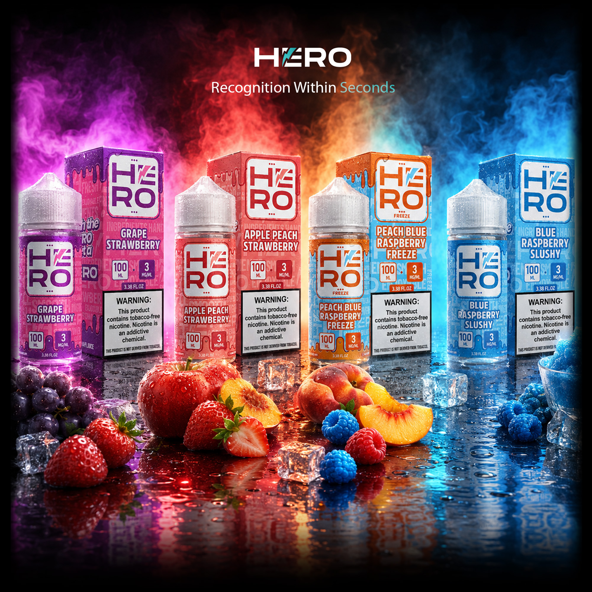
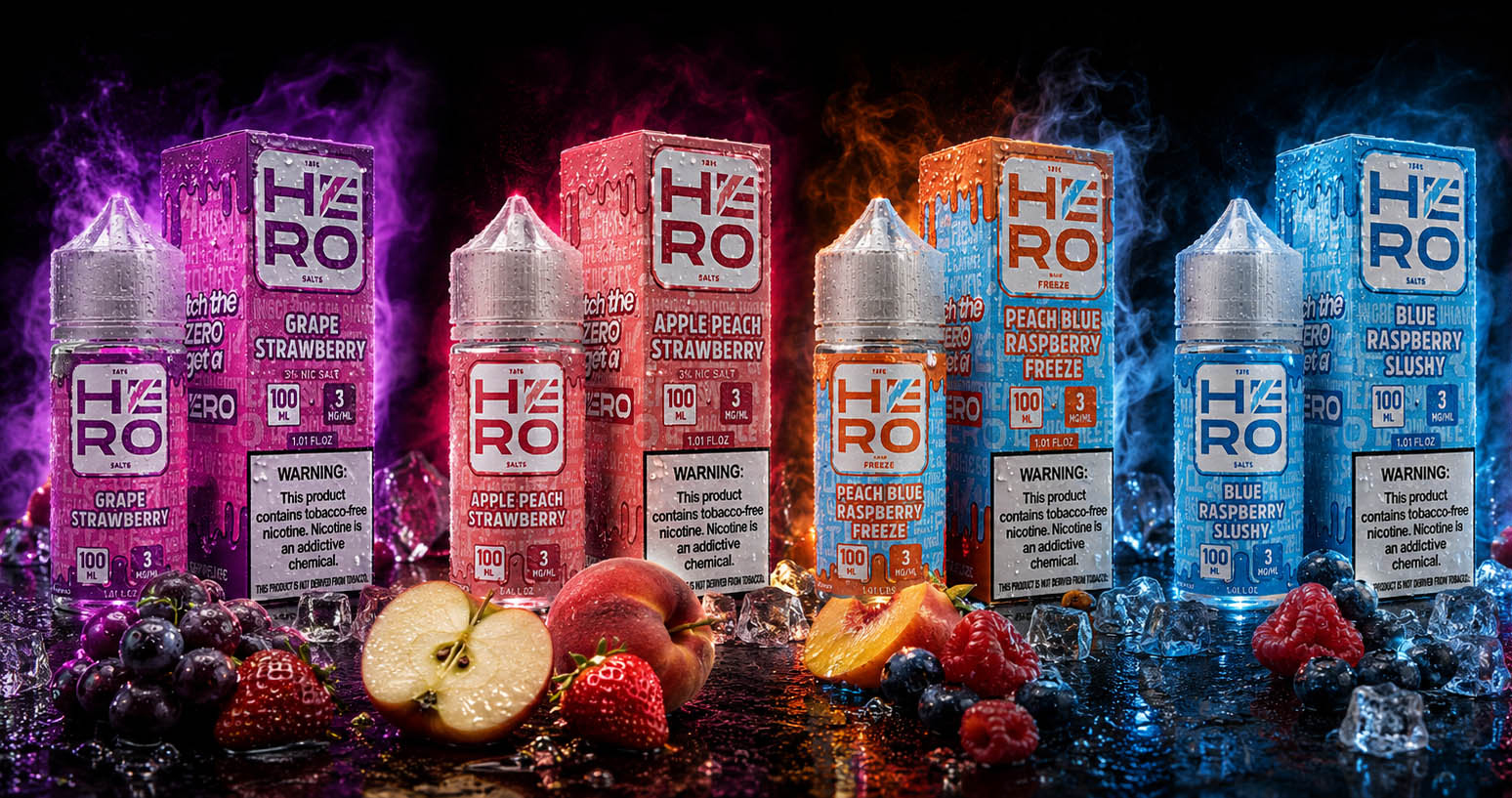
HERO® FROM A BOLD E-LIQUID BRAND TO A POWERFUL SHELF EXPERIENCE

Reimagining Product Identity To Create Stronger Shelf Presence, Higher Recognition, And Greater Consumer Impact.

COMPANY - HERO / TKE Distribution, LLC

Client:

HERO – TKE Distribution LLC

COUNTRY: United States

USA

Info:

Industry: Amazon, E-commerce, Retail, Vape Industry

Market: United States • Europe • Global Distribution

Project Type:
• Brand Identity Refresh
• Packaging Design System
• Retail Packaging Design
• Product Line Architecture • Logo Refinement
• 3D Product Visualization • Print Production

Products:

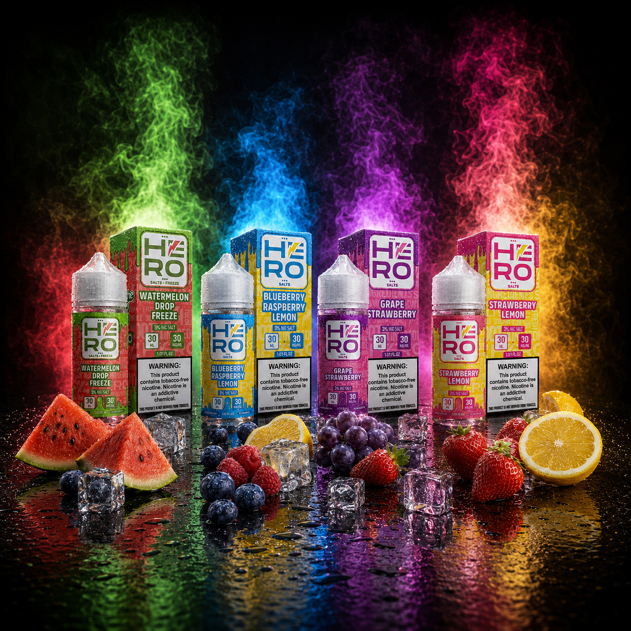
HERO Freebase Collection (100ML)
HERO Salts Collection (30ML)
Limited Editions
Future Flavor Extensions

Strategic Focus:

Brand Identity
Packaging Design
Retail Shelf Visibility
Product Differentiation
Consumer Recognition

HERO LOGO PREZENTACIJA ARHITEKTURE - 4 new

Project Introduction

Transforming An Established Vape Brand Into A Premium Retail Experience Built For Recognition, Scalability, And Long-Term Growth

HERO was already recognized for delivering premium e-liquid products, authentic flavors, and a loyal customer community. However, as the product portfolio expanded and market competition intensified, the brand required a more unified Brand Identity, stronger Packaging Design System, and a scalable visual language capable of supporting long-term commercial growth.

Infinity Design Studio was commissioned to develop far more than a visual redesign. Our objective was to create a complete Retail Packaging Design ecosystem that would strengthen Brand Recognition, improve Shelf Visibility, simplify product differentiation, and establish HERO as a premium brand experience across every customer touchpoint.

The project extended across multiple strategic disciplines, combining Logo Refinement, Packaging Architecture, Typography Systems, Information Hierarchy, Consumer Communication, 3D Product Visualization, and production-ready technical artwork into one cohesive identity designed for future expansion.

Rather than creating individual labels, we built a complete Packaging Design System capable of supporting new flavors, multiple nicotine categories, future collections, and long-term product evolution while maintaining immediate consumer recognition.

HERO 22
Target Audience

Adult vape consumers seeking premium-quality e-liquids, distinctive flavors, and brands that combine performance, consistency, and memorable visual identity. Designed for customers who value craftsmanship, product authenticity, and premium retail experiences across physical stores and international e-commerce platforms.

Project Objective

To transform HERO into a distinctive Premium Vape Brand through a complete Brand Identity Refresh, Packaging Design System, and Retail Communication Strategy capable of increasing Shelf Visibility, strengthening Brand Recognition, differentiating multiple product collections, and supporting future portfolio expansion.

The objective extended far beyond redesigning labels. Every creative decision was strategically developed to create a recognizable visual ecosystem that communicates premium quality before the customer even experiences the product.

About HERO

HERO is not just another vape brand – it is a community and family-driven success story that found a healthier alternative to smoking. Their mission is simple: to offer superior quality, authentic flavors, and an unforgettable vaping experience to users worldwide.

HERO has built a strong reputation by delivering premium e-liquids focused on exceptional flavor quality, product consistency, and customer trust. With an expanding international customer base and multiple product collections, the brand required a visual identity capable of matching the quality of the products themselves.

Infinity Design Studio was commissioned to redesign the complete HERO Brand Experience, developing a scalable Packaging Design System, refining the logo, strengthening brand architecture, differentiating product categories, and creating a premium retail identity prepared for future market growth.

The project transformed HERO from an established product line into a recognizable commercial brand capable of competing confidently in today’s highly competitive vape industry.

Project Snapshot:

“The Strongest Premium Brands Are Built Through Strategy, Refined Through Design, And Remembered Through Experience.”

Industry
Premium Vape Industry • Retail • E-Commerce

Services

Brand Identity Development • Packaging Design • Retail Packaging Design • Brand Strategy • 3D Product Visualization • Production Artwork

Objective

Transform an established vape brand into a premium international retail experience with scalable product architecture and stronger consumer recognition.

Deliverables

Complete Brand Identity Refresh • Packaging Design System • Logo Modernization • Retail Product Architecture • 3D Product Visualizations • Production-Ready Print Files

Focus
Premium Positioning • Brand Recognition • Product Differentiation • Consumer Appeal • Future Scalability

Project Overview:

“Every Successful Brand Transformation Begins With A Clear Business Objective And A Strategic Creative Vision.”

HERO had already earned customer trust through product quality, but its visual identity no longer reflected the premium experience the brand delivered.

Infinity Design Studio was commissioned to develop far more than updated packaging.

The project focused on creating a complete Brand Identity System, Packaging Architecture, and Retail Communication Strategy capable of strengthening consumer perception, simplifying product navigation, improving shelf impact, and creating long-term consistency across every collection.

From the refreshed logo and packaging hierarchy to typography, color systems, and product differentiation, every design decision was guided by one objective:

Transforming HERO into an internationally recognizable premium vape brand built for long-term commercial growth.


Project Scope:


  • Complete Brand Identity Refresh
  • Logo Modernization
  • Packaging Design System
  • Retail Packaging Design
  • Product Architecture
  • Flavor Differentiation Strategy
  • Typography & Information Hierarchy
  • Packaging Color System
  • Consumer Communication Strategy
  • Brand Positioning
  • Product Collection Architecture
  • 3D Product Visualizations
  • Production-Ready Print Files
  • Technical Packaging Preparation
  • Future Product Scalability

Key Project Facts:

“Exceptional Brands Are Never Built By One Decision—They Are Built By Hundreds Of Strategic Ones.”

✓ Complete Brand Identity Refresh

✓ Modernized HERO Logo

✓ Scalable Packaging Design System

✓ Multi-Collection Product Architecture

✓ Production-Ready Commercial Files

✓ Future Flavor Expansion Ready

✓ Global Retail Positioning Strategy

✓ Premium Consumer Experience Development

Project Impact:

“The True Measure Of Great And Premium Design Isn’t How It Looks—It’s How It Performs In The Real World.”

✓ Stronger Brand Recognition

✓ Clear Product Collection Differentiation

✓ Improved Retail Shelf Presence

✓ Premium Market Positioning

✓ Higher Consumer Purchase Confidence

✓ Consistent Global Brand Identity

✓ Manufacturing-Ready Production Files

✓ Scalable Foundation for Future Growth

"The Strongest Brands Are Built Around Experiences Long Before They Are Recognized On The Shelf."

Designing A Lifestyle Brand That People Want To Be Part Of

Today’s consumers don’t simply choose products—they choose identities, experiences, and communities that reflect who they are. The strongest lifestyle brands earn attention by creating emotional connections long before a purchasing decision is ever made. Great branding doesn’t begin with packaging—it begins with the feeling people associate with the brand itself.

For the HERO Rebranding & Packaging Redesign, our objective extended far beyond developing a new visual identity for an e-liquid collection. We created a complete Premium Brand Experience that combines strategic Brand Identity, modern Packaging Design, and consistent visual communication into a scalable ecosystem designed to strengthen recognition, increase shelf impact, and build long-term customer loyalty. Every creative decision was developed to position HERO as a confident, contemporary lifestyle brand that consumers don’t simply purchase—they choose to identify with.

"The Most Memorable Brands Don't Follow Culture—They Become Part Of It."

“Exceptional Packaging Doesn’t Simply Differentiate Products — It Shapes Brand Perception Long Before The First Experience.”

HERO – TKE Distribution LLC– Elevating A Premium E-Liquid Brand Through Strategic Packaging Design, Product Architecture, And Market-Driven Visual Identity


“Building A Premium E-Liquid Packaging System Designed For Recognition, Product Differentiation, And Sustainable Brand Growth.”


The HERO E-Liquids project represented a strategic transformation rather than a conventional visual redesign—a comprehensive Brand Repositioning Strategy created to strengthen market presence, improve Product Recognition, and establish a distinctive competitive position within the highly competitive global Vape Industry. Through a strategic combination of Brand Identity Development, Packaging Design, Visual Communication, and Product Architecture, we transformed an existing product portfolio into a cohesive premium brand engineered for long-term commercial success and sustainable market growth.

Our objective extended far beyond creating visually attractive packaging. Every design decision was driven by the principles of Consumer Psychology, Shelf Visibility, Brand Consistency, and Purchase Influence. From Logo Redesign and product categorization to packaging hierarchy, typography, flavor differentiation, and visual communication, every element was intentionally developed to simplify product navigation, strengthen customer confidence, and elevate the perceived quality of the entire HERO product ecosystem.

The final outcome extends well beyond a successful Packaging Redesign. HERO now operates with a scalable Brand Identity System that supports future product launches, strengthens Brand Recognition, improves retail visibility, and delivers a consistent premium experience across every physical and digital customer touchpoint. More importantly, it establishes a future-ready Brand Ecosystem capable of supporting continuous Product Innovation, Portfolio Expansion, international market adaptation, and sustainable long-term business growth within one of the world’s most competitive consumer industries.

THE SOLUTION INCLUDED:

  • Complete Brand Identity Redesign featuring a modern Logo System, premium Packaging Design, and a scalable visual framework.
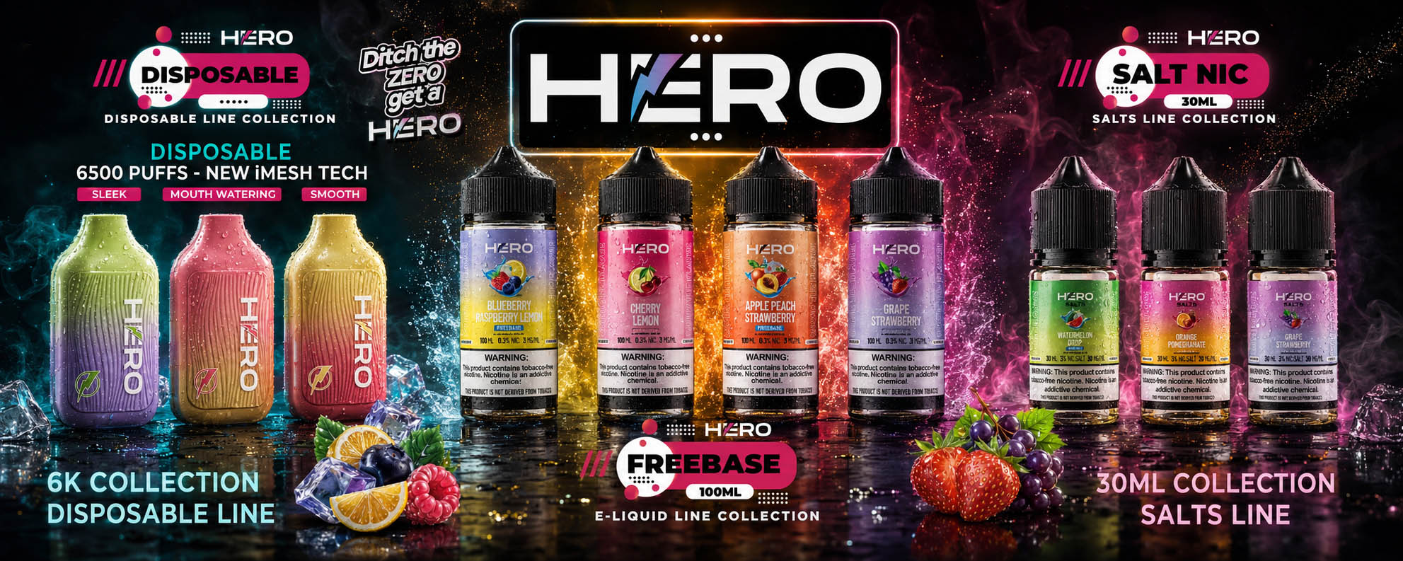
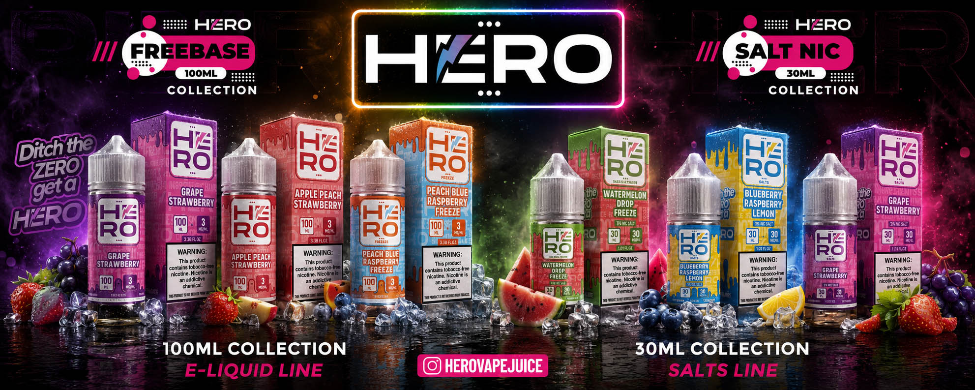
  • Strategic Brand Architecture that clearly differentiates Freebase and Salt Nic Collections while preserving complete visual consistency.
  • Premium Label Design, Packaging Design, Flavor Differentiation, and integrated marketing assets optimized for retail, digital platforms, exhibitions, and promotional campaigns.
  • A scalable Brand Ecosystem designed to support future product launches, portfolio expansion, and long-term commercial growth.

THE FINAL RESULT:

The final solution transformed HERO from a product collection into a strategically positioned Premium Brand with a cohesive Brand Identity, innovative Packaging Design, and a scalable Visual Communication System. Every design decision was driven by business objectives, resulting in stronger Brand Recognition, clearer Product Differentiation, enhanced Shelf Impact, and a future-ready branding ecosystem designed to support continuous Product Innovation, Portfolio Expansion, and sustainable long-term growth within the competitive global Vape Industry.

"Exceptional Packaging Doesn't Just Protect A Product—It Shapes Perception, Builds Trust, And Creates Competitive Advantage."

Download Case Study

Designing Packaging That Builds Recognition Before The First Purchase

Creating A Strategic E-Liquid Packaging System Where Visual Identity, Product Differentiation, And Brand Consistency Work Together

Successful E-Liquid Packaging Design extends far beyond attractive labels. Every visual decision should strengthen product recognition, communicate quality, and simplify the customer’s purchasing decision. The most effective Packaging Design systems combine strategic Brand Identity Design, product architecture, visual hierarchy, and consistent communication to create brands that remain recognizable across every flavor, collection, and retail environment.

For HERO, our objective extended beyond redesigning individual bottles. We developed a complete Packaging Branding ecosystem where typography, color systems, flavor differentiation, logo architecture, and promotional applications work together as one cohesive visual identity. The result is a scalable Premium Packaging Design system that strengthens Shelf Presence, reinforces customer trust, and supports long-term brand growth across both retail shelves and digital marketplaces.

Exclusive Visual Identity

Exclusive Visual Identity — Designing A Brand That Commands Attention

Exceptional E-Liquid Packaging Design begins with a visual identity that immediately communicates confidence, quality, and credibility. In a highly competitive marketplace, packaging is often the customer’s first interaction with the product, making Brand Identity Design one of the most influential factors in purchasing decisions.

For HERO, we developed a bold and recognizable identity that balances premium aesthetics with strong commercial performance. From the redesigned logo and typography to the color system and packaging architecture, every design decision was made to strengthen Brand Recognition, elevate perceived value, and position HERO as a premium brand built for long-term growth.

Brand Consistency

Brand Consistency — Building Recognition Across Every Product Line

The strongest brands are recognized because they remain visually consistent while allowing individual products to stand apart. A scalable Packaging Branding system creates clarity for customers, simplifies product navigation, and reinforces trust at every point of interaction.

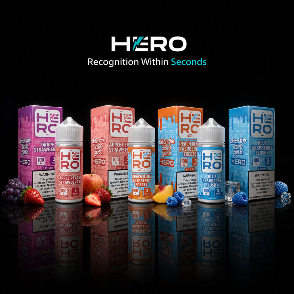
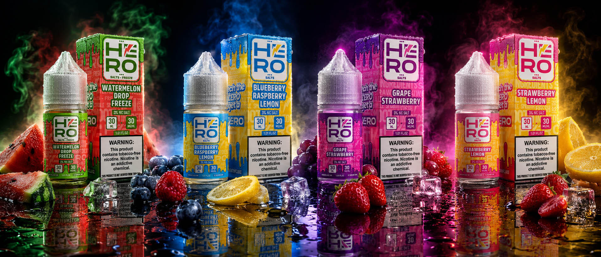
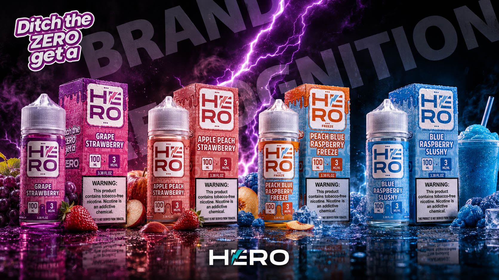
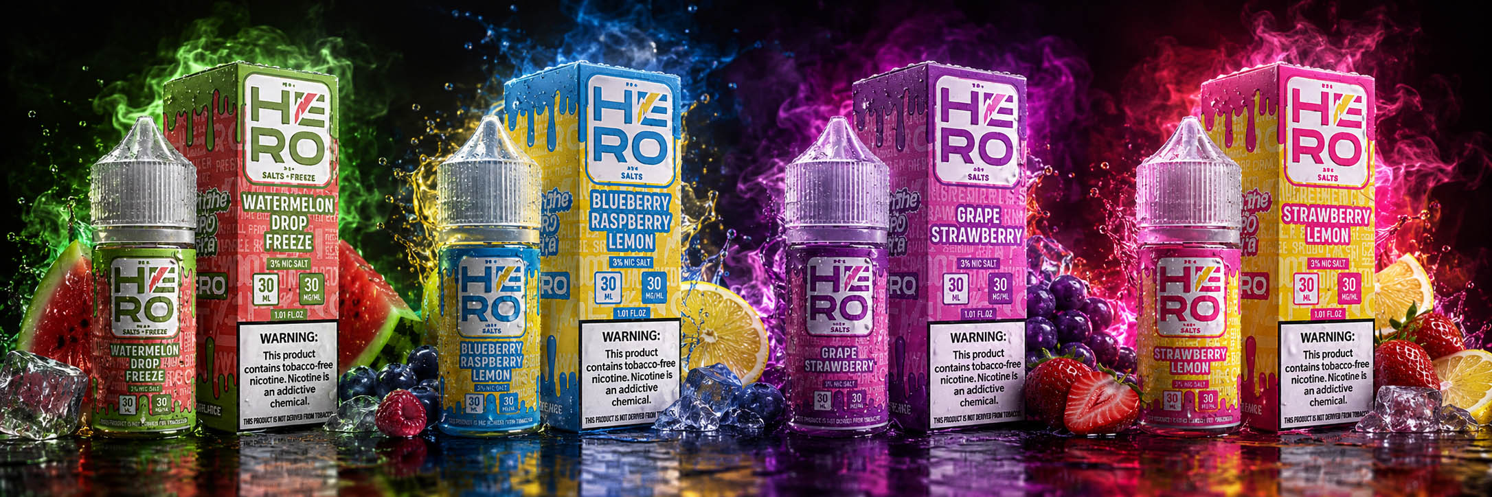
For HERO, we developed a unified visual system that connects both the 30ML Salts and 100ML Freebase collections through consistent typography, layout structure, and brand architecture while clearly differentiating every flavor. The result is a cohesive Premium Packaging Design system that improves Shelf Presence, supports portfolio expansion, and strengthens long-term market recognition.

Emotional Connection

Creating Emotional Connection Through Design And Brand Storytelling

Successful packaging is remembered not only because it looks impressive, but because it communicates a feeling. Every visual element should reinforce the brand’s personality, values, and promise long before the product is experienced.

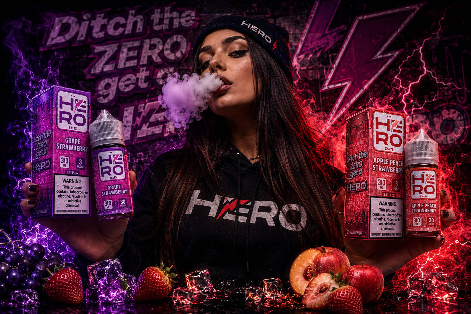
For HERO, the visual identity was designed to express confidence, energy, and authenticity. Supported by the memorable message “Ditch the ZERO, Get a HERO,” the packaging combines dynamic graphics, bold color contrasts, and strategic communication to transform every product into a recognizable brand experience. Rather than simply promoting an e-liquid, the design creates an emotional connection that enco

"Great Packaging Doesn't Win Attention By Chance. It Earns Recognition Through Strategy, Consistency, And Purpose."

BRAND CONTEXT & MARKETING POSITIONING

"The Strongest Packaging Doesn't Compete For Attention — It Creates Recognition."

Positioning A Premium E-Liquid Brand For Recognition, Growth, And Long-Term Shelf Impact

Building A Distinct Packaging Strategy That Turns Every Product Into A Recognizable Brand Experience

The success of an E-Liquid Packaging Design begins long before the first bottle reaches a customer’s hands. In one of the world’s most visually competitive industries, packaging is often the first conversation a brand has with its audience. Within seconds, customers decide whether a product feels trustworthy, premium, innovative, or worth exploring further.

For HERO, the objective extended far beyond creating attractive labels. We developed a strategic Packaging Design System that combines strong visual identity, product differentiation, and long-term brand consistency across every flavor, bottle, and promotional application. Every design decision was made to strengthen Brand Recognition, improve Shelf Presence, and create a memorable experience in both physical retail environments and digital marketplaces.

Rather than designing isolated graphics, we created a scalable visual language capable of supporting future product expansion while maintaining a cohesive Brand Identity Design. The result is a premium packaging ecosystem that communicates confidence, quality, and energy before the product is ever experienced.

Professional Packaging & Brand Assets

0 +

Designed As One Cohesive Visual System

More than thirty strategically designed packaging, branding, and promotional assets were created to establish a recognizable E-Liquid Packaging Design system across products, marketing materials, and customer touchpoints.

Unified Brand Identity Design Strategy

0

Built For Recognition Across Every Product

A single Brand Identity Design system was developed to connect packaging, typography, colors, graphics, and communication into one scalable visual language that strengthens long-term Brand Recognition.

Shelf-Focused Packaging Strategy

0 %

Designed To Maximize Product Visibility

Every packaging decision—from hierarchy and color selection to layout and typography—was strategically created to improve Shelf Presence, communicate product quality, and differentiate the HERO collection in a highly competitive market.

Multi-SKU Scalable Packaging Architecture

0 %

Ready For Product Line Expansion

The packaging system was designed to support multiple flavors, future product launches, limited editions, and promotional collections while maintaining complete visual consistency across the entire brand.

Key Highlights

✔ Strategic Packaging Architecture
A scalable Product Packaging Design system developed to support multiple flavors, future product launches, and long-term brand expansion.

✔ Premium E-Liquid Packaging Design
Distinctive packaging created to communicate product quality, strengthen Shelf Presence, and increase immediate visual recognition.

Unified Brand Identity Design
Every bottle, label, box, and promotional asset follows one consistent visual language that reinforces trust and memorability.

✔ Retail & Digital Market Readiness
Packaging designed to perform equally well on physical retail shelves and across digital marketplaces, ensuring a cohesive customer experience.

✔ Purpose-Driven Visual Communication
Typography, color hierarchy, and graphic elements were strategically crafted to improve clarity, usability, and emotional connection with the audience.

✔ Recognition Built For Long-Term Growth
Rather than creating individual labels, we developed a complete branding ecosystem designed to increase Brand Recognition, strengthen customer loyalty, and support sustainable product growth.

"Exceptional Packaging Doesn't Simply Protect The Product. It Builds Recognition Before The First Experience Begins."

The Challenge:

Repositioning A Growing Brand In A Highly Competitive Market

The vape industry is one of the fastest-evolving and most competitive consumer markets, where purchasing decisions are heavily influenced by Brand Identity, Packaging Design, Shelf Visibility, and overall Product Presentation. To remain competitive, HERO required far more than a visual refresh—it needed a comprehensive Brand Repositioning Strategy capable of strengthening market perception while preparing the brand for future growth.

The primary objective was to redesign the existing HERO Logo and develop a scalable Visual Identity System that could be consistently implemented across every Product Label, Packaging Design, and future product extension. At the same time, it was essential to preserve the brand’s existing recognition while introducing a more modern, premium, and commercially competitive appearance.

Key project objectives included:

  • Developing a completely redesigned HERO Brand Identity suitable for multiple product collections while maintaining visual consistency.
  • Redesigning every Bottle Label and Product Box to create a cleaner, more premium, and highly recognizable packaging system.
  • Building a strategic Product Architecture that enables customers to instantly distinguish between Freebase and Salts collections, individual flavors, nicotine strengths, and future product categories.
  • Creating a structured Color-Coding System and visual hierarchy that improves navigation, strengthens Shelf Recognition, and simplifies purchasing decisions.
  • Introducing new flavors into the existing portfolio while ensuring seamless integration within the overall Brand Identity System.
  • Elevating the perceived value of the products through premium Packaging Design, refined typography, modern layouts, and consistent visual communication.
  • Improving packaging functionality by reorganizing product information and relocating mandatory regulatory elements—such as the Nicotine Warning Label—to enhance readability without compromising the overall design.
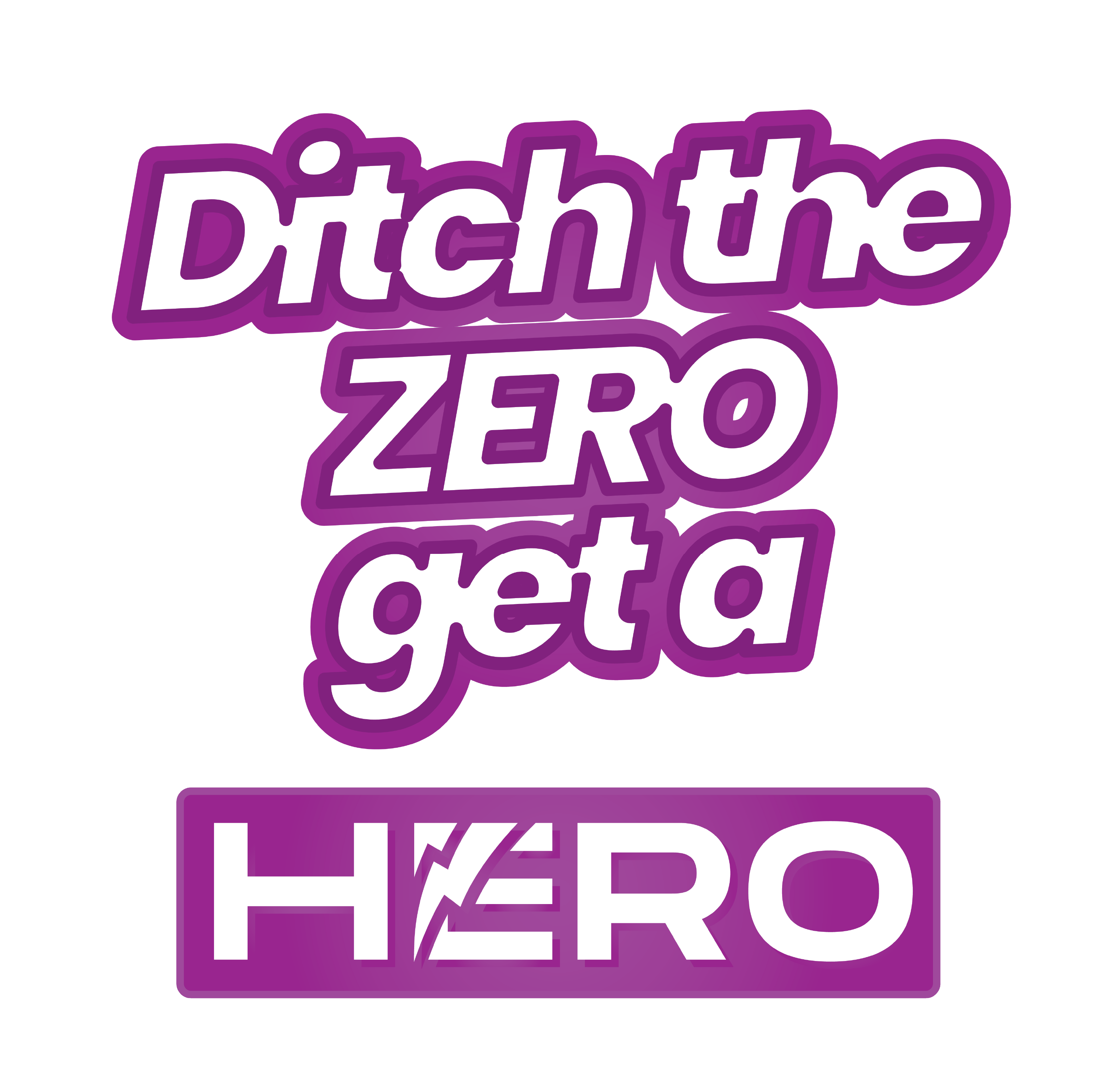
  • Replacing the previous slogan, “Savor The Flavor,” with the more memorable and campaign-oriented “Ditch The ZERO, Get A HERO,” supported by the creation of a new Flash Lightning Brand Element that reinforces recognition and strengthens future marketing campaigns.


The greatest challenge was to successfully balance Brand Evolution with Brand Recognition—modernizing HERO’s entire visual identity while preserving the trust, familiarity, and product recognition already established among existing customers. Every design decision needed to improve commercial appeal, strengthen Brand Consistency, and create a scalable visual system capable of supporting long-term business growth and future product expansion.

Designing A Scalable Product Identity System

"Building A Distinctive Logo Architecture That Unifies Product Collections While Strengthening Brand Recognition."

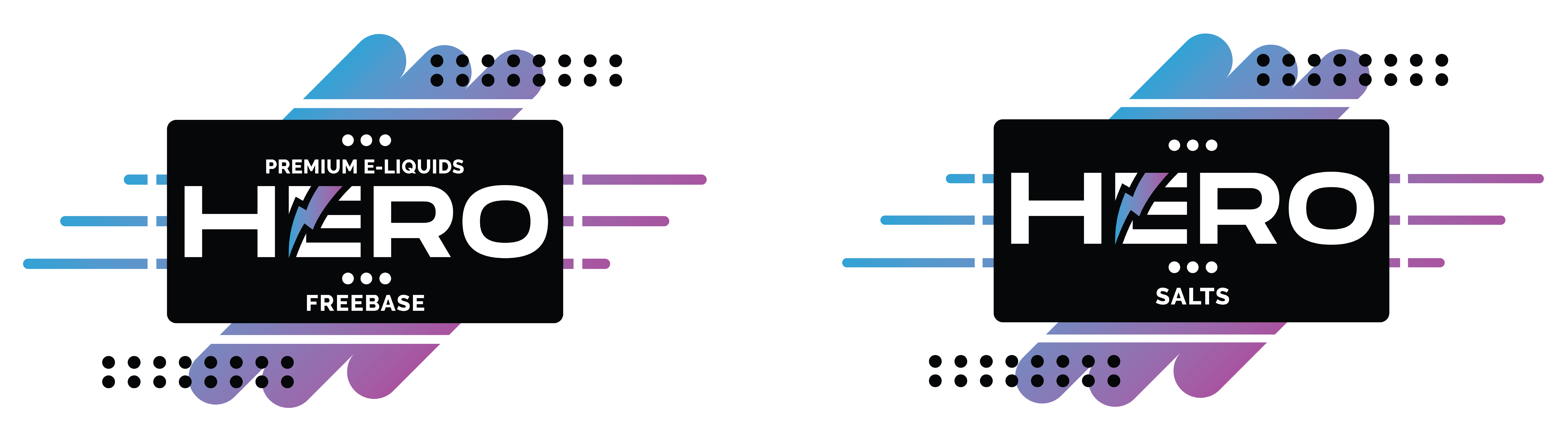
The redesigned HERO logo was developed as the cornerstone of a scalable Brand Identity System capable of supporting multiple product collections while maintaining immediate recognition across every customer touchpoint. Rather than creating a standalone logo, the objective was to establish a flexible visual framework that clearly differentiates product categories without compromising overall brand consistency.

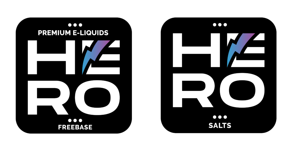
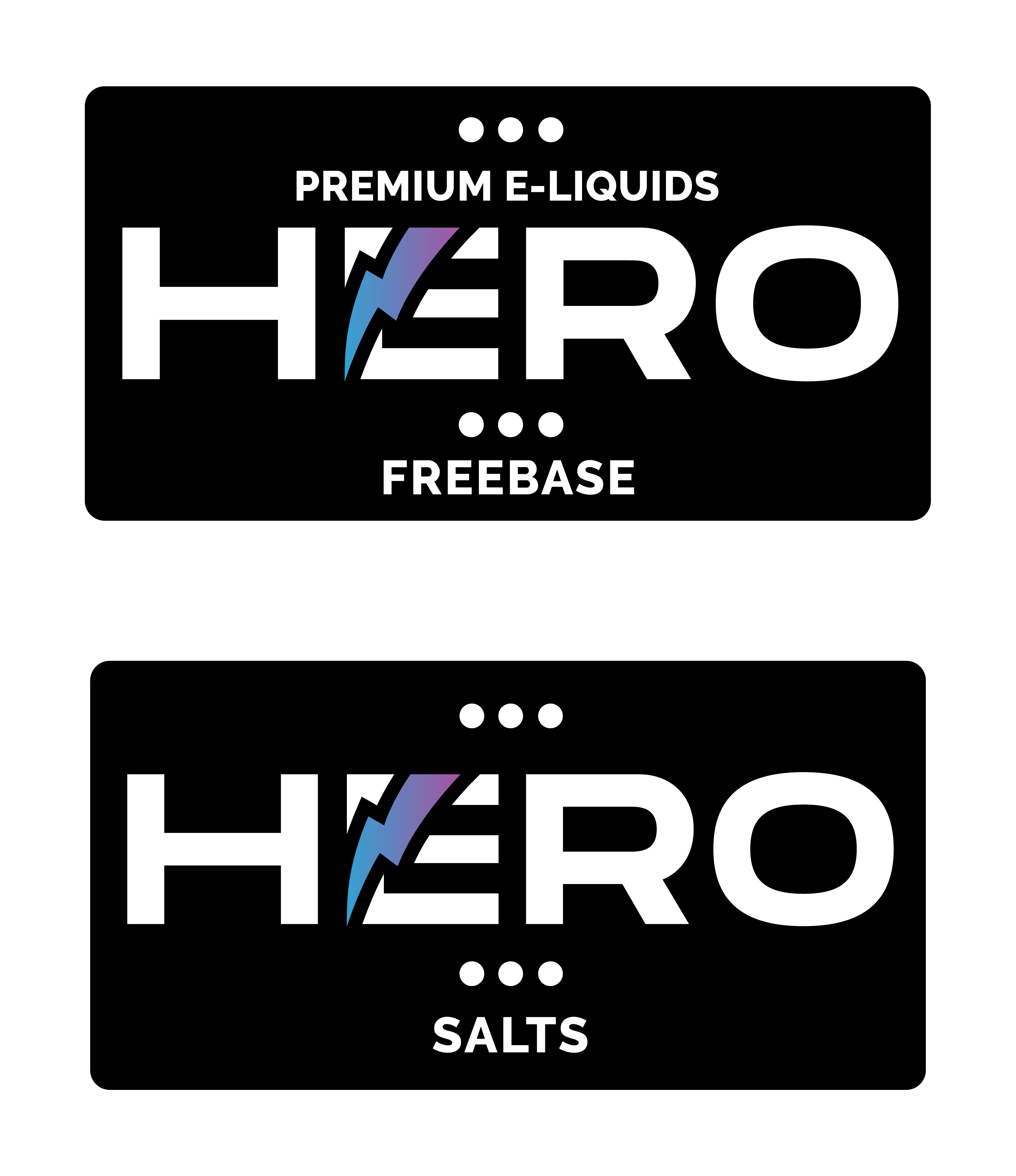
Every element of the identity was carefully refined to improve readability, visual balance, and shelf impact. The newly developed horizontal logo architecture introduces a clean hierarchy that seamlessly integrates collection identifiers such as Freebase and Salts, allowing each product line to communicate its unique positioning while remaining unmistakably part of the HERO brand ecosystem.

Designed with versatility in mind, the system performs consistently across Packaging Design, Bottle Labels, Retail Displays, Marketing Materials, Digital Platforms, and future product extensions. The result is a modern identity that simplifies product recognition, reinforces premium positioning, and provides a scalable branding foundation prepared for long-term business growth.

“A Strong Product Identity Doesn’t Create Separate Products—It Connects Every Collection Under One Recognizable Brand.”

DESIGN STRATEGY:

Building a Packaging System Designed to Perform

Every Design Decision Was Made To Increase Recognition, Simplify Choice, And Create Long-Term Brand Value.

Exceptional packaging is never the result of aesthetics alone. Behind every premium brand lies a carefully crafted strategy that transforms business objectives into meaningful visual experiences. Rather than creating individual labels, Infinity Design Studio developed a scalable Packaging Branding ecosystem that enables HERO to communicate quality, distinguish every product line, and remain instantly recognizable through professional E-Liquid Packaging Design built for long-term brand growth.

From typography and visual hierarchy to flavor differentiation and packaging architecture, every design decision was strategically made to strengthen Shelf Presence, reinforce Brand Recognition, and create a cohesive Brand Identity Design system. The result is a scalable Premium Packaging Design approach that maintains complete visual consistency across the entire product portfolio while supporting both retail environments and future product expansion.

Building Instant Shelf Presence

Exceptional E-Liquid Packaging Design begins long before consumers read a product name.

Within the first few seconds of visual contact, packaging shapes perception, builds trust, and influences purchasing decisions before a single feature or flavor is explored.

Our objective was to develop a strategic Product Packaging Design system that commands immediate attention through confident typography, purposeful visual hierarchy, and balanced composition.

Every design decision was carefully crafted to maximize Shelf Presence, strengthen Brand Recognition, and position HERO as a premium brand that stands out consistently across retail environments and an increasingly competitive marketplace.

Designing Flavor Through Visual Emotion

Every flavor should create an emotional impression long before the bottle is ever opened. Successful E-Liquid Label Design goes beyond color alone—it builds anticipation, communicates product personality, and helps consumers instantly recognize the experience waiting inside. Rather than relying on decorative graphics, we developed a purposeful visual language where every color, typography choice, and graphic element strengthens Brand Identity Design, supports product differentiation, and creates intuitive navigation across the expanding HERO portfolio. The result is a cohesive Vape Packaging Design system that transforms individual flavors into one recognizable premium brand experience.

Creating A Scalable Packaging System

Exceptional Packaging Design is never built for a single product—it is designed to evolve alongside the brand.

Rather than creating individual labels, Infinity Design Studio developed a flexible Packaging Branding system capable of supporting new flavors, nicotine strengths, limited editions, promotional campaigns, and future product expansion without compromising consistency.

Every new asset integrates seamlessly into the HERO ecosystem, preserving a unified Visual Identity, strengthening Brand Recognition, and ensuring long-term production efficiency across the entire product portfolio.

From Individual Design Decisions To One Unified Brand System

Every Strategic Decision Was Made To Strengthen Recognition, Simplify Growth, And Build A Packaging Ecosystem Designed For Long-Term Success.

Exceptional Packaging Design is never defined by individual creative decisions alone. True value is created when every element—from Brand Identity Design and typography to product architecture and Packaging Branding—works together as one scalable system. Consistency becomes more than a visual principle; it becomes a strategic advantage that supports future product development, strengthens customer trust, and reinforces Brand Recognition across every touchpoint.

For HERO, every visual decision served a single objective: to transform individual products into a cohesive premium portfolio capable of growing without losing its identity. By combining strategic thinking with disciplined Visual Identity development, we created a flexible packaging ecosystem prepared to support new flavors, product categories, marketing campaigns, and long-term commercial success.

Design Strategy Was Never About Creating Better Packaging.

It Was About Building A System Capable Of Supporting A Brand For Years To Come.

Every design decision was guided by one clear objective: to develop a scalable Premium Packaging Design ecosystem capable of performing consistently across every product, every collection, and every future expansion. Rather than creating isolated packaging solutions, Infinity Design Studio built a strategic foundation that allows HERO to evolve while preserving visual consistency, production efficiency, and long-term brand value.

Flavors

0

Collections

0

Packaging Assets

0

Display Boxes

0

Unified Design System

0

Key Highlights

✔ Designed For Instant Shelf Recognition

✔ Emotionally Differentiated Flavor System

✔ Flexible Multi-Collection Architecture

✔ Production-Ready Packaging Structure

✔ Expansion-Ready Design System

✔ Long-Term Brand Consistency

"The Strongest Brands Are Never Built One Package At A Time. They Are Built Through Systems That Scale With Every New Opportunity."

PACKAGING EXPLORATION / LABEL SYSTEM

Exploring A Bold Packaging Language Before Defining The Final HERO Identity

Introduction

Exceptional Packaging Design is never the result of a single idea. Behind every successful E-Liquid Packaging Design stands a creative exploration that tests multiple visual directions before a clear system begins to emerge.

Rather than searching for one attractive label, Infinity Design Studio explored numerous concepts, structural layouts, color relationships, flavor hierarchies, typography systems, and packaging variations to identify the visual language capable of representing HERO as a scalable premium brand.

Every iteration brought valuable insight. Some directions strengthened recognition. Others improved production efficiency. Many refined the relationship between Brand Identity Design, consumer perception, and long-term Packaging Branding. Together, these explorations established the foundation for a consistent Premium Packaging Design system that could confidently support future product expansion.

Creative Exploration

Every Great Packaging System Begins With Hundreds Of Small Creative Decisions.

Before defining the final identity, multiple visual concepts were explored across labels, boxes, typography, color systems, structural layouts, and product architecture. Each iteration eliminated unnecessary complexity while bringing the HERO brand closer to a cohesive visual ecosystem capable of growing without compromising consistency.

Packaging Direction Exploration

Early concepts focused on discovering the visual personality that could best represent HERO. Various approaches explored typography, graphic composition, balance, hierarchy, and shelf impact while evaluating how each direction communicated confidence, energy, and premium product quality.

Label System Development

Once the creative direction became clear, every label was refined through multiple iterations that tested flavor differentiation, information hierarchy, production requirements, and manufacturing consistency. Each adjustment strengthened both usability and overall Visual Identity, creating a flexible system ready for large product families.

Packaging Architecture

Individual packaging components were developed as part of one connected system rather than independent designs. Labels, boxes, display packaging, and future product extensions were carefully aligned through shared proportions, typography, spacing, and visual hierarchy to maintain complete Brand Recognition across every customer touchpoint.

From Exploration To Identity

Every concept contributed valuable knowledge, but only one direction successfully balanced creativity, production efficiency, scalability, and long-term brand recognition. That direction became the visual foundation of the HERO ecosystem.

For HERO, every visual decision served a single objective: to transform individual products into a cohesive premium portfolio capable of growing without losing its identity. By combining strategic thinking with disciplined Visual Identity development, we created a flexible packaging ecosystem prepared to support new flavors, product categories, marketing campaigns, and long-term commercial success.

Exploration In Numbers:

Multiple Creative Directions

0 %

Explored Before Defining The Final Identity

Every concept contributed valuable insight, allowing the final E-Liquid Packaging Design system to emerge through evaluation rather than assumption.

Packaging Assets

0

Developed Across The Entire Product Ecosystem

Labels, boxes, display packaging, production artwork, and supporting visual assets were designed as one connected Packaging Branding system.

Flavor Variations

0

Unified Through One Visual Language

Each flavor received its own visual personality while remaining part of a consistent Brand Identity Design system.

Final Packaging System

0

Built For Long-Term Brand Growth

The completed Premium Packaging Design system provides a scalable foundation for future collections, new product launches, and continued portfolio expansion.

Key Highlights

✔ Multiple Packaging Concepts Explored

✔ Label System Development

✔ Typography & Layout Testing

✔ Flavor Color Differentiation

✔ Packaging Architecture

✔ Production-Ready Design System

Great Packaging Is Not Discovered.

It Is Carefully Refined.

The final HERO identity was shaped through continuous exploration, strategic evaluation, and disciplined refinement. Every concept moved the project one step closer to a complete Packaging Design system that delivers stronger Shelf Presence, reinforces Brand Recognition, and supports sustainable business growth across every future collection.

"Every Concept Moved The Brand Forward. Only One Defined Its Future."

"Every Great Brand Deserves A Moment To Simply Be Experienced."

Where Strategy Becomes Experience

Every Great Packaging System Is Built To Perform. The Best Ones Leave A Lasting Impression Without Saying A Word.

The strongest Premium Packaging Design is not remembered because of individual graphics or isolated details. It is remembered because every element works together as one consistent visual experience. After defining the strategy, building the system, and refining every package, the HERO identity became more than a collection of labels—it became a recognizable brand designed to communicate confidence before the first interaction ever begins.

Every proportion, material, color transition, and visual rhythm was intentionally developed to strengthen Brand Recognition, improve Shelf Presence, and create a seamless Packaging Branding experience across every collection. Rather than adding complexity, the system creates clarity, allowing every product to feel familiar while remaining individually distinctive.

Before exploring the creative process behind more than a thousand visual assets, take a moment to experience the atmosphere that defines the HERO brand. Because exceptional Packaging Design is not only measured by what people see—it is remembered by how it makes them feel.

"The Strongest Brands Never Ask For Attention. They Earn It Through Consistency, Confidence, And Experience."

CREATIVE PROCESS IN NUMBERS

Every Exceptional Brand Is Built Through Thousands Of Creative Decisions Long Before The Final Design Is Ever Approved.

Outstanding Packaging Design is never defined by the final presentation alone. Behind every successful E-Liquid Packaging Design lies an extensive creative process built on exploration, evaluation, refinement, and continuous improvement. Every concept, every variation, and every iteration contributes valuable insight that ultimately shapes a stronger, more scalable brand.

For HERO, our objective was never to find the fastest solution—it was to discover the right one. Through hundreds of creative explorations and thousands of production-ready visual assets, Infinity Design Studio developed a complete Packaging Branding ecosystem capable of supporting long-term growth while maintaining complete Brand Recognition and visual consistency across the entire portfolio.

Creative Exploration

Every Great Packaging System Begins With Hundreds Of Small Creative Decisions.

Before defining the final identity, multiple visual concepts were explored across labels, boxes, typography, color systems, structural layouts, and product architecture. Each iteration eliminated unnecessary complexity while bringing the HERO brand closer to a cohesive visual ecosystem capable of growing without compromising consistency.

Exploration In Numbers:

Photorealistic 3D Visualizations

0 +

Developed Throughout The Creative Process

More than one thousand high-quality 3D renderings were created to evaluate packaging proportions, materials, label placement, lighting, presentation, and production-ready visual consistency.

Packaging Design Concepts

0 +

Explored Before Selecting The Final Direction

Hundreds of creative concepts were developed across labels, boxes, structural layouts, typography, flavor differentiation, and Brand Identity Design before defining the final HERO packaging language.

Final Packaging Assets

0

Prepared For Production

The completed project includes labels, product boxes, display packaging, print-ready artwork, and supporting visual assets developed as one connected Premium Packaging Design system.

Unified Packaging Ecosystem

0

Built For Long-Term Brand Growth

Every design decision contributes to one scalable Visual Identity system capable of supporting future collections, new products, marketing campaigns, and continued portfolio expansion.

Packaging Direction Exploration

Key Highlights

Creative Process Highlights

✔ 1000+ Photorealistic 3D Visualizations

✔ 500+ Packaging Concepts Explored

✔ Extensive Label & Layout Development

✔ Production-Ready Packaging System

✔ Unified Brand Architecture

✔ Scalable Visual Identity

The Final Design Represents Only A Fraction Of The Work.

The Real Value Lies In Every Creative Decision That Made It Possible.

Every sketch, every layout, every packaging variation, and every 3D visualization contributed to a single objective: creating a Premium Packaging Design system capable of performing consistently across retail environments, future product launches, and long-term brand evolution. Rather than presenting isolated creative solutions, HERO became the result of a disciplined design methodology where every decision served a greater strategic purpose.

"The Designs You See Represent The Final 1%. The Other 99% Is Strategic Thinking, Creative Exploration, And Relentless Refinement."

PRINT & PACKAGING PRODUCTION SYSTEM

Preparing Premium Packaging For Real-World Production

"Exceptional Packaging Design Is Only Complete When Every Detail Performs Perfectly In Production."

Creating visually distinctive packaging was only one part of the project. Every Packaging Design solution was developed with real-world manufacturing, print accuracy, production efficiency, and long-term scalability in mind. From the earliest layout decisions to final print-ready files, every component was carefully engineered to ensure that the HERO packaging system performs consistently across multiple products, formats, and production batches.

By combining Premium Packaging Design, technical precision, and production-focused planning, the final packaging ecosystem delivers both visual excellence and manufacturing reliability without compromising the overall Brand Identity Design.

From Creative Vision To Production Precision

01

Label Format Optimization System

Every label was precisely engineered to fit multiple bottle formats while maintaining identical visual balance, typography hierarchy, and regulatory information placement. Careful spacing, proportions, and alignment ensure maximum readability without sacrificing premium aesthetics.


Key Highlights

  • Optimized Label Dimensions
  • Consistent Visual Hierarchy
  • High Small-Format Readability

02

Packaging Structure & Box System

Each packaging layout was developed as part of a unified Product Packaging Design system capable of supporting multiple flavors, nicotine strengths, and future product expansion. Structural consistency allows every new package to integrate seamlessly into the existing brand ecosystem.


Key Highlights

  • Unified Box Architecture
  • Flexible Product Expansion
  • Scalable Packaging System

03

Print Consistency & Color Control

Maintaining consistent colors across hundreds of packaging assets required a disciplined production workflow. Every file was prepared using professional print standards, ensuring repeatable color accuracy, typography clarity, and consistent reproduction across multiple production runs.


Key Highlights

  • Print-Ready Production Files
  • Professional Color Management
  • Production Consistency

04

Information Hierarchy & Compliance

Front and back layouts were carefully organized to balance visual impact with technical requirements. Product identity, flavor recognition, nicotine information, ingredients, warnings, and regulatory content were arranged using a clear hierarchy that supports both consumer experience and production compliance.


Key Highlights

  • Front & Back Information Balance
  • Compliance-Oriented Layout
  • Consumer-Friendly Readability

Production Excellence Is Built On Invisible Details

The strongest packaging systems are defined not only by how they look, but by how reliably they perform throughout manufacturing. Every technical decision—from typography scaling and color calibration to layout consistency and production-ready artwork—was developed to ensure that every printed package reflects the same premium standard as the brand itself.

Supporting A Complete Production Ecosystem

Before reaching final production, every packaging component was technically prepared, optimized, tested, and adapted for real-world manufacturing. From labels and folding cartons to display packaging and production-ready artwork, every asset was engineered to ensure consistent print quality across the entire HERO product ecosystem.

Production System In Numbers

Print-Ready Packaging Assets

0 +

Complete Production System

Every Packaging Design asset—including labels, folding cartons, and display packaging—was professionally prepared for manufacturing, ensuring consistent print quality, precise dimensions, and flawless production across every product variation.

Production Print Files

0 +

Developed For Multiple Print Processes

Behind every finished package stand hundreds of production-ready files prepared for different printing techniques, finishes, revisions, and manufacturing requirements throughout the complete Premium Packaging Design system.

Print Preparation Per Asset

0 x

Optimized For Manufacturing

Each packaging component was prepared through multiple production stages to accommodate technical print requirements, color control, finishing effects, and manufacturing precision before final approval.

Production Ready

0 %

Commercial Manufacturing Approved

Every label, carton, and display package was finalized as production-ready artwork, allowing seamless transition from digital design to large-scale commercial manufacturing.

Multiple

Print Technologies Supported

Professional Manufacturing Compatibility

Packaging assets were optimized for multiple commercial printing processes and finishing techniques, ensuring reliable reproduction, premium quality, and consistent visual performance across every production run.

Complete

Front & Back Architecture

Clear Information Hierarchy

Every packaging layout was carefully structured to balance product identity, flavor recognition, nicotine information, regulatory content, and consumer readability without compromising visual impact.

All

MG Nicotine Variations

Built Into One Unified System

The packaging architecture was developed to support every nicotine strength through one scalable Brand Identity Design system while maintaining complete visual consistency across the entire portfolio.

One

Unified Production Ecosystem

Built For Future Growth

Every production asset contributes to one scalable packaging ecosystem capable of supporting future flavors, product launches, limited editions, and long-term brand expansion without redesigning the entire system.

Premium Packaging Doesn't End With Great Design.

It Ends With Absolute Production Confidence.

Every artwork, dieline, label, and packaging component was developed to move seamlessly from digital concept to physical production. By combining Packaging Design, technical accuracy, and manufacturing discipline, HERO now benefits from a production system capable of delivering consistent quality across every product, every print run, and every future expansion.

"Great Packaging Isn't Defined By What You See. It's Defined By Everything You Never Have To Question."

PREMIUM BRAND IDENTITY SYSTEM

Square Logo System For Maximum Brand Flexibility

"Designed To Deliver Instant Recognition Across Every Product, Platform, And Customer Touchpoint."

The Square HERO Logo System was strategically developed as a complementary extension of the primary brand identity, ensuring maximum flexibility across various packaging formats, digital platforms, promotional materials, and retail applications. While preserving the same recognizable Brand Identity, typography, and visual language, the compact square format provides superior adaptability wherever space is limited without compromising brand consistency or visual impact.

Rather than functioning as an alternative logo, this version expands the HERO Visual Identity System, allowing every product category to maintain a strong and recognizable presence across different label layouts, packaging dimensions, point-of-sale materials, social media, merchandising, and future brand applications. Its balanced composition improves scalability, enhances visibility, and reinforces consistent brand recognition regardless of format or display size.

The Solution Included:

  • Development of a Square Logo System optimized for compact packaging layouts and digital applications.
  • Consistent implementation of the established Brand Identity, typography, and signature lightning element across all product categories.
  • Enhanced flexibility for labels, product boxes, promotional materials, social media, merchandising, and retail communication.
  • Improved visual balance and scalability while preserving immediate Brand Recognition across every customer touchpoint.


The Final Result:

The completed Square HERO Logo System provides a highly versatile branding solution that complements the primary logo while extending the brand’s visual consistency across every communication channel. By combining flexibility, scalability, and premium aesthetics, it strengthens Brand Recognition, supports future product expansion, and ensures a cohesive visual experience throughout the entire HERO product ecosystem.

“Strong brands remain recognizable—not because they use one logo, but because every version speaks the same visual language.”

Identity Development In Numbers

Behind Every Recognizable Brand Is A System Built Through Hundreds Of Strategic Decisions

Creating a successful Brand Identity requires far more than designing a memorable logo. Every visual element, communication layer, and structural decision must work together to create a cohesive identity capable of growing with the business. The HERO project combined strategic thinking, visual consistency, and scalable design principles to establish a complete identity system prepared for long-term product expansion.

Logo Explorations

0 +

Multiple strategic concepts were explored before refining the final visual identity, ensuring the brand communicates confidence, energy, and immediate recognition across every application.

Signature Brand Symbol

0

A single lightning-inspired symbol became the core visual asset of the entire identity system, strengthening memorability while creating a recognizable visual signature across all products.

Product Categories

0

The identity system was strategically developed to support multiple product families—including Freebase, Nicotine Salts, and future product extensions—while maintaining complete brand consistency.

Packaging Architecture Systems

0

Independent visual structures were created for both primary collections, allowing customers to distinguish product types instantly while preserving one unified brand experience.

Brand Communication Direction

0

A consistent messaging approach was established to strengthen the personality of the brand and create clear communication beyond the packaging itself.

Unlimited Future Expansion

0 %

Every identity component was intentionally designed as part of a scalable visual ecosystem capable of supporting future flavors, limited editions, new collections, and continued brand evolution.

"Every Number Represents A Strategic Decision. Every Decision Strengthens The Brand."

Building A Dynamic Brand Environment

"Every Visual Element Around The Logo Was Designed To Reinforce Brand Recognition, Product Energy, And Premium Shelf Presence."

The HERO Visual Brand Environment was strategically developed to extend the impact of the redesigned logo beyond packaging and into a complete Brand Identity System. Rather than presenting the logo as an isolated graphic element, every surrounding component—including custom background patterns, dynamic gradients, signature graphic elements, typography, and visual effects—was carefully designed to strengthen recognition, improve product differentiation, and create a distinctive premium appearance across every customer touchpoint.

The visual system combines modern geometric compositions with industry-inspired graphic elements that communicate freshness, energy, flavor diversity, and product quality. By maintaining consistent visual relationships between the logo and its surrounding environment, the identity becomes instantly recognizable whether displayed on Product Packaging, digital advertising, social media campaigns, promotional materials, point-of-sale displays, or future marketing assets.

The Solution Included:

  • Development of a complete Brand Environment System that extends the HERO identity beyond the logo itself.
  • Custom Background Graphics, dynamic visual patterns, and branded design elements created specifically for the premium e-liquid industry.
  • Consistent use of Typography, Colors, Graphic Shapes, and Motion-Inspired Effects to improve visual recognition and strengthen product presentation.
  • Flexible visual compositions optimized for packaging, advertising campaigns, retail displays, websites, social media, merchandising, and future product launches.


The Final Result:

The completed visual environment transforms the HERO logo into the centerpiece of a scalable Brand Communication System that consistently delivers premium presentation across every application. By combining strategic graphic design, cohesive visual storytelling, and distinctive branding elements, the system strengthens Brand Recognition, increases shelf visibility, supports future product expansion, and creates a memorable customer experience that remains instantly recognizable across every platform.

“Powerful brands are remembered not only by their logo—but by the complete visual world built around it.”

Creating A New Brand Message

"A Memorable Slogan Transforms A Brand Into An Experience Customers Remember."

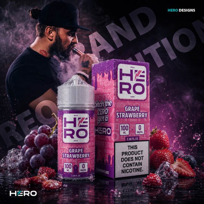
To strengthen HERO’s market positioning, we developed a completely new Brand Slogan that reflects the company’s bold personality and modern identity. Replacing the previous message with “Ditch the ZERO, get a HERO” introduced a stronger emotional connection, clearer brand differentiation, and a memorable call-to-action that aligns with the brand’s energetic communication style.

Rather than serving as a simple tagline, the slogan became an integral part of the overall Brand Identity, supporting advertising campaigns, packaging, digital marketing, promotional materials, and future product launches while reinforcing recognition across every customer touchpoint.


The Solution Included:

  • Development of a new Brand Slogan aligned with HERO’s modern identity.
  • Stronger Brand Messaging focused on memorability and market differentiation.
  • Consistent integration across Packaging Design, advertising, and promotional campaigns.
  • A scalable communication concept supporting future marketing activities.


The Final Result:

The new slogan successfully transformed HERO’s verbal identity into a recognizable marketing asset that complements the visual brand system, strengthens Brand Recognition, and creates a memorable connection with customers across every communication channel.

“Great Brands Are Remembered By What They Say As Clearly As By How They Look.”

"Great Brands Are Remembered Not Only By What They Look Like—But By How They Make People Feel."

Experience Beyond The Product

Creating Emotional Connections That Extend Beyond Packaging And Into Everyday Life

Exceptional Brand Identity is never limited to a logo, a package, or a campaign. Its true value is revealed in the everyday moments it quietly becomes part of—building familiarity, trust, and lasting emotional connection over time.

For HERO, the goal extended beyond creating visually distinctive Packaging Design. Every creative decision was made to support a brand experience that feels approachable, energetic, and memorable wherever customers encounter it—whether on a retail shelf, in digital advertising, or during everyday use.

Rather than competing for attention through noise, the brand communicates through consistency. By combining thoughtful Visual Identity, strategic storytelling, and premium design, HERO creates an experience that customers recognize instantly and remember long after the first purchase.

"The Strongest Brands Don't Interrupt People's Lives—They Become A Natural Part Of Them."

Creating A Distinctive Brand Symbol

"A Powerful Brand Symbol Communicates Meaning Long Before A Single Word Is Read."

As part of HERO’s visual transformation, we designed a distinctive Lightning Symbol that became an integral element of the brand’s identity. More than a graphic accent, the symbol represents energy, performance, innovation, and the dynamic spirit that defines HERO. Its clean geometric form strengthens the logo while creating an instantly recognizable visual asset capable of standing on its own across a wide range of brand applications.

Rather than functioning as a standalone illustration, the lightning was strategically integrated into the overall Brand Identity System, supporting Packaging Design, digital marketing, advertising campaigns, promotional materials, merchandise, and future product launches. This flexible design approach ensures long-term consistency while reinforcing recognition across every customer touchpoint.

The Solution Included:

  • Design of a distinctive Lightning Symbol representing HERO’s energy and personality.
  • Strategic integration into the Logo System and overall Brand Identity.
  • Consistent application across Packaging Design, advertising, and promotional campaigns.
  • A scalable visual asset optimized for both print and digital communication.


The Final Result:

The new lightning symbol successfully evolved into a recognizable brand asset that complements the HERO logo, strengthens Brand Recognition, and creates a bold visual signature that instantly communicates speed, innovation, and premium product quality across every communication channel.

“The Strongest Brand Symbols Don’t Decorate A Brand—They Define Its Character.”

Building A Distinct Collection Identity

"Clear Product Differentiation Creates Faster Recognition And Stronger Brand Recall."

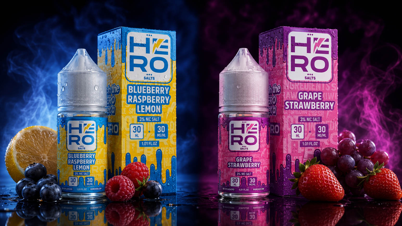
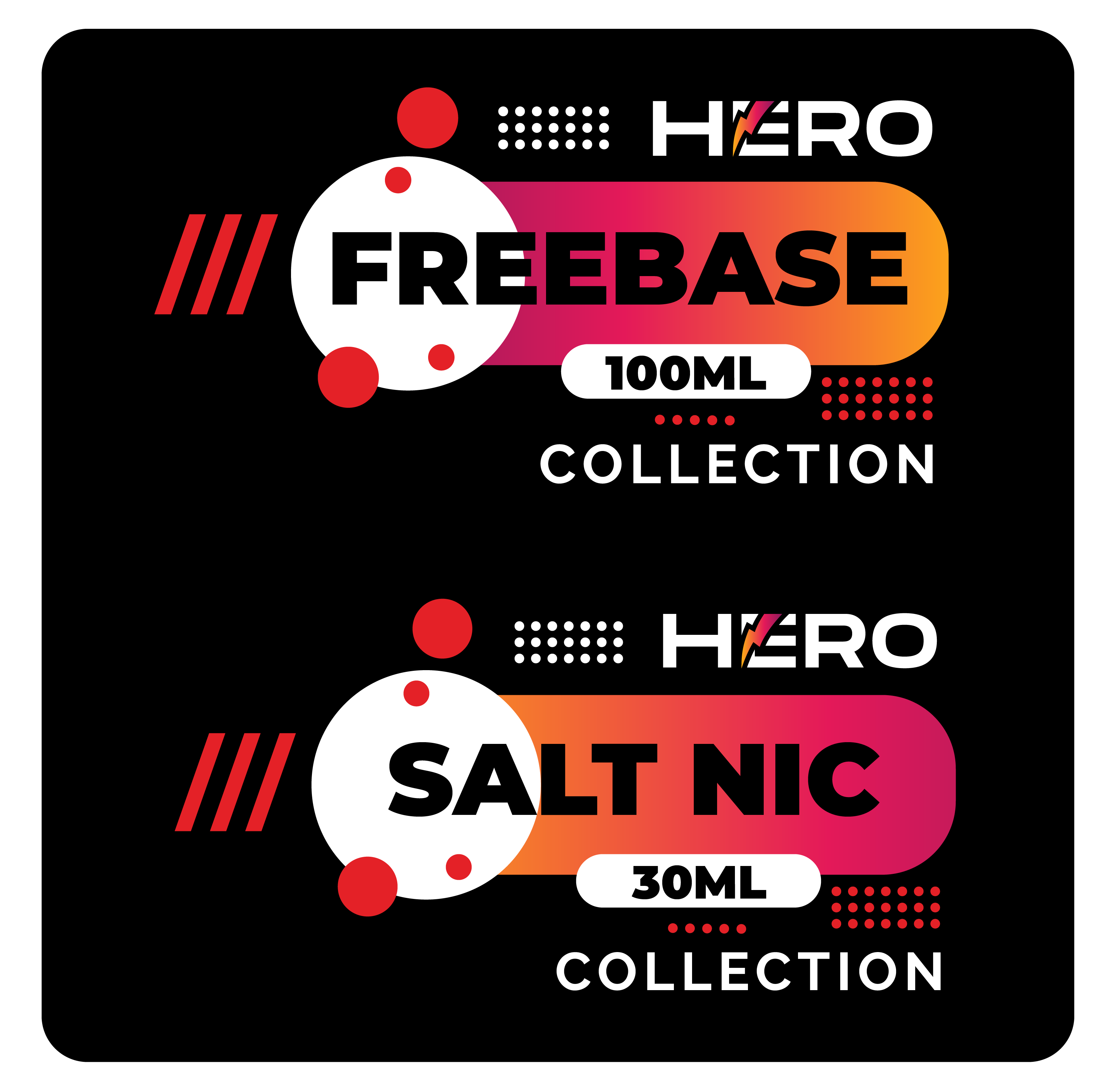
To strengthen the HERO product portfolio, we developed a dedicated Collection Identity System that clearly distinguishes the Freebase and Salt Nic product lines while maintaining a consistent Brand Identity. Through strategic use of Typography, Color Hierarchy, and structured graphic elements, the selected concept delivers immediate product recognition, premium shelf presence, and a scalable visual foundation for future product expansion.

The Solution Included:

  • Dedicated Visual Identity for both product collections.
  • Strategic Color Coding and graphic hierarchy for instant recognition.
  • Scalable design system supporting future flavors and product launches.
  • Consistent implementation across packaging and brand communication.


The Final Result:

The selected concept became the official visual direction for both HERO collections, strengthening Brand Recognition, improving Product Differentiation, and creating a premium, scalable identity that supports long-term portfolio growth.

“Strong Collections Are Built On Clear Visual Strategy, Not Just Different Packaging.”

Building A Complete Brand Identity Ecosystem

Every Visual Element Was Designed To Solve A Business Challenge

Rather than treating branding as a collection of individual design assets, the HERO project focused on building an integrated visual ecosystem where every component serves a clear strategic purpose. From the logo and brand symbol to product architecture and communication, each element contributes to stronger recognition, improved customer experience, and long-term scalability.

01

Primary Logo System

A refined logo structure was developed to establish a bold, memorable identity capable of performing consistently across packaging, digital media, retail environments, and future brand applications.

02

Signature Brand Symbol

The lightning-inspired symbol became the visual centerpiece of the brand, reinforcing themes of energy, performance, innovation, and instant recognition across the complete product portfolio.

03

Product Architecture

Distinct visual frameworks were created for Freebase and Nicotine Salts, allowing customers to identify product categories immediately while maintaining one cohesive Brand Identity.

04

Communication System

Typography, naming hierarchy, and messaging were carefully structured to create a confident and recognizable brand voice that supports every customer interaction.

05

Collection Identity

Each product collection was designed as part of one unified system, ensuring consistency across flavors, packaging formats, marketing materials, and future product releases.

06

Future Scalability

Every design decision supports long-term flexibility, enabling HERO to introduce new collections, product categories, and international market adaptations without compromising visual consistency.

A Unified Identity Designed For Long-Term Growth

Strong Brand Identity Design is built through systems rather than isolated graphics. By combining strategic thinking, scalable visual architecture, and consistent communication, HERO gained a flexible identity capable of supporting future innovation while strengthening recognition across every customer touchpoint.

"When Every Element Works Together, The Brand Becomes Greater Than The Sum Of Its Parts."

STRONG & BOLD BRAND SYSTEM IN ACTION

Transforming The Salt Nic Collection

"Premium Packaging Doesn't Just Refresh A Product—It Reinvents How Customers Experience The Brand."

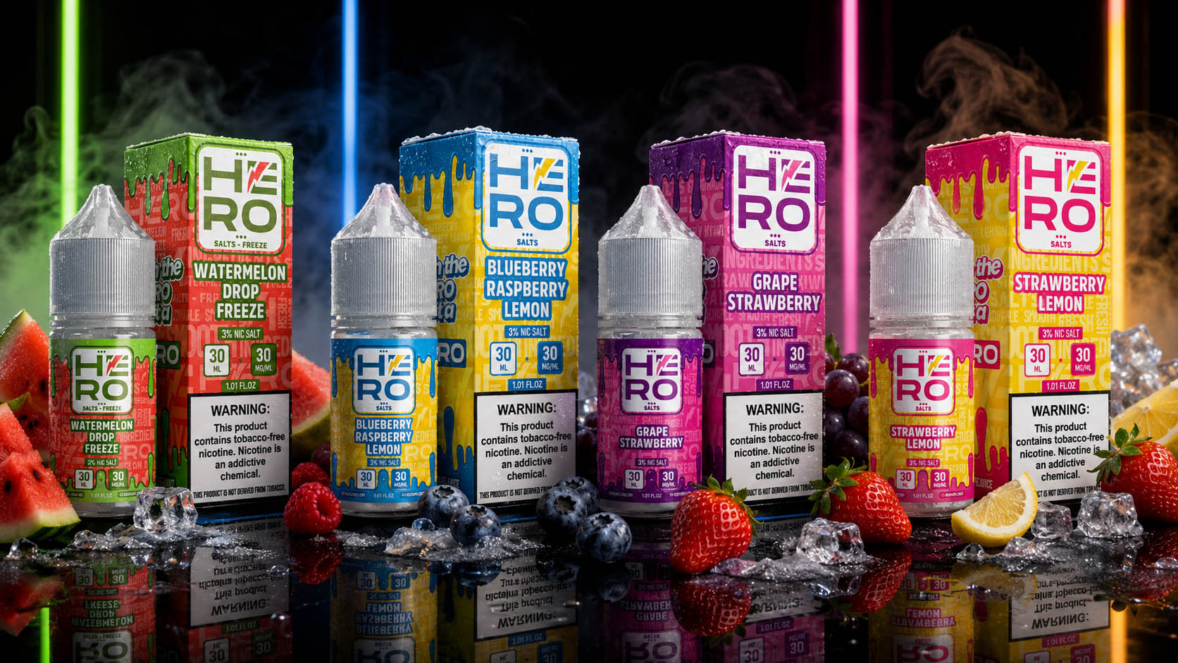
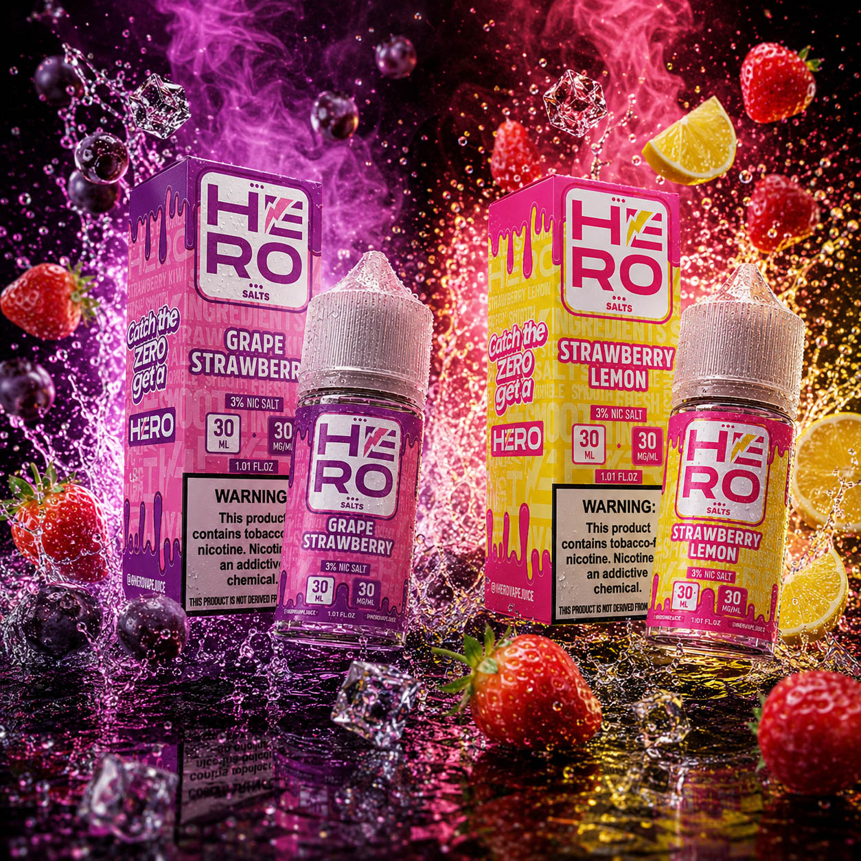
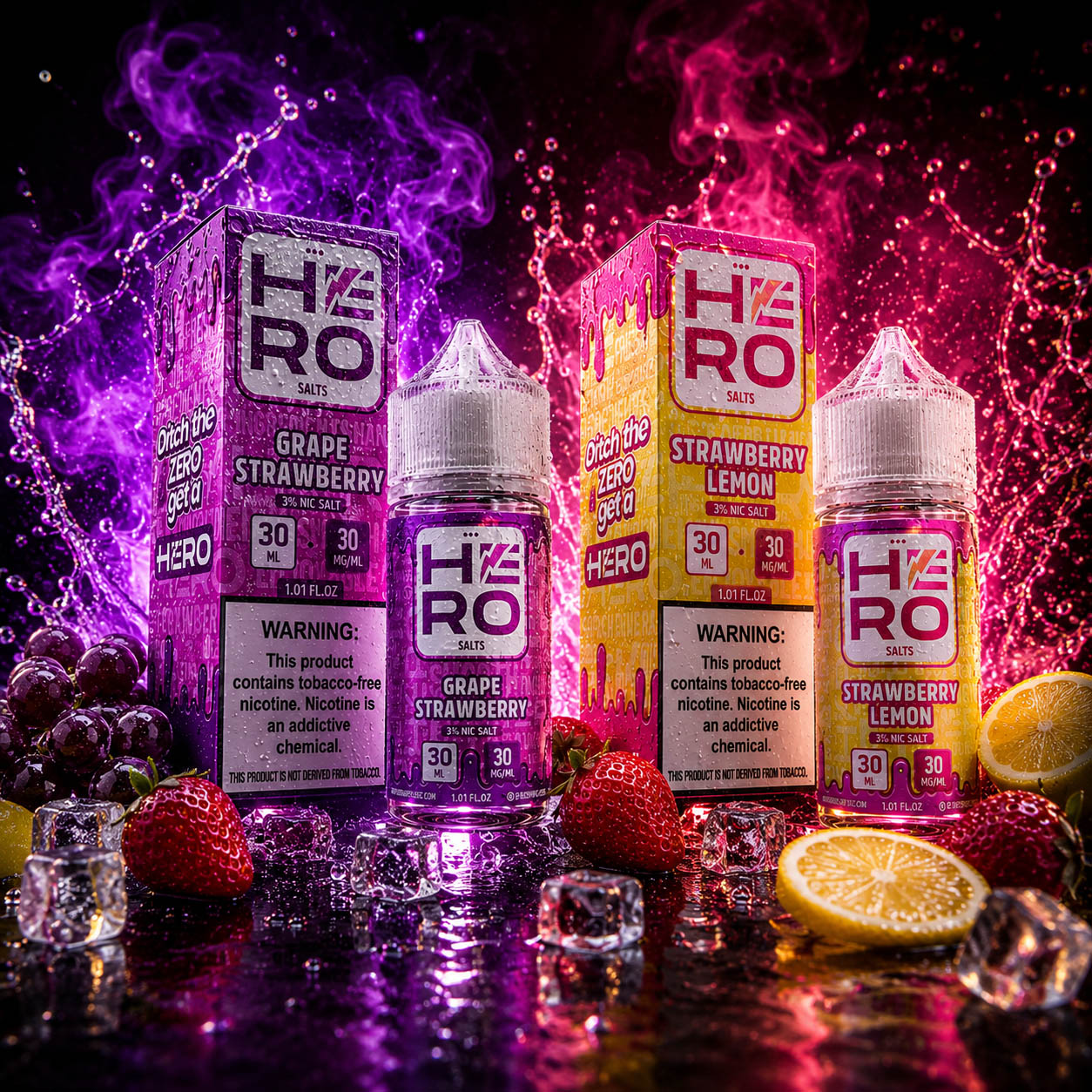
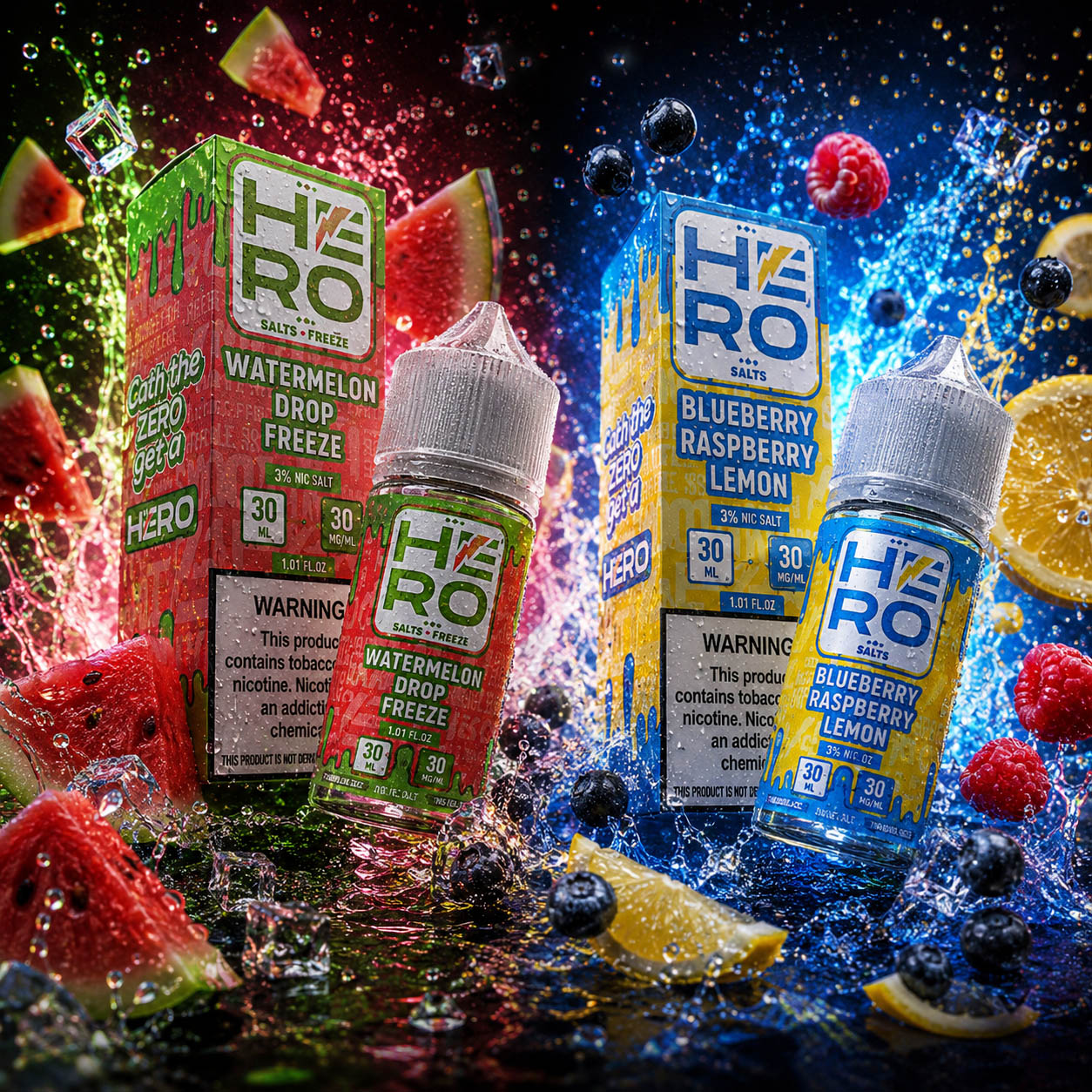
The HERO Salt Nic Collection underwent a complete visual transformation aimed at elevating product perception, strengthening Brand Recognition, and creating a modern Packaging Design System capable of supporting long-term portfolio growth. Rather than applying cosmetic design updates, the project focused on redesigning the entire customer experience—from Label Design and Box Packaging to Visual Hierarchy, Flavor Differentiation, and product presentation across retail environments.

Every design element was strategically refined to improve shelf visibility, simplify product identification, and establish a stronger emotional connection with consumers. The introduction of bold typography, vibrant flavor-specific color systems, premium graphic compositions, and a consistent Brand Architecture created a cohesive collection that immediately communicates quality, innovation, and professionalism while remaining highly scalable for future product launches.


The Solution Included:

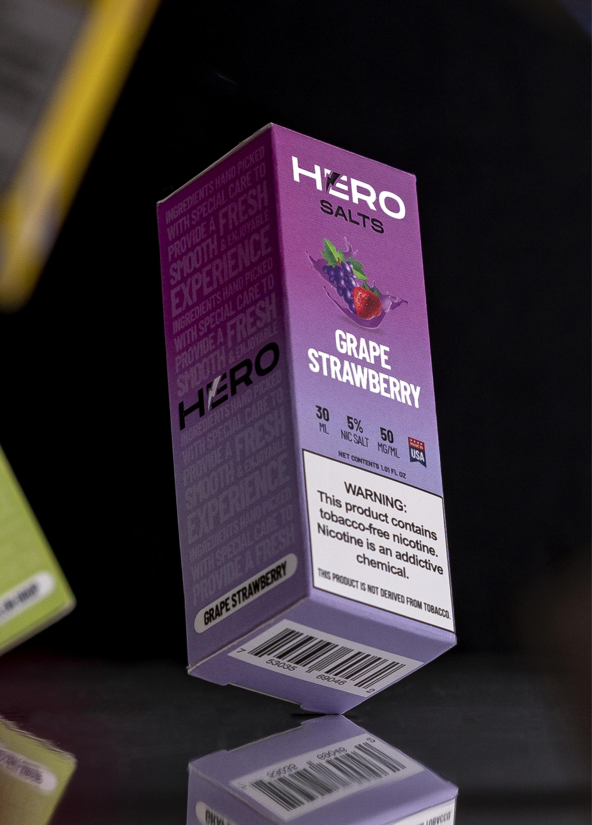
  • Complete redesign of the 30ML Salt Nic Collection packaging and label system.
  • Strategic Flavor Differentiation using bold colors, typography, and visual hierarchy.
  • Modern Packaging Design optimized for stronger shelf impact and faster product recognition.
  • Unified Brand Architecture supporting future product expansion and long-term consistency.


The Final Result:

The redesigned Salt Nic Collection successfully transformed an existing product line into a premium visual ecosystem that enhances Brand Recognition, improves Shelf Visibility, and creates a stronger competitive presence. By combining strategic Packaging Design, consistent Brand Identity, and customer-focused visual communication, the new collection established a scalable foundation for future growth while significantly elevating the overall perception of the HERO brand.

"Exceptional Packaging Doesn't Change Only How Products Look—It Changes How Customers Remember Them."

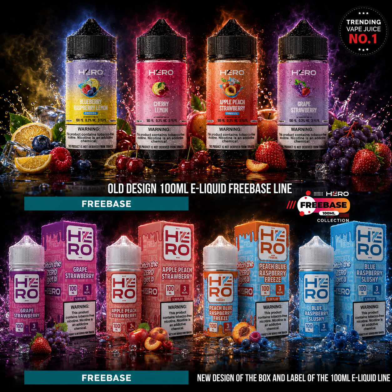
Transforming The Freebase Collection

"A Strong Packaging System Turns Premium Products Into Unforgettable Brand Experiences."

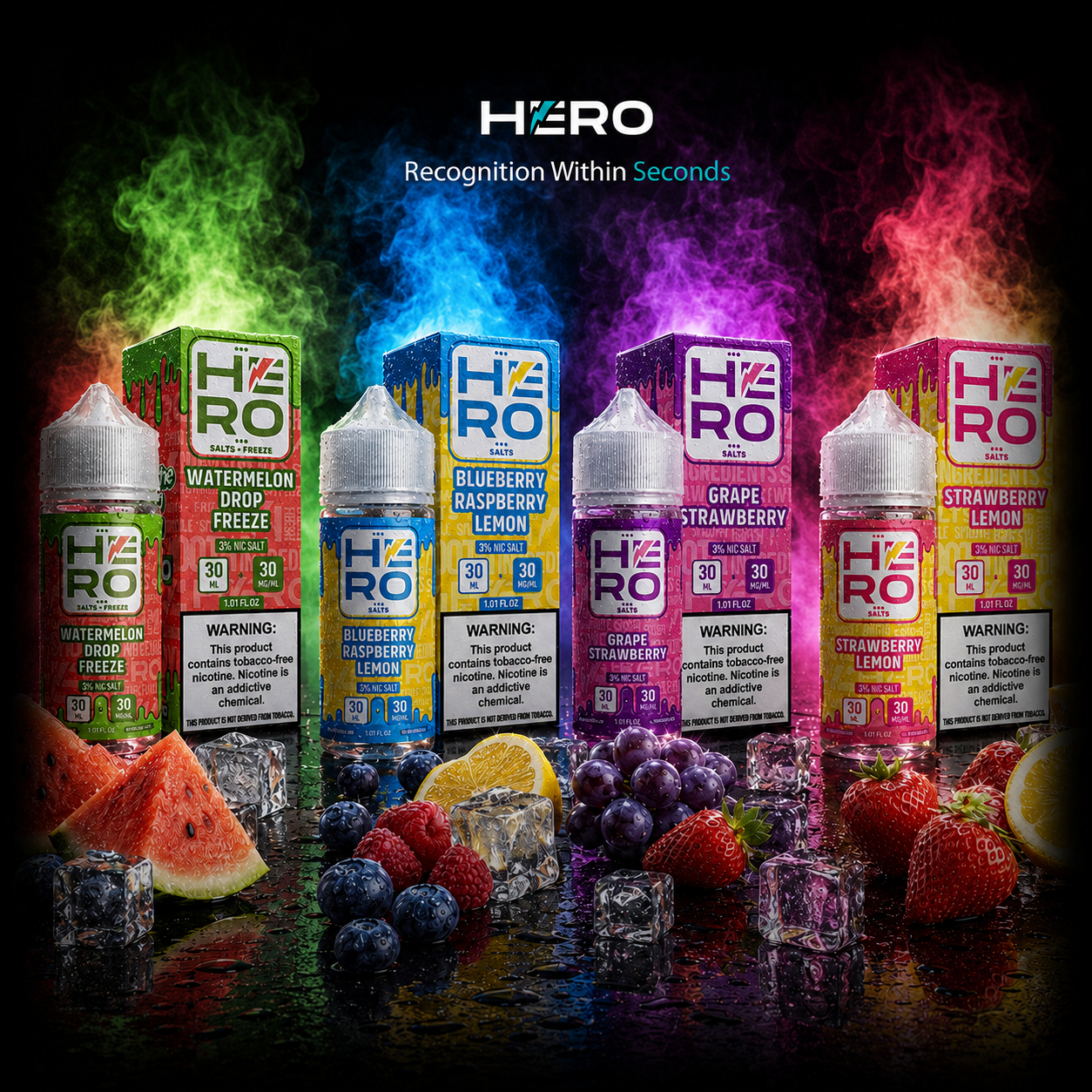
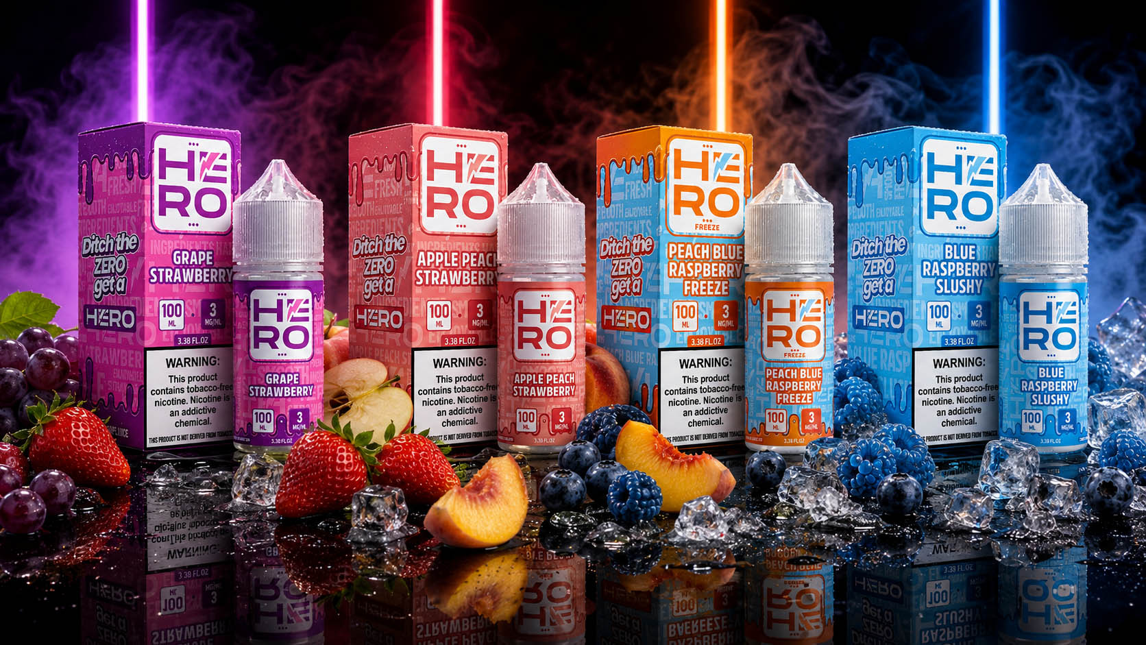
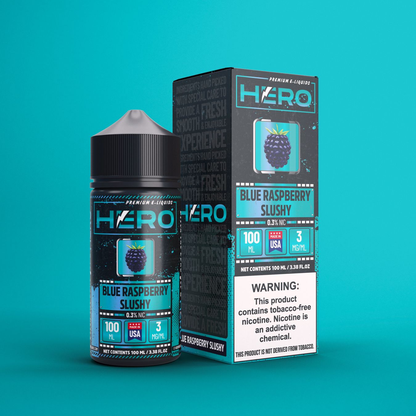
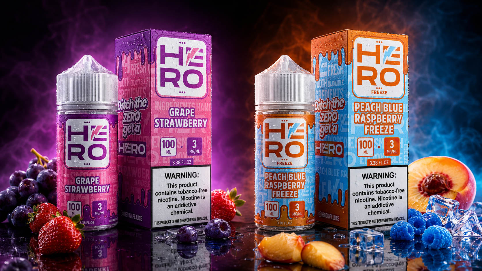
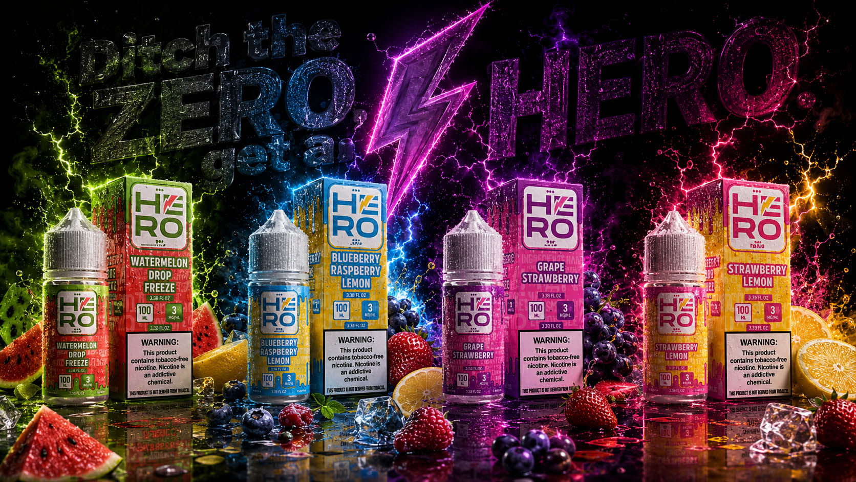
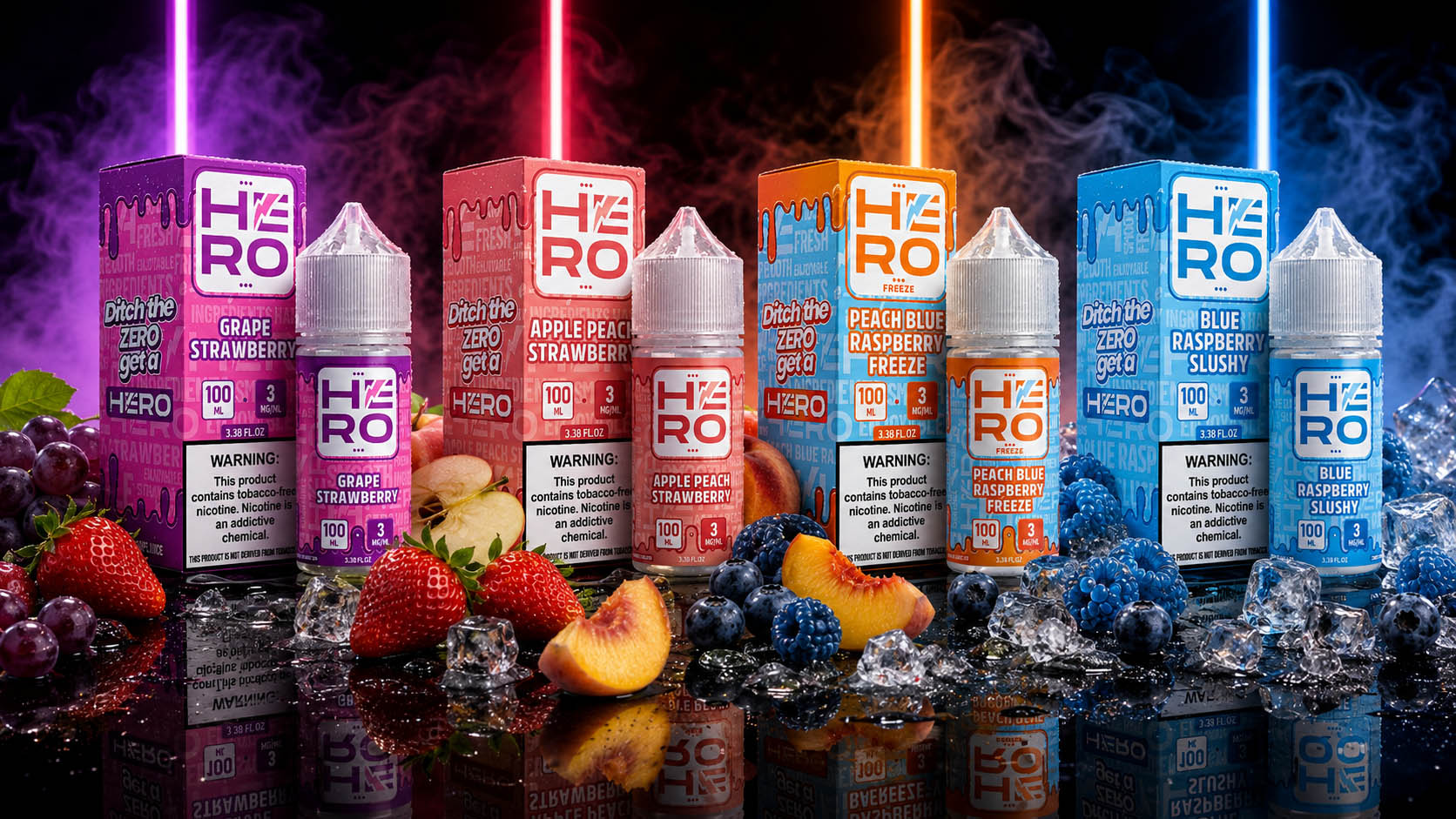
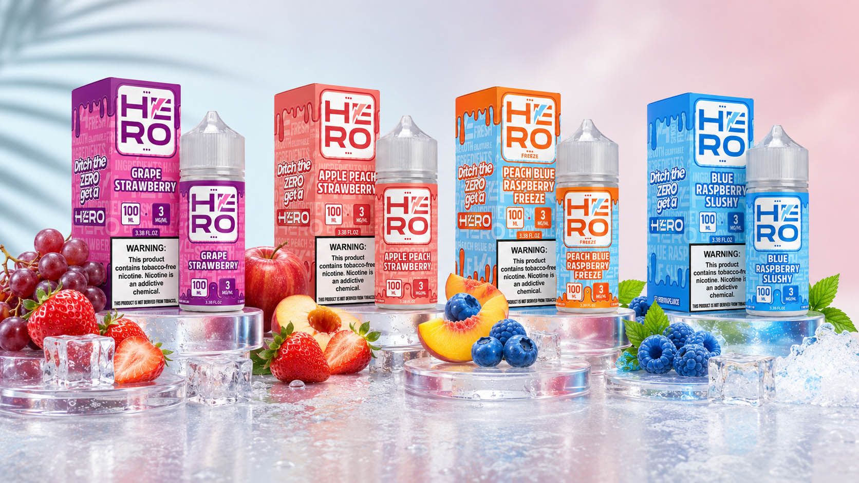
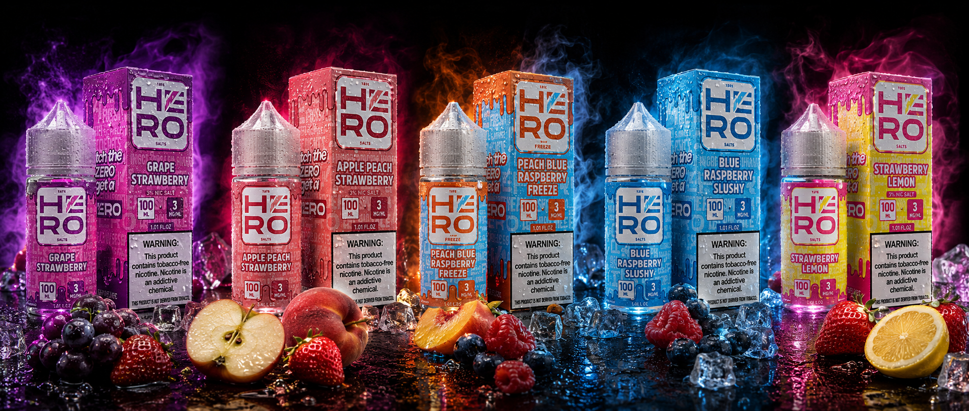
The HERO Freebase Collection was completely redesigned to establish a stronger Premium Brand Identity, improve Shelf Visibility, and create a unified Packaging Design System for the flagship 100ML product line. The redesign extended far beyond visual improvements, focusing on a strategic balance between Brand Recognition, Flavor Differentiation, and modern consumer appeal while preserving the recognizable HERO identity.

Every label and packaging element was restructured using a consistent visual language, bold typography, vibrant flavor-specific color palettes, and improved information hierarchy. The result is a premium packaging ecosystem that enhances product recognition, strengthens purchasing confidence, and provides a scalable foundation capable of supporting future product launches and portfolio expansion.


The Solution Included:

  • Complete redesign of the 100ML Freebase Collection packaging and label system.
  • Strategic Flavor Differentiation through vibrant color palettes and premium visual hierarchy.
  • Modern Packaging Design optimized for stronger shelf presence and instant product recognition.
  • Unified Brand Architecture built for scalability, consistency, and long-term brand growth.


The Final Result:

The redesigned Freebase Collection successfully transformed the original product line into a premium visual identity that immediately communicates quality, innovation, and professionalism. By combining strategic Packaging Design, consistent Brand Identity, and customer-focused visual communication, the new collection significantly improves Brand Recognition, strengthens Shelf Impact, and positions HERO as a modern, premium leader within the highly competitive e-liquid market.

"Outstanding Packaging Doesn't Simply Protect The Product—It Defines The Brand Behind It."

Integrated Brand Marketing Ecosystem

"Building A Scalable Marketing Ecosystem That Keeps Every Product Launch Consistent, Every Campaign Recognizable, And Every Customer Touchpoint Unmistakably HERO."

Throughout the HERO Brand Transformation, our work extended far beyond Packaging Design. We developed a complete ecosystem of Integrated Marketing Campaigns supporting every stage of the customer journey—from new product launches and seasonal promotions to retail communication, digital advertising, exhibitions, email campaigns, printed materials, and long-term brand activation.

Rather than producing isolated promotional assets, we established a scalable Marketing Design System where every campaign, graphic, and communication piece reinforced the same Brand Identity, strengthened Consumer Recognition, and maintained complete visual consistency across every customer touchpoint.

Every promotional asset was strategically designed to communicate product benefits instantly while supporting future flavor launches, expanding product categories, and long-term commercial growth without compromising the HERO visual language.

KEY PROJECT FACTS

"Powerful Campaigns Are Never Built One Design At A Time—They Are Built Through Systems That Scale."

2,000+ Promotional Marketing Assets Created

✓ Multi-Year Brand Communication Support

✓ Integrated Online & Offline Marketing System

✓ Campaign Design Across 15+ Marketing Categories

✓ Retail, Digital & Trade Show Communication

✓ Future Campaign Scalability Built Into Every Asset

✓ Unified Brand Communication Strategy

✓ Consistent Premium Visual Identity Across Every Platform

THE SOLUTION INCLUDED

  • Promotional Campaign Design for both Freebase and Salt Nic Collections
  • Product Launch Campaigns for new flavors, limited editions, and existing collections
  • Website Banners & Landing Page Graphics
  • Login Screen & Digital Platform Visuals
  • Flyer, Brochure & Poster Design
  • Trade Show & Exhibition Graphics
  • Cover Photos & Social Media Campaign Assets
  • Email Marketing Campaigns
  • SMS Promotional Visuals
  • Product Inserts & Marketing Cards
  • Showbook Presentation Design
  • Retail Zone Graphics (Zone A / Zone B / Zone F)
  • Consumer-Focused Graphic Communication
  • Consistent Brand Messaging Across Every Channel

PROJECT IMPACT

"A Strong Brand Is Not Built By One Great Campaign—It Is Built By Thousands Of Consistent Customer Impressions."

✓ More Than 2,000 Commercial Marketing Assets Successfully Developed

✓ Complete Brand Consistency Across Every Communication Channel

✓ Faster Introduction Of New Products And Flavor Extensions

✓ Stronger Consumer Recognition Across Digital & Retail Environments

✓ Flexible Marketing System Supporting Future Business Growth

✓ Unified Promotional Identity Across Online And Offline Media

✓ Increased Brand Visibility Through Long-Term Campaign Consistency

✓ Scalable Marketing Foundation For Continuous Product Expansion

THE FINAL RESULT

Rather than creating individual advertisements, Infinity Design Studio developed a complete Integrated Marketing Ecosystem capable of supporting HERO’s continuous growth across every communication channel.

By combining Packaging Design, Campaign Strategy, Retail Communication, Digital Marketing Assets, and Production-Ready Promotional Materials, we created a scalable visual system that enables new product launches, seasonal campaigns, and future portfolio expansion while maintaining complete Brand Consistency.

Today, every HERO marketing campaign speaks the same visual language—whether viewed on a retail shelf, social media platform, exhibition stand, email campaign, printed brochure, or promotional banner—creating a recognizable and commercially powerful brand experience at every customer interaction.

MARKETING ECOSYSTEM AT A GLANCE

"One Brand. One System. Thousands Of Customer Touchpoints."

MetricValue
Promotional Assets Created2,000+
Marketing Categories Covered15+
Product Collections SupportedFreebase + Salt Nic
Product Launch CampaignsDozens
Communication ChannelsDigital + Print + Retail + Events
Brand ConsistencyUnified Across Every Asset

"Great Packaging Starts The Conversation. Great Marketing Makes It Last."

"Packaging Introduced The Brand. Marketing Made It Unforgettable."

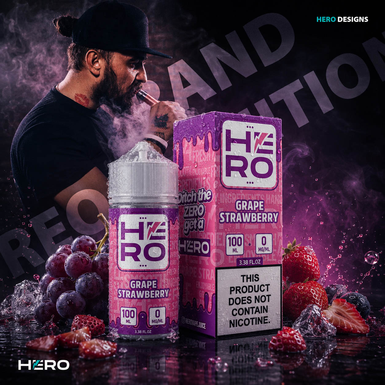
AI-Enhanced Marketing & Presentation

Combining Strategic Design, Packaging, Photography, And Artificial Intelligence To Create Scalable Marketing Assets That Elevate Brand Presentation Across Every Communication Channel.

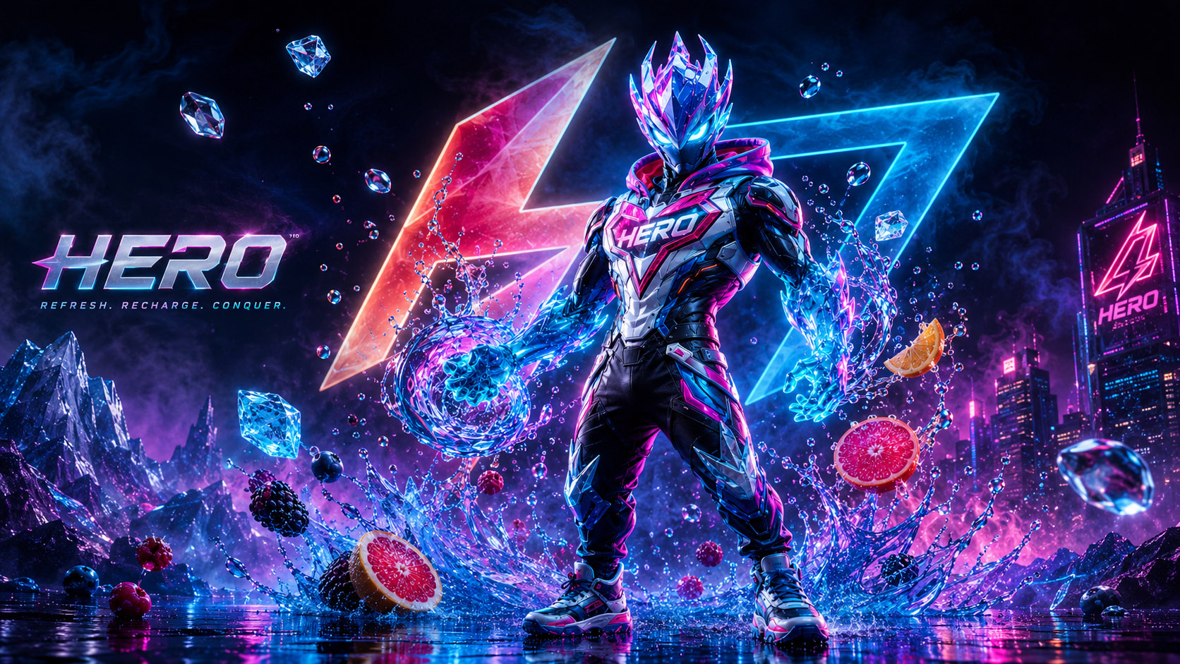
The HERO project demonstrates how Artificial Intelligence can become a powerful creative production tool when guided by an experienced Brand Designer and Creative Director.

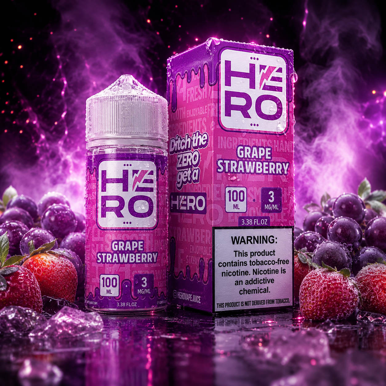
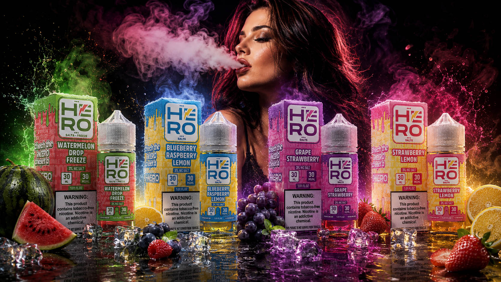
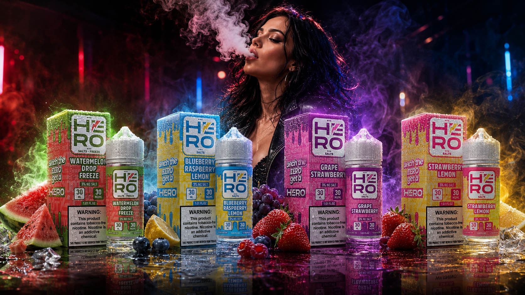
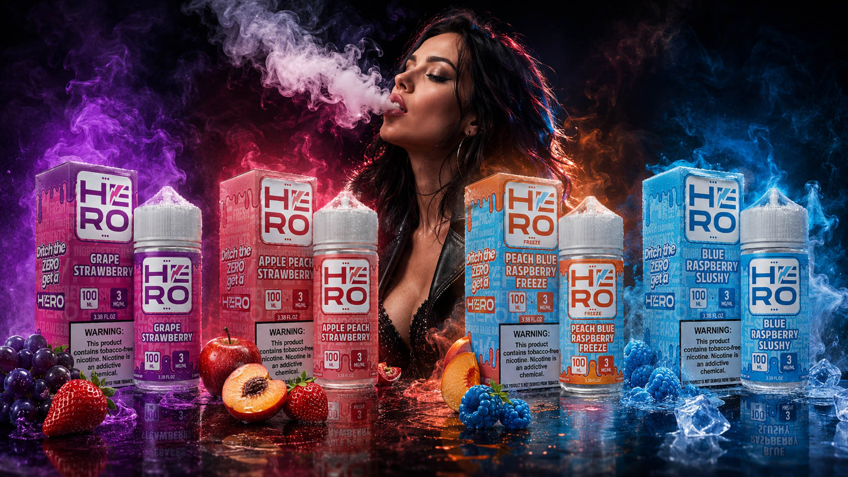
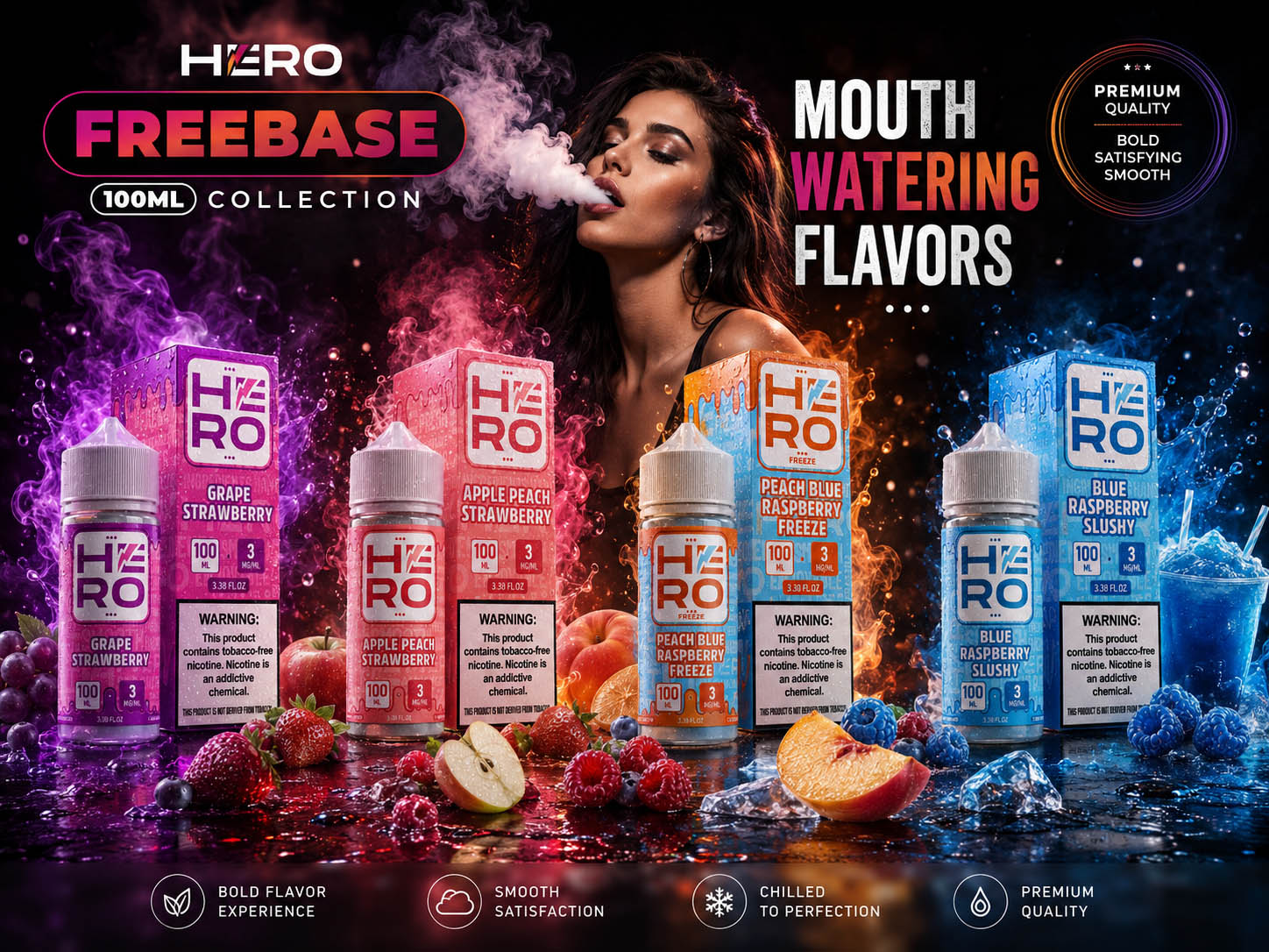
Instead of replacing Commercial Photography, Branding, Graphic Design, or Visual Communication, AI was strategically integrated into the creative workflow to accelerate production, expand marketing possibilities, and generate high-end Commercial Marketing Assets for multiple communication channels.

Every generated visual remained rooted in the original Packaging Design, Brand Identity, Visual Identity System, color system, and Marketing Strategy, ensuring complete Brand Consistency across the entire marketing ecosystem.

As modern marketing continues to evolve, brands require more than exceptional products—they need the ability to produce premium Marketing Content, Commercial Advertising Visuals, and Product Presentation Assets quickly, consistently, and at scale. During the HERO project, Artificial Intelligence was strategically integrated into the creative workflow to expand marketing possibilities while preserving complete control over the brand’s visual identity.

Rather than replacing traditional Graphic Design, Packaging Design, Commercial Photography, or Creative Direction, AI became a production accelerator that complemented Product Visualization, Advertising Design, Marketing Design, and Brand Communication. Every generated concept remained based on the original packaging system, typography, color hierarchy, and Brand Guidelines developed throughout the complete rebranding process.

The result was the ability to rapidly produce high-end Commercial Advertising Visuals, Lifestyle Marketing Content, and Brand Campaign Assets that would traditionally require multiple photo shoots, large production teams, complex post-production, and significantly higher marketing budgets.

AI-Enhanced Creative Production

Integrating Artificial Intelligence Into Professional Design Workflows To Expand Marketing Possibilities, Accelerate Content Production, And Deliver Premium Commercial Visuals At Scale.

01

AI-Enhanced Creative Workflow

Artificial Intelligence was strategically integrated into the creative production process to accelerate concept development, expand marketing possibilities, and produce premium commercial visuals while maintaining complete consistency with the HERO brand identity.

02

Professional Commercial Visualization

AI-generated imagery transformed existing packaging designs into high-end commercial advertising visuals, enabling realistic product presentations suitable for digital campaigns, social media, retail marketing, and promotional communication.

03

Marketing Scalability System

A scalable production workflow made it possible to create hundreds of campaign variations, promotional concepts, seasonal visuals, and product launches without compromising visual consistency across the entire marketing ecosystem.

04

Only One Right Creative Direction

Every AI-generated visual was guided by professional creative direction, ensuring that composition, lighting, storytelling, product hierarchy, and brand recognition remained aligned with the established HERO identity.

05

Maximum Production Efficiency

By combining strategic design with AI-assisted production, complex marketing visuals that traditionally required extensive photography, large production teams, and significant budgets could be developed faster and more efficiently.

06

Future Marketing System

The final result is a flexible marketing production system capable of supporting future campaigns, new product launches, seasonal promotions, retail communication, and digital advertising while preserving a recognizable and premium visual language.

Where AI Added Value

✔ Premium Product Visualizations

✔ Lifestyle Advertising Campaigns

✔ Social Media Content Creation

✔ Billboard & Outdoor Concepts

✔ Promotional Campaign Mockups

✔ Marketing Storytelling

✔ Creative Concept Exploration

✔ Campaign Variations In Minutes

✔ Fast Iteration Before Production

✔ Cost-Efficient Commercial Assets

Human Creativity Remains The Foundation

Every visual began with strategic Creative Direction—not with Artificial Intelligence.

The Packaging Design System, Brand Identity, typography, color architecture, product hierarchy, Marketing Strategy, and communication goals were established before AI became part of the creative production process. Every prompt, composition, lighting setup, product placement, storytelling concept, and visual refinement was intentionally directed to ensure that each generated asset remained consistent with the HERO Brand Identity and overall Marketing Communication System.

Artificial Intelligence accelerated production.

Creative thinking defined the outcome.

Business Advantages

By integrating AI into the creative production workflow, the HERO Marketing Ecosystem became significantly more flexible, scalable, commercially efficient, and capable of supporting long-term Brand Growth.

Key Benefits

✔ Faster Marketing Campaign Development

✔ Rapid Production Of Commercial Marketing Visuals

✔ Increased Creative Content Production Capacity

✔ Premium Product Presentation Without Expensive Photo Productions

✔ Faster Creative Testing Before Product Launch

✔ Greater Brand Consistency Across Every Marketing Platform

✔ Cost-Efficient Commercial Content Production

✔ Unlimited Creative Exploration While Preserving Brand Identity

✔ Scalable Marketing Assets For Future Product Launches

✔ Higher Brand Visibility Across Digital, Print & Social Media

AI Applications Throughout The HERO Project

"Strategic AI Integration."

01

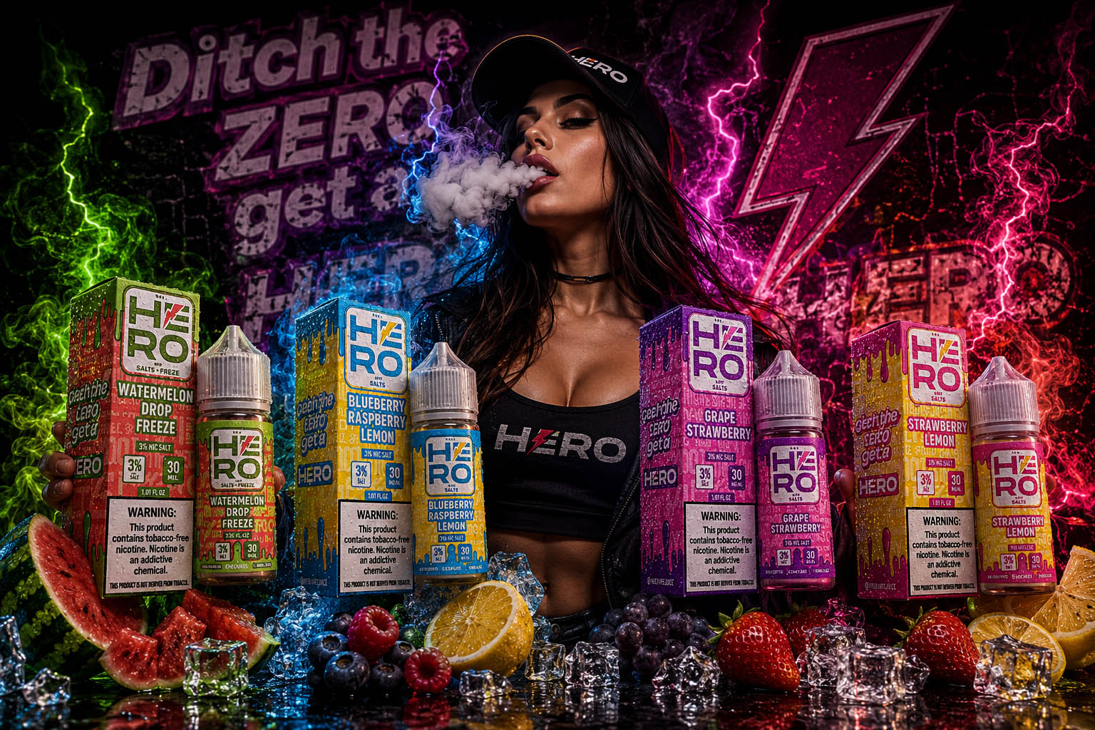
Lifestyle Advertising

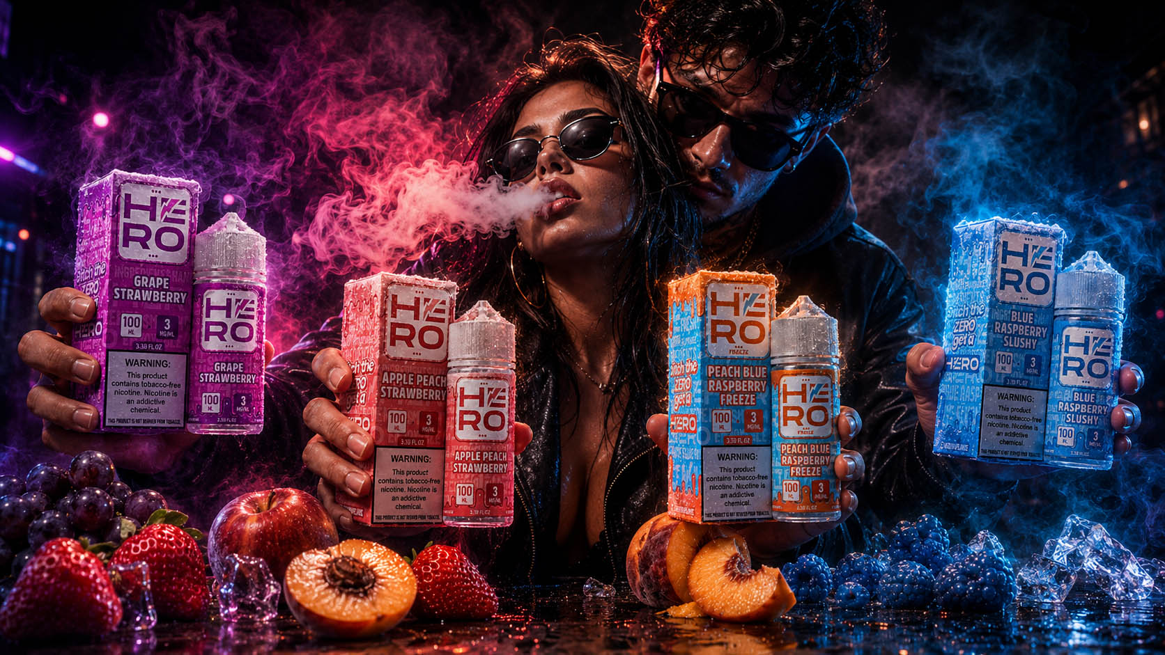
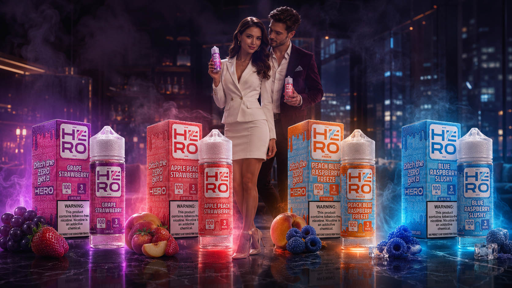
Artificial Intelligence expanded lifestyle photography by generating premium commercial scenes that showcase products in realistic environments, helping brands create emotional connections and memorable customer experiences.

Key Highlights

  • AI Lifestyle Concepts
  • Commercial Scene Creation
  • Premium Brand Presentation

02

Product Visualization

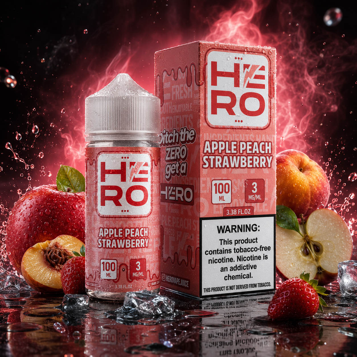
AI-generated product visualizations transformed packaging into premium commercial assets, highlighting textures, lighting, reflections, and realistic presentation suitable for both digital and print marketing.

Key Highlights

  • Premium Product Renders
  • Realistic Lighting
  • Commercial Presentation

03

Campaign Concept

Creative campaign concepts were rapidly explored through AI-assisted visualization, enabling multiple marketing directions to be tested before final production and launch.

Key Highlights

  • Campaign Exploration
  • Creative Direction
  • Faster Concept Development

04

Social Media Content

Consistent social media visuals were generated to maintain brand recognition across every platform while supporting continuous engagement with high-quality promotional content.

Key Highlights

  • Social Media Graphics
  • Brand Consistency
  • Continuous Content Creation

05

Launch Campaign

AI accelerated product launch campaigns by producing premium promotional visuals that supported new releases across digital advertising, retail, and online communication.

Key Highlights

  • Product Launch Assets
  • Marketing Campaigns
  • Cross-Channel Promotion

06

Retail Promotion

Retail-focused marketing visuals enhanced shelf communication through attention-grabbing compositions designed to strengthen product visibility and support promotional activities.

Key Highlights

  • Retail Graphics
  • Shelf Visibility
  • Promotional Materials

07

Billboard Visual

Large-format advertising concepts were developed to demonstrate how the HERO identity performs across premium outdoor campaigns and high-impact commercial environments.

Key Highlights

  • Outdoor Advertising
  • Large Format Concepts
  • Premium Visual Impact

08

Brand Storytelling

AI-supported storytelling visuals transformed product presentations into emotional marketing experiences that strengthened recognition, engagement, and long-term brand perception.

Key Highlights

  • Emotional Storytelling
  • Brand Recognition
  • Marketing Experience

Creative Production At Scale

One of the greatest advantages of integrating Artificial Intelligence into the HERO workflow was the ability to dramatically expand Creative Production without compromising quality, Brand Consistency, or visual identity.

Instead of producing only a limited number of advertising visuals, the project evolved into a continuously growing Marketing Content Library capable of supporting future Advertising Campaigns, seasonal promotions, product launches, Social Media Marketing, retail marketing, Digital Advertising, and broader Brand Communication.

Every new concept could be developed while maintaining the same recognizable Visual Language, Packaging Design System, and Brand Identity established during the original rebranding process.

The Final Result

The combination of Strategic Branding, Packaging Design, Commercial Photography, Creative Direction, and AI-Assisted Creative Production transformed HERO into a scalable Marketing Ecosystem capable of generating premium Commercial Visual Communication at an entirely new level.

Rather than replacing creativity, Artificial Intelligence amplified what strategic Brand Design could achieve—making it possible to produce more Marketing Content, explore more creative ideas, accelerate campaign development, strengthen Brand Recognition, improve Customer Engagement, and maintain complete Brand Consistency across every digital, retail, and commercial customer touchpoint.

Project Highlights

MetricResult
Promotional Marketing Assets Created2,000+
Marketing Categories Developed15+
Campaign Concepts ProducedHundreds
Product Visual VariationsExtensive Creative Library
Brand ConsistencyMaintained Across Every Asset
Production ApproachDesign-Led, AI-Enhanced Workflow


Artificial Intelligence Didn't Replace Creativity.

It Expanded What Strategic Creativity Can Achieve.

Solution: 

Building a Premium Brand Identity Through Strategic Packaging Design

To reposition HERO as a stronger and more competitive brand, Infinity Design Studio developed a comprehensive Brand Identity and Packaging Design System focused on premium aesthetics, product differentiation, and long-term brand consistency. Rather than refreshing individual labels, we created a scalable visual framework that unifies the entire product portfolio while allowing each collection and flavor to maintain its own distinctive identity.

The solution included:

  • Complete HERO Logo Redesign to strengthen Brand Recognition, improve scalability, and create a more modern, premium appearance.
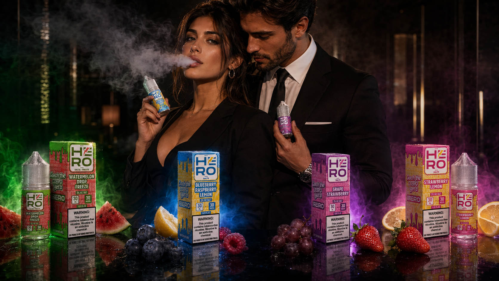
  • Development of a unified Brand Architecture that clearly distinguishes Freebase and Salt Nic Collections while maintaining a consistent visual identity.
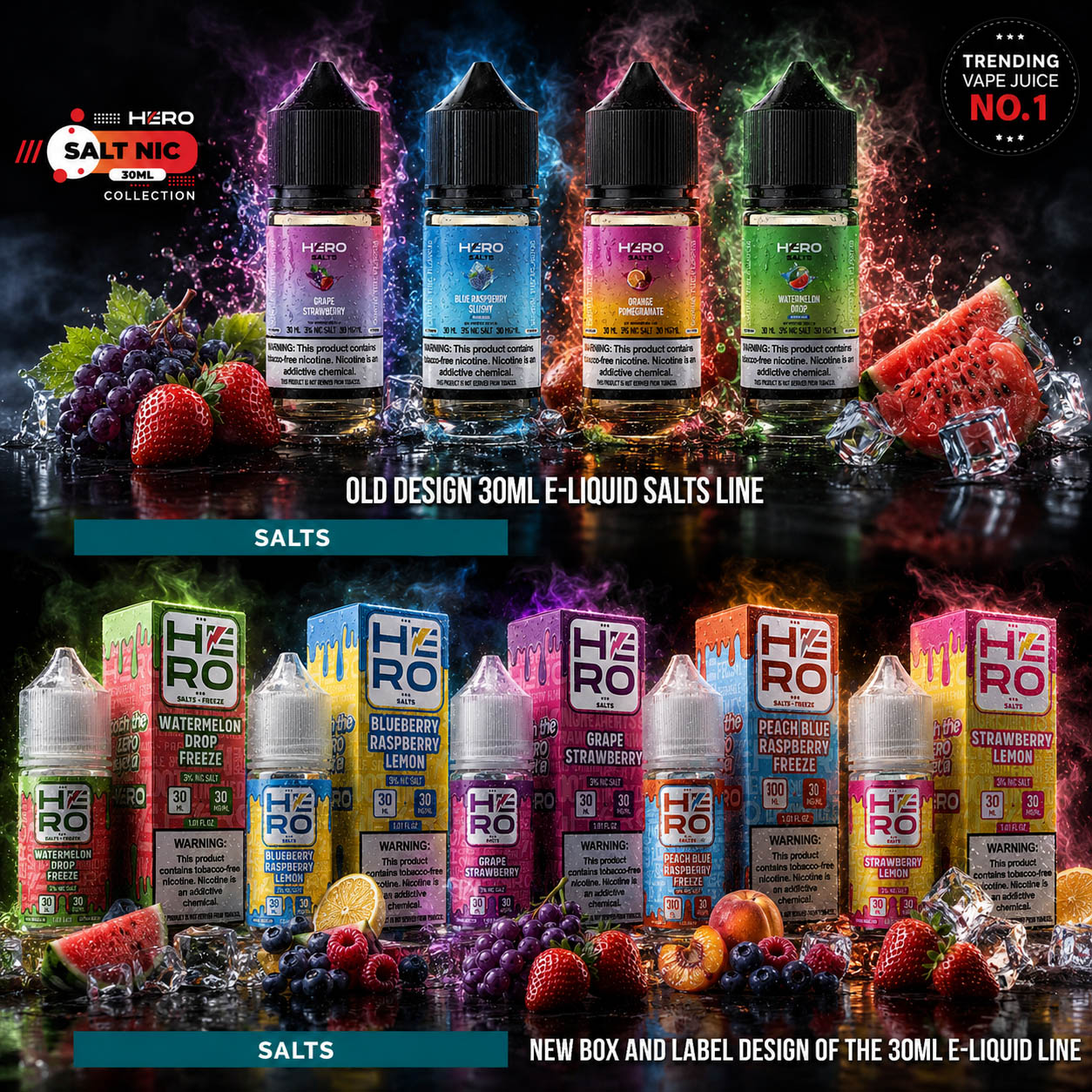
  • Creation of a bold Visual Communication System featuring dynamic typography, premium graphic elements, and strategically organized information hierarchy.
  • Introduction of distinctive Color-Coding and flavor-specific visual assets for instant product identification and improved customer navigation.
  • Complete redesign of Labels and Packaging Layouts to enhance readability, visual balance, regulatory compliance, and shelf visibility.
  • Development of premium packaging concepts that elevate perceived product quality and create a stronger first impression at the point of sale.

  • Seamless integration of new flavors and future product releases into a flexible, scalable design system that supports long-term portfolio growth.

 

The result is a cohesive Premium Packaging Ecosystem that combines strategic Brand Identity, modern Packaging Design, and compelling Visual Communication to strengthen market positioning, improve customer recognition, and clearly differentiate HERO within the highly competitive E-Liquid Industry.

“Exceptional Packaging Doesn’t Just Showcase Products—It Defines Brands, Builds Trust, and Creates Lasting Market Recognition.”

Results:

Transforming Strategic Packaging Design Into Long-Term Brand Recognition

Successful E-Liquid Packaging Design is measured by far more than attractive labels. It succeeds when every product communicates quality instantly, simplifies purchasing decisions, strengthens consumer trust, and creates a memorable brand experience across every customer touchpoint.

Through a comprehensive combination of Brand Identity Design, Premium Packaging Design, Visual Identity, Packaging Architecture, and scalable Product Packaging Design, HERO evolved into a cohesive product ecosystem designed to increase visibility, improve product differentiation, and support long-term commercial growth.

The completed redesign successfully transformed HERO’s established reputation into a stronger and more recognizable market presence, providing the brand with a scalable visual system capable of supporting future product launches, portfolio expansion, and continued brand evolution.


Project Outcomes

  • Stronger Premium Brand Identity
    The redesigned HERO identity communicates confidence, innovation, and premium quality through a unified Visual Identity System that strengthens customer trust and reinforces the brand’s position within the competitive E-Liquid market.
  • Clear Product Differentiation Across The Portfolio
    A structured Packaging Design system allows customers to instantly distinguish between 30ML Salts, 100ML Freebase, and individual flavors, creating a faster, more intuitive purchasing experience.
  • Greater Shelf Presence And Brand Recognition
    Bold typography, refined packaging hierarchy, and distinctive flavor communication significantly improve Shelf Presence, helping HERO attract attention both in retail environments and digital marketplaces.
  • A Scalable Packaging Ecosystem
    Rather than creating isolated product labels, the project established a flexible Packaging Branding system capable of supporting future flavors, limited editions, and new product categories while maintaining complete visual consistency.
  • Improved Customer Experience Through Design
    Every packaging element—from logo placement and typography to color differentiation and information hierarchy—was strategically optimized to improve readability, simplify product selection, and strengthen overall user confidence.
  • A Future-Ready Global Brand Platform
    The completed Brand Identity Design provides HERO with a scalable visual foundation prepared for international growth, retail expansion, marketing campaigns, exhibitions, and long-term portfolio development.


The success of the HERO project demonstrates that exceptional Premium Packaging Design extends far beyond aesthetics. When Brand Strategy, Visual Identity, and Packaging Design work together, they transform products into recognizable brands that customers trust, remember, and choose with confidence. By aligning commercial objectives with strategic design thinking, Infinity Design Studio created a scalable brand ecosystem that strengthens market positioning today while providing a scalable foundation for HERO’s continued growth.

"Transforming Product Identity Into A Competitive Advantage Through Strategic Branding And Packaging Design."

Repositioning A Brand For Stronger Market Performance

The HERO E-Liquids project was far more than a visual redesign—it was a comprehensive Brand Repositioning Strategy developed to strengthen market presence, improve product recognition, and establish a more distinctive identity within the highly competitive vaping industry. Through a strategic combination of Brand Identity Development, Packaging Design, Visual Communication, and Product Architecture, we transformed an existing product range into a cohesive premium brand built for long-term commercial success.

Our objective extended beyond creating attractive packaging. Every design decision was guided by the principles of consumer psychology, shelf visibility, brand consistency, and purchase influence. From logo refinement and product categorization to packaging hierarchy, typography, and color differentiation, each visual element was carefully developed to simplify product navigation, strengthen customer confidence, and elevate the overall perception of quality across the entire product portfolio.

The result is a scalable branding ecosystem that not only enhances visual appeal but also improves market recognition, supports future product expansion, and positions HERO as a stronger, more recognizable brand capable of standing out in an increasingly competitive global marketplace.

"Exceptional Packaging Doesn't Just Protect A Product—It Shapes Perception, Builds Trust, And Influences Every Buying Decision."

Conclusion:

The Strongest Packaging Doesn't Simply Protect Products — It Builds Brands People Remember

Exceptional E-Liquid Packaging Design is never defined by attractive labels alone. It is built through strategic thinking, commercial understanding, and hundreds of carefully considered creative decisions that influence how customers discover, evaluate, trust, and ultimately choose a product.

For HERO, our objective extended far beyond redesigning packaging. We developed a complete Brand Identity System that combines Premium Packaging Design, Visual Identity, Brand Architecture, Product Differentiation, and scalable communication into one cohesive ecosystem. Every logo refinement, flavor hierarchy, typography decision, and packaging detail was intentionally designed to strengthen Brand Recognition, improve Shelf Presence, and support long-term business growth.

This project demonstrates that successful packaging is never just about aesthetics—it is about creating clarity in competitive markets, building customer confidence, and transforming every product into a consistent Brand Experience. When strategy and design work together, packaging becomes a powerful business asset rather than simply a product container.

If you’re looking to create a distinctive Brand Identity, elevate your Product Packaging Design, or develop a scalable visual system that performs across Retail, E-Commerce, and Amazon Marketplace, Infinity Design Studio transforms strategic thinking into premium packaging solutions that inspire trust, strengthen market position, and create lasting commercial value.

"The Most Successful Brands Don't Compete For Shelf Space. They Earn Customer Trust Through Strategic Packaging, Consistent Identity, And Exceptional Brand Experience."

FINAL THOUGHT

Memorable Brands Are Built By Those Who Dare To Be Different.

In highly competitive markets, products rarely succeed by blending in. They succeed by expressing a clear identity, creating emotional recognition, and delivering a visual experience that consumers remember long after the first purchase.

Exceptional packaging is never just decoration—it is the strategic bridge between a product, its story, and the people it is designed to inspire.

Every idea.
Every exploration.
Every refinement.

Each creative decision strengthened the personality of the HERO brand, transforming bold concepts into a distinctive visual identity designed to stand out with confidence.

For HERO, packaging became more than product presentation.

It became the brand’s strongest statement.

WHERE BOLD IDENTITY BECOMES LASTING RECOGNITION.

IMPACT & METRICS

Increase in Shelf Visibility
and Brand Recall

0 %

Bold colors, structured layout, and new logos made HERO products instantly recognizable in retail environments.

Sales Growth After
Packaging Relaunch

0 %

Modernized visuals, clear flavor differentiation, and impactful slogans led to significantly higher sales across both Freebase and Salts collections.

More Distributor Inquiries
Internationally

0 x

Refreshed branding elevated HERO’s status, resulting in tripled B2B interest from premium vape distributors.

Positive Consumer
Feedback on Design

0 %

Surveys and online reviews highlight strong consumer appreciation for the premium look, improved clarity, and shelf appeal.

New Flavors
Successfully Integrated

+ 0

Thanks to the unified branding system, over 30 new flavors were introduced while maintaining visual consistency and category clarity.

Design-Driven Product Interactions

Est. 0 +

Retail placements, online listings, and marketplace visibility generated over 50,000 direct brand engagements within the first 4 months.

Proud Clients

The Team Behind the Project - Led by Creative Director

The Team Behind the Project:
Every Infinity Design Studio project is personally led and directed by Filip Narančić – Founder & Creative Director.

With a unique blend of creativity, strategy, and precision, Filip ensures that each project delivers premium quality, timeless design, and measurable impact.

Infinity Design Studio operates with a boutique approach, where every detail is carefully crafted, and each solution is tailored to the client’s vision and market demands. By combining multidisciplinary expertise with hands-on leadership, the studio transforms every project into a distinctive brand experience.

Filip Narančić

Founder & CEO – Infinity Design Studio

SPECIALIZED IN:

Architecture and Urbanism
Interior Design
Graphic Design and Professional Photography
Video Production and Drone Filming
Website and Mobile App Design
3D Modeling and Rendering

Short biography

Born on June 24, 1982, in Valjevo, Filip Narančić turned his passion for architecture and design into a thriving career.
He graduated from the Faculty of Technical Sciences in Novi Sad, Department of Architecture and Urbanism. During his studies, he launched a pilot project that later evolved into today’s Infinity Design Studio.

Testimonials

Let’s Work Together

Infinity Design Studio is your trusted creative partner for Strategic CASE STUDIES that strengthen Brand Authority, build customer trust, and transform successful projects into powerful business assets.

Explore More Stunning Work

The LIBERAZEN brand required a modern and visually distinctive label design in order to strengthen its positioning within the premium
The goal was to create flyers and brochures that capture attention and drive action.
The goal was to create a bold and dynamic logo for a media entertainment company that embodies creativity, collaboration, and

Let’s Create a Premium Design Experience

Infinity Design Studio is ready to turn your ideas into powerful results. Share your vision with us and let’s begin building something extraordinary together.

We’ll get back to you within 24 hours.

Personal Information
Please provide your basic contact information so we can connect with you quickly and start shaping your project experience with precision and care.
Project Details
Please provide your basic contact information so we can connect with you quickly and start shaping your project experience with precision and care.
Budget & Timeline
Indicate your preferred budget range and project timeline so we can align our creative process with your expectations and deliver optimal results.
Final Note
Feel free to share any additional notes or preferences — every detail helps us tailor a truly premium experience for your brand.

Schedule a Call

Subscribe to Our Newsletter