Packaging isn’t just a wrapper. It’s your first promise to the customer.
Packaging is the first point of contact between your brand and the customer — and in that single moment, a good or bad first impression is made.
If it doesn’t grab attention, communicate clarity, functionality, or perceived value — the product remains unnoticed, or worse, feels cheap and unprofessional.
In this blog, we reveal the 5 golden rules that separate successful brands from average ones.
Backed by real visual examples and actionable strategies we use at Infinity Design Studio for premium global clients.
1. Your Packaging Must Tell a Story — Instantly
🛑 Mistake: A visual that communicates nothing.
No emotion, no identity, no message.
A design that just “informs” without creating atmosphere, context, or feeling — isn’t a design that sells.
➡ Feels generic
➡ Looks amateur
➡ Destroys brand trust
✅ Solution: Great packaging immediately tells the customer who you are — before they read a single word.
2. A Brand Must “Hit the Mark” — For the Right Audience
🛑 Mistake: Packaging that tries to appeal to everyone ends up appealing to no one.
✅ Solution: Every design must speak clearly to a defined persona.
➡ Is it a young, urban male?
➡ A premium female audience looking for elegance?
➡ A family with kids?
➡ A wine lover with refined taste?
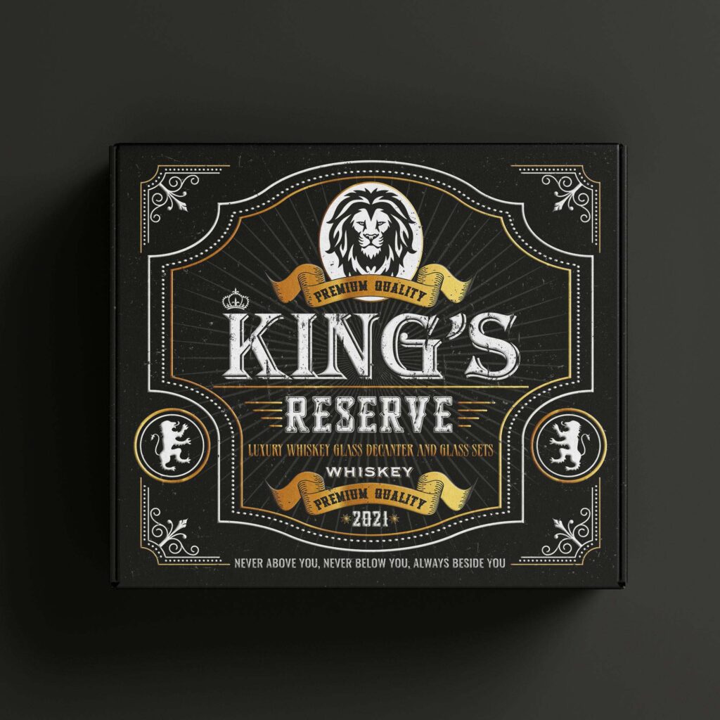
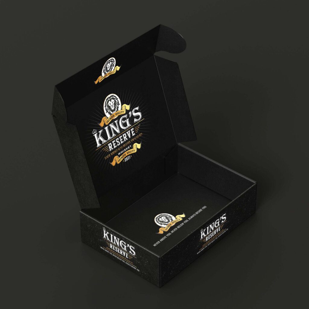
Our design for King’s Reserve communicates luxury, quality, and heritage — without saying a single extra word.
3. Design Must Be Functional — Not Just Beautiful
🛑 Mistake: Packaging that’s confusing to open, lacks usability, or doesn’t prioritize clarity.
✅ Solution: A perfect balance between aesthetics and function.
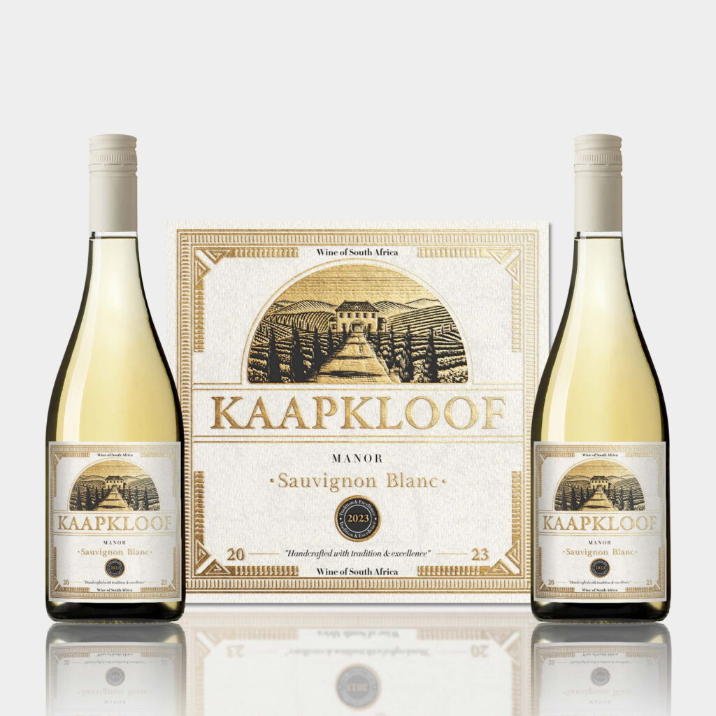
Our wine packaging for Kaapkloof shows a carefully structured layout, readability, and elegant information hierarchy — without sacrificing design.
This applies to supplements, cosmetics, tech, and food — form must follow function.
4. Details Make the Difference Between Ordinary and Premium
🛑 Mistake: Flat, lifeless packaging with no depth, texture, or visual drama.
✅ Solution:
➡ Gold or copper foil
➡ Embossed printing
➡ Matte vs glossy contrast
➡ Tactile surfaces that beg to be touched
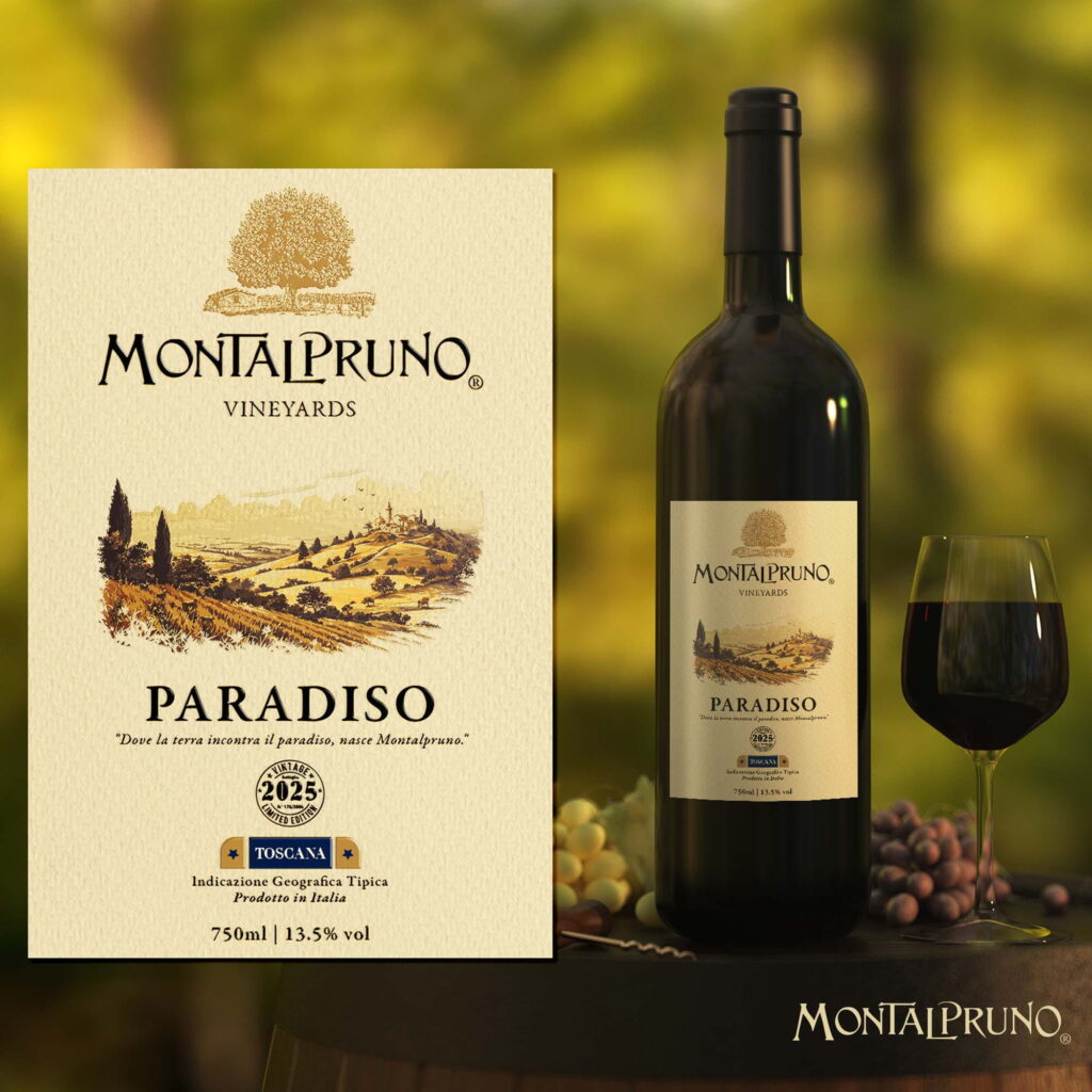
Our work on the Montalpruno – Paradiso wine label uses illustration, texture, and warm light to evoke heritage, nature, and luxury — all at once.
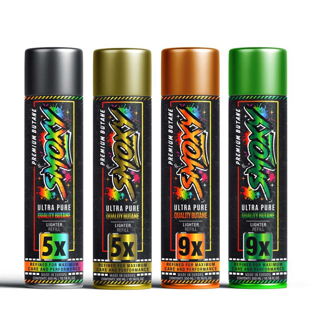
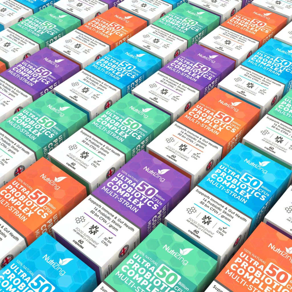
5. Packaging Must Look Great in Context
On the shelf, in hand, on E-commerce platforms.
🛑 Mistake: A design that looks good in a PDF — but fails in real-world presentation.
✅ Solution:
➡ Test visuals in mockups and real environments
➡ Show packaging in shelf context
➡ Demonstrate consistency across product lines
Our design for NutriZing showcases vibrant colors, clear segmentation, and visual consistency that dominates the shelf.
🔚 Conclusion: Packaging Is Your Silent Salesperson
✔ If it grabs attention — it sparks interest
✔ If it tells a story — it builds identity
✔ If it’s functional — it earns trust
✔ If it looks serious — it builds a brand
At Infinity Design Studio, we believe your packaging should make your product look like it already belongs with the giants, even if your brand is just getting started.