

FROM VISUAL MARK TO RECOGNIZABLE BRAND SYSTEM
A Serious Brand Has To Become More Than A Logo.
A logo can make a business identifiable. A complete visual identity gives that recognition structure—connecting typography, color, hierarchy, imagery, materials, and applications into one coherent brand language.
A logo can be distinctive, elegant, and professionally designed while still communicating only a fraction of what the brand needs to express. It may introduce a name or symbol, but it cannot independently define how the business should look, feel, communicate, and remain recognizable across different contexts.
This is where visual identity becomes more than logo design. The mark gains meaning through the system built around it: typography establishes tone, color shapes perception, hierarchy creates order, imagery defines atmosphere, and applications prove whether those decisions can remain coherent beyond the original presentation.
The strongest identities therefore do not depend on seeing the logo at every moment. They create enough visual consistency, character, and recognizable structure that the brand can still feel present through a brochure, business card, digital interface, environmental graphic, signage system, or physical experience.
That consistency is not about making every touchpoint look identical. It is about giving different applications the same visual logic—so that each expression can adapt to its purpose without losing the identity connecting it to the larger brand.
When those relationships work together, the logo stops carrying the entire responsibility of recognition on its own. It becomes one part of something far more powerful: a visual system that allows the brand to remain coherent, distinctive, and recognizable wherever people encounter it.
A LOGO MAY BE THE FIRST THING PEOPLE RECOGNIZE.
THE BRAND IS EVERYTHING THAT MAKES THAT RECOGNITION MEAN SOMETHING.
FROM RECOGNITION TO COHERENT BRAND EXPERIENCE
What Makes A Visual Identity Strong Enough To Become A Brand System
Recognition. Structure. Consistency. Adaptability. Experience.
A visual identity is not created by collecting attractive elements around a logo. It depends on how successfully those elements work together to create one recognizable visual language that can remain coherent across different contexts, formats, scales, and applications.
Recognition gives the audience something distinctive to remember. Structure connects logo, typography, color, hierarchy, imagery, and supporting elements into a deliberate system. Consistency ensures that those decisions continue speaking the same language wherever the brand appears. Adaptability allows the identity to change format without losing its character. Experience determines whether the complete system still feels intentional when people encounter it in the real world.
These dimensions are interconnected. A distinctive logo without structure can quickly become inconsistent. A rigid system may remain visually controlled while failing to adapt to different applications. And consistency without enough character can create repetition without meaningful recognition.
The strongest visual identities therefore do not ask only:
Does the logo look distinctive?
It asks a more important question:
Does the entire brand remain recognizable, coherent, and credible when the logo is no longer doing all the work?
A STRONG VISUAL IDENTITY DOES NOT SIMPLY REPEAT A LOGO.
IT BUILDS ENOUGH STRUCTURE AROUND IT FOR THE ENTIRE BRAND TO BECOME RECOGNIZABLE.
01 —
RECOGNITION BEFORE DECORATION
WHY IT MATTERS
Before a visual identity can feel premium, contemporary, minimal, expressive, or luxurious, it has to give people something they can recognize and remember.
A beautifully designed logo may create an immediate impression, but appearance alone does not establish a distinctive brand language. If typography, color, composition, imagery, proportions, and supporting graphic elements change without clear logic, the audience may repeatedly see attractive design without developing a stable visual memory of who it belongs to.
Recognition begins when individual decisions stop behaving like isolated styling choices and start reinforcing one another.
The logo introduces a visual signature. Typography extends its character. Color establishes recurring cues. Composition creates familiar rhythm. Imagery strengthens atmosphere. Supporting elements help the identity remain recognizable even when the primary mark is reduced, repositioned, or temporarily absent.
This is why a strong identity is not judged only by whether the logo looks distinctive in isolation. It is judged by whether the complete visual system creates enough continuity for the brand to remain identifiable across changing applications.
Aesthetic quality can attract attention.
Recognition is what allows that attention to become memory.
COMMON FAILURE
The logo is treated as the identity instead of the beginning of one.
A business may have a polished symbol and still appear inconsistent everywhere else.
Different typefaces begin appearing without purpose. Colors change according to convenience. Photography follows no recognizable direction. Layouts are rebuilt from scratch for every new application. Social media, print materials, signage, packaging, and digital interfaces may all carry the same logo while feeling as though they belong to completely different businesses.
The problem is not necessarily poor design.
It is the absence of a visual system capable of connecting individual design decisions into one recognizable identity.
When the logo becomes the only constant element, recognition depends too heavily on seeing that mark clearly every time. Remove it, reduce it, or place it inside a visually inconsistent environment and very little remains to tell the audience whose brand they are looking at.
That is the difference between using a logo repeatedly and building recognition deliberately.
When A Logo Exists Without A Visual System Around It
WHY THIS EXAMPLE MATTERS
A collection of individual marks may demonstrate graphic variation, but a logo alone does not explain how a brand should communicate once it leaves the logo presentation itself.
Without recurring typography, color logic, image direction, hierarchy, supporting elements, and application principles, there is no broader visual language capable of carrying recognition across different touchpoints.
The logo may remain identifiable while everything surrounding it becomes visually interchangeable.

WHAT NOT TO DO — Treat The Logo As The Complete Identity
Recognition becomes fragile when the logo is expected to provide all of the consistency while the rest of the visual communication changes without a shared system.
BETTER
DIRECTION
Build recognition through relationships between elements, not through repetition of the mark.
Logo → Typography → Color → Composition → Imagery → Supporting Elements → Application
The logo should introduce the visual character, but other parts of the identity need to continue that character independently.
Typography can establish a recognizable tone even when the logo is absent.
Color can create immediate association before a viewer reads a name.
Recurring composition and spacing can establish rhythm.
Image direction can make different photographs feel as though they belong to the same brand world.
Graphic elements, materials, textures, and supporting symbols can extend the identity into situations where the primary logo should not dominate.
The objective is not to make every application look identical.
It is to create enough recognizable visual DNA that different applications still feel related without needing to repeat the same composition every time.
When that happens, recognition becomes distributed across the identity rather than concentrated inside one symbol.
PROJECT
EVIDENCE
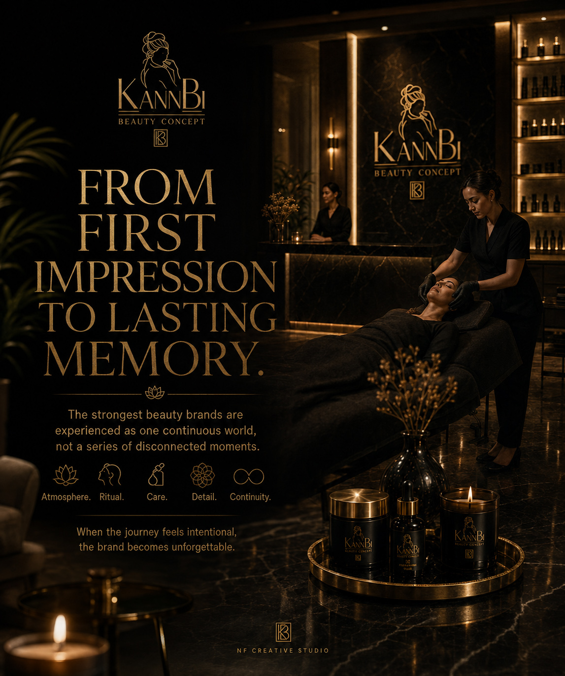
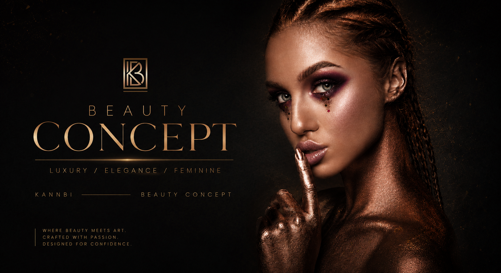
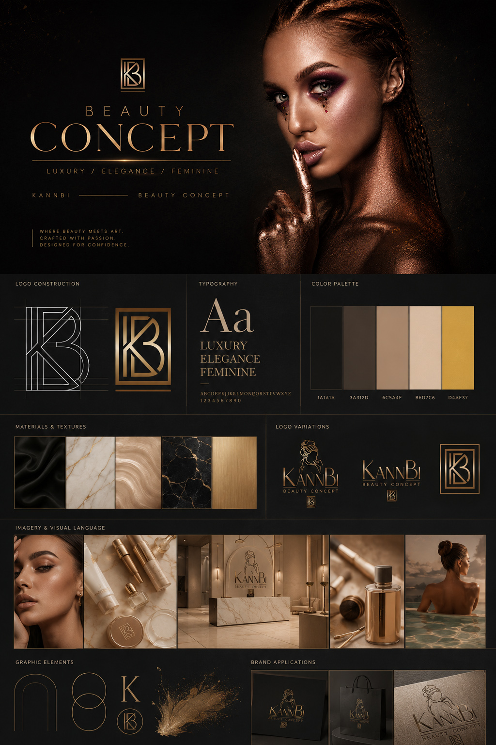
The KannBi Beauty Concept identity demonstrates how recognition becomes stronger when the logo is supported by a broader visual language that remains coherent across materials, formats, scales, environments, and moments of interaction.
The monogram and primary wordmark establish recognizable anchors, but the identity does not stop there. Typography, a controlled black-and-gold palette, warm neutral tones, material references, image direction, graphic structure, and application examples extend the same character into a larger system.
The important point is not that every element looks identical.
It is that the elements share enough visual relationships to feel intentional together.
The gold detailing connects typography, marks, materials, and applications. Dark surfaces establish a recurring visual foundation. Beauty imagery introduces a consistent emotional tone. Supporting compositions, textures, and secondary elements give the system flexibility without disconnecting it from the identity.
As a result, recognition does not depend exclusively on the audience seeing the logo at full scale.
The complete visual environment begins carrying the identity with it across physical and digital brand experiences, with consistency, clarity, and recognizable authority.
When A Logo Becomes Part Of A Complete Recognizable Visual Language
WHY THIS EXAMPLE MATTERS
This presentation brings together the primary identity, monogram construction, typography, color palette, material character, imagery, graphic elements, and brand applications within one coordinated visual world.
Rather than asking the logo to create recognition alone, multiple elements reinforce the same character and positioning, allowing the identity to remain coherent across different forms of communication.
The result demonstrates the shift from designing a recognizable mark to designing a recognizable system.
PROJECT EVIDENCE
KannBi Beauty Concept Identity Built Beyond The Primary Logo
A coordinated relationship between logo, typography, color, imagery, materials, and applications allows recognition to continue through the complete visual environment.
A LOGO CAN GIVE PEOPLE SOMETHING TO RECOGNIZE.
A VISUAL SYSTEM GIVES THEM ENOUGH CONSISTENCY TO REMEMBER WHO IT BELONGS TO.
02 —
STRUCTURE BEFORE STYLE
WHY IT MATTERS
A visual identity can look sophisticated and still lack the structure required to function as a serious brand system.
Style determines how something feels at first glance. Structure determines whether that visual language can be repeated, adapted, expanded, and controlled without losing its identity.
This distinction becomes important as soon as the brand moves beyond a single presentation. The primary logo may need to become smaller. A monogram may need to replace the full mark. Typography has to establish hierarchy across headlines, supporting information, digital interfaces, print materials, and environmental applications. Colors need defined roles rather than being selected differently every time a new layout is created.
Without those relationships, design decisions remain dependent on individual taste.
With structure, they become repeatable principles.
A strong identity therefore needs more than attractive elements. It needs clear relationships between those elements: which ones lead, which ones support, how proportions are controlled, how spacing creates order, how typography behaves, and how the system changes without losing its visual character.
The objective is not rigidity.
It is to create enough underlying logic that the brand can evolve without having to reinvent itself every time something new is designed.
COMMON FAILURE
The identity has attractive ingredients, but no clear rules connecting them.
A logo is designed.
A secondary mark is added later.
Several typefaces are selected because they individually look appropriate.
Colors are chosen from a mood board.
Graphic elements appear when a layout feels too empty.
Different versions of the logo begin solving different practical problems—but without clear hierarchy, proportion, or defined responsibility.
Individually, many of those decisions may still look good.
Together, however, they begin creating a brand that behaves unpredictably.
One application gives the logo enormous visual dominance. Another reduces it until it becomes secondary. Typography changes character between formats. Spacing shifts according to available room. Supporting elements are introduced without a clear relationship to the primary identity.
The problem is not necessarily a lack of creativity.
It is a lack of visual architecture.
When every new application requires the designer to decide again how the brand should behave, the identity has not yet become a system.
When Attractive Brand Elements Exist Without A Clear System
WHY THIS EXAMPLE MATTERS
A collection of individually polished visual elements can create the impression of a developed identity while still leaving fundamental relationships undefined.
When logo variations, typography, color, spacing, proportions, and supporting graphics do not have clear roles, the identity becomes difficult to reproduce consistently once it moves beyond the original presentation.
The problem appears gradually. Each new application introduces another interpretation until the brand begins depending on subjective styling rather than recognizable visual logic.
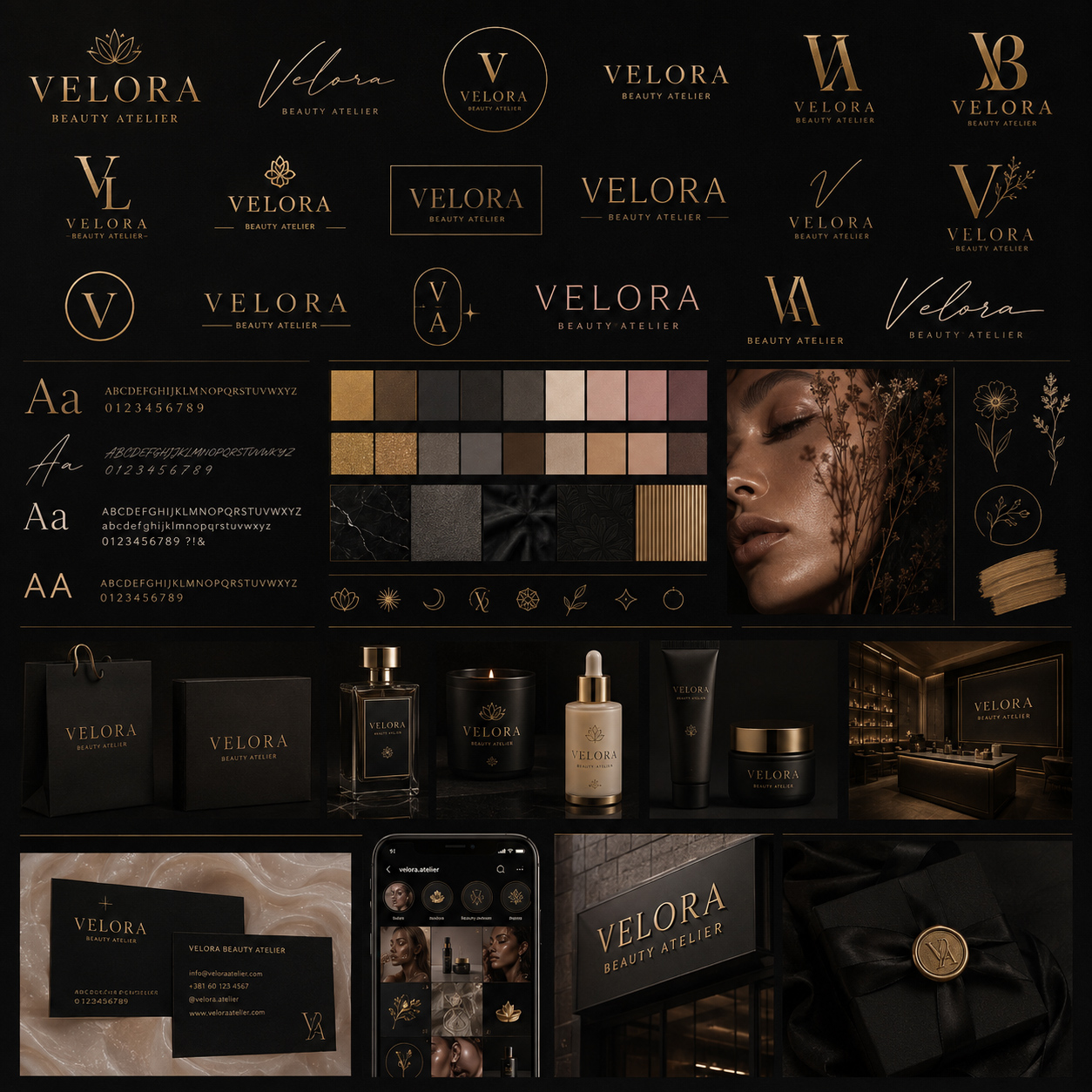
WHAT NOT TO DO — Build A Visual Style Without Defining How The System Works
Strong individual elements cannot create a reliable identity when their hierarchy, proportions, roles, and relationships have to be reinvented for every new application.
BETTER
DIRECTION
Define the system before asking the style to carry it across every format, scale, surface, context, future application, channel, environment, and stage of future brand growth.
Concept → Primary Mark → Secondary Mark → Proportion → Typography → Color Roles → Spacing → Application Logic
The primary mark should have a clear responsibility.
Secondary marks should exist because different contexts require them—not simply because more variations look impressive.
Proportions should remain controlled so that the relationship between symbol, typography, and supporting information stays recognizable.
Typography should have hierarchy: different levels of information need defined voices rather than a collection of visually compatible fonts.
Colors should perform specific roles within the identity. Primary tones establish recognition. Secondary and supporting tones provide flexibility without changing the character of the brand.
Spacing matters because identity is not created only by the elements themselves. It is also created through the relationships and breathing room between them.
And each decision should answer a practical question:
How can this identity behave differently without becoming a different identity?
The answer is not to freeze every application into one template.
It is to build a visual architecture strong enough to support variation while preserving the relationships that make the brand recognizable.
When that architecture exists, style becomes far more powerful—because it is no longer improvising.
It is expressing a system.
PROJECT
EVIDENCE
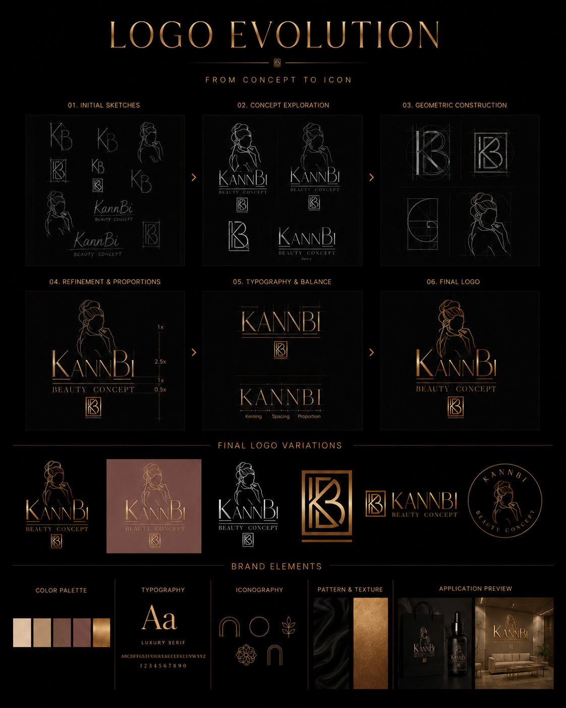
The development of the KannBi Beauty Concept identity demonstrates how a visual mark becomes stronger when its final appearance is supported by deliberate structural decisions.
The identity does not begin with one finished logo appearing fully resolved.
It moves through initial sketches, concept exploration, geometric construction, refinement of proportions, typographic balance, and final logo definition before expanding into the variations required for different applications.
That progression matters because each stage solves a different part of the identity.
Early exploration establishes visual possibilities.
Construction introduces proportion and alignment.
Refinement determines the relationship between illustration, wordmark, supporting typography, and monogram.
Typography is adjusted so that spacing, scale, and balance support the overall composition rather than competing with it.
Only after those relationships become controlled does the identity move into final variants.
The full logo can carry the complete expression when space allows.
The horizontal configuration responds to different proportions.
The monogram creates a compact recognizable device for smaller or more focused applications.
These are not separate logos competing for attention.
They are different expressions of the same underlying structure.
That is what allows the identity to adapt without requiring the visual language to be redesigned every time the format changes.
When Visual Identity Is Built Through Structure Before Final Expression
WHY THIS EXAMPLE MATTERS
This presentation reveals the identity as a development process rather than a finished logo appearing in isolation.
Initial sketches, concept exploration, geometric construction, proportion refinement, typography, and final logo variations show how visual character is progressively organized into a controlled system.
The final identity becomes adaptable because its variations are not arbitrary alternatives. They emerge from the same structural logic, allowing different formats to perform different roles while preserving a recognizable relationship to the complete brand.
PROJECT EVIDENCE
KannBi Beauty Concept Logo Evolution Built Through Proportion, Hierarchy, And Controlled Variation
A structured development process connects concept, geometry, typography, spacing, and logo variations into one identity capable of adapting without losing its visual logic.
STYLE CAN MAKE AN IDENTITY ATTRACTIVE.
STRUCTURE IS WHAT ALLOWS THAT IDENTITY TO REMAIN COHERENT WHEN THE BRAND HAS TO GROW.
03 —
CONSISTENCY BEFORE EXPANSION
WHY IT MATTERS
A visual identity becomes significantly more difficult to control once the brand begins moving across different touchpoints.
A business card, brochure, website, social post, product package, environmental graphic, uniform, and digital interface all have different practical requirements. Each format needs enough flexibility to perform its own function, but the audience should still feel that every expression belongs to the same recognizable brand world.
This is where consistency becomes more than visual repetition.
The objective is not to copy the same layout everywhere. It is to preserve the relationships that matter: logo behavior, typographic hierarchy, color roles, spacing, image direction, material character, and the overall tone of communication.
When those relationships remain stable, the brand can expand without becoming fragmented.
The audience begins recognizing patterns before consciously analyzing them. Familiar proportions, colors, type treatments, materials, compositions, and visual cues create continuity from one encounter to the next.
That continuity gradually turns identity into memory.
A brand becomes stronger when every new application adds to recognition instead of asking the audience to learn the visual language again.
COMMON FAILURE
Every touchpoint is designed as a separate creative project.
The website follows one visual direction.
Social media introduces another.
Printed materials use different typography because it fits the layout better.
Packaging adds new colors.
Signage simplifies the identity in a way that removes its character.
Photography changes according to whoever creates the next campaign.
The logo may still appear everywhere, but everything surrounding it begins speaking a different visual language.
This creates a deceptive form of consistency:
the same logo appears repeatedly, while the identity itself keeps changing.
Over time, the brand becomes increasingly dependent on the logo for recognition because typography, color, imagery, hierarchy, and application style no longer reinforce one another.
The result may still contain individually attractive designs.
What disappears is the feeling that they belong to one deliberate system.
When The Same Logo Appears Everywhere But The Brand Still Feels Inconsistent
WHY THIS EXAMPLE MATTERS
Repeated logo usage can create the appearance of consistency without actually building a coherent visual identity.
When typography, color, imagery, hierarchy, materials, and composition change independently between touchpoints, the logo becomes the only element holding the brand together.
Each application may remain professionally designed on its own, but collectively they fail to strengthen the same visual memory.
Consistency is created when multiple elements reinforce recognition—not when one symbol is repeatedly placed inside unrelated design environments.

WHAT NOT TO DO — Use The Same Logo Inside Different Visual Languages
A repeated mark cannot compensate for inconsistent typography, color, imagery, hierarchy, and application logic across the wider brand experience.
BETTER
DIRECTION
Identify what must remain recognizable before deciding what is allowed to change across formats, scales, and communication needs.
Core Identity → Visual Constants → Application Rules → Controlled Variation → Consistent Experience
Logo behavior should remain predictable.
Typography should preserve a recognizable hierarchy even when layouts change.
The palette can expand when necessary, but primary and supporting colors need clearly understood roles.
Photography and imagery should share enough atmosphere, framing, lighting, or emotional character to belong to the same visual world.
Materials and textures can change according to application while maintaining the brand’s broader positioning.
Spacing and composition should establish familiar rhythm rather than forcing every format into one identical template.
The strongest systems distinguish between consistency and uniformity.
Uniformity repeats the same solution.
Consistency preserves the same identity while allowing different solutions to perform different jobs.
That distinction gives the brand room to grow without gradually losing the visual relationships that made it recognizable in the first place.
PROJECT
EVIDENCE
The KannBi Beauty Concept system demonstrates how one identity can move through substantially different applications while preserving a consistent visual character.
The primary logo, secondary marks, color system, typography, material palette, stationery, packaging, printed communication, digital interfaces, environmental graphics, uniforms, and social media all perform different functions.
They are not presented through one repeated template.
Instead, they remain connected through controlled visual constants.
Black establishes a dominant foundation.
Warm metallic gold creates a recurring premium accent.
Typography maintains hierarchy and tone.
Materials reinforce tactile sophistication.
The illustrated identity and monogram reappear according to scale and context rather than competing for equal prominence everywhere.
Digital communication adapts the system to screens, while environmental applications translate it into physical space.
The individual executions change.
The identity does not.
That relationship is what makes expansion strengthen the brand instead of slowly fragmenting it.
When One Visual Language Remains Recognizable Across Every Brand Touchpoint
WHY THIS EXAMPLE MATTERS
This presentation shows the identity operating across logo systems, color, typography, stationery, packaging, print materials, digital interfaces, signage, uniforms, and social communication.
Each application responds to a different functional context, yet the same visual relationships continue connecting them into one coherent identity.
The strength of the system comes not from making every touchpoint identical, but from controlling the elements that should remain recognizable while allowing individual applications enough flexibility to work properly.
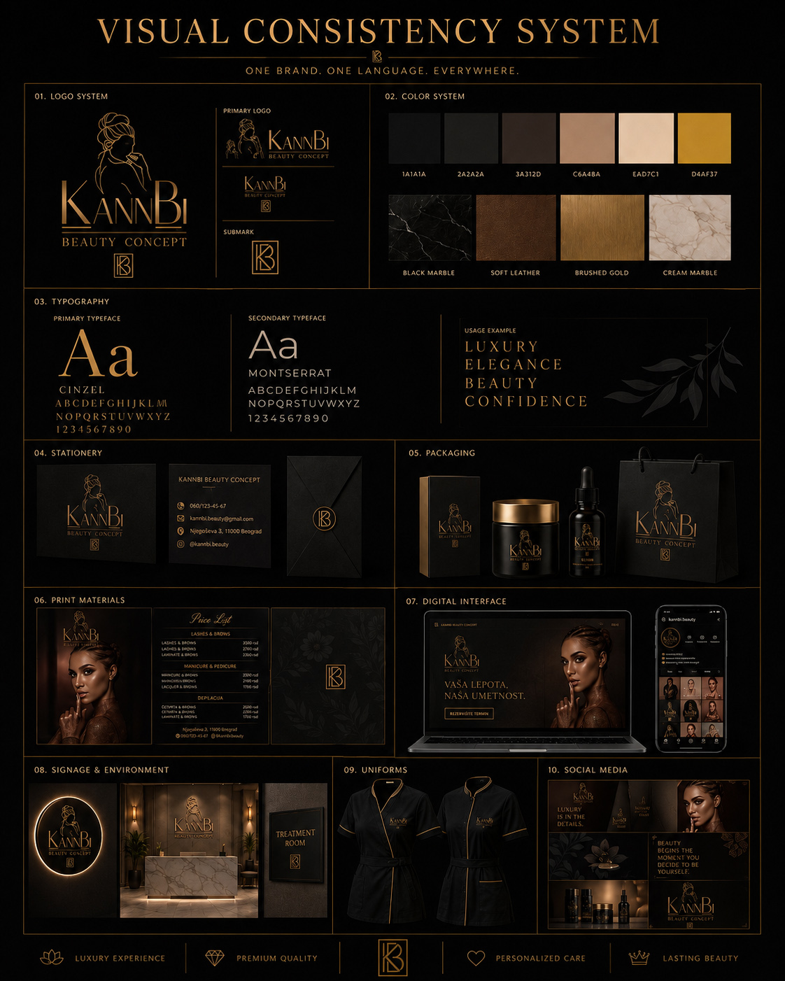
PROJECT EVIDENCE
KannBi Beauty Concept Visual Consistency Across Physical And Digital Applications
A controlled relationship between identity, typography, color, materials, imagery, and application rules allows different touchpoints to perform distinct roles without fragmenting the brand.
CONSISTENCY DOES NOT MEAN MAKING EVERY TOUCHPOINT LOOK THE SAME.
IT MEANS MAKING EVERY TOUCHPOINT FEEL UNMISTAKABLY PART OF THE SAME BRAND.
04 —
ADAPTABILITY BEFORE REINVENTION
WHY IT MATTERS
A visual identity cannot remain effective by behaving exactly the same way in every situation.
Different formats create different demands. A full logo that works beautifully on a presentation cover may become unreadable as a small digital icon. A horizontal composition may not fit a narrow application. Gold detailing may perform perfectly against black while losing clarity on a lighter surface. Typography that creates authority at large scale may need a different hierarchy when information becomes denser.
A serious brand system anticipates those conditions before they become problems.
Adaptability gives the identity enough flexibility to respond to format, scale, background, medium, and context without requiring the brand to be redesigned each time.
That flexibility has to be controlled.
Logo variations should have defined responsibilities. Positive and negative versions should preserve clarity across different surfaces. Color alternatives should expand usability without introducing unrelated visual personalities. Horizontal, vertical, and compact configurations should solve real spatial problems while continuing to express the same identity.
This is where adaptability becomes different from inconsistency.
The visual expression may change.
The recognizable logic behind it should not.
COMMON FAILURE
Every new application becomes another opportunity to reinterpret the brand.
The original logo works well in one format, so a new version is improvised for another.
A lighter background creates contrast problems, so the color is changed without considering the broader palette.
A narrow digital space forces the logo into awkward proportions.
A small icon becomes an oversimplified symbol with little relationship to the primary identity.
Typography is substituted because the original composition no longer fits.
None of these individual decisions may appear catastrophic.
The problem emerges through accumulation.
Each adaptation moves slightly further away from the visual logic that made the identity recognizable. Over time, practical adjustments become uncontrolled redesign, and the brand begins collecting versions rather than building a coherent family of solutions.
The alternative can be equally limiting.
An overly rigid system may insist on using one logo, one proportion, one color treatment, and one composition everywhere—even when the context clearly requires something different.
A strong identity needs neither constant reinvention nor inflexible repetition.
It needs controlled variation.
When Every New Format Forces The Brand To Reinvent Itself
WHY THIS EXAMPLE MATTERS
Adaptation is necessary, but uncontrolled adaptation gradually weakens recognition.
When logo proportions, colors, typography, symbols, and compositions are changed independently to solve individual formatting problems, each application may work locally while the identity becomes less coherent globally.
A flexible system should provide alternative solutions before those problems appear.
The objective is not to preserve one composition at any cost. It is to preserve the relationships that make different compositions feel like expressions of the same brand.

WHAT NOT TO DO — Solve Every New Application By Redesigning The Identity
Practical flexibility becomes fragmentation when each format introduces new proportions, colors, typography, or logo behavior without rules connecting those decisions.
BETTER
DIRECTION
Define what can change—and what must remain recognizable.
Core Identity → Approved Variations → Scale Logic → Background Logic → Color Logic → Format Adaptation → Brand Recognition
The primary logo remains the complete expression when space and context allow.
Secondary configurations should solve practical conditions, not become decorative alternatives.
Horizontal and vertical versions can respond to proportions.
A compact monogram can protect recognition at smaller scales.
Positive, negative, and simplified treatments can preserve contrast across different surfaces.
Color variations can provide flexibility within a controlled palette.
Minimum scale, spacing, alignment, and background rules should prevent distortion.
The strongest systems make an important distinction:
some elements are fixed because they create recognition; others are flexible because they allow the identity to survive real-world conditions.
That balance allows the brand to respond rather than improvise.
A designer should not have to rediscover the identity whenever a new application appears.
The system has already established the logic needed to make the decision.
PROJECT
EVIDENCE
The KannBi Beauty Concept identity demonstrates adaptability through a coordinated family of logo configurations, color treatments, and background solutions across a wide range of real-world applications, formats, surfaces, presentation conditions, communication needs, and changing spatial requirements.
The primary identity carries the full relationship between illustration, wordmark, descriptor, and monogram.
But that complete configuration is not forced into every situation.
Alternative vertical and horizontal arrangements allow the brand to respond to changing proportions. The monogram provides a compact recognizable element for reduced formats. Full-color and single-color treatments preserve usability across different visual conditions. Positive and negative versions allow the identity to maintain contrast on both light and dark surfaces.
The important point is that these variations do not behave like separate design directions.
They continue sharing the same proportions, typographic character, visual hierarchy, and recognizable identity logic across every approved application and format.
The application changes because the context changes.
The brand does not.
That is the difference between creating multiple logos and creating one identity capable of behaving intelligently in multiple environments.
GOOD EXAMPLE 01 — COLOR ADAPTABILITY
When Color Variation Expands Usability Without Changing Brand Character
WHY THIS EXAMPLE MATTERS
The identity moves between its premium full-color treatment and simplified alternatives while maintaining the same recognizable construction.
The change in color responds to application requirements rather than introducing a new visual personality.
The identity gains flexibility without asking the audience to relearn it.
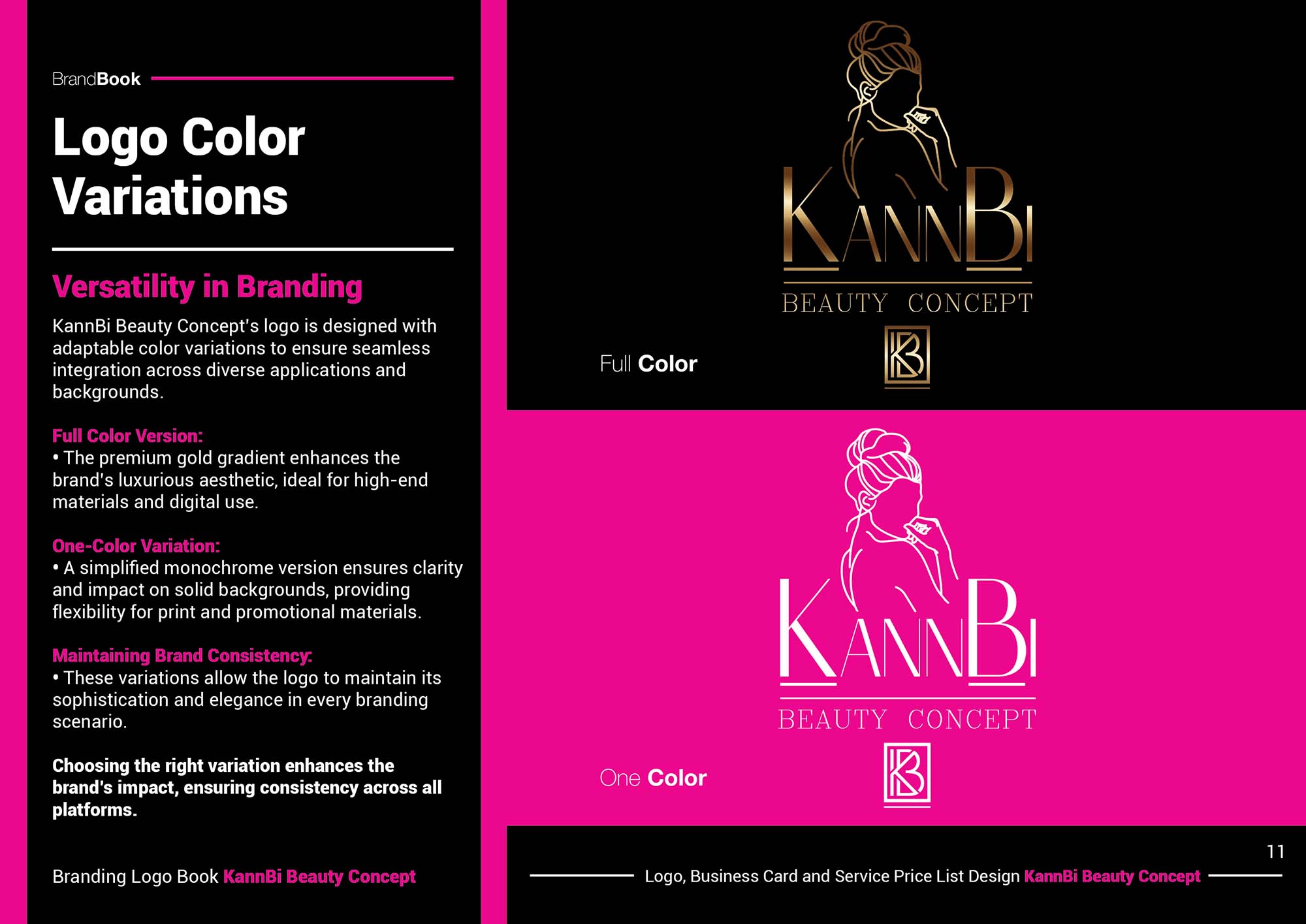
PROJECT EVIDENCE
KannBi Beauty Concept Color Variations Built For Controlled Flexibility
Alternative color treatments extend the identity across different applications while preserving the structure and character of the primary brand system.
GOOD EXAMPLE 02 — BACKGROUND ADAPTABILITY
When One Identity Remains Clear Across Changing Background Conditions
WHY THIS EXAMPLE MATTERS
Light and dark surfaces require different contrast behavior, but they do not require a different identity.
Positive, negative, and full-color treatments allow the mark to remain readable and visually controlled while adapting to its surrounding environment.
The background changes.
Recognition remains stable.
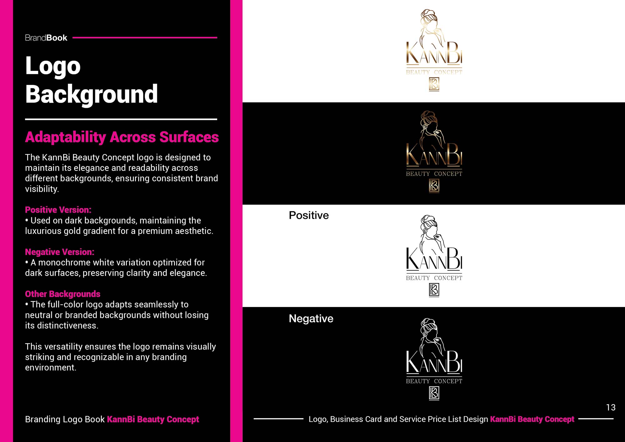
PROJECT EVIDENCE
Positive And Negative Logo Treatments Designed Around Contrast And Legibility
Controlled background variations preserve clarity without altering the underlying visual relationships that make the identity recognizable.
GOOD EXAMPLE 03 — FORMAT ADAPTABILITY
When Logo Variations Solve Different Formats Without Creating Different Brands
WHY THIS EXAMPLE MATTERS
Vertical, horizontal, and compact configurations respond to different spatial requirements while remaining visibly connected to the same identity.
Each variation has a practical reason to exist.
Rather than forcing one composition into every format, the system provides different configurations built from the same recognizable visual logic.
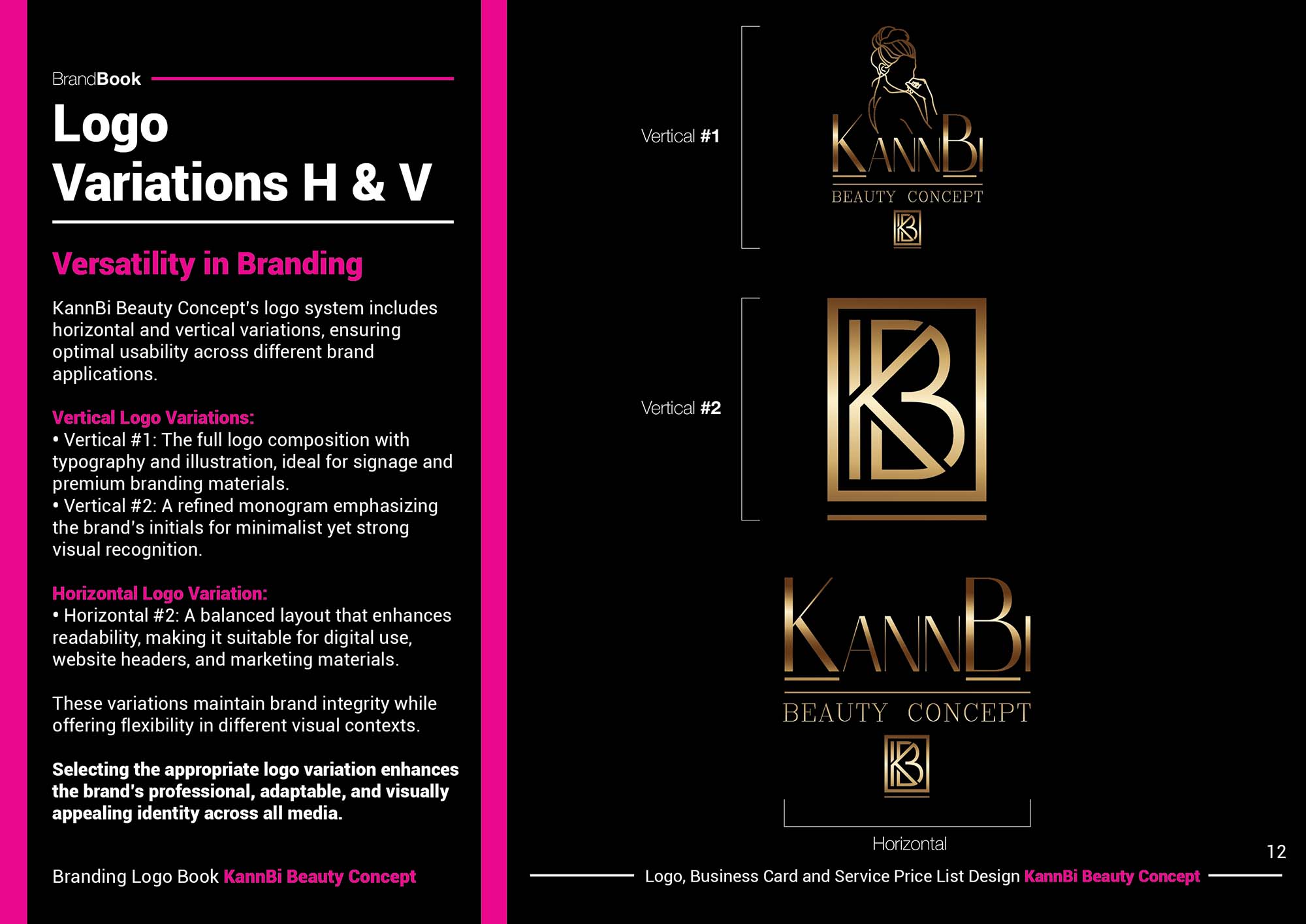
PROJECT EVIDENCE
KannBi Beauty Concept Logo Variations Built For Different Spatial Conditions
A coordinated family of full and compact configurations allows the identity to adapt across formats without compromising proportion, hierarchy, or recognition.
A FLEXIBLE IDENTITY DOES NOT CHANGE ITS CHARACTER EVERY TIME THE FORMAT CHANGES.
IT CHANGES ITS FORM WHILE PRESERVING THE LOGIC THAT MAKES THE BRAND RECOGNIZABLE.
05 —
EXPERIENCE BEFORE EXPOSURE
WHY IT MATTERS
A visual identity does not become valuable simply because more people see it.
It becomes valuable when the people who encounter the brand can move through different touchpoints without losing the sense that they are interacting with one coherent business, one recognizable character, and one intentional experience.
Customers rarely experience a brand through a brand book.
They discover it through social media. They visit a website. They make contact or book a service. They encounter signage, interiors, staff, printed materials, products, packaging, payment moments, follow-up communication, and eventually the possibility of returning.
Each interaction changes the context.
But the identity should continue providing familiarity.
This is where visual identity moves beyond recognition and begins shaping experience.
Typography, color, imagery, materials, environmental graphics, digital interfaces, physical applications, and service communication can create continuity between moments that otherwise have very little in common.
A strong system therefore does more than make every touchpoint look branded.
It makes separate interactions feel connected.
And when that connection is sustained, visual consistency begins doing something more important than decorating the customer journey:
it helps the brand feel intentional before, during, and after the core experience itself.
COMMON FAILURE
The identity looks complete in presentation—but disappears when the customer begins interacting with the business.
The logo, palette, typography, and mockups may look impressive inside a controlled brand presentation.
Then the real journey begins.
The social profile feels different from the website.
The booking interface introduces unrelated visual conventions.
The physical environment uses generic signage.
Printed materials follow another layout.
Staff presentation does not reflect the identity.
Products or retail materials introduce different visual cues.
Follow-up communication looks functional but anonymous.
Every individual touchpoint may still perform its practical job.
What disappears is the feeling that they belong to one deliberately designed experience.
This is where a visual identity can technically exist while the brand itself still feels fragmented.
The problem is no longer logo consistency.
It is experience consistency.
A serious brand should not become less recognizable the closer a customer gets to actually using it.
When A Polished Identity Disappears Across The Customer Journey
WHY THIS EXAMPLE MATTERS
A brand can appear visually sophisticated at first contact while becoming increasingly inconsistent as the customer moves through different interactions.
When digital discovery, booking, environment, service materials, products, payment, and follow-up communication do not share recognizable visual principles, the identity stops supporting continuity precisely where the relationship with the customer becomes more meaningful.
A strong brand experience is not created by placing a logo on every touchpoint.
It is created when those touchpoints feel intentionally connected.

WHAT NOT TO DO — Allow The Brand Experience To Fragment After The First Impression
Professional individual touchpoints cannot create one coherent customer experience when visual language, materials, hierarchy, tone, and presentation change throughout the journey.
BETTER
DIRECTION
Design the identity around the experience—not only where the brand is presented.
Discovery → Exploration → Booking → Arrival → Welcome → Service → Product → Payment → Follow-Up → Return
The digital experience should establish expectations the physical environment can continue.
Booking should feel connected to the brand rather than like an unrelated layer.
Signage should make arrival immediately recognizable.
Printed and service materials should preserve the same hierarchy and tone.
Products and packaging should extend the identity into tangible interaction.
Payment and follow-up communication should not suddenly abandon the system.
Loyalty should continue the existing relationship rather than feel like a separate promotion.
Not every touchpoint needs the same visual intensity.
Some moments require strong brand presence.
Others need restraint.
The important question is:
Does each interaction carry enough of the identity to feel connected to what came before and what comes next?
When the answer is yes, visual identity stops behaving like a layer applied to individual materials.
It begins functioning as infrastructure for the complete brand experience.
PROJECT
EVIDENCE
The expanded KannBi Beauty Concept system demonstrates how visual identity can move beyond individual applications and begin connecting an entire sequence of customer interactions.
The brand is expressed through digital discovery, website presentation, booking, physical arrival, reception, consultation, treatment, product interaction, payment, social communication, and loyalty—each performing a different practical role within the wider experience.
The identity does not need to dominate every moment equally.
Instead, recurring relationships create continuity.
Dark surfaces and warm metallic accents establish recognizable atmosphere.
Typography maintains tone and hierarchy.
Digital interfaces carry the same visual character into browsing and booking.
Environmental applications translate that character into physical space.
Staff presentation, service materials, products, packaging, and supporting objects extend the identity into closer forms of interaction.
The customer journey therefore becomes more than a sequence of operational steps.
It becomes a sequence in which visual recognition can continue accumulating from one touchpoint to the next.
That is where identity begins supporting something larger than appearance.
It begins supporting the experience through which the brand is understood.
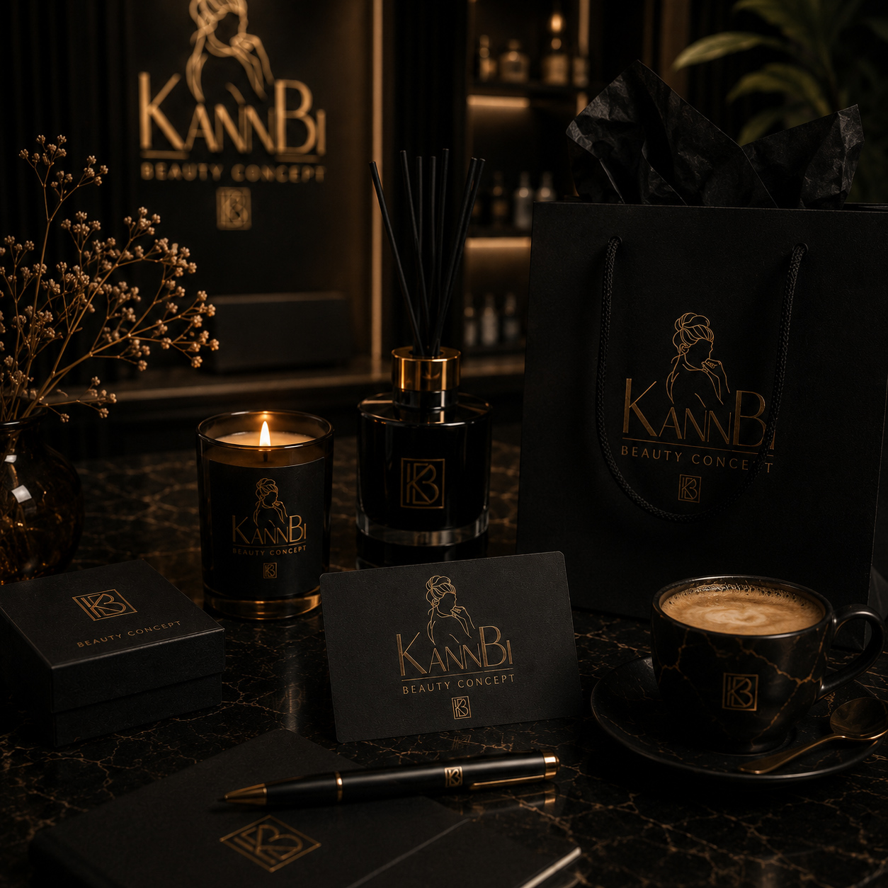
GOOD EXAMPLE 01 — TOUCHPOINT SYSTEM
When Brand Identity Connects Different Touchpoints Into One Recognizable Experience
WHY THIS EXAMPLE MATTERS
This presentation shows the identity extending across environmental branding, printed communication, service materials, digital interfaces, products, packaging, uniforms, and physical brand objects.
These applications perform very different functions, yet recognizable visual relationships connect them into one broader brand environment.
The result demonstrates why consistency becomes more powerful when it is designed around the complete ecosystem rather than around individual assets.
PROJECT EVIDENCE
KannBi Beauty Concept Brand Touchpoint Ecosystem Built Around One Visual Language
Digital, physical, environmental, service, and product applications remain connected through recurring identity principles rather than relying on the logo alone.
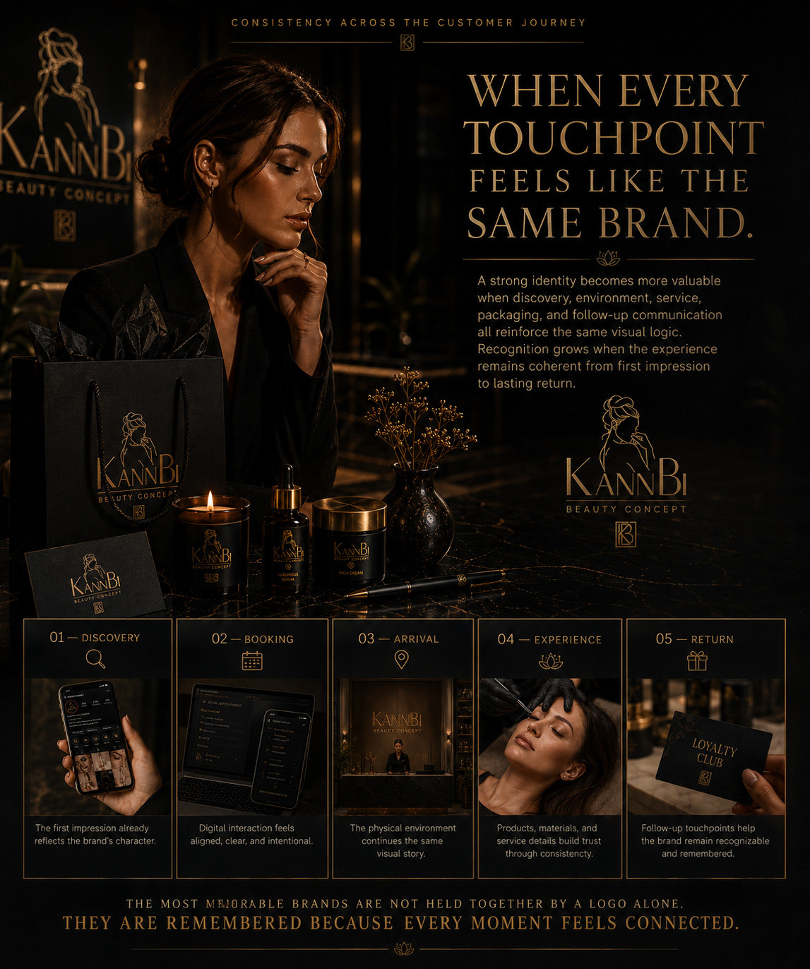
GOOD EXAMPLE 02 — CUSTOMER JOURNEY
When Visual Identity Continues Through The Complete Customer Journey
WHY THIS EXAMPLE MATTERS
The customer journey maps the brand across discovery, exploration, booking, arrival, welcome, consultation, treatment, product experience, payment, social sharing, and return.
Each stage represents a different type of interaction, yet the visual system provides enough continuity for those moments to feel connected rather than isolated.
The identity therefore supports more than recognition at first contact.
It accompanies the relationship as the customer moves deeper into the experience.
PROJECT EVIDENCE
KannBi Beauty Concept Identity Extended From Discovery To Return And Loyalty
A coordinated visual language connects changing customer interactions into one continuous brand experience without forcing every touchpoint to use the same presentation.
A BRAND DOES NOT BECOME STRONGER BECAUSE ITS LOGO APPEARS IN MORE PLACES.
IT BECOMES STRONGER WHEN EVERY PLACE THE CUSTOMER ENCOUNTERS IT FEELS CONNECTED TO THE SAME EXPERIENCE.
FROM VISUAL IDENTITY TO COMPLETE BRAND EXPERIENCE
A Strong Visual Identity Turns Recognition Into A Brand People Can Understand, Trust, And Remember
The strongest identities do more than make a business visually distinctive. They create a recognizable system that gives every expression of the brand enough structure, consistency, flexibility, and continuity to feel intentional wherever people encounter it.
A logo may begin that process by giving the audience something identifiable. But recognition becomes meaningful only when the rest of the visual world reinforces what that mark represents.
Typography establishes tone. Color creates association. Structure organizes information. Imagery shapes atmosphere. Applications prove whether the identity can survive beyond its original presentation. Adaptability allows the system to respond to new formats without losing itself. And experience connects those decisions across the moments where customers actually meet the business.
Across the five principles explored in this article, the same idea keeps returning: recognition, structure, consistency, adaptability, and experience are not separate branding problems.
They are different responsibilities of the same visual system.
A recognizable identity without structure becomes difficult to control.
Structure without consistency remains trapped inside guidelines.
Consistency without adaptability becomes rigid.
Adaptability without recognizable principles becomes fragmentation.
And even the most carefully developed identity remains incomplete if it disappears once the customer begins interacting with the business in the real world.
A serious brand therefore requires more than a collection of beautiful assets.
It requires decisions that continue making sense from the first visual impression to the complete customer experience.
When those decisions work together, the logo no longer has to carry the entire identity by itself.
The brand becomes recognizable through its typography before the logo appears.
Through color before the name is read.
Through atmosphere before the message is understood.
Through application before the customer consciously analyzes why everything feels connected.
And that is the point where visual identity becomes more than presentation.
It becomes part of how the brand is recognized, understood, trusted, and remembered.
THE FIVE DIMENSIONS OF A SERIOUS VISUAL IDENTITY
Recognition gives the audience something distinctive to remember. Structure gives the identity logic. Consistency turns that logic into continuity. Adaptability allows the system to change without losing itself. Experience connects those decisions across the real touchpoints where the brand actually lives.
Considered together, these five dimensions transform a logo from an isolated visual asset into a coherent brand system capable of creating recognition across formats, environments, and interactions.
A LOGO MAY IDENTIFY THE BRAND.
THE SYSTEM AROUND IT IS WHAT MAKES THE BRAND RECOGNIZABLE, COHERENT, AND REAL.
FROM VISUAL IDENTITY PRINCIPLES TO PRACTICAL BRAND DECISIONS
Key Takeaways
A practical framework for evaluating whether a visual identity is simply well designed—or whether it has enough recognition, structure, consistency, adaptability, and experiential continuity to function as a serious brand system.
The five principles explored throughout this article point toward one broader idea: strong visual identity is created when individual design decisions reinforce one another instead of depending on the logo to create all recognition by itself.
These takeaways can be used when developing a new identity, reviewing an existing brand system, expanding into new applications, or evaluating whether different touchpoints still feel connected to the same visual world.
01 —
RECOGNITION BEFORE DECORATION
A visual identity should first give the audience something distinctive enough to recognize and remember across different contexts, formats, and moments.
Color, typography, composition, imagery, supporting elements, and the logo should consistently reinforce one another over time so that recognition continues even when the primary mark is not the dominant element.
Attractive design may create attention.
Recognizable visual relationships are what allow that attention to become memory.
02 —
STRUCTURE BEFORE VISUAL STYLE
A strong aesthetic becomes more valuable when there is clear logic underneath it.
Logo variations, typography, proportions, spacing, color roles, and hierarchy should have defined relationships rather than being decided again for every application.
Clear structure also reduces dependence on individual interpretation. New applications can evolve without forcing the brand to rediscover its visual logic each time.
Style creates character. Structure makes that character repeatable, controllable, and capable of growing.
03 —
CONSISTENCY BEFORE EXPANSION
Every new touchpoint should strengthen what the audience already recognizes.
Consistency does not require identical layouts. It requires stable visual principles that allow print, digital, packaging, environmental graphics, social media, and other applications to feel connected.
Expansion should increase recognition—not introduce another version of the brand.
04 —
ADAPTABILITY BEFORE REINVENTION
Different formats require different solutions, but those solutions should emerge from the same identity logic.
Horizontal, vertical, compact, positive, negative, and simplified configurations can provide flexibility without fragmenting the system.
A strong identity changes its form when necessary without changing the character people recognize.
05 —
EXPERIENCE BEFORE EXPOSURE
The identity should remain coherent beyond the moment when the brand is being presented.
Discovery, booking, physical environments, service interaction, products, payment, follow-up communication, and loyalty may all require different levels of visual presence.
What matters is that each interaction carries enough of the same identity to feel connected to the complete experience.
A serious brand is not defined by how many places display its logo.
It is defined by how consistently people recognize the same brand as they move through those places.
THE STRONGEST BRAND IS NOT THE ONE WITH THE MOST DISTINCTIVE LOGO.
IT IS THE ONE IN WHICH EVERY DECISION MAKES THE IDENTITY EASIER TO RECOGNIZE, TRUST, AND REMEMBER.