Packaging isn’t just a wrapper. It’s your first promise to the customer.
Packaging is the first point of contact between your brand and the customer — and in that single moment, a good or bad first impression is made.
If it doesn’t grab attention, communicate clarity, functionality, or perceived value — the product remains unnoticed, or worse, feels cheap and unprofessional.
In this blog, we reveal the 5 golden rules that separate successful brands from average ones.
Backed by real visual examples and actionable strategies we use at Infinity Design Studio for premium global clients.
📦 Your Packaging Must Tell a Story — Instantly
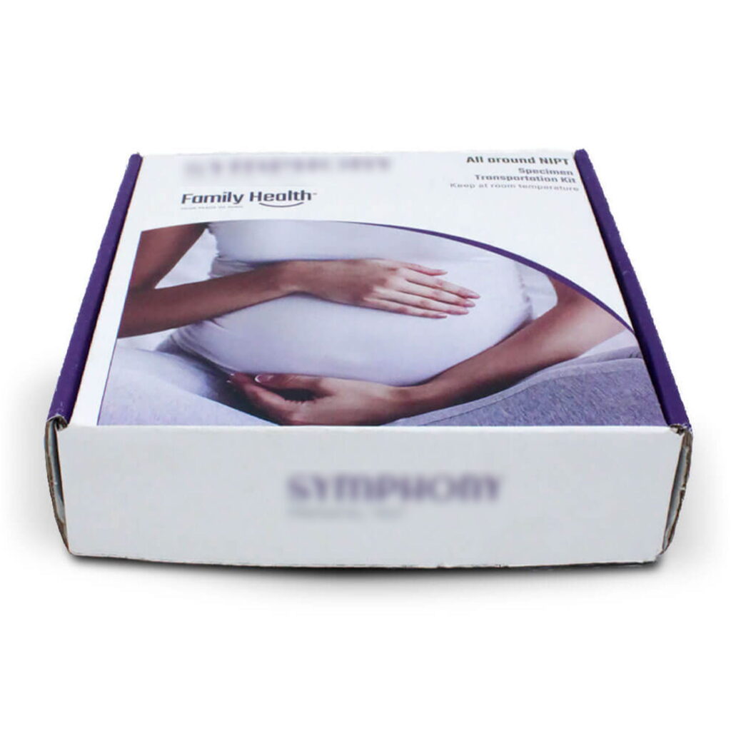
🛑 Mistake: A visual that communicates nothing.
No emotion, no identity, no message.
A design that just “informs” without creating atmosphere, context, or feeling — isn’t a design that sells.
➡ Feels generic
➡ Looks amateur
➡ Destroys brand trust
✅ Solution: Great packaging immediately tells the customer who you are — before they read a single word.
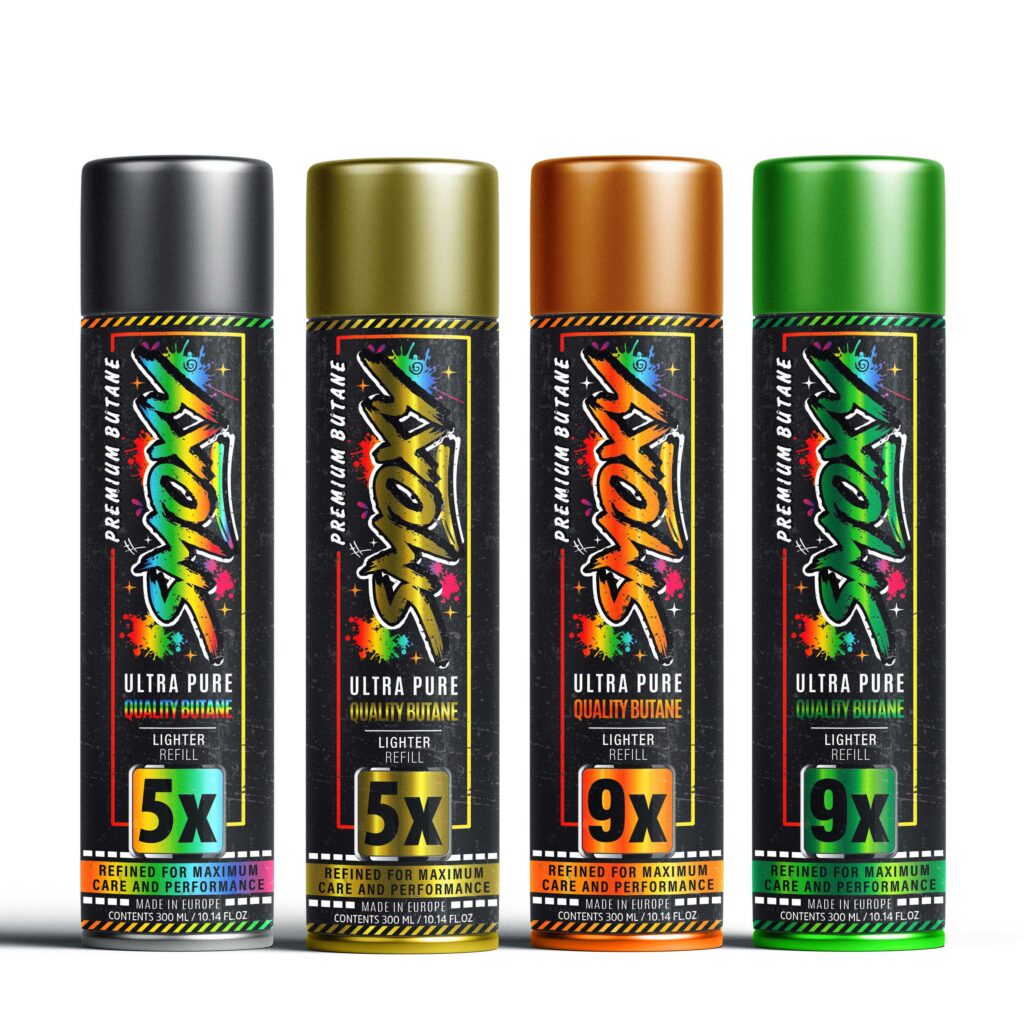
🎯 A Brand Must “Hit the Mark” — For the Right Audience
🛑 Mistake: Packaging that tries to appeal to everyone ends up appealing to no one.
✅ Solution: Every design must speak clearly to a defined persona.
➡ Is it a young, urban male?
➡ A premium female audience looking for elegance?
➡ A family with kids?
➡ A wine lover with refined taste?
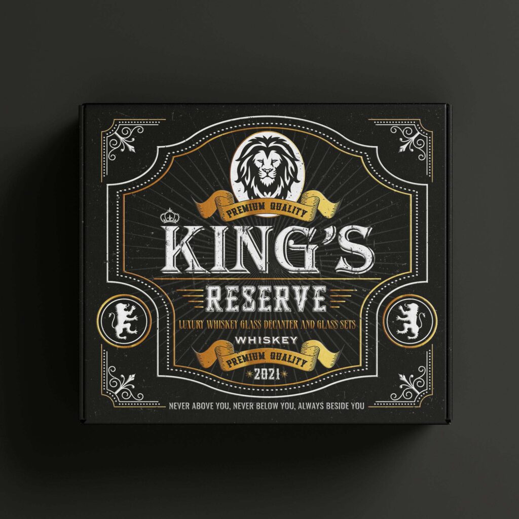
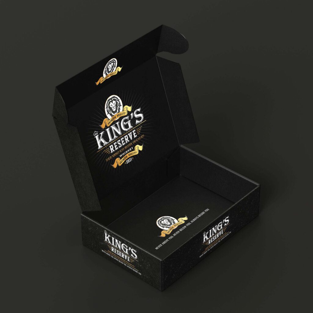
Our design for King’s Reserve communicates luxury, quality, and heritage — without saying a single extra word.
⚙️ Design Must Be Functional — Not Just Beautiful
🛑 Mistake: Packaging that’s confusing to open, lacks usability, or doesn’t prioritize clarity.
✅ Solution: A perfect balance between aesthetics and function.
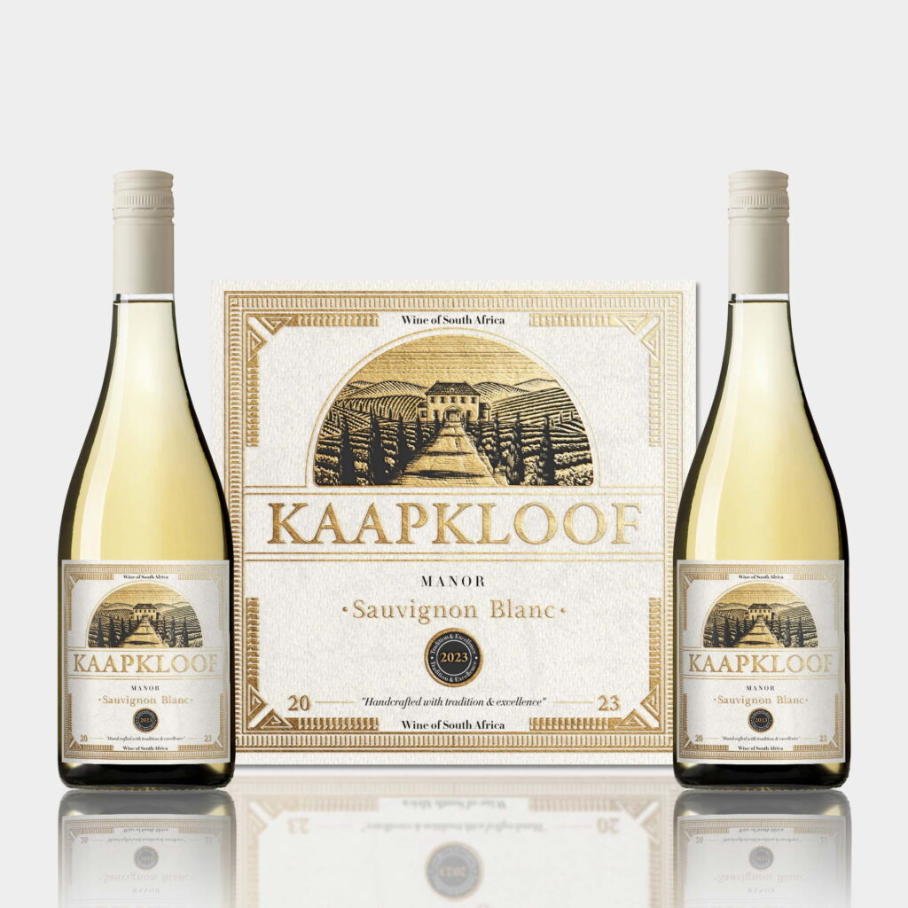
Our wine packaging for Kaapkloof shows a carefully structured layout, readability, and elegant information hierarchy — without sacrificing design.
This applies to supplements, cosmetics, tech, and food — form must follow function.
✨ Details Make the Difference Between Ordinary and Premium
🛑 Mistake: Flat, lifeless packaging with no depth, texture, or visual drama.
✅ Solution:
➡ Gold or copper foil
➡ Embossed printing
➡ Matte vs glossy contrast
➡ Tactile surfaces that beg to be touched
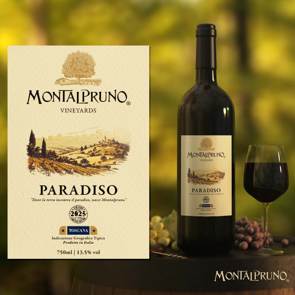
Our work on the Montalpruno – Paradiso wine label uses illustration, texture, and warm light to evoke heritage, nature, and luxury — all at once.
🛍 Packaging Must Look Great in Context
(on the shelf, in hand, on e-commerce platforms)
🛑 Mistake: A design that looks good in a PDF — but fails in real-world presentation.
✅ Solution:
➡ Test visuals in mockups and real environments
➡ Show packaging in shelf context
➡ Demonstrate consistency across product lines
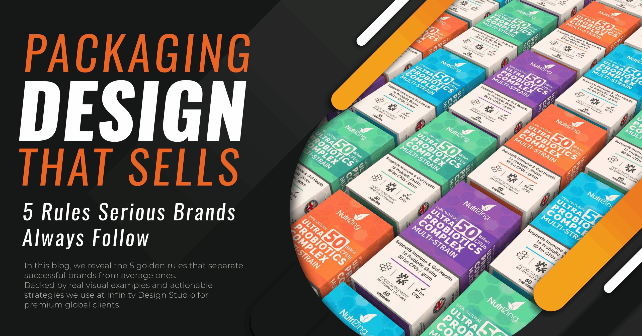
Our design for NutriZing showcases vibrant colors, clear segmentation, and visual consistency that dominates the shelf.
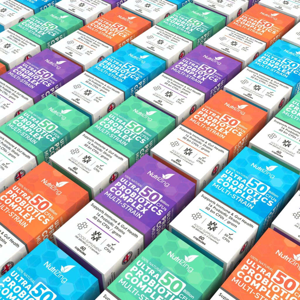
🔚 Conclusion: Packaging Is Your Silent Salesperson
✔ If it grabs attention — it sparks interest
✔ If it tells a story — it builds identity
✔ If it’s functional — it earns trust
✔ If it looks serious — it builds a brand
At Infinity Design Studio, we believe your packaging should make your product look like it already belongs with the giants, even if your brand is just getting started.
🔗 👉 See how we built a powerful visual identity for e-commerce products:
➡️ BARB THE BUILDER – BODYGUARD BACKPACK & TACTICAL PEN
➡️ KAAPKLOOF MANOR – LUXURY WINE LABEL DESIGN
➡️ MEAL 2 GO – PACKAGING REDESIGN FOR A NUTRITIOUS ON-THE-GO DRINK
➡️ VITAL COLON DETOX – MODERN LABEL DESIGN FOR A PREMIUM SUPPLEMENT BRAND
➡️ BRAUEREI 2572 – PREMIUM BEER LABEL DESIGN
➡️ HERO – REBRANDING AND PACKAGING REDESIGN FOR E-LIQUIDS
➡️ KORYO – SCHISAN DRA BERRY HERBAL TEA
➡️ ACCENTRA – SPRING/SUMMER TOILETRIES COLLECTION
➡️ PEAK PRO GEAR – TACTICAL BRANDING & E-COMMERCE STRATEGY
➡️ ZALDERAN – COMPREHENSIVE BRANDING & VISUAL IDENTITY FOR AN OUTDOOR BESTSELLER
➡️ KÍTCHANT – PREMIUM PACKAGING & VISUAL IDENTITY FOR MODERN KITCHENS


