Tourane & CO.
CREATING A DISTINCTIVE VISUAL IDENTITY FOR A PREMIUM BRAND
COMPANY - TOURANE & CO.
Client
Tourane & Co.
Info
Industry: Fashion
Market: USA, EU, Global (Premium Lifestyle Segment)
Project Type: Branding, Visual Identity, Logo Design,
Packaging, Digital Assets
Products
High-end Jewelry & Handbags for
Smartwatches and Fitness Trackers
Barb The Builder is a bold lifestyle brand blending functionality with personal security . Their products are designed for modern consumers who value style, preparedness, and innovation . This case study showcases a full branding system tailored for Amazon success, built around real-world use cases, technical highlights, and visual storytelling.
Exclusive Visual Identity:
A premium brand needs a visual identity that speaks luxury . For Tourane & Co. , we created an elegant and timeless design that reflects its exclusivity and prestige . Carefully chosen colors, typography, and design elements ensure a sophisticated and impactful brand presence.
The Power of First Impressions:
First impressions define a brand. Tourane & Co. required a design that instantly conveys luxury and trust . With refined typography , a sleek color palette , and an elegant logo , we crafted a bold yet sophisticated identity that captivates from the first glance.
Brand Consistency:
A strong brand thrives on consistency . We developed a cohesive system ensuring uniformity across all platforms —business cards, digital assets, and social media templates— reinforcing Tourane & Co.’s credibility and premium positioning.
Client’s Problem & The Challenge:
THE NEED FOR A NEW IDENTITY
The previous visual identity did not fully reflect the brand’s exclusivity and high standards .
The Client Wanted:
- A more modern and sophisticated design approach.
- A clear differentiation from competitors through visual elements .
- A consistent brand identity across all communication channels.
- An exclusive design that conveys luxury, quality, and authenticity .
Achieving these goals required a strategic design approach that combined aesthetics, functionality, and brand recognition .
Solution:
EXCLUSIVE AND DISTINCTIVE DESIGN
To meet the client’s requirements, the design process was structured into several key phases:
- 1. Research and brand analysis:
- In-depth analysis of brand values, competitors, and market trends.
- Identification of key visual elements that would ensure differentiation.
2. Concept development and selection of key elements:
- Creating an elegant and sophisticated typography —the handwritten “ T ” emphasizes femininity and refinement, while the “ Tourane & Co. ” typography ensures a professional and timeless look.
- Colors that reflect luxury and exclusivity — dark neutral shades symbolize sophistication , while light neutrals provide freshness and clarity.
- A magenta accent as a symbol of energy and modernity , creating a striking contrast on dark backgrounds.
- A minimalist and impactful design that leaves a strong visual impression and allows for easy application across different materials.
3. Finalization and technical adaptation:
- Optimization for both digital and print materials.
- Adaptation to different formats and platforms.
- Implementation across all brand communications, including business cards, letterheads, labels, and promotional materials.
INSTAGRAM TEMPLATE SAMPLES
To ensure versatility and adaptability across different applications, the Tourane & Co. visual identity is designed to maintain brand recognition and clarity in diverse digital settings.
Dynamic Visual Templates
- The primary design style for Instagram posts, capturing elegance and energy.
- Best suited for high-contrast visuals to grab attention.
- Retains the brand’s signature pink, black, and white color scheme.
Minimalist Storytelling Layouts - Used for clean, sophisticated designs, ideal for premium branding.
- Perfect for timeless, monochrome campaigns with a luxury feel.
- Ensures strong brand presence while keeping a refined, elegant layout.
Design Principles - Every template follows a cohesive brand aesthetic , ensuring consistency across social media platforms .
- Strategic placement of text and graphics creates a balance between elegance and impact .
- Contrast and bold typography enhance visibility and engagement .
INSTAGRAM HIGHLIGHT COVER ONLINE ICONS
To ensure versatility and adaptability across digital platforms , the Tourane & Co. highlight icons are designed to maintain brand recognition and clarity while enhancing the user experience .
Branded Highlight Icons
- Designed for a clean and modern Instagram presence.
- Best suited for profile organization, ensuring visual harmony.
- Uses the brand’s signature pink, black, and white for consistency.
Minimalist Icon Set - Created for easy navigation and quick identification of key sections.
- Perfect for e-commerce, promotions, and social engagement.
- Ensures a cohesive brand experience across all digital interactions.
Design Principles - Each icon is tailored to reflect the luxury and innovation of the brand
- Consistent spacing and proportions maintain a refined aesthetic.
- High contrast and simple linework ensure clarity across different screen sizes.
MAIN LOGO VERTICAL
The Tourane & Co. vertical logo is a key element of the brand’s identity, offering strong recognition and visual harmony across all applications. Its vertical alignment provides versatility, ensuring an elegant and balanced appearance in compact spaces where a horizontal layout may not be suitable.
To maintain brand integrity and luxury appeal , the logo must always be applied correctly and consistently across all branding materials. Any distortion, modification, or misplacement of the logo may weaken its sophisticated presence and exclusivity.
- Precision in placement ensures clarity and elegance .
- Consistency in usage reinforces trust and professionalism .
- Visual balance strengthens the overall brand identity .
MAIN LOGO HORIZONTAL
The Tourane & Co. horizontal logo is a fundamental representation of the brand, ensuring visual balance and sophistication across various applications.
Designed for optimal readability and aesthetic appeal , this layout provides flexibility for wider formats, such as website headers, packaging, and corporate materials .
To uphold brand prestige and recognition , the logo must be used consistently and correctly across all branding materials. Any misuse, distortion, or modification may compromise its impact and weaken brand identity.
- Strategic placement ensures an elegant and balanced appearance.
- Uniform application enhances credibility and brand consistency.
- Refined alignment reinforces a luxurious and modern brand image.
MAIN LOGO MONO COLOR
The monochrome version of the Tourane & Co. logo embodies versatility and adaptability, ensuring the brand identity remains strong and recognizable across all media, even in black-and-white or grayscale applications.
This refined version maintains the brand’s elegance while offering a professional and timeless aesthetic.
Use Cases:
- Official documents such as invoices and contracts.
- Engraved or embossed branding on packaging and merchandise.
- Situations where full-color printing is not feasible.
Usage Guidelines:
- Ensure clear contrast for optimal readability.
- Avoid modifications that compromise the logo’s integrity and recognition.
- The monochrome version should align with the brand’s professional and luxurious image.
MAIN LOGO STRUCTURE
The Tourane & Co. logo is carefully structured to ensure visual balance, consistency, and recognizability across all applications. Each element is strategically positioned to maintain harmony and readability in both digital and print formats.
Key Structural Elements:
- The cursive “T” serves as a distinctive brand identifier , exuding elegance and sophistication while creating a strong visual impact.
- The typography is selected for clarity and professionalism , ensuring effortless readability across various sizes.
- Precise spacing and alignment follow strict guidelines to maintain a refined and polished brand presence.
Usage Guidelines:
- Maintain the proportions and alignment to ensure brand integrity.
- Respect the clear space around the logo to avoid visual clutter and maximize impact.
- Avoid stretching, distorting, or repositioning elements, as this can compromise the logo’s effectiveness.
MAIN LOGO TYPOGRAPHY STRUCTURE
The monochrome version of the Tourane & Co. logo embodies versatility and adaptability, ensuring the brand identity remains strong and recognizable across all media, even in black-and-white or grayscale applications.
This refined version maintains the brand’s elegance while offering a professional and timeless aesthetic.
Use Cases:
- Official documents such as invoices and contracts.
- Engraved or embossed branding on packaging and merchandise.
- Situations where full-color printing is not feasible.
Usage Guidelines:
- Ensure clear contrast for optimal readability.
- Avoid modifications that compromise the logo’s integrity and recognition.
- The monochrome version should align with the brand’s professional and luxurious image.
HORIZONTAL LOGO EXCLUSION ZONE
To maintain the clarity, impact, and legibility of the Tourane & Co. logo, an exclusion zone must be respected across all applications. This protected space ensures that no other visual elements interfere with the brand’s identity, preserving its elegance and prominence.
Guidelines for the Exclusion Zone:
- The minimum spacing around the logo is determined by the height of the cursive “T” in the logomark.
- No text, images, or graphic elements should enter this protected space.
- The exclusion zone applies to all formats, including print, digital media, and product packaging .
Why It Matters:
- Enhances brand visibility and recognition.
- Maintains a professional and refined presentation.
- Prevents visual clutter, keeping the logo as the dominant element.
MAIN LOGO COLOR VARIATIONS
To ensure versatility and adaptability across different applications, the Tourane & Co. logo is available in multiple color variations. Each version is carefully designed to maintain brand recognition and clarity in diverse settings.
Full Color Version
- The primary logo version used in most applications.
- Best suited for light backgrounds to ensure maximum visibility and contrast.
- Retains the brand’s signature pink, black, and white color scheme.
One-Color Version
- Used for monochrome applications , such as embossing, engraving, or single-color printing.
- Ideal for materials where full-color printing is not available.
- Ensures strong brand presence while maintaining legibility in simplified designs.
Choosing the right variation enhances the brand’s impact , ensuring consistency across all platforms.
LOGO VARIATIONS - HORIZONTAL AND VERTICAL
To maintain consistency and flexibility across different applications, the Tourane & Co. logo is available in multiple layout variations . These options ensure adaptability to different branding materials and spaces.
Vertical Logo
- The icon is placed above the brand name.
- Best for stacked layouts , social media profiles, and compact spaces.
- Ideal for applications that require a square format.
Horizontal Logo
- The icon is positioned to the left of the brand name.
- Works well for website headers, banners, and print materials where horizontal space is available.
- Ensures strong brand presence while maintaining clear readability across both digital and print.
LOGO BACKGROUND
Positive Logo Usage
- Used on light backgrounds (e.g., white or light gray).
- Ensures maximum readability and strong brand visibility.
Negative Logo Usage
- Designed for dark backgrounds (e.g., black or deep blue).
- Logo elements are adjusted to maintain contrast and legibility.
Other Backgrounds
- When placed on colored or image backgrounds, ensure sufficient contrast to maintain clarity.
- If needed, use a background color block or monochrome variations for better adaptability.
By applying the correct logo background variation , Tourane & Co. maintains a strong and professional brand identity across all digital and print platforms.
LOGO USAGE GUIDELINES
To maintain the integrity and consistency of the Tourane & Co. brand , it is essential to adhere to the following logo usage rules.
Do Not Resize or Change the Position
- The logomark and text should remain in their original proportions .
- Avoid stretching, shrinking, or repositioning elements, as this disrupts brand recognition .
Do Not Move Any Parts of the Logo
- The composition must remain unchanged.
- Do not separate, rotate, or rearrange any elements.
Do Not Alter the Spacing
- The distance between elements should remain as originally designed.
- Avoid compressing or expanding the spacing, as it affects visual balance .
APP ICONS
The Tourane & Co. App Icon is a compact and recognizable representation of the brand, designed for digital applications across mobile and desktop platforms.
Design & Adaptability
- Optimized for high visibility and clarity in various digital environments.
- Maintains the brand’s core identity while ensuring scalability across different screen sizes.
Color Variations & Application
- The app icon is available in multiple color schemes to adapt to various backgrounds.
- Ensures versatility and brand consistency across light, dark, and branded backgrounds.
LOGO COLOURS
Color plays a vital role in shaping the visual identity of Tourane & Co..
Each shade is carefully selected to reflect the brand’s elegance, sophistication, and trustworthiness across all platforms.
Primary Brand Colors
- White (#FFFFFF) – Represents clarity, simplicity, and transparency.
- Deep Black (#231F20) – Symbolizes strength, sophistication, and reliability.
- Signature Pink (#EB0D8C) – Expresses boldness, creativity, and premium appeal.
Application & Consistency
- These colors must be applied consistently across all branding materials, digital assets, and printed content.
- The signature pink serves as the primary brand color, with black and white providing contrast and balance.
- Maintaining color consistency strengthens brand recognition and ensures a unified, professional presence.
USED TYPOGRAPHY
Primary Typeface: Gill Sans MT Light
- Selected for its clean and timeless design.
- Used forheadlines, key statements, and emphasis to ensure a refined, professional look.
Supporting Typefaces
- Angeleobardo – Adds character and uniqueness for distinctive brand elements.
- Butterfly – A cursive script that enhances the luxury and exclusivity of the brand identity.
Typography Guidelines
- Maintain consistent letter spacing and sizing for optimal readability.
- Use Gill Sans MT Light as the main typeface for professional and modern brand communication.
- Apply bold and regular weights strategically to create a clear text hierarchy.
By following these typography principles , the brand achieves a harmonious, recognizable, and premium visual identity.
LOGO WEIGHTS & STYLES
Typography plays a vital role in shaping the Tourane & Co. brand identity. The strategic use of font weights and styles ensures clarity, hierarchy, and visual harmony across all brand communications.
Font Pairing:
- FONT BOLD – Used for strong emphasis, headlines, and key messages.
- FONT REGULAR – Applied to supporting text , ensuring a balanced, structured design.
Typography Structure:
- Headline Font: FONT BOLD – Grabs attention and reinforces brand authority.
- Subheadline Font: FONT REGULAR – Provides structure and a professional aesthetic.
- Paragraph Font: FONT LIGHT – Enhances readability with a clean, minimalist appearance.
By maintaining proper font pairing, tracking, and leading, we establish a consistent and professional brand presence that enhances recognizability and trust across all platforms.
BUSINESS CARD AND CARD HOLDER DESIGN
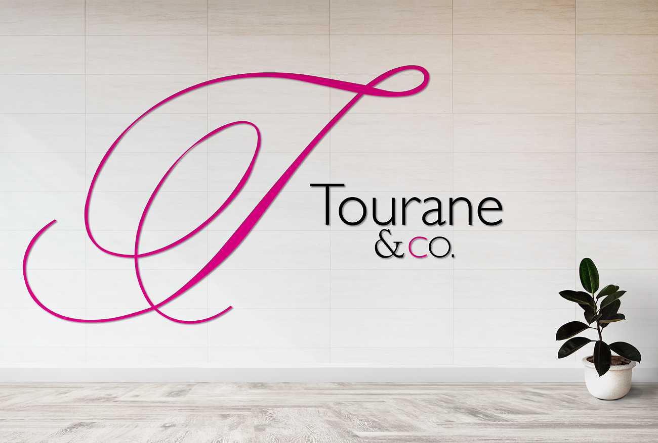
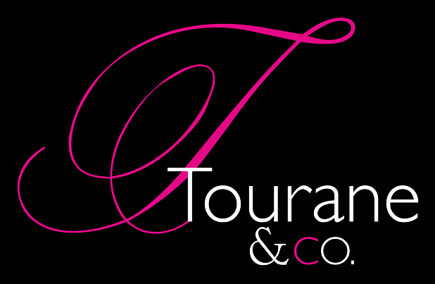
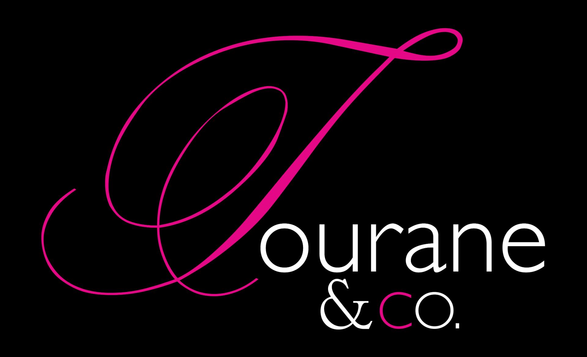
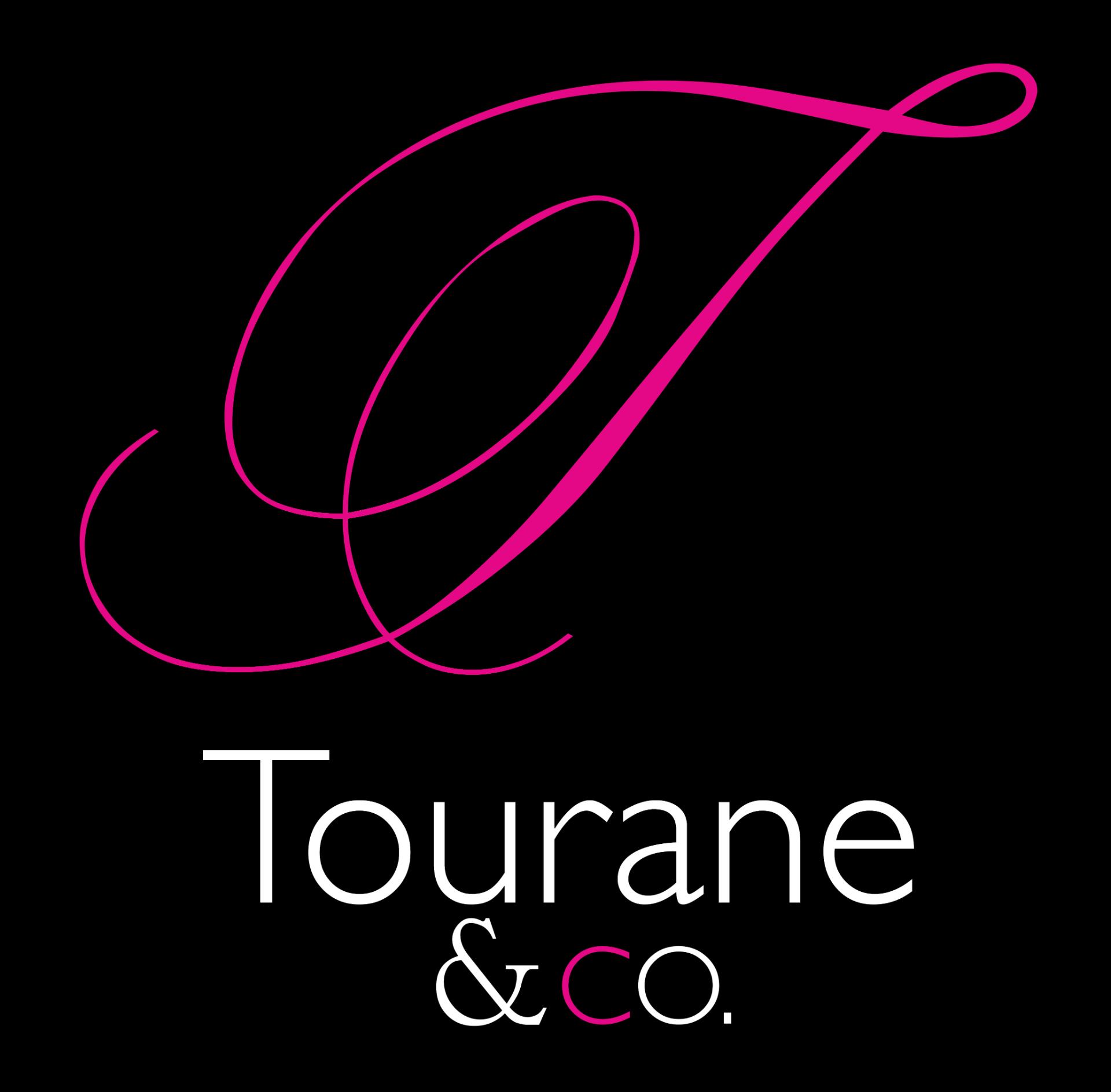
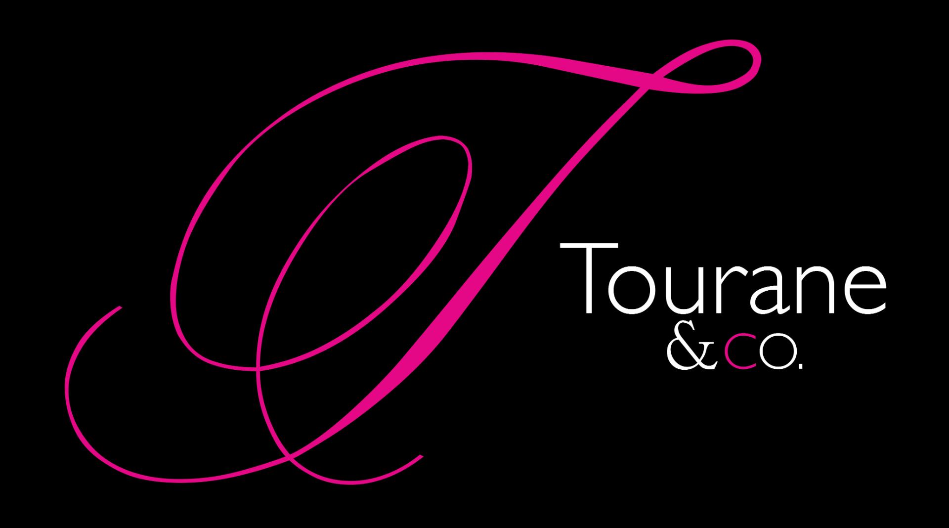
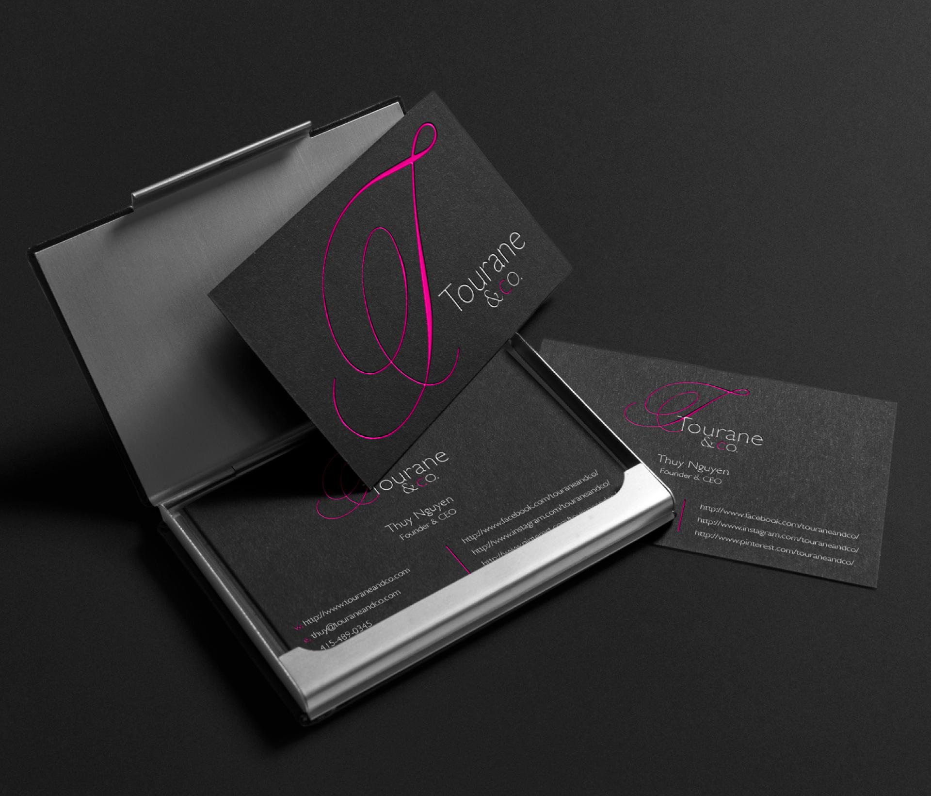
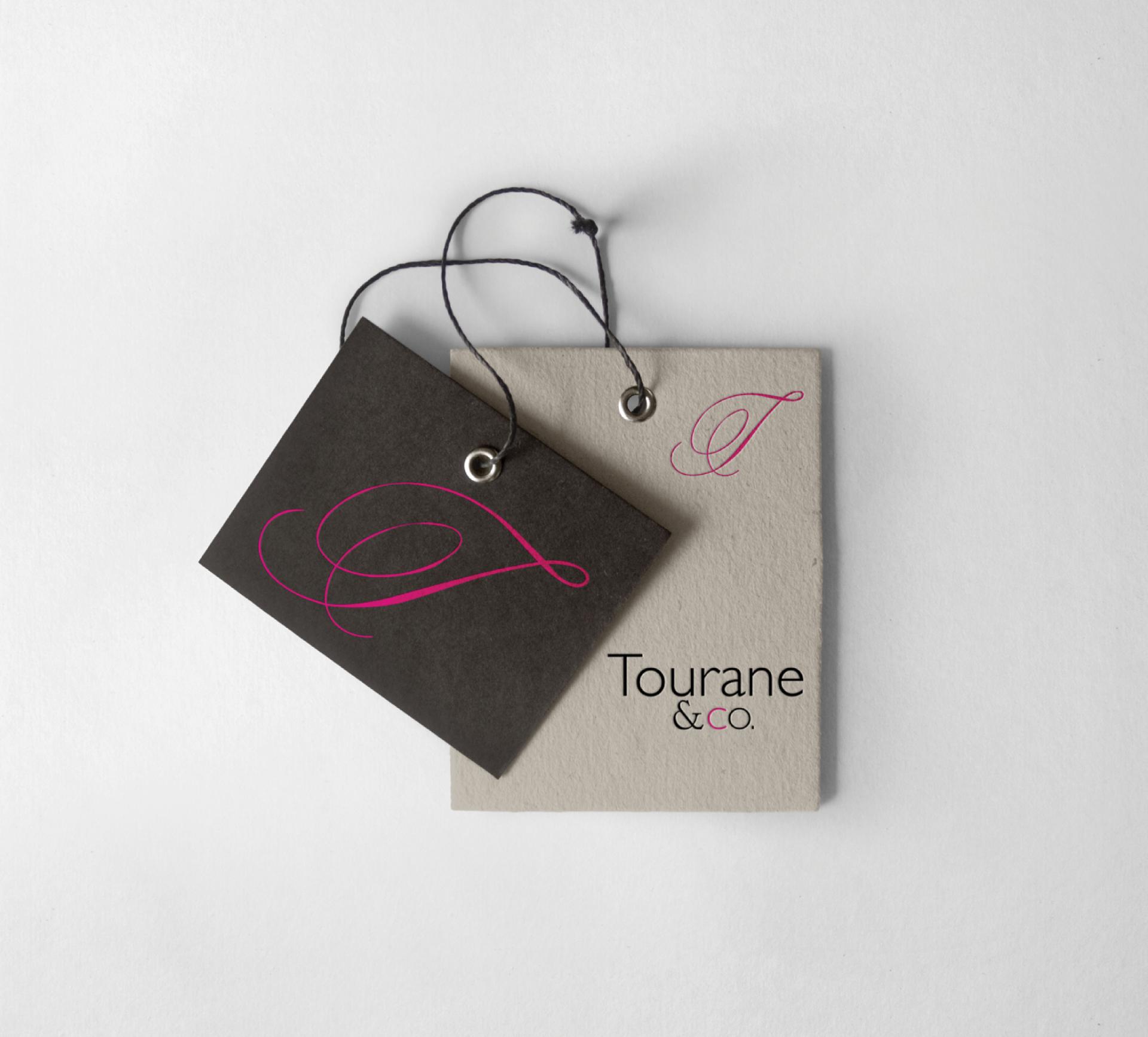
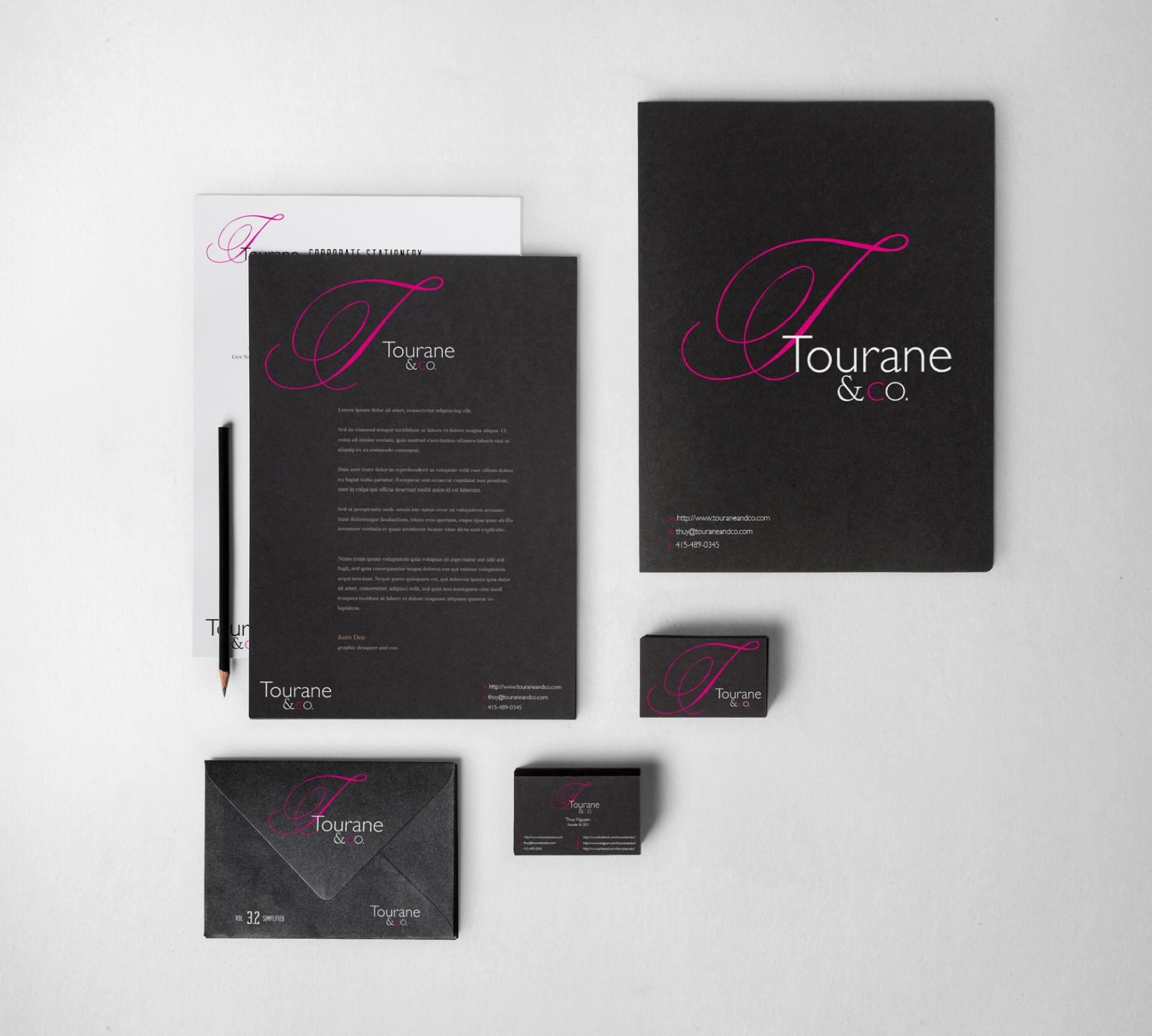
A business card is more than just contact information—it’s a reflection of your brand . The Tourane & Co. business card design embodies luxury, confidence, and exclusivity , ensuring that every introduction leaves a lasting impact.
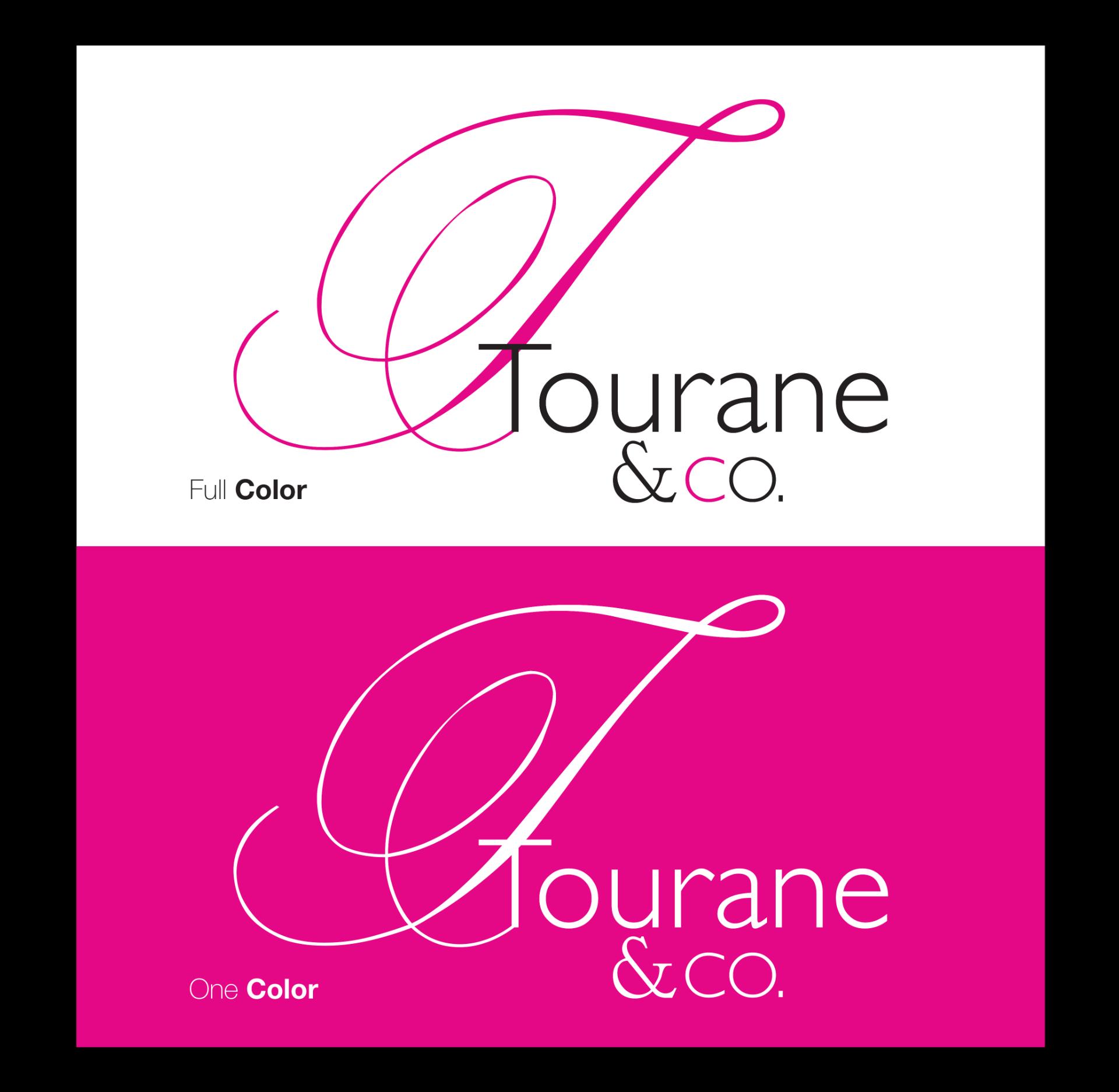
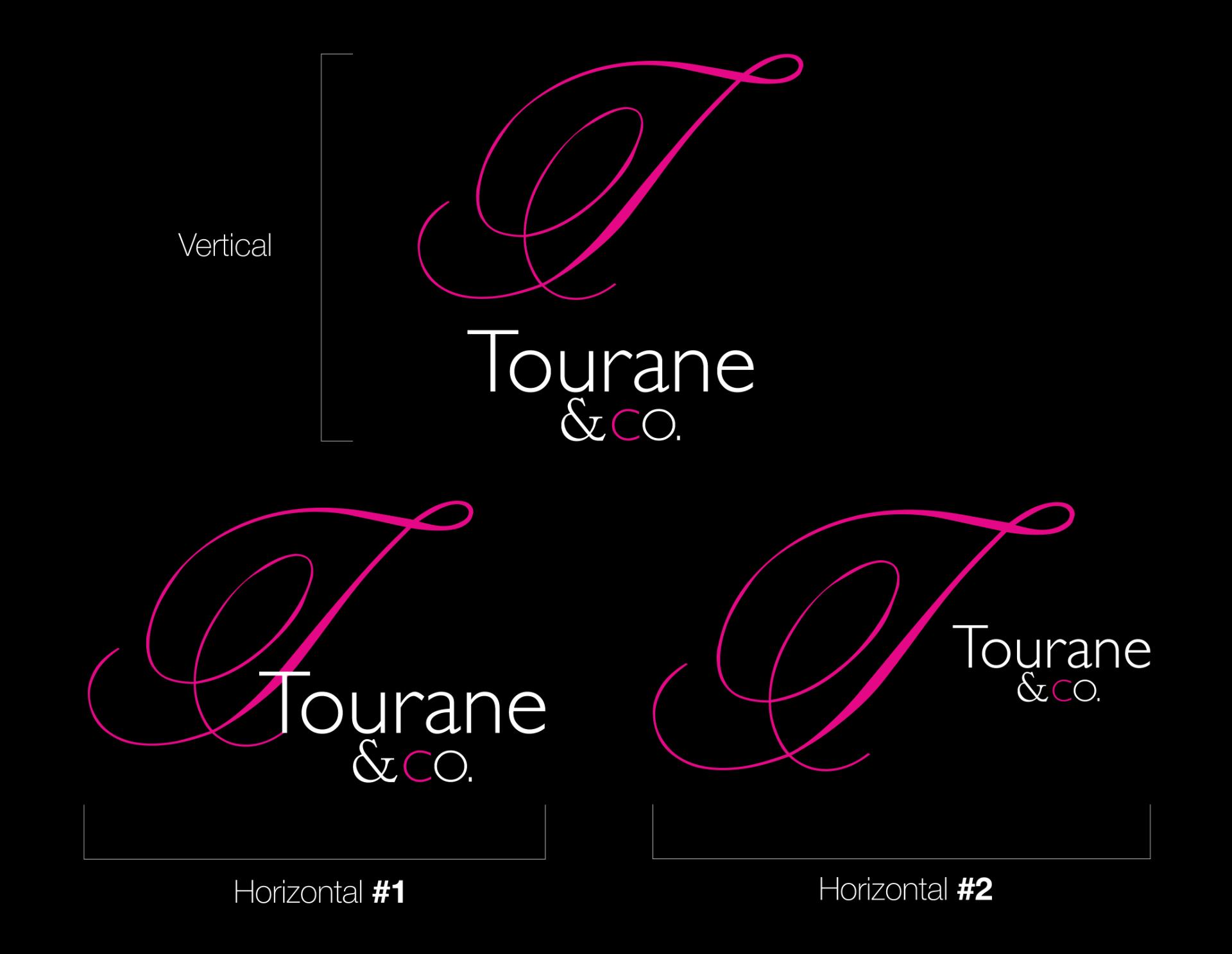
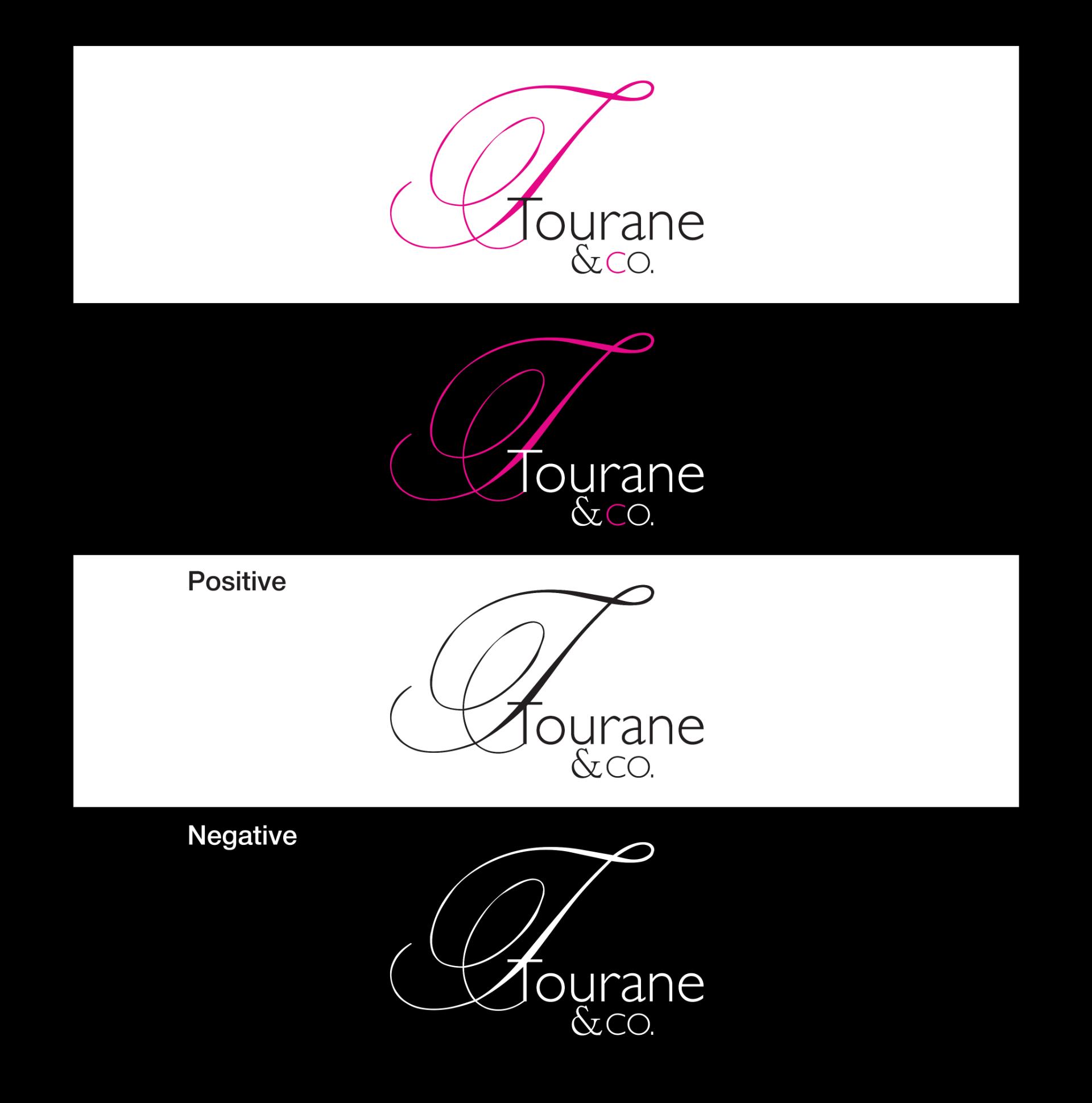
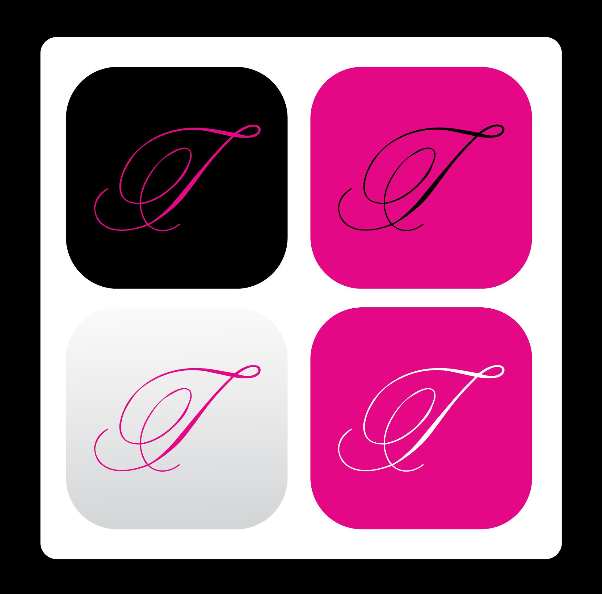
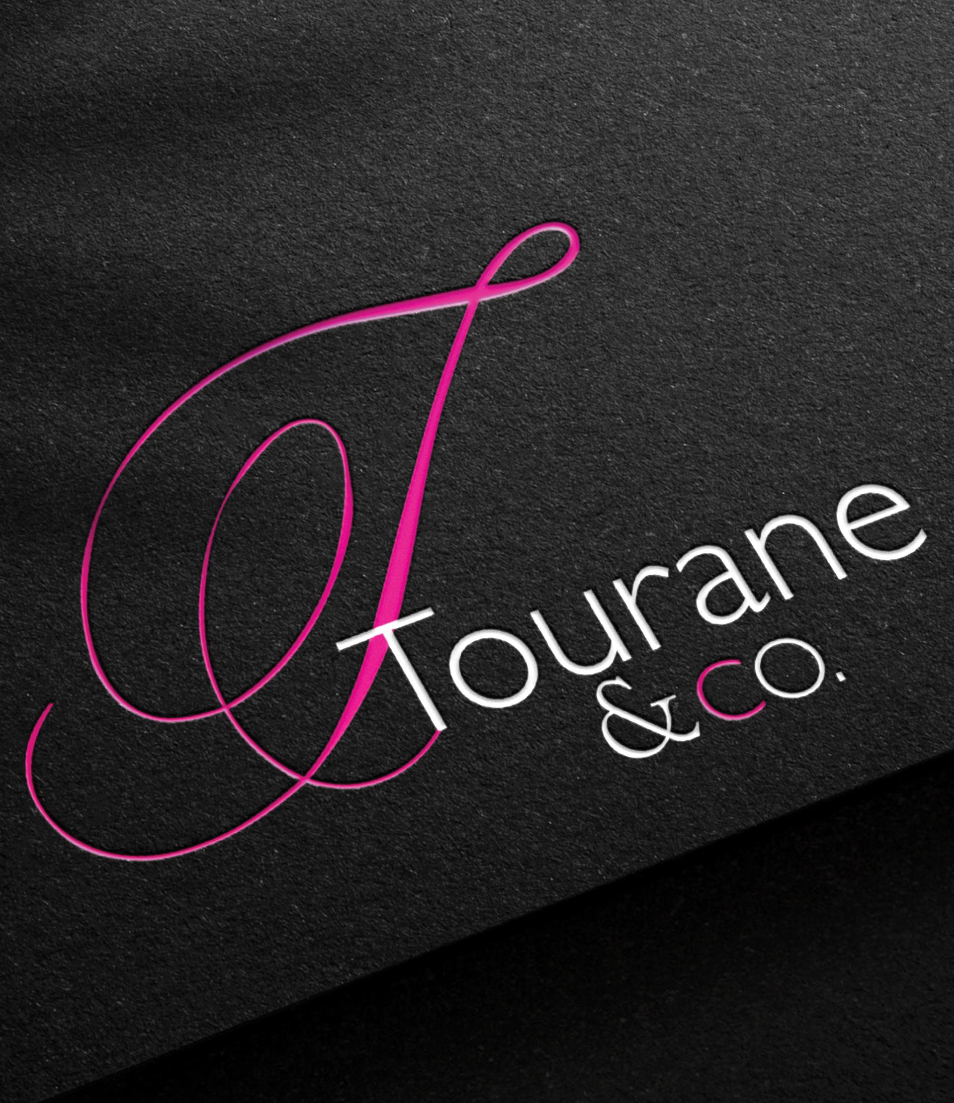
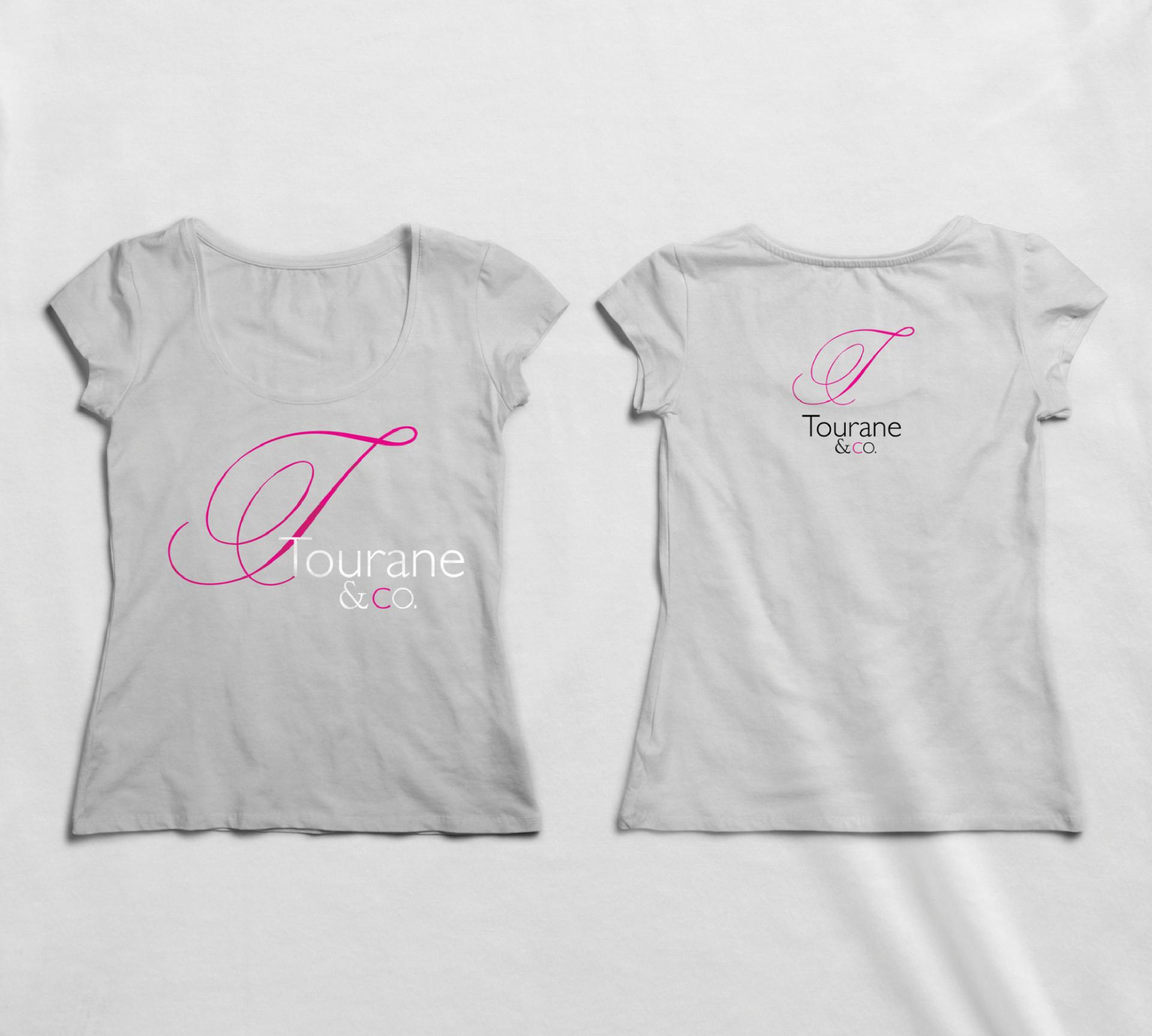
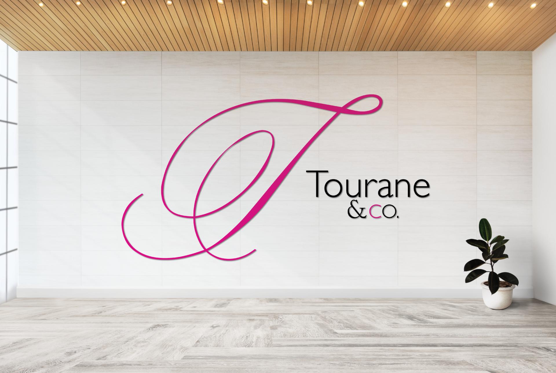
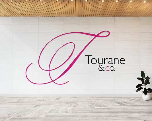
- Sophisticated Black & Magenta Contrast
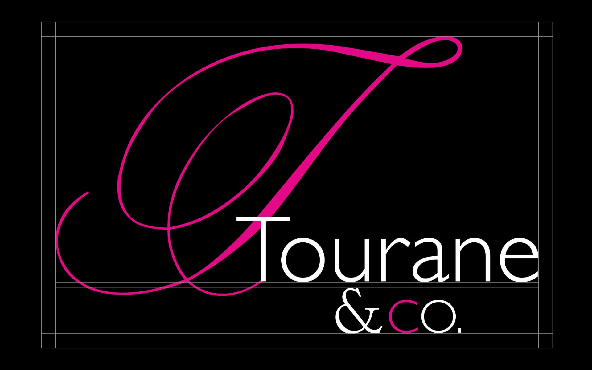
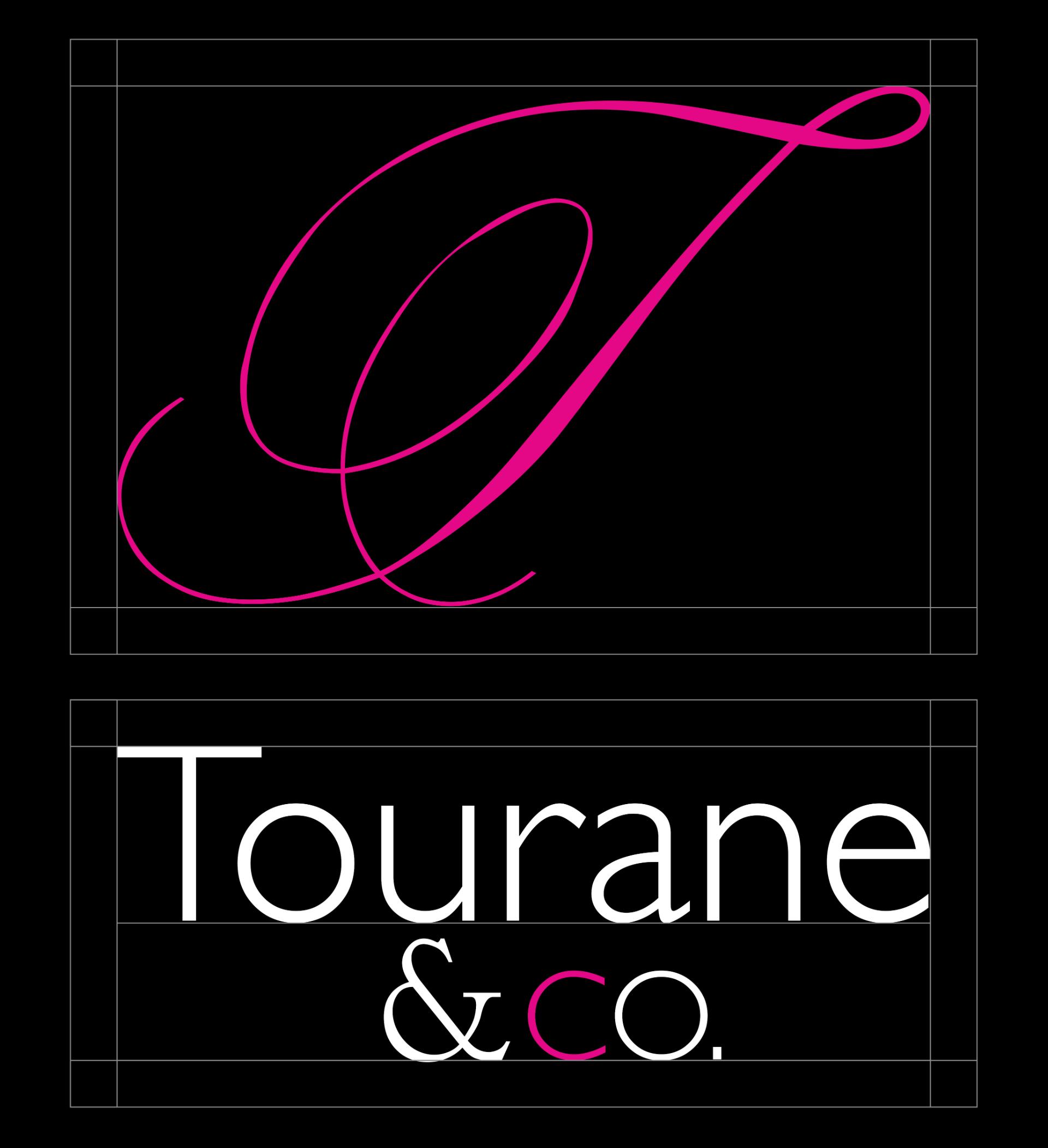
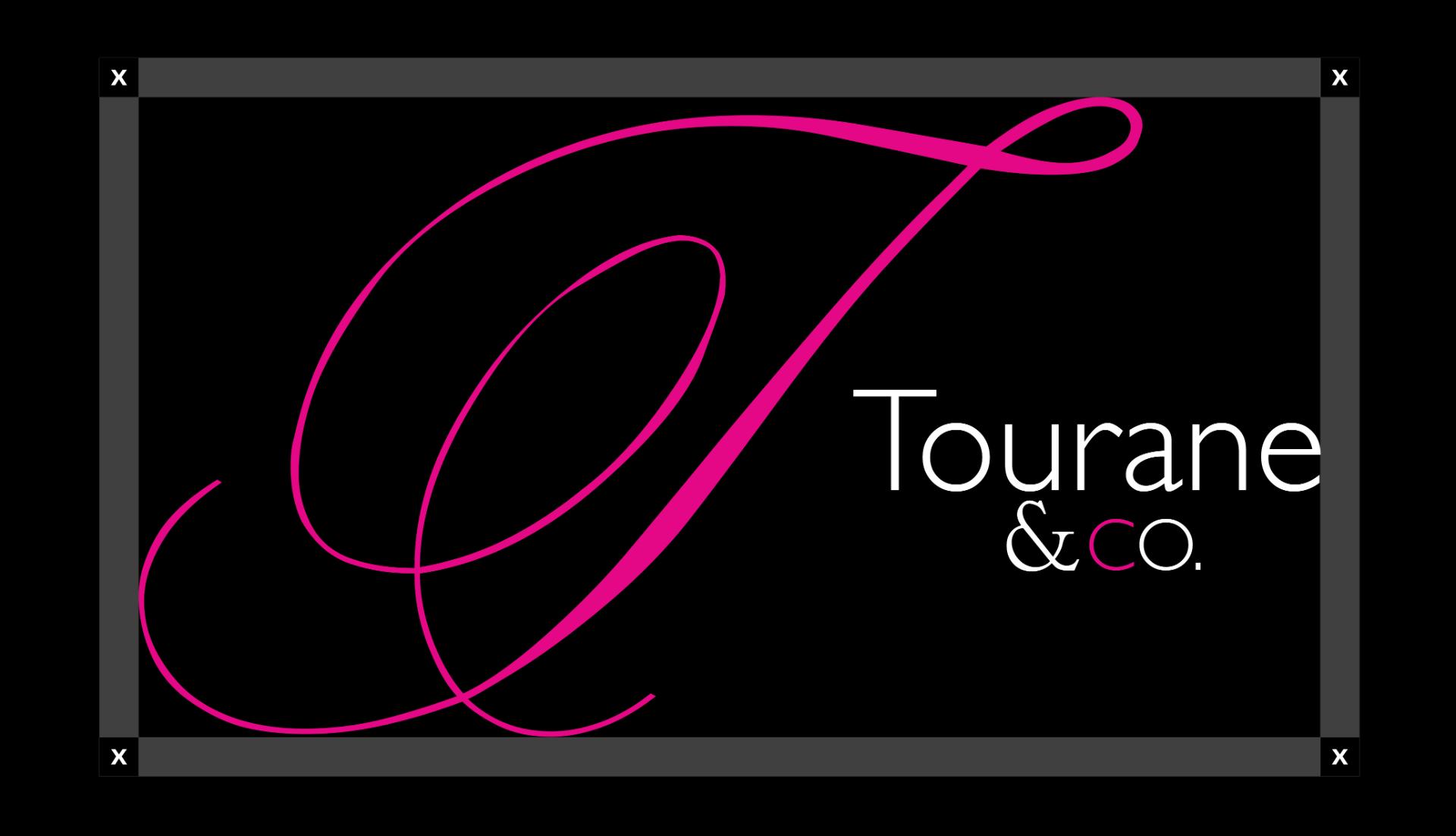
The deep black background symbolizes elegance and professionalism , while the vibrant magenta accents highlight the brand’s bold femininity.
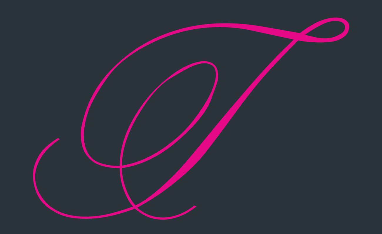
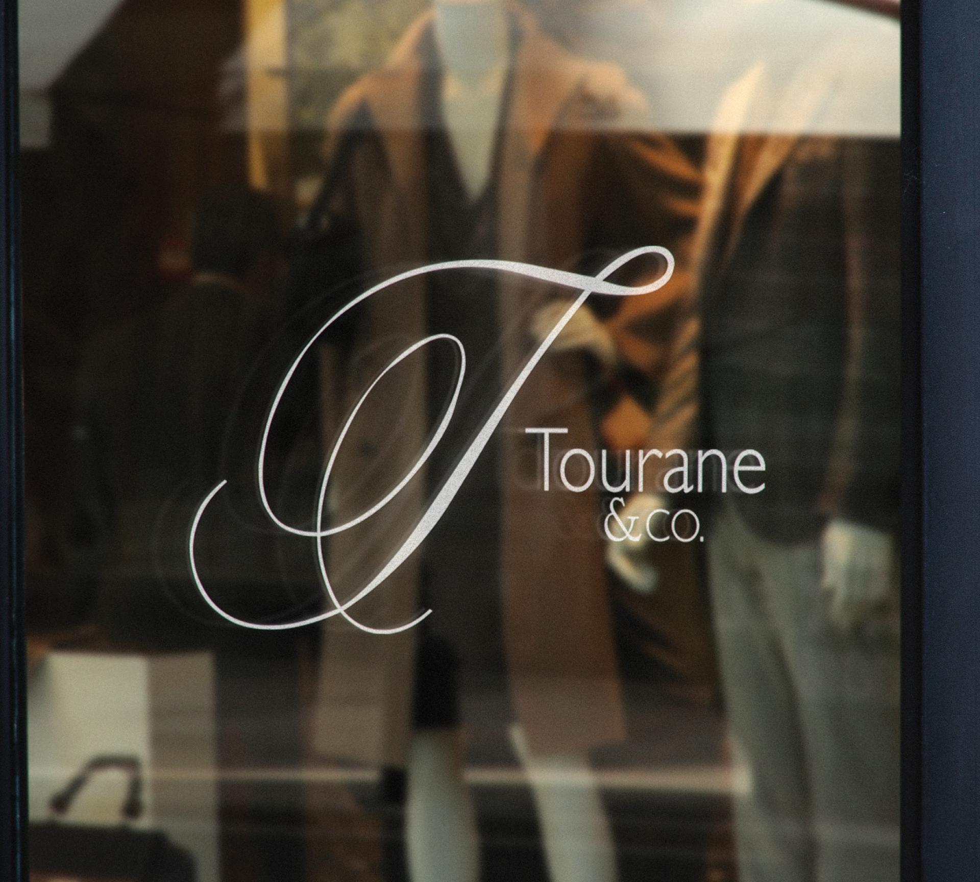
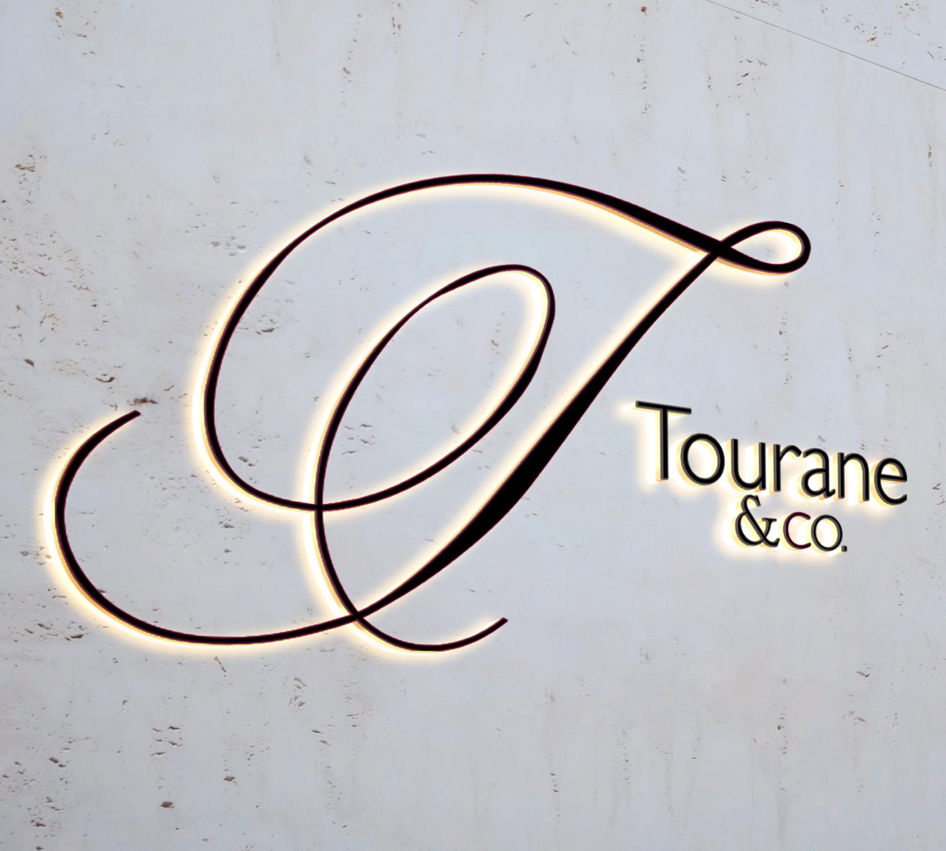
- Refined Typography & Design
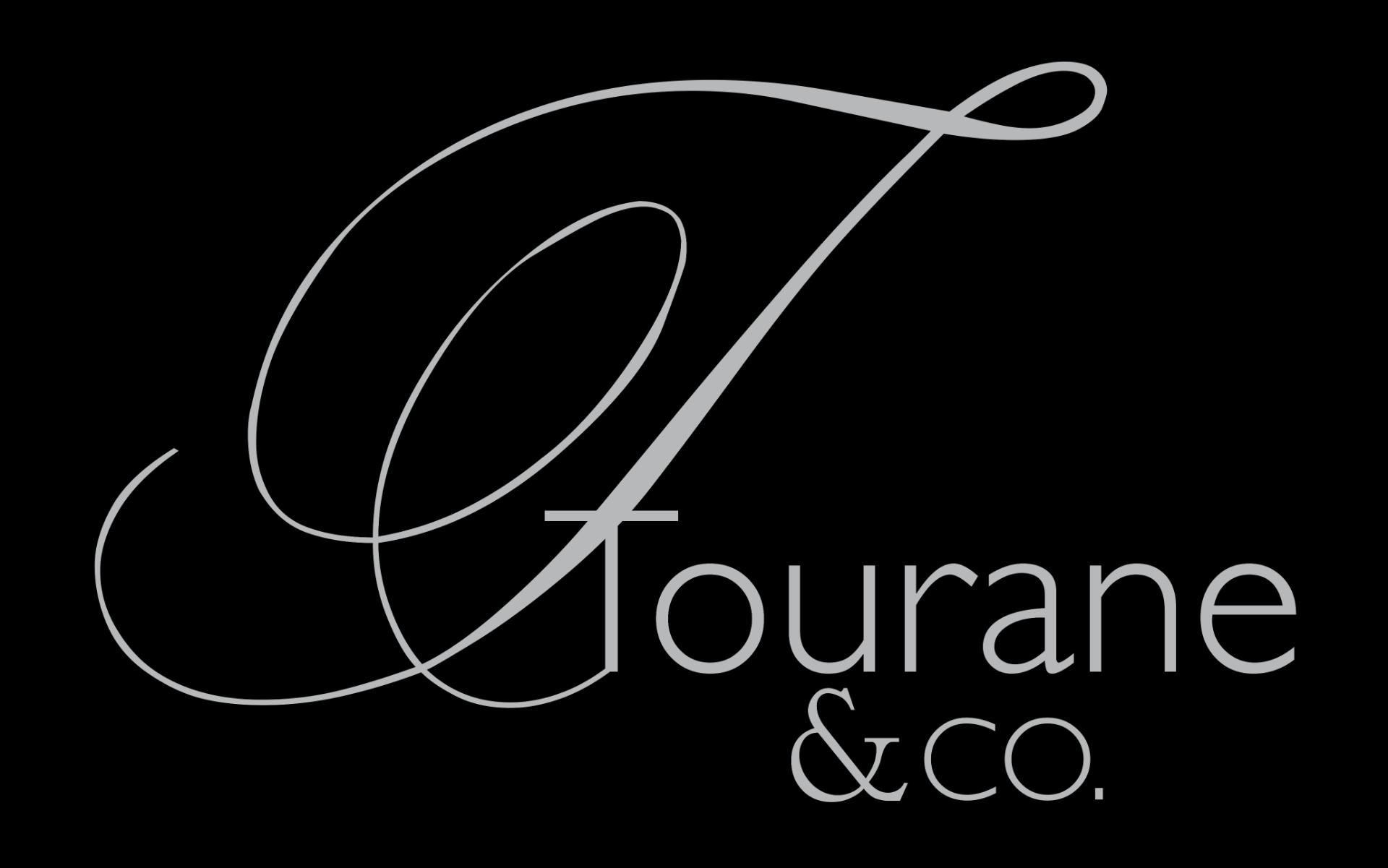
The graceful “ T ” in a signature script adds a touch of sophistication and fluidity , while the sleek, modern typography ensures clarity and readability.
- Premium Material & Finish
Embossed details and high-quality cardstock create a tactile experience , reinforcing the brand’s commitment to excellence.
- Metallic Card Holder
A polished metal case adds a touch of exclusivity , making the business cards feel as valuable as the brand itself.


Results:
Successful Rebranding and Enhanced Brand Image
The new visual identity resulted in:
A more elegant and recognizable brand.
Increased interest from the premium audience.
Clearer positioning in the market.
A cohesive visual identity across all brand materials.
Strengthened brand perception as luxurious and exclusive.
Attraction of customers willing to invest in premium design.
Conclusion:
Visual Identity as The Key to Success
his project demonstrates how strategic design can significantly enhance a brand’s positioning in the premium segment. Through research, analysis, and careful crafting of visual elements, a brand identity was created that ensures long-term recognition and exclusivity.
If you want to elevate your brand with premium, distinctive, and strategically designed visuals, contact Infinity Design Studio today.
IMPACT & METRICS
Higher Social Media Engagement
The new identity increased interaction and shares across Instagram and Pinterest.
Brand Recognition
in Consumer Survey
High recall rate from target audience within first 3 weeks post-launch.
Consistency Across
All Touchpoints
Visual identity maintained across packaging, digital, print, and social media.
Launch Success in 3 International Markets
Successfully launched in USA, Germany, and France with positive feedback.
Increase in Direct-to-Consumer Sales
Strong brand image directly influenced purchasing behavior.
Increase in Premium Perception Among Target Audience
Survey participants described the brand as elegant, exclusive, and professionally elevated, confirming the visual identity’s alignment with luxury expectations.
Proud Clients
The Team Behind the Project - Led by Creative Director
The Team Behind the Project:
Every Infinity Design Studio project is personally led and directed by Filip Narančić – Founder & Creative Director.
With a unique blend of creativity, strategy, and precision, Filip ensures that each project delivers premium quality, timeless design, and measurable impact.
Infinity Design Studio operates with a boutique approach, where every detail is carefully crafted, and each solution is tailored to the client’s vision and market demands. By combining multidisciplinary expertise with hands-on leadership, the studio transforms every project into a distinctive brand experience.
Filip Narančić
Founder & CEO – Infinity Design Studio
SPECIALIZED IN:
Short biography
Born on June 24, 1982, in Valjevo, Filip Narančić turned his passion for architecture and design into a thriving career. He graduated from the Faculty of Technical Sciences in Novi Sad, Department of Architecture and Urbanism. During his studies, he launched a pilot project that later evolved into today’s Infinity Design Studio.
Testimonials
I really enjoyed working with Filip. He is very hardworking, and the service is truly excellent!
AromapetD
AROMAPET
Filip is a very enthusiastic designer, proactively looking for various solutions and flexible in terms ofworking and communication. I am very pleased with the final design and our teamwork!
JaanP
LUCIDKITCHEN
Filip has done excellent work for our project! He’s quick and delivers great designs. Very attentive, very easy to work with, listens to and understands what I am trying to get done immediately. Thanks! Happy to work with him again!
Maike.Rummich
A&O HOTELS and HOSTELS
EXCELLENT!!! Filip is the best designer and even the best contractor I have ever worked with. Hecreated an awesome design and worked with me tirelessly from its greatness to its perfection. Now I havethe most gorgeous packaging on the market, and all my competitors are screwed. Hooray :-)!
Jakub.Novotny7
COPPER GEMZ
We needed a new label for our maple syrup. From start to finish, Filip was right on top of the design, anychanges we requested, and was extremely good at communicating. We loved his style and highly recommend working with him!
The Gateway Farm
THE GATEWAY FARM
“Filip is an extremely talented designer. He was a pleasure to work with throughout this process. In addition to being very responsive, he was able to take a general idea and turn it into something we truly loved. Highly recommend!”
Jrossd
ECOMMDISTRIBUTION, ASHBROOK OUTDOORS
This designer’s professionalism and creativity are truly commendable. We’re delighted with his work andhighly recommend collaborating with him. His talent and dedication consistently deliver outstandingresults.
Harmouch.Fk
NUTRIVEG LAB
Filip was wonderful to work with! As a first-timer in product packaging design, I just asked for eye-catching packaging. He exceeded all of our expectations, and we highly recommend working with Filip – you won’t be disappointed!
Fatime.Perazic
TRIDENT POSEIDON
Excellent professional, quick service. We recommend working with him!
Moltres
BROMELIFE
This designer is AMAZING! I can’t believe how easy it was to work with him on all the changes we madeto our box. He was so positive and encouraging, with great design ability! Highly recommended!
XoginaU
Dr. P RX
Worked perfectly together and carried out extremely quickly with corrections and changes.
MarceQ
BRAUEREI 2572
I NEED MORE THAN 5 STARS TO RATE FILIP. His relentless commitment and creativity made thisproject a dream come true. Highly recommended!
Wong.Jameson
UNO DOGGO
Explore More Stunning Work
Let’s Create a Premium Design Experience
Infinity Design Studio is ready to turn your ideas into powerful results. Share your vision with us and let’s begin building something extraordinary together.