

FROM BRAND IDENTITY TO DIGITAL BEHAVIOR
A Mobile App Becomes A Brand Through The Way It Feels To Use.
Every screen, transition, label, icon, and feedback state contributes to whether the experience feels clear, coherent, and trustworthy.
A mobile app is not simply viewed. People enter it, navigate through it, make decisions, wait for responses, and return expecting the experience to remain familiar.
This gives mobile app design a responsibility that extends beyond visual styling.
A logo can introduce identity. Color can create recognition. A polished interface can attract attention. But none of those elements is enough when users cannot understand where they are, what to do next, or whether an action has been completed.
In a strong mobile UX/UI system, brand identity and usability work together.
Interface hierarchy directs attention. Navigation creates orientation. Typography, color, and iconography establish continuity. Motion explains change. Feedback confirms action. Progress tracking makes repeated activity visible.
Consistency does not mean making every screen identical. It means giving different functions enough shared visual and interaction logic to feel like parts of one intentional digital product.
Power Life Script® brings together script creation, voice recording, composition and playback, content organization, library access, reminders, and visible progress. Each function requires a different interface structure, but the complete experience still needs to feel like one brand, one journey, and one connected environment.
The recording screen must clearly communicate an active state. The library must organize content without unnecessary complexity. Progress screens must present continuity without becoming overloaded. Navigation must connect those areas without forcing users to relearn the product.
Design alone cannot guarantee loyalty or retention.
But thoughtful mobile app design can reduce friction, clarify value, strengthen brand recognition, and create a more coherent foundation for continued user engagement.
A MOBILE APP DOES NOT BECOME A BRAND BECAUSE THE LOGO APPEARS ON THE SCREEN.
IT BECOMES A BRAND WHEN THE COMPLETE EXPERIENCE BEHAVES WITH THE SAME CLARITY, CHARACTER, AND PURPOSE.
FROM INDIVIDUAL SCREENS TO ONE CONNECTED EXPERIENCE
What Mobile App Design Must Achieve Before Engagement Can Grow
Orientation. Recognition. Flow. Feedback. Progress.
A strong mobile experience is not created by polishing isolated screens or adding more features.
It depends on whether every part of the product contributes to one continuous user experience—helping people understand where they are, recognize the environment, complete meaningful actions, trust the system’s response, and see how their activity develops over time.
Orientation gives users a clear sense of location and direction.
It answers the first questions inside every digital product:
Where am I?
What matters here?
What should I do next?
When orientation is weak, even useful features begin to feel more complicated than they are.
Recognition allows the brand to remain present beyond the logo.
Recurring color relationships, typography, iconography, spacing, navigation patterns, and screen structure create familiarity across different functions. The interface does not need to repeat one composition everywhere, but it must maintain enough shared logic to remain recognizable.
Flow connects individual actions into an understandable sequence.
Creating a script, recording it, organizing content, listening, browsing a library, and reviewing progress all require different decisions. Their value becomes clearer when the interface reveals the right action at the right moment.
Feedback makes the system’s response visible.
Recording states, countdowns, playback controls, selected options, and completed actions should be clear without requiring interpretation. Motion, text, and visual state changes are not decoration—they remove uncertainty from interaction.
Progress gives repeated activity a visible structure.
Streaks, reminders, records, and weekly activity can help users understand continuity, but only when the information remains clear, relevant, and easy to interpret.
These five dimensions depend on one another.
A visually consistent interface can still be difficult to navigate. A clear flow can still feel generic without a recognizable brand system. Motion can look polished while failing to explain what changed. Progress data can appear sophisticated while remaining confusing.
The five sections that follow examine these responsibilities through the Power Life Script® experience:
Orientation Before Exploration.
Brand System Before Screen Styling.
Flow Before Feature Count.
Feedback Before Uncertainty.
Visible Progress Before Return.
Together, they move the discussion beyond whether an individual screen looks attractive and toward a more important question:
Does the complete mobile experience help users understand what to do, recognize where they are, trust what is happening, and continue without unnecessary friction?
A STRONG MOBILE EXPERIENCE DOES NOT ASK USERS TO LEARN THE DESIGN.
IT USES DESIGN TO MAKE THE PRODUCT EASIER TO UNDERSTAND, EASIER TO TRUST, AND EASIER TO CONTINUE USING.
Power Life Script® — One Brand Experienced Across A Connected Mobile App System
WHY THIS EXAMPLE MATTERS
This overview brings together the central progress experience, the wider family of application screens, recurring visual categories, and the broader interface language within one coordinated presentation.
The example matters because a mobile product cannot be fully understood through one polished screen. Recognition emerges when different functions continue sharing the same hierarchy, palette, navigation structure, iconography, and interaction logic—allowing the user to move across the experience without feeling that every new feature belongs to a different product.
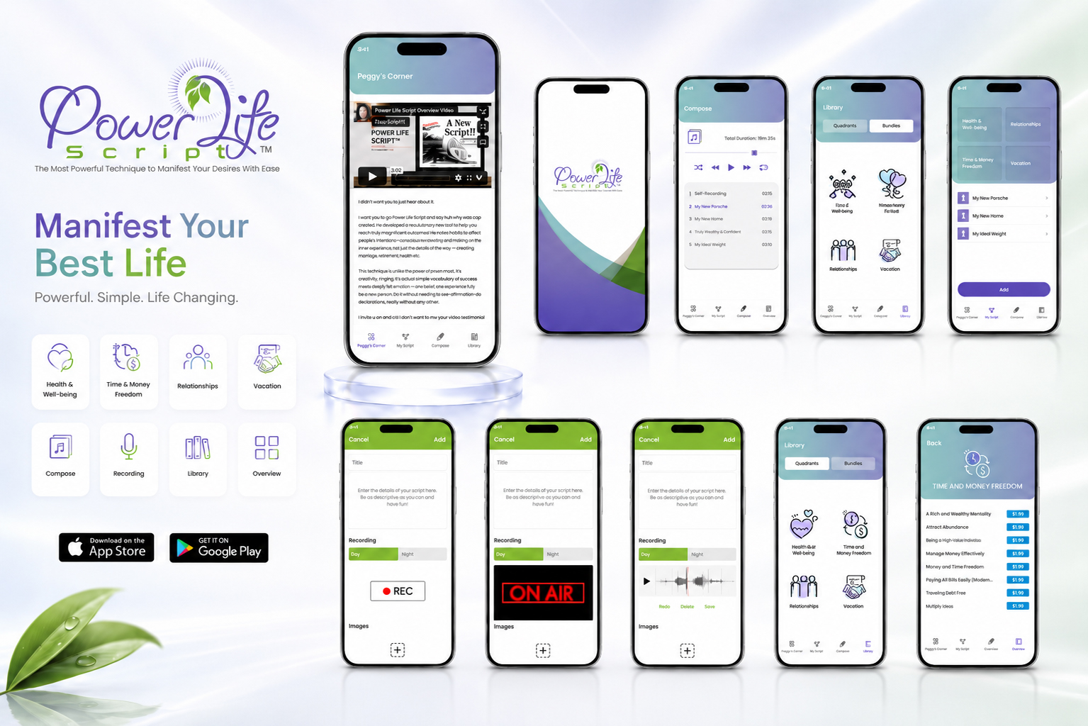
PROJECT OVERVIEW — A Coordinated Mobile Experience Built Across Identity, Interface Hierarchy, Functionality, Feedback, And Visible Progress.
01 —
ORIENTATION BEFORE EXPLORATION
WHY IT MATTERS
Before users can appreciate the features inside a mobile product, they first need to understand where they are, what matters, and what they should do next.
This is the foundation of effective mobile app design.
A well-designed interface does not force users to study the screen before they can act. It uses visual hierarchy, clear navigation, meaningful labels, spacing, and recognizable interaction states to make the next decision easier to understand.
That does not mean every screen must be minimal or contain only one action.
A mobile app can include libraries, recordings, progress tracking, categories, profiles, premium content, reminders, and multiple user paths. The challenge is to organize those features so they do not compete for attention at the same moment.
Strong UX/UI design establishes a clear priority.
The primary action feels immediate. Supporting information remains available without becoming dominant. Active, selected, completed, and unavailable states are visually different. Navigation remains stable enough for users to build familiarity as the content changes.
When those relationships are clear, the interface begins to feel natural.
Users can explore more confidently because the design has already given them direction.
COMMON FAILURE
When Every Feature Competes For The First Decision
An app may contain useful content and still create a weak user experience.
The problem is often not the number of features. It is the absence of a clear relationship between them.
Categories, games, lessons, videos, quizzes, progress states, premium options, and additional controls may all be individually understandable. But when every screen introduces a different hierarchy or gives several elements equal visual importance, users must repeatedly decide how the interface is supposed to work.
This creates unnecessary cognitive effort.
Instead of following a clear user flow, people begin interpreting navigation, comparing competing actions, and searching for the primary purpose of the screen.
A polished visual style cannot fully compensate for that uncertainty.
Good illustrations, attractive colors, and modern interface cards may improve appearance, but usability depends on whether the screen guides attention toward the right action.
That is the difference between an interface that contains features and an interface that organizes them.
When A Mobile App Offers Many Paths Without Establishing A Clear Priority
WHY THIS EXAMPLE MATTERS
This example combines categories, learning content, games, quizzes, videos, premium paths, progress states, and multiple navigation options within one broader mobile experience.
The individual screens may appear visually complete, but the system repeatedly changes how information and actions are prioritized.
As a result, users must reorient whenever the function changes.
The example demonstrates how unclear app navigation, inconsistent interface hierarchy, and competing calls to action can make valuable content feel more difficult to access than it actually is.
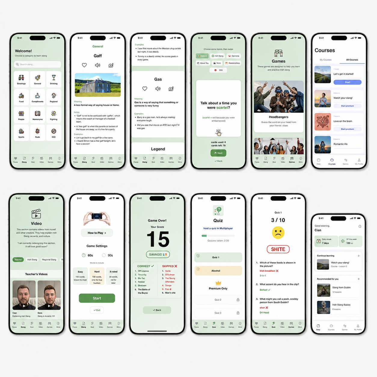
WHAT NOT TO DO — Let Every Feature Demand Attention At The Same Time
When content, navigation, settings, premium options, and secondary actions compete at similar levels, the interface asks users to create the hierarchy themselves.
BETTER
DIRECTION
DESIGN THE NEXT MEANINGFUL DECISION
Begin by defining the primary purpose of each screen.
What should the user understand here?
What should they complete?
What information is necessary before that action?
What can appear later?
A clear mobile interface organizes the experience around this sequence:
Purpose → Primary Action → Supporting Information → Feedback → Next Step
The main action should be visually dominant because it represents the most relevant decision—not simply because it is larger.
Supporting options should remain accessible without competing for the same attention.
App navigation should remain stable across different sections, while the central content adapts to the task.
Labels should explain actions clearly. Selected and active states should be immediately recognizable. More advanced functionality should appear when it becomes relevant instead of being exposed all at once.
The goal is not to remove useful content or reduce the richness of the experience.
It is to create a mobile UX system that makes complexity easier to navigate, understand, and use.
PROJECT
EVIDENCE
POWER LIFE SCRIPT® CONNECTS DIFFERENT TASKS THROUGH ONE CLEAR EXPERIENCE
Power Life Script® brings together several distinct functions:
Peggy’s Corner, script creation, voice recording, composition and playback, content libraries, thematic categories, reminders, and progress tracking.
Each area requires a different screen structure.
The recording interface prioritizes preparation and active recording states. The compose screen organizes playback and duration. The library separates categories and available content. The progress experience presents activity, streaks, records, and reminders.
These screens do not need to look identical.
They need to follow the same interaction logic, navigation system, grouping principles, and visual hierarchy.
Recurring navigation helps users understand the main product areas. Screen titles establish context. Selected states make current choices visible. Primary actions remain clear within each task.
The complete digital product experience therefore feels connected even when the function changes.
Power Life Script® does not present every feature at once.
It allows each function to become visible when it becomes useful.
When Different App Functions Follow One Recognizable Decision Logic
WHY THIS EXAMPLE MATTERS
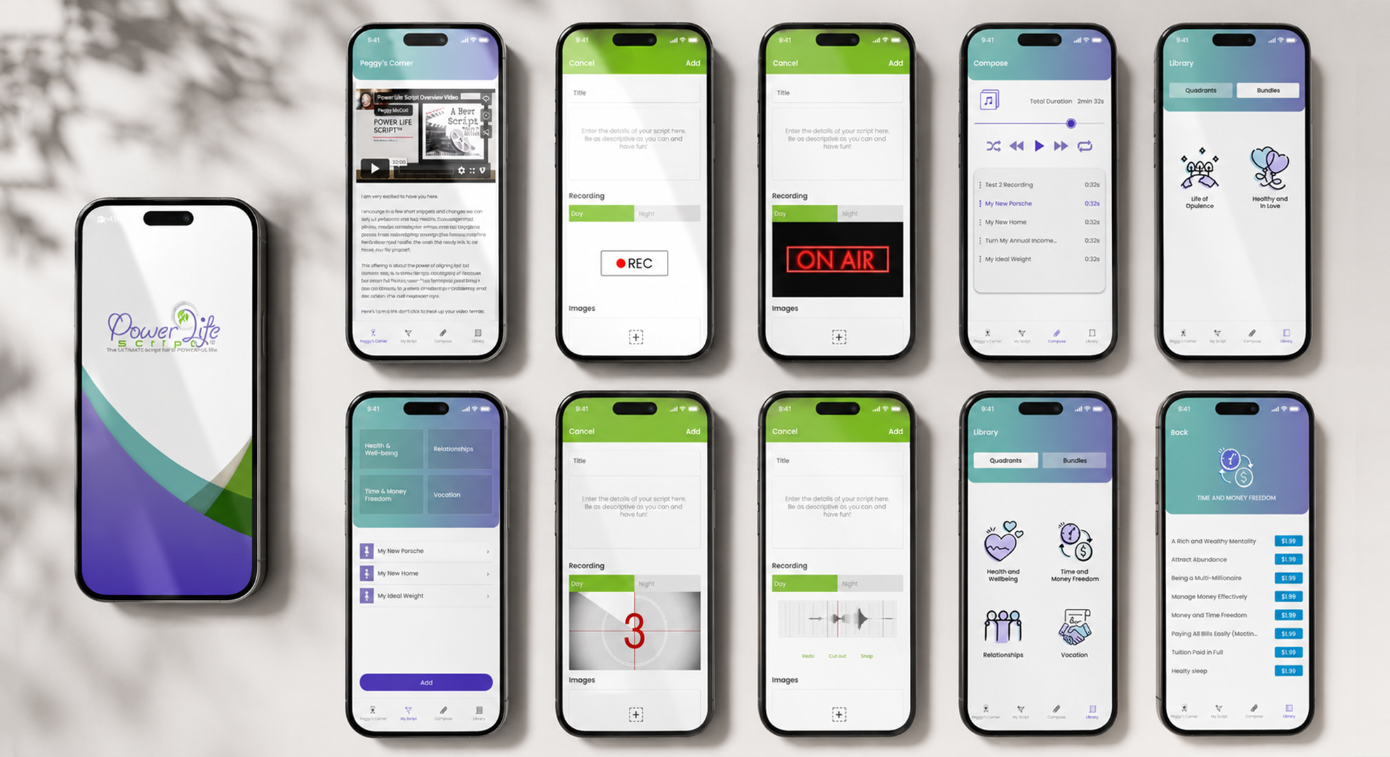
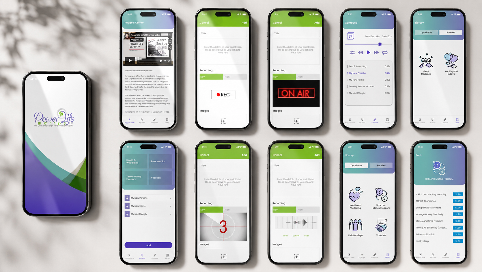
This presentation brings together the central Power Life Script® screens—from the branded entry experience and content creation to recording, composition, library access, thematic categories, and progress-related functions.
Each screen has a different responsibility, but the wider mobile interface system remains recognizable through recurring navigation, screen titles, visual grouping, consistent controls, and clearly differentiated states.
The example shows that strong mobile app usability does not require every screen to repeat the same layout.
It requires every screen to communicate its purpose while remaining connected to one coherent user journey.
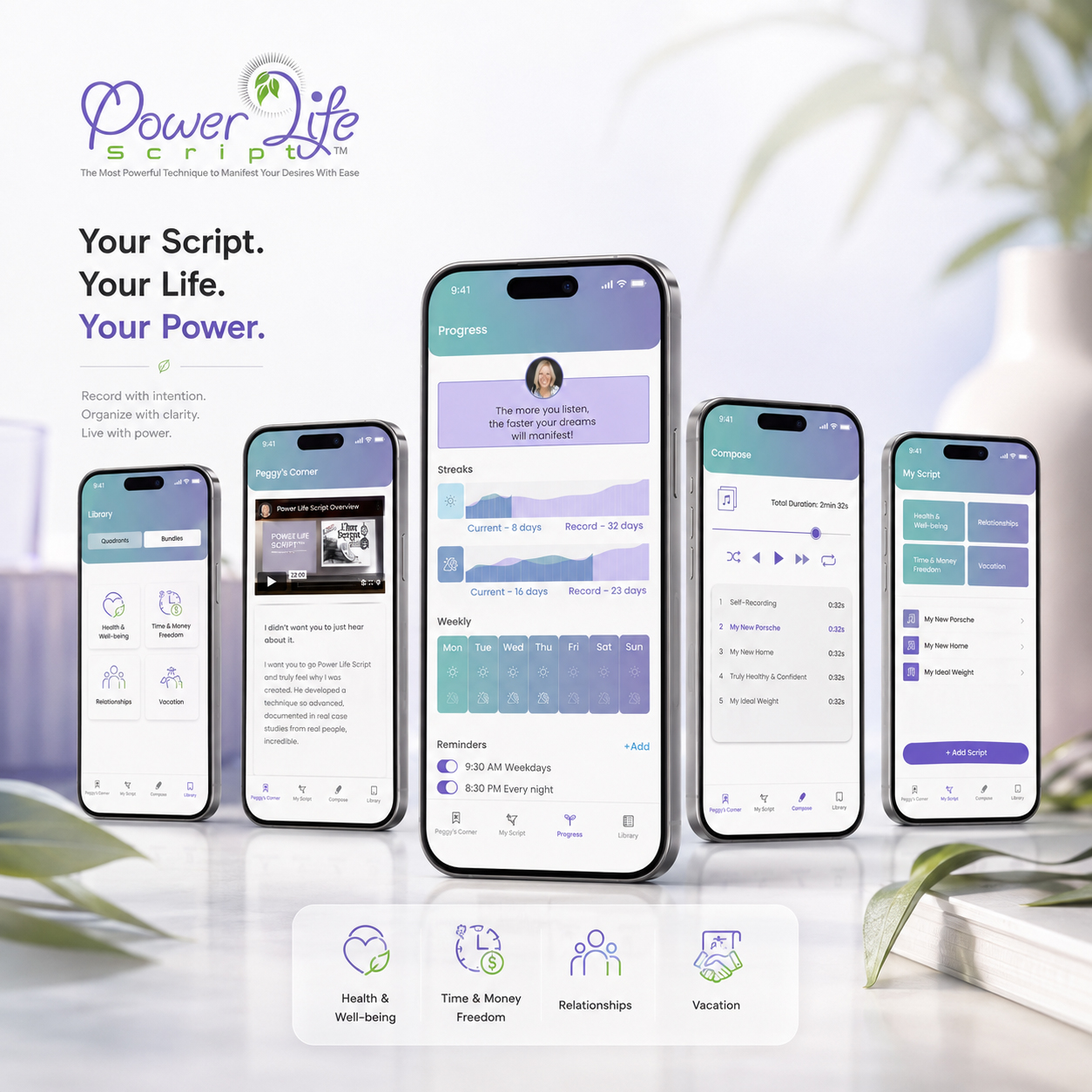
PROJECT EVIDENCE
Power Life Script® Mobile Experience Built Around Clear Navigation And Connected UX Flow
Distinct functions remain easy to recognize because recurring interface relationships connect script creation, recording, playback, library access, and progress within one coordinated product system.
CLARITY DOES NOT REMOVE FUNCTION.
IT ORGANIZES FUNCTION SO USERS CAN UNDERSTAND WHAT MATTERS, WHAT HAPPENS NEXT, AND HOW TO CONTINUE WITHOUT UNNECESSARY FRICTION.
02 —
BRAND SYSTEM BEFORE SCREEN STYLING
WHY IT MATTERS
Before a mobile interface can feel distinctive, it needs to become recognizable beyond the app icon.
The icon may create the first impression on a home screen or inside an App Store listing, but the wider mobile app branding system determines whether that recognition continues after the product opens.
Typography establishes tone. Color creates recurring visual cues. Iconography gives different functions a shared language. Navigation, spacing, interface states, and motion determine whether separate screens still feel connected to one product.
A strong UI design system does not make every screen look identical.
It creates enough continuity for different screens, actions, and content types to remain visually related—even when the app icon or logo is no longer visible.
That is when identity stops being applied to the interface and begins to organize it.
The icon introduces the product. The complete visual system makes the product recognizable through use.
COMMON FAILURE
The App Icon Is Treated As The Complete Identity
A well-designed app icon can be memorable and function clearly at different sizes.
But an icon alone cannot define how the complete digital product experience should communicate.
When typography changes without purpose, colors are applied inconsistently, interface icons follow different styles, and every screen introduces a new visual rhythm, recognition becomes dependent on repeatedly seeing the primary mark.
The product may look polished screen by screen while still feeling fragmented as a system.
This is not necessarily poor graphic design.
It is the absence of a broader mobile visual identity capable of connecting individual design decisions across the entire interface.
When A Strong App Icon Exists Without A Visual System Around It
WHY THIS EXAMPLE MATTERS
A distinctive icon may create recognition before the app opens, but it does not automatically explain how typography, color, navigation, UI components, imagery, or interaction states should behave.
Without those recurring relationships, the icon remains recognizable while the interface surrounding it becomes visually interchangeable.
The example will show the difference between using an app icon repeatedly and building a recognizable product identity deliberately.
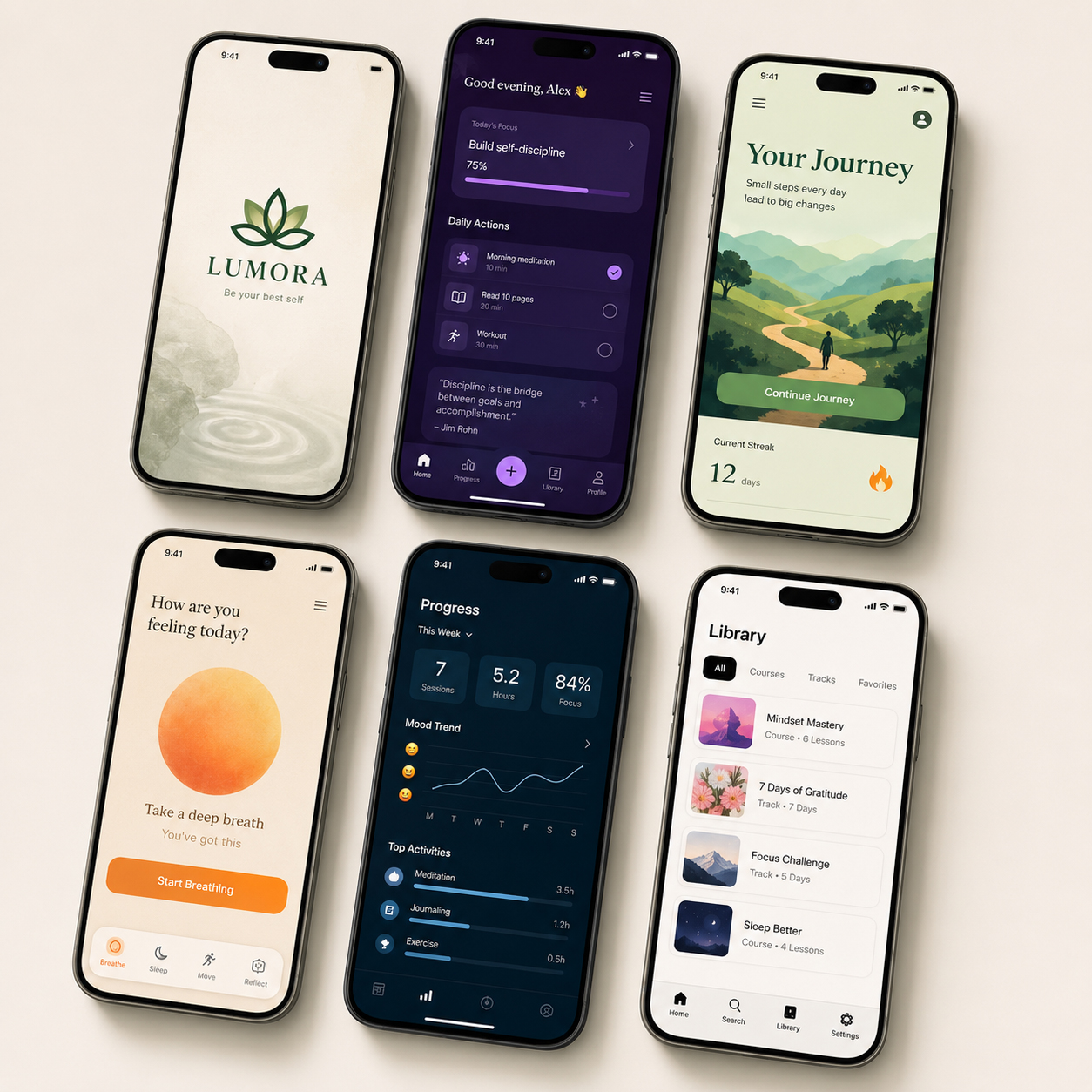
WHAT NOT TO DO — Treat The App Icon As The Complete Mobile Brand
Recognition becomes fragile when the primary mark carries all of the identity while typography, color, iconography, and interface components change without one shared system.
BETTER
DIRECTION
BUILD RECOGNITION THROUGH RELATIONSHIPS BETWEEN ELEMENTS
A mobile brand should be developed as a connected visual sequence:
App Icon → Color Logic → Typography → Iconography → Interface Components → Navigation → Motion → Store Presentation
The app icon should introduce the character of the product, but the remaining elements need to continue that character independently.
A controlled color architecture can connect headers, selected states, controls, progress information, and supporting content.
Typography can create a recognizable tone while maintaining clarity across different screen sizes.
A coordinated icon system can help different categories and functions feel related without making them look identical.
Recurring spacing, corner treatment, navigation behavior, and interface states can establish a familiar rhythm throughout the product.
The objective is not to repeat the same composition everywhere.
It is to create enough shared visual DNA for every part of the app to feel connected before the user actively looks for the logo or consciously recognizes the system.
PROJECT
EVIDENCE
POWER LIFE SCRIPT® EXTENDS IDENTITY ACROSS THE COMPLETE INTERFACE
The Power Life Script® identity does not stop at the primary logo or app icon.
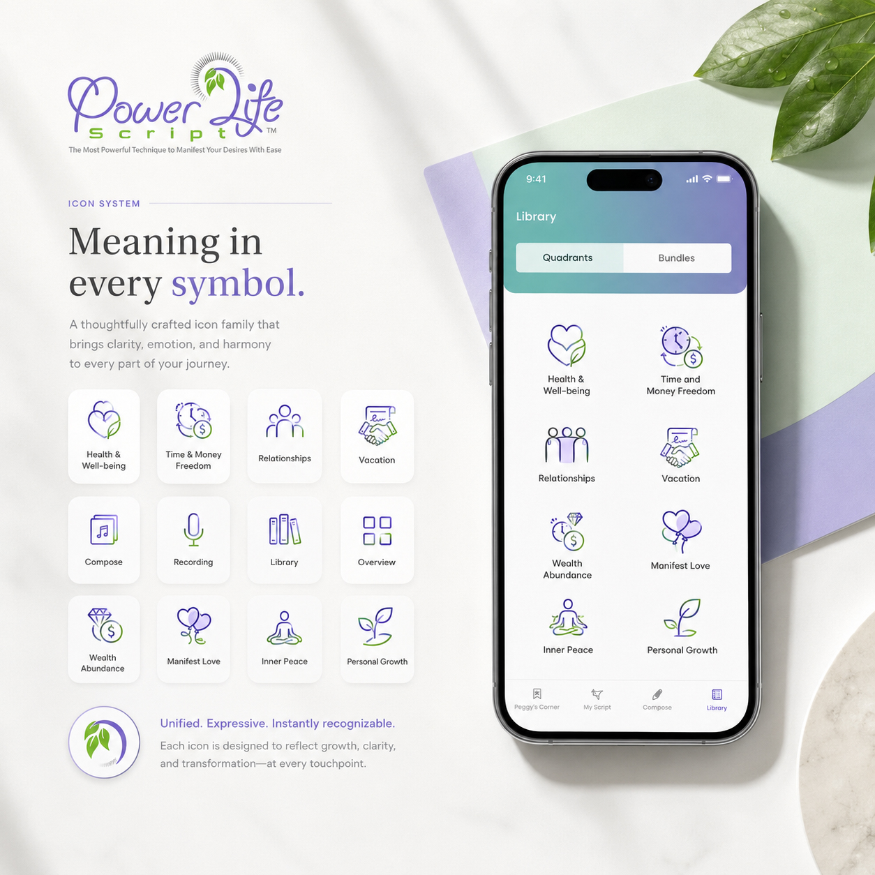
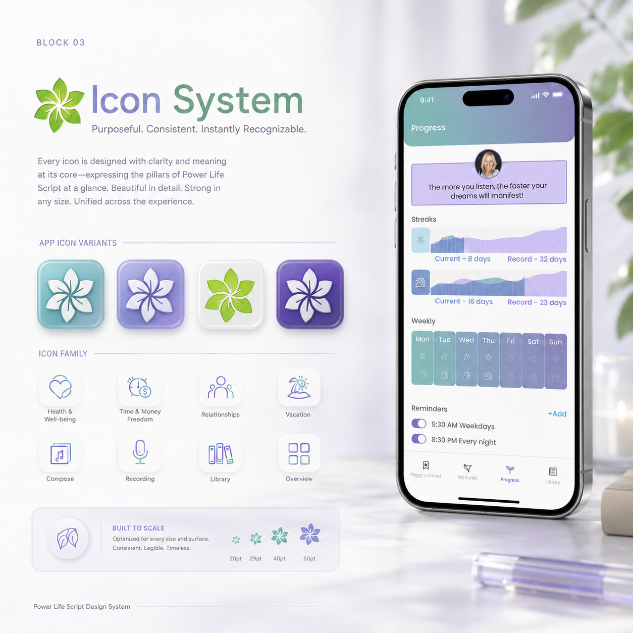
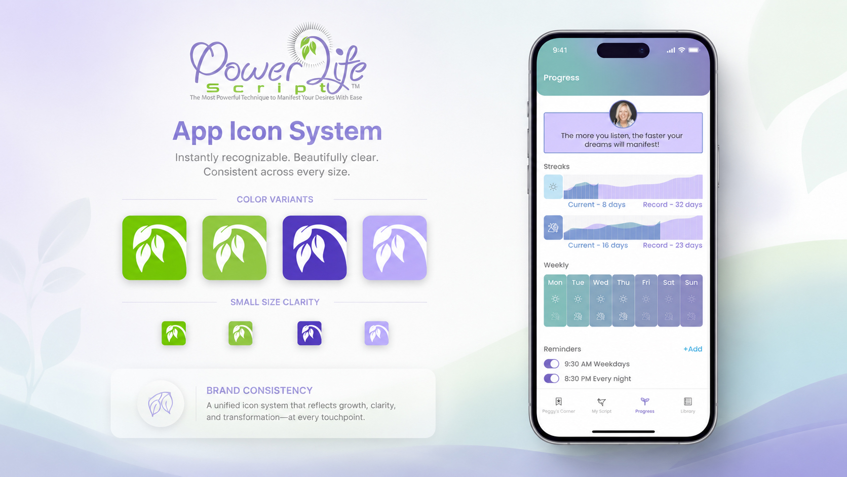
The leaf-based symbol is adapted across different color variants and reduced sizes while maintaining a recognizable silhouette.
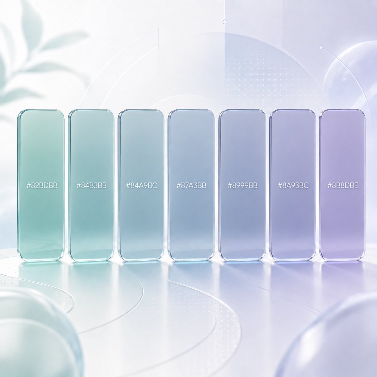
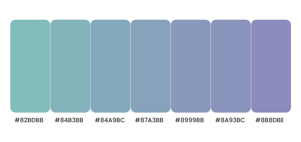
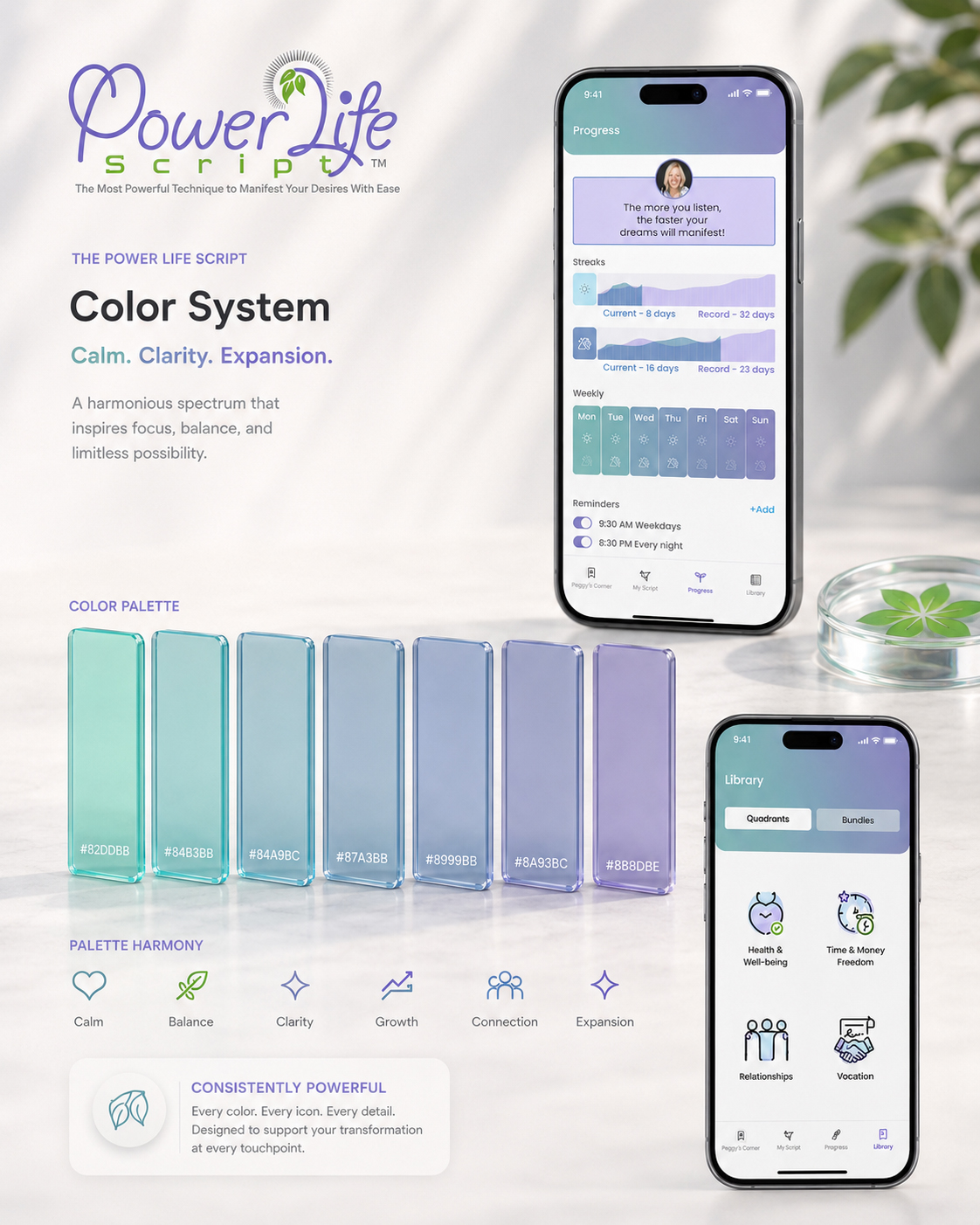
A controlled teal-to-lavender palette establishes continuity across headers, progress information, weekly activity, reminders, navigation states, and supporting interface areas.
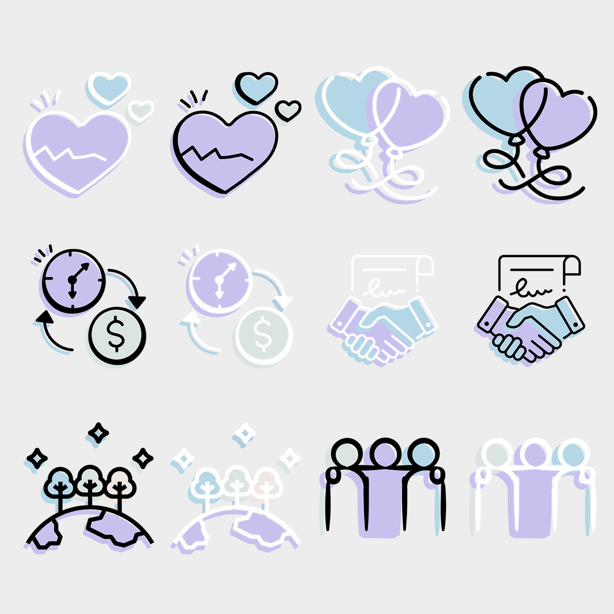
The broader iconography system gives thematic categories—such as health and well-being, relationships, time and money freedom, and vacation—a shared visual character while allowing each category to remain distinct.
These elements are then carried into the wider mobile app interface, where navigation, screen titles, progress modules, selected states, and recurring UI relationships continue the identity.
The important point is not that every element looks the same.
It is that app icon design, color, iconography, and interface styling reinforce the same recognizable product character.
Recognition therefore continues beyond the home screen and becomes part of the experience itself.
When App Icon, Color, And Interface Reinforce One Recognizable Mobile Brand
WHY THIS EXAMPLE MATTERS
These project materials show how Power Life Script® moves from individual identity elements into a coordinated mobile app design system.
The palette establishes continuity. The thematic icons organize different areas of meaning. The app icon remains recognizable across color variants and smaller sizes. The final interface carries those relationships into a functional product environment.
Rather than expecting one mark to create recognition alone, multiple elements reinforce the same visual character across different touchpoints and interaction states.
PROJECT EVIDENCE — 01
SYSTEM DETAIL — A Controlled Color Progression Built For Consistency Across Interface States
The recurring teal, blue, and lavender relationships create a stable visual foundation that can adapt across headers, navigation, progress information, and supporting content.
PROJECT EVIDENCE — 02
SYSTEM DETAIL — Coordinated Iconography That Connects Different Themes Through One Visual Language
Different categories remain individually recognizable while shared line treatment, layering, and color relationships keep them part of the same product world.
PROJECT EVIDENCE — 03
Power Life Script® App Icon System Built Across Color Variants, Small-Size Clarity, And Final Interface Application
The identity remains recognizable because the app icon, palette, scale behavior, and surrounding UI system continue reinforcing the same visual logic.
AN APP ICON CAN INTRODUCE THE PRODUCT.
A COMPLETE BRAND SYSTEM MAKES THE PRODUCT RECOGNIZABLE THROUGH EVERY SCREEN, STATE, AND INTERACTION.
03 —
FLOW BEFORE FEATURE COUNT
WHY IT MATTERS
Users do not experience a mobile product as a list of features.
They experience it as a sequence of decisions and actions.
A feature may be useful in isolation, but its value becomes harder to understand when users cannot see how to reach it, what to do inside it, or where the experience continues afterward.
This is why strong mobile app UX depends on more than screen design.
It depends on how entry points, primary actions, confirmations, transitions, and return paths work together as one user journey.
A clear UX flow reveals the right level of functionality at the right moment.
It helps users move from intention to action without exposing every possibility at once.
Features create capability. Flow turns that capability into an understandable experience.
COMMON FAILURE
MORE FEATURES ARE ADDED WITHOUT DESIGNING THE RELATIONSHIP BETWEEN THEM
A product can offer recording, libraries, categories, playback, reminders, progress tracking, content bundles, and profile areas—and still feel incomplete.
The problem appears when each feature is designed as a separate destination rather than part of one connected task sequence.
Users may reach a screen but not understand why they are there.
They may complete an action but receive no clear next step.
They may repeatedly return to the main menu because the interface does not explain how one function connects to another.
When navigation becomes a catalogue of capabilities, the user must construct the product architecture mentally.
This makes an app feel larger and more complicated than its actual functionality requires.
The strongest interaction design does not simply make every feature available.
It establishes a meaningful relationship between them.
When A Mobile App Shows Everything It Can Do Without Explaining What To Do Next
WHY THIS EXAMPLE MATTERS
The example will show multiple polished features presented with equal importance but without a clear sequence connecting them.
Each function may appear useful, yet the user is forced to choose between several unrelated destinations before understanding which path supports the current goal.
It demonstrates how feature-heavy app navigation, disconnected screens, and missing next-step guidance can weaken an otherwise capable digital product.
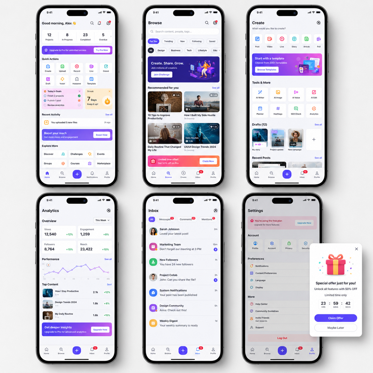
WHAT NOT TO DO — Present Features Without Designing The Journey Between Them
When every capability becomes a separate destination, users must repeatedly reconstruct how the product is meant to work.
BETTER
DIRECTION
BEGIN WITH THE USER GOAL, NOT THE FEATURE INVENTORY
A stronger mobile experience begins by defining the essential journey:
Goal → Entry Point → Primary Action → Confirmation → Next Step → Return
Each screen should have one clear responsibility within that sequence.
The interface should reveal the information required for the current action while allowing secondary options to appear when they become relevant.
Persistent navigation should help users understand the wider product structure without competing with the immediate task.
Completed actions should lead somewhere meaningful.
Clear sequencing also reduces unnecessary decision-making, helping users understand how each step supports the larger task while preserving enough flexibility for exploration, return, and deeper feature discovery over time naturally.
Recording should connect to organization or playback. Content discovery should connect to selection or use. Progress information should connect to continued activity rather than functioning as an isolated report.
This approach creates progressive disclosure.
The product can remain feature-rich without requiring users to understand the complete system before they begin.
The goal is not to hide functionality.
It is to organize functionality into a clear mobile user journey.
PROJECT
EVIDENCE
POWER LIFE SCRIPT® CONNECTS CREATION, RECORDING, LISTENING, AND PROGRESS
The Power Life Script® experience contains several different user intentions.
A user may begin by entering Peggy’s Corner, organizing a personal script, recording content, selecting a day or night context, combining recordings, listening through the compose experience, exploring available library content, or reviewing visible progress.
These functions are not presented as one crowded dashboard.
They are distributed across screens with specific responsibilities.
Script creation focuses on writing and organization.
Recording screens prioritize readiness and active states.
Compose organizes playback, duration, and content order.
The library separates thematic categories from individual scripts and bundles.
Progress screens present repeated activity, records, weekly patterns, and reminders.
Recurring navigation allows those functions to remain connected without forcing all of them into the same screen.
The resulting app user flow supports a broader sequence:
Create → Record → Organize → Compose → Listen → Review Progress → Return
The value does not come from the number of available screens.
It comes from the clear relationship between them, and how each one supports the next.
When Different Features Become One Understandable Mobile Journey
WHY THIS EXAMPLE MATTERS
The following Power Life Script® materials show both the detailed interface system and the broader logic connecting its functions.
The screens move from branded entry and script creation to recording, playback, content organization, thematic libraries, and progress-related experiences.
Each function has its own purpose, but shared navigation and clearly separated task areas help the complete product remain understandable.
The project demonstrates how feature architecture, app navigation, and interaction flow can turn multiple capabilities into one connected digital experience.
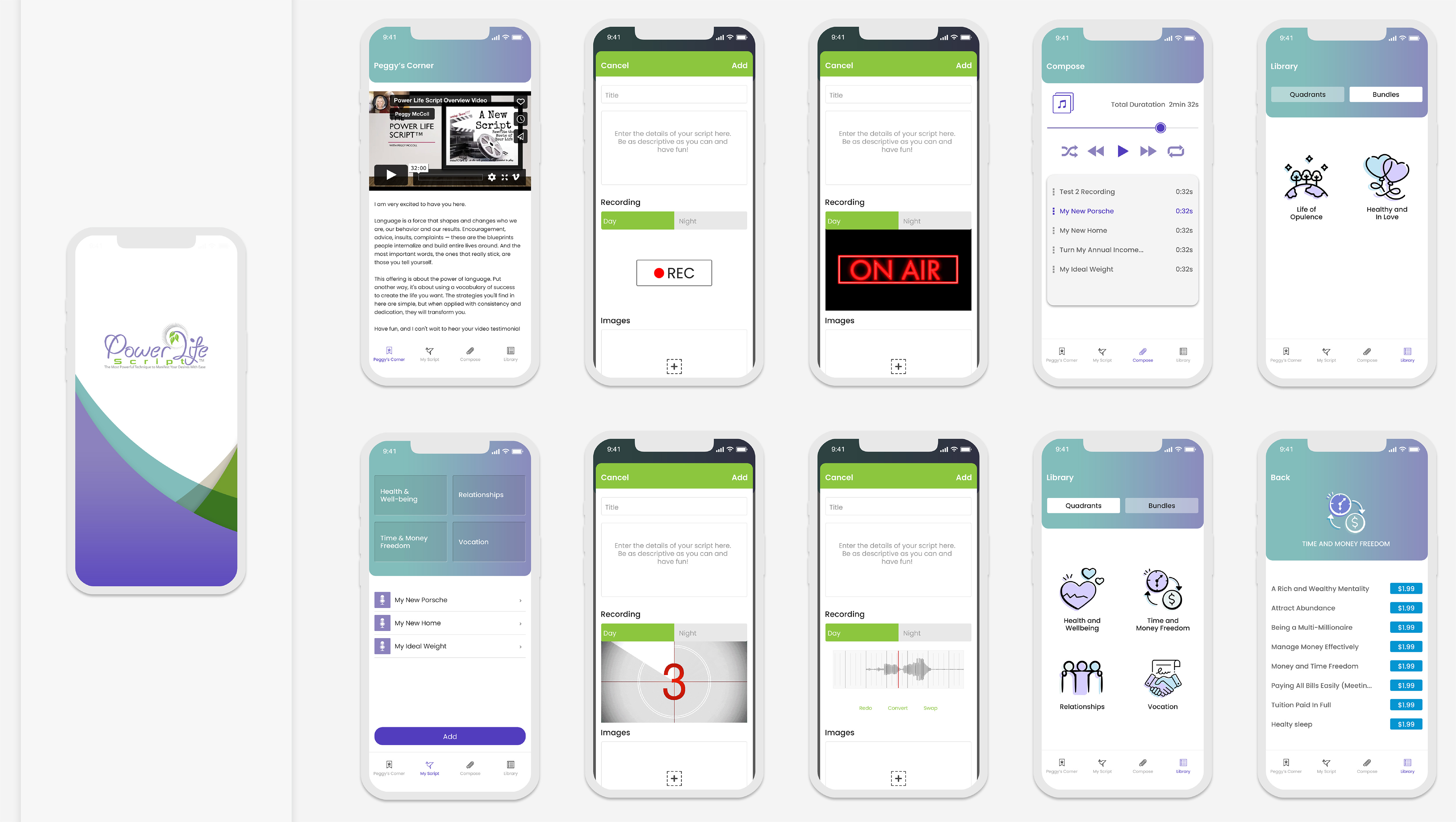
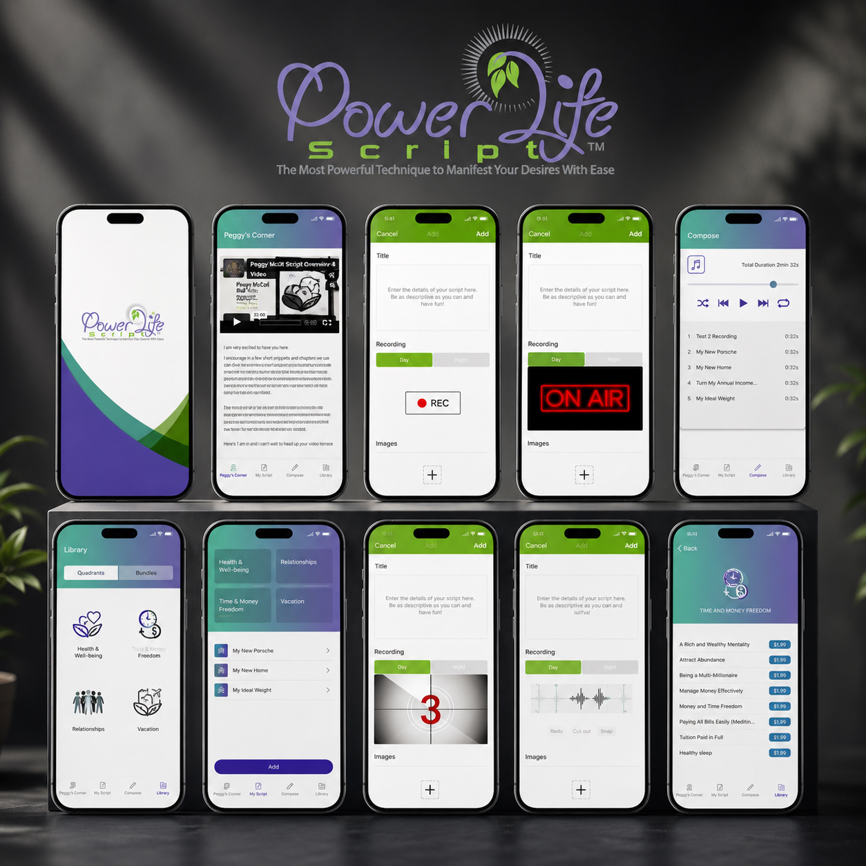
PROJECT EVIDENCE — 01
PROJECT SYSTEM — Key Power Life Script® Screens Organized Across Creation, Recording, Composition, Library Access, And Progress-Related Functions
The detailed screen family shows how separate tasks are distributed across focused interfaces rather than compressed into one overloaded experience.
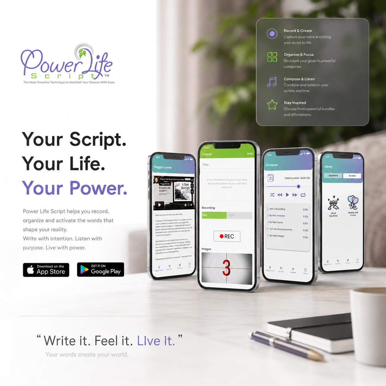
PROJECT EVIDENCE — 02
PROJECT EXPERIENCE — Record And Create, Organize And Focus, Compose And Listen, Then Continue Through A Connected Product Journey
The presentation translates individual features into a clear functional narrative, helping the wider Power Life Script® experience feel purposeful rather than fragmented.
FEATURES EXPLAIN WHAT A PRODUCT CAN DO.
FLOW EXPLAINS HOW USERS REACH THAT VALUE, COMPLETE MEANINGFUL ACTIONS, AND CONTINUE WITHOUT LOSING DIRECTION.
04 —
FEEDBACK BEFORE UNCERTAINTY
WHY IT MATTERS
Every interaction creates an immediate question:
Did the app understand what I just did?
Users need to know whether recording has started, whether a selection is active, whether content has been saved, and whether the system is waiting for the next action.
This is the role of interaction feedback.
Clear labels, state changes, contrast, motion, and interface responses make the product’s behavior visible. They reduce hesitation and help users move through the experience without repeating actions or questioning whether something worked.
In strong mobile app design, animation is not added simply to make the interface feel more dynamic.
It explains change.
A countdown prepares the user for an approaching action. A recording state confirms that the system is active. A transition shows that the experience has moved from one context to another.
When feedback is immediate and understandable, the interface feels more responsive and trustworthy.
Users should not have to guess what the system is doing.
COMMON FAILURE
MOTION IS ADDED WITHOUT COMMUNICATING A CLEAR STATE
A mobile interface may contain polished transitions and visually attractive effects while still leaving the user uncertain.
A button may animate without confirming whether the action was accepted.
A recording screen may change appearance without clearly distinguishing idle, preparation, and active states.
A loading or countdown sequence may create movement without explaining what will happen when it ends.
The problem is not a lack of animation.
It is the absence of meaningful system feedback.
When inactive, active, completed, and unavailable states look too similar, users may tap again, leave the screen too early, or question whether the product responded correctly.
This creates friction at exactly the moment when the interface should be creating confidence.
A useful microinteraction does not simply attract attention.
It confirms a change, explains a state, or prepares the next decision.
When An Interface Moves Without Explaining What The System Is Doing
WHY THIS EXAMPLE MATTERS
The new bad example will show a recording interface with several animated elements but no clear distinction between preparation, active recording, saving, and completion.
The screen may appear visually sophisticated, yet the user cannot immediately identify whether the microphone is ready, whether recording has started, or whether the action has been completed.
It demonstrates how mobile app animation, loading effects, and state changes can create more uncertainty when motion is not connected to a clear functional message.
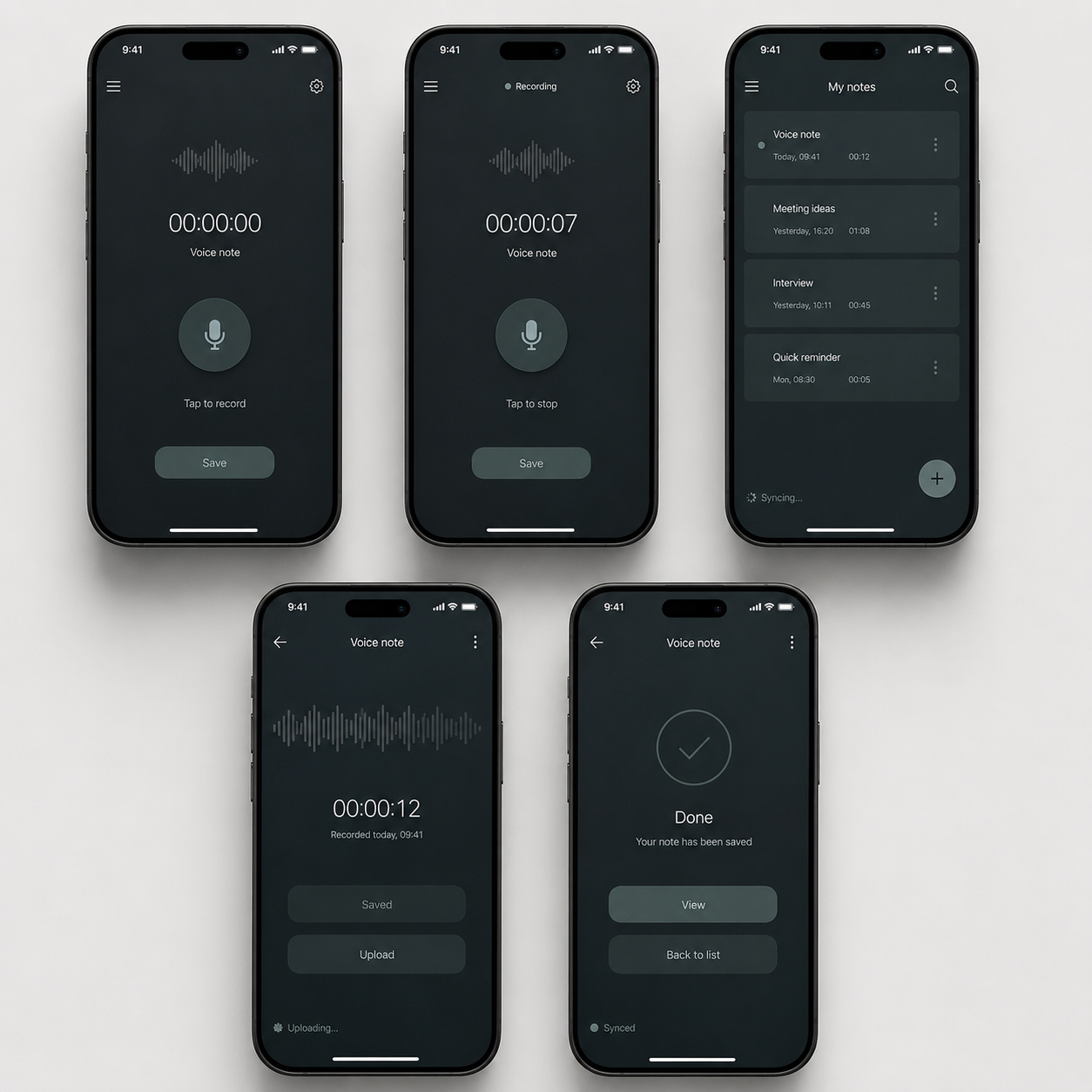
WHAT NOT TO DO — Use Motion Without Clearly Differentiating Preparation, Active, And Completed States
Animation becomes visual noise when users still need to guess whether the system has received, started, or completed an action.
BETTER
DIRECTION
DESIGN THE STATE BEFORE DESIGNING THE ANIMATION
A stronger interaction begins with a clear behavioral sequence:
User Action → Immediate Confirmation → Active State → Completion → Next Step
Every stage should be visibly different.
The interface should confirm a tap immediately.
Active processes should use clear labels, contrast, icons, or motion to show that the system is working.
Completion should communicate what happened and reveal the next relevant action.
Motion should support those changes rather than becoming the only way they are understood.
Important states should also remain clear through text, color, shape, and interface structure, ensuring that the experience does not depend entirely on animation.
The objective is not to animate every interaction.
It is to use UI feedback and purposeful microinteractions where they reduce uncertainty and make the product easier to trust.
PROJECT
EVIDENCE
POWER LIFE SCRIPT® USES MOTION TO PREPARE, TRANSITION, AND CONFIRM
The Power Life Script® experience contains several moments where the user needs clear confirmation of what is happening.
The branded splash sequence creates an intentional entry into the application.
The countdown introduces a short preparation stage before recording begins, helping users understand that the active session is approaching.
The ON AIR state clearly separates preparation from live recording through a stronger visual change.
These moments do not serve the same purpose.
The splash screen establishes entry.
The countdown communicates transition.
The ON AIR state confirms active functionality.
Together, they demonstrate how mobile app motion design can support the experience when every visual change has a specific communication role.
The animation does not replace usability.
It makes the current system state easier to understand.
GOOD EXAMPLE
When Motion Communicates Entry, Preparation, And Active Recording
WHY THIS EXAMPLE MATTERS
These three Power Life Script® animations show a complete sequence of interface feedback.
The user first enters a recognizable branded environment, then receives a clear preparation cue, and finally sees an unmistakable confirmation that recording is active.
Each movement supports a different stage of the interaction instead of repeating the same decorative effect.
The examples demonstrate how splash screen animation, countdown feedback, and recording-state design can work together to reduce uncertainty and strengthen the wider user experience.

PROJECT EVIDENCE — 01
BRANDED ENTRY — A Visual Transition That Introduces The Power Life Script® Environment
The splash sequence creates a clear transition into the product while reinforcing the identity before the functional experience begins.

PROJECT EVIDENCE — 02
PREPARATION FEEDBACK — A Countdown That Makes The Approaching Recording State Clear
The sequence gives users a visible preparation interval instead of moving unexpectedly from setup to active recording.

PROJECT EVIDENCE — 03
ACTIVE STATE — An Immediate Visual Confirmation That Recording Has Started
The ON AIR treatment creates a clear distinction between an interface that is ready and a system that is actively recording.
MOTION SHOULD NOT ASK USERS TO ADMIRE THE INTERFACE.
IT SHOULD HELP THEM UNDERSTAND WHAT JUST HAPPENED, WHAT IS HAPPENING NOW, AND WHAT COMES NEXT.
05 —
VISIBLE PROGRESS BEFORE RETURN
WHY IT MATTERS
Repeated activity becomes easier to understand when the product makes continuity visible.
A user may complete a recording, follow a day or night routine, return several times during the week, or maintain a longer sequence of activity. Without clear progress tracking, those actions can feel isolated from one another.
A well-designed progress experience connects them into an understandable pattern.
It shows what has been completed, what remains active, how current activity compares with previous records, and when the next reminder is scheduled.
This does not mean that every mobile app needs complex analytics or aggressive gamification.
The purpose of progress UI design is not to reward users with more numbers.
It is to make meaningful activity easier to recognize.
When progress is clearly presented, the interface can support motivation, orientation, and continued use without exaggerating achievement or overwhelming the screen with data.
Progress becomes useful when users can understand it at a glance.
COMMON FAILURE
PROGRESS DATA IS DISPLAYED WITHOUT A CLEAR MEANING
A progress dashboard can contain charts, percentages, badges, streaks, records, reminders, and weekly summaries while still failing to explain what matters.
The problem appears when every metric receives equal visual importance.
Current activity may be confused with a personal record.
Completed and missed days may rely on subtle differences.
Charts may look sophisticated but provide no clear comparison.
Badges and streaks may create pressure without explaining the next useful action.
In this situation, data becomes decoration.
The interface reports activity without helping the user interpret it.
A strong mobile progress dashboard should not require users to analyze the design before they can understand their own activity.
It should organize information around a small number of relevant questions:
What have I completed?
What is active now?
How does this compare with my previous activity?
And what should I do next?
When A Progress Dashboard Contains More Information Than Understanding
WHY THIS EXAMPLE MATTERS
The new bad example will present a visually polished progress screen filled with competing charts, percentages, streak badges, reminders, status colors, and achievement labels.
Every element will appear important, but the user will not be able to distinguish the current result, the personal record, the weekly pattern, or the next meaningful action.
It will demonstrate how overloaded progress tracking, weak information hierarchy, and excessive gamification can make personal activity harder—not easier—to understand.
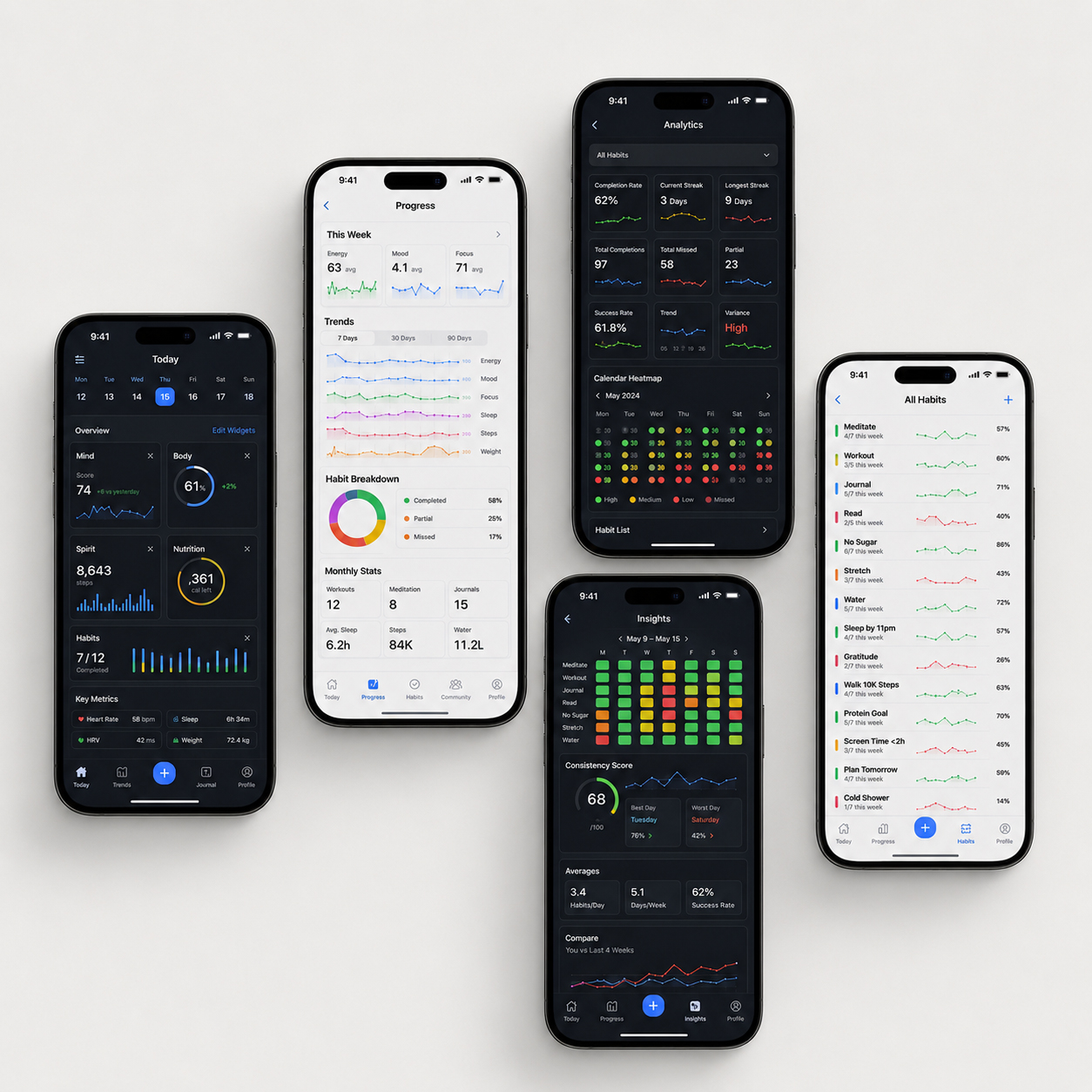
WHAT NOT TO DO — Turn Progress Into A Dashboard Of Competing Numbers, Charts, And Rewards
More data does not create more clarity when users cannot identify what is current, what is important, and how to continue.
BETTER
DIRECTION
ORGANIZE PROGRESS AROUND THE QUESTIONS USERS ACTUALLY NEED ANSWERED
A clearer progress system begins with a simple sequence:
Activity → Confirmation → Pattern → Reminder → Return
The interface should separate current activity from longer-term records.
Weekly patterns should be easy to scan without requiring detailed chart analysis.
Completed, missed, active, and future states should remain visibly different.
Reminders should support the next action rather than compete with the progress information above them.
Graphs, circular indicators, streaks, and comparison values should be used only when they make a specific relationship easier to understand.
The objective is not to show every available metric.
It is to create an engagement dashboard that communicates continuity without turning the experience into a performance report.
Good progress design gives users enough information to recognize their activity and continue with confidence.
PROJECT
EVIDENCE
POWER LIFE SCRIPT® MAKES DAY, NIGHT, WEEKLY, AND RECORD ACTIVITY VISIBLE
The Power Life Script® progress experience organizes several related forms of activity.
Day and night routines are presented separately, allowing users to understand each pattern without combining them into one unclear total.
Current streaks are distinguished from longer personal records.
Weekly activity provides a broader view of consistency across individual days.
Reminders connect progress information to the next scheduled interaction.
The project explored different visual approaches—including graph-based activity and circular progress indicators—to determine how much information could be displayed without losing clarity.
The final direction prioritizes current status, record comparison, weekly visibility, and reminder hierarchy.
This does not claim that interface design alone guarantees retention.
It demonstrates how thoughtful mobile app progress tracking can make repeated activity easier to recognize and the next return easier to understand.
When Progress Turns Repeated Activity Into A Clear, Recognizable Pattern
WHY THIS EXAMPLE MATTERS
The following Power Life Script® materials show the development of the progress experience from comparative graph-based views to simplified streak indicators and a final contextual application.
They demonstrate how different UI approaches were evaluated around the same central goal:
Make current activity, previous records, weekly patterns, and reminders easier to understand within one coordinated screen.
Rather than adding more metrics, the design focuses on the relationships users are most likely to need when reviewing progress and deciding how to continue.
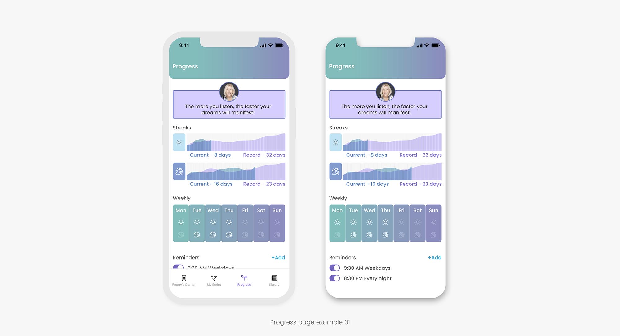
PROJECT EVIDENCE — 01
DESIGN EXPLORATION — Graph-Based Progress Views Comparing Current Activity And Previous Records
The first direction explores how continuous visual data can communicate separate day and night patterns across time.
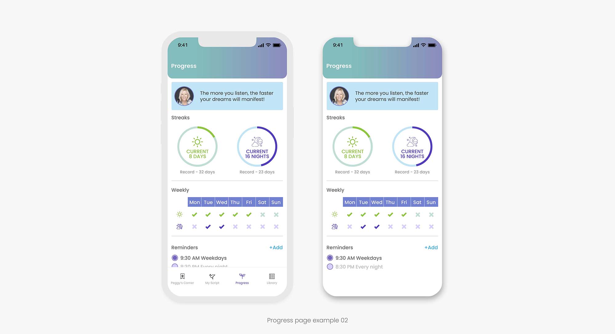
PROJECT EVIDENCE — 02
DESIGN EXPLORATION — Circular Indicators Simplifying Current Streaks, Records, And Weekly Activity
The second direction reduces visual complexity and gives the primary progress relationships stronger immediate hierarchy.
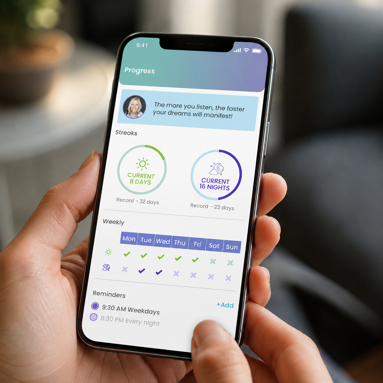
PROJECT EVIDENCE — 03
Power Life Script® Progress Experience Presented In A Realistic Moment Of Use
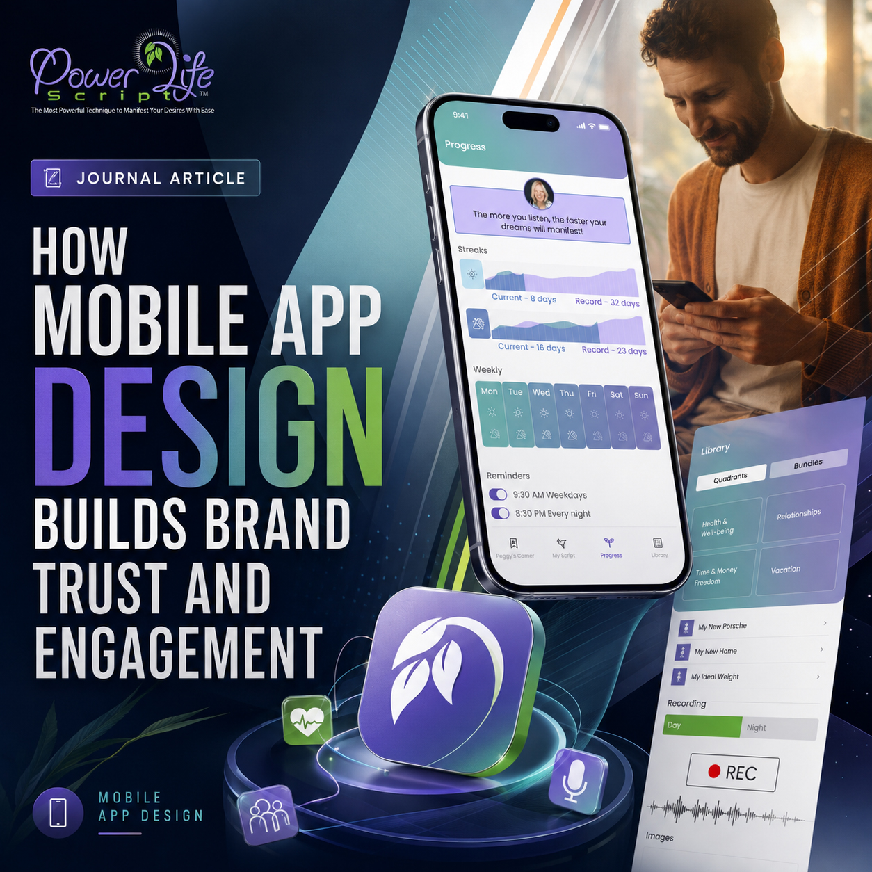
Current activity, personal records, weekly patterns, and reminders remain visible within one clear mobile interface designed for quick interpretation.
PROGRESS IS NOT MORE USEFUL BECAUSE IT CONTAINS MORE DATA.
IT BECOMES USEFUL WHEN USERS CAN SEE WHAT THEY HAVE COMPLETED, WHAT IS ACTIVE NOW, AND HOW TO CONTINUE.
FROM MOBILE INTERFACE TO COMPLETE DIGITAL EXPERIENCE
A Strong Mobile App Turns Functionality Into A Product People Can Understand, Trust, And Continue Using
The strongest mobile experiences do more than make a product visually polished. They create a recognizable system that gives every screen enough direction, continuity, and feedback to feel intentional wherever users enter, act, and return.
An app icon may begin recognition, but recognition becomes meaningful only when the complete mobile interface system reinforces the character that the icon introduces.
Navigation gives direction. Color and typography create continuity. Iconography connects different functions. User flow turns separate actions into an understandable sequence. Feedback confirms what the system is doing. Progress tracking gives repeated activity a visible structure.
Across the five principles explored in this article, the same idea keeps returning: orientation, brand recognition, flow, feedback, and progress are not separate mobile app design problems.
They are different responsibilities of one connected digital product experience.
Orientation without recognition may feel clear but generic.
Recognition without flow becomes surface styling.
Flow without feedback leaves important actions uncertain.
Feedback without progress confirms the moment without showing continuity.
Progress without hierarchy becomes a collection of data rather than useful information.
Even a carefully polished UX/UI design system remains incomplete when users must repeatedly reconstruct how its screens, actions, and states relate to one another.
A serious mobile product therefore requires more than a collection of attractive interfaces.
It requires decisions that continue making sense from the first launch to repeated use.
When those decisions work together, the product no longer depends on the logo to carry the entire brand experience.
Users recognize the product through recurring color and interface relationships before actively searching for the mark.
They understand the next action through hierarchy before reading every available option.
They trust the system through visible feedback before hesitation appears.
They recognize continuity through progress before individual actions begin to feel disconnected.
And that is the point where mobile app design becomes more than presentation.
It becomes part of how the product is understood, recognized, trusted, and experienced through use.
A MOBILE APP MAY CONTAIN THE RIGHT FEATURES.
THE EXPERIENCE BETWEEN THOSE FEATURES IS WHAT MAKES THE PRODUCT FEEL CLEAR, CONNECTED, AND WORTH CONTINUING.
THE FIVE DIMENSIONS OF A CONNECTED MOBILE EXPERIENCE
Orientation gives users direction. Brand System makes the product recognizable. Flow connects actions into a meaningful sequence. Feedback confirms what the system is doing. Visible Progress turns repeated activity into understandable continuity.
Considered together, these five dimensions transform individual screens into a coherent mobile experience capable of maintaining clarity across different functions, interaction states, and moments of use.
A FEATURE LIST MAY DESCRIBE WHAT THE APP CAN DO.
THE SYSTEM BETWEEN THOSE FEATURES IS WHAT MAKES THE EXPERIENCE RECOGNIZABLE, COHERENT, AND TRUSTWORTHY.
FROM MOBILE APP PRINCIPLES TO PRACTICAL PRODUCT DECISIONS
Key Takeaways
A practical framework for evaluating whether a mobile product is simply visually polished—or whether it has enough orientation, brand continuity, flow, feedback, and visible progress to function as one connected experience.
The five principles explored throughout this article point toward one broader idea: strong mobile app design is created when individual interface decisions reinforce one another instead of asking each screen or feature to communicate value independently.
These takeaways can be used when developing a new application, redesigning an existing digital product, introducing additional features, or evaluating whether different touchpoints still feel connected to the same mobile experience.
01 —
ORIENTATION BEFORE EXPLORATION
A mobile interface should first help users understand where they are, what matters, and what they should do next.
Navigation, screen titles, visual hierarchy, grouping, labels, and active states should reinforce one clear priority rather than asking users to interpret several competing directions.
A visually attractive screen may encourage initial exploration.
But exploration becomes meaningful only when the interface has already established enough orientation for the next action to feel understandable.
Clear direction is what allows users to discover more without feeling that the product has become more difficult.
02 —
BRAND SYSTEM BEFORE SCREEN STYLING
A recognizable mobile product requires more than a distinctive app icon or polished splash screen.
Typography, color, iconography, interface components, navigation behavior, spacing, motion, and selected states should share enough visual logic to remain connected across different parts of the experience.
Consistency does not require every screen to repeat one composition.
It requires the product’s visual character to remain recognizable even when the primary logo is not present.
The icon introduces the product. The complete brand system makes the product recognizable through meaningful interaction and use.
03 —
FLOW
BEFORE
FEATURE COUNT
Every feature should support an understandable user journey within a connected mobile experience, not exist as an isolated destination.
Entry points, primary actions, confirmations, transitions, and return paths should explain how one meaningful action connects to the next.
A feature-rich app can remain clear when functionality appears at the moment it becomes relevant.
But more features do not automatically create more value.
Flow is what turns separate capabilities into a product users can understand, complete, and continue.
04 —
FEEDBACK BEFORE UNCERTAINTY
Every important user action should receive an immediate and understandable system response.
Preparation, active, loading, recording, saved, completed, and unavailable states must remain visibly different through text, contrast, icons, motion, and interface structure.
Animation should not exist only to make the product feel dynamic.
It should explain what changed and reduce the need for users to repeat actions or question whether the system responded.
Strong interaction feedback replaces uncertainty with visible confirmation.
05 —
VISIBLE PROGRESS BEFORE RETURN
Repeated activity becomes easier to understand when the interface gives continuity a visible structure.
Current status, previous records, weekly patterns, completed and missed states, and reminders should be organized around the information users actually need.
Progress design should not display every available metric or turn personal activity into a crowded performance dashboard.
It should help users recognize what they have completed, what remains active, and how to continue.
Progress becomes useful when it turns separate actions into one clear and recognizable pattern.
THE STRONGEST MOBILE APP IS NOT THE ONE WITH THE MOST FEATURES.
IT IS THE ONE IN WHICH EVERY SCREEN, ACTION, AND RESPONSE MAKES THE PRODUCT EASIER TO UNDERSTAND, TRUST, AND CONTINUE USING.
FROM INDIVIDUAL INTERACTIONS TO ONE CONNECTED MOBILE EXPERIENCE
Power Life Script® Connects Brand, Function, Feedback, And Progress Across The Complete Product System
The final presentation brings together the branded entry experience, content creation, recording states, composition and playback, library access, thematic categories, and progress-related functions within one coordinated mobile environment.
The importance of this overview is not the number of screens it presents.
It is the relationship between them.
Different functions maintain their own purpose while recurring navigation, interface hierarchy, color logic, iconography, interaction states, and visual rhythm keep the experience connected.
The result demonstrates the shift from designing individual mobile screens to designing a recognizable digital product system.
Power Life Script® — From Individual Functions To One Connected Mobile Experience
WHY THIS EXAMPLE MATTERS
This closing presentation brings together the wider Power Life Script® screen family—from branded entry, script creation, and recording to composition, library access, thematic content, and progress-related functionality.
Viewed individually, each screen solves a specific task.
Viewed together, they demonstrate how mobile app branding, UX hierarchy, user flow, interaction feedback, and progress tracking can operate as parts of one coordinated product experience.
The final image therefore does not simply present a collection of interfaces.
It presents the complete relationship between them.
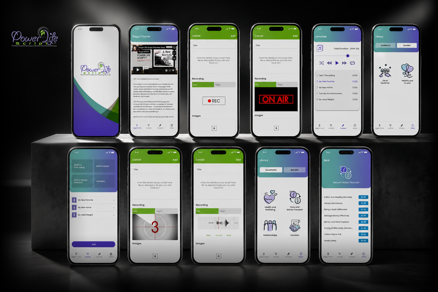
FINAL PROJECT EVIDENCE
Power Life Script® Mobile Experience Built Across Identity, Orientation, Creation, Recording, Organization, Playback, Feedback, And Visible Progress
The product becomes recognizable not because every screen looks identical, but because every screen continues the same visual and interaction logic.