Hero – Rebranding and Packaging Redesign for E-liquids

FREEBASE COLLECTION – OLD AND NEW BOX AND LABEL DESIGNS

COMPANY - HERO

Client

HERO – TKE Distribution LLC

Info

Industry: Vape Industry

Market: USA, EU, Global

Project Type: Rebranding, Visual Identity, Packaging Design, Technical File Preparation

Products

Freebase Collection (100ML), Salts
Collection (30ML), New Flavor Extensions

This case study presents the HERO project, a brand recognized for its premium quality e-liquids and a wide range of flavors. HERO vape products are sold internationally, with the brand being owned by TKE Distribution LLC, headquartered in Ohio, USA.

HERO is not just another vape brand – it is a community and family-driven success story that found a healthier alternative to smoking. Their mission is simple: to offer superior quality, authentic flavors, and an unforgettable vaping experience to users worldwide.
Infinity Design Studio was engaged to refresh the entire HERO visual identity, including:

  • Redesigning the logo and defining a new brand structure.
  • Complete redesign of all e-liquid labels and packaging ( 30ML Salts and 100ML Freebase collections).
  • Developing a visual system for product differentiation and new flavors.
  • Enhancing brand positioning through a modern and impactful design.
  • Technical preparation of all files for printing.

Exclusive Visual Identity – HERO as a Symbol of Premium Vaping Experience:

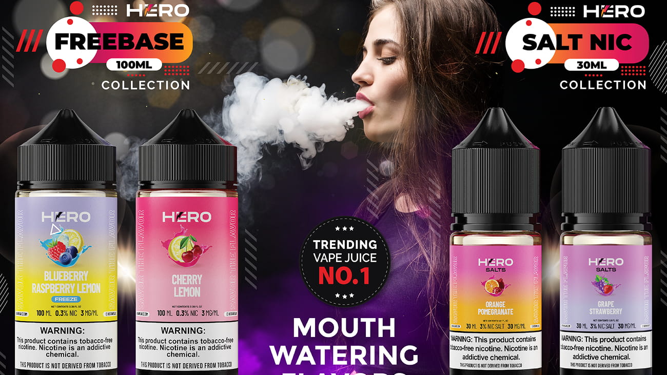
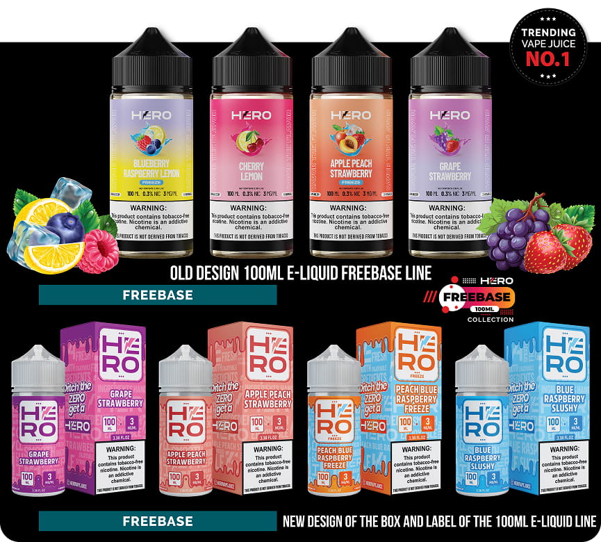
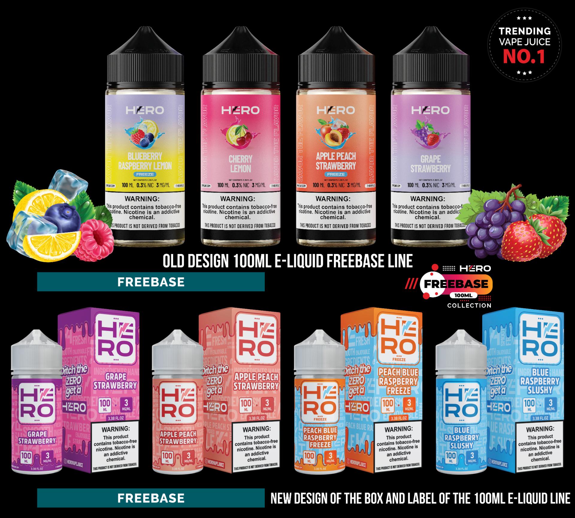
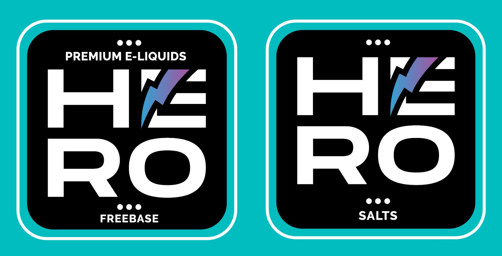
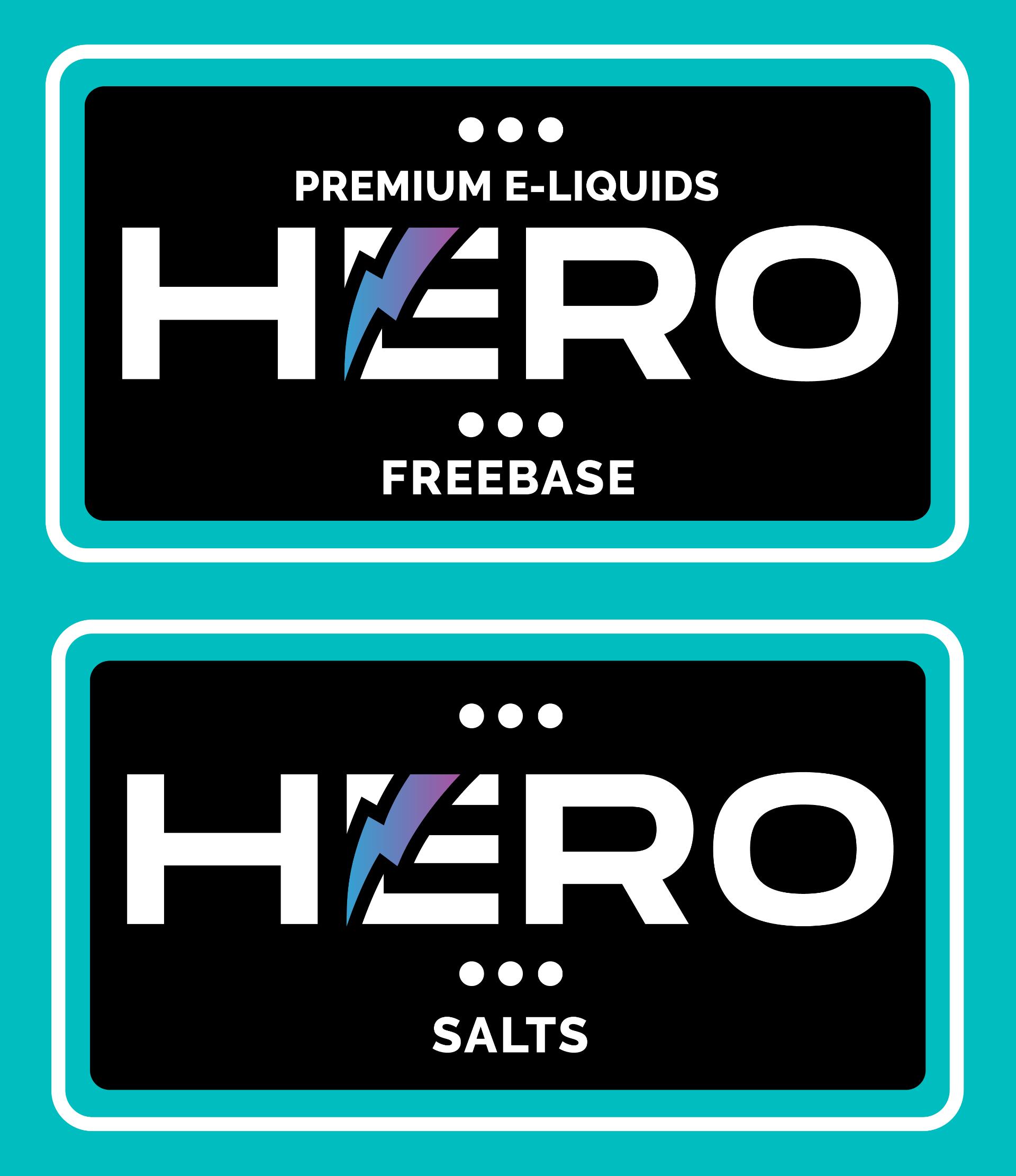
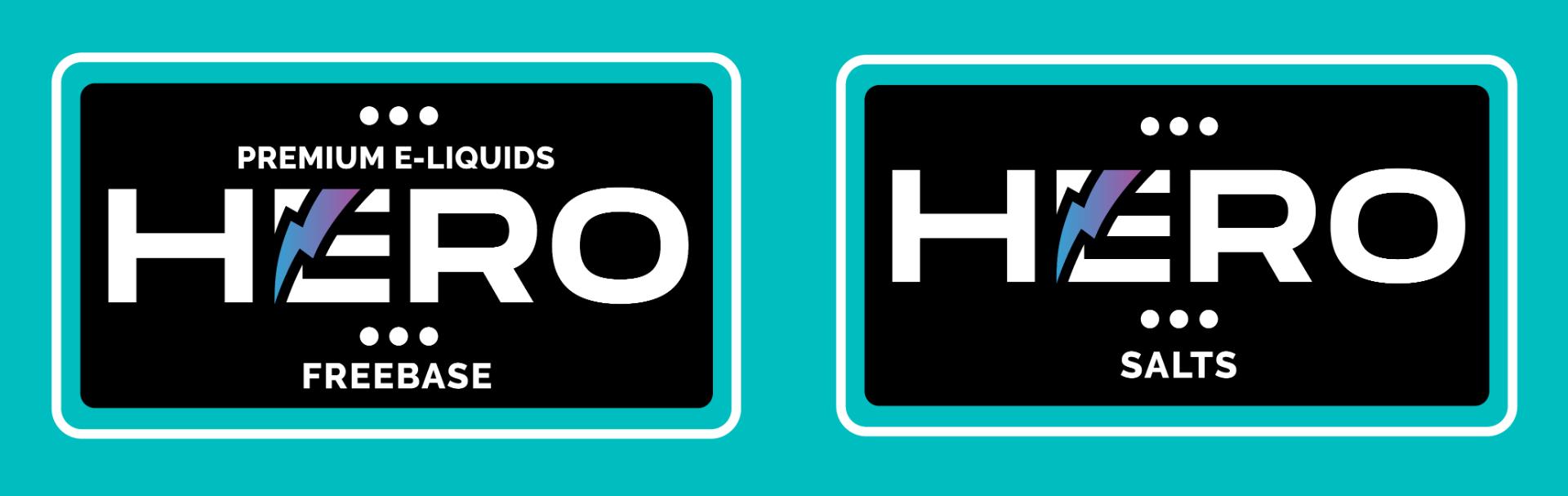
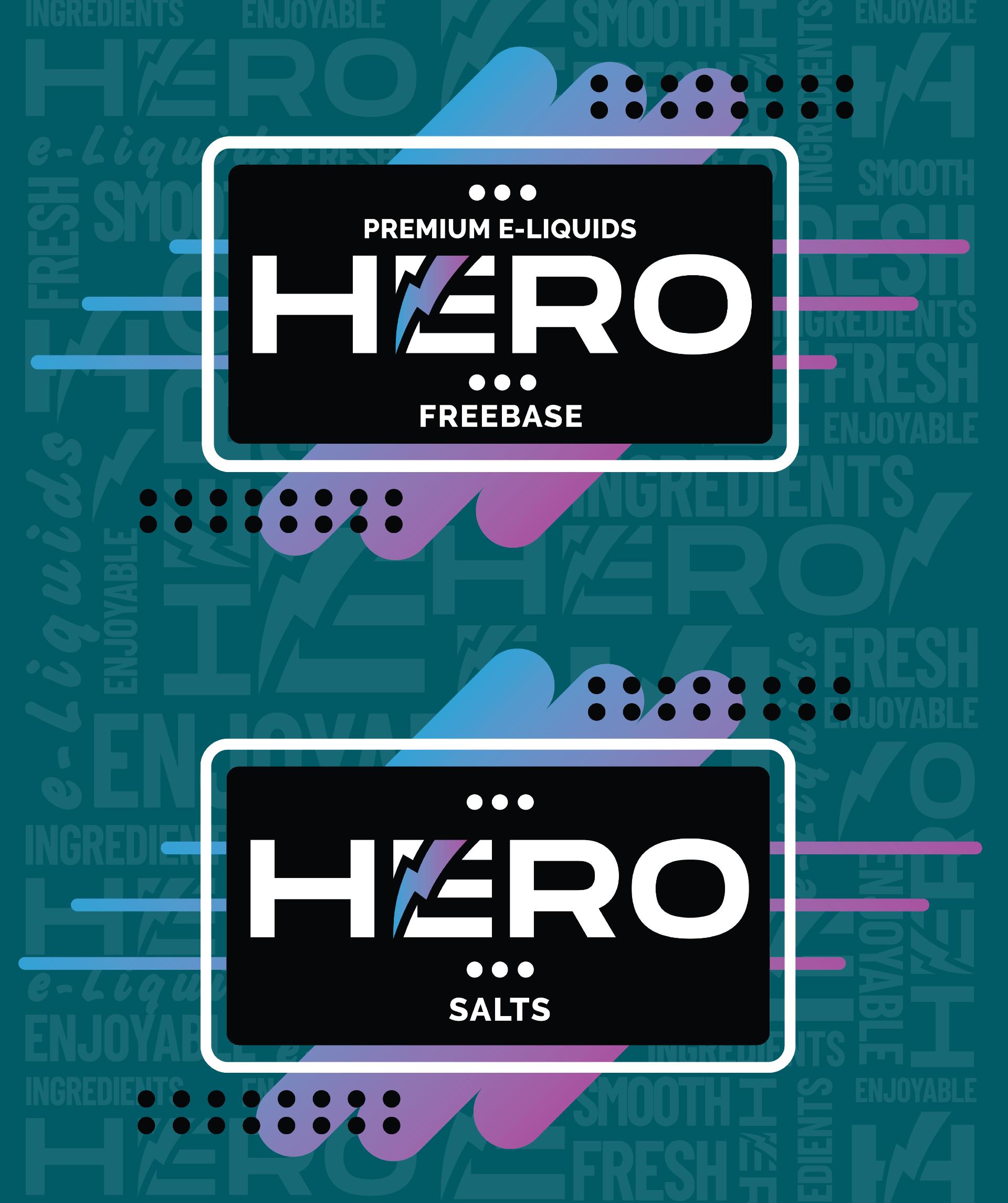
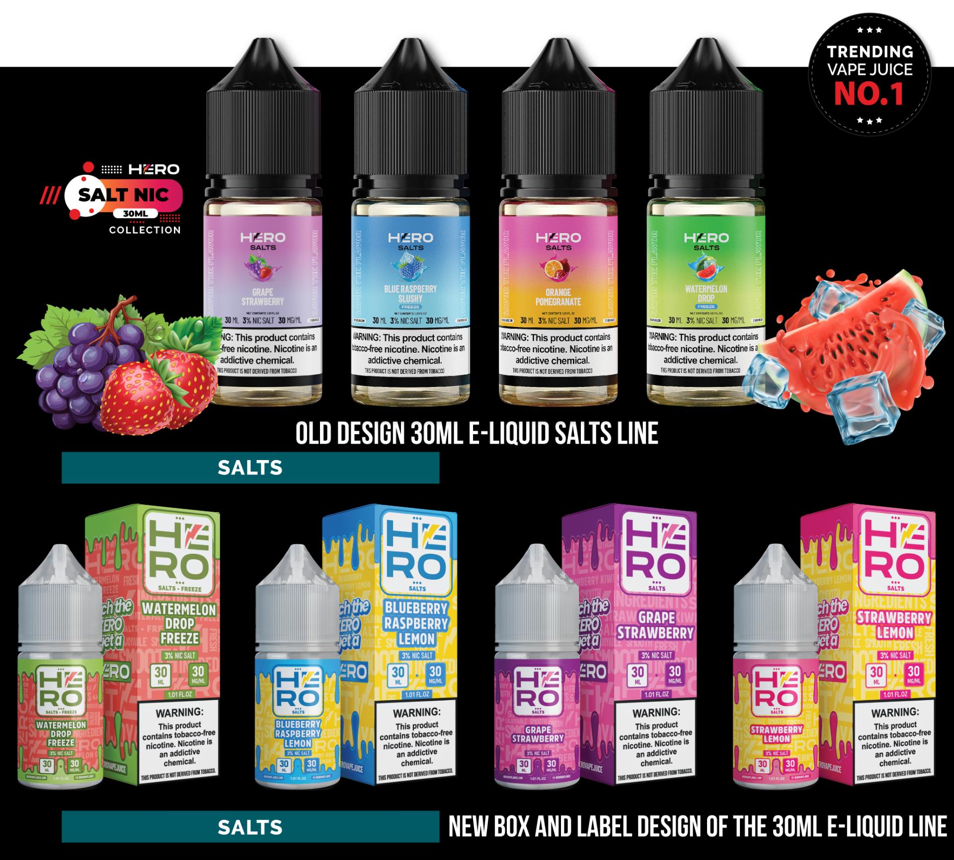
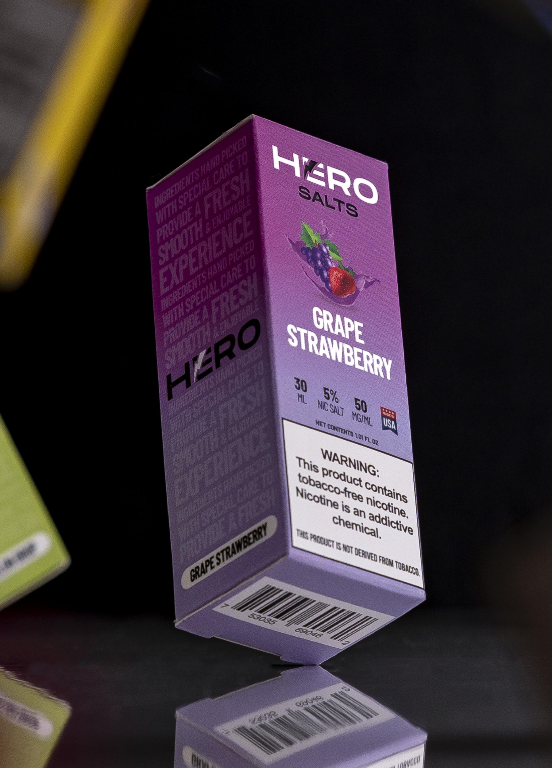
In the world of vape products, packaging and visual identity are not just aesthetics – they define the brand and create an experience. HERO is a brand that embodies quality, innovation, and strong character, and through a carefully designed visual identity, Infinity Design Studio has positioned HERO as a premium brand in the market.

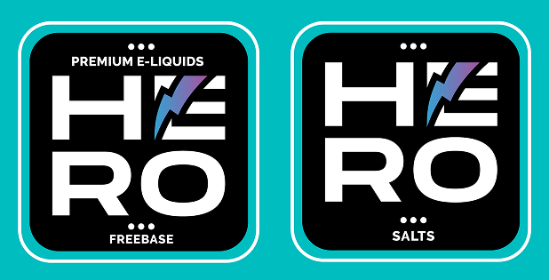
The redesigned HERO identity combines bold typography, vibrant colors, and powerful composition, giving the brand recognizability, energy, and exclusivity. Each label and box tells the story of exceptional flavor and uncompromising quality, while the refreshed logo further strengthens the visual impact.

Brand Consistency – HERO as a Leader in the Vape Industry:

A successful brand is not just recognizable – it is consistent. Every product line, whether the 30ML Salts or 100ML Freebase collection, carries the same strong and luxurious visual identity, which clearly differentiates flavors and product categories.

The new brand structure ensures that HERO stands out immediately on store shelves, and the differentiation between products is now intuitive and visually clear. This not only helps customers make their choice easier but also reinforces HERO’s position as a premium brand in the vape industry

Emotional Connection with Consumers Through Design and Message:

HERO is not just a product – it is a choice, a lifestyle, and a community. The new slogan “Ditch the ZERO, get a HERO” is designed to communicate power, confidence, and the premium quality that HERO brings.

The design is not only visually striking but also strategically crafted to create an emotional response from consumers. Through dynamic colors, powerful graphic elements, and a clear message, HERO positions itself not just as an e-liquid brand – but as an authentic experience.

The Challenge:

Modernizing the Brand and Strengthening Visual Identity

The vape industry is a dynamic and highly competitive market, where brands must differentiate themselves not only through quality but also with a strong visual identity.
HERO aimed to achieve:

  • A complete logo redesign and its integration across all labels and packaging.
  • Refreshing the design of all labels and boxes while preserving HERO’s recognizable identity.
  • Developing a visual system for clear product categorization, making it easy for customers to distinguish flavors and product lines.
  • Introducing new flavors and integrating them into HERO’s existing portfolio.
  • Creating a premium look for labels and packaging, reflecting the superior quality of the products.
  • Better organization of information on packaging – relocating the nicotine warning label to the left side for improved readability.

Implementing the new slogan:

  • Previous slogan: Savor the Flavor
  • New slogan: Ditch the ZERO, get a HERO + New FLASH LIGHTNING Design.

The main challenge was to create a modern, attractive, and functional design while maintaining HERO’s brand recognition and consistency.

Solution: 

Premium Visual Identity and Innovative Packaging Design

Infinity Design Studio developed a completely new visual identity for HERO, with a focus on clear flavor communication, premium aesthetics, and product differentiation.

Key design elements:

  • HERO logo redesign – modernized and refined for better recognition and brand strength.
  • Brand structure and visual system that clearly categorizes different product lines.
  • Bold typography and dynamic visual style that reflects HERO’s energy.
  • Distinct color schemes and graphics to differentiate product flavors and categories.
  • New label and packaging layout for better clarity and readability.
  • Refreshed labels and boxes that attract attention and leave a strong first impression.
  • Integration of new flavors into the HERO product line with a cohesive brand identity.

As a result, HERO’s packaging now clearly communicates premium quality and stands out in the competitive market.

Results:

HERO Positioned as a Leading Premium Brand

A fully refreshed HERO brand identity that reflects its quality and core values.
A modern and cohesive visual identity across all products, enhancing user experience and brand recognition.
Clear differentiation between various product lines, making product selection easier for customers.
Improved packaging readability, better organization of product information, and a refined visual presentation.
A premium, high-end label and packaging look, reinforcing HERO’s mission: quality, innovation, and authenticity.

Conclusion:

Design as the Key to Brand Success

Through a thoughtfully crafted visual identity, Infinity Design Studio has helped HERO retain its recognition while also modernizing and differentiating itself from the competition.

HERO now stands shoulder to shoulder with the top vape brands in the industry, with packaging design that highlights the premium quality of its products.

If you want a visual identity that makes your brand stand out and positions it as an industry leader, contact Infinity Design Studio today.

IMPACT & METRICS

Increase in Shelf Visibility
and Brand Recall

0 %

Bold colors, structured layout, and new logos made HERO products instantly recognizable in retail environments.

Sales Growth After
Packaging Relaunch

0 %

Modernized visuals, clear flavor differentiation, and impactful slogans led to significantly higher sales across both Freebase and Salts collections.

More Distributor Inquiries
Internationally

0 x

Refreshed branding elevated HERO’s status, resulting in tripled B2B interest from premium vape distributors.

Positive Consumer
Feedback on Design

0 %

Surveys and online reviews highlight strong consumer appreciation for the premium look, improved clarity, and shelf appeal.

New Flavors
Successfully Integrated

+ 0

Thanks to the unified branding system, over 30 new flavors were introduced while maintaining visual consistency and category clarity.

Design-Driven Product Interactions

Est. 0 +

Retail placements, online listings, and marketplace visibility generated over 50,000 direct brand engagements within the first 4 months.

Proud Clients

The Team Behind the Project - Led by Creative Director

The Team Behind the Project:
Every Infinity Design Studio project is personally led and directed by Filip Narančić – Founder & Creative Director.

With a unique blend of creativity, strategy, and precision, Filip ensures that each project delivers premium quality, timeless design, and measurable impact.

Infinity Design Studio operates with a boutique approach, where every detail is carefully crafted, and each solution is tailored to the client’s vision and market demands. By combining multidisciplinary expertise with hands-on leadership, the studio transforms every project into a distinctive brand experience.

Filip Narančić

Founder & CEO – Infinity Design Studio

SPECIALIZED IN:

Architecture and Urbanism
Interior Design
Graphic Design and Professional Photography
Video Production and Drone Filming
Website and Mobile App Design
3D Modeling and Rendering

Short biography

Born on June 24, 1982, in Valjevo, Filip Narančić turned his passion for architecture and design into a thriving career.
He graduated from the Faculty of Technical Sciences in Novi Sad, Department of Architecture and Urbanism. During his studies, he launched a pilot project that later evolved into today’s Infinity Design Studio.

Testimonials

Explore More Stunning Work

La Optica B.L.M., a Munich-based retro/modern eyewear brand, aimed to transition its sunglasses packaging from a rubber-touch finish to a
Icebox Diamonds & Watches required a premium and masculine packaging design for their Jewelry Cleaner & Polishing Cloth that aligns
Pain Balm required a rebrand of their Arthritis & Pain Relief Balm packaging while maintaining strong recognition among existing customers

Let’s Create a Premium Design Experience

Infinity Design Studio is ready to turn your ideas into powerful results. Share your vision with us and let’s begin building something extraordinary together.

We’ll get back to you within 24 hours.

Personal Information
Please provide your basic contact information so we can connect with you quickly and start shaping your project experience with precision and care.
Project Details
Please provide your basic contact information so we can connect with you quickly and start shaping your project experience with precision and care.
Budget & Timeline
Indicate your preferred budget range and project timeline so we can align our creative process with your expectations and deliver optimal results.
Final Note
Feel free to share any additional notes or preferences — every detail helps us tailor a truly premium experience for your brand.

Subscribe to Our Newsletter